プレビュー準備中デザインリファレンスを見る
DESIGN REFERENCE
インユース MOONSTAR|線画と余白で見せる普段靴のブランドサイト
淡い背景の線画と黒い靴、縦組みのロゴ、広い余白が特徴。商品一覧、利用者の記事、販売店情報をつなぐブランドサイトの配色・書体・構成・レスポンシブ仕様を整理。
In Use / MOONSTAR — Style Reference
Everyday footwear presented through quiet line drawings, black silhouettes, and generous white space.
Website: products.inuse.jp Original URL: https://products.inuse.jp/ Final URL: https://products.inuse.jp/ Theme: a light interface with neutral illustration backgrounds and a charcoal footer; the captured mobile utility header is black after scrolling. Inspected: October 2, 2026, at 00:56 JST; supplied retrieval timestamp: October 1, 2026, at 15:56:36.213 UTC. Viewports: desktop 1440 × 1000 and mobile 390 × 844 CSS pixels. Scope: the current homepage, including its illustrated opening, concept sections, product catalog, people-story strip, news, stores, related-site banner, contact link, and footer. Visual captures show the opening at both sizes, a desktop catalog segment, and the closing area at both sizes. Other sections are documented through the supplied rendered DOM and computed styles. Linked pages and expanded navigation were not inspected.
In Use is a footwear brand and product homepage with editorial and retail information. Its structure is a long document: an immersive illustrated opening leads into the thinking behind the shoes, fifteen product links, customer stories, news, and physical stores. Shopping links lead to the separate MOONSTAR online store.
The strongest visual relationship is between faint environmental outlines and solid black shoes. The opening lets a walking figure and surrounding vegetation occupy almost the entire screen. The catalog carries that relationship forward with black shoe illustrations, delicate internal seam lines, and small product labels floating on white. Japanese gothic typography gives the sparse interface a firm, practical voice.
The page uses several kinds of space deliberately: expansive illustrated scenes, alternating concept compositions, a precisely spaced product grid, a horizontal story strip, and compact information rows. Preserve these differences when adapting the design. A uniform stack of interchangeable cards would lose much of its character.
閉じる
In Use / MOONSTAR — Style Reference
Everyday footwear presented through quiet line drawings, black silhouettes, and generous white space.
Website: products.inuse.jp Original URL: https://products.inuse.jp/ Final URL: https://products.inuse.jp/ Theme: a light interface with neutral illustration backgrounds and a charcoal footer; the captured mobile utility header is black after scrolling. Inspected: October 2, 2026, at 00:56 JST; supplied retrieval timestamp: October 1, 2026, at 15:56:36.213 UTC. Viewports: desktop 1440 × 1000 and mobile 390 × 844 CSS pixels. Scope: the current homepage, including its illustrated opening, concept sections, product catalog, people-story strip, news, stores, related-site banner, contact link, and footer. Visual captures show the opening at both sizes, a desktop catalog segment, and the closing area at both sizes. Other sections are documented through the supplied rendered DOM and computed styles. Linked pages and expanded navigation were not inspected.
In Use is a footwear brand and product homepage with editorial and retail information. Its structure is a long document: an immersive illustrated opening leads into the thinking behind the shoes, fifteen product links, customer stories, news, and physical stores. Shopping links lead to the separate MOONSTAR online store.
The strongest visual relationship is between faint environmental outlines and solid black shoes. The opening lets a walking figure and surrounding vegetation occupy almost the entire screen. The catalog carries that relationship forward with black shoe illustrations, delicate internal seam lines, and small product labels floating on white. Japanese gothic typography gives the sparse interface a firm, practical voice.
The page uses several kinds of space deliberately: expansive illustrated scenes, alternating concept compositions, a precisely spaced product grid, a horizontal story strip, and compact information rows. Preserve these differences when adapting the design. A uniform stack of interchangeable cards would lose much of its character.
How to Read This Reference
- Measured means a value appears in the supplied computed styles or element rectangles. Values are CSS pixels unless stated otherwise.
- Calculated means arithmetic derived from those measurements, such as column gaps or the space between sections.
- Estimated means a visual judgment from the supplied current-page screenshots. Estimated colors were not sampled with a pixel-reading tool.
- Recommended means an implementation choice for a new project, including the CSS classes, breakpoints, focus treatments, and interaction fallbacks below.
- Token names are descriptive aliases. The supplied custom properties do not expose a complete original design-token system.
- Element rectangles and extracted text have limits. Several visible headings and product names have empty extracted text; their nominal heading font sizes do not necessarily describe the visible artwork.
- No additional browsing, file inspection, or interaction testing was performed for this reference.
Tokens — Colors
Default Palette
| Name | Value | Suggested token | Evidence and role |
|---|---|---|---|
| White | #ffffff |
--color-page |
Measured body background; visible catalog, information sections, and contact area |
| Black | #000000 |
--color-ink |
Measured primary text; visually dominant shoe silhouettes and opening logos |
| Warm Neutral | #f2f1ed |
--color-soft |
Measured people-section background, from rgb(242, 241, 237) |
| Charcoal | #1d1d1d |
--color-dark |
Measured footer and large online-store button backgrounds |
| Reversed White | #ffffff |
--color-on-dark |
Measured footer text and online-store button text |
| Fine Border Gray | Approximately #c4c4c4 |
--color-rule |
Visual estimate for the contact-button outline; recommended reusable border color |
| Illustration Line Gray | Approximately #80807c |
No global UI token required | Visual estimate of opening linework; part of the artwork, not a measured CSS stroke |
The opening illustration has a warm, nearly white ground. Its exact color was not exposed in the supplied element samples. #f2f1ed is a reasonable implementation fallback, but its measured authority is the people section only.
The related-site banner has a pale textured surface. Its visible variation belongs to imagery; a single flat color does not reproduce it. Small catalog swatches introduce cream and gray alternatives alongside black, but their exact colors and product color names were not supplied.
The computed property --swiper-theme-color: #007aff is present. No blue accent is visible in the provided current-page captures, so it should not become part of the design palette. Likewise, generic WordPress font-size presets are not proof of visible headline sizes.
Theme Presets
No selectable themes were evidenced. White content, the black mobile utility bar, and the charcoal footer are section and state treatments within one visual identity. They should not be implemented as evidence of a user-selectable dark mode.
Tokens — Typography
Japanese Gothic — Main Interface
- Measured family:
MFW-PAotoGothicStdN-DeBold. - Measured weight:
400on body text, links, introductory paragraphs, and sampled headings. - Measured body default:
16px / 18.4pxwith normal letter spacing. - Character: visibly substantial Japanese gothic lettering with compact utility labels and unusually open paragraph leading.
- Implementation alias:
--font-body.
The face name contains DeBold, while computed font-weight remains 400. Preserve that distinction. Applying 700 indiscriminately to the original face could alter the intended weight. The supplied evidence establishes the CSS family identifier, not a downloadable font file or licensing permission.
The root HTML element reports Times, but the body overrides it. A serif interface is not supported by the rendered design.
Store Names
Store headings use MFW-PAotoGothicStdN-Bold, also at computed weight 400, with 18px / 20.7px. This is a separate family identifier rather than a verified numeric weight change on the body family.
Graphic Titles and Wordmarks
The vertical opening title, horizontal footer identity, and several section headings behave visually as graphic typography. Their extracted heading text is empty, and some sampled heading elements have line-height: 0px despite nonzero visible bounds.
Use the original authorized wordmark artwork where available. Do not infer that the opening title is ordinary 32px text simply because its containing H1 reports that size. The supplied data does not identify the graphic format or its asset URL.
Type Scale
| Role | Desktop | Mobile | Status |
|---|---|---|---|
| Body default | 16px / 18.4px |
16px / 18.4px |
Measured inherited default; paragraphs often override it |
| Brand introduction | 17px / 39.95px |
15px / 32.55px |
Measured; leading ratios approximately 2.35 and 2.17 |
| Concept explanation | 17px / 35.7px |
15px / 29.25px |
Measured; leading ratios 2.1 and 1.95 |
| Product-group description | 17px / 34px |
16px / 32px |
Measured |
| Product name | Approximately 18–20px visually |
Not separately measured | Desktop screenshot estimate; visible names are absent from extracted link text |
| Product price | Approximately 14–15px visually |
Not separately measured | Desktop screenshot estimate; the enclosing link reports 16px |
| News title | 15px / 27px |
13px / 23.4px |
Measured |
| Store name | 18px / 20.7px |
18px / 20.7px |
Measured, separate Bold family |
| Store details | 15px / 30px |
15px / 30px |
Measured |
| Online-store and contact buttons | 15px / 17.25px |
15px / 17.25px |
Measured |
| Small story-index button | 13px / 14.95px |
Same | Measured |
| Header utility labels | 11px / 12.65px |
Labels visually hidden in the scrolled header | Measured label style; mobile icons remain visible |
| Footer navigation | 13px / 14.95px |
14px / 16.1px |
Measured |
| Footer utility labels | 11px / 12.65px |
Same | Measured |
Most sampled text uses normal tracking. The spacious impression comes primarily from layout and line height, not large letter spacing.
Tokens — Spacing & Shapes
Density: large open regions around relatively small text and illustrations. Geometry: square corners, fine outlines, simple rectangular buttons, and no visible card-shadow system. Base unit: no universal spacing unit was established. The repeated values below are more useful than imposing an artificial eight-point system.
Spacing Scale
| Use | Desktop | Mobile | Evidence |
|---|---|---|---|
| Main inner content width | 1000px |
340px |
Measured catalog and store content |
| Catalog outer wrapper | 1200px, including 100px side padding |
390px, including 25px side padding |
Measured |
| News side padding | 100px inside the desktop wrapper |
20px |
Measured |
| Concept section top/bottom padding | 110px / 150px |
64px / 65px |
Measured |
| Space between concept sections | 150px |
70px |
Calculated from section rectangles |
| Product-group top padding | 60px |
40px |
Measured |
| Product-description bottom to first card | 75px |
45px |
Calculated |
| Product column gap | 95px |
Not applicable | Calculated from three 270px columns in 1000px |
| Product row gap | 35px |
25px |
Calculated from card bounds |
| Story-card gap | 26px |
26px |
Calculated from consecutive link positions |
| People-section top/bottom padding | 65px / 55px |
40px / 35px |
Measured |
| News top/bottom padding | 85px / 30px |
70px / 30px |
Measured |
| Store-section top/bottom padding | 55px / 90px |
25px / 80px |
Measured |
| Banner-to-contact clearance | 70px |
60px |
Calculated |
| Contact-to-footer clearance | 70px |
65px |
Calculated |
Border Radius
| Element | Treatment | Evidence |
|---|---|---|
| Product links and section surfaces | 0 |
Sampled computed styles and desktop screenshot |
| Online-store button | 0 |
Measured |
| Contact button | 0 |
Measured and visible outline |
| Story-index button | 0 |
Measured |
| Banner and footer | Rectangular, full width | Captures and element bounds |
Do not introduce pill buttons, rounded product panels, or elevated white cards. The open page itself is the product surface.
Layout Measurements
| Element | Desktop 1440 × 1000 | Mobile 390 × 844 |
|---|---|---|
| Header height | 68px |
55px |
| Opening vertical title box | 28 × 151px, at (46, 28) |
25 × 134.81px, at (30, 22) |
| Header MOONSTAR link box | 119 × 16px, at (1287, 26) |
113 × 16px, at (255, 23) |
| Main start | Document y = 68px |
Document y = 55px |
| Introduction section start | Document y = 1000px |
Document y = 987px |
| Space from main start to introduction | 932px, calculated |
932px, calculated |
| Product card link box | 270 × 337.98px |
340 × 324.19px |
| Product row pitch | 372.98px |
349.19px |
| Typical story link box | 230 × 411px |
250 × 439.28px |
| Online-store button | 450 × 50px |
340 × 56px |
| Related-site banner | 1440 × 210px |
390 × 190px |
| Contact button | 239.66 × 49.25px |
245.66 × 55.25px |
| Footer | 1440 × 203.58px |
390 × 435.75px |
| Document height | 12055.78px |
14406.38px |
The mobile product link is wider but slightly shorter than the desktop link. Its media cannot safely be assumed to expand into a 340px square. The image element itself was not measured separately.
Components
Opening Header
Role: establish the product identity with almost no navigation competing against the scene.
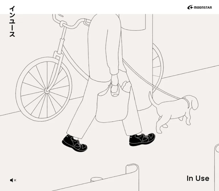
The opening presents a white top band, a vertical black Japanese wordmark at the upper left, and the MOONSTAR logo at the upper right. The vertical title extends well below the header band into the illustration. Its placement is deliberately asymmetric: the title occupies a narrow vertical strip while the corporate logo remains a compact horizontal mark.
At desktop size, the vertical title begins 46px from the left and 28px from the top. Mobile reduces these to 30px and 22px, with a slightly narrower wordmark. The MOONSTAR link sits 34px from the desktop right edge and 22px from the mobile right edge.
The sampled header background is transparent; the visible white opening band is therefore not proof of an opaque white fill on the header element itself. A white opening header is an acceptable implementation simplification.
Scrolled Utility Header
Role: retain access to navigation, shopping, and Instagram while the long page is being explored.
Scrolled desktop captures show a thin three-line menu icon at the left and cart/Instagram utilities at the upper right. The labels are オンラインストア and #インユース. They sit directly over the light content area without a visually heavy navigation container.
The mobile closing capture shows a black 55px top bar with white menu, cart, and Instagram symbols. Utility text disappears from this compact header, although it remains present in the extracted link data and in the footer.
This supports distinct opening and scrolled presentations. The exact trigger position, position mechanism, expanded-menu appearance, and dismissal behavior were not supplied. The opening DOM places utility links above the viewport with negative y coordinates; that is a state observation, not proof of a particular slide animation.
Estimated icon anatomy: a menu glyph about 24px wide, cart artwork about 21px wide, and Instagram artwork about 19px square. Recommended interactive hit areas should be larger than these visible symbols.
Illustrated Opening
Role: communicate the shoes through everyday use before presenting product specifications.
A full-width scene starts immediately below the opening header. A walking figure with a backpack moves through a loosely drawn wooded setting in the captured frame. The person and vegetation use fine gray outlines with almost no shading. The shoes carry the strongest black fill, making them the visual focus without a separate product callout.
The desktop scene is broadly cropped: trees and vegetation continue beyond the frame, and the figure's head is outside the visible composition. A small mute-style speaker symbol sits near the lower left; In Use is placed near the lower right. Both are secondary to the illustration.
Mobile shows a much tighter crop around the figure and shoes. The head remains outside the frame, and most surrounding scenery is lost. Preserve the footwear as the crop's focal point. A different mobile asset and a shared asset with different positioning are both possible; the evidence does not identify which approach the site uses.
The sampled opening occupies 932px between the main start and introduction in both layouts. On mobile, the introduction begins 143px below the first viewport's bottom. Do not describe this as a verified 100vh hero. Its sizing formula and whether the browser session influenced the retained height are unknown.
Brand Introduction and Concept Sections
Role: explain the everyday needs behind the collection.
The introduction contains a graphic heading followed by generously led Japanese text. Its content establishes MOONSTAR's experience making comfortable footwear and describes In Use as shoes supporting ordinary life. This is independently supported by the original-page text.
Five following sections discuss everyday movement, children's feet, varied foot shapes, comfortable leather shoes, and outdoor footwear derived from split-toe work shoes. These are descriptive topic summaries, not transcriptions of unextracted graphic headings.
Desktop paragraph blocks are 500px wide and alternate between x ≈ 834.89px and x ≈ 105.11px. Narrow heading boxes alternate with them: approximately 72 × 349.56px, around x ≈ 1085px and 283px. This produces a repeating left/right composition instead of a uniform centered feature list.
On mobile, paragraphs occupy the full 390px section with 25px internal side padding. Narrow heading boxes remain alternating near x = 304px and 25px, but their measured heights vary. The visual contents of these intermediate sections were not captured, so their exact artwork and overlap relationships remain unverified.
One mobile concept heading is reported above its own section's top boundary, and that section is unusually short. Treat this as an unresolved layout observation. It is not sufficient evidence to deliberately reproduce an overlap.
Product Catalog
Role: make the range browsable while retaining the illustrated brand language.
The catalog contains fifteen product links grouped into sets of seven, three, one, and four. Desktop uses three columns inside a 1000px content area, with card starts at x = 220, 585, and 950px. Each card is 270px wide, leaving 95px between columns.
Mobile presents one product per row, 340px wide with 25px page margins. The first seven-item group therefore becomes a long vertical sequence. This is an evidenced single-column layout, not an inferred two-column mobile shop grid.
Each group begins with a graphic heading and a short explanatory paragraph. Leave 75px between the desktop paragraph's bottom and the first product row; the measured mobile equivalent is 45px.
Product Link
Role: a complete illustrated entry point to a product detail page.
The visible anatomy is:
- A centered pair of shoes, rendered as black silhouettes with fine light seams, laces, and sole details.
- A left-aligned Japanese product name below the image.
- A smaller yen price beneath the name.
- One or two small rectangular color swatches aligned toward the right at approximately the price level.
There is no enclosing border, panel fill, badge, shadow, or separate purchase button in the captured catalog. The whole entry is represented by a product link in the DOM. Example destinations include /product/basket/, /product/stip/, and /product/natts/.
The captured labels include バスケット, スチップ, and ナッツ; example prices include ¥8,800 and ¥16,500. These are capture-time examples, not a guarantee of future pricing.
Estimated details: product names appear around 18–20px, prices around 14–15px, and swatches approximately 17 × 11px with an 8px gap. These internal dimensions were not separately measured. The swatches' appearance establishes color information, but no swatch-selection interaction was tested.
People-Story Strip
Role: connect the shoes with individual experiences and everyday use.
The section changes to measured warm neutral #f2f1ed. Its links form a horizontal sequence rather than a wrapping grid. Desktop cards begin at x = 220px, are 230px wide, and advance by 256px. Mobile cards are 250px wide and advance by 276px; the first starts at x = 70px, centering it in the 390px viewport while exposing part of the next card.
Twenty-nine story links appear in the supplied data. Captions begin with numbers, such as 029.程よいソールの厚み. Most desktop link boxes are 411px tall, with longer captions producing taller boxes. The imagery and complete visual card anatomy were not shown in the current captures.
A centered white もっと見る link measures approximately 112.16 × 34.94px, with 13px type and padding of 10px 14px 10px 20px. Its destination is the people index.
The geometry supports a horizontal carousel or rail presentation. Dragging, autoplay, arrow controls, pagination, and looping remain unverified. A native horizontal rail in the Quick Start is a recommended accessible fallback.
News List
Role: present updates without competing with the product illustrations.
Four news links appear in the sampled homepage. Desktop rows use a date region followed by a title region beginning 127px after the row's left edge. Titles use 15px / 27px; the rows have 10px top and bottom padding and measure 47px high for the captured single-line titles.
Mobile retains the date/title relationship. Titles start 92px after the left edge, use 13px / 23.4px, and wrap within a 258px title area. Vertical padding becomes 8px. Rows expand to accommodate two lines rather than clipping.
The small すべて index link is aligned at the right. No large news cards or colored date badges are evidenced. Divider appearance was not included in the supplied styles and is not visually verified.
Store Row
Role: pair physical retail context with practical visit information.
The desktop closing capture includes a large, natural-color store photograph. It shows an interior with shoe displays, furniture, and daylight. This is a useful contrast to the illustrated catalog: photography is present, but it is concentrated in a practical retail context.
The desktop photograph spans approximately 500px from x = 220px; the text column begins at x = 770px and is measured at 450px wide. This creates an approximately 50px gap. Store-name starts repeat at 360px vertical intervals in the DOM.
Each information block contains a store name, address, opening hours, closing day, telephone number, and an underlined Instagram handle. Store names use the separate Bold family; details use 15px / 30px.
Mobile moves the text to x = 25px with a 340px width. The measurements are consistent with a stacked store layout, though the mobile store photographs themselves were not captured. Do not treat a guessed image ratio as a source measurement.
Online-Store Button
Role: provide a clear route to the separate shopping site after the store information.
A centered charcoal rectangle with white オンラインストア text. Desktop dimensions are 450 × 50px; mobile expands it to the content width of 340px and increases height to 56px. Text is 15px / 17.25px, with square corners.
Its destination is https://www.moonstar.co.jp/store/. The icon used in header shopping utilities does not appear inside this large button in the supplied desktop capture.
Related-Site Banner
Role: link the product homepage to the broader In Use site.
A full-width pale textured panel contains a centered In Use identity and the source phrase “使うこと”を考える. A small external-link symbol sits toward the lower right. The destination is https://inuse.jp/; its page was not inspected.
Measured height is 210px on desktop and 190px on mobile. The mobile screenshot reveals less than the full panel because the black utility header overlays its upper portion. Preserve the measured height rather than treating the visible strip as the complete component.
The material texture is restrained and low contrast. Use an authorized texture asset to reproduce it; a bright gradient or a generic noisy overlay would change the treatment.
Contact Link
Role: provide a quieter secondary action after the banner.
The centered In Use に関するお問い合わせ link has black text, a white surrounding surface, and a fine gray rectangular border. Desktop padding is 15px 20px; mobile padding is 18px 23px. Including its border, the measured dimensions are approximately 239.66 × 49.25px and 245.66 × 55.25px respectively.
The destination is the MOONSTAR contact page. The link's visual hierarchy is lower than the filled online-store button, with generous white space above and below.
Footer
Role: close the document with repeated navigation and corporate identity.
The footer uses measured charcoal #1d1d1d with white content. Desktop padding is 42px 25px 40px 40px. A horizontal In Use identity sits at the upper left, followed by five navigation links in one row. Shopping and Instagram utilities occupy a lower row. The MOONSTAR logo and copyright sit toward the lower right.
The five navigation labels are インユースの工夫, プロダクト, みなさんのインユース, お知らせ, and 販売店. Their original destinations mix in-page anchors and index pages. The concept anchor is spelled #conecpt in the supplied page; retain that spelling when linking to the original URL.
On mobile, padding becomes 40px 25px 45px. Navigation changes to a vertical list, with link starts approximately 41.09px apart. Utility links stack near the lower left, while the MOONSTAR identity and a two-line copyright remain on the right. Footer height grows from 203.58px to 435.75px.
A fine upward-arrow symbol appears near the top-right corner of both footer captures. Its likely return-to-top purpose is visually suggested, but its click behavior was not tested.
Tokens — Motion & Interaction
| Element or behavior | Evidence | What can safely be reused |
|---|---|---|
| Opening title container | Computed transition duration 0.5s |
A measured duration; changed properties and trigger are unknown |
| Header, utility, and many footer links | Computed transition duration 0.2s |
A short interaction timing reference; no verified hover end state |
| Product and people links | Computed transition duration 0.3s |
A slightly slower timing reference; no verified image swap, scale, or fade |
| Main buttons and related-site banner | Computed transition duration 0.3s |
A timing reference only |
| Header presentation | Opening logos and scrolled utility controls appear in separate captures | Two evidenced presentations; transition sequence and threshold unverified |
| Opening sound symbol | Mute-style speaker visible in the desktop capture | Sound-control affordance; actual audio state and toggle outcome unverified |
| Opening illustration | Static frames supplied | Artwork composition is observed; format, playback speed, looping, and audio are unverified |
| People strip | Consecutive links extend horizontally beyond the viewport | Horizontal structure; swipe, autoplay, and snap behavior unverified |
| Footer upward arrow | Visible in both closing captures | A navigation affordance; scroll behavior unverified |
The sampled elements report animation: none. This does not establish that the entire site is static: media elements, scripts, descendants, and perpetual motion may not be represented by those samples.
The collection process waited for layout and image readiness and temporarily paused perpetual animations during readiness checks. That procedure does not establish the complete motion design. No easing curve, keyframe sequence, audio playback test, menu-opening test, or hover comparison is available.
For a new implementation, use subtle opacity or underline feedback at 200–300ms, explicitly as a recommendation. Keep the illustration as the expressive element and avoid adding unverified parallax, cursor effects, or scroll-scrubbed animation.
Surfaces
| Surface | Appearance | Purpose |
|---|---|---|
| Opening band | White, visually quiet | Holds the two contrasting wordmark orientations |
| Opening scene | Warm near-white with thin gray outlines and black shoes | Establishes atmosphere and product focus |
| Main content | White, mostly unboxed | Supports long reading and product browsing |
| People section | Solid #f2f1ed |
Marks a shift from products to personal stories |
| Related-site banner | Pale tactile texture | Separates an external editorial destination |
| Primary store action | Solid #1d1d1d, white label |
Makes the shopping route unmistakable |
| Contact action | Fine gray outline on white | Provides a quieter secondary route |
| Mobile scrolled header | Black with white icons | Keeps compact utilities legible |
| Footer | Solid #1d1d1d, white navigation |
Creates a firm endpoint to the long page |
There is no evidenced general elevation system. Separation comes from space, image scale, background changes, and a few outlines.
Imagery
Opening Illustration
Use thin, slightly irregular contour drawing rather than mechanically perfect geometric outlines. Preserve the lack of tonal modeling in the figure, clothing, backpack, trees, and vegetation. The shoes should remain substantially darker than their environment.
The crop is part of the composition. A head cut off by the top of the scene, vegetation entering from the edges, and a large walking stride make the viewer feel close to an ordinary moment. Avoid shrinking the complete figure into a small centered mascot surrounded by unused space.
Product Illustrations
The captured shoes are shown in pairs at oblique angles. Black fills describe the main volumes; light lines describe stitching, laces, panels, and soles. White space remains between the illustration and product metadata.
Keep the full pair visible in catalog entries. Use object-fit: contain for replacement assets and retain their intrinsic margins. A photographic background, artificial shadow, or aggressive crop would weaken the catalog's visual consistency.
Retail Photography and Texture
The store photograph is naturally colored and architectural. It adds material and spatial context without becoming a competing full-bleed photographic campaign.
The related-site banner uses a light material texture behind its graphic identity. Its exact source and production method are unknown. Texture should stay subordinate to the lettering.
Observed Asset References
No original image, font, video, or SVG asset URLs were included in the supplied evidence. The following inventory identifies visible roles without inventing filenames.
| Asset role | Evidence | Implementation guidance |
|---|---|---|
| Vertical In Use wordmark | Desktop and mobile opening captures | Use authorized artwork; preserve tall, narrow proportions |
| MOONSTAR identity | Opening and footer captures | Use authorized black and reversed versions |
| Walking scene | Opening captures | Preserve thin outlines and the footwear-focused crop |
| Shoe-pair artwork | Desktop catalog capture | Contain the full illustration inside an open media stage |
| Section-title graphics | Empty extracted headings with nonzero bounds | Obtain originals or use clearly labeled typographic substitutes |
| Store photograph | Desktop closing capture | Preserve landscape composition and natural color |
| Related-site banner | Both closing captures | Retain pale texture, centered identity, and corner link symbol |
| Menu, cart, Instagram, speaker, and arrow symbols | Current captures | Use restrained line icons; the original file format is unknown |
The people-section imagery was not visually supplied. Its subject treatment should remain an open implementation requirement rather than an invented style claim.
Layout & Responsive Behavior
Desktop
The page begins at full width, then organizes most catalog and information content inside a 1000px inner column. At 1440px, that column begins at x = 220px. The wrapper itself is 1200px wide and contributes 100px internal padding on each side.
Concept sections break out of that regular catalog alignment, alternating 500px paragraph blocks and narrow graphic headings across the page. The product catalog returns to a stable three-column rhythm. The people strip extends horizontally, while news and store details use structured text columns.
The lower sequence is especially clear: store information, filled shopping link, textured related-site banner, outlined contact link, then charcoal footer.
Mobile
- The opening header reduces from
68pxto55px; the illustration remains a large, tightly cropped scene. - Standard content side margins become
25px, producing a340pxcolumn. News uses20px, producing350px. - Products change from three columns to one. Their measured link width grows from
270pxto340px, while their height decreases slightly. - Concept body text reduces from
17pxto15px, retaining generous line spacing. - The people strip shows one centered
250pxcard with a glimpse of the next card. - News keeps date and title beside one another and permits taller wrapped rows.
- Store information occupies the full content column.
- The online-store button becomes
340 × 56px. - The footer navigation stacks vertically, and the footer becomes more than twice as tall.
- Scrolled header utilities become white icons on black, without visible text labels.
Responsive Limits
Only two viewport sizes were supplied. No original breakpoint, tablet arrangement, safe-area treatment, landscape behavior, or browser-height formula was established. Any breakpoint in the Quick Start is a recommendation.
The concept portion becomes shorter on mobile, while the one-column catalog becomes much longer: the product-section height changes from approximately 3614.89px to 6104.81px. Overall document height grows from approximately 12056px to 14406px.
Do not reproduce all measured y coordinates as absolute positioning. They describe one content state and one font-rendering environment. Reproduce the column widths, grouping, spacing relationships, and natural content flow instead.
Do’s and Don’ts
Do
- Keep white as the main content surface, with warm neutral reserved for distinct sections and artwork.
- Make black shoes the strongest forms in the opening and catalog illustrations.
- Preserve the contrast between the vertical opening identity and horizontal footer identity.
- Use the measured gothic family identifiers when legitimately available, with explicit fallback behavior.
- Retain the exceptionally open paragraph leading.
- Build the desktop catalog around three
270pxentries with95pxgaps at the captured width. - Use one product per row at the evidenced mobile width.
- Keep product illustrations unboxed and fully visible.
- Preserve the horizontal people strip as a different browsing pattern from the catalog.
- Keep shopping, editorial, contact, and corporate destinations visually distinct.
- Let natural-color store photography coexist with the line-art product language.
- Treat graphic-heading dimensions separately from inherited heading font sizes.
Don’t
- Don’t reduce the homepage to a generic headline, feature-card grid, and conversion block.
- Don’t introduce rounded product cards, drop shadows, glossy gradients, or colored sale badges.
- Don’t use the unused blue library variable as the site's accent color.
- Don’t assume the root
Timesdeclaration describes the visible typography. - Don’t apply synthetic bold to every element using the measured DeBold family.
- Don’t turn desktop product spacing into tightly packed ecommerce tiles.
- Don’t infer a two-column mobile catalog.
- Don’t assume every product image is square because its link box is wider on mobile.
- Don’t claim autoplay, looping, audio synchronization, hover image changes, or parallax without testing them.
- Don’t treat the mobile black header as evidence of a selectable dark theme.
- Don’t invent asset paths, exact graphic font names, or production responsibilities.
Recommended Implementation Additions
These are recommendations for a new implementation, not verified features of the original page:
- Give graphic wordmarks and section headings accessible text equivalents. Empty extracted text alone does not establish whether the original accessible names are missing.
- Include both product name and price in each product link's accessible name. Keep decorative shoe artwork and repeated labels from producing redundant announcements.
- Provide at least
44 × 44pxinteractive areas around small header and sound icons. - Add visible keyboard focus indicators that work on both white and charcoal backgrounds.
- Implement an expanded menu with an accessible name, an exposed expanded state, appropriate focus handling, and a reliable close action.
- If the opening uses animation, provide a static poster and reduced-motion behavior. If it uses sound, require an explicit action before audible playback.
- Make the people strip keyboard-reachable and operable without relying exclusively on dragging.
- Preserve color-option information in text or accessible labels instead of relying solely on tiny swatches.
- Reserve image dimensions to limit layout changes, especially in the long mobile catalog and store list.
- Use one primary page heading and a coherent section hierarchy when adapting graphic titles into semantic markup.
- Keep in-page destinations clear of the persistent header with
scroll-margin-top.
Agent Prompt Guide
Quick Color Reference
- Main page:
#ffffff. - Main text and strongest illustration forms:
#000000. - People-section background:
#f2f1ed. - Footer and main shopping button:
#1d1d1d. - Reversed labels:
#ffffff. - Fine contact border: approximately
#c4c4c4, an estimated adaptation. - Opening ground: warm near-white; exact artwork color unmeasured.
- Texture: pale and restrained, confined to the related-site banner.
Overall Prompt
“Create a Japanese everyday-footwear brand homepage inspired by the current In Use / MOONSTAR layout. Begin with a large warm near-white line drawing of a walking person, using thin gray environmental outlines and solid black shoes. Place a narrow vertical Japanese identity at the upper left and a compact horizontal corporate logo at the upper right. Follow with generously led concept text and alternating compositions, then an unboxed shoe catalog. At 1440px, use a 1000px catalog column with three 270px entries and 95px gaps; at 390px, use one 340px entry per row with 25px side margins. Use substantial Japanese gothic typography, black text, white surfaces, small rectangular color swatches, a warm neutral story strip, practical store photography, a charcoal shopping button, a pale textured related-site banner, and a charcoal footer. Treat animation and expanded navigation as separately specified requirements.”
Example Component Prompts
- Opening: “A full-width warm near-white scene with a walking figure and vegetation drawn in fine gray contours. Make the shoes solid black with delicate internal detail. Crop the figure closely on mobile while preserving the shoes. Add a vertical identity at upper left, a small corporate logo at upper right, and understated corner utilities.”
- Product entry: “An unboxed white footwear entry, 270px wide on desktop, with a centered illustrated black shoe pair. Below it place a compact Japanese product name, a small yen price, and one or two tiny rectangular swatches aligned to the right. Use square geometry and no shadow.”
- People strip: “A full-width #f2f1ed section containing a horizontal sequence of numbered story links. Use 230px entries and 26px gaps on desktop. On a 390px phone, center a 250px entry and reveal the next one. Add a small centered white index button. Do not assume autoplay.”
- Store row: “Pair a natural-color retail interior photograph with a practical information column. At desktop size, target 500px for the image, 50px for the gap, and 450px for the details. Use an 18px store name and 15px text with 30px line height. Stack the content on mobile.”
- Closing sequence: “Place a centered charcoal shopping button above a full-width pale textured banner. Follow with a small outlined contact link surrounded by white space, then a charcoal footer with white navigation. Stack footer links vertically on mobile and retain compact corporate identity at the lower right.”
Quick Start
CSS Custom Properties
This is a reusable adaptation of the measured proportions, not recovered source CSS. It uses a conventional 16px root and normal document scrolling.
The 760px breakpoint is recommended. The 932px opening height reproduces the supplied snapshots; it is not asserted to be the original sizing rule. Product media-stage heights, product-label metrics, image ratios, hover opacity, and the native story rail are explicit approximations or recommendations.
The header expects application-controlled data-state='opening' or data-state='content'. The CSS supplies their appearance without claiming the original state trigger. Font declarations reference the observed family names only; font files must be supplied through an authorized setup.
:root {
  /* Measured palette, except the estimated rule color. */
  --color-page: #fff;
  --color-ink: #000;
  --color-soft: #f2f1ed;
  --color-dark: #1d1d1d;
  --color-on-dark: #fff;
  --color-rule: #c4c4c4;

  /* Observed family identifiers with recommended fallbacks. */
  --font-body: 'MFW-PAotoGothicStdN-DeBold', sans-serif;
  --font-store: 'MFW-PAotoGothicStdN-Bold', sans-serif;
  --weight-body: 400;

  --content-width: 1000px;
  --page-gutter: 25px;
  --header-height: 68px;
  --opening-height: 932px;
  --product-column-gap: 95px;
  --product-row-gap: 35px;
  --story-width: 230px;
  --story-gap: 26px;

  /* Estimated internal product dimensions. */
  --product-media-height: 270px;
  --swatch-width: 17px;
  --swatch-height: 11px;

  /* Measured durations; properties below are recommendations. */
  --duration-link: 200ms;
  --duration-card: 300ms;
  --duration-brand: 500ms;
}

* { box-sizing: border-box; }

body {
  margin: 0;
  color: var(--color-ink);
  background: var(--color-page);
  font: var(--weight-body) 16px/1.15 var(--font-body);
}

img, video { display: block; max-width: 100%; }
button, a { -webkit-tap-highlight-color: transparent; }
button { font: inherit; }
a { color: inherit; }
h1, h2, h3, p { margin: 0; }

.container {
  width: min(var(--content-width), calc(100% - 2 * var(--page-gutter)));
  margin-inline: auto;
}

.page { padding-top: var(--header-height); }
section[id] { scroll-margin-top: calc(var(--header-height) + 20px); }

.site-header {
  position: fixed;
  z-index: 20;
  inset: 0 0 auto;
  height: var(--header-height);
}

.site-header[data-state='opening'] { background: var(--color-page); }
.site-header[data-state='opening'] .header-content { display: none; }
.site-header[data-state='content'] .header-opening { display: none; }

.header-brand {
  position: absolute;
  top: 28px;
  left: 46px;
  width: 28px;
}

.header-corporate {
  position: absolute;
  top: 26px;
  right: 34px;
  width: 119px;
}

.header-content {
  display: flex;
  align-items: center;
  justify-content: space-between;
  height: 100%;
  padding-inline: 16px 34px;
}

.header-utilities {
  display: flex;
  align-items: center;
  gap: 25px;
}

.utility-link {
  display: inline-flex;
  align-items: center;
  gap: 10px;
  min-height: 44px;
  font-size: 11px;
  line-height: 12.65px;
  text-decoration: none;
}

.icon-button {
  display: inline-grid;
  place-items: center;
  width: 44px;
  height: 44px;
  padding: 0;
  border: 0;
  border-radius: 0;
  color: inherit;
  background: transparent;
  cursor: pointer;
}

.hero {
  position: relative;
  height: var(--opening-height);
  overflow: hidden;
  background: var(--color-soft);
}

.hero-media {
  width: 100%;
  height: 100%;
  object-fit: cover;
  object-position: center;
}

/* Artwork-specific focal positions must be calibrated separately. */
.hero-caption {
  position: absolute;
  right: 46px;
  bottom: 40px;
  font-size: 36px;
  line-height: 1;
}

.hero-sound { position: absolute; left: 40px; bottom: 30px; }

.concept { padding-block: 110px 150px; }
.concept-intro { font-size: 17px; line-height: 2.35; text-align: center; }
.concept-copy { max-width: 500px; font-size: 17px; line-height: 2.1; }
.concept-feature + .concept-feature { margin-top: 150px; }

.product-group { padding-top: 60px; }
.product-group + .product-group { margin-top: 40px; }
.product-group-description { margin-top: 27px; font-size: 17px; line-height: 2; }

.product-grid {
  display: grid;
  grid-template-columns: repeat(3, minmax(0, 1fr));
  gap: var(--product-row-gap) var(--product-column-gap);
  margin-top: 75px;
}

.product-card {
  display: block;
  min-width: 0;
  text-decoration: none;
  transition: opacity var(--duration-card);
}

.product-card-media {
  display: grid;
  place-items: center;
  height: var(--product-media-height);
}

.product-card-media img {
  width: 100%;
  height: 100%;
  object-fit: contain;
}

.product-card-name {
  margin: 20px 0 10px;
  font-size: 18px;
  font-weight: inherit;
  line-height: 22px;
}

.product-card-meta {
  display: flex;
  align-items: center;
  justify-content: space-between;
  gap: 12px;
  font-size: 14px;
  line-height: 16px;
}

.product-swatches { display: flex; gap: 8px; }
.product-swatch {
  width: var(--swatch-width);
  height: var(--swatch-height);
  background: var(--swatch, var(--color-ink));
}

.people { margin-top: 60px; padding-block: 65px 55px; background: var(--color-soft); }

/* Recommended native horizontal rail, not verified source behavior. */
.story-rail {
  display: flex;
  gap: var(--story-gap);
  margin-top: 60px;
  padding-inline: max(25px, calc((100% - var(--content-width)) / 2));
  overflow-x: auto;
  scroll-snap-type: x proximity;
}

.story-card { flex: 0 0 var(--story-width); scroll-snap-align: center; }
.story-card img { width: 100%; height: auto; }
.story-card-title { margin-top: 20px; font-size: 16px; line-height: 1.5; }

.more-link {
  display: table;
  margin: 50px auto 0;
  padding: 10px 14px 10px 20px;
  background: var(--color-page);
  font-size: 13px;
  line-height: 14.95px;
  text-decoration: none;
}

.news { padding-block: 85px 30px; }
.news-list { margin-top: 46px; }
.news-row {
  display: grid;
  grid-template-columns: 127px minmax(0, 1fr);
  padding-block: 10px;
  text-decoration: none;
}
.news-row h3 { font-size: 15px; font-weight: inherit; line-height: 27px; }

.stores { padding-block: 55px 90px; }
.store-list { display: grid; gap: 60px; margin-top: 75px; }
.store-row { display: grid; grid-template-columns: 500fr 450fr; gap: 50px; }

/* A recommended landscape ratio; image bounds were not fully measured. */
.store-photo { width: 100%; aspect-ratio: 5 / 3; object-fit: cover; }
.store-name { font: 400 18px/20.7px var(--font-store); }
.store-details { margin-top: 35px; font-size: 15px; line-height: 30px; }

.shop-button {
  display: flex;
  align-items: center;
  justify-content: center;
  width: min(450px, 100%);
  min-height: 50px;
  margin: 90px auto 0;
  color: var(--color-on-dark);
  background: var(--color-dark);
  font-size: 15px;
  line-height: 17.25px;
  text-decoration: none;
}

.related-banner {
  position: relative;
  display: grid;
  place-items: center;
  min-height: 210px;
  background: var(--color-soft);
  text-decoration: none;
}
.related-banner-texture {
  position: absolute;
  inset: 0;
  width: 100%;
  height: 100%;
  object-fit: cover;
}
.related-banner-content { position: relative; text-align: center; }
.related-banner-icon { position: absolute; right: 34px; bottom: 30px; }

.contact-area { padding-block: 70px; text-align: center; }
.contact-link {
  display: inline-flex;
  align-items: center;
  justify-content: center;
  max-width: calc(100% - 40px);
  padding: 15px 20px;
  border: 1px solid var(--color-rule);
  font-size: 15px;
  line-height: 17.25px;
  text-decoration: none;
}

.site-footer {
  position: relative;
  padding: 42px 25px 40px 40px;
  color: var(--color-on-dark);
  background: var(--color-dark);
}
.footer-brand { width: 173px; }
.footer-nav { display: flex; flex-wrap: wrap; gap: 20px; margin-top: 30px; }
.footer-nav a { padding-block: 5px; font-size: 13px; line-height: 14.95px; text-decoration: none; }
.footer-bottom { display: flex; align-items: end; justify-content: space-between; gap: 25px; margin-top: 30px; }
.footer-utilities { display: flex; gap: 25px; }
.footer-corporate { text-align: right; }
.footer-corporate img { width: 119px; margin-left: auto; }
.footer-copyright { margin-top: 20px; font-size: 11px; line-height: 1.8; }
.footer-top { position: absolute; top: 26px; right: 15px; }

/* Recommended feedback, not a reconstruction of observed hover states. */
:where(a, button):focus-visible { outline: 2px solid currentColor; outline-offset: 5px; }
@media (hover: hover) {
  .product-card:hover { opacity: 0.7; }
  .utility-link:hover, .footer-nav a:hover { text-decoration: underline; }
}

@media (max-width: 1100px) and (min-width: 761px) {
  .product-grid { column-gap: 40px; }
}

/* Recommended breakpoint matching the two evidenced layouts. */
@media (max-width: 760px) {
  :root {
    --header-height: 55px;
    --product-row-gap: 25px;
    --product-media-height: 256px;
    --story-width: 250px;
  }
  .header-brand { top: 22px; left: 30px; width: 25px; }
  .header-corporate { top: 23px; right: 22px; width: 113px; }
  .site-header[data-state='content'] { color: #fff; background: #000; }
  .header-content { padding-inline: 15px; }
  .header-utilities { gap: 0; }
  .header-utilities .utility-link { justify-content: center; width: 44px; }
  .header-utilities .utility-label { display: none; }
  .hero-caption { right: 25px; }
  .hero-sound { left: 15px; }
  .concept { padding-block: 64px 65px; }
  .concept-intro { font-size: 15px; line-height: 2.17; }
  .concept-copy { max-width: none; padding-inline: 25px; font-size: 15px; line-height: 1.95; }
  .concept-feature + .concept-feature { margin-top: 70px; }
  .product-group { padding-top: 40px; }
  .product-group + .product-group { margin-top: 25px; }
  .product-group-description { font-size: 16px; line-height: 2; }
  .product-grid { grid-template-columns: 1fr; margin-top: 45px; }
  .people { margin-top: 30px; padding-block: 40px 35px; }
  .story-rail { margin-top: 38px; padding-inline: max(25px, calc((100% - var(--story-width)) / 2)); }
  .news { width: calc(100% - 40px); padding-block: 70px 30px; }
  .news-row { grid-template-columns: 92px minmax(0, 1fr); padding-block: 8px; }
  .news-row h3 { font-size: 13px; line-height: 23.4px; }
  .stores { padding-block: 25px 80px; }
  .store-row { grid-template-columns: 1fr; gap: 30px; }
  .store-details { margin-top: 30px; }
  .shop-button { width: 100%; min-height: 56px; margin-top: 70px; }
  .related-banner { min-height: 190px; }
  .related-banner-icon { right: 18px; bottom: 18px; }
  .contact-area { padding-block: 60px 65px; }
  .contact-link { padding: 18px 23px; }
  .site-footer { padding: 40px 25px 45px; }
  .footer-nav { flex-direction: column; align-items: flex-start; gap: 15px; margin-top: 35px; }
  .footer-nav a { font-size: 14px; line-height: 16.1px; }
  .footer-bottom { margin-top: 30px; gap: 15px; }
  .footer-utilities { flex-direction: column; gap: 0; }
  .footer-corporate { max-width: 160px; }
}

@media (prefers-reduced-motion: reduce) {
  .product-card { transition: none; }
  .story-rail { scroll-snap-type: none; }
  /* Pause animated media in application logic and show its poster. */
}
The concept-section illustration compositions require separate asset placement; the CSS above provides their spacing and text treatment only. It also does not implement a menu, media player, scroll-state detector, or return-to-top action.
Example Product Markup
This markup demonstrates the open product anatomy without inventing interactive swatches. Replace the uppercase asset placeholder with an authorized illustration. Color descriptions are recommended accessible labels, not verified product color names.
<a class='product-card' href='https://products.inuse.jp/product/basket/'>
  <div class='product-card-media'>
    <img src='YOUR_AUTHORIZED_PRODUCT_ART_URL' alt='' width='540' height='540'>
  </div>
  <h3 class='product-card-name' lang='ja'>バスケット</h3>
  <div class='product-card-meta'>
    <span>¥8,800</span>
    <span class='product-swatches' role='img' aria-label='Color options: black and light neutral'>
      <span class='product-swatch' style='--swatch: #000'></span>
      <span class='product-swatch' style='--swatch: #eeeadd'></span>
    </span>
  </div>
</a>
The example image dimensions are placeholders for reserving layout space. Replace them with the real asset's intrinsic dimensions.
Tailwind v4 Token Mapping
Optional aliases for a project already using Tailwind v4. They are not evidence that the original website uses Tailwind. Keep the layout CSS above or reproduce its measured relationships in utilities.
@theme inline {
  --color-page: #fff;
  --color-ink: #000;
  --color-soft: #f2f1ed;
  --color-dark: #1d1d1d;
  --color-rule: #c4c4c4;

  --font-brand: 'MFW-PAotoGothicStdN-DeBold', sans-serif;
  --font-store: 'MFW-PAotoGothicStdN-Bold', sans-serif;

  --text-utility: 11px;
  --text-footer: 13px;
  --text-detail: 15px;
  --text-editorial: 17px;

  --spacing-page-gutter: 25px;
  --spacing-story-gap: 26px;
  --spacing-product-gap: 95px;
  --container-catalog: 1000px;
  --radius-flat: 0px;
}
Sources & Evidence
- Inspected original and final page: https://products.inuse.jp/. The supplied browser record reports HTTP
200and no URL change. - Capture time:
2026-10-01T15:56:36.213Z, equivalent to October 2, 2026, at 00:56:36.213 JST. This is the supplied inspection time, not a separate visit performed while writing this document. - Desktop evidence:
1440 × 1000viewport; opening, catalog, and closing screenshots; rendered DOM and computed styles covering the homepage. Measured document height:12055.78125px. - Mobile evidence:
390 × 844viewport; opening and closing screenshots; rendered DOM and computed styles covering the homepage. Measured document height:14406.375px. - Interaction evidence: page scrolling and captured opening/scrolled presentations. Link destinations are present in the DOM. Click outcomes, expanded navigation, hover states, sound, playback, and carousel controls were not exercised in the supplied evidence.
- Readiness limits: the collection waited for document loading, relevant finite animations, sampled layout/text stability, and visible image decoding within bounded waits. Perpetual animations were temporarily paused for readiness checks and resumed. These checks do not prove semantic completeness or reveal all delayed content. SharedWorkers and service workers were disabled.
- Measurement limits: no original stylesheet files, media metadata, asset URLs, font files, or separate internal product-image measurements were supplied. Intermediate concept, people, news, and most store regions are described from DOM evidence rather than complete visual captures.
This reference describes the current supplied page state. Calculated geometry, visual estimates, and implementation recommendations are identified separately from measured values.
# In Use / MOONSTAR — Style Reference

> Everyday footwear presented through quiet line drawings, black silhouettes, and generous white space.

**Website:** [products.inuse.jp](https://products.inuse.jp/)
**Original URL:** https://products.inuse.jp/
**Final URL:** https://products.inuse.jp/
**Theme:** a light interface with neutral illustration backgrounds and a charcoal footer; the captured mobile utility header is black after scrolling.
**Inspected:** October 2, 2026, at 00:56 JST; supplied retrieval timestamp: October 1, 2026, at 15:56:36.213 UTC.
**Viewports:** desktop 1440 × 1000 and mobile 390 × 844 CSS pixels.
**Scope:** the current homepage, including its illustrated opening, concept sections, product catalog, people-story strip, news, stores, related-site banner, contact link, and footer. Visual captures show the opening at both sizes, a desktop catalog segment, and the closing area at both sizes. Other sections are documented through the supplied rendered DOM and computed styles. Linked pages and expanded navigation were not inspected.

In Use is a footwear brand and product homepage with editorial and retail information. Its structure is a long document: an immersive illustrated opening leads into the thinking behind the shoes, fifteen product links, customer stories, news, and physical stores. Shopping links lead to the separate MOONSTAR online store.

The strongest visual relationship is between faint environmental outlines and solid black shoes. The opening lets a walking figure and surrounding vegetation occupy almost the entire screen. The catalog carries that relationship forward with black shoe illustrations, delicate internal seam lines, and small product labels floating on white. Japanese gothic typography gives the sparse interface a firm, practical voice.

The page uses several kinds of space deliberately: expansive illustrated scenes, alternating concept compositions, a precisely spaced product grid, a horizontal story strip, and compact information rows. Preserve these differences when adapting the design. A uniform stack of interchangeable cards would lose much of its character.
閉じる
# In Use / MOONSTAR — Style Reference

> Everyday footwear presented through quiet line drawings, black silhouettes, and generous white space.

**Website:** [products.inuse.jp](https://products.inuse.jp/)
**Original URL:** https://products.inuse.jp/
**Final URL:** https://products.inuse.jp/
**Theme:** a light interface with neutral illustration backgrounds and a charcoal footer; the captured mobile utility header is black after scrolling.
**Inspected:** October 2, 2026, at 00:56 JST; supplied retrieval timestamp: October 1, 2026, at 15:56:36.213 UTC.
**Viewports:** desktop 1440 × 1000 and mobile 390 × 844 CSS pixels.
**Scope:** the current homepage, including its illustrated opening, concept sections, product catalog, people-story strip, news, stores, related-site banner, contact link, and footer. Visual captures show the opening at both sizes, a desktop catalog segment, and the closing area at both sizes. Other sections are documented through the supplied rendered DOM and computed styles. Linked pages and expanded navigation were not inspected.

In Use is a footwear brand and product homepage with editorial and retail information. Its structure is a long document: an immersive illustrated opening leads into the thinking behind the shoes, fifteen product links, customer stories, news, and physical stores. Shopping links lead to the separate MOONSTAR online store.

The strongest visual relationship is between faint environmental outlines and solid black shoes. The opening lets a walking figure and surrounding vegetation occupy almost the entire screen. The catalog carries that relationship forward with black shoe illustrations, delicate internal seam lines, and small product labels floating on white. Japanese gothic typography gives the sparse interface a firm, practical voice.

The page uses several kinds of space deliberately: expansive illustrated scenes, alternating concept compositions, a precisely spaced product grid, a horizontal story strip, and compact information rows. Preserve these differences when adapting the design. A uniform stack of interchangeable cards would lose much of its character.

## How to Read This Reference

- **Measured** means a value appears in the supplied computed styles or element rectangles. Values are CSS pixels unless stated otherwise.
- **Calculated** means arithmetic derived from those measurements, such as column gaps or the space between sections.
- **Estimated** means a visual judgment from the supplied current-page screenshots. Estimated colors were not sampled with a pixel-reading tool.
- **Recommended** means an implementation choice for a new project, including the CSS classes, breakpoints, focus treatments, and interaction fallbacks below.
- Token names are descriptive aliases. The supplied custom properties do not expose a complete original design-token system.
- Element rectangles and extracted text have limits. Several visible headings and product names have empty extracted text; their nominal heading font sizes do not necessarily describe the visible artwork.
- No additional browsing, file inspection, or interaction testing was performed for this reference.

## Tokens — Colors

### Default Palette

| Name | Value | Suggested token | Evidence and role |
| --- | --- | --- | --- |
| White | `#ffffff` | `--color-page` | Measured body background; visible catalog, information sections, and contact area |
| Black | `#000000` | `--color-ink` | Measured primary text; visually dominant shoe silhouettes and opening logos |
| Warm Neutral | `#f2f1ed` | `--color-soft` | Measured people-section background, from `rgb(242, 241, 237)` |
| Charcoal | `#1d1d1d` | `--color-dark` | Measured footer and large online-store button backgrounds |
| Reversed White | `#ffffff` | `--color-on-dark` | Measured footer text and online-store button text |
| Fine Border Gray | Approximately `#c4c4c4` | `--color-rule` | Visual estimate for the contact-button outline; recommended reusable border color |
| Illustration Line Gray | Approximately `#80807c` | No global UI token required | Visual estimate of opening linework; part of the artwork, not a measured CSS stroke |

The opening illustration has a warm, nearly white ground. Its exact color was not exposed in the supplied element samples. `#f2f1ed` is a reasonable implementation fallback, but its measured authority is the people section only.

The related-site banner has a pale textured surface. Its visible variation belongs to imagery; a single flat color does not reproduce it. Small catalog swatches introduce cream and gray alternatives alongside black, but their exact colors and product color names were not supplied.

The computed property `--swiper-theme-color: #007aff` is present. No blue accent is visible in the provided current-page captures, so it should not become part of the design palette. Likewise, generic WordPress font-size presets are not proof of visible headline sizes.

### Theme Presets

No selectable themes were evidenced. White content, the black mobile utility bar, and the charcoal footer are section and state treatments within one visual identity. They should not be implemented as evidence of a user-selectable dark mode.

## Tokens — Typography

### Japanese Gothic — Main Interface

- **Measured family:** `MFW-PAotoGothicStdN-DeBold`.
- **Measured weight:** `400` on body text, links, introductory paragraphs, and sampled headings.
- **Measured body default:** `16px / 18.4px` with normal letter spacing.
- **Character:** visibly substantial Japanese gothic lettering with compact utility labels and unusually open paragraph leading.
- **Implementation alias:** `--font-body`.

The face name contains `DeBold`, while computed `font-weight` remains `400`. Preserve that distinction. Applying `700` indiscriminately to the original face could alter the intended weight. The supplied evidence establishes the CSS family identifier, not a downloadable font file or licensing permission.

The root HTML element reports `Times`, but the body overrides it. A serif interface is not supported by the rendered design.

### Store Names

Store headings use `MFW-PAotoGothicStdN-Bold`, also at computed weight `400`, with `18px / 20.7px`. This is a separate family identifier rather than a verified numeric weight change on the body family.

### Graphic Titles and Wordmarks

The vertical opening title, horizontal footer identity, and several section headings behave visually as graphic typography. Their extracted heading text is empty, and some sampled heading elements have `line-height: 0px` despite nonzero visible bounds.

Use the original authorized wordmark artwork where available. Do not infer that the opening title is ordinary `32px` text simply because its containing H1 reports that size. The supplied data does not identify the graphic format or its asset URL.

### Type Scale

| Role | Desktop | Mobile | Status |
| --- | --- | --- | --- |
| Body default | `16px / 18.4px` | `16px / 18.4px` | Measured inherited default; paragraphs often override it |
| Brand introduction | `17px / 39.95px` | `15px / 32.55px` | Measured; leading ratios approximately 2.35 and 2.17 |
| Concept explanation | `17px / 35.7px` | `15px / 29.25px` | Measured; leading ratios 2.1 and 1.95 |
| Product-group description | `17px / 34px` | `16px / 32px` | Measured |
| Product name | Approximately `18–20px` visually | Not separately measured | Desktop screenshot estimate; visible names are absent from extracted link text |
| Product price | Approximately `14–15px` visually | Not separately measured | Desktop screenshot estimate; the enclosing link reports `16px` |
| News title | `15px / 27px` | `13px / 23.4px` | Measured |
| Store name | `18px / 20.7px` | `18px / 20.7px` | Measured, separate Bold family |
| Store details | `15px / 30px` | `15px / 30px` | Measured |
| Online-store and contact buttons | `15px / 17.25px` | `15px / 17.25px` | Measured |
| Small story-index button | `13px / 14.95px` | Same | Measured |
| Header utility labels | `11px / 12.65px` | Labels visually hidden in the scrolled header | Measured label style; mobile icons remain visible |
| Footer navigation | `13px / 14.95px` | `14px / 16.1px` | Measured |
| Footer utility labels | `11px / 12.65px` | Same | Measured |

Most sampled text uses normal tracking. The spacious impression comes primarily from layout and line height, not large letter spacing.

## Tokens — Spacing & Shapes

**Density:** large open regions around relatively small text and illustrations.
**Geometry:** square corners, fine outlines, simple rectangular buttons, and no visible card-shadow system.
**Base unit:** no universal spacing unit was established. The repeated values below are more useful than imposing an artificial eight-point system.

### Spacing Scale

| Use | Desktop | Mobile | Evidence |
| --- | --- | --- | --- |
| Main inner content width | `1000px` | `340px` | Measured catalog and store content |
| Catalog outer wrapper | `1200px`, including `100px` side padding | `390px`, including `25px` side padding | Measured |
| News side padding | `100px` inside the desktop wrapper | `20px` | Measured |
| Concept section top/bottom padding | `110px / 150px` | `64px / 65px` | Measured |
| Space between concept sections | `150px` | `70px` | Calculated from section rectangles |
| Product-group top padding | `60px` | `40px` | Measured |
| Product-description bottom to first card | `75px` | `45px` | Calculated |
| Product column gap | `95px` | Not applicable | Calculated from three `270px` columns in `1000px` |
| Product row gap | `35px` | `25px` | Calculated from card bounds |
| Story-card gap | `26px` | `26px` | Calculated from consecutive link positions |
| People-section top/bottom padding | `65px / 55px` | `40px / 35px` | Measured |
| News top/bottom padding | `85px / 30px` | `70px / 30px` | Measured |
| Store-section top/bottom padding | `55px / 90px` | `25px / 80px` | Measured |
| Banner-to-contact clearance | `70px` | `60px` | Calculated |
| Contact-to-footer clearance | `70px` | `65px` | Calculated |

### Border Radius

| Element | Treatment | Evidence |
| --- | --- | --- |
| Product links and section surfaces | `0` | Sampled computed styles and desktop screenshot |
| Online-store button | `0` | Measured |
| Contact button | `0` | Measured and visible outline |
| Story-index button | `0` | Measured |
| Banner and footer | Rectangular, full width | Captures and element bounds |

Do not introduce pill buttons, rounded product panels, or elevated white cards. The open page itself is the product surface.

### Layout Measurements

| Element | Desktop 1440 × 1000 | Mobile 390 × 844 |
| --- | --- | --- |
| Header height | `68px` | `55px` |
| Opening vertical title box | `28 × 151px`, at `(46, 28)` | `25 × 134.81px`, at `(30, 22)` |
| Header MOONSTAR link box | `119 × 16px`, at `(1287, 26)` | `113 × 16px`, at `(255, 23)` |
| Main start | Document y = `68px` | Document y = `55px` |
| Introduction section start | Document y = `1000px` | Document y = `987px` |
| Space from main start to introduction | `932px`, calculated | `932px`, calculated |
| Product card link box | `270 × 337.98px` | `340 × 324.19px` |
| Product row pitch | `372.98px` | `349.19px` |
| Typical story link box | `230 × 411px` | `250 × 439.28px` |
| Online-store button | `450 × 50px` | `340 × 56px` |
| Related-site banner | `1440 × 210px` | `390 × 190px` |
| Contact button | `239.66 × 49.25px` | `245.66 × 55.25px` |
| Footer | `1440 × 203.58px` | `390 × 435.75px` |
| Document height | `12055.78px` | `14406.38px` |

The mobile product link is wider but slightly shorter than the desktop link. Its media cannot safely be assumed to expand into a `340px` square. The image element itself was not measured separately.

## Components

### Opening Header

**Role:** establish the product identity with almost no navigation competing against the scene.

The opening presents a white top band, a vertical black Japanese wordmark at the upper left, and the MOONSTAR logo at the upper right. The vertical title extends well below the header band into the illustration. Its placement is deliberately asymmetric: the title occupies a narrow vertical strip while the corporate logo remains a compact horizontal mark.

At desktop size, the vertical title begins `46px` from the left and `28px` from the top. Mobile reduces these to `30px` and `22px`, with a slightly narrower wordmark. The MOONSTAR link sits `34px` from the desktop right edge and `22px` from the mobile right edge.

The sampled header background is transparent; the visible white opening band is therefore not proof of an opaque white fill on the header element itself. A white opening header is an acceptable implementation simplification.

### Scrolled Utility Header

**Role:** retain access to navigation, shopping, and Instagram while the long page is being explored.

Scrolled desktop captures show a thin three-line menu icon at the left and cart/Instagram utilities at the upper right. The labels are `オンラインストア` and `#インユース`. They sit directly over the light content area without a visually heavy navigation container.

The mobile closing capture shows a black `55px` top bar with white menu, cart, and Instagram symbols. Utility text disappears from this compact header, although it remains present in the extracted link data and in the footer.

This supports distinct opening and scrolled presentations. The exact trigger position, position mechanism, expanded-menu appearance, and dismissal behavior were not supplied. The opening DOM places utility links above the viewport with negative y coordinates; that is a state observation, not proof of a particular slide animation.

**Estimated icon anatomy:** a menu glyph about `24px` wide, cart artwork about `21px` wide, and Instagram artwork about `19px` square. Recommended interactive hit areas should be larger than these visible symbols.

### Illustrated Opening

**Role:** communicate the shoes through everyday use before presenting product specifications.

A full-width scene starts immediately below the opening header. A walking figure with a backpack moves through a loosely drawn wooded setting in the captured frame. The person and vegetation use fine gray outlines with almost no shading. The shoes carry the strongest black fill, making them the visual focus without a separate product callout.

The desktop scene is broadly cropped: trees and vegetation continue beyond the frame, and the figure's head is outside the visible composition. A small mute-style speaker symbol sits near the lower left; `In Use` is placed near the lower right. Both are secondary to the illustration.

Mobile shows a much tighter crop around the figure and shoes. The head remains outside the frame, and most surrounding scenery is lost. Preserve the footwear as the crop's focal point. A different mobile asset and a shared asset with different positioning are both possible; the evidence does not identify which approach the site uses.

The sampled opening occupies `932px` between the main start and introduction in both layouts. On mobile, the introduction begins `143px` below the first viewport's bottom. Do not describe this as a verified `100vh` hero. Its sizing formula and whether the browser session influenced the retained height are unknown.

### Brand Introduction and Concept Sections

**Role:** explain the everyday needs behind the collection.

The introduction contains a graphic heading followed by generously led Japanese text. Its content establishes MOONSTAR's experience making comfortable footwear and describes In Use as shoes supporting ordinary life. This is independently supported by the original-page text.

Five following sections discuss everyday movement, children's feet, varied foot shapes, comfortable leather shoes, and outdoor footwear derived from split-toe work shoes. These are descriptive topic summaries, not transcriptions of unextracted graphic headings.

Desktop paragraph blocks are `500px` wide and alternate between x ≈ `834.89px` and x ≈ `105.11px`. Narrow heading boxes alternate with them: approximately `72 × 349.56px`, around x ≈ `1085px` and `283px`. This produces a repeating left/right composition instead of a uniform centered feature list.

On mobile, paragraphs occupy the full `390px` section with `25px` internal side padding. Narrow heading boxes remain alternating near x = `304px` and `25px`, but their measured heights vary. The visual contents of these intermediate sections were not captured, so their exact artwork and overlap relationships remain unverified.

One mobile concept heading is reported above its own section's top boundary, and that section is unusually short. Treat this as an unresolved layout observation. It is not sufficient evidence to deliberately reproduce an overlap.

### Product Catalog

**Role:** make the range browsable while retaining the illustrated brand language.

The catalog contains fifteen product links grouped into sets of seven, three, one, and four. Desktop uses three columns inside a `1000px` content area, with card starts at x = `220`, `585`, and `950px`. Each card is `270px` wide, leaving `95px` between columns.

Mobile presents one product per row, `340px` wide with `25px` page margins. The first seven-item group therefore becomes a long vertical sequence. This is an evidenced single-column layout, not an inferred two-column mobile shop grid.

Each group begins with a graphic heading and a short explanatory paragraph. Leave `75px` between the desktop paragraph's bottom and the first product row; the measured mobile equivalent is `45px`.

### Product Link

**Role:** a complete illustrated entry point to a product detail page.

The visible anatomy is:

1. A centered pair of shoes, rendered as black silhouettes with fine light seams, laces, and sole details.
2. A left-aligned Japanese product name below the image.
3. A smaller yen price beneath the name.
4. One or two small rectangular color swatches aligned toward the right at approximately the price level.

There is no enclosing border, panel fill, badge, shadow, or separate purchase button in the captured catalog. The whole entry is represented by a product link in the DOM. Example destinations include `/product/basket/`, `/product/stip/`, and `/product/natts/`.

The captured labels include `バスケット`, `スチップ`, and `ナッツ`; example prices include `¥8,800` and `¥16,500`. These are capture-time examples, not a guarantee of future pricing.

**Estimated details:** product names appear around `18–20px`, prices around `14–15px`, and swatches approximately `17 × 11px` with an `8px` gap. These internal dimensions were not separately measured. The swatches' appearance establishes color information, but no swatch-selection interaction was tested.

### People-Story Strip

**Role:** connect the shoes with individual experiences and everyday use.

The section changes to measured warm neutral `#f2f1ed`. Its links form a horizontal sequence rather than a wrapping grid. Desktop cards begin at x = `220px`, are `230px` wide, and advance by `256px`. Mobile cards are `250px` wide and advance by `276px`; the first starts at x = `70px`, centering it in the `390px` viewport while exposing part of the next card.

Twenty-nine story links appear in the supplied data. Captions begin with numbers, such as `029.程よいソールの厚み`. Most desktop link boxes are `411px` tall, with longer captions producing taller boxes. The imagery and complete visual card anatomy were not shown in the current captures.

A centered white `もっと見る` link measures approximately `112.16 × 34.94px`, with `13px` type and padding of `10px 14px 10px 20px`. Its destination is the people index.

The geometry supports a horizontal carousel or rail presentation. Dragging, autoplay, arrow controls, pagination, and looping remain unverified. A native horizontal rail in the Quick Start is a recommended accessible fallback.

### News List

**Role:** present updates without competing with the product illustrations.

Four news links appear in the sampled homepage. Desktop rows use a date region followed by a title region beginning `127px` after the row's left edge. Titles use `15px / 27px`; the rows have `10px` top and bottom padding and measure `47px` high for the captured single-line titles.

Mobile retains the date/title relationship. Titles start `92px` after the left edge, use `13px / 23.4px`, and wrap within a `258px` title area. Vertical padding becomes `8px`. Rows expand to accommodate two lines rather than clipping.

The small `すべて` index link is aligned at the right. No large news cards or colored date badges are evidenced. Divider appearance was not included in the supplied styles and is not visually verified.

### Store Row

**Role:** pair physical retail context with practical visit information.

The desktop closing capture includes a large, natural-color store photograph. It shows an interior with shoe displays, furniture, and daylight. This is a useful contrast to the illustrated catalog: photography is present, but it is concentrated in a practical retail context.

The desktop photograph spans approximately `500px` from x = `220px`; the text column begins at x = `770px` and is measured at `450px` wide. This creates an approximately `50px` gap. Store-name starts repeat at `360px` vertical intervals in the DOM.

Each information block contains a store name, address, opening hours, closing day, telephone number, and an underlined Instagram handle. Store names use the separate Bold family; details use `15px / 30px`.

Mobile moves the text to x = `25px` with a `340px` width. The measurements are consistent with a stacked store layout, though the mobile store photographs themselves were not captured. Do not treat a guessed image ratio as a source measurement.

### Online-Store Button

**Role:** provide a clear route to the separate shopping site after the store information.

A centered charcoal rectangle with white `オンラインストア` text. Desktop dimensions are `450 × 50px`; mobile expands it to the content width of `340px` and increases height to `56px`. Text is `15px / 17.25px`, with square corners.

Its destination is `https://www.moonstar.co.jp/store/`. The icon used in header shopping utilities does not appear inside this large button in the supplied desktop capture.

### Related-Site Banner

**Role:** link the product homepage to the broader In Use site.

A full-width pale textured panel contains a centered `In Use` identity and the source phrase `“使うこと”を考える`. A small external-link symbol sits toward the lower right. The destination is `https://inuse.jp/`; its page was not inspected.

Measured height is `210px` on desktop and `190px` on mobile. The mobile screenshot reveals less than the full panel because the black utility header overlays its upper portion. Preserve the measured height rather than treating the visible strip as the complete component.

The material texture is restrained and low contrast. Use an authorized texture asset to reproduce it; a bright gradient or a generic noisy overlay would change the treatment.

### Contact Link

**Role:** provide a quieter secondary action after the banner.

The centered `In Use に関するお問い合わせ` link has black text, a white surrounding surface, and a fine gray rectangular border. Desktop padding is `15px 20px`; mobile padding is `18px 23px`. Including its border, the measured dimensions are approximately `239.66 × 49.25px` and `245.66 × 55.25px` respectively.

The destination is the MOONSTAR contact page. The link's visual hierarchy is lower than the filled online-store button, with generous white space above and below.

### Footer

**Role:** close the document with repeated navigation and corporate identity.

The footer uses measured charcoal `#1d1d1d` with white content. Desktop padding is `42px 25px 40px 40px`. A horizontal In Use identity sits at the upper left, followed by five navigation links in one row. Shopping and Instagram utilities occupy a lower row. The MOONSTAR logo and copyright sit toward the lower right.

The five navigation labels are `インユースの工夫`, `プロダクト`, `みなさんのインユース`, `お知らせ`, and `販売店`. Their original destinations mix in-page anchors and index pages. The concept anchor is spelled `#conecpt` in the supplied page; retain that spelling when linking to the original URL.

On mobile, padding becomes `40px 25px 45px`. Navigation changes to a vertical list, with link starts approximately `41.09px` apart. Utility links stack near the lower left, while the MOONSTAR identity and a two-line copyright remain on the right. Footer height grows from `203.58px` to `435.75px`.

A fine upward-arrow symbol appears near the top-right corner of both footer captures. Its likely return-to-top purpose is visually suggested, but its click behavior was not tested.

## Tokens — Motion & Interaction

| Element or behavior | Evidence | What can safely be reused |
| --- | --- | --- |
| Opening title container | Computed transition duration `0.5s` | A measured duration; changed properties and trigger are unknown |
| Header, utility, and many footer links | Computed transition duration `0.2s` | A short interaction timing reference; no verified hover end state |
| Product and people links | Computed transition duration `0.3s` | A slightly slower timing reference; no verified image swap, scale, or fade |
| Main buttons and related-site banner | Computed transition duration `0.3s` | A timing reference only |
| Header presentation | Opening logos and scrolled utility controls appear in separate captures | Two evidenced presentations; transition sequence and threshold unverified |
| Opening sound symbol | Mute-style speaker visible in the desktop capture | Sound-control affordance; actual audio state and toggle outcome unverified |
| Opening illustration | Static frames supplied | Artwork composition is observed; format, playback speed, looping, and audio are unverified |
| People strip | Consecutive links extend horizontally beyond the viewport | Horizontal structure; swipe, autoplay, and snap behavior unverified |
| Footer upward arrow | Visible in both closing captures | A navigation affordance; scroll behavior unverified |

The sampled elements report `animation: none`. This does not establish that the entire site is static: media elements, scripts, descendants, and perpetual motion may not be represented by those samples.

The collection process waited for layout and image readiness and temporarily paused perpetual animations during readiness checks. That procedure does not establish the complete motion design. No easing curve, keyframe sequence, audio playback test, menu-opening test, or hover comparison is available.

For a new implementation, use subtle opacity or underline feedback at `200–300ms`, explicitly as a recommendation. Keep the illustration as the expressive element and avoid adding unverified parallax, cursor effects, or scroll-scrubbed animation.

## Surfaces

| Surface | Appearance | Purpose |
| --- | --- | --- |
| Opening band | White, visually quiet | Holds the two contrasting wordmark orientations |
| Opening scene | Warm near-white with thin gray outlines and black shoes | Establishes atmosphere and product focus |
| Main content | White, mostly unboxed | Supports long reading and product browsing |
| People section | Solid `#f2f1ed` | Marks a shift from products to personal stories |
| Related-site banner | Pale tactile texture | Separates an external editorial destination |
| Primary store action | Solid `#1d1d1d`, white label | Makes the shopping route unmistakable |
| Contact action | Fine gray outline on white | Provides a quieter secondary route |
| Mobile scrolled header | Black with white icons | Keeps compact utilities legible |
| Footer | Solid `#1d1d1d`, white navigation | Creates a firm endpoint to the long page |

There is no evidenced general elevation system. Separation comes from space, image scale, background changes, and a few outlines.

## Imagery

### Opening Illustration

Use thin, slightly irregular contour drawing rather than mechanically perfect geometric outlines. Preserve the lack of tonal modeling in the figure, clothing, backpack, trees, and vegetation. The shoes should remain substantially darker than their environment.

The crop is part of the composition. A head cut off by the top of the scene, vegetation entering from the edges, and a large walking stride make the viewer feel close to an ordinary moment. Avoid shrinking the complete figure into a small centered mascot surrounded by unused space.

### Product Illustrations

The captured shoes are shown in pairs at oblique angles. Black fills describe the main volumes; light lines describe stitching, laces, panels, and soles. White space remains between the illustration and product metadata.

Keep the full pair visible in catalog entries. Use `object-fit: contain` for replacement assets and retain their intrinsic margins. A photographic background, artificial shadow, or aggressive crop would weaken the catalog's visual consistency.

### Retail Photography and Texture

The store photograph is naturally colored and architectural. It adds material and spatial context without becoming a competing full-bleed photographic campaign.

The related-site banner uses a light material texture behind its graphic identity. Its exact source and production method are unknown. Texture should stay subordinate to the lettering.

### Observed Asset References

No original image, font, video, or SVG asset URLs were included in the supplied evidence. The following inventory identifies visible roles without inventing filenames.

| Asset role | Evidence | Implementation guidance |
| --- | --- | --- |
| Vertical In Use wordmark | Desktop and mobile opening captures | Use authorized artwork; preserve tall, narrow proportions |
| MOONSTAR identity | Opening and footer captures | Use authorized black and reversed versions |
| Walking scene | Opening captures | Preserve thin outlines and the footwear-focused crop |
| Shoe-pair artwork | Desktop catalog capture | Contain the full illustration inside an open media stage |
| Section-title graphics | Empty extracted headings with nonzero bounds | Obtain originals or use clearly labeled typographic substitutes |
| Store photograph | Desktop closing capture | Preserve landscape composition and natural color |
| Related-site banner | Both closing captures | Retain pale texture, centered identity, and corner link symbol |
| Menu, cart, Instagram, speaker, and arrow symbols | Current captures | Use restrained line icons; the original file format is unknown |

The people-section imagery was not visually supplied. Its subject treatment should remain an open implementation requirement rather than an invented style claim.

## Layout & Responsive Behavior

### Desktop

The page begins at full width, then organizes most catalog and information content inside a `1000px` inner column. At `1440px`, that column begins at x = `220px`. The wrapper itself is `1200px` wide and contributes `100px` internal padding on each side.

Concept sections break out of that regular catalog alignment, alternating `500px` paragraph blocks and narrow graphic headings across the page. The product catalog returns to a stable three-column rhythm. The people strip extends horizontally, while news and store details use structured text columns.

The lower sequence is especially clear: store information, filled shopping link, textured related-site banner, outlined contact link, then charcoal footer.

### Mobile

- The opening header reduces from `68px` to `55px`; the illustration remains a large, tightly cropped scene.
- Standard content side margins become `25px`, producing a `340px` column. News uses `20px`, producing `350px`.
- Products change from three columns to one. Their measured link width grows from `270px` to `340px`, while their height decreases slightly.
- Concept body text reduces from `17px` to `15px`, retaining generous line spacing.
- The people strip shows one centered `250px` card with a glimpse of the next card.
- News keeps date and title beside one another and permits taller wrapped rows.
- Store information occupies the full content column.
- The online-store button becomes `340 × 56px`.
- The footer navigation stacks vertically, and the footer becomes more than twice as tall.
- Scrolled header utilities become white icons on black, without visible text labels.

### Responsive Limits

Only two viewport sizes were supplied. No original breakpoint, tablet arrangement, safe-area treatment, landscape behavior, or browser-height formula was established. Any breakpoint in the Quick Start is a recommendation.

The concept portion becomes shorter on mobile, while the one-column catalog becomes much longer: the product-section height changes from approximately `3614.89px` to `6104.81px`. Overall document height grows from approximately `12056px` to `14406px`.

Do not reproduce all measured y coordinates as absolute positioning. They describe one content state and one font-rendering environment. Reproduce the column widths, grouping, spacing relationships, and natural content flow instead.

## Do’s and Don’ts

### Do

- Keep white as the main content surface, with warm neutral reserved for distinct sections and artwork.
- Make black shoes the strongest forms in the opening and catalog illustrations.
- Preserve the contrast between the vertical opening identity and horizontal footer identity.
- Use the measured gothic family identifiers when legitimately available, with explicit fallback behavior.
- Retain the exceptionally open paragraph leading.
- Build the desktop catalog around three `270px` entries with `95px` gaps at the captured width.
- Use one product per row at the evidenced mobile width.
- Keep product illustrations unboxed and fully visible.
- Preserve the horizontal people strip as a different browsing pattern from the catalog.
- Keep shopping, editorial, contact, and corporate destinations visually distinct.
- Let natural-color store photography coexist with the line-art product language.
- Treat graphic-heading dimensions separately from inherited heading font sizes.

### Don’t

- Don’t reduce the homepage to a generic headline, feature-card grid, and conversion block.
- Don’t introduce rounded product cards, drop shadows, glossy gradients, or colored sale badges.
- Don’t use the unused blue library variable as the site's accent color.
- Don’t assume the root `Times` declaration describes the visible typography.
- Don’t apply synthetic bold to every element using the measured DeBold family.
- Don’t turn desktop product spacing into tightly packed ecommerce tiles.
- Don’t infer a two-column mobile catalog.
- Don’t assume every product image is square because its link box is wider on mobile.
- Don’t claim autoplay, looping, audio synchronization, hover image changes, or parallax without testing them.
- Don’t treat the mobile black header as evidence of a selectable dark theme.
- Don’t invent asset paths, exact graphic font names, or production responsibilities.

## Recommended Implementation Additions

These are recommendations for a new implementation, not verified features of the original page:

- Give graphic wordmarks and section headings accessible text equivalents. Empty extracted text alone does not establish whether the original accessible names are missing.
- Include both product name and price in each product link's accessible name. Keep decorative shoe artwork and repeated labels from producing redundant announcements.
- Provide at least `44 × 44px` interactive areas around small header and sound icons.
- Add visible keyboard focus indicators that work on both white and charcoal backgrounds.
- Implement an expanded menu with an accessible name, an exposed expanded state, appropriate focus handling, and a reliable close action.
- If the opening uses animation, provide a static poster and reduced-motion behavior. If it uses sound, require an explicit action before audible playback.
- Make the people strip keyboard-reachable and operable without relying exclusively on dragging.
- Preserve color-option information in text or accessible labels instead of relying solely on tiny swatches.
- Reserve image dimensions to limit layout changes, especially in the long mobile catalog and store list.
- Use one primary page heading and a coherent section hierarchy when adapting graphic titles into semantic markup.
- Keep in-page destinations clear of the persistent header with `scroll-margin-top`.

## Agent Prompt Guide

### Quick Color Reference

- Main page: `#ffffff`.
- Main text and strongest illustration forms: `#000000`.
- People-section background: `#f2f1ed`.
- Footer and main shopping button: `#1d1d1d`.
- Reversed labels: `#ffffff`.
- Fine contact border: approximately `#c4c4c4`, an estimated adaptation.
- Opening ground: warm near-white; exact artwork color unmeasured.
- Texture: pale and restrained, confined to the related-site banner.

### Overall Prompt

“Create a Japanese everyday-footwear brand homepage inspired by the current In Use / MOONSTAR layout. Begin with a large warm near-white line drawing of a walking person, using thin gray environmental outlines and solid black shoes. Place a narrow vertical Japanese identity at the upper left and a compact horizontal corporate logo at the upper right. Follow with generously led concept text and alternating compositions, then an unboxed shoe catalog. At 1440px, use a 1000px catalog column with three 270px entries and 95px gaps; at 390px, use one 340px entry per row with 25px side margins. Use substantial Japanese gothic typography, black text, white surfaces, small rectangular color swatches, a warm neutral story strip, practical store photography, a charcoal shopping button, a pale textured related-site banner, and a charcoal footer. Treat animation and expanded navigation as separately specified requirements.”

### Example Component Prompts

1. **Opening:** “A full-width warm near-white scene with a walking figure and vegetation drawn in fine gray contours. Make the shoes solid black with delicate internal detail. Crop the figure closely on mobile while preserving the shoes. Add a vertical identity at upper left, a small corporate logo at upper right, and understated corner utilities.”
2. **Product entry:** “An unboxed white footwear entry, 270px wide on desktop, with a centered illustrated black shoe pair. Below it place a compact Japanese product name, a small yen price, and one or two tiny rectangular swatches aligned to the right. Use square geometry and no shadow.”
3. **People strip:** “A full-width #f2f1ed section containing a horizontal sequence of numbered story links. Use 230px entries and 26px gaps on desktop. On a 390px phone, center a 250px entry and reveal the next one. Add a small centered white index button. Do not assume autoplay.”
4. **Store row:** “Pair a natural-color retail interior photograph with a practical information column. At desktop size, target 500px for the image, 50px for the gap, and 450px for the details. Use an 18px store name and 15px text with 30px line height. Stack the content on mobile.”
5. **Closing sequence:** “Place a centered charcoal shopping button above a full-width pale textured banner. Follow with a small outlined contact link surrounded by white space, then a charcoal footer with white navigation. Stack footer links vertically on mobile and retain compact corporate identity at the lower right.”

## Quick Start

### CSS Custom Properties

This is a reusable adaptation of the measured proportions, not recovered source CSS. It uses a conventional `16px` root and normal document scrolling.

The `760px` breakpoint is recommended. The `932px` opening height reproduces the supplied snapshots; it is not asserted to be the original sizing rule. Product media-stage heights, product-label metrics, image ratios, hover opacity, and the native story rail are explicit approximations or recommendations.

The header expects application-controlled `data-state='opening'` or `data-state='content'`. The CSS supplies their appearance without claiming the original state trigger. Font declarations reference the observed family names only; font files must be supplied through an authorized setup.

```css
:root {
  /* Measured palette, except the estimated rule color. */
  --color-page: #fff;
  --color-ink: #000;
  --color-soft: #f2f1ed;
  --color-dark: #1d1d1d;
  --color-on-dark: #fff;
  --color-rule: #c4c4c4;

  /* Observed family identifiers with recommended fallbacks. */
  --font-body: 'MFW-PAotoGothicStdN-DeBold', sans-serif;
  --font-store: 'MFW-PAotoGothicStdN-Bold', sans-serif;
  --weight-body: 400;

  --content-width: 1000px;
  --page-gutter: 25px;
  --header-height: 68px;
  --opening-height: 932px;
  --product-column-gap: 95px;
  --product-row-gap: 35px;
  --story-width: 230px;
  --story-gap: 26px;

  /* Estimated internal product dimensions. */
  --product-media-height: 270px;
  --swatch-width: 17px;
  --swatch-height: 11px;

  /* Measured durations; properties below are recommendations. */
  --duration-link: 200ms;
  --duration-card: 300ms;
  --duration-brand: 500ms;
}

* { box-sizing: border-box; }

body {
  margin: 0;
  color: var(--color-ink);
  background: var(--color-page);
  font: var(--weight-body) 16px/1.15 var(--font-body);
}

img, video { display: block; max-width: 100%; }
button, a { -webkit-tap-highlight-color: transparent; }
button { font: inherit; }
a { color: inherit; }
h1, h2, h3, p { margin: 0; }

.container {
  width: min(var(--content-width), calc(100% - 2 * var(--page-gutter)));
  margin-inline: auto;
}

.page { padding-top: var(--header-height); }
section[id] { scroll-margin-top: calc(var(--header-height) + 20px); }

.site-header {
  position: fixed;
  z-index: 20;
  inset: 0 0 auto;
  height: var(--header-height);
}

.site-header[data-state='opening'] { background: var(--color-page); }
.site-header[data-state='opening'] .header-content { display: none; }
.site-header[data-state='content'] .header-opening { display: none; }

.header-brand {
  position: absolute;
  top: 28px;
  left: 46px;
  width: 28px;
}

.header-corporate {
  position: absolute;
  top: 26px;
  right: 34px;
  width: 119px;
}

.header-content {
  display: flex;
  align-items: center;
  justify-content: space-between;
  height: 100%;
  padding-inline: 16px 34px;
}

.header-utilities {
  display: flex;
  align-items: center;
  gap: 25px;
}

.utility-link {
  display: inline-flex;
  align-items: center;
  gap: 10px;
  min-height: 44px;
  font-size: 11px;
  line-height: 12.65px;
  text-decoration: none;
}

.icon-button {
  display: inline-grid;
  place-items: center;
  width: 44px;
  height: 44px;
  padding: 0;
  border: 0;
  border-radius: 0;
  color: inherit;
  background: transparent;
  cursor: pointer;
}

.hero {
  position: relative;
  height: var(--opening-height);
  overflow: hidden;
  background: var(--color-soft);
}

.hero-media {
  width: 100%;
  height: 100%;
  object-fit: cover;
  object-position: center;
}

/* Artwork-specific focal positions must be calibrated separately. */
.hero-caption {
  position: absolute;
  right: 46px;
  bottom: 40px;
  font-size: 36px;
  line-height: 1;
}

.hero-sound { position: absolute; left: 40px; bottom: 30px; }

.concept { padding-block: 110px 150px; }
.concept-intro { font-size: 17px; line-height: 2.35; text-align: center; }
.concept-copy { max-width: 500px; font-size: 17px; line-height: 2.1; }
.concept-feature + .concept-feature { margin-top: 150px; }

.product-group { padding-top: 60px; }
.product-group + .product-group { margin-top: 40px; }
.product-group-description { margin-top: 27px; font-size: 17px; line-height: 2; }

.product-grid {
  display: grid;
  grid-template-columns: repeat(3, minmax(0, 1fr));
  gap: var(--product-row-gap) var(--product-column-gap);
  margin-top: 75px;
}

.product-card {
  display: block;
  min-width: 0;
  text-decoration: none;
  transition: opacity var(--duration-card);
}

.product-card-media {
  display: grid;
  place-items: center;
  height: var(--product-media-height);
}

.product-card-media img {
  width: 100%;
  height: 100%;
  object-fit: contain;
}

.product-card-name {
  margin: 20px 0 10px;
  font-size: 18px;
  font-weight: inherit;
  line-height: 22px;
}

.product-card-meta {
  display: flex;
  align-items: center;
  justify-content: space-between;
  gap: 12px;
  font-size: 14px;
  line-height: 16px;
}

.product-swatches { display: flex; gap: 8px; }
.product-swatch {
  width: var(--swatch-width);
  height: var(--swatch-height);
  background: var(--swatch, var(--color-ink));
}

.people { margin-top: 60px; padding-block: 65px 55px; background: var(--color-soft); }

/* Recommended native horizontal rail, not verified source behavior. */
.story-rail {
  display: flex;
  gap: var(--story-gap);
  margin-top: 60px;
  padding-inline: max(25px, calc((100% - var(--content-width)) / 2));
  overflow-x: auto;
  scroll-snap-type: x proximity;
}

.story-card { flex: 0 0 var(--story-width); scroll-snap-align: center; }
.story-card img { width: 100%; height: auto; }
.story-card-title { margin-top: 20px; font-size: 16px; line-height: 1.5; }

.more-link {
  display: table;
  margin: 50px auto 0;
  padding: 10px 14px 10px 20px;
  background: var(--color-page);
  font-size: 13px;
  line-height: 14.95px;
  text-decoration: none;
}

.news { padding-block: 85px 30px; }
.news-list { margin-top: 46px; }
.news-row {
  display: grid;
  grid-template-columns: 127px minmax(0, 1fr);
  padding-block: 10px;
  text-decoration: none;
}
.news-row h3 { font-size: 15px; font-weight: inherit; line-height: 27px; }

.stores { padding-block: 55px 90px; }
.store-list { display: grid; gap: 60px; margin-top: 75px; }
.store-row { display: grid; grid-template-columns: 500fr 450fr; gap: 50px; }

/* A recommended landscape ratio; image bounds were not fully measured. */
.store-photo { width: 100%; aspect-ratio: 5 / 3; object-fit: cover; }
.store-name { font: 400 18px/20.7px var(--font-store); }
.store-details { margin-top: 35px; font-size: 15px; line-height: 30px; }

.shop-button {
  display: flex;
  align-items: center;
  justify-content: center;
  width: min(450px, 100%);
  min-height: 50px;
  margin: 90px auto 0;
  color: var(--color-on-dark);
  background: var(--color-dark);
  font-size: 15px;
  line-height: 17.25px;
  text-decoration: none;
}

.related-banner {
  position: relative;
  display: grid;
  place-items: center;
  min-height: 210px;
  background: var(--color-soft);
  text-decoration: none;
}
.related-banner-texture {
  position: absolute;
  inset: 0;
  width: 100%;
  height: 100%;
  object-fit: cover;
}
.related-banner-content { position: relative; text-align: center; }
.related-banner-icon { position: absolute; right: 34px; bottom: 30px; }

.contact-area { padding-block: 70px; text-align: center; }
.contact-link {
  display: inline-flex;
  align-items: center;
  justify-content: center;
  max-width: calc(100% - 40px);
  padding: 15px 20px;
  border: 1px solid var(--color-rule);
  font-size: 15px;
  line-height: 17.25px;
  text-decoration: none;
}

.site-footer {
  position: relative;
  padding: 42px 25px 40px 40px;
  color: var(--color-on-dark);
  background: var(--color-dark);
}
.footer-brand { width: 173px; }
.footer-nav { display: flex; flex-wrap: wrap; gap: 20px; margin-top: 30px; }
.footer-nav a { padding-block: 5px; font-size: 13px; line-height: 14.95px; text-decoration: none; }
.footer-bottom { display: flex; align-items: end; justify-content: space-between; gap: 25px; margin-top: 30px; }
.footer-utilities { display: flex; gap: 25px; }
.footer-corporate { text-align: right; }
.footer-corporate img { width: 119px; margin-left: auto; }
.footer-copyright { margin-top: 20px; font-size: 11px; line-height: 1.8; }
.footer-top { position: absolute; top: 26px; right: 15px; }

/* Recommended feedback, not a reconstruction of observed hover states. */
:where(a, button):focus-visible { outline: 2px solid currentColor; outline-offset: 5px; }
@media (hover: hover) {
  .product-card:hover { opacity: 0.7; }
  .utility-link:hover, .footer-nav a:hover { text-decoration: underline; }
}

@media (max-width: 1100px) and (min-width: 761px) {
  .product-grid { column-gap: 40px; }
}

/* Recommended breakpoint matching the two evidenced layouts. */
@media (max-width: 760px) {
  :root {
    --header-height: 55px;
    --product-row-gap: 25px;
    --product-media-height: 256px;
    --story-width: 250px;
  }
  .header-brand { top: 22px; left: 30px; width: 25px; }
  .header-corporate { top: 23px; right: 22px; width: 113px; }
  .site-header[data-state='content'] { color: #fff; background: #000; }
  .header-content { padding-inline: 15px; }
  .header-utilities { gap: 0; }
  .header-utilities .utility-link { justify-content: center; width: 44px; }
  .header-utilities .utility-label { display: none; }
  .hero-caption { right: 25px; }
  .hero-sound { left: 15px; }
  .concept { padding-block: 64px 65px; }
  .concept-intro { font-size: 15px; line-height: 2.17; }
  .concept-copy { max-width: none; padding-inline: 25px; font-size: 15px; line-height: 1.95; }
  .concept-feature + .concept-feature { margin-top: 70px; }
  .product-group { padding-top: 40px; }
  .product-group + .product-group { margin-top: 25px; }
  .product-group-description { font-size: 16px; line-height: 2; }
  .product-grid { grid-template-columns: 1fr; margin-top: 45px; }
  .people { margin-top: 30px; padding-block: 40px 35px; }
  .story-rail { margin-top: 38px; padding-inline: max(25px, calc((100% - var(--story-width)) / 2)); }
  .news { width: calc(100% - 40px); padding-block: 70px 30px; }
  .news-row { grid-template-columns: 92px minmax(0, 1fr); padding-block: 8px; }
  .news-row h3 { font-size: 13px; line-height: 23.4px; }
  .stores { padding-block: 25px 80px; }
  .store-row { grid-template-columns: 1fr; gap: 30px; }
  .store-details { margin-top: 30px; }
  .shop-button { width: 100%; min-height: 56px; margin-top: 70px; }
  .related-banner { min-height: 190px; }
  .related-banner-icon { right: 18px; bottom: 18px; }
  .contact-area { padding-block: 60px 65px; }
  .contact-link { padding: 18px 23px; }
  .site-footer { padding: 40px 25px 45px; }
  .footer-nav { flex-direction: column; align-items: flex-start; gap: 15px; margin-top: 35px; }
  .footer-nav a { font-size: 14px; line-height: 16.1px; }
  .footer-bottom { margin-top: 30px; gap: 15px; }
  .footer-utilities { flex-direction: column; gap: 0; }
  .footer-corporate { max-width: 160px; }
}

@media (prefers-reduced-motion: reduce) {
  .product-card { transition: none; }
  .story-rail { scroll-snap-type: none; }
  /* Pause animated media in application logic and show its poster. */
}
```

The concept-section illustration compositions require separate asset placement; the CSS above provides their spacing and text treatment only. It also does not implement a menu, media player, scroll-state detector, or return-to-top action.

### Example Product Markup

This markup demonstrates the open product anatomy without inventing interactive swatches. Replace the uppercase asset placeholder with an authorized illustration. Color descriptions are recommended accessible labels, not verified product color names.

```html
<a class='product-card' href='https://products.inuse.jp/product/basket/'>
  <div class='product-card-media'>
    <img src='YOUR_AUTHORIZED_PRODUCT_ART_URL' alt='' width='540' height='540'>
  </div>
  <h3 class='product-card-name' lang='ja'>バスケット</h3>
  <div class='product-card-meta'>
    <span>¥8,800</span>
    <span class='product-swatches' role='img' aria-label='Color options: black and light neutral'>
      <span class='product-swatch' style='--swatch: #000'></span>
      <span class='product-swatch' style='--swatch: #eeeadd'></span>
    </span>
  </div>
</a>
```

The example image dimensions are placeholders for reserving layout space. Replace them with the real asset's intrinsic dimensions.

### Tailwind v4 Token Mapping

Optional aliases for a project already using Tailwind v4. They are not evidence that the original website uses Tailwind. Keep the layout CSS above or reproduce its measured relationships in utilities.

```css
@theme inline {
  --color-page: #fff;
  --color-ink: #000;
  --color-soft: #f2f1ed;
  --color-dark: #1d1d1d;
  --color-rule: #c4c4c4;

  --font-brand: 'MFW-PAotoGothicStdN-DeBold', sans-serif;
  --font-store: 'MFW-PAotoGothicStdN-Bold', sans-serif;

  --text-utility: 11px;
  --text-footer: 13px;
  --text-detail: 15px;
  --text-editorial: 17px;

  --spacing-page-gutter: 25px;
  --spacing-story-gap: 26px;
  --spacing-product-gap: 95px;
  --container-catalog: 1000px;
  --radius-flat: 0px;
}
```

## Sources & Evidence

- **Inspected original and final page:** [https://products.inuse.jp/](https://products.inuse.jp/). The supplied browser record reports HTTP `200` and no URL change.
- **Capture time:** `2026-10-01T15:56:36.213Z`, equivalent to October 2, 2026, at 00:56:36.213 JST. This is the supplied inspection time, not a separate visit performed while writing this document.
- **Desktop evidence:** `1440 × 1000` viewport; opening, catalog, and closing screenshots; rendered DOM and computed styles covering the homepage. Measured document height: `12055.78125px`.
- **Mobile evidence:** `390 × 844` viewport; opening and closing screenshots; rendered DOM and computed styles covering the homepage. Measured document height: `14406.375px`.
- **Interaction evidence:** page scrolling and captured opening/scrolled presentations. Link destinations are present in the DOM. Click outcomes, expanded navigation, hover states, sound, playback, and carousel controls were not exercised in the supplied evidence.
- **Readiness limits:** the collection waited for document loading, relevant finite animations, sampled layout/text stability, and visible image decoding within bounded waits. Perpetual animations were temporarily paused for readiness checks and resumed. These checks do not prove semantic completeness or reveal all delayed content. SharedWorkers and service workers were disabled.
- **Measurement limits:** no original stylesheet files, media metadata, asset URLs, font files, or separate internal product-image measurements were supplied. Intermediate concept, people, news, and most store regions are described from DOM evidence rather than complete visual captures.

This reference describes the current supplied page state. Calculated geometry, visual estimates, and implementation recommendations are identified separately from measured values.関連するデザイン
スタイルやページの種類、ジャンルが近いデザインを集めました。