プレビュー準備中デザインリファレンスを見る
DESIGN REFERENCE
SSS Re\arise|イラストレーション展覧会サイト
グレーの余白に巨大なロゴ、鮮烈な紫、精緻なイラストを組み合わせた展覧会サイト。モバイルではロゴが縦向きになり、情報欄が一列に再構成されます。
SSS Re\arise — Style Reference
A monumental exhibition wordmark on cool gray, punctuated by electric violet and intricate illustration.
Website: rearise.sss.applibot.co.jp
Original URL: https://rearise.sss.applibot.co.jp/
Final URL: https://rearise.sss.applibot.co.jp/
Theme: cool gray canvas, black typography, white utility labels, and saturated violet accents and exhibition fields.
Inspected: October 2, 2026, at 04:49:31 JST; supplied retrieval timestamp: 2026-10-01T19:49:31.380Z.
Viewports: desktop 1440 × 1000 and mobile 390 × 844 CSS pixels.
Scope: the current Japanese exhibition-project homepage: opening composition, document-wide content structure, desktop exhibition and closing views, mobile opening and closing views, and supplied rendered DOM/computed-style measurements. Linked exhibition details, the English edition, social destinations, and the external shop were not inspected.
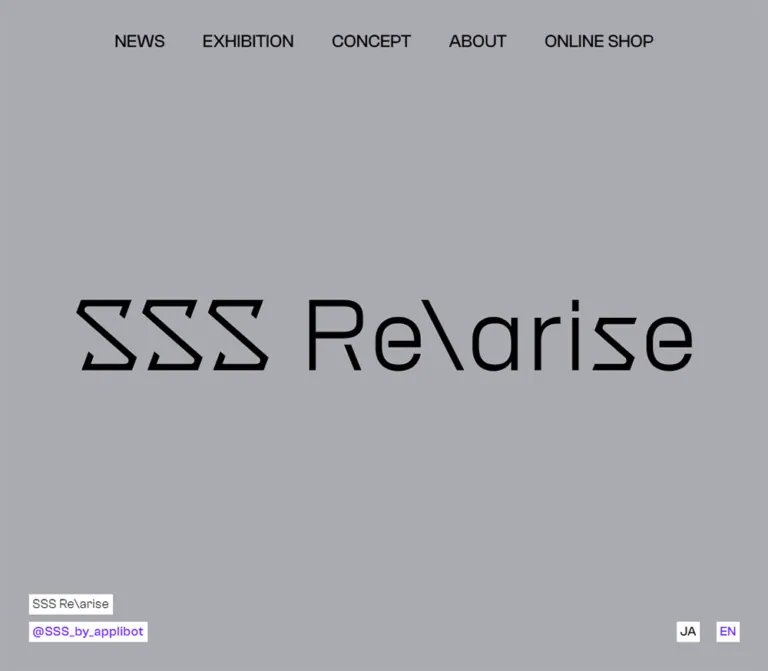
SSS Re\arise presents an illustration exhibition project through an unusually restrained interface surrounding highly detailed artwork. The opening screen contains almost nothing except a huge black custom wordmark, a centered navigation row, and small white identification labels. The gray is slightly violet in character rather than warm or neutral. Farther down, saturated violet fields and edge-to-edge illustration interrupt that quiet opening.
The page is a long exhibition index with news, three exhibition entries, a project statement, producer biographies, and an external-shop gateway. Its identity comes from scale changes: enormous graphic lettering, light uppercase section titles, dense illustration, and compact practical labels. Mobile deliberately changes the composition by turning the wordmark vertically and replacing the horizontal navigation with a small black capsule control.
閉じる
SSS Re\arise — Style Reference
A monumental exhibition wordmark on cool gray, punctuated by electric violet and intricate illustration.
Website: rearise.sss.applibot.co.jp
Original URL: https://rearise.sss.applibot.co.jp/
Final URL: https://rearise.sss.applibot.co.jp/
Theme: cool gray canvas, black typography, white utility labels, and saturated violet accents and exhibition fields.
Inspected: October 2, 2026, at 04:49:31 JST; supplied retrieval timestamp: 2026-10-01T19:49:31.380Z.
Viewports: desktop 1440 × 1000 and mobile 390 × 844 CSS pixels.
Scope: the current Japanese exhibition-project homepage: opening composition, document-wide content structure, desktop exhibition and closing views, mobile opening and closing views, and supplied rendered DOM/computed-style measurements. Linked exhibition details, the English edition, social destinations, and the external shop were not inspected.
SSS Re\arise presents an illustration exhibition project through an unusually restrained interface surrounding highly detailed artwork. The opening screen contains almost nothing except a huge black custom wordmark, a centered navigation row, and small white identification labels. The gray is slightly violet in character rather than warm or neutral. Farther down, saturated violet fields and edge-to-edge illustration interrupt that quiet opening.
The page is a long exhibition index with news, three exhibition entries, a project statement, producer biographies, and an external-shop gateway. Its identity comes from scale changes: enormous graphic lettering, light uppercase section titles, dense illustration, and compact practical labels. Mobile deliberately changes the composition by turning the wordmark vertically and replacing the horizontal navigation with a small black capsule control.
How to Read This Reference
- Measured values come from the supplied rendered DOM and computed styles at the two stated viewports. Rectangles are CSS-pixel measurements, occasionally rounded for readability.
- Calculated values are derived from those rectangles, such as column gaps or aspect ratios. They do not establish the original CSS formula.
- Visual estimates describe the supplied original-page screenshots where a matching computed style was not included.
- Recommendations and Quick Start code describe a reusable implementation. They are not recovered source code.
- All custom-property names in this document are implementation aliases. The supplied custom-property extraction was empty.
- Computed styles describe sampled elements, not every painted child or pseudo-element. Several controls have transparent, square outer boxes while their visible graphics are filled capsules.
- Nonzero DOM rectangles do not prove that an element was visible. This distinction matters for the mobile navigation and the opening-state TOP control.
Tokens — Colors
Default Palette
| Name | Value | Suggested token | Evidence and role |
|---|---|---|---|
| Exhibition Gray | #aaaab2 |
--color-canvas |
Measured body background, rgb(170, 170, 178), at both viewports. Dominates the opening and appears between content regions. |
| Electric Violet | #6e28f0 |
--color-accent |
Measured link color, rgb(110, 40, 240), on social, news, language, and footer links. |
| Black | #000000 |
--color-ink |
Measured primary text and media-stage background; visually used by the hero mark and mobile capsule. |
| White | #ffffff |
--color-paper |
Measured language-label and footer backgrounds; measured exhibition-heading and About-introduction text. |
| Pale Brand Pattern | Approximately #c4c4ca |
--color-pattern |
Visual estimate for oversized pale lettering and diagonal marks on the gray canvas. No matching fill declaration was supplied. |
| Link-wrapper Gray | #d8d8d8 |
No general-purpose token | Measured on text-empty exhibition and shop anchor wrappers. It does not describe their visible artwork or button fill. |
Color Application
Violet operates at two scales: small text links on gray or white, and large exhibition-information fields. The shop CTA and desktop TOP capsule also appear violet. Their precise painted fill was not supplied in the computed-style subset; using #6e28f0 for these surfaces is a recommended consolidation around the measured accent.
White identification strips isolate tiny text from changing backgrounds. They remain separate rectangles rather than joining into one toolbar surface. The large areas of color are flat. There is no evidenced gradient, glass treatment, or general shadow system.
The closing shop illustration appears pale in both desktop and mobile captures. This is a specific observed image treatment, not evidence of a global filter or theme switch. Its opacity, compositing method, and original asset colors are unknown.
Tokens — Typography
Clash Grotesk — Display and Interface
The supplied computed styles identify three family names:
ClashGrotesk-Light, weight300, for uppercase section headings.ClashGrotesk-Regular, weight400, for body copy, exhibition headings, and the small brand name.ClashGrotesk-Medium, weight500, for navigation, news links, social handles, and utility links.
The observed fallback sequence is -apple-system, "system-ui", Arial, "Hiragino Kaku Gothic ProN", "Hiragino Sans", Meiryo, sans-serif.
These are computed family declarations, not a glyph-by-glyph font audit. Japanese text may use a fallback. Font asset URLs and licensing details were not supplied.
Graphic Wordmark
The main wordmark is graphic lettering. Its angular S forms and diagonal separator are not reproduced by typing the name in Clash Grotesk. The measured heading wrapper has no extracted text, while the visible mark is large and custom shaped.
Preserve an authorized brand asset. Its file format and source path are unknown. The mobile appearance is vertically oriented, but the evidence does not establish whether the source rotates one asset or swaps to a separate version.
Type Scale
Values below are measured unless explicitly marked otherwise.
| Role | Desktop size / line height | Mobile size / line height | Weight and notes |
|---|---|---|---|
| Root and inherited wrapper base | 10px / normal at HTML; body 10px / 18px |
Same | Structural base, not the general reading size. |
| Opening navigation | 28px / 50.4px |
Mobile navigation DOM also specifies 28px / 50.4px |
Medium 500; mobile entries are not visible in the closed-menu screenshots. |
| Navigation in scrolled desktop captures | Approximately 22px |
Not applicable | Visual estimate; only the initial navigation has supplied computed measurements. |
| Brand label | 18px / 18px |
Same | Regular 400; 0.54px tracking, equivalent to 0.03em. |
| Social label | 18px / 18px |
Same | Medium 500; 0.03em tracking in the persistent identity group. |
| JA / EN | 18px / 18px |
Same | Medium 500. |
| Section heading | 80px / 80px |
45px / 45px |
Light 300; NEWS, EXHIBITION, CONCEPT, ABOUT, ONLINE STORE. |
| Exhibition heading group | 60px / 69px |
32px / 36.8px |
Regular 400, white; contains event name, dates, and venue. |
| News headline | 18px / 31.14px |
15px / 25.95px |
Medium 500; line-height ratio 1.73. |
| Concept paragraph | 22px / 44px |
18px / 36px |
Regular 400; line-height ratio 2. |
| About subheading | 36px / 36px |
30px / 30px |
Regular 400; white. |
| PRODUCER heading | 36px / 63px |
30px / 52.5px |
Regular 400; white. |
| About introduction | 18px / 31.5px |
Same | Medium 500; white, 0.06em tracking. |
| Producer biography | 18px / 31.5px |
15px / 26.25px |
Regular 400; 0.06em tracking. |
| Producer social link | 18px / 18px |
Same | Medium 500; 0.04em tracking. |
| Footer links | 18px / 25.2px |
Same | Medium 500; violet. |
| Shop CTA label | Approximately 28px |
Approximately 20px |
Visual estimates; the supplied anchor has no extracted text styling. |
Avoid flattening this system into one body size and one bold heading. Light display lettering, regular exhibition information, and medium utility text each have a distinct role.
Tokens — Spacing & Shapes
Spacing Scale
| Use | Desktop | Mobile | Evidence |
|---|---|---|---|
| White utility-label padding | 5px |
5px |
Measured directly on language links; identity strips visually agree. |
| Identity-strip gap | 10px |
10px |
Calculated from two 28px strips within a 66px group. |
| Language-link gap | 30px |
20px |
Calculated from measured link rectangles. |
| Persistent horizontal edge inset | 22.5px |
25px |
Measured on identity, language, and footer positioning. |
| Main section outer padding | Usually 90px 40px 120px |
60px 25px 90px |
Measured for NEWS and ABOUT; CONCEPT starts with 95px on desktop. |
| Section title to main content | 55px for NEWS, CONCEPT, ABOUT |
40px |
Calculated from heading and main rectangles. |
| Exhibition/store title to following content | 60px |
40px |
Calculated. |
| Desktop primary-nav link gap | 60px |
Not applicable | Calculated from adjacent inline rectangles. |
| Desktop profile-column gap | 60px |
Columns stack | Calculated from two 580px columns within 1220px. |
| Exhibition-entry separation | 90px |
60px |
Calculated between full-entry link rectangles. |
| Concept paragraph separation | Approximately 48.39px |
Approximately 39.59px |
Calculated; consistent with about 2.2em at the respective font sizes. The source rule is unknown. |
| Shop action area top padding | 90px |
60px |
Measured. |
| Footer bottom padding | 120px |
90px |
Measured. |
Border Radius and Edges
| Element | Observed treatment |
|---|---|
| Utility labels | Square white rectangles; language links have measured 0px radius. |
| Shop CTA | Square violet rectangle. |
| Artwork | Rectangular, full-width crops without visible rounded corners. |
| Mobile navigation control | Black vertical capsule, approximately 50px wide. Its outer button has computed radius zero; the capsule belongs to its painted content. |
| Desktop TOP control | Violet vertical capsule with a white angular arrow and small TOP caption. The measured outer button is also square and transparent. |
| Section boundary | A thin black horizontal rule is visible above ONLINE STORE in the mobile closing capture. Its exact CSS border declaration was not supplied. |
Layout Measurements
| Element | Desktop 1440 × 1000 |
Mobile 390 × 844 |
|---|---|---|
| Opening screen | Next section begins at y=1000 |
Next section begins at y=844 |
| Hero mark bounds | 1155 × 134.02px, at 142.5, 432.98 |
74 × 633.41px, at 158, 105.30 |
| Main text rail | 1220px wide, starting at x=110 |
340px wide, starting at x=25 |
| Separate media rail | 1155 × 649.69px |
340 × 191.25px |
| Concept text column | 640px wide |
340px wide |
| About/profile columns | Two 580px columns, 60px apart |
One 340px column |
| Shop artwork region | 1440 × 480px |
390 × 166px |
| Shop CTA | 580 × 88px, at x=430 |
340 × 64px, at x=25 |
| Mobile menu button | Not present in the desktop sample | 50 × 63px, at approximately 315, 25 |
| Desktop TOP button | 100.5 × 120px outer box |
No corresponding TOP button in the supplied mobile element list |
| Document height | 11764.69px |
8809.86px |
The two media-rail rectangles calculate to 16:9. This establishes their geometry, not their media type or playback behavior.
Components
Opening Wordmark Composition
Role: introduce the project as a visual identity before presenting information.
Use a full first viewport of uninterrupted gray. Center the black mark horizontally and vertically. On desktop it spans approximately 80.2% of the viewport width, while occupying only about 134px of height. The surrounding empty field is essential to its impact.
The five navigation links sit above it. The identity strips occupy the lower-left corner, and JA/EN occupy the lower-right. There is no opening paragraph, card group, or prominent shop button in this captured state.
On mobile, the wordmark becomes a narrow vertical composition centered at x=195. Its long dimension occupies about 75% of the viewport height. Treat this as an intentional responsive composition, not a text-wrapping accident.
Desktop Section Navigation
Role: direct access to the five main content regions.
The visible labels are NEWS, EXHIBITION, CONCEPT, ABOUT, and ONLINE SHOP. They are unboxed black text on a transparent background. The opening row spans approximately 846px, with 60px gaps between links.
The actual targets are #TopNews, #TopExhibition, #TopConcept, #TopAbout, and #TopStore. The last label says ONLINE SHOP, while the corresponding section heading says ONLINE STORE.
Navigation remains visible in the supplied scrolled desktop captures, appearing more compact. Exact positioning rules and the trigger for the size change were not provided. Anchor destinations are established; smooth scrolling, focus transfer, and scroll offsets were not exercised.
Identity and Language Strips
Role: maintain project identity and utility access without a full header bar.
The identity group contains two separate white strips: the black project name and the violet @SSS_by_applibot link. The group measures approximately 163.81 × 66px. Each strip hugs its own contents instead of sharing a fixed width.
JA and EN are separate white boxes of approximately 32 × 28px. JA is black in the Japanese page; EN is violet and links to /en/. Their 18px typography remains unchanged on mobile.
At the opening, these groups sit near the viewport bottom. In the supplied scrolled views, they appear near the top edge: approximately 40px on desktop and about 27px on mobile. This relocation is visible across states, but the continuous motion path is not documented.
Mobile Navigation Capsule
Role: replace the wide desktop navigation with a compact persistent control.
The opening screenshot shows a black capsule near the upper-right, with three white diagonal strokes. The measured outer button is 50 × 63px. In the closing mobile screenshot, the capsule appears near the lower-right, while the identity and language labels sit near the top.
The mobile DOM contains the five navigation links arranged vertically, using white 28px medium text. However, the supplied screenshots show the closed control, not an opened menu. The menu background, opening animation, focus management, close behavior, and exact relationship between this control and the hidden link group remain unverified.
Graphic Interlude and Media Stage
Role: extend the visual introduction before the practical information begins.
After the opening viewport, the DOM records a large graphic section containing a Re\arise heading and an oversized graphical element. Its height is approximately 1761px on desktop and 573px on mobile. The graphical element extends beyond the viewport horizontally in both samples.
A black section follows, containing a centered 16:9 region. It measures approximately 1155 × 650px on desktop and 340 × 191px on mobile.
These intermediate regions are not directly pictured in the supplied original-page captures. Their content, loading state, media type, and interaction should not be invented from their empty extracted text. Preserve their structural place in a faithful implementation only when the corresponding assets are available.
News List
Role: expose dated announcements as a readable archive.
There are thirteen entries in the supplied page text. The dates range from April 2022 to February 2023. These are the current page's displayed dates, not evidence that a new exhibition is underway.
Desktop headlines begin at x=430 inside the 1220px rail, leaving a 320px leading region for dates and separation. Headline blocks are 900px wide. Consecutive one-line headlines advance by approximately 51.13px: a 31.13px line box plus about 20px of separation.
On mobile, the date precedes the headline in the same 340px column. The first headline begins 32px below the list's starting position. Headline text becomes 15px and can wrap across two lines. The archive consequently becomes taller despite the smaller typography.
Use real links where destinations exist. The last announcement is present as text without an accompanying link in the supplied extraction. Avoid fabricating a destination for it.
Exhibition Entry
Role: make each exhibition a large visual and informational destination.
The index contains three entries in this order: L.A., Kyoto, and Tokyo. Each has a full-width link region, an illustration region, a large event-heading group, location and hours, and a prominent -> Detail treatment.
In the supplied desktop scroll capture, white location text sits on a saturated violet field, followed by a large black Detail label. A gray band with pale oversized branding separates that field from the next full-width illustration. The artwork is visually dense and cropped to a wide band.
Measured desktop link regions are 1440 × 1084px, separated by 90px. Heading groups start 570px below their entry's top and use 60px / 69px typography. A 480px artwork band followed by roughly 90px of upper information spacing is consistent with this geometry, although the first artwork's own rectangle was not supplied.
Mobile entry heights vary from about 618px to 654px because the 32px event headings wrap differently. The heading groups begin 226px below their entry tops. Do not impose equal fixed heights on mobile event text.
The detail destinations are /1_6la/, /1_5kyoto/, and /1st-tokyo/. Their content was not opened. Several entry anchors have empty extracted text even though adjacent headings describe the events; a new implementation should provide a clear accessible name rather than copying that extraction literally.
Concept Statement
Role: give the project a deliberate editorial pause.
The section pairs an 80px light heading with a 640px left-aligned text column on desktop, leaving substantial unused width on the right. Five paragraphs explain the project. Desktop paragraphs use 22px type with 44px leading; mobile uses 18px with 36px leading across the 340px rail.
The first desktop paragraph's measured position includes a 40px offset below its main wrapper. That offset is absent on mobile. Because transitions are declared on these paragraphs, the supplied geometry alone does not prove that the offset is a permanent margin.
The desktop extracted text contains line breaks that are reduced in the mobile text. Preserve responsive Japanese line flow rather than hardcoding desktop breaks into every viewport.
About and Producer Profiles
Role: describe the creative collective and introduce the project producers.
The introductory row uses two desktop columns: a 580px heading region at left and a 580px paragraph region at right, separated by 60px. On mobile, the heading is followed by the paragraph with about 40px between them.
Below the PRODUCER heading, PALOW. and 米山舞 appear in parallel desktop columns and stack on mobile. Each profile combines a name, violet social link, and unboxed biography paragraphs. These are project-producer listings; they do not establish website design or development credits.
The introduction and subsection headings compute to white, while biography paragraphs compute to black. The sampled section wrappers are transparent. A complete painted backing for the introduction is not shown in the supplied screenshots, so do not infer an additional solid-color About panel solely from white text.
Online Store Gateway
Role: provide one clear external commerce destination at the end of the project content.
The component contains a light uppercase ONLINE STORE heading, a full-width pale illustration, a white action area, and one violet rectangular CTA labeled オンラインショップ.
Desktop artwork measures 1440 × 480px; mobile artwork measures 390 × 166px. The phone therefore shows a proportionally taller crop. Both captures retain the central character and surrounding ornamental forms.
The CTA is centered at 580 × 88px on desktop. On mobile it fills the 340px content rail at 64px high. The action links to https://sss-by-applibot.booth.pm/. The destination's current availability and transaction flow were not tested.
Footer and Return Control
Role: close the page with organizational links and persistent navigation support.
The white footer contains SSS →, Applibot →, and ©SSS by Applibot, Inc.. These original-page elements support the site's stated organizational identity.
On desktop, the two violet links sit at the left edge and the copyright sits at the right. On mobile, copyright moves below the links. The desktop layout includes a 105px gray patterned interval between the shop CTA area and the white footer; the mobile store footer flows directly into the site footer.
The desktop TOP control is a violet capsule with a white angular upward mark and small caption. It appears near the lower-right in the middle scroll capture and higher beside the footer in the closing capture. The exact fixed, sticky, or boundary-clamping logic is unknown. Its click behavior was not tested.
Tokens — Motion & Interaction
| Element or treatment | Supplied declaration or observation | Evidence limit |
|---|---|---|
| Identity group | 1.4s cubic-bezier(0.77, 0, 0.175, 1) |
Duration and easing measured; changing property and triggering logic not supplied. |
| Mobile capsule button | 1.4s cubic-bezier(0.77, 0, 0.175, 1) |
Same limitation; top and bottom positions are visible in different captures. |
| Graphic interlude heading | 1.5s cubic-bezier(0.77, 0, 0.175, 1) |
No temporal sequence supplied. |
| Oversized interlude graphic | 0.6s cubic-bezier(0.77, 0, 0.175, 1) 0.6s |
A delayed transition is declared; effect and endpoints are unknown. |
| Main sections | 0.6s |
This does not identify whether opacity, geometry, or color changes. |
| Concept paragraphs | 0.6s, with delays from 0s through 0.4s |
Supports an ordered stagger, not a verified reveal direction. |
| Language links | 0.3s |
Hover, focus, and active endpoints were not captured. |
| Desktop social identity link | 0.3s |
A transition exists; its visual endpoint is unverified. |
| Fragment navigation | Five same-page anchor targets | Link destinations verified from DOM; scrolling behavior untested. |
| Exhibition and shop links | Explicit destination URLs | Navigation and resulting pages untested. |
Most sampled elements report animation: none. A bare transition: all without a nonzero duration is not evidence of an animated effect. These samples also do not rule out JavaScript-driven motion or animations on unlisted descendants.
The capture process waited for document load, visible image decoding, finite motion, and sampled layout stability within stated limits. Perpetual animations were temporarily paused during readiness checks and resumed afterward. Consequently, the still images are useful state evidence but cannot establish an animation's complete timing, direction, repetition, or trigger.
For a new implementation, use the measured long easing for the deliberate repositioning of identity elements and shorter transitions for local feedback. Keep content visible by default. Do not add autoplay, parallax, a carousel, or scroll hijacking without separate requirements.
Surfaces
| Surface | Appearance | Structural purpose |
|---|---|---|
| Main canvas | Solid cool gray | Quiet background for black typography and the opening mark. |
| Graphic bands | Gray with oversized pale lettering and diagonals | Carry the brand between major content regions. |
| Exhibition information | Saturated violet in the visible desktop sample | Gives white event information strong visual presence. |
| Artwork regions | Full-width rectangular illustration crops | Supply detail, color complexity, and character. |
| Identity utilities | Individual white rectangles | Keep tiny identity and language labels legible across changing backgrounds. |
| Shop action area and footer | Solid white | Create a clean closing field around the final action and organizational links. |
| Media stage | Measured black wrapper | Contains a centered 16:9 region of unverified content. |
| Floating controls | Black mobile capsule; violet desktop TOP capsule | Distinct utility silhouettes without a conventional toolbar. |
Hierarchy comes from scale, color fields, boundaries, and whitespace. The visible design does not rely on elevated cards.
Imagery
The artwork uses detailed digital illustration with anime-influenced characters, ornamental structures, flowers, sharp linework, and densely interwoven color. One desktop exhibition crop places a brightly lit face within saturated blue, violet, red, and orange detail. The closing store image instead shows a centrally arranged figure surrounded by pale organic and geometric forms.
These are deliberately different visual intensities. Preserve the vivid exhibition imagery and the subdued closing image as separate treatments. Do not flatten all assets into one filter or replace the paintings with generic gradients.
The interface also uses graphic identity assets: the angular wordmark, large pale brand fragments, diagonal menu strokes, and a stylized upward arrow. Their precise geometry contributes more than a generic icon library would.
Observed Asset References
No image src, background-image URL, font file URL, or asset manifest was included in the evidence. The table records visible roles without inventing paths.
| Asset role | Observed evidence | Implementation guidance |
|---|---|---|
| Main wordmark | Desktop horizontal mark and mobile vertical composition | Use an authorized asset; preserve proportions and sharp edges. |
| Background brand fragments | Pale oversized forms in scrolled desktop and mobile captures | Treat as decorative; keep them out of the accessible reading order. |
| Exhibition illustration | Saturated full-width character artwork in a desktop scroll sample | Retain image-specific focal positioning when cropping. |
| Store illustration | Pale centered figure in both closing captures | Match the observed subdued state without assuming a known opacity formula. |
| Mobile capsule glyph | Three white diagonal strokes | Preserve its visual relationship to the angular identity. |
| TOP glyph | White angular upward mark | Use a meaningful control label independently of the graphic. |
| Media-stage content | Only a measured black section and 16:9 inner rectangle | Obtain separate evidence before specifying an image, video, or embed. |
CSS can recreate the shell, columns, and label geometry. It cannot replace the identity carried by the original artwork and wordmark.
Layout & Responsive Behavior
Document Structure
The page scrolls as a document rather than as a fixed application shell. The measured order and approximate heights are:
| Region | Desktop height | Mobile height |
|---|---|---|
| Opening viewport | 1000px |
844px |
| Graphic interlude | 1761px |
573px |
| Black media stage | 650px |
191px |
| NEWS | 992px |
1454px |
| EXHIBITION | 3662px |
2186px |
| CONCEPT | 1294px |
1187px |
| ABOUT | 1209px |
1706px |
| ONLINE STORE | 888px |
455px |
| Interval before final footer | 105px |
None measured |
| Final footer | 205px |
213px |
These are captured dimensions, not recommended fixed section heights. Text wrapping and asset sizing should determine most section heights in a new implementation.
Desktop Composition
Two width systems coexist: a 1220px information rail and a 1155px wordmark/media rail. Full-bleed illustrations extend beyond both. The concept column is narrower still at 640px. This variation gives each region an appropriate reading or viewing scale.
Large section headings align to the information rail, while persistent utility strips align much closer to the viewport edges. Avoid forcing every element onto one universal left margin.
Mobile Composition
The mobile layout retains 25px content gutters and a 340px information width. It makes several structural changes:
- The main mark becomes vertical rather than merely shrinking.
- The horizontal navigation disappears from the opening screenshot and a capsule control appears.
- News dates move above their associated headlines.
- About and producer columns stack.
- Section headings decrease from 80px to 45px.
- News and profile body text decrease to 15px, while identity labels remain 18px.
- The shop CTA becomes rail-wide, and the artwork crop becomes proportionally taller.
- Footer links and copyright occupy separate rows.
No intermediate-width or landscape capture was provided. The original breakpoint cannot be derived from two endpoints. The Quick Start uses a recommended 70rem breakpoint to leave room for the desktop navigation and utility groups; it is not an observed source value.
Do’s and Don’ts
Do
- Preserve the measured gray
#aaaab2and violet link color#6e28f0. - Give the opening wordmark substantial empty space.
- Keep the main mark as custom artwork and preserve its mobile vertical composition.
- Use light uppercase section headings against smaller medium-weight utilities.
- Keep identity and language labels as separate white rectangles.
- Alternate constrained information rails with full-width illustration.
- Maintain generous concept leading and a narrower desktop reading column.
- Let exhibition headings wrap naturally on mobile.
- Preserve the contrast between saturated exhibition art and the pale store image.
- Distinguish project-producer content from website-production attribution.
Don’t
- Don’t replace the custom mark with ordinary typed lettering.
- Don’t introduce a grid of rounded cards or a general shadow system.
- Don’t add a sales headline and large CTA to the sparse opening state.
- Don’t turn the entire interface violet; gray, black, and white remain structurally important.
- Don’t copy the 10px inherited wrapper size into all body text.
- Don’t treat empty anchor text as proof that an entire component is visually empty.
- Don’t present the mobile menu's opened state as observed.
- Don’t identify the black 16:9 region as video without additional evidence.
- Don’t assume the pale store artwork is an unfinished fade-in.
- Don’t hardcode desktop section heights or Japanese line breaks into mobile layouts.
Recommended Implementation Additions
These are recommendations, not verified original-site features:
- Use one clear primary heading with a meaningful text alternative for the wordmark. Keep decorative copies out of the accessibility tree.
- Give the mobile menu button an accessible name,
aria-expanded, and an associated navigation region. Implement keyboard focus handling and Escape behavior if it opens an overlay. - Give exhibition links descriptive names that identify their event, especially when a visual overlay link otherwise contains no text.
- Preserve the small visual utility strips while increasing their effective touch targets where necessary. The measured language boxes are only 28px high.
- Add visible focus indicators on gray, white, violet, and artwork backgrounds.
- Check contrast for violet text on gray and white introduction text over its actual painted backing. The supplied evidence is not a complete contrast audit.
- Reserve safe-area clearance for edge utilities on devices with display cutouts.
- Respect reduced-motion preferences and avoid hiding essential copy until an observer or animation runs.
- Set anchor scroll margins so relocated navigation does not obscure section titles.
- Use responsive image sources and meaningful image alternatives where artwork carries content. Do not delay the opening wordmark as if it were a below-fold decorative asset.
- If the TOP control changes position at the footer boundary, implement and test that boundary behavior explicitly rather than relying on arbitrary viewport offsets.
Agent Prompt Guide
Quick Color Reference
- Main canvas: measured
#aaaab2. - Text and main wordmark: black.
- Links: measured
#6e28f0. - Exhibition fields, shop CTA, and TOP capsule: visually saturated violet; use
#6e28f0as a recommended shared token. - Utility strips, shop action area, and footer: white.
- Oversized background lettering: pale gray, approximately
#c4c4ca. - Artwork: retain its own colors; do not limit it to the interface palette.
Overall Prompt
“Create an illustration-exhibition project homepage inspired by the supplied SSS Re\arise reference. Use a cool gray #aaaab2 canvas, a monumental black custom wordmark, light uppercase Clash Grotesk section headings, violet #6e28f0 links, and small separate white identity and language labels. Begin with a full-viewport composition containing extensive empty space. Follow with an editorial news archive, full-width illustrated exhibition entries, a narrow concept statement, producer biographies, and a pale artwork banner leading to a square violet shop CTA. Use a 1220px desktop information rail, distinct full-bleed image bands, and 25px mobile gutters. On mobile, orient the hero mark vertically, stack informational columns, and use a small black capsule menu control. Preserve the artwork and custom graphics; do not substitute generic cards or icons.”
Example Component Prompts
- Opening composition: “Build a 1440 × 1000 gray opening view with a centered 1155 × 134px black brand asset. Place five unboxed navigation links at the top, separate white identity strips at bottom left, and JA/EN labels at bottom right. At 390 × 844, display the mark as a centered vertical composition approximately 74 × 633px.”
- News archive: “Use an 80px light uppercase NEWS heading, a date region at left, and violet 18px medium headlines beginning 320px into a 1220px rail. On mobile, use a 45px heading and stack each date above a 15px headline with comfortable line spacing.”
- Exhibition entry: “Pair a full-width detailed illustration with a flat violet information field. Use white 60px event typography on desktop, white location information, and a large black
-> Detailtreatment. On mobile, reduce the event heading to 32px and allow its height to follow wrapping.” - Project statement: “Create a left-aligned 640px text column on a broad gray desktop canvas. Set Japanese statement copy at 22px with 44px leading beneath a light 80px CONCEPT heading. At mobile width, use the 340px rail and 18px text with 36px leading.”
- Store ending: “Place a pale ornamental character illustration edge to edge above a white action area. Center a square violet shop link measuring 580 × 88px on desktop and 340 × 64px on mobile. Finish with small violet organizational links and a simple black copyright line.”
- Motion adaptation: “Use the measured 1.4-second cubic-bezier easing for a deliberate identity-position change, and short local transitions for feedback. Treat triggering logic as a new implementation decision. Keep content available without motion and provide a reduced-motion path.”
Quick Start
CSS Custom Properties
This is an implementation scaffold, not recovered source CSS. It keeps a conventional root font size and uses explicit pixel tokens. Load the authorized font files separately; their URLs were not supplied. Supply the actual wordmark and illustrations as image assets.
The violet surface fill, breakpoint, mobile rotation method, compact scrolled navigation size, and control docking below are recommended approximations. The measured token tables above remain the authority for what was actually observed.
:root {
  --color-canvas: #aaaab2;
  --color-accent: #6e28f0;
  --color-ink: #000;
  --color-paper: #fff;
  --color-pattern: #c4c4ca; /* Visual estimate */

  --font-fallback: -apple-system, system-ui, Arial,
    'Hiragino Kaku Gothic ProN', 'Hiragino Sans', Meiryo, sans-serif;
  --font-regular: 'ClashGrotesk-Regular', var(--font-fallback);
  --font-medium: 'ClashGrotesk-Medium', var(--font-fallback);
  --font-light: 'ClashGrotesk-Light', var(--font-fallback);

  --rail: 1220px;
  --media-rail: 1155px;
  --concept-width: 640px;
  --gutter: 40px;
  --edge: 22.5px;
  --section-top: 90px;
  --section-bottom: 120px;
  --section-gap: 55px;
  --column-gap: 60px;

  --text-section: 80px;
  --text-event: 60px;
  --text-body: 18px;
  --text-concept: 22px;
  --text-utility: 18px;
  --text-shop: 28px; /* Visual estimate */

  --ease-brand: cubic-bezier(0.77, 0, 0.175, 1);
  --motion-chrome: 1.4s var(--ease-brand);
  --motion-reveal: 0.6s;
  --motion-link: 0.3s;
}

* { box-sizing: border-box; }
html { font-size: 100%; }
body {
  margin: 0;
  color: var(--color-ink);
  background: var(--color-canvas);
  font-family: var(--font-regular);
  font-size: var(--text-body);
  line-height: 1.75;
}
img { display: block; max-width: 100%; }
a { color: var(--color-accent); text-decoration: none; }
button { font: inherit; cursor: pointer; }
[hidden] { display: none !important; }

.content-rail {
  width: min(100%, var(--rail));
  margin-inline: auto;
}
.section {
  padding: var(--section-top) var(--gutter) var(--section-bottom);
  scroll-margin-top: 120px; /* Recommended anchor clearance */
}
.section-title {
  margin: 0 0 var(--section-gap);
  font-family: var(--font-light);
  font-size: var(--text-section);
  font-weight: 300;
  line-height: 1;
}

.hero {
  position: relative;
  display: grid;
  place-items: center;
  min-height: 100vh;
  min-height: 100svh;
}
.hero__mark {
  width: min(var(--media-rail), calc(100% - 80px));
  height: auto;
}
.primary-nav {
  position: fixed;
  z-index: 30;
  top: 35px;
  left: 50%;
  display: flex;
  gap: 60px;
  transform: translateX(-50%);
  white-space: nowrap;
  color: var(--color-ink);
  font-family: var(--font-medium);
  font-size: 28px;
  font-weight: 500;
  line-height: 1.8;
}
.primary-nav a { color: inherit; }

.identity,
.languages {
  position: fixed;
  z-index: 30;
  transition: top var(--motion-chrome);
}
.identity {
  top: calc(100svh - 106px);
  left: var(--edge);
  display: grid;
  justify-items: start;
  gap: 10px;
}
.utility-tag {
  display: inline-block;
  margin: 0;
  padding: 5px;
  background: var(--color-paper);
  font-size: var(--text-utility);
  line-height: 18px;
  letter-spacing: 0.03em;
}
.identity a,
.languages a {
  font-family: var(--font-medium);
  font-weight: 500;
}
.languages {
  top: calc(100svh - 68px);
  right: var(--edge);
  display: flex;
  gap: 30px;
}
.languages .utility-tag { letter-spacing: normal; }
.languages [aria-current='page'] { color: var(--color-ink); }

/* State hooks require application logic. */
.is-scrolled .identity,
.is-scrolled .languages { top: 40px; }
.is-scrolled .primary-nav { font-size: 22px; } /* Visual estimate */
.menu-toggle { display: none; }

.media-stage { background: var(--color-ink); }
.media-frame {
  width: min(var(--media-rail), calc(100% - 80px));
  margin-inline: auto;
  aspect-ratio: 16 / 9;
}

.news-list { margin: 0; padding: 0; list-style: none; }
.news-row {
  display: grid;
  grid-template-columns: 260px minmax(0, 1fr);
  gap: 60px;
  margin-block-end: 20px;
}
.news-row h3 {
  margin: 0;
  font-family: var(--font-medium);
  font-size: var(--text-body);
  font-weight: 500;
  line-height: 1.73;
}

.exhibition { margin-block-end: 90px; }
.exhibition > a { display: block; color: inherit; }
.art-band {
  width: 100%;
  height: 480px;
  object-fit: cover;
  object-position: var(--art-position, center);
}
.exhibition__info {
  padding: 90px var(--gutter);
  color: var(--color-paper);
  background: var(--color-accent); /* Recommended fill match */
}
.exhibition__heading {
  margin: 0 0 30px;
  font-size: var(--text-event);
  font-weight: 400;
  line-height: 1.15;
}
.exhibition__heading > span { display: block; }
.exhibition__meta { margin: 0 0 40px; }
.exhibition__detail {
  color: var(--color-ink);
  font-size: var(--text-event); /* Approximation for the visible label */
  line-height: 1.15;
}

.concept-copy { max-width: var(--concept-width); }
.concept-copy p {
  margin: 0 0 2.2em;
  font-size: var(--text-concept);
  line-height: 2;
}
.about-intro,
.producer-grid {
  display: grid;
  grid-template-columns: repeat(2, minmax(0, 1fr));
  gap: var(--column-gap);
}
.about-intro { margin-block-end: 150px; }
.about-intro h3 {
  margin: 0;
  font-size: 36px;
  font-weight: 400;
  line-height: 1;
}
.about-intro p {
  margin: 0;
  font-family: var(--font-medium);
  font-size: 18px;
  font-weight: 500;
  line-height: 1.75;
  letter-spacing: 0.06em;
}
/* Validate the introduction's backing before applying its observed white text. */
.producer p {
  font-size: var(--text-body);
  line-height: 1.75;
  letter-spacing: 0.06em;
}
.producer__social {
  font-family: var(--font-medium);
  font-size: 18px;
  letter-spacing: 0.04em;
}

.store-action {
  padding: 90px var(--gutter) 0;
  background: var(--color-paper);
}
.shop-link {
  display: grid;
  place-items: center;
  width: min(580px, 100%);
  min-height: 88px;
  margin-inline: auto;
  padding: 16px;
  color: var(--color-paper);
  background: var(--color-accent);
  font-size: var(--text-shop);
  line-height: 1.4;
}
.footer-brand-band {
  height: 105px;
  background-color: var(--color-canvas);
  background-image: var(--authorized-brand-pattern, none);
  background-position: center;
}
.site-footer {
  position: relative;
  padding: 60px var(--edge) 120px;
  background: var(--color-paper);
}
.site-footer__inner {
  display: flex;
  justify-content: space-between;
  align-items: start;
  gap: 40px;
}
.site-footer__links { display: flex; gap: 30px; }
.site-footer__links a {
  font-family: var(--font-medium);
  font-size: 18px;
  line-height: 1.4;
}
.site-footer__copyright { margin: 0; font-size: 18px; line-height: 1; }
.to-top {
  position: fixed;
  z-index: 35;
  right: var(--edge);
  bottom: 40px;
  display: none;
  place-items: center;
  width: 100.5px;
  height: 120px;
  border: 0;
  border-radius: 999px;
  color: var(--color-paper);
  background: var(--color-accent);
}
.is-scrolled .to-top { display: grid; }
/* Optional footer-boundary hook; place the control inside .site-footer. */
.at-footer .to-top { position: absolute; top: -99px; bottom: auto; }

:where(a, button):focus-visible {
  outline: 3px solid var(--color-ink);
  outline-offset: 4px;
}
@media (hover: hover) {
  a:hover { text-decoration: underline; text-underline-offset: 0.2em; }
  .shop-link:hover { text-decoration: none; outline: 2px solid var(--color-ink); }
}

/* Recommended breakpoint; the original breakpoint is unknown. */
@media (max-width: 70rem) {
  :root {
    --gutter: 25px;
    --edge: 25px;
    --section-top: 60px;
    --section-bottom: 90px;
    --section-gap: 40px;
    --column-gap: 50px;
    --text-section: 45px;
    --text-event: 32px;
    --text-body: 15px;
    --text-concept: 18px;
    --text-shop: 20px;
  }
  .hero__mark {
    position: absolute;
    top: 50%;
    left: 50%;
    width: min(75svh, 680px);
    max-width: none;
    transform: translate(-50%, -50%) rotate(90deg);
  }
  .primary-nav { display: none; }
  /* Suggested menu surface; the original opened state was not observed. */
  .primary-nav.is-open {
    inset: 0;
    z-index: 40;
    display: flex;
    flex-direction: column;
    justify-content: center;
    align-items: center;
    gap: 0;
    transform: none;
    color: var(--color-paper);
    background: var(--color-ink);
    font-size: 28px;
  }
  .menu-toggle {
    position: fixed;
    z-index: 50;
    top: 25px;
    right: var(--edge);
    display: grid;
    place-items: center;
    width: 50px;
    height: 63px;
    padding: 0;
    border: 0;
    border-radius: 999px;
    color: var(--color-paper);
    background: var(--color-ink);
    transition: top var(--motion-chrome);
  }
  .identity { top: calc(100svh - 86px); }
  .languages { top: calc(100svh - 48px); gap: 20px; }
  .is-scrolled .identity,
  .is-scrolled .languages { top: 25px; }
  .is-scrolled .menu-toggle { top: calc(100svh - 82px); }
  .media-frame { width: calc(100% - 50px); }
  .news-row { display: block; margin-block-end: 30px; }
  .news-row time { display: block; margin-bottom: 6px; line-height: 26px; }
  .exhibition { margin-block-end: 60px; }
  .art-band { height: 166px; }
  .exhibition__info { padding: 60px var(--gutter); }
  .about-intro,
  .producer-grid { grid-template-columns: 1fr; }
  .about-intro { gap: 40px; margin-block-end: 100px; }
  .about-intro h3 { font-size: 30px; }
  .store-action { padding: 60px 25px 20px; }
  .shop-link { min-height: 64px; }
  .footer-brand-band { display: none; }
  .site-footer { padding: 40px 25px 90px; }
  .site-footer__inner { flex-direction: column; }
  .to-top,
  .is-scrolled .to-top { display: none; }
  .primary-nav :focus-visible,
  .menu-toggle:focus-visible { outline-color: var(--color-paper); }
}

@media (prefers-reduced-motion: reduce) {
  .identity,
  .languages,
  .menu-toggle { transition: none; }
  html { scroll-behavior: auto; }
}
Use .content-rail inside padded sections, and place full-width artwork outside that rail. The .hero__mark rule expects an image with the horizontal mark's intrinsic proportions. Each exhibition should expose one descriptive link around its relevant content rather than relying on a text-empty overlay.
The .is-scrolled, .is-open, and .at-footer classes are integration hooks. The CSS does not implement menu operation, scroll detection, or return-to-top behavior. Choose their triggers separately, maintain accessible state, and test at both captured sizes. No store-image veil is included because the supplied evidence does not establish its construction.
Tailwind v4 Token Mapping
Optional aliases for a project that already uses Tailwind v4. This is not evidence that the original website uses Tailwind. Define the custom properties above first.
@theme inline {
  --color-canvas: #aaaab2;
  --color-accent: #6e28f0;
  --color-ink: #000000;
  --color-paper: #ffffff;

  --font-sans: var(--font-regular);
  --font-display: var(--font-light);
  --font-ui: var(--font-medium);

  --text-section: var(--text-section-size, 80px);
  --text-exhibition: var(--text-event);
  --text-copy: var(--text-body);
  --text-statement: var(--text-concept);

  --spacing-page-gutter: var(--gutter);
  --spacing-section-start: var(--section-top);
  --spacing-section-end: var(--section-bottom);
  --container-content: 1220px;
  --container-media: 1155px;
  --container-statement: 640px;
  --radius-capsule: 999px;
}

/* Separate alias avoids a self-referential theme variable. */
:root { --text-section-size: 80px; }
@media (max-width: 70rem) {
  :root { --text-section-size: 45px; }
}
Sources & Evidence
- Inspected original and final page: SSS Re\arise. Both URLs are identical; the supplied response status is HTTP 200.
- Capture timestamp:
2026-10-01T19:49:31.380Z, equivalent to October 2, 2026, 04:49:31.380 JST. - Desktop evidence: original-page captures at
1440 × 1000, covering the opening, an exhibition transition, and the closing shop/footer area; supplied document-wide rendered text, link destinations, element rectangles, and computed-style samples. - Mobile evidence: original-page captures at
390 × 844, covering the opening and closing regions, with corresponding document-wide DOM and computed-style samples. - Measured coverage: page geometry, font declarations, colors on sampled elements, section padding, link and heading dimensions, and declared transition timing. The evidence does not include complete stylesheets or asset URLs.
- Interaction coverage: captured states after scrolling and explicit anchor destinations. No supplied click test establishes menu behavior, hover endpoints, language switching, exhibition-detail loading, shop behavior, media playback, or TOP-button operation.
- Capture limitations: readiness checks used a 15-second overall limit, a five-second pending-image limit, and up to ten seconds per scroll position. SharedWorkers and service workers were disabled. Delayed content and unexercised interactions remain unverified.
This reference describes the current homepage served at the supplied URL and capture time. Measured values, visual estimates, and implementation recommendations are distinguished throughout; the document does not reconstruct an earlier design.
# SSS Re\arise — Style Reference

> A monumental exhibition wordmark on cool gray, punctuated by electric violet and intricate illustration.

**Website:** [rearise.sss.applibot.co.jp](https://rearise.sss.applibot.co.jp/)
**Original URL:** https://rearise.sss.applibot.co.jp/
**Final URL:** https://rearise.sss.applibot.co.jp/
**Theme:** cool gray canvas, black typography, white utility labels, and saturated violet accents and exhibition fields.
**Inspected:** October 2, 2026, at 04:49:31 JST; supplied retrieval timestamp: `2026-10-01T19:49:31.380Z`.
**Viewports:** desktop `1440 × 1000` and mobile `390 × 844` CSS pixels.
**Scope:** the current Japanese exhibition-project homepage: opening composition, document-wide content structure, desktop exhibition and closing views, mobile opening and closing views, and supplied rendered DOM/computed-style measurements. Linked exhibition details, the English edition, social destinations, and the external shop were not inspected.

SSS Re\arise presents an illustration exhibition project through an unusually restrained interface surrounding highly detailed artwork. The opening screen contains almost nothing except a huge black custom wordmark, a centered navigation row, and small white identification labels. The gray is slightly violet in character rather than warm or neutral. Farther down, saturated violet fields and edge-to-edge illustration interrupt that quiet opening.

The page is a long exhibition index with news, three exhibition entries, a project statement, producer biographies, and an external-shop gateway. Its identity comes from scale changes: enormous graphic lettering, light uppercase section titles, dense illustration, and compact practical labels. Mobile deliberately changes the composition by turning the wordmark vertically and replacing the horizontal navigation with a small black capsule control.
閉じる
# SSS Re\arise — Style Reference

> A monumental exhibition wordmark on cool gray, punctuated by electric violet and intricate illustration.

**Website:** [rearise.sss.applibot.co.jp](https://rearise.sss.applibot.co.jp/)
**Original URL:** https://rearise.sss.applibot.co.jp/
**Final URL:** https://rearise.sss.applibot.co.jp/
**Theme:** cool gray canvas, black typography, white utility labels, and saturated violet accents and exhibition fields.
**Inspected:** October 2, 2026, at 04:49:31 JST; supplied retrieval timestamp: `2026-10-01T19:49:31.380Z`.
**Viewports:** desktop `1440 × 1000` and mobile `390 × 844` CSS pixels.
**Scope:** the current Japanese exhibition-project homepage: opening composition, document-wide content structure, desktop exhibition and closing views, mobile opening and closing views, and supplied rendered DOM/computed-style measurements. Linked exhibition details, the English edition, social destinations, and the external shop were not inspected.

SSS Re\arise presents an illustration exhibition project through an unusually restrained interface surrounding highly detailed artwork. The opening screen contains almost nothing except a huge black custom wordmark, a centered navigation row, and small white identification labels. The gray is slightly violet in character rather than warm or neutral. Farther down, saturated violet fields and edge-to-edge illustration interrupt that quiet opening.

The page is a long exhibition index with news, three exhibition entries, a project statement, producer biographies, and an external-shop gateway. Its identity comes from scale changes: enormous graphic lettering, light uppercase section titles, dense illustration, and compact practical labels. Mobile deliberately changes the composition by turning the wordmark vertically and replacing the horizontal navigation with a small black capsule control.

## How to Read This Reference

- **Measured** values come from the supplied rendered DOM and computed styles at the two stated viewports. Rectangles are CSS-pixel measurements, occasionally rounded for readability.
- **Calculated** values are derived from those rectangles, such as column gaps or aspect ratios. They do not establish the original CSS formula.
- **Visual estimates** describe the supplied original-page screenshots where a matching computed style was not included.
- **Recommendations** and Quick Start code describe a reusable implementation. They are not recovered source code.
- All custom-property names in this document are implementation aliases. The supplied custom-property extraction was empty.
- Computed styles describe sampled elements, not every painted child or pseudo-element. Several controls have transparent, square outer boxes while their visible graphics are filled capsules.
- Nonzero DOM rectangles do not prove that an element was visible. This distinction matters for the mobile navigation and the opening-state TOP control.

## Tokens — Colors

### Default Palette

| Name | Value | Suggested token | Evidence and role |
| --- | --- | --- | --- |
| Exhibition Gray | `#aaaab2` | `--color-canvas` | Measured body background, `rgb(170, 170, 178)`, at both viewports. Dominates the opening and appears between content regions. |
| Electric Violet | `#6e28f0` | `--color-accent` | Measured link color, `rgb(110, 40, 240)`, on social, news, language, and footer links. |
| Black | `#000000` | `--color-ink` | Measured primary text and media-stage background; visually used by the hero mark and mobile capsule. |
| White | `#ffffff` | `--color-paper` | Measured language-label and footer backgrounds; measured exhibition-heading and About-introduction text. |
| Pale Brand Pattern | Approximately `#c4c4ca` | `--color-pattern` | Visual estimate for oversized pale lettering and diagonal marks on the gray canvas. No matching fill declaration was supplied. |
| Link-wrapper Gray | `#d8d8d8` | No general-purpose token | Measured on text-empty exhibition and shop anchor wrappers. It does not describe their visible artwork or button fill. |

### Color Application

Violet operates at two scales: small text links on gray or white, and large exhibition-information fields. The shop CTA and desktop TOP capsule also appear violet. Their precise painted fill was not supplied in the computed-style subset; using `#6e28f0` for these surfaces is a recommended consolidation around the measured accent.

White identification strips isolate tiny text from changing backgrounds. They remain separate rectangles rather than joining into one toolbar surface. The large areas of color are flat. There is no evidenced gradient, glass treatment, or general shadow system.

The closing shop illustration appears pale in both desktop and mobile captures. This is a specific observed image treatment, not evidence of a global filter or theme switch. Its opacity, compositing method, and original asset colors are unknown.

## Tokens — Typography

### Clash Grotesk — Display and Interface

The supplied computed styles identify three family names:

- `ClashGrotesk-Light`, weight `300`, for uppercase section headings.
- `ClashGrotesk-Regular`, weight `400`, for body copy, exhibition headings, and the small brand name.
- `ClashGrotesk-Medium`, weight `500`, for navigation, news links, social handles, and utility links.

The observed fallback sequence is `-apple-system, "system-ui", Arial, "Hiragino Kaku Gothic ProN", "Hiragino Sans", Meiryo, sans-serif`.

These are computed family declarations, not a glyph-by-glyph font audit. Japanese text may use a fallback. Font asset URLs and licensing details were not supplied.

### Graphic Wordmark

The main wordmark is graphic lettering. Its angular S forms and diagonal separator are not reproduced by typing the name in Clash Grotesk. The measured heading wrapper has no extracted text, while the visible mark is large and custom shaped.

Preserve an authorized brand asset. Its file format and source path are unknown. The mobile appearance is vertically oriented, but the evidence does not establish whether the source rotates one asset or swaps to a separate version.

### Type Scale

Values below are measured unless explicitly marked otherwise.

| Role | Desktop size / line height | Mobile size / line height | Weight and notes |
| --- | --- | --- | --- |
| Root and inherited wrapper base | `10px / normal` at HTML; body `10px / 18px` | Same | Structural base, not the general reading size. |
| Opening navigation | `28px / 50.4px` | Mobile navigation DOM also specifies `28px / 50.4px` | Medium `500`; mobile entries are not visible in the closed-menu screenshots. |
| Navigation in scrolled desktop captures | Approximately `22px` | Not applicable | Visual estimate; only the initial navigation has supplied computed measurements. |
| Brand label | `18px / 18px` | Same | Regular `400`; `0.54px` tracking, equivalent to `0.03em`. |
| Social label | `18px / 18px` | Same | Medium `500`; `0.03em` tracking in the persistent identity group. |
| JA / EN | `18px / 18px` | Same | Medium `500`. |
| Section heading | `80px / 80px` | `45px / 45px` | Light `300`; NEWS, EXHIBITION, CONCEPT, ABOUT, ONLINE STORE. |
| Exhibition heading group | `60px / 69px` | `32px / 36.8px` | Regular `400`, white; contains event name, dates, and venue. |
| News headline | `18px / 31.14px` | `15px / 25.95px` | Medium `500`; line-height ratio `1.73`. |
| Concept paragraph | `22px / 44px` | `18px / 36px` | Regular `400`; line-height ratio `2`. |
| About subheading | `36px / 36px` | `30px / 30px` | Regular `400`; white. |
| PRODUCER heading | `36px / 63px` | `30px / 52.5px` | Regular `400`; white. |
| About introduction | `18px / 31.5px` | Same | Medium `500`; white, `0.06em` tracking. |
| Producer biography | `18px / 31.5px` | `15px / 26.25px` | Regular `400`; `0.06em` tracking. |
| Producer social link | `18px / 18px` | Same | Medium `500`; `0.04em` tracking. |
| Footer links | `18px / 25.2px` | Same | Medium `500`; violet. |
| Shop CTA label | Approximately `28px` | Approximately `20px` | Visual estimates; the supplied anchor has no extracted text styling. |

Avoid flattening this system into one body size and one bold heading. Light display lettering, regular exhibition information, and medium utility text each have a distinct role.

## Tokens — Spacing & Shapes

### Spacing Scale

| Use | Desktop | Mobile | Evidence |
| --- | --- | --- | --- |
| White utility-label padding | `5px` | `5px` | Measured directly on language links; identity strips visually agree. |
| Identity-strip gap | `10px` | `10px` | Calculated from two 28px strips within a 66px group. |
| Language-link gap | `30px` | `20px` | Calculated from measured link rectangles. |
| Persistent horizontal edge inset | `22.5px` | `25px` | Measured on identity, language, and footer positioning. |
| Main section outer padding | Usually `90px 40px 120px` | `60px 25px 90px` | Measured for NEWS and ABOUT; CONCEPT starts with 95px on desktop. |
| Section title to main content | `55px` for NEWS, CONCEPT, ABOUT | `40px` | Calculated from heading and main rectangles. |
| Exhibition/store title to following content | `60px` | `40px` | Calculated. |
| Desktop primary-nav link gap | `60px` | Not applicable | Calculated from adjacent inline rectangles. |
| Desktop profile-column gap | `60px` | Columns stack | Calculated from two 580px columns within 1220px. |
| Exhibition-entry separation | `90px` | `60px` | Calculated between full-entry link rectangles. |
| Concept paragraph separation | Approximately `48.39px` | Approximately `39.59px` | Calculated; consistent with about `2.2em` at the respective font sizes. The source rule is unknown. |
| Shop action area top padding | `90px` | `60px` | Measured. |
| Footer bottom padding | `120px` | `90px` | Measured. |

### Border Radius and Edges

| Element | Observed treatment |
| --- | --- |
| Utility labels | Square white rectangles; language links have measured `0px` radius. |
| Shop CTA | Square violet rectangle. |
| Artwork | Rectangular, full-width crops without visible rounded corners. |
| Mobile navigation control | Black vertical capsule, approximately 50px wide. Its outer button has computed radius zero; the capsule belongs to its painted content. |
| Desktop TOP control | Violet vertical capsule with a white angular arrow and small TOP caption. The measured outer button is also square and transparent. |
| Section boundary | A thin black horizontal rule is visible above ONLINE STORE in the mobile closing capture. Its exact CSS border declaration was not supplied. |

### Layout Measurements

| Element | Desktop `1440 × 1000` | Mobile `390 × 844` |
| --- | --- | --- |
| Opening screen | Next section begins at `y=1000` | Next section begins at `y=844` |
| Hero mark bounds | `1155 × 134.02px`, at `142.5, 432.98` | `74 × 633.41px`, at `158, 105.30` |
| Main text rail | `1220px` wide, starting at `x=110` | `340px` wide, starting at `x=25` |
| Separate media rail | `1155 × 649.69px` | `340 × 191.25px` |
| Concept text column | `640px` wide | `340px` wide |
| About/profile columns | Two `580px` columns, `60px` apart | One `340px` column |
| Shop artwork region | `1440 × 480px` | `390 × 166px` |
| Shop CTA | `580 × 88px`, at `x=430` | `340 × 64px`, at `x=25` |
| Mobile menu button | Not present in the desktop sample | `50 × 63px`, at approximately `315, 25` |
| Desktop TOP button | `100.5 × 120px` outer box | No corresponding TOP button in the supplied mobile element list |
| Document height | `11764.69px` | `8809.86px` |

The two media-rail rectangles calculate to `16:9`. This establishes their geometry, not their media type or playback behavior.

## Components

### Opening Wordmark Composition

**Role:** introduce the project as a visual identity before presenting information.

Use a full first viewport of uninterrupted gray. Center the black mark horizontally and vertically. On desktop it spans approximately 80.2% of the viewport width, while occupying only about 134px of height. The surrounding empty field is essential to its impact.

The five navigation links sit above it. The identity strips occupy the lower-left corner, and JA/EN occupy the lower-right. There is no opening paragraph, card group, or prominent shop button in this captured state.

On mobile, the wordmark becomes a narrow vertical composition centered at `x=195`. Its long dimension occupies about 75% of the viewport height. Treat this as an intentional responsive composition, not a text-wrapping accident.

### Desktop Section Navigation

**Role:** direct access to the five main content regions.

The visible labels are NEWS, EXHIBITION, CONCEPT, ABOUT, and ONLINE SHOP. They are unboxed black text on a transparent background. The opening row spans approximately `846px`, with 60px gaps between links.

The actual targets are `#TopNews`, `#TopExhibition`, `#TopConcept`, `#TopAbout`, and `#TopStore`. The last label says ONLINE SHOP, while the corresponding section heading says ONLINE STORE.

Navigation remains visible in the supplied scrolled desktop captures, appearing more compact. Exact positioning rules and the trigger for the size change were not provided. Anchor destinations are established; smooth scrolling, focus transfer, and scroll offsets were not exercised.

### Identity and Language Strips

**Role:** maintain project identity and utility access without a full header bar.

The identity group contains two separate white strips: the black project name and the violet `@SSS_by_applibot` link. The group measures approximately `163.81 × 66px`. Each strip hugs its own contents instead of sharing a fixed width.

JA and EN are separate white boxes of approximately `32 × 28px`. JA is black in the Japanese page; EN is violet and links to `/en/`. Their 18px typography remains unchanged on mobile.

At the opening, these groups sit near the viewport bottom. In the supplied scrolled views, they appear near the top edge: approximately 40px on desktop and about 27px on mobile. This relocation is visible across states, but the continuous motion path is not documented.

### Mobile Navigation Capsule

**Role:** replace the wide desktop navigation with a compact persistent control.

The opening screenshot shows a black capsule near the upper-right, with three white diagonal strokes. The measured outer button is `50 × 63px`. In the closing mobile screenshot, the capsule appears near the lower-right, while the identity and language labels sit near the top.

The mobile DOM contains the five navigation links arranged vertically, using white 28px medium text. However, the supplied screenshots show the closed control, not an opened menu. The menu background, opening animation, focus management, close behavior, and exact relationship between this control and the hidden link group remain unverified.

### Graphic Interlude and Media Stage

**Role:** extend the visual introduction before the practical information begins.

After the opening viewport, the DOM records a large graphic section containing a `Re\arise` heading and an oversized graphical element. Its height is approximately 1761px on desktop and 573px on mobile. The graphical element extends beyond the viewport horizontally in both samples.

A black section follows, containing a centered 16:9 region. It measures approximately `1155 × 650px` on desktop and `340 × 191px` on mobile.

These intermediate regions are not directly pictured in the supplied original-page captures. Their content, loading state, media type, and interaction should not be invented from their empty extracted text. Preserve their structural place in a faithful implementation only when the corresponding assets are available.

### News List

**Role:** expose dated announcements as a readable archive.

There are thirteen entries in the supplied page text. The dates range from April 2022 to February 2023. These are the current page's displayed dates, not evidence that a new exhibition is underway.

Desktop headlines begin at `x=430` inside the 1220px rail, leaving a 320px leading region for dates and separation. Headline blocks are 900px wide. Consecutive one-line headlines advance by approximately 51.13px: a 31.13px line box plus about 20px of separation.

On mobile, the date precedes the headline in the same 340px column. The first headline begins 32px below the list's starting position. Headline text becomes 15px and can wrap across two lines. The archive consequently becomes taller despite the smaller typography.

Use real links where destinations exist. The last announcement is present as text without an accompanying link in the supplied extraction. Avoid fabricating a destination for it.

### Exhibition Entry

**Role:** make each exhibition a large visual and informational destination.

The index contains three entries in this order: L.A., Kyoto, and Tokyo. Each has a full-width link region, an illustration region, a large event-heading group, location and hours, and a prominent `-> Detail` treatment.

In the supplied desktop scroll capture, white location text sits on a saturated violet field, followed by a large black Detail label. A gray band with pale oversized branding separates that field from the next full-width illustration. The artwork is visually dense and cropped to a wide band.

Measured desktop link regions are `1440 × 1084px`, separated by 90px. Heading groups start 570px below their entry's top and use `60px / 69px` typography. A 480px artwork band followed by roughly 90px of upper information spacing is consistent with this geometry, although the first artwork's own rectangle was not supplied.

Mobile entry heights vary from about 618px to 654px because the 32px event headings wrap differently. The heading groups begin 226px below their entry tops. Do not impose equal fixed heights on mobile event text.

The detail destinations are `/1_6la/`, `/1_5kyoto/`, and `/1st-tokyo/`. Their content was not opened. Several entry anchors have empty extracted text even though adjacent headings describe the events; a new implementation should provide a clear accessible name rather than copying that extraction literally.

### Concept Statement

**Role:** give the project a deliberate editorial pause.

The section pairs an 80px light heading with a 640px left-aligned text column on desktop, leaving substantial unused width on the right. Five paragraphs explain the project. Desktop paragraphs use 22px type with 44px leading; mobile uses 18px with 36px leading across the 340px rail.

The first desktop paragraph's measured position includes a 40px offset below its main wrapper. That offset is absent on mobile. Because transitions are declared on these paragraphs, the supplied geometry alone does not prove that the offset is a permanent margin.

The desktop extracted text contains line breaks that are reduced in the mobile text. Preserve responsive Japanese line flow rather than hardcoding desktop breaks into every viewport.

### About and Producer Profiles

**Role:** describe the creative collective and introduce the project producers.

The introductory row uses two desktop columns: a 580px heading region at left and a 580px paragraph region at right, separated by 60px. On mobile, the heading is followed by the paragraph with about 40px between them.

Below the PRODUCER heading, PALOW. and 米山舞 appear in parallel desktop columns and stack on mobile. Each profile combines a name, violet social link, and unboxed biography paragraphs. These are project-producer listings; they do not establish website design or development credits.

The introduction and subsection headings compute to white, while biography paragraphs compute to black. The sampled section wrappers are transparent. A complete painted backing for the introduction is not shown in the supplied screenshots, so do not infer an additional solid-color About panel solely from white text.

### Online Store Gateway

**Role:** provide one clear external commerce destination at the end of the project content.

The component contains a light uppercase ONLINE STORE heading, a full-width pale illustration, a white action area, and one violet rectangular CTA labeled `オンラインショップ`.

Desktop artwork measures `1440 × 480px`; mobile artwork measures `390 × 166px`. The phone therefore shows a proportionally taller crop. Both captures retain the central character and surrounding ornamental forms.

The CTA is centered at `580 × 88px` on desktop. On mobile it fills the 340px content rail at 64px high. The action links to `https://sss-by-applibot.booth.pm/`. The destination's current availability and transaction flow were not tested.

### Footer and Return Control

**Role:** close the page with organizational links and persistent navigation support.

The white footer contains `SSS →`, `Applibot →`, and `©SSS by Applibot, Inc.`. These original-page elements support the site's stated organizational identity.

On desktop, the two violet links sit at the left edge and the copyright sits at the right. On mobile, copyright moves below the links. The desktop layout includes a 105px gray patterned interval between the shop CTA area and the white footer; the mobile store footer flows directly into the site footer.

The desktop TOP control is a violet capsule with a white angular upward mark and small caption. It appears near the lower-right in the middle scroll capture and higher beside the footer in the closing capture. The exact fixed, sticky, or boundary-clamping logic is unknown. Its click behavior was not tested.

## Tokens — Motion & Interaction

| Element or treatment | Supplied declaration or observation | Evidence limit |
| --- | --- | --- |
| Identity group | `1.4s cubic-bezier(0.77, 0, 0.175, 1)` | Duration and easing measured; changing property and triggering logic not supplied. |
| Mobile capsule button | `1.4s cubic-bezier(0.77, 0, 0.175, 1)` | Same limitation; top and bottom positions are visible in different captures. |
| Graphic interlude heading | `1.5s cubic-bezier(0.77, 0, 0.175, 1)` | No temporal sequence supplied. |
| Oversized interlude graphic | `0.6s cubic-bezier(0.77, 0, 0.175, 1) 0.6s` | A delayed transition is declared; effect and endpoints are unknown. |
| Main sections | `0.6s` | This does not identify whether opacity, geometry, or color changes. |
| Concept paragraphs | `0.6s`, with delays from `0s` through `0.4s` | Supports an ordered stagger, not a verified reveal direction. |
| Language links | `0.3s` | Hover, focus, and active endpoints were not captured. |
| Desktop social identity link | `0.3s` | A transition exists; its visual endpoint is unverified. |
| Fragment navigation | Five same-page anchor targets | Link destinations verified from DOM; scrolling behavior untested. |
| Exhibition and shop links | Explicit destination URLs | Navigation and resulting pages untested. |

Most sampled elements report `animation: none`. A bare `transition: all` without a nonzero duration is not evidence of an animated effect. These samples also do not rule out JavaScript-driven motion or animations on unlisted descendants.

The capture process waited for document load, visible image decoding, finite motion, and sampled layout stability within stated limits. Perpetual animations were temporarily paused during readiness checks and resumed afterward. Consequently, the still images are useful state evidence but cannot establish an animation's complete timing, direction, repetition, or trigger.

For a new implementation, use the measured long easing for the deliberate repositioning of identity elements and shorter transitions for local feedback. Keep content visible by default. Do not add autoplay, parallax, a carousel, or scroll hijacking without separate requirements.

## Surfaces

| Surface | Appearance | Structural purpose |
| --- | --- | --- |
| Main canvas | Solid cool gray | Quiet background for black typography and the opening mark. |
| Graphic bands | Gray with oversized pale lettering and diagonals | Carry the brand between major content regions. |
| Exhibition information | Saturated violet in the visible desktop sample | Gives white event information strong visual presence. |
| Artwork regions | Full-width rectangular illustration crops | Supply detail, color complexity, and character. |
| Identity utilities | Individual white rectangles | Keep tiny identity and language labels legible across changing backgrounds. |
| Shop action area and footer | Solid white | Create a clean closing field around the final action and organizational links. |
| Media stage | Measured black wrapper | Contains a centered 16:9 region of unverified content. |
| Floating controls | Black mobile capsule; violet desktop TOP capsule | Distinct utility silhouettes without a conventional toolbar. |

Hierarchy comes from scale, color fields, boundaries, and whitespace. The visible design does not rely on elevated cards.

## Imagery

The artwork uses detailed digital illustration with anime-influenced characters, ornamental structures, flowers, sharp linework, and densely interwoven color. One desktop exhibition crop places a brightly lit face within saturated blue, violet, red, and orange detail. The closing store image instead shows a centrally arranged figure surrounded by pale organic and geometric forms.

These are deliberately different visual intensities. Preserve the vivid exhibition imagery and the subdued closing image as separate treatments. Do not flatten all assets into one filter or replace the paintings with generic gradients.

The interface also uses graphic identity assets: the angular wordmark, large pale brand fragments, diagonal menu strokes, and a stylized upward arrow. Their precise geometry contributes more than a generic icon library would.

### Observed Asset References

No image `src`, background-image URL, font file URL, or asset manifest was included in the evidence. The table records visible roles without inventing paths.

| Asset role | Observed evidence | Implementation guidance |
| --- | --- | --- |
| Main wordmark | Desktop horizontal mark and mobile vertical composition | Use an authorized asset; preserve proportions and sharp edges. |
| Background brand fragments | Pale oversized forms in scrolled desktop and mobile captures | Treat as decorative; keep them out of the accessible reading order. |
| Exhibition illustration | Saturated full-width character artwork in a desktop scroll sample | Retain image-specific focal positioning when cropping. |
| Store illustration | Pale centered figure in both closing captures | Match the observed subdued state without assuming a known opacity formula. |
| Mobile capsule glyph | Three white diagonal strokes | Preserve its visual relationship to the angular identity. |
| TOP glyph | White angular upward mark | Use a meaningful control label independently of the graphic. |
| Media-stage content | Only a measured black section and 16:9 inner rectangle | Obtain separate evidence before specifying an image, video, or embed. |

CSS can recreate the shell, columns, and label geometry. It cannot replace the identity carried by the original artwork and wordmark.

## Layout & Responsive Behavior

### Document Structure

The page scrolls as a document rather than as a fixed application shell. The measured order and approximate heights are:

| Region | Desktop height | Mobile height |
| --- | --- | --- |
| Opening viewport | `1000px` | `844px` |
| Graphic interlude | `1761px` | `573px` |
| Black media stage | `650px` | `191px` |
| NEWS | `992px` | `1454px` |
| EXHIBITION | `3662px` | `2186px` |
| CONCEPT | `1294px` | `1187px` |
| ABOUT | `1209px` | `1706px` |
| ONLINE STORE | `888px` | `455px` |
| Interval before final footer | `105px` | None measured |
| Final footer | `205px` | `213px` |

These are captured dimensions, not recommended fixed section heights. Text wrapping and asset sizing should determine most section heights in a new implementation.

### Desktop Composition

Two width systems coexist: a 1220px information rail and a 1155px wordmark/media rail. Full-bleed illustrations extend beyond both. The concept column is narrower still at 640px. This variation gives each region an appropriate reading or viewing scale.

Large section headings align to the information rail, while persistent utility strips align much closer to the viewport edges. Avoid forcing every element onto one universal left margin.

### Mobile Composition

The mobile layout retains 25px content gutters and a 340px information width. It makes several structural changes:

- The main mark becomes vertical rather than merely shrinking.
- The horizontal navigation disappears from the opening screenshot and a capsule control appears.
- News dates move above their associated headlines.
- About and producer columns stack.
- Section headings decrease from 80px to 45px.
- News and profile body text decrease to 15px, while identity labels remain 18px.
- The shop CTA becomes rail-wide, and the artwork crop becomes proportionally taller.
- Footer links and copyright occupy separate rows.

No intermediate-width or landscape capture was provided. The original breakpoint cannot be derived from two endpoints. The Quick Start uses a recommended `70rem` breakpoint to leave room for the desktop navigation and utility groups; it is not an observed source value.

## Do’s and Don’ts

### Do

- Preserve the measured gray `#aaaab2` and violet link color `#6e28f0`.
- Give the opening wordmark substantial empty space.
- Keep the main mark as custom artwork and preserve its mobile vertical composition.
- Use light uppercase section headings against smaller medium-weight utilities.
- Keep identity and language labels as separate white rectangles.
- Alternate constrained information rails with full-width illustration.
- Maintain generous concept leading and a narrower desktop reading column.
- Let exhibition headings wrap naturally on mobile.
- Preserve the contrast between saturated exhibition art and the pale store image.
- Distinguish project-producer content from website-production attribution.

### Don’t

- Don’t replace the custom mark with ordinary typed lettering.
- Don’t introduce a grid of rounded cards or a general shadow system.
- Don’t add a sales headline and large CTA to the sparse opening state.
- Don’t turn the entire interface violet; gray, black, and white remain structurally important.
- Don’t copy the 10px inherited wrapper size into all body text.
- Don’t treat empty anchor text as proof that an entire component is visually empty.
- Don’t present the mobile menu's opened state as observed.
- Don’t identify the black 16:9 region as video without additional evidence.
- Don’t assume the pale store artwork is an unfinished fade-in.
- Don’t hardcode desktop section heights or Japanese line breaks into mobile layouts.

## Recommended Implementation Additions

These are recommendations, not verified original-site features:

- Use one clear primary heading with a meaningful text alternative for the wordmark. Keep decorative copies out of the accessibility tree.
- Give the mobile menu button an accessible name, `aria-expanded`, and an associated navigation region. Implement keyboard focus handling and Escape behavior if it opens an overlay.
- Give exhibition links descriptive names that identify their event, especially when a visual overlay link otherwise contains no text.
- Preserve the small visual utility strips while increasing their effective touch targets where necessary. The measured language boxes are only 28px high.
- Add visible focus indicators on gray, white, violet, and artwork backgrounds.
- Check contrast for violet text on gray and white introduction text over its actual painted backing. The supplied evidence is not a complete contrast audit.
- Reserve safe-area clearance for edge utilities on devices with display cutouts.
- Respect reduced-motion preferences and avoid hiding essential copy until an observer or animation runs.
- Set anchor scroll margins so relocated navigation does not obscure section titles.
- Use responsive image sources and meaningful image alternatives where artwork carries content. Do not delay the opening wordmark as if it were a below-fold decorative asset.
- If the TOP control changes position at the footer boundary, implement and test that boundary behavior explicitly rather than relying on arbitrary viewport offsets.

## Agent Prompt Guide

### Quick Color Reference

- Main canvas: measured `#aaaab2`.
- Text and main wordmark: black.
- Links: measured `#6e28f0`.
- Exhibition fields, shop CTA, and TOP capsule: visually saturated violet; use `#6e28f0` as a recommended shared token.
- Utility strips, shop action area, and footer: white.
- Oversized background lettering: pale gray, approximately `#c4c4ca`.
- Artwork: retain its own colors; do not limit it to the interface palette.

### Overall Prompt

“Create an illustration-exhibition project homepage inspired by the supplied SSS Re\arise reference. Use a cool gray `#aaaab2` canvas, a monumental black custom wordmark, light uppercase Clash Grotesk section headings, violet `#6e28f0` links, and small separate white identity and language labels. Begin with a full-viewport composition containing extensive empty space. Follow with an editorial news archive, full-width illustrated exhibition entries, a narrow concept statement, producer biographies, and a pale artwork banner leading to a square violet shop CTA. Use a 1220px desktop information rail, distinct full-bleed image bands, and 25px mobile gutters. On mobile, orient the hero mark vertically, stack informational columns, and use a small black capsule menu control. Preserve the artwork and custom graphics; do not substitute generic cards or icons.”

### Example Component Prompts

1. **Opening composition:** “Build a 1440 × 1000 gray opening view with a centered 1155 × 134px black brand asset. Place five unboxed navigation links at the top, separate white identity strips at bottom left, and JA/EN labels at bottom right. At 390 × 844, display the mark as a centered vertical composition approximately 74 × 633px.”
2. **News archive:** “Use an 80px light uppercase NEWS heading, a date region at left, and violet 18px medium headlines beginning 320px into a 1220px rail. On mobile, use a 45px heading and stack each date above a 15px headline with comfortable line spacing.”
3. **Exhibition entry:** “Pair a full-width detailed illustration with a flat violet information field. Use white 60px event typography on desktop, white location information, and a large black `-> Detail` treatment. On mobile, reduce the event heading to 32px and allow its height to follow wrapping.”
4. **Project statement:** “Create a left-aligned 640px text column on a broad gray desktop canvas. Set Japanese statement copy at 22px with 44px leading beneath a light 80px CONCEPT heading. At mobile width, use the 340px rail and 18px text with 36px leading.”
5. **Store ending:** “Place a pale ornamental character illustration edge to edge above a white action area. Center a square violet shop link measuring 580 × 88px on desktop and 340 × 64px on mobile. Finish with small violet organizational links and a simple black copyright line.”
6. **Motion adaptation:** “Use the measured 1.4-second cubic-bezier easing for a deliberate identity-position change, and short local transitions for feedback. Treat triggering logic as a new implementation decision. Keep content available without motion and provide a reduced-motion path.”

## Quick Start

### CSS Custom Properties

This is an implementation scaffold, not recovered source CSS. It keeps a conventional root font size and uses explicit pixel tokens. Load the authorized font files separately; their URLs were not supplied. Supply the actual wordmark and illustrations as image assets.

The violet surface fill, breakpoint, mobile rotation method, compact scrolled navigation size, and control docking below are recommended approximations. The measured token tables above remain the authority for what was actually observed.

```css
:root {
  --color-canvas: #aaaab2;
  --color-accent: #6e28f0;
  --color-ink: #000;
  --color-paper: #fff;
  --color-pattern: #c4c4ca; /* Visual estimate */

  --font-fallback: -apple-system, system-ui, Arial,
    'Hiragino Kaku Gothic ProN', 'Hiragino Sans', Meiryo, sans-serif;
  --font-regular: 'ClashGrotesk-Regular', var(--font-fallback);
  --font-medium: 'ClashGrotesk-Medium', var(--font-fallback);
  --font-light: 'ClashGrotesk-Light', var(--font-fallback);

  --rail: 1220px;
  --media-rail: 1155px;
  --concept-width: 640px;
  --gutter: 40px;
  --edge: 22.5px;
  --section-top: 90px;
  --section-bottom: 120px;
  --section-gap: 55px;
  --column-gap: 60px;

  --text-section: 80px;
  --text-event: 60px;
  --text-body: 18px;
  --text-concept: 22px;
  --text-utility: 18px;
  --text-shop: 28px; /* Visual estimate */

  --ease-brand: cubic-bezier(0.77, 0, 0.175, 1);
  --motion-chrome: 1.4s var(--ease-brand);
  --motion-reveal: 0.6s;
  --motion-link: 0.3s;
}

* { box-sizing: border-box; }
html { font-size: 100%; }
body {
  margin: 0;
  color: var(--color-ink);
  background: var(--color-canvas);
  font-family: var(--font-regular);
  font-size: var(--text-body);
  line-height: 1.75;
}
img { display: block; max-width: 100%; }
a { color: var(--color-accent); text-decoration: none; }
button { font: inherit; cursor: pointer; }
[hidden] { display: none !important; }

.content-rail {
  width: min(100%, var(--rail));
  margin-inline: auto;
}
.section {
  padding: var(--section-top) var(--gutter) var(--section-bottom);
  scroll-margin-top: 120px; /* Recommended anchor clearance */
}
.section-title {
  margin: 0 0 var(--section-gap);
  font-family: var(--font-light);
  font-size: var(--text-section);
  font-weight: 300;
  line-height: 1;
}

.hero {
  position: relative;
  display: grid;
  place-items: center;
  min-height: 100vh;
  min-height: 100svh;
}
.hero__mark {
  width: min(var(--media-rail), calc(100% - 80px));
  height: auto;
}
.primary-nav {
  position: fixed;
  z-index: 30;
  top: 35px;
  left: 50%;
  display: flex;
  gap: 60px;
  transform: translateX(-50%);
  white-space: nowrap;
  color: var(--color-ink);
  font-family: var(--font-medium);
  font-size: 28px;
  font-weight: 500;
  line-height: 1.8;
}
.primary-nav a { color: inherit; }

.identity,
.languages {
  position: fixed;
  z-index: 30;
  transition: top var(--motion-chrome);
}
.identity {
  top: calc(100svh - 106px);
  left: var(--edge);
  display: grid;
  justify-items: start;
  gap: 10px;
}
.utility-tag {
  display: inline-block;
  margin: 0;
  padding: 5px;
  background: var(--color-paper);
  font-size: var(--text-utility);
  line-height: 18px;
  letter-spacing: 0.03em;
}
.identity a,
.languages a {
  font-family: var(--font-medium);
  font-weight: 500;
}
.languages {
  top: calc(100svh - 68px);
  right: var(--edge);
  display: flex;
  gap: 30px;
}
.languages .utility-tag { letter-spacing: normal; }
.languages [aria-current='page'] { color: var(--color-ink); }

/* State hooks require application logic. */
.is-scrolled .identity,
.is-scrolled .languages { top: 40px; }
.is-scrolled .primary-nav { font-size: 22px; } /* Visual estimate */
.menu-toggle { display: none; }

.media-stage { background: var(--color-ink); }
.media-frame {
  width: min(var(--media-rail), calc(100% - 80px));
  margin-inline: auto;
  aspect-ratio: 16 / 9;
}

.news-list { margin: 0; padding: 0; list-style: none; }
.news-row {
  display: grid;
  grid-template-columns: 260px minmax(0, 1fr);
  gap: 60px;
  margin-block-end: 20px;
}
.news-row h3 {
  margin: 0;
  font-family: var(--font-medium);
  font-size: var(--text-body);
  font-weight: 500;
  line-height: 1.73;
}

.exhibition { margin-block-end: 90px; }
.exhibition > a { display: block; color: inherit; }
.art-band {
  width: 100%;
  height: 480px;
  object-fit: cover;
  object-position: var(--art-position, center);
}
.exhibition__info {
  padding: 90px var(--gutter);
  color: var(--color-paper);
  background: var(--color-accent); /* Recommended fill match */
}
.exhibition__heading {
  margin: 0 0 30px;
  font-size: var(--text-event);
  font-weight: 400;
  line-height: 1.15;
}
.exhibition__heading > span { display: block; }
.exhibition__meta { margin: 0 0 40px; }
.exhibition__detail {
  color: var(--color-ink);
  font-size: var(--text-event); /* Approximation for the visible label */
  line-height: 1.15;
}

.concept-copy { max-width: var(--concept-width); }
.concept-copy p {
  margin: 0 0 2.2em;
  font-size: var(--text-concept);
  line-height: 2;
}
.about-intro,
.producer-grid {
  display: grid;
  grid-template-columns: repeat(2, minmax(0, 1fr));
  gap: var(--column-gap);
}
.about-intro { margin-block-end: 150px; }
.about-intro h3 {
  margin: 0;
  font-size: 36px;
  font-weight: 400;
  line-height: 1;
}
.about-intro p {
  margin: 0;
  font-family: var(--font-medium);
  font-size: 18px;
  font-weight: 500;
  line-height: 1.75;
  letter-spacing: 0.06em;
}
/* Validate the introduction's backing before applying its observed white text. */
.producer p {
  font-size: var(--text-body);
  line-height: 1.75;
  letter-spacing: 0.06em;
}
.producer__social {
  font-family: var(--font-medium);
  font-size: 18px;
  letter-spacing: 0.04em;
}

.store-action {
  padding: 90px var(--gutter) 0;
  background: var(--color-paper);
}
.shop-link {
  display: grid;
  place-items: center;
  width: min(580px, 100%);
  min-height: 88px;
  margin-inline: auto;
  padding: 16px;
  color: var(--color-paper);
  background: var(--color-accent);
  font-size: var(--text-shop);
  line-height: 1.4;
}
.footer-brand-band {
  height: 105px;
  background-color: var(--color-canvas);
  background-image: var(--authorized-brand-pattern, none);
  background-position: center;
}
.site-footer {
  position: relative;
  padding: 60px var(--edge) 120px;
  background: var(--color-paper);
}
.site-footer__inner {
  display: flex;
  justify-content: space-between;
  align-items: start;
  gap: 40px;
}
.site-footer__links { display: flex; gap: 30px; }
.site-footer__links a {
  font-family: var(--font-medium);
  font-size: 18px;
  line-height: 1.4;
}
.site-footer__copyright { margin: 0; font-size: 18px; line-height: 1; }
.to-top {
  position: fixed;
  z-index: 35;
  right: var(--edge);
  bottom: 40px;
  display: none;
  place-items: center;
  width: 100.5px;
  height: 120px;
  border: 0;
  border-radius: 999px;
  color: var(--color-paper);
  background: var(--color-accent);
}
.is-scrolled .to-top { display: grid; }
/* Optional footer-boundary hook; place the control inside .site-footer. */
.at-footer .to-top { position: absolute; top: -99px; bottom: auto; }

:where(a, button):focus-visible {
  outline: 3px solid var(--color-ink);
  outline-offset: 4px;
}
@media (hover: hover) {
  a:hover { text-decoration: underline; text-underline-offset: 0.2em; }
  .shop-link:hover { text-decoration: none; outline: 2px solid var(--color-ink); }
}

/* Recommended breakpoint; the original breakpoint is unknown. */
@media (max-width: 70rem) {
  :root {
    --gutter: 25px;
    --edge: 25px;
    --section-top: 60px;
    --section-bottom: 90px;
    --section-gap: 40px;
    --column-gap: 50px;
    --text-section: 45px;
    --text-event: 32px;
    --text-body: 15px;
    --text-concept: 18px;
    --text-shop: 20px;
  }
  .hero__mark {
    position: absolute;
    top: 50%;
    left: 50%;
    width: min(75svh, 680px);
    max-width: none;
    transform: translate(-50%, -50%) rotate(90deg);
  }
  .primary-nav { display: none; }
  /* Suggested menu surface; the original opened state was not observed. */
  .primary-nav.is-open {
    inset: 0;
    z-index: 40;
    display: flex;
    flex-direction: column;
    justify-content: center;
    align-items: center;
    gap: 0;
    transform: none;
    color: var(--color-paper);
    background: var(--color-ink);
    font-size: 28px;
  }
  .menu-toggle {
    position: fixed;
    z-index: 50;
    top: 25px;
    right: var(--edge);
    display: grid;
    place-items: center;
    width: 50px;
    height: 63px;
    padding: 0;
    border: 0;
    border-radius: 999px;
    color: var(--color-paper);
    background: var(--color-ink);
    transition: top var(--motion-chrome);
  }
  .identity { top: calc(100svh - 86px); }
  .languages { top: calc(100svh - 48px); gap: 20px; }
  .is-scrolled .identity,
  .is-scrolled .languages { top: 25px; }
  .is-scrolled .menu-toggle { top: calc(100svh - 82px); }
  .media-frame { width: calc(100% - 50px); }
  .news-row { display: block; margin-block-end: 30px; }
  .news-row time { display: block; margin-bottom: 6px; line-height: 26px; }
  .exhibition { margin-block-end: 60px; }
  .art-band { height: 166px; }
  .exhibition__info { padding: 60px var(--gutter); }
  .about-intro,
  .producer-grid { grid-template-columns: 1fr; }
  .about-intro { gap: 40px; margin-block-end: 100px; }
  .about-intro h3 { font-size: 30px; }
  .store-action { padding: 60px 25px 20px; }
  .shop-link { min-height: 64px; }
  .footer-brand-band { display: none; }
  .site-footer { padding: 40px 25px 90px; }
  .site-footer__inner { flex-direction: column; }
  .to-top,
  .is-scrolled .to-top { display: none; }
  .primary-nav :focus-visible,
  .menu-toggle:focus-visible { outline-color: var(--color-paper); }
}

@media (prefers-reduced-motion: reduce) {
  .identity,
  .languages,
  .menu-toggle { transition: none; }
  html { scroll-behavior: auto; }
}
```

Use `.content-rail` inside padded sections, and place full-width artwork outside that rail. The `.hero__mark` rule expects an image with the horizontal mark's intrinsic proportions. Each exhibition should expose one descriptive link around its relevant content rather than relying on a text-empty overlay.

The `.is-scrolled`, `.is-open`, and `.at-footer` classes are integration hooks. The CSS does not implement menu operation, scroll detection, or return-to-top behavior. Choose their triggers separately, maintain accessible state, and test at both captured sizes. No store-image veil is included because the supplied evidence does not establish its construction.

### Tailwind v4 Token Mapping

Optional aliases for a project that already uses Tailwind v4. This is not evidence that the original website uses Tailwind. Define the custom properties above first.

```css
@theme inline {
  --color-canvas: #aaaab2;
  --color-accent: #6e28f0;
  --color-ink: #000000;
  --color-paper: #ffffff;

  --font-sans: var(--font-regular);
  --font-display: var(--font-light);
  --font-ui: var(--font-medium);

  --text-section: var(--text-section-size, 80px);
  --text-exhibition: var(--text-event);
  --text-copy: var(--text-body);
  --text-statement: var(--text-concept);

  --spacing-page-gutter: var(--gutter);
  --spacing-section-start: var(--section-top);
  --spacing-section-end: var(--section-bottom);
  --container-content: 1220px;
  --container-media: 1155px;
  --container-statement: 640px;
  --radius-capsule: 999px;
}

/* Separate alias avoids a self-referential theme variable. */
:root { --text-section-size: 80px; }
@media (max-width: 70rem) {
  :root { --text-section-size: 45px; }
}
```

## Sources & Evidence

- **Inspected original and final page:** [SSS Re\arise](https://rearise.sss.applibot.co.jp/). Both URLs are identical; the supplied response status is HTTP 200.
- **Capture timestamp:** `2026-10-01T19:49:31.380Z`, equivalent to October 2, 2026, 04:49:31.380 JST.
- **Desktop evidence:** original-page captures at `1440 × 1000`, covering the opening, an exhibition transition, and the closing shop/footer area; supplied document-wide rendered text, link destinations, element rectangles, and computed-style samples.
- **Mobile evidence:** original-page captures at `390 × 844`, covering the opening and closing regions, with corresponding document-wide DOM and computed-style samples.
- **Measured coverage:** page geometry, font declarations, colors on sampled elements, section padding, link and heading dimensions, and declared transition timing. The evidence does not include complete stylesheets or asset URLs.
- **Interaction coverage:** captured states after scrolling and explicit anchor destinations. No supplied click test establishes menu behavior, hover endpoints, language switching, exhibition-detail loading, shop behavior, media playback, or TOP-button operation.
- **Capture limitations:** readiness checks used a 15-second overall limit, a five-second pending-image limit, and up to ten seconds per scroll position. SharedWorkers and service workers were disabled. Delayed content and unexercised interactions remain unverified.

This reference describes the current homepage served at the supplied URL and capture time. Measured values, visual estimates, and implementation recommendations are distinguished throughout; the document does not reconstruct an earlier design.関連するデザイン
スタイルやページの種類、ジャンルが近いデザインを集めました。