その他
プレビュー準備中デザインリファレンスを見る
DESIGN REFERENCE
秋川牧園リクルートサイト|まっすぐに、はたらく。
深緑と生成りを基調に、農場や働く人の写真、中央の白い縦帯、縦書き見出しを組み合わせた採用サイト。大胆な写真配置と余白を保ちながら、スマートフォンでは採用導線と本文を再構成しています。
Akikawa Bokuen Recruiting — Style Reference
A white vertical ribbon through everyday farm life, followed by green ink, warm paper, and expansive photographs.
Website: recruit.akikawabokuen.com
Original URL: https://recruit.akikawabokuen.com/
Final URL: https://recruit.akikawabokuen.com/
Theme: warm light canvas with deep green identity, white photographic overlays, and a solid green footer.
Inspected: October 5, 2026, at 06:00:48 JST; supplied retrieval timestamp: 2026-10-04T21:00:48.861Z.
Viewports: desktop 1440 × 1000 and mobile 390 × 844 CSS pixels.
Scope: the current recruitment homepage, using three desktop captures, two mobile captures, and supplied rendered DOM/computed-style records. Linked stories, job pages, navigation overlays, and application flows were not separately inspected.
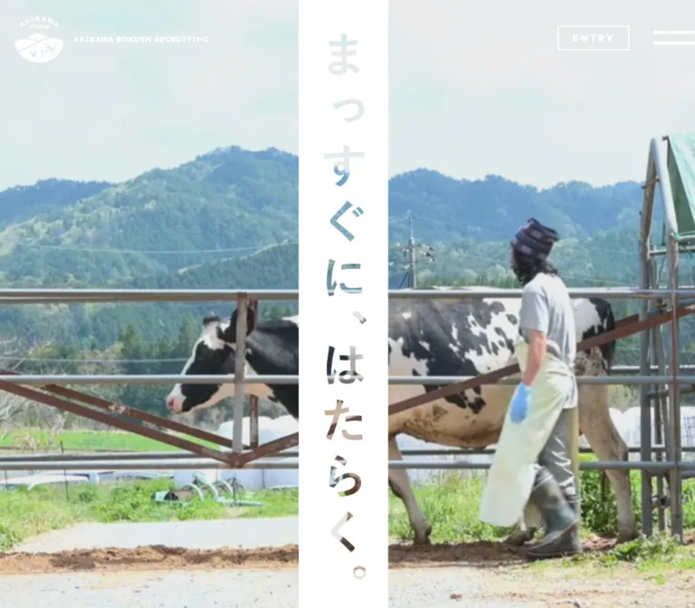
Akikawa Bokuen presents recruitment through people, food production, and the landscape surrounding their work. The opening composition is exceptionally direct: large photographic imagery, a central white strip, and the vertical statement 「まっすぐに、はたらく。」. The characters appear to reveal imagery through the strip. Small identity and recruitment controls sit around this central gesture.
Below the opening, the page becomes an editorial directory into the organization. Vertical Japanese headings, smaller English category names, narrow text columns, broad rectangular photographs, and generous paper-colored intervals establish a repeated rhythm. The footer turns the same vocabulary inside out: white vertical text strips and thin utility rules sit on a large green field beneath a landscape-shaped transition.
This is the homepage of a recruitment website with multiple content and hiring destinations. Its reusable structure includes company philosophy, business information, employee stories, news, and three employment categories.
閉じる
Akikawa Bokuen Recruiting — Style Reference
A white vertical ribbon through everyday farm life, followed by green ink, warm paper, and expansive photographs.
Website: recruit.akikawabokuen.com
Original URL: https://recruit.akikawabokuen.com/
Final URL: https://recruit.akikawabokuen.com/
Theme: warm light canvas with deep green identity, white photographic overlays, and a solid green footer.
Inspected: October 5, 2026, at 06:00:48 JST; supplied retrieval timestamp: 2026-10-04T21:00:48.861Z.
Viewports: desktop 1440 × 1000 and mobile 390 × 844 CSS pixels.
Scope: the current recruitment homepage, using three desktop captures, two mobile captures, and supplied rendered DOM/computed-style records. Linked stories, job pages, navigation overlays, and application flows were not separately inspected.
Akikawa Bokuen presents recruitment through people, food production, and the landscape surrounding their work. The opening composition is exceptionally direct: large photographic imagery, a central white strip, and the vertical statement 「まっすぐに、はたらく。」. The characters appear to reveal imagery through the strip. Small identity and recruitment controls sit around this central gesture.
Below the opening, the page becomes an editorial directory into the organization. Vertical Japanese headings, smaller English category names, narrow text columns, broad rectangular photographs, and generous paper-colored intervals establish a repeated rhythm. The footer turns the same vocabulary inside out: white vertical text strips and thin utility rules sit on a large green field beneath a landscape-shaped transition.
This is the homepage of a recruitment website with multiple content and hiring destinations. Its reusable structure includes company philosophy, business information, employee stories, news, and three employment categories.
How to Read This Reference
- Measured — M: values directly supplied by rendered DOM rectangles or computed styles. Measurements describe the captured state and viewport.
- Calculated — C: arithmetic derived from those measurements, such as column proportions or spacing between section boundaries.
- Visual estimate — V: proportions or treatments visible in the screenshots but lacking a corresponding computed value. These are approximate.
- Recommended — R: implementation guidance for a new project. Recommended breakpoints, accessibility treatments, and fallback behavior are not claims about the original.
- Token names are new aliases. The supplied custom-property extraction was empty; no original variable naming system was established.
- A parent box is not its visible lettering. Several headings and links contain styled descendants or artwork that were not individually sampled. Parent font sizes, colors, and rectangles should not be substituted blindly for the final visible treatment.
- DOM presence does not establish visibility. Repeated navigation groups, overlapping slides, and the opening manifesto appear in the records without all being visible in the supplied screenshots.
Tokens — Colors
Default Palette
| Name | Value | Suggested token | Role and evidence |
|---|---|---|---|
| Farm Green | #005842 |
--color-green |
M: body foreground, filled hero links, and recruitment buttons. V: the dominant footer field and green identity treatment correspond to this color. |
| Warm Paper | #e9e9df |
--color-paper |
M: body background. Visible in editorial margins and the copyright band. |
| White | #ffffff |
--color-white |
M: photographic overlay text and mobile recruitment button backgrounds. V: central hero ribbon and reversed footer labels. |
| Photographic color | Content-dependent | No global UI token | Skin, vegetation, blue sky, buildings, poultry, and work clothing supply the secondary colors. |
The interface has a restrained three-color system; photography contributes most of its chromatic variation. The bright blue sky in the Philosophy image belongs to that photograph, not to an additional button or navigation theme.
The mobile opening has a muted gray-green field around a horizontal photographic band. Its exact color and compositing method were not supplied. Treat it as a separate hero presentation to verify against assets, rather than adding an invented brand hex value.
Color Behavior
The header appears white over the opening photograph, green over the paper section, and white over the green footer. This change is visible across the supplied captures. The source mechanism, scroll thresholds, and transition timing are unverified.
Some green-filled anchors also report a green inherited foreground, while their visible child labels are white. The footer's parent element similarly reports a transparent background and inherited green text despite its visibly green field and white details. Read the final screenshot together with descendant styling; these parent declarations do not describe the complete painted result.
There is no evidence of selectable themes or a user-controlled dark mode.
Tokens — Typography
Japanese Interface and Editorial Copy
Computed source stack: Noto Sans JP, Yu Gothic Medium, localized Yu Gothic equivalents, YuGothic, Hiragino Kaku Gothic ProN, Hiragino Kaku Gothic Pro, localized Hiragino equivalents, Verdana, Meiryo, sans-serif.
The declared leading family is Noto Sans JP. The records establish the computed family stack, but do not establish which font file supplied every glyph. Retain a Japanese sans-serif fallback chain.
The typography combines several distinct treatments:
- Compact horizontal utility labels for hiring routes and news.
- Spacious, tracked story titles over photography.
- Vertical Japanese section headings on solid green strips.
- Desktop descriptive copy set in narrow vertical columns.
- Horizontal descriptive copy on mobile, with deliberate line breaks.
English Accents
Measured family: Sen, sans-serif on STORY #1, STORY #2, and the copyright line.
Sen gives these small English elements an approachable geometric character. Its use on every English category name or VIEW MORE label was not established. Use it selectively in an adaptation instead of assuming a universal English font assignment.
Display Lettering and Nested Headings
The hero slogan is visually much larger than the sampled body text and has an image-through-letter effect. No direct computed measurement or definitive asset type was supplied for that slogan. Its exact font, masking technique, and relationship to the underlying media remain unverified.
The sampled section h2 elements report 19.5px, weight 400, and line height 19.5px at both viewports. The visible heading strips are larger and more assertive than that parent value suggests. Their descendants or artwork must be measured separately for an exact reconstruction.
Type Scale
| Role | Desktop | Mobile | Weight / tracking | Status |
|---|---|---|---|---|
| Root font size | 10px |
10px |
Root reports Times; visible page descendants override it | M |
| Body default | 13px / 13px |
13px / 13px |
400, normal tracking |
M; not the paragraph scale |
| Opening manifesto | 20px / 52px |
15.6px / 40.56px |
700; 2.8px / 2.184px tracking |
M |
| Editorial description | 16px / 36px |
11.44px / 22.88px |
400; 0.32px / 1.6016px tracking |
M |
| Story eyebrow | 18px / 32.4px |
12.48px / 22.464px |
Sen 400; 1.44px / 0.9984px tracking |
M |
| Story title | 30px / 50px |
18.72px / 29.12px |
400; 5.7px / 3.5568px tracking |
M |
| Sampled section-heading parent | 19.5px / 19.5px |
19.5px / 19.5px |
400; descendants not measured |
M |
| Secondary news heading | 21px / 21px |
15px / 15px |
400; 0.1em tracking |
M |
| Opening news title | 14px / 14px |
12px / 12px |
400 |
M |
| Secondary news article text | 14px / 25.8462px |
11px / 21px |
400; 0.15em tracking |
M |
| Copyright | 11px / 19.8px |
10px / 18px |
Sen 400; 0.05em tracking |
M |
| Visible hero slogan | Approximately 60px |
Approximately 42–44px |
Exact family and weight unverified | V |
| Visible section-strip lettering | Approximately 32–36px |
Approximately 20–24px |
Nested display treatment unmeasured | V |
The manifesto uses a measured 2.6 line-height ratio and 0.14em tracking at both widths. Story titles retain 0.19em tracking. Mobile descriptions change from the desktop's restrained 0.02em tracking to 0.14em, alongside their change to horizontal reading.
The mobile values may originate from fluid sizing, but the actual CSS formulas and breakpoint conditions were not supplied. A value that happens to equal a viewport percentage at 390px is not sufficient evidence of that source formula.
Tokens — Spacing & Shapes
Geometry: square photographs, square buttons, rectangular title strips, thin rules, and small circular pagination marks.
Density: compact controls inside an otherwise spacious editorial composition. The page does not use a general rounded-card or shadow system.
Spacing Scale
| Use | Desktop | Mobile | Evidence |
|---|---|---|---|
| Hero navigation gap | 8px |
8px |
M: adjacent anchor positions |
| Header recruitment link padding | 14px on each side |
Header group absent from opening capture | M |
| Editorial page gutter | 55px |
Section wrappers reach the viewport edges | M |
| Gap between Philosophy and Business | 115px |
Approximately 42.63px |
C: measured section boundaries |
| Mobile recruitment-row gap | — | 15px |
C: 75px start interval minus 60px row height |
| Footer utility-column gap | Approximately 28.09px |
Approximately 13px |
C |
| Footer utility-row gap | 25px |
20px |
C |
| Footer utility bottom padding | 8px |
5px |
M |
| Footer side margin | 439px around a centered 562px group |
Approximately 32.77px |
M / C |
These values reveal several independent scales. Avoid forcing every dimension onto an assumed 8px spacing system.
Border Radius and Rules
| Element | Treatment | Evidence |
|---|---|---|
| Sampled links, sections, and buttons | border-radius: 0 |
M |
| Photographs and heading strips | Square corners | V |
| Header hiring group | Fine outlined rectangles with shared dividers | V |
| News category badge | Thin green rectangular outline | V |
| Footer utility links | Strong horizontal white bottom rules, approximately 3px | V |
| Story pagination | Small filled and outlined green circles, approximately 10–12px visually | V |
| Decorative looping line | White 2px SVG stroke, round line caps, no fill |
M: embedded SVG style text |
Layout Measurements
| Element | Desktop, 1440 × 1000 | Mobile, 390 × 844 | Notes |
|---|---|---|---|
| Document height | 7144px |
5874px |
M: reported document heights |
| First section | 1440 × 1000px |
390 × 844px |
M: includes opening navigation/news composition |
| Header box | 1440 × 95px |
390 × 58px |
M: transparent overlay structure |
| Header brand link | 370 × 71px, at 31.625, 24 |
130 × 42px, at 18.719, 16 |
M: hit area, not necessarily visible artwork bounds |
| Central white ribbon | Approximately 126px wide |
Approximately 84px wide |
V |
| Hero navigation | Four 190 × 58px links |
Three 120 × 36px links |
M: desktop editorial routes; mobile hiring routes |
| Hero navigation start | x:328, y:882 |
x:7, y:718 |
M |
| Opening news surface | Approximately 60px high |
Approximately 90px high |
V, corroborated by content positions |
| Editorial inner width | 1330px |
Up to 390px |
M |
| Philosophy image link | 944.297 × 560px |
390 × 463.609px |
M; mobile link encompasses the feature composition, not a proven image-only rectangle |
| Business image link | 944.297 × 560px |
390 × 463.609px |
M; same distinction |
| Interview slide link | Approximately 945 × 560px |
337 × 436.797px, starting at x:53.047 |
M |
| Section-heading wrapper width | 82px |
45.234px |
M; does not establish exact painted-strip height |
| Footer main-link group | Approximately 562px overall |
Approximately 324.47px overall |
C |
| Footer utility link | 168.594 × 36px |
155.734 × 31px |
M; corporate link is shorter |
| Mobile ENTRY control | Not present in desktop records | 390 × 68px |
M |
Components
Persistent Identity Header
Role: keep the organization recognizable and hiring routes available while visitors explore the page.
The desktop identity sits near the upper-left corner: the farm emblem followed by AKIKAWA BOKUEN RECRUITING. On mobile, the wordmark breaks into a small stacked arrangement beside the emblem. The transparent header lets the current page surface remain visible beneath it.
Desktop recruitment links form an outlined group with three destinations: 「新卒採用」, 「中途採用」, and 「パート・アルバイト」. Their sampled inner heights are 34px, with 14px horizontal padding. The first two links are approximately 95px wide; the longer third link is approximately 157px.
A two-line menu mark is visible at the mobile upper-right edge. It consists of long horizontal strokes, with no enclosing circle. Menu opening behavior was not tested. Navigation-like groups in the DOM are not evidence of a visibly opened menu.
The header remains at the viewport's upper edge in the sampled scrolled captures. This supports persistent behavior, although the exact fixed-versus-sticky implementation is not supplied. Its desktop right-hand controls also occupy different positions between opening and scrolled captures; do not hardcode every state from the initial right-edge alignment.
Hero Ribbon and Photographic Stage
Role: communicate the recruitment promise through a single memorable visual relationship.
An uninterrupted white strip divides the opening photograph vertically. The Japanese statement 「まっすぐに、はたらく。」 runs down its center with ample space between characters. The lettering appears to expose portions of photographic color within the white strip.
In the desktop opening, the image fills nearly the entire first viewport above the news band. A close human interaction occupies both sides of the ribbon. The crop is intentionally large: faces extend beyond the frame, and the typography acts as the stable centerline.
The mobile opening is materially different. The white ribbon remains tall, but a horizontal image band crosses the middle of a muted field. Workers in protective clothing occupy the left and poultry the right. In that capture, the image band spans approximately y:289–551, while the ribbon is approximately x:153–237. These are visual estimates from the screenshot, not source layout rules.
For an implementation, separate the photographic stage, central ribbon, accessible heading, and visual mask. A mask or supplied vector treatment can create the letter-shaped windows. The exact original method was not established. A separately cropped image inside each glyph would require careful registration to avoid breaking the relationship with the surrounding image.
Opening Narrative Layer
Role: articulate the organization's attitude to food and honest work.
The rendered DOM contains a ten-line manifesto within the first section. Its desktop box is approximately 379.28 × 520px, centered at x:530.36, y:215. On mobile it is approximately 295.84 × 405.31px, at x:47.08, y:209.34.
The text is white, bold, widely tracked, and exceptionally loose in line spacing: 20px / 52px on desktop and 15.6px / 40.56px on mobile.
This paragraph is not visibly exposed in the supplied initial frames. Its reveal sequence, relationship to the slogan, and any scroll-driven transitions remain unverified. Preserve it as a distinct content layer when planning a fuller implementation, without assuming a particular animation timeline.
Hero Navigation Tabs
Role: provide immediate onward routes at the base of the visual opening.
Desktop uses four green tabs, each 190 × 58px, with 8px gaps. Each combines a prominent white Japanese label and a smaller English caption. The routes are Welcome, Philosophy, Business, and Interview.
Mobile replaces this set with three hiring links, each 120 × 36px at the inspected width. They begin 7px from the viewport edge and retain 8px gaps. This is a change in information priority, not simply a compressed version of the four desktop tabs.
All tabs have square edges and no shadow. The observed link transition is 400ms with the site's shared easing curve; hover endpoints were not recorded.
Opening News Strip
Role: place a current update directly beneath the opening composition.
The white desktop strip aligns a green news heading, a short vertical divider, date, outlined category label, article title, and VIEW ALL with a thin directional arrow. The category is 「新卒採用」, and the current article is 「内定式を実施しました!」 dated 2026.10.2.
The strip becomes two rows on mobile. The heading sits at upper left and VIEW ALL at upper right. Below, the outlined category badge occupies the left; date and title stack to its right. The sampled article title drops from 14px to 12px.
Keep the article link and the archive link as separate accessible targets. The desktop article anchor has a broad measured box, but that does not justify placing nested links inside it.
Secondary News Section
Role: provide a larger editorial news entry point farther down the page.
The desktop DOM exposes two articles in adjacent approximately 637px-wide rows. Each combines a prominent day value, year/month, category, and headline. The mobile snapshot exposes one approximately 322px-wide entry.
The section has 200px top padding on desktop and 100px on mobile. Article text is more spacious here than in the opening news strip, with approximately 1.85–1.91 line-height ratios and 0.15em tracking.
The evidence does not establish whether additional mobile items are hidden, clipped, or dynamically selected. Do not infer a news carousel from this difference alone.
Welcome Story Feature
Role: introduce the organization through employees guiding people close to them through their work.
Desktop uses a broad 1330 × 560px section inside 55px side gutters. The title and description occupy the right side of the photographic composition. Two story links and two pagination buttons are present in the DOM.
Story labels use Sen, followed by a two-line Japanese headline and VIEW MORE. The measured headline treatment is 30px / 50px with 0.19em tracking. Text color differs between recorded story layers, supporting adaptation to each photograph.
On mobile, the section becomes approximately 603px tall. The vertical title remains near the right edge, while introductory copy becomes a horizontal block near the upper left. The story caption moves toward the lower portion and scales to 18.72px / 29.12px.
Both story anchors have zero-height wrapper rectangles while their children have positioned geometry. Do not copy those wrapper dimensions into an ordinary document-flow implementation. The records indicate layered composition, but do not establish its exact slider mechanics.
Philosophy and Business Features
Role: alternate organizational explanation with large visual entry points.
The desktop Philosophy section is a two-part spread. At left, a vertical English category name, a green Japanese title strip, and three narrow columns of green explanatory text occupy the paper surface. At right, a 944.297 × 560px photograph shows a roof and clock tower against a clear blue sky. A fine white line curls across the sky, with VIEW MORE and an arrow near the lower-right corner.
The inner width is 1330px. The image occupies approximately 71% of it; the remaining 29% houses the heading/copy group and its surrounding space. These percentages are calculated from the supplied rectangles, not observed CSS grid declarations.
Business reverses the spread: image at left, vertical title and copy at right. The next row begins 115px after the previous row ends. This alternating layout produces the page's primary editorial rhythm.
On mobile, section wrappers reach the viewport edges and the copy becomes horizontal. Philosophy's title wrapper begins at x:32; Business's begins near x:315.14. Both extend roughly 16.63px above their section's measured top. Body copy sits near the lower portion at x:52, spanning 338px.
No mobile middle-section screenshot was supplied. The mobile placement and typography above are supported by DOM measurements; exact image crops and decorative-line positions are unverified.
Interview Feature
Role: connect the organization's values to individual employees and their work.
The desktop introduction returns to the left-hand vertical heading/copy arrangement. Four interview links share an approximately 945 × 560px visual region at the right, with four pagination buttons below. The supplied text includes numbered interview statements and VIEW MORE labels.
On mobile, the slide link region starts approximately 53px from the left and reaches the right edge. It is approximately 337 × 436.8px. The heading remains near the left edge; horizontal introductory text appears farther right, measured in white in the supplied state.
These overlapping link rectangles and pagination controls support a slide-based structure. Swipe handling, autoplay, transition direction, timing, and pause behavior were not observed.
Recruitment Section
Role: route visitors to the appropriate employment information.
The section contains three hiring categories, followed by FAQ and a recruitment-harassment policy link. Desktop exposes three green VIEW MORE links, each 162 × 40px, arranged horizontally. The complete outer dimensions of their associated category presentations were not supplied.
Mobile uses a different control treatment: three stacked white links with green text, each approximately 280.8 × 60px, with 15px vertical gaps. Their width is a calculated 72% of the 390px viewport. The FAQ link follows at the same width and height, with white text on a transparent surface; the policy is a smaller text link beneath it.
The vertical Recruitment heading projects above the section's main rectangle. Keep this layered relationship instead of treating the title as a conventional centered horizontal heading with an unrelated large margin.
Landscape Transition and Footer
Role: close the narrative while offering a complete, compact directory.
A landscape-shaped edge connects the recruitment imagery to the solid green footer. The desktop capture shows broad cream curves crossing the top of the green field. The mobile capture reveals a richly textured rural landscape and green hill-like shapes flowing into the footer.
The footer overlaps the preceding recruitment section's measured extent by approximately 170px on desktop and 120px on mobile. This is consistent with layered transition artwork; it should not be recreated as two unrelated rectangular blocks separated by blank space.
A centered white farm emblem and recruitment wordmark lead the footer. Below are four groups of vertical Japanese labels on individual white strips. Their visual left-to-right order is Interview, Business, Philosophy, and Welcome. Small vertical English captions sit beside them.
The major-link anchor groups measure approximately 100 × 149.34px on desktop and 60 × 93.81px on mobile. A desktop group contains roughly 36px-wide painted strips; the mobile strips appear about 20px wide. These strip widths are visual estimates, distinct from anchor measurements.
Utility navigation uses three columns on desktop and two on mobile. Every link pairs a left-aligned label with a fine arrow or external-site icon, above a strong white rule. The corporate link occupies the final single position.
A paper-colored band carries the original-page copyright text, copyright AKIKAWA FOODS & FARMS CO., LTD.. The footer also links to the corporate website. No production credit is established by the supplied original-page evidence.
Mobile ENTRY Bar
Role: retain a direct hiring entry point in the scrolled mobile experience.
The lower mobile capture shows a full-width green ENTRY bar with a large, widely tracked white label. Its measured control height is 68px, and its link target is #entryMenu.
In the initial DOM measurement its top is at y:844, immediately below the viewport, while the scrolled capture shows it at the bottom of the screen. This supports state-dependent positioning or visibility. The reveal threshold, target behavior, menu animation, and dismissal rules were not tested.
Tokens — Motion & Interaction
| Treatment | Evidence | What can be reused safely |
|---|---|---|
| Common link transition | M: 0.4s cubic-bezier(0.165, 0.84, 0.44, 1) on header hiring links, hero tabs, opening news links, and recruitment controls |
Reuse duration and easing; choose and document new hover endpoints separately. |
| Header contrast changes | V: white over imagery/green field, green over paper | Preserve readable surface-dependent variants; exact switching mechanism is unknown. |
| Hero media | Different imagery appears across desktop/mobile captures | Photographic presentation is established; video playback, looping, and temporal sequencing are not. |
| Opening manifesto | Positioned white copy exists in the first section's DOM | Preserve the content layer; reveal trigger and duration remain unknown. |
| White looping illustration | M: inline SVG style specifies a white 2px rounded stroke | Reuse the line character; a draw-on animation is not established. |
| Welcome stories | Two links and two pagination buttons; filled/outlined dots visible | Provide two selectable stories; original transition behavior is unverified. |
| Interviews | Four overlapping slide links and four buttons | Provide four meaningful destinations; original autoplay and swipe behavior are unverified. |
| Mobile ENTRY visibility | Initial below-viewport box and later visible bottom bar | Account for an additional mobile action surface; do not invent the original reveal threshold. |
Most sampled elements report animation: none. That does not rule out media playback, JavaScript-driven transforms, animation on descendants, or paused capture states. Likewise, a bare transition: all entry without a meaningful duration is not evidence of an animated effect.
The supplied capture process waited for loading, visible image decoding, and sampled layout stability. It temporarily paused perpetual animations during readiness checks and resumed them afterward. These precautions improve screenshot stability but do not establish a complete motion timeline.
No click, hover, keyboard, drag, audio, menu-opening, or reduced-motion test result was supplied.
Surfaces
| Surface | Appearance | Purpose |
|---|---|---|
| Editorial canvas | Flat warm paper | Provides breathing room around vertical copy and large photographs. |
| Hero stage | Large photographic field; mobile uses a central image band in the captured state | Establishes people and practical work as the primary visual material. |
| Hero ribbon | Opaque white strip with image-like lettering | Creates the central visual signature. |
| Section-title strip | Green rectangle with white vertical text | Makes section identity readable independently of the photograph. |
| News surface | White with green typography and a small outlined category | Introduces current information without a card shell. |
| Recruitment controls | Green desktop buttons; white mobile hiring rows | Makes hiring categories easy to distinguish and select. |
| Footer field | Solid green with white labels, strips, and rules | Consolidates navigation and identity. |
| Copyright band | Warm paper with small green type | Provides a quiet closing edge. |
No general elevation hierarchy is visible. Separation comes from color fields, whitespace, rules, and the edges of photography.
Imagery
Photography is documentary in subject and direct in presentation. The supplied current-page captures show a close interaction between an adult and child, workers wearing protective clothing, poultry and eggs, a clock tower and roof against blue sky, and a broad rural landscape near the footer.
Preserve the relationships between people, work, animals, and place. Crops can be unusually tight in the hero and much wider in editorial sections. Avoid making every image obey one universal focal point or aspect ratio.
The Philosophy image is especially useful as a reference: a large, calm blue sky supplies negative space for a white looping line, while the roof and tower anchor the lower and right edges. The line feels lightly hand-drawn but remains thin and clean. It does not need a glow, shadow, or thick illustrative outline.
The farm emblem combines landscape curves with animal silhouettes. Reuse an authorized identity asset rather than approximating it with a generic agricultural icon.
Observed Asset References
No photograph, logo, hero-mask, or media-file URL was included in the supplied original-page evidence. The following is an asset inventory, not a list of discovered filenames.
| Asset | Observed use | Implementation consequence |
|---|---|---|
| Farm emblem and recruitment wordmark | Header and footer, in white and green treatments | Prepare appropriate contrast variants while preserving the supplied identity artwork. |
| Hero photographic material | Large desktop crop and narrower mobile band | Provide viewport-specific crop control and verify any motion separately. |
| Vertical slogan treatment | Central white ribbon | Requires a matching mask/artwork treatment for visual fidelity. |
| Philosophy photograph | Roof, tower, and blue sky | Retain negative sky space and the tower's right-hand placement. |
| White looping line | Across the Philosophy photograph and repeated SVG-bearing sections | A white 2px rounded SVG stroke is supported by the source evidence. |
| Landscape/footer transition | Rural image with hill-like boundaries and sweeping contours | Preserve overlap and organic edges across viewport sizes. |
| Arrow and external-site marks | News, editorial links, footer utilities | Use fine, small directional geometry that inherits surrounding color. |
Do not invent asset paths. Obtain the authorized originals or select clearly identified replacement imagery for a new implementation.
Layout & Responsive Behavior
Desktop Composition
The first section occupies one viewport. Its photograph and ribbon end visually at the white news strip, with four centered editorial tabs bridging the lower part of the image.
Later content uses a 1330px inner width inside 55px side gutters. Philosophy, Business, and Interview have 560px-tall section boxes. The Philosophy image begins at x:440.703; Business's begins at x:55. Their complementary alignment establishes an alternating spread rather than a repeated card grid.
The footer's principal navigation occupies a much narrower centered group, approximately 562px wide. The surrounding green space is part of the composition; expanding its navigation to the full editorial width would change the visual balance.
Mobile Recomposition
At 390px, the page preserves vertical heading strips while reorganizing adjacent content:
- The header brand contracts to a 130px-wide link area and the menu uses two exposed horizontal strokes.
- The hero's central ribbon remains prominent, while the photograph is a horizontal band in the supplied initial state.
- Three hiring links replace the desktop hero's four editorial links.
- News becomes a two-row arrangement with the archive link at upper right.
- Descriptive paragraphs become horizontal; the large vertical title strips remain as edge anchors.
- Philosophy and Business wrappers become full width, with title positions alternating between left and right.
- Interview imagery is offset from the left by approximately 53px.
- Hiring choices become a vertical stack of 60px-tall white links.
- Footer utility links change from three columns to two; the four major vertical-link groups remain in one row.
- A 68px ENTRY bar is visible at the bottom in the scrolled capture.
Mobile middle-section imagery was not visually captured. Its geometry and text changes are documented from the DOM, with crop and overlap details left unverified.
Scroll Structure and Measurement Limits
The next measured news section begins at document y:2200 on desktop and y:2044 on mobile. Both are 1200px beyond the first section's measured bottom. The intervening visual sequence is not fully shown. Treat this as an observed layout interval, not a recommendation to insert an empty 1200px spacer.
The original responsive breakpoint, intermediate tablet behavior, orientation changes, browser-toolbar resizing, and safe-area rules were not supplied. Use the two observed layouts as endpoints and test intermediate widths rather than claiming an exact source media query.
Do’s and Don’ts
Do
- Keep
#005842,#e9e9df, and white as the interface's central palette. - Preserve the white vertical hero ribbon and its relationship to the underlying imagery.
- Use photography of actual people, work, food production, and landscape as the principal visual material.
- Retain vertical Japanese title strips and restrained English category accents.
- Alternate broad image placement across desktop editorial sections.
- Keep the measured 55px desktop frame and generous section intervals as reference proportions.
- Recompose the mobile hierarchy, including its direct hiring links and horizontal body copy.
- Use square edges, fine arrows, outlined badges, and strong footer rules.
- Treat the footer's narrow centered directory and wide green surroundings as one composition.
- Distinguish visual letter size from the computed style of a containing heading.
Don’t
- Don't turn every section into a rounded card with a drop shadow.
- Don't spread photographic sky blue or vegetation yellow into unrelated UI accents.
- Don't replace the vertical headings with generic centered horizontal headlines throughout.
- Don't assume the mobile hero is a full-height cover crop; the supplied capture shows a horizontal media band.
- Don't shrink the four desktop hero tabs to fit mobile when the observed mobile content uses three hiring categories.
- Don't interpret all navigation groups in the DOM as simultaneously visible menus.
- Don't apply the parent's
19.5pxheading size to all visible title lettering. - Don't copy zero-height slider wrappers as normal content heights.
- Don't claim video autoplay, animated line drawing, parallax, or swipe behavior without further evidence.
- Don't convert the observed 1200px layout interval into unexplained blank space.
Recommended Implementation Additions
These are recommendations for a new implementation, not verified original features:
- Expose the hero statement as real accessible text even when its visual version uses a mask or image.
- Give the menu a descriptive accessible name, an expanded state, and keyboard-operable open/close behavior.
- Give every image-led story link an accessible name tied to its story title. Empty extracted link text alone does not establish the original accessibility state.
- Implement pagination as buttons with meaningful slide labels and a programmatic selected state. Expand touch targets beyond the small visible dots.
- Keep mobile reading copy comfortably legible. A 14–16px adaptation is advisable for substantial paragraphs; it intentionally differs from the measured 11.44px presentation.
- Provide a static poster and pause mechanism if ambient video or automatic slide rotation is introduced. Keep reduced-motion visitors on a stable presentation.
- Match the actual image focal points at each viewport; do not crop faces or work details beneath the central ribbon accidentally.
- Reserve space and safe-area clearance for a persistent mobile ENTRY bar so it cannot cover content or focused controls.
- Use visible focus indicators that work on paper, photographs, white controls, and the green footer.
- Verify the header's white variant against bright photographic areas. Add a localized contrast treatment if the final asset requires one.
Agent Prompt Guide
Quick Color Reference
- Main green:
#005842. - Editorial paper:
#e9e9df. - Ribbon, reversed type, and selected control surfaces:
#ffffff. - Photographic colors remain within imagery.
- Primary geometry: square rectangles, narrow vertical strips, thin arrows, small pagination circles.
- Decoration: white 2px looping lines and broad landscape-shaped footer edges.
Overall Prompt
“Create a recruitment website homepage inspired by Akikawa Bokuen's current editorial composition. Use deep green #005842, warm paper #e9e9df, and white. Open with documentary farm imagery divided by a narrow white vertical ribbon carrying the Japanese statement 「まっすぐに、はたらく。」. Place a compact identity at upper left and restrained recruitment controls near the edges. Below, alternate large rectangular photographs with vertical Japanese title strips, small English category labels, and narrow desktop copy columns. Include company stories, philosophy, business, employee interviews, news, and three hiring routes. On mobile, retain the vertical headings while changing descriptive text to horizontal blocks and promoting three hiring links. Finish with a landscape-shaped transition into a spacious green footer, white vertical navigation strips, and ruled utility links. Use square corners and minimal ornament. Treat any video, menu, or carousel behavior as a separately specified implementation requirement.”
Example Component Prompts
- Hero: “A full-width desktop photographic opening with an approximately 126px white ribbon centered over the image. Set 「まっすぐに、はたらく。」 vertically, with image-like color visible through the lettering. Keep the brand small at upper left and four green editorial links at the image's lower edge. For the 390px mobile layout, use an approximately 84px ribbon, the supplied horizontal image-band composition, and three hiring links.”
- Philosophy feature: “Inside a 1330px desktop frame, allocate approximately 29% to vertical green copy and a green title strip, and 71% to a 944 × 560px photograph of a tower and roof against open blue sky. Add a thin white looping line and a small lower-right VIEW MORE arrow. Preserve broad paper margins and square image edges.”
- News strip: “A compact white news band with green type, a small rectangular category outline, date, article headline, and a tracked VIEW ALL label with a fine arrow. At 390px, place the heading and archive link on the first row, with category beside a stacked date and title on the second.”
- Recruitment links: “Three mobile white hiring rows, approximately 281px wide and 60px tall, centered with 15px vertical gaps. Use green Japanese labels and restrained directional marks. Follow with an outlined FAQ route and a smaller policy link.”
- Footer: “A deep green footer beneath an organic landscape edge. Center a white farm identity, then four groups of Japanese vertical labels on separate white strips. Under them, arrange thin-arrow utility links with strong white bottom rules: three columns on desktop, two on mobile. End with a warm-paper copyright band.”
Quick Start
CSS Custom Properties
This is a reusable adaptation, not extracted site CSS. It keeps a conventional 16px root, uses new class names, and reproduces the principal color and layout relationships.
Measured colors, desktop gutters, feature proportions, tab geometry, and link easing are retained. The 767px breakpoint, visible heading sizes, mobile image aspect ratio, 14px mobile paragraph floor, focus styles, and hover opacity are recommendations. The hero text uses a solid-green fallback; the exact image-through-letter mask requires a separate authorized asset or implementation.
:root {
  /* Measured palette */
  --color-green: #005842;
  --color-paper: #e9e9df;
  --color-white: #ffffff;

  /* Shortened source stack; localized duplicate names omitted */
  --font-jp: 'Noto Sans JP', 'Yu Gothic Medium', YuGothic,
    'Hiragino Kaku Gothic ProN', 'Hiragino Kaku Gothic Pro',
    Verdana, Meiryo, sans-serif;
  --font-accent: Sen, sans-serif;

  /* Measured desktop values and calculated proportions */
  --page-gutter: 55px;
  --feature-copy-share: 29%;
  --feature-image-share: 71%;
  --feature-gap: 115px;
  --feature-copy-size: 16px;
  --feature-copy-leading: 36px;
  --footer-width: 562px;
  --nav-gap: 8px;

  /* Visual approximations for the opening */
  --ribbon-width: 126px;
  --hero-type-size: 60px;
  --news-height: 60px;

  /* Measured transition; endpoints are implementation choices */
  --link-duration: 400ms;
  --link-ease: cubic-bezier(0.165, 0.84, 0.44, 1);
}

* { box-sizing: border-box; }
html { font-size: 16px; }
body {
  margin: 0;
  color: var(--color-green);
  background: var(--color-paper);
  font-family: var(--font-jp);
  font-size: 14px;
  line-height: 1.8;
}
a { color: inherit; }
button { font: inherit; }
img { display: block; max-width: 100%; }

/* Persistent positioning is an adaptation of observed behavior. */
.site-header {
  position: fixed;
  z-index: 20;
  inset: 0 0 auto;
  display: flex;
  align-items: center;
  justify-content: space-between;
  padding: 24px 32px 0;
  color: var(--color-white);
  pointer-events: none;
}
.site-header a,
.site-header button { pointer-events: auto; }
.site-header[data-tone='green'] { color: var(--color-green); }
.brand-link {
  display: flex;
  align-items: center;
  width: 370px;
  height: 71px;
}
.brand-link img { max-height: 100%; object-fit: contain; }
.header-jobs { display: flex; border: 1px solid currentColor; }
.header-jobs a {
  display: flex;
  align-items: center;
  min-height: 34px;
  padding-inline: 14px;
  font-size: 13px;
  text-decoration: none;
}
.header-jobs a + a { border-left: 1px solid currentColor; }
.menu-button {
  display: none;
  width: 60px;
  min-height: 44px;
  padding: 12px 0;
  border: 0;
  color: inherit;
  background: transparent;
  cursor: pointer;
}
.menu-button::before,
.menu-button::after {
  content: '';
  display: block;
  height: 4px;
  background: currentColor;
}
.menu-button::after { margin-top: 6px; }

.hero {
  position: relative;
  height: calc(100svh - var(--news-height));
  min-height: 720px;
  overflow: hidden;
  background: var(--color-paper);
}
.hero-media {
  position: absolute;
  inset: 0;
  width: 100%;
  height: 100%;
  object-fit: cover;
  object-position: var(--hero-focal-point, center);
}
.hero-ribbon {
  position: absolute;
  inset-block: 0;
  left: 50%;
  display: flex;
  justify-content: center;
  width: var(--ribbon-width);
  transform: translateX(-50%);
  background: var(--color-white);
}
.hero-title {
  align-self: flex-start;
  margin: 40px 0 0;
  color: var(--color-green);
  writing-mode: vertical-rl;
  text-orientation: mixed;
  white-space: nowrap;
  font-size: var(--hero-type-size);
  font-weight: 700;
  line-height: 1.3;
  letter-spacing: 0.14em;
}
.hero-nav {
  position: absolute;
  bottom: 0;
  left: 50%;
  display: grid;
  grid-template-columns: repeat(4, 190px);
  gap: var(--nav-gap);
  transform: translateX(-50%);
}
.hero-nav a {
  display: flex;
  flex-direction: column;
  align-items: center;
  justify-content: center;
  min-height: 58px;
  color: var(--color-white);
  background: var(--color-green);
  font-size: 16px;
  font-weight: 700;
  line-height: 1.4;
  text-decoration: none;
}
.hero-nav small { font-size: 10px; letter-spacing: 0.04em; }
.hero-nav--jobs { display: none; }

.news-strip {
  display: grid;
  grid-template-columns: 170px minmax(0, 1fr) auto;
  align-items: center;
  gap: 28px;
  min-height: var(--news-height);
  padding: 10px 32px;
  background: var(--color-white);
}
.news-heading {
  margin: 0;
  border-right: 1px solid currentColor;
  font-size: 20px;
  letter-spacing: 0.12em;
}
.news-entry {
  display: grid;
  grid-template-columns: auto auto minmax(0, 1fr);
  align-items: center;
  gap: 20px;
  text-decoration: none;
}
.news-date { font-size: 12px; letter-spacing: 0.12em; }
.news-badge {
  padding: 3px 12px;
  border: 1px solid currentColor;
  font-size: 12px;
  line-height: 1.6;
}
.news-title { margin: 0; font-size: 14px; font-weight: 400; }
.news-all {
  display: inline-flex;
  align-items: center;
  gap: 12px;
  font-size: 11px;
  font-weight: 700;
  letter-spacing: 0.22em;
  text-decoration: none;
}

.feature-row {
  position: relative;
  display: grid;
  grid-template-columns:
    var(--feature-copy-share) var(--feature-image-share);
  align-items: start;
  margin: 0 var(--page-gutter) var(--feature-gap);
}
.feature-row--reverse {
  grid-template-columns:
    var(--feature-image-share) var(--feature-copy-share);
}
.feature-row--reverse .feature-head { order: 2; }
.feature-head {
  display: flex;
  flex-direction: row-reverse;
  justify-content: center;
  align-items: flex-start;
  gap: 24px;
}
.feature-kicker {
  margin: 0;
  writing-mode: vertical-rl;
  font-size: 17px;
  font-weight: 700;
  letter-spacing: 0.06em;
}
.feature-title {
  width: 82px;
  margin: 0;
  padding: 18px 16px;
  color: var(--color-white);
  background: var(--color-green);
  writing-mode: vertical-rl;
  text-orientation: mixed;
  white-space: nowrap;
  font-size: 34px;
  font-weight: 700;
  line-height: 1.45;
  letter-spacing: 0.15em;
}
.feature-copy {
  height: 408px;
  margin: 0;
  writing-mode: vertical-rl;
  font-size: var(--feature-copy-size);
  line-height: var(--feature-copy-leading);
  letter-spacing: 0.02em;
}
.feature-media {
  position: relative;
  display: block;
  aspect-ratio: 944.297 / 560;
  overflow: hidden;
  color: var(--color-white);
}
.feature-media img {
  width: 100%;
  height: 100%;
  object-fit: cover;
  object-position: var(--feature-focal-point, center);
}
.feature-more {
  position: absolute;
  right: 28px;
  bottom: 20px;
  display: flex;
  align-items: center;
  gap: 12px;
  font-size: 13px;
  font-weight: 700;
  letter-spacing: 0.3em;
}
.line-arrow {
  position: relative;
  display: inline-block;
  flex: 0 0 35px;
  width: 35px;
  height: 8px;
  border-bottom: 1px solid currentColor;
}
.line-arrow::after {
  content: '';
  position: absolute;
  right: 0;
  bottom: -1px;
  width: 11px;
  border-bottom: 1px solid currentColor;
  transform: rotate(32deg);
  transform-origin: right center;
}

.recruit-links {
  display: flex;
  justify-content: center;
  gap: 30px;
}
.recruit-links a {
  display: flex;
  align-items: center;
  justify-content: space-between;
  width: 162px;
  min-height: 40px;
  padding-inline: 18px;
  color: var(--color-white);
  background: var(--color-green);
  text-decoration: none;
}

.site-footer {
  color: var(--color-white);
  background: var(--color-green);
  padding-top: 80px;
}
.footer-inner {
  width: min(var(--footer-width), 83.2%);
  margin-inline: auto;
  padding-bottom: 150px;
}
.footer-brand {
  display: block;
  width: 122px;
  margin: 0 auto 80px;
}
.footer-major {
  display: flex;
  justify-content: space-between;
  gap: 16px;
  margin-bottom: 65px;
}
.footer-major-link {
  display: flex;
  align-items: flex-start;
  gap: 8px;
  width: 100px;
  text-decoration: none;
}
.footer-major-link .strip {
  padding: 8px 5px;
  color: var(--color-green);
  background: var(--color-white);
  writing-mode: vertical-rl;
  white-space: nowrap;
  font-size: 22px;
  font-weight: 700;
  line-height: 1.2;
  letter-spacing: 0.1em;
}
.footer-major-link small {
  writing-mode: vertical-rl;
  white-space: nowrap;
  font-size: 9px;
  letter-spacing: 0.06em;
}
.footer-utilities {
  display: grid;
  grid-template-columns: repeat(3, minmax(0, 1fr));
  gap: 25px 28px;
}
.footer-utilities a {
  display: flex;
  align-items: center;
  justify-content: space-between;
  min-height: 36px;
  padding-bottom: 8px;
  border-bottom: 3px solid currentColor;
  font-size: 13px;
  text-decoration: none;
}
.copyright {
  margin: 0;
  padding: 20px 12px;
  color: var(--color-green);
  background: var(--color-paper);
  text-align: center;
  font: 11px/1.8 var(--font-accent);
  letter-spacing: 0.05em;
}
.entry-bar { display: none; }

/* Recommended interaction endpoints and keyboard treatment. */
a {
  transition: opacity var(--link-duration) var(--link-ease);
}
:focus-visible {
  outline: 3px solid currentColor;
  outline-offset: 5px;
}
@media (hover: hover) {
  a:hover { opacity: 0.82; }
}

/* Recommended breakpoint, not a recovered source media query. */
@media (max-width: 767px) {
  :root {
    --ribbon-width: 84px;
    --hero-type-size: 44px;
    --news-height: 90px;
    --feature-gap: 60px;
  }
  .site-header { padding: 16px 0 0 4.8%; }
  .brand-link { width: 130px; height: 42px; }
  .header-jobs { display: none; }
  .menu-button { display: block; }
  .hero { min-height: 650px; }
  .hero-media {
    top: 38.3%;
    bottom: auto;
    height: 67.2vw;
  }
  .hero-title { margin-top: 140px; letter-spacing: 0.08em; }
  .hero-nav--editorial { display: none; }
  .hero-nav--jobs {
    display: grid;
    width: calc(100% - 14px);
    grid-template-columns: repeat(3, minmax(0, 1fr));
  }
  .hero-nav a { min-height: 36px; font-size: 12px; }
  .news-strip {
    grid-template-columns: 1fr auto;
    gap: 8px 16px;
    padding: 10px 4%;
  }
  .news-heading { border: 0; font-size: 15px; }
  .news-entry {
    grid-column: 1 / -1;
    grid-row: 2;
    grid-template-columns: 54px minmax(0, 1fr);
    gap: 0 11px;
  }
  .news-date { grid-column: 2; grid-row: 1; font-size: 10px; }
  .news-badge {
    grid-column: 1;
    grid-row: 1 / span 2;
    padding-inline: 5px;
    font-size: 10px;
  }
  .news-title { grid-column: 2; grid-row: 2; font-size: 12px; }
  .news-all { font-size: 10px; }
  .feature-row,
  .feature-row--reverse {
    display: flex;
    flex-direction: column;
    gap: 20px;
    margin-inline: 0;
  }
  .feature-head { display: contents; }
  .feature-kicker {
    position: absolute;
    z-index: 2;
    top: -16px;
    left: 84px;
    font-size: 12px;
  }
  .feature-title {
    position: absolute;
    z-index: 2;
    top: -16px;
    left: 32px;
    width: 45.234px;
    padding: 12px 8px;
    font-size: 22px;
    line-height: 1.3;
  }
  .feature-row--reverse .feature-title { left: auto; right: 32px; }
  .feature-row--reverse .feature-kicker { left: auto; right: 12px; }
  .feature-media {
    order: 1;
    width: 100%;
    aspect-ratio: 4 / 3;
  }
  .feature-copy {
    order: 2;
    width: calc(100% - 72px);
    height: auto;
    margin-left: 52px;
    writing-mode: horizontal-tb;
    font-size: 14px;
    line-height: 2;
    letter-spacing: 0.14em;
  }
  .feature-more { right: 20px; bottom: 18px; font-size: 11px; }
  .recruit-links {
    flex-direction: column;
    align-items: center;
    gap: 15px;
  }
  .recruit-links a {
    width: 72%;
    min-height: 60px;
    padding-inline: 20px;
    color: var(--color-green);
    background: var(--color-white);
  }
  .footer-inner { padding-bottom: 60px; }
  .footer-brand { margin-bottom: 40px; }
  .footer-major { gap: 12px; margin-bottom: 30px; }
  .footer-major-link { width: 60px; gap: 4px; }
  .footer-major-link .strip { padding: 5px 3px; font-size: 14px; }
  .footer-major-link small { font-size: 6px; }
  .footer-utilities { grid-template-columns: repeat(2, 1fr); gap: 20px 13px; }
  .footer-utilities a { min-height: 44px; padding-bottom: 5px; font-size: 12px; }
  .copyright { padding: 5px 8px; font-size: 10px; }
  .entry-bar[data-visible='true'] {
    position: fixed;
    z-index: 30;
    inset: auto 0 0;
    display: grid;
    place-items: center;
    min-height: calc(68px + env(safe-area-inset-bottom, 0px));
    padding-bottom: env(safe-area-inset-bottom, 0px);
    color: var(--color-white);
    background: var(--color-green);
    font-size: 18px;
    font-weight: 700;
    letter-spacing: 0.2em;
    text-decoration: none;
  }
  body.has-entry-bar {
    padding-bottom: calc(68px + env(safe-area-inset-bottom, 0px));
  }
}

@media (prefers-reduced-motion: reduce) {
  a { transition: none; }
  html { scroll-behavior: auto; }
}
Example Component Markup
This example demonstrates the editorial feature classes. Replace the uppercase image placeholder with an authorized asset. The mobile photo ratio and body layout in the CSS are an adaptation; exact mobile crops were not supplied.
<section class='feature-row' aria-labelledby='philosophy-title'>
  <div class='feature-head'>
    <p class='feature-kicker'>Philosophy</p>
    <h2 class='feature-title' id='philosophy-title' lang='ja'>秋川牧園の想い</h2>
    <p class='feature-copy' lang='ja'>
      私たちにはずっと大切にしている「想い」があります。<br>
      だからこそ、さまざまな食の課題に取り組み、<br>
      乗り越えてくることができました。
    </p>
  </div>
  <a class='feature-media' href='/philosophy/' aria-label='Read our philosophy'>
    <img
      src='YOUR_AUTHORIZED_PHILOSOPHY_IMAGE'
      alt='A roof and clock tower beneath a clear blue sky'
      loading='lazy'
      width='944'
      height='560'
    >
    <span class='feature-more'>
      VIEW MORE <span class='line-arrow' aria-hidden='true'></span>
    </span>
  </a>
</section>
The header's tone and mobile ENTRY visibility require explicit state handling. The CSS does not implement menus, slide switching, video playback, hero masks, or the decorative footer artwork. Keep these as distinct components with their own accessible behavior and asset requirements.
Tailwind v4 Token Mapping
Optional aliases for a project already using Tailwind v4. This does not imply the original website uses Tailwind. Define the custom properties above first.
@theme inline {
  --color-farm-green: #005842;
  --color-warm-paper: #e9e9df;
  --color-ribbon-white: #ffffff;
  --font-editorial: var(--font-jp);
  --font-accent: Sen, sans-serif;
  --spacing-page-gutter: var(--page-gutter);
  --spacing-feature-gap: var(--feature-gap);
  --spacing-ribbon: var(--ribbon-width);
  --radius-editorial: 0px;
  --ease-editorial: cubic-bezier(0.165, 0.84, 0.44, 1);
}
Sources & Evidence
- Original and final homepage: https://recruit.akikawabokuen.com/. The supplied browser observation reports HTTP 200 and no URL change.
- Capture timestamp:
2026-10-04T21:00:48.861Z, equivalent to October 5, 2026, 06:00:48.861 JST. - Desktop evidence: three current-page captures at
1440 × 1000, showing the opening, Philosophy region, and footer; rendered DOM/computed-style records report a document height of 7144px. - Mobile evidence: two current-page captures at
390 × 844, showing the opening and lower-page/footer state; rendered DOM/computed-style records report a document height of 5874px. - Measured material: element rectangles, typography, colors, backgrounds, padding, corner radii, transition strings, link destinations, pagination buttons, and inline SVG stroke declarations supplied with those observations.
- Original-page identity evidence: the visible recruitment branding, original-page copyright naming AKIKAWA FOODS & FARMS CO., LTD., and the footer's Corporate site link. The corporate destination was not separately inspected.
- Interaction scope: the supplied process traversed intermediate scroll positions and captured settled states. No explicit link activation, opened navigation, carousel selection, hover, keyboard, or media-control result was supplied.
- Capture limitations: readiness checks included at least five seconds of initial observation, bounded waits for layout and image stability, and temporary pausing of perpetual animations. SharedWorkers and service workers were disabled. These conditions do not prove semantic completeness or reveal every delayed or interactive state.
This reference describes the current homepage using the supplied original-page evidence. It separates measured values from visual estimates and implementation recommendations, and does not claim unobserved behavior or exact layouts for uninspected destination pages.
# Akikawa Bokuen Recruiting — Style Reference

> A white vertical ribbon through everyday farm life, followed by green ink, warm paper, and expansive photographs.

**Website:** [recruit.akikawabokuen.com](https://recruit.akikawabokuen.com/)
**Original URL:** https://recruit.akikawabokuen.com/
**Final URL:** https://recruit.akikawabokuen.com/
**Theme:** warm light canvas with deep green identity, white photographic overlays, and a solid green footer.
**Inspected:** October 5, 2026, at 06:00:48 JST; supplied retrieval timestamp: `2026-10-04T21:00:48.861Z`.
**Viewports:** desktop `1440 × 1000` and mobile `390 × 844` CSS pixels.
**Scope:** the current recruitment homepage, using three desktop captures, two mobile captures, and supplied rendered DOM/computed-style records. Linked stories, job pages, navigation overlays, and application flows were not separately inspected.

Akikawa Bokuen presents recruitment through people, food production, and the landscape surrounding their work. The opening composition is exceptionally direct: large photographic imagery, a central white strip, and the vertical statement 「まっすぐに、はたらく。」. The characters appear to reveal imagery through the strip. Small identity and recruitment controls sit around this central gesture.

Below the opening, the page becomes an editorial directory into the organization. Vertical Japanese headings, smaller English category names, narrow text columns, broad rectangular photographs, and generous paper-colored intervals establish a repeated rhythm. The footer turns the same vocabulary inside out: white vertical text strips and thin utility rules sit on a large green field beneath a landscape-shaped transition.

This is the homepage of a recruitment website with multiple content and hiring destinations. Its reusable structure includes company philosophy, business information, employee stories, news, and three employment categories.
閉じる
# Akikawa Bokuen Recruiting — Style Reference

> A white vertical ribbon through everyday farm life, followed by green ink, warm paper, and expansive photographs.

**Website:** [recruit.akikawabokuen.com](https://recruit.akikawabokuen.com/)
**Original URL:** https://recruit.akikawabokuen.com/
**Final URL:** https://recruit.akikawabokuen.com/
**Theme:** warm light canvas with deep green identity, white photographic overlays, and a solid green footer.
**Inspected:** October 5, 2026, at 06:00:48 JST; supplied retrieval timestamp: `2026-10-04T21:00:48.861Z`.
**Viewports:** desktop `1440 × 1000` and mobile `390 × 844` CSS pixels.
**Scope:** the current recruitment homepage, using three desktop captures, two mobile captures, and supplied rendered DOM/computed-style records. Linked stories, job pages, navigation overlays, and application flows were not separately inspected.

Akikawa Bokuen presents recruitment through people, food production, and the landscape surrounding their work. The opening composition is exceptionally direct: large photographic imagery, a central white strip, and the vertical statement 「まっすぐに、はたらく。」. The characters appear to reveal imagery through the strip. Small identity and recruitment controls sit around this central gesture.

Below the opening, the page becomes an editorial directory into the organization. Vertical Japanese headings, smaller English category names, narrow text columns, broad rectangular photographs, and generous paper-colored intervals establish a repeated rhythm. The footer turns the same vocabulary inside out: white vertical text strips and thin utility rules sit on a large green field beneath a landscape-shaped transition.

This is the homepage of a recruitment website with multiple content and hiring destinations. Its reusable structure includes company philosophy, business information, employee stories, news, and three employment categories.

## How to Read This Reference

- **Measured — M:** values directly supplied by rendered DOM rectangles or computed styles. Measurements describe the captured state and viewport.
- **Calculated — C:** arithmetic derived from those measurements, such as column proportions or spacing between section boundaries.
- **Visual estimate — V:** proportions or treatments visible in the screenshots but lacking a corresponding computed value. These are approximate.
- **Recommended — R:** implementation guidance for a new project. Recommended breakpoints, accessibility treatments, and fallback behavior are not claims about the original.
- **Token names are new aliases.** The supplied custom-property extraction was empty; no original variable naming system was established.
- **A parent box is not its visible lettering.** Several headings and links contain styled descendants or artwork that were not individually sampled. Parent font sizes, colors, and rectangles should not be substituted blindly for the final visible treatment.
- **DOM presence does not establish visibility.** Repeated navigation groups, overlapping slides, and the opening manifesto appear in the records without all being visible in the supplied screenshots.

## Tokens — Colors

### Default Palette

| Name | Value | Suggested token | Role and evidence |
| --- | --- | --- | --- |
| Farm Green | `#005842` | `--color-green` | M: body foreground, filled hero links, and recruitment buttons. V: the dominant footer field and green identity treatment correspond to this color. |
| Warm Paper | `#e9e9df` | `--color-paper` | M: body background. Visible in editorial margins and the copyright band. |
| White | `#ffffff` | `--color-white` | M: photographic overlay text and mobile recruitment button backgrounds. V: central hero ribbon and reversed footer labels. |
| Photographic color | Content-dependent | No global UI token | Skin, vegetation, blue sky, buildings, poultry, and work clothing supply the secondary colors. |

The interface has a restrained three-color system; photography contributes most of its chromatic variation. The bright blue sky in the Philosophy image belongs to that photograph, not to an additional button or navigation theme.

The mobile opening has a muted gray-green field around a horizontal photographic band. Its exact color and compositing method were not supplied. Treat it as a separate hero presentation to verify against assets, rather than adding an invented brand hex value.

### Color Behavior

The header appears white over the opening photograph, green over the paper section, and white over the green footer. This change is visible across the supplied captures. The source mechanism, scroll thresholds, and transition timing are unverified.

Some green-filled anchors also report a green inherited foreground, while their visible child labels are white. The footer's parent element similarly reports a transparent background and inherited green text despite its visibly green field and white details. Read the final screenshot together with descendant styling; these parent declarations do not describe the complete painted result.

There is no evidence of selectable themes or a user-controlled dark mode.

## Tokens — Typography

### Japanese Interface and Editorial Copy

**Computed source stack:** `Noto Sans JP`, `Yu Gothic Medium`, localized Yu Gothic equivalents, `YuGothic`, `Hiragino Kaku Gothic ProN`, `Hiragino Kaku Gothic Pro`, localized Hiragino equivalents, `Verdana`, `Meiryo`, `sans-serif`.

The declared leading family is Noto Sans JP. The records establish the computed family stack, but do not establish which font file supplied every glyph. Retain a Japanese sans-serif fallback chain.

The typography combines several distinct treatments:

- Compact horizontal utility labels for hiring routes and news.
- Spacious, tracked story titles over photography.
- Vertical Japanese section headings on solid green strips.
- Desktop descriptive copy set in narrow vertical columns.
- Horizontal descriptive copy on mobile, with deliberate line breaks.

### English Accents

**Measured family:** `Sen, sans-serif` on `STORY #1`, `STORY #2`, and the copyright line.

Sen gives these small English elements an approachable geometric character. Its use on every English category name or `VIEW MORE` label was not established. Use it selectively in an adaptation instead of assuming a universal English font assignment.

### Display Lettering and Nested Headings

The hero slogan is visually much larger than the sampled body text and has an image-through-letter effect. No direct computed measurement or definitive asset type was supplied for that slogan. Its exact font, masking technique, and relationship to the underlying media remain unverified.

The sampled section `h2` elements report `19.5px`, weight `400`, and line height `19.5px` at both viewports. The visible heading strips are larger and more assertive than that parent value suggests. Their descendants or artwork must be measured separately for an exact reconstruction.

### Type Scale

| Role | Desktop | Mobile | Weight / tracking | Status |
| --- | --- | --- | --- | --- |
| Root font size | `10px` | `10px` | Root reports Times; visible page descendants override it | M |
| Body default | `13px / 13px` | `13px / 13px` | `400`, normal tracking | M; not the paragraph scale |
| Opening manifesto | `20px / 52px` | `15.6px / 40.56px` | `700`; `2.8px` / `2.184px` tracking | M |
| Editorial description | `16px / 36px` | `11.44px / 22.88px` | `400`; `0.32px` / `1.6016px` tracking | M |
| Story eyebrow | `18px / 32.4px` | `12.48px / 22.464px` | Sen `400`; `1.44px` / `0.9984px` tracking | M |
| Story title | `30px / 50px` | `18.72px / 29.12px` | `400`; `5.7px` / `3.5568px` tracking | M |
| Sampled section-heading parent | `19.5px / 19.5px` | `19.5px / 19.5px` | `400`; descendants not measured | M |
| Secondary news heading | `21px / 21px` | `15px / 15px` | `400`; `0.1em` tracking | M |
| Opening news title | `14px / 14px` | `12px / 12px` | `400` | M |
| Secondary news article text | `14px / 25.8462px` | `11px / 21px` | `400`; `0.15em` tracking | M |
| Copyright | `11px / 19.8px` | `10px / 18px` | Sen `400`; `0.05em` tracking | M |
| Visible hero slogan | Approximately `60px` | Approximately `42–44px` | Exact family and weight unverified | V |
| Visible section-strip lettering | Approximately `32–36px` | Approximately `20–24px` | Nested display treatment unmeasured | V |

The manifesto uses a measured `2.6` line-height ratio and `0.14em` tracking at both widths. Story titles retain `0.19em` tracking. Mobile descriptions change from the desktop's restrained `0.02em` tracking to `0.14em`, alongside their change to horizontal reading.

The mobile values may originate from fluid sizing, but the actual CSS formulas and breakpoint conditions were not supplied. A value that happens to equal a viewport percentage at 390px is not sufficient evidence of that source formula.

## Tokens — Spacing & Shapes

**Geometry:** square photographs, square buttons, rectangular title strips, thin rules, and small circular pagination marks.

**Density:** compact controls inside an otherwise spacious editorial composition. The page does not use a general rounded-card or shadow system.

### Spacing Scale

| Use | Desktop | Mobile | Evidence |
| --- | --- | --- | --- |
| Hero navigation gap | `8px` | `8px` | M: adjacent anchor positions |
| Header recruitment link padding | `14px` on each side | Header group absent from opening capture | M |
| Editorial page gutter | `55px` | Section wrappers reach the viewport edges | M |
| Gap between Philosophy and Business | `115px` | Approximately `42.63px` | C: measured section boundaries |
| Mobile recruitment-row gap | — | `15px` | C: 75px start interval minus 60px row height |
| Footer utility-column gap | Approximately `28.09px` | Approximately `13px` | C |
| Footer utility-row gap | `25px` | `20px` | C |
| Footer utility bottom padding | `8px` | `5px` | M |
| Footer side margin | `439px` around a centered 562px group | Approximately `32.77px` | M / C |

These values reveal several independent scales. Avoid forcing every dimension onto an assumed 8px spacing system.

### Border Radius and Rules

| Element | Treatment | Evidence |
| --- | --- | --- |
| Sampled links, sections, and buttons | `border-radius: 0` | M |
| Photographs and heading strips | Square corners | V |
| Header hiring group | Fine outlined rectangles with shared dividers | V |
| News category badge | Thin green rectangular outline | V |
| Footer utility links | Strong horizontal white bottom rules, approximately 3px | V |
| Story pagination | Small filled and outlined green circles, approximately 10–12px visually | V |
| Decorative looping line | White `2px` SVG stroke, round line caps, no fill | M: embedded SVG style text |

### Layout Measurements

| Element | Desktop, 1440 × 1000 | Mobile, 390 × 844 | Notes |
| --- | --- | --- | --- |
| Document height | `7144px` | `5874px` | M: reported document heights |
| First section | `1440 × 1000px` | `390 × 844px` | M: includes opening navigation/news composition |
| Header box | `1440 × 95px` | `390 × 58px` | M: transparent overlay structure |
| Header brand link | `370 × 71px`, at `31.625, 24` | `130 × 42px`, at `18.719, 16` | M: hit area, not necessarily visible artwork bounds |
| Central white ribbon | Approximately `126px` wide | Approximately `84px` wide | V |
| Hero navigation | Four `190 × 58px` links | Three `120 × 36px` links | M: desktop editorial routes; mobile hiring routes |
| Hero navigation start | `x:328, y:882` | `x:7, y:718` | M |
| Opening news surface | Approximately `60px` high | Approximately `90px` high | V, corroborated by content positions |
| Editorial inner width | `1330px` | Up to `390px` | M |
| Philosophy image link | `944.297 × 560px` | `390 × 463.609px` | M; mobile link encompasses the feature composition, not a proven image-only rectangle |
| Business image link | `944.297 × 560px` | `390 × 463.609px` | M; same distinction |
| Interview slide link | Approximately `945 × 560px` | `337 × 436.797px`, starting at `x:53.047` | M |
| Section-heading wrapper width | `82px` | `45.234px` | M; does not establish exact painted-strip height |
| Footer main-link group | Approximately `562px` overall | Approximately `324.47px` overall | C |
| Footer utility link | `168.594 × 36px` | `155.734 × 31px` | M; corporate link is shorter |
| Mobile ENTRY control | Not present in desktop records | `390 × 68px` | M |

## Components

### Persistent Identity Header

**Role:** keep the organization recognizable and hiring routes available while visitors explore the page.

The desktop identity sits near the upper-left corner: the farm emblem followed by `AKIKAWA BOKUEN RECRUITING`. On mobile, the wordmark breaks into a small stacked arrangement beside the emblem. The transparent header lets the current page surface remain visible beneath it.

Desktop recruitment links form an outlined group with three destinations: 「新卒採用」, 「中途採用」, and 「パート・アルバイト」. Their sampled inner heights are 34px, with 14px horizontal padding. The first two links are approximately 95px wide; the longer third link is approximately 157px.

A two-line menu mark is visible at the mobile upper-right edge. It consists of long horizontal strokes, with no enclosing circle. Menu opening behavior was not tested. Navigation-like groups in the DOM are not evidence of a visibly opened menu.

The header remains at the viewport's upper edge in the sampled scrolled captures. This supports persistent behavior, although the exact fixed-versus-sticky implementation is not supplied. Its desktop right-hand controls also occupy different positions between opening and scrolled captures; do not hardcode every state from the initial right-edge alignment.

### Hero Ribbon and Photographic Stage

**Role:** communicate the recruitment promise through a single memorable visual relationship.

An uninterrupted white strip divides the opening photograph vertically. The Japanese statement 「まっすぐに、はたらく。」 runs down its center with ample space between characters. The lettering appears to expose portions of photographic color within the white strip.

In the desktop opening, the image fills nearly the entire first viewport above the news band. A close human interaction occupies both sides of the ribbon. The crop is intentionally large: faces extend beyond the frame, and the typography acts as the stable centerline.

The mobile opening is materially different. The white ribbon remains tall, but a horizontal image band crosses the middle of a muted field. Workers in protective clothing occupy the left and poultry the right. In that capture, the image band spans approximately `y:289–551`, while the ribbon is approximately `x:153–237`. These are visual estimates from the screenshot, not source layout rules.

For an implementation, separate the photographic stage, central ribbon, accessible heading, and visual mask. A mask or supplied vector treatment can create the letter-shaped windows. The exact original method was not established. A separately cropped image inside each glyph would require careful registration to avoid breaking the relationship with the surrounding image.

### Opening Narrative Layer

**Role:** articulate the organization's attitude to food and honest work.

The rendered DOM contains a ten-line manifesto within the first section. Its desktop box is approximately `379.28 × 520px`, centered at `x:530.36, y:215`. On mobile it is approximately `295.84 × 405.31px`, at `x:47.08, y:209.34`.

The text is white, bold, widely tracked, and exceptionally loose in line spacing: `20px / 52px` on desktop and `15.6px / 40.56px` on mobile.

This paragraph is not visibly exposed in the supplied initial frames. Its reveal sequence, relationship to the slogan, and any scroll-driven transitions remain unverified. Preserve it as a distinct content layer when planning a fuller implementation, without assuming a particular animation timeline.

### Hero Navigation Tabs

**Role:** provide immediate onward routes at the base of the visual opening.

Desktop uses four green tabs, each `190 × 58px`, with 8px gaps. Each combines a prominent white Japanese label and a smaller English caption. The routes are Welcome, Philosophy, Business, and Interview.

Mobile replaces this set with three hiring links, each `120 × 36px` at the inspected width. They begin 7px from the viewport edge and retain 8px gaps. This is a change in information priority, not simply a compressed version of the four desktop tabs.

All tabs have square edges and no shadow. The observed link transition is 400ms with the site's shared easing curve; hover endpoints were not recorded.

### Opening News Strip

**Role:** place a current update directly beneath the opening composition.

The white desktop strip aligns a green news heading, a short vertical divider, date, outlined category label, article title, and `VIEW ALL` with a thin directional arrow. The category is 「新卒採用」, and the current article is 「内定式を実施しました!」 dated `2026.10.2`.

The strip becomes two rows on mobile. The heading sits at upper left and `VIEW ALL` at upper right. Below, the outlined category badge occupies the left; date and title stack to its right. The sampled article title drops from 14px to 12px.

Keep the article link and the archive link as separate accessible targets. The desktop article anchor has a broad measured box, but that does not justify placing nested links inside it.

### Secondary News Section

**Role:** provide a larger editorial news entry point farther down the page.

The desktop DOM exposes two articles in adjacent approximately 637px-wide rows. Each combines a prominent day value, year/month, category, and headline. The mobile snapshot exposes one approximately 322px-wide entry.

The section has 200px top padding on desktop and 100px on mobile. Article text is more spacious here than in the opening news strip, with approximately 1.85–1.91 line-height ratios and `0.15em` tracking.

The evidence does not establish whether additional mobile items are hidden, clipped, or dynamically selected. Do not infer a news carousel from this difference alone.

### Welcome Story Feature

**Role:** introduce the organization through employees guiding people close to them through their work.

Desktop uses a broad `1330 × 560px` section inside 55px side gutters. The title and description occupy the right side of the photographic composition. Two story links and two pagination buttons are present in the DOM.

Story labels use Sen, followed by a two-line Japanese headline and `VIEW MORE`. The measured headline treatment is `30px / 50px` with `0.19em` tracking. Text color differs between recorded story layers, supporting adaptation to each photograph.

On mobile, the section becomes approximately 603px tall. The vertical title remains near the right edge, while introductory copy becomes a horizontal block near the upper left. The story caption moves toward the lower portion and scales to `18.72px / 29.12px`.

Both story anchors have zero-height wrapper rectangles while their children have positioned geometry. Do not copy those wrapper dimensions into an ordinary document-flow implementation. The records indicate layered composition, but do not establish its exact slider mechanics.

### Philosophy and Business Features

**Role:** alternate organizational explanation with large visual entry points.

The desktop Philosophy section is a two-part spread. At left, a vertical English category name, a green Japanese title strip, and three narrow columns of green explanatory text occupy the paper surface. At right, a `944.297 × 560px` photograph shows a roof and clock tower against a clear blue sky. A fine white line curls across the sky, with `VIEW MORE` and an arrow near the lower-right corner.

The inner width is 1330px. The image occupies approximately 71% of it; the remaining 29% houses the heading/copy group and its surrounding space. These percentages are calculated from the supplied rectangles, not observed CSS grid declarations.

Business reverses the spread: image at left, vertical title and copy at right. The next row begins 115px after the previous row ends. This alternating layout produces the page's primary editorial rhythm.

On mobile, section wrappers reach the viewport edges and the copy becomes horizontal. Philosophy's title wrapper begins at `x:32`; Business's begins near `x:315.14`. Both extend roughly 16.63px above their section's measured top. Body copy sits near the lower portion at `x:52`, spanning 338px.

No mobile middle-section screenshot was supplied. The mobile placement and typography above are supported by DOM measurements; exact image crops and decorative-line positions are unverified.

### Interview Feature

**Role:** connect the organization's values to individual employees and their work.

The desktop introduction returns to the left-hand vertical heading/copy arrangement. Four interview links share an approximately `945 × 560px` visual region at the right, with four pagination buttons below. The supplied text includes numbered interview statements and `VIEW MORE` labels.

On mobile, the slide link region starts approximately 53px from the left and reaches the right edge. It is approximately `337 × 436.8px`. The heading remains near the left edge; horizontal introductory text appears farther right, measured in white in the supplied state.

These overlapping link rectangles and pagination controls support a slide-based structure. Swipe handling, autoplay, transition direction, timing, and pause behavior were not observed.

### Recruitment Section

**Role:** route visitors to the appropriate employment information.

The section contains three hiring categories, followed by FAQ and a recruitment-harassment policy link. Desktop exposes three green `VIEW MORE` links, each `162 × 40px`, arranged horizontally. The complete outer dimensions of their associated category presentations were not supplied.

Mobile uses a different control treatment: three stacked white links with green text, each approximately `280.8 × 60px`, with 15px vertical gaps. Their width is a calculated 72% of the 390px viewport. The FAQ link follows at the same width and height, with white text on a transparent surface; the policy is a smaller text link beneath it.

The vertical Recruitment heading projects above the section's main rectangle. Keep this layered relationship instead of treating the title as a conventional centered horizontal heading with an unrelated large margin.

### Landscape Transition and Footer

**Role:** close the narrative while offering a complete, compact directory.

A landscape-shaped edge connects the recruitment imagery to the solid green footer. The desktop capture shows broad cream curves crossing the top of the green field. The mobile capture reveals a richly textured rural landscape and green hill-like shapes flowing into the footer.

The footer overlaps the preceding recruitment section's measured extent by approximately 170px on desktop and 120px on mobile. This is consistent with layered transition artwork; it should not be recreated as two unrelated rectangular blocks separated by blank space.

A centered white farm emblem and recruitment wordmark lead the footer. Below are four groups of vertical Japanese labels on individual white strips. Their visual left-to-right order is Interview, Business, Philosophy, and Welcome. Small vertical English captions sit beside them.

The major-link anchor groups measure approximately `100 × 149.34px` on desktop and `60 × 93.81px` on mobile. A desktop group contains roughly 36px-wide painted strips; the mobile strips appear about 20px wide. These strip widths are visual estimates, distinct from anchor measurements.

Utility navigation uses three columns on desktop and two on mobile. Every link pairs a left-aligned label with a fine arrow or external-site icon, above a strong white rule. The corporate link occupies the final single position.

A paper-colored band carries the original-page copyright text, `copyright AKIKAWA FOODS & FARMS CO., LTD.`. The footer also links to the corporate website. No production credit is established by the supplied original-page evidence.

### Mobile ENTRY Bar

**Role:** retain a direct hiring entry point in the scrolled mobile experience.

The lower mobile capture shows a full-width green `ENTRY` bar with a large, widely tracked white label. Its measured control height is 68px, and its link target is `#entryMenu`.

In the initial DOM measurement its top is at `y:844`, immediately below the viewport, while the scrolled capture shows it at the bottom of the screen. This supports state-dependent positioning or visibility. The reveal threshold, target behavior, menu animation, and dismissal rules were not tested.

## Tokens — Motion & Interaction

| Treatment | Evidence | What can be reused safely |
| --- | --- | --- |
| Common link transition | M: `0.4s cubic-bezier(0.165, 0.84, 0.44, 1)` on header hiring links, hero tabs, opening news links, and recruitment controls | Reuse duration and easing; choose and document new hover endpoints separately. |
| Header contrast changes | V: white over imagery/green field, green over paper | Preserve readable surface-dependent variants; exact switching mechanism is unknown. |
| Hero media | Different imagery appears across desktop/mobile captures | Photographic presentation is established; video playback, looping, and temporal sequencing are not. |
| Opening manifesto | Positioned white copy exists in the first section's DOM | Preserve the content layer; reveal trigger and duration remain unknown. |
| White looping illustration | M: inline SVG style specifies a white 2px rounded stroke | Reuse the line character; a draw-on animation is not established. |
| Welcome stories | Two links and two pagination buttons; filled/outlined dots visible | Provide two selectable stories; original transition behavior is unverified. |
| Interviews | Four overlapping slide links and four buttons | Provide four meaningful destinations; original autoplay and swipe behavior are unverified. |
| Mobile ENTRY visibility | Initial below-viewport box and later visible bottom bar | Account for an additional mobile action surface; do not invent the original reveal threshold. |

Most sampled elements report `animation: none`. That does not rule out media playback, JavaScript-driven transforms, animation on descendants, or paused capture states. Likewise, a bare `transition: all` entry without a meaningful duration is not evidence of an animated effect.

The supplied capture process waited for loading, visible image decoding, and sampled layout stability. It temporarily paused perpetual animations during readiness checks and resumed them afterward. These precautions improve screenshot stability but do not establish a complete motion timeline.

No click, hover, keyboard, drag, audio, menu-opening, or reduced-motion test result was supplied.

## Surfaces

| Surface | Appearance | Purpose |
| --- | --- | --- |
| Editorial canvas | Flat warm paper | Provides breathing room around vertical copy and large photographs. |
| Hero stage | Large photographic field; mobile uses a central image band in the captured state | Establishes people and practical work as the primary visual material. |
| Hero ribbon | Opaque white strip with image-like lettering | Creates the central visual signature. |
| Section-title strip | Green rectangle with white vertical text | Makes section identity readable independently of the photograph. |
| News surface | White with green typography and a small outlined category | Introduces current information without a card shell. |
| Recruitment controls | Green desktop buttons; white mobile hiring rows | Makes hiring categories easy to distinguish and select. |
| Footer field | Solid green with white labels, strips, and rules | Consolidates navigation and identity. |
| Copyright band | Warm paper with small green type | Provides a quiet closing edge. |

No general elevation hierarchy is visible. Separation comes from color fields, whitespace, rules, and the edges of photography.

## Imagery

Photography is documentary in subject and direct in presentation. The supplied current-page captures show a close interaction between an adult and child, workers wearing protective clothing, poultry and eggs, a clock tower and roof against blue sky, and a broad rural landscape near the footer.

Preserve the relationships between people, work, animals, and place. Crops can be unusually tight in the hero and much wider in editorial sections. Avoid making every image obey one universal focal point or aspect ratio.

The Philosophy image is especially useful as a reference: a large, calm blue sky supplies negative space for a white looping line, while the roof and tower anchor the lower and right edges. The line feels lightly hand-drawn but remains thin and clean. It does not need a glow, shadow, or thick illustrative outline.

The farm emblem combines landscape curves with animal silhouettes. Reuse an authorized identity asset rather than approximating it with a generic agricultural icon.

### Observed Asset References

No photograph, logo, hero-mask, or media-file URL was included in the supplied original-page evidence. The following is an asset inventory, not a list of discovered filenames.

| Asset | Observed use | Implementation consequence |
| --- | --- | --- |
| Farm emblem and recruitment wordmark | Header and footer, in white and green treatments | Prepare appropriate contrast variants while preserving the supplied identity artwork. |
| Hero photographic material | Large desktop crop and narrower mobile band | Provide viewport-specific crop control and verify any motion separately. |
| Vertical slogan treatment | Central white ribbon | Requires a matching mask/artwork treatment for visual fidelity. |
| Philosophy photograph | Roof, tower, and blue sky | Retain negative sky space and the tower's right-hand placement. |
| White looping line | Across the Philosophy photograph and repeated SVG-bearing sections | A white 2px rounded SVG stroke is supported by the source evidence. |
| Landscape/footer transition | Rural image with hill-like boundaries and sweeping contours | Preserve overlap and organic edges across viewport sizes. |
| Arrow and external-site marks | News, editorial links, footer utilities | Use fine, small directional geometry that inherits surrounding color. |

Do not invent asset paths. Obtain the authorized originals or select clearly identified replacement imagery for a new implementation.

## Layout & Responsive Behavior

### Desktop Composition

The first section occupies one viewport. Its photograph and ribbon end visually at the white news strip, with four centered editorial tabs bridging the lower part of the image.

Later content uses a 1330px inner width inside 55px side gutters. Philosophy, Business, and Interview have 560px-tall section boxes. The Philosophy image begins at `x:440.703`; Business's begins at `x:55`. Their complementary alignment establishes an alternating spread rather than a repeated card grid.

The footer's principal navigation occupies a much narrower centered group, approximately 562px wide. The surrounding green space is part of the composition; expanding its navigation to the full editorial width would change the visual balance.

### Mobile Recomposition

At 390px, the page preserves vertical heading strips while reorganizing adjacent content:

- The header brand contracts to a 130px-wide link area and the menu uses two exposed horizontal strokes.
- The hero's central ribbon remains prominent, while the photograph is a horizontal band in the supplied initial state.
- Three hiring links replace the desktop hero's four editorial links.
- News becomes a two-row arrangement with the archive link at upper right.
- Descriptive paragraphs become horizontal; the large vertical title strips remain as edge anchors.
- Philosophy and Business wrappers become full width, with title positions alternating between left and right.
- Interview imagery is offset from the left by approximately 53px.
- Hiring choices become a vertical stack of 60px-tall white links.
- Footer utility links change from three columns to two; the four major vertical-link groups remain in one row.
- A 68px ENTRY bar is visible at the bottom in the scrolled capture.

Mobile middle-section imagery was not visually captured. Its geometry and text changes are documented from the DOM, with crop and overlap details left unverified.

### Scroll Structure and Measurement Limits

The next measured news section begins at document `y:2200` on desktop and `y:2044` on mobile. Both are 1200px beyond the first section's measured bottom. The intervening visual sequence is not fully shown. Treat this as an observed layout interval, not a recommendation to insert an empty 1200px spacer.

The original responsive breakpoint, intermediate tablet behavior, orientation changes, browser-toolbar resizing, and safe-area rules were not supplied. Use the two observed layouts as endpoints and test intermediate widths rather than claiming an exact source media query.

## Do’s and Don’ts

### Do

- Keep `#005842`, `#e9e9df`, and white as the interface's central palette.
- Preserve the white vertical hero ribbon and its relationship to the underlying imagery.
- Use photography of actual people, work, food production, and landscape as the principal visual material.
- Retain vertical Japanese title strips and restrained English category accents.
- Alternate broad image placement across desktop editorial sections.
- Keep the measured 55px desktop frame and generous section intervals as reference proportions.
- Recompose the mobile hierarchy, including its direct hiring links and horizontal body copy.
- Use square edges, fine arrows, outlined badges, and strong footer rules.
- Treat the footer's narrow centered directory and wide green surroundings as one composition.
- Distinguish visual letter size from the computed style of a containing heading.

### Don’t

- Don't turn every section into a rounded card with a drop shadow.
- Don't spread photographic sky blue or vegetation yellow into unrelated UI accents.
- Don't replace the vertical headings with generic centered horizontal headlines throughout.
- Don't assume the mobile hero is a full-height cover crop; the supplied capture shows a horizontal media band.
- Don't shrink the four desktop hero tabs to fit mobile when the observed mobile content uses three hiring categories.
- Don't interpret all navigation groups in the DOM as simultaneously visible menus.
- Don't apply the parent's `19.5px` heading size to all visible title lettering.
- Don't copy zero-height slider wrappers as normal content heights.
- Don't claim video autoplay, animated line drawing, parallax, or swipe behavior without further evidence.
- Don't convert the observed 1200px layout interval into unexplained blank space.

## Recommended Implementation Additions

These are recommendations for a new implementation, not verified original features:

- Expose the hero statement as real accessible text even when its visual version uses a mask or image.
- Give the menu a descriptive accessible name, an expanded state, and keyboard-operable open/close behavior.
- Give every image-led story link an accessible name tied to its story title. Empty extracted link text alone does not establish the original accessibility state.
- Implement pagination as buttons with meaningful slide labels and a programmatic selected state. Expand touch targets beyond the small visible dots.
- Keep mobile reading copy comfortably legible. A 14–16px adaptation is advisable for substantial paragraphs; it intentionally differs from the measured 11.44px presentation.
- Provide a static poster and pause mechanism if ambient video or automatic slide rotation is introduced. Keep reduced-motion visitors on a stable presentation.
- Match the actual image focal points at each viewport; do not crop faces or work details beneath the central ribbon accidentally.
- Reserve space and safe-area clearance for a persistent mobile ENTRY bar so it cannot cover content or focused controls.
- Use visible focus indicators that work on paper, photographs, white controls, and the green footer.
- Verify the header's white variant against bright photographic areas. Add a localized contrast treatment if the final asset requires one.

## Agent Prompt Guide

### Quick Color Reference

- Main green: `#005842`.
- Editorial paper: `#e9e9df`.
- Ribbon, reversed type, and selected control surfaces: `#ffffff`.
- Photographic colors remain within imagery.
- Primary geometry: square rectangles, narrow vertical strips, thin arrows, small pagination circles.
- Decoration: white 2px looping lines and broad landscape-shaped footer edges.

### Overall Prompt

“Create a recruitment website homepage inspired by Akikawa Bokuen's current editorial composition. Use deep green #005842, warm paper #e9e9df, and white. Open with documentary farm imagery divided by a narrow white vertical ribbon carrying the Japanese statement 「まっすぐに、はたらく。」. Place a compact identity at upper left and restrained recruitment controls near the edges. Below, alternate large rectangular photographs with vertical Japanese title strips, small English category labels, and narrow desktop copy columns. Include company stories, philosophy, business, employee interviews, news, and three hiring routes. On mobile, retain the vertical headings while changing descriptive text to horizontal blocks and promoting three hiring links. Finish with a landscape-shaped transition into a spacious green footer, white vertical navigation strips, and ruled utility links. Use square corners and minimal ornament. Treat any video, menu, or carousel behavior as a separately specified implementation requirement.”

### Example Component Prompts

1. **Hero:** “A full-width desktop photographic opening with an approximately 126px white ribbon centered over the image. Set 「まっすぐに、はたらく。」 vertically, with image-like color visible through the lettering. Keep the brand small at upper left and four green editorial links at the image's lower edge. For the 390px mobile layout, use an approximately 84px ribbon, the supplied horizontal image-band composition, and three hiring links.”
2. **Philosophy feature:** “Inside a 1330px desktop frame, allocate approximately 29% to vertical green copy and a green title strip, and 71% to a 944 × 560px photograph of a tower and roof against open blue sky. Add a thin white looping line and a small lower-right VIEW MORE arrow. Preserve broad paper margins and square image edges.”
3. **News strip:** “A compact white news band with green type, a small rectangular category outline, date, article headline, and a tracked VIEW ALL label with a fine arrow. At 390px, place the heading and archive link on the first row, with category beside a stacked date and title on the second.”
4. **Recruitment links:** “Three mobile white hiring rows, approximately 281px wide and 60px tall, centered with 15px vertical gaps. Use green Japanese labels and restrained directional marks. Follow with an outlined FAQ route and a smaller policy link.”
5. **Footer:** “A deep green footer beneath an organic landscape edge. Center a white farm identity, then four groups of Japanese vertical labels on separate white strips. Under them, arrange thin-arrow utility links with strong white bottom rules: three columns on desktop, two on mobile. End with a warm-paper copyright band.”

## Quick Start

### CSS Custom Properties

This is a reusable adaptation, not extracted site CSS. It keeps a conventional 16px root, uses new class names, and reproduces the principal color and layout relationships.

Measured colors, desktop gutters, feature proportions, tab geometry, and link easing are retained. The `767px` breakpoint, visible heading sizes, mobile image aspect ratio, 14px mobile paragraph floor, focus styles, and hover opacity are recommendations. The hero text uses a solid-green fallback; the exact image-through-letter mask requires a separate authorized asset or implementation.

```css
:root {
  /* Measured palette */
  --color-green: #005842;
  --color-paper: #e9e9df;
  --color-white: #ffffff;

  /* Shortened source stack; localized duplicate names omitted */
  --font-jp: 'Noto Sans JP', 'Yu Gothic Medium', YuGothic,
    'Hiragino Kaku Gothic ProN', 'Hiragino Kaku Gothic Pro',
    Verdana, Meiryo, sans-serif;
  --font-accent: Sen, sans-serif;

  /* Measured desktop values and calculated proportions */
  --page-gutter: 55px;
  --feature-copy-share: 29%;
  --feature-image-share: 71%;
  --feature-gap: 115px;
  --feature-copy-size: 16px;
  --feature-copy-leading: 36px;
  --footer-width: 562px;
  --nav-gap: 8px;

  /* Visual approximations for the opening */
  --ribbon-width: 126px;
  --hero-type-size: 60px;
  --news-height: 60px;

  /* Measured transition; endpoints are implementation choices */
  --link-duration: 400ms;
  --link-ease: cubic-bezier(0.165, 0.84, 0.44, 1);
}

* { box-sizing: border-box; }
html { font-size: 16px; }
body {
  margin: 0;
  color: var(--color-green);
  background: var(--color-paper);
  font-family: var(--font-jp);
  font-size: 14px;
  line-height: 1.8;
}
a { color: inherit; }
button { font: inherit; }
img { display: block; max-width: 100%; }

/* Persistent positioning is an adaptation of observed behavior. */
.site-header {
  position: fixed;
  z-index: 20;
  inset: 0 0 auto;
  display: flex;
  align-items: center;
  justify-content: space-between;
  padding: 24px 32px 0;
  color: var(--color-white);
  pointer-events: none;
}
.site-header a,
.site-header button { pointer-events: auto; }
.site-header[data-tone='green'] { color: var(--color-green); }
.brand-link {
  display: flex;
  align-items: center;
  width: 370px;
  height: 71px;
}
.brand-link img { max-height: 100%; object-fit: contain; }
.header-jobs { display: flex; border: 1px solid currentColor; }
.header-jobs a {
  display: flex;
  align-items: center;
  min-height: 34px;
  padding-inline: 14px;
  font-size: 13px;
  text-decoration: none;
}
.header-jobs a + a { border-left: 1px solid currentColor; }
.menu-button {
  display: none;
  width: 60px;
  min-height: 44px;
  padding: 12px 0;
  border: 0;
  color: inherit;
  background: transparent;
  cursor: pointer;
}
.menu-button::before,
.menu-button::after {
  content: '';
  display: block;
  height: 4px;
  background: currentColor;
}
.menu-button::after { margin-top: 6px; }

.hero {
  position: relative;
  height: calc(100svh - var(--news-height));
  min-height: 720px;
  overflow: hidden;
  background: var(--color-paper);
}
.hero-media {
  position: absolute;
  inset: 0;
  width: 100%;
  height: 100%;
  object-fit: cover;
  object-position: var(--hero-focal-point, center);
}
.hero-ribbon {
  position: absolute;
  inset-block: 0;
  left: 50%;
  display: flex;
  justify-content: center;
  width: var(--ribbon-width);
  transform: translateX(-50%);
  background: var(--color-white);
}
.hero-title {
  align-self: flex-start;
  margin: 40px 0 0;
  color: var(--color-green);
  writing-mode: vertical-rl;
  text-orientation: mixed;
  white-space: nowrap;
  font-size: var(--hero-type-size);
  font-weight: 700;
  line-height: 1.3;
  letter-spacing: 0.14em;
}
.hero-nav {
  position: absolute;
  bottom: 0;
  left: 50%;
  display: grid;
  grid-template-columns: repeat(4, 190px);
  gap: var(--nav-gap);
  transform: translateX(-50%);
}
.hero-nav a {
  display: flex;
  flex-direction: column;
  align-items: center;
  justify-content: center;
  min-height: 58px;
  color: var(--color-white);
  background: var(--color-green);
  font-size: 16px;
  font-weight: 700;
  line-height: 1.4;
  text-decoration: none;
}
.hero-nav small { font-size: 10px; letter-spacing: 0.04em; }
.hero-nav--jobs { display: none; }

.news-strip {
  display: grid;
  grid-template-columns: 170px minmax(0, 1fr) auto;
  align-items: center;
  gap: 28px;
  min-height: var(--news-height);
  padding: 10px 32px;
  background: var(--color-white);
}
.news-heading {
  margin: 0;
  border-right: 1px solid currentColor;
  font-size: 20px;
  letter-spacing: 0.12em;
}
.news-entry {
  display: grid;
  grid-template-columns: auto auto minmax(0, 1fr);
  align-items: center;
  gap: 20px;
  text-decoration: none;
}
.news-date { font-size: 12px; letter-spacing: 0.12em; }
.news-badge {
  padding: 3px 12px;
  border: 1px solid currentColor;
  font-size: 12px;
  line-height: 1.6;
}
.news-title { margin: 0; font-size: 14px; font-weight: 400; }
.news-all {
  display: inline-flex;
  align-items: center;
  gap: 12px;
  font-size: 11px;
  font-weight: 700;
  letter-spacing: 0.22em;
  text-decoration: none;
}

.feature-row {
  position: relative;
  display: grid;
  grid-template-columns:
    var(--feature-copy-share) var(--feature-image-share);
  align-items: start;
  margin: 0 var(--page-gutter) var(--feature-gap);
}
.feature-row--reverse {
  grid-template-columns:
    var(--feature-image-share) var(--feature-copy-share);
}
.feature-row--reverse .feature-head { order: 2; }
.feature-head {
  display: flex;
  flex-direction: row-reverse;
  justify-content: center;
  align-items: flex-start;
  gap: 24px;
}
.feature-kicker {
  margin: 0;
  writing-mode: vertical-rl;
  font-size: 17px;
  font-weight: 700;
  letter-spacing: 0.06em;
}
.feature-title {
  width: 82px;
  margin: 0;
  padding: 18px 16px;
  color: var(--color-white);
  background: var(--color-green);
  writing-mode: vertical-rl;
  text-orientation: mixed;
  white-space: nowrap;
  font-size: 34px;
  font-weight: 700;
  line-height: 1.45;
  letter-spacing: 0.15em;
}
.feature-copy {
  height: 408px;
  margin: 0;
  writing-mode: vertical-rl;
  font-size: var(--feature-copy-size);
  line-height: var(--feature-copy-leading);
  letter-spacing: 0.02em;
}
.feature-media {
  position: relative;
  display: block;
  aspect-ratio: 944.297 / 560;
  overflow: hidden;
  color: var(--color-white);
}
.feature-media img {
  width: 100%;
  height: 100%;
  object-fit: cover;
  object-position: var(--feature-focal-point, center);
}
.feature-more {
  position: absolute;
  right: 28px;
  bottom: 20px;
  display: flex;
  align-items: center;
  gap: 12px;
  font-size: 13px;
  font-weight: 700;
  letter-spacing: 0.3em;
}
.line-arrow {
  position: relative;
  display: inline-block;
  flex: 0 0 35px;
  width: 35px;
  height: 8px;
  border-bottom: 1px solid currentColor;
}
.line-arrow::after {
  content: '';
  position: absolute;
  right: 0;
  bottom: -1px;
  width: 11px;
  border-bottom: 1px solid currentColor;
  transform: rotate(32deg);
  transform-origin: right center;
}

.recruit-links {
  display: flex;
  justify-content: center;
  gap: 30px;
}
.recruit-links a {
  display: flex;
  align-items: center;
  justify-content: space-between;
  width: 162px;
  min-height: 40px;
  padding-inline: 18px;
  color: var(--color-white);
  background: var(--color-green);
  text-decoration: none;
}

.site-footer {
  color: var(--color-white);
  background: var(--color-green);
  padding-top: 80px;
}
.footer-inner {
  width: min(var(--footer-width), 83.2%);
  margin-inline: auto;
  padding-bottom: 150px;
}
.footer-brand {
  display: block;
  width: 122px;
  margin: 0 auto 80px;
}
.footer-major {
  display: flex;
  justify-content: space-between;
  gap: 16px;
  margin-bottom: 65px;
}
.footer-major-link {
  display: flex;
  align-items: flex-start;
  gap: 8px;
  width: 100px;
  text-decoration: none;
}
.footer-major-link .strip {
  padding: 8px 5px;
  color: var(--color-green);
  background: var(--color-white);
  writing-mode: vertical-rl;
  white-space: nowrap;
  font-size: 22px;
  font-weight: 700;
  line-height: 1.2;
  letter-spacing: 0.1em;
}
.footer-major-link small {
  writing-mode: vertical-rl;
  white-space: nowrap;
  font-size: 9px;
  letter-spacing: 0.06em;
}
.footer-utilities {
  display: grid;
  grid-template-columns: repeat(3, minmax(0, 1fr));
  gap: 25px 28px;
}
.footer-utilities a {
  display: flex;
  align-items: center;
  justify-content: space-between;
  min-height: 36px;
  padding-bottom: 8px;
  border-bottom: 3px solid currentColor;
  font-size: 13px;
  text-decoration: none;
}
.copyright {
  margin: 0;
  padding: 20px 12px;
  color: var(--color-green);
  background: var(--color-paper);
  text-align: center;
  font: 11px/1.8 var(--font-accent);
  letter-spacing: 0.05em;
}
.entry-bar { display: none; }

/* Recommended interaction endpoints and keyboard treatment. */
a {
  transition: opacity var(--link-duration) var(--link-ease);
}
:focus-visible {
  outline: 3px solid currentColor;
  outline-offset: 5px;
}
@media (hover: hover) {
  a:hover { opacity: 0.82; }
}

/* Recommended breakpoint, not a recovered source media query. */
@media (max-width: 767px) {
  :root {
    --ribbon-width: 84px;
    --hero-type-size: 44px;
    --news-height: 90px;
    --feature-gap: 60px;
  }
  .site-header { padding: 16px 0 0 4.8%; }
  .brand-link { width: 130px; height: 42px; }
  .header-jobs { display: none; }
  .menu-button { display: block; }
  .hero { min-height: 650px; }
  .hero-media {
    top: 38.3%;
    bottom: auto;
    height: 67.2vw;
  }
  .hero-title { margin-top: 140px; letter-spacing: 0.08em; }
  .hero-nav--editorial { display: none; }
  .hero-nav--jobs {
    display: grid;
    width: calc(100% - 14px);
    grid-template-columns: repeat(3, minmax(0, 1fr));
  }
  .hero-nav a { min-height: 36px; font-size: 12px; }
  .news-strip {
    grid-template-columns: 1fr auto;
    gap: 8px 16px;
    padding: 10px 4%;
  }
  .news-heading { border: 0; font-size: 15px; }
  .news-entry {
    grid-column: 1 / -1;
    grid-row: 2;
    grid-template-columns: 54px minmax(0, 1fr);
    gap: 0 11px;
  }
  .news-date { grid-column: 2; grid-row: 1; font-size: 10px; }
  .news-badge {
    grid-column: 1;
    grid-row: 1 / span 2;
    padding-inline: 5px;
    font-size: 10px;
  }
  .news-title { grid-column: 2; grid-row: 2; font-size: 12px; }
  .news-all { font-size: 10px; }
  .feature-row,
  .feature-row--reverse {
    display: flex;
    flex-direction: column;
    gap: 20px;
    margin-inline: 0;
  }
  .feature-head { display: contents; }
  .feature-kicker {
    position: absolute;
    z-index: 2;
    top: -16px;
    left: 84px;
    font-size: 12px;
  }
  .feature-title {
    position: absolute;
    z-index: 2;
    top: -16px;
    left: 32px;
    width: 45.234px;
    padding: 12px 8px;
    font-size: 22px;
    line-height: 1.3;
  }
  .feature-row--reverse .feature-title { left: auto; right: 32px; }
  .feature-row--reverse .feature-kicker { left: auto; right: 12px; }
  .feature-media {
    order: 1;
    width: 100%;
    aspect-ratio: 4 / 3;
  }
  .feature-copy {
    order: 2;
    width: calc(100% - 72px);
    height: auto;
    margin-left: 52px;
    writing-mode: horizontal-tb;
    font-size: 14px;
    line-height: 2;
    letter-spacing: 0.14em;
  }
  .feature-more { right: 20px; bottom: 18px; font-size: 11px; }
  .recruit-links {
    flex-direction: column;
    align-items: center;
    gap: 15px;
  }
  .recruit-links a {
    width: 72%;
    min-height: 60px;
    padding-inline: 20px;
    color: var(--color-green);
    background: var(--color-white);
  }
  .footer-inner { padding-bottom: 60px; }
  .footer-brand { margin-bottom: 40px; }
  .footer-major { gap: 12px; margin-bottom: 30px; }
  .footer-major-link { width: 60px; gap: 4px; }
  .footer-major-link .strip { padding: 5px 3px; font-size: 14px; }
  .footer-major-link small { font-size: 6px; }
  .footer-utilities { grid-template-columns: repeat(2, 1fr); gap: 20px 13px; }
  .footer-utilities a { min-height: 44px; padding-bottom: 5px; font-size: 12px; }
  .copyright { padding: 5px 8px; font-size: 10px; }
  .entry-bar[data-visible='true'] {
    position: fixed;
    z-index: 30;
    inset: auto 0 0;
    display: grid;
    place-items: center;
    min-height: calc(68px + env(safe-area-inset-bottom, 0px));
    padding-bottom: env(safe-area-inset-bottom, 0px);
    color: var(--color-white);
    background: var(--color-green);
    font-size: 18px;
    font-weight: 700;
    letter-spacing: 0.2em;
    text-decoration: none;
  }
  body.has-entry-bar {
    padding-bottom: calc(68px + env(safe-area-inset-bottom, 0px));
  }
}

@media (prefers-reduced-motion: reduce) {
  a { transition: none; }
  html { scroll-behavior: auto; }
}
```

### Example Component Markup

This example demonstrates the editorial feature classes. Replace the uppercase image placeholder with an authorized asset. The mobile photo ratio and body layout in the CSS are an adaptation; exact mobile crops were not supplied.

```html
<section class='feature-row' aria-labelledby='philosophy-title'>
  <div class='feature-head'>
    <p class='feature-kicker'>Philosophy</p>
    <h2 class='feature-title' id='philosophy-title' lang='ja'>秋川牧園の想い</h2>
    <p class='feature-copy' lang='ja'>
      私たちにはずっと大切にしている「想い」があります。<br>
      だからこそ、さまざまな食の課題に取り組み、<br>
      乗り越えてくることができました。
    </p>
  </div>
  <a class='feature-media' href='/philosophy/' aria-label='Read our philosophy'>
    <img
      src='YOUR_AUTHORIZED_PHILOSOPHY_IMAGE'
      alt='A roof and clock tower beneath a clear blue sky'
      loading='lazy'
      width='944'
      height='560'
    >
    <span class='feature-more'>
      VIEW MORE <span class='line-arrow' aria-hidden='true'></span>
    </span>
  </a>
</section>
```

The header's tone and mobile ENTRY visibility require explicit state handling. The CSS does not implement menus, slide switching, video playback, hero masks, or the decorative footer artwork. Keep these as distinct components with their own accessible behavior and asset requirements.

### Tailwind v4 Token Mapping

Optional aliases for a project already using Tailwind v4. This does not imply the original website uses Tailwind. Define the custom properties above first.

```css
@theme inline {
  --color-farm-green: #005842;
  --color-warm-paper: #e9e9df;
  --color-ribbon-white: #ffffff;
  --font-editorial: var(--font-jp);
  --font-accent: Sen, sans-serif;
  --spacing-page-gutter: var(--page-gutter);
  --spacing-feature-gap: var(--feature-gap);
  --spacing-ribbon: var(--ribbon-width);
  --radius-editorial: 0px;
  --ease-editorial: cubic-bezier(0.165, 0.84, 0.44, 1);
}
```

## Sources & Evidence

- **Original and final homepage:** [https://recruit.akikawabokuen.com/](https://recruit.akikawabokuen.com/). The supplied browser observation reports HTTP 200 and no URL change.
- **Capture timestamp:** `2026-10-04T21:00:48.861Z`, equivalent to October 5, 2026, 06:00:48.861 JST.
- **Desktop evidence:** three current-page captures at `1440 × 1000`, showing the opening, Philosophy region, and footer; rendered DOM/computed-style records report a document height of 7144px.
- **Mobile evidence:** two current-page captures at `390 × 844`, showing the opening and lower-page/footer state; rendered DOM/computed-style records report a document height of 5874px.
- **Measured material:** element rectangles, typography, colors, backgrounds, padding, corner radii, transition strings, link destinations, pagination buttons, and inline SVG stroke declarations supplied with those observations.
- **Original-page identity evidence:** the visible recruitment branding, original-page copyright naming AKIKAWA FOODS & FARMS CO., LTD., and the footer's [Corporate site](https://www.akikawabokuen.com/) link. The corporate destination was not separately inspected.
- **Interaction scope:** the supplied process traversed intermediate scroll positions and captured settled states. No explicit link activation, opened navigation, carousel selection, hover, keyboard, or media-control result was supplied.
- **Capture limitations:** readiness checks included at least five seconds of initial observation, bounded waits for layout and image stability, and temporary pausing of perpetual animations. SharedWorkers and service workers were disabled. These conditions do not prove semantic completeness or reveal every delayed or interactive state.

This reference describes the current homepage using the supplied original-page evidence. It separates measured values from visual estimates and implementation recommendations, and does not claim unobserved behavior or exact layouts for uninspected destination pages.関連するデザイン
スタイルやページの種類、ジャンルが近いデザインを集めました。