プレビュー準備中デザインリファレンスを見る
日本のWebデザインを、AIの制作リファレンスに。
DESIGN REFERENCE
温かな接客現場の大判写真に、明朝・セリフ体と細幅の白いカラムを組み合わせた採用サイト。コーラルの導線とゆったりした余白で、上質なホスピタリティを伝えます。
オリジナルサイトを見るA slim white editorial column set against warm, full-height portraits of hospitality at work.
Website: recruit.takami-hd.com Original URL: https://recruit.takami-hd.com/ Final URL: https://recruit.takami-hd.com/ Theme: white surfaces, deep brown typography, coral controls, and warm workplace photography. Inspected: September 22, 2026, from the supplied browser evidence retrieved at 14:32:08 UTC / 23:32:08 JST. Viewports: desktop 1440 × 1000 CSS pixels; mobile 390 × 844 CSS pixels. Scope: the current recruitment homepage. Visual evidence covers the desktop photographic opening, the Identity section and beginning of Sustainability, the desktop footer, and mobile Identity and footer views. Rendered DOM evidence additionally covers Business, Career, People, News, FAQ, Recruit, and navigation/application link structures. Destination pages and application forms were not inspected.
The site presents recruitment through the atmosphere of hospitality: arranging flowers, selecting a wedding dress, preparing food, and welcoming guests. Large photographs establish warmth and professional attention. A restrained white column carries the detailed information, using serif English titles, Japanese Mincho text, small coral arrows, and unusually generous vertical pauses.
Desktop has two distinct visual states in the supplied captures. The opening fills the screen with two adjoining workplace photographs and a centered white message. Subsequent views place a narrow white reading column toward the right over a chef photograph that remains visible beside both the introductory content and footer. Mobile retains the editorial column at full viewport width; its captured first view starts with the wordmark and Identity section.
The document title is “TAKAMI GROUP 採用サイト”; the visible wordmark and footer use TAKAMI HOLDINGS. Preserve this observed distinction when describing the source identity.
A slim white editorial column set against warm, full-height portraits of hospitality at work.
Website: recruit.takami-hd.com Original URL: https://recruit.takami-hd.com/ Final URL: https://recruit.takami-hd.com/ Theme: white surfaces, deep brown typography, coral controls, and warm workplace photography. Inspected: September 22, 2026, from the supplied browser evidence retrieved at 14:32:08 UTC / 23:32:08 JST. Viewports: desktop 1440 × 1000 CSS pixels; mobile 390 × 844 CSS pixels. Scope: the current recruitment homepage. Visual evidence covers the desktop photographic opening, the Identity section and beginning of Sustainability, the desktop footer, and mobile Identity and footer views. Rendered DOM evidence additionally covers Business, Career, People, News, FAQ, Recruit, and navigation/application link structures. Destination pages and application forms were not inspected.
The site presents recruitment through the atmosphere of hospitality: arranging flowers, selecting a wedding dress, preparing food, and welcoming guests. Large photographs establish warmth and professional attention. A restrained white column carries the detailed information, using serif English titles, Japanese Mincho text, small coral arrows, and unusually generous vertical pauses.
Desktop has two distinct visual states in the supplied captures. The opening fills the screen with two adjoining workplace photographs and a centered white message. Subsequent views place a narrow white reading column toward the right over a chef photograph that remains visible beside both the introductory content and footer. Mobile retains the editorial column at full viewport width; its captured first view starts with the wordmark and Identity section.
The document title is “TAKAMI GROUP 採用サイト”; the visible wordmark and footer use TAKAMI HOLDINGS. Preserve this observed distinction when describing the source identity.
| Name | Value | Suggested token | Evidence and role |
|---|---|---|---|
| Editorial White | #ffffff |
--color-paper |
Measured main background and route-link fill; visually the reading column and mobile canvas |
| Deep Brown | #2f2725 |
--color-ink |
Measured body, heading-container, navigation, and link text color |
| Action Coral | #ff603f |
--color-action |
Measured fill of the square MENU and ENTRY controls |
| Social Coral | #ff7350 |
--color-social |
Measured fill of Instagram and X link circles |
| Reversed White | #ffffff |
--color-on-photo |
Measured dock-label color; visually also the opening wordmark, photographic message, and scroll cue |
| Fine Gray Rule | Approximately #aaaaaa |
--color-rule |
Visual estimate from the footer divider; its computed border color was not supplied |
The two measured corals have different roles. Keep the stronger #ff603f for the square navigation/application controls and #ff7350 for social circles. The detail-link disks also appear coral, but their own computed fill was not included. Using Social Coral for those disks is a recommended approximation, not a measured equivalence.
Most interface area is white. Brown typography supplies the structure, and coral marks a small number of actions. The cream, gold, olive, wood brown, and near-black tones belong primarily to photography; they are not evidence of additional page-background tokens.
There is no visible gradient, glass layer, or broad tinted-card system in the supplied views. No selectable theme or dark-mode behavior was evidenced.
The measured body family is:
font-family: garamond-premier-pro, MFW-PA1MinchoStdN-Regular, serif;
This is direct evidence of the declared family names. It does not independently verify which font files loaded or which face rendered every glyph.
The stack pairs refined Latin serif typography with Japanese Mincho text. English headings are open and gently tracked; Japanese copy remains light in appearance, with comfortable line spacing. The sampled weight is 400, so do not substitute an invented light-font weight to reproduce the delicacy.
Measured body values are 16px, weight 400, line height 25.6px, and letter spacing 0.8px. These correspond to a 1.6 line-height ratio and 0.05em tracking at the measured body size.
MENU and ENTRY have the same measured type values. They use uppercase text centered in square coral fields, without an accompanying hamburger or arrow in the visible desktop controls.
The HTML root is measured at 10px. This is a source implementation detail, not a requirement for a new project. The Quick Start uses explicit pixel dimensions and leaves the application's root size alone.
| Role | Measured evidence | Visible appearance or recommended approximation |
|---|---|---|
| Body and general link containers | 16px / 25.6px, 400, 0.8px tracking |
Use as the reliable base style |
| MENU / ENTRY labels | 16px / 25.6px, 400, 0.8px tracking |
Regular serif capitals |
| Section H2 containers | 24px / 38.4px; actual measured box height 61.25px |
Child title styles are unsampled; the visible English title looks approximately 32–36px |
| English section title | No child-level computed style supplied | Recommended 35px / 1.75, regular weight, modest tracking; its line box is 61.25px |
| Japanese section subtitle | Child styles not supplied | Visual estimate 12–14px, centered beneath the English title |
| Identity message | Paragraph styles not supplied separately | Visual estimate 16–18px, with roughly 32–34px between lines |
| Opening photographic message | No direct text-style measurement | Visual estimate 44–48px on the 1440px-wide opening |
| Message beside the reading column | No direct text-style measurement | Visual estimate 32–36px, in three centered lines |
| Detail-link label | Parent anchor is 16px; child style unknown |
Visible label approximately 12–13px |
| Footer English navigation | Parent anchor is 16px; child style unknown |
Visible label approximately 20–22px |
| Footer Japanese navigation and policy links | Child styles unknown | Visible labels approximately 12px |
| Copyright | No direct text-style measurement | Visual estimate 10–11px, tracked capitals and numerals |
Do not use the hidden or unsampled H1's 32px measurement as the photographic slogan size. Likewise, do not force all footer text to 16px simply because that value appears on its parent links.
The Identity heading, subtitle, message, and CTA all share a central axis. Its message uses deliberate short lines and a stanza break:
人生の節目に、
替えのきかない体験を。届けるなら、
最高だけを。
The footer changes to left-aligned bilingual link pairs within two columns. English provides the larger navigational signpost; Japanese clarifies the destination below it.
Density: spacious editorial content in a narrow column, with compact but clearly separated navigation details.
Shape language: square photographic edges and square primary controls, small circular directional/social marks, and only slight rounding on route links.
These values describe observed uses rather than a proven universal source spacing scale.
| Value | Evidence | Use |
|---|---|---|
2px |
Calculated from mobile control bounds | Gap between the two mobile dock positions recorded in the DOM |
10px |
Calculated | Desktop dock gap; vertical gap between Career and Recruit route links |
15px |
Measured or visually inferred by role | Detail-link gap is measured; outer desktop rail gutter is inferred from screenshot and content bounds |
16px |
Calculated | Vertical gap between footer link boxes |
20px |
Calculated | Gap between 240px People links; additional footer navigation inset |
24px |
Calculated | Gap between the 40px footer social circles |
25px |
Calculated/measured | Main text inset; News row vertical padding |
30px |
Measured/calculated | Header top and bottom padding; desktop dock left and bottom offsets; approximate footer column gap |
32px |
Calculated | Header end at 104px to first H2 top at 136px |
75px |
Measured/calculated | Footer top padding and the gap between its logo link and navigation grid |
| Element | Value | Evidence |
|---|---|---|
| MENU / ENTRY squares | 0 |
Measured |
| General links and footer navigation | 0 |
Measured |
| Career and Recruit route links | 3px |
Measured |
| Social links | 50% |
Measured |
| Photographs | Visually square corners | Screenshot observation |
| Detail-link disk | Circle | Screenshot observation; approximately 40px diameter |
| Element | Desktop 1440 × 1000 | Mobile 390 × 844 | Status |
|---|---|---|---|
| White reading rail | Approximately 428px wide, from x ≈ 912 to 1340 |
Full 390px width |
Desktop outer boundary is a visual estimate |
| Inner rail/header width | 398px, x = 927 |
390px, x = 0 |
Measured |
| Standard text width | 348px, x = 952 |
340px, x = 25 |
Measured |
| Background strip to the rail's right | Approximately 100px |
Not visible | Visual estimate |
| Header | 104px high; 30px vertical padding |
Same | Measured |
| Header logo link | 44px high |
44px high |
Measured link box, not intrinsic artwork size |
| Identity H2 top | y = 136px |
y = 136px |
Measured |
| Identity detail link | 119 × 40px |
119 × 40px |
Measured |
| MENU / ENTRY | Each 95 × 95px, x = 30px |
Each 60 × 60px, x = 330px |
Mobile bounds exist in DOM but controls are not visible in supplied mobile captures |
| Career / Recruit route links | 300 × 57px |
320 × 57px |
Measured |
| People link width | 240px |
240px |
Measured |
| People link horizontal step | 260px |
260px |
Calculated; implies 20px gap |
| Footer social circles | 40 × 40px |
40 × 40px |
Measured |
| Footer | 398 × 928.5px |
390 × 928.5px |
Measured |
A useful desktop reconstruction is 428px outer rail − 15px gutters on each side = 398px inner rail, followed by another 25px on each side for a 348px text area. The corresponding mobile text area is 390 − 50 = 340px.
These are captured relationships, not a recovered breakpoint formula. Some states also differ: the desktop DOM records the Identity detail anchor at y ≈ 420.13px, while its visible disk in the supplied content screenshot begins near y = 440px. Do not combine every coordinate into a supposedly exact, synchronized layout record.
Role: establish the people, craft, and emotional tone of the recruitment site.
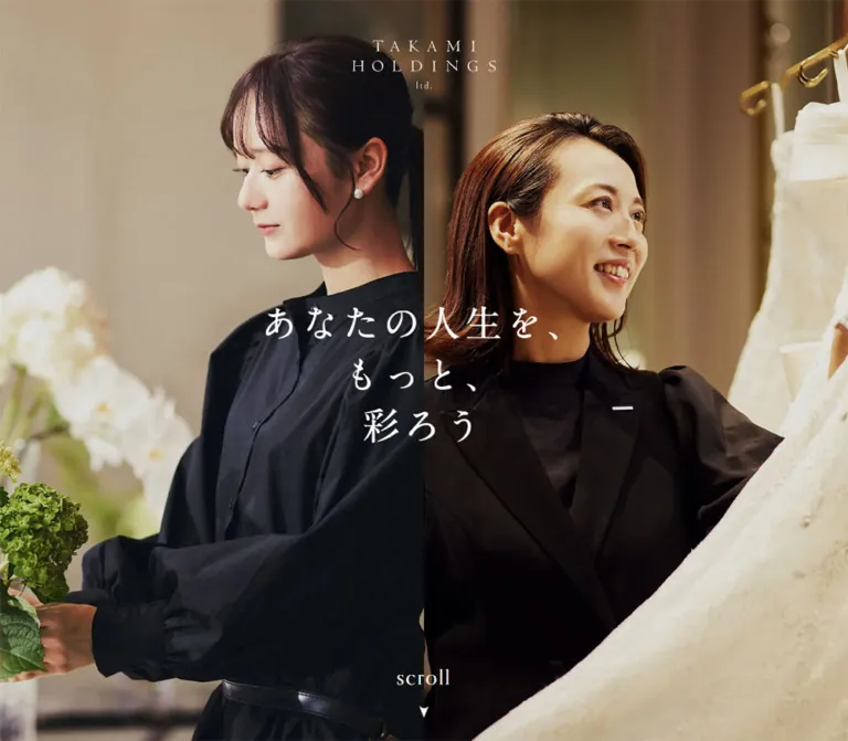
The opening is a full-screen photographic composition. At 1440px wide, a clean vertical seam near x = 720px joins two equally broad subjects: a staff member arranging flowers on the left and a staff member handling a wedding dress on the right. There is no visible gutter or decorative frame.
A white TAKAMI HOLDINGS wordmark sits near the top center. Its visible width is approximately 180px; that is an estimate from the capture, not a measured image box. The message is centered across the seam in three lines:
あなたの人生を、
もっと、
彩ろう
A small white “scroll” cue sits near the lower center. MENU and ENTRY are not visible in this opening screenshot, although their nodes appear in the broader DOM evidence.
Treat this as an observed desktop opening state. Its dismissal trigger, duration, and transition into the reading layout were not recorded.
Role: maintain the atmosphere of the workplace while detailed content is read.
The later desktop captures show a chef in a warmly lit kitchen, with the white message positioned over the broad left region. A narrow strip of the same photographic environment remains visible to the right of the white reading rail.
The chef composition is present beside both Identity and the footer. This supports visual persistence through the captured reading states, but does not prove a specific CSS position, carousel library, or automatic image cycle.
Keep faces, hands, and the work itself prominent. The photograph needs composition-aware cropping; a generic centered crop may place the subject behind the reading column.
Role: carry the full homepage information hierarchy without competing with the background photograph.
The desktop rail is narrow enough to retain almost phone-sized editorial proportions. It contains the wordmark header, section introductions, imagery, route links, people content, news, recruitment paths, and footer.
The supplied desktop document height is only 1010px, while descendant bounds extend beyond y = 6000px. Together with the changing right-column screenshots, this strongly suggests a contained desktop content scroller. The exact scroll container and event handling were not supplied.
Mobile changes to a full-width white document with a measured height of approximately 6022.09px. The Quick Start uses a desktop scrolling rail and normal mobile document flow as a practical adaptation.
Role: provide quiet brand identification at the top of the reading column.
The header is 104px high, with a 44px logo-link box between 30px top and bottom padding. The wordmark is centered and appears approximately 120px wide in the introductory captures.
The mark itself uses widely spaced capitals over a small “ltd.” line. Prefer an authorized brand asset rather than rebuilding the logo with arbitrary letter spacing. The source asset URL and format were not included.
Role: introduce the company's service philosophy.
The anatomy is:
The first heading starts at y = 136px in both measured viewports. In the mobile capture, the photograph begins near y = 520px and extends to approximately y = 755px, filling the complete 390px width. On desktop it sits inside the 398px inner rail, with an approximately 398 × 240px visible frame.
The image frame is therefore close to 5:3. This ratio is visually inferred; the original image dimensions were not supplied.
Role: provide a light, repeatable route into a section.
The measured Identity anchor is 119 × 40px, using flex layout and a 15px gap. Visually, it consists of a small coral text label and a 40px coral circle containing a tiny white right-pointing mark.
Other detail links have wider parent boxes of 348px or 340px. Those parent widths should not be interpreted as large filled buttons. The visible treatment remains a small text-and-disk composition within the available section width.
The recorded anchor color is inherited brown, while the screenshot label is coral. This is a child-style distinction: the label and disk need their own appearance rules.
Role: offer conspicuous navigation and application access against the photograph.
In the desktop reading captures, two 95px square controls sit at the lower left. MENU begins at (30, 770) and ENTRY at (30, 875) within the 1440 × 1000 viewport. This produces a 10px gap and 30px bottom clearance.
Each square has a measured #ff603f background and centered white 16px serif text. There is no visible border radius or shadow.
The mobile DOM records 60px squares at the right edge, starting at y = 100px and 162px. They are absent from the supplied mobile screenshots. Visibility conditions were not captured; do not assume they should always cover the mobile Identity section.
Both source link records point to the homepage. That alone does not reveal their scripted behavior. Opening, closing, focus movement, and application-panel operation remain unverified.
Role: continue the same editorial section rhythm into social responsibility and company information.
Sustainability begins below the Identity image, with its title visible near the bottom of the desktop content capture. Its DOM includes a Japanese subtitle, short statement, and detail link.
Business follows the same title/subtitle/description/link structure. Its measured text block is slightly narrower: 324px on desktop and 316px on mobile, inset a further 12px on each side relative to the standard text region.
Only the beginning of Sustainability is visually captured. Additional imagery, backgrounds, and decorative treatment for these sections are not established by the supplied screenshots.
Role: turn a short section introduction into clear navigation choices.
Career exposes three routes: “キャリア職コース”, “専門職・技術職コース”, and “職種について”. Recruit exposes five categories: new graduates, mid-career applicants, internships, part-time roles, and group-company recruitment.
Measured route anchors are white, 57px high, and have 3px corner rounding. Their widths are 300px on desktop and 320px on mobile, with 10px vertical gaps. The mobile links are wider despite the slightly narrower text area; preserve this observed distinction if reproducing those dimensions.
The source does not provide these controls' border or shadow properties. Do not invent a heavy card treatment. A fine boundary can be added deliberately in a new implementation if needed.
A separate set of application links exists in the DOM, including requirement pages, external entry forms, and a scout form. Its active presentation and interaction were not visually tested.
Role: introduce employees through their work, career context, and personal statements.
Five employee links are arranged horizontally in the supplied geometry. Each link is 240px wide, with consecutive x positions separated by 260px. The same width and gap appear at both inspected viewports.
Each link contains an interview title, department or role, and joining year. Measured heights range from approximately 395px to 461px, reflecting differing content lengths. This is not evidence of uniformly fixed-height cards.
The horizontal arrangement is verified. Swipe behavior, dragging, autoplay, arrows, and pagination are not. No People image bounds or image source URLs were supplied, so do not prescribe a supposedly measured portrait aspect ratio.
Role: make recruitment updates easy to scan within the narrow column.
Three dated entries are present, with dates in YYYY.MM.DD form. Each measured anchor uses a two-column grid:
130px 196px, with a 22px gap inside 348px.130px 188px, with the same gap inside 340px.25px 0.136px.The date column retains its width on mobile, leaving a deliberately narrow headline column. In a new implementation, preserve the relationship at the inspected width but allow content to determine minimum row height. Long headlines should not be clipped to force a screenshot measurement.
Role: provide a compact route to frequently asked questions.
The DOM establishes an FAQ heading, Japanese subtitle, and detail link. The heading container's measured text color is white, unlike the ordinary section headings. This suggests a contrasting treatment, but the underlying surface or image was not included in the visual evidence.
Do not invent an FAQ photograph, colored banner, or accordion for this homepage reference. The known structure is a linked teaser.
Role: end the reading experience with a complete site map, social links, policy links, and identity.
The visible two-column navigation composition corresponds to the supplied FOOTER structure. It is not evidence of a tested open-menu overlay.
Its anatomy is:
50px-high link box.75px pause before the navigation grid.The left column reads Top Page, Identity, Sustainability, Business, and Career. The right column reads People, News, FAQ, Recruit, and Contact. Link boxes are 69px high with an 85px row step, yielding 16px between rows.
Footer social circles are 40px across, separated by 24px. The white camera outline and X symbol are visually recognizable, but their source asset format is unknown.
The footer has measured padding of 75px 0 34px and a total height of 928.5px at both viewports. Keep its generous spacing rather than compressing it into a conventional dense legal strip.
The DOM also contains a distinct navigation structure with staggered transition delays. On desktop its links occupy two columns well outside the reading rail's ordinary text positions. On mobile its recorded links form a centered vertical sequence.
These bounds establish a separate layout structure, but its closed/open appearance and triggering behavior were not captured. Keep it separate from the visually confirmed two-column footer when planning an implementation.
| Treatment | Supplied evidence | What can safely be concluded |
|---|---|---|
| Body transition | 0.6s |
A transition is declared; the changing properties and visible effect are not established |
| MENU / ENTRY controls | 0.6s |
Duration is measured; hover and activation endpoints are not |
| Route links, social links, and footer links | 0.6s |
Shared transition timing is present in computed styles |
| Desktop additional navigation | 1s with delays from 0.18s to 0.9s |
Both columns use a measured stagger sequence |
| Mobile additional navigation | 1s; Identity delay 0.36s, continuing to Contact at 1.8s |
A longer sequential delay pattern exists in the sampled mobile structure |
| Photographic opening and later chef view | Different photographic states appear in screenshots | Multiple states are evidenced; timing, trigger, looping, and transition style are unknown |
| Main content and footer | Different scrolled content states with the same surrounding chef image | Persistence is visually supported; exact scrolling mechanics are not supplied |
| People track | Horizontally spaced link bounds | Horizontal layout is known; interaction method is unknown |
Bare transition: all values without a duration should not be treated as evidence of a visible animation. Sampled elements report no named keyframe animation, but this does not rule out JavaScript motion or animation on unsampled layers.
Recommended adaptation: use restrained opacity or color transitions for small controls, and preserve the measured 600ms timing only where it feels appropriate. If recreating a navigation reveal, the measured 1s duration and 180ms delay increment are useful references, but the reveal direction and transform remain design choices.
Do not claim parallax, automatic slideshow intervals, scroll snapping, drag gestures, or tested menu interactions from this evidence. The capture readiness process is not an interaction log.
| Layer | Appearance | Purpose |
|---|---|---|
| Desktop opening | Edge-to-edge photography with white typography | Establish people and service atmosphere |
| Desktop background | Warm chef photograph visible on both sides of the reading rail | Maintain context during reading |
| Reading rail | Opaque white, square boundaries | Give serif copy a quiet, consistent surface |
| Section images | Broad rectangular photographs without visible rounding | Connect the editorial text to actual workplaces |
| MENU / ENTRY | Solid coral squares | Strong navigation and application anchors |
| Detail and social marks | Small coral circles | Lightweight directional and social emphasis |
| Route links | White, slight 3px rounding in DOM |
Group practical career and recruitment destinations |
| Footer | White with one fine divider | Organize navigation without introducing a new visual theme |
No general shadow-based elevation system is visible in the supplied screenshots. Separation comes from white space, photographic boundaries, color, and a small number of rules and shapes.
The photographs make service work tangible. They emphasize faces, hands, clothing, flowers, food, and the architectural settings in which staff meet guests. Warm lighting, soft background detail, black uniforms, ivory fabric, and natural materials produce the atmosphere; the interface itself stays neutral.
The opening pairs two related but different disciplines. Later, the chef scene gives the desktop background a single strong subject. The Identity image uses architectural depth: pale columns, a patterned floor, dark lanterns, and a staff member positioned to one side of the frame.
Use natural photographic rendering. There is no visible halftone treatment, duotone recoloring, pixelation, or illustrative texture. Avoid adding a blanket sepia filter just because the interiors are warm.
No image src, background-image URL, intrinsic image dimensions, or font-file URL was included in the supplied evidence. The following are visual asset roles, not fabricated file paths.
| Asset role | Visible evidence | Reuse guidance |
|---|---|---|
| Flower-arranging workplace image | Left half of the desktop opening | Preserve the staff member, hands, and floral foreground |
| Dress-consultation image | Right half of the desktop opening | Retain the face and large ivory dress shape |
| Chef workplace image | Desktop content and footer backgrounds | Crop deliberately around the subject and reading rail |
| Hospitality-interior image | Identity section on desktop and mobile | Preserve the broad architectural frame, approximately 5:3 in the captures |
| TAKAMI HOLDINGS wordmark | Opening, header, and footer | Use authorized artwork; black and white appearances are both evidenced |
| Directional mark | Detail-link disks | A small white right-pointing form; exact asset format unknown |
| Instagram and X symbols | Footer circles | Thin white symbols centered within the coral disks |
Use supplied or authorized photographs when available. If new assets are commissioned, match the work, framing, and lighting relationships rather than substituting generic office portraits.
The opening and reading states have different hierarchies. The opening centers the logo and message across the viewport. The reading state shifts attention to a narrow rail near the right edge while leaving most of the photography exposed.
At 1440px wide, the rail occupies approximately 29.7% of the viewport, calculated from its estimated 428px width. It is not centered and is not flush to the right edge: approximately 100px of background remains beyond it.
Within the rail, the primary text area is only 348px wide. Large desktop screens therefore do not turn the section content into wide, multi-column marketing layouts. This near-mobile reading measure is a defining feature.
At 390px wide, the supplied first view contains the centered wordmark, Identity heading and copy, the circular detail link, and the full-width workplace photograph. The desktop photographic backdrop and opening message are absent from this captured state and from the mobile visible-text extract.
The inner type scale is largely retained: body style remains 16px / 25.6px, heading-container measurements match desktop, and the header stays 104px high. Responsiveness primarily changes the surrounding layout rather than shrinking all typography.
The footer remains two columns. It does not collapse into a single vertical list in the supplied mobile footer capture. The distinct additional navigation structure has different mobile geometry and must not be confused with the footer.
The mobile footer screenshot begins partway through the wordmark. This is consistent with a bottom-of-document capture, not necessarily a clipped-logo defect: 6022.09px document height minus 844px viewport height gives a maximum scroll near 5178.09px, while the footer logo link starts near 5168.59px. Its top would therefore sit approximately 9.5px above the viewport.
The exact responsive breakpoint is unknown. A 1024px breakpoint in the Quick Start is a recommended implementation choice between the two tested widths, not a recovered source rule. Tablet widths, landscape phones, zoomed layouts, and safe-area behavior were not tested.
240px People-link geometry when adapting that component.These are recommendations for a new implementation, not verified features of the original site:
40px circle while allowing at least a 44px interactive target around small actions.#ffffff.#2f2725.#ff603f.#ff7350.#ff7350 is a recommended approximation.#aaaaaa; exact border color unmeasured.“Create an editorial recruitment homepage inspired by the observed TAKAMI GROUP site. At a 1440px desktop width, place an approximately 428px white reading rail 100px from the right edge over a full-height hospitality workplace photograph. Keep a broad photographic region on the left with a short centered white Japanese message. Use regular serif English headings, Japanese Mincho body text, deep brown #2f2725, generous vertical spacing, and small coral circular detail links. Place two 95px coral #ff603f MENU and ENTRY squares at the lower left. Inside the rail, use a centered wordmark, bilingual section introductions, broad rectangular workplace images, practical route lists, a horizontal employee-link track, date-and-title news rows, and a spacious two-column footer. On mobile, make the white content full width and retain its editorial scale. Treat menu reveals and photographic transitions as unspecified behavior, and implement accessible navigation deliberately.”
This CSS recreates the principal reading layout and component relationships. It is not a source-code extraction. Exact palette values, body typography, route-link sizes, and key gaps come from measurements. The outer rail geometry, child type sizes, photograph ratio, breakpoint, focus treatment, and hover behavior are adaptations.
Place .photo-backdrop and .action-dock beside .content-lane inside .takami-reference. Put the header, editorial sections, and footer inside the lane. Supply authorized image and logo assets through ordinary image elements; no asset URLs were available to embed here.
The desktop scroller is a recommended interpretation of the observed layout. Mobile dock visibility follows the supplied screenshots by leaving that dock hidden; the footer still provides navigation. The optional opening state requires separate, accessible state handling.
:root {
  /* Measured colors */
  --color-paper: #ffffff;
  --color-ink: #2f2725;
  --color-action: #ff603f;
  --color-social: #ff7350;
  --color-on-photo: #ffffff;

  /* Visual estimate and recommended CTA approximation */
  --color-rule: #aaaaaa;
  --color-detail: var(--color-social);

  /* Declared source stack; font files must be supplied separately */
  --font-editorial: 'garamond-premier-pro',
    'MFW-PA1MinchoStdN-Regular', serif;
  --text-body: 16px;
  --leading-body: 1.6;
  --tracking-body: 0.8px;
  --weight-regular: 400;

  /* Estimated child text sizes */
  --text-section: 35px;
  --text-caption: 12px;
  --text-footer-link: 21px;
  --text-copyright: 10px;

  /* Measured spacing relationships */
  --space-stack: 10px;
  --space-detail: 15px;
  --space-track: 20px;
  --space-social: 24px;
  --space-inset: 25px;
  --space-header: 30px;
  --space-footer: 75px;

  /* Geometry */
  --rail-width: 428px;
  --rail-gutter: 15px;
  --circle-size: 40px;
  --route-height: 57px;
  --route-radius: 3px;
  --people-width: 240px;
  --dock-size: 95px;

  /* Measured durations; transition properties below are adaptations */
  --duration-ui: 600ms;
  --duration-menu: 1000ms;
  --delay-menu-step: 180ms;
}

.takami-reference,
.takami-reference * {
  box-sizing: border-box;
}

body {
  margin: 0;
}

.takami-reference {
  min-height: 100svh;
  color: var(--color-ink);
  background: var(--color-paper);
  font-family: var(--font-editorial);
  font-size: var(--text-body);
  font-weight: var(--weight-regular);
  line-height: var(--leading-body);
  letter-spacing: var(--tracking-body);
}

.takami-reference a {
  color: inherit;
  text-decoration: none;
}

.takami-reference button {
  font: inherit;
  letter-spacing: inherit;
}

.takami-reference img {
  display: block;
  max-width: 100%;
}

.photo-backdrop,
.action-dock,
.opening {
  display: none;
}

.content-lane {
  width: 100%;
  background: var(--color-paper);
}

.brand-header {
  display: grid;
  place-items: center;
  height: 104px;
  padding-block: var(--space-header);
}

.brand-header a {
  display: grid;
  place-items: center;
  min-height: 44px;
}

.brand-header img {
  width: 120px;
  height: 44px;
  object-fit: contain;
}

.section-inset {
  padding-inline: var(--space-inset);
}

.editorial-section {
  padding-block: 75px;
  text-align: center;
}

.identity-section {
  padding-top: 32px;
  padding-bottom: 0;
}

.section-title {
  margin: 0;
  font-size: var(--text-section);
  font-weight: 400;
  line-height: 1.75;
  letter-spacing: 0.08em;
}

.section-label {
  margin: 0;
  font-size: var(--text-caption);
  line-height: 21px;
}

.identity-copy {
  margin-top: 28px;
  font-size: 16px;
  line-height: 2.1;
}

.identity-copy p {
  margin: 0;
}

.identity-copy p + p {
  margin-top: 32px;
}

.takami-reference .detail-link {
  display: inline-flex;
  align-items: center;
  justify-content: center;
  gap: var(--space-detail);
  min-height: 44px;
  margin-top: 24px;
  color: var(--color-detail);
  font-size: var(--text-caption);
}

.detail-disk {
  display: grid;
  place-items: center;
  flex: 0 0 var(--circle-size);
  width: var(--circle-size);
  height: var(--circle-size);
  border-radius: 50%;
  background: var(--color-detail);
}

/* Recommended CSS approximation of the small directional mark */
.detail-disk::before {
  content: '';
  width: 0;
  height: 0;
  margin-left: 2px;
  border-top: 4px solid transparent;
  border-bottom: 4px solid transparent;
  border-left: 8px solid var(--color-on-photo);
}

.section-photo {
  width: 100%;
  height: auto;
  margin-top: 40px;
  aspect-ratio: 5 / 3;
  object-fit: cover;
}

.route-list {
  display: grid;
  gap: var(--space-stack);
  width: min(320px, 100%);
  margin: 32px auto 0;
  padding: 0;
  list-style: none;
}

.route-link {
  display: flex;
  align-items: center;
  justify-content: center;
  min-height: var(--route-height);
  padding: 10px 16px;
  border-radius: var(--route-radius);
  background: var(--color-paper);
}

/* A deliberate addition; the source border was not measured */
.route-link {
  border: 1px solid var(--color-rule);
}

.people-track {
  display: flex;
  gap: var(--space-track);
  margin: 32px 0 0;
  padding: 0 25px 12px;
  overflow-x: auto;
  list-style: none;
}

.people-track > li {
  flex: 0 0 var(--people-width);
  min-width: 0;
}

.people-link {
  display: block;
  text-align: left;
}

.people-link img {
  width: 100%;
  height: auto;
}

.news-list {
  margin: 28px 0 0;
  padding: 0;
  list-style: none;
}

.news-link {
  display: grid;
  grid-template-columns: 130px minmax(0, 1fr);
  gap: 22px;
  min-height: 136px;
  padding-block: 25px;
  text-align: left;
}

.news-link time {
  white-space: nowrap;
}

.news-link > span {
  min-width: 0;
  overflow-wrap: anywhere;
}

.site-footer {
  padding: 75px 25px 34px;
  text-align: center;
}

.footer-brand {
  display: grid;
  place-items: center;
  height: 50px;
}

.footer-brand img {
  width: 150px;
  height: 50px;
  object-fit: contain;
}

.footer-nav {
  display: grid;
  grid-template-columns: repeat(2, minmax(0, 1fr));
  gap: 16px 30px;
  margin: 75px 20px 0;
  padding: 0;
  list-style: none;
  text-align: left;
}

.footer-nav a {
  display: block;
  min-height: 69px;
}

.footer-nav .label-en {
  display: block;
  font-size: var(--text-footer-link);
  line-height: 1.6;
  letter-spacing: 0.08em;
}

.footer-nav .label-ja {
  display: block;
  margin-top: 4px;
  font-size: var(--text-caption);
  line-height: 21px;
}

.footer-rule {
  margin: 36px 0 50px;
  border: 0;
  border-top: 1px solid var(--color-rule);
}

.footer-social {
  display: flex;
  justify-content: center;
  gap: var(--space-social);
}

.takami-reference .social-link {
  display: grid;
  place-items: center;
  width: var(--circle-size);
  height: var(--circle-size);
  border-radius: 50%;
  color: var(--color-on-photo);
  background: var(--color-social);
}

.social-link svg {
  width: 18px;
  height: 18px;
}

.footer-policies {
  display: grid;
  justify-items: center;
  gap: 6px;
  margin-top: 36px;
  font-size: var(--text-caption);
  line-height: 21px;
}

.footer-copyright {
  margin: 32px 0 0;
  font-size: var(--text-copyright);
  line-height: 15px;
  letter-spacing: 0.08em;
}

/* Recommended breakpoint; only 390px and 1440px were inspected */
@media (min-width: 1024px) {
  .photo-backdrop {
    position: fixed;
    inset: 0;
    display: block;
  }

  .photo-backdrop > img {
    width: 100%;
    height: 100%;
    object-fit: cover;
    object-position: var(--scene-focus, center);
  }

  .backdrop-message {
    position: absolute;
    top: 50%;
    left: 33.333%;
    width: max-content;
    margin: 0;
    transform: translate(-50%, -50%);
    color: var(--color-on-photo);
    font-size: 34px;
    line-height: 1.5;
    letter-spacing: 0.12em;
    text-align: center;
  }

  .content-lane {
    position: fixed;
    z-index: 1;
    inset-block: 0;
    right: clamp(24px, 6.944vw, 100px);
    width: var(--rail-width);
    padding-inline: var(--rail-gutter);
    overflow-y: auto;
  }

  .action-dock {
    position: fixed;
    z-index: 2;
    left: 30px;
    bottom: 30px;
    display: grid;
    gap: var(--space-stack);
  }

  .action-dock > :is(a, button) {
    display: grid;
    place-items: center;
    width: var(--dock-size);
    height: var(--dock-size);
    padding: 0;
    border: 0;
    border-radius: 0;
    color: var(--color-on-photo);
    background: var(--color-action);
    cursor: pointer;
  }

  .route-list {
    width: min(300px, 100%);
  }

  /* Optional opening layout; state changes require separate logic */
  .opening:not([hidden]) {
    position: fixed;
    z-index: 10;
    inset: 0;
    display: grid;
    grid-template-columns: 1fr 1fr;
    background: var(--color-ink);
  }

  .opening-photo {
    width: 100%;
    height: 100%;
    min-width: 0;
    object-fit: cover;
  }

  .opening-logo {
    position: absolute;
    top: 50px;
    left: 50%;
    width: 180px;
    transform: translateX(-50%);
  }

  .opening-message {
    position: absolute;
    top: 50%;
    left: 50%;
    width: max-content;
    margin: 0;
    transform: translate(-50%, -50%);
    color: var(--color-on-photo);
    font-size: 46px;
    line-height: 1.35;
    letter-spacing: 0.12em;
    text-align: center;
  }

  .opening-scroll {
    position: absolute;
    bottom: 60px;
    left: 50%;
    transform: translateX(-50%);
    color: var(--color-on-photo);
    font-size: 24px;
  }
}

/* Recommended interaction treatment, not observed hover endpoints */
@media (hover: hover) {
  .detail-link,
  .route-link,
  .footer-nav a,
  .social-link {
    transition: opacity var(--duration-ui) ease;
  }

  .detail-link:hover,
  .route-link:hover,
  .footer-nav a:hover,
  .social-link:hover {
    opacity: 0.75;
  }
}

.takami-reference :focus-visible {
  outline: 2px solid var(--color-ink);
  outline-offset: 4px;
}

.action-dock :focus-visible {
  outline-color: var(--color-on-photo);
  box-shadow: 0 0 0 6px var(--color-ink);
}

@media (prefers-reduced-motion: reduce) {
  .takami-reference *,
  .takami-reference *::before,
  .takami-reference *::after {
    transition: none !important;
    animation: none !important;
    scroll-behavior: auto !important;
  }
}
This example uses a source label and destination, with a recommended section-specific accessible name. Add the authorized section photograph after the inset block using the .section-photo class.
<section class="editorial-section identity-section"
         aria-labelledby="identity-title">
  <div class="section-inset">
    <h2 class="section-title" id="identity-title">Identity</h2>
    <p class="section-label" lang="ja">企業理念</p>

    <div class="identity-copy" lang="ja">
      <p>人生の節目に、<br>替えのきかない体験を。</p>
      <p>届けるなら、<br>最高だけを。</p>
    </div>

    <a class="detail-link"
       href="https://recruit.takami-hd.com/identity/"
       aria-label="Read more about Identity">
      <span lang="ja">詳細を見る</span>
      <span class="detail-disk" aria-hidden="true"></span>
    </a>
  </div>
</section>
The opening CSS defines appearance only. If an opening is shown, make it dismissible, prevent hidden content from receiving focus, and restore access to the reading rail. Do not infer an automatic timeout from these styles.
Optional aliases for a project already using Tailwind v4. This is not evidence that the original site uses Tailwind. The section-heading size and rule color retain their estimated status.
@theme inline {
  --color-paper: #ffffff;
  --color-ink: #2f2725;
  --color-action: #ff603f;
  --color-social: #ff7350;
  --color-rule: #aaaaaa;

  --font-editorial: 'garamond-premier-pro',
    'MFW-PA1MinchoStdN-Regular', serif;

  --text-body: 16px;
  --text-section: 35px;
  --text-caption: 12px;
  --text-footer-link: 21px;
  --text-copyright: 10px;

  --spacing-inset: 25px;
  --spacing-rail: 428px;
  --spacing-rail-gutter: 15px;
  --spacing-people: 240px;
  --spacing-circle: 40px;
  --spacing-dock: 95px;

  --radius-route: 3px;
}
200. Browser evidence was retrieved on September 22, 2026 at 14:32:08.264Z.This document describes the current homepage represented by the supplied original-page evidence. The reusable CSS preserves its defining visual relationships while explicitly separating measured values, visual estimates, and recommended implementation choices.
# TAKAMI GROUP Recruitment — Style Reference

> A slim white editorial column set against warm, full-height portraits of hospitality at work.

**Website:** [recruit.takami-hd.com](https://recruit.takami-hd.com/)
**Original URL:** https://recruit.takami-hd.com/
**Final URL:** https://recruit.takami-hd.com/
**Theme:** white surfaces, deep brown typography, coral controls, and warm workplace photography.
**Inspected:** September 22, 2026, from the supplied browser evidence retrieved at 14:32:08 UTC / 23:32:08 JST.
**Viewports:** desktop 1440 × 1000 CSS pixels; mobile 390 × 844 CSS pixels.
**Scope:** the current recruitment homepage. Visual evidence covers the desktop photographic opening, the Identity section and beginning of Sustainability, the desktop footer, and mobile Identity and footer views. Rendered DOM evidence additionally covers Business, Career, People, News, FAQ, Recruit, and navigation/application link structures. Destination pages and application forms were not inspected.

The site presents recruitment through the atmosphere of hospitality: arranging flowers, selecting a wedding dress, preparing food, and welcoming guests. Large photographs establish warmth and professional attention. A restrained white column carries the detailed information, using serif English titles, Japanese Mincho text, small coral arrows, and unusually generous vertical pauses.

Desktop has two distinct visual states in the supplied captures. The opening fills the screen with two adjoining workplace photographs and a centered white message. Subsequent views place a narrow white reading column toward the right over a chef photograph that remains visible beside both the introductory content and footer. Mobile retains the editorial column at full viewport width; its captured first view starts with the wordmark and Identity section.

The document title is “TAKAMI GROUP 採用サイト”; the visible wordmark and footer use TAKAMI HOLDINGS. Preserve this observed distinction when describing the source identity.
# TAKAMI GROUP Recruitment — Style Reference

> A slim white editorial column set against warm, full-height portraits of hospitality at work.

**Website:** [recruit.takami-hd.com](https://recruit.takami-hd.com/)
**Original URL:** https://recruit.takami-hd.com/
**Final URL:** https://recruit.takami-hd.com/
**Theme:** white surfaces, deep brown typography, coral controls, and warm workplace photography.
**Inspected:** September 22, 2026, from the supplied browser evidence retrieved at 14:32:08 UTC / 23:32:08 JST.
**Viewports:** desktop 1440 × 1000 CSS pixels; mobile 390 × 844 CSS pixels.
**Scope:** the current recruitment homepage. Visual evidence covers the desktop photographic opening, the Identity section and beginning of Sustainability, the desktop footer, and mobile Identity and footer views. Rendered DOM evidence additionally covers Business, Career, People, News, FAQ, Recruit, and navigation/application link structures. Destination pages and application forms were not inspected.

The site presents recruitment through the atmosphere of hospitality: arranging flowers, selecting a wedding dress, preparing food, and welcoming guests. Large photographs establish warmth and professional attention. A restrained white column carries the detailed information, using serif English titles, Japanese Mincho text, small coral arrows, and unusually generous vertical pauses.

Desktop has two distinct visual states in the supplied captures. The opening fills the screen with two adjoining workplace photographs and a centered white message. Subsequent views place a narrow white reading column toward the right over a chef photograph that remains visible beside both the introductory content and footer. Mobile retains the editorial column at full viewport width; its captured first view starts with the wordmark and Identity section.

The document title is “TAKAMI GROUP 採用サイト”; the visible wordmark and footer use TAKAMI HOLDINGS. Preserve this observed distinction when describing the source identity.

## How to Read This Reference

- **Measured** means a value appears in the supplied rendered DOM or computed-style extract. Coordinates belong to the sampled state, which may differ from an attached screenshot.
- **Visual estimate** means a dimension or appearance is inferred from the original-page screenshots. Such values are approximate and are not recovered stylesheet declarations.
- **Calculated** means arithmetic applied to measured bounds, such as the gap between consecutive links.
- **Recommended** means an implementation choice for reusing the design. The CSS below is an adaptation, not the original source code.
- All named custom properties are descriptive aliases. No reusable source design-token system was provided.
- Computed styles on a parent do not establish the styles of unsampled child text. This particularly affects English section titles, Japanese captions, and CTA labels.
- The supplied DOM includes navigation structures that are not visibly open in the screenshots. Their existence and transition declarations do not prove that their interactions were exercised.

## Tokens — Colors

### Default Palette

| Name | Value | Suggested token | Evidence and role |
| --- | --- | --- | --- |
| Editorial White | `#ffffff` | `--color-paper` | Measured main background and route-link fill; visually the reading column and mobile canvas |
| Deep Brown | `#2f2725` | `--color-ink` | Measured body, heading-container, navigation, and link text color |
| Action Coral | `#ff603f` | `--color-action` | Measured fill of the square MENU and ENTRY controls |
| Social Coral | `#ff7350` | `--color-social` | Measured fill of Instagram and X link circles |
| Reversed White | `#ffffff` | `--color-on-photo` | Measured dock-label color; visually also the opening wordmark, photographic message, and scroll cue |
| Fine Gray Rule | Approximately `#aaaaaa` | `--color-rule` | Visual estimate from the footer divider; its computed border color was not supplied |

The two measured corals have different roles. Keep the stronger `#ff603f` for the square navigation/application controls and `#ff7350` for social circles. The detail-link disks also appear coral, but their own computed fill was not included. Using Social Coral for those disks is a recommended approximation, not a measured equivalence.

### Color Hierarchy

Most interface area is white. Brown typography supplies the structure, and coral marks a small number of actions. The cream, gold, olive, wood brown, and near-black tones belong primarily to photography; they are not evidence of additional page-background tokens.

There is no visible gradient, glass layer, or broad tinted-card system in the supplied views. No selectable theme or dark-mode behavior was evidenced.

## Tokens — Typography

### Declared Serif Stack

The measured body family is:

```css
font-family: garamond-premier-pro, MFW-PA1MinchoStdN-Regular, serif;
```

This is direct evidence of the declared family names. It does not independently verify which font files loaded or which face rendered every glyph.

The stack pairs refined Latin serif typography with Japanese Mincho text. English headings are open and gently tracked; Japanese copy remains light in appearance, with comfortable line spacing. The sampled weight is `400`, so do not substitute an invented light-font weight to reproduce the delicacy.

### Body and Utility Text

Measured body values are `16px`, weight `400`, line height `25.6px`, and letter spacing `0.8px`. These correspond to a `1.6` line-height ratio and `0.05em` tracking at the measured body size.

MENU and ENTRY have the same measured type values. They use uppercase text centered in square coral fields, without an accompanying hamburger or arrow in the visible desktop controls.

The HTML root is measured at `10px`. This is a source implementation detail, not a requirement for a new project. The Quick Start uses explicit pixel dimensions and leaves the application's root size alone.

### Type Scale

| Role | Measured evidence | Visible appearance or recommended approximation |
| --- | --- | --- |
| Body and general link containers | `16px / 25.6px`, `400`, `0.8px` tracking | Use as the reliable base style |
| MENU / ENTRY labels | `16px / 25.6px`, `400`, `0.8px` tracking | Regular serif capitals |
| Section H2 containers | `24px / 38.4px`; actual measured box height `61.25px` | Child title styles are unsampled; the visible English title looks approximately `32–36px` |
| English section title | No child-level computed style supplied | Recommended `35px / 1.75`, regular weight, modest tracking; its line box is `61.25px` |
| Japanese section subtitle | Child styles not supplied | Visual estimate `12–14px`, centered beneath the English title |
| Identity message | Paragraph styles not supplied separately | Visual estimate `16–18px`, with roughly `32–34px` between lines |
| Opening photographic message | No direct text-style measurement | Visual estimate `44–48px` on the 1440px-wide opening |
| Message beside the reading column | No direct text-style measurement | Visual estimate `32–36px`, in three centered lines |
| Detail-link label | Parent anchor is `16px`; child style unknown | Visible label approximately `12–13px` |
| Footer English navigation | Parent anchor is `16px`; child style unknown | Visible label approximately `20–22px` |
| Footer Japanese navigation and policy links | Child styles unknown | Visible labels approximately `12px` |
| Copyright | No direct text-style measurement | Visual estimate `10–11px`, tracked capitals and numerals |

Do not use the hidden or unsampled H1's `32px` measurement as the photographic slogan size. Likewise, do not force all footer text to `16px` simply because that value appears on its parent links.

### Typographic Composition

The Identity heading, subtitle, message, and CTA all share a central axis. Its message uses deliberate short lines and a stanza break:

> 人生の節目に、
> 替えのきかない体験を。
>
> 届けるなら、
> 最高だけを。

The footer changes to left-aligned bilingual link pairs within two columns. English provides the larger navigational signpost; Japanese clarifies the destination below it.

## Tokens — Spacing & Shapes

**Density:** spacious editorial content in a narrow column, with compact but clearly separated navigation details.

**Shape language:** square photographic edges and square primary controls, small circular directional/social marks, and only slight rounding on route links.

### Spacing Scale

These values describe observed uses rather than a proven universal source spacing scale.

| Value | Evidence | Use |
| --- | --- | --- |
| `2px` | Calculated from mobile control bounds | Gap between the two mobile dock positions recorded in the DOM |
| `10px` | Calculated | Desktop dock gap; vertical gap between Career and Recruit route links |
| `15px` | Measured or visually inferred by role | Detail-link gap is measured; outer desktop rail gutter is inferred from screenshot and content bounds |
| `16px` | Calculated | Vertical gap between footer link boxes |
| `20px` | Calculated | Gap between 240px People links; additional footer navigation inset |
| `24px` | Calculated | Gap between the 40px footer social circles |
| `25px` | Calculated/measured | Main text inset; News row vertical padding |
| `30px` | Measured/calculated | Header top and bottom padding; desktop dock left and bottom offsets; approximate footer column gap |
| `32px` | Calculated | Header end at `104px` to first H2 top at `136px` |
| `75px` | Measured/calculated | Footer top padding and the gap between its logo link and navigation grid |

### Border Radius

| Element | Value | Evidence |
| --- | --- | --- |
| MENU / ENTRY squares | `0` | Measured |
| General links and footer navigation | `0` | Measured |
| Career and Recruit route links | `3px` | Measured |
| Social links | `50%` | Measured |
| Photographs | Visually square corners | Screenshot observation |
| Detail-link disk | Circle | Screenshot observation; approximately `40px` diameter |

### Layout Measurements

| Element | Desktop 1440 × 1000 | Mobile 390 × 844 | Status |
| --- | --- | --- | --- |
| White reading rail | Approximately `428px` wide, from x ≈ `912` to `1340` | Full `390px` width | Desktop outer boundary is a visual estimate |
| Inner rail/header width | `398px`, x = `927` | `390px`, x = `0` | Measured |
| Standard text width | `348px`, x = `952` | `340px`, x = `25` | Measured |
| Background strip to the rail's right | Approximately `100px` | Not visible | Visual estimate |
| Header | `104px` high; `30px` vertical padding | Same | Measured |
| Header logo link | `44px` high | `44px` high | Measured link box, not intrinsic artwork size |
| Identity H2 top | y = `136px` | y = `136px` | Measured |
| Identity detail link | `119 × 40px` | `119 × 40px` | Measured |
| MENU / ENTRY | Each `95 × 95px`, x = `30px` | Each `60 × 60px`, x = `330px` | Mobile bounds exist in DOM but controls are not visible in supplied mobile captures |
| Career / Recruit route links | `300 × 57px` | `320 × 57px` | Measured |
| People link width | `240px` | `240px` | Measured |
| People link horizontal step | `260px` | `260px` | Calculated; implies `20px` gap |
| Footer social circles | `40 × 40px` | `40 × 40px` | Measured |
| Footer | `398 × 928.5px` | `390 × 928.5px` | Measured |

A useful desktop reconstruction is `428px outer rail − 15px gutters on each side = 398px inner rail`, followed by another `25px` on each side for a `348px` text area. The corresponding mobile text area is `390 − 50 = 340px`.

These are captured relationships, not a recovered breakpoint formula. Some states also differ: the desktop DOM records the Identity detail anchor at y ≈ `420.13px`, while its visible disk in the supplied content screenshot begins near y = `440px`. Do not combine every coordinate into a supposedly exact, synchronized layout record.

## Components

### Desktop Photographic Opening

**Role:** establish the people, craft, and emotional tone of the recruitment site.

The opening is a full-screen photographic composition. At 1440px wide, a clean vertical seam near x = `720px` joins two equally broad subjects: a staff member arranging flowers on the left and a staff member handling a wedding dress on the right. There is no visible gutter or decorative frame.

A white TAKAMI HOLDINGS wordmark sits near the top center. Its visible width is approximately `180px`; that is an estimate from the capture, not a measured image box. The message is centered across the seam in three lines:

> あなたの人生を、
> もっと、
> 彩ろう

A small white “scroll” cue sits near the lower center. MENU and ENTRY are not visible in this opening screenshot, although their nodes appear in the broader DOM evidence.

Treat this as an observed desktop opening state. Its dismissal trigger, duration, and transition into the reading layout were not recorded.

### Persistent Photographic Background

**Role:** maintain the atmosphere of the workplace while detailed content is read.

The later desktop captures show a chef in a warmly lit kitchen, with the white message positioned over the broad left region. A narrow strip of the same photographic environment remains visible to the right of the white reading rail.

The chef composition is present beside both Identity and the footer. This supports visual persistence through the captured reading states, but does not prove a specific CSS `position`, carousel library, or automatic image cycle.

Keep faces, hands, and the work itself prominent. The photograph needs composition-aware cropping; a generic centered crop may place the subject behind the reading column.

### White Reading Rail

**Role:** carry the full homepage information hierarchy without competing with the background photograph.

The desktop rail is narrow enough to retain almost phone-sized editorial proportions. It contains the wordmark header, section introductions, imagery, route links, people content, news, recruitment paths, and footer.

The supplied desktop document height is only `1010px`, while descendant bounds extend beyond y = `6000px`. Together with the changing right-column screenshots, this strongly suggests a contained desktop content scroller. The exact scroll container and event handling were not supplied.

Mobile changes to a full-width white document with a measured height of approximately `6022.09px`. The Quick Start uses a desktop scrolling rail and normal mobile document flow as a practical adaptation.

### Wordmark Header

**Role:** provide quiet brand identification at the top of the reading column.

The header is `104px` high, with a `44px` logo-link box between `30px` top and bottom padding. The wordmark is centered and appears approximately `120px` wide in the introductory captures.

The mark itself uses widely spaced capitals over a small “ltd.” line. Prefer an authorized brand asset rather than rebuilding the logo with arbitrary letter spacing. The source asset URL and format were not included.

### Identity Section

**Role:** introduce the company's service philosophy.

The anatomy is:

1. A centered English section title.
2. A smaller Japanese subtitle, “企業理念”.
3. Two short, two-line Japanese stanzas with substantial space between them.
4. A centered “詳細を見る” link with a small coral directional disk.
5. A wide photograph of a staff member in a columned hospitality interior.

The first heading starts at y = `136px` in both measured viewports. In the mobile capture, the photograph begins near y = `520px` and extends to approximately y = `755px`, filling the complete `390px` width. On desktop it sits inside the `398px` inner rail, with an approximately `398 × 240px` visible frame.

The image frame is therefore close to `5:3`. This ratio is visually inferred; the original image dimensions were not supplied.

### Detail Link

**Role:** provide a light, repeatable route into a section.

The measured Identity anchor is `119 × 40px`, using flex layout and a `15px` gap. Visually, it consists of a small coral text label and a `40px` coral circle containing a tiny white right-pointing mark.

Other detail links have wider parent boxes of `348px` or `340px`. Those parent widths should not be interpreted as large filled buttons. The visible treatment remains a small text-and-disk composition within the available section width.

The recorded anchor color is inherited brown, while the screenshot label is coral. This is a child-style distinction: the label and disk need their own appearance rules.

### MENU / ENTRY Dock

**Role:** offer conspicuous navigation and application access against the photograph.

In the desktop reading captures, two `95px` square controls sit at the lower left. MENU begins at `(30, 770)` and ENTRY at `(30, 875)` within the `1440 × 1000` viewport. This produces a `10px` gap and `30px` bottom clearance.

Each square has a measured `#ff603f` background and centered white `16px` serif text. There is no visible border radius or shadow.

The mobile DOM records `60px` squares at the right edge, starting at y = `100px` and `162px`. They are absent from the supplied mobile screenshots. Visibility conditions were not captured; do not assume they should always cover the mobile Identity section.

Both source link records point to the homepage. That alone does not reveal their scripted behavior. Opening, closing, focus movement, and application-panel operation remain unverified.

### Sustainability and Business Introductions

**Role:** continue the same editorial section rhythm into social responsibility and company information.

Sustainability begins below the Identity image, with its title visible near the bottom of the desktop content capture. Its DOM includes a Japanese subtitle, short statement, and detail link.

Business follows the same title/subtitle/description/link structure. Its measured text block is slightly narrower: `324px` on desktop and `316px` on mobile, inset a further `12px` on each side relative to the standard text region.

Only the beginning of Sustainability is visually captured. Additional imagery, backgrounds, and decorative treatment for these sections are not established by the supplied screenshots.

### Career and Recruitment Route Lists

**Role:** turn a short section introduction into clear navigation choices.

Career exposes three routes: “キャリア職コース”, “専門職・技術職コース”, and “職種について”. Recruit exposes five categories: new graduates, mid-career applicants, internships, part-time roles, and group-company recruitment.

Measured route anchors are white, `57px` high, and have `3px` corner rounding. Their widths are `300px` on desktop and `320px` on mobile, with `10px` vertical gaps. The mobile links are wider despite the slightly narrower text area; preserve this observed distinction if reproducing those dimensions.

The source does not provide these controls' border or shadow properties. Do not invent a heavy card treatment. A fine boundary can be added deliberately in a new implementation if needed.

A separate set of application links exists in the DOM, including requirement pages, external entry forms, and a scout form. Its active presentation and interaction were not visually tested.

### People Link Track

**Role:** introduce employees through their work, career context, and personal statements.

Five employee links are arranged horizontally in the supplied geometry. Each link is `240px` wide, with consecutive x positions separated by `260px`. The same width and gap appear at both inspected viewports.

Each link contains an interview title, department or role, and joining year. Measured heights range from approximately `395px` to `461px`, reflecting differing content lengths. This is not evidence of uniformly fixed-height cards.

The horizontal arrangement is verified. Swipe behavior, dragging, autoplay, arrows, and pagination are not. No People image bounds or image source URLs were supplied, so do not prescribe a supposedly measured portrait aspect ratio.

### News Rows

**Role:** make recruitment updates easy to scan within the narrow column.

Three dated entries are present, with dates in `YYYY.MM.DD` form. Each measured anchor uses a two-column grid:

- Desktop: `130px 196px`, with a `22px` gap inside `348px`.
- Mobile: `130px 188px`, with the same gap inside `340px`.
- Vertical padding: `25px 0`.
- Captured row height: `136px`.

The date column retains its width on mobile, leaving a deliberately narrow headline column. In a new implementation, preserve the relationship at the inspected width but allow content to determine minimum row height. Long headlines should not be clipped to force a screenshot measurement.

### FAQ Teaser

**Role:** provide a compact route to frequently asked questions.

The DOM establishes an FAQ heading, Japanese subtitle, and detail link. The heading container's measured text color is white, unlike the ordinary section headings. This suggests a contrasting treatment, but the underlying surface or image was not included in the visual evidence.

Do not invent an FAQ photograph, colored banner, or accordion for this homepage reference. The known structure is a linked teaser.

### Footer Navigation

**Role:** end the reading experience with a complete site map, social links, policy links, and identity.

The visible two-column navigation composition corresponds to the supplied FOOTER structure. It is not evidence of a tested open-menu overlay.

Its anatomy is:

1. A centered wordmark within a `50px`-high link box.
2. A `75px` pause before the navigation grid.
3. Five rows of bilingual links in two columns.
4. A thin gray horizontal divider.
5. Centered Instagram and X circles.
6. Three centered policy/corporate links.
7. Small, tracked copyright text.

The left column reads Top Page, Identity, Sustainability, Business, and Career. The right column reads People, News, FAQ, Recruit, and Contact. Link boxes are `69px` high with an `85px` row step, yielding `16px` between rows.

Footer social circles are `40px` across, separated by `24px`. The white camera outline and X symbol are visually recognizable, but their source asset format is unknown.

The footer has measured padding of `75px 0 34px` and a total height of `928.5px` at both viewports. Keep its generous spacing rather than compressing it into a conventional dense legal strip.

### Additional Navigation Structure

The DOM also contains a distinct navigation structure with staggered transition delays. On desktop its links occupy two columns well outside the reading rail's ordinary text positions. On mobile its recorded links form a centered vertical sequence.

These bounds establish a separate layout structure, but its closed/open appearance and triggering behavior were not captured. Keep it separate from the visually confirmed two-column footer when planning an implementation.

## Tokens — Motion & Interaction

| Treatment | Supplied evidence | What can safely be concluded |
| --- | --- | --- |
| Body transition | `0.6s` | A transition is declared; the changing properties and visible effect are not established |
| MENU / ENTRY controls | `0.6s` | Duration is measured; hover and activation endpoints are not |
| Route links, social links, and footer links | `0.6s` | Shared transition timing is present in computed styles |
| Desktop additional navigation | `1s` with delays from `0.18s` to `0.9s` | Both columns use a measured stagger sequence |
| Mobile additional navigation | `1s`; Identity delay `0.36s`, continuing to Contact at `1.8s` | A longer sequential delay pattern exists in the sampled mobile structure |
| Photographic opening and later chef view | Different photographic states appear in screenshots | Multiple states are evidenced; timing, trigger, looping, and transition style are unknown |
| Main content and footer | Different scrolled content states with the same surrounding chef image | Persistence is visually supported; exact scrolling mechanics are not supplied |
| People track | Horizontally spaced link bounds | Horizontal layout is known; interaction method is unknown |

Bare `transition: all` values without a duration should not be treated as evidence of a visible animation. Sampled elements report no named keyframe animation, but this does not rule out JavaScript motion or animation on unsampled layers.

**Recommended adaptation:** use restrained opacity or color transitions for small controls, and preserve the measured `600ms` timing only where it feels appropriate. If recreating a navigation reveal, the measured `1s` duration and `180ms` delay increment are useful references, but the reveal direction and transform remain design choices.

Do not claim parallax, automatic slideshow intervals, scroll snapping, drag gestures, or tested menu interactions from this evidence. The capture readiness process is not an interaction log.

## Surfaces

| Layer | Appearance | Purpose |
| --- | --- | --- |
| Desktop opening | Edge-to-edge photography with white typography | Establish people and service atmosphere |
| Desktop background | Warm chef photograph visible on both sides of the reading rail | Maintain context during reading |
| Reading rail | Opaque white, square boundaries | Give serif copy a quiet, consistent surface |
| Section images | Broad rectangular photographs without visible rounding | Connect the editorial text to actual workplaces |
| MENU / ENTRY | Solid coral squares | Strong navigation and application anchors |
| Detail and social marks | Small coral circles | Lightweight directional and social emphasis |
| Route links | White, slight `3px` rounding in DOM | Group practical career and recruitment destinations |
| Footer | White with one fine divider | Organize navigation without introducing a new visual theme |

No general shadow-based elevation system is visible in the supplied screenshots. Separation comes from white space, photographic boundaries, color, and a small number of rules and shapes.

## Imagery

The photographs make service work tangible. They emphasize faces, hands, clothing, flowers, food, and the architectural settings in which staff meet guests. Warm lighting, soft background detail, black uniforms, ivory fabric, and natural materials produce the atmosphere; the interface itself stays neutral.

The opening pairs two related but different disciplines. Later, the chef scene gives the desktop background a single strong subject. The Identity image uses architectural depth: pale columns, a patterned floor, dark lanterns, and a staff member positioned to one side of the frame.

Use natural photographic rendering. There is no visible halftone treatment, duotone recoloring, pixelation, or illustrative texture. Avoid adding a blanket sepia filter just because the interiors are warm.

### Observed Asset References

No image `src`, background-image URL, intrinsic image dimensions, or font-file URL was included in the supplied evidence. The following are visual asset roles, not fabricated file paths.

| Asset role | Visible evidence | Reuse guidance |
| --- | --- | --- |
| Flower-arranging workplace image | Left half of the desktop opening | Preserve the staff member, hands, and floral foreground |
| Dress-consultation image | Right half of the desktop opening | Retain the face and large ivory dress shape |
| Chef workplace image | Desktop content and footer backgrounds | Crop deliberately around the subject and reading rail |
| Hospitality-interior image | Identity section on desktop and mobile | Preserve the broad architectural frame, approximately `5:3` in the captures |
| TAKAMI HOLDINGS wordmark | Opening, header, and footer | Use authorized artwork; black and white appearances are both evidenced |
| Directional mark | Detail-link disks | A small white right-pointing form; exact asset format unknown |
| Instagram and X symbols | Footer circles | Thin white symbols centered within the coral disks |

Use supplied or authorized photographs when available. If new assets are commissioned, match the work, framing, and lighting relationships rather than substituting generic office portraits.

## Layout & Responsive Behavior

### Desktop Composition

The opening and reading states have different hierarchies. The opening centers the logo and message across the viewport. The reading state shifts attention to a narrow rail near the right edge while leaving most of the photography exposed.

At 1440px wide, the rail occupies approximately `29.7%` of the viewport, calculated from its estimated `428px` width. It is not centered and is not flush to the right edge: approximately `100px` of background remains beyond it.

Within the rail, the primary text area is only `348px` wide. Large desktop screens therefore do not turn the section content into wide, multi-column marketing layouts. This near-mobile reading measure is a defining feature.

### Mobile Composition

At 390px wide, the supplied first view contains the centered wordmark, Identity heading and copy, the circular detail link, and the full-width workplace photograph. The desktop photographic backdrop and opening message are absent from this captured state and from the mobile visible-text extract.

The inner type scale is largely retained: body style remains `16px / 25.6px`, heading-container measurements match desktop, and the header stays `104px` high. Responsiveness primarily changes the surrounding layout rather than shrinking all typography.

The footer remains two columns. It does not collapse into a single vertical list in the supplied mobile footer capture. The distinct additional navigation structure has different mobile geometry and must not be confused with the footer.

### Reading and Crop Details

The mobile footer screenshot begins partway through the wordmark. This is consistent with a bottom-of-document capture, not necessarily a clipped-logo defect: `6022.09px` document height minus `844px` viewport height gives a maximum scroll near `5178.09px`, while the footer logo link starts near `5168.59px`. Its top would therefore sit approximately `9.5px` above the viewport.

The exact responsive breakpoint is unknown. A `1024px` breakpoint in the Quick Start is a recommended implementation choice between the two tested widths, not a recovered source rule. Tablet widths, landscape phones, zoomed layouts, and safe-area behavior were not tested.

## Do’s and Don’ts

### Do

- Keep the desktop reading column narrow, offset toward the right, and surrounded by visible photography.
- Preserve the white, deep-brown, and coral hierarchy.
- Use the measured serif stack when the fonts are available and appropriately licensed.
- Keep regular text weight, generous leading, and deliberate short Japanese lines.
- Center section introductions, then use left-aligned bilingual pairs in the footer.
- Preserve the square MENU / ENTRY controls and small circular secondary marks.
- Retain approximately phone-sized reading proportions on desktop.
- Let workplace photographs carry the emotional impact.
- Preserve the horizontal `240px` People-link geometry when adapting that component.
- Keep footer spacing generous and retain its two-column organization on the inspected mobile width.
- Distinguish visible states, measured hidden structures, and recommended behavior.

### Don’t

- Do not turn the site into a generic centered recruitment hero followed by a wide card grid.
- Do not add beige backgrounds merely to imitate the warmth of the photographs.
- Do not replace all typography with bold geometric sans-serif text.
- Do not inflate every detail link into a large rounded pill.
- Do not add shadows, glass blur, glossy gradients, or decorative image rounding to the visible editorial shell.
- Do not confuse footer navigation with a verified open-menu state.
- Do not assume the mobile dock is always visible because its links have recorded bounds.
- Do not claim autoplay, parallax, snapping, or swipe support without testing it.
- Do not copy parent text measurements onto unsampled child labels as if they were exact.
- Do not invent image paths, font downloads, or the appearance of uncaptured sections.

## Recommended Implementation Additions

These are recommendations for a new implementation, not verified features of the original site:

- Provide real navigation destinations or semantic buttons for MENU and ENTRY. If they open panels, add explicit expanded state, keyboard operation, Escape handling, and appropriate focus management.
- Make a desktop reading scroller reachable by keyboard and ensure wheel, touch, and anchor navigation all reach its content.
- Preserve a visible `40px` circle while allowing at least a `44px` interactive target around small actions.
- Check contrast for small coral text and white labels on coral. Use a darker text variant where needed while keeping bright coral for decorative marks.
- Supply visible focus indicators that remain distinguishable on both photographs and white surfaces.
- Keep repeated “詳細を見る” links understandable through section-specific accessible names.
- Use real heading hierarchy and list semantics for navigation, interviews, and news.
- Provide reduced-motion behavior and direct access to the content if an opening sequence is implemented.
- Use responsive image sources and meaningful focal positions. Reserve image dimensions to avoid layout shifts when photography loads.
- Allow long Japanese headlines, translated labels, and larger text settings to grow naturally rather than fixing every captured height.
- Keep mobile navigation available even when a floating dock is omitted from the initial view.

## Agent Prompt Guide

### Quick Color Reference

- Reading surface: `#ffffff`.
- Main typography: `#2f2725`.
- MENU / ENTRY fill: `#ff603f`.
- Social circles: `#ff7350`.
- Detail disks: visually coral; `#ff7350` is a recommended approximation.
- Photo-overlay typography: white.
- Footer divider: approximately `#aaaaaa`; exact border color unmeasured.
- Warm browns and creams: supplied by photography, not extra UI fills.

### Overall Prompt

“Create an editorial recruitment homepage inspired by the observed TAKAMI GROUP site. At a 1440px desktop width, place an approximately 428px white reading rail 100px from the right edge over a full-height hospitality workplace photograph. Keep a broad photographic region on the left with a short centered white Japanese message. Use regular serif English headings, Japanese Mincho body text, deep brown #2f2725, generous vertical spacing, and small coral circular detail links. Place two 95px coral #ff603f MENU and ENTRY squares at the lower left. Inside the rail, use a centered wordmark, bilingual section introductions, broad rectangular workplace images, practical route lists, a horizontal employee-link track, date-and-title news rows, and a spacious two-column footer. On mobile, make the white content full width and retain its editorial scale. Treat menu reveals and photographic transitions as unspecified behavior, and implement accessible navigation deliberately.”

### Example Component Prompts

1. **Identity introduction:** “Build a centered white section with the English heading Identity, the smaller source label ‘企業理念’, two short Japanese stanzas, and a small coral text link paired with a 40px circular arrow. Keep 25px text insets and place a broad workplace photograph below the copy. Use regular serif and Mincho typography with generous vertical pauses.”
2. **Desktop reading shell:** “Create a fixed-height desktop composition with warm workplace photography behind a narrow scrolling white rail. At 1440 × 1000, target a rail near x = 912 with a width of 428px, leaving a 100px photographic strip at the right. Keep the inner image area 398px and ordinary text measure 348px. Treat these as reference dimensions rather than a universal fixed layout.”
3. **Action dock:** “Place MENU and ENTRY in two sharp-cornered 95px coral squares, separated by 10px, 30px from the desktop's left and bottom edges. Use centered white 16px regular serif capitals. Provide functional navigation and a visible keyboard focus state.”
4. **Footer:** “Design a white footer with a centered wordmark, a large pause, and five rows of bilingual navigation in two columns. Use approximately 21px English labels over 12px Japanese subtitles. Add one fine gray divider, two 40px coral social circles separated by 24px, centered policy links, and small tracked copyright text.”
5. **People and News:** “Keep employee links 240px wide in a horizontal track with 20px gaps and content-driven heights. Below, create narrow news rows using a 130px date column, a 22px gap, and a flexible headline column. Avoid inventing carousel behavior; supply an explicit accessible scrolling approach in the implementation.”

## Quick Start

### CSS Custom Properties

This CSS recreates the principal reading layout and component relationships. It is not a source-code extraction. Exact palette values, body typography, route-link sizes, and key gaps come from measurements. The outer rail geometry, child type sizes, photograph ratio, breakpoint, focus treatment, and hover behavior are adaptations.

Place `.photo-backdrop` and `.action-dock` beside `.content-lane` inside `.takami-reference`. Put the header, editorial sections, and footer inside the lane. Supply authorized image and logo assets through ordinary image elements; no asset URLs were available to embed here.

The desktop scroller is a recommended interpretation of the observed layout. Mobile dock visibility follows the supplied screenshots by leaving that dock hidden; the footer still provides navigation. The optional opening state requires separate, accessible state handling.

```css
:root {
  /* Measured colors */
  --color-paper: #ffffff;
  --color-ink: #2f2725;
  --color-action: #ff603f;
  --color-social: #ff7350;
  --color-on-photo: #ffffff;

  /* Visual estimate and recommended CTA approximation */
  --color-rule: #aaaaaa;
  --color-detail: var(--color-social);

  /* Declared source stack; font files must be supplied separately */
  --font-editorial: 'garamond-premier-pro',
    'MFW-PA1MinchoStdN-Regular', serif;
  --text-body: 16px;
  --leading-body: 1.6;
  --tracking-body: 0.8px;
  --weight-regular: 400;

  /* Estimated child text sizes */
  --text-section: 35px;
  --text-caption: 12px;
  --text-footer-link: 21px;
  --text-copyright: 10px;

  /* Measured spacing relationships */
  --space-stack: 10px;
  --space-detail: 15px;
  --space-track: 20px;
  --space-social: 24px;
  --space-inset: 25px;
  --space-header: 30px;
  --space-footer: 75px;

  /* Geometry */
  --rail-width: 428px;
  --rail-gutter: 15px;
  --circle-size: 40px;
  --route-height: 57px;
  --route-radius: 3px;
  --people-width: 240px;
  --dock-size: 95px;

  /* Measured durations; transition properties below are adaptations */
  --duration-ui: 600ms;
  --duration-menu: 1000ms;
  --delay-menu-step: 180ms;
}

.takami-reference,
.takami-reference * {
  box-sizing: border-box;
}

body {
  margin: 0;
}

.takami-reference {
  min-height: 100svh;
  color: var(--color-ink);
  background: var(--color-paper);
  font-family: var(--font-editorial);
  font-size: var(--text-body);
  font-weight: var(--weight-regular);
  line-height: var(--leading-body);
  letter-spacing: var(--tracking-body);
}

.takami-reference a {
  color: inherit;
  text-decoration: none;
}

.takami-reference button {
  font: inherit;
  letter-spacing: inherit;
}

.takami-reference img {
  display: block;
  max-width: 100%;
}

.photo-backdrop,
.action-dock,
.opening {
  display: none;
}

.content-lane {
  width: 100%;
  background: var(--color-paper);
}

.brand-header {
  display: grid;
  place-items: center;
  height: 104px;
  padding-block: var(--space-header);
}

.brand-header a {
  display: grid;
  place-items: center;
  min-height: 44px;
}

.brand-header img {
  width: 120px;
  height: 44px;
  object-fit: contain;
}

.section-inset {
  padding-inline: var(--space-inset);
}

.editorial-section {
  padding-block: 75px;
  text-align: center;
}

.identity-section {
  padding-top: 32px;
  padding-bottom: 0;
}

.section-title {
  margin: 0;
  font-size: var(--text-section);
  font-weight: 400;
  line-height: 1.75;
  letter-spacing: 0.08em;
}

.section-label {
  margin: 0;
  font-size: var(--text-caption);
  line-height: 21px;
}

.identity-copy {
  margin-top: 28px;
  font-size: 16px;
  line-height: 2.1;
}

.identity-copy p {
  margin: 0;
}

.identity-copy p + p {
  margin-top: 32px;
}

.takami-reference .detail-link {
  display: inline-flex;
  align-items: center;
  justify-content: center;
  gap: var(--space-detail);
  min-height: 44px;
  margin-top: 24px;
  color: var(--color-detail);
  font-size: var(--text-caption);
}

.detail-disk {
  display: grid;
  place-items: center;
  flex: 0 0 var(--circle-size);
  width: var(--circle-size);
  height: var(--circle-size);
  border-radius: 50%;
  background: var(--color-detail);
}

/* Recommended CSS approximation of the small directional mark */
.detail-disk::before {
  content: '';
  width: 0;
  height: 0;
  margin-left: 2px;
  border-top: 4px solid transparent;
  border-bottom: 4px solid transparent;
  border-left: 8px solid var(--color-on-photo);
}

.section-photo {
  width: 100%;
  height: auto;
  margin-top: 40px;
  aspect-ratio: 5 / 3;
  object-fit: cover;
}

.route-list {
  display: grid;
  gap: var(--space-stack);
  width: min(320px, 100%);
  margin: 32px auto 0;
  padding: 0;
  list-style: none;
}

.route-link {
  display: flex;
  align-items: center;
  justify-content: center;
  min-height: var(--route-height);
  padding: 10px 16px;
  border-radius: var(--route-radius);
  background: var(--color-paper);
}

/* A deliberate addition; the source border was not measured */
.route-link {
  border: 1px solid var(--color-rule);
}

.people-track {
  display: flex;
  gap: var(--space-track);
  margin: 32px 0 0;
  padding: 0 25px 12px;
  overflow-x: auto;
  list-style: none;
}

.people-track > li {
  flex: 0 0 var(--people-width);
  min-width: 0;
}

.people-link {
  display: block;
  text-align: left;
}

.people-link img {
  width: 100%;
  height: auto;
}

.news-list {
  margin: 28px 0 0;
  padding: 0;
  list-style: none;
}

.news-link {
  display: grid;
  grid-template-columns: 130px minmax(0, 1fr);
  gap: 22px;
  min-height: 136px;
  padding-block: 25px;
  text-align: left;
}

.news-link time {
  white-space: nowrap;
}

.news-link > span {
  min-width: 0;
  overflow-wrap: anywhere;
}

.site-footer {
  padding: 75px 25px 34px;
  text-align: center;
}

.footer-brand {
  display: grid;
  place-items: center;
  height: 50px;
}

.footer-brand img {
  width: 150px;
  height: 50px;
  object-fit: contain;
}

.footer-nav {
  display: grid;
  grid-template-columns: repeat(2, minmax(0, 1fr));
  gap: 16px 30px;
  margin: 75px 20px 0;
  padding: 0;
  list-style: none;
  text-align: left;
}

.footer-nav a {
  display: block;
  min-height: 69px;
}

.footer-nav .label-en {
  display: block;
  font-size: var(--text-footer-link);
  line-height: 1.6;
  letter-spacing: 0.08em;
}

.footer-nav .label-ja {
  display: block;
  margin-top: 4px;
  font-size: var(--text-caption);
  line-height: 21px;
}

.footer-rule {
  margin: 36px 0 50px;
  border: 0;
  border-top: 1px solid var(--color-rule);
}

.footer-social {
  display: flex;
  justify-content: center;
  gap: var(--space-social);
}

.takami-reference .social-link {
  display: grid;
  place-items: center;
  width: var(--circle-size);
  height: var(--circle-size);
  border-radius: 50%;
  color: var(--color-on-photo);
  background: var(--color-social);
}

.social-link svg {
  width: 18px;
  height: 18px;
}

.footer-policies {
  display: grid;
  justify-items: center;
  gap: 6px;
  margin-top: 36px;
  font-size: var(--text-caption);
  line-height: 21px;
}

.footer-copyright {
  margin: 32px 0 0;
  font-size: var(--text-copyright);
  line-height: 15px;
  letter-spacing: 0.08em;
}

/* Recommended breakpoint; only 390px and 1440px were inspected */
@media (min-width: 1024px) {
  .photo-backdrop {
    position: fixed;
    inset: 0;
    display: block;
  }

  .photo-backdrop > img {
    width: 100%;
    height: 100%;
    object-fit: cover;
    object-position: var(--scene-focus, center);
  }

  .backdrop-message {
    position: absolute;
    top: 50%;
    left: 33.333%;
    width: max-content;
    margin: 0;
    transform: translate(-50%, -50%);
    color: var(--color-on-photo);
    font-size: 34px;
    line-height: 1.5;
    letter-spacing: 0.12em;
    text-align: center;
  }

  .content-lane {
    position: fixed;
    z-index: 1;
    inset-block: 0;
    right: clamp(24px, 6.944vw, 100px);
    width: var(--rail-width);
    padding-inline: var(--rail-gutter);
    overflow-y: auto;
  }

  .action-dock {
    position: fixed;
    z-index: 2;
    left: 30px;
    bottom: 30px;
    display: grid;
    gap: var(--space-stack);
  }

  .action-dock > :is(a, button) {
    display: grid;
    place-items: center;
    width: var(--dock-size);
    height: var(--dock-size);
    padding: 0;
    border: 0;
    border-radius: 0;
    color: var(--color-on-photo);
    background: var(--color-action);
    cursor: pointer;
  }

  .route-list {
    width: min(300px, 100%);
  }

  /* Optional opening layout; state changes require separate logic */
  .opening:not([hidden]) {
    position: fixed;
    z-index: 10;
    inset: 0;
    display: grid;
    grid-template-columns: 1fr 1fr;
    background: var(--color-ink);
  }

  .opening-photo {
    width: 100%;
    height: 100%;
    min-width: 0;
    object-fit: cover;
  }

  .opening-logo {
    position: absolute;
    top: 50px;
    left: 50%;
    width: 180px;
    transform: translateX(-50%);
  }

  .opening-message {
    position: absolute;
    top: 50%;
    left: 50%;
    width: max-content;
    margin: 0;
    transform: translate(-50%, -50%);
    color: var(--color-on-photo);
    font-size: 46px;
    line-height: 1.35;
    letter-spacing: 0.12em;
    text-align: center;
  }

  .opening-scroll {
    position: absolute;
    bottom: 60px;
    left: 50%;
    transform: translateX(-50%);
    color: var(--color-on-photo);
    font-size: 24px;
  }
}

/* Recommended interaction treatment, not observed hover endpoints */
@media (hover: hover) {
  .detail-link,
  .route-link,
  .footer-nav a,
  .social-link {
    transition: opacity var(--duration-ui) ease;
  }

  .detail-link:hover,
  .route-link:hover,
  .footer-nav a:hover,
  .social-link:hover {
    opacity: 0.75;
  }
}

.takami-reference :focus-visible {
  outline: 2px solid var(--color-ink);
  outline-offset: 4px;
}

.action-dock :focus-visible {
  outline-color: var(--color-on-photo);
  box-shadow: 0 0 0 6px var(--color-ink);
}

@media (prefers-reduced-motion: reduce) {
  .takami-reference *,
  .takami-reference *::before,
  .takami-reference *::after {
    transition: none !important;
    animation: none !important;
    scroll-behavior: auto !important;
  }
}
```

### Example Component Markup

This example uses a source label and destination, with a recommended section-specific accessible name. Add the authorized section photograph after the inset block using the `.section-photo` class.

```html
<section class="editorial-section identity-section"
         aria-labelledby="identity-title">
  <div class="section-inset">
    <h2 class="section-title" id="identity-title">Identity</h2>
    <p class="section-label" lang="ja">企業理念</p>

    <div class="identity-copy" lang="ja">
      <p>人生の節目に、<br>替えのきかない体験を。</p>
      <p>届けるなら、<br>最高だけを。</p>
    </div>

    <a class="detail-link"
       href="https://recruit.takami-hd.com/identity/"
       aria-label="Read more about Identity">
      <span lang="ja">詳細を見る</span>
      <span class="detail-disk" aria-hidden="true"></span>
    </a>
  </div>
</section>
```

The opening CSS defines appearance only. If an opening is shown, make it dismissible, prevent hidden content from receiving focus, and restore access to the reading rail. Do not infer an automatic timeout from these styles.

### Tailwind v4 Token Mapping

Optional aliases for a project already using Tailwind v4. This is not evidence that the original site uses Tailwind. The section-heading size and rule color retain their estimated status.

```css
@theme inline {
  --color-paper: #ffffff;
  --color-ink: #2f2725;
  --color-action: #ff603f;
  --color-social: #ff7350;
  --color-rule: #aaaaaa;

  --font-editorial: 'garamond-premier-pro',
    'MFW-PA1MinchoStdN-Regular', serif;

  --text-body: 16px;
  --text-section: 35px;
  --text-caption: 12px;
  --text-footer-link: 21px;
  --text-copyright: 10px;

  --spacing-inset: 25px;
  --spacing-rail: 428px;
  --spacing-rail-gutter: 15px;
  --spacing-people: 240px;
  --spacing-circle: 40px;
  --spacing-dock: 95px;

  --radius-route: 3px;
}
```

## Sources & Evidence

- [Current TAKAMI GROUP recruitment homepage](https://recruit.takami-hd.com/): original and final URL are identical; supplied HTTP status is `200`. Browser evidence was retrieved on September 22, 2026 at `14:32:08.264Z`.
- **Desktop original-page captures, 1440 × 1000:** photographic opening; Identity and the beginning of Sustainability over the chef background; footer navigation with the same surrounding photograph.
- **Mobile original-page captures, 390 × 844:** Identity introduction and image; footer at a lower document position.
- **Supplied rendered DOM and computed styles:** declared font family, body typography, exact text and control colors, element bounds, padding, gaps, radii, News grid columns, link destinations, transition durations, and document heights.
- **Capture conditions:** initial observation lasted at least five seconds. The capture process waited for document readiness, finite visible motion, sampled layout/text stability, and image decoding within stated time limits. Perpetual animations were temporarily paused for readiness checks. SharedWorkers and service workers were disabled.
- **Interaction limits:** scrolled page states are available, but no explicit MENU, ENTRY, social, form, hover, or People-track interaction results were supplied. Transition endpoints and photographic timing remain unverified.
- **Inspection limits:** no original stylesheet files, script source, child-level styles for several visible text roles, asset URLs, or additional viewport tests were supplied. Measurements and screenshots may represent different settled states. Linked destinations were recorded without being visited for this reference.

This document describes the current homepage represented by the supplied original-page evidence. The reusable CSS preserves its defining visual relationships while explicitly separating measured values, visual estimates, and recommended implementation choices.スタイルやページの種類、ジャンルが近いデザインを集めました。