プレビュー準備中デザインリファレンスを見る
DESIGN REFERENCE
御茶ノ水RITTOR BASE|音楽イベントと映像アーカイブ
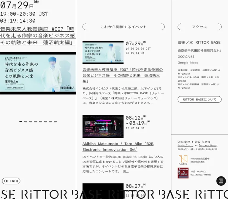
3カラム構成、細い罫線、括弧状の見出し、下部を流れるロゴが特徴の音楽イベントスペースサイト。モノトーンの静かな画面に、公演写真と映像サムネイルが彩りを添えます。
RITTOR BASE — Style Reference
A music venue noticeboard framed by fine rules, quiet whitespace, and a moving wordmark.
Website: rittorbase.jp Original URL: https://rittorbase.jp/ Final URL: https://rittorbase.jp/ Theme: near-white canvas with charcoal typography and full-color event imagery Inspected: October 2, 2026, 04:10:40 JST; supplied retrieval timestamp: October 1, 2026, 19:10:40.332 UTC Viewports: 1440 × 1000 desktop and 390 × 844 mobile, in CSS pixels Scope: the current homepage: featured event carousel, upcoming-event section, three archive entries, About and contact information, gallery pagination, equipment disclosure, access information, legal footer, and persistent bottom controls. Desktop captures show multiple scroll positions; mobile captures show the opening and access/footer states. Intermediate mobile content is additionally documented by the supplied DOM measurements.
RITTOR BASE presents a venue, its programming, and its archive through a restrained editorial interface. Almost everything outside the event imagery uses the same charcoal-on-near-white treatment. Regular-weight Japanese sans-serif text, monospaced technical details, underlined titles, thin dividers, and unusually shallow outlined buttons establish the hierarchy. Color comes from posters and performance photographs rather than interface accents.
The defining desktop composition has three unequal columns. A featured event remains visible on the left, editorial content advances through the center, and access information stays visible on the right. A repeated custom wordmark occupies the bottom edge, with an OFFAIR button and circular menu control floating above it. On mobile, the content becomes one vertical sequence while those bottom controls remain viewport-anchored.
閉じる
RITTOR BASE — Style Reference
A music venue noticeboard framed by fine rules, quiet whitespace, and a moving wordmark.
Website: rittorbase.jp Original URL: https://rittorbase.jp/ Final URL: https://rittorbase.jp/ Theme: near-white canvas with charcoal typography and full-color event imagery Inspected: October 2, 2026, 04:10:40 JST; supplied retrieval timestamp: October 1, 2026, 19:10:40.332 UTC Viewports: 1440 × 1000 desktop and 390 × 844 mobile, in CSS pixels Scope: the current homepage: featured event carousel, upcoming-event section, three archive entries, About and contact information, gallery pagination, equipment disclosure, access information, legal footer, and persistent bottom controls. Desktop captures show multiple scroll positions; mobile captures show the opening and access/footer states. Intermediate mobile content is additionally documented by the supplied DOM measurements.
RITTOR BASE presents a venue, its programming, and its archive through a restrained editorial interface. Almost everything outside the event imagery uses the same charcoal-on-near-white treatment. Regular-weight Japanese sans-serif text, monospaced technical details, underlined titles, thin dividers, and unusually shallow outlined buttons establish the hierarchy. Color comes from posters and performance photographs rather than interface accents.
The defining desktop composition has three unequal columns. A featured event remains visible on the left, editorial content advances through the center, and access information stays visible on the right. A repeated custom wordmark occupies the bottom edge, with an OFFAIR button and circular menu control floating above it. On mobile, the content becomes one vertical sequence while those bottom controls remain viewport-anchored.
How to Read This Reference
- Measured values come from the supplied rendered element bounds and computed styles. They describe the captured state, not a complete recovered stylesheet.
- Visual estimates come from the five current-page screenshots. Border thickness, some image dimensions, and unsampled text styles are identified accordingly.
- Derived values are calculations from those measurements, such as column proportions and bottom offsets.
- Recommendations and the Quick Start are implementation guidance. The proposed breakpoint, accessible focus styles, and interaction implementations are not verified source behavior.
- All custom property names introduced here are descriptive aliases. The provided source variables do not expose a dedicated public design-token system.
- Computed font-family declarations establish the requested stacks, not proof that every font file successfully loaded or supplied every glyph.
Tokens — Colors
Default Palette
| Name | Value | Suggested token | Evidence and role |
|---|---|---|---|
| Near White | #f9f9f9 |
--color-canvas |
Measured body background; the dominant page surface |
| Charcoal | #191919 |
--color-ink |
Measured body text and menu background; visually also the principal linework color |
| Control White | #ffffff |
--color-control |
Measured background of outlined navigation links and the OFFAIR button |
| Literal Black | #000000 |
--color-black |
Measured text color on the equipment toggle; a suitable approximation for the visibly black media mattes |
The white controls are only slightly brighter than the canvas. Their thin outline and pill geometry do more work than their fill. Preserve this small difference instead of introducing gray cards or a colored primary button.
The posters contain greens, reds, blues, and other saturated colors. These belong to individual events. The orange NexTone mark and dark red JASRAC mark are also asset colors, not a general action palette.
The supplied computed custom properties include administrative and editor presets. Their blue and purple values are not evidence of visible interface accents. No alternate color theme was demonstrated.
Tokens — Typography
Japanese Sans-Serif Interface
The measured body stack begins with "Noto Sans JP", "Helvetica Neue", Helvetica, Arial and continues through Japanese system fallbacks including Yu Gothic, Hiragino Kaku Gothic Pro, Meiryo, and MS PGothic before sans-serif.
Most sampled headings use weight 400. Hierarchy comes from size, spacing, underlining, and placement rather than heavy type. The contact heading requests the separately named family "Noto Sans JP Medium", while its computed numeric weight remains 400. Do not silently reinterpret that declaration as a measured 500 weight.
Monospaced Information
TTInterphasesMono-Regular, sans-serif is explicitly recorded for equipment descriptions and copyright links. It gives technical specifications and legal details the character of a compact equipment sheet.
The featured date, time, status, archive update dates, and video durations also look monospaced in the screenshots. Their individual font-family declarations were not supplied. Reusing the recorded mono family for them is a reasonable adaptation, not a verified mapping.
Utility Controls
The OFFAIR button uses Arial, 18px, weight 400, with 0.6px letter spacing. The equipment toggle also uses Arial at approximately 13.33px. These browser-style control faces are part of the restrained treatment; no decorative display face is needed for ordinary controls.
Wordmark
The bottom RITTOR BASE lettering is custom graphic lettering with interrupted strokes and rounded terminals. The sampled H1 has no text content and a computed size of 10px, so that number does not describe the visible wordmark. Its font or asset format cannot be identified from the supplied evidence.
Type Scale
| Role | Size / line height | Weight | Evidence |
|---|---|---|---|
| Featured event title | 25px / 31.25px |
400 | Measured at both viewports |
| Section heading | 18px / 30px |
400 | Measured at both viewports |
| Archive entry title | 18px / 27px |
400 | Measured at both viewports |
| Outline navigation link | 15px / 28px |
400 | Measured; 30px total control height |
| Contact heading | 15px / 15px |
400 in the named Medium family | Measured |
| Contact email | 15px / 15px |
400 | Measured; inline glyph bounds are taller than the line-height value |
| Map link | 15px / 27.75px |
400 | Measured |
OFFAIR |
18px / 28px |
400 | Measured; 0.6px tracking |
| Equipment toggle | 13.33px / 54px |
400 | Measured; line height centers the label in the row |
| Equipment details | 11px / 16.5px |
400 | Measured on DOM descendants; expanded visibility unverified |
| Copyright links | 11px / 17.05px |
400 | Measured |
| Featured date numerals | Approximately 44px |
Visually regular | Screenshot estimate |
Featured time and end |
Approximately 25px |
Visually regular | Screenshot estimate |
| Archive excerpt | Approximately 15px / 22.5px |
Visually regular | Screenshot estimate |
| About paragraph | Approximately 15px / 26px |
Visually regular | Screenshot estimate |
| Route and license details | Approximately 10–11px |
Visually regular | Screenshot estimate |
The source root and body both report a 10px base size. That is not the size of the principal reading text. The Quick Start uses explicit pixel values and can coexist with a conventional root size.
Tokens — Spacing & Shapes
The layout combines compact controls with large section intervals. A 30px inset, 50px heading gap, and 100px section padding provide a more useful reconstruction basis than an invented universal spacing grid.
Spacing Scale
| Use | Value | Evidence |
|---|---|---|
| Main horizontal inset | 30px |
Measured in center content and footer; retained on mobile |
| Desktop first section offset | 110px |
Measured heading top position |
| Standard section vertical padding | 100px |
Measured archive and About sections at both viewports |
| Heading-to-upcoming-link gap | 50px |
Derived from heading bottom and link top at both viewports |
| Archive heading-to-first-image gap | Approximately 50px |
Screenshot estimate |
| Featured title-to-media gap | Approximately 30px |
Bounds and screenshot correspondence |
| Archive image-to-title gap | Approximately 30px |
Screenshot estimate |
| Last archive text-to-action gap | 35px |
Derived from the recorded element bounds |
| Gap between stacked archive links | 10px |
Derived from two 30px controls positioned 40px apart |
| Carousel pagination button | 23 × 14px |
Measured; includes horizontal padding |
| Pagination button horizontal padding | 5px per side |
Measured |
| Bottom controls' horizontal inset | 10px |
Measured at both viewports |
| Equipment toggle inset | 30px left, 66px right |
Measured |
| Mobile access top padding | 69px |
Measured |
Border Radius and Linework
| Element | Geometry | Evidence |
|---|---|---|
| Outline navigation links | 15px radius, 30px height |
Measured |
OFFAIR button |
15px radius, 84 × 30px |
Measured |
| Menu button | 50% radius, 44 × 44px |
Measured |
| Event and archive images | Square corners | Visible in screenshots |
| Category label | Small rectangular outline | Visible in screenshots |
| Column and section rules | Approximately 1px |
Visual estimate; border properties were not supplied |
| Section-heading brackets | Approximately 15 × 30px each |
Visual estimate; thin semicircular strokes |
| Pagination marks | Approximately 13 × 4px |
Visual estimate within the measured button boxes |
| Equipment disclosure | Dashed horizontal boundaries | Visible in the About capture |
Layout Measurements
| Element | Desktop: 1440 × 1000 | Mobile: 390 × 844 |
|---|---|---|
| Featured slide width | 479px |
390px |
| Center column outer width | Approximately 600.47px |
Full viewport flow |
| Center content width | 540.47px |
330px |
| Center content left edge | 509.94px |
30px |
| Access/footer region | 360 × 1000px, starting at x = 1080 |
390 × 844px, starting at document y = 3285.75 |
| First featured link height | 511.19px |
461.13px |
| First featured title | 479 × 93.75px |
390 × 93.75px |
| Bottom wordmark H1 | 1440 × 43px, y = 957 |
390 × 38px, y = 806 |
| Animated home-link element | 2880 × 43px |
780 × 38px |
| Document height | Approximately 3068.63px |
4129.75px |
Desktop widths are consistent with roughly one third / five twelfths / one quarter of the viewport. A 4fr 5fr 3fr grid is a useful reconstruction, but the original layout formula was not provided.
Components
Featured Event Panel
Role: keep one event immediately visible while visitors explore the site.
The panel begins directly at the upper-left viewport edge, without a conventional header above it. Its anatomy is:
- Large date numerals with smaller Japanese month/day labels and a small weekday.
- A time range and
JSTwhen supplied by the event. - The plain status word
endin the captured state. - A regular-weight, underlined event title at 25px.
- A full-width landscape image separated from the title by approximately 30px.
- Centered pagination marks below the image.
The first visible event is Ableton and Max Community Japan #075 RNBO Move Takeover 出演:kentaro. Its image shows a music controller, shallow-focus greenery, and typography embedded in the artwork. The image frame is consistent with 16:9: approximately 479 × 269.44px on desktop and 390 × 219.38px on mobile. Those ratios are derived from the visible media start and the enclosing link bounds, rather than an inspected image style.
The title remains 25px on mobile. It wraps differently while retaining three lines in this particular event. Keep the image flush with the panel edges; do not apply the center column's 30px inset here.
The DOM contains three horizontally arranged event links. Only the first is visible in the supplied captures. Their arrangement and pagination support a carousel interpretation, but autoplay, swipe handling, and slide-transition timing were not demonstrated.
Carousel Pagination
Role: indicate position within a small set of items.
Three marks accompany featured events; five accompany the About gallery. Each recorded button is 23 × 14px. The visible mark is much smaller: a short rounded outline, with the first mark filled in charcoal in the captures.
The desktop featured pagination starts 44px below the first slide's lower edge. On mobile, it starts 57px below that slide. The second mobile slide has a taller recorded height of 474.13px, and its bottom plus 44px matches the pagination position. This is consistent with reserving the tallest slide's height; the governing source rule is not available.
Do not turn these into large circular indicators. For a new implementation, increase the invisible hit area and provide accessible slide names while preserving the small visible marks.
Bracketed Section Heading
Role: introduce a section without a filled header band.
Center an 18px regular heading in a 30px-high row. Place a thin left semicircle at the far left of the content width and its mirror at the far right. The open space between the arcs and the label remains unruled.
This treatment appears on upcoming events, archives, About, and access. It resembles a pair of widely separated parentheses rather than a complete pill border. CSS pseudo-elements can recreate the geometry; the source drawing method was not supplied.
Upcoming Events Section
Role: provide access to future programming.
In the captured current state, the section contains the heading これから開催するイベント and the full-width link これから開催のイベント情報をもっと見る, without visible event rows between them.
On desktop, the heading starts at y = 110 and the link at y = 190. The section ends at y = 320, leaving 100px after the link. Mobile retains the same heading/link spacing and bottom padding, but places the section below the featured carousel.
This sparse state is part of the current evidence. Do not invent upcoming event cards to fill it or infer that the website is discontinued because its visible featured event has ended.
Archive Entry
Role: connect recorded performances and reports to their detail pages.
Each entry uses a vertical composition:
- A square-cornered thumbnail, left aligned and approximately half the desktop content width.
- A small white
PLAYcapsule centered over the image. - A compact duration at the lower-left image edge, against black.
- An underlined title spanning the full text width.
- A small outlined
アーカイブ動画category label. - A compact update date.
- A short Japanese excerpt ending in an ellipsis.
The desktop thumbnails appear approximately 270 × 215px, including their black edges. This is a screenshot estimate, not proof of a common source aspect ratio. Do not impose the featured banner's 16:9 ratio on these different assets.
Text does not sit beside the thumbnail. It begins below it and uses the full 540.47px center content width. Titles are 18px with a 27px line height; longer titles add lines rather than shrinking. The archive entries are separated by generous whitespace, without cards, shadows, or individual enclosing borders.
The three visible records are the PSYCHOSIS/Dowser performance, the Yumi Matsutoya album listening event, and the m°fe live recording. The displayed durations are 00:05:13, 01:44:25, and 00:07:06. The screenshots establish play affordances, but playback and player presentation were not exercised.
Outline Navigation Link
Role: provide a quiet, clearly bounded route to a collection or section.
Use a white fill, a thin charcoal outline, 15px corner radius, and 30px total height. The text is centered at 15px with a 28px line height. Center-column links span approximately 540px on desktop and 330px on mobile; the desktop access link spans 299px.
The archive ends with two of these controls separated by 10px: one for more archive material and one for past events. These are ordinary navigation links. Their measured transition declaration covers text and background color over 600ms; the resulting hover colors were not captured.
About and Contact
Role: explain the venue and provide a direct inquiry route.
The About section starts after a full-width center-column divider and 100px of top padding. A bracketed heading is followed by a short paragraph and a separate contact label with an underlined email address.
The original About copy identifies Rittor Music as the organization that established the multipurpose venue. The footer independently links to Rittor Music and identifies its Impress Group relationship.
A large region below the contact information appears blank in the supplied desktop capture, followed by five pagination marks. No venue photograph is visible there. This evidence does not establish whether the blank area is intentional, a media-loading condition, or another runtime state. Retain that uncertainty rather than describing unseen interiors.
Equipment Disclosure
Role: place extensive technical information behind a compact row.
The visible collapsed row spans the full center column, extending 30px beyond the text inset on both sides. It is 54px high, has dashed horizontal boundaries, and places スペースの詳細(基本設備等) on the left with a thin plus sign at the right.
The DOM includes audio and video equipment lists styled in the recorded mono family at 11px/16.5px. Some descendant coordinates extend beyond the reported document height, and the screenshot shows a collapsed control. Text extraction therefore does not prove that the entire equipment list was visible. Opening, closing, height animation, and focus handling remain unverified.
A native disclosure or an accessible button-controlled region is recommended for a new implementation. Keep the specification content as readable text rather than converting it into a screenshot.
Access and Legal Footer
Role: keep practical venue information easy to find.
On desktop, the rightmost 360px column remains visible across the supplied scroll captures. Its contents begin with 110px top padding and approximately 30px horizontal insets:
- Bracketed access heading.
- Venue name.
- Street address and underlined
Google Mapslink. - Three compact station/walking-time lines.
- A shallow outlined link to the About section.
A full-width horizontal rule separates the legal block near y = 698 in the desktop capture. Copyright text uses compact monospaced typography. NexTone and JASRAC graphics sit beside their corresponding license information. Preserve the authentic graphics and their colors.
On mobile, access becomes the final full-width section. The desktop About shortcut is absent from the visible mobile link list. A small upward chevron occupies a much larger measured button area: 330 × 177px, with 80px top and 83px bottom padding. It suggests a return-to-top action, but its actual result was not tested. The legal divider appears approximately 489px below the start of this mobile footer view.
Persistent Bottom Controls
Role: expose broadcast status and navigation while preserving the sparse page.
The OFFAIR control is a white outlined pill, 84 × 30px, positioned 10px from the left. The menu is a 44px charcoal circle, 10px from the right, containing three short rounded white strokes.
Both controls share a vertical center 84px above the viewport bottom. This produces measured bottom offsets of 69px for OFFAIR and 62px for the menu at both viewports. Their appearance and position persist across the supplied scroll captures.
OFFAIR is a button in the rendered DOM, but clicking it was not documented. The menu's open state, contents, and transition were also not supplied. Do not infer a fullscreen navigation overlay from the circular trigger alone.
Bottom Wordmark Strip
Role: provide continuous brand presence at the viewport edge.
A horizontally repeated custom RITTOR BASE wordmark fills the lower edge, cropped naturally at both sides. The measured visible H1 is 43px high on desktop and 38px on mobile. Its home-link element is twice the viewport width in both cases.
The computed style explicitly declares a 10-second, linear, infinite animation, with separate desktop and mobile keyframe names. Different captures show different portions of the repetition. The keyframe bodies were not supplied, so exact travel distance and direction are not established.
Keep the graphic low and edge-bound. Its role is a moving identity strip, not a large text heading inserted into the editorial flow.
Tokens — Motion & Interaction
| Treatment | Recorded value or evidence | What is established |
|---|---|---|
| Desktop wordmark | 10s linear infinite bg-slide |
Continuous CSS animation is declared |
| Mobile wordmark | 10s linear infinite bg-slide-sp |
A separate mobile animation is declared with the same timing |
Outline links and OFFAIR |
color 0.6s cubic-bezier(0.19, 1, 0.22, 1), background-color 0.6s cubic-bezier(0.19, 1, 0.22, 1) |
Transition properties and timing; endpoint colors unverified |
| Circular menu trigger | background-color 0.6s cubic-bezier(0.19, 1, 0.22, 1) |
Trigger color transition; menu-opening motion unknown |
| Equipment toggle | Same 600ms background-color transition | Row color transition; disclosure movement unknown |
| Desktop scrolling | Left event and right access remain in place across screenshots | Persistent side-panel behavior; exact fixed/sticky implementation unknown |
| Featured carousel | Three positioned slides and three buttons | Carousel structure; autoplay, dragging, and timing unknown |
| About gallery | Five buttons and a blank visible media region | Pagination exists; actual slides and transitions unverified |
| Archive media | PLAY and duration overlays |
Playback affordance only |
Do not interpret a computed transition: all without a supplied duration as evidence of a meaningful animation. Avoid adding scroll reveals, parallax, hover zoom, or smooth anchor scrolling as source facts.
For an adaptation, use the recorded 600ms easing for modest color feedback and retain one restrained wordmark loop. Reduced-motion behavior and a pause option for the perpetual strip are recommended additions.
Surfaces
| Surface | Appearance | Structural purpose |
|---|---|---|
| Page canvas | Solid #f9f9f9 |
Shared ground across all columns |
| Editorial content | Same canvas, thin section rules | Grouping without card containers |
| Outline links | White fill, charcoal outline | Lightweight navigation targets |
| Menu trigger | Charcoal circular fill with white strokes | Strongest solid UI shape |
| Media | Full-color imagery with black edges where present | Content emphasis and visual contrast |
| Equipment row | Transparent/canvas surface with dashed rules | Compact expandable boundary |
| Legal block | Same canvas, thin top rule | Clear separation without a different background |
There is no observed shadow elevation system, gradient surface, frosted layer, or decorative background texture. Horizontal and vertical rules carry the structure.
Imagery
The imagery belongs to the venue's programming: music equipment, performers, album events, and low-light live recordings. Each item keeps its own color treatment. The homepage does not normalize everything into a shared duotone or apply rounded image masks.
The featured RNBO artwork uses a controller close-up with pale pads and soft green foreground blur. The PSYCHOSIS/Dowser image contrasts red costuming with a dark stage. The album event thumbnail combines colorful poster graphics with a speaker photograph. The m°fe image remains predominantly dark, with small lit areas around the performers and instruments.
Preserve embedded poster typography and black margins where they belong to the supplied media. Use normal photographic rendering, not pixelated scaling. Avoid arbitrary crops that remove event names, artist credits, or dates embedded in an image.
Observed Asset References
No image src, background-image URL, font-file URL, or logo asset path was included in the evidence. The URLs below identify the associated visible content links; they are not verified image endpoints, and their destination pages were not inspected.
| Asset or artwork | Original-page context | Observation |
|---|---|---|
| RNBO featured banner | Event 1473 | Controller photograph and embedded event lettering |
| PSYCHOSIS/Dowser thumbnail | Event 1197 | Red-and-dark performance composition |
| Album listening-event thumbnail | Event 1093 | Colorful poster and talk photograph |
| m°fe thumbnail | Event 1020 | Dark live-performance image |
| Repeated wordmark | Homepage | Custom interrupted-stroke lettering; asset format unknown |
| Rights graphics | Homepage legal block | NexTone and JASRAC marks; file paths unknown |
Use authorized originals when reproducing the actual venue. CSS can reproduce the frame, but ordinary typesetting cannot reproduce the custom wordmark accurately.
Layout & Responsive Behavior
Desktop Composition
The first vertical division sits around x = 479–480; the second around x = 1080. The center's approximately 600px outer width contains 540.47px of usable content after two 30px insets. The right column occupies the last quarter of the viewport.
The supplied desktop scroll states preserve the featured event and access/footer positions while revealing later center-column material. This demonstrates persistent side panels around the advancing editorial content. It does not distinguish position: fixed from a sticky implementation or prove separate scroll containers.
The center sequence is upcoming events, archive entries, archive navigation, and About. The sparse upcoming section is approximately 320px tall from the page top. The archive section runs from document y = 320 to 2071.88. About begins there and extends through the collapsed equipment row.
Mobile Composition
At 390px, the featured panel becomes full width. All following text sections use 30px side insets, leaving 330px for headings, paragraphs, and navigation links. The source retains the main type sizes: 25px featured titles, 18px section and archive headings, and 15px navigation links.
| Element | Observed mobile change |
|---|---|
| Desktop columns | Become one vertical sequence |
| Featured event | Full-width image and text at the top |
| Upcoming section | Heading begins at document y = 582.13 |
| Archive section | Begins at y = 792.13; heading at y = 892.13 |
| About section | Begins at y = 2459.16 |
| Equipment toggle | Expands to the full 390px width |
| Access/footer | Follows About at y = 3285.75 and measures 844px high |
| Desktop About shortcut | Not present in the visible mobile links |
| Upward chevron | Visible in the mobile access section |
| Bottom wordmark | Reduces from 43px to 38px high |
OFFAIR and menu |
Retain their dimensions and bottom offsets |
The mobile archive titles and text widths are measured, but intermediate mobile archive screenshots were not supplied. Their exact image dimensions should not be asserted from the desktop capture alone.
The breakpoint is unknown. The Quick Start uses 1000px as a recommended starting point, not a recovered source value. Validate intermediate widths, long event titles, short desktop windows, zoom, and device safe areas before production use.
Do’s and Don’ts
Do
- Preserve the unequal three-column desktop composition and the single mobile flow.
- Use
#f9f9f9for the canvas,#191919for the principal ink, and white for shallow outlined controls. - Keep regular-weight headings and visible underlines on editorial links.
- Preserve the 30px text inset and the much larger 100px section rhythm.
- Draw heading brackets as two separated arcs, leaving the middle unruled.
- Place archive thumbnails above full-width metadata rather than beside it.
- Let event artwork provide the color and retain its embedded typography.
- Keep the bottom wordmark, status pill, and circular menu visually distinct.
- Represent the captured empty upcoming section and blank gallery region honestly.
- Separate visible evidence from DOM content that may be clipped or collapsed.
Don't
- Don't replace the homepage with a sales hero, feature-card grid, or prominent conversion banner.
- Don't make the three desktop columns equal width.
- Don't introduce large rounded cards, soft shadows, gradients, or colored category badges.
- Don't apply the 16:9 featured-banner ratio indiscriminately to archive artwork.
- Don't make all titles bold or enlarge them into marketing headlines.
- Don't treat the wordmark's computed 10px H1 font size as its visible lettering size.
- Don't claim autoplay, swipe gestures, video modals, or a menu overlay without interaction evidence.
- Don't assign equipment-list visibility solely from extracted DOM text.
- Don't describe unobserved venue photographs in the About gallery.
- Don't treat poster colors or editor preset variables as the site's action palette.
Recommended Implementation Additions
These are improvements for a new implementation, not verified features of the original:
- Give the graphic home link, menu button, pagination, play controls, and upward chevron explicit accessible names. Their extracted text alone does not establish their accessible names.
- Keep visible pagination marks small while expanding their interactive areas. Likewise, provide at least a 44px target around the 30px pill visuals where practical.
- Add a visible charcoal focus outline and preserve underlines for text links.
- Provide reduced-motion behavior and a pause mechanism for the continuously moving wordmark.
- Ensure fixed controls do not obscure the last links, equipment rows, or legal information. Include safe-area clearance on applicable devices.
- Use a keyboard-operable disclosure with an exposed expanded state for equipment details; prevent collapsed descendants from receiving focus.
- Validate gallery loading and provide an appropriate fallback if expected media is unavailable. Do not silently invent replacement photography.
- Keep ended-event status and future-event availability understandable independently of a countdown or motion.
- Load authorized font and graphic assets explicitly. Use readable fallbacks if the recorded fonts are unavailable.
Agent Prompt Guide
Quick Color Reference
- Main canvas:
#f9f9f9. - Text, principal rules, and menu fill:
#191919. - Outline control fill:
#ffffff. - Media colors: retain each event's original artwork.
- Interaction emphasis: outlines, underlines, and restrained monochrome feedback.
- Avoid a general accent color or shadow-based hierarchy.
Overall Prompt
“Create a music venue homepage inspired by the current RITTOR BASE interface. Use a near-white #f9f9f9 canvas, charcoal #191919 text, thin dividers, regular Japanese sans-serif headings, and compact monospaced technical information. At desktop size, compose approximately 4:5:3 columns: a persistent featured event at left, a scrolling editorial sequence in the center, and persistent venue access information at right. Use 30px text insets, generous 100px section spacing, headings framed by separated semicircular brackets, and white outlined pill links only 30px high. Archive thumbnails sit above full-width underlined titles and excerpts. Anchor a repeated custom wordmark to the bottom edge, with a small OFFAIR pill at left and a 44px dark circular menu at right. Stack the content on mobile while retaining the bottom controls. Treat menu, carousel, and playback behavior as separate implementation decisions requiring explicit specifications.”
Example Component Prompts
- Featured event: “A flush-left venue event panel with large monospaced date numerals, smaller Japanese date labels, a time range, plain end status, and a 25px regular underlined title. Place a full-width landscape event banner below it and three tiny horizontal pagination marks underneath. Keep the image square-cornered.”
- Section heading and navigation: “An 18px centered Japanese heading in a 30px row, framed only by a thin left semicircle at the far left and a matching right semicircle at the far right. Leave 50px before a full-width white outlined link with a 15px radius and 30px height.”
- Archive entry: “A sparse editorial entry on near-white. Put a small full-color performance thumbnail at the upper left, a white PLAY capsule over its center, and a duration against its black lower edge. Below it, use a full-width underlined 18px title, a tiny square category stamp, a compact mono update date, and a short 15px excerpt. No surrounding card.”
- Access column: “A quiet right-side venue information column with 30px insets, a bracketed access heading, venue name, postal address, underlined map link, and small train-route details. Separate copyright and authentic license graphics with a thin full-width rule.”
- Persistent controls: “A custom repeated wordmark clipped along the viewport bottom, with an 84 × 30px OFFAIR outline pill 10px from the left and a 44px charcoal circular menu 10px from the right. Align both control centers 84px above the bottom. Use a restrained 10-second linear wordmark loop with reduced-motion support.”
Quick Start
CSS Custom Properties
This is an adaptation, not extracted production CSS. Measured sizes are retained where available. The desktop breakpoint, grid implementation, hover endpoints, native disclosure behavior, and keyframe travel are recommendations. Archive media width below is based on the desktop appearance; its mobile value is provisional.
Use .feature-panel, .editorial-panel, and .access-panel as siblings inside .rittor-layout. Place .brand-strip, .offair, and .menu-toggle outside that grid. A .feature-track contains equal-width slides; interaction code must manage the active slide and inactive-slide focus. Use real anchors for navigation and native buttons for actions.
:root {
  /* Measured palette */
  --color-canvas: #f9f9f9;
  --color-ink: #191919;
  --color-control: #ffffff;
  --color-black: #000000;

  /* Recorded family names; font files must be supplied separately */
  --font-ui: 'Noto Sans JP', 'Helvetica Neue', Helvetica,
    Arial, 'Yu Gothic', Meiryo, sans-serif;
  /* Monospace fallbacks are an adaptation of the source stack */
  --font-mono: 'TTInterphasesMono-Regular', ui-monospace, monospace;

  --text-feature: 25px;
  --text-heading: 18px;
  --text-body: 15px;
  --text-meta: 11px;
  --inset: 30px;
  --section-space: 100px;
  --heading-gap: 50px;
  --rule: 1px;
  --pill-radius: 15px;
  --pill-height: 30px;
  --menu-size: 44px;
  --brand-height: 38px;
  --safe-bottom: env(safe-area-inset-bottom, 0px);
  --ease-color: cubic-bezier(0.19, 1, 0.22, 1);
  --color-duration: 600ms;
  --wordmark-art: none;
}

* { box-sizing: border-box; }

body {
  margin: 0;
  color: var(--color-ink);
  background: var(--color-canvas);
  font: 400 var(--text-body)/1.5 var(--font-ui);
}

a { color: inherit; }
button { cursor: pointer; }
img { display: block; max-inline-size: 100%; }

.rittor-layout { display: block; }
.feature-panel,
.editorial-panel,
.access-panel { min-inline-size: 0; }

.feature-window { overflow: hidden; }
.feature-track {
  display: grid;
  grid-auto-flow: column;
  grid-auto-columns: 100%;
  align-items: start;
}
.feature-slide { min-inline-size: 0; }

/* Schedule sizes below are screenshot-based approximations */
.event-date { font: 400 44px/1 var(--font-mono); }
.event-time,
.event-status { font: 400 25px/1.28 var(--font-mono); }
.feature-title {
  margin: 8px 0 30px;
  font-size: var(--text-feature);
  font-weight: 400;
  line-height: 1.25;
  text-decoration: underline;
}
.feature-image {
  inline-size: 100%;
  aspect-ratio: 16 / 9;
  object-fit: contain;
  background: var(--color-black);
}

.pagination {
  display: flex;
  justify-content: center;
  margin-block-start: 44px;
}
.pagination button {
  display: grid;
  place-items: center;
  inline-size: 23px;
  block-size: 14px;
  padding: 0 5px;
  border: 0;
  color: inherit;
  background: transparent;
}
.pagination button::before {
  content: '';
  inline-size: 13px;
  block-size: 4px;
  border: var(--rule) solid currentColor;
  border-radius: 2px;
}
.pagination button[aria-current='true']::before {
  background: currentColor;
}

.content-section {
  padding: var(--section-space) var(--inset);
  border-block-start: var(--rule) solid var(--color-ink);
}
.upcoming-section {
  padding: 50px var(--inset) var(--section-space);
}
.section-heading {
  position: relative;
  margin: 0 0 var(--heading-gap);
  padding-inline: 24px;
  min-block-size: 30px;
  font-size: var(--text-heading);
  font-weight: 400;
  line-height: 30px;
  text-align: center;
}
.section-heading::before,
.section-heading::after {
  content: '';
  position: absolute;
  inset-block-start: 0;
  inline-size: 15px;
  block-size: 30px;
  border: var(--rule) solid currentColor;
}
.section-heading::before {
  inset-inline-start: 0;
  border-inline-end: 0;
  border-radius: 15px 0 0 15px;
}
.section-heading::after {
  inset-inline-end: 0;
  border-inline-start: 0;
  border-radius: 0 15px 15px 0;
}

.pill-link,
.offair {
  border: var(--rule) solid var(--color-ink);
  border-radius: var(--pill-radius);
  color: var(--color-ink);
  background: var(--color-control);
  transition:
    color var(--color-duration) var(--ease-color),
    background-color var(--color-duration) var(--ease-color);
}
.pill-link {
  display: block;
  min-block-size: var(--pill-height);
  padding-inline: 8px;
  font-size: 15px;
  line-height: 28px;
  text-align: center;
  text-decoration: none;
}

.archive-entry + .archive-entry { margin-block-start: 45px; }
.archive-media {
  position: relative;
  inline-size: 50%;
  margin: 0;
  background: var(--color-black);
}
.archive-media img {
  inline-size: 100%;
  block-size: auto;
}
.play-label {
  position: absolute;
  inset-block-start: 50%;
  inset-inline-start: 50%;
  transform: translate(-50%, -50%);
  padding: 2px 10px;
  border-radius: 999px;
  color: var(--color-ink);
  background: var(--color-control);
  font: 12px/1.4 Arial, sans-serif;
}
.media-duration {
  position: absolute;
  inset-inline-start: 0;
  inset-block-end: 0;
  color: white;
  background: black;
  font: 11px/1 var(--font-mono);
}
.archive-title {
  margin: 30px 0 15px;
  font-size: 18px;
  font-weight: 400;
  line-height: 27px;
}
.archive-title a { text-decoration: underline; }
.archive-kind {
  display: inline-block;
  padding: 1px 3px;
  border: var(--rule) solid currentColor;
  font-size: 11px;
  line-height: 16px;
}
.archive-date {
  margin-block: 8px 10px;
  font: 11px/1.55 var(--font-mono);
}
.archive-excerpt { margin: 0; font-size: 15px; line-height: 1.5; }
.archive-actions { display: grid; gap: 10px; margin-block-start: 35px; }
.about-copy { line-height: 1.75; }

/* Native details is a recommended disclosure implementation */
.equipment-details {
  margin: 40px calc(-1 * var(--inset)) 0;
  border-block: var(--rule) dashed var(--color-ink);
}
.equipment-details summary {
  position: relative;
  min-block-size: 54px;
  padding: 0 66px 0 30px;
  list-style: none;
  color: var(--color-black);
  font: 13.333px/54px Arial, sans-serif;
  cursor: pointer;
}
.equipment-details summary::-webkit-details-marker { display: none; }
.equipment-details summary::after {
  content: '+';
  position: absolute;
  inset-inline-end: 24px;
  inset-block-start: 0;
  font-size: 24px;
  font-weight: 400;
}
.equipment-details[open] summary::after { content: '−'; }
.equipment-body { padding: 30px; font: 11px/1.5 var(--font-mono); }

.access-panel {
  display: flex;
  flex-direction: column;
  min-block-size: 100svh;
  padding: 69px 30px 140px;
  border-block-start: var(--rule) solid var(--color-ink);
}
.access-panel address { font-style: normal; }
.access-routes { font-size: 11px; line-height: 1.55; }
.about-shortcut { display: none; }
.back-top {
  display: block;
  inline-size: 100%;
  min-block-size: 177px;
  border: 0;
  color: inherit;
  background: transparent;
}
.legal-block {
  margin-inline: -30px;
  padding: 28px 30px 0;
  border-block-start: var(--rule) solid var(--color-ink);
  font: 11px/1.55 var(--font-mono);
}
.license-row { display: flex; align-items: center; gap: 10px; margin-top: 14px; }

.offair {
  position: fixed;
  z-index: 20;
  inset-inline-start: 10px;
  inset-block-end: calc(69px + var(--safe-bottom));
  inline-size: 84px;
  block-size: 30px;
  padding: 0 8px;
  font: 400 18px/28px Arial, sans-serif;
  letter-spacing: 0.6px;
}
.menu-toggle {
  position: fixed;
  z-index: 20;
  inset-inline-end: 10px;
  inset-block-end: calc(62px + var(--safe-bottom));
  display: flex;
  flex-direction: column;
  align-items: center;
  justify-content: center;
  gap: 5px;
  inline-size: var(--menu-size);
  block-size: var(--menu-size);
  padding: 0;
  border: 0;
  border-radius: 50%;
  background: var(--color-ink);
  transition: background-color 600ms var(--ease-color);
}
.menu-toggle span {
  inline-size: 20px;
  block-size: 4px;
  border-radius: 2px;
  background: white;
}

.brand-strip {
  position: fixed;
  z-index: 10;
  inset-inline: 0;
  inset-block-end: var(--safe-bottom);
  block-size: var(--brand-height);
  margin: 0;
  overflow: hidden;
  background: var(--color-canvas);
}
.brand-track {
  display: flex;
  inline-size: 200%;
  block-size: 100%;
  text-decoration: none;
  animation: reference-wordmark 10s linear infinite;
}
.brand-repeat {
  flex: 0 0 50%;
  overflow: hidden;
  white-space: nowrap;
  background-image: var(--wordmark-art);
  background-repeat: repeat-x;
  background-size: auto 100%;
  /* Text is a temporary fallback, not the original wordmark */
  font: 400 var(--brand-height)/1 Arial, sans-serif;
}
.brand-repeat.has-art { color: transparent; }
@keyframes reference-wordmark {
  to { transform: translateX(-50%); }
}

/* Recommended endpoints; source hover colors were not captured */
@media (hover: hover) {
  .pill-link:hover,
  .offair:hover {
    color: var(--color-control);
    background: var(--color-ink);
  }
}

/* Recommended breakpoint, not a recovered source media query */
@media (min-width: 1000px) {
  :root { --brand-height: 43px; }
  .rittor-layout {
    display: grid;
    grid-template-columns: minmax(0, 4fr) minmax(0, 5fr) minmax(0, 3fr);
    align-items: start;
  }
  .feature-panel {
    position: sticky;
    inset-block-start: 0;
    min-block-size: 100svh;
    border-inline-end: var(--rule) solid var(--color-ink);
  }
  .upcoming-section { padding-block-start: 110px; }
  .editorial-panel { padding-block-end: 62px; }
  .access-panel {
    position: sticky;
    inset-block-start: 0;
    block-size: 100svh;
    min-block-size: 0;
    overflow-y: auto;
    padding-block: 110px 112px;
    border-block-start: 0;
    border-inline-start: var(--rule) solid var(--color-ink);
  }
  .about-shortcut { display: block; margin-block-start: 30px; }
  .back-top { display: none; }
  .legal-block { margin-block-start: auto; }
}

/* Recommended accessibility treatments */
:where(a, button, summary):focus-visible {
  outline: 2px solid var(--color-ink);
  outline-offset: 3px;
}
@media (prefers-reduced-motion: reduce) {
  .brand-track { animation: none; }
  .pill-link,
  .offair,
  .menu-toggle { transition: none; }
}
For the wordmark, place two identical .brand-repeat spans inside the home link .brand-track. Give the link an accessible name and hide the repeated decorative spans from assistive technology. Set --wordmark-art to an authorized asset and apply .has-art when it is available. A temporary text fallback will not reproduce the original lettering.
This CSS does not implement an unobserved menu, media player, carousel controller, or gallery. Those require explicit behavior, accessible state management, and actual assets. Expand small hit areas and test short desktop heights before treating the scaffold as production-ready.
Tailwind v4 Token Mapping
Optional aliases for projects already using Tailwind v4. This does not imply that the original website uses Tailwind. Define the custom properties above first.
@theme inline {
  --color-canvas: #f9f9f9;
  --color-ink: #191919;
  --color-control: #ffffff;
  --font-interface: var(--font-ui);
  --font-technical: var(--font-mono);
  --text-feature: 25px;
  --text-section: 18px;
  --text-copy: 15px;
  --text-meta: 11px;
  --spacing-inset: 30px;
  --spacing-section: 100px;
  --spacing-heading-gap: 50px;
  --radius-pill: 15px;
}
Sources & Evidence
- RITTOR BASE homepage: supplied current-page browser observation, HTTP 200, with the original and final URL both
https://rittorbase.jp/. - Capture retrieval timestamp:
2026-10-01T19:10:40.332Z, equivalent to October 2, 2026, 04:10:40.332 JST. Viewports were 1440 × 1000 and 390 × 844 CSS pixels. - Visual evidence: three desktop scroll captures and two mobile captures of the current homepage. These establish visible composition, media appearance, collapsed equipment presentation, and persistent bottom controls.
- Rendered evidence: element rectangles, computed colors, font stacks, sizes, line heights, padding, radii, transition declarations, animation names, document heights, and homepage link destinations. Linked destination pages and asset files were not separately inspected.
- Interaction evidence is limited to the supplied scrolling states and recorded styles. No opened menu, changed carousel slide, playing video, expanded equipment panel, or activated return-to-top control was documented.
- Capture preparation included an initial observation of at least five seconds and bounded checks for document readiness, finite animation, layout stability, and visible-image decoding. Perpetual animations were temporarily paused during readiness checks and resumed. SharedWorkers and service workers were disabled. These checks do not establish completion of delayed content or the behavior of unexercised controls.
This reference describes the current captured homepage. Exact source breakpoints, keyframe bodies, media URLs, font loading, and the blank About gallery's cause remain unverified. All reconstruction choices and accessibility additions are labeled separately from the observed design.
# RITTOR BASE — Style Reference

> A music venue noticeboard framed by fine rules, quiet whitespace, and a moving wordmark.

**Website:** [rittorbase.jp](https://rittorbase.jp/)
**Original URL:** https://rittorbase.jp/
**Final URL:** https://rittorbase.jp/
**Theme:** near-white canvas with charcoal typography and full-color event imagery
**Inspected:** October 2, 2026, 04:10:40 JST; supplied retrieval timestamp: October 1, 2026, 19:10:40.332 UTC
**Viewports:** 1440 × 1000 desktop and 390 × 844 mobile, in CSS pixels
**Scope:** the current homepage: featured event carousel, upcoming-event section, three archive entries, About and contact information, gallery pagination, equipment disclosure, access information, legal footer, and persistent bottom controls. Desktop captures show multiple scroll positions; mobile captures show the opening and access/footer states. Intermediate mobile content is additionally documented by the supplied DOM measurements.

RITTOR BASE presents a venue, its programming, and its archive through a restrained editorial interface. Almost everything outside the event imagery uses the same charcoal-on-near-white treatment. Regular-weight Japanese sans-serif text, monospaced technical details, underlined titles, thin dividers, and unusually shallow outlined buttons establish the hierarchy. Color comes from posters and performance photographs rather than interface accents.

The defining desktop composition has three unequal columns. A featured event remains visible on the left, editorial content advances through the center, and access information stays visible on the right. A repeated custom wordmark occupies the bottom edge, with an `OFFAIR` button and circular menu control floating above it. On mobile, the content becomes one vertical sequence while those bottom controls remain viewport-anchored.
閉じる
# RITTOR BASE — Style Reference

> A music venue noticeboard framed by fine rules, quiet whitespace, and a moving wordmark.

**Website:** [rittorbase.jp](https://rittorbase.jp/)
**Original URL:** https://rittorbase.jp/
**Final URL:** https://rittorbase.jp/
**Theme:** near-white canvas with charcoal typography and full-color event imagery
**Inspected:** October 2, 2026, 04:10:40 JST; supplied retrieval timestamp: October 1, 2026, 19:10:40.332 UTC
**Viewports:** 1440 × 1000 desktop and 390 × 844 mobile, in CSS pixels
**Scope:** the current homepage: featured event carousel, upcoming-event section, three archive entries, About and contact information, gallery pagination, equipment disclosure, access information, legal footer, and persistent bottom controls. Desktop captures show multiple scroll positions; mobile captures show the opening and access/footer states. Intermediate mobile content is additionally documented by the supplied DOM measurements.

RITTOR BASE presents a venue, its programming, and its archive through a restrained editorial interface. Almost everything outside the event imagery uses the same charcoal-on-near-white treatment. Regular-weight Japanese sans-serif text, monospaced technical details, underlined titles, thin dividers, and unusually shallow outlined buttons establish the hierarchy. Color comes from posters and performance photographs rather than interface accents.

The defining desktop composition has three unequal columns. A featured event remains visible on the left, editorial content advances through the center, and access information stays visible on the right. A repeated custom wordmark occupies the bottom edge, with an `OFFAIR` button and circular menu control floating above it. On mobile, the content becomes one vertical sequence while those bottom controls remain viewport-anchored.

## How to Read This Reference

- **Measured** values come from the supplied rendered element bounds and computed styles. They describe the captured state, not a complete recovered stylesheet.
- **Visual estimates** come from the five current-page screenshots. Border thickness, some image dimensions, and unsampled text styles are identified accordingly.
- **Derived values** are calculations from those measurements, such as column proportions and bottom offsets.
- **Recommendations** and the Quick Start are implementation guidance. The proposed breakpoint, accessible focus styles, and interaction implementations are not verified source behavior.
- All custom property names introduced here are descriptive aliases. The provided source variables do not expose a dedicated public design-token system.
- Computed font-family declarations establish the requested stacks, not proof that every font file successfully loaded or supplied every glyph.

## Tokens — Colors

### Default Palette

| Name | Value | Suggested token | Evidence and role |
| --- | --- | --- | --- |
| Near White | `#f9f9f9` | `--color-canvas` | Measured body background; the dominant page surface |
| Charcoal | `#191919` | `--color-ink` | Measured body text and menu background; visually also the principal linework color |
| Control White | `#ffffff` | `--color-control` | Measured background of outlined navigation links and the `OFFAIR` button |
| Literal Black | `#000000` | `--color-black` | Measured text color on the equipment toggle; a suitable approximation for the visibly black media mattes |

The white controls are only slightly brighter than the canvas. Their thin outline and pill geometry do more work than their fill. Preserve this small difference instead of introducing gray cards or a colored primary button.

The posters contain greens, reds, blues, and other saturated colors. These belong to individual events. The orange NexTone mark and dark red JASRAC mark are also asset colors, not a general action palette.

The supplied computed custom properties include administrative and editor presets. Their blue and purple values are not evidence of visible interface accents. No alternate color theme was demonstrated.

## Tokens — Typography

### Japanese Sans-Serif Interface

The measured body stack begins with `"Noto Sans JP", "Helvetica Neue", Helvetica, Arial` and continues through Japanese system fallbacks including Yu Gothic, Hiragino Kaku Gothic Pro, Meiryo, and MS PGothic before `sans-serif`.

Most sampled headings use **weight 400**. Hierarchy comes from size, spacing, underlining, and placement rather than heavy type. The contact heading requests the separately named family `"Noto Sans JP Medium"`, while its computed numeric weight remains 400. Do not silently reinterpret that declaration as a measured 500 weight.

### Monospaced Information

`TTInterphasesMono-Regular, sans-serif` is explicitly recorded for equipment descriptions and copyright links. It gives technical specifications and legal details the character of a compact equipment sheet.

The featured date, time, status, archive update dates, and video durations also look monospaced in the screenshots. Their individual font-family declarations were not supplied. Reusing the recorded mono family for them is a reasonable adaptation, not a verified mapping.

### Utility Controls

The `OFFAIR` button uses Arial, 18px, weight 400, with 0.6px letter spacing. The equipment toggle also uses Arial at approximately 13.33px. These browser-style control faces are part of the restrained treatment; no decorative display face is needed for ordinary controls.

### Wordmark

The bottom `RITTOR BASE` lettering is custom graphic lettering with interrupted strokes and rounded terminals. The sampled H1 has no text content and a computed size of 10px, so that number does not describe the visible wordmark. Its font or asset format cannot be identified from the supplied evidence.

### Type Scale

| Role | Size / line height | Weight | Evidence |
| --- | --- | --- | --- |
| Featured event title | `25px / 31.25px` | 400 | Measured at both viewports |
| Section heading | `18px / 30px` | 400 | Measured at both viewports |
| Archive entry title | `18px / 27px` | 400 | Measured at both viewports |
| Outline navigation link | `15px / 28px` | 400 | Measured; 30px total control height |
| Contact heading | `15px / 15px` | 400 in the named Medium family | Measured |
| Contact email | `15px / 15px` | 400 | Measured; inline glyph bounds are taller than the line-height value |
| Map link | `15px / 27.75px` | 400 | Measured |
| `OFFAIR` | `18px / 28px` | 400 | Measured; 0.6px tracking |
| Equipment toggle | `13.33px / 54px` | 400 | Measured; line height centers the label in the row |
| Equipment details | `11px / 16.5px` | 400 | Measured on DOM descendants; expanded visibility unverified |
| Copyright links | `11px / 17.05px` | 400 | Measured |
| Featured date numerals | Approximately `44px` | Visually regular | Screenshot estimate |
| Featured time and `end` | Approximately `25px` | Visually regular | Screenshot estimate |
| Archive excerpt | Approximately `15px / 22.5px` | Visually regular | Screenshot estimate |
| About paragraph | Approximately `15px / 26px` | Visually regular | Screenshot estimate |
| Route and license details | Approximately `10–11px` | Visually regular | Screenshot estimate |

The source root and body both report a 10px base size. That is not the size of the principal reading text. The Quick Start uses explicit pixel values and can coexist with a conventional root size.

## Tokens — Spacing & Shapes

The layout combines compact controls with large section intervals. A 30px inset, 50px heading gap, and 100px section padding provide a more useful reconstruction basis than an invented universal spacing grid.

### Spacing Scale

| Use | Value | Evidence |
| --- | --- | --- |
| Main horizontal inset | `30px` | Measured in center content and footer; retained on mobile |
| Desktop first section offset | `110px` | Measured heading top position |
| Standard section vertical padding | `100px` | Measured archive and About sections at both viewports |
| Heading-to-upcoming-link gap | `50px` | Derived from heading bottom and link top at both viewports |
| Archive heading-to-first-image gap | Approximately `50px` | Screenshot estimate |
| Featured title-to-media gap | Approximately `30px` | Bounds and screenshot correspondence |
| Archive image-to-title gap | Approximately `30px` | Screenshot estimate |
| Last archive text-to-action gap | `35px` | Derived from the recorded element bounds |
| Gap between stacked archive links | `10px` | Derived from two 30px controls positioned 40px apart |
| Carousel pagination button | `23 × 14px` | Measured; includes horizontal padding |
| Pagination button horizontal padding | `5px` per side | Measured |
| Bottom controls' horizontal inset | `10px` | Measured at both viewports |
| Equipment toggle inset | `30px` left, `66px` right | Measured |
| Mobile access top padding | `69px` | Measured |

### Border Radius and Linework

| Element | Geometry | Evidence |
| --- | --- | --- |
| Outline navigation links | `15px` radius, `30px` height | Measured |
| `OFFAIR` button | `15px` radius, `84 × 30px` | Measured |
| Menu button | `50%` radius, `44 × 44px` | Measured |
| Event and archive images | Square corners | Visible in screenshots |
| Category label | Small rectangular outline | Visible in screenshots |
| Column and section rules | Approximately `1px` | Visual estimate; border properties were not supplied |
| Section-heading brackets | Approximately `15 × 30px` each | Visual estimate; thin semicircular strokes |
| Pagination marks | Approximately `13 × 4px` | Visual estimate within the measured button boxes |
| Equipment disclosure | Dashed horizontal boundaries | Visible in the About capture |

### Layout Measurements

| Element | Desktop: 1440 × 1000 | Mobile: 390 × 844 |
| --- | --- | --- |
| Featured slide width | `479px` | `390px` |
| Center column outer width | Approximately `600.47px` | Full viewport flow |
| Center content width | `540.47px` | `330px` |
| Center content left edge | `509.94px` | `30px` |
| Access/footer region | `360 × 1000px`, starting at x = 1080 | `390 × 844px`, starting at document y = 3285.75 |
| First featured link height | `511.19px` | `461.13px` |
| First featured title | `479 × 93.75px` | `390 × 93.75px` |
| Bottom wordmark H1 | `1440 × 43px`, y = 957 | `390 × 38px`, y = 806 |
| Animated home-link element | `2880 × 43px` | `780 × 38px` |
| Document height | Approximately `3068.63px` | `4129.75px` |

Desktop widths are consistent with roughly **one third / five twelfths / one quarter** of the viewport. A `4fr 5fr 3fr` grid is a useful reconstruction, but the original layout formula was not provided.

## Components

### Featured Event Panel

**Role:** keep one event immediately visible while visitors explore the site.

The panel begins directly at the upper-left viewport edge, without a conventional header above it. Its anatomy is:

1. Large date numerals with smaller Japanese month/day labels and a small weekday.
2. A time range and `JST` when supplied by the event.
3. The plain status word `end` in the captured state.
4. A regular-weight, underlined event title at 25px.
5. A full-width landscape image separated from the title by approximately 30px.
6. Centered pagination marks below the image.

The first visible event is `Ableton and Max Community Japan #075 RNBO Move Takeover 出演:kentaro`. Its image shows a music controller, shallow-focus greenery, and typography embedded in the artwork. The image frame is consistent with 16:9: approximately 479 × 269.44px on desktop and 390 × 219.38px on mobile. Those ratios are derived from the visible media start and the enclosing link bounds, rather than an inspected image style.

The title remains 25px on mobile. It wraps differently while retaining three lines in this particular event. Keep the image flush with the panel edges; do not apply the center column's 30px inset here.

The DOM contains three horizontally arranged event links. Only the first is visible in the supplied captures. Their arrangement and pagination support a carousel interpretation, but autoplay, swipe handling, and slide-transition timing were not demonstrated.

### Carousel Pagination

**Role:** indicate position within a small set of items.

Three marks accompany featured events; five accompany the About gallery. Each recorded button is 23 × 14px. The visible mark is much smaller: a short rounded outline, with the first mark filled in charcoal in the captures.

The desktop featured pagination starts 44px below the first slide's lower edge. On mobile, it starts 57px below that slide. The second mobile slide has a taller recorded height of 474.13px, and its bottom plus 44px matches the pagination position. This is consistent with reserving the tallest slide's height; the governing source rule is not available.

Do not turn these into large circular indicators. For a new implementation, increase the invisible hit area and provide accessible slide names while preserving the small visible marks.

### Bracketed Section Heading

**Role:** introduce a section without a filled header band.

Center an 18px regular heading in a 30px-high row. Place a thin left semicircle at the far left of the content width and its mirror at the far right. The open space between the arcs and the label remains unruled.

This treatment appears on upcoming events, archives, About, and access. It resembles a pair of widely separated parentheses rather than a complete pill border. CSS pseudo-elements can recreate the geometry; the source drawing method was not supplied.

### Upcoming Events Section

**Role:** provide access to future programming.

In the captured current state, the section contains the heading `これから開催するイベント` and the full-width link `これから開催のイベント情報をもっと見る`, without visible event rows between them.

On desktop, the heading starts at y = 110 and the link at y = 190. The section ends at y = 320, leaving 100px after the link. Mobile retains the same heading/link spacing and bottom padding, but places the section below the featured carousel.

This sparse state is part of the current evidence. Do not invent upcoming event cards to fill it or infer that the website is discontinued because its visible featured event has ended.

### Archive Entry

**Role:** connect recorded performances and reports to their detail pages.

Each entry uses a vertical composition:

1. A square-cornered thumbnail, left aligned and approximately half the desktop content width.
2. A small white `PLAY` capsule centered over the image.
3. A compact duration at the lower-left image edge, against black.
4. An underlined title spanning the full text width.
5. A small outlined `アーカイブ動画` category label.
6. A compact update date.
7. A short Japanese excerpt ending in an ellipsis.

The desktop thumbnails appear approximately 270 × 215px, including their black edges. This is a screenshot estimate, not proof of a common source aspect ratio. Do not impose the featured banner's 16:9 ratio on these different assets.

Text does not sit beside the thumbnail. It begins below it and uses the full 540.47px center content width. Titles are 18px with a 27px line height; longer titles add lines rather than shrinking. The archive entries are separated by generous whitespace, without cards, shadows, or individual enclosing borders.

The three visible records are the PSYCHOSIS/Dowser performance, the Yumi Matsutoya album listening event, and the m°fe live recording. The displayed durations are `00:05:13`, `01:44:25`, and `00:07:06`. The screenshots establish play affordances, but playback and player presentation were not exercised.

### Outline Navigation Link

**Role:** provide a quiet, clearly bounded route to a collection or section.

Use a white fill, a thin charcoal outline, 15px corner radius, and 30px total height. The text is centered at 15px with a 28px line height. Center-column links span approximately 540px on desktop and 330px on mobile; the desktop access link spans 299px.

The archive ends with two of these controls separated by 10px: one for more archive material and one for past events. These are ordinary navigation links. Their measured transition declaration covers text and background color over 600ms; the resulting hover colors were not captured.

### About and Contact

**Role:** explain the venue and provide a direct inquiry route.

The About section starts after a full-width center-column divider and 100px of top padding. A bracketed heading is followed by a short paragraph and a separate contact label with an underlined email address.

The original About copy identifies Rittor Music as the organization that established the multipurpose venue. The footer independently links to Rittor Music and identifies its Impress Group relationship.

A large region below the contact information appears blank in the supplied desktop capture, followed by five pagination marks. No venue photograph is visible there. This evidence does not establish whether the blank area is intentional, a media-loading condition, or another runtime state. Retain that uncertainty rather than describing unseen interiors.

### Equipment Disclosure

**Role:** place extensive technical information behind a compact row.

The visible collapsed row spans the full center column, extending 30px beyond the text inset on both sides. It is 54px high, has dashed horizontal boundaries, and places `スペースの詳細(基本設備等)` on the left with a thin plus sign at the right.

The DOM includes audio and video equipment lists styled in the recorded mono family at 11px/16.5px. Some descendant coordinates extend beyond the reported document height, and the screenshot shows a collapsed control. Text extraction therefore does not prove that the entire equipment list was visible. Opening, closing, height animation, and focus handling remain unverified.

A native disclosure or an accessible button-controlled region is recommended for a new implementation. Keep the specification content as readable text rather than converting it into a screenshot.

### Access and Legal Footer

**Role:** keep practical venue information easy to find.

On desktop, the rightmost 360px column remains visible across the supplied scroll captures. Its contents begin with 110px top padding and approximately 30px horizontal insets:

- Bracketed access heading.
- Venue name.
- Street address and underlined `Google Maps` link.
- Three compact station/walking-time lines.
- A shallow outlined link to the About section.

A full-width horizontal rule separates the legal block near y = 698 in the desktop capture. Copyright text uses compact monospaced typography. NexTone and JASRAC graphics sit beside their corresponding license information. Preserve the authentic graphics and their colors.

On mobile, access becomes the final full-width section. The desktop About shortcut is absent from the visible mobile link list. A small upward chevron occupies a much larger measured button area: 330 × 177px, with 80px top and 83px bottom padding. It suggests a return-to-top action, but its actual result was not tested. The legal divider appears approximately 489px below the start of this mobile footer view.

### Persistent Bottom Controls

**Role:** expose broadcast status and navigation while preserving the sparse page.

The `OFFAIR` control is a white outlined pill, 84 × 30px, positioned 10px from the left. The menu is a 44px charcoal circle, 10px from the right, containing three short rounded white strokes.

Both controls share a vertical center 84px above the viewport bottom. This produces measured bottom offsets of 69px for `OFFAIR` and 62px for the menu at both viewports. Their appearance and position persist across the supplied scroll captures.

`OFFAIR` is a button in the rendered DOM, but clicking it was not documented. The menu's open state, contents, and transition were also not supplied. Do not infer a fullscreen navigation overlay from the circular trigger alone.

### Bottom Wordmark Strip

**Role:** provide continuous brand presence at the viewport edge.

A horizontally repeated custom `RITTOR BASE` wordmark fills the lower edge, cropped naturally at both sides. The measured visible H1 is 43px high on desktop and 38px on mobile. Its home-link element is twice the viewport width in both cases.

The computed style explicitly declares a 10-second, linear, infinite animation, with separate desktop and mobile keyframe names. Different captures show different portions of the repetition. The keyframe bodies were not supplied, so exact travel distance and direction are not established.

Keep the graphic low and edge-bound. Its role is a moving identity strip, not a large text heading inserted into the editorial flow.

## Tokens — Motion & Interaction

| Treatment | Recorded value or evidence | What is established |
| --- | --- | --- |
| Desktop wordmark | `10s linear infinite bg-slide` | Continuous CSS animation is declared |
| Mobile wordmark | `10s linear infinite bg-slide-sp` | A separate mobile animation is declared with the same timing |
| Outline links and `OFFAIR` | `color 0.6s cubic-bezier(0.19, 1, 0.22, 1), background-color 0.6s cubic-bezier(0.19, 1, 0.22, 1)` | Transition properties and timing; endpoint colors unverified |
| Circular menu trigger | `background-color 0.6s cubic-bezier(0.19, 1, 0.22, 1)` | Trigger color transition; menu-opening motion unknown |
| Equipment toggle | Same 600ms background-color transition | Row color transition; disclosure movement unknown |
| Desktop scrolling | Left event and right access remain in place across screenshots | Persistent side-panel behavior; exact fixed/sticky implementation unknown |
| Featured carousel | Three positioned slides and three buttons | Carousel structure; autoplay, dragging, and timing unknown |
| About gallery | Five buttons and a blank visible media region | Pagination exists; actual slides and transitions unverified |
| Archive media | `PLAY` and duration overlays | Playback affordance only |

Do not interpret a computed `transition: all` without a supplied duration as evidence of a meaningful animation. Avoid adding scroll reveals, parallax, hover zoom, or smooth anchor scrolling as source facts.

For an adaptation, use the recorded 600ms easing for modest color feedback and retain one restrained wordmark loop. Reduced-motion behavior and a pause option for the perpetual strip are recommended additions.

## Surfaces

| Surface | Appearance | Structural purpose |
| --- | --- | --- |
| Page canvas | Solid `#f9f9f9` | Shared ground across all columns |
| Editorial content | Same canvas, thin section rules | Grouping without card containers |
| Outline links | White fill, charcoal outline | Lightweight navigation targets |
| Menu trigger | Charcoal circular fill with white strokes | Strongest solid UI shape |
| Media | Full-color imagery with black edges where present | Content emphasis and visual contrast |
| Equipment row | Transparent/canvas surface with dashed rules | Compact expandable boundary |
| Legal block | Same canvas, thin top rule | Clear separation without a different background |

There is no observed shadow elevation system, gradient surface, frosted layer, or decorative background texture. Horizontal and vertical rules carry the structure.

## Imagery

The imagery belongs to the venue's programming: music equipment, performers, album events, and low-light live recordings. Each item keeps its own color treatment. The homepage does not normalize everything into a shared duotone or apply rounded image masks.

The featured RNBO artwork uses a controller close-up with pale pads and soft green foreground blur. The PSYCHOSIS/Dowser image contrasts red costuming with a dark stage. The album event thumbnail combines colorful poster graphics with a speaker photograph. The m°fe image remains predominantly dark, with small lit areas around the performers and instruments.

Preserve embedded poster typography and black margins where they belong to the supplied media. Use normal photographic rendering, not pixelated scaling. Avoid arbitrary crops that remove event names, artist credits, or dates embedded in an image.

### Observed Asset References

No image `src`, background-image URL, font-file URL, or logo asset path was included in the evidence. The URLs below identify the associated visible content links; they are not verified image endpoints, and their destination pages were not inspected.

| Asset or artwork | Original-page context | Observation |
| --- | --- | --- |
| RNBO featured banner | [Event 1473](https://rittorbase.jp/event/1473/) | Controller photograph and embedded event lettering |
| PSYCHOSIS/Dowser thumbnail | [Event 1197](https://rittorbase.jp/event/1197/) | Red-and-dark performance composition |
| Album listening-event thumbnail | [Event 1093](https://rittorbase.jp/event/1093/) | Colorful poster and talk photograph |
| m°fe thumbnail | [Event 1020](https://rittorbase.jp/event/1020/) | Dark live-performance image |
| Repeated wordmark | [Homepage](https://rittorbase.jp/) | Custom interrupted-stroke lettering; asset format unknown |
| Rights graphics | Homepage legal block | NexTone and JASRAC marks; file paths unknown |

Use authorized originals when reproducing the actual venue. CSS can reproduce the frame, but ordinary typesetting cannot reproduce the custom wordmark accurately.

## Layout & Responsive Behavior

### Desktop Composition

The first vertical division sits around x = 479–480; the second around x = 1080. The center's approximately 600px outer width contains 540.47px of usable content after two 30px insets. The right column occupies the last quarter of the viewport.

The supplied desktop scroll states preserve the featured event and access/footer positions while revealing later center-column material. This demonstrates persistent side panels around the advancing editorial content. It does not distinguish `position: fixed` from a sticky implementation or prove separate scroll containers.

The center sequence is upcoming events, archive entries, archive navigation, and About. The sparse upcoming section is approximately 320px tall from the page top. The archive section runs from document y = 320 to 2071.88. About begins there and extends through the collapsed equipment row.

### Mobile Composition

At 390px, the featured panel becomes full width. All following text sections use 30px side insets, leaving 330px for headings, paragraphs, and navigation links. The source retains the main type sizes: 25px featured titles, 18px section and archive headings, and 15px navigation links.

| Element | Observed mobile change |
| --- | --- |
| Desktop columns | Become one vertical sequence |
| Featured event | Full-width image and text at the top |
| Upcoming section | Heading begins at document y = 582.13 |
| Archive section | Begins at y = 792.13; heading at y = 892.13 |
| About section | Begins at y = 2459.16 |
| Equipment toggle | Expands to the full 390px width |
| Access/footer | Follows About at y = 3285.75 and measures 844px high |
| Desktop About shortcut | Not present in the visible mobile links |
| Upward chevron | Visible in the mobile access section |
| Bottom wordmark | Reduces from 43px to 38px high |
| `OFFAIR` and menu | Retain their dimensions and bottom offsets |

The mobile archive titles and text widths are measured, but intermediate mobile archive screenshots were not supplied. Their exact image dimensions should not be asserted from the desktop capture alone.

The breakpoint is unknown. The Quick Start uses 1000px as a recommended starting point, not a recovered source value. Validate intermediate widths, long event titles, short desktop windows, zoom, and device safe areas before production use.

## Do’s and Don’ts

### Do

- Preserve the unequal three-column desktop composition and the single mobile flow.
- Use `#f9f9f9` for the canvas, `#191919` for the principal ink, and white for shallow outlined controls.
- Keep regular-weight headings and visible underlines on editorial links.
- Preserve the 30px text inset and the much larger 100px section rhythm.
- Draw heading brackets as two separated arcs, leaving the middle unruled.
- Place archive thumbnails above full-width metadata rather than beside it.
- Let event artwork provide the color and retain its embedded typography.
- Keep the bottom wordmark, status pill, and circular menu visually distinct.
- Represent the captured empty upcoming section and blank gallery region honestly.
- Separate visible evidence from DOM content that may be clipped or collapsed.

### Don't

- Don't replace the homepage with a sales hero, feature-card grid, or prominent conversion banner.
- Don't make the three desktop columns equal width.
- Don't introduce large rounded cards, soft shadows, gradients, or colored category badges.
- Don't apply the 16:9 featured-banner ratio indiscriminately to archive artwork.
- Don't make all titles bold or enlarge them into marketing headlines.
- Don't treat the wordmark's computed 10px H1 font size as its visible lettering size.
- Don't claim autoplay, swipe gestures, video modals, or a menu overlay without interaction evidence.
- Don't assign equipment-list visibility solely from extracted DOM text.
- Don't describe unobserved venue photographs in the About gallery.
- Don't treat poster colors or editor preset variables as the site's action palette.

## Recommended Implementation Additions

These are improvements for a new implementation, not verified features of the original:

- Give the graphic home link, menu button, pagination, play controls, and upward chevron explicit accessible names. Their extracted text alone does not establish their accessible names.
- Keep visible pagination marks small while expanding their interactive areas. Likewise, provide at least a 44px target around the 30px pill visuals where practical.
- Add a visible charcoal focus outline and preserve underlines for text links.
- Provide reduced-motion behavior and a pause mechanism for the continuously moving wordmark.
- Ensure fixed controls do not obscure the last links, equipment rows, or legal information. Include safe-area clearance on applicable devices.
- Use a keyboard-operable disclosure with an exposed expanded state for equipment details; prevent collapsed descendants from receiving focus.
- Validate gallery loading and provide an appropriate fallback if expected media is unavailable. Do not silently invent replacement photography.
- Keep ended-event status and future-event availability understandable independently of a countdown or motion.
- Load authorized font and graphic assets explicitly. Use readable fallbacks if the recorded fonts are unavailable.

## Agent Prompt Guide

### Quick Color Reference

- Main canvas: `#f9f9f9`.
- Text, principal rules, and menu fill: `#191919`.
- Outline control fill: `#ffffff`.
- Media colors: retain each event's original artwork.
- Interaction emphasis: outlines, underlines, and restrained monochrome feedback.
- Avoid a general accent color or shadow-based hierarchy.

### Overall Prompt

“Create a music venue homepage inspired by the current RITTOR BASE interface. Use a near-white `#f9f9f9` canvas, charcoal `#191919` text, thin dividers, regular Japanese sans-serif headings, and compact monospaced technical information. At desktop size, compose approximately 4:5:3 columns: a persistent featured event at left, a scrolling editorial sequence in the center, and persistent venue access information at right. Use 30px text insets, generous 100px section spacing, headings framed by separated semicircular brackets, and white outlined pill links only 30px high. Archive thumbnails sit above full-width underlined titles and excerpts. Anchor a repeated custom wordmark to the bottom edge, with a small OFFAIR pill at left and a 44px dark circular menu at right. Stack the content on mobile while retaining the bottom controls. Treat menu, carousel, and playback behavior as separate implementation decisions requiring explicit specifications.”

### Example Component Prompts

1. **Featured event:** “A flush-left venue event panel with large monospaced date numerals, smaller Japanese date labels, a time range, plain end status, and a 25px regular underlined title. Place a full-width landscape event banner below it and three tiny horizontal pagination marks underneath. Keep the image square-cornered.”
2. **Section heading and navigation:** “An 18px centered Japanese heading in a 30px row, framed only by a thin left semicircle at the far left and a matching right semicircle at the far right. Leave 50px before a full-width white outlined link with a 15px radius and 30px height.”
3. **Archive entry:** “A sparse editorial entry on near-white. Put a small full-color performance thumbnail at the upper left, a white PLAY capsule over its center, and a duration against its black lower edge. Below it, use a full-width underlined 18px title, a tiny square category stamp, a compact mono update date, and a short 15px excerpt. No surrounding card.”
4. **Access column:** “A quiet right-side venue information column with 30px insets, a bracketed access heading, venue name, postal address, underlined map link, and small train-route details. Separate copyright and authentic license graphics with a thin full-width rule.”
5. **Persistent controls:** “A custom repeated wordmark clipped along the viewport bottom, with an 84 × 30px OFFAIR outline pill 10px from the left and a 44px charcoal circular menu 10px from the right. Align both control centers 84px above the bottom. Use a restrained 10-second linear wordmark loop with reduced-motion support.”

## Quick Start

### CSS Custom Properties

This is an adaptation, not extracted production CSS. Measured sizes are retained where available. The desktop breakpoint, grid implementation, hover endpoints, native disclosure behavior, and keyframe travel are recommendations. Archive media width below is based on the desktop appearance; its mobile value is provisional.

Use `.feature-panel`, `.editorial-panel`, and `.access-panel` as siblings inside `.rittor-layout`. Place `.brand-strip`, `.offair`, and `.menu-toggle` outside that grid. A `.feature-track` contains equal-width slides; interaction code must manage the active slide and inactive-slide focus. Use real anchors for navigation and native buttons for actions.

```css
:root {
  /* Measured palette */
  --color-canvas: #f9f9f9;
  --color-ink: #191919;
  --color-control: #ffffff;
  --color-black: #000000;

  /* Recorded family names; font files must be supplied separately */
  --font-ui: 'Noto Sans JP', 'Helvetica Neue', Helvetica,
    Arial, 'Yu Gothic', Meiryo, sans-serif;
  /* Monospace fallbacks are an adaptation of the source stack */
  --font-mono: 'TTInterphasesMono-Regular', ui-monospace, monospace;

  --text-feature: 25px;
  --text-heading: 18px;
  --text-body: 15px;
  --text-meta: 11px;
  --inset: 30px;
  --section-space: 100px;
  --heading-gap: 50px;
  --rule: 1px;
  --pill-radius: 15px;
  --pill-height: 30px;
  --menu-size: 44px;
  --brand-height: 38px;
  --safe-bottom: env(safe-area-inset-bottom, 0px);
  --ease-color: cubic-bezier(0.19, 1, 0.22, 1);
  --color-duration: 600ms;
  --wordmark-art: none;
}

* { box-sizing: border-box; }

body {
  margin: 0;
  color: var(--color-ink);
  background: var(--color-canvas);
  font: 400 var(--text-body)/1.5 var(--font-ui);
}

a { color: inherit; }
button { cursor: pointer; }
img { display: block; max-inline-size: 100%; }

.rittor-layout { display: block; }
.feature-panel,
.editorial-panel,
.access-panel { min-inline-size: 0; }

.feature-window { overflow: hidden; }
.feature-track {
  display: grid;
  grid-auto-flow: column;
  grid-auto-columns: 100%;
  align-items: start;
}
.feature-slide { min-inline-size: 0; }

/* Schedule sizes below are screenshot-based approximations */
.event-date { font: 400 44px/1 var(--font-mono); }
.event-time,
.event-status { font: 400 25px/1.28 var(--font-mono); }
.feature-title {
  margin: 8px 0 30px;
  font-size: var(--text-feature);
  font-weight: 400;
  line-height: 1.25;
  text-decoration: underline;
}
.feature-image {
  inline-size: 100%;
  aspect-ratio: 16 / 9;
  object-fit: contain;
  background: var(--color-black);
}

.pagination {
  display: flex;
  justify-content: center;
  margin-block-start: 44px;
}
.pagination button {
  display: grid;
  place-items: center;
  inline-size: 23px;
  block-size: 14px;
  padding: 0 5px;
  border: 0;
  color: inherit;
  background: transparent;
}
.pagination button::before {
  content: '';
  inline-size: 13px;
  block-size: 4px;
  border: var(--rule) solid currentColor;
  border-radius: 2px;
}
.pagination button[aria-current='true']::before {
  background: currentColor;
}

.content-section {
  padding: var(--section-space) var(--inset);
  border-block-start: var(--rule) solid var(--color-ink);
}
.upcoming-section {
  padding: 50px var(--inset) var(--section-space);
}
.section-heading {
  position: relative;
  margin: 0 0 var(--heading-gap);
  padding-inline: 24px;
  min-block-size: 30px;
  font-size: var(--text-heading);
  font-weight: 400;
  line-height: 30px;
  text-align: center;
}
.section-heading::before,
.section-heading::after {
  content: '';
  position: absolute;
  inset-block-start: 0;
  inline-size: 15px;
  block-size: 30px;
  border: var(--rule) solid currentColor;
}
.section-heading::before {
  inset-inline-start: 0;
  border-inline-end: 0;
  border-radius: 15px 0 0 15px;
}
.section-heading::after {
  inset-inline-end: 0;
  border-inline-start: 0;
  border-radius: 0 15px 15px 0;
}

.pill-link,
.offair {
  border: var(--rule) solid var(--color-ink);
  border-radius: var(--pill-radius);
  color: var(--color-ink);
  background: var(--color-control);
  transition:
    color var(--color-duration) var(--ease-color),
    background-color var(--color-duration) var(--ease-color);
}
.pill-link {
  display: block;
  min-block-size: var(--pill-height);
  padding-inline: 8px;
  font-size: 15px;
  line-height: 28px;
  text-align: center;
  text-decoration: none;
}

.archive-entry + .archive-entry { margin-block-start: 45px; }
.archive-media {
  position: relative;
  inline-size: 50%;
  margin: 0;
  background: var(--color-black);
}
.archive-media img {
  inline-size: 100%;
  block-size: auto;
}
.play-label {
  position: absolute;
  inset-block-start: 50%;
  inset-inline-start: 50%;
  transform: translate(-50%, -50%);
  padding: 2px 10px;
  border-radius: 999px;
  color: var(--color-ink);
  background: var(--color-control);
  font: 12px/1.4 Arial, sans-serif;
}
.media-duration {
  position: absolute;
  inset-inline-start: 0;
  inset-block-end: 0;
  color: white;
  background: black;
  font: 11px/1 var(--font-mono);
}
.archive-title {
  margin: 30px 0 15px;
  font-size: 18px;
  font-weight: 400;
  line-height: 27px;
}
.archive-title a { text-decoration: underline; }
.archive-kind {
  display: inline-block;
  padding: 1px 3px;
  border: var(--rule) solid currentColor;
  font-size: 11px;
  line-height: 16px;
}
.archive-date {
  margin-block: 8px 10px;
  font: 11px/1.55 var(--font-mono);
}
.archive-excerpt { margin: 0; font-size: 15px; line-height: 1.5; }
.archive-actions { display: grid; gap: 10px; margin-block-start: 35px; }
.about-copy { line-height: 1.75; }

/* Native details is a recommended disclosure implementation */
.equipment-details {
  margin: 40px calc(-1 * var(--inset)) 0;
  border-block: var(--rule) dashed var(--color-ink);
}
.equipment-details summary {
  position: relative;
  min-block-size: 54px;
  padding: 0 66px 0 30px;
  list-style: none;
  color: var(--color-black);
  font: 13.333px/54px Arial, sans-serif;
  cursor: pointer;
}
.equipment-details summary::-webkit-details-marker { display: none; }
.equipment-details summary::after {
  content: '+';
  position: absolute;
  inset-inline-end: 24px;
  inset-block-start: 0;
  font-size: 24px;
  font-weight: 400;
}
.equipment-details[open] summary::after { content: '−'; }
.equipment-body { padding: 30px; font: 11px/1.5 var(--font-mono); }

.access-panel {
  display: flex;
  flex-direction: column;
  min-block-size: 100svh;
  padding: 69px 30px 140px;
  border-block-start: var(--rule) solid var(--color-ink);
}
.access-panel address { font-style: normal; }
.access-routes { font-size: 11px; line-height: 1.55; }
.about-shortcut { display: none; }
.back-top {
  display: block;
  inline-size: 100%;
  min-block-size: 177px;
  border: 0;
  color: inherit;
  background: transparent;
}
.legal-block {
  margin-inline: -30px;
  padding: 28px 30px 0;
  border-block-start: var(--rule) solid var(--color-ink);
  font: 11px/1.55 var(--font-mono);
}
.license-row { display: flex; align-items: center; gap: 10px; margin-top: 14px; }

.offair {
  position: fixed;
  z-index: 20;
  inset-inline-start: 10px;
  inset-block-end: calc(69px + var(--safe-bottom));
  inline-size: 84px;
  block-size: 30px;
  padding: 0 8px;
  font: 400 18px/28px Arial, sans-serif;
  letter-spacing: 0.6px;
}
.menu-toggle {
  position: fixed;
  z-index: 20;
  inset-inline-end: 10px;
  inset-block-end: calc(62px + var(--safe-bottom));
  display: flex;
  flex-direction: column;
  align-items: center;
  justify-content: center;
  gap: 5px;
  inline-size: var(--menu-size);
  block-size: var(--menu-size);
  padding: 0;
  border: 0;
  border-radius: 50%;
  background: var(--color-ink);
  transition: background-color 600ms var(--ease-color);
}
.menu-toggle span {
  inline-size: 20px;
  block-size: 4px;
  border-radius: 2px;
  background: white;
}

.brand-strip {
  position: fixed;
  z-index: 10;
  inset-inline: 0;
  inset-block-end: var(--safe-bottom);
  block-size: var(--brand-height);
  margin: 0;
  overflow: hidden;
  background: var(--color-canvas);
}
.brand-track {
  display: flex;
  inline-size: 200%;
  block-size: 100%;
  text-decoration: none;
  animation: reference-wordmark 10s linear infinite;
}
.brand-repeat {
  flex: 0 0 50%;
  overflow: hidden;
  white-space: nowrap;
  background-image: var(--wordmark-art);
  background-repeat: repeat-x;
  background-size: auto 100%;
  /* Text is a temporary fallback, not the original wordmark */
  font: 400 var(--brand-height)/1 Arial, sans-serif;
}
.brand-repeat.has-art { color: transparent; }
@keyframes reference-wordmark {
  to { transform: translateX(-50%); }
}

/* Recommended endpoints; source hover colors were not captured */
@media (hover: hover) {
  .pill-link:hover,
  .offair:hover {
    color: var(--color-control);
    background: var(--color-ink);
  }
}

/* Recommended breakpoint, not a recovered source media query */
@media (min-width: 1000px) {
  :root { --brand-height: 43px; }
  .rittor-layout {
    display: grid;
    grid-template-columns: minmax(0, 4fr) minmax(0, 5fr) minmax(0, 3fr);
    align-items: start;
  }
  .feature-panel {
    position: sticky;
    inset-block-start: 0;
    min-block-size: 100svh;
    border-inline-end: var(--rule) solid var(--color-ink);
  }
  .upcoming-section { padding-block-start: 110px; }
  .editorial-panel { padding-block-end: 62px; }
  .access-panel {
    position: sticky;
    inset-block-start: 0;
    block-size: 100svh;
    min-block-size: 0;
    overflow-y: auto;
    padding-block: 110px 112px;
    border-block-start: 0;
    border-inline-start: var(--rule) solid var(--color-ink);
  }
  .about-shortcut { display: block; margin-block-start: 30px; }
  .back-top { display: none; }
  .legal-block { margin-block-start: auto; }
}

/* Recommended accessibility treatments */
:where(a, button, summary):focus-visible {
  outline: 2px solid var(--color-ink);
  outline-offset: 3px;
}
@media (prefers-reduced-motion: reduce) {
  .brand-track { animation: none; }
  .pill-link,
  .offair,
  .menu-toggle { transition: none; }
}
```

For the wordmark, place two identical `.brand-repeat` spans inside the home link `.brand-track`. Give the link an accessible name and hide the repeated decorative spans from assistive technology. Set `--wordmark-art` to an authorized asset and apply `.has-art` when it is available. A temporary text fallback will not reproduce the original lettering.

This CSS does not implement an unobserved menu, media player, carousel controller, or gallery. Those require explicit behavior, accessible state management, and actual assets. Expand small hit areas and test short desktop heights before treating the scaffold as production-ready.

### Tailwind v4 Token Mapping

Optional aliases for projects already using Tailwind v4. This does not imply that the original website uses Tailwind. Define the custom properties above first.

```css
@theme inline {
  --color-canvas: #f9f9f9;
  --color-ink: #191919;
  --color-control: #ffffff;
  --font-interface: var(--font-ui);
  --font-technical: var(--font-mono);
  --text-feature: 25px;
  --text-section: 18px;
  --text-copy: 15px;
  --text-meta: 11px;
  --spacing-inset: 30px;
  --spacing-section: 100px;
  --spacing-heading-gap: 50px;
  --radius-pill: 15px;
}
```

## Sources & Evidence

- [RITTOR BASE homepage](https://rittorbase.jp/): supplied current-page browser observation, HTTP 200, with the original and final URL both `https://rittorbase.jp/`.
- Capture retrieval timestamp: `2026-10-01T19:10:40.332Z`, equivalent to October 2, 2026, 04:10:40.332 JST. Viewports were 1440 × 1000 and 390 × 844 CSS pixels.
- Visual evidence: three desktop scroll captures and two mobile captures of the current homepage. These establish visible composition, media appearance, collapsed equipment presentation, and persistent bottom controls.
- Rendered evidence: element rectangles, computed colors, font stacks, sizes, line heights, padding, radii, transition declarations, animation names, document heights, and homepage link destinations. Linked destination pages and asset files were not separately inspected.
- Interaction evidence is limited to the supplied scrolling states and recorded styles. No opened menu, changed carousel slide, playing video, expanded equipment panel, or activated return-to-top control was documented.
- Capture preparation included an initial observation of at least five seconds and bounded checks for document readiness, finite animation, layout stability, and visible-image decoding. Perpetual animations were temporarily paused during readiness checks and resumed. SharedWorkers and service workers were disabled. These checks do not establish completion of delayed content or the behavior of unexercised controls.

This reference describes the current captured homepage. Exact source breakpoints, keyframe bodies, media URLs, font loading, and the blank About gallery's cause remain unverified. All reconstruction choices and accessibility additions are labeled separately from the observed design.関連するデザイン
スタイルやページの種類、ジャンルが近いデザインを集めました。