プレビュー準備中デザインリファレンスを見る
日本のWebデザインを、AIの制作リファレンスに。
DESIGN REFERENCE
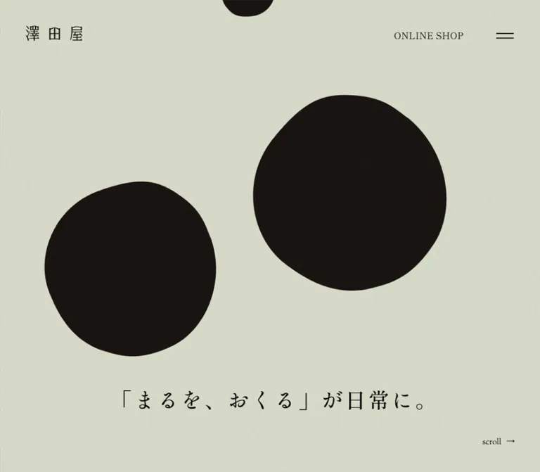
淡い灰緑の紙のような背景に、黒い有機的な円形と広い余白を組み合わせた和菓子ブランドサイト。横方向の商品ストーリー、丸い章の境界、控えめな写真と細い枠線が特徴です。
オリジナルサイトを見るSoft green paper, dark rounded forms, and the quiet ritual of giving a handmade sweet.
Website: sawataya.jp Original URL: https://sawataya.jp/ Final URL: https://sawataya.jp/ Theme: pale gray-green canvas, alternating warm dark chapters, and an off-white philosophy section; no selectable theme was evidenced. Inspected: September 22, 2026, at 14:06:39 UTC / 23:06:39 JST, through the supplied browser evidence. Viewports: 1440 × 1000 and 390 × 844 CSS pixels. Scope: the current homepage: opening composition, product narrative, philosophy, store/cafe/event-space information, company introduction, news, contact invitation, navigation structure, and footer. Visual captures cover the desktop opening, an intermediate product-story frame, desktop contact/footer, mobile opening, and mobile footer. Other sections are supported by rendered text and sampled element styles, with their imagery and complete visual states unverified.
Sawataya presents its confectionery through the idea of roundness. Large, slightly irregular dark forms stand for the shape of Kurodama; broad curved chapter boundaries repeat the motif at page scale. Thin pill outlines, rounded photography, and the restrained wordmark carry it into smaller components. The pale green surface has a fine visible grain, giving large empty areas a material quality.
The homepage combines product storytelling with a substantial corporate and visitor-information site. Its desktop product narrative occupies a wide horizontal track before the document continues through philosophy, shop information, and a dark closing area. Mobile reorganizes the narrative into a vertical sequence of overlapping rounded sections. An external shop link remains a quiet utility, while product history, making, gifting, and local spaces receive the main editorial attention.
Soft green paper, dark rounded forms, and the quiet ritual of giving a handmade sweet.
Website: sawataya.jp Original URL: https://sawataya.jp/ Final URL: https://sawataya.jp/ Theme: pale gray-green canvas, alternating warm dark chapters, and an off-white philosophy section; no selectable theme was evidenced. Inspected: September 22, 2026, at 14:06:39 UTC / 23:06:39 JST, through the supplied browser evidence. Viewports: 1440 × 1000 and 390 × 844 CSS pixels. Scope: the current homepage: opening composition, product narrative, philosophy, store/cafe/event-space information, company introduction, news, contact invitation, navigation structure, and footer. Visual captures cover the desktop opening, an intermediate product-story frame, desktop contact/footer, mobile opening, and mobile footer. Other sections are supported by rendered text and sampled element styles, with their imagery and complete visual states unverified.
Sawataya presents its confectionery through the idea of roundness. Large, slightly irregular dark forms stand for the shape of Kurodama; broad curved chapter boundaries repeat the motif at page scale. Thin pill outlines, rounded photography, and the restrained wordmark carry it into smaller components. The pale green surface has a fine visible grain, giving large empty areas a material quality.
The homepage combines product storytelling with a substantial corporate and visitor-information site. Its desktop product narrative occupies a wide horizontal track before the document continues through philosophy, shop information, and a dark closing area. Mobile reorganizes the narrative into a vertical sequence of overlapping rounded sections. An external shop link remains a quiet utility, while product history, making, gifting, and local spaces receive the main editorial attention.
| Name | Value | Suggested token | Evidence and role |
|---|---|---|---|
| Green Paper | #DADDCD |
--paper |
Measured rgb(218, 221, 205) on the page, navigation layer, shop section, and footer. The principal canvas. |
| Warm Dark | #1D1715 |
--dark |
Measured rgb(29, 23, 21) on the closing information region and dark mobile story chapters. |
| Deep Ink | #14100E |
--ink |
Measured rgb(20, 16, 14) on light product-story headings. A suitable approximation for the visible dark hero forms, whose own fill was not sampled. |
| Pale Olive | #CBD2AE |
--accent |
Measured rgb(203, 210, 174) on closing-area headings and the promotion-movie link. |
| Warm White | #F7F4F2 |
--warm-white |
Measured rgb(247, 244, 242) on the philosophy section. |
| Text Black | #000000 |
--text |
Measured on light-surface body text and navigation. |
| Reversed White | #FFFFFF |
--reverse |
Measured on dark-section paragraphs and several link containers. |
Green Paper is the flat computed background beneath the visibly textured result. Do not sample one bright grain speck and use it as the base color. The texture asset, blending method, and opacity were not supplied.
Pale Olive is a restrained secondary ink for dark surfaces. It does not act as a bright promotional fill. Contact-button lettering and its thin border appear pale in the desktop capture, although the sampled anchor container computes white; child styling was not included in the evidence.
The supplied blue and purple framework custom properties are not evidence of visible brand colors. Likewise, registered slider variables do not establish a visible carousel or its behavior.
| Context | Surface | Primary content | Supporting treatment |
|---|---|---|---|
| Opening | Green Paper | Dark organic forms and black text | Fine, low-contrast grain |
| Product history and making on mobile | Warm Dark | White paragraphs and Green Paper headings | Large curved upper boundary |
| Ingredients and gifting on mobile | Green Paper | Black paragraphs and Deep Ink headings | The same curved chapter geometry |
| Philosophy | Warm White | Black text | Spacious editorial composition |
| About, news, contact | Warm Dark | White content | Pale Olive headings and quiet outlined links |
| Footer | Green Paper | Black navigation and brand | Visually subdued copyright |
These are section-dependent surface changes. No color-theme selector was observed.
The sampled Japanese headings and paragraphs declare Shippori Mincho, followed by Yu Gothic variants, a Hiragino Gothic fallback, Meiryo, and sans-serif.
400, including the large story headings.Do not infer the logo's typeface from this stack. The sampled H1 has no text and a compact graphic-sized rectangle. Its inherited 40px / 50px, weight 700, does not describe the visible logo lettering.
Sorts Mill Goudy is the measured first family for PHILOSOPHY, SHOP, the scroll cue, the promotion-movie link, and the footer shop pill. It is followed by the Japanese stack.
The desktop header's ONLINE SHOP link instead uses the main stack in the supplied sample. Preserve this distinction when working from computed styles; do not apply the Latin accent family to every English word automatically.
The visible identity is the spaced three-character mark 澤田屋. It uses fine, contrasting strokes and generous internal separation. Treat it as brand artwork when an authorized asset is available. The source asset format and URL were not supplied, so neither an SVG path nor an exact replacement font can be specified.
Measured wordmark containers:
Values below are measured unless labeled estimated. Sizes refer to the sampled element; descendants can have their own styles.
| Role | Desktop size / line height | Mobile size / line height | Tracking and notes |
|---|---|---|---|
| Root/body defaults | 20 / 40px |
20 / 40px |
Defaults are extensively overridden. |
| Opening slogan | Approximately 44px |
Approximately 22px |
Screenshot estimate; its element style was not sampled. |
| Product anniversary heading | 34 / 44px |
20 / 30px |
Regular weight; normal tracking. |
| Main product-story H2 | 46 / 56px |
20 / 30px |
0.1em tracking: 4.6px desktop, 2px mobile. |
| Product-story body | 18 / 42px |
12 / 30.36px in most chapters |
0.05em tracking. |
| First product-history body on mobile | — | 13 / 32.89px |
0.65px tracking; wider than later story copy. |
| English section title | 60 / 60px |
30 / 30px |
Sorts Mill Goudy first in the declared stack. |
| Philosophy/shop H3 | 36 / 54px |
20 / 30px |
0.05em tracking. |
| Philosophy/shop paragraph | 15 / 33.45px |
12 / 30px |
0.03em tracking. |
| Store-information heading | 22 / 33px |
22 / 33px |
1.1px tracking. |
| About heading | 36 / 46px |
20 / 30px |
Pale Olive on Warm Dark. |
| News/contact heading | 30 / 30px |
20 / 20px |
Regular weight. |
| Contact explanation | 15 / 30px |
12 / 24px |
Centered; mobile uses three visible lines. |
| Desktop header shop link | 18 / 36px |
Not visible | Main font stack. |
| Scroll cue | 16 / 16px |
16 / 16px |
Position and arrow direction change. |
| Footer navigation | 18 / 18px |
15 / 15px |
Generous space between links. |
| Footer shop pill | 15 / 30px |
12 / 24px |
Latin accent stack. |
| Navigation-layer anchors | 15 / 15px |
12 / 12px |
Combined English/Japanese content; child styles unprovided. |
The unusually generous paragraph leading is fundamental. Desktop story copy uses roughly 2.33× line height; mobile story copy uses roughly 2.53×. This produces airy blocks despite small text.
Recommended accessibility adjustment: consider 14–16px mobile body copy for a new site. The observed 12–13px sizes are reference measurements, not a readability target that must be preserved at every cost.
The layout mixes fixed utility offsets, viewport-scale chapter shapes, and narrow editorial text blocks. It is not adequately described by one universal spacing unit.
| Relationship | Desktop | Mobile | Status |
|---|---|---|---|
| Header brand left/top | 50 / 50px |
25 / 24px |
Measured |
| Menu anchor box | 100 × 100px, at 1320, 20 |
75 × 75px, at 315, 0 |
Measured |
| Scroll cue bottom clearance | 50px |
50px |
Calculated from its rectangle |
| Philosophy/shop text left inset | 160px in left column |
30px |
Measured |
| Standard editorial text width | 526.39px |
330px |
Measured |
| First mobile story text inset | — | 40px; width 310px |
Measured |
| Later mobile story body inset | — | 70px; width 250px |
Measured |
| Editorial heading-to-paragraph gap | 20px |
20px |
Calculated from sampled rectangles |
| Philosophy/shop section top padding | 1000px |
499.2px |
Measured; part of the complete staged section composition |
| Philosophy bottom padding | 288px |
78px |
Measured |
| Shop bottom padding | 288px |
156px |
Measured |
| Footer padding, top/bottom | 288 / 160px |
78 / 80px |
Measured |
| Footer navigation row pitch | 48px |
45px |
Calculated |
The 1000px desktop section padding belongs to a larger media/title composition. Do not copy it into a plain text section without the associated visual stage.
| Element | Geometry | Evidence |
|---|---|---|
| Hero forms | Rounded but visibly irregular silhouettes | Screenshot observation; exact paths unavailable |
| Lifestyle photo | Portrait crop, approximately 371 × 465px, radius about 24px |
Desktop screenshot estimate |
| Contact pill | 50px radius; approximately 318 × 57px desktop |
Measured |
| Contact pill on mobile | Approximately 274 × 57px |
Measured |
| Resource pill | 50px radius; approximately 234 × 38px |
Measured |
| Promotion-movie pill | 100px radius; about 237 × 43px desktop and 202 × 40px mobile |
Measured |
| Footer shop pill | 30px radius; 140 × 42px desktop, 140 × 32px mobile |
Measured |
| Mobile story cap | 800px 800px 0 0 on oversized section boxes |
Measured |
| Mobile closing region | 800px radius on a 690px-wide box |
Measured |
| Desktop dark-to-footer boundary | Broad downward-bulging arc | Screenshot observation; exact generating rule unavailable |
The mobile curve is not a rounded card inside the viewport. Several sections are 690px wide at a 390px viewport, positioned at x = −150px, with 150px horizontal padding restoring the content area. The initial dark story cap is 630px wide at x = −120px. Their geometry creates a shallow, page-spanning dome.
For a new implementation, contain decorative overhang locally. Avoid making the whole document horizontally scrollable merely to construct these curves.
| Structure | Desktop | Mobile |
|---|---|---|
| Document height | 23,090px |
Approximately 13,400px |
| Opening stage | 1440 × 1000px |
390 × 844px |
| Product narrative track | Flex layout, approximately 9509.66px wide, starting at x = 1440px |
Block layout, 390px wide, beginning at y = 844px |
| Opening/product wrapper | 13,390px high |
Approximately 5310.59px high |
| Editorial content span | 1120px, from x = 160 to 1280 |
330px, from x = 30 to 360 |
| Editorial text columns | 526.39px each, with a calculated 67.22px gap |
One column |
| News content width | 730px, centered |
330px inside 30px side padding |
| About copy width | 306px |
215px |
| Footer outer content span | Approximately 1160px |
One centered stack |
| Footer total height | 640px |
855px |
Document heights describe the captured content and its scroll staging. They should never become fixed implementation tokens.
Anatomy: brand link at the upper left; contextual section label farther right; desktop shop link near the upper right; two-stroke menu control at the edge.
The header has no visible filled bar or enclosing border. Its sampled structural height is zero, while its child controls occupy independent rectangles. Across the supplied desktop opening and lower-page captures, the logo and controls remain in the same screen region, supporting a persistent overlay treatment. The exact positioning declaration was not supplied.
At 1440px, the brand begins at (50, 50). The shop link begins around (1163, 50). The menu's visible strokes are approximately 34px wide, centered within a much larger 100px anchor box. The large box and small strokes are separate design decisions.
The contextual label uses a fine horizontal rule, a short English section name, and a smaller Japanese description. The intermediate capture reads KURODAMA and くろ玉について; the closing capture reads ABOUT and 澤田屋について. On the dark surface, the logo and menu strokes appear white while the context label takes a pale tone.
Mobile observation: the header shop link disappears; the logo moves to (25, 24) and shrinks. Context labels visibly overlap and extend beyond the right edge in both supplied mobile captures. This is an observed rendering issue. A new implementation should hide or recomposite that label on narrow screens.
Anatomy: Green Paper field; oversized dark organic forms; a single Japanese slogan; unobtrusive scroll cue; persistent header above the composition.
The desktop frame places one form low on the left and a larger form higher on the right. Approximate visual bounds are:
x ≈ 178px, y ≈ 402px, 337 × 342px.x ≈ 741px, y ≈ 199px, 374 × 380px.y = 825–865px.The source copy is 「まるを、おくる」が日常に。. Its position leaves a broad field between the header and message. There is no large filled purchase button in this opening composition.
The mobile frame changes the arrangement: a small form near the upper center, a large form around the center-right, and another form partly cropped by the left edge. The slogan is near y ≈ 572px, while scroll ↓ is centered close to the bottom.
These captures establish compositions, not animation trajectories. Do not infer continuous morphing, physics, or a looping path from the different desktop and mobile arrangements.
Content order: anniversary/history, product origins, ingredients, hand making, and gifting.
Desktop uses a horizontally arranged series of panels, with varied widths rather than identical slides. Sampled panel widths range from approximately 1034px to 2280px. Large regular-weight headings and very loose paragraph leading accompany alternating light and reversed content colors.
The track's offscreen horizontal geometry and the rightward desktop scroll cue support a horizontal storytelling model. The large enclosing document region suggests scroll staging, but the exact vertical-scroll-to-horizontal-translation mapping was not supplied.
On mobile, the same content appears in normal vertical order. Dark and light sections overlap through broad curved caps. The first story paragraph is 310px wide; later copy narrows to 250px. This tighter center column leaves room for the rounded composition to remain perceptible.
The measured 46px desktop story headings become 20px on mobile while retaining 0.1em tracking. Preserve the order and readable flow even when using a simpler scroll implementation.
The intermediate desktop capture contains a single portrait photo at approximately (779, 386), measuring 371 × 465px. Its rounded rectangle sits to the right of center with expansive paper space around it.
The image shows a child looking down as a hand presents a glossy dark sweet on a small ceramic plate. The human face is soft in focus; the sweet and act of serving form the narrative center. Warm wood, skin tones, and off-white ceramics introduce color without competing with the page palette.
This capture has little visible copy beyond the header. Treat it as one captured story state, not proof that the surrounding narrative permanently lacks text.
Reusable anatomy: portrait media window, modest corner radius, natural photograph, no border, no caption card, and substantial surrounding negative space.
The rendered content contains three numbered philosophy entries beneath the PHILOSOPHY section heading.
Desktop text blocks alternate between x = 753.61px and x = 160px, each 526.39px wide. This establishes alternating editorial alignment. Associated media content is not visible in the supplied screenshots, so its subject, crop, and exact dimensions remain unspecified.
Each entry contains a small identifying label, a 36px regular-weight Japanese H3, and a 15px paragraph with 33.45px leading. On mobile, the heading becomes 20px, the paragraph 12px, and every text block occupies the same 330px column.
Use Warm White to distinguish this section from the greener product and shop areas. Preserve its editorial rhythm rather than turning the three statements into equal-height promotional cards.
The homepage describes three uses of the physical location: STORE, CAFE, and EVENT SPACE. The desktop text alternates left, right, then left. Headings and body styles follow the philosophy-row scale.
The event-space module includes a compact outlined resource link, ご利用案内のPDFファイル. Its measured padding is 10px 20px, with a 50px radius. The linked document was not opened during this analysis.
A subsequent information block contains the store name, address, map access, parking link, telephone, opening hours, and closure notes. The store heading remains 22px on both tested widths. Small MAP and parking controls use 13px type with 5px 10px padding and 50px radii.
Separate practical venue details from editorial paragraphs. A semantic description list is a recommended implementation, not a claim about the source markup.
A Warm Dark region groups a compact company introduction, three dated news links, and contact information.
The company introduction is unusually narrow: 306px on desktop and 215px on mobile. Its pale heading and white body copy establish a quiet transition from the broad shop narrative.
News links sit in a 730px desktop column and a 330px mobile column. Sampled row boxes are approximately 115px and 113px high, respectively, with vertical padding changing from 33px to 25px. They remain text links; there is no evidence here for image-led news cards.
The news-anchor container computes 20px / 40px, but the date and title child styles were not supplied. Do not assign that parent value to every visible line without further inspection.
Anatomy: centered heading, short explanatory paragraph, outlined pill link, and a broad curved lower boundary leading into the footer.
The desktop heading is 30px; the body is 15px with 30px leading. The contact link measures approximately 318 × 57px, has a 50px radius, and uses measured padding of 15px 60px 20px. The mobile pill remains 57px tall and narrows to approximately 274px.
The visible label is お問い合わせフォームへ, followed by a restrained rightward arrow. The arrow construction and child font size were not sampled.
In the desktop capture, the dark boundary reaches approximately y = 381px at the edges and y = 504px near the center. This roughly 123px difference is a screenshot estimate of the arc's depth, not a source border-radius value.
A full-viewport Green Paper navigation section exists in the DOM. It contains eight primary destinations with English/Japanese label pairs and two social links.
The sampled desktop links are centered in a vertical sequence, with approximately 82px between corresponding row starts. Mobile row starts are approximately 70.75px apart. The navigation section declares a 0.4s transition.
No menu-opening sequence was supplied. Focus handling, scroll locking, close behavior, and the actual revealed appearance remain unverified. The last mobile original-page capture is the footer: its logo dimensions, seven Japanese navigation links, shop pill, social links, and address match the footer evidence, not this eight-item navigation layer.
Desktop uses a broad brand-and-contact group on the left, two navigation columns, and a rightmost shop/social group.
Measured column starts are approximately:
x = 140px.x = 720px.x = 940px.x = 1160px.The footer wordmark is larger than the header mark. Address, telephone, email, and copyright sit beneath it in small text. Navigation links use a 48px row pitch, leaving them visually unboxed.
Mobile reorganizes the footer into a centered vertical sequence: wordmark, seven navigation links, shop pill, stacked social links, contact details, and copyright. The whole footer measures 855px high at the tested width.
Instagram and X appear as recognizable outline symbols paired with names. Some sampled parent anchors compute white even though their visible content is dark on the light footer; child styling or artwork was not included in the sample. Follow the visible contrast rather than copying the parent color indiscriminately.
| Element or group | Recorded value | What the evidence establishes |
|---|---|---|
| Header, many links, navigation layer | 0.4s transition |
A shared short transition duration; target properties and visual end states are not established. |
| Opening full-screen surface | 0.8s linear 0.5s |
A delayed transition declaration on an opening layer. |
| Another opening/media section | 0.8s linear 2s |
A longer initial delay; its exact visual function is unverified. |
| Product-story headings | 0.9s transition |
Heading transition duration in the sampled state. |
| Philosophy/shop headings and paragraphs | 0.6s transition |
Shared editorial reveal-related timing, without a supplied trajectory. |
| Mobile product headings | 2s steps(47) 0.2s forwards mask-play |
A named, finite stepped animation. Keyframes and mask artwork were not supplied. |
| Mobile contact section | 2s steps(47) forwards mask-play |
The same animation name, without the heading's 0.2s delay in this sample. |
| Mobile contact transition | 0.6s 0.1s |
Additional transition duration and delay. |
| Unidentified full-viewport layer | 0.5s transition |
Existence of a transition; purpose unverified. |
A bare transition: all entry without a nonzero duration is not evidence of visible motion. Do not derive a universal animation rule from those entries.
The mask-play declaration supports a stepped reveal mechanism, but it does not reveal whether the actual mask looks brushed, grainy, geometric, or otherwise. Recreating its exact appearance requires the missing keyframes and asset.
https://www.kurodama.co.jp/. Checkout and shop-page behavior are outside scope.PROMOTION MOVIE points to a YouTube URL. This does not establish an in-page modal, autoplay, or audio behavior.The capture process waited for finite animations and layout stability, with bounded timeouts. It temporarily paused perpetual animation during readiness checks and then resumed it. Static captures therefore cannot prove complete animation coverage or a particular phase of a continuous effect.
| Layer | Appearance | Structural role |
|---|---|---|
| Primary canvas | Pale green with fine visible grain | Holds sparse opening artwork and large negative spaces |
| Dark chapter | Warm near-black | Provides contrast and repeats the confection's dark exterior |
| Philosophy field | Warm off-white | Separates the values narrative from product and venue information |
| Photograph | Rounded portrait image without a surrounding card | Adds human scale, food texture, and warmth |
| Utility control | Thin outline, rounded ends, transparent fill | Quiet navigation to shop, movie, resources, and contact |
| Closing boundary | Very broad curved silhouette | Carries the round motif into the footer transition |
| Navigation layer | Full-viewport paper-colored section in the DOM | Organizes primary destinations; revealed state unverified |
No general elevation or card-shadow system is apparent in the supplied screenshots. Separation comes from color fields, scale, blank space, media crops, and curved boundaries.
The defining visual asset is the dark rounded form. It has enough asymmetry to feel handmade without becoming cartoonish. Its relationship to the actual sweet is reinforced by the photograph of a glossy black Kurodama on a plate.
The visible photography is domestic and relational: a child, an adult hand, ceramic dishes, and warm interior tones. The image communicates serving and receiving. For additional photography, prefer real handling, preparation, sharing, and the physical venue. These are recommendations; the unseen original image sets were not inspected.
Keep grain fine and quiet. It should register across open paper areas without visibly obscuring small text. Avoid turning the surface into strongly stained parchment or a dramatic rough-paper collage.
No image src, video src, logo file path, or mask asset URL was included in the supplied evidence. The following references identify visible assets and known destinations without inventing filenames.
| Asset or reference | Evidence | Implementation implication |
|---|---|---|
| Sawataya wordmark | Visible in header and footer; measured containers supplied | Use approved brand artwork; the exact lettering face is unknown. |
| Dark organic hero forms | Visible in desktop and mobile openings | Reusable silhouettes may be approximated with SVG paths or asymmetric radii. Exact source construction is unknown. |
| Portrait serving photograph | Visible in the intermediate desktop capture | Preserve the roughly 4:5 crop, subtle radius, and warm natural palette. |
| Paper grain | Visible across original-page captures | A fine repeated texture can approximate it; original asset and blend settings are unknown. |
| Social symbols | Instagram and X symbols visible in the footer | Use recognizable accessible marks, not unrelated decorative icons. |
| Promotion movie | Original-page link to YouTube | Destination is evidenced; movie content and playback interaction were not inspected. |
Use authorized photography and brand assets when available. A CSS approximation can reproduce the spatial language but cannot replace the identity of the actual wordmark or photographs.
The opening is a full-screen scene. A following flex track spans approximately 9509.66px beyond the initial viewport, with product panels of unequal widths. The enclosing section's 13,390px height is consistent with a substantial scroll-controlled sequence, but the supplied evidence does not expose its controller or exact pinning range.
After that region, philosophy and shop sections use alternating text positions within a 1120px content span. Their major English titles are 60px and their Japanese subsection headings are 36px. The closing region narrows the reading measure again, first to a compact about block and then to a 730px news/contact area.
The footer distributes information horizontally and restores the light green surface beneath a broad dark arc.
At 390px, the product track switches to block layout and begins immediately after the 844px opening stage. Oversized rounded section backgrounds create alternating domes rather than a horizontally traversed strip.
Text columns vary deliberately:
The footer becomes a centered sequence and the scroll cue moves from the bottom right to the bottom center. The header shop link disappears while the footer retains shop access.
The mobile opening preserves substantial empty space and changes the scale and placement of its dark forms. It is a separate composition, not a uniform downscale of the desktop frame.
At the upper right of both mobile captures, contextual section labels overlap and are clipped by the viewport edge. Preserve this as an inspection finding, not a design instruction. The exact cause was not established; possible implementation fixes should be tested rather than assumed.
Only 1440px and 390px widths were supplied. The original breakpoint, tablet layout, landscape behavior, zoom behavior, safe-area handling, and dynamic browser-toolbar response are unknown. The 767px breakpoint used below is a recommended starting point for an adaptation.
These are recommendations for a new implementation, not verified original-site features:
aria-expanded, and aria-controls. If it opens a modal navigation layer, implement appropriate focus management and Escape handling.#DADDCD.#1D1715.#14100E; ordinary text is also measured as #000000.#CBD2AE.#F7F4F2.#FFFFFF.“Create a Japanese confectionery brand homepage inspired by Sawataya's current visual language. Use pale gray-green paper #DADDCD, warm dark brown #1D1715, irregular dark rounded silhouettes, fine grain, and generous empty space. Place a compact three-character brand mark at the upper left and a small shop link plus two-stroke menu at the upper right. Center a restrained Japanese message low in the full-screen opening. Organize the product story as a broad horizontal desktop narrative and vertically stacked, curved chapters on mobile. Continue into philosophy, store/cafe/event-space information, company news, contact, and a spacious footer. Use regular-weight Japanese editorial typography, loose leading, warm human photography, and thin outlined pills. Keep the mobile header free of overlapping labels.”
「まるを、おくる」が日常に。 near the lower fifth, with a tiny rightward scroll cue at the desktop bottom right. On mobile, recompose the forms and center a downward scroll cue.”“Use supplied measurements where available. Label substitute silhouette geometry, grain, breakpoints, and hover states as approximations. Do not invent original asset paths, claim exact font rendering, or describe untested navigation and media interactions as established behavior.”
This is a reusable adaptation, not extracted source CSS. It uses measured colors and component dimensions, estimated static hero geometry, and a recommended mobile-header fix. The optional horizontal strip uses native overflow; the original scroll controller, media playback, and mask animation are not recreated.
The font declarations require approved font files to be loaded separately. The generated SVG grain is an approximation. The mobile editorial body token is intentionally raised to 14px from the observed 12px for readability.
:root {
  /* Measured palette */
  --paper: #daddcd;
  --dark: #1d1715;
  --ink: #14100e;
  --accent: #cbd2ae;
  --warm-white: #f7f4f2;
  --text: #000;
  --reverse: #fff;

  /* Observed first choices with a simplified fallback stack */
  --font-body: 'Shippori Mincho', 'Yu Gothic', sans-serif;
  --font-latin: 'Sorts Mill Goudy', var(--font-body);

  --story-title: 46px;
  --story-body: 18px;
  --editorial-title: 36px;
  --editorial-body: 15px;
  --mobile-body: 14px; /* Recommended; observed editorial body is 12px */

  --content-width: 1120px;
  --reading-width: 730px;
  --column-gap: 67.2px;
  --radius-photo: 24px; /* Screenshot estimate */
  --radius-pill: 50px;
  --rule: 1px; /* Visual approximation */
  --duration-ui: 400ms;
  --duration-editorial: 600ms;
}

* { box-sizing: border-box; }
body {
  margin: 0;
  color: var(--text);
  background: var(--paper);
  font-family: var(--font-body);
  font-weight: 400;
}
img { display: block; max-width: 100%; }
button, a { -webkit-tap-highlight-color: transparent; }
button { font: inherit; }
a { color: inherit; }

/* Recommended local texture approximation */
.paper-surface {
  position: relative;
  isolation: isolate;
  background: var(--paper);
}
.paper-surface::before {
  content: '';
  position: absolute;
  inset: 0;
  z-index: -1;
  pointer-events: none;
  opacity: 0.055;
  background-image: url("data:image/svg+xml,%3Csvg xmlns='http://www.w3.org/2000/svg' width='160' height='160'%3E%3Cfilter id='n'%3E%3CfeTurbulence type='fractalNoise' baseFrequency='.85' numOctaves='3' stitchTiles='stitch'/%3E%3C/filter%3E%3Cpath fill='%23000' filter='url(%23n)' d='M0 0h160v160H0z'/%3E%3C/svg%3E");
}

.site-header {
  position: fixed;
  inset: 0 0 auto;
  z-index: 20;
  height: 0;
  color: var(--text);
  pointer-events: none;
}
.site-header > * { pointer-events: auto; }
.site-header[data-surface='dark'] { color: var(--reverse); }
.brand {
  position: absolute;
  top: 50px;
  left: 50px;
  width: 110px;
  text-decoration: none;
}
.brand img { width: 100%; height: auto; }
.brand-wordmark {
  font-size: 30px;
  line-height: 1;
  letter-spacing: 0.3em;
  white-space: nowrap;
}
.header-shop {
  position: absolute;
  top: 50px;
  right: 150px;
  font-size: 18px;
  line-height: 36px;
  text-decoration: none;
}
.section-context {
  position: absolute;
  top: 60px;
  left: 235px;
  display: flex;
  align-items: center;
  gap: 16px;
  font-size: 16px;
  line-height: 1;
}
.section-context::before {
  content: '';
  width: 78px;
  border-top: 1px solid currentColor;
}
.menu-toggle {
  position: absolute;
  top: 20px;
  right: 20px;
  width: 100px;
  height: 100px;
  padding: 0;
  border: 0;
  background: none;
  color: inherit;
  cursor: pointer;
}
.menu-toggle::before,
.menu-toggle::after {
  content: '';
  position: absolute;
  left: 50%;
  width: 34px;
  height: 1px;
  background: currentColor;
  transform: translateX(-50%);
}
.menu-toggle::before { top: 44px; }
.menu-toggle::after { top: 53px; }

/* Static poster geometry estimated from the opening captures */
.hero {
  position: relative;
  height: 100vh;
  height: 100svh;
  min-height: 600px;
  overflow: clip;
}
.blob {
  position: absolute;
  background: var(--ink);
  border-radius: 48% 52% 51% 49% / 47% 53% 47% 53%;
}
.blob--left {
  left: 12.4%;
  top: 40.2%;
  width: 23.4%;
  aspect-ratio: 337 / 342;
  transform: rotate(-12deg);
}
.blob--right {
  left: 51.5%;
  top: 19.9%;
  width: 26%;
  aspect-ratio: 374 / 380;
  transform: rotate(9deg);
}
.blob--small { display: none; }
.hero-slogan {
  position: absolute;
  top: 81.5%;
  inset-inline: 25px;
  margin: 0;
  font-size: clamp(22px, 3.05vw, 44px);
  font-weight: 400;
  line-height: 1.4;
  letter-spacing: 0.1em;
  text-align: center;
}
.scroll-cue {
  position: absolute;
  right: 50px;
  bottom: 50px;
  display: flex;
  gap: 12px;
  font: 16px / 1 var(--font-latin);
  text-decoration: none;
}
.arrow-mobile { display: none; }

/* Optional native desktop reading strip; no scroll hijacking */
.story-track {
  display: flex;
  overflow-x: auto;
  scroll-snap-type: x proximity;
}
.story-panel {
  flex: 0 0 100%;
  min-width: 0;
  min-height: 100svh;
  padding: 120px max(40px, 11vw);
  scroll-snap-align: start;
}
.story-panel h2 {
  font-size: var(--story-title);
  font-weight: 400;
  line-height: 56px;
  letter-spacing: 0.1em;
}
.story-panel p {
  max-width: 490px;
  font-size: var(--story-body);
  line-height: 42px;
  letter-spacing: 0.05em;
}
.surface-dark {
  color: var(--reverse);
  background: var(--dark);
}
.surface-dark h2 { color: var(--paper); }

.editorial-section { padding: 120px 30px; }
.editorial-section--philosophy { background: var(--warm-white); }
.editorial-row {
  display: grid;
  grid-template-columns: repeat(2, minmax(0, 1fr));
  align-items: center;
  gap: var(--column-gap);
  max-width: var(--content-width);
  margin-inline: auto;
}
.editorial-row + .editorial-row { margin-top: 160px; }
.editorial-row--reverse .editorial-media { order: 2; }
.editorial-copy h3 {
  margin: 0 0 20px;
  font-size: var(--editorial-title);
  font-weight: 400;
  line-height: 1.5;
  letter-spacing: 0.05em;
}
.editorial-copy p {
  margin: 0;
  font-size: var(--editorial-body);
  line-height: 2.23;
  letter-spacing: 0.03em;
}
.portrait-photo {
  width: 371px;
  max-width: 100%;
  aspect-ratio: 371 / 465;
  object-fit: cover;
  border-radius: var(--radius-photo);
}
.pill {
  display: inline-flex;
  align-items: center;
  justify-content: center;
  gap: 10px;
  min-height: 44px;
  max-width: 100%;
  padding: 10px 20px;
  border: var(--rule) solid currentColor;
  border-radius: var(--radius-pill);
  color: inherit;
  background: transparent;
  font-size: 16px;
  line-height: 1.4;
  text-decoration: none;
  transition: opacity var(--duration-ui);
}
.contact-section {
  padding: 100px 30px 160px;
  color: var(--reverse);
  background: var(--dark);
  border-radius: 0 0 50% 50% / 0 0 124px 124px;
  text-align: center;
}
.contact-section h2 {
  margin: 0 0 50px;
  color: var(--accent);
  font-size: 30px;
  font-weight: 400;
  line-height: 1;
}
.contact-section p {
  margin: 0 auto 40px;
  max-width: var(--reading-width);
  font-size: 15px;
  line-height: 2;
}
.contact-section .pill {
  width: 318px;
  min-height: 57px;
  color: var(--accent);
}
.site-footer { padding: 144px 30px 160px; }
.footer-grid {
  display: grid;
  grid-template-columns: minmax(0, 580px) 220px 220px 140px;
  max-width: 1160px;
  margin-inline: auto;
}
.footer-brand img { width: 162px; height: auto; }
.footer-contact {
  margin-top: 60px;
  font-size: 12px;
  line-height: 1.7;
}
.footer-nav { display: grid; align-content: start; gap: 30px; }
.footer-nav a { font-size: 18px; line-height: 1; text-decoration: none; }
.footer-social { display: grid; align-content: start; gap: 20px; }
.footer-social .pill { width: 140px; font-family: var(--font-latin); }
.copyright { opacity: 0.4; }

/* Recommended feedback; original hover appearance was not supplied */
:where(a, button):focus-visible {
  outline: 2px solid currentColor;
  outline-offset: 5px;
}
@media (hover: hover) {
  .pill:hover { opacity: 0.7; }
}

/* Recommended intermediate layout; original breakpoint unknown */
@media (min-width: 768px) and (max-width: 1199px) {
  .section-context { display: none; }
  .footer-grid {
    grid-template-columns: 2fr 1fr 1fr 140px;
    gap: 24px;
  }
}

@media (max-width: 767px) {
  .brand { top: 24px; left: 25px; width: 78px; }
  .brand-wordmark { font-size: 21px; }
  .header-shop, .section-context { display: none; }
  .menu-toggle { top: 0; right: 0; width: 75px; height: 75px; }
  .menu-toggle::before, .menu-toggle::after { width: 26px; }
  .menu-toggle::before { top: 33px; }
  .menu-toggle::after { top: 40px; }
  .hero { min-height: 560px; }
  .blob--left {
    left: -46px;
    top: 57.9%;
    width: 126px;
    aspect-ratio: 1;
  }
  .blob--right {
    left: 34.9%;
    top: 32.4%;
    width: 50.3%;
    aspect-ratio: 196 / 193;
  }
  .blob--small {
    display: block;
    left: 33.8%;
    top: 12.7%;
    width: 14.6%;
    aspect-ratio: 1;
  }
  .hero-slogan { top: 67.1%; font-size: 22px; letter-spacing: 0.05em; }
  .scroll-cue { left: 50%; right: auto; transform: translateX(-50%); }
  .arrow-desktop { display: none; }
  .arrow-mobile { display: inline; }
  .story-track { display: block; overflow: visible; }
  .story-panel { min-height: 0; padding: 100px 40px; }
  .story-panel h2 { font-size: 20px; line-height: 30px; }
  .story-panel p { font-size: var(--mobile-body); line-height: 2.3; }
  .editorial-section { padding: 78px 30px; }
  .editorial-row { grid-template-columns: 1fr; gap: 40px; }
  .editorial-row--reverse .editorial-media { order: initial; }
  .editorial-row + .editorial-row { margin-top: 80px; }
  .editorial-copy h3 { font-size: 20px; line-height: 30px; }
  .editorial-copy p { font-size: var(--mobile-body); line-height: 2.2; }
  .contact-section { padding: 80px 30px 100px; }
  .contact-section h2 { font-size: 20px; margin-bottom: 20px; }
  .contact-section p { font-size: var(--mobile-body); margin-bottom: 20px; }
  .contact-section .pill { width: 274px; }
  .site-footer { padding: 78px 30px 80px; text-align: center; }
  .footer-grid { display: flex; flex-direction: column; align-items: center; gap: 30px; }
  .footer-brand { order: 0; margin-bottom: 20px; }
  .footer-brand img { width: 124px; margin-inline: auto; }
  .footer-nav { order: 1; width: 100%; }
  .footer-nav a { font-size: 15px; }
  .footer-social { order: 2; justify-items: center; margin-top: 30px; }
  .footer-contact { order: 3; margin-top: 15px; }
}

@media (prefers-reduced-motion: reduce) {
  .pill { transition: none; }
  .story-track { scroll-snap-type: none; }
  [data-reveal] {
    animation: none !important;
    transition: none !important;
    opacity: 1 !important;
    transform: none !important;
    mask-image: none !important;
    -webkit-mask-image: none !important;
  }
}
This example uses text as an explicit wordmark placeholder. Replace it with approved brand artwork for fidelity. The menu button requires a separately implemented navigation layer and behavior. Keep contact details as a separate footer-grid item if using the mobile reordering rules above.
<header class="site-header">
  <a class="brand" href="/" aria-label="Sawataya home">
    <span class="brand-wordmark">澤田屋</span>
  </a>
  <a class="header-shop" href="https://www.kurodama.co.jp/">ONLINE SHOP</a>
  <button class="menu-toggle" type="button" aria-label="Open navigation"></button>
</header>

<main>
  <section class="hero paper-surface" aria-labelledby="opening-message">
    <span class="blob blob--left" aria-hidden="true"></span>
    <span class="blob blob--right" aria-hidden="true"></span>
    <span class="blob blob--small" aria-hidden="true"></span>
    <h1 class="hero-slogan" id="opening-message">「まるを、おくる」が日常に。</h1>
    <a class="scroll-cue" href="#kurodama">
      <span>scroll</span>
      <span class="arrow-desktop" aria-hidden="true">→</span>
      <span class="arrow-mobile" aria-hidden="true">↓</span>
    </a>
  </section>

  <section class="story-panel surface-dark" id="kurodama">
    <h2>地域に愛されつづける<br>“まるい”和菓子</h2>
    <p>元祖くろ玉が誕生したのは1929年(昭和4年)のこと。</p>
  </section>
</main>
Optional aliases for a project already using Tailwind v4. This does not imply that the original site uses Tailwind. Define the custom properties above first.
@theme inline {
  --color-paper: var(--paper);
  --color-dark: var(--dark);
  --color-ink: var(--ink);
  --color-accent: var(--accent);
  --color-warm-white: var(--warm-white);
  --font-editorial: var(--font-body);
  --font-display: var(--font-latin);
  --text-story: var(--story-title);
  --text-editorial: var(--editorial-title);
  --radius-photo: 24px;
  --radius-pill: 50px;
  --spacing-editorial-gap: 67.2px;
}
2026-09-22T14:06:39.467Z, equivalent to 23:06:39 JST.This reference describes the current homepage evidenced by the supplied captures and rendered measurements. Estimates and implementation recommendations are identified separately from measured original-page values.
# Sawataya / Kurodama — Style Reference

> Soft green paper, dark rounded forms, and the quiet ritual of giving a handmade sweet.

**Website:** [sawataya.jp](https://sawataya.jp/)
**Original URL:** https://sawataya.jp/
**Final URL:** https://sawataya.jp/
**Theme:** pale gray-green canvas, alternating warm dark chapters, and an off-white philosophy section; no selectable theme was evidenced.
**Inspected:** September 22, 2026, at 14:06:39 UTC / 23:06:39 JST, through the supplied browser evidence.
**Viewports:** 1440 × 1000 and 390 × 844 CSS pixels.
**Scope:** the current homepage: opening composition, product narrative, philosophy, store/cafe/event-space information, company introduction, news, contact invitation, navigation structure, and footer. Visual captures cover the desktop opening, an intermediate product-story frame, desktop contact/footer, mobile opening, and mobile footer. Other sections are supported by rendered text and sampled element styles, with their imagery and complete visual states unverified.

Sawataya presents its confectionery through the idea of roundness. Large, slightly irregular dark forms stand for the shape of Kurodama; broad curved chapter boundaries repeat the motif at page scale. Thin pill outlines, rounded photography, and the restrained wordmark carry it into smaller components. The pale green surface has a fine visible grain, giving large empty areas a material quality.

The homepage combines product storytelling with a substantial corporate and visitor-information site. Its desktop product narrative occupies a wide horizontal track before the document continues through philosophy, shop information, and a dark closing area. Mobile reorganizes the narrative into a vertical sequence of overlapping rounded sections. An external shop link remains a quiet utility, while product history, making, gifting, and local spaces receive the main editorial attention.
# Sawataya / Kurodama — Style Reference

> Soft green paper, dark rounded forms, and the quiet ritual of giving a handmade sweet.

**Website:** [sawataya.jp](https://sawataya.jp/)
**Original URL:** https://sawataya.jp/
**Final URL:** https://sawataya.jp/
**Theme:** pale gray-green canvas, alternating warm dark chapters, and an off-white philosophy section; no selectable theme was evidenced.
**Inspected:** September 22, 2026, at 14:06:39 UTC / 23:06:39 JST, through the supplied browser evidence.
**Viewports:** 1440 × 1000 and 390 × 844 CSS pixels.
**Scope:** the current homepage: opening composition, product narrative, philosophy, store/cafe/event-space information, company introduction, news, contact invitation, navigation structure, and footer. Visual captures cover the desktop opening, an intermediate product-story frame, desktop contact/footer, mobile opening, and mobile footer. Other sections are supported by rendered text and sampled element styles, with their imagery and complete visual states unverified.

Sawataya presents its confectionery through the idea of roundness. Large, slightly irregular dark forms stand for the shape of Kurodama; broad curved chapter boundaries repeat the motif at page scale. Thin pill outlines, rounded photography, and the restrained wordmark carry it into smaller components. The pale green surface has a fine visible grain, giving large empty areas a material quality.

The homepage combines product storytelling with a substantial corporate and visitor-information site. Its desktop product narrative occupies a wide horizontal track before the document continues through philosophy, shop information, and a dark closing area. Mobile reorganizes the narrative into a vertical sequence of overlapping rounded sections. An external shop link remains a quiet utility, while product history, making, gifting, and local spaces receive the main editorial attention.

## How to Read This Reference

- **Measured** means a value explicitly included in the supplied computed styles or element rectangles. These measurements are snapshots, not a complete stylesheet audit.
- **Estimated** means a visual approximation from the original-page captures. Hero artwork dimensions, grain strength, and some visible lettering sizes fall into this category.
- **Calculated** means arithmetic based on supplied measurements, such as the gap between desktop editorial columns.
- **Recommended** means guidance for a new implementation. Breakpoints, accessibility improvements, replacement geometry, and the Quick Start classes are recommendations unless stated otherwise.
- **Token names** are implementation aliases introduced here. The supplied custom-property list did not expose a useful semantic brand-token system.
- **Visibility matters:** the DOM includes offscreen content and navigation layers. A measured rectangle does not establish that an element was visible or interactive at capture time.
- **Typography matters:** a computed font-family list identifies the declared stack, not which downloaded font actually rendered every glyph.

## Tokens — Colors

### Core Palette

| Name | Value | Suggested token | Evidence and role |
| --- | --- | --- | --- |
| Green Paper | `#DADDCD` | `--paper` | Measured `rgb(218, 221, 205)` on the page, navigation layer, shop section, and footer. The principal canvas. |
| Warm Dark | `#1D1715` | `--dark` | Measured `rgb(29, 23, 21)` on the closing information region and dark mobile story chapters. |
| Deep Ink | `#14100E` | `--ink` | Measured `rgb(20, 16, 14)` on light product-story headings. A suitable approximation for the visible dark hero forms, whose own fill was not sampled. |
| Pale Olive | `#CBD2AE` | `--accent` | Measured `rgb(203, 210, 174)` on closing-area headings and the promotion-movie link. |
| Warm White | `#F7F4F2` | `--warm-white` | Measured `rgb(247, 244, 242)` on the philosophy section. |
| Text Black | `#000000` | `--text` | Measured on light-surface body text and navigation. |
| Reversed White | `#FFFFFF` | `--reverse` | Measured on dark-section paragraphs and several link containers. |

Green Paper is the flat computed background beneath the visibly textured result. Do not sample one bright grain speck and use it as the base color. The texture asset, blending method, and opacity were not supplied.

Pale Olive is a restrained secondary ink for dark surfaces. It does not act as a bright promotional fill. Contact-button lettering and its thin border appear pale in the desktop capture, although the sampled anchor container computes white; child styling was not included in the evidence.

The supplied blue and purple framework custom properties are not evidence of visible brand colors. Likewise, registered slider variables do not establish a visible carousel or its behavior.

### Color Relationships

| Context | Surface | Primary content | Supporting treatment |
| --- | --- | --- | --- |
| Opening | Green Paper | Dark organic forms and black text | Fine, low-contrast grain |
| Product history and making on mobile | Warm Dark | White paragraphs and Green Paper headings | Large curved upper boundary |
| Ingredients and gifting on mobile | Green Paper | Black paragraphs and Deep Ink headings | The same curved chapter geometry |
| Philosophy | Warm White | Black text | Spacious editorial composition |
| About, news, contact | Warm Dark | White content | Pale Olive headings and quiet outlined links |
| Footer | Green Paper | Black navigation and brand | Visually subdued copyright |

These are section-dependent surface changes. No color-theme selector was observed.

## Tokens — Typography

### Japanese Editorial Stack

The sampled Japanese headings and paragraphs declare **Shippori Mincho**, followed by Yu Gothic variants, a Hiragino Gothic fallback, Meiryo, and `sans-serif`.

- **Measured weight:** predominantly `400`, including the large story headings.
- **Character intended by the declaration:** a restrained Japanese editorial voice with a Mincho first choice.
- **Rendering limitation:** several labels in the supplied captures have a sans-serif appearance. Font loading and individual rendered glyph faces were not audited.
- **Implementation recommendation:** load approved font files explicitly when matching the declared typography. Keep a deliberate fallback rather than assuming that writing a family name downloads it.

Do not infer the logo's typeface from this stack. The sampled H1 has no text and a compact graphic-sized rectangle. Its inherited `40px / 50px`, weight `700`, does not describe the visible logo lettering.

### Latin Accent Stack

**Sorts Mill Goudy** is the measured first family for `PHILOSOPHY`, `SHOP`, the scroll cue, the promotion-movie link, and the footer shop pill. It is followed by the Japanese stack.

The desktop header's `ONLINE SHOP` link instead uses the main stack in the supplied sample. Preserve this distinction when working from computed styles; do not apply the Latin accent family to every English word automatically.

### Wordmark

The visible identity is the spaced three-character mark `澤田屋`. It uses fine, contrasting strokes and generous internal separation. Treat it as brand artwork when an authorized asset is available. The source asset format and URL were not supplied, so neither an SVG path nor an exact replacement font can be specified.

Measured wordmark containers:

- Header, desktop: **110 × 30px**.
- Header, mobile: **78 × 21.27px**.
- Footer, desktop: **162 × 44.17px**.
- Footer, mobile: **124 × 33.81px**.

### Type Scale

Values below are measured unless labeled estimated. Sizes refer to the sampled element; descendants can have their own styles.

| Role | Desktop size / line height | Mobile size / line height | Tracking and notes |
| --- | --- | --- | --- |
| Root/body defaults | `20 / 40px` | `20 / 40px` | Defaults are extensively overridden. |
| Opening slogan | Approximately `44px` | Approximately `22px` | Screenshot estimate; its element style was not sampled. |
| Product anniversary heading | `34 / 44px` | `20 / 30px` | Regular weight; normal tracking. |
| Main product-story H2 | `46 / 56px` | `20 / 30px` | `0.1em` tracking: `4.6px` desktop, `2px` mobile. |
| Product-story body | `18 / 42px` | `12 / 30.36px` in most chapters | `0.05em` tracking. |
| First product-history body on mobile | — | `13 / 32.89px` | `0.65px` tracking; wider than later story copy. |
| English section title | `60 / 60px` | `30 / 30px` | Sorts Mill Goudy first in the declared stack. |
| Philosophy/shop H3 | `36 / 54px` | `20 / 30px` | `0.05em` tracking. |
| Philosophy/shop paragraph | `15 / 33.45px` | `12 / 30px` | `0.03em` tracking. |
| Store-information heading | `22 / 33px` | `22 / 33px` | `1.1px` tracking. |
| About heading | `36 / 46px` | `20 / 30px` | Pale Olive on Warm Dark. |
| News/contact heading | `30 / 30px` | `20 / 20px` | Regular weight. |
| Contact explanation | `15 / 30px` | `12 / 24px` | Centered; mobile uses three visible lines. |
| Desktop header shop link | `18 / 36px` | Not visible | Main font stack. |
| Scroll cue | `16 / 16px` | `16 / 16px` | Position and arrow direction change. |
| Footer navigation | `18 / 18px` | `15 / 15px` | Generous space between links. |
| Footer shop pill | `15 / 30px` | `12 / 24px` | Latin accent stack. |
| Navigation-layer anchors | `15 / 15px` | `12 / 12px` | Combined English/Japanese content; child styles unprovided. |

The unusually generous paragraph leading is fundamental. Desktop story copy uses roughly **2.33×** line height; mobile story copy uses roughly **2.53×**. This produces airy blocks despite small text.

**Recommended accessibility adjustment:** consider 14–16px mobile body copy for a new site. The observed 12–13px sizes are reference measurements, not a readability target that must be preserved at every cost.

## Tokens — Spacing & Shapes

The layout mixes fixed utility offsets, viewport-scale chapter shapes, and narrow editorial text blocks. It is not adequately described by one universal spacing unit.

### Spacing Measurements

| Relationship | Desktop | Mobile | Status |
| --- | --- | --- | --- |
| Header brand left/top | `50 / 50px` | `25 / 24px` | Measured |
| Menu anchor box | `100 × 100px`, at `1320, 20` | `75 × 75px`, at `315, 0` | Measured |
| Scroll cue bottom clearance | `50px` | `50px` | Calculated from its rectangle |
| Philosophy/shop text left inset | `160px` in left column | `30px` | Measured |
| Standard editorial text width | `526.39px` | `330px` | Measured |
| First mobile story text inset | — | `40px`; width `310px` | Measured |
| Later mobile story body inset | — | `70px`; width `250px` | Measured |
| Editorial heading-to-paragraph gap | `20px` | `20px` | Calculated from sampled rectangles |
| Philosophy/shop section top padding | `1000px` | `499.2px` | Measured; part of the complete staged section composition |
| Philosophy bottom padding | `288px` | `78px` | Measured |
| Shop bottom padding | `288px` | `156px` | Measured |
| Footer padding, top/bottom | `288 / 160px` | `78 / 80px` | Measured |
| Footer navigation row pitch | `48px` | `45px` | Calculated |

The 1000px desktop section padding belongs to a larger media/title composition. Do not copy it into a plain text section without the associated visual stage.

### Shapes and Radii

| Element | Geometry | Evidence |
| --- | --- | --- |
| Hero forms | Rounded but visibly irregular silhouettes | Screenshot observation; exact paths unavailable |
| Lifestyle photo | Portrait crop, approximately `371 × 465px`, radius about `24px` | Desktop screenshot estimate |
| Contact pill | `50px` radius; approximately `318 × 57px` desktop | Measured |
| Contact pill on mobile | Approximately `274 × 57px` | Measured |
| Resource pill | `50px` radius; approximately `234 × 38px` | Measured |
| Promotion-movie pill | `100px` radius; about `237 × 43px` desktop and `202 × 40px` mobile | Measured |
| Footer shop pill | `30px` radius; `140 × 42px` desktop, `140 × 32px` mobile | Measured |
| Mobile story cap | `800px 800px 0 0` on oversized section boxes | Measured |
| Mobile closing region | `800px` radius on a `690px`-wide box | Measured |
| Desktop dark-to-footer boundary | Broad downward-bulging arc | Screenshot observation; exact generating rule unavailable |

The mobile curve is not a rounded card inside the viewport. Several sections are **690px wide at a 390px viewport**, positioned at **x = −150px**, with **150px horizontal padding** restoring the content area. The initial dark story cap is **630px wide at x = −120px**. Their geometry creates a shallow, page-spanning dome.

For a new implementation, contain decorative overhang locally. Avoid making the whole document horizontally scrollable merely to construct these curves.

### Layout Measurements

| Structure | Desktop | Mobile |
| --- | --- | --- |
| Document height | `23,090px` | Approximately `13,400px` |
| Opening stage | `1440 × 1000px` | `390 × 844px` |
| Product narrative track | Flex layout, approximately `9509.66px` wide, starting at `x = 1440px` | Block layout, `390px` wide, beginning at `y = 844px` |
| Opening/product wrapper | `13,390px` high | Approximately `5310.59px` high |
| Editorial content span | `1120px`, from `x = 160` to `1280` | `330px`, from `x = 30` to `360` |
| Editorial text columns | `526.39px` each, with a calculated `67.22px` gap | One column |
| News content width | `730px`, centered | `330px` inside `30px` side padding |
| About copy width | `306px` | `215px` |
| Footer outer content span | Approximately `1160px` | One centered stack |
| Footer total height | `640px` | `855px` |

Document heights describe the captured content and its scroll staging. They should never become fixed implementation tokens.

## Components

### Persistent Header

**Anatomy:** brand link at the upper left; contextual section label farther right; desktop shop link near the upper right; two-stroke menu control at the edge.

The header has no visible filled bar or enclosing border. Its sampled structural height is zero, while its child controls occupy independent rectangles. Across the supplied desktop opening and lower-page captures, the logo and controls remain in the same screen region, supporting a persistent overlay treatment. The exact positioning declaration was not supplied.

At 1440px, the brand begins at `(50, 50)`. The shop link begins around `(1163, 50)`. The menu's visible strokes are approximately 34px wide, centered within a much larger 100px anchor box. The large box and small strokes are separate design decisions.

The contextual label uses a fine horizontal rule, a short English section name, and a smaller Japanese description. The intermediate capture reads `KURODAMA` and `くろ玉について`; the closing capture reads `ABOUT` and `澤田屋について`. On the dark surface, the logo and menu strokes appear white while the context label takes a pale tone.

**Mobile observation:** the header shop link disappears; the logo moves to `(25, 24)` and shrinks. Context labels visibly overlap and extend beyond the right edge in both supplied mobile captures. This is an observed rendering issue. A new implementation should hide or recomposite that label on narrow screens.

### Full-Viewport Opening

**Anatomy:** Green Paper field; oversized dark organic forms; a single Japanese slogan; unobtrusive scroll cue; persistent header above the composition.

The desktop frame places one form low on the left and a larger form higher on the right. Approximate visual bounds are:

- Left form: `x ≈ 178px`, `y ≈ 402px`, `337 × 342px`.
- Right form: `x ≈ 741px`, `y ≈ 199px`, `374 × 380px`.
- Slogan: centered horizontally, with visible lettering around `y = 825–865px`.

The source copy is `「まるを、おくる」が日常に。`. Its position leaves a broad field between the header and message. There is no large filled purchase button in this opening composition.

The mobile frame changes the arrangement: a small form near the upper center, a large form around the center-right, and another form partly cropped by the left edge. The slogan is near `y ≈ 572px`, while `scroll ↓` is centered close to the bottom.

These captures establish compositions, not animation trajectories. Do not infer continuous morphing, physics, or a looping path from the different desktop and mobile arrangements.

### Product Narrative

**Content order:** anniversary/history, product origins, ingredients, hand making, and gifting.

Desktop uses a horizontally arranged series of panels, with varied widths rather than identical slides. Sampled panel widths range from approximately 1034px to 2280px. Large regular-weight headings and very loose paragraph leading accompany alternating light and reversed content colors.

The track's offscreen horizontal geometry and the rightward desktop scroll cue support a horizontal storytelling model. The large enclosing document region suggests scroll staging, but the exact vertical-scroll-to-horizontal-translation mapping was not supplied.

On mobile, the same content appears in normal vertical order. Dark and light sections overlap through broad curved caps. The first story paragraph is 310px wide; later copy narrows to 250px. This tighter center column leaves room for the rounded composition to remain perceptible.

The measured 46px desktop story headings become 20px on mobile while retaining `0.1em` tracking. Preserve the order and readable flow even when using a simpler scroll implementation.

### Lifestyle Photograph

The intermediate desktop capture contains a single portrait photo at approximately `(779, 386)`, measuring `371 × 465px`. Its rounded rectangle sits to the right of center with expansive paper space around it.

The image shows a child looking down as a hand presents a glossy dark sweet on a small ceramic plate. The human face is soft in focus; the sweet and act of serving form the narrative center. Warm wood, skin tones, and off-white ceramics introduce color without competing with the page palette.

This capture has little visible copy beyond the header. Treat it as one captured story state, not proof that the surrounding narrative permanently lacks text.

**Reusable anatomy:** portrait media window, modest corner radius, natural photograph, no border, no caption card, and substantial surrounding negative space.

### Philosophy Editorial Rows

The rendered content contains three numbered philosophy entries beneath the `PHILOSOPHY` section heading.

Desktop text blocks alternate between `x = 753.61px` and `x = 160px`, each 526.39px wide. This establishes alternating editorial alignment. Associated media content is not visible in the supplied screenshots, so its subject, crop, and exact dimensions remain unspecified.

Each entry contains a small identifying label, a 36px regular-weight Japanese H3, and a 15px paragraph with 33.45px leading. On mobile, the heading becomes 20px, the paragraph 12px, and every text block occupies the same 330px column.

Use Warm White to distinguish this section from the greener product and shop areas. Preserve its editorial rhythm rather than turning the three statements into equal-height promotional cards.

### Shop and Venue Modules

The homepage describes three uses of the physical location: `STORE`, `CAFE`, and `EVENT SPACE`. The desktop text alternates left, right, then left. Headings and body styles follow the philosophy-row scale.

The event-space module includes a compact outlined resource link, `ご利用案内のPDFファイル`. Its measured padding is `10px 20px`, with a 50px radius. The linked document was not opened during this analysis.

A subsequent information block contains the store name, address, map access, parking link, telephone, opening hours, and closure notes. The store heading remains 22px on both tested widths. Small `MAP` and parking controls use 13px type with `5px 10px` padding and 50px radii.

Separate practical venue details from editorial paragraphs. A semantic description list is a recommended implementation, not a claim about the source markup.

### Dark Company and News Region

A Warm Dark region groups a compact company introduction, three dated news links, and contact information.

The company introduction is unusually narrow: 306px on desktop and 215px on mobile. Its pale heading and white body copy establish a quiet transition from the broad shop narrative.

News links sit in a 730px desktop column and a 330px mobile column. Sampled row boxes are approximately 115px and 113px high, respectively, with vertical padding changing from 33px to 25px. They remain text links; there is no evidence here for image-led news cards.

The news-anchor container computes `20px / 40px`, but the date and title child styles were not supplied. Do not assign that parent value to every visible line without further inspection.

### Contact Invitation

**Anatomy:** centered heading, short explanatory paragraph, outlined pill link, and a broad curved lower boundary leading into the footer.

The desktop heading is 30px; the body is 15px with 30px leading. The contact link measures approximately `318 × 57px`, has a 50px radius, and uses measured padding of `15px 60px 20px`. The mobile pill remains 57px tall and narrows to approximately 274px.

The visible label is `お問い合わせフォームへ`, followed by a restrained rightward arrow. The arrow construction and child font size were not sampled.

In the desktop capture, the dark boundary reaches approximately `y = 381px` at the edges and `y = 504px` near the center. This roughly 123px difference is a screenshot estimate of the arc's depth, not a source border-radius value.

### Navigation Layer

A full-viewport Green Paper navigation section exists in the DOM. It contains eight primary destinations with English/Japanese label pairs and two social links.

The sampled desktop links are centered in a vertical sequence, with approximately 82px between corresponding row starts. Mobile row starts are approximately 70.75px apart. The navigation section declares a 0.4s transition.

No menu-opening sequence was supplied. Focus handling, scroll locking, close behavior, and the actual revealed appearance remain unverified. The last mobile original-page capture is the **footer**: its logo dimensions, seven Japanese navigation links, shop pill, social links, and address match the footer evidence, not this eight-item navigation layer.

### Footer

Desktop uses a broad brand-and-contact group on the left, two navigation columns, and a rightmost shop/social group.

Measured column starts are approximately:

- Brand/contact: `x = 140px`.
- First navigation column: `x = 720px`.
- Second navigation column: `x = 940px`.
- Shop/social group: `x = 1160px`.

The footer wordmark is larger than the header mark. Address, telephone, email, and copyright sit beneath it in small text. Navigation links use a 48px row pitch, leaving them visually unboxed.

Mobile reorganizes the footer into a centered vertical sequence: wordmark, seven navigation links, shop pill, stacked social links, contact details, and copyright. The whole footer measures 855px high at the tested width.

Instagram and X appear as recognizable outline symbols paired with names. Some sampled parent anchors compute white even though their visible content is dark on the light footer; child styling or artwork was not included in the sample. Follow the visible contrast rather than copying the parent color indiscriminately.

## Tokens — Motion & Interaction

### Recorded Motion Values

| Element or group | Recorded value | What the evidence establishes |
| --- | --- | --- |
| Header, many links, navigation layer | `0.4s` transition | A shared short transition duration; target properties and visual end states are not established. |
| Opening full-screen surface | `0.8s linear 0.5s` | A delayed transition declaration on an opening layer. |
| Another opening/media section | `0.8s linear 2s` | A longer initial delay; its exact visual function is unverified. |
| Product-story headings | `0.9s` transition | Heading transition duration in the sampled state. |
| Philosophy/shop headings and paragraphs | `0.6s` transition | Shared editorial reveal-related timing, without a supplied trajectory. |
| Mobile product headings | `2s steps(47) 0.2s forwards mask-play` | A named, finite stepped animation. Keyframes and mask artwork were not supplied. |
| Mobile contact section | `2s steps(47) forwards mask-play` | The same animation name, without the heading's 0.2s delay in this sample. |
| Mobile contact transition | `0.6s 0.1s` | Additional transition duration and delay. |
| Unidentified full-viewport layer | `0.5s` transition | Existence of a transition; purpose unverified. |

A bare `transition: all` entry without a nonzero duration is not evidence of visible motion. Do not derive a universal animation rule from those entries.

The `mask-play` declaration supports a stepped reveal mechanism, but it does not reveal whether the actual mask looks brushed, grainy, geometric, or otherwise. Recreating its exact appearance requires the missing keyframes and asset.

### Interaction Evidence and Limits

- The desktop scroll cue displays a right arrow; mobile displays a down arrow. This corresponds to the measured change from horizontal flex panels to vertical blocks.
- Anchor destinations for product, philosophy, and shop sections are present. Their click behavior and animated positioning were not exercised in the supplied evidence.
- The shop link points to `https://www.kurodama.co.jp/`. Checkout and shop-page behavior are outside scope.
- `PROMOTION MOVIE` points to a YouTube URL. This does not establish an in-page modal, autoplay, or audio behavior.
- Video fallback text exists in the DOM, but playback, source files, duration, and controls were not supplied.
- The menu and parking controls use fragment-style links. Their application behavior cannot be inferred from the URL alone.
- No verified hover appearance, keyboard flow, touch gesture, or reduced-motion state was supplied.

The capture process waited for finite animations and layout stability, with bounded timeouts. It temporarily paused perpetual animation during readiness checks and then resumed it. Static captures therefore cannot prove complete animation coverage or a particular phase of a continuous effect.

## Surfaces

| Layer | Appearance | Structural role |
| --- | --- | --- |
| Primary canvas | Pale green with fine visible grain | Holds sparse opening artwork and large negative spaces |
| Dark chapter | Warm near-black | Provides contrast and repeats the confection's dark exterior |
| Philosophy field | Warm off-white | Separates the values narrative from product and venue information |
| Photograph | Rounded portrait image without a surrounding card | Adds human scale, food texture, and warmth |
| Utility control | Thin outline, rounded ends, transparent fill | Quiet navigation to shop, movie, resources, and contact |
| Closing boundary | Very broad curved silhouette | Carries the round motif into the footer transition |
| Navigation layer | Full-viewport paper-colored section in the DOM | Organizes primary destinations; revealed state unverified |

No general elevation or card-shadow system is apparent in the supplied screenshots. Separation comes from color fields, scale, blank space, media crops, and curved boundaries.

## Imagery

The defining visual asset is the dark rounded form. It has enough asymmetry to feel handmade without becoming cartoonish. Its relationship to the actual sweet is reinforced by the photograph of a glossy black Kurodama on a plate.

The visible photography is domestic and relational: a child, an adult hand, ceramic dishes, and warm interior tones. The image communicates serving and receiving. For additional photography, prefer real handling, preparation, sharing, and the physical venue. These are recommendations; the unseen original image sets were not inspected.

Keep grain fine and quiet. It should register across open paper areas without visibly obscuring small text. Avoid turning the surface into strongly stained parchment or a dramatic rough-paper collage.

### Observed Asset References

No image `src`, video `src`, logo file path, or mask asset URL was included in the supplied evidence. The following references identify visible assets and known destinations without inventing filenames.

| Asset or reference | Evidence | Implementation implication |
| --- | --- | --- |
| Sawataya wordmark | Visible in header and footer; measured containers supplied | Use approved brand artwork; the exact lettering face is unknown. |
| Dark organic hero forms | Visible in desktop and mobile openings | Reusable silhouettes may be approximated with SVG paths or asymmetric radii. Exact source construction is unknown. |
| Portrait serving photograph | Visible in the intermediate desktop capture | Preserve the roughly 4:5 crop, subtle radius, and warm natural palette. |
| Paper grain | Visible across original-page captures | A fine repeated texture can approximate it; original asset and blend settings are unknown. |
| Social symbols | Instagram and X symbols visible in the footer | Use recognizable accessible marks, not unrelated decorative icons. |
| Promotion movie | Original-page link to [YouTube](https://www.youtube.com/watch?v=axsUukI6ZKQ) | Destination is evidenced; movie content and playback interaction were not inspected. |

Use authorized photography and brand assets when available. A CSS approximation can reproduce the spatial language but cannot replace the identity of the actual wordmark or photographs.

## Layout & Responsive Behavior

### Desktop: Horizontal Product Story, Then Vertical Editorial Content

The opening is a full-screen scene. A following flex track spans approximately 9509.66px beyond the initial viewport, with product panels of unequal widths. The enclosing section's 13,390px height is consistent with a substantial scroll-controlled sequence, but the supplied evidence does not expose its controller or exact pinning range.

After that region, philosophy and shop sections use alternating text positions within a 1120px content span. Their major English titles are 60px and their Japanese subsection headings are 36px. The closing region narrows the reading measure again, first to a compact about block and then to a 730px news/contact area.

The footer distributes information horizontally and restores the light green surface beneath a broad dark arc.

### Mobile: Vertical Chapters and Centered Footer

At 390px, the product track switches to block layout and begins immediately after the 844px opening stage. Oversized rounded section backgrounds create alternating domes rather than a horizontally traversed strip.

Text columns vary deliberately:

- 310px for the first history paragraph.
- 250px for most later product-story paragraphs.
- 330px for philosophy, shop, and news content.
- 215px for the compact company introduction.

The footer becomes a centered sequence and the scroll cue moves from the bottom right to the bottom center. The header shop link disappears while the footer retains shop access.

The mobile opening preserves substantial empty space and changes the scale and placement of its dark forms. It is a separate composition, not a uniform downscale of the desktop frame.

### Observed Responsive Issue

At the upper right of both mobile captures, contextual section labels overlap and are clipped by the viewport edge. Preserve this as an inspection finding, not a design instruction. The exact cause was not established; possible implementation fixes should be tested rather than assumed.

### Responsive Limits

Only 1440px and 390px widths were supplied. The original breakpoint, tablet layout, landscape behavior, zoom behavior, safe-area handling, and dynamic browser-toolbar response are unknown. The 767px breakpoint used below is a recommended starting point for an adaptation.

## Do’s and Don’ts

### Do

- Build the visual system around Green Paper, Warm Dark, and a restrained Pale Olive accent.
- Repeat roundness at several scales: hero silhouettes, chapter boundaries, portrait corners, and pill controls.
- Keep the dark forms slightly irregular and preserve their large areas of uninterrupted fill.
- Leave substantial negative space around imagery and the opening slogan.
- Use regular-weight editorial headings and generous paragraph leading.
- Preserve the desktop/mobile change in narrative direction and content flow.
- Keep corporate information, venue details, news, and contact access integral to the homepage.
- Distinguish a tiny visible menu symbol from its larger interaction target.
- Keep photography warm, human, and focused on the product's place in daily life.
- Treat measured font declarations separately from verified rendered font faces.

### Don’t

- Do not reduce the homepage to a purchase-focused landing page with repeated sales CTAs.
- Do not replace the broad chapter shapes with a grid of rounded cards.
- Do not make every organic form a mathematically perfect circle.
- Do not introduce bright accent buttons, glossy gradients, glass panels, or decorative shadows.
- Do not infer animation paths or autoplay from static frames.
- Do not claim that navigation, parking overlays, or media dialogs were tested.
- Do not use inherited H1 or anchor styles to identify the logo font or every child label size.
- Do not reproduce the mobile context-label collision.
- Do not hardcode captured document heights or leave large stage padding around missing media.
- Do not use a text-only approximation of the brand mark as an exact logo recreation.

## Recommended Implementation Additions

These are recommendations for a new implementation, not verified original-site features:

- Use a real button for the menu trigger, with an accessible name, `aria-expanded`, and `aria-controls`. If it opens a modal navigation layer, implement appropriate focus management and Escape handling.
- Hide or reposition the contextual header label on narrow screens so that it never competes with the menu control.
- Maintain readable contrast when persistent header elements pass over light and dark sections.
- Offer a static or normal-flow alternative to any pinned horizontal storytelling. Essential content should remain reachable without animation.
- Increase small mobile body text where needed and retest line lengths rather than simply enlarging the whole page.
- Preserve at least a 44px practical interaction target for small resource and shop links, using extra surrounding hit area where the visible pill is shorter.
- Respect reduced-motion preferences. Remove masks and reveal transforms completely in that mode so that content cannot remain hidden.
- Mark decorative hero shapes as hidden from assistive technology and provide concise, contextual descriptions for meaningful photographs.
- Expose section anchors and a skip link independently of the animated presentation.
- Keep oversized decorative curves inside a local clipping wrapper; investigate real content overflow instead of hiding it globally.

## Agent Prompt Guide

### Quick Color Reference

- Main paper: `#DADDCD`.
- Dark chapter surface: `#1D1715`.
- Deep editorial ink: `#14100E`; ordinary text is also measured as `#000000`.
- Pale headings on dark: `#CBD2AE`.
- Philosophy field: `#F7F4F2`.
- Reversed paragraphs: `#FFFFFF`.
- Control language: transparent fill, fine outline, rounded ends.
- Surface detail: subtle grain; no general shadow system.

### Overall Prompt

“Create a Japanese confectionery brand homepage inspired by Sawataya's current visual language. Use pale gray-green paper `#DADDCD`, warm dark brown `#1D1715`, irregular dark rounded silhouettes, fine grain, and generous empty space. Place a compact three-character brand mark at the upper left and a small shop link plus two-stroke menu at the upper right. Center a restrained Japanese message low in the full-screen opening. Organize the product story as a broad horizontal desktop narrative and vertically stacked, curved chapters on mobile. Continue into philosophy, store/cafe/event-space information, company news, contact, and a spacious footer. Use regular-weight Japanese editorial typography, loose leading, warm human photography, and thin outlined pills. Keep the mobile header free of overlapping labels.”

### Example Component Prompts

1. **Opening:** “A full-viewport pale green paper field with two oversized, slightly irregular near-black forms at unequal heights. Leave the center open. Place `「まるを、おくる」が日常に。` near the lower fifth, with a tiny rightward scroll cue at the desktop bottom right. On mobile, recompose the forms and center a downward scroll cue.”
2. **Story chapter:** “Create a quiet product-origin chapter with a warm dark background, pale green regular-weight heading, white body copy, and unusually generous line spacing. On mobile, use a broad rounded top extending beyond the viewport, while keeping text in a readable centered column.”
3. **Photo placement:** “Place a warm portrait photograph of a sweet being served on ceramic tableware to the right of center. Use an approximately 4:5 crop, a modest 24px corner radius, no shadow, and expansive pale green space around it.”
4. **Editorial row:** “Build an alternating desktop editorial row inside a 1120px content area. Use a 526px text column, a 36px regular Japanese heading, and 15px body text with roughly 33px leading. Stack into one 330px column at a 390px viewport.”
5. **Contact ending:** “Center a pale olive contact heading, short white explanation, and thin outlined pill on warm dark brown. End the dark region with a shallow, full-width downward curve that reveals a pale green footer.”
6. **Footer:** “Create a spacious pale green footer with brand and contact details at left, two unboxed navigation columns, and shop/social links at right. On mobile, center the brand, links, pill, social controls, and contact information in a single vertical sequence.”

### Evidence-Sensitive Prompt Addendum

“Use supplied measurements where available. Label substitute silhouette geometry, grain, breakpoints, and hover states as approximations. Do not invent original asset paths, claim exact font rendering, or describe untested navigation and media interactions as established behavior.”

## Quick Start

### CSS Custom Properties

This is a reusable adaptation, not extracted source CSS. It uses measured colors and component dimensions, estimated static hero geometry, and a recommended mobile-header fix. The optional horizontal strip uses native overflow; the original scroll controller, media playback, and mask animation are not recreated.

The font declarations require approved font files to be loaded separately. The generated SVG grain is an approximation. The mobile editorial body token is intentionally raised to 14px from the observed 12px for readability.

```css
:root {
  /* Measured palette */
  --paper: #daddcd;
  --dark: #1d1715;
  --ink: #14100e;
  --accent: #cbd2ae;
  --warm-white: #f7f4f2;
  --text: #000;
  --reverse: #fff;

  /* Observed first choices with a simplified fallback stack */
  --font-body: 'Shippori Mincho', 'Yu Gothic', sans-serif;
  --font-latin: 'Sorts Mill Goudy', var(--font-body);

  --story-title: 46px;
  --story-body: 18px;
  --editorial-title: 36px;
  --editorial-body: 15px;
  --mobile-body: 14px; /* Recommended; observed editorial body is 12px */

  --content-width: 1120px;
  --reading-width: 730px;
  --column-gap: 67.2px;
  --radius-photo: 24px; /* Screenshot estimate */
  --radius-pill: 50px;
  --rule: 1px; /* Visual approximation */
  --duration-ui: 400ms;
  --duration-editorial: 600ms;
}

* { box-sizing: border-box; }
body {
  margin: 0;
  color: var(--text);
  background: var(--paper);
  font-family: var(--font-body);
  font-weight: 400;
}
img { display: block; max-width: 100%; }
button, a { -webkit-tap-highlight-color: transparent; }
button { font: inherit; }
a { color: inherit; }

/* Recommended local texture approximation */
.paper-surface {
  position: relative;
  isolation: isolate;
  background: var(--paper);
}
.paper-surface::before {
  content: '';
  position: absolute;
  inset: 0;
  z-index: -1;
  pointer-events: none;
  opacity: 0.055;
  background-image: url("data:image/svg+xml,%3Csvg xmlns='http://www.w3.org/2000/svg' width='160' height='160'%3E%3Cfilter id='n'%3E%3CfeTurbulence type='fractalNoise' baseFrequency='.85' numOctaves='3' stitchTiles='stitch'/%3E%3C/filter%3E%3Cpath fill='%23000' filter='url(%23n)' d='M0 0h160v160H0z'/%3E%3C/svg%3E");
}

.site-header {
  position: fixed;
  inset: 0 0 auto;
  z-index: 20;
  height: 0;
  color: var(--text);
  pointer-events: none;
}
.site-header > * { pointer-events: auto; }
.site-header[data-surface='dark'] { color: var(--reverse); }
.brand {
  position: absolute;
  top: 50px;
  left: 50px;
  width: 110px;
  text-decoration: none;
}
.brand img { width: 100%; height: auto; }
.brand-wordmark {
  font-size: 30px;
  line-height: 1;
  letter-spacing: 0.3em;
  white-space: nowrap;
}
.header-shop {
  position: absolute;
  top: 50px;
  right: 150px;
  font-size: 18px;
  line-height: 36px;
  text-decoration: none;
}
.section-context {
  position: absolute;
  top: 60px;
  left: 235px;
  display: flex;
  align-items: center;
  gap: 16px;
  font-size: 16px;
  line-height: 1;
}
.section-context::before {
  content: '';
  width: 78px;
  border-top: 1px solid currentColor;
}
.menu-toggle {
  position: absolute;
  top: 20px;
  right: 20px;
  width: 100px;
  height: 100px;
  padding: 0;
  border: 0;
  background: none;
  color: inherit;
  cursor: pointer;
}
.menu-toggle::before,
.menu-toggle::after {
  content: '';
  position: absolute;
  left: 50%;
  width: 34px;
  height: 1px;
  background: currentColor;
  transform: translateX(-50%);
}
.menu-toggle::before { top: 44px; }
.menu-toggle::after { top: 53px; }

/* Static poster geometry estimated from the opening captures */
.hero {
  position: relative;
  height: 100vh;
  height: 100svh;
  min-height: 600px;
  overflow: clip;
}
.blob {
  position: absolute;
  background: var(--ink);
  border-radius: 48% 52% 51% 49% / 47% 53% 47% 53%;
}
.blob--left {
  left: 12.4%;
  top: 40.2%;
  width: 23.4%;
  aspect-ratio: 337 / 342;
  transform: rotate(-12deg);
}
.blob--right {
  left: 51.5%;
  top: 19.9%;
  width: 26%;
  aspect-ratio: 374 / 380;
  transform: rotate(9deg);
}
.blob--small { display: none; }
.hero-slogan {
  position: absolute;
  top: 81.5%;
  inset-inline: 25px;
  margin: 0;
  font-size: clamp(22px, 3.05vw, 44px);
  font-weight: 400;
  line-height: 1.4;
  letter-spacing: 0.1em;
  text-align: center;
}
.scroll-cue {
  position: absolute;
  right: 50px;
  bottom: 50px;
  display: flex;
  gap: 12px;
  font: 16px / 1 var(--font-latin);
  text-decoration: none;
}
.arrow-mobile { display: none; }

/* Optional native desktop reading strip; no scroll hijacking */
.story-track {
  display: flex;
  overflow-x: auto;
  scroll-snap-type: x proximity;
}
.story-panel {
  flex: 0 0 100%;
  min-width: 0;
  min-height: 100svh;
  padding: 120px max(40px, 11vw);
  scroll-snap-align: start;
}
.story-panel h2 {
  font-size: var(--story-title);
  font-weight: 400;
  line-height: 56px;
  letter-spacing: 0.1em;
}
.story-panel p {
  max-width: 490px;
  font-size: var(--story-body);
  line-height: 42px;
  letter-spacing: 0.05em;
}
.surface-dark {
  color: var(--reverse);
  background: var(--dark);
}
.surface-dark h2 { color: var(--paper); }

.editorial-section { padding: 120px 30px; }
.editorial-section--philosophy { background: var(--warm-white); }
.editorial-row {
  display: grid;
  grid-template-columns: repeat(2, minmax(0, 1fr));
  align-items: center;
  gap: var(--column-gap);
  max-width: var(--content-width);
  margin-inline: auto;
}
.editorial-row + .editorial-row { margin-top: 160px; }
.editorial-row--reverse .editorial-media { order: 2; }
.editorial-copy h3 {
  margin: 0 0 20px;
  font-size: var(--editorial-title);
  font-weight: 400;
  line-height: 1.5;
  letter-spacing: 0.05em;
}
.editorial-copy p {
  margin: 0;
  font-size: var(--editorial-body);
  line-height: 2.23;
  letter-spacing: 0.03em;
}
.portrait-photo {
  width: 371px;
  max-width: 100%;
  aspect-ratio: 371 / 465;
  object-fit: cover;
  border-radius: var(--radius-photo);
}
.pill {
  display: inline-flex;
  align-items: center;
  justify-content: center;
  gap: 10px;
  min-height: 44px;
  max-width: 100%;
  padding: 10px 20px;
  border: var(--rule) solid currentColor;
  border-radius: var(--radius-pill);
  color: inherit;
  background: transparent;
  font-size: 16px;
  line-height: 1.4;
  text-decoration: none;
  transition: opacity var(--duration-ui);
}
.contact-section {
  padding: 100px 30px 160px;
  color: var(--reverse);
  background: var(--dark);
  border-radius: 0 0 50% 50% / 0 0 124px 124px;
  text-align: center;
}
.contact-section h2 {
  margin: 0 0 50px;
  color: var(--accent);
  font-size: 30px;
  font-weight: 400;
  line-height: 1;
}
.contact-section p {
  margin: 0 auto 40px;
  max-width: var(--reading-width);
  font-size: 15px;
  line-height: 2;
}
.contact-section .pill {
  width: 318px;
  min-height: 57px;
  color: var(--accent);
}
.site-footer { padding: 144px 30px 160px; }
.footer-grid {
  display: grid;
  grid-template-columns: minmax(0, 580px) 220px 220px 140px;
  max-width: 1160px;
  margin-inline: auto;
}
.footer-brand img { width: 162px; height: auto; }
.footer-contact {
  margin-top: 60px;
  font-size: 12px;
  line-height: 1.7;
}
.footer-nav { display: grid; align-content: start; gap: 30px; }
.footer-nav a { font-size: 18px; line-height: 1; text-decoration: none; }
.footer-social { display: grid; align-content: start; gap: 20px; }
.footer-social .pill { width: 140px; font-family: var(--font-latin); }
.copyright { opacity: 0.4; }

/* Recommended feedback; original hover appearance was not supplied */
:where(a, button):focus-visible {
  outline: 2px solid currentColor;
  outline-offset: 5px;
}
@media (hover: hover) {
  .pill:hover { opacity: 0.7; }
}

/* Recommended intermediate layout; original breakpoint unknown */
@media (min-width: 768px) and (max-width: 1199px) {
  .section-context { display: none; }
  .footer-grid {
    grid-template-columns: 2fr 1fr 1fr 140px;
    gap: 24px;
  }
}

@media (max-width: 767px) {
  .brand { top: 24px; left: 25px; width: 78px; }
  .brand-wordmark { font-size: 21px; }
  .header-shop, .section-context { display: none; }
  .menu-toggle { top: 0; right: 0; width: 75px; height: 75px; }
  .menu-toggle::before, .menu-toggle::after { width: 26px; }
  .menu-toggle::before { top: 33px; }
  .menu-toggle::after { top: 40px; }
  .hero { min-height: 560px; }
  .blob--left {
    left: -46px;
    top: 57.9%;
    width: 126px;
    aspect-ratio: 1;
  }
  .blob--right {
    left: 34.9%;
    top: 32.4%;
    width: 50.3%;
    aspect-ratio: 196 / 193;
  }
  .blob--small {
    display: block;
    left: 33.8%;
    top: 12.7%;
    width: 14.6%;
    aspect-ratio: 1;
  }
  .hero-slogan { top: 67.1%; font-size: 22px; letter-spacing: 0.05em; }
  .scroll-cue { left: 50%; right: auto; transform: translateX(-50%); }
  .arrow-desktop { display: none; }
  .arrow-mobile { display: inline; }
  .story-track { display: block; overflow: visible; }
  .story-panel { min-height: 0; padding: 100px 40px; }
  .story-panel h2 { font-size: 20px; line-height: 30px; }
  .story-panel p { font-size: var(--mobile-body); line-height: 2.3; }
  .editorial-section { padding: 78px 30px; }
  .editorial-row { grid-template-columns: 1fr; gap: 40px; }
  .editorial-row--reverse .editorial-media { order: initial; }
  .editorial-row + .editorial-row { margin-top: 80px; }
  .editorial-copy h3 { font-size: 20px; line-height: 30px; }
  .editorial-copy p { font-size: var(--mobile-body); line-height: 2.2; }
  .contact-section { padding: 80px 30px 100px; }
  .contact-section h2 { font-size: 20px; margin-bottom: 20px; }
  .contact-section p { font-size: var(--mobile-body); margin-bottom: 20px; }
  .contact-section .pill { width: 274px; }
  .site-footer { padding: 78px 30px 80px; text-align: center; }
  .footer-grid { display: flex; flex-direction: column; align-items: center; gap: 30px; }
  .footer-brand { order: 0; margin-bottom: 20px; }
  .footer-brand img { width: 124px; margin-inline: auto; }
  .footer-nav { order: 1; width: 100%; }
  .footer-nav a { font-size: 15px; }
  .footer-social { order: 2; justify-items: center; margin-top: 30px; }
  .footer-contact { order: 3; margin-top: 15px; }
}

@media (prefers-reduced-motion: reduce) {
  .pill { transition: none; }
  .story-track { scroll-snap-type: none; }
  [data-reveal] {
    animation: none !important;
    transition: none !important;
    opacity: 1 !important;
    transform: none !important;
    mask-image: none !important;
    -webkit-mask-image: none !important;
  }
}
```

### Minimal Opening Markup

This example uses text as an explicit wordmark placeholder. Replace it with approved brand artwork for fidelity. The menu button requires a separately implemented navigation layer and behavior. Keep contact details as a separate footer-grid item if using the mobile reordering rules above.

```html
<header class="site-header">
  <a class="brand" href="/" aria-label="Sawataya home">
    <span class="brand-wordmark">澤田屋</span>
  </a>
  <a class="header-shop" href="https://www.kurodama.co.jp/">ONLINE SHOP</a>
  <button class="menu-toggle" type="button" aria-label="Open navigation"></button>
</header>

<main>
  <section class="hero paper-surface" aria-labelledby="opening-message">
    <span class="blob blob--left" aria-hidden="true"></span>
    <span class="blob blob--right" aria-hidden="true"></span>
    <span class="blob blob--small" aria-hidden="true"></span>
    <h1 class="hero-slogan" id="opening-message">「まるを、おくる」が日常に。</h1>
    <a class="scroll-cue" href="#kurodama">
      <span>scroll</span>
      <span class="arrow-desktop" aria-hidden="true">→</span>
      <span class="arrow-mobile" aria-hidden="true">↓</span>
    </a>
  </section>

  <section class="story-panel surface-dark" id="kurodama">
    <h2>地域に愛されつづける<br>“まるい”和菓子</h2>
    <p>元祖くろ玉が誕生したのは1929年(昭和4年)のこと。</p>
  </section>
</main>
```

### Tailwind v4 Token Mapping

Optional aliases for a project already using Tailwind v4. This does not imply that the original site uses Tailwind. Define the custom properties above first.

```css
@theme inline {
  --color-paper: var(--paper);
  --color-dark: var(--dark);
  --color-ink: var(--ink);
  --color-accent: var(--accent);
  --color-warm-white: var(--warm-white);
  --font-editorial: var(--font-body);
  --font-display: var(--font-latin);
  --text-story: var(--story-title);
  --text-editorial: var(--editorial-title);
  --radius-photo: 24px;
  --radius-pill: 50px;
  --spacing-editorial-gap: 67.2px;
}
```

## Sources & Evidence

- **Inspected original and final website:** [Sawataya](https://sawataya.jp/). Both supplied URLs are identical; the reported response status is HTTP 200.
- **Capture timestamp:** September 22, 2026, `2026-09-22T14:06:39.467Z`, equivalent to 23:06:39 JST.
- **Desktop evidence:** 1440 × 1000 CSS pixels; opening capture, intermediate product-story photograph, and contact/footer capture. The sampled document height is 23,090px.
- **Mobile evidence:** 390 × 844 CSS pixels; opening and footer captures. The sampled document height is approximately 13,400px.
- **Rendered DOM evidence:** homepage text, original-page links, element rectangles, computed colors, declared font stacks, typography, padding, radii, transitions, and selected animation declarations at both widths.
- **Original-page destinations:** section anchors and links to company, news, recruitment, contact, the external shop, social profiles, a promotion movie, map access, and a venue document. Their presence is evidenced; the destination pages and their behavior were not independently inspected here.
- **Capture conditions:** the supplied browser process waited for document readiness, bounded animation/layout stabilization, and visible-image decoding, and traversed intermediate scroll positions. SharedWorkers and service workers were disabled during inspection.
- **Limitations:** no independent browsing or command execution was performed for this reference. No complete stylesheet, source image paths, mask keyframes, font-loading report, menu interaction sequence, hover recording, or media-playback test was supplied. Device pixel ratio and intermediate responsive widths are unknown.

This reference describes the current homepage evidenced by the supplied captures and rendered measurements. Estimates and implementation recommendations are identified separately from measured original-page values.スタイルやページの種類、ジャンルが近いデザインを集めました。