プレビュー準備中デザインリファレンスを見る
DESIGN REFERENCE
星槎大学|通信制課程 共生科学部
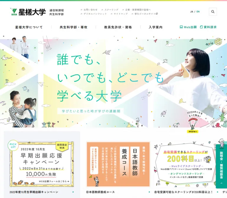
白を基調に、パステルの幾何学模様、人物写真、手描きの宇宙モチーフを組み合わせた大学サイト。縦書き見出しと細いグラデーション罫線で情報を整理し、モバイルでは固定の出願・相談ナビゲーションを設けています。
SEISA University — Style Reference
An expansive university information hub framed by pastel geometry, human portraits, and tiny hand-drawn worlds.
Website: seisa.ac.jp Original URL: https://seisa.ac.jp/ Final URL: https://seisa.ac.jp/ Response: HTTP 200; no redirect recorded. Theme: observed light presentation with white surfaces, teal actions, and multicolor decorative gradients. Inspected: October 2, 2026, at 03:56 JST; supplied retrieval timestamp: October 1, 2026, 18:56:00.927 UTC. Viewports: 1440 × 1000 desktop and 390 × 844 mobile, in CSS pixels. Scope: the current institutional homepage, including its opening composition, promotional links, notices, audience navigation, university overview, events, news, columns, institutional directory, persistent navigation, and footer. Visual evidence includes desktop opening, news, and footer captures plus mobile opening and footer captures. Other homepage sections are supported by the supplied rendered DOM measurements. Linked destination pages and opened menu/search states were not inspected.
SEISA University's homepage combines a substantial information architecture with an unusually playful visual identity. Its navigation is orderly and typographically restrained: black Japanese text, white headers, fine separators, and teal action links. The opening artwork introduces another register through pastel triangular fields, broad white diagonals, photographic cutouts, planets, stars, and small irregular characters.
The visual balance depends on this change in density. The hero is rich with imagery, while news and footer sections leave generous space around compact text. Rainbow color is concentrated in thin rules, small heading highlights, and artwork. Desktop section titles run vertically alongside lists; mobile titles become horizontal and the admissions actions move into a permanent bottom bar. Preserve these relationships when extending the site.
閉じる
SEISA University — Style Reference
An expansive university information hub framed by pastel geometry, human portraits, and tiny hand-drawn worlds.
Website: seisa.ac.jp Original URL: https://seisa.ac.jp/ Final URL: https://seisa.ac.jp/ Response: HTTP 200; no redirect recorded. Theme: observed light presentation with white surfaces, teal actions, and multicolor decorative gradients. Inspected: October 2, 2026, at 03:56 JST; supplied retrieval timestamp: October 1, 2026, 18:56:00.927 UTC. Viewports: 1440 × 1000 desktop and 390 × 844 mobile, in CSS pixels. Scope: the current institutional homepage, including its opening composition, promotional links, notices, audience navigation, university overview, events, news, columns, institutional directory, persistent navigation, and footer. Visual evidence includes desktop opening, news, and footer captures plus mobile opening and footer captures. Other homepage sections are supported by the supplied rendered DOM measurements. Linked destination pages and opened menu/search states were not inspected.
SEISA University's homepage combines a substantial information architecture with an unusually playful visual identity. Its navigation is orderly and typographically restrained: black Japanese text, white headers, fine separators, and teal action links. The opening artwork introduces another register through pastel triangular fields, broad white diagonals, photographic cutouts, planets, stars, and small irregular characters.
The visual balance depends on this change in density. The hero is rich with imagery, while news and footer sections leave generous space around compact text. Rainbow color is concentrated in thin rules, small heading highlights, and artwork. Desktop section titles run vertically alongside lists; mobile titles become horizontal and the admissions actions move into a permanent bottom bar. Preserve these relationships when extending the site.
How to Read This Reference
- Measured means a value appears in the supplied rendered element rectangles or computed styles. It is a measurement of the captured state, not necessarily the original CSS declaration.
- Observed means the feature is visible in the current-page screenshots. Colors and dimensions derived visually are marked estimated.
- Calculated values are arithmetic derived from measured rectangles, such as a container's percentage of viewport width.
- Recommended values and code are implementation guidance. They do not establish the original breakpoint, script behavior, or stylesheet structure.
- All custom-property names below are reference aliases. The supplied custom-property inventory was empty.
- Some extracted elements belong to offscreen or unopened interface structures. A DOM rectangle alone does not prove that an element was visible. Screenshot evidence takes precedence when describing the displayed composition.
Tokens — Colors
Measured Interface Palette
| Name | Value | Suggested token | Evidence and role |
|---|---|---|---|
| White | #ffffff |
--color-page |
Measured HTML and header background; also measured on desktop footer navigation slabs |
| Primary ink | #111111 |
--color-ink |
Measured body, article headings, and navigation text |
| SEISA teal | #00a491 |
--color-brand |
Measured language link, active carousel dot, important-notice text, and SVG fill declaration |
| Secondary ink | #555555 |
--color-muted |
Measured footer secondary links |
| Search gray | #666666 |
--color-icon-muted |
Search SVG fill declaration included in the supplied DOM evidence |
| Notice pink | #f679a1 |
--color-notice |
Measured text color of the special-support teacher qualification notice |
| Inactive dot | #cbcbcb |
--color-dot |
Measured carousel pagination background |
| Reversed text | #ffffff |
--color-on-action |
Measured text on the list-navigation buttons |
The header action links and mobile action bar visibly use teal and white, although their sampled anchor wrappers sometimes report inherited black text and transparent backgrounds. Use the painted screenshot appearance for the complete component; wrapper styles do not describe every child, image, or pseudo-element.
Estimated Decorative Palette
These hex values are practical approximations of the screenshots, not sampled pixels or extracted gradient stops.
| Name | Approximation | Role |
|---|---|---|
| Footer gray | #f6f6f6 |
Quiet background behind the large footer sitemap |
| Promotion panel | #f4f4f8 |
Pale gray-lavender surround for the featured promotion |
| Pastel mint | #d5f1e8 |
Hero polygon fields |
| Pastel cyan | #def5f8 |
Hero fields and soft blue banner artwork |
| Pastel lemon | #f5facd |
Hero fields and illustrated promotional backgrounds |
| Pastel lavender | #e3e4f5 |
Hero fields and secondary artwork |
| Action cyan | #48c2e6 |
Approximate right endpoint of the list-button gradient |
| Spectrum yellow | #f5ed45 |
Bright part of the thin header spectrum |
| Spectrum pink | #f5b1c4 |
Approximate final color of decorative spectrum rules |
Gradient Roles
- Header spectrum: a very thin horizontal band progressing from teal/green through yellow to pink. Its visible depth is approximately 6px on the large desktop header; the compact header has measured 5px top padding and the mobile header 3px top padding.
- Article separators: approximately 1px multicolor horizontal rules. They introduce color without filling the article rows.
- Section-label highlight: a compact mint-to-yellow-to-pink field behind the black heading. On desktop it forms a vertical strip; mobile heading boxes become horizontal.
- List action: a stronger teal-to-cyan horizontal gradient behind white text.
- Hero artwork: broad, very pale color fields divided by white diagonals. This is an illustrated composition, not a single generic gradient background.
No alternate theme selector or dark presentation is established by the supplied evidence.
Tokens — Typography
Main Japanese Interface
Measured computed stack: "Zen Kaku Gothic New", 游ゴシック体, YuGothic, 游ゴシック, "Yu Gothic", "Hiragino Kaku Gothic ProN", "Hiragino Sans", メイリオ, sans-serif.
The stack begins with Zen Kaku Gothic New. Font-file loading and the actual font used for every glyph were not independently verified. Regular text uses weight 400; article headings, section headings, and prominent footer navigation use 700.
The measured HTML font size is 10px at both viewports. Body text is 15px with inherited 0.5px letter spacing. The body itself has a reset-like 15px line height, but real paragraph components override this to 30px, and article headings use 27px. Do not apply the body reset line height to long-form content in an adaptation.
Latin Utility Text
The sampled EN links use Roboto, sans-serif, weight 700: 12px in the expanded desktop header and 13px in another navigation structure. This evidence supports Roboto for that utility role only; it does not establish Roboto for every number or English word on the page.
Artwork Lettering and Brand Mark
The hero displays the source copy 星槎大学=つながるだいがく in large, light lettering with a lavender-to-blue/teal appearance. The sampled H1 has no extracted text and reports a 15px font size, which does not describe the visible lettering. Treat the hero lettering as artwork for reference purposes; its typeface, construction, and accessible name were not exposed.
The black university wordmark, green symbol, and small course/faculty descriptor form one brand lockup. Preserve an authorized logo asset rather than approximating it with a bold text heading.
Type Scale
| Role | Size / line height | Weight | Tracking | Status |
|---|---|---|---|---|
| Root | 10px / 10px |
400 | 0.5px |
Measured |
| Body default | 15px / 15px |
400 | 0.5px |
Measured reset-level value |
| Explanatory paragraph | 15px / 30px |
400 | 0.5px |
Measured overview paragraph |
| Notice paragraph | 15px / 30px |
700 | 0.5px |
Measured |
| News, column, event title | 15px / 27px |
700 | 0.5px |
Measured |
| Desktop section title | 25px / 25px |
700 | 3.75px |
Measured |
| Mobile section title | 19px / 19px |
700 | 2.85px |
Measured |
| List-navigation button | 16px / 16px |
700 | 0.5px |
Measured |
| Footer main link | 15px / 21px |
700 | 0.5px |
Measured |
| Footer secondary link | 14px / 19.6px |
400 | 0.5px |
Measured |
| Expanded-header language link | 12px / 12px |
700 | 0.5px |
Measured; Roboto stack |
| News date / category | Approximately 14px / 12px respectively |
Mixed | Not separately extracted | Visual estimate |
| Hero lettering | Approximately 80–85px desktop, 36–40px mobile |
Visually light | Artwork-dependent | Visual estimate; not a CSS token from the source |
The section-heading tracking is consistently 0.15em: 3.75 / 25 and 2.85 / 19. This is a useful measured relationship to retain.
Tokens — Spacing & Shapes
Spacing Scale
The measurements do not establish a universal base grid. They do show a recurring vocabulary of small control spacing, 20px row padding, and large section intervals.
| Use | Desktop | Mobile | Status |
|---|---|---|---|
| Major notice/audience section top padding | 100px |
50px |
Measured |
| News section top padding | 100px |
75px |
Measured |
| Column section padding | 40px 0 130px |
75px 0 70px |
Measured |
| News-row vertical padding | 20px 0 |
18px 0 25px |
Measured |
| Gap from last news row to list button | 55px |
50px |
Calculated from rectangles |
| Promotion section padding | 20px 0 |
25px 0 30px |
Measured |
| Promotion card gap | 20px |
20px |
Calculated from card positions |
| Notice internal padding | 40px 59.61px 55px |
30px 20.47px 35px |
Measured at the inspected widths |
| Footer secondary-link vertical gap | Approximately 12px |
Approximately 12px |
Calculated from line-box positions |
Border Radius
| Element | Value | Status |
|---|---|---|
| Main structural blocks, article rows, footer main links | 0 |
Measured |
| List-navigation buttons | 3px |
Measured |
| Notice links | 5px |
Measured |
| Carousel dots | 50% |
Measured |
| Consultation rail corners | Approximately 5px on the exposed side |
Visual estimate |
This is predominantly a square-edged site. Large pill buttons and highly rounded content cards would change its character.
Layout Measurements
| Element | Desktop: 1440 × 1000 | Mobile: 390 × 844 |
|---|---|---|
| Document height | 7217.58px, reported rounded as 7218 |
8732.70px, reported rounded as 8733 |
| Expanded header | 191px high |
Not displayed in the opening capture |
| Compact header | 80px high |
60px high |
| Brand-link box | 287 × 41.30px expanded; 210 × 34.22px compact |
180 × 29.89px |
| Header brand left edge | 64.80px |
12.19px |
| Hero | 1440 × 585px, starting at document y=191 |
390 × 487.5px, starting at y=60 |
| Main content container | x=123.84px, width=1192.31px |
x=24.375px, width=341.25px |
| News list | x=223.84px, width=1092.31px |
x=24.375px, width=341.25px |
| Promotion link box | 360 × 293.5px |
Usually 292.5 × 239px; one longer caption increases height |
| Desktop consultation rail | 60 × 238.5px; right edge fixed to viewport |
Replaced by the bottom action bar |
| Mobile action bar | Not displayed | 55px high at y=789 |
| Directory tile width | 360px, four columns |
195px, two columns |
The desktop content width is approximately 82.8% of the viewport; the mobile content width is exactly 87.5% at 390px. These are calculated proportions, not recovered media-query rules. The source breakpoint and any large-screen maximum width are unknown.
Components
Expanded Desktop Header
Role: expose the university's broad navigation without obscuring its identity.
The 191px white header contains two distinct levels. The upper level has the large brand lockup on the left, two compact rows of utility links toward the center-right, the language selector, and a square search control. The measured search button is 42 × 42px, with a gray magnifying-glass graphic and a fine visible border.
The lower level contains four major categories: 星槎大学について, 共生科学部・専攻, 教員免許状・資格, and 入学案内. Short vertical gray separators divide the categories. Teal outline icons accompany Web出願 and 資料請求 at the right.
Keep the upper utility links visually subordinate to the main category labels. The large amount of white space is part of the desktop header's hierarchy.
Compact Header and Mobile Header
Role: retain identity and access while scrolling.
The supplied desktop news and footer captures show an 80px compact white header containing the smaller logo, the four primary categories, and the two admissions actions. At the initial desktop state, the corresponding measured header is positioned at y=-80px, consistent with being outside the viewport before its displayed scroll state.
At 390px, the header is 60px high from the opening state onward. Its brand link begins at x=12.19px; the desktop navigation is replaced visually by a small two-line menu control at the right. The sampled menu button box is only 18 × 7px. A larger invisible hit area is recommended for a new implementation.
The compact header's presence is established by the captures. The exact scroll threshold, transition property, and opened menu layout are unverified.
Hero Composition
Role: express the university's identity before the dense information sections begin.
The desktop hero is a wide 1440 × 585 composition. A large portrait of a person in a white shirt occupies the right; a smiling person with a bag appears at lower left; a smaller pair of portraits sits near the upper left. The central copy is surrounded by pale mint, cyan, lemon, lavender, and gray polygon fields. Thick white diagonals create a loose network across the canvas.
Fine hand-drawn planets, stars, creatures, and small objects sit across the background. Their linework is slightly irregular and their scale varies. Five sketch-framed words appear below the headline: 人生, 教職員, 仕事, 明日, and あなた. Their appearance resembles labels within the artwork; no click behavior for them was established.
Mobile uses a deliberately rearranged 390 × 487.5 composition. The main portrait moves to the upper right, the headline occupies the left and middle, the five word frames break into three above two, and the smaller portraits appear toward the lower edge. This is art direction, not a uniform crop of the desktop canvas.
Featured Promotion and Carousel
Role: highlight current applications while presenting additional courses and services.
The desktop promotion area begins immediately after the hero. A pale inset panel holds the application promotion at the left, including a circular PICK UP! marker. A horizontal sequence of illustrated banners extends to the right and is clipped by the viewport.
The featured link is measured at x=52px, y=851px, with a 360 × 293.5px box. Visible carousel links begin at x=476px, then x=856px, giving a 380px pitch and a calculated 20px gap. These are complete link boxes; do not assume the artwork alone has the same height.
At 390px, the featured promotion is centered above the carousel. Its link width is 292.5px, or 75% of the viewport. The carousel also uses 292.5px-wide links and 20px spacing. Some link heights grow when captions wrap.
Two directional controls and pagination buttons are present in the DOM. Desktop pagination has four 7 × 7px dots; mobile has eight 5 × 5px dots. Active dots are teal; inactive dots are gray. Repeated offscreen entries are consistent with a looping carousel implementation, but autoplay interval, swipe handling, and transition duration were not tested.
Notice Panels
Role: separate high-priority institutional information from promotions and routine news.
Two measured notice links follow the promotional area. One announces the special-support teacher qualification curriculum and uses pink text; the other uses teal for 重要なお知らせ. Both have 5px corner radii and bold 15px / 30px explanatory text.
At desktop size, the notices span the 1192.31px content width with generous internal padding. On mobile, they use the 341.25px content width, 30px top padding, approximately 20.47px horizontal padding, and 35px bottom padding. The longer pink notice grows to approximately 441.38px high as its text wraps.
Their geometry and typography are measured. The selected screenshots do not show their complete painted border/background treatment, so those details should remain implementation choices rather than invented source facts.
Audience Routes and University Overview
Role: let visitors choose a relevant path while introducing the institution.
Three audience links cover prospective students, current students/alumni, and corporate/educational partners. Desktop link boxes are approximately 429.22 × 86.53px; mobile boxes become 341.25 × 60px.
The desktop university overview occupies a separate right-side area: its measured link begins near x=753.08px, with introductory text set at 15px / 30px. Part of a detailed hand-drawn scene is visible above the news section in the supplied desktop capture. The full overview composition is not visible in that crop.
On mobile, the overview follows the three audience links and precedes the events section. Its measured full link region is approximately 341.25 × 649.06px. Preserve this content order when adapting the page.
Events List
Role: provide access to seminars and public lectures.
Each entry groups category labels, a date, a bold multiline title, and location text within one link. At desktop size, this list sits in the narrower left region beneath the audience routes, with measured entry widths of approximately 329.22px. The right-side overview occupies the adjacent composition.
Mobile moves the events into their own full-width content section after the overview. Titles retain 15px / 27px typography. Entries are separated by a calculated 30px gap, compared with 50px between the measured desktop event links.
The mobile section title is セミナー・公開講座, set at 19px, weight 700, with 2.85px tracking. A gradient 一覧を見る button closes the list.
News and Column Sections
Role: make frequently updated content readable within a large institutional homepage.
The desktop anatomy is distinctive:
- A narrow vertical heading starts at the content container's left edge.
- The list begins 100px farther right and 55px below the heading's top.
- Each linked row contains a teal date, a small neutral outlined category, and a bold title.
- A thin spectrum rule separates rows.
- A gradient list button aligns with the list's left edge below the entries.
The news heading measures 39 × 124.61px; the shorter column heading measures 39 × 100.34px. Their typography is 25px / 25px, weight 700, with 3.75px tracking. The screenshot shows a pastel highlight directly behind the vertical characters.
Each desktop article title begins 210px after the row's left edge, reserving a stable metadata area. The category box is approximately 90px wide visually. Single-line title rows measure 67px high; longer titles or wrapped category labels increase their height.
On mobile, the title becomes a compact horizontal heading. Each article is a block: date and category above the title, followed by natural multiline wrapping. The observed news rows measure approximately 131.8px, 131.8px, and 185.8px high. These heights are content-driven, not a fixed card system.
Gradient List Button
Role: open a full archive from a short homepage list.
The desktop button is 285 × 50px, with 3px radius, white 16px bold text, and a small right-side triangular arrow. Its fill visibly transitions from teal/green at left to cyan at right. It uses the label 一覧を見る in the inspected lists.
The mobile DOM reports a width of 346.25px, although the associated content container is 341.25px. This 5px discrepancy is a measured result, not a recommended overflow behavior. The Quick Start uses border-box sizing and a contained width: 100% instead.
Persistent Admissions Actions
Desktop: a teal consultation rail attaches to the viewport's right edge. Its measured box is 60 × 238.5px, with its bottom 100px above the bottom of the 1000px viewport. A small illustrated character protrudes above it; white Japanese text runs vertically, with an arrow near the bottom. The recorded destination is online information sessions and consultations.
Mobile: a full-width teal bar stays at the viewport bottom. Four links pair white outline icons with two-line labels: Web出願, 資料請求, 説明会/相談会, and LINE登録. Icons sit beside the labels, not in a separate row above them.
At 390px, each link is 96.75px wide, with three 1px separators across the bar. The bar is 55px high. The body has measured 60px top and 55px bottom padding, reserving space for the persistent header and actions.
Institutional Directory
Role: expose the university's larger network of services, centers, programs, and affiliated destinations.
The DOM establishes twenty directory links. Desktop uses four columns of 360 × 360px linked tiles, forming five rows. The section is full width and 1800px high at the inspected desktop viewport.
Mobile uses two columns of 195px-wide tiles. Heights vary by row from approximately 207px to 269.97px, so forcing all mobile tiles into a square would contradict the measured layout.
The supplied screenshot selection does not show the directory itself. Its content, count, link geometry, and responsive arrangement are established; the complete artwork and label placement within each tile are not.
Footer Sitemap
Role: provide a complete secondary route through the institution.
Desktop places the brand at left and three dense navigation columns to its right on a pale gray field. The measured main-link slabs are approximately 306.39 × 40px, separated horizontally by approximately 34.61px. They are white, square-cornered, and use a small teal triangle before bold black text.
Nested links are indented 30px from the slab's left edge, use 14px / 19.6px gray text, and recur at approximately 31.59px vertical intervals. The sitemap mixes broad institutional categories with admissions and contact shortcuts.
Mobile shows five full-width main routes, followed by six utility routes arranged in two columns. The two-column links measure approximately 160.38px wide with a 20.5px gap. Their heights grow from 56px to 77px where labels wrap. The desktop white slabs become transparent rows with fine bottom rules, and the expanded nested link lists are absent from the supplied mobile presentation. This does not establish an accordion interaction.
Social Links, Legal Links, and Page Top
Five familiar social marks appear in a horizontal row using their recognizable platform colors. The measured icon link boxes are generally 25 × 25px, with a 37px pitch. The supplied screenshot includes the blue bird mark used by the site's Twitter link.
A fine gray rule separates this area from sitemap, privacy, repository, and related-institution links. Small external-link marks accompany relevant destinations. Mobile lets these links wrap across short lines.
A white copyright strip finishes the page. A small square upward-chevron control is visible near the mobile footer's right edge, approximately 36px square. Its recorded href is https://seisa.ac.jp/#pagetop; smooth scrolling was not verified.
Tokens — Motion & Interaction
| Treatment | Evidence | What can be concluded |
|---|---|---|
| Link/button transitions | Many sampled controls report transition: 0.3s |
A 300ms transition is declared; the changed properties and actual hover appearance are not established |
| Compact header | Measured offscreen at desktop entry; visible in scrolled screenshots; 0.3s transition reported |
A distinct compact scroll state exists; threshold and exact animation are unknown |
| Promotional carousel | Direction buttons, active pagination, and repeated offscreen links | Carousel structure is supported; autoplay, swipe, easing, and timing remain unverified |
| Mobile menu | Visible menu control and additional navigation structures in DOM | Entry point exists; opened state, focus behavior, and animation were not exercised |
| Search | Desktop search button and close controls in DOM | Search entry point exists; search surface and results behavior were not inspected |
| Persistent admissions actions | Same viewport placement across relevant screenshots | Their persistent placement is observed; activation results were not tested |
| Page-top control | Visible chevron and recorded #pagetop destination |
Anchor destination is known; scrolling animation is unknown |
| Decorative artwork | Static captures; sampled elements report animation: none |
This does not rule out animation in assets, pseudo-elements, or JavaScript |
The capture procedure waited at least five seconds initially and checked layout, visible text, finite animations, and image readiness within stated limits. Perpetual animations were paused during readiness checks and resumed afterward. These safeguards do not establish that the site is motionless or that every delayed state was captured.
Recommended adaptation: use restrained 150–300ms feedback for links and compact-header movement. Keep illustration motion optional. Provide reduced-motion behavior and explicit carousel controls if implementing rotation. Do not invent parallax, bouncing mascots, or automatic hero changes as observed features.
Surfaces
| Layer | Appearance | Function |
|---|---|---|
| Page canvas | White | Maintains legibility and large areas of breathing room |
| Header | White with a thin spectrum edge | Establishes identity and navigation hierarchy |
| Hero | Pale geometric color fields, white diagonals, portraits, fine illustrations | Carries the strongest visual identity |
| Promotion area | Fine dotted texture with a pale featured panel | Separates current offers from the main artwork |
| Editorial lists | White with thin multicolor dividers | Supports dense, readable institutional content |
| Heading highlight | Small pastel spectrum strip | Gives a compact navigational landmark |
| Action surfaces | Teal or teal-to-cyan fill | Makes admissions and archive actions easy to locate |
| Footer | Estimated very light gray with white desktop link slabs | Organizes a large sitemap without excessive contrast |
There is no broad shadow-based elevation system. A faint shadow is visible around persistent chrome, particularly the consultation rail and compact header, but ordinary lists and navigation blocks remain flat.
Imagery
The key combination is photographic people + geometric light fields + small hand-drawn illustrations. The portraits have clean cutout edges and natural lighting. The surrounding creatures and astronomical objects use thin, uneven outlines and restrained patches of color. Their imperfect drawing quality keeps the university presentation approachable.
The broad white diagonal bands are structural negative space. They separate portraits and text while implying connections across the hero. Do not fill all the empty triangular regions with illustrations; the lightness depends on empty space between the tiny details.
Promotional banners are individual illustrated compositions with their own typography, panels, and small visual stories. Reproduce their role and proportions with authorized assets. A generic set of identically styled cards would lose the varied campaign-poster quality.
Observed Asset References
The supplied evidence does not expose image src, srcset, font-file URLs, or CSS background-image paths. No asset filenames can be documented reliably.
| Asset group | Current-page evidence | Implementation treatment |
|---|---|---|
| University brand lockup | Desktop and mobile headers; desktop footer | Preserve the full mark and descriptor as an authorized asset |
| Hero portraits | Current desktop and mobile opening captures | Supply separate art direction for wide and narrow layouts |
| Hero headline and framed words | Current opening captures | Preserve composition; do not assign the sampled H1 font to the artwork |
| Planets, stars, characters | Current hero, banners, and consultation rail | Retain irregular linework and varied scale |
| Featured application banner | Current promotion panel | Preserve artwork and expose meaningful link text |
| Overview illustration | Partial scene visible above the desktop news section | Full composition requires an asset source beyond the supplied crop |
| Social and action icons | Header, footer, consultation rail, and mobile action bar | Use recognizable marks and simple outline symbols; no icon library was identified |
CSS can reproduce the page framework, rules, gradients, and spacing. It cannot recover the distinctive illustration assets from DOM measurements.
Layout & Responsive Behavior
Observed Changes
| Area | Desktop | Mobile |
|---|---|---|
| Header | Expanded two-level entry header; compact header on scroll | Compact logo/menu header from entry |
| Hero | Wide landscape composition | Rearranged portrait composition |
| Promotions | Featured panel beside a horizontal banner rail | Featured panel above the banner rail |
| Audience/overview/events | Split composition with events in the left region | Audience routes, overview, then a separate events list |
| Section labels | Vertical, 25px type | Horizontal, 19px type |
| News metadata | Date, category, and title on one row | Metadata above the multiline title |
| List buttons | 285px wide | Approximately content width |
| Directory | Four columns; square link boxes | Two columns; variable-height link boxes |
| Admissions shortcuts | Header links and right-edge consultation rail | Four-part fixed bottom bar |
| Footer | Brand plus three sitemap columns with nested links | Full-width primary routes and two-column utility routes |
Measured Proportions
The desktop hero has a width-to-height ratio of 1440 / 585 = 32 / 13. The mobile hero is 390 / 487.5 = 4 / 5. These ratios are useful adaptation targets at the inspected sizes, but they do not prove the original site uses CSS aspect-ratio.
Main mobile content has 24.375px side margins, corresponding to 6.25% per side. The logo uses a smaller 12.1875px left offset, or 3.125%. The distinction lets persistent navigation feel compact while long content retains comfortable margins.
The mobile page is longer even though its large section paddings are often smaller. Text wraps, promotions stack, the events move into normal vertical flow, and the directory changes from five to ten rows.
Unverified Ranges
No tablet, landscape phone, wide desktop beyond 1440px, browser zoom, or expanded-menu viewport was supplied. The breakpoint used in the Quick Start is a recommendation. Validate the long Japanese navigation labels before choosing a production threshold.
Do’s and Don’ts
Do
- Keep white as the dominant page surface and teal as the main interface accent.
- Concentrate the multicolor palette in artwork, thin rules, heading highlights, and selected actions.
- Preserve the hero's mix of portraits, broad white diagonals, pale polygons, and small irregular drawings.
- Art-direct the mobile hero so the headline, portraits, and framed words remain legible.
- Retain compact 15px editorial text with generous 27–30px line heights where measured.
- Use vertical desktop section labels and horizontal mobile labels.
- Reserve a consistent desktop metadata area before article titles.
- Keep institutional navigation, news, events, and admissions routes prominent throughout the homepage.
- Reserve document space for the mobile header and bottom action bar.
- Let mobile directory tiles and footer links grow with their content.
Don’t
- Do not replace the homepage's information architecture with a single campaign funnel.
- Do not treat the hero's sampled
15pxH1 style as its visible lettering size. - Do not stretch the desktop hero into the mobile composition with an indiscriminate center crop.
- Do not turn every article or footer link into a large rounded card with a shadow.
- Do not spread saturated rainbow fills across ordinary content surfaces.
- Do not shrink mobile paragraphs simply to retain desktop row heights.
- Do not assume menu expansion, carousel autoplay, parallax, or smooth anchor scrolling from static evidence.
- Do not reproduce the measured mobile button overflow as a required feature.
- Do not infer asset URLs, illustration authorship, or production credits from visual resemblance.
Recommended Implementation Additions
These are recommendations for a new implementation, not verified original-site features.
- Provide an accessible text equivalent for the hero's central message. The empty extracted H1 does not establish what assistive technology receives.
- Give search, menu, carousel arrows, pagination, and page-top controls explicit accessible names.
- Enlarge the menu, social-icon, and pagination hit areas to approximately 44px while preserving their small visible graphics.
- Add a clear focus indicator and ensure fixed bars do not cover focused content.
- Include safe-area bottom padding in the mobile action bar and reserve the same space in the document.
- Verify text contrast across the entire action gradient, especially its lighter cyan end. Adjust text or fill colors if needed.
- Keep carousel clones out of the keyboard sequence and accessibility tree. Provide pause behavior if implementing automatic rotation.
- Use meaningful image alternatives for linked banners and empty alternatives for purely decorative creatures and stars.
- Retain usable content order without animation or JavaScript. Avoid duplicating every navigation item in the active accessibility tree when switching header states.
Agent Prompt Guide
Quick Color Reference
- Main surface: measured
#ffffff. - Main text: measured
#111111. - Secondary footer text: measured
#555555. - Main teal: measured
#00a491. - Special notice pink: measured
#f679a1. - Inactive pagination: measured
#cbcbcb. - Footer field: estimated
#f6f6f6. - Action gradient: approximate teal to
#48c2e6. - Decorative spectrum: teal/green through yellow to pink; exact stops were not supplied.
Overall Prompt
“Create an institutional university homepage inspired by the current SEISA University design. Use a white canvas, near-black Japanese sans-serif text, teal navigation accents, thin multicolor separators, and small pastel heading highlights. Build a broad desktop header with a brand lockup, utility links, four main institutional categories, and admissions actions. The hero combines clean photographic cutouts, pale triangular fields, wide white diagonal bands, and tiny hand-drawn planets and characters. Follow it with a featured application promotion, a horizontal illustrated banner rail, notices, audience routes, an overview, events, news, columns, a directory, and a substantial sitemap footer. Use vertical section headings beside desktop article lists. On mobile, recompose the hero, make headings horizontal, stack metadata above titles, and provide a four-part teal bottom action bar. Keep the measured typography and spacing distinct from estimated artwork colors.”
Example Component Prompts
- News section: “Create a white desktop news section with a narrow vertical Japanese heading on a mint-to-yellow-to-pink highlight. Offset the article list 100px to the right and 55px below the heading top. Use teal dates, neutral outlined category labels, 15px bold titles with 27px line height, and 1px spectrum separators. Add a 285 × 50px teal-to-cyan archive button. On mobile, use a 19px horizontal heading and place metadata above each title.”
- Hero: “Art-direct a university hero with a large portrait at the right, smaller portraits at the left, very pale mint/cyan/lemon/lavender polygons, and broad white diagonal gaps. Scatter fine hand-drawn stars, planets, and small characters without filling every blank area. Include the source-style copy
星槎大学=つながるだいがくand five sketch-framed words. Produce a separate 4:5 mobile composition.” - Mobile actions: “Build a fixed 55px teal bottom bar with four equal links separated by 1px rules. Pair simple white outline icons beside compact two-line labels for applications, document requests, consultations, and LINE registration. Reserve document space for the bar and add safe-area support.”
- Footer: “Create a pale gray university sitemap footer. On desktop, place the brand at left and three navigation columns at right, with square white heading slabs, tiny teal triangles, and indented 14px gray links. Add colored social marks, a fine divider, quiet legal links, and a white copyright strip. On mobile, use full-width primary rows and two-column utility rows.”
- Promotion area: “Place one application banner in a pale inset panel with a circular pickup marker. Beside it, show an overflow-clipped row of individually illustrated course banners, using 360px-wide links with 20px gaps. On mobile, stack the featured panel above a rail of 75vw-wide links. Preserve complete banner content and allow captions to wrap.”
Quick Start
CSS Custom Properties
This is a reusable adaptation, not recovered source CSS. Measured interface values are retained in pixels so the host project can keep its normal root font size. Decorative gradients, the 48rem breakpoint, focus treatment, safe-area handling, and hover feedback are recommended choices. Hero assets and functional header/menu/carousel logic must be supplied separately.
:root {
  /* Measured interface colors */
  --color-page: #ffffff;
  --color-ink: #111111;
  --color-muted: #555555;
  --color-brand: #00a491;
  --color-notice: #f679a1;
  --color-dot: #cbcbcb;
  --color-on-action: #ffffff;

  /* Estimated decorative colors */
  --color-footer: #f6f6f6;
  --color-promo: #f4f4f8;
  --color-rule: #dddddd;
  --color-cyan: #48c2e6;
  --gradient-spectrum: linear-gradient(
    90deg, #00a491 0%, #91d276 48%, #f5ed45 84%, #f5b1c4 100%
  );
  --gradient-marker: linear-gradient(
    180deg, #89dfbf 0%, #edf58a 75%, #ffc8d7 100%
  );
  --gradient-action: linear-gradient(90deg, #00a491, #48c2e6);

  /* Computed source stack; provide the font separately if available */
  --font-body: 'Zen Kaku Gothic New', '游ゴシック体', YuGothic,
    '游ゴシック', 'Yu Gothic', 'Hiragino Kaku Gothic ProN',
    'Hiragino Sans', 'メイリオ', sans-serif;
  --font-latin: Roboto, sans-serif;
  --text-body: 15px;
  --text-secondary: 14px;
  --text-action: 16px;
  --text-section: 25px;
  --leading-title: 27px;
  --leading-copy: 30px;
  --tracking-body: 0.5px;
  --tracking-section: 0.15em;

  /* Measured dimensions and calculated viewport proportions */
  --content-width: 82.8%;
  --header-expanded: 191px;
  --header-compact: 80px;
  --header-mobile: 60px;
  --mobile-actions: 55px;
  --section-space: 100px;
  --section-label-column: 100px;
  --news-meta-width: 210px;
  --promo-card-width: 360px;
  --radius-action: 3px;
  --radius-notice: 5px;
  --safe-bottom: env(safe-area-inset-bottom, 0px);
  --transition-ui: 300ms;
}

* { box-sizing: border-box; }

body {
  margin: 0;
  color: var(--color-ink);
  background: var(--color-page);
  font-family: var(--font-body);
  font-size: var(--text-body);
  line-height: 1.8; /* Recommended readable default */
  letter-spacing: var(--tracking-body);
}

img { display: block; max-width: 100%; height: auto; }
a { color: inherit; }
button { font: inherit; }

.content {
  width: var(--content-width);
  margin-inline: auto;
}

.header-inner {
  width: 91%;
  height: 100%;
  margin-inline: auto;
}

.site-header {
  position: relative;
  background: var(--color-page);
}

.site-header::before {
  content: '';
  position: absolute;
  inset: 0 0 auto;
  height: 6px;
  background: var(--gradient-spectrum);
}

.site-header--expanded { height: var(--header-expanded); }
.site-header--expanded .brand { display: block; width: 287px; }

.site-header--compact {
  position: fixed;
  inset: 0 0 auto;
  z-index: 50;
  height: var(--header-compact);
  transform: translateY(-100%);
  transition: transform var(--transition-ui) ease;
}

.site-header--compact::before { height: 5px; }
.site-header--compact .brand { display: block; width: 210px; }
.site-header--compact .header-inner {
  display: flex;
  align-items: center;
  justify-content: space-between;
  gap: 24px;
}

/* Set this state with application logic; the source threshold is unknown. */
.is-scrolled .site-header--compact { transform: translateY(0); }

.menu-button { display: none; }

.hero { aspect-ratio: 32 / 13; }
.hero picture, .hero img { width: 100%; height: 100%; }
.hero picture { display: block; }
.hero img { object-fit: contain; }

/* Use separate authorized wide and narrow hero compositions. */
.hero-copy { line-height: var(--leading-copy); }

.promo-zone {
  display: grid;
  grid-template-columns: 448px minmax(0, 1fr);
  gap: 28px;
  padding-block: 20px;
  background: radial-gradient(#eee6f0 0.65px, transparent 0.8px)
    0 0 / 5px 5px; /* Estimated texture */
}

.promo-pickup {
  margin-inline: 20px 4px;
  padding: 55px 32px;
  background: var(--color-promo);
}

.promo-card {
  display: block;
  flex: 0 0 var(--promo-card-width);
  width: var(--promo-card-width);
  max-width: 100%;
  text-decoration: none;
}

/* Recommended native scrolling fallback, not the original carousel engine. */
.promo-rail {
  display: flex;
  align-items: flex-start;
  gap: 20px;
  min-width: 0;
  overflow-x: auto;
  padding-block: 55px 20px;
  scroll-snap-type: x proximity;
}

.promo-rail .promo-card { scroll-snap-align: start; }

.notice {
  display: block;
  margin-top: var(--section-space);
  padding: 40px 5% 55px;
  border-radius: var(--radius-notice);
  color: var(--color-brand);
  font-weight: 700;
  text-decoration: none;
}

.notice--pink { color: var(--color-notice); }
.notice p { margin-block: 16px 0; line-height: var(--leading-copy); }

.editorial-section {
  display: grid;
  grid-template-columns: var(--section-label-column) minmax(0, 1fr);
  padding-top: var(--section-space);
}

.editorial-section--columns { padding-block: 40px 130px; }

.section-title {
  align-self: start;
  justify-self: start;
  margin: 0;
  padding: 10px 8px;
  background: var(--gradient-marker);
  writing-mode: vertical-rl;
  font-size: var(--text-section);
  font-weight: 700;
  line-height: 1;
  letter-spacing: var(--tracking-section);
}

.editorial-content { min-width: 0; padding-top: 55px; }

.news-list {
  margin: 0;
  padding: 0;
  list-style: none;
  background: var(--gradient-spectrum) left top / 100% 1px no-repeat;
}

.news-row {
  display: grid;
  grid-template-columns: var(--news-meta-width) minmax(0, 1fr);
  align-items: center;
  padding-block: 20px;
  text-decoration: none;
  background: var(--gradient-spectrum) left bottom / 100% 1px no-repeat;
}

.news-meta {
  display: flex;
  align-items: center;
  gap: 15px;
}

.news-date {
  flex: 0 0 82px; /* Visual approximation */
  color: var(--color-brand);
  font-size: 14px;
  font-weight: 700;
  line-height: 22px;
}

.news-category {
  width: 90px; /* Visual approximation */
  padding: 2px 4px;
  border: 1px solid var(--color-rule);
  color: var(--color-muted);
  font-size: 12px;
  line-height: 1.4;
  text-align: center;
}

.news-title {
  margin: 0;
  font-size: 15px;
  font-weight: 700;
  line-height: var(--leading-title);
  overflow-wrap: anywhere;
}

.list-button {
  position: relative;
  display: flex;
  align-items: center;
  justify-content: center;
  width: 285px;
  max-width: 100%;
  min-height: 50px;
  margin-top: 55px;
  padding: 12px 30px;
  border-radius: var(--radius-action);
  color: var(--color-on-action);
  background: var(--gradient-action);
  font-size: var(--text-action);
  font-weight: 700;
  line-height: 1;
  text-decoration: none;
}

.list-button::after {
  content: '';
  position: absolute;
  right: 15px;
  border-block: 4px solid transparent;
  border-left: 6px solid currentColor;
}

.consultation-rail {
  position: fixed;
  right: 0;
  bottom: 100px;
  z-index: 40;
  display: grid;
  place-items: center;
  width: 60px;
  min-height: 238.5px;
  padding-block: 30px 20px;
  color: white;
  background: var(--color-brand);
  border-radius: 5px 0 0 5px;
  text-decoration: none;
}

.consultation-rail__label { writing-mode: vertical-rl; }
.mobile-actions { display: none; }

.directory {
  display: grid;
  grid-template-columns: repeat(4, minmax(0, 1fr));
}

.directory-tile { min-width: 0; aspect-ratio: 1; }

.site-footer { background: var(--color-footer); }
.footer-primary-link {
  position: relative;
  display: block;
  padding: 10px 20px 9px 32px;
  background: white;
  font-weight: 700;
  line-height: 21px;
  text-decoration: none;
}

.footer-primary-link::before {
  content: '';
  position: absolute;
  left: 15px;
  top: 17px;
  border-block: 4px solid transparent;
  border-left: 6px solid var(--color-brand);
}

.footer-secondary-link {
  color: var(--color-muted);
  font-size: 14px;
  line-height: 19.6px;
  text-decoration: none;
}

/* Recommended interaction feedback */
:where(a, button):focus-visible {
  outline: 3px solid #006f63;
  outline-offset: 4px;
}

@media (hover: hover) {
  .news-row:hover .news-title { text-decoration: underline; }
  .footer-secondary-link:hover { text-decoration: underline; }
}

/* Recommended breakpoint; only 390px and 1440px were inspected. */
@media (max-width: 48rem) {
  :root {
    --content-width: 87.5%;
    --section-space: 50px;
    --text-section: 19px;
    --promo-card-width: 75vw;
  }

  body {
    padding-top: var(--header-mobile);
    padding-bottom: calc(var(--mobile-actions) + var(--safe-bottom));
  }

  .site-header--expanded, .desktop-nav, .consultation-rail { display: none; }
  .site-header--compact {
    height: var(--header-mobile);
    transform: none;
  }
  .site-header--compact::before { height: 3px; }
  .site-header--compact .header-inner { width: 93.75%; }
  .site-header--compact .brand { width: 180px; }

  .menu-button {
    display: grid;
    place-items: center;
    width: 44px;
    height: 44px;
    padding: 0;
    border: 0;
    background: transparent;
  }

  .hero { aspect-ratio: 4 / 5; }
  .promo-zone { display: block; padding-block: 25px 30px; }
  .promo-pickup { margin-inline: 20px; padding: 20px 0; }
  .promo-pickup .promo-card { margin-inline: auto; }
  .promo-rail { padding: 27px 12.5vw 20px; }

  .notice { padding: 30px 6% 35px; }
  .editorial-section { display: block; padding-top: 75px; }
  .editorial-section--columns { padding-bottom: 70px; }
  .section-title {
    display: inline-block;
    writing-mode: horizontal-tb;
    padding: 4px 6px;
  }
  .editorial-content { padding-top: 40px; }
  .news-row { display: block; padding-block: 18px 25px; }
  .news-meta { margin-bottom: 12px; }
  .list-button { width: 100%; margin-top: 50px; }

  .directory { grid-template-columns: repeat(2, minmax(0, 1fr)); }
  .directory-tile { aspect-ratio: auto; }

  .footer-primary-link {
    display: flex;
    align-items: center;
    min-height: 56px;
    padding: 18px 0 16px 15px;
    border-bottom: 1px solid #e3e3e3;
    background: transparent;
  }
  .footer-primary-link::before { left: 0; top: calc(50% - 4px); }

  .mobile-actions {
    position: fixed;
    inset: auto 0 0;
    z-index: 60;
    display: grid;
    grid-template-columns: repeat(4, minmax(0, 1fr));
    gap: 1px;
    padding-bottom: var(--safe-bottom);
    background: var(--color-brand);
  }
  .mobile-actions a {
    display: flex;
    align-items: center;
    justify-content: center;
    gap: 7px;
    min-width: 0;
    min-height: var(--mobile-actions);
    padding-inline: 6px;
    color: white;
    background: var(--color-brand);
    box-shadow: 1px 0 0 rgb(0 0 0 / 8%);
    font-size: 14px;
    font-weight: 700;
    line-height: 1.35;
    text-decoration: none;
  }
  .mobile-actions svg { flex: 0 0 18px; width: 18px; height: 18px; }
}

@media (prefers-reduced-motion: reduce) {
  .site-header--compact { transition: none; }
  .promo-rail { scroll-behavior: auto; }
}
Minimal Component Markup
This example uses recorded homepage link destinations and source UI copy. The class structure corresponds to the CSS above; it does not claim to reproduce the original markup.
<section class="content editorial-section" aria-labelledby="news-heading">
  <h2 id="news-heading" class="section-title">お知らせ</h2>
  <div class="editorial-content">
    <ul class="news-list">
      <li>
        <a class="news-row" href="https://seisa.ac.jp/2026/10/kihon/">
          <div class="news-meta">
            <time class="news-date" datetime="2026-10-01">2026/10/01</time>
            <span class="news-category">お知らせ</span>
          </div>
          <h3 class="news-title">学校法人国際学園における過剰な苦情・不当な要求等に対する基本方針を策定</h3>
        </a>
      </li>
    </ul>
    <a class="list-button" href="https://seisa.ac.jp/topics/">一覧を見る</a>
  </div>
</section>
Tailwind v4 Token Mapping
Optional aliases for a project already using Tailwind v4. The inspected site was not identified as using Tailwind. Define the custom properties above first.
@theme inline {
  --color-page: #ffffff;
  --color-ink: #111111;
  --color-muted: #555555;
  --color-brand: #00a491;
  --color-notice: #f679a1;
  --color-footer: #f6f6f6;

  --font-sans: var(--font-body);
  --text-body: 15px;
  --text-secondary: 14px;
  --text-action: 16px;
  --text-section-heading: var(--text-section);

  --spacing-section: var(--section-space);
  --spacing-promo-card: var(--promo-card-width);
  --radius-action: 3px;
  --radius-notice: 5px;
}
Sources & Evidence
- Inspected original and final page: SEISA University. Both supplied URL fields identify the same homepage; the recorded response is HTTP 200.
- Capture date:
2026-10-01T18:56:00.927Z, equivalent to October 2, 2026, 03:56:00.927 JST. This reference analyzes that supplied inspection rather than claiming an additional live visit. - Desktop evidence: 1440 × 1000 opening, scrolled news, and footer captures; rendered DOM text, link destinations, computed styles, and rectangles across the homepage. Document height approximately 7217.58px.
- Mobile evidence: 390 × 844 opening and footer captures; corresponding rendered DOM and measurements. Document height approximately 8732.70px.
- Observed state changes: desktop expanded versus compact header presentation, persistent consultation/mobile action placement, and responsive differences between the supplied viewport states. No independent click-through or opened menu/search inspection was performed.
- Recorded link examples: applications, document requests, online consultations, news, and page top. These destinations were present in the homepage evidence; their destination pages were not analyzed.
- Limitations: image and font-file URLs, exact decorative gradient stops, original CSS selectors and media queries, complete pseudo-element styling, event-handler logic, animation timing, keyboard behavior, and destination-page content were not supplied. SharedWorkers and service workers were disabled during the recorded inspection. Readiness checks reduce transient capture errors but do not prove semantic completeness.
Measured facts, visual estimates, and recommended implementation choices are identified separately throughout this reference.
# SEISA University — Style Reference

> An expansive university information hub framed by pastel geometry, human portraits, and tiny hand-drawn worlds.

**Website:** [seisa.ac.jp](https://seisa.ac.jp/)
**Original URL:** https://seisa.ac.jp/
**Final URL:** https://seisa.ac.jp/
**Response:** HTTP 200; no redirect recorded.
**Theme:** observed light presentation with white surfaces, teal actions, and multicolor decorative gradients.
**Inspected:** October 2, 2026, at 03:56 JST; supplied retrieval timestamp: October 1, 2026, 18:56:00.927 UTC.
**Viewports:** 1440 × 1000 desktop and 390 × 844 mobile, in CSS pixels.
**Scope:** the current institutional homepage, including its opening composition, promotional links, notices, audience navigation, university overview, events, news, columns, institutional directory, persistent navigation, and footer. Visual evidence includes desktop opening, news, and footer captures plus mobile opening and footer captures. Other homepage sections are supported by the supplied rendered DOM measurements. Linked destination pages and opened menu/search states were not inspected.

SEISA University's homepage combines a substantial information architecture with an unusually playful visual identity. Its navigation is orderly and typographically restrained: black Japanese text, white headers, fine separators, and teal action links. The opening artwork introduces another register through pastel triangular fields, broad white diagonals, photographic cutouts, planets, stars, and small irregular characters.

The visual balance depends on this change in density. The hero is rich with imagery, while news and footer sections leave generous space around compact text. Rainbow color is concentrated in thin rules, small heading highlights, and artwork. Desktop section titles run vertically alongside lists; mobile titles become horizontal and the admissions actions move into a permanent bottom bar. Preserve these relationships when extending the site.
閉じる
# SEISA University — Style Reference

> An expansive university information hub framed by pastel geometry, human portraits, and tiny hand-drawn worlds.

**Website:** [seisa.ac.jp](https://seisa.ac.jp/)
**Original URL:** https://seisa.ac.jp/
**Final URL:** https://seisa.ac.jp/
**Response:** HTTP 200; no redirect recorded.
**Theme:** observed light presentation with white surfaces, teal actions, and multicolor decorative gradients.
**Inspected:** October 2, 2026, at 03:56 JST; supplied retrieval timestamp: October 1, 2026, 18:56:00.927 UTC.
**Viewports:** 1440 × 1000 desktop and 390 × 844 mobile, in CSS pixels.
**Scope:** the current institutional homepage, including its opening composition, promotional links, notices, audience navigation, university overview, events, news, columns, institutional directory, persistent navigation, and footer. Visual evidence includes desktop opening, news, and footer captures plus mobile opening and footer captures. Other homepage sections are supported by the supplied rendered DOM measurements. Linked destination pages and opened menu/search states were not inspected.

SEISA University's homepage combines a substantial information architecture with an unusually playful visual identity. Its navigation is orderly and typographically restrained: black Japanese text, white headers, fine separators, and teal action links. The opening artwork introduces another register through pastel triangular fields, broad white diagonals, photographic cutouts, planets, stars, and small irregular characters.

The visual balance depends on this change in density. The hero is rich with imagery, while news and footer sections leave generous space around compact text. Rainbow color is concentrated in thin rules, small heading highlights, and artwork. Desktop section titles run vertically alongside lists; mobile titles become horizontal and the admissions actions move into a permanent bottom bar. Preserve these relationships when extending the site.

## How to Read This Reference

- **Measured** means a value appears in the supplied rendered element rectangles or computed styles. It is a measurement of the captured state, not necessarily the original CSS declaration.
- **Observed** means the feature is visible in the current-page screenshots. Colors and dimensions derived visually are marked **estimated**.
- **Calculated** values are arithmetic derived from measured rectangles, such as a container's percentage of viewport width.
- **Recommended** values and code are implementation guidance. They do not establish the original breakpoint, script behavior, or stylesheet structure.
- All custom-property names below are reference aliases. The supplied custom-property inventory was empty.
- Some extracted elements belong to offscreen or unopened interface structures. A DOM rectangle alone does not prove that an element was visible. Screenshot evidence takes precedence when describing the displayed composition.

## Tokens — Colors

### Measured Interface Palette

| Name | Value | Suggested token | Evidence and role |
| --- | --- | --- | --- |
| White | `#ffffff` | `--color-page` | Measured HTML and header background; also measured on desktop footer navigation slabs |
| Primary ink | `#111111` | `--color-ink` | Measured body, article headings, and navigation text |
| SEISA teal | `#00a491` | `--color-brand` | Measured language link, active carousel dot, important-notice text, and SVG fill declaration |
| Secondary ink | `#555555` | `--color-muted` | Measured footer secondary links |
| Search gray | `#666666` | `--color-icon-muted` | Search SVG fill declaration included in the supplied DOM evidence |
| Notice pink | `#f679a1` | `--color-notice` | Measured text color of the special-support teacher qualification notice |
| Inactive dot | `#cbcbcb` | `--color-dot` | Measured carousel pagination background |
| Reversed text | `#ffffff` | `--color-on-action` | Measured text on the list-navigation buttons |

The header action links and mobile action bar visibly use teal and white, although their sampled anchor wrappers sometimes report inherited black text and transparent backgrounds. Use the painted screenshot appearance for the complete component; wrapper styles do not describe every child, image, or pseudo-element.

### Estimated Decorative Palette

These hex values are practical approximations of the screenshots, not sampled pixels or extracted gradient stops.

| Name | Approximation | Role |
| --- | --- | --- |
| Footer gray | `#f6f6f6` | Quiet background behind the large footer sitemap |
| Promotion panel | `#f4f4f8` | Pale gray-lavender surround for the featured promotion |
| Pastel mint | `#d5f1e8` | Hero polygon fields |
| Pastel cyan | `#def5f8` | Hero fields and soft blue banner artwork |
| Pastel lemon | `#f5facd` | Hero fields and illustrated promotional backgrounds |
| Pastel lavender | `#e3e4f5` | Hero fields and secondary artwork |
| Action cyan | `#48c2e6` | Approximate right endpoint of the list-button gradient |
| Spectrum yellow | `#f5ed45` | Bright part of the thin header spectrum |
| Spectrum pink | `#f5b1c4` | Approximate final color of decorative spectrum rules |

### Gradient Roles

1. **Header spectrum:** a very thin horizontal band progressing from teal/green through yellow to pink. Its visible depth is approximately 6px on the large desktop header; the compact header has measured 5px top padding and the mobile header 3px top padding.
2. **Article separators:** approximately 1px multicolor horizontal rules. They introduce color without filling the article rows.
3. **Section-label highlight:** a compact mint-to-yellow-to-pink field behind the black heading. On desktop it forms a vertical strip; mobile heading boxes become horizontal.
4. **List action:** a stronger teal-to-cyan horizontal gradient behind white text.
5. **Hero artwork:** broad, very pale color fields divided by white diagonals. This is an illustrated composition, not a single generic gradient background.

No alternate theme selector or dark presentation is established by the supplied evidence.

## Tokens — Typography

### Main Japanese Interface

**Measured computed stack:** `"Zen Kaku Gothic New", 游ゴシック体, YuGothic, 游ゴシック, "Yu Gothic", "Hiragino Kaku Gothic ProN", "Hiragino Sans", メイリオ, sans-serif`.

The stack begins with Zen Kaku Gothic New. Font-file loading and the actual font used for every glyph were not independently verified. Regular text uses weight `400`; article headings, section headings, and prominent footer navigation use `700`.

The measured HTML font size is `10px` at both viewports. Body text is `15px` with inherited `0.5px` letter spacing. The body itself has a reset-like `15px` line height, but real paragraph components override this to `30px`, and article headings use `27px`. Do not apply the body reset line height to long-form content in an adaptation.

### Latin Utility Text

The sampled `EN` links use `Roboto, sans-serif`, weight `700`: `12px` in the expanded desktop header and `13px` in another navigation structure. This evidence supports Roboto for that utility role only; it does not establish Roboto for every number or English word on the page.

### Artwork Lettering and Brand Mark

The hero displays the source copy `星槎大学=つながるだいがく` in large, light lettering with a lavender-to-blue/teal appearance. The sampled H1 has no extracted text and reports a `15px` font size, which does not describe the visible lettering. Treat the hero lettering as artwork for reference purposes; its typeface, construction, and accessible name were not exposed.

The black university wordmark, green symbol, and small course/faculty descriptor form one brand lockup. Preserve an authorized logo asset rather than approximating it with a bold text heading.

### Type Scale

| Role | Size / line height | Weight | Tracking | Status |
| --- | --- | --- | --- | --- |
| Root | `10px / 10px` | 400 | `0.5px` | Measured |
| Body default | `15px / 15px` | 400 | `0.5px` | Measured reset-level value |
| Explanatory paragraph | `15px / 30px` | 400 | `0.5px` | Measured overview paragraph |
| Notice paragraph | `15px / 30px` | 700 | `0.5px` | Measured |
| News, column, event title | `15px / 27px` | 700 | `0.5px` | Measured |
| Desktop section title | `25px / 25px` | 700 | `3.75px` | Measured |
| Mobile section title | `19px / 19px` | 700 | `2.85px` | Measured |
| List-navigation button | `16px / 16px` | 700 | `0.5px` | Measured |
| Footer main link | `15px / 21px` | 700 | `0.5px` | Measured |
| Footer secondary link | `14px / 19.6px` | 400 | `0.5px` | Measured |
| Expanded-header language link | `12px / 12px` | 700 | `0.5px` | Measured; Roboto stack |
| News date / category | Approximately `14px / 12px` respectively | Mixed | Not separately extracted | Visual estimate |
| Hero lettering | Approximately `80–85px` desktop, `36–40px` mobile | Visually light | Artwork-dependent | Visual estimate; not a CSS token from the source |

The section-heading tracking is consistently `0.15em`: `3.75 / 25` and `2.85 / 19`. This is a useful measured relationship to retain.

## Tokens — Spacing & Shapes

### Spacing Scale

The measurements do not establish a universal base grid. They do show a recurring vocabulary of small control spacing, 20px row padding, and large section intervals.

| Use | Desktop | Mobile | Status |
| --- | --- | --- | --- |
| Major notice/audience section top padding | `100px` | `50px` | Measured |
| News section top padding | `100px` | `75px` | Measured |
| Column section padding | `40px 0 130px` | `75px 0 70px` | Measured |
| News-row vertical padding | `20px 0` | `18px 0 25px` | Measured |
| Gap from last news row to list button | `55px` | `50px` | Calculated from rectangles |
| Promotion section padding | `20px 0` | `25px 0 30px` | Measured |
| Promotion card gap | `20px` | `20px` | Calculated from card positions |
| Notice internal padding | `40px 59.61px 55px` | `30px 20.47px 35px` | Measured at the inspected widths |
| Footer secondary-link vertical gap | Approximately `12px` | Approximately `12px` | Calculated from line-box positions |

### Border Radius

| Element | Value | Status |
| --- | --- | --- |
| Main structural blocks, article rows, footer main links | `0` | Measured |
| List-navigation buttons | `3px` | Measured |
| Notice links | `5px` | Measured |
| Carousel dots | `50%` | Measured |
| Consultation rail corners | Approximately `5px` on the exposed side | Visual estimate |

This is predominantly a square-edged site. Large pill buttons and highly rounded content cards would change its character.

### Layout Measurements

| Element | Desktop: 1440 × 1000 | Mobile: 390 × 844 |
| --- | --- | --- |
| Document height | `7217.58px`, reported rounded as 7218 | `8732.70px`, reported rounded as 8733 |
| Expanded header | `191px` high | Not displayed in the opening capture |
| Compact header | `80px` high | `60px` high |
| Brand-link box | `287 × 41.30px` expanded; `210 × 34.22px` compact | `180 × 29.89px` |
| Header brand left edge | `64.80px` | `12.19px` |
| Hero | `1440 × 585px`, starting at document y=191 | `390 × 487.5px`, starting at y=60 |
| Main content container | x=`123.84px`, width=`1192.31px` | x=`24.375px`, width=`341.25px` |
| News list | x=`223.84px`, width=`1092.31px` | x=`24.375px`, width=`341.25px` |
| Promotion link box | `360 × 293.5px` | Usually `292.5 × 239px`; one longer caption increases height |
| Desktop consultation rail | `60 × 238.5px`; right edge fixed to viewport | Replaced by the bottom action bar |
| Mobile action bar | Not displayed | `55px` high at y=789 |
| Directory tile width | `360px`, four columns | `195px`, two columns |

The desktop content width is approximately **82.8%** of the viewport; the mobile content width is exactly **87.5%** at 390px. These are calculated proportions, not recovered media-query rules. The source breakpoint and any large-screen maximum width are unknown.

## Components

### Expanded Desktop Header

**Role:** expose the university's broad navigation without obscuring its identity.

The 191px white header contains two distinct levels. The upper level has the large brand lockup on the left, two compact rows of utility links toward the center-right, the language selector, and a square search control. The measured search button is `42 × 42px`, with a gray magnifying-glass graphic and a fine visible border.

The lower level contains four major categories: `星槎大学について`, `共生科学部・専攻`, `教員免許状・資格`, and `入学案内`. Short vertical gray separators divide the categories. Teal outline icons accompany `Web出願` and `資料請求` at the right.

Keep the upper utility links visually subordinate to the main category labels. The large amount of white space is part of the desktop header's hierarchy.

### Compact Header and Mobile Header

**Role:** retain identity and access while scrolling.

The supplied desktop news and footer captures show an 80px compact white header containing the smaller logo, the four primary categories, and the two admissions actions. At the initial desktop state, the corresponding measured header is positioned at y=`-80px`, consistent with being outside the viewport before its displayed scroll state.

At 390px, the header is 60px high from the opening state onward. Its brand link begins at x=`12.19px`; the desktop navigation is replaced visually by a small two-line menu control at the right. The sampled menu button box is only `18 × 7px`. A larger invisible hit area is recommended for a new implementation.

The compact header's presence is established by the captures. The exact scroll threshold, transition property, and opened menu layout are unverified.

### Hero Composition

**Role:** express the university's identity before the dense information sections begin.

The desktop hero is a wide 1440 × 585 composition. A large portrait of a person in a white shirt occupies the right; a smiling person with a bag appears at lower left; a smaller pair of portraits sits near the upper left. The central copy is surrounded by pale mint, cyan, lemon, lavender, and gray polygon fields. Thick white diagonals create a loose network across the canvas.

Fine hand-drawn planets, stars, creatures, and small objects sit across the background. Their linework is slightly irregular and their scale varies. Five sketch-framed words appear below the headline: `人生`, `教職員`, `仕事`, `明日`, and `あなた`. Their appearance resembles labels within the artwork; no click behavior for them was established.

Mobile uses a deliberately rearranged 390 × 487.5 composition. The main portrait moves to the upper right, the headline occupies the left and middle, the five word frames break into three above two, and the smaller portraits appear toward the lower edge. This is art direction, not a uniform crop of the desktop canvas.

### Featured Promotion and Carousel

**Role:** highlight current applications while presenting additional courses and services.

The desktop promotion area begins immediately after the hero. A pale inset panel holds the application promotion at the left, including a circular `PICK UP!` marker. A horizontal sequence of illustrated banners extends to the right and is clipped by the viewport.

The featured link is measured at x=`52px`, y=`851px`, with a `360 × 293.5px` box. Visible carousel links begin at x=`476px`, then x=`856px`, giving a 380px pitch and a calculated 20px gap. These are complete link boxes; do not assume the artwork alone has the same height.

At 390px, the featured promotion is centered above the carousel. Its link width is `292.5px`, or 75% of the viewport. The carousel also uses 292.5px-wide links and 20px spacing. Some link heights grow when captions wrap.

Two directional controls and pagination buttons are present in the DOM. Desktop pagination has four `7 × 7px` dots; mobile has eight `5 × 5px` dots. Active dots are teal; inactive dots are gray. Repeated offscreen entries are consistent with a looping carousel implementation, but autoplay interval, swipe handling, and transition duration were not tested.

### Notice Panels

**Role:** separate high-priority institutional information from promotions and routine news.

Two measured notice links follow the promotional area. One announces the special-support teacher qualification curriculum and uses pink text; the other uses teal for `重要なお知らせ`. Both have `5px` corner radii and bold `15px / 30px` explanatory text.

At desktop size, the notices span the 1192.31px content width with generous internal padding. On mobile, they use the 341.25px content width, 30px top padding, approximately 20.47px horizontal padding, and 35px bottom padding. The longer pink notice grows to approximately 441.38px high as its text wraps.

Their geometry and typography are measured. The selected screenshots do not show their complete painted border/background treatment, so those details should remain implementation choices rather than invented source facts.

### Audience Routes and University Overview

**Role:** let visitors choose a relevant path while introducing the institution.

Three audience links cover prospective students, current students/alumni, and corporate/educational partners. Desktop link boxes are approximately `429.22 × 86.53px`; mobile boxes become `341.25 × 60px`.

The desktop university overview occupies a separate right-side area: its measured link begins near x=`753.08px`, with introductory text set at `15px / 30px`. Part of a detailed hand-drawn scene is visible above the news section in the supplied desktop capture. The full overview composition is not visible in that crop.

On mobile, the overview follows the three audience links and precedes the events section. Its measured full link region is approximately `341.25 × 649.06px`. Preserve this content order when adapting the page.

### Events List

**Role:** provide access to seminars and public lectures.

Each entry groups category labels, a date, a bold multiline title, and location text within one link. At desktop size, this list sits in the narrower left region beneath the audience routes, with measured entry widths of approximately `329.22px`. The right-side overview occupies the adjacent composition.

Mobile moves the events into their own full-width content section after the overview. Titles retain `15px / 27px` typography. Entries are separated by a calculated 30px gap, compared with 50px between the measured desktop event links.

The mobile section title is `セミナー・公開講座`, set at `19px`, weight 700, with `2.85px` tracking. A gradient `一覧を見る` button closes the list.

### News and Column Sections

**Role:** make frequently updated content readable within a large institutional homepage.

The desktop anatomy is distinctive:

1. A narrow vertical heading starts at the content container's left edge.
2. The list begins 100px farther right and 55px below the heading's top.
3. Each linked row contains a teal date, a small neutral outlined category, and a bold title.
4. A thin spectrum rule separates rows.
5. A gradient list button aligns with the list's left edge below the entries.

The news heading measures `39 × 124.61px`; the shorter column heading measures `39 × 100.34px`. Their typography is `25px / 25px`, weight 700, with `3.75px` tracking. The screenshot shows a pastel highlight directly behind the vertical characters.

Each desktop article title begins 210px after the row's left edge, reserving a stable metadata area. The category box is approximately 90px wide visually. Single-line title rows measure 67px high; longer titles or wrapped category labels increase their height.

On mobile, the title becomes a compact horizontal heading. Each article is a block: date and category above the title, followed by natural multiline wrapping. The observed news rows measure approximately 131.8px, 131.8px, and 185.8px high. These heights are content-driven, not a fixed card system.

### Gradient List Button

**Role:** open a full archive from a short homepage list.

The desktop button is `285 × 50px`, with `3px` radius, white `16px` bold text, and a small right-side triangular arrow. Its fill visibly transitions from teal/green at left to cyan at right. It uses the label `一覧を見る` in the inspected lists.

The mobile DOM reports a width of `346.25px`, although the associated content container is `341.25px`. This 5px discrepancy is a measured result, not a recommended overflow behavior. The Quick Start uses border-box sizing and a contained `width: 100%` instead.

### Persistent Admissions Actions

**Desktop:** a teal consultation rail attaches to the viewport's right edge. Its measured box is `60 × 238.5px`, with its bottom 100px above the bottom of the 1000px viewport. A small illustrated character protrudes above it; white Japanese text runs vertically, with an arrow near the bottom. The recorded destination is [online information sessions and consultations](https://seisa.ac.jp/opencampus/online/).

**Mobile:** a full-width teal bar stays at the viewport bottom. Four links pair white outline icons with two-line labels: `Web出願`, `資料請求`, `説明会/相談会`, and `LINE登録`. Icons sit beside the labels, not in a separate row above them.

At 390px, each link is 96.75px wide, with three 1px separators across the bar. The bar is 55px high. The body has measured `60px` top and `55px` bottom padding, reserving space for the persistent header and actions.

### Institutional Directory

**Role:** expose the university's larger network of services, centers, programs, and affiliated destinations.

The DOM establishes twenty directory links. Desktop uses four columns of `360 × 360px` linked tiles, forming five rows. The section is full width and 1800px high at the inspected desktop viewport.

Mobile uses two columns of 195px-wide tiles. Heights vary by row from approximately 207px to 269.97px, so forcing all mobile tiles into a square would contradict the measured layout.

The supplied screenshot selection does not show the directory itself. Its content, count, link geometry, and responsive arrangement are established; the complete artwork and label placement within each tile are not.

### Footer Sitemap

**Role:** provide a complete secondary route through the institution.

Desktop places the brand at left and three dense navigation columns to its right on a pale gray field. The measured main-link slabs are approximately `306.39 × 40px`, separated horizontally by approximately 34.61px. They are white, square-cornered, and use a small teal triangle before bold black text.

Nested links are indented 30px from the slab's left edge, use `14px / 19.6px` gray text, and recur at approximately 31.59px vertical intervals. The sitemap mixes broad institutional categories with admissions and contact shortcuts.

Mobile shows five full-width main routes, followed by six utility routes arranged in two columns. The two-column links measure approximately 160.38px wide with a 20.5px gap. Their heights grow from 56px to 77px where labels wrap. The desktop white slabs become transparent rows with fine bottom rules, and the expanded nested link lists are absent from the supplied mobile presentation. This does not establish an accordion interaction.

### Social Links, Legal Links, and Page Top

Five familiar social marks appear in a horizontal row using their recognizable platform colors. The measured icon link boxes are generally `25 × 25px`, with a 37px pitch. The supplied screenshot includes the blue bird mark used by the site's Twitter link.

A fine gray rule separates this area from sitemap, privacy, repository, and related-institution links. Small external-link marks accompany relevant destinations. Mobile lets these links wrap across short lines.

A white copyright strip finishes the page. A small square upward-chevron control is visible near the mobile footer's right edge, approximately 36px square. Its recorded href is `https://seisa.ac.jp/#pagetop`; smooth scrolling was not verified.

## Tokens — Motion & Interaction

| Treatment | Evidence | What can be concluded |
| --- | --- | --- |
| Link/button transitions | Many sampled controls report `transition: 0.3s` | A 300ms transition is declared; the changed properties and actual hover appearance are not established |
| Compact header | Measured offscreen at desktop entry; visible in scrolled screenshots; `0.3s` transition reported | A distinct compact scroll state exists; threshold and exact animation are unknown |
| Promotional carousel | Direction buttons, active pagination, and repeated offscreen links | Carousel structure is supported; autoplay, swipe, easing, and timing remain unverified |
| Mobile menu | Visible menu control and additional navigation structures in DOM | Entry point exists; opened state, focus behavior, and animation were not exercised |
| Search | Desktop search button and close controls in DOM | Search entry point exists; search surface and results behavior were not inspected |
| Persistent admissions actions | Same viewport placement across relevant screenshots | Their persistent placement is observed; activation results were not tested |
| Page-top control | Visible chevron and recorded `#pagetop` destination | Anchor destination is known; scrolling animation is unknown |
| Decorative artwork | Static captures; sampled elements report `animation: none` | This does not rule out animation in assets, pseudo-elements, or JavaScript |

The capture procedure waited at least five seconds initially and checked layout, visible text, finite animations, and image readiness within stated limits. Perpetual animations were paused during readiness checks and resumed afterward. These safeguards do not establish that the site is motionless or that every delayed state was captured.

**Recommended adaptation:** use restrained 150–300ms feedback for links and compact-header movement. Keep illustration motion optional. Provide reduced-motion behavior and explicit carousel controls if implementing rotation. Do not invent parallax, bouncing mascots, or automatic hero changes as observed features.

## Surfaces

| Layer | Appearance | Function |
| --- | --- | --- |
| Page canvas | White | Maintains legibility and large areas of breathing room |
| Header | White with a thin spectrum edge | Establishes identity and navigation hierarchy |
| Hero | Pale geometric color fields, white diagonals, portraits, fine illustrations | Carries the strongest visual identity |
| Promotion area | Fine dotted texture with a pale featured panel | Separates current offers from the main artwork |
| Editorial lists | White with thin multicolor dividers | Supports dense, readable institutional content |
| Heading highlight | Small pastel spectrum strip | Gives a compact navigational landmark |
| Action surfaces | Teal or teal-to-cyan fill | Makes admissions and archive actions easy to locate |
| Footer | Estimated very light gray with white desktop link slabs | Organizes a large sitemap without excessive contrast |

There is no broad shadow-based elevation system. A faint shadow is visible around persistent chrome, particularly the consultation rail and compact header, but ordinary lists and navigation blocks remain flat.

## Imagery

The key combination is **photographic people + geometric light fields + small hand-drawn illustrations**. The portraits have clean cutout edges and natural lighting. The surrounding creatures and astronomical objects use thin, uneven outlines and restrained patches of color. Their imperfect drawing quality keeps the university presentation approachable.

The broad white diagonal bands are structural negative space. They separate portraits and text while implying connections across the hero. Do not fill all the empty triangular regions with illustrations; the lightness depends on empty space between the tiny details.

Promotional banners are individual illustrated compositions with their own typography, panels, and small visual stories. Reproduce their role and proportions with authorized assets. A generic set of identically styled cards would lose the varied campaign-poster quality.

### Observed Asset References

The supplied evidence does not expose image `src`, `srcset`, font-file URLs, or CSS background-image paths. No asset filenames can be documented reliably.

| Asset group | Current-page evidence | Implementation treatment |
| --- | --- | --- |
| University brand lockup | Desktop and mobile headers; desktop footer | Preserve the full mark and descriptor as an authorized asset |
| Hero portraits | Current desktop and mobile opening captures | Supply separate art direction for wide and narrow layouts |
| Hero headline and framed words | Current opening captures | Preserve composition; do not assign the sampled H1 font to the artwork |
| Planets, stars, characters | Current hero, banners, and consultation rail | Retain irregular linework and varied scale |
| Featured application banner | Current promotion panel | Preserve artwork and expose meaningful link text |
| Overview illustration | Partial scene visible above the desktop news section | Full composition requires an asset source beyond the supplied crop |
| Social and action icons | Header, footer, consultation rail, and mobile action bar | Use recognizable marks and simple outline symbols; no icon library was identified |

CSS can reproduce the page framework, rules, gradients, and spacing. It cannot recover the distinctive illustration assets from DOM measurements.

## Layout & Responsive Behavior

### Observed Changes

| Area | Desktop | Mobile |
| --- | --- | --- |
| Header | Expanded two-level entry header; compact header on scroll | Compact logo/menu header from entry |
| Hero | Wide landscape composition | Rearranged portrait composition |
| Promotions | Featured panel beside a horizontal banner rail | Featured panel above the banner rail |
| Audience/overview/events | Split composition with events in the left region | Audience routes, overview, then a separate events list |
| Section labels | Vertical, 25px type | Horizontal, 19px type |
| News metadata | Date, category, and title on one row | Metadata above the multiline title |
| List buttons | 285px wide | Approximately content width |
| Directory | Four columns; square link boxes | Two columns; variable-height link boxes |
| Admissions shortcuts | Header links and right-edge consultation rail | Four-part fixed bottom bar |
| Footer | Brand plus three sitemap columns with nested links | Full-width primary routes and two-column utility routes |

### Measured Proportions

The desktop hero has a width-to-height ratio of `1440 / 585 = 32 / 13`. The mobile hero is `390 / 487.5 = 4 / 5`. These ratios are useful adaptation targets at the inspected sizes, but they do not prove the original site uses CSS `aspect-ratio`.

Main mobile content has 24.375px side margins, corresponding to 6.25% per side. The logo uses a smaller 12.1875px left offset, or 3.125%. The distinction lets persistent navigation feel compact while long content retains comfortable margins.

The mobile page is longer even though its large section paddings are often smaller. Text wraps, promotions stack, the events move into normal vertical flow, and the directory changes from five to ten rows.

### Unverified Ranges

No tablet, landscape phone, wide desktop beyond 1440px, browser zoom, or expanded-menu viewport was supplied. The breakpoint used in the Quick Start is a recommendation. Validate the long Japanese navigation labels before choosing a production threshold.

## Do’s and Don’ts

### Do

- Keep white as the dominant page surface and teal as the main interface accent.
- Concentrate the multicolor palette in artwork, thin rules, heading highlights, and selected actions.
- Preserve the hero's mix of portraits, broad white diagonals, pale polygons, and small irregular drawings.
- Art-direct the mobile hero so the headline, portraits, and framed words remain legible.
- Retain compact 15px editorial text with generous 27–30px line heights where measured.
- Use vertical desktop section labels and horizontal mobile labels.
- Reserve a consistent desktop metadata area before article titles.
- Keep institutional navigation, news, events, and admissions routes prominent throughout the homepage.
- Reserve document space for the mobile header and bottom action bar.
- Let mobile directory tiles and footer links grow with their content.

### Don’t

- Do not replace the homepage's information architecture with a single campaign funnel.
- Do not treat the hero's sampled `15px` H1 style as its visible lettering size.
- Do not stretch the desktop hero into the mobile composition with an indiscriminate center crop.
- Do not turn every article or footer link into a large rounded card with a shadow.
- Do not spread saturated rainbow fills across ordinary content surfaces.
- Do not shrink mobile paragraphs simply to retain desktop row heights.
- Do not assume menu expansion, carousel autoplay, parallax, or smooth anchor scrolling from static evidence.
- Do not reproduce the measured mobile button overflow as a required feature.
- Do not infer asset URLs, illustration authorship, or production credits from visual resemblance.

## Recommended Implementation Additions

These are recommendations for a new implementation, not verified original-site features.

- Provide an accessible text equivalent for the hero's central message. The empty extracted H1 does not establish what assistive technology receives.
- Give search, menu, carousel arrows, pagination, and page-top controls explicit accessible names.
- Enlarge the menu, social-icon, and pagination hit areas to approximately 44px while preserving their small visible graphics.
- Add a clear focus indicator and ensure fixed bars do not cover focused content.
- Include safe-area bottom padding in the mobile action bar and reserve the same space in the document.
- Verify text contrast across the entire action gradient, especially its lighter cyan end. Adjust text or fill colors if needed.
- Keep carousel clones out of the keyboard sequence and accessibility tree. Provide pause behavior if implementing automatic rotation.
- Use meaningful image alternatives for linked banners and empty alternatives for purely decorative creatures and stars.
- Retain usable content order without animation or JavaScript. Avoid duplicating every navigation item in the active accessibility tree when switching header states.

## Agent Prompt Guide

### Quick Color Reference

- Main surface: measured `#ffffff`.
- Main text: measured `#111111`.
- Secondary footer text: measured `#555555`.
- Main teal: measured `#00a491`.
- Special notice pink: measured `#f679a1`.
- Inactive pagination: measured `#cbcbcb`.
- Footer field: estimated `#f6f6f6`.
- Action gradient: approximate teal to `#48c2e6`.
- Decorative spectrum: teal/green through yellow to pink; exact stops were not supplied.

### Overall Prompt

“Create an institutional university homepage inspired by the current SEISA University design. Use a white canvas, near-black Japanese sans-serif text, teal navigation accents, thin multicolor separators, and small pastel heading highlights. Build a broad desktop header with a brand lockup, utility links, four main institutional categories, and admissions actions. The hero combines clean photographic cutouts, pale triangular fields, wide white diagonal bands, and tiny hand-drawn planets and characters. Follow it with a featured application promotion, a horizontal illustrated banner rail, notices, audience routes, an overview, events, news, columns, a directory, and a substantial sitemap footer. Use vertical section headings beside desktop article lists. On mobile, recompose the hero, make headings horizontal, stack metadata above titles, and provide a four-part teal bottom action bar. Keep the measured typography and spacing distinct from estimated artwork colors.”

### Example Component Prompts

1. **News section:** “Create a white desktop news section with a narrow vertical Japanese heading on a mint-to-yellow-to-pink highlight. Offset the article list 100px to the right and 55px below the heading top. Use teal dates, neutral outlined category labels, 15px bold titles with 27px line height, and 1px spectrum separators. Add a 285 × 50px teal-to-cyan archive button. On mobile, use a 19px horizontal heading and place metadata above each title.”
2. **Hero:** “Art-direct a university hero with a large portrait at the right, smaller portraits at the left, very pale mint/cyan/lemon/lavender polygons, and broad white diagonal gaps. Scatter fine hand-drawn stars, planets, and small characters without filling every blank area. Include the source-style copy `星槎大学=つながるだいがく` and five sketch-framed words. Produce a separate 4:5 mobile composition.”
3. **Mobile actions:** “Build a fixed 55px teal bottom bar with four equal links separated by 1px rules. Pair simple white outline icons beside compact two-line labels for applications, document requests, consultations, and LINE registration. Reserve document space for the bar and add safe-area support.”
4. **Footer:** “Create a pale gray university sitemap footer. On desktop, place the brand at left and three navigation columns at right, with square white heading slabs, tiny teal triangles, and indented 14px gray links. Add colored social marks, a fine divider, quiet legal links, and a white copyright strip. On mobile, use full-width primary rows and two-column utility rows.”
5. **Promotion area:** “Place one application banner in a pale inset panel with a circular pickup marker. Beside it, show an overflow-clipped row of individually illustrated course banners, using 360px-wide links with 20px gaps. On mobile, stack the featured panel above a rail of 75vw-wide links. Preserve complete banner content and allow captions to wrap.”

## Quick Start

### CSS Custom Properties

This is a reusable adaptation, not recovered source CSS. Measured interface values are retained in pixels so the host project can keep its normal root font size. Decorative gradients, the 48rem breakpoint, focus treatment, safe-area handling, and hover feedback are recommended choices. Hero assets and functional header/menu/carousel logic must be supplied separately.

```css
:root {
  /* Measured interface colors */
  --color-page: #ffffff;
  --color-ink: #111111;
  --color-muted: #555555;
  --color-brand: #00a491;
  --color-notice: #f679a1;
  --color-dot: #cbcbcb;
  --color-on-action: #ffffff;

  /* Estimated decorative colors */
  --color-footer: #f6f6f6;
  --color-promo: #f4f4f8;
  --color-rule: #dddddd;
  --color-cyan: #48c2e6;
  --gradient-spectrum: linear-gradient(
    90deg, #00a491 0%, #91d276 48%, #f5ed45 84%, #f5b1c4 100%
  );
  --gradient-marker: linear-gradient(
    180deg, #89dfbf 0%, #edf58a 75%, #ffc8d7 100%
  );
  --gradient-action: linear-gradient(90deg, #00a491, #48c2e6);

  /* Computed source stack; provide the font separately if available */
  --font-body: 'Zen Kaku Gothic New', '游ゴシック体', YuGothic,
    '游ゴシック', 'Yu Gothic', 'Hiragino Kaku Gothic ProN',
    'Hiragino Sans', 'メイリオ', sans-serif;
  --font-latin: Roboto, sans-serif;
  --text-body: 15px;
  --text-secondary: 14px;
  --text-action: 16px;
  --text-section: 25px;
  --leading-title: 27px;
  --leading-copy: 30px;
  --tracking-body: 0.5px;
  --tracking-section: 0.15em;

  /* Measured dimensions and calculated viewport proportions */
  --content-width: 82.8%;
  --header-expanded: 191px;
  --header-compact: 80px;
  --header-mobile: 60px;
  --mobile-actions: 55px;
  --section-space: 100px;
  --section-label-column: 100px;
  --news-meta-width: 210px;
  --promo-card-width: 360px;
  --radius-action: 3px;
  --radius-notice: 5px;
  --safe-bottom: env(safe-area-inset-bottom, 0px);
  --transition-ui: 300ms;
}

* { box-sizing: border-box; }

body {
  margin: 0;
  color: var(--color-ink);
  background: var(--color-page);
  font-family: var(--font-body);
  font-size: var(--text-body);
  line-height: 1.8; /* Recommended readable default */
  letter-spacing: var(--tracking-body);
}

img { display: block; max-width: 100%; height: auto; }
a { color: inherit; }
button { font: inherit; }

.content {
  width: var(--content-width);
  margin-inline: auto;
}

.header-inner {
  width: 91%;
  height: 100%;
  margin-inline: auto;
}

.site-header {
  position: relative;
  background: var(--color-page);
}

.site-header::before {
  content: '';
  position: absolute;
  inset: 0 0 auto;
  height: 6px;
  background: var(--gradient-spectrum);
}

.site-header--expanded { height: var(--header-expanded); }
.site-header--expanded .brand { display: block; width: 287px; }

.site-header--compact {
  position: fixed;
  inset: 0 0 auto;
  z-index: 50;
  height: var(--header-compact);
  transform: translateY(-100%);
  transition: transform var(--transition-ui) ease;
}

.site-header--compact::before { height: 5px; }
.site-header--compact .brand { display: block; width: 210px; }
.site-header--compact .header-inner {
  display: flex;
  align-items: center;
  justify-content: space-between;
  gap: 24px;
}

/* Set this state with application logic; the source threshold is unknown. */
.is-scrolled .site-header--compact { transform: translateY(0); }

.menu-button { display: none; }

.hero { aspect-ratio: 32 / 13; }
.hero picture, .hero img { width: 100%; height: 100%; }
.hero picture { display: block; }
.hero img { object-fit: contain; }

/* Use separate authorized wide and narrow hero compositions. */
.hero-copy { line-height: var(--leading-copy); }

.promo-zone {
  display: grid;
  grid-template-columns: 448px minmax(0, 1fr);
  gap: 28px;
  padding-block: 20px;
  background: radial-gradient(#eee6f0 0.65px, transparent 0.8px)
    0 0 / 5px 5px; /* Estimated texture */
}

.promo-pickup {
  margin-inline: 20px 4px;
  padding: 55px 32px;
  background: var(--color-promo);
}

.promo-card {
  display: block;
  flex: 0 0 var(--promo-card-width);
  width: var(--promo-card-width);
  max-width: 100%;
  text-decoration: none;
}

/* Recommended native scrolling fallback, not the original carousel engine. */
.promo-rail {
  display: flex;
  align-items: flex-start;
  gap: 20px;
  min-width: 0;
  overflow-x: auto;
  padding-block: 55px 20px;
  scroll-snap-type: x proximity;
}

.promo-rail .promo-card { scroll-snap-align: start; }

.notice {
  display: block;
  margin-top: var(--section-space);
  padding: 40px 5% 55px;
  border-radius: var(--radius-notice);
  color: var(--color-brand);
  font-weight: 700;
  text-decoration: none;
}

.notice--pink { color: var(--color-notice); }
.notice p { margin-block: 16px 0; line-height: var(--leading-copy); }

.editorial-section {
  display: grid;
  grid-template-columns: var(--section-label-column) minmax(0, 1fr);
  padding-top: var(--section-space);
}

.editorial-section--columns { padding-block: 40px 130px; }

.section-title {
  align-self: start;
  justify-self: start;
  margin: 0;
  padding: 10px 8px;
  background: var(--gradient-marker);
  writing-mode: vertical-rl;
  font-size: var(--text-section);
  font-weight: 700;
  line-height: 1;
  letter-spacing: var(--tracking-section);
}

.editorial-content { min-width: 0; padding-top: 55px; }

.news-list {
  margin: 0;
  padding: 0;
  list-style: none;
  background: var(--gradient-spectrum) left top / 100% 1px no-repeat;
}

.news-row {
  display: grid;
  grid-template-columns: var(--news-meta-width) minmax(0, 1fr);
  align-items: center;
  padding-block: 20px;
  text-decoration: none;
  background: var(--gradient-spectrum) left bottom / 100% 1px no-repeat;
}

.news-meta {
  display: flex;
  align-items: center;
  gap: 15px;
}

.news-date {
  flex: 0 0 82px; /* Visual approximation */
  color: var(--color-brand);
  font-size: 14px;
  font-weight: 700;
  line-height: 22px;
}

.news-category {
  width: 90px; /* Visual approximation */
  padding: 2px 4px;
  border: 1px solid var(--color-rule);
  color: var(--color-muted);
  font-size: 12px;
  line-height: 1.4;
  text-align: center;
}

.news-title {
  margin: 0;
  font-size: 15px;
  font-weight: 700;
  line-height: var(--leading-title);
  overflow-wrap: anywhere;
}

.list-button {
  position: relative;
  display: flex;
  align-items: center;
  justify-content: center;
  width: 285px;
  max-width: 100%;
  min-height: 50px;
  margin-top: 55px;
  padding: 12px 30px;
  border-radius: var(--radius-action);
  color: var(--color-on-action);
  background: var(--gradient-action);
  font-size: var(--text-action);
  font-weight: 700;
  line-height: 1;
  text-decoration: none;
}

.list-button::after {
  content: '';
  position: absolute;
  right: 15px;
  border-block: 4px solid transparent;
  border-left: 6px solid currentColor;
}

.consultation-rail {
  position: fixed;
  right: 0;
  bottom: 100px;
  z-index: 40;
  display: grid;
  place-items: center;
  width: 60px;
  min-height: 238.5px;
  padding-block: 30px 20px;
  color: white;
  background: var(--color-brand);
  border-radius: 5px 0 0 5px;
  text-decoration: none;
}

.consultation-rail__label { writing-mode: vertical-rl; }
.mobile-actions { display: none; }

.directory {
  display: grid;
  grid-template-columns: repeat(4, minmax(0, 1fr));
}

.directory-tile { min-width: 0; aspect-ratio: 1; }

.site-footer { background: var(--color-footer); }
.footer-primary-link {
  position: relative;
  display: block;
  padding: 10px 20px 9px 32px;
  background: white;
  font-weight: 700;
  line-height: 21px;
  text-decoration: none;
}

.footer-primary-link::before {
  content: '';
  position: absolute;
  left: 15px;
  top: 17px;
  border-block: 4px solid transparent;
  border-left: 6px solid var(--color-brand);
}

.footer-secondary-link {
  color: var(--color-muted);
  font-size: 14px;
  line-height: 19.6px;
  text-decoration: none;
}

/* Recommended interaction feedback */
:where(a, button):focus-visible {
  outline: 3px solid #006f63;
  outline-offset: 4px;
}

@media (hover: hover) {
  .news-row:hover .news-title { text-decoration: underline; }
  .footer-secondary-link:hover { text-decoration: underline; }
}

/* Recommended breakpoint; only 390px and 1440px were inspected. */
@media (max-width: 48rem) {
  :root {
    --content-width: 87.5%;
    --section-space: 50px;
    --text-section: 19px;
    --promo-card-width: 75vw;
  }

  body {
    padding-top: var(--header-mobile);
    padding-bottom: calc(var(--mobile-actions) + var(--safe-bottom));
  }

  .site-header--expanded, .desktop-nav, .consultation-rail { display: none; }
  .site-header--compact {
    height: var(--header-mobile);
    transform: none;
  }
  .site-header--compact::before { height: 3px; }
  .site-header--compact .header-inner { width: 93.75%; }
  .site-header--compact .brand { width: 180px; }

  .menu-button {
    display: grid;
    place-items: center;
    width: 44px;
    height: 44px;
    padding: 0;
    border: 0;
    background: transparent;
  }

  .hero { aspect-ratio: 4 / 5; }
  .promo-zone { display: block; padding-block: 25px 30px; }
  .promo-pickup { margin-inline: 20px; padding: 20px 0; }
  .promo-pickup .promo-card { margin-inline: auto; }
  .promo-rail { padding: 27px 12.5vw 20px; }

  .notice { padding: 30px 6% 35px; }
  .editorial-section { display: block; padding-top: 75px; }
  .editorial-section--columns { padding-bottom: 70px; }
  .section-title {
    display: inline-block;
    writing-mode: horizontal-tb;
    padding: 4px 6px;
  }
  .editorial-content { padding-top: 40px; }
  .news-row { display: block; padding-block: 18px 25px; }
  .news-meta { margin-bottom: 12px; }
  .list-button { width: 100%; margin-top: 50px; }

  .directory { grid-template-columns: repeat(2, minmax(0, 1fr)); }
  .directory-tile { aspect-ratio: auto; }

  .footer-primary-link {
    display: flex;
    align-items: center;
    min-height: 56px;
    padding: 18px 0 16px 15px;
    border-bottom: 1px solid #e3e3e3;
    background: transparent;
  }
  .footer-primary-link::before { left: 0; top: calc(50% - 4px); }

  .mobile-actions {
    position: fixed;
    inset: auto 0 0;
    z-index: 60;
    display: grid;
    grid-template-columns: repeat(4, minmax(0, 1fr));
    gap: 1px;
    padding-bottom: var(--safe-bottom);
    background: var(--color-brand);
  }
  .mobile-actions a {
    display: flex;
    align-items: center;
    justify-content: center;
    gap: 7px;
    min-width: 0;
    min-height: var(--mobile-actions);
    padding-inline: 6px;
    color: white;
    background: var(--color-brand);
    box-shadow: 1px 0 0 rgb(0 0 0 / 8%);
    font-size: 14px;
    font-weight: 700;
    line-height: 1.35;
    text-decoration: none;
  }
  .mobile-actions svg { flex: 0 0 18px; width: 18px; height: 18px; }
}

@media (prefers-reduced-motion: reduce) {
  .site-header--compact { transition: none; }
  .promo-rail { scroll-behavior: auto; }
}
```

### Minimal Component Markup

This example uses recorded homepage link destinations and source UI copy. The class structure corresponds to the CSS above; it does not claim to reproduce the original markup.

```html
<section class="content editorial-section" aria-labelledby="news-heading">
  <h2 id="news-heading" class="section-title">お知らせ</h2>
  <div class="editorial-content">
    <ul class="news-list">
      <li>
        <a class="news-row" href="https://seisa.ac.jp/2026/10/kihon/">
          <div class="news-meta">
            <time class="news-date" datetime="2026-10-01">2026/10/01</time>
            <span class="news-category">お知らせ</span>
          </div>
          <h3 class="news-title">学校法人国際学園における過剰な苦情・不当な要求等に対する基本方針を策定</h3>
        </a>
      </li>
    </ul>
    <a class="list-button" href="https://seisa.ac.jp/topics/">一覧を見る</a>
  </div>
</section>
```

### Tailwind v4 Token Mapping

Optional aliases for a project already using Tailwind v4. The inspected site was not identified as using Tailwind. Define the custom properties above first.

```css
@theme inline {
  --color-page: #ffffff;
  --color-ink: #111111;
  --color-muted: #555555;
  --color-brand: #00a491;
  --color-notice: #f679a1;
  --color-footer: #f6f6f6;

  --font-sans: var(--font-body);
  --text-body: 15px;
  --text-secondary: 14px;
  --text-action: 16px;
  --text-section-heading: var(--text-section);

  --spacing-section: var(--section-space);
  --spacing-promo-card: var(--promo-card-width);
  --radius-action: 3px;
  --radius-notice: 5px;
}
```

## Sources & Evidence

- **Inspected original and final page:** [SEISA University](https://seisa.ac.jp/). Both supplied URL fields identify the same homepage; the recorded response is HTTP 200.
- **Capture date:** `2026-10-01T18:56:00.927Z`, equivalent to October 2, 2026, 03:56:00.927 JST. This reference analyzes that supplied inspection rather than claiming an additional live visit.
- **Desktop evidence:** 1440 × 1000 opening, scrolled news, and footer captures; rendered DOM text, link destinations, computed styles, and rectangles across the homepage. Document height approximately 7217.58px.
- **Mobile evidence:** 390 × 844 opening and footer captures; corresponding rendered DOM and measurements. Document height approximately 8732.70px.
- **Observed state changes:** desktop expanded versus compact header presentation, persistent consultation/mobile action placement, and responsive differences between the supplied viewport states. No independent click-through or opened menu/search inspection was performed.
- **Recorded link examples:** [applications](https://seisa.ac.jp/admission/flow/), [document requests](https://seisa.ac.jp/document-request/), [online consultations](https://seisa.ac.jp/opencampus/online/), [news](https://seisa.ac.jp/topics/), and [page top](https://seisa.ac.jp/#pagetop). These destinations were present in the homepage evidence; their destination pages were not analyzed.
- **Limitations:** image and font-file URLs, exact decorative gradient stops, original CSS selectors and media queries, complete pseudo-element styling, event-handler logic, animation timing, keyboard behavior, and destination-page content were not supplied. SharedWorkers and service workers were disabled during the recorded inspection. Readiness checks reduce transient capture errors but do not prove semantic completeness.

Measured facts, visual estimates, and recommended implementation choices are identified separately throughout this reference.関連するデザイン
スタイルやページの種類、ジャンルが近いデザインを集めました。