プレビュー準備中デザインリファレンスを見る
日本のWebデザインを、AIの制作リファレンスに。
DESIGN REFERENCE
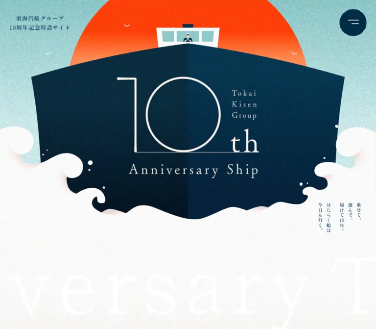
大きな船首と朝日、波のイラストで始まる周年記念サイト。紙のような粒子感、紺色の明朝体、縦書きコピーを軸に、船舶紹介や働く人の写真、フォトコンテスト作品を展開します。
オリジナルサイトを見るA commemorative maritime picture book: a monumental ship, an orange sun, and navy Mincho lettering on grainy paper.
Website: Tokai Kisen Group 10th Anniversary Original URL: https://www.tokaikisen.co.jp/tokaikisen-group10th/ Final URL: https://www.tokaikisen.co.jp/tokaikisen-group10th/ Response: HTTP 200; original and final URLs match. Theme: light paper and pale aqua fields, with navy typography and saturated orange artwork. Inspected: supplied browser capture dated September 22, 2026, 17:33:12.744 UTC; September 23, 2026, 02:33:12.744 JST. Viewports: 1440 × 1000 and 390 × 844 CSS pixels. Scope: desktop opening, cargo-editorial, and footer screenshots; mobile opening and footer screenshots; rendered text, links, element rectangles, custom properties, and computed styles spanning additional sections. Open-menu states, activated story cards, gallery navigation, and interview-reveal behavior were not supplied.
This is an anniversary editorial microsite. Its content introduces working vessels, explains cargo transport, presents crew interviews and maritime stories, and records a completed photo competition. The current page includes the original 2024 anniversary narrative, a sixth vessel marked for its 2025 anniversary, news, and published competition results. These are the contents currently served at the inspected URL.
The opening illustration establishes the scale: a dark ship approaches head-on, its bow carrying an enormous fine-line anniversary mark. A bright orange sun sits behind the bridge, small white birds punctuate the sky, and curling white waves become the next page surface. The drawing feels like a printed poster because grain runs through the broad color fields.
Below that opening, the page becomes a patient illustrated publication. Heavy Japanese serif text, long line spacing, thin rules, rectangular documentary photographs, and full-width navy subsection bands organize the information. Pale aqua returns around the competition photographs, and another wave silhouette carries the reader into a compact social footer.
A commemorative maritime picture book: a monumental ship, an orange sun, and navy Mincho lettering on grainy paper.
Website: Tokai Kisen Group 10th Anniversary Original URL: https://www.tokaikisen.co.jp/tokaikisen-group10th/ Final URL: https://www.tokaikisen.co.jp/tokaikisen-group10th/ Response: HTTP 200; original and final URLs match. Theme: light paper and pale aqua fields, with navy typography and saturated orange artwork. Inspected: supplied browser capture dated September 22, 2026, 17:33:12.744 UTC; September 23, 2026, 02:33:12.744 JST. Viewports: 1440 × 1000 and 390 × 844 CSS pixels. Scope: desktop opening, cargo-editorial, and footer screenshots; mobile opening and footer screenshots; rendered text, links, element rectangles, custom properties, and computed styles spanning additional sections. Open-menu states, activated story cards, gallery navigation, and interview-reveal behavior were not supplied.
This is an anniversary editorial microsite. Its content introduces working vessels, explains cargo transport, presents crew interviews and maritime stories, and records a completed photo competition. The current page includes the original 2024 anniversary narrative, a sixth vessel marked for its 2025 anniversary, news, and published competition results. These are the contents currently served at the inspected URL.
The opening illustration establishes the scale: a dark ship approaches head-on, its bow carrying an enormous fine-line anniversary mark. A bright orange sun sits behind the bridge, small white birds punctuate the sky, and curling white waves become the next page surface. The drawing feels like a printed poster because grain runs through the broad color fields.
Below that opening, the page becomes a patient illustrated publication. Heavy Japanese serif text, long line spacing, thin rules, rectangular documentary photographs, and full-width navy subsection bands organize the information. Pale aqua returns around the competition photographs, and another wave silhouette carries the reader into a compact social footer.
| Name | Value | Evidence | Role and implementation alias |
|---|---|---|---|
| Maritime Navy | #003656 |
Measured: --color-primary, --color-text, body text, subsection backgrounds |
Main text, rules, headings, and navy bands; --color-ink |
| Warm Paper | #F1ECEA |
Measured: --color-back, HTML and body backgrounds |
Base canvas beneath the rendered artwork and textures; --color-paper |
| Editorial Orange | #F04E29 |
Measured: --color-3rd, anniversary update text, story text |
Small update notices and story accents; --color-accent |
| Soft Orange Tint | rgba(240, 78, 41, 0.07) |
Declared: --color-3rd-opacity |
Available tint; its exact visible placement is not established |
| Muted Sea Green | #659C8A |
Declared: --color-secondary |
Secondary palette token; do not assume it is the pale hero sky |
| White | #FFFFFF |
Measured on reversed subsection headings; visually present in waves and cards | Reversed lettering and light surfaces; --color-white |
| Pale Aqua | Approximately #B5E2DC |
Estimated from original opening and footer captures | Flat-color starting point for the textured sky and competition surroundings; --color-sea |
| Sun Orange | Approximately #FF5208 |
Estimated from the opening illustration | Artwork-specific orange; the actual sun includes tonal variation and grain |
| Deep Hull | Approximately #002D45 |
Estimated from the opening illustration | Dark bow artwork; not an additional verified CSS token |
The exact site navy and the apparent hull color are related but should not be treated as identical sampled pixels. Similarly, the bright illustrated sun is not evidence that the CSS accent changes from #F04E29 to a brighter value.
The base body background is warm gray, while the photographed viewport often looks much whiter or more aqua because large illustrated surfaces cover it. The white wave field, aqua sky, orange sun, and dark bow all carry visible grain. The evidence does not identify whether that grain comes from individual assets, a common overlay, or a combination.
Keep the page palette restricted, but preserve natural colors in working-ship photographs and official colors in social logos. The footer visibly uses Instagram, YouTube, LINE, X, and Facebook branding. These colors belong to recognizable destination icons rather than a general multicolor interface system.
No theme-switching interface is established. Generic CMS gradients, shadows, and the library's default blue are not evidence of additional visible themes.
Measured family: "Zen Old Mincho", serif through both --fontFamily-default and --fontFamily-mincho.
The body defaults to 16px, weight 400, 24px line height, and 0.06em tracking. Much of the editorial content overrides this with weight 900 and significantly more generous leading. The result is dark, deliberate Japanese lettering with sufficient space between lines to keep long explanatory passages approachable.
Use the measured heavy weights where applicable. A regular-weight serif with the same nominal size will look noticeably lighter than the section introductions and competition captions.
Measured family: "Zen Antique", serif through --fontFamily-antique.
This family appears in the small site title, menu links, opening vertical copy, introductory statement, and vessel-index labels. Weight 400 is recorded for these elements. Its visual weight should come from the actual family rather than an assumed bold setting.
The oversized English 10th, stacked Tokai Kisen Group, and Anniversary Ship form a single visual lockup within the opening composition. The supplied text-element measurements do not identify its font or construction.
Treat the lockup as custom lettering or supplied artwork until its source is available. Its defining features are the very thin numeral strokes, nearly circular zero, extended baseline, much smaller serif letters, and generous English tracking. Do not assign a guessed commercial font to it.
The actual DOM H1 is the modest Japanese site identity in the upper-left corner. Its size is unrelated to the enormous anniversary artwork.
Values below are measured unless marked otherwise. Desktop refers to 1440 × 1000; mobile refers to 390 × 844.
| Role | Desktop size / line height | Mobile size / line height | Weight | Tracking |
|---|---|---|---|---|
| Base body | 16 / 24px | 16 / 24px | 400 | 0.96px |
| Japanese site H1 | 16 / 26px | 10 / 16.25px | 400, Antique | 0.96px at both widths |
| Menu links | 25 / 37.5px | 20 / 30px | 400, Antique | 0.96px |
| Opening vertical copy | 18 / 31.68px | 15.6 / 27.456px | 400, Antique | 0.96px |
| Anniversary introduction | 18 / 41.4px | 14 / 33.6px | 400, Antique | 0.06em |
| Vessel-index labels | 15 / 22.5px | 11.44 / 17.16px | 400, Antique | 0.06em |
| News heading | 30 / 45px | 26 / 39px | 400 | 0.1em |
| News titles | 16 / 24px | 15 / 32px | 900 | 0.1em |
| News category label | 13 / 19.5px | 12 / 15.6px | 700 | 0.1em |
| Major section headings | 44 / 66px | 26 / 39px | 900 | 4.4px desktop; normal mobile |
| Navy subsection bands | 27 / 40.5px | 18 / 27px | 900 | 0.1em |
| Cargo-editorial introduction | 20 / 36px | 15 / 32px | 900 | 0.96px |
| Interview paragraphs | 15 / 36px | 14 / 30px | 900 | Normal |
| Story paragraph elements | 15 / 32px | 15 / 32px | 900 | 1.5px; visible clipping/state unverified |
| Competition introduction | 16 / 36px | Not present in supplied mobile element sample | 900 | 1.6px |
| Winner vessel caption | 18 / 36px | Visually similar; exact mobile value unavailable | 900 | 1.8px desktop |
| Winner photographer caption | 16 / 20px | Visually similar; exact mobile value unavailable | 900 | 1.6px desktop |
| Footer announcement | 16 / 32px | Estimated 14 / 28px | 900 desktop | 1.6px desktop |
The source declares a rem-based size vocabulary from 0.8rem to 8rem, but the actual component values above include local overrides. For example, the measured 44px major heading should not be replaced by the declared 2.67rem token merely because the numbers are close.
Root size: measured 16px at both viewports.
General gutter: source --gutter: min(27.5px, 7.3%).
Primary content width: source --width-inner: 1100, confirmed by measured 1100px editorial content on desktop.
Secondary declared width: --width-subInner: 900; actual news content measures approximately 905.88px, so it is not an exact universal wrapper width.
| Source declaration or measured use | Value | Interpretation |
|---|---|---|
--gutter-y-half |
0.5rem = 8px |
Declared small spacing |
--spacing-md, --gutter-y |
1rem = 16px |
Declared base spacing |
--spacing-2xl |
1.6rem = 25.6px |
Declared intermediate spacing |
--spacing-3xl, --gutter-y-2 |
2rem = 32px |
Declared medium spacing |
--spacing-5xl, --gutter-y-4 |
4rem = 64px |
Declared large spacing |
--gutter-y-5 |
5rem = 80px |
Declared section spacing |
--spacing-6xl, --gutter-y-8 |
8rem = 128px |
Declared broad spacing |
| Main gutter at both captures | 27.5px | Measured in multiple content regions |
| Major heading bottom padding | 30px | Measured at both widths |
| Navy-band padding | 8.1px desktop; 3.6px mobile | Measured on all sides |
| Cargo section outer padding | 215px top / 100px bottom desktop | Measured |
| Cargo section outer padding | 170px top / 40px bottom mobile | Measured |
| Band-to-introduction gap | 50px desktop; 27px mobile | Calculated from element rectangles |
| Desktop story-card gaps | 25px horizontally and vertically | Calculated |
| Mobile story-card pitch | 238px for 218px cards | Calculated 20px gap; repeated horizontal structure |
The design does not use one small spacing scale everywhere. Tight type details sit inside broad chapter transitions. Preserve those changes in pace instead of normalizing every gap to a compact component-library default.
| Element | Evidence | Treatment |
|---|---|---|
| Editorial photographs | Screenshot | Square corners |
| Navy subsection bands | Measured radius 0 | Square rectangle |
| Story button boxes | Measured radius 0 | No rounded wrapper established |
| Gallery arrow buttons | Measured 50% | Circular controls |
| Menu button silhouette | Screenshot | Rough-edged navy disc |
| Menu button DOM wrapper | Measured radius 0, transparent background | The wrapper does not account for the visible disc; child/decorative styling was not supplied |
| Competition photograph cards | Estimated around 10–12px | Gently rounded white frame |
There is no visible general-purpose shadow elevation system in the supplied original-page screenshots. Separation comes from color fields, rules, picture edges, whitespace, and the white competition frames.
| Element | Desktop | Mobile | Status |
|---|---|---|---|
| Document height | 21,260.19px | 18,029.53px | Measured |
| Header box | 1440 × 125px | 390 × 70px | Measured |
| Site-title position | x 36, y 36.5px | x 9.75, y 18.75px | Measured |
| Site-title box | 171.25 × 52px | 111 × 32.5px | Measured |
| Menu-button box | 76 × 76px; x 1328, y 24.5px | 42 × 42px; x 338.25, y 14px | Measured |
| Main editorial inner | 1100px wide; x 170px | 335px wide; x 27.5px | Measured |
| Navy subsection band | 1100 × 56.69px | 335 × 34.19px | Measured |
| Vessel-index item | 340px wide; three across | 157.5px wide; two across | Measured |
| News inner | Approximately 905.88px | Approximately 329.16px | Measured |
| Gallery section | 1440 × 540px | 335 × 404.55px | Measured container, not individual image |
| Gallery control | 82 × 82px | 46 × 46px | Measured |
| Story button | 327.5 × 450px | 218 × 297px | Measured |
| Final competition card | Approximately 530px wide | Approximately 335px wide | Screenshot estimate |
| Final card photograph | 450px wide | Approximately 285 × 191px | Desktop width supported by caption alignment; mobile estimated |
The shared title/menu horizontal offsets equal 2.5% of the viewport at both captured widths: 36px and 9.75px. That relationship is calculated; the underlying rule was not supplied.
Role: retain a quiet identity while providing access to the long document.
The opening header is transparent over the illustration. Its upper-left identity consists of two lines: 東海汽船グループ and 10周年記念特設サイト. It links to the anniversary page and contains the H1. Its modest scale leaves the anniversary drawing in control of the composition.
At the upper right, a navy disc contains two thin white horizontal strokes of unequal lengths. The outer contour has a slightly irregular printed edge. Its measured box decreases from 76px to 42px on mobile.
The toggle stays in the same upper-right location in the supplied scrolled screenshots. This supports persistent positioning for the toggle. The evidence does not establish that the entire identity header remains fixed.
The closed-state DOM contains six navigation destinations: top, vessels, the working-ship pictorial, short stories, the photo competition, and news. Four are section anchors; news links to a separate directory. The menu links are positioned above the captured viewport. Its activated surface, focus behavior, and opening sequence were not exercised.
Role: establish the commemorative identity before the editorial material.
The anatomy is a layered visual composition:
These are visual layers; the supplied evidence does not prove that each is a separate DOM element or asset.
On desktop, the bow extends approximately from x 120 to x 1320. Its upper point sits around y 160, while the central lower wave boundary reaches roughly y 825. The sun is cropped by the top edge of the viewport. On mobile, the sun begins around y 85 and the bow spans the full width; the wave boundary ends around y 585. These are screenshot estimates.
The opening is not a photograph with a text overlay. Its typography, scale, and silhouettes are authored together. Reuse authorized artwork or create a new composition with equivalent art direction; a generic ship photo will not reproduce its structure.
Role: connect the monumental illustration with the practical work of the vessels.
The actual copy is 乗せて、運んで、届けて10年。 followed by はたらく船は今日も行く。. Two paragraph groups form five vertical columns, read from the right.
On desktop, their combined area begins around x 1213 and y 776, near the right edge of the wave field. On mobile, the same groups are centered beneath the illustration, beginning around x 118 and y 681. They remain vertical rather than becoming a horizontal paragraph.
The mobile version is a recomposition: the copy moves below the bow with approximately 96px of visual separation from the central wave boundary. It is not merely a uniformly scaled desktop hero.
Role: explain the anniversary and offer direct entry into individual vessel sections.
A centered, generously led introduction follows the opening. It names the group companies and explains the role of the ships in connecting islands with the mainland. Measured line heights are 41.4px desktop and 33.6px mobile, giving the short statement a ceremonial pace.
Six vessel links follow. Their desktop boxes form three columns of 340px within a 1020px span; mobile uses two 157.5px columns with a 20px gap. Each item reserves a larger visual region above its compact centered vessel label. The supplied element sample does not expose the corresponding image URLs or image dimensions.
The sixth item includes the orange source label NEW 2025年で10周年!. Preserve this distinction as part of the current content, rather than assuming the index still contains only the five ships described in the original introduction.
Role: keep anniversary announcements available within the editorial page.
The list contains three dated announcements and an お知らせ一覧 link. Desktop rows align the date, a small category label, and a heavy serif title horizontally. Measured rows are approximately 135–144px high.
On mobile, title text moves below the metadata area. It changes from 16/24px to 15/32px, with row heights of approximately 159–191px. This is an increase in reading space, despite the smaller type.
The list heading uses regular-weight Mincho rather than the weight-900 treatment of the major chapter headings. Keep that hierarchy distinction. Border appearance and news hover states were not established by the supplied screenshots.
Role: combine an individual ship's identity, operational description, and crew perspective.
The rendered content includes the company name, a short descriptive phrase, the vessel name, an operational paragraph, and captain-interview material for the first five ships. Interview topics include the anniversary, favorite qualities, points of interest, memorable events, and views from the route.
The desktop profile heading box is approximately 96.59px wide and 502px tall. On mobile, the equivalent heading is approximately 68px tall and substantially wider. These rectangles indicate a major change from an upright desktop composition to a horizontal mobile heading region; the exact child typography and writing-mode declarations were not supplied.
Operational description blocks measure 770–880px wide in several desktop profiles and 280px on mobile. Interview paragraphs measure roughly 560–580px on desktop and 295–315px on mobile, with very open leading.
The interviews are laid out far to the right of the initial viewport: examples begin beyond x 2000 on desktop and beyond x 1174 on mobile. This is evidence of offscreen content arrangement, not proof of a modal, a carousel, drag interaction, or scroll-driven pinning. A faithful implementation needs that behavior inspected separately. An adaptation should provide an explicit, keyboard-operable way to reach every interview.
Role: explain the difference between passenger-cargo ships and cargo ships, then show their working cycle.
This is the clearest photographed editorial pattern in the supplied middle-page capture. A centered 1100px region contains a heavy major heading, a solid navy subsection band, introductory copy, and paired photographs with captions.
The band 貨物船の動き measures 56.69px high on desktop. Its title is centered, white, 27px, weight 900, with 2.7px tracking. On mobile the band reduces to 34.19px and the title to 18px.
Below the band, an explanatory paragraph is followed by a compact centered white day label such as 1日目:芝浦(東京)→各島へ. The supplied screenshot shows a fine navy lower edge on that label. Its full styling is not present in the computed sample.
Desktop photographs sit inside two equal-width columns with thin navy vertical rules at the outer edges and between columns. The images are approximately 405px wide with approximately 72px side insets inside each 550px column. Captions sit below with generous leading. The visible images show ships in service, cranes, trucks, and containers.
The mobile cargo section is taller despite narrower and shorter headings: approximately 3920px versus 2960px on desktop. This is consistent with a more vertical reading flow. Its exact photograph layout was not visually captured, so a one-column implementation is a recommendation rather than a fully verified screenshot observation.
Role: present a visual account of ships, loading operations, equipment, and maintenance.
Two gallery regions follow a major heading. Their supplied content includes ship portraits, staff coordinating loads, derrick posts, the hold, container repair, and ship washing.
Each desktop gallery container is 540px high. Circular previous/next button boxes measure 82px and are positioned symmetrically around the center. Mobile containers measure approximately 335 × 404.55px, with 46px buttons overlapping their lateral edges.
Repeated captions and offscreen content are consistent with cloned carousel tracks. The supplied evidence does not establish autoplay, looping duration, swipe support, active-slide treatment, or the visual result of pressing an arrow. Keep those as unresolved interaction details.
Role: turn operational facts into short, approachable editorial entries.
Eight unique topics appear, including aquarium seawater, uniform shoulder marks, unusual containers, maritime traffic rules, crew meals, Christmas deliveries, crew numbers, and reserve vessels.
Desktop button boxes form four columns and two rows, each 327.5 × 450px with 25px gaps. The major section heading is white; story title and paragraph elements compute to the orange accent. The enclosing section's precise background and card artwork were not captured visually and should not be invented.
Mobile cards measure 218 × 297px. Their positions and repeated copies establish two horizontal tracks rather than a simple eight-card vertical list. Copies extend beyond both viewport edges. Track movement and direction were not recorded over time.
The extraction includes title and paragraph content in overlapping card regions. It does not show whether the original uses a flip, a reveal, or another mechanism. The measured transform 0.3s transition is not sufficient to choose one. A new implementation can use an explicit disclosure, with all copy available when scripting or motion is disabled.
Role: preserve the invitation, current closed status, and selected photographs as an anniversary record.
The page includes a 詳細はこちら link, the explicit status 応募は締め切りました, and an announcement of winning photographs selected from 431 entries. Preserve the closed state alongside the older invitation text.
The measured detail-link box is 258 × 52.78px on desktop, with white 16px, weight-900 text. Its sampled element background is transparent; the visible fill cannot be recovered from that property alone.
The earlier winner captions occupy centered 520px blocks. Later captions occupy paired 450px blocks. The final desktop screenshot shows a white frame at the left of the larger aqua field; the corresponding mobile frame fills the 335px content width.
Visible frame anatomy:
The final mobile image is approximately 285 × 191px. Preserve each photograph's natural composition; the evidence does not justify cropping every winner to a uniform ratio. Photographer labels belong to the photographs and are not website-production credits.
Role: close the illustrated journey and offer continuing contact with the company.
A broad aqua area gives way to an irregular white wave edge. Large curls rise at the left and right, while the center forms a low rolling silhouette. Small white droplets and pale warm undertones make it feel drawn rather than mechanically scalloped.
The footer centers a two-line announcement, a row of five official social icons, the Tokai Kisen logo, and a small copyright line. The icon order is Instagram, YouTube, LINE, X, Facebook. The X mark links to the supplied legacy Twitter URL; the visible logo and the destination naming do not need to match.
Desktop social widths recorded on the anchors are 45, 47, 44, 37, and 39px, with calculated 25px gaps. Their 24px inline anchor heights do not describe the taller visible icons. The row remains horizontal in the mobile screenshot.
The corporate logo is approximately 170px wide in both supplied footer views. The footer is compact, centered, and visually separate from the long editorial content above it.
| Target | Supplied evidence | What can be concluded |
|---|---|---|
| Menu links | opacity 0.7s ease-out 0.7s, transform 0.7s ease-in-out 0.7s |
Both properties have a 700ms duration and 700ms delay; triggering state and travel distance are unverified |
| News-list link | opacity 0.3s |
An opacity transition is defined; endpoint opacity and triggering state are unverified |
| Gallery buttons | transition: 0.2s |
A 200ms transition exists; affected appearance was not exercised |
| Story buttons | transform 0.3s |
Transform feedback is defined; rotation, scale, translation, and trigger are unknown |
| Navigation destinations | Section-anchor and external-page hrefs | Destination structure is verified; smooth scrolling is not |
| Persistent menu | Same upper-right location in scrolled captures | Persistent positioning is visually supported |
| Gallery repetitions | Repeated captions and offscreen boxes | Carousel-like track structure is supported; autoplay and loop behavior are not confirmed |
| Mobile story tracks | Repeated 218px cards at 238px intervals | Horizontal repeated layout is supported; animation timing and direction are unverified |
| Hero waves, sun, and boat | Static supplied captures | No bobbing, parallax, entrance, or wave animation can be claimed |
Most sampled elements report animation: none. Many also report only transition: all, without a meaningful nonzero duration in the supplied record. Neither statement establishes the behavior of child assets, pseudo-elements, or JavaScript animation.
The capture process waited for load, visible image decoding, and sampled layout stability. It temporarily paused perpetual animations during readiness checks and resumed them afterward. This makes the screenshots useful records of settled appearance, but it does not supply motion sequences or prove that delayed content and every interactive state were reached.
For an adaptation, keep decorative movement optional and restrained. Use the recorded transition values only for corresponding components, and implement a reduced-motion path that leaves all content reachable.
| Layer | Appearance | Evidence and purpose |
|---|---|---|
| Base document | Warm paper #F1ECEA |
Measured body background |
| Opening sky | Pale aqua with fine grain | Screenshot; establishes the marine setting |
| Bow and sun | Large textured dark and orange fields | Screenshot; carry the identity |
| Editorial canvas | Light, subtly warm paper with grain | Screenshot; supports photographs and dense text |
| Subsection header | Flat navy rectangle with white serif text | Measured and photographed; organizes explanations |
| Editorial boundaries | Thin navy vertical rules | Screenshot; separates paired image/caption columns |
| Winner frames | White, softly rounded, shadowless | Screenshot; mounts contributed photographs |
| Footer | White wave field with centered navy text | Screenshot; provides a calm ending |
The grain should remain fine relative to the viewport. It should not become a coarse halftone, visible tiled pattern, or blur over the photographs. Its precise opacity, blend mode, and asset construction are not supplied.
The page combines two distinct kinds of imagery: an authored maritime illustration and documentary photography. Their relationship is important. The illustration creates warmth and ceremony; the photographs show real vessels, routes, working equipment, and the people who maintain the service.
The opening drawing uses a frontal bow with exaggerated scale, a simple geometric bridge, a tiny human figure, an oversized sun, and stylized foam. It is symmetrical at the ship's center but irregular at the wave edges. Fine grain softens the otherwise bold shapes.
The editorial photographs retain natural colors: yellow ship paint, blue hulls and containers, green island slopes, gray harbors, and blue water. Keep the machinery, cargo, and surrounding context visible. These images explain work as well as decorate the page.
Competition photographs appear inside clean white frames, with vessel and photographer labels. They should retain their individual framing and aspect ratios. Official company and social logos remain recognizable and unmodified.
No original image src paths, downloadable artwork URLs, or font-file URLs were supplied. The following are visual references, not invented asset filenames.
| Asset group | Where observed | Reuse guidance |
|---|---|---|
| Bow, sun, bridge, anniversary lockup | Original desktop and mobile opening screenshots | Use authorized art or a newly authored composition; provide mobile art direction |
| Wave silhouettes and droplets | Original opening and footer screenshots | Preserve broad curls and asymmetric foam; avoid repetitive generic scallops |
| Grain texture | Original opening, editorial, and footer screenshots | Supply a subtle authored texture if available; exact implementation unknown |
| Working-ship and loading photographs | Original desktop cargo screenshot | Use descriptive, contextual documentary images |
| Final winning photograph | Original desktop and mobile footer-area screenshots | Preserve the vessel and harbor composition |
| Tokai Kisen logo and social icons | Original footer screenshots and rendered links | Use authorized official marks with accessible destination labels |
Do not apply image-rendering: pixelated. The visible texture is grain, while photographs and lettering retain normal rendering.
The document alternates full-width illustrated regions with narrower reading regions. At 1440px, the main 1100px editorial wrapper leaves 170px margins. At 390px, it becomes 335px wide with 27.5px margins. The vessel index, news, story tracks, and profile interiors have their own dimensions rather than inheriting one universal width.
| Pattern | Desktop observation | Mobile observation |
|---|---|---|
| Opening | Broad frontal ship; copy at lower right | Full-width bow; vertical copy centered below |
| Header identity | 16px title inside a 125px header | 10px title inside a 70px header |
| Menu disc | 76px | 42px |
| Vessel index | Three columns | Two columns with 20px gap |
| Major headings | 44px with 0.1em tracking | 26px with normal tracking |
| News rows | Metadata and title horizontally aligned | Title beneath metadata, with 32px leading |
| Profile heading region | Narrow, tall desktop box | Wider, short mobile box |
| Gallery regions | Full viewport-width containers | 335px containers with controls near screen edges |
| Story collection | Four columns by two rows | Two repeated horizontal tracks |
| Final winner frame | Approximately 530px wide | Approximately 335px wide |
| Social links | One centered row | One centered row |
The source declares design references of 1920px desktop width, 900px height, and 375px mobile width. These are authoring constants, not the inspected viewport dimensions. The actual breakpoint and interpolation formulas were not supplied.
Mobile document height is shorter overall even though the cargo explanation becomes taller. Several regions change structure, size, and horizontal arrangement. A simple instruction to stack every desktop column would miss those distinctions.
The Quick Start uses 767px as a recommended breakpoint to reproduce the two known endpoint layouts. It is not a recovered source breakpoint. Test intermediate widths, long headings, zoom, and landscape separately.
#003656, paper #F1ECEA, and editorial orange #F04E29 as semantic anchors.These are recommendations for a new implementation, not verified features of the inspected page:
aria-expanded, and a relationship to its navigation region. Support Escape and return focus when an overlay closes.#003656.#F1ECEA.#F04E29.#B5E2DC.#FF5208.“Create an anniversary editorial microsite for a Japanese island-shipping group. Open with an authored, grainy maritime illustration: a monumental dark navy ship bow viewed head-on, a small bridge and captain, a large orange sun, tiny white gulls, and curling white foam that becomes the page surface. Place a custom fine-line anniversary lockup on the bow and short Japanese vertical copy at the lower right on desktop, centered beneath the illustration on mobile. Use Zen Old Mincho for heavy editorial headings and copy, Zen Antique for the small identity and introductory text, navy #003656, warm paper #F1ECEA, and restrained #F04E29 accents. Build a long sequence of vessel profiles, news, cargo explanations, documentary galleries, maritime stories, and completed photo-competition results. Use 1100px desktop reading regions, wide leading, flat navy subsection bands, thin rules, square photographs, and softly rounded white winner frames. Finish with an illustrated wave transition and a centered official-logo social footer.”
This is an implementation adaptation, not recovered source code. It uses measured colors and typography, a few clearly marked visual estimates, and a recommended breakpoint. Font files, anniversary artwork, wave art, texture, and photographs must be supplied separately from authorized sources.
Class contract: place the page inside .anniversary-page; use .inner for standard reading regions; place an art-directed picture or image inside .hero__scene; put the two vertical paragraphs inside .hero__copy; use semantic figures for editorial and winner photographs. The menu's scripting and the unresolved interview/gallery behavior are outside this CSS shell.
:root {
  /* Exact colors from the supplied source evidence. */
  --color-ink: #003656;
  --color-paper: #f1ecea;
  --color-accent: #f04e29;
  --color-secondary: #659c8a;
  --color-white: #ffffff;

  /* Visual estimate for a flat fallback behind authored aqua art. */
  --color-sea: #b5e2dc;

  /* Verified family names; load authorized font files separately. */
  --font-editorial: 'Zen Old Mincho', serif;
  --font-antique: 'Zen Antique', serif;
  --weight-regular: 400;
  --weight-heavy: 900;
  --tracking-body: 0.06em;
  --tracking-heading: 0.1em;

  --content-width: 1100px;
  --gutter: min(27.5px, 7.3%);
  --space-small: 16px;
  --space-medium: 32px;
  --space-large: 64px;
  --space-chapter: 128px;
  --radius-photo-frame: 12px; /* Estimated from screenshots. */

  /* Optional texture asset; none keeps a functional solid fallback. */
  --texture-image: none;
  --texture-opacity: 0.07; /* Recommended, not measured. */

  /* Source stacking values. */
  --z-header: 40;
  --z-menu: 41;
  --z-toggle: 42;
}

* {
  box-sizing: border-box;
}

body {
  margin: 0;
  background: var(--color-paper);
}

.anniversary-page {
  color: var(--color-ink);
  background: var(--color-paper);
  font-family: var(--font-editorial);
  font-size: 16px;
  font-weight: var(--weight-regular);
  line-height: 1.5;
  letter-spacing: var(--tracking-body);
}

.anniversary-page img {
  display: block;
  max-width: 100%;
  height: auto;
}

.anniversary-page a {
  color: inherit;
}

.inner {
  width: min(
    var(--content-width),
    calc(100% - var(--gutter) - var(--gutter))
  );
  margin-inline: auto;
}

/* Optional texture treatment, not a claim about the original method. */
.textured {
  position: relative;
  isolation: isolate;
}

.textured::before {
  content: '';
  position: absolute;
  inset: 0;
  z-index: -1;
  pointer-events: none;
  background-image: var(--texture-image);
  background-repeat: repeat;
  opacity: var(--texture-opacity);
}

.site-header {
  position: absolute;
  inset: 0 0 auto;
  z-index: var(--z-header);
  height: 125px;
  pointer-events: none;
}

.site-brand {
  position: absolute;
  top: 36.5px;
  left: 2.5%;
  pointer-events: auto;
  text-decoration: none;
}

.site-brand h1 {
  margin: 0;
  font-family: var(--font-antique);
  font-size: 16px;
  font-weight: 400;
  line-height: 26px;
  letter-spacing: 0.96px;
  text-align: center;
}

.menu-toggle {
  position: fixed;
  z-index: var(--z-toggle);
  top: 24.5px;
  right: 2.5%;
  display: grid;
  place-content: center;
  justify-items: end;
  gap: 8px;
  width: 76px;
  height: 76px;
  padding: 0;
  border: 0;
  border-radius: 50%;
  color: var(--color-white);
  background: var(--color-ink);
  cursor: pointer;
  /* Replace the smooth disc with authorized rough-edge art if available. */
}

.menu-toggle span {
  display: block;
  width: 30px;
  height: 2px;
  background: currentColor;
}

.menu-toggle span:last-child {
  width: 20px;
}

.hero {
  position: relative;
  padding-bottom: 120px;
  background: var(--color-white);
}

.hero__scene {
  aspect-ratio: 1440 / 825; /* Screenshot-based composition estimate. */
  overflow: hidden;
  background: var(--color-sea);
}

.hero__scene picture,
.hero__scene img {
  display: block;
  width: 100%;
  height: 100%;
}

.hero__scene img {
  object-fit: cover;
}

.hero__copy {
  position: absolute;
  top: 54vw; /* Recommended approximation of the measured placement. */
  right: 3.5%;
  display: flex;
  flex-direction: row-reverse;
  gap: 1em;
  font-family: var(--font-antique);
  font-size: 18px;
  line-height: 1.76;
  letter-spacing: 0.96px;
}

.hero__copy p {
  margin: 0;
  writing-mode: vertical-rl;
  text-orientation: mixed;
}

.intro-copy {
  margin: 0 auto;
  padding-inline: var(--gutter);
  font-family: var(--font-antique);
  font-size: 18px;
  line-height: 2.3;
  text-align: center;
}

.vessel-index {
  display: grid;
  grid-template-columns: repeat(3, minmax(0, 1fr));
  gap: 10px 0;
  width: min(1020px, calc(100% - 55px));
  margin: 100px auto 0;
}

.vessel-link {
  min-width: 0;
  text-align: center;
  text-decoration: none;
}

.vessel-label,
.vessel-update {
  margin: 8px 0 0;
  font-family: var(--font-antique);
  font-size: 15px;
  line-height: 1.5;
}

.vessel-update {
  color: var(--color-accent);
}

.section-title {
  margin: 0;
  padding-bottom: 30px;
  font-size: 44px;
  font-weight: var(--weight-heavy);
  line-height: 1.5;
  letter-spacing: var(--tracking-heading);
  text-align: center;
}

.pictorial {
  padding-block: 215px 100px;
}

.subsection-band {
  margin: 90px 0 50px;
  padding: 8.1px;
  color: var(--color-white);
  background: var(--color-ink);
  font-size: 27px;
  font-weight: var(--weight-heavy);
  line-height: 1.5;
  letter-spacing: 0.1em;
  text-align: center;
}

.editorial-lead {
  margin: 0 0 50px;
  font-size: 20px;
  font-weight: var(--weight-heavy);
  line-height: 36px;
}

.day-label {
  display: table;
  max-width: 100%;
  margin: 50px auto 60px;
  padding: 4px 22px;
  border-bottom: 1px solid var(--color-ink);
  background: var(--color-white);
  font-size: 20px;
  font-weight: var(--weight-heavy);
  text-align: center;
}

.pictorial-grid {
  display: grid;
  grid-template-columns: repeat(2, minmax(0, 1fr));
  border-left: 1px solid var(--color-ink);
}

.pictorial-figure {
  min-width: 0;
  margin: 0;
  padding-inline: 72px;
  border-right: 1px solid var(--color-ink);
}

.pictorial-figure img {
  width: 100%;
  border-radius: 0;
}

.pictorial-figure figcaption {
  margin-top: 32px;
  font-weight: var(--weight-heavy);
  line-height: 2;
}

.award-region {
  background: var(--color-sea);
}

.award-grid {
  display: grid;
  grid-template-columns: repeat(2, minmax(0, 1fr));
  gap: 40px;
}

.award-card {
  min-width: 0;
  margin: 0;
  padding: 40px 40px 60px;
  border-radius: var(--radius-photo-frame);
  background: var(--color-white);
  text-align: center;
}

.award-card img {
  width: 100%;
  height: auto;
  border-radius: 0;
}

.award-card figcaption {
  margin-top: 16px;
  font-weight: var(--weight-heavy);
}

.award-card__ship {
  margin: 0;
  font-size: 18px;
  line-height: 36px;
  letter-spacing: 0.1em;
}

.award-card__author {
  margin: 0;
  font-size: 16px;
  line-height: 20px;
  letter-spacing: 0.1em;
}

.site-footer {
  padding-bottom: 20px;
  background: var(--color-white);
  text-align: center;
}

.footer-wave {
  width: 100%;
  height: auto;
}

.footer-content {
  padding: 64px var(--gutter) 0;
}

.footer-note {
  margin: 0;
  font-size: 16px;
  font-weight: var(--weight-heavy);
  line-height: 32px;
  letter-spacing: 0.1em;
}

.social-list {
  display: flex;
  flex-wrap: wrap;
  justify-content: center;
  align-items: center;
  gap: 25px;
  margin: 34px 0 68px;
  padding: 0;
  list-style: none;
}

.social-list a {
  display: grid;
  place-items: center;
  min-width: 44px;
  min-height: 44px;
}

.social-list img {
  width: auto;
  max-width: 47px;
  height: 44px;
  object-fit: contain;
}

.footer-logo {
  width: 170px;
  margin-inline: auto;
}

.footer-copyright {
  margin: 24px 0 0;
  font-size: 11px; /* Recommended visual approximation. */
}

/* Recommended anchor and keyboard treatment. */
.anniversary-page [id] {
  scroll-margin-top: 90px;
}

.anniversary-page :focus-visible {
  outline: 2px solid var(--color-white);
  outline-offset: 2px;
  box-shadow: 0 0 0 5px var(--color-ink);
}

/* Recommended breakpoint; the original breakpoint is unknown. */
@media (max-width: 767px) {
  .site-header {
    height: 70px;
  }

  .site-brand {
    top: 18.75px;
  }

  .site-brand h1 {
    font-size: 10px;
    line-height: 16.25px;
  }

  .menu-toggle {
    top: 14px;
    width: 42px;
    height: 42px;
    gap: 5px;
  }

  .menu-toggle::before {
    content: '';
    position: absolute;
    inset: -2px;
    border-radius: 50%;
  }

  .menu-toggle span {
    width: 18px;
    height: 1px;
  }

  .menu-toggle span:last-child {
    width: 12px;
  }

  .hero {
    padding-bottom: 60px;
  }

  .hero__scene {
    aspect-ratio: 390 / 585;
  }

  .hero__copy {
    position: static;
    width: max-content;
    max-width: 100%;
    margin: 96px auto 0;
    font-size: 15.6px;
  }

  .intro-copy {
    font-size: 14px;
    line-height: 2.4;
  }

  .vessel-index {
    grid-template-columns: repeat(2, minmax(0, 1fr));
    gap: 10px 20px;
    margin-top: 62px;
  }

  .vessel-label,
  .vessel-update {
    font-size: 11.44px;
  }

  .section-title {
    font-size: 26px;
    letter-spacing: normal;
  }

  .pictorial {
    padding-block: 170px 40px;
  }

  .subsection-band {
    margin-block: 60px 27px;
    padding: 3.6px;
    font-size: 18px;
  }

  .editorial-lead {
    font-size: 15px;
    line-height: 32px;
  }

  .day-label {
    padding-inline: 12px;
    font-size: 16px;
  }

  /* Recommended readable adaptation; mobile photo layout is unverified. */
  .pictorial-grid {
    grid-template-columns: minmax(0, 1fr);
    gap: 40px;
    border: 0;
  }

  .pictorial-figure {
    padding: 0;
    border: 0;
  }

  .award-grid {
    grid-template-columns: minmax(0, 1fr);
    gap: 32px;
  }

  .award-card {
    padding: 30px 25px;
  }

  .footer-content {
    padding-top: 56px;
  }

  .footer-note {
    font-size: 14px;
    line-height: 28px;
  }

  .social-list {
    gap: 22px;
  }
}

/* Scripts must separately honor this preference for moving tracks. */
@media (prefers-reduced-motion: reduce) {
  .anniversary-page *,
  .anniversary-page *::before,
  .anniversary-page *::after {
    animation: none !important;
    transition: none !important;
    scroll-behavior: auto !important;
  }
}
The artwork carries much of the identity. Without supplied images, this CSS provides the hierarchy, spacing, colors, and framing, but it does not reconstruct the illustrated ship or its custom lettering. The measured typography also assumes that the named fonts load successfully.
Optional aliases for a project already using Tailwind v4. This is not evidence that the original page uses Tailwind. Keep the component-specific responsive values above where exact endpoint proportions matter.
@theme inline {
  --color-maritime: var(--color-ink);
  --color-warm-paper: var(--color-paper);
  --color-anniversary-orange: var(--color-accent);
  --color-pale-sea: var(--color-sea);

  --font-mincho: var(--font-editorial);
  --font-antique: var(--font-antique-source, 'Zen Antique', serif);

  --text-section: 44px;
  --text-section-mobile: 26px;
  --text-band: 27px;
  --text-band-mobile: 18px;
  --text-editorial: 20px;

  --spacing-content: 1100px;
  --spacing-chapter: 128px;
  --spacing-page-gutter: 27.5px;
  --radius-photo-frame: 12px;
}
This reference describes the currently served anniversary experience using the supplied original-page evidence. The CSS and implementation recommendations are adaptations and were not executed or browser-tested during this analysis.
# Tokai Kisen Group 10th Anniversary — Style Reference

> A commemorative maritime picture book: a monumental ship, an orange sun, and navy Mincho lettering on grainy paper.

**Website:** [Tokai Kisen Group 10th Anniversary](https://www.tokaikisen.co.jp/tokaikisen-group10th/)
**Original URL:** https://www.tokaikisen.co.jp/tokaikisen-group10th/
**Final URL:** https://www.tokaikisen.co.jp/tokaikisen-group10th/
**Response:** HTTP 200; original and final URLs match.
**Theme:** light paper and pale aqua fields, with navy typography and saturated orange artwork.
**Inspected:** supplied browser capture dated September 22, 2026, 17:33:12.744 UTC; September 23, 2026, 02:33:12.744 JST.
**Viewports:** 1440 × 1000 and 390 × 844 CSS pixels.
**Scope:** desktop opening, cargo-editorial, and footer screenshots; mobile opening and footer screenshots; rendered text, links, element rectangles, custom properties, and computed styles spanning additional sections. Open-menu states, activated story cards, gallery navigation, and interview-reveal behavior were not supplied.

This is an anniversary editorial microsite. Its content introduces working vessels, explains cargo transport, presents crew interviews and maritime stories, and records a completed photo competition. The current page includes the original 2024 anniversary narrative, a sixth vessel marked for its 2025 anniversary, news, and published competition results. These are the contents currently served at the inspected URL.

The opening illustration establishes the scale: a dark ship approaches head-on, its bow carrying an enormous fine-line anniversary mark. A bright orange sun sits behind the bridge, small white birds punctuate the sky, and curling white waves become the next page surface. The drawing feels like a printed poster because grain runs through the broad color fields.

Below that opening, the page becomes a patient illustrated publication. Heavy Japanese serif text, long line spacing, thin rules, rectangular documentary photographs, and full-width navy subsection bands organize the information. Pale aqua returns around the competition photographs, and another wave silhouette carries the reader into a compact social footer.
# Tokai Kisen Group 10th Anniversary — Style Reference

> A commemorative maritime picture book: a monumental ship, an orange sun, and navy Mincho lettering on grainy paper.

**Website:** [Tokai Kisen Group 10th Anniversary](https://www.tokaikisen.co.jp/tokaikisen-group10th/)
**Original URL:** https://www.tokaikisen.co.jp/tokaikisen-group10th/
**Final URL:** https://www.tokaikisen.co.jp/tokaikisen-group10th/
**Response:** HTTP 200; original and final URLs match.
**Theme:** light paper and pale aqua fields, with navy typography and saturated orange artwork.
**Inspected:** supplied browser capture dated September 22, 2026, 17:33:12.744 UTC; September 23, 2026, 02:33:12.744 JST.
**Viewports:** 1440 × 1000 and 390 × 844 CSS pixels.
**Scope:** desktop opening, cargo-editorial, and footer screenshots; mobile opening and footer screenshots; rendered text, links, element rectangles, custom properties, and computed styles spanning additional sections. Open-menu states, activated story cards, gallery navigation, and interview-reveal behavior were not supplied.

This is an anniversary editorial microsite. Its content introduces working vessels, explains cargo transport, presents crew interviews and maritime stories, and records a completed photo competition. The current page includes the original 2024 anniversary narrative, a sixth vessel marked for its 2025 anniversary, news, and published competition results. These are the contents currently served at the inspected URL.

The opening illustration establishes the scale: a dark ship approaches head-on, its bow carrying an enormous fine-line anniversary mark. A bright orange sun sits behind the bridge, small white birds punctuate the sky, and curling white waves become the next page surface. The drawing feels like a printed poster because grain runs through the broad color fields.

Below that opening, the page becomes a patient illustrated publication. Heavy Japanese serif text, long line spacing, thin rules, rectangular documentary photographs, and full-width navy subsection bands organize the information. Pale aqua returns around the competition photographs, and another wave silhouette carries the reader into a compact social footer.

## How to Read This Reference

- **Measured** means a value appears in the supplied rendered DOM, computed styles, or custom properties. Measurements describe the captured state and viewport.
- **Calculated** means a value is derived from supplied rectangles or declared units. The calculation does not establish the original CSS formula.
- **Estimated** means a dimension, color, or shape is read visually from an original-page screenshot. Textures make exact color sampling especially inappropriate.
- **Recommended** means an implementation choice for an adaptation. Breakpoints, accessible behavior, and the Quick Start are recommendations unless explicitly identified otherwise.
- **Declared tokens are not proof of visible use.** The evidence contains CMS presets and library variables alongside site-specific properties. Only relevant values are included below.
- **DOM presence is not visibility.** Several interview blocks lie far outside the viewport, and repeated gallery or story content appears in the extraction. Their presence does not prove that all those items were simultaneously visible.
- The document uses English explanations. Japanese is retained only for actual interface labels, source copy, and proper names.

## Tokens — Colors

### Default Palette

| Name | Value | Evidence | Role and implementation alias |
| --- | --- | --- | --- |
| Maritime Navy | `#003656` | Measured: `--color-primary`, `--color-text`, body text, subsection backgrounds | Main text, rules, headings, and navy bands; `--color-ink` |
| Warm Paper | `#F1ECEA` | Measured: `--color-back`, HTML and body backgrounds | Base canvas beneath the rendered artwork and textures; `--color-paper` |
| Editorial Orange | `#F04E29` | Measured: `--color-3rd`, anniversary update text, story text | Small update notices and story accents; `--color-accent` |
| Soft Orange Tint | `rgba(240, 78, 41, 0.07)` | Declared: `--color-3rd-opacity` | Available tint; its exact visible placement is not established |
| Muted Sea Green | `#659C8A` | Declared: `--color-secondary` | Secondary palette token; do not assume it is the pale hero sky |
| White | `#FFFFFF` | Measured on reversed subsection headings; visually present in waves and cards | Reversed lettering and light surfaces; `--color-white` |
| Pale Aqua | Approximately `#B5E2DC` | Estimated from original opening and footer captures | Flat-color starting point for the textured sky and competition surroundings; `--color-sea` |
| Sun Orange | Approximately `#FF5208` | Estimated from the opening illustration | Artwork-specific orange; the actual sun includes tonal variation and grain |
| Deep Hull | Approximately `#002D45` | Estimated from the opening illustration | Dark bow artwork; not an additional verified CSS token |

The exact site navy and the apparent hull color are related but should not be treated as identical sampled pixels. Similarly, the bright illustrated sun is not evidence that the CSS accent changes from `#F04E29` to a brighter value.

### Color Behavior

The base body background is warm gray, while the photographed viewport often looks much whiter or more aqua because large illustrated surfaces cover it. The white wave field, aqua sky, orange sun, and dark bow all carry visible grain. The evidence does not identify whether that grain comes from individual assets, a common overlay, or a combination.

Keep the page palette restricted, but preserve natural colors in working-ship photographs and official colors in social logos. The footer visibly uses Instagram, YouTube, LINE, X, and Facebook branding. These colors belong to recognizable destination icons rather than a general multicolor interface system.

No theme-switching interface is established. Generic CMS gradients, shadows, and the library's default blue are not evidence of additional visible themes.

## Tokens — Typography

### Zen Old Mincho — Editorial Text and Section Titles

**Measured family:** `"Zen Old Mincho", serif` through both `--fontFamily-default` and `--fontFamily-mincho`.

The body defaults to 16px, weight 400, 24px line height, and `0.06em` tracking. Much of the editorial content overrides this with weight 900 and significantly more generous leading. The result is dark, deliberate Japanese lettering with sufficient space between lines to keep long explanatory passages approachable.

Use the measured heavy weights where applicable. A regular-weight serif with the same nominal size will look noticeably lighter than the section introductions and competition captions.

### Zen Antique — Identity, Navigation, and Introductory Copy

**Measured family:** `"Zen Antique", serif` through `--fontFamily-antique`.

This family appears in the small site title, menu links, opening vertical copy, introductory statement, and vessel-index labels. Weight 400 is recorded for these elements. Its visual weight should come from the actual family rather than an assumed bold setting.

### Anniversary Lettering

The oversized English `10th`, stacked `Tokai Kisen Group`, and `Anniversary Ship` form a single visual lockup within the opening composition. The supplied text-element measurements do not identify its font or construction.

Treat the lockup as custom lettering or supplied artwork until its source is available. Its defining features are the very thin numeral strokes, nearly circular zero, extended baseline, much smaller serif letters, and generous English tracking. Do not assign a guessed commercial font to it.

The actual DOM H1 is the modest Japanese site identity in the upper-left corner. Its size is unrelated to the enormous anniversary artwork.

### Type Scale

Values below are measured unless marked otherwise. Desktop refers to 1440 × 1000; mobile refers to 390 × 844.

| Role | Desktop size / line height | Mobile size / line height | Weight | Tracking |
| --- | --- | --- | --- | --- |
| Base body | 16 / 24px | 16 / 24px | 400 | 0.96px |
| Japanese site H1 | 16 / 26px | 10 / 16.25px | 400, Antique | 0.96px at both widths |
| Menu links | 25 / 37.5px | 20 / 30px | 400, Antique | 0.96px |
| Opening vertical copy | 18 / 31.68px | 15.6 / 27.456px | 400, Antique | 0.96px |
| Anniversary introduction | 18 / 41.4px | 14 / 33.6px | 400, Antique | 0.06em |
| Vessel-index labels | 15 / 22.5px | 11.44 / 17.16px | 400, Antique | 0.06em |
| News heading | 30 / 45px | 26 / 39px | 400 | 0.1em |
| News titles | 16 / 24px | 15 / 32px | 900 | 0.1em |
| News category label | 13 / 19.5px | 12 / 15.6px | 700 | 0.1em |
| Major section headings | 44 / 66px | 26 / 39px | 900 | 4.4px desktop; normal mobile |
| Navy subsection bands | 27 / 40.5px | 18 / 27px | 900 | 0.1em |
| Cargo-editorial introduction | 20 / 36px | 15 / 32px | 900 | 0.96px |
| Interview paragraphs | 15 / 36px | 14 / 30px | 900 | Normal |
| Story paragraph elements | 15 / 32px | 15 / 32px | 900 | 1.5px; visible clipping/state unverified |
| Competition introduction | 16 / 36px | Not present in supplied mobile element sample | 900 | 1.6px |
| Winner vessel caption | 18 / 36px | Visually similar; exact mobile value unavailable | 900 | 1.8px desktop |
| Winner photographer caption | 16 / 20px | Visually similar; exact mobile value unavailable | 900 | 1.6px desktop |
| Footer announcement | 16 / 32px | Estimated 14 / 28px | 900 desktop | 1.6px desktop |

The source declares a rem-based size vocabulary from `0.8rem` to `8rem`, but the actual component values above include local overrides. For example, the measured 44px major heading should not be replaced by the declared `2.67rem` token merely because the numbers are close.

## Tokens — Spacing & Shapes

**Root size:** measured 16px at both viewports.
**General gutter:** source `--gutter: min(27.5px, 7.3%)`.
**Primary content width:** source `--width-inner: 1100`, confirmed by measured 1100px editorial content on desktop.
**Secondary declared width:** `--width-subInner: 900`; actual news content measures approximately 905.88px, so it is not an exact universal wrapper width.

### Spacing Scale

| Source declaration or measured use | Value | Interpretation |
| --- | --- | --- |
| `--gutter-y-half` | `0.5rem` = 8px | Declared small spacing |
| `--spacing-md`, `--gutter-y` | `1rem` = 16px | Declared base spacing |
| `--spacing-2xl` | `1.6rem` = 25.6px | Declared intermediate spacing |
| `--spacing-3xl`, `--gutter-y-2` | `2rem` = 32px | Declared medium spacing |
| `--spacing-5xl`, `--gutter-y-4` | `4rem` = 64px | Declared large spacing |
| `--gutter-y-5` | `5rem` = 80px | Declared section spacing |
| `--spacing-6xl`, `--gutter-y-8` | `8rem` = 128px | Declared broad spacing |
| Main gutter at both captures | 27.5px | Measured in multiple content regions |
| Major heading bottom padding | 30px | Measured at both widths |
| Navy-band padding | 8.1px desktop; 3.6px mobile | Measured on all sides |
| Cargo section outer padding | 215px top / 100px bottom desktop | Measured |
| Cargo section outer padding | 170px top / 40px bottom mobile | Measured |
| Band-to-introduction gap | 50px desktop; 27px mobile | Calculated from element rectangles |
| Desktop story-card gaps | 25px horizontally and vertically | Calculated |
| Mobile story-card pitch | 238px for 218px cards | Calculated 20px gap; repeated horizontal structure |

The design does not use one small spacing scale everywhere. Tight type details sit inside broad chapter transitions. Preserve those changes in pace instead of normalizing every gap to a compact component-library default.

### Border Radius

| Element | Evidence | Treatment |
| --- | --- | --- |
| Editorial photographs | Screenshot | Square corners |
| Navy subsection bands | Measured radius 0 | Square rectangle |
| Story button boxes | Measured radius 0 | No rounded wrapper established |
| Gallery arrow buttons | Measured 50% | Circular controls |
| Menu button silhouette | Screenshot | Rough-edged navy disc |
| Menu button DOM wrapper | Measured radius 0, transparent background | The wrapper does not account for the visible disc; child/decorative styling was not supplied |
| Competition photograph cards | Estimated around 10–12px | Gently rounded white frame |

There is no visible general-purpose shadow elevation system in the supplied original-page screenshots. Separation comes from color fields, rules, picture edges, whitespace, and the white competition frames.

### Layout Measurements

| Element | Desktop | Mobile | Status |
| --- | --- | --- | --- |
| Document height | 21,260.19px | 18,029.53px | Measured |
| Header box | 1440 × 125px | 390 × 70px | Measured |
| Site-title position | x 36, y 36.5px | x 9.75, y 18.75px | Measured |
| Site-title box | 171.25 × 52px | 111 × 32.5px | Measured |
| Menu-button box | 76 × 76px; x 1328, y 24.5px | 42 × 42px; x 338.25, y 14px | Measured |
| Main editorial inner | 1100px wide; x 170px | 335px wide; x 27.5px | Measured |
| Navy subsection band | 1100 × 56.69px | 335 × 34.19px | Measured |
| Vessel-index item | 340px wide; three across | 157.5px wide; two across | Measured |
| News inner | Approximately 905.88px | Approximately 329.16px | Measured |
| Gallery section | 1440 × 540px | 335 × 404.55px | Measured container, not individual image |
| Gallery control | 82 × 82px | 46 × 46px | Measured |
| Story button | 327.5 × 450px | 218 × 297px | Measured |
| Final competition card | Approximately 530px wide | Approximately 335px wide | Screenshot estimate |
| Final card photograph | 450px wide | Approximately 285 × 191px | Desktop width supported by caption alignment; mobile estimated |

The shared title/menu horizontal offsets equal 2.5% of the viewport at both captured widths: 36px and 9.75px. That relationship is calculated; the underlying rule was not supplied.

## Components

### Site Identity and Persistent Menu Toggle

**Role:** retain a quiet identity while providing access to the long document.

The opening header is transparent over the illustration. Its upper-left identity consists of two lines: `東海汽船グループ` and `10周年記念特設サイト`. It links to the anniversary page and contains the H1. Its modest scale leaves the anniversary drawing in control of the composition.

At the upper right, a navy disc contains two thin white horizontal strokes of unequal lengths. The outer contour has a slightly irregular printed edge. Its measured box decreases from 76px to 42px on mobile.

The toggle stays in the same upper-right location in the supplied scrolled screenshots. This supports persistent positioning for the toggle. The evidence does not establish that the entire identity header remains fixed.

The closed-state DOM contains six navigation destinations: top, vessels, the working-ship pictorial, short stories, the photo competition, and news. Four are section anchors; news links to a separate directory. The menu links are positioned above the captured viewport. Its activated surface, focus behavior, and opening sequence were not exercised.

### Illustrated Anniversary Opening

**Role:** establish the commemorative identity before the editorial material.

The anatomy is a layered visual composition:

1. A pale aqua, visibly grainy sky.
2. A very large orange sun behind the ship.
3. Small white gull marks and a compact bridge containing a uniformed figure.
4. A massive dark bow, seen symmetrically from the front.
5. The fine-line anniversary lockup centered on the bow.
6. White curling waves and isolated droplets overlapping the lower silhouette.
7. Short vertical Japanese copy placed on the light surface.

These are visual layers; the supplied evidence does not prove that each is a separate DOM element or asset.

On desktop, the bow extends approximately from x 120 to x 1320. Its upper point sits around y 160, while the central lower wave boundary reaches roughly y 825. The sun is cropped by the top edge of the viewport. On mobile, the sun begins around y 85 and the bow spans the full width; the wave boundary ends around y 585. These are screenshot estimates.

The opening is not a photograph with a text overlay. Its typography, scale, and silhouettes are authored together. Reuse authorized artwork or create a new composition with equivalent art direction; a generic ship photo will not reproduce its structure.

### Vertical Opening Copy

**Role:** connect the monumental illustration with the practical work of the vessels.

The actual copy is `乗せて、運んで、届けて10年。` followed by `はたらく船は今日も行く。`. Two paragraph groups form five vertical columns, read from the right.

On desktop, their combined area begins around x 1213 and y 776, near the right edge of the wave field. On mobile, the same groups are centered beneath the illustration, beginning around x 118 and y 681. They remain vertical rather than becoming a horizontal paragraph.

The mobile version is a recomposition: the copy moves below the bow with approximately 96px of visual separation from the central wave boundary. It is not merely a uniformly scaled desktop hero.

### Introductory Statement and Vessel Index

**Role:** explain the anniversary and offer direct entry into individual vessel sections.

A centered, generously led introduction follows the opening. It names the group companies and explains the role of the ships in connecting islands with the mainland. Measured line heights are 41.4px desktop and 33.6px mobile, giving the short statement a ceremonial pace.

Six vessel links follow. Their desktop boxes form three columns of 340px within a 1020px span; mobile uses two 157.5px columns with a 20px gap. Each item reserves a larger visual region above its compact centered vessel label. The supplied element sample does not expose the corresponding image URLs or image dimensions.

The sixth item includes the orange source label `NEW 2025年で10周年!`. Preserve this distinction as part of the current content, rather than assuming the index still contains only the five ships described in the original introduction.

### News List

**Role:** keep anniversary announcements available within the editorial page.

The list contains three dated announcements and an `お知らせ一覧` link. Desktop rows align the date, a small category label, and a heavy serif title horizontally. Measured rows are approximately 135–144px high.

On mobile, title text moves below the metadata area. It changes from 16/24px to 15/32px, with row heights of approximately 159–191px. This is an increase in reading space, despite the smaller type.

The list heading uses regular-weight Mincho rather than the weight-900 treatment of the major chapter headings. Keep that hierarchy distinction. Border appearance and news hover states were not established by the supplied screenshots.

### Vessel Profiles and Captain Interviews

**Role:** combine an individual ship's identity, operational description, and crew perspective.

The rendered content includes the company name, a short descriptive phrase, the vessel name, an operational paragraph, and captain-interview material for the first five ships. Interview topics include the anniversary, favorite qualities, points of interest, memorable events, and views from the route.

The desktop profile heading box is approximately 96.59px wide and 502px tall. On mobile, the equivalent heading is approximately 68px tall and substantially wider. These rectangles indicate a major change from an upright desktop composition to a horizontal mobile heading region; the exact child typography and writing-mode declarations were not supplied.

Operational description blocks measure 770–880px wide in several desktop profiles and 280px on mobile. Interview paragraphs measure roughly 560–580px on desktop and 295–315px on mobile, with very open leading.

The interviews are laid out far to the right of the initial viewport: examples begin beyond x 2000 on desktop and beyond x 1174 on mobile. This is evidence of offscreen content arrangement, not proof of a modal, a carousel, drag interaction, or scroll-driven pinning. A faithful implementation needs that behavior inspected separately. An adaptation should provide an explicit, keyboard-operable way to reach every interview.

### Cargo Pictorial Section

**Role:** explain the difference between passenger-cargo ships and cargo ships, then show their working cycle.

This is the clearest photographed editorial pattern in the supplied middle-page capture. A centered 1100px region contains a heavy major heading, a solid navy subsection band, introductory copy, and paired photographs with captions.

The band `貨物船の動き` measures 56.69px high on desktop. Its title is centered, white, 27px, weight 900, with 2.7px tracking. On mobile the band reduces to 34.19px and the title to 18px.

Below the band, an explanatory paragraph is followed by a compact centered white day label such as `1日目:芝浦(東京)→各島へ`. The supplied screenshot shows a fine navy lower edge on that label. Its full styling is not present in the computed sample.

Desktop photographs sit inside two equal-width columns with thin navy vertical rules at the outer edges and between columns. The images are approximately 405px wide with approximately 72px side insets inside each 550px column. Captions sit below with generous leading. The visible images show ships in service, cranes, trucks, and containers.

The mobile cargo section is taller despite narrower and shorter headings: approximately 3920px versus 2960px on desktop. This is consistent with a more vertical reading flow. Its exact photograph layout was not visually captured, so a one-column implementation is a recommendation rather than a fully verified screenshot observation.

### Working Ships and People Galleries

**Role:** present a visual account of ships, loading operations, equipment, and maintenance.

Two gallery regions follow a major heading. Their supplied content includes ship portraits, staff coordinating loads, derrick posts, the hold, container repair, and ship washing.

Each desktop gallery container is 540px high. Circular previous/next button boxes measure 82px and are positioned symmetrically around the center. Mobile containers measure approximately 335 × 404.55px, with 46px buttons overlapping their lateral edges.

Repeated captions and offscreen content are consistent with cloned carousel tracks. The supplied evidence does not establish autoplay, looping duration, swipe support, active-slide treatment, or the visual result of pressing an arrow. Keep those as unresolved interaction details.

### Maritime Story Cards

**Role:** turn operational facts into short, approachable editorial entries.

Eight unique topics appear, including aquarium seawater, uniform shoulder marks, unusual containers, maritime traffic rules, crew meals, Christmas deliveries, crew numbers, and reserve vessels.

Desktop button boxes form four columns and two rows, each 327.5 × 450px with 25px gaps. The major section heading is white; story title and paragraph elements compute to the orange accent. The enclosing section's precise background and card artwork were not captured visually and should not be invented.

Mobile cards measure 218 × 297px. Their positions and repeated copies establish two horizontal tracks rather than a simple eight-card vertical list. Copies extend beyond both viewport edges. Track movement and direction were not recorded over time.

The extraction includes title and paragraph content in overlapping card regions. It does not show whether the original uses a flip, a reveal, or another mechanism. The measured `transform 0.3s` transition is not sufficient to choose one. A new implementation can use an explicit disclosure, with all copy available when scripting or motion is disabled.

### Photo Competition and Winner Frames

**Role:** preserve the invitation, current closed status, and selected photographs as an anniversary record.

The page includes a `詳細はこちら` link, the explicit status `応募は締め切りました`, and an announcement of winning photographs selected from 431 entries. Preserve the closed state alongside the older invitation text.

The measured detail-link box is 258 × 52.78px on desktop, with white 16px, weight-900 text. Its sampled element background is transparent; the visible fill cannot be recovered from that property alone.

The earlier winner captions occupy centered 520px blocks. Later captions occupy paired 450px blocks. The final desktop screenshot shows a white frame at the left of the larger aqua field; the corresponding mobile frame fills the 335px content width.

Visible frame anatomy:

- A white surface with approximately 10–12px rounded corners and no visible elevation shadow.
- A square-cornered photograph inset approximately 40px on desktop and 25px on mobile.
- A centered vessel name in heavy navy Mincho.
- A separate photographer-name line beneath it.
- Generous bottom padding that makes the image read as a mounted photograph.

The final mobile image is approximately 285 × 191px. Preserve each photograph's natural composition; the evidence does not justify cropping every winner to a uniform ratio. Photographer labels belong to the photographs and are not website-production credits.

### Wave Transition and Social Footer

**Role:** close the illustrated journey and offer continuing contact with the company.

A broad aqua area gives way to an irregular white wave edge. Large curls rise at the left and right, while the center forms a low rolling silhouette. Small white droplets and pale warm undertones make it feel drawn rather than mechanically scalloped.

The footer centers a two-line announcement, a row of five official social icons, the Tokai Kisen logo, and a small copyright line. The icon order is Instagram, YouTube, LINE, X, Facebook. The X mark links to the supplied legacy Twitter URL; the visible logo and the destination naming do not need to match.

Desktop social widths recorded on the anchors are 45, 47, 44, 37, and 39px, with calculated 25px gaps. Their 24px inline anchor heights do not describe the taller visible icons. The row remains horizontal in the mobile screenshot.

The corporate logo is approximately 170px wide in both supplied footer views. The footer is compact, centered, and visually separate from the long editorial content above it.

## Tokens — Motion & Interaction

| Target | Supplied evidence | What can be concluded |
| --- | --- | --- |
| Menu links | `opacity 0.7s ease-out 0.7s, transform 0.7s ease-in-out 0.7s` | Both properties have a 700ms duration and 700ms delay; triggering state and travel distance are unverified |
| News-list link | `opacity 0.3s` | An opacity transition is defined; endpoint opacity and triggering state are unverified |
| Gallery buttons | `transition: 0.2s` | A 200ms transition exists; affected appearance was not exercised |
| Story buttons | `transform 0.3s` | Transform feedback is defined; rotation, scale, translation, and trigger are unknown |
| Navigation destinations | Section-anchor and external-page hrefs | Destination structure is verified; smooth scrolling is not |
| Persistent menu | Same upper-right location in scrolled captures | Persistent positioning is visually supported |
| Gallery repetitions | Repeated captions and offscreen boxes | Carousel-like track structure is supported; autoplay and loop behavior are not confirmed |
| Mobile story tracks | Repeated 218px cards at 238px intervals | Horizontal repeated layout is supported; animation timing and direction are unverified |
| Hero waves, sun, and boat | Static supplied captures | No bobbing, parallax, entrance, or wave animation can be claimed |

Most sampled elements report `animation: none`. Many also report only `transition: all`, without a meaningful nonzero duration in the supplied record. Neither statement establishes the behavior of child assets, pseudo-elements, or JavaScript animation.

The capture process waited for load, visible image decoding, and sampled layout stability. It temporarily paused perpetual animations during readiness checks and resumed them afterward. This makes the screenshots useful records of settled appearance, but it does not supply motion sequences or prove that delayed content and every interactive state were reached.

For an adaptation, keep decorative movement optional and restrained. Use the recorded transition values only for corresponding components, and implement a reduced-motion path that leaves all content reachable.

## Surfaces

| Layer | Appearance | Evidence and purpose |
| --- | --- | --- |
| Base document | Warm paper `#F1ECEA` | Measured body background |
| Opening sky | Pale aqua with fine grain | Screenshot; establishes the marine setting |
| Bow and sun | Large textured dark and orange fields | Screenshot; carry the identity |
| Editorial canvas | Light, subtly warm paper with grain | Screenshot; supports photographs and dense text |
| Subsection header | Flat navy rectangle with white serif text | Measured and photographed; organizes explanations |
| Editorial boundaries | Thin navy vertical rules | Screenshot; separates paired image/caption columns |
| Winner frames | White, softly rounded, shadowless | Screenshot; mounts contributed photographs |
| Footer | White wave field with centered navy text | Screenshot; provides a calm ending |

The grain should remain fine relative to the viewport. It should not become a coarse halftone, visible tiled pattern, or blur over the photographs. Its precise opacity, blend mode, and asset construction are not supplied.

## Imagery

The page combines two distinct kinds of imagery: an authored maritime illustration and documentary photography. Their relationship is important. The illustration creates warmth and ceremony; the photographs show real vessels, routes, working equipment, and the people who maintain the service.

The opening drawing uses a frontal bow with exaggerated scale, a simple geometric bridge, a tiny human figure, an oversized sun, and stylized foam. It is symmetrical at the ship's center but irregular at the wave edges. Fine grain softens the otherwise bold shapes.

The editorial photographs retain natural colors: yellow ship paint, blue hulls and containers, green island slopes, gray harbors, and blue water. Keep the machinery, cargo, and surrounding context visible. These images explain work as well as decorate the page.

Competition photographs appear inside clean white frames, with vessel and photographer labels. They should retain their individual framing and aspect ratios. Official company and social logos remain recognizable and unmodified.

### Observed Asset References

No original image `src` paths, downloadable artwork URLs, or font-file URLs were supplied. The following are visual references, not invented asset filenames.

| Asset group | Where observed | Reuse guidance |
| --- | --- | --- |
| Bow, sun, bridge, anniversary lockup | Original desktop and mobile opening screenshots | Use authorized art or a newly authored composition; provide mobile art direction |
| Wave silhouettes and droplets | Original opening and footer screenshots | Preserve broad curls and asymmetric foam; avoid repetitive generic scallops |
| Grain texture | Original opening, editorial, and footer screenshots | Supply a subtle authored texture if available; exact implementation unknown |
| Working-ship and loading photographs | Original desktop cargo screenshot | Use descriptive, contextual documentary images |
| Final winning photograph | Original desktop and mobile footer-area screenshots | Preserve the vessel and harbor composition |
| Tokai Kisen logo and social icons | Original footer screenshots and rendered links | Use authorized official marks with accessible destination labels |

Do not apply `image-rendering: pixelated`. The visible texture is grain, while photographs and lettering retain normal rendering.

## Layout & Responsive Behavior

The document alternates full-width illustrated regions with narrower reading regions. At 1440px, the main 1100px editorial wrapper leaves 170px margins. At 390px, it becomes 335px wide with 27.5px margins. The vessel index, news, story tracks, and profile interiors have their own dimensions rather than inheriting one universal width.

| Pattern | Desktop observation | Mobile observation |
| --- | --- | --- |
| Opening | Broad frontal ship; copy at lower right | Full-width bow; vertical copy centered below |
| Header identity | 16px title inside a 125px header | 10px title inside a 70px header |
| Menu disc | 76px | 42px |
| Vessel index | Three columns | Two columns with 20px gap |
| Major headings | 44px with 0.1em tracking | 26px with normal tracking |
| News rows | Metadata and title horizontally aligned | Title beneath metadata, with 32px leading |
| Profile heading region | Narrow, tall desktop box | Wider, short mobile box |
| Gallery regions | Full viewport-width containers | 335px containers with controls near screen edges |
| Story collection | Four columns by two rows | Two repeated horizontal tracks |
| Final winner frame | Approximately 530px wide | Approximately 335px wide |
| Social links | One centered row | One centered row |

The source declares design references of 1920px desktop width, 900px height, and 375px mobile width. These are authoring constants, not the inspected viewport dimensions. The actual breakpoint and interpolation formulas were not supplied.

Mobile document height is shorter overall even though the cargo explanation becomes taller. Several regions change structure, size, and horizontal arrangement. A simple instruction to stack every desktop column would miss those distinctions.

The Quick Start uses 767px as a recommended breakpoint to reproduce the two known endpoint layouts. It is not a recovered source breakpoint. Test intermediate widths, long headings, zoom, and landscape separately.

## Do’s and Don’ts

### Do

- Keep the exact measured navy `#003656`, paper `#F1ECEA`, and editorial orange `#F04E29` as semantic anchors.
- Preserve the large bow, thin anniversary lettering, bright sun, and white wave silhouette as one coherent composition.
- Use the verified Zen Old Mincho and Zen Antique family roles.
- Give heavy editorial text generous line height and clear paragraph spacing.
- Keep the opening copy vertical on mobile while moving it beneath the illustration.
- Use broad navy subsection bands and fine column rules for explanatory content.
- Retain natural color and operational context in ship photographs.
- Treat winner photographs as mounted images with separate vessel and photographer captions.
- Preserve the current competition-closed status and published results.
- Keep the persistent menu visually compact and the social footer centered.
- Distinguish actual interactive behavior from what offscreen DOM content merely suggests.

### Don’t

- Do not replace the maritime opening with a generic full-screen photograph and a large conversion button.
- Do not assign a guessed font to the anniversary lockup.
- Do not substitute the declared muted green for the much paler illustrated sky without checking the artwork.
- Do not interpret every CMS preset as part of the visible palette or shadow system.
- Do not round editorial photographs merely because the competition frames are rounded.
- Do not recolor documentary photographs or official social marks into a uniform duotone.
- Do not introduce coarse pixel rendering to imitate the fine grain.
- Do not shrink the entire desktop composition uniformly onto a phone.
- Do not claim that the story cards flip, the ship bobs, or interviews open in modals without further evidence.
- Do not expose cloned carousel items repeatedly to keyboard or assistive-technology users in a new implementation.

## Recommended Implementation Additions

These are recommendations for a new implementation, not verified features of the inspected page:

- Give the icon-only menu an accessible name, `aria-expanded`, and a relationship to its navigation region. Support Escape and return focus when an overlay closes.
- Retain the observed 42px mobile disc if visual fidelity matters, but expand its practical pointer target to at least 44px without moving the visible artwork.
- Give section anchors an appropriate scroll margin and keep keyboard focus visible when navigating the long page.
- Provide an explicit, accessible route to offscreen interview material. Do not require dragging as the only input method.
- Label gallery controls, keep focus within visible content, and remove inactive clones from the interaction and accessibility order.
- Offer pause controls if galleries or story tracks move automatically. Honor reduced motion in both CSS and script.
- Expose the anniversary identity as meaningful text even when the large lockup is artwork. Mark decorative waves, birds, and grain as decorative.
- Keep vertical copy in a logical reading order and use proper vertical text layout rather than rotating a horizontal paragraph image.
- Supply meaningful alt text for working photographs and separate visible photographer credits from image descriptions.
- Reserve image dimensions, load the opening art promptly, and lazy-load distant photographs without collapsing the long document's layout.
- Reassess the very small mobile identity and vessel-index labels for the needs of a new audience; larger text is an accessibility adaptation, not the measured original.

## Agent Prompt Guide

### Quick Color Reference

- Primary text and section bands: exact `#003656`.
- Base paper: exact `#F1ECEA`.
- Small editorial accents: exact `#F04E29`.
- Pale aqua artwork fallback: estimated `#B5E2DC`.
- Bright sun fallback: estimated `#FF5208`.
- White waves, mounted-photo surfaces, and reversed labels: white.
- Keep natural photographic colors and official social-logo colors.

### Overall Prompt

“Create an anniversary editorial microsite for a Japanese island-shipping group. Open with an authored, grainy maritime illustration: a monumental dark navy ship bow viewed head-on, a small bridge and captain, a large orange sun, tiny white gulls, and curling white foam that becomes the page surface. Place a custom fine-line anniversary lockup on the bow and short Japanese vertical copy at the lower right on desktop, centered beneath the illustration on mobile. Use Zen Old Mincho for heavy editorial headings and copy, Zen Antique for the small identity and introductory text, navy #003656, warm paper #F1ECEA, and restrained #F04E29 accents. Build a long sequence of vessel profiles, news, cargo explanations, documentary galleries, maritime stories, and completed photo-competition results. Use 1100px desktop reading regions, wide leading, flat navy subsection bands, thin rules, square photographs, and softly rounded white winner frames. Finish with an illustrated wave transition and a centered official-logo social footer.”

### Example Component Prompts

1. **Opening composition:** “Design a maritime anniversary illustration with a frontal bow that occupies most of the viewport. Put a vivid orange sun behind a small white bridge, delicate anniversary lettering on the hull, and large white curling waves across the foreground. Use fine print-like grain. Art-direct a separate mobile crop so the vertical Japanese message sits below the ship.”
2. **Cargo explanation:** “Build a 1100px-wide paper editorial section. Center a white 27px heavy Mincho title inside a 56.7px navy band. Follow it with 20px copy at 36px leading, a small white day label, and two documentary photographs separated by fine navy vertical rules. Use a readable single-column adaptation on narrow screens.”
3. **Vessel index:** “Create six illustrated vessel links in three desktop columns and two mobile columns. Keep labels compact, centered, and in Zen Antique. Add one small orange anniversary update beneath the sixth entry. Avoid decorative card shadows and large colored badges.”
4. **Winner frame:** “Mount a naturally proportioned ship photograph inside a white card with a gentle 12px radius. Use approximately 40px desktop and 25px mobile horizontal padding. Center a heavy navy vessel name and a smaller photographer credit below the image. Place the card on a grainy pale aqua field.”
5. **Footer:** “Use an irregular white wave silhouette to transition from pale aqua into a centered white footer. Include a two-line navy Mincho announcement, Instagram/YouTube/LINE/X/Facebook icons in official colors, a compact company logo, and a small copyright line.”
6. **Accessible interaction adaptation:** “Implement section navigation, reachable interviews, and explicitly labeled gallery controls. Treat the original menu's 700ms transitions and story cards' 300ms transform transition as evidence of timing only. Choose and document accessible interactions without claiming unverified flips, autoplay, or scroll effects.”

## Quick Start

### CSS Custom Properties

This is an implementation adaptation, not recovered source code. It uses measured colors and typography, a few clearly marked visual estimates, and a recommended breakpoint. Font files, anniversary artwork, wave art, texture, and photographs must be supplied separately from authorized sources.

Class contract: place the page inside `.anniversary-page`; use `.inner` for standard reading regions; place an art-directed `picture` or image inside `.hero__scene`; put the two vertical paragraphs inside `.hero__copy`; use semantic figures for editorial and winner photographs. The menu's scripting and the unresolved interview/gallery behavior are outside this CSS shell.

```css
:root {
  /* Exact colors from the supplied source evidence. */
  --color-ink: #003656;
  --color-paper: #f1ecea;
  --color-accent: #f04e29;
  --color-secondary: #659c8a;
  --color-white: #ffffff;

  /* Visual estimate for a flat fallback behind authored aqua art. */
  --color-sea: #b5e2dc;

  /* Verified family names; load authorized font files separately. */
  --font-editorial: 'Zen Old Mincho', serif;
  --font-antique: 'Zen Antique', serif;
  --weight-regular: 400;
  --weight-heavy: 900;
  --tracking-body: 0.06em;
  --tracking-heading: 0.1em;

  --content-width: 1100px;
  --gutter: min(27.5px, 7.3%);
  --space-small: 16px;
  --space-medium: 32px;
  --space-large: 64px;
  --space-chapter: 128px;
  --radius-photo-frame: 12px; /* Estimated from screenshots. */

  /* Optional texture asset; none keeps a functional solid fallback. */
  --texture-image: none;
  --texture-opacity: 0.07; /* Recommended, not measured. */

  /* Source stacking values. */
  --z-header: 40;
  --z-menu: 41;
  --z-toggle: 42;
}

* {
  box-sizing: border-box;
}

body {
  margin: 0;
  background: var(--color-paper);
}

.anniversary-page {
  color: var(--color-ink);
  background: var(--color-paper);
  font-family: var(--font-editorial);
  font-size: 16px;
  font-weight: var(--weight-regular);
  line-height: 1.5;
  letter-spacing: var(--tracking-body);
}

.anniversary-page img {
  display: block;
  max-width: 100%;
  height: auto;
}

.anniversary-page a {
  color: inherit;
}

.inner {
  width: min(
    var(--content-width),
    calc(100% - var(--gutter) - var(--gutter))
  );
  margin-inline: auto;
}

/* Optional texture treatment, not a claim about the original method. */
.textured {
  position: relative;
  isolation: isolate;
}

.textured::before {
  content: '';
  position: absolute;
  inset: 0;
  z-index: -1;
  pointer-events: none;
  background-image: var(--texture-image);
  background-repeat: repeat;
  opacity: var(--texture-opacity);
}

.site-header {
  position: absolute;
  inset: 0 0 auto;
  z-index: var(--z-header);
  height: 125px;
  pointer-events: none;
}

.site-brand {
  position: absolute;
  top: 36.5px;
  left: 2.5%;
  pointer-events: auto;
  text-decoration: none;
}

.site-brand h1 {
  margin: 0;
  font-family: var(--font-antique);
  font-size: 16px;
  font-weight: 400;
  line-height: 26px;
  letter-spacing: 0.96px;
  text-align: center;
}

.menu-toggle {
  position: fixed;
  z-index: var(--z-toggle);
  top: 24.5px;
  right: 2.5%;
  display: grid;
  place-content: center;
  justify-items: end;
  gap: 8px;
  width: 76px;
  height: 76px;
  padding: 0;
  border: 0;
  border-radius: 50%;
  color: var(--color-white);
  background: var(--color-ink);
  cursor: pointer;
  /* Replace the smooth disc with authorized rough-edge art if available. */
}

.menu-toggle span {
  display: block;
  width: 30px;
  height: 2px;
  background: currentColor;
}

.menu-toggle span:last-child {
  width: 20px;
}

.hero {
  position: relative;
  padding-bottom: 120px;
  background: var(--color-white);
}

.hero__scene {
  aspect-ratio: 1440 / 825; /* Screenshot-based composition estimate. */
  overflow: hidden;
  background: var(--color-sea);
}

.hero__scene picture,
.hero__scene img {
  display: block;
  width: 100%;
  height: 100%;
}

.hero__scene img {
  object-fit: cover;
}

.hero__copy {
  position: absolute;
  top: 54vw; /* Recommended approximation of the measured placement. */
  right: 3.5%;
  display: flex;
  flex-direction: row-reverse;
  gap: 1em;
  font-family: var(--font-antique);
  font-size: 18px;
  line-height: 1.76;
  letter-spacing: 0.96px;
}

.hero__copy p {
  margin: 0;
  writing-mode: vertical-rl;
  text-orientation: mixed;
}

.intro-copy {
  margin: 0 auto;
  padding-inline: var(--gutter);
  font-family: var(--font-antique);
  font-size: 18px;
  line-height: 2.3;
  text-align: center;
}

.vessel-index {
  display: grid;
  grid-template-columns: repeat(3, minmax(0, 1fr));
  gap: 10px 0;
  width: min(1020px, calc(100% - 55px));
  margin: 100px auto 0;
}

.vessel-link {
  min-width: 0;
  text-align: center;
  text-decoration: none;
}

.vessel-label,
.vessel-update {
  margin: 8px 0 0;
  font-family: var(--font-antique);
  font-size: 15px;
  line-height: 1.5;
}

.vessel-update {
  color: var(--color-accent);
}

.section-title {
  margin: 0;
  padding-bottom: 30px;
  font-size: 44px;
  font-weight: var(--weight-heavy);
  line-height: 1.5;
  letter-spacing: var(--tracking-heading);
  text-align: center;
}

.pictorial {
  padding-block: 215px 100px;
}

.subsection-band {
  margin: 90px 0 50px;
  padding: 8.1px;
  color: var(--color-white);
  background: var(--color-ink);
  font-size: 27px;
  font-weight: var(--weight-heavy);
  line-height: 1.5;
  letter-spacing: 0.1em;
  text-align: center;
}

.editorial-lead {
  margin: 0 0 50px;
  font-size: 20px;
  font-weight: var(--weight-heavy);
  line-height: 36px;
}

.day-label {
  display: table;
  max-width: 100%;
  margin: 50px auto 60px;
  padding: 4px 22px;
  border-bottom: 1px solid var(--color-ink);
  background: var(--color-white);
  font-size: 20px;
  font-weight: var(--weight-heavy);
  text-align: center;
}

.pictorial-grid {
  display: grid;
  grid-template-columns: repeat(2, minmax(0, 1fr));
  border-left: 1px solid var(--color-ink);
}

.pictorial-figure {
  min-width: 0;
  margin: 0;
  padding-inline: 72px;
  border-right: 1px solid var(--color-ink);
}

.pictorial-figure img {
  width: 100%;
  border-radius: 0;
}

.pictorial-figure figcaption {
  margin-top: 32px;
  font-weight: var(--weight-heavy);
  line-height: 2;
}

.award-region {
  background: var(--color-sea);
}

.award-grid {
  display: grid;
  grid-template-columns: repeat(2, minmax(0, 1fr));
  gap: 40px;
}

.award-card {
  min-width: 0;
  margin: 0;
  padding: 40px 40px 60px;
  border-radius: var(--radius-photo-frame);
  background: var(--color-white);
  text-align: center;
}

.award-card img {
  width: 100%;
  height: auto;
  border-radius: 0;
}

.award-card figcaption {
  margin-top: 16px;
  font-weight: var(--weight-heavy);
}

.award-card__ship {
  margin: 0;
  font-size: 18px;
  line-height: 36px;
  letter-spacing: 0.1em;
}

.award-card__author {
  margin: 0;
  font-size: 16px;
  line-height: 20px;
  letter-spacing: 0.1em;
}

.site-footer {
  padding-bottom: 20px;
  background: var(--color-white);
  text-align: center;
}

.footer-wave {
  width: 100%;
  height: auto;
}

.footer-content {
  padding: 64px var(--gutter) 0;
}

.footer-note {
  margin: 0;
  font-size: 16px;
  font-weight: var(--weight-heavy);
  line-height: 32px;
  letter-spacing: 0.1em;
}

.social-list {
  display: flex;
  flex-wrap: wrap;
  justify-content: center;
  align-items: center;
  gap: 25px;
  margin: 34px 0 68px;
  padding: 0;
  list-style: none;
}

.social-list a {
  display: grid;
  place-items: center;
  min-width: 44px;
  min-height: 44px;
}

.social-list img {
  width: auto;
  max-width: 47px;
  height: 44px;
  object-fit: contain;
}

.footer-logo {
  width: 170px;
  margin-inline: auto;
}

.footer-copyright {
  margin: 24px 0 0;
  font-size: 11px; /* Recommended visual approximation. */
}

/* Recommended anchor and keyboard treatment. */
.anniversary-page [id] {
  scroll-margin-top: 90px;
}

.anniversary-page :focus-visible {
  outline: 2px solid var(--color-white);
  outline-offset: 2px;
  box-shadow: 0 0 0 5px var(--color-ink);
}

/* Recommended breakpoint; the original breakpoint is unknown. */
@media (max-width: 767px) {
  .site-header {
    height: 70px;
  }

  .site-brand {
    top: 18.75px;
  }

  .site-brand h1 {
    font-size: 10px;
    line-height: 16.25px;
  }

  .menu-toggle {
    top: 14px;
    width: 42px;
    height: 42px;
    gap: 5px;
  }

  .menu-toggle::before {
    content: '';
    position: absolute;
    inset: -2px;
    border-radius: 50%;
  }

  .menu-toggle span {
    width: 18px;
    height: 1px;
  }

  .menu-toggle span:last-child {
    width: 12px;
  }

  .hero {
    padding-bottom: 60px;
  }

  .hero__scene {
    aspect-ratio: 390 / 585;
  }

  .hero__copy {
    position: static;
    width: max-content;
    max-width: 100%;
    margin: 96px auto 0;
    font-size: 15.6px;
  }

  .intro-copy {
    font-size: 14px;
    line-height: 2.4;
  }

  .vessel-index {
    grid-template-columns: repeat(2, minmax(0, 1fr));
    gap: 10px 20px;
    margin-top: 62px;
  }

  .vessel-label,
  .vessel-update {
    font-size: 11.44px;
  }

  .section-title {
    font-size: 26px;
    letter-spacing: normal;
  }

  .pictorial {
    padding-block: 170px 40px;
  }

  .subsection-band {
    margin-block: 60px 27px;
    padding: 3.6px;
    font-size: 18px;
  }

  .editorial-lead {
    font-size: 15px;
    line-height: 32px;
  }

  .day-label {
    padding-inline: 12px;
    font-size: 16px;
  }

  /* Recommended readable adaptation; mobile photo layout is unverified. */
  .pictorial-grid {
    grid-template-columns: minmax(0, 1fr);
    gap: 40px;
    border: 0;
  }

  .pictorial-figure {
    padding: 0;
    border: 0;
  }

  .award-grid {
    grid-template-columns: minmax(0, 1fr);
    gap: 32px;
  }

  .award-card {
    padding: 30px 25px;
  }

  .footer-content {
    padding-top: 56px;
  }

  .footer-note {
    font-size: 14px;
    line-height: 28px;
  }

  .social-list {
    gap: 22px;
  }
}

/* Scripts must separately honor this preference for moving tracks. */
@media (prefers-reduced-motion: reduce) {
  .anniversary-page *,
  .anniversary-page *::before,
  .anniversary-page *::after {
    animation: none !important;
    transition: none !important;
    scroll-behavior: auto !important;
  }
}
```

The artwork carries much of the identity. Without supplied images, this CSS provides the hierarchy, spacing, colors, and framing, but it does not reconstruct the illustrated ship or its custom lettering. The measured typography also assumes that the named fonts load successfully.

### Tailwind v4 Token Mapping

Optional aliases for a project already using Tailwind v4. This is not evidence that the original page uses Tailwind. Keep the component-specific responsive values above where exact endpoint proportions matter.

```css
@theme inline {
  --color-maritime: var(--color-ink);
  --color-warm-paper: var(--color-paper);
  --color-anniversary-orange: var(--color-accent);
  --color-pale-sea: var(--color-sea);

  --font-mincho: var(--font-editorial);
  --font-antique: var(--font-antique-source, 'Zen Antique', serif);

  --text-section: 44px;
  --text-section-mobile: 26px;
  --text-band: 27px;
  --text-band-mobile: 18px;
  --text-editorial: 20px;

  --spacing-content: 1100px;
  --spacing-chapter: 128px;
  --spacing-page-gutter: 27.5px;
  --radius-photo-frame: 12px;
}
```

## Sources & Evidence

- [Inspected anniversary page](https://www.tokaikisen.co.jp/tokaikisen-group10th/): original and final URL, HTTP 200, supplied rendered text, links, computed styles, custom properties, and element rectangles.
- **Capture timestamp:** September 22, 2026, 17:33:12.744 UTC, equivalent to September 23, 2026, 02:33:12.744 JST.
- **Desktop evidence:** 1440 × 1000 CSS pixels; three original-page screenshots covering the opening, cargo explanation, and final winner/footer region. Measured document height: 21,260.1875px.
- **Mobile evidence:** 390 × 844 CSS pixels; two original-page screenshots covering the opening and final winner/footer region. Measured document height: 18,029.53125px.
- **Identity evidence:** the inspected page title, company names within the content, footer logo and copyright, and the rendered link to the [corporate homepage](https://www.tokaikisen.co.jp/). The corporate homepage itself was not separately inspected.
- **Navigation evidence:** rendered anchors for vessel sections, editorial sections, news, contest details, and social destinations. Linked pages were not inspected.
- **Inspection limitations:** no supplied menu-open capture, click sequence, hover sequence, keyboard test, gallery advancement, interview reveal, or motion recording. The mobile element sample ends within the story-card collection, so mobile footer measurements rely on the supplied screenshot rather than computed element values.
- **Asset limitations:** original artwork URLs, image intrinsic dimensions, pseudo-element styling, font loading results, and full responsive stylesheets were not supplied. No production-credit claims are derived from the inspected page.

This reference describes the currently served anniversary experience using the supplied original-page evidence. The CSS and implementation recommendations are adaptations and were not executed or browser-tested during this analysis.スタイルやページの種類、ジャンルが近いデザインを集めました。