プレビュー準備中デザインリファレンスを見る
DESIGN REFERENCE
本と美容室|美容室とセレクト書店を、面白きローカルへ
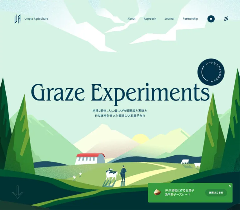
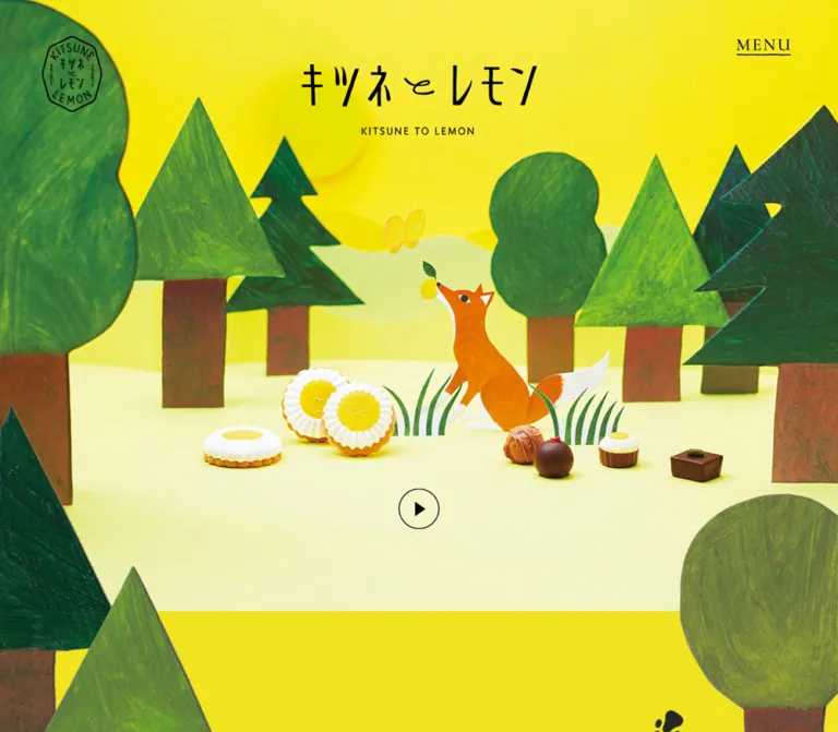
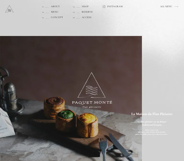
粒子感のある緑のイラストと生成りの背景、明朝体と欧文セリフ、細い罫線が特徴のブランドサイト。店舗紹介、採用、出店募集を、余白の大きい編集的なレイアウトでつなぎます。
Book & Hair / 本と美容室 — Style Reference
A local bookshop and salon expressed through grainy illustration, warm paper, and an editorial rhythm.
Original URL: book-and-hair.com Final URL: book-and-hair.com Theme: light, with warm cream reading surfaces and textured green illustration fields. Inspected: October 2, 2026, at 05:46 JST; supplied inspection timestamp: October 1, 2026, 20:46:13.218 UTC. Viewports: desktop 1440 × 1000 CSS pixels; mobile 390 × 844 CSS pixels. Scope: the current homepage, including its illustrated opening, introductory narrative, project entries, recruitment feature, books and location sections, shop information, closed menu control, and footer. Visual captures cover the desktop opening, recruitment section, and footer, plus the mobile opening and footer. Other sections are documented through the supplied rendered DOM and computed styles. Linked pages and open-menu behavior were not inspected.
Book & Hair presents a publishing and salon project through the language of an illustrated cultural magazine. Its most distinctive element is a large composition of interlocking people, books, scissors, cups, and salon tools. Pale blue, yellow, coral, orange, and dark green shapes sit on a densely speckled green field. The composition is expansive and playful, while the interface remains precise: black lettering, small circular controls, fine rules, and very little container decoration.
Below the opening, warm cream creates breathing room around Japanese prose and large English section names. Desktop layouts alternate between horizontal titles, vertical title rails, and offset content columns. Photography introduces the actual local setting without replacing the illustrated identity. The footer returns to the green field beneath a small illustrated storefront, making navigation feel like the closing page of the same publication.
This is a long brand and project website with several destinations: its story, local stores, recruitment, books, and potential new locations. Preserve those distinct content roles when adapting the design.
閉じる
Book & Hair / 本と美容室 — Style Reference
A local bookshop and salon expressed through grainy illustration, warm paper, and an editorial rhythm.
Original URL: book-and-hair.com Final URL: book-and-hair.com Theme: light, with warm cream reading surfaces and textured green illustration fields. Inspected: October 2, 2026, at 05:46 JST; supplied inspection timestamp: October 1, 2026, 20:46:13.218 UTC. Viewports: desktop 1440 × 1000 CSS pixels; mobile 390 × 844 CSS pixels. Scope: the current homepage, including its illustrated opening, introductory narrative, project entries, recruitment feature, books and location sections, shop information, closed menu control, and footer. Visual captures cover the desktop opening, recruitment section, and footer, plus the mobile opening and footer. Other sections are documented through the supplied rendered DOM and computed styles. Linked pages and open-menu behavior were not inspected.
Book & Hair presents a publishing and salon project through the language of an illustrated cultural magazine. Its most distinctive element is a large composition of interlocking people, books, scissors, cups, and salon tools. Pale blue, yellow, coral, orange, and dark green shapes sit on a densely speckled green field. The composition is expansive and playful, while the interface remains precise: black lettering, small circular controls, fine rules, and very little container decoration.
Below the opening, warm cream creates breathing room around Japanese prose and large English section names. Desktop layouts alternate between horizontal titles, vertical title rails, and offset content columns. Photography introduces the actual local setting without replacing the illustrated identity. The footer returns to the green field beneath a small illustrated storefront, making navigation feel like the closing page of the same publication.
This is a long brand and project website with several destinations: its story, local stores, recruitment, books, and potential new locations. Preserve those distinct content roles when adapting the design.
How to Read This Reference
- Measured values come from the supplied rendered DOM and computed styles at the two inspected viewports. Values are rounded for readability where appropriate.
- Visual estimates describe dimensions or colors visible in the original-page captures that were not included in the computed-style sample. Estimated illustration colors were not obtained through pixel sampling.
- Derived values are simple calculations from measured rectangles, such as the desktop footer's 70px column gap.
- Recommended values belong to the reusable implementation. They are not claims about the original stylesheet.
- Token names in this document are implementation aliases. The supplied source custom properties do not expose a full design-token system.
- Computed font-family declarations identify requested fonts. Actual font-file loading and the face used for each glyph were not independently verified.
- DOM membership does not establish visibility. Header-menu entries and overlapping project entries appear in the extraction, but their active states were not captured.
- The mobile opening is unresolved: the supplied frame shows cream space and a small illustration fragment near its lower edge, rather than the desktop's complete opening artwork. Do not interpret this as a verified intentional mobile layout.
Tokens — Colors
Measured Interface Palette
| Name | Value | Suggested token | Evidence and role |
|---|---|---|---|
| Warm paper | #f2efde |
--color-paper |
Measured body background at both viewports; main reading canvas |
| Black ink | #000000 |
--color-ink |
Measured text and menu fill; visually used for rules, branding, and icons |
| White | #ffffff |
--color-reverse |
Measured menu foreground, introductory pill text, and staffing-label text |
| Muted olive | #8e8a71 |
--color-muted |
Measured Japanese subtitles beneath PROJECT, BOOKS, and SHOP; also present on extracted menu actions |
| Staffing green | #42b775 |
--color-status |
Measured background of the rectangular スタッフ募集 labels |
The muted subtitle color is contextual. The Japanese subtitles beside the desktop vertical RECRUIT and LOCAL headings are black, not olive. Footer text and outlined footer actions are also black in the supplied captures.
Illustration Palette — Visual Estimates
| Name | Approximate value | Suggested token | Role |
|---|---|---|---|
| Textured mint green | #72c995 |
--color-art-green |
Broad opening and footer fields; the grain produces considerable local variation |
| Lemon yellow | #fff16b |
--color-art-yellow |
Clothing, books, scissors, and small objects |
| Golden yellow | #f4cc53 |
--color-art-gold |
Larger warm clothing and tool shapes |
| Coral | #ff9c78 |
--color-art-coral |
Clothing and book covers |
| Orange | #ff7927 |
--color-art-orange |
Smaller contrasting edges and salon objects |
| Powder blue | #b6dce0 |
--color-art-blue |
Sleeves, books, cups, and storefront details |
| Forest green | #203a32 |
--color-art-dark |
Hair, shoes, tool silhouettes, and architectural shadows |
These colors belong primarily to the artwork. The normal interface does not assign a different bright color to every navigation category.
Source-property caution: the extraction includes --swiper-theme-color: #007aff. No corresponding blue interface treatment is established by the supplied screenshots, so it is not a brand-color token. Likewise, a transparent computed background on a section means that the underlying canvas or artwork remains visible; it does not introduce another surface color.
Tokens — Typography
Japanese Editorial Text
Measured primary family: TsukuAOldMinPr6-R.
The supplied stack continues through Japanese Gothic fallbacks, including Yu Gothic Medium, YuGothic, Hiragino Kaku Gothic Pro, Meiryo, and a final sans-serif. The first declared face supplies the intended editorial character; the fallback stack should not be mistaken for evidence that the visible design is primarily sans-serif.
Regular text generally uses computed weight 400. The Japanese body copy is relatively small, but its generous line height makes the page feel patient and literary.
Japanese Headings and Emphasis
Measured primary family: TsukuAOldMinPr6-B.
Project names, feature headings, Japanese section subtitles, and staffing labels request this separate face while still reporting computed weight 400. Preserve the distinction between a separately named bold face and a numeric font-weight: 700 declaration.
English Display Labels
Measured family declaration: 'Yeseva One', cursive.
Large section names and VIEW MORE use this declaration at weight 400. Their visible character is a substantial display serif. The CSS fallback keyword is nevertheless cursive; that is the source declaration, not a recommendation to substitute a handwritten font.
Tracking is consistently close to -0.01em on the sampled English section names and VIEW MORE labels. RECRUIT and LOCAL become vertical title rails on desktop, while their mobile equivalents read horizontally.
Identity and Utility Controls
The wordmark is graphic identity inside an H1 with no extracted text. Its Japanese letterforms and spacing should not be reconstructed from the H1's inherited body-font values.
The menu and shop navigation buttons report Arial at approximately 13.33px, but the screenshots show graphic control marks rather than a prominent Arial label. Do not make Arial a major visible type style merely because it appears on these button elements.
Type Scale
| Role | Desktop measured size / line height | Mobile measured size / line height | Family or qualification |
|---|---|---|---|
| Main English section name | 70 / 84px |
46.86 / 56.23px |
Yeseva One; tracking -0.01em |
| Japanese section subtitle | 18 / 21.6px |
13.54 / 16.24px |
TsukuAOldMinPr6-B |
| Project store name | 32 / 48px |
28.12 / 42.17px |
TsukuAOldMinPr6-B |
| Feature heading | 25 / 37px |
22.91 / 35.51px |
TsukuAOldMinPr6-B |
| Shop name | 23 / 34.5px |
20.83 / 31.24px |
TsukuAOldMinPr6-B |
| Introductory narrative | 17 / 38px |
14.58 / 36.46px |
TsukuAOldMinPr6-R |
| General body | 15 / 29.1px |
14.58 / 27.12px |
TsukuAOldMinPr6-R |
| Shop description | 15 / 26.1px |
14.58 / 27.12px |
Slightly tighter desktop treatment |
| VIEW MORE | 15 / 22.5px |
13.54 / 20.31px |
Yeseva One; tracking -0.01em |
| Staffing label | 14 / 14px |
12.50 / 12.50px |
TsukuAOldMinPr6-B |
| Footer Japanese captions | 13 / 19.5px |
13.54 / 20.31px |
TsukuAOldMinPr6-R |
| Footer legal text | 12 / 12px |
12.50 / 12.50px |
TsukuAOldMinPr6-R |
| PAGETOP | 12 / 12px |
12.50 / 12.50px |
Yeseva One |
Footer English headings appear approximately 22–24px in the screenshots. Their child elements were not separately sampled, so that size and their exact font family remain visual estimates.
Tokens — Spacing & Shapes
Overall density: generous section spacing, narrow prose columns, and compact navigation details.
The measured root font size is 10px on desktop and approximately 10.413px on mobile. This does not establish the underlying responsive formula. The Quick Start uses explicit sizes with a conventional root rather than inventing the original calculation.
Spacing Scale
| Use | Desktop | Mobile | Status |
|---|---|---|---|
| Standard section top padding | 110px |
52.065px |
Measured across the sampled main sections |
| Main horizontal section-heading inset | 100px |
26.031px |
Measured for PROJECT and SHOP |
| Feature heading to paragraph | 20px |
About 15.61px |
Derived from recruitment rectangles |
| Intro paragraph separation | 38px |
About 36.44px |
Derived from consecutive paragraph rectangles |
| Footer column gap | 70px |
Single main column | Derived from navigation and action rectangles |
| Footer action gap | 10px vertically |
15.625px horizontally |
Derived |
| Footer artwork band / top padding | 342px |
113.502px |
Measured footer padding; artwork can extend across this boundary |
| Small link-indent allowance | 10px |
10.413px |
Measured footer store sublinks |
Large gaps between content sections are part of the composition. They accommodate illustrated objects and visual transitions rather than following a uniform compact section stack.
Border Radius
| Element | Desktop | Mobile | Status |
|---|---|---|---|
| Menu control | 50% |
50% |
Measured |
| Shop PREV / NEXT | 50% |
50% |
Measured |
| Introductory black pill | 27.5px |
About 23.43px |
Measured |
| Staffing label | 0 |
0 |
Measured |
| Footer action rectangles | 0 |
0 |
Measured |
| Photograph corners | Visually square | Not visually inspected in mobile content | Visual observation |
There is no general rounded-card system. The pill and circular controls are specific exceptions within an otherwise square, open layout.
Layout Measurements
| Element | Desktop 1440 × 1000 | Mobile 390 × 844 |
|---|---|---|
| Document height | About 10088.69px |
About 8639.19px |
| Header H1 box at initial state | 254 × 50px, at (30, 30) |
211.38 × 41.59px, at (13.53, 17.69) |
| Menu button | 60 × 60px, at (1350, 30) |
46.84 × 46.84px, at (327.55, 15.61) |
| Project descriptive column | About 340px wide, starting at x = 994.73 |
About 337.94px wide, starting at x = 26.03 |
| Recruitment feature link | 800px wide, starting at x = 357.59 |
About 337.94px wide, starting at x = 26.03 |
| Recruitment copy column | About 501.05px |
About 337.94px |
| BOOKS text region | 400px wide, starting at x = 832.5 |
About 337.94px wide, starting at x = 26.03 |
| LOCAL feature link | 660px wide, starting at x = 670 |
About 337.94px wide, starting at x = 26.03 |
| Shop entry | 310px wide, starting at x = 430 |
About 337.94px wide, starting at x = 26.03 |
| Footer main navigation | 590px wide, starting at x = 200 |
About 337.94px wide, starting at x = 26.03 |
| Footer RECRUIT / LOCAL action | 380 × 90px each |
About 161.16 × 83.30px each |
| Introductory pill | About 264.75 × 55px |
About 262.11 × 46.84px |
The desktop footer spans a derived 1040px from x = 200 to x = 1240: 590px navigation, 70px gap, and 380px secondary column.
Components
Persistent Identity and Menu Control
Role: keep the brand and navigation available while the long page scrolls.
The desktop wordmark sits 30px from the top and left edges. The menu sits 30px from the top and right edges. Both remain visible in the supplied recruitment and footer captures, with no opaque full-width header bar behind them. The header element itself has a measured height of zero, consistent with controls positioned outside normal flow.
The menu is a black circle containing three thin white horizontal strokes with small offset circular endpoints. It resembles a compact adjustment symbol rather than a plain three-bar hamburger. Its visible icon should retain that distinction.
On mobile, the measured initial logo is about 211px wide and the button is about 47px across. The logo appears smaller in the scrolled footer capture, but that later size was not measured. A 400ms transition exists on the mobile H1; the exact scrolled transformation is unverified.
The DOM contains ABOUT, PROJECT, BOOKS, SHOP, RECRUIT, and LOCAL navigation content. No open-menu screenshot or activation record was supplied, so its panel appearance, entry motion, focus handling, and dismissal behavior are not established.
Illustrated Opening
Role: establish the combined world of books, hair, and everyday local life.
The desktop opening is dominated by illustration, with the wordmark and menu floating above it. Elongated figures overlap diagonally: a pale-blue sleeve connects to a dark hand, yellow and coral clothing form broad curves, and reading and hairdressing gestures share the same composition. Smaller books, scissors, grooming tools, and cups orbit the figures.
Artwork extends beyond the viewport edges. Cropping is part of the desktop composition; it is not a small centered picture surrounded by a text-heavy hero. No large promotional headline or conversion-button stack is visible over the illustration.
The exact hero element height and asset-fitting rules were not supplied. On mobile, the initial screenshot is largely cream with partial artwork near the bottom. Preserve that as an inspection limitation rather than implementing an unexplained blank viewport as a design requirement.
Introductory Narrative and Pill Link
Role: explain why the publishing project joins a salon with a bookshop.
The rendered structure places a centered graphic heading before several separate paragraphs. Its measured desktop heading box is 295 × 378px; the mobile box is approximately 229.08 × 293.52px. The heading contains no extracted text, so its lettering cannot be specified from the DOM alone.
Paragraphs use unusually relaxed leading: 17px type with 38px lines on desktop, and approximately 14.58px type with 36.46px lines on mobile. Mobile text contains additional line breaks, demonstrating intentional changes to the prose rhythm. Paragraph text alignment was not included in the sampled styles.
A compact black pill closes the introduction. Its source label is 僕らが、考えていること全部, linking to /about/. Desktop padding is 20px at the left and 50px at the right, leaving room for the terminal indicator. The pill is 55px tall on desktop and approximately 46.84px on mobile.
Bilingual Section Heading
Role: divide the long page into distinct editorial subjects.
Each heading pairs a large English section name with a smaller Japanese subtitle. PROJECT and SHOP start near the desktop left margin. BOOKS belongs to an offset right-side text region. RECRUIT and LOCAL use vertical desktop rails beside their content.
In the visible recruitment section, the vertical English title sits beside a smaller vertical Japanese subtitle and a fine line ending in a dot. The line is approximately 1px, with a small solid terminal dot. These dimensions are visual estimates.
All sampled mobile section headings become horizontal and align at approximately 26px from the left edge. Their English size drops from 70px to approximately 46.86px, preserving more emphasis than simply scaling the entire desktop page down.
Project Story Panel
Role: introduce the individual Book & Hair locations.
The DOM includes entries for 萩店 and 真鶴店, each with an English location identifier, a staffing label, a Japanese store name, descriptive prose, and VIEW MORE. The enclosing entry is a link, so its content forms one destination rather than several nested action buttons.
On desktop, each sampled link occupies a full-width flex layout, while its descriptive column is about 340px wide near the right edge. The store name uses 32px type, followed by 15px body copy. The rectangular staffing tag uses white 14px lettering on measured green #42b775.
On mobile, the link becomes a block and its text uses the standard 338px inner column. Store names are approximately 28.12px, and VIEW MORE aligns to the left beneath the paragraph.
Both entries share the same sampled starting coordinates. This supports a layered or sliding presentation, but does not establish which entry was active or how navigation works. Do not present these measurements as proof of two simultaneously visible stacked panels, autoplay, or a particular transition.
Recruitment Editorial Feature
Role: connect the recruitment message to an actual local setting.
The desktop capture shows a wide natural-color image or media frame of a person facing a coastal landscape. Its width corresponds to the measured 800px feature link. The upper part is outside the supplied scrolled frame, so the visible crop is not the original media aspect ratio. Whether the source is a still image, video poster, or moving media is unverified.
Below it, a Japanese heading and paragraph sit on the left. A separate VIEW MORE area sits to the right behind a thin vertical rule. The paragraph is approximately 501px wide; the full feature is 800px wide. In the screenshot, the separator is near x = 1009, with the action farther right. Broad spacing gives this a magazine-like caption structure.
An illustrated open book overlaps the right side of the composition. Other oversized objects appear partially cropped and blurred around the section. These are decorative depth cues in the captured frame, not evidence of a verified parallax system.
On mobile, the heading, paragraph, and action all use the same approximately 338px column. The heading wraps to two lines and the action moves beneath the copy.
Books and Location Features
Role: explain book selection and invite future local partnerships.
The BOOKS text region is 400px wide on desktop and shifted to the right. Its heading, two-line Japanese feature title, paragraph, and VIEW MORE form an editorial stack. The LOCAL section instead pairs a vertical title rail with a wider 660px feature region.
On mobile, both sections use the same left inset and approximately 338px text width as recruitment. Their large English headings become horizontal. The measured BOOKS heading sits substantially above its descriptive text, indicating a separate intervening composition area; the supplied screenshots do not identify its imagery.
Preserve the difference between these desktop arrangements. Repeating an identical image-left/text-right module for every section would remove much of the page's rhythm.
Shop Entry and Navigation
Role: provide practical information about a salon.
The extracted shop entry for 花暮美容室 includes a location label, store name, introduction, address, business hours, closing days, and VIEW MORE. The entry is 310px wide on desktop and approximately 338px on mobile.
PREV and NEXT are actual button elements. On desktop, their measured boxes are 30px circles near the left-side section title. On mobile, they are approximately 31.23px black circles placed near opposite horizontal edges at the same vertical position within the shop section.
Only one shop record is established by the supplied evidence. The controls' presence does not establish the number of additional records, looping, swipe support, or disabled-state behavior.
Illustrated Footer and Navigation Groups
Role: close the illustrated narrative and expose the site's major destinations.
A small illustrated salon storefront bridges the cream canvas and green footer field. It includes a striped barber pole, blocks of dark glazing, plant-like shapes, and a yellow-clothed figure. The green field begins behind the lower part of the scene, allowing the illustration to cross the surface boundary.
Desktop footer content has two columns. The left column contains ABOUT, PROJECT, BOOKS, and SHOP groups. Each combines an English heading, a smaller Japanese description, and a fine horizontal rule ending with a black dot. PROJECT and SHOP include indented, bullet-like store links. These groups do not use raised cards or separate background fills.
The right column contains two stacked outlined actions, RECRUIT and LOCAL. Each is 380px wide and 90px high, with an English heading above a Japanese caption. A repeated wordmark and small right-aligned legal block sit below.
On mobile, the navigation groups become a single full-width stack. The two outlined actions sit side by side beneath them, each approximately 161px wide. The lower wordmark and legal text remain aligned to the right.
The original footer explicitly identifies 合同会社アタシ社 as the operator and links to https://www.atashisya.com/. No production-credit claims are established by the supplied original-page footer.
Page-Top Link
Role: return to the page wrapper from the lower document.
The source destination is https://book-and-hair.com/#wrapper. On desktop, PAGETOP appears vertically along the lower-right viewport edge with a small circular arrow mark. Its measured box is 50px wide and approximately 92.64px high.
On mobile, the label becomes horizontal near the top-right of the footer. Its document-coordinate position and footer screenshot support this placement. It is close to the persistent menu control in the supplied frame; a new implementation should provide clear separation between their interactive regions.
The link target is observed. Smooth scrolling, duration, and keyboard focus movement after activation were not tested.
Tokens — Motion & Interaction
| Treatment | Measured declaration | What is established |
|---|---|---|
| Menu color treatment | Background and color, 0.4s cubic-bezier(0.18, 0.06, 0.23, 1) |
Transition definition; trigger and endpoint colors not exercised |
| Navigation links | Opacity, same 0.4s easing |
A restrained opacity transition is defined |
| Introductory pill | Background, border color, and text color, same 0.4s easing |
Color-transition capability, not a verified hover appearance |
| Footer outlined actions | Background and text color, same 0.4s easing |
Transition declaration on the actual actions |
| Shop controls | Background, color, and opacity, same 0.4s easing |
Defined control feedback; state behavior untested |
| Mobile section headings | Opacity and clip-path, 0.8s cubic-bezier(0.18, 0.06, 0.23, 1) |
Reveal-capable transition; start mask and trigger not recorded |
| Mobile H1 | 0.4s cubic-bezier(0.18, 0.06, 0.23, 1) |
A transition exists; changed properties were not specified in the sample |
The shared easing suggests an unhurried but decisive interaction character. The 800ms heading transitions are longer than the 400ms control transitions.
Most sampled elements report animation: none. This does not rule out animation on descendants, pseudo-elements, media, or JavaScript-controlled transforms. Similarly, a computed transition: all without a meaningful duration is not evidence of visible motion.
The supplied inspection allowed time for document loading, image decoding, and finite animation settling, and traversed the page through intermediate scroll positions. It does not establish autoplay, scroll-linked illustration movement, exact reveal timing, menu animation, or carousel operation. Static blur and overlapping artwork should remain visual observations unless independently tested.
Surfaces
| Layer | Appearance | Function |
|---|---|---|
| Reading canvas | Solid warm cream #f2efde |
Supports prose, photography, and large spaces between sections |
| Illustrated field | Speckled green with embedded color variation | Gives the opening and footer their printed character |
| Green-to-cream boundary | Visually feathered, granular edge in the recruitment capture | Connects the illustration field to the reading surface |
| Editorial content | Mostly transparent over the canvas | Lets typography and composition provide hierarchy |
| Navigation structure | Thin black rules, terminal dots, open space | Separates destinations without card containers |
| Outlined footer action | Transparent interior and fine black rectangle | Gives recruitment and location links prominence |
| Strong action | Black circular menu or black introductory pill | Concentrated utility emphasis |
| Photography | Natural color, square edges, no visible raised frame | Connects the illustrated project to real places |
No general shadow or elevation system is visible. Decorative objects can look soft or blurred, but the interface itself is crisp and flat.
Imagery
The principal illustration language combines flat geometric silhouettes with dense, irregular grain. Bodies are elongated and simplified; faces are small pale shapes; limbs connect broad blocks of coral, yellow, blue, and dark green. Texture remains visible inside the figures as well as in the background, giving the image a printed-paper character.
Keep the composition more expressive than literal. Books and salon tools recur as objects within the same everyday world rather than as isolated feature icons. Their scale varies substantially: some are tiny background marks, while others cross a section edge or occupy a large corner of the frame.
The recruitment photograph or media frame remains natural in color. It is not recolored into the illustration palette. Its coastal setting provides a quieter counterpoint to the graphic opening. Do not infer video playback from the appearance of a single captured frame.
Observed Asset References
No original image filenames, font-file URLs, or media source URLs were supplied. The references below identify visible assets without inventing paths.
| Asset | Original-page evidence | Implementation guidance |
|---|---|---|
| Black wordmark and book/hair emblem | Desktop and mobile headers; both footers | Use the authorized graphic asset; preserve proportions and fine strokes |
| Interlocking people and salon/book objects | Desktop opening capture | Requires authored artwork; CSS geometry alone will not reproduce its character |
| Coastal recruitment image or media frame | Desktop recruitment capture | Preserve natural color and the subject's relationship to the landscape |
| Open-book and salon-tool decorations | Recruitment capture and partial mobile opening | Retain deliberate cropping and texture; motion and asset blur remain unverified |
| Storefront and yellow-clothed figure | Desktop and mobile footer captures | Position across the cream/green boundary |
| Fine green grain | Opening, recruitment transition, and footer | Reuse an authorized texture or commission a compatible one |
Use normal image interpolation. This artwork is grainy, not intentionally pixelated. Applying image-rendering: pixelated would change its character.
Layout & Responsive Behavior
Desktop Composition
The page uses the full browser width for its opening and illustrated fields, while prose occupies narrower, deliberately offset regions. The persistent header remains separate from normal document flow. Section headings do not all share one position: PROJECT and SHOP begin at 100px, recruitment uses a vertical rail near 190px, and BOOKS moves its text to the right.
The footer recenters the composition within a 1040px span. Its structured columns contrast with the freer artwork and offsets above.
Mobile Composition
At 390px, most content columns measure approximately 337.94px, leaving about 26.03px on each side. Project text, recruitment, books, location copy, shop information, and footer navigation share this alignment.
The responsive changes are compositional rather than a uniform scale reduction:
- Vertical RECRUIT and LOCAL title rails become horizontal headings.
- Project entries change from flex layouts to block layouts.
- Recruitment's side action becomes a link beneath its copy.
- Japanese headings wrap and the introductory narrative introduces additional line breaks.
- Desktop footer columns become one stack, while its two secondary actions become a horizontal pair.
- The page-top label changes from a vertical viewport-edge treatment to a horizontal footer placement.
- The header menu remains circular but decreases from 60px to approximately 46.84px.
Observed Vertical Pacing
These are measured section-start coordinates in the document, not recommended absolute-position values.
| Section | Desktop Y | Mobile Y |
|---|---|---|
| Introductory narrative section | 1340px |
948.13px |
| PROJECT | 2853px |
2758.88px |
| RECRUIT | 4390.17px |
3934.95px |
| BOOKS | 5703.55px |
4899.28px |
| LOCAL | 6893.50px |
6008.45px |
| SHOP | 8000.28px |
6966.56px |
| Footer | 9041.69px |
7756.39px |
Use these values to understand pacing, not to position every section absolutely. Content wrapping, images, and font loading should determine document height in a new implementation.
Responsive Limits
The exact source breakpoint, scaling formula, safe-area rules, and behavior between the two supplied widths are unknown. The source property --vh contains 1000px on desktop and 844px on mobile; its usage is not included.
The mobile initial frame does not establish a completed hero state. The footer and DOM remain substantial evidence for the current mobile design, but they do not explain why the opening illustration is absent from that frame. A recommended adaptation should provide an explicit, reliably visible mobile composition instead of relying on delayed entrance behavior.
Do’s and Don’ts
Do
- Keep the measured paper color
#f2efdeand black interface ink. - Let textured illustration supply the broad color palette.
- Pair Japanese editorial type with substantial English serif section names.
- Preserve the distinct desktop layouts for projects, recruitment, books, and locations.
- Give prose generous line spacing and room between sections.
- Retain fine navigation rules with small terminal dots.
- Keep footer actions square and outlined; reserve circles and pills for their observed roles.
- Use the shared approximately 26px mobile inset to create continuity.
- Let the illustrated storefront cross the footer's surface boundary.
- Keep real photography natural in color and visually integrated with the illustration.
Don’t
- Don’t replace the project website with a generic headline, feature-card grid, and repeated conversion buttons.
- Don’t use staffing green as the fill for every action.
- Don’t turn the opening artwork into a collection of interchangeable stock icons.
- Don’t remove the grain or convert it into coarse pixel art.
- Don’t apply rounded corners and drop shadows to every image and navigation group.
- Don’t force every desktop section into the same centered layout.
- Don’t infer a complete mobile hero from the desktop composition or implement the blank capture as a verified intention.
- Don’t claim autoplay, parallax, smooth scrolling, or an open-menu appearance without interaction evidence.
- Don’t treat both overlapping project entries as simultaneously visible content.
- Don’t copy numeric source rem values into a conventional 16px-root project without conversion.
Recommended Implementation Additions
These are recommendations for a new implementation, not verified features of the original site:
- Give the menu a clear accessible name,
aria-expanded, and an associated navigation region. If it opens a modal panel, add appropriate focus management and an explicit close action. - Keep all content visible when reveal scripting fails. Supply a dependable mobile opening image or static composition, and reserve media dimensions to reduce layout movement.
- Preserve visible keyboard focus on large linked features and footer groups. Avoid nesting independent links inside an already linked project panel.
- Increase the effective hit area of the roughly 31px shop controls to at least 44px while preserving their small visible circles.
- Separate the mobile page-top link from the persistent menu, especially over the footer artwork.
- Check the contrast of muted olive subtitles and white staffing text at their small sizes. Adjust those combinations if they do not meet the target accessibility standard.
- Provide meaningful alternatives for the brand and informative images; give purely decorative books and tools empty alternatives and exclude them from pointer interaction.
- Respect reduced-motion preferences and avoid requiring an entrance animation for essential content to become readable.
Agent Prompt Guide
Quick Color Reference
- Reading canvas: measured
#f2efde. - Text, rules, logo, and strong control fills: measured
#000000. - Reversed control text: measured
#ffffff. - Secondary horizontal section subtitles: measured
#8e8a71. - Staffing label: measured
#42b775with white text. - Large illustrated field: approximately
#72c995, with visible grain. - Artwork accents: approximate lemon
#fff16b, coral#ff9c78, blue#b6dce0, orange#ff7927, and forest#203a32. - Structure comes from open space, thin rules, and occasional outlines rather than shadows.
Overall Prompt
“Create an editorial brand website for a project combining neighborhood bookshops and hair salons. Use warm cream #f2efde, black typography, large English display-serif section names, and Japanese Mincho-style prose with generous line spacing. Open with an expansive grainy illustration of interlocking people reading and cutting hair, surrounded by books and salon tools in yellow, coral, pale blue, orange, and dark green. Keep a graphic wordmark at the upper left and a small black circular menu at the upper right. Alternate broad images, offset narrow text columns, and desktop vertical title rails. Finish with an illustrated storefront crossing into a textured green footer, thin ruled navigation groups with terminal dots, and square outlined recruitment and location actions. At 390px, use roughly 26px side margins, horizontal section headings, and stacked content. Provide an explicit visible mobile artwork composition. Do not invent unverified carousel or parallax behavior.”
Example Component Prompts
- Recruitment feature: “Place a vertical RECRUIT title rail beside an approximately 800px-wide natural-color coastal image. Below it, use a Japanese serif heading and a roughly 501px prose column. Separate the right-side VIEW MORE label with a fine vertical black rule. Add a textured open-book decoration near the image edge. On mobile, use one approximately 338px column and move the action beneath the text.”
- Project entry: “Create one active location story with an English location identifier, a compact square green staffing label, a 32px Japanese store name, descriptive prose, and a small serif VIEW MORE label. Use a narrow right-side text region on desktop and a full stacked layout with 26px side insets on mobile. Keep slide behavior separate until specified.”
- Footer navigation: “Create a textured green footer with a storefront illustration overlapping its cream upper boundary. On desktop, use a 590px navigation column, a 70px gap, and a 380px action column. Underline each navigation group with a fine rule ending in a dot. Place two outlined actions vertically on desktop and side by side on mobile.”
- Menu control: “Create a 60px black circular button with three fine white strokes and small offset dots. Use a 47px visible circle on mobile. Keep the control floating directly over the page composition. Provide an accessible name and state without introducing a full-width header surface.”
- Section heading: “Pair a large 70px English display-serif word with a small Japanese subtitle. Use slight negative tracking on the English label. For a narrow screen, change vertical title rails to horizontal headings at approximately 47px and align them to a 26px content inset.”
Quick Start
CSS Custom Properties
This starter reproduces the measured palette, representative typography, header geometry, recruitment anatomy, and footer proportions. It is an adaptation rather than extracted source CSS.
The 900px breakpoint, fallback fonts, 8:5 media placeholder ratio, hover endpoints, and footer-heading sizes below are recommendations. The source breakpoint and complete recruitment media ratio are unknown. Load authorized font files separately; naming a family does not load it. The fallback Mincho and serif faces are chosen to preserve the visual direction, and differ from the source's fallback stacks.
Provide authorized logo, illustration, and media assets. --grain-image defaults to none; set it to a suitable texture in the consuming project. The hero rule deliberately provides a visible mobile surface and does not reproduce the unresolved blank opening capture.
:root {
  /* Measured interface colors */
  --color-paper: #f2efde;
  --color-ink: #000000;
  --color-reverse: #ffffff;
  --color-muted: #8e8a71;
  --color-status: #42b775;

  /* Visual estimates for artwork coordination */
  --color-art-green: #72c995;
  --color-art-yellow: #fff16b;
  --color-art-coral: #ff9c78;
  --color-art-blue: #b6dce0;
  --color-art-dark: #203a32;
  --grain-image: none;

  /* Observed primary families; recommended fallbacks */
  --font-jp: 'TsukuAOldMinPr6-R', 'Yu Mincho', serif;
  --font-jp-strong: 'TsukuAOldMinPr6-B', 'Yu Mincho', serif;
  --font-latin: 'Yeseva One', Georgia, serif;

  --text-body: 15px;
  --leading-body: 1.94;
  --text-display: 70px;
  --text-feature: 25px;
  --leading-feature: 37px;
  --text-subtitle: 18px;
  --text-more: 15px;
  --text-caption: 13px;
  --text-footer-title: 23px;

  /* Responsive interpolation is an adaptation */
  --gutter: clamp(26px, 6.944vw, 100px);
  --section-inset: 110px;
  --rule: 1px;
  --dot: 5px;
  --ease-editorial: cubic-bezier(0.18, 0.06, 0.23, 1);
  --motion-control: 400ms var(--ease-editorial);
  --motion-reveal: 800ms var(--ease-editorial);
}

* { box-sizing: border-box; }

body {
  margin: 0;
  background: var(--color-paper);
  color: var(--color-ink);
  font: 400 var(--text-body) / var(--leading-body) var(--font-jp);
}

img { max-width: 100%; }
a { color: inherit; }
button { font: inherit; }

.site-header {
  position: fixed;
  inset: 0 0 auto;
  z-index: 20;
  height: 0;
  pointer-events: none;
}

.brand-link {
  position: absolute;
  top: 30px;
  left: 30px;
  width: 254px;
  pointer-events: auto;
}

.brand-link img { display: block; width: 100%; height: auto; }

.menu-button {
  position: absolute;
  top: 30px;
  right: 30px;
  display: grid;
  place-content: center;
  gap: 6px;
  width: 60px;
  height: 60px;
  padding: 0;
  border: 0;
  border-radius: 50%;
  background: var(--color-ink);
  color: var(--color-reverse);
  cursor: pointer;
  pointer-events: auto;
  transition: background var(--motion-control), color var(--motion-control);
}

/* Use three decorative spans and an accessible button name. */
.menu-stroke {
  position: relative;
  display: block;
  width: 27px;
  height: 1px;
  background: currentColor;
}

.menu-stroke::after {
  content: '';
  position: absolute;
  top: -1.5px;
  right: 0;
  width: 4px;
  height: 4px;
  border-radius: 50%;
  background: currentColor;
}

.menu-stroke:nth-child(2)::after { right: 10px; }
.menu-stroke:nth-child(3)::after { right: 2px; }

/* Recommended robust hero sizing, not a measured source rule. */
.hero {
  min-height: 100svh;
  position: relative;
  overflow: hidden;
  background: var(--color-art-green);
}

.hero-art {
  display: block;
  width: 100%;
  height: 100svh;
  object-fit: cover;
  object-position: center;
}

.editorial-section { padding-top: var(--section-inset); }

.section-label { position: relative; }
.section-label__en, .section-label__jp { margin: 0; font-weight: 400; }

.section-label__en {
  font-family: var(--font-latin);
  font-size: var(--text-display);
  line-height: 1.2;
  letter-spacing: -0.01em;
}

.section-label__jp {
  font-family: var(--font-jp-strong);
  font-size: var(--text-subtitle);
  line-height: 1.2;
  color: var(--color-muted);
}

.section-label--vertical {
  display: flex;
  flex-direction: row-reverse;
  justify-content: flex-end;
  align-self: start;
}

.section-label--vertical .section-label__en {
  writing-mode: vertical-rl;
  text-orientation: sideways;
}

.section-label--vertical .section-label__jp {
  writing-mode: vertical-rl;
  color: var(--color-ink);
}

.section-label--vertical::before {
  content: '';
  position: absolute;
  inset: 0 -12px 0 auto;
  width: var(--rule);
  background: currentColor;
}

.section-label--vertical::after {
  content: '';
  position: absolute;
  right: -14px;
  bottom: 0;
  width: var(--dot);
  height: var(--dot);
  border-radius: 50%;
  background: currentColor;
}

.recruit-feature {
  display: grid;
  grid-template-columns: 106px minmax(0, 800px);
  gap: 62px;
  width: min(1060px, calc(100% - 2 * var(--gutter)));
  margin-inline: auto;
}

.feature-link { display: block; min-width: 0; text-decoration: none; }

.feature-media {
  display: block;
  width: 100%;
  aspect-ratio: 8 / 5;
  object-fit: cover;
  border-radius: 0;
}

.feature-info {
  display: grid;
  grid-template-columns: minmax(0, 1fr) 149px;
  gap: 150px;
  margin-top: 40px;
}

.feature-title {
  margin: 0 0 20px;
  font-family: var(--font-jp-strong);
  font-size: var(--text-feature);
  font-weight: 400;
  line-height: var(--leading-feature);
}

.feature-copy p { margin: 0; }

.more-label {
  font-family: var(--font-latin);
  font-size: var(--text-more);
  line-height: 1.5;
  letter-spacing: -0.01em;
  white-space: nowrap;
}

.feature-more {
  display: flex;
  align-items: center;
  padding-left: 34px;
  border-left: var(--rule) solid currentColor;
}

.more-mark {
  display: inline-grid;
  place-items: center;
  width: 13px;
  height: 13px;
  margin-left: 10px;
  border-radius: 50%;
  background: var(--color-ink);
  color: var(--color-reverse);
  font: 10px / 1 serif;
}

.intro-copy { font-size: 17px; line-height: 38px; }
.intro-copy p { margin: 0 0 38px; }

.intro-pill {
  display: inline-flex;
  align-items: center;
  min-height: 55px;
  padding: 0 50px 0 20px;
  border: 1px solid var(--color-ink);
  border-radius: 27.5px;
  background: var(--color-ink);
  color: var(--color-reverse);
  font-family: var(--font-jp-strong);
  text-decoration: none;
  transition: background var(--motion-control), color var(--motion-control);
}

.staff-label {
  display: inline-flex;
  align-items: center;
  min-height: 25px;
  padding-inline: 8px;
  background: var(--color-status);
  color: var(--color-reverse);
  font: 400 14px / 1 var(--font-jp-strong);
}

/* Place the authorized storefront image in the preceding scene band. */
.footer-scene-band { position: relative; height: 342px; }

.footer-surface {
  padding-block: 150px 160px;
  background-color: var(--color-art-green);
  background-image: var(--grain-image);
}

.footer-inner {
  display: grid;
  grid-template-columns: minmax(0, 59fr) minmax(0, 38fr);
  gap: 70px;
  width: min(1040px, calc(100% - 2 * var(--gutter)));
  margin-inline: auto;
}

.footer-group {
  position: relative;
  padding-bottom: 5px;
  border-bottom: var(--rule) solid currentColor;
}

.footer-group + .footer-group { margin-top: 38px; }

.footer-group::after {
  content: '';
  position: absolute;
  right: -2px;
  bottom: -3px;
  width: var(--dot);
  height: var(--dot);
  border-radius: 50%;
  background: currentColor;
}

.footer-group a { text-decoration: none; }

.footer-group__title, .footer-action__title {
  display: block;
  font: 400 var(--text-footer-title) / 1.2 var(--font-latin);
}

.footer-group__caption {
  display: block;
  font-size: var(--text-caption);
  line-height: 1.5;
}

.footer-sub-link {
  display: block;
  margin-top: 12px;
  padding-left: 10px;
  font-size: var(--text-caption);
}

.footer-actions { display: grid; gap: 10px; }

.footer-action {
  display: flex;
  flex-direction: column;
  align-items: center;
  justify-content: center;
  gap: 7px;
  min-height: 90px;
  border: var(--rule) solid currentColor;
  border-radius: 0;
  text-decoration: none;
  font-size: var(--text-caption);
  line-height: 1;
  transition: background var(--motion-control), color var(--motion-control);
}

.footer-brand { margin-top: 86px; text-align: right; }
.footer-brand img { width: 254px; height: auto; }
.footer-legal { margin-top: 25px; font-size: 12px; line-height: 1.5; }

/* Recommended interaction endpoints; not observed hover states. */
@media (hover: hover) {
  .footer-action:hover, .intro-pill:hover {
    background: var(--color-paper);
    color: var(--color-ink);
  }
}

:where(a, button):focus-visible {
  outline: 2px solid var(--color-ink);
  outline-offset: 5px;
}

@media (max-width: 900px) {
  :root {
    --gutter: 26.031px;
    --section-inset: 52.065px;
    --text-body: 14.5782px;
    --leading-body: 1.86;
    --text-display: 46.8585px;
    --text-feature: 22.9086px;
    --leading-feature: 35.5083px;
    --text-subtitle: 13.5369px;
    --text-more: 13.5369px;
    --text-caption: 13.5369px;
    --text-footer-title: 24px;
  }

  .brand-link { top: 17.69px; left: 13.53px; width: 211.375px; }
  .menu-button { top: 15.609px; right: 15.609px; width: 46.844px; height: 46.844px; }
  .menu-stroke { width: 23px; }

  .recruit-feature { display: block; }
  .section-label--vertical { display: block; }
  .section-label--vertical .section-label__en,
  .section-label--vertical .section-label__jp { writing-mode: horizontal-tb; }
  .section-label--vertical::before,
  .section-label--vertical::after { display: none; }

  .feature-link { margin-top: 31.24px; }
  .feature-info { display: block; margin-top: 31.24px; }
  .feature-title { margin-bottom: 15.62px; }
  .feature-more { margin-top: 20.83px; padding-left: 0; border-left: 0; }
  .intro-copy { font-size: 14.5782px; line-height: 36.4559px; }
  .intro-copy p { margin-bottom: 36.44px; }
  .intro-pill { min-height: 46.844px; padding-inline: 20.826px 52.065px; }
  .staff-label { min-height: 22.91px; font-size: 12.4956px; }

  .footer-scene-band { height: 113.502px; }
  .footer-surface { padding-block: 62.47px; }
  .footer-inner { grid-template-columns: minmax(0, 1fr); gap: 40px; }
  .footer-group + .footer-group { margin-top: 24px; }
  .footer-actions { grid-template-columns: repeat(2, minmax(0, 1fr)); gap: 15.625px; }
  .footer-action { min-height: 83.30px; }
  .footer-brand { margin-top: 52.065px; }
  .footer-brand img { width: 211.375px; }
  .footer-legal { margin-top: 15.62px; font-size: 12.4956px; }
}

@media (prefers-reduced-motion: reduce) {
  *, *::before, *::after {
    transition-duration: 0s !important;
    animation: none !important;
    scroll-behavior: auto !important;
  }
}
Use .feature-copy and .feature-more as the two children of .feature-info. The decorative arrow mark should be hidden from assistive technology when its meaning is already conveyed by the link. Footer PROJECT and SHOP groups can contain separate sublinks; they should not be wrapped in another enclosing anchor.
The starter does not implement menu state, project switching, shop navigation, or entrance animations. Add those behaviors only with explicit interaction requirements. Keep headings visible by default, even when using the measured reveal-transition timing.
Tailwind v4 Token Mapping
Optional aliases for a project already using Tailwind v4. This is not evidence that the original website uses Tailwind. Define the custom properties above first.
@theme inline {
  --color-paper: #f2efde;
  --color-ink: #000000;
  --color-muted: #8e8a71;
  --color-staffing: #42b775;
  --color-art-green: #72c995;
  --font-editorial: var(--font-jp);
  --font-editorial-strong: var(--font-jp-strong);
  --font-display: var(--font-latin);
  --text-editorial-body: var(--text-body);
  --text-section-name: var(--text-display);
  --text-feature-title: var(--text-feature);
  --text-section-subtitle: var(--text-subtitle);
  --text-link-label: var(--text-more);
  --spacing-page-gutter: var(--gutter);
  --spacing-section-inset: var(--section-inset);
  --radius-intro-pill: 999px;
}
Sources & Evidence
- Original website: https://book-and-hair.com/. The supplied browser observation reports HTTP 200 and the same final URL.
- Capture timestamp:
2026-10-01T20:46:13.218Z, equivalent to October 2, 2026, 05:46:13.218 JST. This is the supplied inspection time, not a separate browsing session performed for this document. - Desktop evidence: 1440 × 1000 CSS-pixel opening, recruitment, and footer captures; rendered page text, links, element rectangles, and computed styles. Measured document height is approximately 10088.69px.
- Mobile evidence: 390 × 844 CSS-pixel opening and footer captures, plus rendered DOM and computed styles. Measured document height is approximately 8639.19px. The opening artwork's completed mobile state is unresolved.
- Navigation evidence: the homepage contains links to
/about/,/books/,/recruit/,/local/, the Hagi and Manaduru project articles,/shop/test-store/, and/#wrapper. Those destinations were identified from the supplied original-page DOM; their destination-page designs were not inspected. - Interaction evidence: scrolling and capture-readiness checks are documented by the supplied inspection. Menu activation, hover endpoints, carousel changes, page-top activation, keyboard behavior, and reduced-motion behavior were not exercised in the evidence provided.
- Measurement limits: the computed-style sample does not include all image nodes, pseudo-elements, font-loading results, media sources, positioning rules, or breakpoint declarations. Image colors and fine decorative dimensions are explicitly identified as estimates. Implementation rules beyond the observed measurements are labeled recommendations.
This reference describes the current homepage represented by the supplied original-page captures and rendered evidence. It does not reconstruct an earlier version or infer missing interaction states.
# Book & Hair / 本と美容室 — Style Reference

> A local bookshop and salon expressed through grainy illustration, warm paper, and an editorial rhythm.

**Original URL:** [book-and-hair.com](https://book-and-hair.com/)
**Final URL:** [book-and-hair.com](https://book-and-hair.com/)
**Theme:** light, with warm cream reading surfaces and textured green illustration fields.
**Inspected:** October 2, 2026, at 05:46 JST; supplied inspection timestamp: October 1, 2026, 20:46:13.218 UTC.
**Viewports:** desktop 1440 × 1000 CSS pixels; mobile 390 × 844 CSS pixels.
**Scope:** the current homepage, including its illustrated opening, introductory narrative, project entries, recruitment feature, books and location sections, shop information, closed menu control, and footer. Visual captures cover the desktop opening, recruitment section, and footer, plus the mobile opening and footer. Other sections are documented through the supplied rendered DOM and computed styles. Linked pages and open-menu behavior were not inspected.

Book & Hair presents a publishing and salon project through the language of an illustrated cultural magazine. Its most distinctive element is a large composition of interlocking people, books, scissors, cups, and salon tools. Pale blue, yellow, coral, orange, and dark green shapes sit on a densely speckled green field. The composition is expansive and playful, while the interface remains precise: black lettering, small circular controls, fine rules, and very little container decoration.

Below the opening, warm cream creates breathing room around Japanese prose and large English section names. Desktop layouts alternate between horizontal titles, vertical title rails, and offset content columns. Photography introduces the actual local setting without replacing the illustrated identity. The footer returns to the green field beneath a small illustrated storefront, making navigation feel like the closing page of the same publication.

This is a long brand and project website with several destinations: its story, local stores, recruitment, books, and potential new locations. Preserve those distinct content roles when adapting the design.
閉じる
# Book & Hair / 本と美容室 — Style Reference

> A local bookshop and salon expressed through grainy illustration, warm paper, and an editorial rhythm.

**Original URL:** [book-and-hair.com](https://book-and-hair.com/)
**Final URL:** [book-and-hair.com](https://book-and-hair.com/)
**Theme:** light, with warm cream reading surfaces and textured green illustration fields.
**Inspected:** October 2, 2026, at 05:46 JST; supplied inspection timestamp: October 1, 2026, 20:46:13.218 UTC.
**Viewports:** desktop 1440 × 1000 CSS pixels; mobile 390 × 844 CSS pixels.
**Scope:** the current homepage, including its illustrated opening, introductory narrative, project entries, recruitment feature, books and location sections, shop information, closed menu control, and footer. Visual captures cover the desktop opening, recruitment section, and footer, plus the mobile opening and footer. Other sections are documented through the supplied rendered DOM and computed styles. Linked pages and open-menu behavior were not inspected.

Book & Hair presents a publishing and salon project through the language of an illustrated cultural magazine. Its most distinctive element is a large composition of interlocking people, books, scissors, cups, and salon tools. Pale blue, yellow, coral, orange, and dark green shapes sit on a densely speckled green field. The composition is expansive and playful, while the interface remains precise: black lettering, small circular controls, fine rules, and very little container decoration.

Below the opening, warm cream creates breathing room around Japanese prose and large English section names. Desktop layouts alternate between horizontal titles, vertical title rails, and offset content columns. Photography introduces the actual local setting without replacing the illustrated identity. The footer returns to the green field beneath a small illustrated storefront, making navigation feel like the closing page of the same publication.

This is a long brand and project website with several destinations: its story, local stores, recruitment, books, and potential new locations. Preserve those distinct content roles when adapting the design.

## How to Read This Reference

- **Measured** values come from the supplied rendered DOM and computed styles at the two inspected viewports. Values are rounded for readability where appropriate.
- **Visual estimates** describe dimensions or colors visible in the original-page captures that were not included in the computed-style sample. Estimated illustration colors were not obtained through pixel sampling.
- **Derived** values are simple calculations from measured rectangles, such as the desktop footer's 70px column gap.
- **Recommended** values belong to the reusable implementation. They are not claims about the original stylesheet.
- Token names in this document are implementation aliases. The supplied source custom properties do not expose a full design-token system.
- Computed font-family declarations identify requested fonts. Actual font-file loading and the face used for each glyph were not independently verified.
- DOM membership does not establish visibility. Header-menu entries and overlapping project entries appear in the extraction, but their active states were not captured.
- The mobile opening is unresolved: the supplied frame shows cream space and a small illustration fragment near its lower edge, rather than the desktop's complete opening artwork. Do not interpret this as a verified intentional mobile layout.

## Tokens — Colors

### Measured Interface Palette

| Name | Value | Suggested token | Evidence and role |
| --- | --- | --- | --- |
| Warm paper | `#f2efde` | `--color-paper` | Measured body background at both viewports; main reading canvas |
| Black ink | `#000000` | `--color-ink` | Measured text and menu fill; visually used for rules, branding, and icons |
| White | `#ffffff` | `--color-reverse` | Measured menu foreground, introductory pill text, and staffing-label text |
| Muted olive | `#8e8a71` | `--color-muted` | Measured Japanese subtitles beneath PROJECT, BOOKS, and SHOP; also present on extracted menu actions |
| Staffing green | `#42b775` | `--color-status` | Measured background of the rectangular `スタッフ募集` labels |

The muted subtitle color is contextual. The Japanese subtitles beside the desktop vertical RECRUIT and LOCAL headings are black, not olive. Footer text and outlined footer actions are also black in the supplied captures.

### Illustration Palette — Visual Estimates

| Name | Approximate value | Suggested token | Role |
| --- | --- | --- | --- |
| Textured mint green | `#72c995` | `--color-art-green` | Broad opening and footer fields; the grain produces considerable local variation |
| Lemon yellow | `#fff16b` | `--color-art-yellow` | Clothing, books, scissors, and small objects |
| Golden yellow | `#f4cc53` | `--color-art-gold` | Larger warm clothing and tool shapes |
| Coral | `#ff9c78` | `--color-art-coral` | Clothing and book covers |
| Orange | `#ff7927` | `--color-art-orange` | Smaller contrasting edges and salon objects |
| Powder blue | `#b6dce0` | `--color-art-blue` | Sleeves, books, cups, and storefront details |
| Forest green | `#203a32` | `--color-art-dark` | Hair, shoes, tool silhouettes, and architectural shadows |

These colors belong primarily to the artwork. The normal interface does not assign a different bright color to every navigation category.

**Source-property caution:** the extraction includes `--swiper-theme-color: #007aff`. No corresponding blue interface treatment is established by the supplied screenshots, so it is not a brand-color token. Likewise, a transparent computed background on a section means that the underlying canvas or artwork remains visible; it does not introduce another surface color.

## Tokens — Typography

### Japanese Editorial Text

**Measured primary family:** `TsukuAOldMinPr6-R`.

The supplied stack continues through Japanese Gothic fallbacks, including `Yu Gothic Medium`, `YuGothic`, `Hiragino Kaku Gothic Pro`, Meiryo, and a final `sans-serif`. The first declared face supplies the intended editorial character; the fallback stack should not be mistaken for evidence that the visible design is primarily sans-serif.

Regular text generally uses computed weight `400`. The Japanese body copy is relatively small, but its generous line height makes the page feel patient and literary.

### Japanese Headings and Emphasis

**Measured primary family:** `TsukuAOldMinPr6-B`.

Project names, feature headings, Japanese section subtitles, and staffing labels request this separate face while still reporting computed weight `400`. Preserve the distinction between a separately named bold face and a numeric `font-weight: 700` declaration.

### English Display Labels

**Measured family declaration:** `'Yeseva One', cursive`.

Large section names and `VIEW MORE` use this declaration at weight `400`. Their visible character is a substantial display serif. The CSS fallback keyword is nevertheless `cursive`; that is the source declaration, not a recommendation to substitute a handwritten font.

Tracking is consistently close to `-0.01em` on the sampled English section names and `VIEW MORE` labels. RECRUIT and LOCAL become vertical title rails on desktop, while their mobile equivalents read horizontally.

### Identity and Utility Controls

The wordmark is graphic identity inside an H1 with no extracted text. Its Japanese letterforms and spacing should not be reconstructed from the H1's inherited body-font values.

The menu and shop navigation buttons report Arial at approximately 13.33px, but the screenshots show graphic control marks rather than a prominent Arial label. Do not make Arial a major visible type style merely because it appears on these button elements.

### Type Scale

| Role | Desktop measured size / line height | Mobile measured size / line height | Family or qualification |
| --- | --- | --- | --- |
| Main English section name | `70 / 84px` | `46.86 / 56.23px` | Yeseva One; tracking `-0.01em` |
| Japanese section subtitle | `18 / 21.6px` | `13.54 / 16.24px` | TsukuAOldMinPr6-B |
| Project store name | `32 / 48px` | `28.12 / 42.17px` | TsukuAOldMinPr6-B |
| Feature heading | `25 / 37px` | `22.91 / 35.51px` | TsukuAOldMinPr6-B |
| Shop name | `23 / 34.5px` | `20.83 / 31.24px` | TsukuAOldMinPr6-B |
| Introductory narrative | `17 / 38px` | `14.58 / 36.46px` | TsukuAOldMinPr6-R |
| General body | `15 / 29.1px` | `14.58 / 27.12px` | TsukuAOldMinPr6-R |
| Shop description | `15 / 26.1px` | `14.58 / 27.12px` | Slightly tighter desktop treatment |
| VIEW MORE | `15 / 22.5px` | `13.54 / 20.31px` | Yeseva One; tracking `-0.01em` |
| Staffing label | `14 / 14px` | `12.50 / 12.50px` | TsukuAOldMinPr6-B |
| Footer Japanese captions | `13 / 19.5px` | `13.54 / 20.31px` | TsukuAOldMinPr6-R |
| Footer legal text | `12 / 12px` | `12.50 / 12.50px` | TsukuAOldMinPr6-R |
| PAGETOP | `12 / 12px` | `12.50 / 12.50px` | Yeseva One |

Footer English headings appear approximately 22–24px in the screenshots. Their child elements were not separately sampled, so that size and their exact font family remain visual estimates.

## Tokens — Spacing & Shapes

**Overall density:** generous section spacing, narrow prose columns, and compact navigation details.

The measured root font size is 10px on desktop and approximately 10.413px on mobile. This does not establish the underlying responsive formula. The Quick Start uses explicit sizes with a conventional root rather than inventing the original calculation.

### Spacing Scale

| Use | Desktop | Mobile | Status |
| --- | --- | --- | --- |
| Standard section top padding | `110px` | `52.065px` | Measured across the sampled main sections |
| Main horizontal section-heading inset | `100px` | `26.031px` | Measured for PROJECT and SHOP |
| Feature heading to paragraph | `20px` | About `15.61px` | Derived from recruitment rectangles |
| Intro paragraph separation | `38px` | About `36.44px` | Derived from consecutive paragraph rectangles |
| Footer column gap | `70px` | Single main column | Derived from navigation and action rectangles |
| Footer action gap | `10px` vertically | `15.625px` horizontally | Derived |
| Footer artwork band / top padding | `342px` | `113.502px` | Measured footer padding; artwork can extend across this boundary |
| Small link-indent allowance | `10px` | `10.413px` | Measured footer store sublinks |

Large gaps between content sections are part of the composition. They accommodate illustrated objects and visual transitions rather than following a uniform compact section stack.

### Border Radius

| Element | Desktop | Mobile | Status |
| --- | --- | --- | --- |
| Menu control | `50%` | `50%` | Measured |
| Shop PREV / NEXT | `50%` | `50%` | Measured |
| Introductory black pill | `27.5px` | About `23.43px` | Measured |
| Staffing label | `0` | `0` | Measured |
| Footer action rectangles | `0` | `0` | Measured |
| Photograph corners | Visually square | Not visually inspected in mobile content | Visual observation |

There is no general rounded-card system. The pill and circular controls are specific exceptions within an otherwise square, open layout.

### Layout Measurements

| Element | Desktop 1440 × 1000 | Mobile 390 × 844 |
| --- | --- | --- |
| Document height | About `10088.69px` | About `8639.19px` |
| Header H1 box at initial state | `254 × 50px`, at `(30, 30)` | `211.38 × 41.59px`, at `(13.53, 17.69)` |
| Menu button | `60 × 60px`, at `(1350, 30)` | `46.84 × 46.84px`, at `(327.55, 15.61)` |
| Project descriptive column | About `340px` wide, starting at `x = 994.73` | About `337.94px` wide, starting at `x = 26.03` |
| Recruitment feature link | `800px` wide, starting at `x = 357.59` | About `337.94px` wide, starting at `x = 26.03` |
| Recruitment copy column | About `501.05px` | About `337.94px` |
| BOOKS text region | `400px` wide, starting at `x = 832.5` | About `337.94px` wide, starting at `x = 26.03` |
| LOCAL feature link | `660px` wide, starting at `x = 670` | About `337.94px` wide, starting at `x = 26.03` |
| Shop entry | `310px` wide, starting at `x = 430` | About `337.94px` wide, starting at `x = 26.03` |
| Footer main navigation | `590px` wide, starting at `x = 200` | About `337.94px` wide, starting at `x = 26.03` |
| Footer RECRUIT / LOCAL action | `380 × 90px` each | About `161.16 × 83.30px` each |
| Introductory pill | About `264.75 × 55px` | About `262.11 × 46.84px` |

The desktop footer spans a derived 1040px from `x = 200` to `x = 1240`: 590px navigation, 70px gap, and 380px secondary column.

## Components

### Persistent Identity and Menu Control

**Role:** keep the brand and navigation available while the long page scrolls.

The desktop wordmark sits 30px from the top and left edges. The menu sits 30px from the top and right edges. Both remain visible in the supplied recruitment and footer captures, with no opaque full-width header bar behind them. The header element itself has a measured height of zero, consistent with controls positioned outside normal flow.

The menu is a black circle containing three thin white horizontal strokes with small offset circular endpoints. It resembles a compact adjustment symbol rather than a plain three-bar hamburger. Its visible icon should retain that distinction.

On mobile, the measured initial logo is about 211px wide and the button is about 47px across. The logo appears smaller in the scrolled footer capture, but that later size was not measured. A 400ms transition exists on the mobile H1; the exact scrolled transformation is unverified.

The DOM contains ABOUT, PROJECT, BOOKS, SHOP, RECRUIT, and LOCAL navigation content. No open-menu screenshot or activation record was supplied, so its panel appearance, entry motion, focus handling, and dismissal behavior are not established.

### Illustrated Opening

**Role:** establish the combined world of books, hair, and everyday local life.

The desktop opening is dominated by illustration, with the wordmark and menu floating above it. Elongated figures overlap diagonally: a pale-blue sleeve connects to a dark hand, yellow and coral clothing form broad curves, and reading and hairdressing gestures share the same composition. Smaller books, scissors, grooming tools, and cups orbit the figures.

Artwork extends beyond the viewport edges. Cropping is part of the desktop composition; it is not a small centered picture surrounded by a text-heavy hero. No large promotional headline or conversion-button stack is visible over the illustration.

The exact hero element height and asset-fitting rules were not supplied. On mobile, the initial screenshot is largely cream with partial artwork near the bottom. Preserve that as an inspection limitation rather than implementing an unexplained blank viewport as a design requirement.

### Introductory Narrative and Pill Link

**Role:** explain why the publishing project joins a salon with a bookshop.

The rendered structure places a centered graphic heading before several separate paragraphs. Its measured desktop heading box is `295 × 378px`; the mobile box is approximately `229.08 × 293.52px`. The heading contains no extracted text, so its lettering cannot be specified from the DOM alone.

Paragraphs use unusually relaxed leading: 17px type with 38px lines on desktop, and approximately 14.58px type with 36.46px lines on mobile. Mobile text contains additional line breaks, demonstrating intentional changes to the prose rhythm. Paragraph text alignment was not included in the sampled styles.

A compact black pill closes the introduction. Its source label is `僕らが、考えていること全部`, linking to `/about/`. Desktop padding is 20px at the left and 50px at the right, leaving room for the terminal indicator. The pill is 55px tall on desktop and approximately 46.84px on mobile.

### Bilingual Section Heading

**Role:** divide the long page into distinct editorial subjects.

Each heading pairs a large English section name with a smaller Japanese subtitle. PROJECT and SHOP start near the desktop left margin. BOOKS belongs to an offset right-side text region. RECRUIT and LOCAL use vertical desktop rails beside their content.

In the visible recruitment section, the vertical English title sits beside a smaller vertical Japanese subtitle and a fine line ending in a dot. The line is approximately 1px, with a small solid terminal dot. These dimensions are visual estimates.

All sampled mobile section headings become horizontal and align at approximately 26px from the left edge. Their English size drops from 70px to approximately 46.86px, preserving more emphasis than simply scaling the entire desktop page down.

### Project Story Panel

**Role:** introduce the individual Book & Hair locations.

The DOM includes entries for `萩店` and `真鶴店`, each with an English location identifier, a staffing label, a Japanese store name, descriptive prose, and `VIEW MORE`. The enclosing entry is a link, so its content forms one destination rather than several nested action buttons.

On desktop, each sampled link occupies a full-width flex layout, while its descriptive column is about 340px wide near the right edge. The store name uses 32px type, followed by 15px body copy. The rectangular staffing tag uses white 14px lettering on measured green `#42b775`.

On mobile, the link becomes a block and its text uses the standard 338px inner column. Store names are approximately 28.12px, and `VIEW MORE` aligns to the left beneath the paragraph.

Both entries share the same sampled starting coordinates. This supports a layered or sliding presentation, but does not establish which entry was active or how navigation works. Do not present these measurements as proof of two simultaneously visible stacked panels, autoplay, or a particular transition.

### Recruitment Editorial Feature

**Role:** connect the recruitment message to an actual local setting.

The desktop capture shows a wide natural-color image or media frame of a person facing a coastal landscape. Its width corresponds to the measured 800px feature link. The upper part is outside the supplied scrolled frame, so the visible crop is not the original media aspect ratio. Whether the source is a still image, video poster, or moving media is unverified.

Below it, a Japanese heading and paragraph sit on the left. A separate `VIEW MORE` area sits to the right behind a thin vertical rule. The paragraph is approximately 501px wide; the full feature is 800px wide. In the screenshot, the separator is near `x = 1009`, with the action farther right. Broad spacing gives this a magazine-like caption structure.

An illustrated open book overlaps the right side of the composition. Other oversized objects appear partially cropped and blurred around the section. These are decorative depth cues in the captured frame, not evidence of a verified parallax system.

On mobile, the heading, paragraph, and action all use the same approximately 338px column. The heading wraps to two lines and the action moves beneath the copy.

### Books and Location Features

**Role:** explain book selection and invite future local partnerships.

The BOOKS text region is 400px wide on desktop and shifted to the right. Its heading, two-line Japanese feature title, paragraph, and `VIEW MORE` form an editorial stack. The LOCAL section instead pairs a vertical title rail with a wider 660px feature region.

On mobile, both sections use the same left inset and approximately 338px text width as recruitment. Their large English headings become horizontal. The measured BOOKS heading sits substantially above its descriptive text, indicating a separate intervening composition area; the supplied screenshots do not identify its imagery.

Preserve the difference between these desktop arrangements. Repeating an identical image-left/text-right module for every section would remove much of the page's rhythm.

### Shop Entry and Navigation

**Role:** provide practical information about a salon.

The extracted shop entry for `花暮美容室` includes a location label, store name, introduction, address, business hours, closing days, and `VIEW MORE`. The entry is 310px wide on desktop and approximately 338px on mobile.

PREV and NEXT are actual button elements. On desktop, their measured boxes are 30px circles near the left-side section title. On mobile, they are approximately 31.23px black circles placed near opposite horizontal edges at the same vertical position within the shop section.

Only one shop record is established by the supplied evidence. The controls' presence does not establish the number of additional records, looping, swipe support, or disabled-state behavior.

### Illustrated Footer and Navigation Groups

**Role:** close the illustrated narrative and expose the site's major destinations.

A small illustrated salon storefront bridges the cream canvas and green footer field. It includes a striped barber pole, blocks of dark glazing, plant-like shapes, and a yellow-clothed figure. The green field begins behind the lower part of the scene, allowing the illustration to cross the surface boundary.

Desktop footer content has two columns. The left column contains ABOUT, PROJECT, BOOKS, and SHOP groups. Each combines an English heading, a smaller Japanese description, and a fine horizontal rule ending with a black dot. PROJECT and SHOP include indented, bullet-like store links. These groups do not use raised cards or separate background fills.

The right column contains two stacked outlined actions, RECRUIT and LOCAL. Each is 380px wide and 90px high, with an English heading above a Japanese caption. A repeated wordmark and small right-aligned legal block sit below.

On mobile, the navigation groups become a single full-width stack. The two outlined actions sit side by side beneath them, each approximately 161px wide. The lower wordmark and legal text remain aligned to the right.

The original footer explicitly identifies `合同会社アタシ社` as the operator and links to `https://www.atashisya.com/`. No production-credit claims are established by the supplied original-page footer.

### Page-Top Link

**Role:** return to the page wrapper from the lower document.

The source destination is `https://book-and-hair.com/#wrapper`. On desktop, `PAGETOP` appears vertically along the lower-right viewport edge with a small circular arrow mark. Its measured box is 50px wide and approximately 92.64px high.

On mobile, the label becomes horizontal near the top-right of the footer. Its document-coordinate position and footer screenshot support this placement. It is close to the persistent menu control in the supplied frame; a new implementation should provide clear separation between their interactive regions.

The link target is observed. Smooth scrolling, duration, and keyboard focus movement after activation were not tested.

## Tokens — Motion & Interaction

| Treatment | Measured declaration | What is established |
| --- | --- | --- |
| Menu color treatment | Background and color, `0.4s cubic-bezier(0.18, 0.06, 0.23, 1)` | Transition definition; trigger and endpoint colors not exercised |
| Navigation links | Opacity, same `0.4s` easing | A restrained opacity transition is defined |
| Introductory pill | Background, border color, and text color, same `0.4s` easing | Color-transition capability, not a verified hover appearance |
| Footer outlined actions | Background and text color, same `0.4s` easing | Transition declaration on the actual actions |
| Shop controls | Background, color, and opacity, same `0.4s` easing | Defined control feedback; state behavior untested |
| Mobile section headings | Opacity and clip-path, `0.8s cubic-bezier(0.18, 0.06, 0.23, 1)` | Reveal-capable transition; start mask and trigger not recorded |
| Mobile H1 | `0.4s cubic-bezier(0.18, 0.06, 0.23, 1)` | A transition exists; changed properties were not specified in the sample |

The shared easing suggests an unhurried but decisive interaction character. The 800ms heading transitions are longer than the 400ms control transitions.

Most sampled elements report `animation: none`. This does not rule out animation on descendants, pseudo-elements, media, or JavaScript-controlled transforms. Similarly, a computed `transition: all` without a meaningful duration is not evidence of visible motion.

The supplied inspection allowed time for document loading, image decoding, and finite animation settling, and traversed the page through intermediate scroll positions. It does not establish autoplay, scroll-linked illustration movement, exact reveal timing, menu animation, or carousel operation. Static blur and overlapping artwork should remain visual observations unless independently tested.

## Surfaces

| Layer | Appearance | Function |
| --- | --- | --- |
| Reading canvas | Solid warm cream `#f2efde` | Supports prose, photography, and large spaces between sections |
| Illustrated field | Speckled green with embedded color variation | Gives the opening and footer their printed character |
| Green-to-cream boundary | Visually feathered, granular edge in the recruitment capture | Connects the illustration field to the reading surface |
| Editorial content | Mostly transparent over the canvas | Lets typography and composition provide hierarchy |
| Navigation structure | Thin black rules, terminal dots, open space | Separates destinations without card containers |
| Outlined footer action | Transparent interior and fine black rectangle | Gives recruitment and location links prominence |
| Strong action | Black circular menu or black introductory pill | Concentrated utility emphasis |
| Photography | Natural color, square edges, no visible raised frame | Connects the illustrated project to real places |

No general shadow or elevation system is visible. Decorative objects can look soft or blurred, but the interface itself is crisp and flat.

## Imagery

The principal illustration language combines flat geometric silhouettes with dense, irregular grain. Bodies are elongated and simplified; faces are small pale shapes; limbs connect broad blocks of coral, yellow, blue, and dark green. Texture remains visible inside the figures as well as in the background, giving the image a printed-paper character.

Keep the composition more expressive than literal. Books and salon tools recur as objects within the same everyday world rather than as isolated feature icons. Their scale varies substantially: some are tiny background marks, while others cross a section edge or occupy a large corner of the frame.

The recruitment photograph or media frame remains natural in color. It is not recolored into the illustration palette. Its coastal setting provides a quieter counterpoint to the graphic opening. Do not infer video playback from the appearance of a single captured frame.

### Observed Asset References

No original image filenames, font-file URLs, or media source URLs were supplied. The references below identify visible assets without inventing paths.

| Asset | Original-page evidence | Implementation guidance |
| --- | --- | --- |
| Black wordmark and book/hair emblem | Desktop and mobile headers; both footers | Use the authorized graphic asset; preserve proportions and fine strokes |
| Interlocking people and salon/book objects | Desktop opening capture | Requires authored artwork; CSS geometry alone will not reproduce its character |
| Coastal recruitment image or media frame | Desktop recruitment capture | Preserve natural color and the subject's relationship to the landscape |
| Open-book and salon-tool decorations | Recruitment capture and partial mobile opening | Retain deliberate cropping and texture; motion and asset blur remain unverified |
| Storefront and yellow-clothed figure | Desktop and mobile footer captures | Position across the cream/green boundary |
| Fine green grain | Opening, recruitment transition, and footer | Reuse an authorized texture or commission a compatible one |

Use normal image interpolation. This artwork is grainy, not intentionally pixelated. Applying `image-rendering: pixelated` would change its character.

## Layout & Responsive Behavior

### Desktop Composition

The page uses the full browser width for its opening and illustrated fields, while prose occupies narrower, deliberately offset regions. The persistent header remains separate from normal document flow. Section headings do not all share one position: PROJECT and SHOP begin at 100px, recruitment uses a vertical rail near 190px, and BOOKS moves its text to the right.

The footer recenters the composition within a 1040px span. Its structured columns contrast with the freer artwork and offsets above.

### Mobile Composition

At 390px, most content columns measure approximately 337.94px, leaving about 26.03px on each side. Project text, recruitment, books, location copy, shop information, and footer navigation share this alignment.

The responsive changes are compositional rather than a uniform scale reduction:

- Vertical RECRUIT and LOCAL title rails become horizontal headings.
- Project entries change from flex layouts to block layouts.
- Recruitment's side action becomes a link beneath its copy.
- Japanese headings wrap and the introductory narrative introduces additional line breaks.
- Desktop footer columns become one stack, while its two secondary actions become a horizontal pair.
- The page-top label changes from a vertical viewport-edge treatment to a horizontal footer placement.
- The header menu remains circular but decreases from 60px to approximately 46.84px.

### Observed Vertical Pacing

These are measured section-start coordinates in the document, not recommended absolute-position values.

| Section | Desktop Y | Mobile Y |
| --- | --- | --- |
| Introductory narrative section | `1340px` | `948.13px` |
| PROJECT | `2853px` | `2758.88px` |
| RECRUIT | `4390.17px` | `3934.95px` |
| BOOKS | `5703.55px` | `4899.28px` |
| LOCAL | `6893.50px` | `6008.45px` |
| SHOP | `8000.28px` | `6966.56px` |
| Footer | `9041.69px` | `7756.39px` |

Use these values to understand pacing, not to position every section absolutely. Content wrapping, images, and font loading should determine document height in a new implementation.

### Responsive Limits

The exact source breakpoint, scaling formula, safe-area rules, and behavior between the two supplied widths are unknown. The source property `--vh` contains `1000px` on desktop and `844px` on mobile; its usage is not included.

The mobile initial frame does not establish a completed hero state. The footer and DOM remain substantial evidence for the current mobile design, but they do not explain why the opening illustration is absent from that frame. A recommended adaptation should provide an explicit, reliably visible mobile composition instead of relying on delayed entrance behavior.

## Do’s and Don’ts

### Do

- Keep the measured paper color `#f2efde` and black interface ink.
- Let textured illustration supply the broad color palette.
- Pair Japanese editorial type with substantial English serif section names.
- Preserve the distinct desktop layouts for projects, recruitment, books, and locations.
- Give prose generous line spacing and room between sections.
- Retain fine navigation rules with small terminal dots.
- Keep footer actions square and outlined; reserve circles and pills for their observed roles.
- Use the shared approximately 26px mobile inset to create continuity.
- Let the illustrated storefront cross the footer's surface boundary.
- Keep real photography natural in color and visually integrated with the illustration.

### Don’t

- Don’t replace the project website with a generic headline, feature-card grid, and repeated conversion buttons.
- Don’t use staffing green as the fill for every action.
- Don’t turn the opening artwork into a collection of interchangeable stock icons.
- Don’t remove the grain or convert it into coarse pixel art.
- Don’t apply rounded corners and drop shadows to every image and navigation group.
- Don’t force every desktop section into the same centered layout.
- Don’t infer a complete mobile hero from the desktop composition or implement the blank capture as a verified intention.
- Don’t claim autoplay, parallax, smooth scrolling, or an open-menu appearance without interaction evidence.
- Don’t treat both overlapping project entries as simultaneously visible content.
- Don’t copy numeric source rem values into a conventional 16px-root project without conversion.

## Recommended Implementation Additions

These are recommendations for a new implementation, not verified features of the original site:

- Give the menu a clear accessible name, `aria-expanded`, and an associated navigation region. If it opens a modal panel, add appropriate focus management and an explicit close action.
- Keep all content visible when reveal scripting fails. Supply a dependable mobile opening image or static composition, and reserve media dimensions to reduce layout movement.
- Preserve visible keyboard focus on large linked features and footer groups. Avoid nesting independent links inside an already linked project panel.
- Increase the effective hit area of the roughly 31px shop controls to at least 44px while preserving their small visible circles.
- Separate the mobile page-top link from the persistent menu, especially over the footer artwork.
- Check the contrast of muted olive subtitles and white staffing text at their small sizes. Adjust those combinations if they do not meet the target accessibility standard.
- Provide meaningful alternatives for the brand and informative images; give purely decorative books and tools empty alternatives and exclude them from pointer interaction.
- Respect reduced-motion preferences and avoid requiring an entrance animation for essential content to become readable.

## Agent Prompt Guide

### Quick Color Reference

- Reading canvas: measured `#f2efde`.
- Text, rules, logo, and strong control fills: measured `#000000`.
- Reversed control text: measured `#ffffff`.
- Secondary horizontal section subtitles: measured `#8e8a71`.
- Staffing label: measured `#42b775` with white text.
- Large illustrated field: approximately `#72c995`, with visible grain.
- Artwork accents: approximate lemon `#fff16b`, coral `#ff9c78`, blue `#b6dce0`, orange `#ff7927`, and forest `#203a32`.
- Structure comes from open space, thin rules, and occasional outlines rather than shadows.

### Overall Prompt

“Create an editorial brand website for a project combining neighborhood bookshops and hair salons. Use warm cream `#f2efde`, black typography, large English display-serif section names, and Japanese Mincho-style prose with generous line spacing. Open with an expansive grainy illustration of interlocking people reading and cutting hair, surrounded by books and salon tools in yellow, coral, pale blue, orange, and dark green. Keep a graphic wordmark at the upper left and a small black circular menu at the upper right. Alternate broad images, offset narrow text columns, and desktop vertical title rails. Finish with an illustrated storefront crossing into a textured green footer, thin ruled navigation groups with terminal dots, and square outlined recruitment and location actions. At 390px, use roughly 26px side margins, horizontal section headings, and stacked content. Provide an explicit visible mobile artwork composition. Do not invent unverified carousel or parallax behavior.”

### Example Component Prompts

1. **Recruitment feature:** “Place a vertical RECRUIT title rail beside an approximately 800px-wide natural-color coastal image. Below it, use a Japanese serif heading and a roughly 501px prose column. Separate the right-side VIEW MORE label with a fine vertical black rule. Add a textured open-book decoration near the image edge. On mobile, use one approximately 338px column and move the action beneath the text.”
2. **Project entry:** “Create one active location story with an English location identifier, a compact square green staffing label, a 32px Japanese store name, descriptive prose, and a small serif VIEW MORE label. Use a narrow right-side text region on desktop and a full stacked layout with 26px side insets on mobile. Keep slide behavior separate until specified.”
3. **Footer navigation:** “Create a textured green footer with a storefront illustration overlapping its cream upper boundary. On desktop, use a 590px navigation column, a 70px gap, and a 380px action column. Underline each navigation group with a fine rule ending in a dot. Place two outlined actions vertically on desktop and side by side on mobile.”
4. **Menu control:** “Create a 60px black circular button with three fine white strokes and small offset dots. Use a 47px visible circle on mobile. Keep the control floating directly over the page composition. Provide an accessible name and state without introducing a full-width header surface.”
5. **Section heading:** “Pair a large 70px English display-serif word with a small Japanese subtitle. Use slight negative tracking on the English label. For a narrow screen, change vertical title rails to horizontal headings at approximately 47px and align them to a 26px content inset.”

## Quick Start

### CSS Custom Properties

This starter reproduces the measured palette, representative typography, header geometry, recruitment anatomy, and footer proportions. It is an adaptation rather than extracted source CSS.

The **900px breakpoint**, fallback fonts, **8:5 media placeholder ratio**, hover endpoints, and footer-heading sizes below are recommendations. The source breakpoint and complete recruitment media ratio are unknown. Load authorized font files separately; naming a family does not load it. The fallback Mincho and serif faces are chosen to preserve the visual direction, and differ from the source's fallback stacks.

Provide authorized logo, illustration, and media assets. `--grain-image` defaults to `none`; set it to a suitable texture in the consuming project. The hero rule deliberately provides a visible mobile surface and does not reproduce the unresolved blank opening capture.

```css
:root {
  /* Measured interface colors */
  --color-paper: #f2efde;
  --color-ink: #000000;
  --color-reverse: #ffffff;
  --color-muted: #8e8a71;
  --color-status: #42b775;

  /* Visual estimates for artwork coordination */
  --color-art-green: #72c995;
  --color-art-yellow: #fff16b;
  --color-art-coral: #ff9c78;
  --color-art-blue: #b6dce0;
  --color-art-dark: #203a32;
  --grain-image: none;

  /* Observed primary families; recommended fallbacks */
  --font-jp: 'TsukuAOldMinPr6-R', 'Yu Mincho', serif;
  --font-jp-strong: 'TsukuAOldMinPr6-B', 'Yu Mincho', serif;
  --font-latin: 'Yeseva One', Georgia, serif;

  --text-body: 15px;
  --leading-body: 1.94;
  --text-display: 70px;
  --text-feature: 25px;
  --leading-feature: 37px;
  --text-subtitle: 18px;
  --text-more: 15px;
  --text-caption: 13px;
  --text-footer-title: 23px;

  /* Responsive interpolation is an adaptation */
  --gutter: clamp(26px, 6.944vw, 100px);
  --section-inset: 110px;
  --rule: 1px;
  --dot: 5px;
  --ease-editorial: cubic-bezier(0.18, 0.06, 0.23, 1);
  --motion-control: 400ms var(--ease-editorial);
  --motion-reveal: 800ms var(--ease-editorial);
}

* { box-sizing: border-box; }

body {
  margin: 0;
  background: var(--color-paper);
  color: var(--color-ink);
  font: 400 var(--text-body) / var(--leading-body) var(--font-jp);
}

img { max-width: 100%; }
a { color: inherit; }
button { font: inherit; }

.site-header {
  position: fixed;
  inset: 0 0 auto;
  z-index: 20;
  height: 0;
  pointer-events: none;
}

.brand-link {
  position: absolute;
  top: 30px;
  left: 30px;
  width: 254px;
  pointer-events: auto;
}

.brand-link img { display: block; width: 100%; height: auto; }

.menu-button {
  position: absolute;
  top: 30px;
  right: 30px;
  display: grid;
  place-content: center;
  gap: 6px;
  width: 60px;
  height: 60px;
  padding: 0;
  border: 0;
  border-radius: 50%;
  background: var(--color-ink);
  color: var(--color-reverse);
  cursor: pointer;
  pointer-events: auto;
  transition: background var(--motion-control), color var(--motion-control);
}

/* Use three decorative spans and an accessible button name. */
.menu-stroke {
  position: relative;
  display: block;
  width: 27px;
  height: 1px;
  background: currentColor;
}

.menu-stroke::after {
  content: '';
  position: absolute;
  top: -1.5px;
  right: 0;
  width: 4px;
  height: 4px;
  border-radius: 50%;
  background: currentColor;
}

.menu-stroke:nth-child(2)::after { right: 10px; }
.menu-stroke:nth-child(3)::after { right: 2px; }

/* Recommended robust hero sizing, not a measured source rule. */
.hero {
  min-height: 100svh;
  position: relative;
  overflow: hidden;
  background: var(--color-art-green);
}

.hero-art {
  display: block;
  width: 100%;
  height: 100svh;
  object-fit: cover;
  object-position: center;
}

.editorial-section { padding-top: var(--section-inset); }

.section-label { position: relative; }
.section-label__en, .section-label__jp { margin: 0; font-weight: 400; }

.section-label__en {
  font-family: var(--font-latin);
  font-size: var(--text-display);
  line-height: 1.2;
  letter-spacing: -0.01em;
}

.section-label__jp {
  font-family: var(--font-jp-strong);
  font-size: var(--text-subtitle);
  line-height: 1.2;
  color: var(--color-muted);
}

.section-label--vertical {
  display: flex;
  flex-direction: row-reverse;
  justify-content: flex-end;
  align-self: start;
}

.section-label--vertical .section-label__en {
  writing-mode: vertical-rl;
  text-orientation: sideways;
}

.section-label--vertical .section-label__jp {
  writing-mode: vertical-rl;
  color: var(--color-ink);
}

.section-label--vertical::before {
  content: '';
  position: absolute;
  inset: 0 -12px 0 auto;
  width: var(--rule);
  background: currentColor;
}

.section-label--vertical::after {
  content: '';
  position: absolute;
  right: -14px;
  bottom: 0;
  width: var(--dot);
  height: var(--dot);
  border-radius: 50%;
  background: currentColor;
}

.recruit-feature {
  display: grid;
  grid-template-columns: 106px minmax(0, 800px);
  gap: 62px;
  width: min(1060px, calc(100% - 2 * var(--gutter)));
  margin-inline: auto;
}

.feature-link { display: block; min-width: 0; text-decoration: none; }

.feature-media {
  display: block;
  width: 100%;
  aspect-ratio: 8 / 5;
  object-fit: cover;
  border-radius: 0;
}

.feature-info {
  display: grid;
  grid-template-columns: minmax(0, 1fr) 149px;
  gap: 150px;
  margin-top: 40px;
}

.feature-title {
  margin: 0 0 20px;
  font-family: var(--font-jp-strong);
  font-size: var(--text-feature);
  font-weight: 400;
  line-height: var(--leading-feature);
}

.feature-copy p { margin: 0; }

.more-label {
  font-family: var(--font-latin);
  font-size: var(--text-more);
  line-height: 1.5;
  letter-spacing: -0.01em;
  white-space: nowrap;
}

.feature-more {
  display: flex;
  align-items: center;
  padding-left: 34px;
  border-left: var(--rule) solid currentColor;
}

.more-mark {
  display: inline-grid;
  place-items: center;
  width: 13px;
  height: 13px;
  margin-left: 10px;
  border-radius: 50%;
  background: var(--color-ink);
  color: var(--color-reverse);
  font: 10px / 1 serif;
}

.intro-copy { font-size: 17px; line-height: 38px; }
.intro-copy p { margin: 0 0 38px; }

.intro-pill {
  display: inline-flex;
  align-items: center;
  min-height: 55px;
  padding: 0 50px 0 20px;
  border: 1px solid var(--color-ink);
  border-radius: 27.5px;
  background: var(--color-ink);
  color: var(--color-reverse);
  font-family: var(--font-jp-strong);
  text-decoration: none;
  transition: background var(--motion-control), color var(--motion-control);
}

.staff-label {
  display: inline-flex;
  align-items: center;
  min-height: 25px;
  padding-inline: 8px;
  background: var(--color-status);
  color: var(--color-reverse);
  font: 400 14px / 1 var(--font-jp-strong);
}

/* Place the authorized storefront image in the preceding scene band. */
.footer-scene-band { position: relative; height: 342px; }

.footer-surface {
  padding-block: 150px 160px;
  background-color: var(--color-art-green);
  background-image: var(--grain-image);
}

.footer-inner {
  display: grid;
  grid-template-columns: minmax(0, 59fr) minmax(0, 38fr);
  gap: 70px;
  width: min(1040px, calc(100% - 2 * var(--gutter)));
  margin-inline: auto;
}

.footer-group {
  position: relative;
  padding-bottom: 5px;
  border-bottom: var(--rule) solid currentColor;
}

.footer-group + .footer-group { margin-top: 38px; }

.footer-group::after {
  content: '';
  position: absolute;
  right: -2px;
  bottom: -3px;
  width: var(--dot);
  height: var(--dot);
  border-radius: 50%;
  background: currentColor;
}

.footer-group a { text-decoration: none; }

.footer-group__title, .footer-action__title {
  display: block;
  font: 400 var(--text-footer-title) / 1.2 var(--font-latin);
}

.footer-group__caption {
  display: block;
  font-size: var(--text-caption);
  line-height: 1.5;
}

.footer-sub-link {
  display: block;
  margin-top: 12px;
  padding-left: 10px;
  font-size: var(--text-caption);
}

.footer-actions { display: grid; gap: 10px; }

.footer-action {
  display: flex;
  flex-direction: column;
  align-items: center;
  justify-content: center;
  gap: 7px;
  min-height: 90px;
  border: var(--rule) solid currentColor;
  border-radius: 0;
  text-decoration: none;
  font-size: var(--text-caption);
  line-height: 1;
  transition: background var(--motion-control), color var(--motion-control);
}

.footer-brand { margin-top: 86px; text-align: right; }
.footer-brand img { width: 254px; height: auto; }
.footer-legal { margin-top: 25px; font-size: 12px; line-height: 1.5; }

/* Recommended interaction endpoints; not observed hover states. */
@media (hover: hover) {
  .footer-action:hover, .intro-pill:hover {
    background: var(--color-paper);
    color: var(--color-ink);
  }
}

:where(a, button):focus-visible {
  outline: 2px solid var(--color-ink);
  outline-offset: 5px;
}

@media (max-width: 900px) {
  :root {
    --gutter: 26.031px;
    --section-inset: 52.065px;
    --text-body: 14.5782px;
    --leading-body: 1.86;
    --text-display: 46.8585px;
    --text-feature: 22.9086px;
    --leading-feature: 35.5083px;
    --text-subtitle: 13.5369px;
    --text-more: 13.5369px;
    --text-caption: 13.5369px;
    --text-footer-title: 24px;
  }

  .brand-link { top: 17.69px; left: 13.53px; width: 211.375px; }
  .menu-button { top: 15.609px; right: 15.609px; width: 46.844px; height: 46.844px; }
  .menu-stroke { width: 23px; }

  .recruit-feature { display: block; }
  .section-label--vertical { display: block; }
  .section-label--vertical .section-label__en,
  .section-label--vertical .section-label__jp { writing-mode: horizontal-tb; }
  .section-label--vertical::before,
  .section-label--vertical::after { display: none; }

  .feature-link { margin-top: 31.24px; }
  .feature-info { display: block; margin-top: 31.24px; }
  .feature-title { margin-bottom: 15.62px; }
  .feature-more { margin-top: 20.83px; padding-left: 0; border-left: 0; }
  .intro-copy { font-size: 14.5782px; line-height: 36.4559px; }
  .intro-copy p { margin-bottom: 36.44px; }
  .intro-pill { min-height: 46.844px; padding-inline: 20.826px 52.065px; }
  .staff-label { min-height: 22.91px; font-size: 12.4956px; }

  .footer-scene-band { height: 113.502px; }
  .footer-surface { padding-block: 62.47px; }
  .footer-inner { grid-template-columns: minmax(0, 1fr); gap: 40px; }
  .footer-group + .footer-group { margin-top: 24px; }
  .footer-actions { grid-template-columns: repeat(2, minmax(0, 1fr)); gap: 15.625px; }
  .footer-action { min-height: 83.30px; }
  .footer-brand { margin-top: 52.065px; }
  .footer-brand img { width: 211.375px; }
  .footer-legal { margin-top: 15.62px; font-size: 12.4956px; }
}

@media (prefers-reduced-motion: reduce) {
  *, *::before, *::after {
    transition-duration: 0s !important;
    animation: none !important;
    scroll-behavior: auto !important;
  }
}
```

Use `.feature-copy` and `.feature-more` as the two children of `.feature-info`. The decorative arrow mark should be hidden from assistive technology when its meaning is already conveyed by the link. Footer PROJECT and SHOP groups can contain separate sublinks; they should not be wrapped in another enclosing anchor.

The starter does not implement menu state, project switching, shop navigation, or entrance animations. Add those behaviors only with explicit interaction requirements. Keep headings visible by default, even when using the measured reveal-transition timing.

### Tailwind v4 Token Mapping

Optional aliases for a project already using Tailwind v4. This is not evidence that the original website uses Tailwind. Define the custom properties above first.

```css
@theme inline {
  --color-paper: #f2efde;
  --color-ink: #000000;
  --color-muted: #8e8a71;
  --color-staffing: #42b775;
  --color-art-green: #72c995;
  --font-editorial: var(--font-jp);
  --font-editorial-strong: var(--font-jp-strong);
  --font-display: var(--font-latin);
  --text-editorial-body: var(--text-body);
  --text-section-name: var(--text-display);
  --text-feature-title: var(--text-feature);
  --text-section-subtitle: var(--text-subtitle);
  --text-link-label: var(--text-more);
  --spacing-page-gutter: var(--gutter);
  --spacing-section-inset: var(--section-inset);
  --radius-intro-pill: 999px;
}
```

## Sources & Evidence

- **Original website:** [https://book-and-hair.com/](https://book-and-hair.com/). The supplied browser observation reports HTTP 200 and the same final URL.
- **Capture timestamp:** `2026-10-01T20:46:13.218Z`, equivalent to October 2, 2026, 05:46:13.218 JST. This is the supplied inspection time, not a separate browsing session performed for this document.
- **Desktop evidence:** 1440 × 1000 CSS-pixel opening, recruitment, and footer captures; rendered page text, links, element rectangles, and computed styles. Measured document height is approximately 10088.69px.
- **Mobile evidence:** 390 × 844 CSS-pixel opening and footer captures, plus rendered DOM and computed styles. Measured document height is approximately 8639.19px. The opening artwork's completed mobile state is unresolved.
- **Navigation evidence:** the homepage contains links to `/about/`, `/books/`, `/recruit/`, `/local/`, the Hagi and Manaduru project articles, `/shop/test-store/`, and `/#wrapper`. Those destinations were identified from the supplied original-page DOM; their destination-page designs were not inspected.
- **Interaction evidence:** scrolling and capture-readiness checks are documented by the supplied inspection. Menu activation, hover endpoints, carousel changes, page-top activation, keyboard behavior, and reduced-motion behavior were not exercised in the evidence provided.
- **Measurement limits:** the computed-style sample does not include all image nodes, pseudo-elements, font-loading results, media sources, positioning rules, or breakpoint declarations. Image colors and fine decorative dimensions are explicitly identified as estimates. Implementation rules beyond the observed measurements are labeled recommendations.

This reference describes the current homepage represented by the supplied original-page captures and rendered evidence. It does not reconstruct an earlier version or infer missing interaction states.関連するデザイン
スタイルやページの種類、ジャンルが近いデザインを集めました。