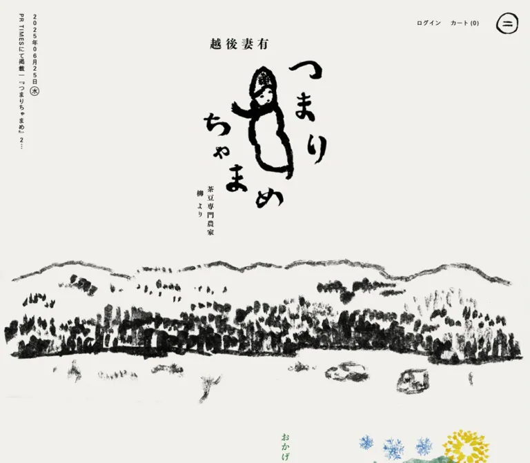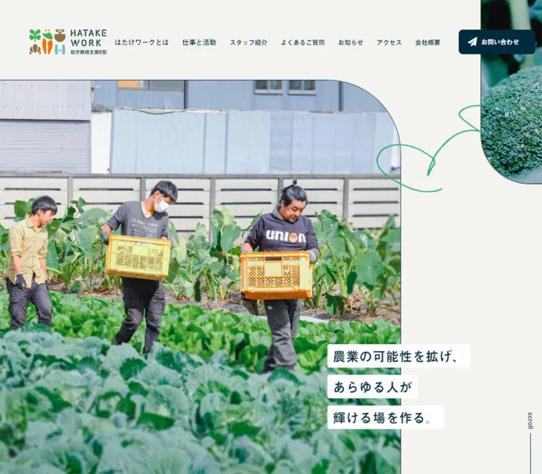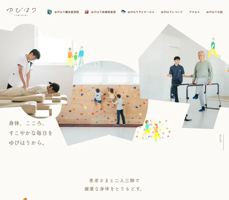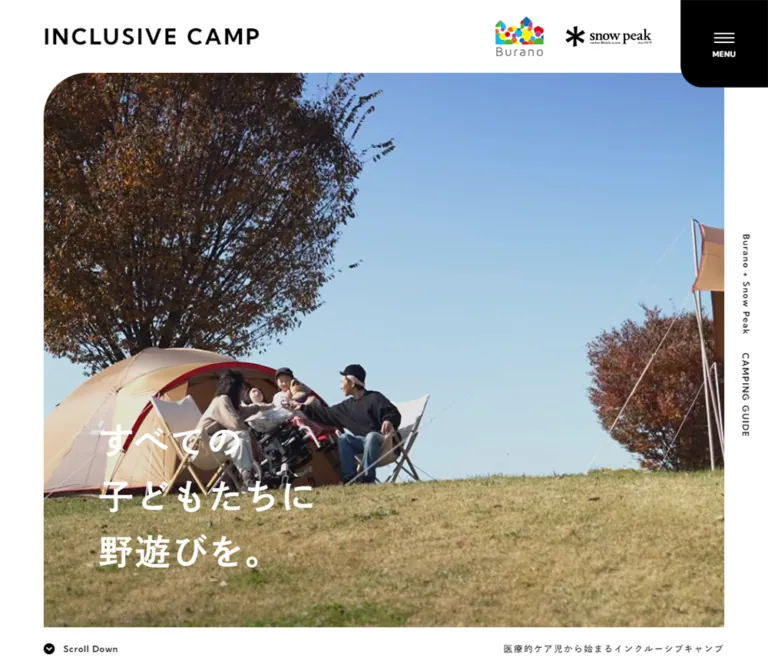
プレビュー準備中デザインリファレンスを見る
DESIGN REFERENCE
フォスタリングカードキット TOKETA
子どもと支援者の対話を支えるカードキットの紹介サイト。黄色い背景の商品写真、丸ゴシック、手描きキャラクター、広い余白で親しみやすく構成されています。
TOKETA — Style Reference
A sunlit card kit on a yellow tabletop, followed by a spacious guide to conversation and care.
Original URL: https://toketa.jp/ Final URL: https://toketa.jp/ Response: HTTP 200; original and final URLs are identical. Theme: white editorial surfaces with warm product photography and category colors; no theme selector was evidenced. Inspected: October 2, 2026, at 03:15:53 JST, corresponding to the supplied retrieval timestamp of October 1, 2026, at 18:15:53.330 UTC. Viewports: desktop 1440 × 1000 and mobile 390 × 844 CSS pixels. Scope: supplied current-page screenshots and rendered DOM/computed-style evidence. Desktop screenshots cover the opening photograph, the beginning of the kit contents, and the footer. Mobile screenshots cover the opening and footer. DOM evidence additionally covers the introduction, background narrative, concept region, usage scenarios, repeated purchase panels, supporting booklets, editorial links, and inquiry form.
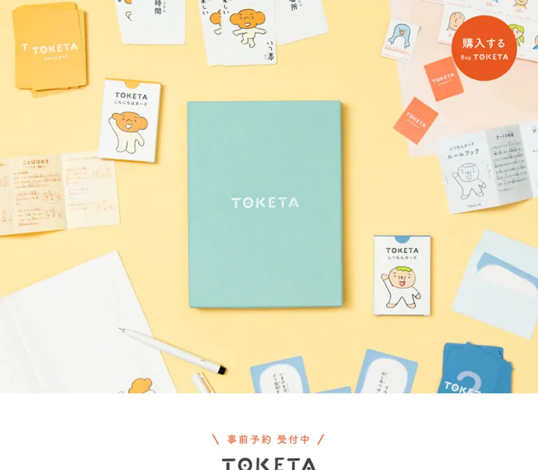
TOKETA presents a fostering card kit through the physical warmth of its materials. A mint-colored box, yellow and blue card decks, small illustrated people, folded instructions, and stationery occupy a pale yellow tabletop. The opening is almost entirely photographic. The brand appears on the photographed objects, while a separate orange purchase circle provides the main desktop interface accent.
The rest of the page shifts to white, rounded Japanese typography, generous line spacing, and large vertical intervals. Hand-drawn characters introduce sections and close the page. Product categories receive distinct yellow, blue, and coral accents, while the supporting guides use brown. Purchase information appears twice, and an external editorial publication has its own cyan treatment. This is a product and project information site with explanatory content, a kit catalog, contact facilities, and external shopping links.
閉じる
TOKETA — Style Reference
A sunlit card kit on a yellow tabletop, followed by a spacious guide to conversation and care.
Original URL: https://toketa.jp/ Final URL: https://toketa.jp/ Response: HTTP 200; original and final URLs are identical. Theme: white editorial surfaces with warm product photography and category colors; no theme selector was evidenced. Inspected: October 2, 2026, at 03:15:53 JST, corresponding to the supplied retrieval timestamp of October 1, 2026, at 18:15:53.330 UTC. Viewports: desktop 1440 × 1000 and mobile 390 × 844 CSS pixels. Scope: supplied current-page screenshots and rendered DOM/computed-style evidence. Desktop screenshots cover the opening photograph, the beginning of the kit contents, and the footer. Mobile screenshots cover the opening and footer. DOM evidence additionally covers the introduction, background narrative, concept region, usage scenarios, repeated purchase panels, supporting booklets, editorial links, and inquiry form.
TOKETA presents a fostering card kit through the physical warmth of its materials. A mint-colored box, yellow and blue card decks, small illustrated people, folded instructions, and stationery occupy a pale yellow tabletop. The opening is almost entirely photographic. The brand appears on the photographed objects, while a separate orange purchase circle provides the main desktop interface accent.
The rest of the page shifts to white, rounded Japanese typography, generous line spacing, and large vertical intervals. Hand-drawn characters introduce sections and close the page. Product categories receive distinct yellow, blue, and coral accents, while the supporting guides use brown. Purchase information appears twice, and an external editorial publication has its own cyan treatment. This is a product and project information site with explanatory content, a kit catalog, contact facilities, and external shopping links.
How to Read This Reference
- Measured values come from the supplied rendered DOM, element rectangles, computed styles, or named custom properties. They describe the two inspected viewport states.
- Calculated values are arithmetic derived from those measurements, such as column gaps and percentage widths. They do not establish the original CSS formula.
- Visual estimates describe screenshot geometry or colors for which no computed value was supplied. Approximate hexadecimal colors are implementation aids, not pixel samples.
- Recommendations describe a new implementation. Proposed breakpoints, hover endpoints, accessibility treatments, and the Quick Start classes are not claims about the original source.
- Font evidence establishes the declared/computed family stack. It does not independently prove which font file supplied every rendered glyph.
- Visibility limitation: the mobile opening screenshot shows white space beneath the photograph even though the DOM places introduction text within that area. The cause is unresolved. Preserve that distinction rather than interpreting the blank capture as an intentional empty section.
Tokens — Colors
Default Palette
| Name | Value | Source evidence | Role |
|---|---|---|---|
| Page White | #FFFFFF |
--color-bg; computed body background |
Main page, reading sections, footer, reversed button surface |
| Main Ink | #444444 |
--color-font; computed text |
Paragraphs, section headings, brand-adjacent text |
| Greeting Yellow | #FED24F |
--color-yellow; greeting-card heading |
Identifies the greeting-card family |
| Question Blue | #298EC6 |
--color-blue; question-card heading and envelope label |
Identifies question cards and their accessory |
| Support Coral | #EF744B |
--color-red; support-card and audience headings |
Support-card category and usage-scenario labels |
| Guide Brown | #53403B |
--color-brown; booklet text |
Supporting guides and their explanations |
| Border Gray | #DCDCDC |
--color-border |
Available neutral border token; use on restrained utility boundaries |
| Purchase Coral | #EB6E4F |
Computed purchase-link background | Filled purchase pills and text of the white leaflet pill |
| Editorial Cyan | #5DC2D0 |
Computed editorial heading and mobile editorial button | Links to the external design publication |
| Product Detail Ink | #403927 |
Computed publisher-link text | Small publication details within purchase panels |
Keep the two corals distinct. The category token is #EF744B, while the measured purchase pills use #EB6E4F. Neither value establishes the fill of the stronger orange desktop purchase disc.
The supplied custom-property list also contains many platform preset gradients, shadows, and colors. Their presence does not demonstrate use in the visible design. They are excluded from this reference's active palette.
Photographic and Graphic Accents
These values are approximate visual references, not measured CSS colors.
| Name | Approximation | Evidence and use |
|---|---|---|
| Sunlit Tabletop | Approximately #FFE9AC |
Broad pale yellow field in the opening and purchase photography; includes lighting variation |
| Mint Packaging | Approximately #A3D4C8 |
Fabric-like product-box surface in the photograph |
| Purchase Disc Orange | Approximately #F2551D |
Strong orange circle at the upper right of desktop captures |
| Floating Note Mint | Approximately #3CC7B5 |
Circular editorial shortcut at the lower left |
Do not replace the photographed tabletop with the stronger Greeting Yellow token. Its pale illumination, material texture, and object shadows are part of the composition. Likewise, the mint package is photographic content, not evidence of a mint page-surface system.
Tokens — Typography
Rounded Japanese Text
Source variable: --font-gothic.
The declared stack starts with FOT-筑紫A丸ゴシック Std B, followed by Japanese system fallbacks including Yu Gothic Medium, YuGothic, Hiragino Sans, Hiragino Kaku Gothic ProN, and Meiryo, then sans-serif.
The rounded letterforms support the friendly illustration style without turning the page into a children's game interface. Body copy remains orderly, moderately sized, and generously spaced. Most sampled text has a computed weight of 400.
Action Typography
Source variable: --font-gothic-b.
Purchase and editorial buttons start with FOT-筑紫A丸ゴシック Std E, followed by the same general fallback family group. Their computed weight is also 400: the stronger appearance comes from the selected family variant rather than a measured font-weight: 700 declaration.
Use the observed faces when available and appropriately licensed. The evidence supplies family names, not font files or loading configuration.
Wordmark and Embedded Lettering
The irregular TOKETA lettering is a visual brand asset. It appears on the photographed packaging and as a separate footer mark. Do not approximate it by increasing letter spacing on a generic font.
Some extracted section headings contain phrases such as の製作背景 because the brand portion is supplied separately. A new implementation should give the complete heading an accessible text equivalent while retaining the visual wordmark.
Type Scale
Sizes, line heights, and tracking below are measured computed values. Tracking is converted to em for reuse.
| Role | Desktop size / line height / tracking | Mobile size / line height / tracking |
|---|---|---|
| Body default | 14px / 14px / normal |
14px / 14px / normal |
| Introductory statement | 24px / 24px / 0.15em |
19px / 35.15px / 0.10em |
| Introductory paragraph | 18px / 39.6px / 0.12em |
15px / 29.25px / 0.02em |
| Background heading | 26px / 26px / 0.14em |
18px / 18px / 0.10em |
| Background paragraphs | 17px / 35.7px / 0.10em |
14px / 27.3px / 0.06em |
| Usage-scenario heading | 25px / 25px / 0.16em |
14px / 14px / 0.10em |
| Typical adult-audience label | 18px / 28.8px / 0.16em |
18px / 27px / 0.16em |
| Typical scenario explanation | 16px / 28.8px / 0.16em |
13px / 22.1px / 0.13em |
| Kit-contents heading | 30px / 30px / 0.15em |
18px / 18px / 0.15em |
| Kit-contents introduction | 18px / 36px / 0.12em |
14px / 27.3px / 0.01em |
| Product-photograph note | 14px / 28px / 0.10em |
12px / 21.6px / 0.05em |
| Card-description paragraph | 16px / 32px / 0.11em |
14px / 26.6px / 0.01em |
| Supporting-guide paragraph | 16px / 32px / 0.04em |
14px / 25.9px / 0.04em |
| Purchase / leaflet button | 20px / 20px / 0.09em |
16px / 16px / 0.10em |
| Editorial teaser heading | 30px / 49.5px / 0.06em |
18px / 29.7px / 0.04em |
| Inquiry field label | 14px / 26.6px / 0.10em |
14px / 27.3px / 0.10em |
The default body's 14px line height is not the paragraph rhythm. Paragraphs override it with approximately 1.85–2.2 line heights.
Nested-heading limitation: card-title h3 wrappers compute to 16.38px, but the desktop screenshot visibly contains a larger category name and a smaller quantity line. The child styles were not supplied. The visible category name is approximately 28–30px on desktop; this is an estimate, not the measured wrapper size. The Quick Start uses separate title and subtitle elements to preserve that anatomy.
Tokens — Spacing & Shapes
The layout uses deliberately varied section spacing rather than an evident universal spacing unit. Small controls are compact, while photographs, explanatory blocks, and footer identity receive substantial breathing room.
Spacing Scale
| Use | Desktop | Mobile | Evidence |
|---|---|---|---|
| Introduction top padding | 95px |
60px |
Computed padding |
| Introduction horizontal inset | 0px on outer section |
39px each side |
Computed padding |
| Introduction-to-background interval | 100px |
85px |
Calculated from section bounds |
| Background-to-concept interval | 140px |
135px |
Calculated from section bounds |
| Concept-to-scenarios interval | 200px |
120px |
Calculated from section bounds |
| Desktop purchase-button gap | 12px |
— | Calculated from link rectangles |
| Mobile purchase-button gap | — | 13px vertically |
Calculated from link rectangles |
| Supporting-guide column gap | 80px |
Single column | Calculated from text-column bounds |
| Inquiry column gap | 58px |
Single column | Calculated from field-wrapper bounds |
| Inquiry section top padding | 140px |
70px |
Computed padding |
| Footer top / bottom padding | 320px / 70px |
100px / 35px |
Computed padding |
Use these as relationships and reference measurements. Do not force every section onto a uniform eight-pixel spacing scale.
Border Radius
| Element | Value | Status |
|---|---|---|
| Purchase and leaflet pills | 50px |
Measured |
| Mobile editorial button | 50px |
Measured |
| Desktop purchase disc | Circle | Visually observed |
| Floating editorial shortcut | Circle | Visually observed |
| Mobile operator/contact panel | Approximately 7px |
Screenshot estimate |
| Product photographs and editorial sections | Square-edged presentation | Visible in supplied captures |
Most content does not sit inside rounded cards. Rounded geometry is concentrated in actions, social symbols, characters, and the mobile contact panel.
Layout Measurements
| Element | Desktop, 1440 × 1000 | Mobile, 390 × 844 |
|---|---|---|
| Document height | 11041.09px |
11818.03px |
| Header layout height | 0px |
0px |
| Opening photograph link | 1440 × 1000px |
390 × 468px |
| Introductory content width | Outer section spans viewport | 312px, starting at x = 39px |
| Background section | 1110px wide, starting at x = 165px |
Full-width section |
| Background prose | 675px wide, starting at x = 600px |
Approximately 323.22px, starting at x = 33.39px |
| Concept region | 1152 × 804px |
390 × 385.5px |
| Card-description column | 455px, starting at x = 768px |
Approximately 319.81px, starting at x = 35.09px |
| Supporting-guide text columns | Two columns of 498px |
One column of approximately 296.41px |
| Purchase / leaflet links | 222.61 × 54px and 253.08 × 54px |
Each approximately 337.89 × 48px |
| Inquiry field columns | Two columns of 500px |
One column of approximately 327.63px |
| Floating editorial shortcut | 64 × 64.5px |
64 × 64.5px |
| Footer height | 732.5px |
Approximately 618.66px |
The visible first card photograph is approximately 486px wide, from x = 217px to x = 703px. Combined with the measured text column, this suggests a centered row about 1006px wide with a 65px image-to-text gap. The photograph measurement is a screenshot estimate.
Components
Opening Photograph and Purchase Disc
Role: establish the product's material identity before introducing explanatory copy.
The opening is a full-width photographic composition. On desktop it fills the inspected 1000px viewport height. A mint box dominates the center, with cards, rulebooks, a notebook, a pen, and an envelope scattered around it. The page does not place a large HTML marketing headline over this photograph.
The complete photographic area is an anchor to #contents. Give this large link an understandable accessible name in a new implementation.
A strong orange disc sits approximately 36px from the top and 49px from the right on desktop. Its visible diameter is approximately 154px. It contains the source label 購入する and a smaller English brand line. Its link targets #sec-cart, so its role is to reach purchase information within the page.
The disc remains in the same screen position in the supplied desktop captures, consistent with fixed positioning. The exact positioning rule was not supplied. Its inline anchor rectangle has only a 20px height; that rectangle does not describe the full visible circular artwork.
At 390px wide, the photograph is 468px high and uses a much tighter composition. The desktop disc is absent from the visible opening capture. A compact purchase link exists in the mobile DOM below the initial viewport, but its later visibility behavior was not exercised.
Brand Introduction
Role: name the kit and explain its purpose.
The DOM places a centered brand heading, a short statement, and an explanatory paragraph immediately after the photograph. Desktop introduction padding begins at 95px; mobile begins at 60px with 39px side insets.
The statement changes from a single desktop line to two mobile lines. The mobile paragraph reduces both font size and tracking rather than simply shrinking the entire section proportionally.
A mobile-only evidenced text link, TOKETAを購入する, occupies a 332 × 48px pill and targets #sec-cart. Its rectangle starts at approximately y = 848.78px, just beyond the initial 844px viewport.
The opening mobile still does not visibly display the introduction text reported by these rectangles. Treat the dimensions as layout evidence and the blank area as an unresolved captured state. Essential introductory content should remain visible by default in a new implementation.
Background Narrative
Role: explain why relationship-building is central to the kit.
Desktop prose sits in a 675px column within a centered 1110px section. The section reserves 435px before that prose. This creates a pronounced asymmetry with room for visual content on the left; the supplied screenshots do not show that region's artwork in sufficient detail to describe it.
Paragraphs use 17px / 35.7px text and 0.10em tracking. On mobile, prose becomes approximately 323px wide with 14px / 27.3px text and tighter tracking. Keep the long-form explanation as readable paragraphs rather than turning it into short promotional cards.
Concept and Usage Scenarios
Role: connect the kit with the people and situations it supports.
A large concept region separates the background narrative from usage examples. Its outer dimensions are measured, but its media type and interaction model are not established by the supplied stills. Do not infer a video player, carousel, or animation from its size.
The usage section includes children and five adult/support contexts: foster parents, birth parents, teachers, fostering or child-welfare professionals, and advocates. Coral labels sit above gray explanatory copy.
Desktop element positions indicate a relationship-diagram arrangement: children near the center, one adult group above, groups on either side, and two groups below. This differs from an evenly spaced feature-card grid.
On mobile, the adult-group rectangles advance roughly 180px vertically, but several have negative horizontal coordinates. Without a corresponding screenshot or transform data, these measurements do not establish the final visible arrangement or prove a clipping defect. A new implementation should use readable document flow and verify every label at narrow widths.
Repeated Purchase Panel
Role: combine the physical kit, practical details, and the next action.
Two instances appear in the DOM: one before the kit contents and one before the footer. The desktop screenshots show portions of their pale yellow photographic field, with the open kit on the left and information/actions on the right.
The information includes the product identity, 2,000円(税込・送料別), and compact publication, planning/production, assistance, and cooperation fields. The publisher link is labeled 一般社団法人 福祉とデザイン. These are product-publication details; the planning/production field does not independently identify the website's designer.
The action pair consists of:
- A coral pill labeled
購入はこちら, linking to the external shop. - A white pill labeled
リーフレット(PDF), with coral lettering and a matching circular arrow.
Desktop buttons are 54px high, separated by 12px, with a measured 50px radius. Their computed padding is 16px 33px 18px 29px. A small outlined circle containing a right-pointing chevron precedes each label.
On mobile, the buttons stack with a 13px gap and become approximately 338px wide and 48px high. They extend wider than the approximately 296px information column. Preserve that distinction between compact publication text and generous action targets.
Kit-Contents Introduction
Role: introduce the package's three card families and two booklets.
A small seated, writing character appears above the centered heading セット内容. In the desktop still, the illustration is approximately 110–115px across. Its black outline and warm orange head connect it to the characters printed on the cards.
Below the heading, two centered lines explain the contents, followed by a smaller product-photograph note. The current page states that its photographs are from 2021 and that the box and some design details have subsequently changed. This is a caveat displayed by the current site, not evidence for reconstructing an earlier website.
The section stays on plain white. No enclosing panel, decorative border, or shadow is needed.
Card-Family Detail Row
Role: show each card family and explain how to use it.
The three families are こんにちはカード, しつもんカード, and おうえんカード. Their accents are yellow, blue, and coral respectively.
Desktop anatomy consists of a large product photograph on the left and a 455px text column on the right. Within the text column, stack the category name, a smaller quantity/accessory line, and a paragraph using 16px / 32px typography. The first screenshot shows a hand holding a card within a carefully arranged yellow tabletop photograph.
The first three measured heading positions share x = 768px and are separated by approximately 477px vertically. This is evidence of repeated row rhythm, not a reason to hardcode every row's height.
Mobile text uses 14px / 26.6px with very little tracking. The measurements support a vertically sequenced presentation rather than keeping the desktop side-by-side row.
The question-card group includes the accessory label ひみつの封筒. It changes from 14px / 26.6px on desktop to 10px / 14px on mobile and wraps onto two lines in the extracted text. Treat it as an accessory annotation, not a fourth main category.
Supporting-Guide Pair
Role: distinguish the child's support booklet from the adult facilitator's guide.
Desktop has two equal 498px columns with an 80px gap. Each group contains a title, an audience qualifier, a substantial media region, and brown explanatory text. The supplied stills do not show the booklet media closely enough to specify its exact composition.
Mobile changes to two sequential groups. Their paragraphs are approximately 296px wide, narrower than the card-description paragraphs. Use this change in measure to make the supporting materials feel like a separate editorial grouping.
Editorial Teaser and Floating Shortcut
Role: connect product information to continuing examples and updates.
The editorial teaser links to the publisher's note publication. Its main desktop anchor is approximately 736px wide. The heading is cyan, with a relaxed 30px / 49.5px rhythm, followed by usage-related tags.
Mobile adds a clearly measured cyan pill labeled デザインノート: approximately 343 × 47px, with 17px text and a 50px radius.
A separate mint circular shortcut with a white document symbol appears at the lower left. Its measured desktop location is x = 59px, with about 45px clearance below; mobile uses x = 12px, with about 12px below. It links to the same publication.
The footer screenshots show a smaller mint publication symbol grouped with the social icons. The mechanism connecting that footer presentation with the floating shortcut is unverified; do not assert that it animates or docks there.
Inquiry Form
Role: accept product and press inquiries.
The DOM supplies five field labels: name, email, email confirmation, telephone number, and inquiry content. Desktop groups four short fields in a 500px left column and the message area in a 500px right column, with a 58px gap.
The short-field wrappers measure 60px high on desktop and 48px on mobile. The message wrapper is approximately 310px high in both measurements. These are wrapper measurements, not a full inspection of the input elements' borders, padding, or native behavior.
Mobile uses a single approximately 328px column. Supporting prose precedes the form and describes an automatic receipt email and subsequent contact. This is the page's stated process; submission, validation, delivery, and success states were not tested.
Footer Identity, Contact, and Supporters
Role: end the page with a friendly brand signature and practical institutional context.
The desktop footer has an unusually large 320px top inset. A waving character sits over the product descriptor, TOKETA wordmark, and copyright. Contact/social information occupies the lower left, while supporter marks occupy the lower right.
The mascot is approximately 156px wide on desktop and 92px on mobile. The wordmark is approximately 224px wide on desktop and 170px on mobile. These are screenshot estimates.
Mobile rearranges the footer into a centered sequence: mascot and brand, copyright, social links, an outlined operator/contact panel, then supporter marks. The contact panel is approximately 315 × 88px, with a small multicolor organization mark at the left and two lines of text at the right.
Supporter marks stack on desktop but sit side by side on mobile. Keep their original green and yellow artwork rather than recoloring them to match the main palette.
Social anchor boxes measure 34 × 34px on desktop and 44 × 44px on mobile. The larger mobile boxes include padding around the visible marks.
Tokens — Motion & Interaction
| Item | Evidence | Implementation implication |
|---|---|---|
| Link transition | Sampled anchors compute to 0.15s ease-out |
A short, restrained response is supported; the animated property and hover endpoint were not demonstrated |
| Sampled element animations | Listed text and section nodes report animation: none |
Does not rule out animated descendants, image assets, pseudo-elements, or script-driven states |
| Opening photograph | Anchor destination is #contents |
In-page navigation is evidenced; smooth scrolling was not tested |
| Purchase shortcut | Anchor destination is #sec-cart |
Goes to purchase information; scroll timing and offsets are unknown |
| Purchase pills | External shop URL is present in the DOM | Use real links; checkout behavior is outside scope |
| Leaflet pill | Original-site PDF URL is present | Document-link role is evidenced; opening behavior and document contents were not inspected |
| Floating controls | Stable desktop screen positions across supplied captures | Consistent with fixed positioning; exact CSS and footer handoff are unverified |
| Form | Field labels and surrounding copy are present | No validation, submit, error, or success interaction was exercised |
| Mobile introductory blank state | Screenshot and DOM visibility disagree | Do not invent a fade, reveal delay, or loading sequence to explain it |
There is no supplied basis for parallax, springs, scroll-scrubbed characters, carousel transitions, or a particular entrance-animation duration. For a new implementation, a 150ms opacity change is a reasonable explicitly recommended link treatment. Keep all essential content available without animation.
Surfaces
| Surface | Appearance | Purpose |
|---|---|---|
| Opening stage | Full-bleed pale yellow photograph | Establishes the physical product and its approachable character |
| Main reading canvas | White, largely unboxed | Supports long explanatory text and spacious product rows |
| Purchase region | Yellow photographic field | Repeats product context around practical details and actions |
| Main action | Coral pill or orange circular graphic | Provides a distinct purchase route |
| Secondary action | White pill with coral text and arrow | Keeps the leaflet visually related but subordinate |
| Editorial action | Cyan pill or mint circular shortcut | Separates continuing editorial content from purchasing |
| Mobile contact panel | White with a fine gray outline | Groups organization identity and contact information |
Soft shadows belong primarily to the photographed objects. They do not establish a CSS card-elevation system. Avoid adding drop shadows to every content group.
Imagery
The photographic direction is bright overhead product photography. Preserve the physical box texture, subtle paper shadows, real card stacks, folded booklets, and small stationery details. The mint box acts as the central anchor while the surrounding objects make the kit feel usable and tangible.
The drawings use uneven dark outlines, simple faces, cream bodies, and warm colored heads. They are expressive but visually modest. In the supplied captures, a writing pose introduces the contents and a waving pose signs off the page. Keep their generous surrounding white space.
Photographs should remain sharp and naturally resampled. There is no evidence for pixelated rendering, duotone conversion, heavy filters, or synthetic gradient replacements.
Observed Asset References
The evidence does not provide original image-file URLs. The following references identify visible roles rather than inventing filenames.
| Asset role | Supplied visual evidence | Reuse guidance |
|---|---|---|
| Opening tabletop composition | Desktop and mobile opening captures | Prepare authorized responsive crops; retain the central box and recognizable surrounding cards |
| Open-kit purchase photograph | Partial desktop purchase panels | Preserve the pale yellow photographic field and physical package shadows |
| Greeting-card demonstration | First desktop kit-content row | Use the photograph of the card in a hand, not a generic card mockup |
| Writing character | Desktop kit-contents introduction | Preserve original outline and transparent surroundings |
| Waving character | Desktop and mobile footer | Scale proportionally and leave substantial whitespace |
| TOKETA wordmark | Packaging and footer | Use the supplied brand artwork when authorized |
| Organization and supporter marks | Desktop and mobile footer | Keep original proportions and colors |
| Social and publication symbols | Floating control and footer | Retain recognizable symbols with accessible link names |
The known leaflet path is /wp/wp-content/themes/toketa3/pdf/toketa_leaflet.pdf. It is evidenced as a link only, not as an inspected visual asset.
Layout & Responsive Behavior
The opening changes its geometry substantially between the two viewports. Desktop fills the inspected viewport height; mobile uses a 390 × 468 photograph, an observed width-to-height ratio of 5:6. That ratio is useful for an adaptation, but the actual source sizing formula is unknown.
Below the opening, desktop alternates broad centered introductions, asymmetric narrative content, product rows, paired guides, and a two-column form. Mobile narrows the text measure and converts most paired content into sequential groups. Tracking is often reduced more aggressively than font size, especially in the card descriptions.
The mobile gutters are intentionally varied:
- Introduction: approximately 10% per side.
- Card-description text: approximately 9% per side.
- Supporting-guide prose: approximately 12% per side.
- Form: approximately 8% per side.
- Purchase buttons: approximately 6.7% per side.
These percentages are calculated from the 390px measurements, not confirmed source declarations.
The purchase pair changes from compact adjacent pills to broad stacked actions. The footer undergoes a stronger reorganization: desktop spreads contact, brand, and supporters across the page, while mobile centers the brand and groups contact in an outlined panel. Supporter marks then share a horizontal row.
Only two viewport widths were supplied. The original breakpoint, tablet layout, landscape behavior, safe-area treatment, and browser zoom behavior are unverified. The Quick Start's 800px breakpoint is a recommendation for reproducing the observed endpoint layouts.
Do’s and Don’ts
Do
- Lead with the real tabletop photograph and its mint package.
- Keep long reading sections white and largely unboxed.
- Use rounded Japanese typography with generous line height.
- Preserve the separate B and E font-family roles where available.
- Keep yellow, blue, coral, and brown attached to their observed content families.
- Distinguish the category coral from the purchase-pill coral.
- Combine category names with smaller quantity or audience lines.
- Preserve the broad spacing around section mascots and footer identity.
- Make mobile actions wider than the associated publication-details column.
- Keep card photography square-edged and retain shadows within the photographs.
- Use the current page's product-photo caveat when reproducing its factual content.
- Make essential copy visible even when optional animation cannot run.
Don’t
- Don’t replace the opening with an oversized text headline on a flat yellow background.
- Don’t turn every explanatory block into a rounded, shadowed card.
- Don’t treat platform preset gradients and shadows as observed design tokens.
- Don’t recreate the irregular wordmark with a generic typeface.
- Don’t interpret the
16.38pxheading wrapper as the visible category-title size. - Don’t infer a carousel or video player from the concept region's dimensions.
- Don’t copy negative mobile coordinates into a new implementation without visual verification.
- Don’t manufacture a scroll-reveal animation to explain the blank mobile capture.
- Don’t assume a functioning checkout or contact submission from the presence of links and labels.
- Don’t apply rounded clipping, filters, or CSS elevation to every product image.
Recommended Implementation Additions
These are recommendations for a new implementation, not verified original features.
- Give the full-image introductory link, purchase artwork, social icons, and floating publication shortcut explicit accessible names.
- Use one primary page heading and a coherent section-heading hierarchy, even where visual logos replace part of a heading.
- Keep visible keyboard focus on all links and controls. Ensure fixed shortcuts do not cover focused form fields or footer links.
- Audit yellow headings, cyan text, and white-on-coral actions for contrast. Use darker functional variants where required while retaining the observed colors in illustrations and category accents.
- Keep form labels programmatically associated with fields. Use appropriate email and telephone input types, clear error text, and an explicit submission status.
- Use at least 16px text inside mobile inputs as an implementation choice; the original input typography was not measured.
- Make scroll effects progressive enhancements. Essential content should not depend on a reveal observer, successful font loading, or a motion preference.
- Supply responsive image sources, intrinsic dimensions, and meaningful alternatives for product photographs. Decorative mascots can use empty alternatives when nearby text already communicates their role.
- Verify the usage-scenario layout at intermediate widths and increased text size. The supplied mobile coordinates require additional visual checking.
Agent Prompt Guide
Quick Color Reference
- Main page:
#FFFFFF. - Main text:
#444444. - Greeting-card accent:
#FED24F. - Question-card accent:
#298EC6. - Support-card and audience accent:
#EF744B. - Purchase pills:
#EB6E4Fwith white text. - Supporting guides:
#53403B. - Editorial teaser:
#5DC2D0. - Fine borders:
#DCDCDC. - Photographic yellow, mint packaging, purchase-disc orange, and floating-shortcut mint are approximate visual colors, not measured CSS tokens.
Overall Prompt
“Create a Japanese product and project information site inspired by TOKETA's current visual language. Open with an edge-to-edge overhead photograph of a mint-colored card-kit box on a softly lit pale yellow tabletop, surrounded by cards, booklets, and stationery. On desktop, place a strong orange circular purchase shortcut near the upper-right corner. Follow with white editorial sections, rounded Japanese typography, generous line spacing, small hand-drawn characters, and broad vertical intervals. Use yellow, blue, and coral to distinguish three card families, and brown for two supporting guides. Pair product photographs with explanatory copy on desktop and stack them on mobile. Repeat a yellow purchase region with coral and white pill links. End with a spacious mascot-and-wordmark footer, organization contact information, social links, and supporter marks. Keep all content visible by default.”
Example Component Prompts
- Product detail row: “On white, place a roughly 486px product photograph beside a 455px text column, separated by about 65px at a 1440px viewport. Use a yellow category title, a smaller quantity line, and gray Japanese copy at 16px with 32px line height. Preserve square image corners and avoid an enclosing card.”
- Purchase actions: “Create adjacent 54px-high pills: coral with white
購入はこちらtext, then white with coralリーフレット(PDF)text. Give each an outlined circular arrow and a 50px radius. At phone width, stack them with a 13px gap and use approximately 338px-wide, 48px-high targets.” - Contents introduction: “Center a small hand-drawn writing character above
セット内容, followed by a spacious two-line introduction and a smaller factual photo note. Use a plain white surface, dark gray rounded text, and no surrounding panel.” - Footer: “Build a generous white footer around a waving orange-headed character and the original TOKETA wordmark. Desktop distributes contact information left and supporter logos right. Mobile centers the brand, then social links, an outlined contact panel with an organization mark, and two supporter marks in a row.”
- Editorial link: “Use cyan rounded Japanese text for a continuing-use teaser. Add a broad cyan publication button on mobile and a separate small mint circular document shortcut. Keep this accent distinct from the coral purchase actions.”
Quick Start
CSS Custom Properties
This is an implementation adaptation, not extracted source CSS. Measured colors and typography are preserved where available. Photo colors, visible category-title sizes, the breakpoint, form-control decoration, and hover opacity are recommendations or estimates.
Apply .toketa to the page body or a containing element. Supply authorized image and logo assets separately. The hero rules reproduce the observed endpoint proportions; image selection and cropping still require visual adjustment. The floating shortcut rule is a simple fixed version and does not implement an unverified footer handoff.
:root {
  /* Measured page colors */
  --t-paper: #ffffff;
  --t-ink: #444444;
  --t-yellow: #fed24f;
  --t-blue: #298ec6;
  --t-coral: #ef744b;
  --t-brown: #53403b;
  --t-border: #dcdcdc;
  --t-action: #eb6e4f;
  --t-editorial: #5dc2d0;

  /* Visual approximations, not sampled source colors */
  --t-photo-yellow: #ffe9ac;
  --t-orb-orange: #f2551d;
  --t-note-mint: #3cc7b5;

  /* Observed leading families with shortened fallback stacks */
  --t-font-body: 'FOT-筑紫A丸ゴシック Std B',
    'Yu Gothic Medium', YuGothic, 'Hiragino Sans', Meiryo, sans-serif;
  --t-font-action: 'FOT-筑紫A丸ゴシック Std E',
    'Yu Gothic Medium', YuGothic, 'Hiragino Sans', Meiryo, sans-serif;

  /* Measured or measurement-derived reference dimensions */
  --t-story-width: 1110px;
  --t-product-width: 1006px;
  --t-guide-width: 1076px;
  --t-form-width: 1058px;
  --t-pill-radius: 50px;
  --t-link-transition: 150ms ease-out;
}

body { margin: 0; }
.toketa, .toketa * { box-sizing: border-box; }
.toketa {
  color: var(--t-ink);
  background: var(--t-paper);
  font-family: var(--t-font-body);
  font-size: 14px;
  font-weight: 400;
  line-height: 1.9;
}
.toketa img {
  display: block;
  max-width: 100%;
  height: auto;
}
.toketa a { transition: opacity var(--t-link-transition); }
.toketa :focus-visible {
  outline: 3px solid var(--t-ink);
  outline-offset: 4px;
}

/* Recommended sizing that matches the inspected desktop endpoint */
.t-hero {
  display: block;
  position: relative;
  height: 100svh;
  overflow: hidden;
  background: var(--t-photo-yellow);
}
.t-hero > img,
.t-hero > picture,
.t-hero > picture > img {
  display: block;
  width: 100%;
  height: 100%;
}
.t-hero img { object-fit: cover; object-position: center; }
.t-buy-orb {
  position: fixed;
  z-index: 20;
  top: 36px;
  right: 49px;
  display: grid;
  place-content: center;
  width: 154px;
  height: 154px;
  border-radius: 50%;
  color: white;
  background: var(--t-orb-orange);
  text-align: center;
  text-decoration: none;
  font-family: var(--t-font-action);
  font-size: 24px;
  line-height: 1.5;
}
.t-buy-orb small { display: block; font-size: 13px; }

.t-intro { padding: 95px 8% 0; text-align: center; }
.t-intro__statement {
  margin: 60px 0 35px;
  font-size: 24px;
  font-weight: 400;
  line-height: 1;
  letter-spacing: .15em;
}
.t-intro__copy {
  margin: 0;
  font-size: 18px;
  line-height: 2.2;
  letter-spacing: .12em;
}
.t-intro__purchase { display: none; }
.t-story {
  width: min(var(--t-story-width), 88%);
  margin: 100px auto 140px;
  padding-left: 435px;
}
.t-story p {
  margin: 0 0 19px;
  font-size: 17px;
  line-height: 2.1;
  letter-spacing: .1em;
}

.t-kit-head { margin: 90px auto; text-align: center; }
.t-kit-head__mascot { width: 112px; margin: 0 auto 44px; }
.t-kit-head h2 {
  margin: 0 0 35px;
  font-size: 30px;
  font-weight: 400;
  line-height: 1;
  letter-spacing: .15em;
}
.t-kit-head__copy {
  font-size: 18px;
  line-height: 2;
  letter-spacing: .12em;
}
.t-kit-head__note {
  font-size: 14px;
  line-height: 2;
  letter-spacing: .1em;
}
.t-card-row {
  --t-item-color: var(--t-yellow);
  display: grid;
  grid-template-columns: minmax(0, 486fr) minmax(0, 455fr);
  align-items: start;
  gap: 65px;
  width: min(var(--t-product-width), calc(100% - 48px));
  margin: 0 auto 96px;
}
.t-card-row--question { --t-item-color: var(--t-blue); }
.t-card-row--support { --t-item-color: var(--t-coral); }
.t-card-row__photo { width: 100%; }
.t-card-row__title {
  margin: 28px 0 0;
  color: var(--t-item-color);
  font-size: 30px; /* Estimated visible title size */
  font-weight: 400;
  line-height: 1.5;
  letter-spacing: .12em;
}
.t-card-row__subtitle {
  display: block;
  font-size: 16px;
  line-height: 1.8;
  letter-spacing: .04em;
}
.t-card-row__copy {
  margin-top: 28px;
  font-size: 16px;
  line-height: 2;
  letter-spacing: .11em;
}
.t-guide-grid {
  display: grid;
  grid-template-columns: repeat(2, minmax(0, 1fr));
  gap: 80px;
  width: min(var(--t-guide-width), 88%);
  margin-inline: auto;
  color: var(--t-brown);
}
.t-guide-grid p {
  font-size: 16px;
  line-height: 2;
  letter-spacing: .04em;
}

/* Place this group within the purchase panel's information column */
.t-actions { display: flex; flex-wrap: wrap; gap: 12px; }
.t-btn {
  display: inline-grid;
  grid-template-columns: 30px auto;
  grid-template-rows: 20px;
  align-items: center;
  column-gap: 14px;
  min-height: 54px;
  padding: 16px 33px 18px 29px;
  border: 0;
  border-radius: var(--t-pill-radius);
  color: white;
  background: var(--t-action);
  text-decoration: none;
  font-family: var(--t-font-action);
  font-size: 20px;
  font-weight: 400;
  line-height: 20px;
  letter-spacing: .09em;
}
.t-btn--secondary { color: var(--t-action); background: white; }
.t-btn--editorial { background: var(--t-editorial); }
.t-btn__arrow {
  display: grid;
  place-items: center;
  width: 30px;
  height: 30px;
  border: 2px solid currentColor;
  border-radius: 50%;
}
.t-btn__arrow::before {
  content: '';
  width: 8px;
  height: 8px;
  margin-left: -3px;
  border-top: 2px solid currentColor;
  border-right: 2px solid currentColor;
  transform: rotate(45deg);
}
.t-note-float {
  position: fixed;
  z-index: 15;
  left: 59px;
  bottom: 45px;
  display: grid;
  place-items: center;
  width: 64px;
  height: 64px;
  border-radius: 50%;
  color: white;
  background: var(--t-note-mint);
}

/* Control borders and input typography are recommended additions */
.t-inquiry { padding-top: 140px; }
.t-form {
  display: grid;
  grid-template-columns: repeat(2, minmax(0, 1fr));
  gap: 58px;
  width: min(var(--t-form-width), 84%);
  margin-inline: auto;
}
.t-field { margin-bottom: 20px; }
.t-field label { display: block; margin-bottom: 10px; letter-spacing: .1em; }
.t-field input,
.t-field textarea {
  width: 100%;
  min-height: 60px;
  padding: 12px 16px;
  border: 1px solid var(--t-border);
  border-radius: 4px;
  color: var(--t-ink);
  background: white;
  font: inherit;
  font-size: 16px;
}
.t-field textarea { min-height: 310px; resize: vertical; }

.t-footer {
  display: grid;
  grid-template-columns: 1fr auto 1fr;
  align-items: end;
  gap: 40px;
  padding: 320px 60px 70px;
}
.t-footer__brand { grid-column: 2; grid-row: 1; text-align: center; }
.t-footer__mascot { width: 156px; margin: 0 auto 44px; }
.t-footer__wordmark { width: 224px; margin: 18px auto 24px; }
.t-footer__contact { grid-column: 1; grid-row: 1; }
.t-footer__sponsors {
  grid-column: 3;
  grid-row: 1;
  justify-self: end;
  display: flex;
  flex-direction: column;
  gap: 20px;
}
.t-sponsor--foundation { width: 216px; }
.t-sponsor--campaign { width: 220px; }
.t-social { display: flex; gap: 4px; margin-bottom: 24px; }
.t-social a {
  display: grid;
  place-items: center;
  width: 34px;
  height: 34px;
  padding: 2px;
}
.t-contact-card__logo { display: none; }

/* Recommended hover endpoint; only timing was evidenced */
@media (hover: hover) {
  .t-btn:hover, .t-note-float:hover, .t-buy-orb:hover { opacity: .85; }
}

/* Recommended breakpoint; the original breakpoint is unknown */
@media (max-width: 800px) {
  .t-hero { height: 120vw; }
  .t-buy-orb { display: none; }
  .t-intro { padding: 60px 10% 0; }
  .t-intro__statement {
    margin: 32px 0 18px;
    font-size: 19px;
    line-height: 1.85;
    letter-spacing: .1em;
  }
  .t-intro__copy { font-size: 15px; line-height: 1.95; letter-spacing: .02em; }
  .t-intro__purchase { display: grid; margin-top: 30px; }
  .t-story { width: 83%; margin: 85px auto 135px; padding: 0; }
  .t-story p { font-size: 14px; line-height: 1.95; letter-spacing: .06em; }
  .t-kit-head { width: 82%; margin-block: 70px; }
  .t-kit-head h2 { font-size: 18px; }
  .t-kit-head__copy { font-size: 14px; line-height: 1.95; letter-spacing: .01em; }
  .t-kit-head__note { font-size: 12px; line-height: 1.8; letter-spacing: .05em; }
  .t-card-row { grid-template-columns: 1fr; width: 82%; gap: 24px; margin-bottom: 75px; }
  .t-card-row__title { margin-top: 0; font-size: 22px; }
  .t-card-row__subtitle { font-size: 14px; }
  .t-card-row__copy { margin-top: 24px; font-size: 14px; line-height: 1.9; letter-spacing: .01em; }
  .t-guide-grid { grid-template-columns: 1fr; width: 76%; gap: 75px; }
  .t-guide-grid p { font-size: 14px; line-height: 1.85; }
  .t-actions { display: grid; gap: 13px; }
  .t-btn {
    grid-template-columns: 26px auto;
    grid-template-rows: 16px;
    justify-content: center;
    width: 100%;
    min-height: 48px;
    padding: 16px;
    font-size: 16px;
    line-height: 16px;
    letter-spacing: .1em;
  }
  .t-btn__arrow { width: 26px; height: 26px; }
  .t-note-float { left: 12px; bottom: 12px; }
  .t-inquiry { padding-top: 70px; }
  .t-form { grid-template-columns: 1fr; gap: 0; }
  .t-field input { min-height: 48px; }
  .t-footer {
    display: flex;
    flex-direction: column;
    align-items: center;
    gap: 32px;
    padding: 100px 7% 35px;
  }
  .t-footer__brand { order: 0; }
  .t-footer__contact { order: 1; width: 100%; }
  .t-footer__sponsors { order: 2; flex-direction: row; align-items: end; gap: 20px; }
  .t-footer__mascot { width: 92px; margin-bottom: 28px; }
  .t-footer__wordmark { width: 170px; }
  .t-social { justify-content: center; }
  .t-social a { width: 44px; height: 44px; padding: 5px; }
  .t-contact-card {
    display: flex;
    align-items: center;
    gap: 24px;
    width: min(315px, 100%);
    margin-inline: auto;
    padding: 18px;
    border: 1px solid var(--t-border);
    border-radius: 7px;
  }
  .t-contact-card__logo { display: block; width: 60px; flex: 0 0 60px; }
  .t-sponsor--foundation { width: 138px; max-width: 41%; }
  .t-sponsor--campaign { width: 178px; max-width: 53%; }
}

@media (prefers-reduced-motion: reduce) {
  .toketa a { transition: none; }
}
The Quick Start deliberately leaves the concept artwork, relationship-diagram positioning, original asset selection, contact backend, and any animation controller to separate implementation. Their complete behavior is not established by the supplied evidence. Its proposed form borders and title-child sizes should not be mistaken for extracted source values.
Tailwind v4 Token Mapping
Optional aliases for a project that already uses Tailwind v4. Define the properties above first. This is not evidence that the original site uses Tailwind.
@theme inline {
  --color-toketa-paper: var(--t-paper);
  --color-toketa-ink: var(--t-ink);
  --color-toketa-yellow: var(--t-yellow);
  --color-toketa-blue: var(--t-blue);
  --color-toketa-coral: var(--t-coral);
  --color-toketa-brown: var(--t-brown);
  --color-toketa-action: var(--t-action);
  --color-toketa-editorial: var(--t-editorial);
  --color-toketa-border: var(--t-border);
  --font-toketa: var(--t-font-body);
  --font-toketa-action: var(--t-font-action);
  --radius-toketa-pill: var(--t-pill-radius);
}
Sources & Evidence
- Original and final website: https://toketa.jp/. The supplied inspection reports HTTP 200 and the page title
フォスタリングカードキット TOKETA. - Capture batch: retrieved October 1, 2026, at
18:15:53.330Z, equivalent to October 2 at03:15:53.330in Japan. Separate timestamps for individual screenshots were not supplied. - Desktop evidence: 1440 × 1000 CSS-pixel viewport; opening, kit-content, and footer screenshots; document height approximately 11041px; rendered text, link destinations, custom properties, computed typography, and element rectangles.
- Mobile evidence: 390 × 844 CSS-pixel viewport; opening and footer screenshots; document height approximately 11818px; equivalent rendered DOM and computed-style measurements.
- Original-page link evidence: in-page destinations
#contentsand#sec-cart; external purchase and editorial destinations; the original-site leaflet link; organization, social, and supporter links. These establish link roles, not successful downstream behavior. - Readiness limitations: the supplied capture process waited for load, visible image decoding, finite animation readiness, and sampled layout/text stability within bounded time limits. Those checks do not establish semantic completeness. Perpetual animation handling and disabled workers also limit conclusions about every possible runtime state.
- Unverified areas: input-element styling beyond wrapper measurements, actual font-file selection, hover endpoints, keyboard interactions, form submission, checkout, PDF contents, tablet breakpoints, reveal logic, and the mobile screenshot/DOM visibility discrepancy.
This reference describes the current page represented by the supplied original-site evidence. Computed measurements, screenshot estimates, and implementation recommendations are identified separately throughout.
# TOKETA — Style Reference

> A sunlit card kit on a yellow tabletop, followed by a spacious guide to conversation and care.

**Original URL:** [https://toketa.jp/](https://toketa.jp/)
**Final URL:** [https://toketa.jp/](https://toketa.jp/)
**Response:** HTTP 200; original and final URLs are identical.
**Theme:** white editorial surfaces with warm product photography and category colors; no theme selector was evidenced.
**Inspected:** October 2, 2026, at 03:15:53 JST, corresponding to the supplied retrieval timestamp of October 1, 2026, at 18:15:53.330 UTC.
**Viewports:** desktop 1440 × 1000 and mobile 390 × 844 CSS pixels.
**Scope:** supplied current-page screenshots and rendered DOM/computed-style evidence. Desktop screenshots cover the opening photograph, the beginning of the kit contents, and the footer. Mobile screenshots cover the opening and footer. DOM evidence additionally covers the introduction, background narrative, concept region, usage scenarios, repeated purchase panels, supporting booklets, editorial links, and inquiry form.

TOKETA presents a fostering card kit through the physical warmth of its materials. A mint-colored box, yellow and blue card decks, small illustrated people, folded instructions, and stationery occupy a pale yellow tabletop. The opening is almost entirely photographic. The brand appears on the photographed objects, while a separate orange purchase circle provides the main desktop interface accent.

The rest of the page shifts to white, rounded Japanese typography, generous line spacing, and large vertical intervals. Hand-drawn characters introduce sections and close the page. Product categories receive distinct yellow, blue, and coral accents, while the supporting guides use brown. Purchase information appears twice, and an external editorial publication has its own cyan treatment. This is a product and project information site with explanatory content, a kit catalog, contact facilities, and external shopping links.
閉じる
# TOKETA — Style Reference

> A sunlit card kit on a yellow tabletop, followed by a spacious guide to conversation and care.

**Original URL:** [https://toketa.jp/](https://toketa.jp/)
**Final URL:** [https://toketa.jp/](https://toketa.jp/)
**Response:** HTTP 200; original and final URLs are identical.
**Theme:** white editorial surfaces with warm product photography and category colors; no theme selector was evidenced.
**Inspected:** October 2, 2026, at 03:15:53 JST, corresponding to the supplied retrieval timestamp of October 1, 2026, at 18:15:53.330 UTC.
**Viewports:** desktop 1440 × 1000 and mobile 390 × 844 CSS pixels.
**Scope:** supplied current-page screenshots and rendered DOM/computed-style evidence. Desktop screenshots cover the opening photograph, the beginning of the kit contents, and the footer. Mobile screenshots cover the opening and footer. DOM evidence additionally covers the introduction, background narrative, concept region, usage scenarios, repeated purchase panels, supporting booklets, editorial links, and inquiry form.

TOKETA presents a fostering card kit through the physical warmth of its materials. A mint-colored box, yellow and blue card decks, small illustrated people, folded instructions, and stationery occupy a pale yellow tabletop. The opening is almost entirely photographic. The brand appears on the photographed objects, while a separate orange purchase circle provides the main desktop interface accent.

The rest of the page shifts to white, rounded Japanese typography, generous line spacing, and large vertical intervals. Hand-drawn characters introduce sections and close the page. Product categories receive distinct yellow, blue, and coral accents, while the supporting guides use brown. Purchase information appears twice, and an external editorial publication has its own cyan treatment. This is a product and project information site with explanatory content, a kit catalog, contact facilities, and external shopping links.

## How to Read This Reference

- **Measured** values come from the supplied rendered DOM, element rectangles, computed styles, or named custom properties. They describe the two inspected viewport states.
- **Calculated** values are arithmetic derived from those measurements, such as column gaps and percentage widths. They do not establish the original CSS formula.
- **Visual estimates** describe screenshot geometry or colors for which no computed value was supplied. Approximate hexadecimal colors are implementation aids, not pixel samples.
- **Recommendations** describe a new implementation. Proposed breakpoints, hover endpoints, accessibility treatments, and the Quick Start classes are not claims about the original source.
- **Font evidence** establishes the declared/computed family stack. It does not independently prove which font file supplied every rendered glyph.
- **Visibility limitation:** the mobile opening screenshot shows white space beneath the photograph even though the DOM places introduction text within that area. The cause is unresolved. Preserve that distinction rather than interpreting the blank capture as an intentional empty section.

## Tokens — Colors

### Default Palette

| Name | Value | Source evidence | Role |
| --- | --- | --- | --- |
| Page White | `#FFFFFF` | `--color-bg`; computed body background | Main page, reading sections, footer, reversed button surface |
| Main Ink | `#444444` | `--color-font`; computed text | Paragraphs, section headings, brand-adjacent text |
| Greeting Yellow | `#FED24F` | `--color-yellow`; greeting-card heading | Identifies the greeting-card family |
| Question Blue | `#298EC6` | `--color-blue`; question-card heading and envelope label | Identifies question cards and their accessory |
| Support Coral | `#EF744B` | `--color-red`; support-card and audience headings | Support-card category and usage-scenario labels |
| Guide Brown | `#53403B` | `--color-brown`; booklet text | Supporting guides and their explanations |
| Border Gray | `#DCDCDC` | `--color-border` | Available neutral border token; use on restrained utility boundaries |
| Purchase Coral | `#EB6E4F` | Computed purchase-link background | Filled purchase pills and text of the white leaflet pill |
| Editorial Cyan | `#5DC2D0` | Computed editorial heading and mobile editorial button | Links to the external design publication |
| Product Detail Ink | `#403927` | Computed publisher-link text | Small publication details within purchase panels |

**Keep the two corals distinct.** The category token is `#EF744B`, while the measured purchase pills use `#EB6E4F`. Neither value establishes the fill of the stronger orange desktop purchase disc.

The supplied custom-property list also contains many platform preset gradients, shadows, and colors. Their presence does not demonstrate use in the visible design. They are excluded from this reference's active palette.

### Photographic and Graphic Accents

These values are approximate visual references, not measured CSS colors.

| Name | Approximation | Evidence and use |
| --- | --- | --- |
| Sunlit Tabletop | Approximately `#FFE9AC` | Broad pale yellow field in the opening and purchase photography; includes lighting variation |
| Mint Packaging | Approximately `#A3D4C8` | Fabric-like product-box surface in the photograph |
| Purchase Disc Orange | Approximately `#F2551D` | Strong orange circle at the upper right of desktop captures |
| Floating Note Mint | Approximately `#3CC7B5` | Circular editorial shortcut at the lower left |

Do not replace the photographed tabletop with the stronger Greeting Yellow token. Its pale illumination, material texture, and object shadows are part of the composition. Likewise, the mint package is photographic content, not evidence of a mint page-surface system.

## Tokens — Typography

### Rounded Japanese Text

**Source variable:** `--font-gothic`.

The declared stack starts with `FOT-筑紫A丸ゴシック Std B`, followed by Japanese system fallbacks including `Yu Gothic Medium`, `YuGothic`, `Hiragino Sans`, `Hiragino Kaku Gothic ProN`, and `Meiryo`, then `sans-serif`.

The rounded letterforms support the friendly illustration style without turning the page into a children's game interface. Body copy remains orderly, moderately sized, and generously spaced. Most sampled text has a computed weight of `400`.

### Action Typography

**Source variable:** `--font-gothic-b`.

Purchase and editorial buttons start with `FOT-筑紫A丸ゴシック Std E`, followed by the same general fallback family group. Their computed weight is also `400`: the stronger appearance comes from the selected family variant rather than a measured `font-weight: 700` declaration.

Use the observed faces when available and appropriately licensed. The evidence supplies family names, not font files or loading configuration.

### Wordmark and Embedded Lettering

The irregular TOKETA lettering is a visual brand asset. It appears on the photographed packaging and as a separate footer mark. Do not approximate it by increasing letter spacing on a generic font.

Some extracted section headings contain phrases such as `の製作背景` because the brand portion is supplied separately. A new implementation should give the complete heading an accessible text equivalent while retaining the visual wordmark.

### Type Scale

Sizes, line heights, and tracking below are measured computed values. Tracking is converted to `em` for reuse.

| Role | Desktop size / line height / tracking | Mobile size / line height / tracking |
| --- | --- | --- |
| Body default | `14px / 14px / normal` | `14px / 14px / normal` |
| Introductory statement | `24px / 24px / 0.15em` | `19px / 35.15px / 0.10em` |
| Introductory paragraph | `18px / 39.6px / 0.12em` | `15px / 29.25px / 0.02em` |
| Background heading | `26px / 26px / 0.14em` | `18px / 18px / 0.10em` |
| Background paragraphs | `17px / 35.7px / 0.10em` | `14px / 27.3px / 0.06em` |
| Usage-scenario heading | `25px / 25px / 0.16em` | `14px / 14px / 0.10em` |
| Typical adult-audience label | `18px / 28.8px / 0.16em` | `18px / 27px / 0.16em` |
| Typical scenario explanation | `16px / 28.8px / 0.16em` | `13px / 22.1px / 0.13em` |
| Kit-contents heading | `30px / 30px / 0.15em` | `18px / 18px / 0.15em` |
| Kit-contents introduction | `18px / 36px / 0.12em` | `14px / 27.3px / 0.01em` |
| Product-photograph note | `14px / 28px / 0.10em` | `12px / 21.6px / 0.05em` |
| Card-description paragraph | `16px / 32px / 0.11em` | `14px / 26.6px / 0.01em` |
| Supporting-guide paragraph | `16px / 32px / 0.04em` | `14px / 25.9px / 0.04em` |
| Purchase / leaflet button | `20px / 20px / 0.09em` | `16px / 16px / 0.10em` |
| Editorial teaser heading | `30px / 49.5px / 0.06em` | `18px / 29.7px / 0.04em` |
| Inquiry field label | `14px / 26.6px / 0.10em` | `14px / 27.3px / 0.10em` |

The default body's `14px` line height is not the paragraph rhythm. Paragraphs override it with approximately `1.85–2.2` line heights.

**Nested-heading limitation:** card-title `h3` wrappers compute to `16.38px`, but the desktop screenshot visibly contains a larger category name and a smaller quantity line. The child styles were not supplied. The visible category name is approximately `28–30px` on desktop; this is an estimate, not the measured wrapper size. The Quick Start uses separate title and subtitle elements to preserve that anatomy.

## Tokens — Spacing & Shapes

The layout uses deliberately varied section spacing rather than an evident universal spacing unit. Small controls are compact, while photographs, explanatory blocks, and footer identity receive substantial breathing room.

### Spacing Scale

| Use | Desktop | Mobile | Evidence |
| --- | --- | --- | --- |
| Introduction top padding | `95px` | `60px` | Computed padding |
| Introduction horizontal inset | `0px` on outer section | `39px` each side | Computed padding |
| Introduction-to-background interval | `100px` | `85px` | Calculated from section bounds |
| Background-to-concept interval | `140px` | `135px` | Calculated from section bounds |
| Concept-to-scenarios interval | `200px` | `120px` | Calculated from section bounds |
| Desktop purchase-button gap | `12px` | — | Calculated from link rectangles |
| Mobile purchase-button gap | — | `13px` vertically | Calculated from link rectangles |
| Supporting-guide column gap | `80px` | Single column | Calculated from text-column bounds |
| Inquiry column gap | `58px` | Single column | Calculated from field-wrapper bounds |
| Inquiry section top padding | `140px` | `70px` | Computed padding |
| Footer top / bottom padding | `320px / 70px` | `100px / 35px` | Computed padding |

Use these as relationships and reference measurements. Do not force every section onto a uniform eight-pixel spacing scale.

### Border Radius

| Element | Value | Status |
| --- | --- | --- |
| Purchase and leaflet pills | `50px` | Measured |
| Mobile editorial button | `50px` | Measured |
| Desktop purchase disc | Circle | Visually observed |
| Floating editorial shortcut | Circle | Visually observed |
| Mobile operator/contact panel | Approximately `7px` | Screenshot estimate |
| Product photographs and editorial sections | Square-edged presentation | Visible in supplied captures |

Most content does not sit inside rounded cards. Rounded geometry is concentrated in actions, social symbols, characters, and the mobile contact panel.

### Layout Measurements

| Element | Desktop, 1440 × 1000 | Mobile, 390 × 844 |
| --- | --- | --- |
| Document height | `11041.09px` | `11818.03px` |
| Header layout height | `0px` | `0px` |
| Opening photograph link | `1440 × 1000px` | `390 × 468px` |
| Introductory content width | Outer section spans viewport | `312px`, starting at `x = 39px` |
| Background section | `1110px` wide, starting at `x = 165px` | Full-width section |
| Background prose | `675px` wide, starting at `x = 600px` | Approximately `323.22px`, starting at `x = 33.39px` |
| Concept region | `1152 × 804px` | `390 × 385.5px` |
| Card-description column | `455px`, starting at `x = 768px` | Approximately `319.81px`, starting at `x = 35.09px` |
| Supporting-guide text columns | Two columns of `498px` | One column of approximately `296.41px` |
| Purchase / leaflet links | `222.61 × 54px` and `253.08 × 54px` | Each approximately `337.89 × 48px` |
| Inquiry field columns | Two columns of `500px` | One column of approximately `327.63px` |
| Floating editorial shortcut | `64 × 64.5px` | `64 × 64.5px` |
| Footer height | `732.5px` | Approximately `618.66px` |

The visible first card photograph is approximately `486px` wide, from `x = 217px` to `x = 703px`. Combined with the measured text column, this suggests a centered row about `1006px` wide with a `65px` image-to-text gap. The photograph measurement is a screenshot estimate.

## Components

### Opening Photograph and Purchase Disc

**Role:** establish the product's material identity before introducing explanatory copy.

The opening is a full-width photographic composition. On desktop it fills the inspected 1000px viewport height. A mint box dominates the center, with cards, rulebooks, a notebook, a pen, and an envelope scattered around it. The page does not place a large HTML marketing headline over this photograph.

The complete photographic area is an anchor to `#contents`. Give this large link an understandable accessible name in a new implementation.

A strong orange disc sits approximately `36px` from the top and `49px` from the right on desktop. Its visible diameter is approximately `154px`. It contains the source label `購入する` and a smaller English brand line. Its link targets `#sec-cart`, so its role is to reach purchase information within the page.

The disc remains in the same screen position in the supplied desktop captures, consistent with fixed positioning. The exact positioning rule was not supplied. Its inline anchor rectangle has only a `20px` height; that rectangle does not describe the full visible circular artwork.

At 390px wide, the photograph is 468px high and uses a much tighter composition. The desktop disc is absent from the visible opening capture. A compact purchase link exists in the mobile DOM below the initial viewport, but its later visibility behavior was not exercised.

### Brand Introduction

**Role:** name the kit and explain its purpose.

The DOM places a centered brand heading, a short statement, and an explanatory paragraph immediately after the photograph. Desktop introduction padding begins at 95px; mobile begins at 60px with 39px side insets.

The statement changes from a single desktop line to two mobile lines. The mobile paragraph reduces both font size and tracking rather than simply shrinking the entire section proportionally.

A mobile-only evidenced text link, `TOKETAを購入する`, occupies a `332 × 48px` pill and targets `#sec-cart`. Its rectangle starts at approximately `y = 848.78px`, just beyond the initial 844px viewport.

The opening mobile still does not visibly display the introduction text reported by these rectangles. Treat the dimensions as layout evidence and the blank area as an unresolved captured state. Essential introductory content should remain visible by default in a new implementation.

### Background Narrative

**Role:** explain why relationship-building is central to the kit.

Desktop prose sits in a 675px column within a centered 1110px section. The section reserves 435px before that prose. This creates a pronounced asymmetry with room for visual content on the left; the supplied screenshots do not show that region's artwork in sufficient detail to describe it.

Paragraphs use `17px / 35.7px` text and `0.10em` tracking. On mobile, prose becomes approximately 323px wide with `14px / 27.3px` text and tighter tracking. Keep the long-form explanation as readable paragraphs rather than turning it into short promotional cards.

### Concept and Usage Scenarios

**Role:** connect the kit with the people and situations it supports.

A large concept region separates the background narrative from usage examples. Its outer dimensions are measured, but its media type and interaction model are not established by the supplied stills. Do not infer a video player, carousel, or animation from its size.

The usage section includes children and five adult/support contexts: foster parents, birth parents, teachers, fostering or child-welfare professionals, and advocates. Coral labels sit above gray explanatory copy.

Desktop element positions indicate a relationship-diagram arrangement: children near the center, one adult group above, groups on either side, and two groups below. This differs from an evenly spaced feature-card grid.

On mobile, the adult-group rectangles advance roughly 180px vertically, but several have negative horizontal coordinates. Without a corresponding screenshot or transform data, these measurements do not establish the final visible arrangement or prove a clipping defect. A new implementation should use readable document flow and verify every label at narrow widths.

### Repeated Purchase Panel

**Role:** combine the physical kit, practical details, and the next action.

Two instances appear in the DOM: one before the kit contents and one before the footer. The desktop screenshots show portions of their pale yellow photographic field, with the open kit on the left and information/actions on the right.

The information includes the product identity, `2,000円(税込・送料別)`, and compact publication, planning/production, assistance, and cooperation fields. The publisher link is labeled `一般社団法人 福祉とデザイン`. These are product-publication details; the planning/production field does not independently identify the website's designer.

The action pair consists of:

- A coral pill labeled `購入はこちら`, linking to the external shop.
- A white pill labeled `リーフレット(PDF)`, with coral lettering and a matching circular arrow.

Desktop buttons are 54px high, separated by 12px, with a measured 50px radius. Their computed padding is `16px 33px 18px 29px`. A small outlined circle containing a right-pointing chevron precedes each label.

On mobile, the buttons stack with a 13px gap and become approximately 338px wide and 48px high. They extend wider than the approximately 296px information column. Preserve that distinction between compact publication text and generous action targets.

### Kit-Contents Introduction

**Role:** introduce the package's three card families and two booklets.

A small seated, writing character appears above the centered heading `セット内容`. In the desktop still, the illustration is approximately 110–115px across. Its black outline and warm orange head connect it to the characters printed on the cards.

Below the heading, two centered lines explain the contents, followed by a smaller product-photograph note. The current page states that its photographs are from 2021 and that the box and some design details have subsequently changed. This is a caveat displayed by the current site, not evidence for reconstructing an earlier website.

The section stays on plain white. No enclosing panel, decorative border, or shadow is needed.

### Card-Family Detail Row

**Role:** show each card family and explain how to use it.

The three families are `こんにちはカード`, `しつもんカード`, and `おうえんカード`. Their accents are yellow, blue, and coral respectively.

Desktop anatomy consists of a large product photograph on the left and a 455px text column on the right. Within the text column, stack the category name, a smaller quantity/accessory line, and a paragraph using `16px / 32px` typography. The first screenshot shows a hand holding a card within a carefully arranged yellow tabletop photograph.

The first three measured heading positions share `x = 768px` and are separated by approximately 477px vertically. This is evidence of repeated row rhythm, not a reason to hardcode every row's height.

Mobile text uses `14px / 26.6px` with very little tracking. The measurements support a vertically sequenced presentation rather than keeping the desktop side-by-side row.

The question-card group includes the accessory label `ひみつの封筒`. It changes from `14px / 26.6px` on desktop to `10px / 14px` on mobile and wraps onto two lines in the extracted text. Treat it as an accessory annotation, not a fourth main category.

### Supporting-Guide Pair

**Role:** distinguish the child's support booklet from the adult facilitator's guide.

Desktop has two equal 498px columns with an 80px gap. Each group contains a title, an audience qualifier, a substantial media region, and brown explanatory text. The supplied stills do not show the booklet media closely enough to specify its exact composition.

Mobile changes to two sequential groups. Their paragraphs are approximately 296px wide, narrower than the card-description paragraphs. Use this change in measure to make the supporting materials feel like a separate editorial grouping.

### Editorial Teaser and Floating Shortcut

**Role:** connect product information to continuing examples and updates.

The editorial teaser links to the publisher's note publication. Its main desktop anchor is approximately 736px wide. The heading is cyan, with a relaxed `30px / 49.5px` rhythm, followed by usage-related tags.

Mobile adds a clearly measured cyan pill labeled `デザインノート`: approximately `343 × 47px`, with `17px` text and a 50px radius.

A separate mint circular shortcut with a white document symbol appears at the lower left. Its measured desktop location is `x = 59px`, with about 45px clearance below; mobile uses `x = 12px`, with about 12px below. It links to the same publication.

The footer screenshots show a smaller mint publication symbol grouped with the social icons. The mechanism connecting that footer presentation with the floating shortcut is unverified; do not assert that it animates or docks there.

### Inquiry Form

**Role:** accept product and press inquiries.

The DOM supplies five field labels: name, email, email confirmation, telephone number, and inquiry content. Desktop groups four short fields in a 500px left column and the message area in a 500px right column, with a 58px gap.

The short-field wrappers measure 60px high on desktop and 48px on mobile. The message wrapper is approximately 310px high in both measurements. These are wrapper measurements, not a full inspection of the input elements' borders, padding, or native behavior.

Mobile uses a single approximately 328px column. Supporting prose precedes the form and describes an automatic receipt email and subsequent contact. This is the page's stated process; submission, validation, delivery, and success states were not tested.

### Footer Identity, Contact, and Supporters

**Role:** end the page with a friendly brand signature and practical institutional context.

The desktop footer has an unusually large 320px top inset. A waving character sits over the product descriptor, TOKETA wordmark, and copyright. Contact/social information occupies the lower left, while supporter marks occupy the lower right.

The mascot is approximately 156px wide on desktop and 92px on mobile. The wordmark is approximately 224px wide on desktop and 170px on mobile. These are screenshot estimates.

Mobile rearranges the footer into a centered sequence: mascot and brand, copyright, social links, an outlined operator/contact panel, then supporter marks. The contact panel is approximately `315 × 88px`, with a small multicolor organization mark at the left and two lines of text at the right.

Supporter marks stack on desktop but sit side by side on mobile. Keep their original green and yellow artwork rather than recoloring them to match the main palette.

Social anchor boxes measure `34 × 34px` on desktop and `44 × 44px` on mobile. The larger mobile boxes include padding around the visible marks.

## Tokens — Motion & Interaction

| Item | Evidence | Implementation implication |
| --- | --- | --- |
| Link transition | Sampled anchors compute to `0.15s ease-out` | A short, restrained response is supported; the animated property and hover endpoint were not demonstrated |
| Sampled element animations | Listed text and section nodes report `animation: none` | Does not rule out animated descendants, image assets, pseudo-elements, or script-driven states |
| Opening photograph | Anchor destination is `#contents` | In-page navigation is evidenced; smooth scrolling was not tested |
| Purchase shortcut | Anchor destination is `#sec-cart` | Goes to purchase information; scroll timing and offsets are unknown |
| Purchase pills | External shop URL is present in the DOM | Use real links; checkout behavior is outside scope |
| Leaflet pill | Original-site PDF URL is present | Document-link role is evidenced; opening behavior and document contents were not inspected |
| Floating controls | Stable desktop screen positions across supplied captures | Consistent with fixed positioning; exact CSS and footer handoff are unverified |
| Form | Field labels and surrounding copy are present | No validation, submit, error, or success interaction was exercised |
| Mobile introductory blank state | Screenshot and DOM visibility disagree | Do not invent a fade, reveal delay, or loading sequence to explain it |

There is no supplied basis for parallax, springs, scroll-scrubbed characters, carousel transitions, or a particular entrance-animation duration. For a new implementation, a 150ms opacity change is a reasonable explicitly recommended link treatment. Keep all essential content available without animation.

## Surfaces

| Surface | Appearance | Purpose |
| --- | --- | --- |
| Opening stage | Full-bleed pale yellow photograph | Establishes the physical product and its approachable character |
| Main reading canvas | White, largely unboxed | Supports long explanatory text and spacious product rows |
| Purchase region | Yellow photographic field | Repeats product context around practical details and actions |
| Main action | Coral pill or orange circular graphic | Provides a distinct purchase route |
| Secondary action | White pill with coral text and arrow | Keeps the leaflet visually related but subordinate |
| Editorial action | Cyan pill or mint circular shortcut | Separates continuing editorial content from purchasing |
| Mobile contact panel | White with a fine gray outline | Groups organization identity and contact information |

Soft shadows belong primarily to the photographed objects. They do not establish a CSS card-elevation system. Avoid adding drop shadows to every content group.

## Imagery

The photographic direction is bright overhead product photography. Preserve the physical box texture, subtle paper shadows, real card stacks, folded booklets, and small stationery details. The mint box acts as the central anchor while the surrounding objects make the kit feel usable and tangible.

The drawings use uneven dark outlines, simple faces, cream bodies, and warm colored heads. They are expressive but visually modest. In the supplied captures, a writing pose introduces the contents and a waving pose signs off the page. Keep their generous surrounding white space.

Photographs should remain sharp and naturally resampled. There is no evidence for pixelated rendering, duotone conversion, heavy filters, or synthetic gradient replacements.

### Observed Asset References

The evidence does not provide original image-file URLs. The following references identify visible roles rather than inventing filenames.

| Asset role | Supplied visual evidence | Reuse guidance |
| --- | --- | --- |
| Opening tabletop composition | Desktop and mobile opening captures | Prepare authorized responsive crops; retain the central box and recognizable surrounding cards |
| Open-kit purchase photograph | Partial desktop purchase panels | Preserve the pale yellow photographic field and physical package shadows |
| Greeting-card demonstration | First desktop kit-content row | Use the photograph of the card in a hand, not a generic card mockup |
| Writing character | Desktop kit-contents introduction | Preserve original outline and transparent surroundings |
| Waving character | Desktop and mobile footer | Scale proportionally and leave substantial whitespace |
| TOKETA wordmark | Packaging and footer | Use the supplied brand artwork when authorized |
| Organization and supporter marks | Desktop and mobile footer | Keep original proportions and colors |
| Social and publication symbols | Floating control and footer | Retain recognizable symbols with accessible link names |

The known leaflet path is `/wp/wp-content/themes/toketa3/pdf/toketa_leaflet.pdf`. It is evidenced as a link only, not as an inspected visual asset.

## Layout & Responsive Behavior

The opening changes its geometry substantially between the two viewports. Desktop fills the inspected viewport height; mobile uses a 390 × 468 photograph, an observed width-to-height ratio of `5:6`. That ratio is useful for an adaptation, but the actual source sizing formula is unknown.

Below the opening, desktop alternates broad centered introductions, asymmetric narrative content, product rows, paired guides, and a two-column form. Mobile narrows the text measure and converts most paired content into sequential groups. Tracking is often reduced more aggressively than font size, especially in the card descriptions.

The mobile gutters are intentionally varied:

- Introduction: approximately 10% per side.
- Card-description text: approximately 9% per side.
- Supporting-guide prose: approximately 12% per side.
- Form: approximately 8% per side.
- Purchase buttons: approximately 6.7% per side.

These percentages are calculated from the 390px measurements, not confirmed source declarations.

The purchase pair changes from compact adjacent pills to broad stacked actions. The footer undergoes a stronger reorganization: desktop spreads contact, brand, and supporters across the page, while mobile centers the brand and groups contact in an outlined panel. Supporter marks then share a horizontal row.

Only two viewport widths were supplied. The original breakpoint, tablet layout, landscape behavior, safe-area treatment, and browser zoom behavior are unverified. The Quick Start's 800px breakpoint is a recommendation for reproducing the observed endpoint layouts.

## Do’s and Don’ts

### Do

- Lead with the real tabletop photograph and its mint package.
- Keep long reading sections white and largely unboxed.
- Use rounded Japanese typography with generous line height.
- Preserve the separate B and E font-family roles where available.
- Keep yellow, blue, coral, and brown attached to their observed content families.
- Distinguish the category coral from the purchase-pill coral.
- Combine category names with smaller quantity or audience lines.
- Preserve the broad spacing around section mascots and footer identity.
- Make mobile actions wider than the associated publication-details column.
- Keep card photography square-edged and retain shadows within the photographs.
- Use the current page's product-photo caveat when reproducing its factual content.
- Make essential copy visible even when optional animation cannot run.

### Don’t

- Don’t replace the opening with an oversized text headline on a flat yellow background.
- Don’t turn every explanatory block into a rounded, shadowed card.
- Don’t treat platform preset gradients and shadows as observed design tokens.
- Don’t recreate the irregular wordmark with a generic typeface.
- Don’t interpret the `16.38px` heading wrapper as the visible category-title size.
- Don’t infer a carousel or video player from the concept region's dimensions.
- Don’t copy negative mobile coordinates into a new implementation without visual verification.
- Don’t manufacture a scroll-reveal animation to explain the blank mobile capture.
- Don’t assume a functioning checkout or contact submission from the presence of links and labels.
- Don’t apply rounded clipping, filters, or CSS elevation to every product image.

## Recommended Implementation Additions

These are recommendations for a new implementation, not verified original features.

- Give the full-image introductory link, purchase artwork, social icons, and floating publication shortcut explicit accessible names.
- Use one primary page heading and a coherent section-heading hierarchy, even where visual logos replace part of a heading.
- Keep visible keyboard focus on all links and controls. Ensure fixed shortcuts do not cover focused form fields or footer links.
- Audit yellow headings, cyan text, and white-on-coral actions for contrast. Use darker functional variants where required while retaining the observed colors in illustrations and category accents.
- Keep form labels programmatically associated with fields. Use appropriate email and telephone input types, clear error text, and an explicit submission status.
- Use at least 16px text inside mobile inputs as an implementation choice; the original input typography was not measured.
- Make scroll effects progressive enhancements. Essential content should not depend on a reveal observer, successful font loading, or a motion preference.
- Supply responsive image sources, intrinsic dimensions, and meaningful alternatives for product photographs. Decorative mascots can use empty alternatives when nearby text already communicates their role.
- Verify the usage-scenario layout at intermediate widths and increased text size. The supplied mobile coordinates require additional visual checking.

## Agent Prompt Guide

### Quick Color Reference

- Main page: `#FFFFFF`.
- Main text: `#444444`.
- Greeting-card accent: `#FED24F`.
- Question-card accent: `#298EC6`.
- Support-card and audience accent: `#EF744B`.
- Purchase pills: `#EB6E4F` with white text.
- Supporting guides: `#53403B`.
- Editorial teaser: `#5DC2D0`.
- Fine borders: `#DCDCDC`.
- Photographic yellow, mint packaging, purchase-disc orange, and floating-shortcut mint are approximate visual colors, not measured CSS tokens.

### Overall Prompt

“Create a Japanese product and project information site inspired by TOKETA's current visual language. Open with an edge-to-edge overhead photograph of a mint-colored card-kit box on a softly lit pale yellow tabletop, surrounded by cards, booklets, and stationery. On desktop, place a strong orange circular purchase shortcut near the upper-right corner. Follow with white editorial sections, rounded Japanese typography, generous line spacing, small hand-drawn characters, and broad vertical intervals. Use yellow, blue, and coral to distinguish three card families, and brown for two supporting guides. Pair product photographs with explanatory copy on desktop and stack them on mobile. Repeat a yellow purchase region with coral and white pill links. End with a spacious mascot-and-wordmark footer, organization contact information, social links, and supporter marks. Keep all content visible by default.”

### Example Component Prompts

1. **Product detail row:** “On white, place a roughly 486px product photograph beside a 455px text column, separated by about 65px at a 1440px viewport. Use a yellow category title, a smaller quantity line, and gray Japanese copy at 16px with 32px line height. Preserve square image corners and avoid an enclosing card.”
2. **Purchase actions:** “Create adjacent 54px-high pills: coral with white `購入はこちら` text, then white with coral `リーフレット(PDF)` text. Give each an outlined circular arrow and a 50px radius. At phone width, stack them with a 13px gap and use approximately 338px-wide, 48px-high targets.”
3. **Contents introduction:** “Center a small hand-drawn writing character above `セット内容`, followed by a spacious two-line introduction and a smaller factual photo note. Use a plain white surface, dark gray rounded text, and no surrounding panel.”
4. **Footer:** “Build a generous white footer around a waving orange-headed character and the original TOKETA wordmark. Desktop distributes contact information left and supporter logos right. Mobile centers the brand, then social links, an outlined contact panel with an organization mark, and two supporter marks in a row.”
5. **Editorial link:** “Use cyan rounded Japanese text for a continuing-use teaser. Add a broad cyan publication button on mobile and a separate small mint circular document shortcut. Keep this accent distinct from the coral purchase actions.”

## Quick Start

### CSS Custom Properties

This is an implementation adaptation, not extracted source CSS. Measured colors and typography are preserved where available. Photo colors, visible category-title sizes, the breakpoint, form-control decoration, and hover opacity are recommendations or estimates.

Apply `.toketa` to the page body or a containing element. Supply authorized image and logo assets separately. The hero rules reproduce the observed endpoint proportions; image selection and cropping still require visual adjustment. The floating shortcut rule is a simple fixed version and does not implement an unverified footer handoff.

```css
:root {
  /* Measured page colors */
  --t-paper: #ffffff;
  --t-ink: #444444;
  --t-yellow: #fed24f;
  --t-blue: #298ec6;
  --t-coral: #ef744b;
  --t-brown: #53403b;
  --t-border: #dcdcdc;
  --t-action: #eb6e4f;
  --t-editorial: #5dc2d0;

  /* Visual approximations, not sampled source colors */
  --t-photo-yellow: #ffe9ac;
  --t-orb-orange: #f2551d;
  --t-note-mint: #3cc7b5;

  /* Observed leading families with shortened fallback stacks */
  --t-font-body: 'FOT-筑紫A丸ゴシック Std B',
    'Yu Gothic Medium', YuGothic, 'Hiragino Sans', Meiryo, sans-serif;
  --t-font-action: 'FOT-筑紫A丸ゴシック Std E',
    'Yu Gothic Medium', YuGothic, 'Hiragino Sans', Meiryo, sans-serif;

  /* Measured or measurement-derived reference dimensions */
  --t-story-width: 1110px;
  --t-product-width: 1006px;
  --t-guide-width: 1076px;
  --t-form-width: 1058px;
  --t-pill-radius: 50px;
  --t-link-transition: 150ms ease-out;
}

body { margin: 0; }
.toketa, .toketa * { box-sizing: border-box; }
.toketa {
  color: var(--t-ink);
  background: var(--t-paper);
  font-family: var(--t-font-body);
  font-size: 14px;
  font-weight: 400;
  line-height: 1.9;
}
.toketa img {
  display: block;
  max-width: 100%;
  height: auto;
}
.toketa a { transition: opacity var(--t-link-transition); }
.toketa :focus-visible {
  outline: 3px solid var(--t-ink);
  outline-offset: 4px;
}

/* Recommended sizing that matches the inspected desktop endpoint */
.t-hero {
  display: block;
  position: relative;
  height: 100svh;
  overflow: hidden;
  background: var(--t-photo-yellow);
}
.t-hero > img,
.t-hero > picture,
.t-hero > picture > img {
  display: block;
  width: 100%;
  height: 100%;
}
.t-hero img { object-fit: cover; object-position: center; }
.t-buy-orb {
  position: fixed;
  z-index: 20;
  top: 36px;
  right: 49px;
  display: grid;
  place-content: center;
  width: 154px;
  height: 154px;
  border-radius: 50%;
  color: white;
  background: var(--t-orb-orange);
  text-align: center;
  text-decoration: none;
  font-family: var(--t-font-action);
  font-size: 24px;
  line-height: 1.5;
}
.t-buy-orb small { display: block; font-size: 13px; }

.t-intro { padding: 95px 8% 0; text-align: center; }
.t-intro__statement {
  margin: 60px 0 35px;
  font-size: 24px;
  font-weight: 400;
  line-height: 1;
  letter-spacing: .15em;
}
.t-intro__copy {
  margin: 0;
  font-size: 18px;
  line-height: 2.2;
  letter-spacing: .12em;
}
.t-intro__purchase { display: none; }
.t-story {
  width: min(var(--t-story-width), 88%);
  margin: 100px auto 140px;
  padding-left: 435px;
}
.t-story p {
  margin: 0 0 19px;
  font-size: 17px;
  line-height: 2.1;
  letter-spacing: .1em;
}

.t-kit-head { margin: 90px auto; text-align: center; }
.t-kit-head__mascot { width: 112px; margin: 0 auto 44px; }
.t-kit-head h2 {
  margin: 0 0 35px;
  font-size: 30px;
  font-weight: 400;
  line-height: 1;
  letter-spacing: .15em;
}
.t-kit-head__copy {
  font-size: 18px;
  line-height: 2;
  letter-spacing: .12em;
}
.t-kit-head__note {
  font-size: 14px;
  line-height: 2;
  letter-spacing: .1em;
}
.t-card-row {
  --t-item-color: var(--t-yellow);
  display: grid;
  grid-template-columns: minmax(0, 486fr) minmax(0, 455fr);
  align-items: start;
  gap: 65px;
  width: min(var(--t-product-width), calc(100% - 48px));
  margin: 0 auto 96px;
}
.t-card-row--question { --t-item-color: var(--t-blue); }
.t-card-row--support { --t-item-color: var(--t-coral); }
.t-card-row__photo { width: 100%; }
.t-card-row__title {
  margin: 28px 0 0;
  color: var(--t-item-color);
  font-size: 30px; /* Estimated visible title size */
  font-weight: 400;
  line-height: 1.5;
  letter-spacing: .12em;
}
.t-card-row__subtitle {
  display: block;
  font-size: 16px;
  line-height: 1.8;
  letter-spacing: .04em;
}
.t-card-row__copy {
  margin-top: 28px;
  font-size: 16px;
  line-height: 2;
  letter-spacing: .11em;
}
.t-guide-grid {
  display: grid;
  grid-template-columns: repeat(2, minmax(0, 1fr));
  gap: 80px;
  width: min(var(--t-guide-width), 88%);
  margin-inline: auto;
  color: var(--t-brown);
}
.t-guide-grid p {
  font-size: 16px;
  line-height: 2;
  letter-spacing: .04em;
}

/* Place this group within the purchase panel's information column */
.t-actions { display: flex; flex-wrap: wrap; gap: 12px; }
.t-btn {
  display: inline-grid;
  grid-template-columns: 30px auto;
  grid-template-rows: 20px;
  align-items: center;
  column-gap: 14px;
  min-height: 54px;
  padding: 16px 33px 18px 29px;
  border: 0;
  border-radius: var(--t-pill-radius);
  color: white;
  background: var(--t-action);
  text-decoration: none;
  font-family: var(--t-font-action);
  font-size: 20px;
  font-weight: 400;
  line-height: 20px;
  letter-spacing: .09em;
}
.t-btn--secondary { color: var(--t-action); background: white; }
.t-btn--editorial { background: var(--t-editorial); }
.t-btn__arrow {
  display: grid;
  place-items: center;
  width: 30px;
  height: 30px;
  border: 2px solid currentColor;
  border-radius: 50%;
}
.t-btn__arrow::before {
  content: '';
  width: 8px;
  height: 8px;
  margin-left: -3px;
  border-top: 2px solid currentColor;
  border-right: 2px solid currentColor;
  transform: rotate(45deg);
}
.t-note-float {
  position: fixed;
  z-index: 15;
  left: 59px;
  bottom: 45px;
  display: grid;
  place-items: center;
  width: 64px;
  height: 64px;
  border-radius: 50%;
  color: white;
  background: var(--t-note-mint);
}

/* Control borders and input typography are recommended additions */
.t-inquiry { padding-top: 140px; }
.t-form {
  display: grid;
  grid-template-columns: repeat(2, minmax(0, 1fr));
  gap: 58px;
  width: min(var(--t-form-width), 84%);
  margin-inline: auto;
}
.t-field { margin-bottom: 20px; }
.t-field label { display: block; margin-bottom: 10px; letter-spacing: .1em; }
.t-field input,
.t-field textarea {
  width: 100%;
  min-height: 60px;
  padding: 12px 16px;
  border: 1px solid var(--t-border);
  border-radius: 4px;
  color: var(--t-ink);
  background: white;
  font: inherit;
  font-size: 16px;
}
.t-field textarea { min-height: 310px; resize: vertical; }

.t-footer {
  display: grid;
  grid-template-columns: 1fr auto 1fr;
  align-items: end;
  gap: 40px;
  padding: 320px 60px 70px;
}
.t-footer__brand { grid-column: 2; grid-row: 1; text-align: center; }
.t-footer__mascot { width: 156px; margin: 0 auto 44px; }
.t-footer__wordmark { width: 224px; margin: 18px auto 24px; }
.t-footer__contact { grid-column: 1; grid-row: 1; }
.t-footer__sponsors {
  grid-column: 3;
  grid-row: 1;
  justify-self: end;
  display: flex;
  flex-direction: column;
  gap: 20px;
}
.t-sponsor--foundation { width: 216px; }
.t-sponsor--campaign { width: 220px; }
.t-social { display: flex; gap: 4px; margin-bottom: 24px; }
.t-social a {
  display: grid;
  place-items: center;
  width: 34px;
  height: 34px;
  padding: 2px;
}
.t-contact-card__logo { display: none; }

/* Recommended hover endpoint; only timing was evidenced */
@media (hover: hover) {
  .t-btn:hover, .t-note-float:hover, .t-buy-orb:hover { opacity: .85; }
}

/* Recommended breakpoint; the original breakpoint is unknown */
@media (max-width: 800px) {
  .t-hero { height: 120vw; }
  .t-buy-orb { display: none; }
  .t-intro { padding: 60px 10% 0; }
  .t-intro__statement {
    margin: 32px 0 18px;
    font-size: 19px;
    line-height: 1.85;
    letter-spacing: .1em;
  }
  .t-intro__copy { font-size: 15px; line-height: 1.95; letter-spacing: .02em; }
  .t-intro__purchase { display: grid; margin-top: 30px; }
  .t-story { width: 83%; margin: 85px auto 135px; padding: 0; }
  .t-story p { font-size: 14px; line-height: 1.95; letter-spacing: .06em; }
  .t-kit-head { width: 82%; margin-block: 70px; }
  .t-kit-head h2 { font-size: 18px; }
  .t-kit-head__copy { font-size: 14px; line-height: 1.95; letter-spacing: .01em; }
  .t-kit-head__note { font-size: 12px; line-height: 1.8; letter-spacing: .05em; }
  .t-card-row { grid-template-columns: 1fr; width: 82%; gap: 24px; margin-bottom: 75px; }
  .t-card-row__title { margin-top: 0; font-size: 22px; }
  .t-card-row__subtitle { font-size: 14px; }
  .t-card-row__copy { margin-top: 24px; font-size: 14px; line-height: 1.9; letter-spacing: .01em; }
  .t-guide-grid { grid-template-columns: 1fr; width: 76%; gap: 75px; }
  .t-guide-grid p { font-size: 14px; line-height: 1.85; }
  .t-actions { display: grid; gap: 13px; }
  .t-btn {
    grid-template-columns: 26px auto;
    grid-template-rows: 16px;
    justify-content: center;
    width: 100%;
    min-height: 48px;
    padding: 16px;
    font-size: 16px;
    line-height: 16px;
    letter-spacing: .1em;
  }
  .t-btn__arrow { width: 26px; height: 26px; }
  .t-note-float { left: 12px; bottom: 12px; }
  .t-inquiry { padding-top: 70px; }
  .t-form { grid-template-columns: 1fr; gap: 0; }
  .t-field input { min-height: 48px; }
  .t-footer {
    display: flex;
    flex-direction: column;
    align-items: center;
    gap: 32px;
    padding: 100px 7% 35px;
  }
  .t-footer__brand { order: 0; }
  .t-footer__contact { order: 1; width: 100%; }
  .t-footer__sponsors { order: 2; flex-direction: row; align-items: end; gap: 20px; }
  .t-footer__mascot { width: 92px; margin-bottom: 28px; }
  .t-footer__wordmark { width: 170px; }
  .t-social { justify-content: center; }
  .t-social a { width: 44px; height: 44px; padding: 5px; }
  .t-contact-card {
    display: flex;
    align-items: center;
    gap: 24px;
    width: min(315px, 100%);
    margin-inline: auto;
    padding: 18px;
    border: 1px solid var(--t-border);
    border-radius: 7px;
  }
  .t-contact-card__logo { display: block; width: 60px; flex: 0 0 60px; }
  .t-sponsor--foundation { width: 138px; max-width: 41%; }
  .t-sponsor--campaign { width: 178px; max-width: 53%; }
}

@media (prefers-reduced-motion: reduce) {
  .toketa a { transition: none; }
}
```

The Quick Start deliberately leaves the concept artwork, relationship-diagram positioning, original asset selection, contact backend, and any animation controller to separate implementation. Their complete behavior is not established by the supplied evidence. Its proposed form borders and title-child sizes should not be mistaken for extracted source values.

### Tailwind v4 Token Mapping

Optional aliases for a project that already uses Tailwind v4. Define the properties above first. This is not evidence that the original site uses Tailwind.

```css
@theme inline {
  --color-toketa-paper: var(--t-paper);
  --color-toketa-ink: var(--t-ink);
  --color-toketa-yellow: var(--t-yellow);
  --color-toketa-blue: var(--t-blue);
  --color-toketa-coral: var(--t-coral);
  --color-toketa-brown: var(--t-brown);
  --color-toketa-action: var(--t-action);
  --color-toketa-editorial: var(--t-editorial);
  --color-toketa-border: var(--t-border);
  --font-toketa: var(--t-font-body);
  --font-toketa-action: var(--t-font-action);
  --radius-toketa-pill: var(--t-pill-radius);
}
```

## Sources & Evidence

- **Original and final website:** [https://toketa.jp/](https://toketa.jp/). The supplied inspection reports HTTP 200 and the page title `フォスタリングカードキット TOKETA`.
- **Capture batch:** retrieved October 1, 2026, at `18:15:53.330Z`, equivalent to October 2 at `03:15:53.330` in Japan. Separate timestamps for individual screenshots were not supplied.
- **Desktop evidence:** 1440 × 1000 CSS-pixel viewport; opening, kit-content, and footer screenshots; document height approximately 11041px; rendered text, link destinations, custom properties, computed typography, and element rectangles.
- **Mobile evidence:** 390 × 844 CSS-pixel viewport; opening and footer screenshots; document height approximately 11818px; equivalent rendered DOM and computed-style measurements.
- **Original-page link evidence:** in-page destinations `#contents` and `#sec-cart`; external purchase and editorial destinations; the original-site leaflet link; organization, social, and supporter links. These establish link roles, not successful downstream behavior.
- **Readiness limitations:** the supplied capture process waited for load, visible image decoding, finite animation readiness, and sampled layout/text stability within bounded time limits. Those checks do not establish semantic completeness. Perpetual animation handling and disabled workers also limit conclusions about every possible runtime state.
- **Unverified areas:** input-element styling beyond wrapper measurements, actual font-file selection, hover endpoints, keyboard interactions, form submission, checkout, PDF contents, tablet breakpoints, reveal logic, and the mobile screenshot/DOM visibility discrepancy.

This reference describes the current page represented by the supplied original-site evidence. Computed measurements, screenshot estimates, and implementation recommendations are identified separately throughout.関連するデザイン
スタイルやページの種類、ジャンルが近いデザインを集めました。