プレビュー準備中デザインリファレンスを見る
DESIGN REFERENCE
ゆびはり|鍼灸整骨院・体操倶楽部・デイサービス
生成りの背景と茶色の丸ゴシックに、変形フレームの写真と手描きイラストを組み合わせた地域医療・福祉サイト。3事業の色分けと、スマートフォンで大胆に組み替わる構図が特徴。
Yubihari — Style Reference
Bright care photography, small painted people, and generous warm-paper space.
Website: yubihari.com
Original URL: https://yubihari.com/
Final URL: https://yubihari.com/
Theme: light; warm ivory canvas, brown typography, and three service accents.
Inspected: October 2, 2026, 01:50 JST, from the supplied browser inspection recorded at 2026-10-01T16:50:46.051Z.
Viewports: desktop 1440 × 1000 and mobile 390 × 844 CSS pixels.
Scope: the current homepage: persistent header, introductory photo composition, care statement, three service cards, diary entries, Instagram section, and contact footer. Navigation markup and transition declarations were supplied; opened menus and destination pages were not visually inspected.
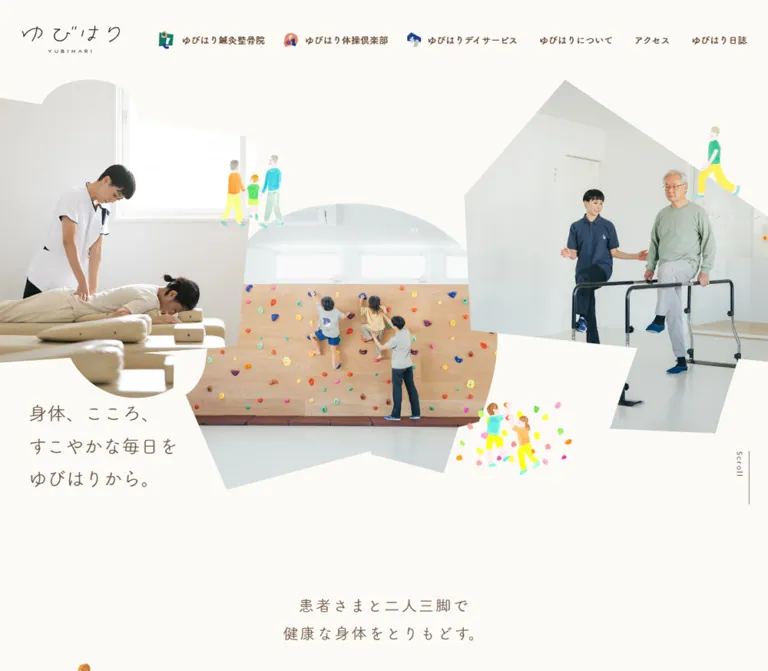
Yubihari is a local healthcare and activity-service homepage connecting an acupuncture and osteopathic clinic, a children's exercise club, and a walking-training day service. Its structure supports service discovery, local information, updates, and contact. The opening composition introduces those three services through people and spaces before the page presents conventional information blocks.
The strongest visual relationship is between irregular photographic silhouettes and quiet typography. Bright rooms and natural interactions occupy large, overlapping cutouts. Small watercolor-like figures sit around their edges, while brown rounded Japanese type rests on a nearly white ivory background. Below this expressive opening, three orderly white cards repeat the service identities in green, coral, and blue. Broad gaps between sections keep the page gentle despite its substantial content.
閉じる
Yubihari — Style Reference
Bright care photography, small painted people, and generous warm-paper space.
Website: yubihari.com
Original URL: https://yubihari.com/
Final URL: https://yubihari.com/
Theme: light; warm ivory canvas, brown typography, and three service accents.
Inspected: October 2, 2026, 01:50 JST, from the supplied browser inspection recorded at 2026-10-01T16:50:46.051Z.
Viewports: desktop 1440 × 1000 and mobile 390 × 844 CSS pixels.
Scope: the current homepage: persistent header, introductory photo composition, care statement, three service cards, diary entries, Instagram section, and contact footer. Navigation markup and transition declarations were supplied; opened menus and destination pages were not visually inspected.
Yubihari is a local healthcare and activity-service homepage connecting an acupuncture and osteopathic clinic, a children's exercise club, and a walking-training day service. Its structure supports service discovery, local information, updates, and contact. The opening composition introduces those three services through people and spaces before the page presents conventional information blocks.
The strongest visual relationship is between irregular photographic silhouettes and quiet typography. Bright rooms and natural interactions occupy large, overlapping cutouts. Small watercolor-like figures sit around their edges, while brown rounded Japanese type rests on a nearly white ivory background. Below this expressive opening, three orderly white cards repeat the service identities in green, coral, and blue. Broad gaps between sections keep the page gentle despite its substantial content.
How to Read This Reference
- Measured means a value appears in the supplied rendered DOM or computed-style evidence. Dimensions use CSS pixels.
- Declared means a custom property or transition exists in the evidence; this does not establish that every component uses it.
- Derived means arithmetic from measured bounds, such as the gap between adjacent cards.
- Visual estimate means an approximation from the current-page screenshots. Estimated colors were not independently sampled.
- Recommended means guidance for a new implementation. The Quick Start uses new class names, approximate masks, and proposed breakpoints; it is not the original stylesheet.
- Computed font stacks identify requested families, not a verified font file for every glyph. Hidden navigation can have measurable bounds without being visible.
- Desktop images cover the opening, service cards, and lower page. Mobile images cover the opening and lower page. DOM evidence supplies additional measurements for intervening sections.
Tokens — Colors
Main Palette
| Name | Value | Source or reuse token | Role and evidence |
|---|---|---|---|
| Warm Ivory | #fcfaf6 |
Source --bg-color, --color-vista-white |
Measured HTML/body background; the main page canvas |
| Body Brown | #665241 |
Source --base-text-color, --color-kabul |
Measured body copy, hero statement, and ordinary links |
| Heading Brown | #6a513e |
Source --color-shingle-fawn |
Measured section headings, diary links, and footer text |
| Navigation Brown | #644630 |
Source --color-spice |
Measured desktop primary navigation text |
| White | #ffffff |
Source --color-white |
Measured service-card and footer backgrounds; white action labels |
| Taupe | #957d6c |
Source --color-almond-frost |
Exact declared value; visually consistent with neutral pills and social circles, although their fill-bearing layers were not sampled |
| Pale Cream | #fcf5e4 |
Source --color-old-lace |
Exact declared value; visually consistent with the Instagram panel, whose inner background element was not sampled |
| Fine Gray | #ebebeb |
Source --line-color, --color-cararra |
Declared rule color; suitable for restrained separators, but individual border bindings were not supplied |
Service Accents
| Service | Approximate value | Reuse alias | Visible application |
|---|---|---|---|
| Clinic | #127868 |
--color-clinic |
Green detail pill and corresponding geometric emblem |
| Exercise club | #e98b6d |
--color-exercise |
Coral detail pill and corresponding emblem |
| Day service | #223e91 |
--color-day |
Deep blue detail pill and corresponding emblem |
These three hexadecimal values are visual approximations, not recovered source variables. Replace them with verified artwork or stylesheet colors when those become available.
The palette has distinct responsibilities. Ivory separates the overall page from white cards; brown carries readable information; service colors identify destinations. The illustrations introduce brighter yellow, mint, pink, and turquoise in small areas. Those illustration colors should not become an unrestricted interface palette.
The desktop header has a measured background of rgba(252, 250, 246, 0.9). The initial mobile header is transparent. The mobile lower-page capture also shows artwork behind the persistent identity area. No backdrop blur was established.
Tokens — Typography
Rounded Japanese Body Text
The measured body stack is:
font-family: YakuHanJPs, TsukuARdGothicStd-R, 'Hiragino Sans',
  '游ゴシック', 'Yu Gothic', yugothic, 'San Francisco', meiryo,
  'Hiragino Kaku Gothic ProN', sans-serif;
Body text uses weight 300, generally 15px / 27.99px, with 0.375px tracking. Its light strokes, open spacing, and rounded forms are central to the page's calm character. The typography is not uniformly Mincho: a Mincho stack is declared, but the sampled hero copy, paragraphs, and headings use the rounded Gothic stack.
Navigation and Action Labels
Desktop primary navigation requests TsukuARdGothicStd-B, sans-serif at 14px, weight 700. Service action labels request FOT-筑紫A丸ゴシック Std B, while their reported CSS weight is 300. Preserve this distinction between the family name and the numeric weight; do not infer that the action labels use the same regular face as body copy.
The navigation's compact, stronger lettering anchors an otherwise light interface. Service labels are short and centered inside broad pills.
Latin Details
Dates request a stack beginning with Lato. Copyright requests Lato, sans-serif. Both use weight 300 and pronounced tracking. Latin details remain small supporting information rather than a second display typography system.
Brand and Service Lockups
The main wordmark consists of thin, handwritten-looking Japanese lettering with a tiny, widely spaced YUBIHARI line below it. Its measured box is 148 × 41px at both inspected viewport widths. The service cards repeat delicate brand/service lockups beside colored emblems.
The evidence does not identify the lettering's font or expose its asset format. Treat these lockups as artwork to preserve, rather than typesetting an assumed substitute font.
Type Scale
| Role | Desktop size / line height | Mobile size / line height | Weight | Tracking |
|---|---|---|---|---|
| Body and service descriptions | 15 / 27.99px |
15 / 27.99px |
300 |
0.375px |
| Hero statement | 35.568 / 62.244px |
17 / 29.75px |
300 |
Normal |
| Care-statement heading | 26 / 45.999px |
20 / 40px |
400 |
2.6px desktop; 1px mobile |
| Care-statement paragraph | 17 / 45.999px |
16 / 36px |
300 |
0.85px desktop; 0.8px mobile |
| Diary section heading | 26 / 45.999px |
20 / 40px |
400 |
2.6px desktop; 2px mobile |
| Diary introduction | 15 / 27.99px |
14 / 23.999px |
300 |
0.375px |
| Diary date | 13 / 13.26px |
Same | 300 |
1.3px |
| Diary entry title | 15 / 24px |
Same | 400 |
0.375px |
| Service action label | 15 / 15.3px |
11 / 11.22px |
300, bold-named family |
0.375px |
| Follow/contact link text | 15 / 15.3px |
15 / 15.3px |
300 |
1.125px |
| Footer name | 24 / 24.48px |
20 / 20.4px |
400 |
0.375px |
| Footer service summary | 13 / 19.5px |
Same | 300 |
0.375px |
| Copyright | 11 / 11.22px |
Same | 300 |
1.1px |
The root font size is measured at 16px. A declared --font-size-base: 12px does not equal the actual body size. Copy the measured component values rather than deriving every size from that variable.
Tokens — Spacing & Shapes
Density: spacious page sections, moderately padded cards, compact navigation.
Geometry: irregular hero silhouettes, rectangular photos, 16px service-card corners, pill actions, and circular social links.
Spacing Measurements
| Use | Desktop | Mobile | Evidence |
|---|---|---|---|
| General section padding | 32px each side |
28px each side |
Measured |
| Service-card padding | 45px 40px 0 |
37px 32px 0 |
Measured on the outer link |
| Gap between service surfaces | 42px horizontally |
60px vertically |
Derived from card bounds |
| Care heading to paragraph | About 55.5px |
45px |
Derived |
| Care section end to services | About 225.5px |
74px |
Derived |
| Service surfaces end to diary | 172px |
112px |
Derived; excludes protruding pill clearance |
| Diary end to social section | 126px |
90px |
Derived |
| Main bottom padding | 200px |
100px |
Measured |
| Footer bottom padding | 50px |
35px |
Measured |
These gaps are not one uniform spacing scale. The opening and care statement have a slower rhythm than the information sections.
Layout Measurements
| Element | Desktop 1440 × 1000 |
Mobile 390 × 844 |
|---|---|---|
| Initial header | 120px high |
80px high |
| Declared compact header height | 80px |
65px |
| Main wordmark | 148 × 41px, at approximately 33, 38.5 |
148 × 41px, at 121, 39 |
| Service group | 1286px wide, beginning at x=77 |
334px wide, beginning at x=28 |
| Individual service surface | About 400.66 × 549.83px |
334px wide; heights 457.61, 458.59, and 430.25px |
| Service text width | About 320.66px |
270px |
| Service action pill | 240 × 63.30px |
192 × 58px |
| Pill extension below service surface | About 31.65px |
29px |
| Diary link region | 756px wide |
278px wide |
| Diary date column | 111px |
111px |
| Instagram tiles | Three 187 × 187px tiles |
Four approximately 140.22px square tiles |
| Follow pill | 240 × 63.30px |
Same |
| Footer content width | 1088px |
334px |
| Contact link | 240 × 63.30px |
197 × 55.30px |
| Footer social circles | 49px diameter |
39px diameter |
| Document height | 4244px, reported rounded |
4747px, reported rounded |
The mobile contact wrapper is measured at 240px, but its actual anchor is only 197px wide. Use the anchor measurement when reproducing the visible control.
Shape Rules
Service surfaces have a measured 16px radius. Their photos remain rectangular with square corners. Action labels have very large reported radii—1440px desktop and 844px mobile—which simply produce pills at their measured dimensions. A reusable implementation can use 999px.
The diary panel appears similarly rounded, but its radius was not directly sampled. Its approximately 16px treatment is a visual estimate. The social section uses a pale field with a rounded lower edge on desktop and a contained rounded panel on mobile.
Hero masks are custom compositions. The left silhouette combines slanted edges with rounded protrusions, the middle uses a broad arch above an angular base, and the right has a roof-like outline and an irregular lower extension. Replacing all three with identical rounded rectangles would remove the page's primary visual feature.
Components
Persistent Header
Role: identity and access to three services plus supporting information.
At desktop width, the wordmark sits near the left edge within a 120px header. Six primary destinations run across the right: three icon-and-label service links followed by About, Access, and Diary. Service icons are small, colorful geometric emblems, visually around 21–27px high. Primary labels use the stronger rounded face at 14px.
The DOM also contains clinic and day-service sublinks for concepts, facilities, fees, and other details. These use 12px bold-family text. Their presence does not prove a particular hover or click trigger; the supplied screenshots show the closed primary navigation state.
On mobile, the full desktop navigation disappears. The wordmark is centered and remains 148px wide. A three-line menu symbol sits at the right. The measured Open Navigation button is 28 × 28px at x=334, y=37 in the initial viewport.
The header remains visible in lower-page captures. Compact-height variables are present, and the logo sits higher in the scrolled mobile capture. Exact positioning rules and the scroll threshold were not supplied. The evidence supports a persistent header with compact states, without establishing whether its source uses fixed or sticky positioning.
A separate navigation structure contains a home link, the main destinations, contact, social links, and Close Navigation. Its open appearance, focus handling, and scrolling behavior remain unverified.
Introductory Photo Composition
Role: introduce the three services through real people, with the brand promise embedded in the composition.
The desktop composition begins below the initial 120px header. A treatment photograph occupies the left, a children's climbing-wall photograph sits lower in the center, and a walking-training photograph rises on the right. Their boundaries overlap spatially, with ivory gaps and cutouts keeping the composition open.
The three-line statement—身体、こころ、 / すこやかな毎日を / ゆびはりから。—sits in the lower-left negative space. Its measured desktop box begins at approximately x=52.7, y=712.4, and its type is 35.568px / 62.244px. It is a paragraph in the supplied DOM; the page's H1 wraps the brand artwork.
On mobile, the composition is deliberately rearranged. The treatment photo moves to the upper left, the statement occupies the upper right, the exercise photo fills the middle right, and the walking scene sits below on the left. The statement begins at approximately x=229.7, y=140.3, using 17px / 29.75px type.
The mobile capture shows an acupuncture close-up and a close view of climbing holds where the desktop capture shows wider scenes. This establishes different captured imagery, but not its cause: responsive asset selection and changes over time cannot be distinguished from these images alone.
Small painted figures connect the scenes: a family, climbing children, and a walking person. Keep them separate from the photographic masks so they can cross edges without being clipped.
A vertical Scroll link sits near the right edge beside a fine vertical line. Its destination is the observed #content anchor. Smooth scrolling or line animation was not verified.
Care Statement
Role: explain the shared philosophy behind the three services.
The section contains a two-line heading followed by an unusually airy paragraph. The desktop DOM records 26px / 46px heading text and 17px / 46px paragraph text. On mobile these become 20px / 40px and 16px / 36px respectively.
The content explains the progression from the clinic to the exercise club and walking-focused day service, emphasizing personal support. Keep this as readable prose with deliberate line breaks and space around it.
The mobile opening capture shows a centered heading near the bottom of the viewport. Desktop alignment for this section is not independently visible in the supplied current-page screenshots; the centered desktop treatment in the Quick Start is a recommendation. The DOM does establish its generous spacing and full available content box.
Service Card
Role: a complete linked introduction to one service.
Each desktop card is a white, rounded surface approximately 401px wide and 550px tall. The anatomy is:
- A delicate service lockup at the upper left and a geometric colored emblem at the upper right.
- A bright landscape photograph beneath a generous gap.
- A short brown paragraph, generally three desktop lines.
- A centered service-colored
さらに詳しくpill overlapping the bottom edge.
The visible photo is approximately 321 × 186px, a visual estimate from the desktop service capture. Its crop is close to a 1.73:1 landscape ratio. The source image dimensions were not supplied.
The outer card is an anchor to /shinkyu/, /taisou/, or /dayservice/. The pill label is a paragraph inside that anchor, not a nested button. Preserve one interactive target per card in a new implementation.
At mobile width, the cards stack in the same order. They measure 334px across, with 32px inner side padding and 270px text width. Description text stays at 15px; the first two descriptions occupy four lines, while the last occupies three. Card heights therefore differ. Do not force equal mobile heights.
The pill overlaps the desktop surface by half its 63.3px height and the mobile surface by half its 58px height. The outer surface must allow visible overflow.
Pill Action
Role: a calm, recognizable destination cue.
Pills use centered white text with a thin right-pointing arrow near the right edge. They have broad horizontal breathing room, no visible outline, and no elevated shadow. Service pills use green, coral, or blue; contact and Follow actions use taupe.
The Follow pill retains its 240px width on mobile. Service pills shrink to 192px, while the mobile contact anchor becomes 197px. A single universal mobile button width would miss these distinctions.
The sampled label nodes often report a transparent background even though the screenshots show solid pills. Their visual fill belongs to an unsampled surrounding or decorative layer. Reproduce the visible fill without claiming a specific pseudo-element implementation.
Diary Panel and Entry Row
Role: publish current notices within the broader service homepage.
A large white rounded panel follows the service cards. Its heading, ゆびはり日誌, is centered. The desktop capture shows a small illustration of two seated people overlapping its upper-right area.
The desktop heading begins approximately 43px below the panel top. The supporting paragraph uses 15px / 28px type. The entry list is narrower than the panel: 756px, centered at x=342.
Each entry is an anchor laid out with a 111px date column and a flexible title column. Dates use tracked Lato at 13px; titles use rounded Japanese text at 15px / 24px. Sampled rows have 33px vertical padding and measured heights of 81px when the title stays on one line.
On mobile, the inner region is 278px wide, with a 111px + 167px grid. The date remains beside the title. The first measured title wraps and increases its row to 105px. Preserve wrapping instead of truncating notices or automatically converting every row into a stacked date/title block.
The supplied entries concern fees and holiday schedules. Their dates are content, not the website inspection date.
Instagram Health-Tips Section
Role: connect the clinic's educational illustration content with its social account.
Desktop composition is asymmetric. A pale cream field extends to the left viewport edge; explanatory copy and three square tiles sit inside it. A narrow title area appears to the right, with vertically arranged Japanese lettering and small character artwork. Official Instagram is present in the desktop rendered text.
The paragraph is measured at 670px wide, starting at x=177. Three 187px square tiles begin at x=177, 416, and 655, giving derived horizontal gaps of 52px. The taupe Follow pill aligns with the first tile and overlaps the lower panel boundary.
On mobile, the section becomes a contained 334px panel with 22px internal side insets, producing a 290px content region. Its heading is above the copy. Four approximately 140px square tiles form a two-by-two grid with roughly 9.5px gutters. A fourth post link is present in the mobile DOM and screenshot; it is not simply the desktop three-tile row stacked vertically.
The Follow pill is centered at x=75, remains 240 × 63.3px, and extends below the cream surface. Mobile copy uses 14px / 24px text.
Contact Footer
Role: provide a stable local identity, location link, contact route, and social links.
The footer changes the canvas to pure white. Desktop content is constrained to 1088px, beginning at x=176. The organization name, service summary, linked postal address, and contact pill occupy the left. The lower row places copyright at the left and two taupe social circles at the right.
The page displays ゆびはり and the address 610-1123 京都市西京区大原野上里南ノ町165. The address links to a map destination; no embedded map appears in the inspected footer.
Desktop social circles are 49px with a 20px gap. Mobile circles are 39px with a 25px gap. On mobile they move beneath the contact control and above copyright, all left aligned. The address breaks after the postal code.
Retain the broad empty area to the right on desktop and the deliberate vertical spacing on mobile. This footer is a quiet contact block rather than a dense sitemap.
Tokens — Motion & Interaction
The following are computed transition declarations, not complete recordings of their triggers or visual endpoints.
| Element | Supplied declaration | What can be concluded |
|---|---|---|
| Header | opacity 0.6s ease-out, background 0.3s ease-out |
Header opacity and background can transition |
| Main wordmark wrapper | transform 0.25s ease-out |
A transform transition is defined; exact transform values are unavailable |
| Ordinary links | color 0.2s ease-out |
Short color feedback is declared |
| Desktop service sublinks | opacity 0.3s ease-out |
Opacity feedback is defined; opening trigger is unverified |
| Hero statement and several section text blocks | opacity 1s cubic-bezier(0.69, 0, 0.33, 1) |
A slow text-opacity transition is available |
| Diary and social post links | opacity 0.2s ease-out |
Short opacity feedback is available |
| Open-navigation control | transform 0.25s ease-out, opacity 0.25s ease-out |
Compact control transitions are declared |
| Close-navigation control | opacity 0.5s ease-out |
A longer opacity transition is defined |
| Navigation entries | opacity 0.5s ease-out, plus a zero-duration transform reset delayed 0.6s |
A staged navigation sequence is suggested by CSS, but its open state was not exercised |
| Navigation wordmark | opacity 0.5s ease-out 0.6s |
A delayed opacity transition is declared |
Sampled nodes report animation: none. This does not rule out animation on omitted wrappers, images, pseudo-elements, or JavaScript-driven properties. Conversely, declared easing variables and Swiper-related variables do not prove a hero carousel.
The capture process waited for document load, image decoding, layout stability, and eligible finite motion, with bounded timeouts. Perpetual animations were temporarily paused during readiness checks. These are settled views, not evidence of every opening sequence or delayed state.
Observed link destinations establish service navigation, diary articles, contact, map access, Instagram posts, and LINE. Hover endpoints, menu opening, smooth-scroll behavior, autoplay, parallax, and image-change timing remain unverified.
For a new implementation, use restrained opacity feedback and preserve content visibility when motion is disabled. Any added arrow movement or scroll reveal should be labeled as an adaptation.
Surfaces
| Layer | Appearance | Purpose |
|---|---|---|
| Page canvas | Solid #fcfaf6 |
Connects all sections and softens the photography |
| Desktop header | Ivory at measured 0.9 alpha |
Maintains navigation over the page |
| Mobile header | Transparent in the initial measured state | Allows the composition to extend behind the identity area |
| Service surfaces | White, 16px corners |
Organizes the three destinations |
| Diary panel | White, visibly rounded | Separates notices from the surrounding canvas |
| Social field | Pale cream, asymmetric desktop extent | Gives the illustrated health tips a distinct area |
| Footer | Solid white | Creates a quiet, practical ending |
| Action fills | Service accents or taupe | Identifies destinations without adding elevation |
There is no visible general-purpose shadow system. Hierarchy comes from spacing, silhouette, typography, and the small difference between white and ivory.
Imagery
Photography is bright and natural, with white rooms, pale flooring, neutral clothing, and soft daylight. The scenes communicate specific activities: treatment, children learning movement, and supported walking. Preserve the interaction between people and equipment; a crop that removes the therapist's hands, climbing action, or walking frame weakens the service explanation.
The opening uses custom cutouts, while service cards use simple landscape rectangles. The same content world is therefore introduced expressively and then repeated in a more legible informational format.
Decorative people have thin, uneven contours and translucent painted fills. Bright clothing supplies small flashes of yellow, orange, green, and turquoise. They remain small relative to the photographs. Service emblems use a different language: compact, flat geometric shapes in each service color. Keep these two illustration systems distinct.
The health-tip tiles contain sparse hand-drawn linework, muted gray lettering, and pale pink accents. The cat and hedgehog characters appear in the section artwork and posts. These drawings should remain quiet enough to fit the surrounding warm canvas.
Observed Asset References
Image source URLs and original mask files were not included in the supplied evidence. This inventory identifies visible assets without inventing filenames.
| Asset group | Visible reference | Implementation guidance |
|---|---|---|
| Main wordmark | Thin Japanese lettering above tracked YUBIHARI |
Preserve authorized artwork and its approximately 148:41 displayed ratio |
| Three service emblems | Green, coral, and blue geometric symbols | Reuse the same identities in navigation and cards |
| Hero photography | Treatment, climbing, and walking scenes | Supply independently art-directed crops for the custom masks |
| Service photography | Bright landscape scenes in the three white cards | Keep rectangular crops and consistent displayed proportions |
| Decorative people | Family, walkers, climbers, seated figures | Use transparent assets outside photo clipping layers |
| Health-tip artwork | Illustrated square posts and small characters | Preserve square composition and embedded lettering |
Use original assets only when authorized. The Quick Start's asset names are proposed local project files, not observed website paths.
Layout & Responsive Behavior
| Relationship | Desktop observation | Mobile observation |
|---|---|---|
| Header | Left-aligned logo and six visible primary links | Centered logo and right-side menu control |
| Hero composition | Three broad overlapping scenes across the viewport | Staggered vertical composition with alternating image positions |
| Hero copy | Large, lower left | Smaller, upper right |
| Care statement | Measured 26px heading and 17px paragraph |
20px heading and 16px paragraph |
| Services | Three equal-height surfaces in one row | One column with content-dependent heights |
| Diary rows | 111px date plus wide title |
Same date width; narrower title wraps |
| Social tiles | Three items in one row | Four items in a two-by-two grid |
| Social title | Separate right-hand title area | Heading above copy inside the panel |
| Footer | Wide left contact block; social links at lower right | Contact, social links, and copyright stacked at the left |
The inspected page uses declared content widths of 720, 752, 904, 1088, 1286, and 1366px. Measured components do not always equal the nearest named token: the diary link region is 756px, for example.
The declared base grid changes from twelve columns with a 16px gap to eight columns with an 8px gap. This is supporting layout infrastructure, not proof that every visible section directly uses that grid.
Only the two supplied viewport widths were inspected. Actual breakpoints, tablet behavior, landscape-phone layouts, maximum hero scaling, and text-zoom behavior are unknown. The Quick Start introduces separate proposed breakpoints for header collapse and content stacking so intermediate widths do not depend on uniform scaling.
Do’s and Don’ts
Do
- Begin with ivory
#fcfaf6, brown body text, and white information surfaces. - Preserve the three distinct service accents and repeat them consistently in emblems and actions.
- Give the hero three different photographic silhouettes with purposeful negative space.
- Art-direct mobile composition independently, including the statement's move to the upper right.
- Keep body text light, rounded, and generously led.
- Preserve the whole-card service links and half-overlapping action pills.
- Let mobile card heights follow their descriptions.
- Keep diary dates beside titles at the inspected mobile width.
- Use small painted people as edge details and transitions between sections.
- Preserve the footer's simple location, contact, and social structure.
Don’t
- Replace the opening with a single rectangular banner and a centered oversized headline.
- Turn every photograph into the same generic blob or rounded card.
- Apply a clinical blue theme across all services.
- Replace rounded Japanese text with a heavy geometric sans-serif throughout.
- Infer a display font from the illustrated wordmark.
- Add glossy gradients, glass panels, or a universal drop shadow.
- Make the pill a nested button inside the linked service card.
- Assume the desktop social section contains the same number of tiles as mobile.
- Treat transparent sampled label backgrounds as evidence that the visible pills are unfilled.
- Invent a carousel, parallax sequence, or menu animation from static captures and unused variables.
Recommended Implementation Additions
These are improvements for a new implementation, not verified features of the original page:
- Give the image-based identity an accessible name. Use empty alternatives for decorative people and concise descriptive alternatives for meaningful service photos.
- Keep one anchor per service card and provide a visible focus outline around the entire card, including its relationship to the protruding pill.
- Expand the
28pxmenu-control hit area and39pxmobile social targets to at least44pxwithout necessarily enlarging their visible artwork. - Verify white-label contrast on coral and taupe. Darken fills or adjust label color where needed; keep the original visual estimates separate from accessibility-adjusted tokens.
- Consider increasing the measured
11pxmobile service-action label to13–15pxfor readability. - Implement menu state, keyboard access, focus restoration, and background scroll behavior explicitly. The supplied DOM labels do not establish that these behaviors already work.
- Preserve visible content without JavaScript and under reduced-motion preferences. Avoid a permanently transparent initial state for reveal effects.
- Use intrinsic image dimensions and art-directed image sources to prevent layout movement while preserving faces, hands, and equipment inside masks.
Agent Prompt Guide
Quick Color Reference
- Canvas:
#fcfaf6. - Main copy:
#665241. - Headings and footer:
#6a513e. - Primary navigation:
#644630. - Information surfaces:
#ffffff. - Neutral-action starting point: declared taupe
#957d6c. - Social-panel starting point: declared pale cream
#fcf5e4. - Approximate service accents: green
#127868, coral#e98b6d, blue#223e91. - Avoid shadows as the main separator; use whitespace and white-on-ivory surface changes.
Overall Prompt
“Create a Japanese local healthcare homepage with three equal service identities: a clinic, a children's exercise club, and a walking-training day service. Use warm ivory, light brown rounded Japanese typography, bright natural photography, and small watercolor-like people. Compose three large photographs inside different irregular masks across the desktop opening, with a quiet three-line statement in the lower-left negative space. Recompose the opening vertically on mobile, placing the statement at the upper right. Follow with spacious explanatory prose, three white rounded service cards with colored pills overlapping their lower edges, a restrained diary panel, an illustrated social section, and a simple white contact footer. Preserve generous whitespace and avoid decorative elevation.”
Example Component Prompts
- Opening composition: “Build three overlapping photographic cutouts: a slanted treatment frame with rounded protrusions at left, an arched climbing-wall frame in the lower center, and a roof-like walking-training frame at right. Keep the page ivory visible between shapes. Place small painted figures outside the clipping layers and a vertical Scroll cue at the right.”
- Service card: “Create a white service-card anchor with a 16px radius, a delicate service lockup, a geometric colored emblem, a square-cornered landscape photo, and 15px brown text with 28px line height. Center a 240px colored detail pill halfway across the bottom edge. Stack the cards on mobile and reduce the pill to 192px.”
- Diary: “Create a white rounded information panel with a centered, lightly tracked Japanese heading. Put dated notices in a narrow list. Use a fixed 111px date column with small tracked Latin numerals and a flexible Japanese title column that wraps naturally on mobile.”
- Health tips: “Use a pale cream desktop field bleeding to the left edge, with three square illustrated posts and a separate narrow title area on the right. On mobile use an inset rounded panel, heading above copy, four posts in a two-by-two grid, and a centered taupe Follow pill overlapping the bottom.”
- Footer: “Build a quiet white footer with the organization name, small service summary, linked postal address, and taupe contact pill. Use a 1088px desktop container. Keep social circles at the lower right on desktop and move them below contact, above copyright, on mobile.”
Quick Start
CSS Custom Properties
This is a reusable adaptation with a conventional 16px root. Exact observed colors and dimensions are mixed with explicitly approximate service colors and hero geometry. The 78rem header breakpoint and 48rem content breakpoint are recommendations, not recovered source rules. Header compaction and menu opening require application logic.
:root {
  /* Observed colors and declared source palette */
  --color-paper: #fcfaf6;
  --color-surface: #fff;
  --color-ink: #665241;
  --color-heading: #6a513e;
  --color-navigation: #644630;
  --color-taupe: #957d6c;
  --color-cream: #fcf5e4;
  --color-rule: #ebebeb;

  /* Visual approximations; verify against authorized assets */
  --color-clinic: #127868;
  --color-exercise: #e98b6d;
  --color-day: #223e91;

  --font-body: 'YakuHanJPs', 'TsukuARdGothicStd-R',
    'Hiragino Sans', 'Yu Gothic', meiryo, sans-serif;
  --font-strong: 'TsukuARdGothicStd-B', 'Hiragino Sans', sans-serif;
  --font-latin: 'Lato', sans-serif;

  --page-gutter: 32px;
  --content-wide: 1286px;
  --content-footer: 1088px;
  --header-height: 120px;
  --header-compact: 80px;
  --radius-panel: 16px;
  --radius-pill: 999px;
  --service-gap: 42px;
  --ease-reveal: cubic-bezier(0.69, 0, 0.33, 1);
}

* { box-sizing: border-box; }
html { font-size: 16px; }
body {
  margin: 0;
  color: var(--color-ink);
  background: var(--color-paper);
  font-family: var(--font-body);
  font-size: 15px;
  font-weight: 300;
  line-height: 1.866;
  letter-spacing: 0.025em;
}
img { display: block; max-width: 100%; }
a { color: inherit; }
button { font: inherit; }
h1, h2, h3, p { margin: 0; }

.page-width {
  width: min(var(--content-wide), calc(100% - 2 * var(--page-gutter)));
  margin-inline: auto;
}
.site-main {
  padding-top: var(--header-height);
  padding-bottom: 200px;
}
#content { scroll-margin-top: calc(var(--header-compact) + 24px); }

.site-header {
  position: fixed;
  inset: 0 0 auto;
  z-index: 20;
  display: flex;
  align-items: center;
  justify-content: space-between;
  height: var(--header-height);
  padding-inline: var(--page-gutter);
  background: rgb(252 250 246 / 90%);
  transition: opacity 600ms ease-out, background 300ms ease-out;
}
.site-header[data-compact='true'] { height: var(--header-compact); }
.site-brand img { width: 148px; height: 41px; object-fit: contain; }
.primary-nav { display: flex; align-items: center; gap: 38px; }
.primary-nav a {
  display: inline-flex;
  align-items: center;
  gap: 12px;
  color: var(--color-navigation);
  font-family: var(--font-strong);
  font-size: 14px;
  font-weight: 700;
  line-height: 1.02;
  text-decoration: none;
}
.primary-nav img { width: 24px; max-height: 27px; object-fit: contain; }
.nav-toggle { display: none; }

/* Recommended silhouette placement, approximated from captures */
.hero {
  position: relative;
  height: min(64.74vw, 1040px);
  overflow: hidden;
}
.hero__scene { position: absolute; margin: 0; }
.hero__scene img { width: 100%; height: 100%; object-fit: cover; }
.hero__scene--clinic {
  left: -2%; top: 0; width: 36%; height: 65%;
  clip-path: url(#clinic-cutout);
}
.hero__scene--exercise {
  left: 24.2%; top: 25%; width: 40.7%; height: 57.7%;
  clip-path: url(#exercise-cutout);
}
.hero__scene--day {
  left: 60.4%; top: 0; width: 43%; height: 71.2%;
  clip-path: url(#day-cutout);
}
.hero__copy {
  position: absolute;
  left: 3.66%; top: 63.5%;
  z-index: 2;
  font-size: clamp(22px, 2.47vw, 40px);
  line-height: 1.75;
  letter-spacing: normal;
}
.hero__decoration { position: absolute; z-index: 3; pointer-events: none; }
.hero__decoration--family { left: 28.8%; top: 14.4%; width: 8.5%; }
.hero__decoration--climbers { left: 59.7%; top: 64.2%; width: 15%; }
.hero__decoration--walker { left: 91%; top: 9%; width: 6%; }
.hero__scroll {
  position: absolute;
  right: 26px; top: 77.5%;
  font-size: 11px;
  letter-spacing: 0.1em;
  writing-mode: vertical-rl;
  text-decoration: none;
}
.hero__scroll::after {
  content: '';
  position: absolute;
  top: 0; right: -8px;
  height: 80px;
  border-right: 1px solid currentColor;
}

/* Centered desktop prose is an adaptation; alignment was not sampled. */
.intro {
  width: min(1366px, calc(100% - 2 * var(--page-gutter)));
  margin-inline: auto;
  text-align: center;
}
.section-heading {
  color: var(--color-heading);
  font-size: 26px;
  font-weight: 400;
  line-height: 1.7692;
  letter-spacing: 0.1em;
}
.intro__copy {
  margin-top: 55.5px;
  font-size: 17px;
  line-height: 46px;
  letter-spacing: 0.05em;
}

.service-grid {
  display: grid;
  grid-template-columns: repeat(3, minmax(0, 1fr));
  gap: var(--service-gap);
  margin-top: 225px;
}
.service-card {
  --service-color: var(--color-clinic);
  position: relative;
  display: flex;
  flex-direction: column;
  min-width: 0;
  min-height: 550px;
  padding: 45px 40px 80px;
  background: var(--color-surface);
  border-radius: var(--radius-panel);
  text-decoration: none;
}
.service-card--exercise { --service-color: var(--color-exercise); }
.service-card--day { --service-color: var(--color-day); }
.service-card__identity {
  display: flex;
  align-items: flex-start;
  justify-content: space-between;
  gap: 20px;
  min-height: 72px;
}
.service-card__lockup { width: 148px; max-width: 65%; }
.service-card__emblem { width: 68px; max-width: 25%; }
.service-card__photo {
  width: 100%;
  aspect-ratio: 1.73;
  margin-top: 45px;
  object-fit: cover;
}
.service-card__description { margin-top: 18px; }
.pill {
  position: relative;
  display: flex;
  align-items: center;
  justify-content: center;
  width: 240px;
  max-width: 100%;
  min-height: 63.3px;
  padding: 18px 42px;
  border-radius: var(--radius-pill);
  color: #fff;
  background: var(--color-taupe);
  font-size: 15px;
  line-height: 1.02;
  letter-spacing: 0.075em;
  text-decoration: none;
}
.pill::after {
  content: '→';
  position: absolute;
  right: 18px;
  font-family: sans-serif;
  font-size: 22px;
  font-weight: 300;
}
.service-card__action {
  position: absolute;
  left: 50%; bottom: -31.65px;
  transform: translateX(-50%);
  background: var(--service-color);
  font-family: var(--font-strong);
  letter-spacing: 0.025em;
}

.diary {
  margin-top: 172px;
  padding: 43px 32px 50px;
  border-radius: var(--radius-panel);
  background: var(--color-surface);
}
.diary > .section-heading, .diary__intro { text-align: center; }
.diary__intro { margin-top: 32px; }
.diary__list { width: min(756px, 100%); margin: 71px auto 0; }
.diary__row {
  display: grid;
  grid-template-columns: 111px minmax(0, 1fr);
  padding-block: 33px;
  color: var(--color-heading);
  text-decoration: none;
  transition: opacity 200ms ease-out;
}
/* Recommended subtle separator; the source border was not sampled. */
.diary__row + .diary__row { border-top: 1px solid var(--color-rule); }
.diary__date {
  padding-top: 1.3px;
  font-family: var(--font-latin);
  font-size: 13px;
  line-height: 1.02;
  letter-spacing: 0.1em;
}
.diary__title { font-size: 15px; font-weight: 400; line-height: 24px; }

.social {
  display: grid;
  grid-template-areas: 'content title';
  grid-template-columns: minmax(0, 1fr) 316px;
  gap: 40px;
  margin-top: 126px;
}
.social__title { grid-area: title; color: var(--color-heading); }
.social__vertical-label { writing-mode: vertical-rl; font-size: 26px; }
.social__content {
  grid-area: content;
  position: relative;
  isolation: isolate;
  padding: 50px 100px 85px;
}
.social__content::before {
  content: '';
  position: absolute;
  z-index: -1;
  inset: 0;
  left: min(0px, calc((1286px - 100vw) / 2));
  border-radius: 0 0 16px 0;
  background: var(--color-cream);
}
.social__copy { max-width: 670px; }
.social__tiles {
  display: grid;
  grid-template-columns: repeat(3, 187px);
  gap: 52px;
  margin-top: 49px;
}
.social__tile img { width: 100%; aspect-ratio: 1; object-fit: cover; }
.social__tile:nth-child(n + 4) { display: none; }
.social__follow { position: absolute; left: 100px; bottom: -31.65px; }

.site-footer {
  padding: 55px 0 50px;
  color: var(--color-heading);
  background: var(--color-surface);
}
.footer-inner {
  width: min(var(--content-footer), calc(100% - 2 * var(--page-gutter)));
  margin-inline: auto;
}
.footer-name { font-size: 24px; font-weight: 400; line-height: 1.02; }
.footer-services { margin-top: 13px; font-size: 13px; line-height: 1.5; }
.footer-address { margin-top: 24px; font-style: normal; }
.footer-address a { text-decoration: none; }
.footer-contact { margin-top: 36px; }
.footer-bottom {
  display: flex;
  justify-content: space-between;
  align-items: center;
  margin-top: 61px;
}
.footer-copyright {
  font-family: var(--font-latin);
  font-size: 11px;
  line-height: 1.02;
  letter-spacing: 0.1em;
}
.footer-socials { display: flex; gap: 20px; }
.footer-socials a {
  display: grid;
  place-items: center;
  width: 49px;
  height: 49px;
  border-radius: 50%;
  color: #fff;
  background: var(--color-taupe);
  text-decoration: none;
}

/* Proposed intermediate layout, not an observed source breakpoint */
@media (max-width: 78rem) {
  :root { --header-height: 80px; --header-compact: 65px; }
  .site-header { background: transparent; }
  .site-brand { position: absolute; left: 50%; top: 39px; transform: translateX(-50%); }
  .site-header[data-compact='true'] .site-brand { top: 25px; }
  .primary-nav { display: none; }
  .nav-toggle {
    position: absolute;
    right: calc(var(--page-gutter) - 8px);
    top: 29px;
    display: grid;
    place-items: center;
    width: 44px;
    height: 44px;
    padding: 8px;
    border: 0;
    color: inherit;
    background: transparent;
  }
  .social { grid-template-columns: minmax(0, 1fr) 180px; }
  .social__content { padding-inline: 40px; }
  .social__tiles { grid-template-columns: repeat(3, minmax(0, 1fr)); gap: 24px; }
  .social__follow { left: 40px; }
}

@media (max-width: 48rem) {
  :root { --page-gutter: 28px; }
  .site-main { padding-bottom: 100px; }
  .hero { height: 179vw; }
  .hero__scene--clinic { left: -4%; top: 0; width: 58%; height: 37.4%; }
  .hero__scene--exercise { left: 31%; top: 22.7%; width: 66%; height: 35%; }
  .hero__scene--day { left: 5.4%; top: 45.4%; width: 68%; height: 38.5%; }
  .hero__copy { left: 58.9%; top: 8.65%; font-size: 17px; line-height: 1.75; }
  .hero__decoration--family { left: 3%; top: 23.5%; width: 15%; }
  .hero__decoration--climbers { left: auto; right: 3%; top: 52%; width: 28%; }
  .hero__decoration--walker { left: 4%; top: 64.5%; width: 15%; }
  .hero__scroll { right: 16px; top: 75.9%; }
  .section-heading { font-size: 20px; line-height: 40px; }
  .intro .section-heading { letter-spacing: 0.05em; }
  .intro__copy { margin-top: 45px; font-size: 16px; line-height: 36px; text-align: left; }
  .service-grid { grid-template-columns: 1fr; gap: 60px; margin-top: 74px; }
  .service-card { min-height: 0; padding: 37px 32px 46px; }
  .service-card__identity { min-height: 60px; }
  .service-card__photo { margin-top: 29px; }
  .service-card__action { width: 192px; min-height: 58px; bottom: -29px; font-size: 11px; }
  .diary { margin-top: 112px; padding: 27px 28px 36px; }
  .diary__intro { margin-top: 19px; font-size: 14px; line-height: 24px; }
  .diary__list { margin-top: 36px; }
  .social {
    display: block;
    margin-top: 90px;
    border-radius: 16px;
    background: var(--color-cream);
  }
  .social__title { padding: 28px 22px 0; }
  .social__vertical-label { writing-mode: horizontal-tb; font-size: 20px; }
  .social__content { padding: 21px 22px 74px; }
  .social__content::before { display: none; }
  .social__copy { font-size: 14px; line-height: 24px; }
  .social__tiles { grid-template-columns: repeat(2, minmax(0, 1fr)); gap: 9.5px; margin-top: 35px; }
  .social__tile:nth-child(4) { display: block; }
  .social__follow { left: 50%; transform: translateX(-50%); }
  .site-footer { padding-block: 39px 35px; }
  .footer-name { font-size: 20px; }
  .footer-address { line-height: 24px; }
  .footer-contact { width: 197px; min-height: 55.3px; }
  .footer-bottom { flex-direction: column-reverse; align-items: flex-start; gap: 35px; margin-top: 64px; }
  .footer-socials { gap: 25px; }
  .footer-socials a { width: 39px; height: 39px; }
}

/* Recommended interaction additions, not verified source states */
:where(a, button):focus-visible {
  outline: 2px solid var(--color-ink);
  outline-offset: 5px;
}
@media (hover: hover) {
  .diary__row:hover, .social__tile:hover { opacity: 0.75; }
}
@media (prefers-reduced-motion: reduce) {
  .site-header, .diary__row { transition: none; }
}
The service card's extra bottom padding in this adaptation accommodates its absolute-positioned pill. It differs from the source outer link's measured padding-bottom: 0. Diary rows are allowed to grow naturally with line boxes rather than being forced to the measured desktop row height.
Markup Contract and Approximate Masks
Place the definitions once in the document. These normalized SVG paths are recommended approximations with rounded and angular sections, not extracted original masks. All image paths below are example local assets that must be supplied by the implementer.
<svg width='0' height='0' aria-hidden='true' focusable='false'
     style='position:absolute'>
  <defs>
    <clipPath id='clinic-cutout' clipPathUnits='objectBoundingBox'>
      <path d='M0 .05 L.20 .08 C.27 -.03 .57 -.02 .58 .13
               L1 .19 L.93 .78 L.73 .79
               C.78 1 .40 1.05 .31 .86 L0 .88 Z'/>
    </clipPath>
    <clipPath id='exercise-cutout' clipPathUnits='objectBoundingBox'>
      <path d='M.18 .20 C.20 -.05 .89 -.08 .95 .20
               L1 .55 L.82 .94 L.59 .87 L.18 1
               L.04 .66 L.12 .59 Z'/>
    </clipPath>
    <clipPath id='day-cutout' clipPathUnits='objectBoundingBox'>
      <path d='M.30 0 L1 .38 L1 .80 L.84 .78
               L.76 1 L.44 .99 L.53 .76 L.02 .71 L0 .33 Z'/>
    </clipPath>
  </defs>
</svg>

<section class='hero' aria-label='Yubihari services'>
  <figure class='hero__scene hero__scene--clinic'>
    <picture>
      <source media='(max-width: 48rem)' srcset='/assets/clinic-mobile.webp'>
      <img src='/assets/clinic-desktop.webp'
           alt='A practitioner treating a patient' fetchpriority='high'>
    </picture>
  </figure>
  <figure class='hero__scene hero__scene--exercise'>
    <img src='/assets/exercise.webp' alt='Children practicing on a climbing wall'>
  </figure>
  <figure class='hero__scene hero__scene--day'>
    <img src='/assets/walking.webp' alt='A staff member supporting walking practice'>
  </figure>
  <p class='hero__copy'>身体、こころ、<br>すこやかな毎日を<br>ゆびはりから。</p>
  <img class='hero__decoration hero__decoration--family'
       src='/assets/painted-family.webp' alt=''>
  <a class='hero__scroll' href='#content'>Scroll</a>
</section>

<a class='service-card' href='/shinkyu/'>
  <div class='service-card__identity'>
    <img class='service-card__lockup' src='/assets/clinic-lockup.svg'
         alt='ゆびはり鍼灸整骨院'>
    <img class='service-card__emblem' src='/assets/clinic-emblem.svg' alt=''>
  </div>
  <img class='service-card__photo' src='/assets/clinic-card.webp'
       alt='' loading='lazy'>
  <p class='service-card__description'>身体の“今ツラい”部分を緩和するだけではなく、いつも快適な状態へ。私たちの想いや処置についてお話しします。</p>
  <span class='pill service-card__action'>さらに詳しく</span>
</a>
Add explicit intrinsic image dimensions when preparing actual files. Apply equivalent mobile art direction to the exercise image when appropriate. The proposed <picture> mechanism is implementation guidance; the original image-switching mechanism was not exposed.
Tailwind v4 Token Mapping
Optional aliases for a project already using Tailwind v4. This is not evidence that the original website uses Tailwind. Define the properties above first.
@theme inline {
  --color-paper: #fcfaf6;
  --color-surface: #fff;
  --color-ink: #665241;
  --color-heading: #6a513e;
  --color-taupe: #957d6c;
  --color-cream: #fcf5e4;
  --color-clinic: #127868;
  --color-exercise: #e98b6d;
  --color-day: #223e91;
  --font-care: var(--font-body);
  --font-care-strong: var(--font-strong);
  --font-numerals: var(--font-latin);
  --text-body: 15px;
  --text-section: 26px;
  --text-date: 13px;
  --radius-panel: 16px;
  --radius-pill: 999px;
  --spacing-page: var(--page-gutter);
}
Sources & Evidence
- Yubihari homepage: both the requested original URL and the final URL; supplied HTTP status
200. - Capture timestamp:
2026-10-01T16:50:46.051Z, equivalent to October 2, 2026, 01:50 JST. - Desktop evidence:
1440 × 1000CSS-pixel viewport; three supplied current-page screenshots covering the opening, services, and lower page; rendered document height approximately4244px. - Mobile evidence:
390 × 844CSS-pixel viewport; two supplied current-page screenshots covering the opening and lower page; rendered document height approximately4747px. - Rendered DOM and computed styles: element bounds, text, link destinations, font stacks, colors, padding, grid columns, radii, transitions, and custom properties at both widths. Offscreen sections have DOM measurements even where a current-page screenshot does not show their full appearance.
- Observed state coverage: settled initial views and supplied scrolled captures. Persistent header placement and responsive composition are visible; menu activation, link destination rendering, hover endpoints, and temporal hero behavior were not tested in the supplied interaction record.
- Inspection limitations: readiness waits were bounded; delayed content and unexercised states may remain. SharedWorkers and service workers were disabled during capture. Original image URLs, exact mask paths, full selector rules, and font-file resolution were not supplied.
This reference describes the current homepage represented by that evidence. Source measurements, visual approximations, and recommended implementation choices are identified separately throughout.
# Yubihari — Style Reference

> Bright care photography, small painted people, and generous warm-paper space.

**Website:** [yubihari.com](https://yubihari.com/)
**Original URL:** https://yubihari.com/
**Final URL:** https://yubihari.com/
**Theme:** light; warm ivory canvas, brown typography, and three service accents.
**Inspected:** October 2, 2026, 01:50 JST, from the supplied browser inspection recorded at `2026-10-01T16:50:46.051Z`.
**Viewports:** desktop `1440 × 1000` and mobile `390 × 844` CSS pixels.
**Scope:** the current homepage: persistent header, introductory photo composition, care statement, three service cards, diary entries, Instagram section, and contact footer. Navigation markup and transition declarations were supplied; opened menus and destination pages were not visually inspected.

Yubihari is a local healthcare and activity-service homepage connecting an acupuncture and osteopathic clinic, a children's exercise club, and a walking-training day service. Its structure supports service discovery, local information, updates, and contact. The opening composition introduces those three services through people and spaces before the page presents conventional information blocks.

The strongest visual relationship is between irregular photographic silhouettes and quiet typography. Bright rooms and natural interactions occupy large, overlapping cutouts. Small watercolor-like figures sit around their edges, while brown rounded Japanese type rests on a nearly white ivory background. Below this expressive opening, three orderly white cards repeat the service identities in green, coral, and blue. Broad gaps between sections keep the page gentle despite its substantial content.
閉じる
# Yubihari — Style Reference

> Bright care photography, small painted people, and generous warm-paper space.

**Website:** [yubihari.com](https://yubihari.com/)
**Original URL:** https://yubihari.com/
**Final URL:** https://yubihari.com/
**Theme:** light; warm ivory canvas, brown typography, and three service accents.
**Inspected:** October 2, 2026, 01:50 JST, from the supplied browser inspection recorded at `2026-10-01T16:50:46.051Z`.
**Viewports:** desktop `1440 × 1000` and mobile `390 × 844` CSS pixels.
**Scope:** the current homepage: persistent header, introductory photo composition, care statement, three service cards, diary entries, Instagram section, and contact footer. Navigation markup and transition declarations were supplied; opened menus and destination pages were not visually inspected.

Yubihari is a local healthcare and activity-service homepage connecting an acupuncture and osteopathic clinic, a children's exercise club, and a walking-training day service. Its structure supports service discovery, local information, updates, and contact. The opening composition introduces those three services through people and spaces before the page presents conventional information blocks.

The strongest visual relationship is between irregular photographic silhouettes and quiet typography. Bright rooms and natural interactions occupy large, overlapping cutouts. Small watercolor-like figures sit around their edges, while brown rounded Japanese type rests on a nearly white ivory background. Below this expressive opening, three orderly white cards repeat the service identities in green, coral, and blue. Broad gaps between sections keep the page gentle despite its substantial content.

## How to Read This Reference

- **Measured** means a value appears in the supplied rendered DOM or computed-style evidence. Dimensions use CSS pixels.
- **Declared** means a custom property or transition exists in the evidence; this does not establish that every component uses it.
- **Derived** means arithmetic from measured bounds, such as the gap between adjacent cards.
- **Visual estimate** means an approximation from the current-page screenshots. Estimated colors were not independently sampled.
- **Recommended** means guidance for a new implementation. The Quick Start uses new class names, approximate masks, and proposed breakpoints; it is not the original stylesheet.
- Computed font stacks identify requested families, not a verified font file for every glyph. Hidden navigation can have measurable bounds without being visible.
- Desktop images cover the opening, service cards, and lower page. Mobile images cover the opening and lower page. DOM evidence supplies additional measurements for intervening sections.

## Tokens — Colors

### Main Palette

| Name | Value | Source or reuse token | Role and evidence |
| --- | --- | --- | --- |
| Warm Ivory | `#fcfaf6` | Source `--bg-color`, `--color-vista-white` | Measured HTML/body background; the main page canvas |
| Body Brown | `#665241` | Source `--base-text-color`, `--color-kabul` | Measured body copy, hero statement, and ordinary links |
| Heading Brown | `#6a513e` | Source `--color-shingle-fawn` | Measured section headings, diary links, and footer text |
| Navigation Brown | `#644630` | Source `--color-spice` | Measured desktop primary navigation text |
| White | `#ffffff` | Source `--color-white` | Measured service-card and footer backgrounds; white action labels |
| Taupe | `#957d6c` | Source `--color-almond-frost` | Exact declared value; visually consistent with neutral pills and social circles, although their fill-bearing layers were not sampled |
| Pale Cream | `#fcf5e4` | Source `--color-old-lace` | Exact declared value; visually consistent with the Instagram panel, whose inner background element was not sampled |
| Fine Gray | `#ebebeb` | Source `--line-color`, `--color-cararra` | Declared rule color; suitable for restrained separators, but individual border bindings were not supplied |

### Service Accents

| Service | Approximate value | Reuse alias | Visible application |
| --- | --- | --- | --- |
| Clinic | `#127868` | `--color-clinic` | Green detail pill and corresponding geometric emblem |
| Exercise club | `#e98b6d` | `--color-exercise` | Coral detail pill and corresponding emblem |
| Day service | `#223e91` | `--color-day` | Deep blue detail pill and corresponding emblem |

These three hexadecimal values are **visual approximations**, not recovered source variables. Replace them with verified artwork or stylesheet colors when those become available.

The palette has distinct responsibilities. Ivory separates the overall page from white cards; brown carries readable information; service colors identify destinations. The illustrations introduce brighter yellow, mint, pink, and turquoise in small areas. Those illustration colors should not become an unrestricted interface palette.

The desktop header has a measured background of `rgba(252, 250, 246, 0.9)`. The initial mobile header is transparent. The mobile lower-page capture also shows artwork behind the persistent identity area. No backdrop blur was established.

## Tokens — Typography

### Rounded Japanese Body Text

The measured body stack is:

```css
font-family: YakuHanJPs, TsukuARdGothicStd-R, 'Hiragino Sans',
  '游ゴシック', 'Yu Gothic', yugothic, 'San Francisco', meiryo,
  'Hiragino Kaku Gothic ProN', sans-serif;
```

Body text uses weight `300`, generally `15px / 27.99px`, with `0.375px` tracking. Its light strokes, open spacing, and rounded forms are central to the page's calm character. The typography is not uniformly Mincho: a Mincho stack is declared, but the sampled hero copy, paragraphs, and headings use the rounded Gothic stack.

### Navigation and Action Labels

Desktop primary navigation requests `TsukuARdGothicStd-B, sans-serif` at `14px`, weight `700`. Service action labels request `FOT-筑紫A丸ゴシック Std B`, while their reported CSS weight is `300`. Preserve this distinction between the family name and the numeric weight; do not infer that the action labels use the same regular face as body copy.

The navigation's compact, stronger lettering anchors an otherwise light interface. Service labels are short and centered inside broad pills.

### Latin Details

Dates request a stack beginning with `Lato`. Copyright requests `Lato, sans-serif`. Both use weight `300` and pronounced tracking. Latin details remain small supporting information rather than a second display typography system.

### Brand and Service Lockups

The main wordmark consists of thin, handwritten-looking Japanese lettering with a tiny, widely spaced `YUBIHARI` line below it. Its measured box is `148 × 41px` at both inspected viewport widths. The service cards repeat delicate brand/service lockups beside colored emblems.

The evidence does not identify the lettering's font or expose its asset format. Treat these lockups as artwork to preserve, rather than typesetting an assumed substitute font.

### Type Scale

| Role | Desktop size / line height | Mobile size / line height | Weight | Tracking |
| --- | --- | --- | --- | --- |
| Body and service descriptions | `15 / 27.99px` | `15 / 27.99px` | `300` | `0.375px` |
| Hero statement | `35.568 / 62.244px` | `17 / 29.75px` | `300` | Normal |
| Care-statement heading | `26 / 45.999px` | `20 / 40px` | `400` | `2.6px` desktop; `1px` mobile |
| Care-statement paragraph | `17 / 45.999px` | `16 / 36px` | `300` | `0.85px` desktop; `0.8px` mobile |
| Diary section heading | `26 / 45.999px` | `20 / 40px` | `400` | `2.6px` desktop; `2px` mobile |
| Diary introduction | `15 / 27.99px` | `14 / 23.999px` | `300` | `0.375px` |
| Diary date | `13 / 13.26px` | Same | `300` | `1.3px` |
| Diary entry title | `15 / 24px` | Same | `400` | `0.375px` |
| Service action label | `15 / 15.3px` | `11 / 11.22px` | `300`, bold-named family | `0.375px` |
| Follow/contact link text | `15 / 15.3px` | `15 / 15.3px` | `300` | `1.125px` |
| Footer name | `24 / 24.48px` | `20 / 20.4px` | `400` | `0.375px` |
| Footer service summary | `13 / 19.5px` | Same | `300` | `0.375px` |
| Copyright | `11 / 11.22px` | Same | `300` | `1.1px` |

The root font size is measured at `16px`. A declared `--font-size-base: 12px` does not equal the actual body size. Copy the measured component values rather than deriving every size from that variable.

## Tokens — Spacing & Shapes

**Density:** spacious page sections, moderately padded cards, compact navigation.
**Geometry:** irregular hero silhouettes, rectangular photos, `16px` service-card corners, pill actions, and circular social links.

### Spacing Measurements

| Use | Desktop | Mobile | Evidence |
| --- | --- | --- | --- |
| General section padding | `32px` each side | `28px` each side | Measured |
| Service-card padding | `45px 40px 0` | `37px 32px 0` | Measured on the outer link |
| Gap between service surfaces | `42px` horizontally | `60px` vertically | Derived from card bounds |
| Care heading to paragraph | About `55.5px` | `45px` | Derived |
| Care section end to services | About `225.5px` | `74px` | Derived |
| Service surfaces end to diary | `172px` | `112px` | Derived; excludes protruding pill clearance |
| Diary end to social section | `126px` | `90px` | Derived |
| Main bottom padding | `200px` | `100px` | Measured |
| Footer bottom padding | `50px` | `35px` | Measured |

These gaps are not one uniform spacing scale. The opening and care statement have a slower rhythm than the information sections.

### Layout Measurements

| Element | Desktop `1440 × 1000` | Mobile `390 × 844` |
| --- | --- | --- |
| Initial header | `120px` high | `80px` high |
| Declared compact header height | `80px` | `65px` |
| Main wordmark | `148 × 41px`, at approximately `33, 38.5` | `148 × 41px`, at `121, 39` |
| Service group | `1286px` wide, beginning at `x=77` | `334px` wide, beginning at `x=28` |
| Individual service surface | About `400.66 × 549.83px` | `334px` wide; heights `457.61`, `458.59`, and `430.25px` |
| Service text width | About `320.66px` | `270px` |
| Service action pill | `240 × 63.30px` | `192 × 58px` |
| Pill extension below service surface | About `31.65px` | `29px` |
| Diary link region | `756px` wide | `278px` wide |
| Diary date column | `111px` | `111px` |
| Instagram tiles | Three `187 × 187px` tiles | Four approximately `140.22px` square tiles |
| Follow pill | `240 × 63.30px` | Same |
| Footer content width | `1088px` | `334px` |
| Contact link | `240 × 63.30px` | `197 × 55.30px` |
| Footer social circles | `49px` diameter | `39px` diameter |
| Document height | `4244px`, reported rounded | `4747px`, reported rounded |

The mobile contact wrapper is measured at `240px`, but its actual anchor is only `197px` wide. Use the anchor measurement when reproducing the visible control.

### Shape Rules

Service surfaces have a measured `16px` radius. Their photos remain rectangular with square corners. Action labels have very large reported radii—`1440px` desktop and `844px` mobile—which simply produce pills at their measured dimensions. A reusable implementation can use `999px`.

The diary panel appears similarly rounded, but its radius was not directly sampled. Its approximately `16px` treatment is a visual estimate. The social section uses a pale field with a rounded lower edge on desktop and a contained rounded panel on mobile.

Hero masks are custom compositions. The left silhouette combines slanted edges with rounded protrusions, the middle uses a broad arch above an angular base, and the right has a roof-like outline and an irregular lower extension. Replacing all three with identical rounded rectangles would remove the page's primary visual feature.

## Components

### Persistent Header

**Role:** identity and access to three services plus supporting information.

At desktop width, the wordmark sits near the left edge within a `120px` header. Six primary destinations run across the right: three icon-and-label service links followed by About, Access, and Diary. Service icons are small, colorful geometric emblems, visually around `21–27px` high. Primary labels use the stronger rounded face at `14px`.

The DOM also contains clinic and day-service sublinks for concepts, facilities, fees, and other details. These use `12px` bold-family text. Their presence does not prove a particular hover or click trigger; the supplied screenshots show the closed primary navigation state.

On mobile, the full desktop navigation disappears. The wordmark is centered and remains `148px` wide. A three-line menu symbol sits at the right. The measured `Open Navigation` button is `28 × 28px` at `x=334, y=37` in the initial viewport.

The header remains visible in lower-page captures. Compact-height variables are present, and the logo sits higher in the scrolled mobile capture. Exact positioning rules and the scroll threshold were not supplied. The evidence supports a persistent header with compact states, without establishing whether its source uses fixed or sticky positioning.

A separate navigation structure contains a home link, the main destinations, contact, social links, and `Close Navigation`. Its open appearance, focus handling, and scrolling behavior remain unverified.

### Introductory Photo Composition

**Role:** introduce the three services through real people, with the brand promise embedded in the composition.

The desktop composition begins below the initial `120px` header. A treatment photograph occupies the left, a children's climbing-wall photograph sits lower in the center, and a walking-training photograph rises on the right. Their boundaries overlap spatially, with ivory gaps and cutouts keeping the composition open.

The three-line statement—`身体、こころ、 / すこやかな毎日を / ゆびはりから。`—sits in the lower-left negative space. Its measured desktop box begins at approximately `x=52.7, y=712.4`, and its type is `35.568px / 62.244px`. It is a paragraph in the supplied DOM; the page's H1 wraps the brand artwork.

On mobile, the composition is deliberately rearranged. The treatment photo moves to the upper left, the statement occupies the upper right, the exercise photo fills the middle right, and the walking scene sits below on the left. The statement begins at approximately `x=229.7, y=140.3`, using `17px / 29.75px` type.

The mobile capture shows an acupuncture close-up and a close view of climbing holds where the desktop capture shows wider scenes. This establishes different captured imagery, but not its cause: responsive asset selection and changes over time cannot be distinguished from these images alone.

Small painted figures connect the scenes: a family, climbing children, and a walking person. Keep them separate from the photographic masks so they can cross edges without being clipped.

A vertical `Scroll` link sits near the right edge beside a fine vertical line. Its destination is the observed `#content` anchor. Smooth scrolling or line animation was not verified.

### Care Statement

**Role:** explain the shared philosophy behind the three services.

The section contains a two-line heading followed by an unusually airy paragraph. The desktop DOM records `26px / 46px` heading text and `17px / 46px` paragraph text. On mobile these become `20px / 40px` and `16px / 36px` respectively.

The content explains the progression from the clinic to the exercise club and walking-focused day service, emphasizing personal support. Keep this as readable prose with deliberate line breaks and space around it.

The mobile opening capture shows a centered heading near the bottom of the viewport. Desktop alignment for this section is not independently visible in the supplied current-page screenshots; the centered desktop treatment in the Quick Start is a recommendation. The DOM does establish its generous spacing and full available content box.

### Service Card

**Role:** a complete linked introduction to one service.

Each desktop card is a white, rounded surface approximately `401px` wide and `550px` tall. The anatomy is:

1. A delicate service lockup at the upper left and a geometric colored emblem at the upper right.
2. A bright landscape photograph beneath a generous gap.
3. A short brown paragraph, generally three desktop lines.
4. A centered service-colored `さらに詳しく` pill overlapping the bottom edge.

The visible photo is approximately `321 × 186px`, a **visual estimate** from the desktop service capture. Its crop is close to a `1.73:1` landscape ratio. The source image dimensions were not supplied.

The outer card is an anchor to `/shinkyu/`, `/taisou/`, or `/dayservice/`. The pill label is a paragraph inside that anchor, not a nested button. Preserve one interactive target per card in a new implementation.

At mobile width, the cards stack in the same order. They measure `334px` across, with `32px` inner side padding and `270px` text width. Description text stays at `15px`; the first two descriptions occupy four lines, while the last occupies three. Card heights therefore differ. Do not force equal mobile heights.

The pill overlaps the desktop surface by half its `63.3px` height and the mobile surface by half its `58px` height. The outer surface must allow visible overflow.

### Pill Action

**Role:** a calm, recognizable destination cue.

Pills use centered white text with a thin right-pointing arrow near the right edge. They have broad horizontal breathing room, no visible outline, and no elevated shadow. Service pills use green, coral, or blue; contact and Follow actions use taupe.

The Follow pill retains its `240px` width on mobile. Service pills shrink to `192px`, while the mobile contact anchor becomes `197px`. A single universal mobile button width would miss these distinctions.

The sampled label nodes often report a transparent background even though the screenshots show solid pills. Their visual fill belongs to an unsampled surrounding or decorative layer. Reproduce the visible fill without claiming a specific pseudo-element implementation.

### Diary Panel and Entry Row

**Role:** publish current notices within the broader service homepage.

A large white rounded panel follows the service cards. Its heading, `ゆびはり日誌`, is centered. The desktop capture shows a small illustration of two seated people overlapping its upper-right area.

The desktop heading begins approximately `43px` below the panel top. The supporting paragraph uses `15px / 28px` type. The entry list is narrower than the panel: `756px`, centered at `x=342`.

Each entry is an anchor laid out with a `111px` date column and a flexible title column. Dates use tracked Lato at `13px`; titles use rounded Japanese text at `15px / 24px`. Sampled rows have `33px` vertical padding and measured heights of `81px` when the title stays on one line.

On mobile, the inner region is `278px` wide, with a `111px + 167px` grid. The date remains beside the title. The first measured title wraps and increases its row to `105px`. Preserve wrapping instead of truncating notices or automatically converting every row into a stacked date/title block.

The supplied entries concern fees and holiday schedules. Their dates are content, not the website inspection date.

### Instagram Health-Tips Section

**Role:** connect the clinic's educational illustration content with its social account.

Desktop composition is asymmetric. A pale cream field extends to the left viewport edge; explanatory copy and three square tiles sit inside it. A narrow title area appears to the right, with vertically arranged Japanese lettering and small character artwork. `Official Instagram` is present in the desktop rendered text.

The paragraph is measured at `670px` wide, starting at `x=177`. Three `187px` square tiles begin at `x=177`, `416`, and `655`, giving derived horizontal gaps of `52px`. The taupe Follow pill aligns with the first tile and overlaps the lower panel boundary.

On mobile, the section becomes a contained `334px` panel with `22px` internal side insets, producing a `290px` content region. Its heading is above the copy. Four approximately `140px` square tiles form a two-by-two grid with roughly `9.5px` gutters. A fourth post link is present in the mobile DOM and screenshot; it is not simply the desktop three-tile row stacked vertically.

The Follow pill is centered at `x=75`, remains `240 × 63.3px`, and extends below the cream surface. Mobile copy uses `14px / 24px` text.

### Contact Footer

**Role:** provide a stable local identity, location link, contact route, and social links.

The footer changes the canvas to pure white. Desktop content is constrained to `1088px`, beginning at `x=176`. The organization name, service summary, linked postal address, and contact pill occupy the left. The lower row places copyright at the left and two taupe social circles at the right.

The page displays `ゆびはり` and the address `610-1123 京都市西京区大原野上里南ノ町165`. The address links to a map destination; no embedded map appears in the inspected footer.

Desktop social circles are `49px` with a `20px` gap. Mobile circles are `39px` with a `25px` gap. On mobile they move beneath the contact control and above copyright, all left aligned. The address breaks after the postal code.

Retain the broad empty area to the right on desktop and the deliberate vertical spacing on mobile. This footer is a quiet contact block rather than a dense sitemap.

## Tokens — Motion & Interaction

The following are **computed transition declarations**, not complete recordings of their triggers or visual endpoints.

| Element | Supplied declaration | What can be concluded |
| --- | --- | --- |
| Header | `opacity 0.6s ease-out, background 0.3s ease-out` | Header opacity and background can transition |
| Main wordmark wrapper | `transform 0.25s ease-out` | A transform transition is defined; exact transform values are unavailable |
| Ordinary links | `color 0.2s ease-out` | Short color feedback is declared |
| Desktop service sublinks | `opacity 0.3s ease-out` | Opacity feedback is defined; opening trigger is unverified |
| Hero statement and several section text blocks | `opacity 1s cubic-bezier(0.69, 0, 0.33, 1)` | A slow text-opacity transition is available |
| Diary and social post links | `opacity 0.2s ease-out` | Short opacity feedback is available |
| Open-navigation control | `transform 0.25s ease-out, opacity 0.25s ease-out` | Compact control transitions are declared |
| Close-navigation control | `opacity 0.5s ease-out` | A longer opacity transition is defined |
| Navigation entries | `opacity 0.5s ease-out`, plus a zero-duration transform reset delayed `0.6s` | A staged navigation sequence is suggested by CSS, but its open state was not exercised |
| Navigation wordmark | `opacity 0.5s ease-out 0.6s` | A delayed opacity transition is declared |

Sampled nodes report `animation: none`. This does not rule out animation on omitted wrappers, images, pseudo-elements, or JavaScript-driven properties. Conversely, declared easing variables and Swiper-related variables do not prove a hero carousel.

The capture process waited for document load, image decoding, layout stability, and eligible finite motion, with bounded timeouts. Perpetual animations were temporarily paused during readiness checks. These are settled views, not evidence of every opening sequence or delayed state.

Observed link destinations establish service navigation, diary articles, contact, map access, Instagram posts, and LINE. Hover endpoints, menu opening, smooth-scroll behavior, autoplay, parallax, and image-change timing remain unverified.

For a new implementation, use restrained opacity feedback and preserve content visibility when motion is disabled. Any added arrow movement or scroll reveal should be labeled as an adaptation.

## Surfaces

| Layer | Appearance | Purpose |
| --- | --- | --- |
| Page canvas | Solid `#fcfaf6` | Connects all sections and softens the photography |
| Desktop header | Ivory at measured `0.9` alpha | Maintains navigation over the page |
| Mobile header | Transparent in the initial measured state | Allows the composition to extend behind the identity area |
| Service surfaces | White, `16px` corners | Organizes the three destinations |
| Diary panel | White, visibly rounded | Separates notices from the surrounding canvas |
| Social field | Pale cream, asymmetric desktop extent | Gives the illustrated health tips a distinct area |
| Footer | Solid white | Creates a quiet, practical ending |
| Action fills | Service accents or taupe | Identifies destinations without adding elevation |

There is no visible general-purpose shadow system. Hierarchy comes from spacing, silhouette, typography, and the small difference between white and ivory.

## Imagery

Photography is bright and natural, with white rooms, pale flooring, neutral clothing, and soft daylight. The scenes communicate specific activities: treatment, children learning movement, and supported walking. Preserve the interaction between people and equipment; a crop that removes the therapist's hands, climbing action, or walking frame weakens the service explanation.

The opening uses custom cutouts, while service cards use simple landscape rectangles. The same content world is therefore introduced expressively and then repeated in a more legible informational format.

Decorative people have thin, uneven contours and translucent painted fills. Bright clothing supplies small flashes of yellow, orange, green, and turquoise. They remain small relative to the photographs. Service emblems use a different language: compact, flat geometric shapes in each service color. Keep these two illustration systems distinct.

The health-tip tiles contain sparse hand-drawn linework, muted gray lettering, and pale pink accents. The cat and hedgehog characters appear in the section artwork and posts. These drawings should remain quiet enough to fit the surrounding warm canvas.

### Observed Asset References

Image source URLs and original mask files were not included in the supplied evidence. This inventory identifies visible assets without inventing filenames.

| Asset group | Visible reference | Implementation guidance |
| --- | --- | --- |
| Main wordmark | Thin Japanese lettering above tracked `YUBIHARI` | Preserve authorized artwork and its approximately `148:41` displayed ratio |
| Three service emblems | Green, coral, and blue geometric symbols | Reuse the same identities in navigation and cards |
| Hero photography | Treatment, climbing, and walking scenes | Supply independently art-directed crops for the custom masks |
| Service photography | Bright landscape scenes in the three white cards | Keep rectangular crops and consistent displayed proportions |
| Decorative people | Family, walkers, climbers, seated figures | Use transparent assets outside photo clipping layers |
| Health-tip artwork | Illustrated square posts and small characters | Preserve square composition and embedded lettering |

Use original assets only when authorized. The Quick Start's asset names are proposed local project files, not observed website paths.

## Layout & Responsive Behavior

| Relationship | Desktop observation | Mobile observation |
| --- | --- | --- |
| Header | Left-aligned logo and six visible primary links | Centered logo and right-side menu control |
| Hero composition | Three broad overlapping scenes across the viewport | Staggered vertical composition with alternating image positions |
| Hero copy | Large, lower left | Smaller, upper right |
| Care statement | Measured `26px` heading and `17px` paragraph | `20px` heading and `16px` paragraph |
| Services | Three equal-height surfaces in one row | One column with content-dependent heights |
| Diary rows | `111px` date plus wide title | Same date width; narrower title wraps |
| Social tiles | Three items in one row | Four items in a two-by-two grid |
| Social title | Separate right-hand title area | Heading above copy inside the panel |
| Footer | Wide left contact block; social links at lower right | Contact, social links, and copyright stacked at the left |

The inspected page uses declared content widths of `720`, `752`, `904`, `1088`, `1286`, and `1366px`. Measured components do not always equal the nearest named token: the diary link region is `756px`, for example.

The declared base grid changes from twelve columns with a `16px` gap to eight columns with an `8px` gap. This is supporting layout infrastructure, not proof that every visible section directly uses that grid.

Only the two supplied viewport widths were inspected. Actual breakpoints, tablet behavior, landscape-phone layouts, maximum hero scaling, and text-zoom behavior are unknown. The Quick Start introduces separate proposed breakpoints for header collapse and content stacking so intermediate widths do not depend on uniform scaling.

## Do’s and Don’ts

### Do

- Begin with ivory `#fcfaf6`, brown body text, and white information surfaces.
- Preserve the three distinct service accents and repeat them consistently in emblems and actions.
- Give the hero three different photographic silhouettes with purposeful negative space.
- Art-direct mobile composition independently, including the statement's move to the upper right.
- Keep body text light, rounded, and generously led.
- Preserve the whole-card service links and half-overlapping action pills.
- Let mobile card heights follow their descriptions.
- Keep diary dates beside titles at the inspected mobile width.
- Use small painted people as edge details and transitions between sections.
- Preserve the footer's simple location, contact, and social structure.

### Don’t

- Replace the opening with a single rectangular banner and a centered oversized headline.
- Turn every photograph into the same generic blob or rounded card.
- Apply a clinical blue theme across all services.
- Replace rounded Japanese text with a heavy geometric sans-serif throughout.
- Infer a display font from the illustrated wordmark.
- Add glossy gradients, glass panels, or a universal drop shadow.
- Make the pill a nested button inside the linked service card.
- Assume the desktop social section contains the same number of tiles as mobile.
- Treat transparent sampled label backgrounds as evidence that the visible pills are unfilled.
- Invent a carousel, parallax sequence, or menu animation from static captures and unused variables.

## Recommended Implementation Additions

These are improvements for a new implementation, not verified features of the original page:

- Give the image-based identity an accessible name. Use empty alternatives for decorative people and concise descriptive alternatives for meaningful service photos.
- Keep one anchor per service card and provide a visible focus outline around the entire card, including its relationship to the protruding pill.
- Expand the `28px` menu-control hit area and `39px` mobile social targets to at least `44px` without necessarily enlarging their visible artwork.
- Verify white-label contrast on coral and taupe. Darken fills or adjust label color where needed; keep the original visual estimates separate from accessibility-adjusted tokens.
- Consider increasing the measured `11px` mobile service-action label to `13–15px` for readability.
- Implement menu state, keyboard access, focus restoration, and background scroll behavior explicitly. The supplied DOM labels do not establish that these behaviors already work.
- Preserve visible content without JavaScript and under reduced-motion preferences. Avoid a permanently transparent initial state for reveal effects.
- Use intrinsic image dimensions and art-directed image sources to prevent layout movement while preserving faces, hands, and equipment inside masks.

## Agent Prompt Guide

### Quick Color Reference

- Canvas: `#fcfaf6`.
- Main copy: `#665241`.
- Headings and footer: `#6a513e`.
- Primary navigation: `#644630`.
- Information surfaces: `#ffffff`.
- Neutral-action starting point: declared taupe `#957d6c`.
- Social-panel starting point: declared pale cream `#fcf5e4`.
- Approximate service accents: green `#127868`, coral `#e98b6d`, blue `#223e91`.
- Avoid shadows as the main separator; use whitespace and white-on-ivory surface changes.

### Overall Prompt

“Create a Japanese local healthcare homepage with three equal service identities: a clinic, a children's exercise club, and a walking-training day service. Use warm ivory, light brown rounded Japanese typography, bright natural photography, and small watercolor-like people. Compose three large photographs inside different irregular masks across the desktop opening, with a quiet three-line statement in the lower-left negative space. Recompose the opening vertically on mobile, placing the statement at the upper right. Follow with spacious explanatory prose, three white rounded service cards with colored pills overlapping their lower edges, a restrained diary panel, an illustrated social section, and a simple white contact footer. Preserve generous whitespace and avoid decorative elevation.”

### Example Component Prompts

1. **Opening composition:** “Build three overlapping photographic cutouts: a slanted treatment frame with rounded protrusions at left, an arched climbing-wall frame in the lower center, and a roof-like walking-training frame at right. Keep the page ivory visible between shapes. Place small painted figures outside the clipping layers and a vertical Scroll cue at the right.”
2. **Service card:** “Create a white service-card anchor with a 16px radius, a delicate service lockup, a geometric colored emblem, a square-cornered landscape photo, and 15px brown text with 28px line height. Center a 240px colored detail pill halfway across the bottom edge. Stack the cards on mobile and reduce the pill to 192px.”
3. **Diary:** “Create a white rounded information panel with a centered, lightly tracked Japanese heading. Put dated notices in a narrow list. Use a fixed 111px date column with small tracked Latin numerals and a flexible Japanese title column that wraps naturally on mobile.”
4. **Health tips:** “Use a pale cream desktop field bleeding to the left edge, with three square illustrated posts and a separate narrow title area on the right. On mobile use an inset rounded panel, heading above copy, four posts in a two-by-two grid, and a centered taupe Follow pill overlapping the bottom.”
5. **Footer:** “Build a quiet white footer with the organization name, small service summary, linked postal address, and taupe contact pill. Use a 1088px desktop container. Keep social circles at the lower right on desktop and move them below contact, above copyright, on mobile.”

## Quick Start

### CSS Custom Properties

This is a reusable adaptation with a conventional `16px` root. Exact observed colors and dimensions are mixed with explicitly approximate service colors and hero geometry. The `78rem` header breakpoint and `48rem` content breakpoint are recommendations, not recovered source rules. Header compaction and menu opening require application logic.

```css
:root {
  /* Observed colors and declared source palette */
  --color-paper: #fcfaf6;
  --color-surface: #fff;
  --color-ink: #665241;
  --color-heading: #6a513e;
  --color-navigation: #644630;
  --color-taupe: #957d6c;
  --color-cream: #fcf5e4;
  --color-rule: #ebebeb;

  /* Visual approximations; verify against authorized assets */
  --color-clinic: #127868;
  --color-exercise: #e98b6d;
  --color-day: #223e91;

  --font-body: 'YakuHanJPs', 'TsukuARdGothicStd-R',
    'Hiragino Sans', 'Yu Gothic', meiryo, sans-serif;
  --font-strong: 'TsukuARdGothicStd-B', 'Hiragino Sans', sans-serif;
  --font-latin: 'Lato', sans-serif;

  --page-gutter: 32px;
  --content-wide: 1286px;
  --content-footer: 1088px;
  --header-height: 120px;
  --header-compact: 80px;
  --radius-panel: 16px;
  --radius-pill: 999px;
  --service-gap: 42px;
  --ease-reveal: cubic-bezier(0.69, 0, 0.33, 1);
}

* { box-sizing: border-box; }
html { font-size: 16px; }
body {
  margin: 0;
  color: var(--color-ink);
  background: var(--color-paper);
  font-family: var(--font-body);
  font-size: 15px;
  font-weight: 300;
  line-height: 1.866;
  letter-spacing: 0.025em;
}
img { display: block; max-width: 100%; }
a { color: inherit; }
button { font: inherit; }
h1, h2, h3, p { margin: 0; }

.page-width {
  width: min(var(--content-wide), calc(100% - 2 * var(--page-gutter)));
  margin-inline: auto;
}
.site-main {
  padding-top: var(--header-height);
  padding-bottom: 200px;
}
#content { scroll-margin-top: calc(var(--header-compact) + 24px); }

.site-header {
  position: fixed;
  inset: 0 0 auto;
  z-index: 20;
  display: flex;
  align-items: center;
  justify-content: space-between;
  height: var(--header-height);
  padding-inline: var(--page-gutter);
  background: rgb(252 250 246 / 90%);
  transition: opacity 600ms ease-out, background 300ms ease-out;
}
.site-header[data-compact='true'] { height: var(--header-compact); }
.site-brand img { width: 148px; height: 41px; object-fit: contain; }
.primary-nav { display: flex; align-items: center; gap: 38px; }
.primary-nav a {
  display: inline-flex;
  align-items: center;
  gap: 12px;
  color: var(--color-navigation);
  font-family: var(--font-strong);
  font-size: 14px;
  font-weight: 700;
  line-height: 1.02;
  text-decoration: none;
}
.primary-nav img { width: 24px; max-height: 27px; object-fit: contain; }
.nav-toggle { display: none; }

/* Recommended silhouette placement, approximated from captures */
.hero {
  position: relative;
  height: min(64.74vw, 1040px);
  overflow: hidden;
}
.hero__scene { position: absolute; margin: 0; }
.hero__scene img { width: 100%; height: 100%; object-fit: cover; }
.hero__scene--clinic {
  left: -2%; top: 0; width: 36%; height: 65%;
  clip-path: url(#clinic-cutout);
}
.hero__scene--exercise {
  left: 24.2%; top: 25%; width: 40.7%; height: 57.7%;
  clip-path: url(#exercise-cutout);
}
.hero__scene--day {
  left: 60.4%; top: 0; width: 43%; height: 71.2%;
  clip-path: url(#day-cutout);
}
.hero__copy {
  position: absolute;
  left: 3.66%; top: 63.5%;
  z-index: 2;
  font-size: clamp(22px, 2.47vw, 40px);
  line-height: 1.75;
  letter-spacing: normal;
}
.hero__decoration { position: absolute; z-index: 3; pointer-events: none; }
.hero__decoration--family { left: 28.8%; top: 14.4%; width: 8.5%; }
.hero__decoration--climbers { left: 59.7%; top: 64.2%; width: 15%; }
.hero__decoration--walker { left: 91%; top: 9%; width: 6%; }
.hero__scroll {
  position: absolute;
  right: 26px; top: 77.5%;
  font-size: 11px;
  letter-spacing: 0.1em;
  writing-mode: vertical-rl;
  text-decoration: none;
}
.hero__scroll::after {
  content: '';
  position: absolute;
  top: 0; right: -8px;
  height: 80px;
  border-right: 1px solid currentColor;
}

/* Centered desktop prose is an adaptation; alignment was not sampled. */
.intro {
  width: min(1366px, calc(100% - 2 * var(--page-gutter)));
  margin-inline: auto;
  text-align: center;
}
.section-heading {
  color: var(--color-heading);
  font-size: 26px;
  font-weight: 400;
  line-height: 1.7692;
  letter-spacing: 0.1em;
}
.intro__copy {
  margin-top: 55.5px;
  font-size: 17px;
  line-height: 46px;
  letter-spacing: 0.05em;
}

.service-grid {
  display: grid;
  grid-template-columns: repeat(3, minmax(0, 1fr));
  gap: var(--service-gap);
  margin-top: 225px;
}
.service-card {
  --service-color: var(--color-clinic);
  position: relative;
  display: flex;
  flex-direction: column;
  min-width: 0;
  min-height: 550px;
  padding: 45px 40px 80px;
  background: var(--color-surface);
  border-radius: var(--radius-panel);
  text-decoration: none;
}
.service-card--exercise { --service-color: var(--color-exercise); }
.service-card--day { --service-color: var(--color-day); }
.service-card__identity {
  display: flex;
  align-items: flex-start;
  justify-content: space-between;
  gap: 20px;
  min-height: 72px;
}
.service-card__lockup { width: 148px; max-width: 65%; }
.service-card__emblem { width: 68px; max-width: 25%; }
.service-card__photo {
  width: 100%;
  aspect-ratio: 1.73;
  margin-top: 45px;
  object-fit: cover;
}
.service-card__description { margin-top: 18px; }
.pill {
  position: relative;
  display: flex;
  align-items: center;
  justify-content: center;
  width: 240px;
  max-width: 100%;
  min-height: 63.3px;
  padding: 18px 42px;
  border-radius: var(--radius-pill);
  color: #fff;
  background: var(--color-taupe);
  font-size: 15px;
  line-height: 1.02;
  letter-spacing: 0.075em;
  text-decoration: none;
}
.pill::after {
  content: '→';
  position: absolute;
  right: 18px;
  font-family: sans-serif;
  font-size: 22px;
  font-weight: 300;
}
.service-card__action {
  position: absolute;
  left: 50%; bottom: -31.65px;
  transform: translateX(-50%);
  background: var(--service-color);
  font-family: var(--font-strong);
  letter-spacing: 0.025em;
}

.diary {
  margin-top: 172px;
  padding: 43px 32px 50px;
  border-radius: var(--radius-panel);
  background: var(--color-surface);
}
.diary > .section-heading, .diary__intro { text-align: center; }
.diary__intro { margin-top: 32px; }
.diary__list { width: min(756px, 100%); margin: 71px auto 0; }
.diary__row {
  display: grid;
  grid-template-columns: 111px minmax(0, 1fr);
  padding-block: 33px;
  color: var(--color-heading);
  text-decoration: none;
  transition: opacity 200ms ease-out;
}
/* Recommended subtle separator; the source border was not sampled. */
.diary__row + .diary__row { border-top: 1px solid var(--color-rule); }
.diary__date {
  padding-top: 1.3px;
  font-family: var(--font-latin);
  font-size: 13px;
  line-height: 1.02;
  letter-spacing: 0.1em;
}
.diary__title { font-size: 15px; font-weight: 400; line-height: 24px; }

.social {
  display: grid;
  grid-template-areas: 'content title';
  grid-template-columns: minmax(0, 1fr) 316px;
  gap: 40px;
  margin-top: 126px;
}
.social__title { grid-area: title; color: var(--color-heading); }
.social__vertical-label { writing-mode: vertical-rl; font-size: 26px; }
.social__content {
  grid-area: content;
  position: relative;
  isolation: isolate;
  padding: 50px 100px 85px;
}
.social__content::before {
  content: '';
  position: absolute;
  z-index: -1;
  inset: 0;
  left: min(0px, calc((1286px - 100vw) / 2));
  border-radius: 0 0 16px 0;
  background: var(--color-cream);
}
.social__copy { max-width: 670px; }
.social__tiles {
  display: grid;
  grid-template-columns: repeat(3, 187px);
  gap: 52px;
  margin-top: 49px;
}
.social__tile img { width: 100%; aspect-ratio: 1; object-fit: cover; }
.social__tile:nth-child(n + 4) { display: none; }
.social__follow { position: absolute; left: 100px; bottom: -31.65px; }

.site-footer {
  padding: 55px 0 50px;
  color: var(--color-heading);
  background: var(--color-surface);
}
.footer-inner {
  width: min(var(--content-footer), calc(100% - 2 * var(--page-gutter)));
  margin-inline: auto;
}
.footer-name { font-size: 24px; font-weight: 400; line-height: 1.02; }
.footer-services { margin-top: 13px; font-size: 13px; line-height: 1.5; }
.footer-address { margin-top: 24px; font-style: normal; }
.footer-address a { text-decoration: none; }
.footer-contact { margin-top: 36px; }
.footer-bottom {
  display: flex;
  justify-content: space-between;
  align-items: center;
  margin-top: 61px;
}
.footer-copyright {
  font-family: var(--font-latin);
  font-size: 11px;
  line-height: 1.02;
  letter-spacing: 0.1em;
}
.footer-socials { display: flex; gap: 20px; }
.footer-socials a {
  display: grid;
  place-items: center;
  width: 49px;
  height: 49px;
  border-radius: 50%;
  color: #fff;
  background: var(--color-taupe);
  text-decoration: none;
}

/* Proposed intermediate layout, not an observed source breakpoint */
@media (max-width: 78rem) {
  :root { --header-height: 80px; --header-compact: 65px; }
  .site-header { background: transparent; }
  .site-brand { position: absolute; left: 50%; top: 39px; transform: translateX(-50%); }
  .site-header[data-compact='true'] .site-brand { top: 25px; }
  .primary-nav { display: none; }
  .nav-toggle {
    position: absolute;
    right: calc(var(--page-gutter) - 8px);
    top: 29px;
    display: grid;
    place-items: center;
    width: 44px;
    height: 44px;
    padding: 8px;
    border: 0;
    color: inherit;
    background: transparent;
  }
  .social { grid-template-columns: minmax(0, 1fr) 180px; }
  .social__content { padding-inline: 40px; }
  .social__tiles { grid-template-columns: repeat(3, minmax(0, 1fr)); gap: 24px; }
  .social__follow { left: 40px; }
}

@media (max-width: 48rem) {
  :root { --page-gutter: 28px; }
  .site-main { padding-bottom: 100px; }
  .hero { height: 179vw; }
  .hero__scene--clinic { left: -4%; top: 0; width: 58%; height: 37.4%; }
  .hero__scene--exercise { left: 31%; top: 22.7%; width: 66%; height: 35%; }
  .hero__scene--day { left: 5.4%; top: 45.4%; width: 68%; height: 38.5%; }
  .hero__copy { left: 58.9%; top: 8.65%; font-size: 17px; line-height: 1.75; }
  .hero__decoration--family { left: 3%; top: 23.5%; width: 15%; }
  .hero__decoration--climbers { left: auto; right: 3%; top: 52%; width: 28%; }
  .hero__decoration--walker { left: 4%; top: 64.5%; width: 15%; }
  .hero__scroll { right: 16px; top: 75.9%; }
  .section-heading { font-size: 20px; line-height: 40px; }
  .intro .section-heading { letter-spacing: 0.05em; }
  .intro__copy { margin-top: 45px; font-size: 16px; line-height: 36px; text-align: left; }
  .service-grid { grid-template-columns: 1fr; gap: 60px; margin-top: 74px; }
  .service-card { min-height: 0; padding: 37px 32px 46px; }
  .service-card__identity { min-height: 60px; }
  .service-card__photo { margin-top: 29px; }
  .service-card__action { width: 192px; min-height: 58px; bottom: -29px; font-size: 11px; }
  .diary { margin-top: 112px; padding: 27px 28px 36px; }
  .diary__intro { margin-top: 19px; font-size: 14px; line-height: 24px; }
  .diary__list { margin-top: 36px; }
  .social {
    display: block;
    margin-top: 90px;
    border-radius: 16px;
    background: var(--color-cream);
  }
  .social__title { padding: 28px 22px 0; }
  .social__vertical-label { writing-mode: horizontal-tb; font-size: 20px; }
  .social__content { padding: 21px 22px 74px; }
  .social__content::before { display: none; }
  .social__copy { font-size: 14px; line-height: 24px; }
  .social__tiles { grid-template-columns: repeat(2, minmax(0, 1fr)); gap: 9.5px; margin-top: 35px; }
  .social__tile:nth-child(4) { display: block; }
  .social__follow { left: 50%; transform: translateX(-50%); }
  .site-footer { padding-block: 39px 35px; }
  .footer-name { font-size: 20px; }
  .footer-address { line-height: 24px; }
  .footer-contact { width: 197px; min-height: 55.3px; }
  .footer-bottom { flex-direction: column-reverse; align-items: flex-start; gap: 35px; margin-top: 64px; }
  .footer-socials { gap: 25px; }
  .footer-socials a { width: 39px; height: 39px; }
}

/* Recommended interaction additions, not verified source states */
:where(a, button):focus-visible {
  outline: 2px solid var(--color-ink);
  outline-offset: 5px;
}
@media (hover: hover) {
  .diary__row:hover, .social__tile:hover { opacity: 0.75; }
}
@media (prefers-reduced-motion: reduce) {
  .site-header, .diary__row { transition: none; }
}
```

The service card's extra bottom padding in this adaptation accommodates its absolute-positioned pill. It differs from the source outer link's measured `padding-bottom: 0`. Diary rows are allowed to grow naturally with line boxes rather than being forced to the measured desktop row height.

### Markup Contract and Approximate Masks

Place the definitions once in the document. These normalized SVG paths are recommended approximations with rounded and angular sections, not extracted original masks. All image paths below are example local assets that must be supplied by the implementer.

```html
<svg width='0' height='0' aria-hidden='true' focusable='false'
     style='position:absolute'>
  <defs>
    <clipPath id='clinic-cutout' clipPathUnits='objectBoundingBox'>
      <path d='M0 .05 L.20 .08 C.27 -.03 .57 -.02 .58 .13
               L1 .19 L.93 .78 L.73 .79
               C.78 1 .40 1.05 .31 .86 L0 .88 Z'/>
    </clipPath>
    <clipPath id='exercise-cutout' clipPathUnits='objectBoundingBox'>
      <path d='M.18 .20 C.20 -.05 .89 -.08 .95 .20
               L1 .55 L.82 .94 L.59 .87 L.18 1
               L.04 .66 L.12 .59 Z'/>
    </clipPath>
    <clipPath id='day-cutout' clipPathUnits='objectBoundingBox'>
      <path d='M.30 0 L1 .38 L1 .80 L.84 .78
               L.76 1 L.44 .99 L.53 .76 L.02 .71 L0 .33 Z'/>
    </clipPath>
  </defs>
</svg>

<section class='hero' aria-label='Yubihari services'>
  <figure class='hero__scene hero__scene--clinic'>
    <picture>
      <source media='(max-width: 48rem)' srcset='/assets/clinic-mobile.webp'>
      <img src='/assets/clinic-desktop.webp'
           alt='A practitioner treating a patient' fetchpriority='high'>
    </picture>
  </figure>
  <figure class='hero__scene hero__scene--exercise'>
    <img src='/assets/exercise.webp' alt='Children practicing on a climbing wall'>
  </figure>
  <figure class='hero__scene hero__scene--day'>
    <img src='/assets/walking.webp' alt='A staff member supporting walking practice'>
  </figure>
  <p class='hero__copy'>身体、こころ、<br>すこやかな毎日を<br>ゆびはりから。</p>
  <img class='hero__decoration hero__decoration--family'
       src='/assets/painted-family.webp' alt=''>
  <a class='hero__scroll' href='#content'>Scroll</a>
</section>

<a class='service-card' href='/shinkyu/'>
  <div class='service-card__identity'>
    <img class='service-card__lockup' src='/assets/clinic-lockup.svg'
         alt='ゆびはり鍼灸整骨院'>
    <img class='service-card__emblem' src='/assets/clinic-emblem.svg' alt=''>
  </div>
  <img class='service-card__photo' src='/assets/clinic-card.webp'
       alt='' loading='lazy'>
  <p class='service-card__description'>身体の“今ツラい”部分を緩和するだけではなく、いつも快適な状態へ。私たちの想いや処置についてお話しします。</p>
  <span class='pill service-card__action'>さらに詳しく</span>
</a>
```

Add explicit intrinsic image dimensions when preparing actual files. Apply equivalent mobile art direction to the exercise image when appropriate. The proposed `<picture>` mechanism is implementation guidance; the original image-switching mechanism was not exposed.

### Tailwind v4 Token Mapping

Optional aliases for a project already using Tailwind v4. This is not evidence that the original website uses Tailwind. Define the properties above first.

```css
@theme inline {
  --color-paper: #fcfaf6;
  --color-surface: #fff;
  --color-ink: #665241;
  --color-heading: #6a513e;
  --color-taupe: #957d6c;
  --color-cream: #fcf5e4;
  --color-clinic: #127868;
  --color-exercise: #e98b6d;
  --color-day: #223e91;
  --font-care: var(--font-body);
  --font-care-strong: var(--font-strong);
  --font-numerals: var(--font-latin);
  --text-body: 15px;
  --text-section: 26px;
  --text-date: 13px;
  --radius-panel: 16px;
  --radius-pill: 999px;
  --spacing-page: var(--page-gutter);
}
```

## Sources & Evidence

- [Yubihari homepage](https://yubihari.com/): both the requested original URL and the final URL; supplied HTTP status `200`.
- **Capture timestamp:** `2026-10-01T16:50:46.051Z`, equivalent to October 2, 2026, 01:50 JST.
- **Desktop evidence:** `1440 × 1000` CSS-pixel viewport; three supplied current-page screenshots covering the opening, services, and lower page; rendered document height approximately `4244px`.
- **Mobile evidence:** `390 × 844` CSS-pixel viewport; two supplied current-page screenshots covering the opening and lower page; rendered document height approximately `4747px`.
- **Rendered DOM and computed styles:** element bounds, text, link destinations, font stacks, colors, padding, grid columns, radii, transitions, and custom properties at both widths. Offscreen sections have DOM measurements even where a current-page screenshot does not show their full appearance.
- **Observed state coverage:** settled initial views and supplied scrolled captures. Persistent header placement and responsive composition are visible; menu activation, link destination rendering, hover endpoints, and temporal hero behavior were not tested in the supplied interaction record.
- **Inspection limitations:** readiness waits were bounded; delayed content and unexercised states may remain. SharedWorkers and service workers were disabled during capture. Original image URLs, exact mask paths, full selector rules, and font-file resolution were not supplied.

This reference describes the current homepage represented by that evidence. Source measurements, visual approximations, and recommended implementation choices are identified separately throughout.関連するデザイン
スタイルやページの種類、ジャンルが近いデザインを集めました。