プレビュー準備中デザインリファレンスを見る
日本のWebデザインを、AIの制作リファレンスに。
DESIGN REFERENCE
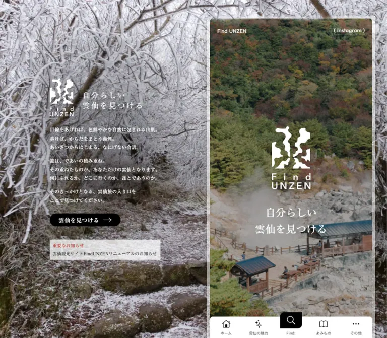
夕景の固定背景と細幅の観光コンテンツを組み合わせ、明朝体、淡い紙の質感、写真、常設ナビゲーションで雲仙の旅を案内するサイト。
オリジナルサイトを見るA compact travel guide framed by a sunset landscape, with Japanese serif typography and quiet paper textures.
Website: Find UNZEN Original URL: https://www.unzen.org/ Final URL: https://www.unzen.org/ Theme: light editorial surfaces with photographic backgrounds and white overlaid identity; no theme switch was verified. Inspected: September 23, 2026, Japan Standard Time. The supplied retrieval timestamp is September 22, 2026, 18:12:16.075 UTC, equivalent to September 23, 03:12:16.075 JST. Viewports: 1440 × 1000 desktop and 390 × 844 mobile, in CSS pixels. Scope: the current tourism homepage, using supplied desktop opening, theme-section, and footer captures; mobile opening and footer captures; and rendered DOM, link, and computed-style evidence for both viewports. Destination pages and opened navigation states were not inspected.
Find UNZEN is a tourism information portal organized around discovery: news, events, model courses, travel themes, mood-based tags, places, and articles. Its distinctive desktop composition places a long, narrow content column at the right of a full-screen sunset photograph. A separate introduction remains visible over the landscape at the left. On mobile, the content column becomes the page itself.
The visual identity combines a white abstract steam-like emblem, measured Japanese Mincho typography, small English utility labels, black capsule actions, and documentary photography. Cream paper and muted category backgrounds support the content without competing with the landscape. Persistent navigation gives this long editorial homepage the practical feel of a pocket destination guide.
A compact travel guide framed by a sunset landscape, with Japanese serif typography and quiet paper textures.
Website: Find UNZEN Original URL: https://www.unzen.org/ Final URL: https://www.unzen.org/ Theme: light editorial surfaces with photographic backgrounds and white overlaid identity; no theme switch was verified. Inspected: September 23, 2026, Japan Standard Time. The supplied retrieval timestamp is September 22, 2026, 18:12:16.075 UTC, equivalent to September 23, 03:12:16.075 JST. Viewports: 1440 × 1000 desktop and 390 × 844 mobile, in CSS pixels. Scope: the current tourism homepage, using supplied desktop opening, theme-section, and footer captures; mobile opening and footer captures; and rendered DOM, link, and computed-style evidence for both viewports. Destination pages and opened navigation states were not inspected.
Find UNZEN is a tourism information portal organized around discovery: news, events, model courses, travel themes, mood-based tags, places, and articles. Its distinctive desktop composition places a long, narrow content column at the right of a full-screen sunset photograph. A separate introduction remains visible over the landscape at the left. On mobile, the content column becomes the page itself.
The visual identity combines a white abstract steam-like emblem, measured Japanese Mincho typography, small English utility labels, black capsule actions, and documentary photography. Cream paper and muted category backgrounds support the content without competing with the landscape. Persistent navigation gives this long editorial homepage the practical feel of a pocket destination guide.
| Name | Value | Suggested token | Evidence and role |
|---|---|---|---|
| Warm Paper | #f8f4ee |
--paper |
Measured body background; source --s-color-258de26b: #f8f4eeff |
| Black Ink | #000000 |
--ink |
Measured headings, capsule action backgrounds, and category labels |
| Soft Ink | #333333 |
--ink-soft |
Measured theme descriptions and several inherited container text colors |
| White | #ffffff |
--white |
Measured photographic-overlay text and reversed labels; visually observed bottom navigation surface |
| Warm Gray | #7a7671 |
--muted |
Measured news dates and small reading labels |
| Notice Red | #b9281d |
--notice |
Measured text color of 重要なお知らせ |
| Pick-up Pink | #e1375a |
--pickup |
Measured event PICK UP badge fill |
| Utility Tint | rgba(0, 0, 0, 0.1) |
--utility-tint |
Measured background of the home capsule and menu button |
| Quiet Tag Ink | rgba(0, 0, 0, 0.5) |
--tag-ink |
Measured route-card hashtags |
| Reversed Metadata | rgba(255, 255, 255, 0.75) |
--metadata-reversed |
Measured event dates |
| Reversed Tags | rgba(255, 255, 255, 0.5) |
--tag-reversed |
Measured event hashtags |
The primary action color is black. Notice Red and Pick-up Pink have separate editorial functions; neither should replace black across the navigation or all buttons.
These values are visual approximations, intended as starting points for implementation.
| Surface | Approximate value | Suggested token | Visible use |
|---|---|---|---|
| Mist Blue | #cbd5d7 |
--theme-onsen |
The visible lower portion of the hot-spring theme panel |
| Muted Rose | #d7c7c2 |
--theme-food |
The food theme panel |
| Sage Gray | #c6cec5 |
--theme-area |
The destination theme panel |
| Fine Paper Rule | #d7d0c6 |
--rule |
Footer section separators |
| Pale Coral | approximately #f3c7bd |
Asset-specific | Background within the linked portal banner artwork |
The category panels use low-saturation color fields. The banner's coral and dark blue belong to its artwork and should not be promoted into a universal site palette. Colors for the accommodation and activity panels are not established by the supplied screenshots.
The custom-property inventory includes --s-color-7fa71194: #e74808 and --s-color-9090eb84: linear-gradient(90deg, #e84708, #fdd0bf). Their presence alone does not identify where they appear. Do not treat orange or that gradient as the homepage's primary action treatment.
The supplied styles distinguish three named Mincho faces:
| Source family | Source custom property | Verified roles |
|---|---|---|
リュウミン M-KL JIS2004 |
--s-font-e5bfe5ec |
Hero slogan, desktop introduction, concept heading and prose, discovery headings, theme titles, article titles |
リュウミン R-KL JIS2004 |
--s-font-e29ad663 |
Discovery introductions and event excerpts |
リュウミン B-KL JIS2004 |
--s-font-5da65c8d |
Primary action labels, important notices, and parenthesized editorial links |
These families create the site's literary, deliberate tone. Keep the thin-to-thick stroke contrast and generous line spacing, particularly in the concept copy.
Weight distinction: many elements using the B face report font-weight: 400, because the named family already identifies a heavier face. News and route titles instead report the M family with font-weight: 900. Preserve this distinction when documenting source values; do not simplify every emphasized label to the same CSS weight.
Find UNZEN, ( English ), uppercase section labels, discovery indices, dates, parentheses, and PICK UP.から見つける.Other families appear in the custom-property inventory, including Lora, Damion, Aclonica, and additional Japanese families. No sampled component establishes their role here. The inherited Times value on the document root is also not the font used by the explicitly styled Japanese editorial components.
Values below are measured, except the final navigation-caption estimate. Where desktop and mobile differ, both are shown.
| Role | Family | Size / line height | Tracking | Weight |
|---|---|---|---|---|
| Desktop vertical slogan | Ryumin M | 24px / 33.6px |
4.8px, or 0.2em |
400 |
| Desktop introduction | Ryumin M | 14px / 28px |
Normal | 400 |
| Main hero slogan, desktop | Ryumin M | 28px / 44.8px |
Normal | 400 |
| Main hero slogan, mobile | Ryumin M | 24px / 38.4px |
Normal | 400 |
| Header utility text | Outfit | 14px / 14px |
0.28px, or 0.02em |
400 |
| Concept heading | Ryumin M | 24px / 38.4px |
2.4px, or 0.1em |
400 |
| Concept prose | Ryumin M | 15px / 30px |
0.45px, or 0.03em |
400 |
| Event section heading | Ryumin M | 24px / 38.4px |
1.2px, or 0.05em |
400 |
| Discovery heading | Ryumin M | 36px / 57.6px |
1.8px, or 0.05em |
400 |
| Discovery prose, desktop | Ryumin R | 15px / 27px |
0.75px, or 0.05em |
400 |
| Discovery prose, mobile | Ryumin R | 14px / 25.2px |
0.7px, or 0.05em |
400 |
| Theme title | Ryumin M | 32px / 32px |
1.6px, or 0.05em |
400 |
| Theme description | Noto Sans JP | 12px / 20.4px |
0.12px, or 0.01em |
400 |
| News and event card title | Ryumin M | 15px / 24px |
0.75px, or 0.05em |
900 |
| Route card title | Ryumin M | 14px / 22.4px |
0.7px, or 0.05em |
900 |
| Event excerpt | Ryumin R | 12px / 19.2px |
0.12px |
400 |
| Section eyebrow | Outfit | 14px / 14px |
0.28px |
400 |
| Discovery index | Outfit | 12px / 12px |
0.24px |
400 |
| Dates and reading labels | Outfit / Ryumin M | 11px / 11px |
0.55px |
400 |
| Hashtags | Noto Sans JP | 11px / 17.6px |
0.55px |
400 |
| Capsule action label | Ryumin B | 15px / 15px |
0.75px |
400 |
| Large editorial link label | Ryumin B | 18px / 18px |
0.9px |
400 |
| Theme editorial link label | Ryumin B | 14px / 14px |
0.7px |
400 |
| Important notice | Ryumin B | 12px / 16.8px |
0.12px |
400 |
| Bottom navigation caption | Not established by the style sample | Approximately 10px |
Not measured | Not measured |
The scale is intentionally restrained. The 36px discovery headings are larger than the opening slogan, allowing the landscape and emblem to dominate the first screen.
Spacing character: compact controls and metadata, 20px recurring content insets, and broad 80–100px editorial section intervals. The evidence does not establish a single mathematical spacing system.
| Value | Measured application |
|---|---|
4px |
Home-icon gap; badge vertical padding |
8px |
Menu vertical padding; spacing between sampled event hashtags |
10px |
Primary action internal gap; compact editorial-link gap; utility horizontal padding |
12px |
Badge horizontal padding; large editorial-link gap |
20px |
Header horizontal inset; recurring content inset; card-rail gaps; concept paragraph gaps |
24px |
Primary capsule horizontal padding; theme description-to-link interval |
32px |
Desktop identity-group gap; event heading-to-content gap; concept prose-to-link interval |
36px / 44px |
Event section top and bottom padding |
40px |
Derived route-grid row gap; derived desktop content-column right clearance |
50px / 60px |
News top padding on desktop / mobile |
80px |
Route and theme section top padding |
100px |
Concept section top and bottom padding |
| Element | Value | Evidence |
|---|---|---|
| Desktop main column | 8px |
Measured |
| Mobile main column | 0 |
Measured |
| Home and menu capsules | 16px |
Measured |
| Primary action | 1000px |
Measured; effectively a capsule |
| Category and pick-up badges | 128px |
Measured; effectively capsules |
| Seasonal banner | 5px |
Measured |
| Event section | 0px 36px |
Measured shorthand: top-right and bottom-left rounded |
| News, event, and route card wrappers | 0 |
Measured |
| Bottom navigation upper corners | Approximately 8px |
Screenshot estimate |
| Central search block | Approximately 16px 0 16px 0 |
Screenshot estimate; opposite rounded corners |
Rounded shapes are concentrated in controls and selected section boundaries. They do not form a universal rounded-card system.
| Element | Desktop: 1440 × 1000 | Mobile: 390 × 844 | Evidence |
|---|---|---|---|
| Main column | x: 920px, y: 50px, 480px wide |
x: 0, y: 0, 390px wide |
Measured |
| Column right clearance | 40px |
0 |
Derived |
| Standard inset content | 440px wide |
350px wide |
Measured |
| Theme description width | 400px |
310px |
Measured; an additional 20px inset per side |
| Header | x: 920px, y: 75px, 480 × 30px |
x: 0, y: 32px, 390 × 30px |
Measured |
| Home capsule | 125.47 × 30px |
Same | Measured |
| Menu capsule | 42 × 30px |
Same | Measured |
| Desktop introduction columns | 88px + 32px gap + 322px |
Hidden | Measured widths and derived relationship |
| Desktop primary action | 192.39 × 35px |
No equivalent in the opening screen | Measured |
| News card width | 280px |
280px |
Measured |
| Event card width | 320px |
320px |
Measured |
| Route card width | 210px |
165px |
Measured |
| Route column gap | 20px |
20px |
Derived |
| Bottom navigation | Approximately 480 × 58px |
Approximately 390 × 58px |
Screenshot estimate |
| Search icon block | Approximately 60 × 44px, raised 12px |
Same | Screenshot estimate |
| Document height | Reported 14,325px |
Reported 14,825px |
Capture metadata |
The desktop main-element height is measured separately as approximately 14,267px, starting 50px below the viewport top. Document and element heights are distinct measurements; neither should become a fixed implementation height.
Role: persistent destination atmosphere and a compact explanation of the site's purpose.
The current desktop captures show a sunset over water, a distant coastline, and a small paddler. The landscape continues behind the right column and remains visually stationary while different page sections appear. The left introduction also stays in substantially the same position, with a small vertical shift in the footer capture.
At the opening state, the identity link begins around x: 239px, y: 256px. Its 88px-wide column contains the white emblem and wordmark, followed by the vertically arranged slogan 自分らしい雲仙を見つける. A 32px gap separates this identity column from a 322px-wide prose column beginning at x: 359px.
The prose uses three short groups, 14px Mincho type, and 28px leading. A black 雲仙を見つける capsule sits below the prose, followed by a separate pale notice strip across the wider introduction group. This composition is roughly 442px wide, leaving substantial landscape around it.
The mobile DOM and opening screenshot omit this separate introduction. Its conceptual content remains available later in the main page.
Role: a continuous tourism guide that retains similar reading proportions across devices.
On desktop, the main content is 480px wide, starts 50px below the viewport top, and ends 40px from the right edge. A pale translucent frame appears approximately 8px thick around it. The visible top corners are gently rounded.
On mobile, the column becomes edge-to-edge and loses the desktop corner radius. The structure remains a long document. The visual resemblance to a phone screen does not establish an iframe or an independently scrolling application.
Most content sections use 20px outer insets. Individual theme panels introduce another 20px for their descriptions, creating a consistent hierarchy of full column, inset section, and inner text.
Role: home, English-language entry, and menu access.
The header floats over the content instead of occupying a solid full-width bar. Its anatomy is:
Find UNZEN.( English ).The home capsule measures about 125.47 × 30px, with 4px 10px padding, a 4px internal gap, a 16px radius, and a 10% black background. The menu measures 42 × 30px, with 8px 10px padding and the same tint and radius. Fine white outlines are visible in the screenshots; their exact border declaration was not supplied.
The header remains visible at the top in the scrolled captures, including over the pale footer. This produces visibly weak contrast in some light areas. A stronger light-surface variant is recommended for an adaptation.
The English link points to /volcano-story. That destination is verified as a link, but a site-wide language-switching mechanism is not verified. The menu was not opened.
Role: establish place and identity before the information directory begins.
A tall photograph fills the main column. The current image shows wooded slopes above a rocky geothermal landscape, rising steam, wooden walkways, small visitors, and dark-roofed shelters. The white emblem and stacked wordmark sit centrally over the photograph. Beneath them is the two-line slogan 自分らしい / 雲仙を見つける.
The slogan uses 28px type on desktop and 24px on mobile, both with 1.6 line height. The logo is approximately 88px wide on mobile and approximately 105–110px wide inside the desktop column. These logo widths are visual estimates, not image-element measurements.
The mobile photograph fills the opening viewport behind the bottom navigation. The photograph has a subdued appearance that supports white text, but the evidence does not distinguish original image grading from a CSS overlay.
Use deliberate subject positioning when cropping: keep the steam and paths legible below the emblem, with foliage providing a relatively dark field behind it. No slideshow, video playback, or animated steam was verified.
Role: bring timely information into an otherwise calm editorial page.
The desktop introduction includes a pale notice strip with a red 重要なお知らせ label and a black linked message. A separate notice appears after the main hero. The two notices contain different messages in the captured page and should be treated as separate content placements.
The main notice is horizontal in the desktop DOM: its label and link share the same y-coordinate. On mobile, the label appears at y: 872px and the linked message below at approximately y: 893.8px, establishing a stacked arrangement.
Notice text is 12px Ryumin B with 16.8px line height and 0.12px tracking. The treatment is typographic; it does not use a large warning icon or a saturated alert box.
A seasonal banner follows. Its measured box is 440 × 120px on desktop and 350 × 120px on mobile, with a 5px radius. It links to /season/summer; its destination was not opened.
Role: expose recent updates without turning the entire narrow page into a dense list.
The NEWS eyebrow sits opposite お知らせ一覧へ. Below it are three linked cards arranged horizontally. Each is 280px wide, with 20px between consecutive cards. The second and third card coordinates extend beyond the column, establishing the horizontal arrangement.
Each card groups media, an editorial title, and a small bottom line containing a date and 読む. Titles use 15px Ryumin M at weight 900 and 24px leading. The dates use 11px Outfit in Warm Gray, while the reading label uses 11px Ryumin M.
Card heights vary with imagery and title length. Do not force every news item into a single universal image ratio based on the first card. The sampled wrappers are transparent and square-cornered.
Horizontal movement, dragging, snapping, and automatic advancement were not exercised. Native horizontal scrolling is a recommended implementation, not an observed interaction result.
Role: slow the reading pace and articulate the site's invitation to explore.
The section begins with CONCEPT, then a three-line Mincho heading: 見つけることは、 / であうこと。 / あなただけの雲仙へ。 The measured heading uses 24px type, 38.4px leading, and 0.1em tracking.
Prose follows at 15px with 30px leading. Paragraph groups are separated by 20px. The text retains its size on mobile, but line breaks change: the first paragraph grows from three lines to four, and the second grows from three to five. This is a deliberate editorial reflow, not simply uniform downscaling.
The section uses 100px top and bottom padding at both measured widths. Its concluding link uses the larger parenthesized action treatment and leads to /about.
Role: introduce activities through imagery, dates, descriptive titles, and tags.
The DOM establishes a section with 36px 20px 44px padding, a 32px main gap, and opposite 36px corner rounding. Its heading and card text are white. The underlying surface or pseudo-element background is not fully represented by the sampled transparent container style, so an exact event-section background color cannot be assigned from this evidence.
The horizontal cards are 320px wide with 20px gaps. Each contains a media region, a top-right PICK UP badge, a date line, a title, a short excerpt, and hashtags. The badge is approximately 73.36 × 20px with 4px 12px padding, 12px Outfit, and Pick-up Pink fill. Its measured placement is 12px from the card's top and right edges.
Titles use the same 15px / 24px emphasized Mincho treatment as news. Excerpts use 12px / 19.2px Ryumin R. Event dates and tags switch to Noto Sans JP with reduced white opacity.
Role: organize three distinct ways to find a trip.
The page presents ROUTE 01/03, THEME 02/03, and FEELING 03/03. The first two have detailed measurements in the supplied styles; the third is confirmed by rendered text.
The measured marker row distributes Find!, the English category, and the index across the section width. It uses 12px Outfit with 0.02em tracking. Below, a 36px Mincho heading names the discovery method, followed by the smaller sans-serif subtitle から見つける.
Introductory prose uses Ryumin R at 15px / 27px on desktop and 14px / 25.2px on mobile. Source text exposes portrait-oriented image references before the route and theme introductions, but their complete visual compositions are not visible in the supplied screenshots.
Role: offer concrete itinerary and destination stories within the narrow guide.
Four route entries form two columns at both measured widths. Desktop cards are 210px wide inside a 440px section; mobile cards are 165px wide inside a 350px section. The horizontal gap is 20px, and the measured row positions establish a 40px row gap after the taller card in the preceding row.
The anatomy is media, one or more black category capsules, a multiline title, muted hashtags, then a date and reading label. Category capsules use 12px Noto Sans JP, 0.05em tracking, 4px 12px padding, and a 128px radius. Card titles use 14px / 22.4px Ryumin M at weight 900.
The cards remain unboxed: their wrapper background is transparent and their radius is zero. Let the photographs, text alignment, and category capsules establish grouping.
On mobile, hashtags can wrap to an additional line. Preserve that natural height change rather than truncating all supporting metadata to one line.
Role: provide an illustrated introduction to a broad tourism category.
Five themes are present: 温泉, 食, 旅先, 宿, and 体験. The desktop scrolled screenshot directly shows the food panel, the beginning of the destination panel, and the end of the hot-spring panel.
Each visible panel follows this hierarchy:
THEME label at the upper left and a numbered marker at the upper right.もっと見る link with a fine arrow.The food panel is approximately 440px wide and 515px tall in the screenshot. Its centered image is approximately 240 × 260px. The lower image edge appears softly faded into the rose background; the method is unverified. The destination panel uses a street photograph on a sage field.
Descriptions measure 400px wide on desktop and 310px on mobile, using 12px / 20.4px Noto Sans JP. Food copy grows from approximately 81.6px high on desktop to 122.3px on mobile. Panel height should therefore follow content.
A narrow paper-colored gap, approximately 4px in the desktop screenshot, separates adjacent panels. Keep their outer corners square. These are large editorial color fields, not elevated product cards.
Role: provide a recognizable secondary action without a filled button.
A label and fine right arrow sit between detached parentheses. The theme version measures approximately 125.73 × 25.19px, with 10px internal gaps, a 14px Ryumin B label, and 18px Outfit parentheses. The larger route version measures approximately 162.30 × 33.59px, using an 18px label, 24px parentheses, and 12px gaps.
The DOM contains duplicate label layers positioned vertically. Only one label is visible in the screenshots. This supports the existence of layered text, but does not prove a particular hover-roll animation. Render one accessible label unless a verified interaction requires a decorative duplicate.
Role: extend discovery beyond predefined itineraries.
Rendered text and links establish a mood-led introduction, a TAGS area with twenty linked terms, a SPOTS section with two featured places, and an ARTICLE section with three recent stories. The tags link to individual /spot/tag/... URLs. This establishes linked tag navigation, not an inline multi-select filter.
Spot entries contain a category, place name, short introductory phrase, and excerpt. Article entries include categories, titles, hashtags, dates, and reading labels. Their exact card geometry and complete imagery are outside the supplied visual coverage, so do not copy the route layout into these sections as a claimed original measurement.
Role: conclude discovery with community participation, institutional identity, and a complete site directory.
The rendered text includes a #FindUNZEN sharing invitation, a link to hashtag posts, and the account @unzen_destination_service. The footer identifies the operator as 一般社団法人 雲仙観光局, with its postal address, telephone number, and the copyright text ©2023 Unzen Destination Service.
The visible footer sits on warm, lightly mottled paper. Four black social symbols—X, YouTube, Facebook, and Instagram—form a centered row. Their icons appear approximately 24px across, with approximately 32px gaps.
Fine horizontal rules divide the social area, portal banner, and site directory. The linked portal banner is approximately 440 × 125px on desktop and 350 × 100px on mobile, preserving roughly a 3.5:1 ratio.
The directory retains two columns on mobile, with five links per column and approximately 42px between row positions. The labels use a modest serif appearance, visually around 14px; an exact footer font declaration was not included.
A centered black 自分らしい雲仙を見つける capsule appears below the directory. It is approximately 272 × 35px in both screenshots. Generous space separates this action from the small policy and copyright lines. Preserve enough final clearance for the persistent bottom navigation.
Role: keep the main tourism paths available throughout a very long page.
The current navigation has five items: 雲仙の魅力, モデルコース, Find!, イベント・体験, and アクセス. The associated symbols are a sparkle motif, a winding route, a magnifying glass, a ticket, and a car.
The bar is white, approximately 58px high, and has gently rounded upper corners. It is restricted to the 480px content column on desktop and spans the 390px mobile viewport. Five equal slots imply widths of 96px and 78px respectively.
The central magnifier sits in a black block approximately 60 × 44px, protruding about 12px above the bar. Opposite rounded corners echo the event-section shape. Its caption remains below on white. The other icons are approximately 24px, above small black captions.
The black center is a persistent visual emphasis in the captures. Do not interpret it as a verified selected-page state. Its click behavior was not supplied. The four surrounding destinations are supported by the rendered links.
| Target | Recorded value | What the evidence establishes |
|---|---|---|
| Many links, buttons, text elements, and wrappers | 0.3s cubic-bezier(0.4, 0.4, 0, 1) |
A widely shared transition declaration; the triggering state and changed property are not always established |
| Body background | background 0.5s cubic-bezier(0.4, 0.4, 0, 1) |
Background changes are configured to transition; no specific color-change sequence was captured |
| Sampled desktop theme titles | 1.8s cubic-bezier(0.19, 1, 0.22, 1) 0.2s |
A slower transition with a 200ms delay exists on these headings |
| Sampled mobile theme titles | 0.3s cubic-bezier(0.4, 0.4, 0, 1) |
The recorded mobile declaration differs from the desktop heading declaration |
| Sampled animation property | none |
No CSS keyframe animation was reported on those sampled elements; this does not establish the absence of all site motion |
The capture process waited for load, visible-image decoding, sampled stability, and finite animation readiness within bounded time limits. Perpetual animations were temporarily paused during readiness checks and then resumed. This improves screenshot stability but does not provide a complete motion recording.
Recommended adaptation: use the measured 300ms easing for restrained control feedback. Keep content visible by default. If entrance effects are added, make them progressive enhancements, respect reduced motion, and document their translation and opacity values as new choices.
| Layer | Appearance | Purpose and evidence |
|---|---|---|
| Desktop backdrop | Sunset photography covering the viewport | Persistent atmospheric setting, directly visible |
| Desktop introduction | White type directly over the photograph | Identity and concept; no enclosing card |
| Main editorial ground | Warm cream with subtle mottling visible in the footer | Gives the long guide a tactile, printed character |
| Desktop column frame | Pale translucent perimeter | Approximately 8px visually; opacity and implementation unmeasured |
| Theme panels | Muted blue, rose, and sage fields | Category differentiation in the visible theme sequence |
| Utility capsules | Transparent header with small tinted, outlined controls | Keeps photography visible around navigation |
| Primary actions | Black capsules with white serif labels | Clear action emphasis |
| Bottom navigation | Solid white with black icons | Consistent functional surface over imagery and paper |
| Notices | Pale surface, small red label, black message | Editorial priority without large alert styling |
There is no visible general-purpose drop-shadow system. Most separation comes from spacing, color fields, photographic boundaries, fine rules, and black action shapes. The small translucent utility backgrounds should not become a full glassmorphism treatment.
Photography carries the destination identity. The current desktop backdrop uses broad sky and water, while the main opening uses a much denser vertical landscape of forest, steam, rocks, and paths. Small human figures communicate scale and activity without competing with the emblem.
Within the visible food panel, fish, vegetables, and marbled beef form a richly colored still life. The following destination panel shows an ordinary streetscape. This range connects large natural scenery with tangible local experiences.
Keep the photographs in natural color. The interface's restrained black, white, and cream treatment allows foliage, water, food, and architecture to provide variation. Avoid adding the same heavy color wash to every image.
The emblem has irregular organic negative spaces. Preserve its original silhouette and stacked wordmark when authorized; do not approximate it with a hot-spring emoji or a newly typeset logo. Navigation symbols, by comparison, use fine black or white linework.
| Asset or reference | Evidence | Use and limitation |
|---|---|---|
| Desktop sunset photograph | Current desktop screenshots | Full-screen background; complete asset URL not supplied |
| Geothermal opening photograph | Current desktop and mobile screenshots | Tall main hero; complete asset URL not supplied |
| Find UNZEN emblem and wordmark | Current opening screenshots | White identity artwork; complete asset URL not supplied |
| Food and street photographs | Current desktop theme screenshot | Centered theme imagery; complete asset URLs not supplied |
| Warm paper texture | Current desktop and mobile footer screenshots | Low-contrast surface texture; file and tiling method unverified |
| Family route-card image | https://storage.googleapis.com/studio-cms-assets/projects/JpOLBElKaQ/s-4104x2736_d66e961b-1202-4610-b5bb-af3f7d6402ee.webp |
Complete URL exposed in the rendered route-card background rule; asset not separately opened |
| Portrait source references | Truncated route/theme references containing s-1600x2400 |
Establish portrait-oriented source assets; incomplete URLs must not be reconstructed |
The asset table records supplied evidence only. The CSS below accepts authorized image URLs supplied by the implementer; it does not invent missing original filenames.
At 1440px, the 480px column occupies one third of the viewport width and sits 40px from the right edge. The approximately 920px-wide area to its left accommodates the persistent introduction. The photograph extends underneath the whole composition.
The header and bottom navigation align to the column rather than the browser edges. This alignment is essential: a full-width desktop navigation bar would change the composition substantially.
The document remains long. The theme and footer captures show different content under the same surrounding visual frame. A native document scroll with fixed background, introduction, and navigation is a practical reconstruction strategy; the supplied evidence does not prove the original scroll-container implementation.
At 390px, the desktop background presentation and separate introductory rail disappear. The main hero reaches both screen edges, and the column radius becomes zero. The header moves from y: 75px to y: 32px, while retaining its 20px horizontal padding and 30px visible control height.
The hero slogan decreases from 28px to 24px. Many other sizes remain unchanged: 24px concept headings, 36px discovery headings, 32px theme titles, and 14px route-card titles. Discovery prose decreases by one pixel, while concept prose preserves its 15px size and adds line breaks.
The 20px section insets leave 350px of content width. The route grid remains two columns, producing (350 - 20) / 2 = 165px cards. Theme descriptions use a further 20px inset on each side, leaving 310px.
News and event cards retain their 280px and 320px widths, with subsequent entries positioned horizontally outside the initial visible area. The footer directory also retains two columns. This responsive design changes the surrounding composition more than it changes the internal editorial vocabulary.
A max-width: 1080px media query is present in the exposed line-break CSS. That fragment does not establish the complete breakpoint logic for the desktop shell. Intermediate widths, landscape phones, browser zoom, and safe-area behavior were not supplied.
The Quick Start uses 1080px as an explicitly chosen adaptation breakpoint. Test the transition around that width and keep the desktop introduction hidden whenever it would collide with the content column.
Use content-driven section heights. The recorded document lengths are approximately 14.3k pixels on desktop and 14.8k pixels on mobile; they describe this content snapshot, not reusable layout tokens.
These are recommendations for a new implementation, not verified original-site features:
#f8f4ee.#000000.#333333.#ffffff.#7a7671.#b9281d.#e1375a.#cbd5d7, rose #d7c7c2, sage #c6cec5.“Create a Japanese destination-information homepage inspired by the current Find UNZEN composition. On a 1440px desktop, place a 480px-wide scrolling guide 40px from the right edge and 50px below the top. Fill the surrounding viewport with a sunset photograph over water. Place a compact white identity and introduction at the left, combining an organic emblem, a vertical Japanese slogan, three short Mincho prose groups, a black capsule action, and a pale notice strip. Begin the guide with a tall geothermal landscape photograph, centered white identity, and a two-line 28px slogan. Follow with news, concept copy, events, route cards, travel themes, mood tags, places, articles, and a paper-textured footer. Use cream #f8f4ee, black actions, Japanese Mincho headings, Outfit English labels, and Noto Sans JP metadata. Keep a floating utility header and a five-item white bottom navigation aligned to the guide. On a 390px phone, remove the desktop introduction, make the guide edge-to-edge, reduce the hero slogan to 24px, and retain the two-column route grid.”
This is a usable CSS adaptation, not the original stylesheet. It preserves measured dimensions where available and labels visual estimates and new choices in comments. The surrounding page keeps a conventional 16px root.
Suggested structure: place .desktop-scene, .desktop-intro, and .tourism-column as siblings inside a body with class .unzen-page. The column contains the header, main content, footer, and bottom navigation. Use normal document scrolling; reserve horizontal overflow for individual card rails.
Set --desktop-photo, --hero-photo, and --paper-texture to authorized url(...) values. Their defaults are none. Supply logo images separately with the indicated classes. Font declarations require licensed or otherwise authorized font loading; the fallbacks keep the stylesheet usable without those files.
:root {
  /* Measured semantic colors */
  --paper: #f8f4ee;
  --ink: #000000;
  --ink-soft: #333333;
  --white: #ffffff;
  --muted: #7a7671;
  --notice: #b9281d;
  --pickup: #e1375a;
  --utility-tint: rgb(0 0 0 / 10%);

  /* Visual approximations, not computed source colors */
  --theme-onsen: #cbd5d7;
  --theme-food: #d7c7c2;
  --theme-area: #c6cec5;
  --rule: #d7d0c6;

  /* Source family names with recommended fallbacks */
  --font-mincho-m: 'リュウミン M-KL JIS2004', serif;
  --font-mincho-r: 'リュウミン R-KL JIS2004', serif;
  --font-mincho-b: 'リュウミン B-KL JIS2004', serif;
  --font-latin: Outfit, sans-serif;
  --font-sans: 'Noto Sans JP', sans-serif;

  --inset: 20px;
  --pane-width: 100%;
  --pane-edge: 0px;
  --header-top: 32px;
  --hero-type: 24px;
  --intro-type: 14px;
  --route-media-height: 145px;

  /* Navigation dimensions are screenshot estimates */
  --nav-height: 58px;
  --search-width: 60px;
  --search-height: 44px;
  --search-rise: 12px;
  --safe-bottom: env(safe-area-inset-bottom, 0px);

  /* Measured transition timing; application below is recommended */
  --ease-ui: cubic-bezier(0.4, 0.4, 0, 1);
  --duration-ui: 300ms;

  /* Assign authorized imagery in the consuming project */
  --desktop-photo: none;
  --hero-photo: none;
  --paper-texture: none;
}

* { box-sizing: border-box; }

html {
  font-size: 16px;
  scroll-padding-top: 110px;
  scroll-padding-bottom: calc(80px + var(--safe-bottom));
}

body.unzen-page {
  margin: 0;
  color: var(--ink);
  background: var(--paper);
  font-family: var(--font-mincho-m);
  overflow-x: clip;
  isolation: isolate;
}

.unzen-page :where(h1, h2, h3, p, figure) { margin: 0; }
.unzen-page a { color: inherit; }
.unzen-page img { display: block; max-width: 100%; }
.unzen-page button { font: inherit; cursor: pointer; }

.desktop-scene,
.desktop-intro {
  display: none;
}

.tourism-column {
  position: relative;
  z-index: 2;
  width: var(--pane-width);
  min-height: 100svh;
  padding-bottom: calc(80px + var(--safe-bottom));
  background-color: var(--paper);
  background-image: var(--paper-texture);
}

.site-header {
  position: fixed;
  z-index: 20;
  top: var(--header-top);
  right: var(--pane-edge);
  display: flex;
  align-items: center;
  width: var(--pane-width);
  height: 30px;
  padding-inline: var(--inset);
  color: var(--white);
}

.header-home { margin-right: auto; }
.header-tools { display: flex; align-items: center; gap: 10px; }

.utility-pill {
  display: inline-flex;
  align-items: center;
  justify-content: center;
  gap: 4px;
  height: 30px;
  padding: 4px 10px;
  border: 1px solid currentColor;
  border-radius: 16px;
  color: inherit;
  background: var(--utility-tint);
  text-decoration: none;
}

.utility-label,
.language-link {
  font: 400 14px / 1 var(--font-latin);
  letter-spacing: 0.02em;
  text-decoration: none;
}

.menu-control { width: 42px; padding: 8px 10px; }

/* Recommended state: apply when the header overlays light content. */
.site-header[data-surface='light'] { color: var(--ink); }
.site-header[data-surface='light'] .utility-pill {
  background: rgb(248 244 238 / 94%);
}

.hero {
  position: relative;
  display: grid;
  place-items: center;
  min-height: 100svh;
  overflow: hidden;
  color: var(--white);
  background: var(--ink-soft) var(--hero-photo) center / cover no-repeat;
}

/* Recommended overlay strength; tune against the actual photograph. */
.hero::before {
  content: '';
  position: absolute;
  inset: 0;
  background: rgb(0 0 0 / 15%);
}

.hero-content {
  position: relative;
  display: grid;
  justify-items: center;
  gap: 32px;
  padding: 90px 20px;
  text-align: center;
  transform: translateY(-24px);
}

/* Logo width and vertical offset approximate the supplied captures. */
.hero-logo { width: 88px; height: auto; }
.hero-title {
  font: 400 var(--hero-type) / 1.6 var(--font-mincho-m);
}

.section-inset { margin-inline: var(--inset); }
.section-eyebrow {
  font: 400 14px / 1 var(--font-latin);
  letter-spacing: 0.02em;
}

.notice {
  display: flex;
  flex-wrap: wrap;
  gap: 5px 12px;
  padding: 12px;
  background: rgb(255 255 255 / 80%);
  font: 400 12px / 1.4 var(--font-mincho-b);
  letter-spacing: 0.01em;
}

.notice-label { color: var(--notice); }
.main-notice { flex-direction: column; margin: 16px 20px 0; }

.capsule-action {
  display: inline-flex;
  align-items: center;
  justify-content: center;
  gap: 10px;
  max-width: 100%;
  padding: 10px 24px;
  border: 0;
  border-radius: 1000px;
  color: var(--white);
  background: var(--ink);
  font: 400 15px / 1 var(--font-mincho-b);
  letter-spacing: 0.05em;
  text-decoration: none;
}

.action-arrow { width: 24px; flex: none; }

.concept { padding-block: 100px; }
.concept-title {
  margin-top: 20px;
  font: 400 24px / 1.6 var(--font-mincho-m);
  letter-spacing: 0.1em;
}
.concept-copy {
  display: grid;
  gap: 20px;
  margin-top: 24px;
  font: 400 15px / 2 var(--font-mincho-m);
  letter-spacing: 0.03em;
}

.discovery { padding-top: 80px; }
.discovery-index {
  display: flex;
  justify-content: space-between;
  font: 400 12px / 1 var(--font-latin);
  letter-spacing: 0.02em;
}
.discovery-title {
  margin-top: 36px;
  font: 400 36px / 1.6 var(--font-mincho-m);
  letter-spacing: 0.05em;
}
.discovery-subtitle {
  margin-top: 8px;
  font: 400 14px / 1 var(--font-sans);
  letter-spacing: 0.05em;
}
.discovery-copy {
  margin-top: 32px;
  font: 400 var(--intro-type) / 1.8 var(--font-mincho-r);
  letter-spacing: 0.05em;
}

/* Native scrolling is a recommended implementation of the observed rails. */
.card-rail {
  display: flex;
  gap: 20px;
  overflow-x: auto;
  padding: 4px 20px 16px;
  overscroll-behavior-inline: contain;
}
.news-card { flex: 0 0 280px; }
.event-card { flex: 0 0 320px; }

.route-grid {
  display: grid;
  grid-template-columns: repeat(2, minmax(0, 1fr));
  gap: 40px 20px;
  margin-top: 50px;
}

.editorial-card {
  min-width: 0;
  color: inherit;
  background: transparent;
  text-decoration: none;
}

/* Media heights are inferred from adjacent route-card coordinates. */
.route-card-media {
  width: 100%;
  height: var(--route-media-height);
  object-fit: cover;
}
.card-categories {
  display: flex;
  flex-wrap: wrap;
  gap: 8px 12px;
  margin-top: 20px;
}
.category-pill,
.pickup-badge {
  display: inline-flex;
  padding: 4px 12px;
  border-radius: 128px;
  color: var(--white);
  background: var(--ink);
  font: 400 12px / 1 var(--font-sans);
  letter-spacing: 0.05em;
}
.pickup-badge { background: var(--pickup); font-family: var(--font-latin); }
.route-card-title {
  margin-top: 16px;
  font: 900 14px / 1.6 var(--font-mincho-m);
  letter-spacing: 0.05em;
}
.card-tags {
  margin-top: 12px;
  color: rgb(0 0 0 / 50%);
  font: 400 11px / 1.6 var(--font-sans);
  letter-spacing: 0.05em;
}
.card-meta {
  display: flex;
  justify-content: space-between;
  gap: 8px;
  margin-top: 8px;
  font: 400 11px / 1 var(--font-latin);
  letter-spacing: 0.05em;
}

.theme-stack { display: grid; gap: 4px; margin-top: 50px; }
.theme-card { padding: 20px 20px 32px; background: var(--theme-color, var(--paper)); }
.theme-card--onsen { --theme-color: var(--theme-onsen); }
.theme-card--food { --theme-color: var(--theme-food); }
.theme-card--area { --theme-color: var(--theme-area); }
.theme-index {
  display: flex;
  justify-content: space-between;
  font: 400 12px / 1 var(--font-latin);
  letter-spacing: 0.02em;
}
.theme-title {
  margin-top: 8px;
  text-align: center;
  font: 400 32px / 1 var(--font-mincho-m);
  letter-spacing: 0.05em;
}

/* Estimated image geometry; mobile width is an adaptation choice. */
.theme-image {
  width: min(240px, 100%);
  height: 260px;
  margin: 20px auto 0;
  object-fit: cover;
}
.theme-description {
  color: var(--ink-soft);
  font: 400 12px / 1.7 var(--font-sans);
  letter-spacing: 0.01em;
}
.editorial-link {
  display: flex;
  align-items: center;
  justify-content: center;
  gap: 10px;
  width: fit-content;
  min-height: 25.2px;
  margin: 24px auto 0;
  text-decoration: none;
  font: 400 14px / 1 var(--font-mincho-b);
  letter-spacing: 0.05em;
}
.editorial-link .paren { font: 400 18px / 1.4 var(--font-latin); }
.editorial-link--large { gap: 12px; font-size: 18px; }
.editorial-link--large .paren { font-size: 24px; }

.site-footer { padding: 64px 20px 32px; text-align: center; }
.footer-socials { display: flex; justify-content: center; gap: 32px; }
.footer-socials svg { width: 24px; height: 24px; }
.footer-divider { margin-block: 44px; border: 0; border-top: 1px solid var(--rule); }
.footer-banner { display: block; }
.footer-banner img { width: 100%; height: auto; }
.footer-directory {
  display: grid;
  grid-template-columns: repeat(2, minmax(0, 1fr));
  gap: 24px 20px;
  font-size: 14px;
  line-height: 1.3;
}
.footer-directory a { text-decoration: none; }
.footer-action { margin: 48px auto 80px; }
.footer-legal { color: var(--muted); font-size: 12px; line-height: 1.8; }

.bottom-nav {
  position: fixed;
  z-index: 30;
  right: var(--pane-edge);
  bottom: 0;
  display: grid;
  grid-template-columns: repeat(5, minmax(0, 1fr));
  width: var(--pane-width);
  min-height: calc(var(--nav-height) + var(--safe-bottom));
  padding-bottom: var(--safe-bottom);
  border-radius: 8px 8px 0 0;
  color: var(--ink);
  background: var(--white);
}
.nav-item {
  display: flex;
  flex-direction: column;
  align-items: center;
  justify-content: center;
  gap: 6px;
  min-width: 0;
  min-height: var(--nav-height);
  padding: 0;
  border: 0;
  color: inherit;
  background: transparent;
  text-decoration: none;
  font: 400 10px / 1 var(--font-sans);
}
.nav-icon { display: grid; place-items: center; width: 24px; height: 24px; }
.nav-icon svg { width: 24px; height: 24px; }
.nav-item--find { justify-content: flex-start; }
.nav-item--find .nav-icon {
  width: var(--search-width);
  height: var(--search-height);
  margin-top: calc(-1 * var(--search-rise));
  border-radius: 16px 0 16px 0;
  color: var(--white);
  background: var(--ink);
}
.nav-item--find .nav-icon svg { width: 28px; height: 28px; }

/* Chosen adaptation breakpoint; the complete original breakpoint is unknown. */
@media (min-width: 1081px) {
  :root {
    --pane-width: 480px;
    --pane-edge: 40px;
    --header-top: 75px;
    --hero-type: 28px;
    --intro-type: 15px;
    --route-media-height: 160px;
  }
  .desktop-scene {
    display: block;
    position: fixed;
    inset: 0;
    z-index: 0;
    background: var(--ink-soft) var(--desktop-photo) center / cover no-repeat;
  }
  .desktop-intro {
    position: fixed;
    inset: 0 auto 0 0;
    z-index: 1;
    display: grid;
    place-items: center;
    width: calc(100% - var(--pane-width) - var(--pane-edge));
    color: var(--white);
  }
  .intro-layout {
    display: grid;
    grid-template-columns: 88px 322px;
    gap: 60px 32px;
    width: 442px;
  }
  .intro-identity { display: flex; flex-direction: column; align-items: center; gap: 32px; }
  .intro-logo { width: 88px; height: auto; }
  .intro-slogan {
    writing-mode: vertical-rl;
    text-orientation: upright;
    font: 400 24px / 1.4 var(--font-mincho-m);
    letter-spacing: 0.2em;
  }
  .intro-copy { padding-top: 48px; font: 400 14px / 2 var(--font-mincho-m); }
  .intro-copy p + p { margin-top: 20px; }
  .intro-copy .capsule-action { margin-top: 40px; }
  .intro-layout > .notice { grid-column: 1 / -1; color: var(--ink); }
  .tourism-column {
    margin: 50px var(--pane-edge) 0 auto;
    border-radius: 8px;
    /* Estimated translucent frame, not a soft elevation shadow. */
    box-shadow: 0 0 0 8px rgb(255 255 255 / 50%);
  }
  .hero { border-radius: 8px 8px 0 0; }
  .hero-content { gap: 40px; transform: translateY(-14px); }
  .hero-logo { width: 108px; }
  .main-notice { flex-direction: row; }
}

/* Recommended accommodation for widths narrower than the inspected phone. */
@media (max-width: 340px) {
  .route-grid { grid-template-columns: 1fr; }
}

/* Recommended keyboard and pointer feedback. */
.unzen-page :focus-visible { outline: 2px solid currentColor; outline-offset: 4px; }
.capsule-action,
.editorial-link { transition: opacity var(--duration-ui) var(--ease-ui); }
@media (hover: hover) {
  .capsule-action:hover,
  .editorial-link:hover { opacity: 0.75; }
}
@media (prefers-reduced-motion: reduce) {
  .unzen-page *,
  .unzen-page *::before,
  .unzen-page *::after {
    animation: none !important;
    transition: none !important;
    scroll-behavior: auto !important;
  }
}
Keep the header and bottom navigation outside transformed ancestors so their fixed positioning remains viewport-based. Header surface changes, menu/search behavior, accessible names, and larger hit areas require markup or application logic; the stylesheet does not implement those interactions.
Optional aliases for a project already using Tailwind v4. This is an adaptation convenience, not evidence that the original site uses Tailwind. Define the custom properties above first.
@theme inline {
  --color-paper: var(--paper);
  --color-ink: var(--ink);
  --color-ink-soft: var(--ink-soft);
  --color-muted: var(--muted);
  --color-notice: var(--notice);
  --color-pickup: var(--pickup);
  --color-theme-onsen: var(--theme-onsen);
  --color-theme-food: var(--theme-food);
  --color-theme-area: var(--theme-area);

  --font-editorial: var(--font-mincho-m);
  --font-reading: var(--font-mincho-r);
  --font-action: var(--font-mincho-b);
  --font-utility: var(--font-latin);
  --font-interface: var(--font-sans);

  --text-meta: 11px;
  --text-caption: 12px;
  --text-card: 14px;
  --text-body: 15px;
  --text-section: 24px;
  --text-theme: 32px;
  --text-discovery: 36px;

  --spacing-inset: 20px;
  --spacing-pane: 480px;
  --spacing-editorial: 100px;
  --radius-control: 16px;
  --radius-pill: 1000px;
}
This reference describes the current page represented by the supplied evidence. Screenshot estimates, derived geometry, and implementation additions are identified separately from measured source values.
# Find UNZEN — Style Reference

> A compact travel guide framed by a sunset landscape, with Japanese serif typography and quiet paper textures.

**Website:** [Find UNZEN](https://www.unzen.org/)
**Original URL:** https://www.unzen.org/
**Final URL:** https://www.unzen.org/
**Theme:** light editorial surfaces with photographic backgrounds and white overlaid identity; no theme switch was verified.
**Inspected:** September 23, 2026, Japan Standard Time. The supplied retrieval timestamp is September 22, 2026, 18:12:16.075 UTC, equivalent to September 23, 03:12:16.075 JST.
**Viewports:** 1440 × 1000 desktop and 390 × 844 mobile, in CSS pixels.
**Scope:** the current tourism homepage, using supplied desktop opening, theme-section, and footer captures; mobile opening and footer captures; and rendered DOM, link, and computed-style evidence for both viewports. Destination pages and opened navigation states were not inspected.

Find UNZEN is a tourism information portal organized around discovery: news, events, model courses, travel themes, mood-based tags, places, and articles. Its distinctive desktop composition places a long, narrow content column at the right of a full-screen sunset photograph. A separate introduction remains visible over the landscape at the left. On mobile, the content column becomes the page itself.

The visual identity combines a white abstract steam-like emblem, measured Japanese Mincho typography, small English utility labels, black capsule actions, and documentary photography. Cream paper and muted category backgrounds support the content without competing with the landscape. Persistent navigation gives this long editorial homepage the practical feel of a pocket destination guide.
# Find UNZEN — Style Reference

> A compact travel guide framed by a sunset landscape, with Japanese serif typography and quiet paper textures.

**Website:** [Find UNZEN](https://www.unzen.org/)
**Original URL:** https://www.unzen.org/
**Final URL:** https://www.unzen.org/
**Theme:** light editorial surfaces with photographic backgrounds and white overlaid identity; no theme switch was verified.
**Inspected:** September 23, 2026, Japan Standard Time. The supplied retrieval timestamp is September 22, 2026, 18:12:16.075 UTC, equivalent to September 23, 03:12:16.075 JST.
**Viewports:** 1440 × 1000 desktop and 390 × 844 mobile, in CSS pixels.
**Scope:** the current tourism homepage, using supplied desktop opening, theme-section, and footer captures; mobile opening and footer captures; and rendered DOM, link, and computed-style evidence for both viewports. Destination pages and opened navigation states were not inspected.

Find UNZEN is a tourism information portal organized around discovery: news, events, model courses, travel themes, mood-based tags, places, and articles. Its distinctive desktop composition places a long, narrow content column at the right of a full-screen sunset photograph. A separate introduction remains visible over the landscape at the left. On mobile, the content column becomes the page itself.

The visual identity combines a white abstract steam-like emblem, measured Japanese Mincho typography, small English utility labels, black capsule actions, and documentary photography. Cream paper and muted category backgrounds support the content without competing with the landscape. Persistent navigation gives this long editorial homepage the practical feel of a pocket destination guide.

## How to Read This Reference

- **Measured** means reported by the supplied rendered DOM or computed styles. These measurements describe the recorded state, not every possible state of the website.
- **Derived** means calculated from reported coordinates, dimensions, or typography values.
- **Estimated** means visually approximated from the current-page screenshots. Estimated colors were not extracted with a pixel sampler.
- **Recommended** means an implementation choice for a new project. It is not a claim about the original website.
- **Named tokens** are reusable descriptive aliases unless a source custom property is explicitly identified.
- The supplied element-style samples cover only part of the long document. Text and links establish additional sections, but do not establish their complete visual treatment.
- Computed font-family names identify declared families. The evidence does not independently verify which font file rendered every glyph.

## Tokens — Colors

### Default Palette

| Name | Value | Suggested token | Evidence and role |
| --- | --- | --- | --- |
| Warm Paper | `#f8f4ee` | `--paper` | Measured body background; source `--s-color-258de26b: #f8f4eeff` |
| Black Ink | `#000000` | `--ink` | Measured headings, capsule action backgrounds, and category labels |
| Soft Ink | `#333333` | `--ink-soft` | Measured theme descriptions and several inherited container text colors |
| White | `#ffffff` | `--white` | Measured photographic-overlay text and reversed labels; visually observed bottom navigation surface |
| Warm Gray | `#7a7671` | `--muted` | Measured news dates and small reading labels |
| Notice Red | `#b9281d` | `--notice` | Measured text color of `重要なお知らせ` |
| Pick-up Pink | `#e1375a` | `--pickup` | Measured event `PICK UP` badge fill |
| Utility Tint | `rgba(0, 0, 0, 0.1)` | `--utility-tint` | Measured background of the home capsule and menu button |
| Quiet Tag Ink | `rgba(0, 0, 0, 0.5)` | `--tag-ink` | Measured route-card hashtags |
| Reversed Metadata | `rgba(255, 255, 255, 0.75)` | `--metadata-reversed` | Measured event dates |
| Reversed Tags | `rgba(255, 255, 255, 0.5)` | `--tag-reversed` | Measured event hashtags |

The primary action color is black. Notice Red and Pick-up Pink have separate editorial functions; neither should replace black across the navigation or all buttons.

### Content Panel Palette

These values are **visual approximations**, intended as starting points for implementation.

| Surface | Approximate value | Suggested token | Visible use |
| --- | --- | --- | --- |
| Mist Blue | `#cbd5d7` | `--theme-onsen` | The visible lower portion of the hot-spring theme panel |
| Muted Rose | `#d7c7c2` | `--theme-food` | The food theme panel |
| Sage Gray | `#c6cec5` | `--theme-area` | The destination theme panel |
| Fine Paper Rule | `#d7d0c6` | `--rule` | Footer section separators |
| Pale Coral | approximately `#f3c7bd` | Asset-specific | Background within the linked portal banner artwork |

The category panels use low-saturation color fields. The banner's coral and dark blue belong to its artwork and should not be promoted into a universal site palette. Colors for the accommodation and activity panels are not established by the supplied screenshots.

### Declared Colors Without a Verified Role

The custom-property inventory includes `--s-color-7fa71194: #e74808` and `--s-color-9090eb84: linear-gradient(90deg, #e84708, #fdd0bf)`. Their presence alone does not identify where they appear. Do not treat orange or that gradient as the homepage's primary action treatment.

## Tokens — Typography

### Japanese Editorial Families

The supplied styles distinguish three named Mincho faces:

| Source family | Source custom property | Verified roles |
| --- | --- | --- |
| `リュウミン M-KL JIS2004` | `--s-font-e5bfe5ec` | Hero slogan, desktop introduction, concept heading and prose, discovery headings, theme titles, article titles |
| `リュウミン R-KL JIS2004` | `--s-font-e29ad663` | Discovery introductions and event excerpts |
| `リュウミン B-KL JIS2004` | `--s-font-5da65c8d` | Primary action labels, important notices, and parenthesized editorial links |

These families create the site's literary, deliberate tone. Keep the thin-to-thick stroke contrast and generous line spacing, particularly in the concept copy.

**Weight distinction:** many elements using the B face report `font-weight: 400`, because the named family already identifies a heavier face. News and route titles instead report the M family with `font-weight: 900`. Preserve this distinction when documenting source values; do not simplify every emphasized label to the same CSS weight.

### English and Utility Typography

- **Outfit:** measured on `Find UNZEN`, `( English )`, uppercase section labels, discovery indices, dates, parentheses, and `PICK UP`.
- **Noto Sans JP:** measured on theme descriptions, category pills, hashtags, event dates, and the small discovery subtitle `から見つける`.
- **Logo lettering:** treat the emblem and its stacked wordmark as supplied artwork. The text-font measurements do not establish a font for the logo.

Other families appear in the custom-property inventory, including Lora, Damion, Aclonica, and additional Japanese families. No sampled component establishes their role here. The inherited `Times` value on the document root is also not the font used by the explicitly styled Japanese editorial components.

### Type Scale

Values below are **measured**, except the final navigation-caption estimate. Where desktop and mobile differ, both are shown.

| Role | Family | Size / line height | Tracking | Weight |
| --- | --- | --- | --- | --- |
| Desktop vertical slogan | Ryumin M | `24px / 33.6px` | `4.8px`, or `0.2em` | `400` |
| Desktop introduction | Ryumin M | `14px / 28px` | Normal | `400` |
| Main hero slogan, desktop | Ryumin M | `28px / 44.8px` | Normal | `400` |
| Main hero slogan, mobile | Ryumin M | `24px / 38.4px` | Normal | `400` |
| Header utility text | Outfit | `14px / 14px` | `0.28px`, or `0.02em` | `400` |
| Concept heading | Ryumin M | `24px / 38.4px` | `2.4px`, or `0.1em` | `400` |
| Concept prose | Ryumin M | `15px / 30px` | `0.45px`, or `0.03em` | `400` |
| Event section heading | Ryumin M | `24px / 38.4px` | `1.2px`, or `0.05em` | `400` |
| Discovery heading | Ryumin M | `36px / 57.6px` | `1.8px`, or `0.05em` | `400` |
| Discovery prose, desktop | Ryumin R | `15px / 27px` | `0.75px`, or `0.05em` | `400` |
| Discovery prose, mobile | Ryumin R | `14px / 25.2px` | `0.7px`, or `0.05em` | `400` |
| Theme title | Ryumin M | `32px / 32px` | `1.6px`, or `0.05em` | `400` |
| Theme description | Noto Sans JP | `12px / 20.4px` | `0.12px`, or `0.01em` | `400` |
| News and event card title | Ryumin M | `15px / 24px` | `0.75px`, or `0.05em` | `900` |
| Route card title | Ryumin M | `14px / 22.4px` | `0.7px`, or `0.05em` | `900` |
| Event excerpt | Ryumin R | `12px / 19.2px` | `0.12px` | `400` |
| Section eyebrow | Outfit | `14px / 14px` | `0.28px` | `400` |
| Discovery index | Outfit | `12px / 12px` | `0.24px` | `400` |
| Dates and reading labels | Outfit / Ryumin M | `11px / 11px` | `0.55px` | `400` |
| Hashtags | Noto Sans JP | `11px / 17.6px` | `0.55px` | `400` |
| Capsule action label | Ryumin B | `15px / 15px` | `0.75px` | `400` |
| Large editorial link label | Ryumin B | `18px / 18px` | `0.9px` | `400` |
| Theme editorial link label | Ryumin B | `14px / 14px` | `0.7px` | `400` |
| Important notice | Ryumin B | `12px / 16.8px` | `0.12px` | `400` |
| Bottom navigation caption | Not established by the style sample | Approximately `10px` | Not measured | Not measured |

The scale is intentionally restrained. The 36px discovery headings are larger than the opening slogan, allowing the landscape and emblem to dominate the first screen.

## Tokens — Spacing & Shapes

**Spacing character:** compact controls and metadata, 20px recurring content insets, and broad 80–100px editorial section intervals. The evidence does not establish a single mathematical spacing system.

### Spacing Scale

| Value | Measured application |
| --- | --- |
| `4px` | Home-icon gap; badge vertical padding |
| `8px` | Menu vertical padding; spacing between sampled event hashtags |
| `10px` | Primary action internal gap; compact editorial-link gap; utility horizontal padding |
| `12px` | Badge horizontal padding; large editorial-link gap |
| `20px` | Header horizontal inset; recurring content inset; card-rail gaps; concept paragraph gaps |
| `24px` | Primary capsule horizontal padding; theme description-to-link interval |
| `32px` | Desktop identity-group gap; event heading-to-content gap; concept prose-to-link interval |
| `36px / 44px` | Event section top and bottom padding |
| `40px` | Derived route-grid row gap; derived desktop content-column right clearance |
| `50px / 60px` | News top padding on desktop / mobile |
| `80px` | Route and theme section top padding |
| `100px` | Concept section top and bottom padding |

### Border Radius

| Element | Value | Evidence |
| --- | --- | --- |
| Desktop main column | `8px` | Measured |
| Mobile main column | `0` | Measured |
| Home and menu capsules | `16px` | Measured |
| Primary action | `1000px` | Measured; effectively a capsule |
| Category and pick-up badges | `128px` | Measured; effectively capsules |
| Seasonal banner | `5px` | Measured |
| Event section | `0px 36px` | Measured shorthand: top-right and bottom-left rounded |
| News, event, and route card wrappers | `0` | Measured |
| Bottom navigation upper corners | Approximately `8px` | Screenshot estimate |
| Central search block | Approximately `16px 0 16px 0` | Screenshot estimate; opposite rounded corners |

Rounded shapes are concentrated in controls and selected section boundaries. They do not form a universal rounded-card system.

### Layout Measurements

| Element | Desktop: 1440 × 1000 | Mobile: 390 × 844 | Evidence |
| --- | --- | --- | --- |
| Main column | `x: 920px`, `y: 50px`, `480px` wide | `x: 0`, `y: 0`, `390px` wide | Measured |
| Column right clearance | `40px` | `0` | Derived |
| Standard inset content | `440px` wide | `350px` wide | Measured |
| Theme description width | `400px` | `310px` | Measured; an additional 20px inset per side |
| Header | `x: 920px`, `y: 75px`, `480 × 30px` | `x: 0`, `y: 32px`, `390 × 30px` | Measured |
| Home capsule | `125.47 × 30px` | Same | Measured |
| Menu capsule | `42 × 30px` | Same | Measured |
| Desktop introduction columns | `88px + 32px gap + 322px` | Hidden | Measured widths and derived relationship |
| Desktop primary action | `192.39 × 35px` | No equivalent in the opening screen | Measured |
| News card width | `280px` | `280px` | Measured |
| Event card width | `320px` | `320px` | Measured |
| Route card width | `210px` | `165px` | Measured |
| Route column gap | `20px` | `20px` | Derived |
| Bottom navigation | Approximately `480 × 58px` | Approximately `390 × 58px` | Screenshot estimate |
| Search icon block | Approximately `60 × 44px`, raised `12px` | Same | Screenshot estimate |
| Document height | Reported `14,325px` | Reported `14,825px` | Capture metadata |

The desktop main-element height is measured separately as approximately 14,267px, starting 50px below the viewport top. Document and element heights are distinct measurements; neither should become a fixed implementation height.

## Components

### Desktop Landscape and Introduction

**Role:** persistent destination atmosphere and a compact explanation of the site's purpose.

The current desktop captures show a sunset over water, a distant coastline, and a small paddler. The landscape continues behind the right column and remains visually stationary while different page sections appear. The left introduction also stays in substantially the same position, with a small vertical shift in the footer capture.

At the opening state, the identity link begins around `x: 239px`, `y: 256px`. Its 88px-wide column contains the white emblem and wordmark, followed by the vertically arranged slogan `自分らしい雲仙を見つける`. A 32px gap separates this identity column from a 322px-wide prose column beginning at `x: 359px`.

The prose uses three short groups, 14px Mincho type, and 28px leading. A black `雲仙を見つける` capsule sits below the prose, followed by a separate pale notice strip across the wider introduction group. This composition is roughly 442px wide, leaving substantial landscape around it.

The mobile DOM and opening screenshot omit this separate introduction. Its conceptual content remains available later in the main page.

### Narrow Content Column

**Role:** a continuous tourism guide that retains similar reading proportions across devices.

On desktop, the main content is 480px wide, starts 50px below the viewport top, and ends 40px from the right edge. A pale translucent frame appears approximately 8px thick around it. The visible top corners are gently rounded.

On mobile, the column becomes edge-to-edge and loses the desktop corner radius. The structure remains a long document. The visual resemblance to a phone screen does not establish an iframe or an independently scrolling application.

Most content sections use 20px outer insets. Individual theme panels introduce another 20px for their descriptions, creating a consistent hierarchy of full column, inset section, and inner text.

### Persistent Utility Header

**Role:** home, English-language entry, and menu access.

The header floats over the content instead of occupying a solid full-width bar. Its anatomy is:

1. A left home capsule with a small house icon and `Find UNZEN`.
2. Flexible space.
3. The text link `( English )`.
4. A compact menu capsule containing thin horizontal lines.

The home capsule measures about 125.47 × 30px, with `4px 10px` padding, a 4px internal gap, a 16px radius, and a 10% black background. The menu measures 42 × 30px, with `8px 10px` padding and the same tint and radius. Fine white outlines are visible in the screenshots; their exact border declaration was not supplied.

The header remains visible at the top in the scrolled captures, including over the pale footer. This produces visibly weak contrast in some light areas. A stronger light-surface variant is recommended for an adaptation.

The English link points to `/volcano-story`. That destination is verified as a link, but a site-wide language-switching mechanism is not verified. The menu was not opened.

### Photographic Opening

**Role:** establish place and identity before the information directory begins.

A tall photograph fills the main column. The current image shows wooded slopes above a rocky geothermal landscape, rising steam, wooden walkways, small visitors, and dark-roofed shelters. The white emblem and stacked wordmark sit centrally over the photograph. Beneath them is the two-line slogan `自分らしい / 雲仙を見つける`.

The slogan uses 28px type on desktop and 24px on mobile, both with 1.6 line height. The logo is approximately 88px wide on mobile and approximately 105–110px wide inside the desktop column. These logo widths are visual estimates, not image-element measurements.

The mobile photograph fills the opening viewport behind the bottom navigation. The photograph has a subdued appearance that supports white text, but the evidence does not distinguish original image grading from a CSS overlay.

Use deliberate subject positioning when cropping: keep the steam and paths legible below the emblem, with foliage providing a relatively dark field behind it. No slideshow, video playback, or animated steam was verified.

### Important Notice and Seasonal Banner

**Role:** bring timely information into an otherwise calm editorial page.

The desktop introduction includes a pale notice strip with a red `重要なお知らせ` label and a black linked message. A separate notice appears after the main hero. The two notices contain different messages in the captured page and should be treated as separate content placements.

The main notice is horizontal in the desktop DOM: its label and link share the same y-coordinate. On mobile, the label appears at `y: 872px` and the linked message below at approximately `y: 893.8px`, establishing a stacked arrangement.

Notice text is 12px Ryumin B with 16.8px line height and 0.12px tracking. The treatment is typographic; it does not use a large warning icon or a saturated alert box.

A seasonal banner follows. Its measured box is 440 × 120px on desktop and 350 × 120px on mobile, with a 5px radius. It links to `/season/summer`; its destination was not opened.

### News Rail

**Role:** expose recent updates without turning the entire narrow page into a dense list.

The `NEWS` eyebrow sits opposite `お知らせ一覧へ`. Below it are three linked cards arranged horizontally. Each is 280px wide, with 20px between consecutive cards. The second and third card coordinates extend beyond the column, establishing the horizontal arrangement.

Each card groups media, an editorial title, and a small bottom line containing a date and `読む`. Titles use 15px Ryumin M at weight 900 and 24px leading. The dates use 11px Outfit in Warm Gray, while the reading label uses 11px Ryumin M.

Card heights vary with imagery and title length. Do not force every news item into a single universal image ratio based on the first card. The sampled wrappers are transparent and square-cornered.

Horizontal movement, dragging, snapping, and automatic advancement were not exercised. Native horizontal scrolling is a recommended implementation, not an observed interaction result.

### Concept Section

**Role:** slow the reading pace and articulate the site's invitation to explore.

The section begins with `CONCEPT`, then a three-line Mincho heading: `見つけることは、 / であうこと。 / あなただけの雲仙へ。` The measured heading uses 24px type, 38.4px leading, and 0.1em tracking.

Prose follows at 15px with 30px leading. Paragraph groups are separated by 20px. The text retains its size on mobile, but line breaks change: the first paragraph grows from three lines to four, and the second grows from three to five. This is a deliberate editorial reflow, not simply uniform downscaling.

The section uses 100px top and bottom padding at both measured widths. Its concluding link uses the larger parenthesized action treatment and leads to `/about`.

### Event Feature Rail

**Role:** introduce activities through imagery, dates, descriptive titles, and tags.

The DOM establishes a section with `36px 20px 44px` padding, a 32px main gap, and opposite 36px corner rounding. Its heading and card text are white. The underlying surface or pseudo-element background is not fully represented by the sampled transparent container style, so an exact event-section background color cannot be assigned from this evidence.

The horizontal cards are 320px wide with 20px gaps. Each contains a media region, a top-right `PICK UP` badge, a date line, a title, a short excerpt, and hashtags. The badge is approximately 73.36 × 20px with `4px 12px` padding, 12px Outfit, and Pick-up Pink fill. Its measured placement is 12px from the card's top and right edges.

Titles use the same 15px / 24px emphasized Mincho treatment as news. Excerpts use 12px / 19.2px Ryumin R. Event dates and tags switch to Noto Sans JP with reduced white opacity.

### Discovery Section Heading

**Role:** organize three distinct ways to find a trip.

The page presents `ROUTE 01/03`, `THEME 02/03`, and `FEELING 03/03`. The first two have detailed measurements in the supplied styles; the third is confirmed by rendered text.

The measured marker row distributes `Find!`, the English category, and the index across the section width. It uses 12px Outfit with 0.02em tracking. Below, a 36px Mincho heading names the discovery method, followed by the smaller sans-serif subtitle `から見つける`.

Introductory prose uses Ryumin R at 15px / 27px on desktop and 14px / 25.2px on mobile. Source text exposes portrait-oriented image references before the route and theme introductions, but their complete visual compositions are not visible in the supplied screenshots.

### Route Card Grid

**Role:** offer concrete itinerary and destination stories within the narrow guide.

Four route entries form two columns at both measured widths. Desktop cards are 210px wide inside a 440px section; mobile cards are 165px wide inside a 350px section. The horizontal gap is 20px, and the measured row positions establish a 40px row gap after the taller card in the preceding row.

The anatomy is media, one or more black category capsules, a multiline title, muted hashtags, then a date and reading label. Category capsules use 12px Noto Sans JP, 0.05em tracking, `4px 12px` padding, and a 128px radius. Card titles use 14px / 22.4px Ryumin M at weight 900.

The cards remain unboxed: their wrapper background is transparent and their radius is zero. Let the photographs, text alignment, and category capsules establish grouping.

On mobile, hashtags can wrap to an additional line. Preserve that natural height change rather than truncating all supporting metadata to one line.

### Theme Panel

**Role:** provide an illustrated introduction to a broad tourism category.

Five themes are present: `温泉`, `食`, `旅先`, `宿`, and `体験`. The desktop scrolled screenshot directly shows the food panel, the beginning of the destination panel, and the end of the hot-spring panel.

Each visible panel follows this hierarchy:

1. Small `THEME` label at the upper left and a numbered marker at the upper right.
2. Centered Japanese title in 32px Mincho.
3. A centered photograph narrower than the panel.
4. Left-aligned explanatory text.
5. A centered parenthesized `もっと見る` link with a fine arrow.

The food panel is approximately 440px wide and 515px tall in the screenshot. Its centered image is approximately 240 × 260px. The lower image edge appears softly faded into the rose background; the method is unverified. The destination panel uses a street photograph on a sage field.

Descriptions measure 400px wide on desktop and 310px on mobile, using 12px / 20.4px Noto Sans JP. Food copy grows from approximately 81.6px high on desktop to 122.3px on mobile. Panel height should therefore follow content.

A narrow paper-colored gap, approximately 4px in the desktop screenshot, separates adjacent panels. Keep their outer corners square. These are large editorial color fields, not elevated product cards.

### Parenthesized Editorial Link

**Role:** provide a recognizable secondary action without a filled button.

A label and fine right arrow sit between detached parentheses. The theme version measures approximately 125.73 × 25.19px, with 10px internal gaps, a 14px Ryumin B label, and 18px Outfit parentheses. The larger route version measures approximately 162.30 × 33.59px, using an 18px label, 24px parentheses, and 12px gaps.

The DOM contains duplicate label layers positioned vertically. Only one label is visible in the screenshots. This supports the existence of layered text, but does not prove a particular hover-roll animation. Render one accessible label unless a verified interaction requires a decorative duplicate.

### Feeling, Tags, Spots, and Articles

**Role:** extend discovery beyond predefined itineraries.

Rendered text and links establish a mood-led introduction, a `TAGS` area with twenty linked terms, a `SPOTS` section with two featured places, and an `ARTICLE` section with three recent stories. The tags link to individual `/spot/tag/...` URLs. This establishes linked tag navigation, not an inline multi-select filter.

Spot entries contain a category, place name, short introductory phrase, and excerpt. Article entries include categories, titles, hashtags, dates, and reading labels. Their exact card geometry and complete imagery are outside the supplied visual coverage, so do not copy the route layout into these sections as a claimed original measurement.

### Social Invitation and Footer

**Role:** conclude discovery with community participation, institutional identity, and a complete site directory.

The rendered text includes a `#FindUNZEN` sharing invitation, a link to hashtag posts, and the account `@unzen_destination_service`. The footer identifies the operator as `一般社団法人 雲仙観光局`, with its postal address, telephone number, and the copyright text `©2023 Unzen Destination Service`.

The visible footer sits on warm, lightly mottled paper. Four black social symbols—X, YouTube, Facebook, and Instagram—form a centered row. Their icons appear approximately 24px across, with approximately 32px gaps.

Fine horizontal rules divide the social area, portal banner, and site directory. The linked portal banner is approximately 440 × 125px on desktop and 350 × 100px on mobile, preserving roughly a 3.5:1 ratio.

The directory retains two columns on mobile, with five links per column and approximately 42px between row positions. The labels use a modest serif appearance, visually around 14px; an exact footer font declaration was not included.

A centered black `自分らしい雲仙を見つける` capsule appears below the directory. It is approximately 272 × 35px in both screenshots. Generous space separates this action from the small policy and copyright lines. Preserve enough final clearance for the persistent bottom navigation.

### Persistent Bottom Navigation

**Role:** keep the main tourism paths available throughout a very long page.

The current navigation has five items: `雲仙の魅力`, `モデルコース`, `Find!`, `イベント・体験`, and `アクセス`. The associated symbols are a sparkle motif, a winding route, a magnifying glass, a ticket, and a car.

The bar is white, approximately 58px high, and has gently rounded upper corners. It is restricted to the 480px content column on desktop and spans the 390px mobile viewport. Five equal slots imply widths of 96px and 78px respectively.

The central magnifier sits in a black block approximately 60 × 44px, protruding about 12px above the bar. Opposite rounded corners echo the event-section shape. Its caption remains below on white. The other icons are approximately 24px, above small black captions.

The black center is a persistent visual emphasis in the captures. Do not interpret it as a verified selected-page state. Its click behavior was not supplied. The four surrounding destinations are supported by the rendered links.

## Tokens — Motion & Interaction

### Measured Motion Declarations

| Target | Recorded value | What the evidence establishes |
| --- | --- | --- |
| Many links, buttons, text elements, and wrappers | `0.3s cubic-bezier(0.4, 0.4, 0, 1)` | A widely shared transition declaration; the triggering state and changed property are not always established |
| Body background | `background 0.5s cubic-bezier(0.4, 0.4, 0, 1)` | Background changes are configured to transition; no specific color-change sequence was captured |
| Sampled desktop theme titles | `1.8s cubic-bezier(0.19, 1, 0.22, 1) 0.2s` | A slower transition with a 200ms delay exists on these headings |
| Sampled mobile theme titles | `0.3s cubic-bezier(0.4, 0.4, 0, 1)` | The recorded mobile declaration differs from the desktop heading declaration |
| Sampled animation property | `none` | No CSS keyframe animation was reported on those sampled elements; this does not establish the absence of all site motion |

### Observed Behavior and Limits

- Scrolled screenshots show the left landscape and introduction staying visible while the main column advances through the page.
- The utility header and bottom navigation remain visible in opening and footer captures at both sizes.
- Horizontal card positions establish news and event rails. No swipe, drag, snap, or autoplay result was supplied.
- Links identify navigation destinations. Those destinations were not opened during this analysis.
- Menu opening, central search behavior, hover effects, focus states, and loading transitions remain unverified.
- Layered duplicate CTA text may support a transition, but its direction, distance, and trigger are unknown.
- Still captures do not establish image cycling, parallax, video, or animated environmental effects.

The capture process waited for load, visible-image decoding, sampled stability, and finite animation readiness within bounded time limits. Perpetual animations were temporarily paused during readiness checks and then resumed. This improves screenshot stability but does not provide a complete motion recording.

**Recommended adaptation:** use the measured 300ms easing for restrained control feedback. Keep content visible by default. If entrance effects are added, make them progressive enhancements, respect reduced motion, and document their translation and opacity values as new choices.

## Surfaces

| Layer | Appearance | Purpose and evidence |
| --- | --- | --- |
| Desktop backdrop | Sunset photography covering the viewport | Persistent atmospheric setting, directly visible |
| Desktop introduction | White type directly over the photograph | Identity and concept; no enclosing card |
| Main editorial ground | Warm cream with subtle mottling visible in the footer | Gives the long guide a tactile, printed character |
| Desktop column frame | Pale translucent perimeter | Approximately 8px visually; opacity and implementation unmeasured |
| Theme panels | Muted blue, rose, and sage fields | Category differentiation in the visible theme sequence |
| Utility capsules | Transparent header with small tinted, outlined controls | Keeps photography visible around navigation |
| Primary actions | Black capsules with white serif labels | Clear action emphasis |
| Bottom navigation | Solid white with black icons | Consistent functional surface over imagery and paper |
| Notices | Pale surface, small red label, black message | Editorial priority without large alert styling |

There is no visible general-purpose drop-shadow system. Most separation comes from spacing, color fields, photographic boundaries, fine rules, and black action shapes. The small translucent utility backgrounds should not become a full glassmorphism treatment.

## Imagery

Photography carries the destination identity. The current desktop backdrop uses broad sky and water, while the main opening uses a much denser vertical landscape of forest, steam, rocks, and paths. Small human figures communicate scale and activity without competing with the emblem.

Within the visible food panel, fish, vegetables, and marbled beef form a richly colored still life. The following destination panel shows an ordinary streetscape. This range connects large natural scenery with tangible local experiences.

Keep the photographs in natural color. The interface's restrained black, white, and cream treatment allows foliage, water, food, and architecture to provide variation. Avoid adding the same heavy color wash to every image.

The emblem has irregular organic negative spaces. Preserve its original silhouette and stacked wordmark when authorized; do not approximate it with a hot-spring emoji or a newly typeset logo. Navigation symbols, by comparison, use fine black or white linework.

### Observed Asset References

| Asset or reference | Evidence | Use and limitation |
| --- | --- | --- |
| Desktop sunset photograph | Current desktop screenshots | Full-screen background; complete asset URL not supplied |
| Geothermal opening photograph | Current desktop and mobile screenshots | Tall main hero; complete asset URL not supplied |
| Find UNZEN emblem and wordmark | Current opening screenshots | White identity artwork; complete asset URL not supplied |
| Food and street photographs | Current desktop theme screenshot | Centered theme imagery; complete asset URLs not supplied |
| Warm paper texture | Current desktop and mobile footer screenshots | Low-contrast surface texture; file and tiling method unverified |
| Family route-card image | `https://storage.googleapis.com/studio-cms-assets/projects/JpOLBElKaQ/s-4104x2736_d66e961b-1202-4610-b5bb-af3f7d6402ee.webp` | Complete URL exposed in the rendered route-card background rule; asset not separately opened |
| Portrait source references | Truncated route/theme references containing `s-1600x2400` | Establish portrait-oriented source assets; incomplete URLs must not be reconstructed |

The asset table records supplied evidence only. The CSS below accepts authorized image URLs supplied by the implementer; it does not invent missing original filenames.

## Layout & Responsive Behavior

### Desktop Composition

At 1440px, the 480px column occupies one third of the viewport width and sits 40px from the right edge. The approximately 920px-wide area to its left accommodates the persistent introduction. The photograph extends underneath the whole composition.

The header and bottom navigation align to the column rather than the browser edges. This alignment is essential: a full-width desktop navigation bar would change the composition substantially.

The document remains long. The theme and footer captures show different content under the same surrounding visual frame. A native document scroll with fixed background, introduction, and navigation is a practical reconstruction strategy; the supplied evidence does not prove the original scroll-container implementation.

### Mobile Composition

At 390px, the desktop background presentation and separate introductory rail disappear. The main hero reaches both screen edges, and the column radius becomes zero. The header moves from `y: 75px` to `y: 32px`, while retaining its 20px horizontal padding and 30px visible control height.

The hero slogan decreases from 28px to 24px. Many other sizes remain unchanged: 24px concept headings, 36px discovery headings, 32px theme titles, and 14px route-card titles. Discovery prose decreases by one pixel, while concept prose preserves its 15px size and adds line breaks.

The 20px section insets leave 350px of content width. The route grid remains two columns, producing `(350 - 20) / 2 = 165px` cards. Theme descriptions use a further 20px inset on each side, leaving 310px.

News and event cards retain their 280px and 320px widths, with subsequent entries positioned horizontally outside the initial visible area. The footer directory also retains two columns. This responsive design changes the surrounding composition more than it changes the internal editorial vocabulary.

### Breakpoint and Viewport Limits

A `max-width: 1080px` media query is present in the exposed line-break CSS. That fragment does not establish the complete breakpoint logic for the desktop shell. Intermediate widths, landscape phones, browser zoom, and safe-area behavior were not supplied.

The Quick Start uses 1080px as an explicitly chosen adaptation breakpoint. Test the transition around that width and keep the desktop introduction hidden whenever it would collide with the content column.

Use content-driven section heights. The recorded document lengths are approximately 14.3k pixels on desktop and 14.8k pixels on mobile; they describe this content snapshot, not reusable layout tokens.

## Do’s and Don’ts

### Do

- Preserve the 480px desktop guide column and the large photographic area beside it.
- Align persistent header and bottom navigation to the guide column.
- Remove the separate desktop introduction on phones while retaining the concept section in the main document.
- Pair Japanese Mincho editorial text with compact Outfit and Noto Sans JP utilities.
- Keep black capsules, detached parentheses, fine arrows, and small category labels as distinct action patterns.
- Use natural-color destination photography with deliberate crops for the two different hero contexts.
- Keep theme images centered and narrower than their colored panels.
- Retain the two-column route grid at the observed mobile width.
- Allow titles, tags, and descriptions to wrap naturally.
- Preserve the central search block's raised silhouette and opposite rounded corners.
- Use warm paper texture sparingly enough that small text stays readable.
- Keep notice red and pick-up pink tied to their observed editorial roles.

### Don’t

- Do not replace the tourism directory with a generic conversion funnel or a series of feature cards.
- Do not stretch the main content across the entire desktop viewport.
- Do not put every image and paragraph inside a rounded, shadowed card.
- Do not replace the Mincho hierarchy with an all-sans-serif system.
- Do not use the declared orange gradient as a universal brand treatment without locating its actual role.
- Do not treat travel themes as user-selectable interface color themes.
- Do not assume the English link translates the complete site.
- Do not display both copies of a layered CTA label as ordinary visible text.
- Do not infer menu, search, carousel, or hover behavior from an icon or a transition declaration alone.
- Do not force desktop line breaks into the mobile concept paragraphs.
- Do not copy the low-contrast white header over pale content without evaluating readability.
- Do not let fixed navigation cover the final policy link or keyboard-focused content.

## Recommended Implementation Additions

These are recommendations for a new implementation, not verified original-site features:

- Provide a skip link and clear navigation landmarks for the long page.
- Give the menu, search control, social icons, and home icon explicit accessible names. Mark decorative icons as hidden from assistive technology when adjacent text already supplies the name.
- Keep the compact visible header shapes, but provide larger, non-overlapping interaction targets. A 44px target is a useful starting point.
- Add a light-surface header variant with dark text and outlines, or an adequately opaque backing. The footer captures show why a single white treatment is insufficient everywhere.
- Use links for navigation destinations. Implement menu and search buttons only with actual behavior, expanded-state semantics, and appropriate focus handling.
- Give horizontal rails keyboard access and a clear way to reveal additional items. Avoid requiring a drag gesture as the only mechanism.
- Preserve one accessible label per CTA if decorative duplicate layers are used.
- Add safe-area clearance and bottom scroll padding for the fixed navigation.
- Respect reduced motion and keep text available if animation scripts fail.
- Use responsive image sources, reserve image dimensions, and prioritize the opening image. Load later editorial imagery progressively.
- Review the original 10–12px utility sizes for the intended audience. A comfortable-reading mode can increase them without changing the overall layout.
- Maintain notice dates and messages independently in each placement. The captured notices and news illustrate that different homepage modules can contain different stages of an event's lifecycle.

## Agent Prompt Guide

### Quick Color Reference

- Main editorial ground: measured `#f8f4ee`.
- Main headings, icons, and filled actions: measured `#000000`.
- Theme description text: measured `#333333`.
- Photographic identity and reversed controls: measured `#ffffff`.
- Quiet news metadata: measured `#7a7671`.
- Important-notice label: measured `#b9281d`.
- Event pick-up badge: measured `#e1375a`.
- Approximate theme fields: blue `#cbd5d7`, rose `#d7c7c2`, sage `#c6cec5`.
- Surface separation: fine warm-gray rules and subtle paper texture; avoid general card shadows.

### Overall Prompt

“Create a Japanese destination-information homepage inspired by the current Find UNZEN composition. On a 1440px desktop, place a 480px-wide scrolling guide 40px from the right edge and 50px below the top. Fill the surrounding viewport with a sunset photograph over water. Place a compact white identity and introduction at the left, combining an organic emblem, a vertical Japanese slogan, three short Mincho prose groups, a black capsule action, and a pale notice strip. Begin the guide with a tall geothermal landscape photograph, centered white identity, and a two-line 28px slogan. Follow with news, concept copy, events, route cards, travel themes, mood tags, places, articles, and a paper-textured footer. Use cream #f8f4ee, black actions, Japanese Mincho headings, Outfit English labels, and Noto Sans JP metadata. Keep a floating utility header and a five-item white bottom navigation aligned to the guide. On a 390px phone, remove the desktop introduction, make the guide edge-to-edge, reduce the hero slogan to 24px, and retain the two-column route grid.”

### Example Component Prompts

1. **Utility header:** “Create a transparent header with 20px horizontal insets. Place a small outlined home capsule at left, an English entry link near the right, and a 42 × 30px menu capsule at the end. Use 14px Outfit and fine line icons. Include an accessible dark-on-light variant as an implementation addition.”
2. **Theme panel:** “Create a square-cornered muted-rose tourism panel with a small THEME label and index at opposite upper corners, a centered 32px Mincho title, an approximately 240 × 260px food photograph, a compact left-aligned description, and a centered parenthesized arrow link. Keep the photograph narrower than the panel and avoid shadows.”
3. **Route grid:** “Build two columns inside a 350px mobile content area with a 20px gap. Each 165px-wide linked entry has a photograph, small black category capsules, a 14px Mincho title with 22.4px leading, muted hashtags, and a small date/read line. Let card height grow with text.”
4. **Bottom navigation:** “Create a white five-slot navigation bar approximately 58px high, with fine black icons above small captions. Raise the central magnifier in a 60 × 44px black block by 12px and round its top-left and bottom-right corners. Keep the desktop width tied to the 480px content column.”
5. **Footer:** “Create a warm paper-textured footer with centered institutional details, four black social icons, fine horizontal separators, a wide linked banner, and two columns of five serif navigation links. Add a centered black capsule action and generous space before small policy and copyright text.”
6. **Concept copy:** “Set a three-line Japanese Mincho heading at 24px with 38.4px leading, followed by 15px prose with 30px leading and 20px paragraph gaps. Use 100px top and bottom section padding. Recompose line breaks for mobile while preserving the text size.”

## Quick Start

### CSS Custom Properties

This is a usable CSS adaptation, not the original stylesheet. It preserves measured dimensions where available and labels visual estimates and new choices in comments. The surrounding page keeps a conventional 16px root.

Suggested structure: place `.desktop-scene`, `.desktop-intro`, and `.tourism-column` as siblings inside a body with class `.unzen-page`. The column contains the header, main content, footer, and bottom navigation. Use normal document scrolling; reserve horizontal overflow for individual card rails.

Set `--desktop-photo`, `--hero-photo`, and `--paper-texture` to authorized `url(...)` values. Their defaults are `none`. Supply logo images separately with the indicated classes. Font declarations require licensed or otherwise authorized font loading; the fallbacks keep the stylesheet usable without those files.

```css
:root {
  /* Measured semantic colors */
  --paper: #f8f4ee;
  --ink: #000000;
  --ink-soft: #333333;
  --white: #ffffff;
  --muted: #7a7671;
  --notice: #b9281d;
  --pickup: #e1375a;
  --utility-tint: rgb(0 0 0 / 10%);

  /* Visual approximations, not computed source colors */
  --theme-onsen: #cbd5d7;
  --theme-food: #d7c7c2;
  --theme-area: #c6cec5;
  --rule: #d7d0c6;

  /* Source family names with recommended fallbacks */
  --font-mincho-m: 'リュウミン M-KL JIS2004', serif;
  --font-mincho-r: 'リュウミン R-KL JIS2004', serif;
  --font-mincho-b: 'リュウミン B-KL JIS2004', serif;
  --font-latin: Outfit, sans-serif;
  --font-sans: 'Noto Sans JP', sans-serif;

  --inset: 20px;
  --pane-width: 100%;
  --pane-edge: 0px;
  --header-top: 32px;
  --hero-type: 24px;
  --intro-type: 14px;
  --route-media-height: 145px;

  /* Navigation dimensions are screenshot estimates */
  --nav-height: 58px;
  --search-width: 60px;
  --search-height: 44px;
  --search-rise: 12px;
  --safe-bottom: env(safe-area-inset-bottom, 0px);

  /* Measured transition timing; application below is recommended */
  --ease-ui: cubic-bezier(0.4, 0.4, 0, 1);
  --duration-ui: 300ms;

  /* Assign authorized imagery in the consuming project */
  --desktop-photo: none;
  --hero-photo: none;
  --paper-texture: none;
}

* { box-sizing: border-box; }

html {
  font-size: 16px;
  scroll-padding-top: 110px;
  scroll-padding-bottom: calc(80px + var(--safe-bottom));
}

body.unzen-page {
  margin: 0;
  color: var(--ink);
  background: var(--paper);
  font-family: var(--font-mincho-m);
  overflow-x: clip;
  isolation: isolate;
}

.unzen-page :where(h1, h2, h3, p, figure) { margin: 0; }
.unzen-page a { color: inherit; }
.unzen-page img { display: block; max-width: 100%; }
.unzen-page button { font: inherit; cursor: pointer; }

.desktop-scene,
.desktop-intro {
  display: none;
}

.tourism-column {
  position: relative;
  z-index: 2;
  width: var(--pane-width);
  min-height: 100svh;
  padding-bottom: calc(80px + var(--safe-bottom));
  background-color: var(--paper);
  background-image: var(--paper-texture);
}

.site-header {
  position: fixed;
  z-index: 20;
  top: var(--header-top);
  right: var(--pane-edge);
  display: flex;
  align-items: center;
  width: var(--pane-width);
  height: 30px;
  padding-inline: var(--inset);
  color: var(--white);
}

.header-home { margin-right: auto; }
.header-tools { display: flex; align-items: center; gap: 10px; }

.utility-pill {
  display: inline-flex;
  align-items: center;
  justify-content: center;
  gap: 4px;
  height: 30px;
  padding: 4px 10px;
  border: 1px solid currentColor;
  border-radius: 16px;
  color: inherit;
  background: var(--utility-tint);
  text-decoration: none;
}

.utility-label,
.language-link {
  font: 400 14px / 1 var(--font-latin);
  letter-spacing: 0.02em;
  text-decoration: none;
}

.menu-control { width: 42px; padding: 8px 10px; }

/* Recommended state: apply when the header overlays light content. */
.site-header[data-surface='light'] { color: var(--ink); }
.site-header[data-surface='light'] .utility-pill {
  background: rgb(248 244 238 / 94%);
}

.hero {
  position: relative;
  display: grid;
  place-items: center;
  min-height: 100svh;
  overflow: hidden;
  color: var(--white);
  background: var(--ink-soft) var(--hero-photo) center / cover no-repeat;
}

/* Recommended overlay strength; tune against the actual photograph. */
.hero::before {
  content: '';
  position: absolute;
  inset: 0;
  background: rgb(0 0 0 / 15%);
}

.hero-content {
  position: relative;
  display: grid;
  justify-items: center;
  gap: 32px;
  padding: 90px 20px;
  text-align: center;
  transform: translateY(-24px);
}

/* Logo width and vertical offset approximate the supplied captures. */
.hero-logo { width: 88px; height: auto; }
.hero-title {
  font: 400 var(--hero-type) / 1.6 var(--font-mincho-m);
}

.section-inset { margin-inline: var(--inset); }
.section-eyebrow {
  font: 400 14px / 1 var(--font-latin);
  letter-spacing: 0.02em;
}

.notice {
  display: flex;
  flex-wrap: wrap;
  gap: 5px 12px;
  padding: 12px;
  background: rgb(255 255 255 / 80%);
  font: 400 12px / 1.4 var(--font-mincho-b);
  letter-spacing: 0.01em;
}

.notice-label { color: var(--notice); }
.main-notice { flex-direction: column; margin: 16px 20px 0; }

.capsule-action {
  display: inline-flex;
  align-items: center;
  justify-content: center;
  gap: 10px;
  max-width: 100%;
  padding: 10px 24px;
  border: 0;
  border-radius: 1000px;
  color: var(--white);
  background: var(--ink);
  font: 400 15px / 1 var(--font-mincho-b);
  letter-spacing: 0.05em;
  text-decoration: none;
}

.action-arrow { width: 24px; flex: none; }

.concept { padding-block: 100px; }
.concept-title {
  margin-top: 20px;
  font: 400 24px / 1.6 var(--font-mincho-m);
  letter-spacing: 0.1em;
}
.concept-copy {
  display: grid;
  gap: 20px;
  margin-top: 24px;
  font: 400 15px / 2 var(--font-mincho-m);
  letter-spacing: 0.03em;
}

.discovery { padding-top: 80px; }
.discovery-index {
  display: flex;
  justify-content: space-between;
  font: 400 12px / 1 var(--font-latin);
  letter-spacing: 0.02em;
}
.discovery-title {
  margin-top: 36px;
  font: 400 36px / 1.6 var(--font-mincho-m);
  letter-spacing: 0.05em;
}
.discovery-subtitle {
  margin-top: 8px;
  font: 400 14px / 1 var(--font-sans);
  letter-spacing: 0.05em;
}
.discovery-copy {
  margin-top: 32px;
  font: 400 var(--intro-type) / 1.8 var(--font-mincho-r);
  letter-spacing: 0.05em;
}

/* Native scrolling is a recommended implementation of the observed rails. */
.card-rail {
  display: flex;
  gap: 20px;
  overflow-x: auto;
  padding: 4px 20px 16px;
  overscroll-behavior-inline: contain;
}
.news-card { flex: 0 0 280px; }
.event-card { flex: 0 0 320px; }

.route-grid {
  display: grid;
  grid-template-columns: repeat(2, minmax(0, 1fr));
  gap: 40px 20px;
  margin-top: 50px;
}

.editorial-card {
  min-width: 0;
  color: inherit;
  background: transparent;
  text-decoration: none;
}

/* Media heights are inferred from adjacent route-card coordinates. */
.route-card-media {
  width: 100%;
  height: var(--route-media-height);
  object-fit: cover;
}
.card-categories {
  display: flex;
  flex-wrap: wrap;
  gap: 8px 12px;
  margin-top: 20px;
}
.category-pill,
.pickup-badge {
  display: inline-flex;
  padding: 4px 12px;
  border-radius: 128px;
  color: var(--white);
  background: var(--ink);
  font: 400 12px / 1 var(--font-sans);
  letter-spacing: 0.05em;
}
.pickup-badge { background: var(--pickup); font-family: var(--font-latin); }
.route-card-title {
  margin-top: 16px;
  font: 900 14px / 1.6 var(--font-mincho-m);
  letter-spacing: 0.05em;
}
.card-tags {
  margin-top: 12px;
  color: rgb(0 0 0 / 50%);
  font: 400 11px / 1.6 var(--font-sans);
  letter-spacing: 0.05em;
}
.card-meta {
  display: flex;
  justify-content: space-between;
  gap: 8px;
  margin-top: 8px;
  font: 400 11px / 1 var(--font-latin);
  letter-spacing: 0.05em;
}

.theme-stack { display: grid; gap: 4px; margin-top: 50px; }
.theme-card { padding: 20px 20px 32px; background: var(--theme-color, var(--paper)); }
.theme-card--onsen { --theme-color: var(--theme-onsen); }
.theme-card--food { --theme-color: var(--theme-food); }
.theme-card--area { --theme-color: var(--theme-area); }
.theme-index {
  display: flex;
  justify-content: space-between;
  font: 400 12px / 1 var(--font-latin);
  letter-spacing: 0.02em;
}
.theme-title {
  margin-top: 8px;
  text-align: center;
  font: 400 32px / 1 var(--font-mincho-m);
  letter-spacing: 0.05em;
}

/* Estimated image geometry; mobile width is an adaptation choice. */
.theme-image {
  width: min(240px, 100%);
  height: 260px;
  margin: 20px auto 0;
  object-fit: cover;
}
.theme-description {
  color: var(--ink-soft);
  font: 400 12px / 1.7 var(--font-sans);
  letter-spacing: 0.01em;
}
.editorial-link {
  display: flex;
  align-items: center;
  justify-content: center;
  gap: 10px;
  width: fit-content;
  min-height: 25.2px;
  margin: 24px auto 0;
  text-decoration: none;
  font: 400 14px / 1 var(--font-mincho-b);
  letter-spacing: 0.05em;
}
.editorial-link .paren { font: 400 18px / 1.4 var(--font-latin); }
.editorial-link--large { gap: 12px; font-size: 18px; }
.editorial-link--large .paren { font-size: 24px; }

.site-footer { padding: 64px 20px 32px; text-align: center; }
.footer-socials { display: flex; justify-content: center; gap: 32px; }
.footer-socials svg { width: 24px; height: 24px; }
.footer-divider { margin-block: 44px; border: 0; border-top: 1px solid var(--rule); }
.footer-banner { display: block; }
.footer-banner img { width: 100%; height: auto; }
.footer-directory {
  display: grid;
  grid-template-columns: repeat(2, minmax(0, 1fr));
  gap: 24px 20px;
  font-size: 14px;
  line-height: 1.3;
}
.footer-directory a { text-decoration: none; }
.footer-action { margin: 48px auto 80px; }
.footer-legal { color: var(--muted); font-size: 12px; line-height: 1.8; }

.bottom-nav {
  position: fixed;
  z-index: 30;
  right: var(--pane-edge);
  bottom: 0;
  display: grid;
  grid-template-columns: repeat(5, minmax(0, 1fr));
  width: var(--pane-width);
  min-height: calc(var(--nav-height) + var(--safe-bottom));
  padding-bottom: var(--safe-bottom);
  border-radius: 8px 8px 0 0;
  color: var(--ink);
  background: var(--white);
}
.nav-item {
  display: flex;
  flex-direction: column;
  align-items: center;
  justify-content: center;
  gap: 6px;
  min-width: 0;
  min-height: var(--nav-height);
  padding: 0;
  border: 0;
  color: inherit;
  background: transparent;
  text-decoration: none;
  font: 400 10px / 1 var(--font-sans);
}
.nav-icon { display: grid; place-items: center; width: 24px; height: 24px; }
.nav-icon svg { width: 24px; height: 24px; }
.nav-item--find { justify-content: flex-start; }
.nav-item--find .nav-icon {
  width: var(--search-width);
  height: var(--search-height);
  margin-top: calc(-1 * var(--search-rise));
  border-radius: 16px 0 16px 0;
  color: var(--white);
  background: var(--ink);
}
.nav-item--find .nav-icon svg { width: 28px; height: 28px; }

/* Chosen adaptation breakpoint; the complete original breakpoint is unknown. */
@media (min-width: 1081px) {
  :root {
    --pane-width: 480px;
    --pane-edge: 40px;
    --header-top: 75px;
    --hero-type: 28px;
    --intro-type: 15px;
    --route-media-height: 160px;
  }
  .desktop-scene {
    display: block;
    position: fixed;
    inset: 0;
    z-index: 0;
    background: var(--ink-soft) var(--desktop-photo) center / cover no-repeat;
  }
  .desktop-intro {
    position: fixed;
    inset: 0 auto 0 0;
    z-index: 1;
    display: grid;
    place-items: center;
    width: calc(100% - var(--pane-width) - var(--pane-edge));
    color: var(--white);
  }
  .intro-layout {
    display: grid;
    grid-template-columns: 88px 322px;
    gap: 60px 32px;
    width: 442px;
  }
  .intro-identity { display: flex; flex-direction: column; align-items: center; gap: 32px; }
  .intro-logo { width: 88px; height: auto; }
  .intro-slogan {
    writing-mode: vertical-rl;
    text-orientation: upright;
    font: 400 24px / 1.4 var(--font-mincho-m);
    letter-spacing: 0.2em;
  }
  .intro-copy { padding-top: 48px; font: 400 14px / 2 var(--font-mincho-m); }
  .intro-copy p + p { margin-top: 20px; }
  .intro-copy .capsule-action { margin-top: 40px; }
  .intro-layout > .notice { grid-column: 1 / -1; color: var(--ink); }
  .tourism-column {
    margin: 50px var(--pane-edge) 0 auto;
    border-radius: 8px;
    /* Estimated translucent frame, not a soft elevation shadow. */
    box-shadow: 0 0 0 8px rgb(255 255 255 / 50%);
  }
  .hero { border-radius: 8px 8px 0 0; }
  .hero-content { gap: 40px; transform: translateY(-14px); }
  .hero-logo { width: 108px; }
  .main-notice { flex-direction: row; }
}

/* Recommended accommodation for widths narrower than the inspected phone. */
@media (max-width: 340px) {
  .route-grid { grid-template-columns: 1fr; }
}

/* Recommended keyboard and pointer feedback. */
.unzen-page :focus-visible { outline: 2px solid currentColor; outline-offset: 4px; }
.capsule-action,
.editorial-link { transition: opacity var(--duration-ui) var(--ease-ui); }
@media (hover: hover) {
  .capsule-action:hover,
  .editorial-link:hover { opacity: 0.75; }
}
@media (prefers-reduced-motion: reduce) {
  .unzen-page *,
  .unzen-page *::before,
  .unzen-page *::after {
    animation: none !important;
    transition: none !important;
    scroll-behavior: auto !important;
  }
}
```

Keep the header and bottom navigation outside transformed ancestors so their fixed positioning remains viewport-based. Header surface changes, menu/search behavior, accessible names, and larger hit areas require markup or application logic; the stylesheet does not implement those interactions.

### Tailwind v4 Token Mapping

Optional aliases for a project already using Tailwind v4. This is an adaptation convenience, not evidence that the original site uses Tailwind. Define the custom properties above first.

```css
@theme inline {
  --color-paper: var(--paper);
  --color-ink: var(--ink);
  --color-ink-soft: var(--ink-soft);
  --color-muted: var(--muted);
  --color-notice: var(--notice);
  --color-pickup: var(--pickup);
  --color-theme-onsen: var(--theme-onsen);
  --color-theme-food: var(--theme-food);
  --color-theme-area: var(--theme-area);

  --font-editorial: var(--font-mincho-m);
  --font-reading: var(--font-mincho-r);
  --font-action: var(--font-mincho-b);
  --font-utility: var(--font-latin);
  --font-interface: var(--font-sans);

  --text-meta: 11px;
  --text-caption: 12px;
  --text-card: 14px;
  --text-body: 15px;
  --text-section: 24px;
  --text-theme: 32px;
  --text-discovery: 36px;

  --spacing-inset: 20px;
  --spacing-pane: 480px;
  --spacing-editorial: 100px;
  --radius-control: 16px;
  --radius-pill: 1000px;
}
```

## Sources & Evidence

- **Inspected original and final page:** [https://www.unzen.org/](https://www.unzen.org/). The supplied browser record reports HTTP 200 and the same original and final URL.
- **Capture timestamp:** September 22, 2026, 18:12:16.075 UTC; September 23, 2026, 03:12:16.075 JST.
- **Desktop evidence:** 1440 × 1000 CSS-pixel opening, scrolled theme, and footer captures; rendered text, links, custom properties, and sampled element bounds and computed styles.
- **Mobile evidence:** 390 × 844 CSS-pixel opening and footer captures; corresponding rendered text, links, custom properties, and sampled element measurements.
- **Direct visual coverage:** sunset desktop backdrop, introductory rail, geothermal opening, floating utility header, visible theme panels, footer, and persistent bottom navigation.
- **DOM-derived coverage:** news and event rail geometry, route-card grid, typography, section spacing, theme text dimensions, navigation destinations, and the presence of later discovery and editorial sections.
- **Interaction coverage:** supplied scrolling states and persistent-element placement. No menu opening, search action, link navigation, hover, horizontal-rail manipulation, or keyboard interaction result was supplied.
- **Inspection limitations:** readiness checks were bounded; service workers and SharedWorkers were disabled. Delayed content and unexercised motion may not be represented. Intermediate viewports, full asset inspection, font-file verification, and comprehensive accessibility testing were not performed.

This reference describes the current page represented by the supplied evidence. Screenshot estimates, derived geometry, and implementation additions are identified separately from measured source values.スタイルやページの種類、ジャンルが近いデザインを集めました。