プレビュー準備中デザインリファレンスを見る
DESIGN REFERENCE
雲にのる®夢枕 | MOGU(モグ)
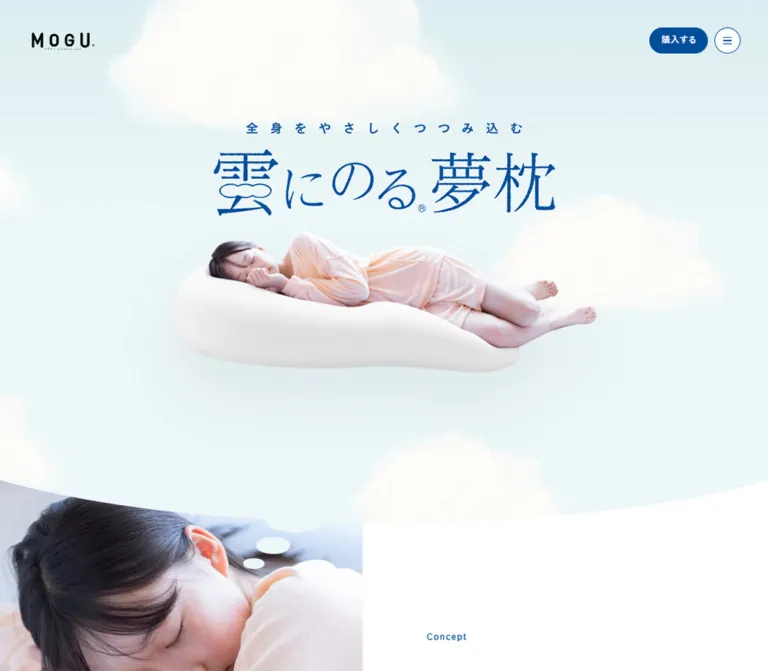
淡い空色と深い青、雲を思わせる曲線、眠る人物の写真で心地よさを伝える寝具の商品紹介ページ。余白の広い構成に、雲形のレビュー、商品ギャラリー、常設の購入導線を組み合わせています。
MOGU / 雲にのる®夢枕 — Style Reference
A floating sleep scene framed by pale skies, deep blue lettering, and cloud-shaped transitions.
Website: mogus.jp/products/kumo Original URL: https://mogus.jp/products/kumo/ Final URL: https://mogus.jp/products/kumo/ Theme: light, with white and pale blue surfaces; no alternative theme was evidenced. Inspected: October 2, 2026, at 02:47:38.780 JST — October 1, 2026, at 17:47:38.780 UTC. Viewports: 1440 × 1000 desktop and 390 × 844 mobile, in CSS pixels. Scope: the current product presentation page, including its opening, Concept, three Feature sections, Material, Voice, Products, two related Kumo series products, closing brand photograph, and footer. Screenshots directly show the opening, desktop Voice area, and closing/footer compositions. Other sections are documented from supplied rendered DOM and computed styles.
MOGU turns the sensation of a large, yielding pillow into the page’s visual structure. A sleeping person rests on a white product cutout against a cloud-filled sky. The product name is a large blue graphic, with delicate Japanese display lettering and a cloud contour incorporated into its first character. The surrounding interface is restrained: a black wordmark, a blue purchase pill, and a small circular menu control.
The same idea continues through bowed section boundaries, white thought-bubble reviews, generous paragraph leading, and large photographs of the product in use. Pale surfaces carry most of the page; deep blue supplies identity and navigation. Product information is extensive, but the layout gives it room through long sections and carefully separated reading and purchasing areas. Purchase links lead to a separate store domain.
閉じる
MOGU / 雲にのる®夢枕 — Style Reference
A floating sleep scene framed by pale skies, deep blue lettering, and cloud-shaped transitions.
Website: mogus.jp/products/kumo Original URL: https://mogus.jp/products/kumo/ Final URL: https://mogus.jp/products/kumo/ Theme: light, with white and pale blue surfaces; no alternative theme was evidenced. Inspected: October 2, 2026, at 02:47:38.780 JST — October 1, 2026, at 17:47:38.780 UTC. Viewports: 1440 × 1000 desktop and 390 × 844 mobile, in CSS pixels. Scope: the current product presentation page, including its opening, Concept, three Feature sections, Material, Voice, Products, two related Kumo series products, closing brand photograph, and footer. Screenshots directly show the opening, desktop Voice area, and closing/footer compositions. Other sections are documented from supplied rendered DOM and computed styles.
MOGU turns the sensation of a large, yielding pillow into the page’s visual structure. A sleeping person rests on a white product cutout against a cloud-filled sky. The product name is a large blue graphic, with delicate Japanese display lettering and a cloud contour incorporated into its first character. The surrounding interface is restrained: a black wordmark, a blue purchase pill, and a small circular menu control.
The same idea continues through bowed section boundaries, white thought-bubble reviews, generous paragraph leading, and large photographs of the product in use. Pale surfaces carry most of the page; deep blue supplies identity and navigation. Product information is extensive, but the layout gives it room through long sections and carefully separated reading and purchasing areas. Purchase links lead to a separate store domain.
How to Read This Reference
- Measured means a value supplied in the rendered DOM or computed-style evidence. Dimensions are rounded where useful; all measurements describe the two inspected viewports.
- Visual estimate means a proportion or treatment read from the original-page screenshots, without an asset file or exact CSS declaration.
- Derived means arithmetic based on measured values, such as column gutters or overlapping section boxes.
- Recommended means guidance for a new implementation. The Quick Start uses new class names and combines measured tokens with explicitly approximate geometry.
- This analysis uses the supplied captures and evidence. No additional browsing, interaction testing, file inspection, or asset retrieval was performed.
- Element rectangles can include transformations, image artwork, or hidden navigation content. They do not always describe visible text or ordinary document flow.
Tokens — Colors
Default Palette
| Name | Value | Suggested token | Evidence and role |
|---|---|---|---|
| MOGU Blue | #004e9c |
--color-blue |
Measured link color, Concept label, review names, counters, and main product purchase fill |
| Page Blue | #e6f1f8 |
--color-page |
Measured body background; visible around the closing photograph and footer |
| Mist Surface | #f3f8fc |
--color-mist |
Measured background of Feature and Kumo series sections |
| Hero Base | #d4e5fa |
--color-hero-base |
Measured background of the first section; not a complete description of the rendered sky |
| White | #ffffff |
--color-white |
Measured Concept and Products backgrounds; visually observed review bubbles and reversed purchase lettering |
| Body Ink | #222222 |
--color-text |
Measured body and explanatory text color |
The opening screenshot looks lighter and more cyan than the first section’s computed #d4e5fa background. Its rendered appearance includes cloud imagery and other visual layers. Replacing the entire composition with that one measured background color would produce the wrong result.
For a CSS-only sky placeholder, visual estimates of #dfeef1 at the top and #edf7f8 below provide a reasonable starting point. These are implementation approximations, not sampled or source-declared colors.
The black wordmark and peach clothing belong to the imagery. The garment’s warmth offsets the cool setting without becoming a second UI action color. Likewise, the five product color names describe merchandise, not five interface themes.
Theme Behavior
Only a light presentation is evidenced. White, mist blue, and page blue alternate across sections. Keep MOGU Blue consistent across navigation, labels, arrows, names, and purchase actions. No dark-mode switch or selectable palette was observed.
Tokens — Typography
Japanese Body Text
Measured stack: "Yu Gothic", yugothic, "ヒラギノ角ゴ ProN", "Hiragino Kaku Gothic ProN", メイリオ, meiryo, sans-serif.
Regular body text uses weight 400, generous leading, and slightly expanded tracking. Desktop paragraphs generally use 18px / 36px; mobile paragraphs use 14.56px / 29.12px. Both retain a line-height ratio of 2.
Concept prose is more spacious: 20px / 50px on desktop and 15.6px / 39px on mobile. This distinction gives the introductory statement a slower rhythm than later technical explanations.
English Labels and Numerical Information
Measured stack: Avenir, Arial, serif on the Concept label, Feature heading containers, and product counters.
The Concept label is bold, small, and blue, with 0.1em tracking. Use it as a quiet section marker rather than a large headline. The evidence establishes a declared stack, not which font file actually rendered on the capture system.
Product Name and Brand Artwork
The hero heading has an empty extracted text value but a substantial visible title graphic. Its measured box is 640 × 175.66px on desktop and 316.16 × 86.77px on mobile. Both preserve an aspect ratio of approximately 3.64:1.
The graphic includes the widely spaced line 全身をやさしくつつみ込む and the product name 雲にのる®夢枕. Its thin, expressive Japanese lettering should be treated as artwork. No font family for that lettering was established.
The H1’s inherited 18px desktop font size does not describe the visible title graphic. Similarly, the HTML element’s default Times family is overridden by the body and is not evidence for the page’s display typography.
Type Scale
Values below describe the sampled elements. Nested artwork or separately styled descendants can differ from their containers.
| Role | Desktop size / line height | Mobile size / line height | Weight | Tracking |
|---|---|---|---|---|
| Body and feature prose | 18 / 36px |
14.56 / 29.12px |
400 | 1.08 / 0.8736px |
| Concept prose | 20 / 50px |
15.6 / 39px |
400 | 1.4 / 1.092px |
| Concept English label | 16 / 32px |
12.48 / 24.96px |
700 | 1.6 / 1.248px |
| Feature index link | 18 / 27px |
14.56 / 21.84px |
400 | 0.36 / 0.2912px |
| Feature label and counter parent | 18 / 18px |
14.56 / 14.56px |
700 | 1.08 / 0.8736px |
| Main Voice quotation | 16 / 32px |
13.52 / 27.04px |
400 | 1.08 / 0.8736px |
| Main Voice author | 13 / 13px |
12.48 / 12.48px |
700 | 1.08 / 0.8736px |
| Related-product quotation | 14 / 25.2px |
12.48 / 22.464px |
400 | 1.08 / 0.8736px |
| Related-product author | 12 / 24px |
10.4 / 20.8px |
700 | 1.08 / 0.8736px |
| Supporting explanation | 14 / 25.2px |
12.48 / 22.464px |
400 | Inherited body tracking |
| Feature disclaimer | 12 / 18px |
10.4 / 15.6px |
400 | Inherited body tracking |
| Replacement-cover link | 16 / 24px |
12.48 / 18.72px |
400 | Inherited body tracking |
| Voice closing statement | 24 / 48px |
16.64 / 33.28px |
700 | Inherited body tracking |
The purchase anchor inherits 18px / 36px on desktop and 14.56px / 29.12px on mobile, while the screenshot’s painted label appears compact and bold. Its final glyph styling was not separately captured. Avoid using inherited anchor typography as proof of the visible lettering’s exact size or weight.
Tokens — Spacing & Shapes
Responsive Unit
The measured root font size is 10px on desktop and 5.2px on mobile. Body text does not simply shrink by that same ratio: it changes from 18px to 14.56px.
Two source custom properties were supplied:
| Property | Desktop | Mobile |
|---|---|---|
--firstViewHeight |
1000px |
844px |
--vw |
1440px |
390px |
Here, --vw contains the complete viewport width, not one viewport-width unit. The evidence does not establish the stylesheet’s root-size formula or breakpoint. Do not extrapolate either from two samples.
Layout Measurements
| Element | Desktop | Mobile | Evidence |
|---|---|---|---|
| Main editorial region | 1120px, with 160px side gutters |
About 291.2px, with 49.4px side gutters |
Measured grids and text boxes |
| Wider product region | Main CTA 640px; banner 1120px |
About 332.8px, with 28.6px side gutters |
Measured |
| Concept grid | 680px 760px |
Full-width media and a centered reading column | Measured layout and content positions |
| Concept text | 640px, starting at x 800px |
291.19px, starting at x 49.41px |
Measured |
| Feature prose | 560px |
291.22px |
Measured |
| Material explanation | Two 400px columns |
Stacked 252.72px columns |
Measured |
| Wordmark graphic container | 118 × 32.19px |
76.44 × 20.84px |
Measured |
| Utility purchase control | 110 × 48px |
77.47 × 37.44px |
Measured |
| Menu control | 48 × 48px |
37.44 × 37.44px |
Measured |
| Utility control gap | 12px |
About 8.31px |
Derived from rectangles |
| Utility top/right inset | 52px |
About 20.8px |
Measured / derived |
| Main product CTA | 640 × 128px |
332.8 × 83.19px |
Measured |
| Voice arrows | 32 × 62.11px |
16.63 × 33.27px |
Measured |
| Product gallery arrows | 64 × 128px |
Equivalent controls not established in the supplied mobile excerpt | Measured desktop only |
Mobile uses two distinct widths: roughly 75% of the viewport for explanatory reading and 85% for product and purchase content. Preserving this difference matters more than applying one universal page gutter.
Section Spacing
| Section | Desktop padding | Mobile padding | Status |
|---|---|---|---|
| Feature | 129px top and bottom |
83.2px top, 49.92px bottom |
Measured |
| Material | 100px top |
52px top; 49.4px horizontal |
Measured |
| Voice | 207px bottom |
102.96px bottom |
Measured |
| Products | 128px top, 160px bottom |
83.2px top, 83.72px bottom |
Measured |
| Kumo series | 240px top, 233px bottom |
120.64px top, 115.44px bottom |
Measured |
| Concept | Layout-dependent | 104px bottom |
Measured mobile |
This is a spacious system with substantial pauses between stories. It is not organized around a compact, uniform card grid.
Border Radius
| Element | Treatment | Evidence |
|---|---|---|
| Main product purchase link | 9999px radius |
Measured |
| Header purchase control | Capsule | Screenshot; sampled anchor itself has transparent background and zero radius |
| Menu | Fine blue circular outline with white interior | Screenshot; likely drawn by another layer or descendant |
| Review bubble | Uneven oval, attached rounded nub, and detached dots | Screenshot; exact path or radii unavailable |
| Hero and closing boundaries | Broad, shallow elliptical curves | Screenshot; exact clipping implementation unavailable |
| Ordinary text regions | Unboxed | Screenshot and sampled styles |
Do not interpret a sampled button’s zero radius as proof that the visible button is square. Several painted shapes are not represented by the sampled element’s own background and radius values.
Components
Brand and Persistent Utility Controls
Anatomy: linked black wordmark at upper left; blue 購入する link at upper right; white circular menu control beside it.
On desktop, the wordmark starts at approximately (60, 60.91) and the purchase/menu controls at y 52px. On mobile, the wordmark starts near (25.47, 31.17) and the controls at y 20.8px.
The purchase and menu controls remain at the same viewport positions in the supplied scrolled captures, consistent with fixed positioning. The wordmark appears in the opening captures but not the later ones; its persistence should not be assumed.
There is no full-width opaque navigation bar. Controls sit directly over the sky or photography. The purchase link points to the Kumo category on mogustore.jp; an in-page checkout was not observed.
Section Navigation
The rendered DOM contains links to #Concept, #Feature, #Material, #Voice, and three lineup anchors. A separate feature index links to #FeatureItem01, #FeatureItem02, and #FeatureItem03.
The screenshots show the menu closed. The expanded panel’s appearance, opening motion, focus handling, and scroll behavior were not exercised. Some recorded navigation rectangles extend outside the viewport; these are not evidence of visible page overflow in the closed state.
Recommended anatomy: a real button with an accessible name and expanded state, a controlled navigation region, and ordinary fragment links. Determine the open-panel design through separate inspection if exact reproduction is required.
Floating Hero
Anatomy: pale sky field; soft cloud images; centered title graphic; isolated sleeping-person/product image; shallow curved lower edge; small bubble-like extension into the next section.
The desktop title graphic begins at (400, 229.34) and measures 640 × 175.66px. The mobile version begins at (36.92, 222.03) and measures 316.16 × 86.77px. Its top position changes little despite the large change in viewport width, preserving an unusually generous blank area above the title on mobile.
Visual estimates: the product/person cutout occupies approximately x 320–1120, y 442–704 on desktop, and x 20–383, y 339–456 on mobile. The subject therefore grows from about 56% of the desktop width to almost the full mobile width. Keep the pillow silhouette intact rather than cropping it into a generic image rectangle.
The title and subject are independent layers, with approximately 30–40px of visible separation. Soft tonal depth beneath the pillow supports the floating effect. It is an image-specific treatment, not a general interface shadow system.
The hero’s measured section box is 1067px tall on desktop and 723.83px on mobile. The Concept section begins earlier, at y 898px and 659.36px respectively. The overlapping boxes accommodate the curved handoff; they do not imply that the visible sky is a rectangle of the same height.
Concept Editorial Section
Anatomy: large lifestyle media region; small blue English label; three loosely spaced Japanese paragraphs.
Desktop uses a 680px / 760px split. The text starts 120px inside the second column, producing a 640px text region. The small Concept label precedes prose with exceptionally open 2.5 line height.
On mobile, the media appears first and the text follows in the 291px reading column. The extracted copy includes additional intentional line breaks, making the statement read as short phrases. The label is measured at document y 1218.86px; this places it about 559.5px after the Concept section begins, including the preceding media and spacing.
Keep the media-to-copy transition spacious. The source’s mobile line breaks are editorial decisions, not merely the desktop paragraph wrapping into a narrower box.
Feature Index and Three Feature Stories
Anatomy: section title artwork; three numbered anchor links; three substantial detail sections; explanatory copy; supporting graphics or image regions; small qualification text.
The desktop index places the three links horizontally to the right of a title region. Link boxes have 24px bottom padding and compact 18px / 27px text. Mobile changes to three stacked rows, each approximately 291 × 68.63px, with 13.52px vertical padding.
The detail sections retain a consistent order: numbered Feature heading, graphic heading/content region, explanation, and supporting evidence. Desktop prose is 560px wide, with narrower supporting text elsewhere in the row. Mobile prose occupies the centered 291px column and supporting material moves down the page.
The text refers to pressure distribution, sleeping position, and relaxation-related evidence. Those topics establish the information hierarchy; the supplied screenshots do not establish the diagrams’ exact visual treatment. Do not invent a chart palette, diagram style, or validation method from the prose alone.
Material Explanations
Anatomy: centered section introduction followed by two material stories, each with a graphic heading/media region and explanatory paragraph.
Desktop paragraph boxes are 400px wide at x 180px and x 860px, leaving broad separation. Mobile stacks the stories and narrows their internal paragraphs to approximately 252.72px, centered within the already narrow reading region.
The content explains the bead filling and stretch fabric. Preserve the distinction between material imagery and readable prose. Exact image assets and their source paths were not supplied.
Voice Photograph and Cloud Reviews
Anatomy: large lifestyle photograph; blue heading arranged vertically in the desktop image area; overlapping white review bubbles; blue chevron controls; follow-up statement and small source notes.
The desktop screenshot shows a person hugging a pale blue cushion while resting on the larger pillow. The photograph fills the width and ends in a broad curve. Review bubbles overlap its lower edge and continue onto a pale blue field.
Two principal bubbles are visible near x 300px and x 740px, each approximately 400px wide. Their text columns are measured at 288px, suggesting roughly 56px side insets in the central cards. The cards sit at different vertical positions. Each has a rounded lower nub and two small detached white dots, carrying the thought-bubble motif into the page background.
Quotation text is dark, with selected phrases bold and underlined. Author names appear below in blue. Adjacent bubbles are smaller and partially clipped at the viewport edges. Their measured text widths of 201.6px and 115.2px are exactly 70% and 40% of the central 288px width, supporting a scaled hierarchy. These are not separate base font sizes.
The DOM repeats the same eight main reviews in multiple sets, consistent with carousel duplication. Do not treat these as additional unique testimonials or infer an autoplay schedule from duplication alone.
Mobile geometry places the two principal review texts one above the other, with staggered horizontal positions, rather than preserving the desktop pair across a row. This is a DOM-derived observation; no mobile Voice screenshot was supplied.
Products Gallery and Main Purchase Block
Anatomy: Products title artwork; product gallery; 01/05 counter; product-name artwork; five color labels; large purchase link; replacement-cover link; usage notes; wide store banner.
The desktop counter occupies a centered 960px-wide region. Large gallery arrow buttons sit outside it. The main purchase link is a blue capsule measuring 640 × 128px; on mobile it becomes approximately 332.8 × 83.19px.
The five rendered color names are ミストグレー, シャインホワイト, ナイトネイビー, スカイブルー, and クリアピンク. A five-position counter and five color names coexist, but their interaction binding was not tested. Do not assume that selecting a color changes the gallery or that the counter necessarily represents color selection.
The replacement-cover link is a smaller, separate text action. A wider store banner is measured at 1120 × 320px on desktop and 332.8 × 95.08px on mobile. Its approximately 3.5:1 ratio remains consistent.
The gallery images, price artwork, and large purchase-label artwork are not fully recoverable from the text extraction. Avoid inventing prices or reproducing empty DOM text as empty visible UI.
Related Kumo Series Modules
Two further product stories follow: 雲に抱きつく夢枕 and 雲にさわる夢クッション.
Each repeats a gallery/counter, graphic product heading, explanatory copy, five color labels, customer reviews, a purchase destination, and a replacement-cover link. The shared section uses Mist Surface with substantial outer padding.
On desktop, each related product’s three review text boxes are 288px wide at x 240, 576, and 912px, giving 48px gaps. On mobile, review boxes are approximately 249.59px wide, with successive boxes positioned about 332.78px apart. This supports a horizontally paged presentation with one principal review visible at a time. Arrow buttons are present in the DOM, but their click, swipe, and looping behavior was not tested.
The related purchase links share the main CTA’s box dimensions. Their sampled backgrounds are transparent, so the main product’s measured blue fill and capsule radius should not automatically be attributed to every related link’s own CSS layer.
Closing Photograph and Footer
Anatomy: broad photograph of a person stretching on the pale blue pillow; brand-supporting statement; curved photo edge; pale blue footer with social links, legal navigation, and copyright.
The closing section is measured at 1100px tall on desktop and 780px on mobile. The desktop statement sits toward the right of the image. The mobile DOM also contains the statement, at 16.64px / 35.776px; its absence from the bottom screenshot means it lies outside that crop, not that it was removed.
The desktop footer presents copyright and a small notice on the left, then company/privacy/contact links and social icons toward the right. Mobile visibly changes the order: social icons first, the three text links next, copyright below, and a centered two-line notice last.
Use the observed LINE symbol, Twitter bird, and Instagram outline when reproducing this captured appearance. The copyright reads © MOGU Co.,Ltd. and the 運用会社 link points to mogus.jp, independently supporting the brand/company association on the original page.
Tokens — Motion & Interaction
The evidence includes transition declarations and settled captures, not a continuous recording of every animation. A declared transition establishes available timing; it does not establish its trigger, initial value, travel distance, or repeat behavior.
| Treatment | Measured declaration | Interpretation and limit |
|---|---|---|
| Hero title opacity | 1s cubic-bezier(0.25, 0.25, 0.75, 0.75) 3.5s |
Delayed title-opacity transition; exact initial opacity not supplied |
| Hero title transform | 1.5s cubic-bezier(0.215, 0.61, 0.355, 1) 3.3s |
Longer eased title movement; translation distance and trigger unverified |
| Navigation and cover-link opacity | 0.2s cubic-bezier(0.25, 0.25, 0.75, 0.75) |
Short opacity feedback; hover endpoint not supplied |
| Mobile Concept entrance | 0.6s opacity; delays 0.1, 0.2, 0.4, 0.6s |
Staggered label and paragraph treatment |
| Mobile Feature detail entrance | 0.6s opacity; delays 0.4, 0.6, 0.8s |
Heading, graphic region, and prose appear in a sequence |
| Mobile Material elements | 0.6s opacity; sampled delays 0.2–0.4s |
Similar restrained reveal vocabulary |
| Mobile Voice arrows | 0.6s opacity with 1.5s delay |
Controls have a later reveal declaration |
| Mobile product counter | 0.6s opacity with 0.5s delay |
Counter participates in section entrance |
Most reveal declarations use cubic-bezier(0.25, 0.25, 0.75, 0.75). The hero transform uses a stronger ease-out curve.
The capture process waited for document load, image decoding, and finite visible or potentially revealing motion within its stated limits. It temporarily paused perpetual animations during readiness checks and then resumed them. This procedure does not identify which page elements move continuously. Cloud drift, pillow bobbing, parallax, carousel autoplay, and smooth anchor scrolling remain unverified.
Recommended: retain gentle opacity changes and limited movement, but keep essential content visible without JavaScript. Offer reduced-motion behavior without the hero’s long waiting period. Implement carousel controls and menu state explicitly; CSS alone does not provide those behaviors.
Surfaces
| Layer | Appearance | Purpose |
|---|---|---|
| Opening atmosphere | Pale cyan sky and softly rendered clouds | Establishes weightlessness and rest |
| Concept and main product areas | White | Separates editorial explanation and purchase content |
| Feature and related series areas | Nearly white blue, #f3f8fc |
Gives long sections a gentle change of field |
| Page and footer | Pale blue, #e6f1f8 |
Connects photographs, reviews, and the final brand area |
| Review surfaces | White organic bubbles | Makes customer quotations part of the cloud motif |
| Primary action | Deep blue with light lettering | Gives purchasing a clear, stable visual anchor |
| Utility menu | White circle and fine blue outline | Stays legible over both sky and photography |
There is no evidenced general-purpose elevation scale, glass panel system, or dense bordered-card language. Separation comes from color fields, composition, and curved boundaries.
Imagery
Photography is bright and low in harsh contrast. White bedding, pale blue products, and peach clothing carry the color story. Close crops emphasize relaxed faces, hands, fabric folds, and the way the pillow yields around the body.
The hero uses a different treatment: the person and white pillow are isolated together, allowing the complete product silhouette to float within the sky. Keep the body-to-product relationship intact. Separating the person and pillow into unrelated stock images would lose the demonstration of scale and support.
Clouds are softly textured photographic or rendered forms. The review containers translate their shape into flatter graphic bubbles. These two treatments are related without being identical: atmospheric clouds behind the hero, clean white shapes around readable quotations.
Observed Asset References
No original asset URLs, intrinsic image sizes, or file formats were provided. The following records visible asset roles without inventing filenames.
| Asset role | Evidence | Reuse guidance |
|---|---|---|
| MOGU wordmark | Opening screenshots and linked graphic container | Preserve its narrow black lettering and small secondary detail |
| Product title lockup | Hero screenshots; measured H1 box | Use authorized artwork with its original aspect ratio |
| Floating person/pillow composition | Desktop and mobile opening screenshots | Preserve the cutout silhouette and soft tonal depth |
| Cloud imagery | Opening screenshots | Keep soft edges and generous empty sky between clouds |
| Concept photograph | Mobile opening reveals its start; DOM establishes media-first structure | Art-direct the crop for a narrow portrait viewport |
| Voice photograph | Desktop Voice screenshot | Preserve the close view of the person hugging the pale blue cushion |
| Review bubble geometry | Desktop Voice screenshot | Approximate with organic shapes; keep text safely within the central area |
| Closing photograph | Desktop and mobile closing screenshots | Crop around the face, extended arms, and large pillow silhouette |
| Social marks | Footer screenshots and rendered links | Preserve the specific observed symbols |
CSS can reproduce the layout and approximate curves. It cannot supply the distinctive title lettering or product photography. Use appropriate supplied assets when available rather than guessed source paths.
Layout & Responsive Behavior
Page Flow
The document is approximately 19,578px tall on desktop and 17,426px on mobile. Despite stacked mobile prose, smaller media and product modules reduce the overall height.
The sequence remains consistent: opening → Concept → Feature → Material → Voice → Products → Kumo series → closing photograph → footer. The page is a continuous document with local navigation and external purchase destinations.
Desktop Composition
A centered 1120px editorial region anchors many sections. Full-width photographs and pale fields break out of it. The Concept section uses an asymmetric split, while product galleries and purchase artwork are centered. This alternation prevents the long page from becoming a repeated two-column template.
The desktop opening leaves substantial clear sky below the floating subject. The Voice section is denser, with overlapping photography and review bubbles. The closing returns to a large, quiet photograph before the compact footer.
Mobile Recomposition
- The hero title occupies about 81% of viewport width, versus 44% on desktop. The product cutout becomes almost full width.
- The first curved transition appears around y
660–680pxin the mobile screenshot, revealing the next photograph before the bottom of the 844px viewport. - Editorial prose uses roughly 49.4px gutters; product and CTA regions use roughly 28.6px gutters.
- Concept changes from side-by-side media/copy to media followed by text. Its source text includes mobile-specific line breaks.
- Feature navigation becomes three stacked rows, while Material stories stack vertically.
- Main Voice geometry indicates a staggered vertical pair; related-product reviews instead occupy a horizontal sequence.
- Footer social links move above the text navigation and copyright.
- The purchase/menu pair remains at the upper right rather than becoming a bottom purchase bar.
Overlap and Cropping
The hero and Concept section boxes overlap by a derived 169px on desktop and approximately 64.47px on mobile. The mobile footer also starts approximately 20.8px before the main element’s lower extent. Such overlaps are compatible with decorative curves; absolute document positions should not be copied as a layout strategy.
The supplied desktop Voice and closing images begin partway through their sections. Headings or prose cut off at the upper edge are capture cropping, not evidence of a broken layout. Tablet behavior, landscape mobile, intermediate breakpoints, and safe-area handling were not tested.
Do’s and Don’ts
Do
- Build the color hierarchy around deep blue, white, and subtly different pale blue fields.
- Preserve the hero title as a graphic with a cloud detail and delicate Japanese lettering.
- Keep the person and full pillow silhouette together in the floating composition.
- Use broad elliptical transitions to connect large sections.
- Separate narrow mobile reading columns from wider product and purchase regions.
- Preserve the unusually generous leading in Concept prose.
- Use organic white thought bubbles, blue author names, and selectively emphasized review phrases.
- Keep purchase and menu controls compact and visually consistent over different backgrounds.
- Recompose the footer order on mobile.
- Treat measured parent styles, visible artwork, and transformed rectangles as different kinds of evidence.
Don’t
- Don’t replace the page with a uniform rounded-card grid.
- Don’t use the hero’s computed base color as its entire rendered sky.
- Don’t infer the title’s font from the H1’s inherited body typography.
- Don’t apply the pillow’s soft depth treatment to every button and content surface.
- Don’t crop the hero pillow to fill a rectangular cover image.
- Don’t use the same mobile gutter for technical prose and large purchase artwork.
- Don’t mistake scaled neighboring reviews for separately authored tiny typography.
- Don’t count repeated carousel entries as unique customer reviews.
- Don’t invent gallery selection, autoplay, menu animation, or parallax behavior.
- Don’t copy source-relative dimensions under a conventional root size without conversion.
- Don’t remove mobile brand copy simply because it is outside the supplied closing crop.
Recommended Implementation Additions
These are recommendations for a new implementation, not verified original features.
- Provide an accessible text equivalent for the title artwork and meaningful alternatives for product-use photographs. Decorative clouds and bubble tails should remain decorative.
- Give menu and carousel buttons explicit accessible names. Empty extracted text alone does not establish whether the original controls already have accessible names.
- Preserve the observed visual control sizes while enlarging mobile pointer targets to at least 44px where practical. Some measured arrow rectangles are much smaller.
- Implement menu focus handling, Escape dismissal, expanded state, and removal of closed-panel links from keyboard navigation.
- Hide carousel clones from assistive technology and expose a coherent current-item state. Keep navigation available without autoplay.
- Keep reveal content visible if scripts fail. Reduced-motion users should receive an immediately readable opening.
- Reassess the smallest mobile text for the intended audience. Increasing the body toward 16px is a readability adaptation, not a measurement of the original.
- Reserve image space with dimensions or aspect ratios, and art-direct mobile crops instead of relying on a single desktop
object-position. - Preserve nearby qualification and source notes when implementing the supplied product information. The design evidence does not independently validate the product-benefit statements.
Agent Prompt Guide
Quick Color Reference
- Primary blue:
#004e9c. - Page and footer:
#e6f1f8. - Feature and related series fields:
#f3f8fc. - Concept, main product field, and review bubbles:
#ffffff. - Body copy:
#222222. - First-section base:
#d4e5fa; the visible sky requires additional imagery or an explicitly approximate treatment. - Peach and pale product blue belong primarily to photography.
Overall Prompt
“Create a long product presentation inspired by MOGU’s 雲にのる®夢枕 page. Use deep blue #004e9c, white, and very pale blue fields. Open with a centered Japanese product-title graphic above a complete cutout of a resting person on a white full-body pillow, surrounded by soft clouds and generous empty sky. Place a small black wordmark at upper left and a persistent blue purchase pill with a white circular menu control at upper right. Continue through editorial Concept copy, three numbered features, material explanations, cloud-shaped customer reviews over a lifestyle photograph, centered product galleries, large purchase capsules, related products, and a curved closing photograph. Use Yu Gothic-based body text with generous leading and small Avenir/Arial section labels. On mobile, distinguish narrow reading columns from wider purchase areas and reorder the footer into centered rows. Treat artwork, gallery behavior, and expanded navigation as separate implementation requirements.”
Example Component Prompts
- Hero: “At 1440px width, center a 640 × 176px product lockup near y 229px and an approximately 800px-wide person/pillow cutout beneath it. Keep a pale cloud-filled sky, a shallow bowed bottom edge, and abundant space below the subject. At 390px width, use a roughly 316px-wide lockup near y 222px and a nearly full-width cutout. Preserve the entire pillow silhouette.”
- Concept: “Create a white editorial section with large media left and a 640px prose region right on desktop. Use a small blue English label and 20px Japanese text with 50px leading. Stack media before a 291px-wide reading column at 390px viewport width; use 15.6px text with 39px leading and deliberate phrase breaks.”
- Voice: “Overlap a bright photograph of pillow use with two large, staggered white thought bubbles. Use approximately 400px-wide principal bubbles, 288px text columns, dark 16px/32px quotations, blue author names, rounded nubs, and two detached dots. Show smaller partial neighbors on desktop. Keep carousel state separate from decorative bubble CSS.”
- Product module: “Use a centered product gallery, blue 01/05 counter, supplied product-name artwork, five labeled colors, and a prominent purchase destination. Make the principal purchase capsule 640 × 128px on desktop and about 333 × 83px on a 390px phone. Place the replacement-cover link beneath it as a smaller text action. Do not invent pricing or color-selection behavior.”
- Footer: “End a bright stretching-person photograph with a wide elliptical curve into a pale blue footer. Arrange copyright, legal links, and blue social symbols across desktop. On mobile, center social symbols first, legal links next, then copyright and the small notice. Keep the purchase/menu cluster at the upper right.”
Quick Start
CSS Custom Properties
This is an implementation scaffold, not recovered source CSS. It keeps a conventional root size and expresses measured typography directly in pixels. The 767px breakpoint, sky gradient, organic radii, some media heights, and hover opacity are recommended approximations. The tables above remain the authority for measured values.
Use a .mogu-page wrapper; a .utility containing the purchase link and menu button; a .hero containing decorative sky/cloud layers, a .hero-lockup H1 with supplied artwork, and a .hero-product image. Review content belongs inside .voice-card elements. Footer children use the three named classes below. Supply real image sources and accessible markup separately; no asset filenames are implied.
:root {
  /* Measured palette */
  --color-blue: #004e9c;
  --color-page: #e6f1f8;
  --color-mist: #f3f8fc;
  --color-hero-base: #d4e5fa;
  --color-white: #ffffff;
  --color-text: #222222;

  /* Visual estimates for a temporary sky treatment */
  --sky-top: #dfeef1;
  --sky-bottom: #edf7f8;

  /* Declared source font stacks */
  --font-japanese: 'Yu Gothic', yugothic, 'ヒラギノ角ゴ ProN',
    'Hiragino Kaku Gothic ProN', 'メイリオ', meiryo, sans-serif;
  --font-label: Avenir, Arial, serif;

  /* Measured desktop type */
  --text-body: 18px;
  --leading-body: 36px;
  --tracking-body: 1.08px;
  --text-concept: 20px;
  --leading-concept: 50px;
  --text-label: 16px;
  --leading-label: 32px;
  --text-review: 16px;
  --leading-review: 32px;

  /* Measured desktop dimensions */
  --main-width: 1120px;
  --utility-inset: 52px;
  --utility-gap: 12px;
  --menu-size: 48px;
  --purchase-width: 110px;
  --purchase-height: 48px;
  --radius-pill: 9999px;

  /* Measured timing curves */
  --ease-opacity: cubic-bezier(0.25, 0.25, 0.75, 0.75);
  --ease-hero: cubic-bezier(0.215, 0.61, 0.355, 1);
  --motion-link: 200ms;
  --motion-reveal: 600ms;
}

* { box-sizing: border-box; }

.mogu-page {
  margin: 0;
  color: var(--color-text);
  background: var(--color-page);
  font-family: var(--font-japanese);
  font-size: var(--text-body);
  line-height: var(--leading-body);
  letter-spacing: var(--tracking-body);
}

.mogu-page img { display: block; max-width: 100%; }
.mogu-page a { color: var(--color-blue); }
.mogu-page button { font: inherit; cursor: pointer; }

.reading-container {
  width: min(var(--main-width), calc(100% - 48px));
  margin-inline: auto;
}

.product-container {
  width: min(var(--main-width), calc(100% - 57.2px));
  margin-inline: auto;
}

.brand {
  position: absolute;
  z-index: 30;
  top: 60.91px;
  left: 60px;
  width: 118px;
}

.utility {
  position: fixed;
  z-index: 40;
  top: var(--utility-inset);
  right: var(--utility-inset);
  display: flex;
  align-items: center;
  gap: var(--utility-gap);
}

.utility-purchase,
.menu-button {
  position: relative;
  display: grid;
  place-items: center;
  padding: 0;
  text-decoration: none;
  transition: opacity var(--motion-link) var(--ease-opacity);
}

/* Label styling is a visual adaptation of the painted control. */
.utility .utility-purchase {
  width: var(--purchase-width);
  height: var(--purchase-height);
  border-radius: var(--radius-pill);
  color: var(--color-white);
  background: var(--color-blue);
  font-size: 16px;
  font-weight: 700;
  line-height: 1;
  letter-spacing: 0;
}

.menu-button {
  width: var(--menu-size);
  height: var(--menu-size);
  border: 1px solid var(--color-blue);
  border-radius: 50%;
  color: var(--color-blue);
  background: var(--color-white);
}

.menu-lines {
  display: block;
  width: 16px;
  height: 1px;
  background: currentColor;
  box-shadow: 0 -5px currentColor, 0 5px currentColor;
}

.hero {
  position: relative;
  z-index: 2;
  height: 1067px;
  isolation: isolate;
}

/* Approximate the visible curved sky independently of its section box. */
.hero-sky {
  position: absolute;
  inset: 0 0 87px;
  overflow: hidden;
  border-radius: 0 0 50% 50% / 0 0 80px 80px;
  background: linear-gradient(var(--sky-top), var(--sky-bottom));
}

.hero-cloud {
  position: absolute;
  width: min(40vw, 580px);
  pointer-events: none;
}

.hero-lockup {
  position: absolute;
  z-index: 1;
  top: 229.34px;
  left: 50%;
  width: min(640px, 81.067vw);
  margin: 0;
  transform: translateX(-50%);
}

.hero-lockup img { width: 100%; height: auto; }

.hero-product {
  position: absolute;
  z-index: 1;
  top: 442px;
  left: 50%;
  width: min(800px, 93.1vw);
  height: auto;
  transform: translateX(-50%);
}

/* Decorative geometry is approximate, not a recovered source path. */
.hero-tail {
  position: absolute;
  top: 960px;
  left: 34.5%;
  width: 120px;
  height: 40px;
  border-radius: 50%;
  background: var(--sky-bottom);
}

.concept {
  position: relative;
  display: grid;
  grid-template-columns: minmax(0, 17fr) minmax(0, 19fr);
  min-height: 1080px;
  margin-top: -169px;
  background: var(--color-white);
}

.concept-media {
  width: 100%;
  height: 100%;
  object-fit: cover;
}

.concept-copy { padding: 280px 0 280px 120px; }

.section-label {
  margin: 0 0 55px;
  color: var(--color-blue);
  font-family: var(--font-label);
  font-size: var(--text-label);
  font-weight: 700;
  line-height: var(--leading-label);
  letter-spacing: 0.1em;
}

.concept-copy p {
  margin: 0 0 40px;
  font-size: var(--text-concept);
  line-height: var(--leading-concept);
  letter-spacing: 0.07em;
}

.concept-copy p:last-child { margin-bottom: 0; }

.feature-section {
  padding-block: 129px;
  background: var(--color-mist);
}

.feature-index { display: flex; gap: 40px; }
.feature-index a { line-height: 1.5; letter-spacing: 0.02em; }
.feature-detail { display: grid; grid-template-columns: 1fr 1fr; }

.material-grid {
  display: grid;
  grid-template-columns: repeat(2, minmax(0, 400px));
  justify-content: space-between;
  gap: 80px;
  width: min(1080px, calc(100% - 48px));
  margin-inline: auto;
}

.voice-viewport { overflow: hidden; }

/* Static central pair; carousel state and adjacent slides are separate. */
.voice-rail {
  display: flex;
  justify-content: center;
  align-items: center;
  gap: 40px;
  padding: 40px 0 90px;
}

.voice-card {
  position: relative;
  flex: 0 0 400px;
  min-height: 344px;
  margin: 0;
  padding: 76px 56px 64px;
  border-radius: 47% 53% 46% 54% / 48% 46% 54% 52%;
  background: var(--color-white);
}

.voice-card:nth-child(2) { transform: translateY(-28px); }

.voice-card::before,
.voice-card::after {
  content: '';
  position: absolute;
  border-radius: 50%;
  background: var(--color-white);
}

.voice-card::before {
  left: 32%;
  bottom: -12px;
  width: 64px;
  height: 28px;
}

.voice-card::after {
  left: 38%;
  bottom: -39px;
  width: 32px;
  height: 16px;
  box-shadow: 14px 24px 0 -4px var(--color-white);
}

.voice-quote {
  margin: 0;
  font-size: var(--text-review);
  line-height: var(--leading-review);
}

.voice-quote strong {
  font-weight: 700;
  text-decoration: underline;
  text-decoration-color: var(--color-hero-base);
  text-decoration-thickness: 4px;
  text-underline-offset: 2px;
}

.voice-author {
  margin: 16px 0 0;
  color: var(--color-blue);
  font-size: 13px;
  font-weight: 700;
  line-height: 1;
}

.products-section {
  padding-block: 128px 160px;
  background: var(--color-white);
}

.gallery-track { width: min(960px, 100%); margin-inline: auto; }
.gallery-counter { color: var(--color-blue); font-family: var(--font-label); }

.product-container .product-cta {
  display: flex;
  align-items: center;
  justify-content: center;
  width: min(640px, 100%);
  min-height: 128px;
  margin-inline: auto;
  padding: 24px;
  border-radius: var(--radius-pill);
  color: var(--color-white);
  background: var(--color-blue);
  text-align: center;
  text-decoration: none;
}

.cover-link {
  display: block;
  margin-top: 35px;
  font-size: 16px;
  line-height: 24px;
  text-align: center;
}

.series-section {
  padding-block: 240px 233px;
  background: var(--color-mist);
}

/* Use a separately art-directed image and crop for the closing section. */
.closing-photo {
  overflow: hidden;
  border-radius: 0 0 50% 50% / 0 0 80px 80px;
}

.closing-photo img { width: 100%; height: 100%; object-fit: cover; }

.site-footer {
  display: grid;
  grid-template-columns: minmax(0, 1fr) auto auto;
  align-items: center;
  gap: 40px;
  min-height: 240px;
  padding-inline: 80px;
  color: var(--color-blue);
}

.footer-legal { display: flex; flex-wrap: wrap; align-items: baseline; gap: 24px; }
.footer-links, .footer-socials { display: flex; align-items: center; gap: 24px; }
.footer-links { font-size: 14px; }
.footer-socials img, .footer-socials svg { width: 22px; height: 22px; }
.footer-copyright { margin: 0; font-size: 16px; }
.footer-notice { margin: 0; font-size: 10px; line-height: 1.6; }

/* Recommended focus and hover feedback. */
.mogu-page :focus-visible {
  outline: 2px solid var(--color-blue);
  outline-offset: 4px;
}

@media (hover: hover) {
  .utility-purchase:hover, .cover-link:hover { opacity: 0.8; }
}

/* Recommended breakpoint; exact source breakpoint was not supplied. */
@media (width <= 767px) {
  :root {
    --text-body: 14.56px;
    --leading-body: 29.12px;
    --tracking-body: 0.8736px;
    --text-concept: 15.6px;
    --leading-concept: 39px;
    --text-label: 12.48px;
    --leading-label: 24.96px;
    --text-review: 13.52px;
    --leading-review: 27.04px;
    --utility-inset: 20.8px;
    --utility-gap: 8.31px;
    --menu-size: 37.44px;
    --purchase-width: 77.47px;
    --purchase-height: 37.44px;
  }

  .reading-container { width: 74.667%; }
  .product-container { width: 85.333%; }
  .brand { top: 31.17px; left: 25.47px; width: 76.44px; }
  .utility .utility-purchase { font-size: 12px; }

  /* Expand pointer areas without enlarging the painted controls. */
  .utility-purchase::before, .menu-button::before {
    content: '';
    position: absolute;
    inset: -4px;
  }

  .hero { height: 723.83px; }
  .hero-sky {
    bottom: 43.83px;
    border-radius: 0 0 50% 50% / 0 0 20px 20px;
  }
  .hero-lockup { top: 222.03px; }
  .hero-product { top: 339px; }
  .hero-tail { top: 664px; left: 60%; width: 72px; height: 28px; }

  .concept {
    grid-template-columns: 1fr;
    min-height: 0;
    margin-top: -64.47px;
  }
  /* Media height is an approximation fitted to the supplied composition. */
  .concept-media { height: 480px; }
  .concept-copy { width: 74.667%; margin-inline: auto; padding: 80px 0 104px; }
  .section-label { margin-bottom: 43.68px; }
  .concept-copy p { margin-bottom: 33.28px; }

  .feature-section { padding-block: 83.2px 49.92px; }
  .feature-index { flex-direction: column; gap: 3.1px; }
  .feature-index a { padding-block: 13.52px; }
  .feature-detail { grid-template-columns: 1fr; }
  .material-grid { width: 64.8%; grid-template-columns: 1fr; }

  .voice-rail { flex-direction: column; gap: 64px; }
  .voice-card {
    flex-basis: auto;
    width: 85.333%;
    min-height: 0;
    padding: 52px 40px;
  }
  .voice-card:nth-child(2) { transform: translateX(10px); }
  .voice-author { font-size: 12.48px; }

  .products-section { padding-block: 83.2px 83.72px; }
  .product-container .product-cta { min-height: 83.19px; }
  .cover-link { margin-top: 29.12px; font-size: 12.48px; line-height: 18.72px; }
  .series-section { padding-block: 120.64px 115.44px; }
  .closing-photo { border-radius: 0 0 50% 50% / 0 0 24px 24px; }

  /* Combined spacing approximates the visible footer composition. */
  .site-footer {
    grid-template-columns: 1fr;
    grid-template-areas: 'social' 'links' 'legal';
    justify-items: center;
    gap: 64px;
    padding: 106px 24px 66.56px;
    text-align: center;
  }
  .footer-socials { grid-area: social; gap: 36px; }
  .footer-links { grid-area: links; gap: 24px; font-size: 10.4px; line-height: 1.5; }
  .footer-legal { grid-area: legal; display: grid; justify-items: center; gap: 12px; }
  .footer-copyright { font-size: 12px; line-height: 1.5; }
  .footer-notice { max-width: 250px; font-size: 10.4px; }
}

@media (prefers-reduced-motion: reduce) {
  .mogu-page *, .mogu-page *::before, .mogu-page *::after {
    animation: none !important;
    transition: none !important;
    scroll-behavior: auto !important;
  }
}
The scaffold deliberately leaves content visible by default. Attach optional reveal behavior through progressive enhancement. Menu state, gallery selection, carousel movement, clone handling, and external navigation require real markup and application behavior; they are not supplied by this CSS.
Tailwind v4 Token Mapping
Optional aliases for an implementation already using Tailwind v4. These do not imply that the original page uses Tailwind. Define the custom properties above first.
@theme inline {
  --color-mogu-blue: var(--color-blue);
  --color-mogu-page: var(--color-page);
  --color-mogu-mist: var(--color-mist);
  --color-mogu-hero-base: var(--color-hero-base);
  --color-mogu-ink: var(--color-text);

  --font-body: var(--font-japanese);
  --font-label: Avenir, Arial, serif;

  --text-body: var(--text-body-size, 18px);
  --text-concept-copy: var(--text-concept);
  --text-review-copy: var(--text-review);

  --spacing-editorial: 1120px;
  --spacing-product-action: 640px;
  --radius-capsule: 9999px;
}
Use responsive utilities or component CSS for the measured mobile type values; the optional body mapping above has an 18px fallback and does not by itself reproduce mobile typography.
Sources & Evidence
- Original and final product page: supplied HTTP 200 response identity, page title, rendered text, link destinations, computed styles, custom properties, and element rectangles. Original and final URLs are identical.
- Capture time: October 1, 2026, 17:47:38.780 UTC, equivalent to October 2, 2026, 02:47:38.780 JST.
- Desktop evidence: 1440 × 1000 viewport; opening, Voice-area, and closing/footer screenshots; rendered document height approximately 19,578px.
- Mobile evidence: 390 × 844 viewport; opening and closing/footer screenshots; rendered document height approximately 17,426px.
- Inspection procedure: the supplied browser process waited for document load, finite motion, sampled layout/text stability, and visible image decoding within stated limits, and traversed intermediate scroll positions. SharedWorkers and service workers were disabled.
- Interaction limits: captures establish scrolled states and persistent utility placement. No supplied action trace verifies menu expansion, arrow clicks, swipe behavior, color selection, autoplay, purchase completion, keyboard handling, or hover endpoints.
- Asset and styling limits: no original asset paths, intrinsic image dimensions, complete stylesheet, pseudo-element styles, or font-loading records were supplied. Middle-page visuals are partly described through DOM structure rather than screenshots. Screenshot estimates and implementation additions are labeled accordingly.
This reference describes the currently supplied page. The CSS is an untested adaptation for reuse, not a claim of pixel-perfect source recovery.
# MOGU / 雲にのる®夢枕 — Style Reference

> A floating sleep scene framed by pale skies, deep blue lettering, and cloud-shaped transitions.

**Website:** [mogus.jp/products/kumo](https://mogus.jp/products/kumo/)
**Original URL:** https://mogus.jp/products/kumo/
**Final URL:** https://mogus.jp/products/kumo/
**Theme:** light, with white and pale blue surfaces; no alternative theme was evidenced.
**Inspected:** October 2, 2026, at 02:47:38.780 JST — October 1, 2026, at 17:47:38.780 UTC.
**Viewports:** 1440 × 1000 desktop and 390 × 844 mobile, in CSS pixels.
**Scope:** the current product presentation page, including its opening, Concept, three Feature sections, Material, Voice, Products, two related Kumo series products, closing brand photograph, and footer. Screenshots directly show the opening, desktop Voice area, and closing/footer compositions. Other sections are documented from supplied rendered DOM and computed styles.

MOGU turns the sensation of a large, yielding pillow into the page’s visual structure. A sleeping person rests on a white product cutout against a cloud-filled sky. The product name is a large blue graphic, with delicate Japanese display lettering and a cloud contour incorporated into its first character. The surrounding interface is restrained: a black wordmark, a blue purchase pill, and a small circular menu control.

The same idea continues through bowed section boundaries, white thought-bubble reviews, generous paragraph leading, and large photographs of the product in use. Pale surfaces carry most of the page; deep blue supplies identity and navigation. Product information is extensive, but the layout gives it room through long sections and carefully separated reading and purchasing areas. Purchase links lead to a separate store domain.
閉じる
# MOGU / 雲にのる®夢枕 — Style Reference

> A floating sleep scene framed by pale skies, deep blue lettering, and cloud-shaped transitions.

**Website:** [mogus.jp/products/kumo](https://mogus.jp/products/kumo/)
**Original URL:** https://mogus.jp/products/kumo/
**Final URL:** https://mogus.jp/products/kumo/
**Theme:** light, with white and pale blue surfaces; no alternative theme was evidenced.
**Inspected:** October 2, 2026, at 02:47:38.780 JST — October 1, 2026, at 17:47:38.780 UTC.
**Viewports:** 1440 × 1000 desktop and 390 × 844 mobile, in CSS pixels.
**Scope:** the current product presentation page, including its opening, Concept, three Feature sections, Material, Voice, Products, two related Kumo series products, closing brand photograph, and footer. Screenshots directly show the opening, desktop Voice area, and closing/footer compositions. Other sections are documented from supplied rendered DOM and computed styles.

MOGU turns the sensation of a large, yielding pillow into the page’s visual structure. A sleeping person rests on a white product cutout against a cloud-filled sky. The product name is a large blue graphic, with delicate Japanese display lettering and a cloud contour incorporated into its first character. The surrounding interface is restrained: a black wordmark, a blue purchase pill, and a small circular menu control.

The same idea continues through bowed section boundaries, white thought-bubble reviews, generous paragraph leading, and large photographs of the product in use. Pale surfaces carry most of the page; deep blue supplies identity and navigation. Product information is extensive, but the layout gives it room through long sections and carefully separated reading and purchasing areas. Purchase links lead to a separate store domain.

## How to Read This Reference

- **Measured** means a value supplied in the rendered DOM or computed-style evidence. Dimensions are rounded where useful; all measurements describe the two inspected viewports.
- **Visual estimate** means a proportion or treatment read from the original-page screenshots, without an asset file or exact CSS declaration.
- **Derived** means arithmetic based on measured values, such as column gutters or overlapping section boxes.
- **Recommended** means guidance for a new implementation. The Quick Start uses new class names and combines measured tokens with explicitly approximate geometry.
- This analysis uses the supplied captures and evidence. No additional browsing, interaction testing, file inspection, or asset retrieval was performed.
- Element rectangles can include transformations, image artwork, or hidden navigation content. They do not always describe visible text or ordinary document flow.

## Tokens — Colors

### Default Palette

| Name | Value | Suggested token | Evidence and role |
| --- | --- | --- | --- |
| MOGU Blue | `#004e9c` | `--color-blue` | Measured link color, Concept label, review names, counters, and main product purchase fill |
| Page Blue | `#e6f1f8` | `--color-page` | Measured body background; visible around the closing photograph and footer |
| Mist Surface | `#f3f8fc` | `--color-mist` | Measured background of Feature and Kumo series sections |
| Hero Base | `#d4e5fa` | `--color-hero-base` | Measured background of the first section; not a complete description of the rendered sky |
| White | `#ffffff` | `--color-white` | Measured Concept and Products backgrounds; visually observed review bubbles and reversed purchase lettering |
| Body Ink | `#222222` | `--color-text` | Measured body and explanatory text color |

The opening screenshot looks lighter and more cyan than the first section’s computed `#d4e5fa` background. Its rendered appearance includes cloud imagery and other visual layers. Replacing the entire composition with that one measured background color would produce the wrong result.

For a CSS-only sky placeholder, **visual estimates** of `#dfeef1` at the top and `#edf7f8` below provide a reasonable starting point. These are implementation approximations, not sampled or source-declared colors.

The black wordmark and peach clothing belong to the imagery. The garment’s warmth offsets the cool setting without becoming a second UI action color. Likewise, the five product color names describe merchandise, not five interface themes.

### Theme Behavior

Only a light presentation is evidenced. White, mist blue, and page blue alternate across sections. Keep MOGU Blue consistent across navigation, labels, arrows, names, and purchase actions. No dark-mode switch or selectable palette was observed.

## Tokens — Typography

### Japanese Body Text

**Measured stack:** `"Yu Gothic", yugothic, "ヒラギノ角ゴ ProN", "Hiragino Kaku Gothic ProN", メイリオ, meiryo, sans-serif`.

Regular body text uses weight `400`, generous leading, and slightly expanded tracking. Desktop paragraphs generally use `18px / 36px`; mobile paragraphs use `14.56px / 29.12px`. Both retain a line-height ratio of `2`.

Concept prose is more spacious: `20px / 50px` on desktop and `15.6px / 39px` on mobile. This distinction gives the introductory statement a slower rhythm than later technical explanations.

### English Labels and Numerical Information

**Measured stack:** `Avenir, Arial, serif` on the Concept label, Feature heading containers, and product counters.

The Concept label is bold, small, and blue, with `0.1em` tracking. Use it as a quiet section marker rather than a large headline. The evidence establishes a declared stack, not which font file actually rendered on the capture system.

### Product Name and Brand Artwork

The hero heading has an empty extracted text value but a substantial visible title graphic. Its measured box is `640 × 175.66px` on desktop and `316.16 × 86.77px` on mobile. Both preserve an aspect ratio of approximately `3.64:1`.

The graphic includes the widely spaced line `全身をやさしくつつみ込む` and the product name `雲にのる®夢枕`. Its thin, expressive Japanese lettering should be treated as artwork. No font family for that lettering was established.

The H1’s inherited `18px` desktop font size does **not** describe the visible title graphic. Similarly, the HTML element’s default `Times` family is overridden by the body and is not evidence for the page’s display typography.

### Type Scale

Values below describe the sampled elements. Nested artwork or separately styled descendants can differ from their containers.

| Role | Desktop size / line height | Mobile size / line height | Weight | Tracking |
| --- | --- | --- | --- | --- |
| Body and feature prose | `18 / 36px` | `14.56 / 29.12px` | 400 | `1.08 / 0.8736px` |
| Concept prose | `20 / 50px` | `15.6 / 39px` | 400 | `1.4 / 1.092px` |
| Concept English label | `16 / 32px` | `12.48 / 24.96px` | 700 | `1.6 / 1.248px` |
| Feature index link | `18 / 27px` | `14.56 / 21.84px` | 400 | `0.36 / 0.2912px` |
| Feature label and counter parent | `18 / 18px` | `14.56 / 14.56px` | 700 | `1.08 / 0.8736px` |
| Main Voice quotation | `16 / 32px` | `13.52 / 27.04px` | 400 | `1.08 / 0.8736px` |
| Main Voice author | `13 / 13px` | `12.48 / 12.48px` | 700 | `1.08 / 0.8736px` |
| Related-product quotation | `14 / 25.2px` | `12.48 / 22.464px` | 400 | `1.08 / 0.8736px` |
| Related-product author | `12 / 24px` | `10.4 / 20.8px` | 700 | `1.08 / 0.8736px` |
| Supporting explanation | `14 / 25.2px` | `12.48 / 22.464px` | 400 | Inherited body tracking |
| Feature disclaimer | `12 / 18px` | `10.4 / 15.6px` | 400 | Inherited body tracking |
| Replacement-cover link | `16 / 24px` | `12.48 / 18.72px` | 400 | Inherited body tracking |
| Voice closing statement | `24 / 48px` | `16.64 / 33.28px` | 700 | Inherited body tracking |

The purchase anchor inherits `18px / 36px` on desktop and `14.56px / 29.12px` on mobile, while the screenshot’s painted label appears compact and bold. Its final glyph styling was not separately captured. Avoid using inherited anchor typography as proof of the visible lettering’s exact size or weight.

## Tokens — Spacing & Shapes

### Responsive Unit

The measured root font size is `10px` on desktop and `5.2px` on mobile. Body text does not simply shrink by that same ratio: it changes from `18px` to `14.56px`.

Two source custom properties were supplied:

| Property | Desktop | Mobile |
| --- | --- | --- |
| `--firstViewHeight` | `1000px` | `844px` |
| `--vw` | `1440px` | `390px` |

Here, `--vw` contains the complete viewport width, not one viewport-width unit. The evidence does not establish the stylesheet’s root-size formula or breakpoint. Do not extrapolate either from two samples.

### Layout Measurements

| Element | Desktop | Mobile | Evidence |
| --- | --- | --- | --- |
| Main editorial region | `1120px`, with `160px` side gutters | About `291.2px`, with `49.4px` side gutters | Measured grids and text boxes |
| Wider product region | Main CTA `640px`; banner `1120px` | About `332.8px`, with `28.6px` side gutters | Measured |
| Concept grid | `680px 760px` | Full-width media and a centered reading column | Measured layout and content positions |
| Concept text | `640px`, starting at x `800px` | `291.19px`, starting at x `49.41px` | Measured |
| Feature prose | `560px` | `291.22px` | Measured |
| Material explanation | Two `400px` columns | Stacked `252.72px` columns | Measured |
| Wordmark graphic container | `118 × 32.19px` | `76.44 × 20.84px` | Measured |
| Utility purchase control | `110 × 48px` | `77.47 × 37.44px` | Measured |
| Menu control | `48 × 48px` | `37.44 × 37.44px` | Measured |
| Utility control gap | `12px` | About `8.31px` | Derived from rectangles |
| Utility top/right inset | `52px` | About `20.8px` | Measured / derived |
| Main product CTA | `640 × 128px` | `332.8 × 83.19px` | Measured |
| Voice arrows | `32 × 62.11px` | `16.63 × 33.27px` | Measured |
| Product gallery arrows | `64 × 128px` | Equivalent controls not established in the supplied mobile excerpt | Measured desktop only |

Mobile uses two distinct widths: roughly **75% of the viewport for explanatory reading** and **85% for product and purchase content**. Preserving this difference matters more than applying one universal page gutter.

### Section Spacing

| Section | Desktop padding | Mobile padding | Status |
| --- | --- | --- | --- |
| Feature | `129px` top and bottom | `83.2px` top, `49.92px` bottom | Measured |
| Material | `100px` top | `52px` top; `49.4px` horizontal | Measured |
| Voice | `207px` bottom | `102.96px` bottom | Measured |
| Products | `128px` top, `160px` bottom | `83.2px` top, `83.72px` bottom | Measured |
| Kumo series | `240px` top, `233px` bottom | `120.64px` top, `115.44px` bottom | Measured |
| Concept | Layout-dependent | `104px` bottom | Measured mobile |

This is a spacious system with substantial pauses between stories. It is not organized around a compact, uniform card grid.

### Border Radius

| Element | Treatment | Evidence |
| --- | --- | --- |
| Main product purchase link | `9999px` radius | Measured |
| Header purchase control | Capsule | Screenshot; sampled anchor itself has transparent background and zero radius |
| Menu | Fine blue circular outline with white interior | Screenshot; likely drawn by another layer or descendant |
| Review bubble | Uneven oval, attached rounded nub, and detached dots | Screenshot; exact path or radii unavailable |
| Hero and closing boundaries | Broad, shallow elliptical curves | Screenshot; exact clipping implementation unavailable |
| Ordinary text regions | Unboxed | Screenshot and sampled styles |

Do not interpret a sampled button’s zero radius as proof that the visible button is square. Several painted shapes are not represented by the sampled element’s own background and radius values.

## Components

### Brand and Persistent Utility Controls

**Anatomy:** linked black wordmark at upper left; blue `購入する` link at upper right; white circular menu control beside it.

On desktop, the wordmark starts at approximately `(60, 60.91)` and the purchase/menu controls at y `52px`. On mobile, the wordmark starts near `(25.47, 31.17)` and the controls at y `20.8px`.

The purchase and menu controls remain at the same viewport positions in the supplied scrolled captures, consistent with fixed positioning. The wordmark appears in the opening captures but not the later ones; its persistence should not be assumed.

There is no full-width opaque navigation bar. Controls sit directly over the sky or photography. The purchase link points to the Kumo category on `mogustore.jp`; an in-page checkout was not observed.

### Section Navigation

The rendered DOM contains links to `#Concept`, `#Feature`, `#Material`, `#Voice`, and three lineup anchors. A separate feature index links to `#FeatureItem01`, `#FeatureItem02`, and `#FeatureItem03`.

The screenshots show the menu closed. The expanded panel’s appearance, opening motion, focus handling, and scroll behavior were not exercised. Some recorded navigation rectangles extend outside the viewport; these are not evidence of visible page overflow in the closed state.

**Recommended anatomy:** a real button with an accessible name and expanded state, a controlled navigation region, and ordinary fragment links. Determine the open-panel design through separate inspection if exact reproduction is required.

### Floating Hero

**Anatomy:** pale sky field; soft cloud images; centered title graphic; isolated sleeping-person/product image; shallow curved lower edge; small bubble-like extension into the next section.

The desktop title graphic begins at `(400, 229.34)` and measures `640 × 175.66px`. The mobile version begins at `(36.92, 222.03)` and measures `316.16 × 86.77px`. Its top position changes little despite the large change in viewport width, preserving an unusually generous blank area above the title on mobile.

**Visual estimates:** the product/person cutout occupies approximately x `320–1120`, y `442–704` on desktop, and x `20–383`, y `339–456` on mobile. The subject therefore grows from about 56% of the desktop width to almost the full mobile width. Keep the pillow silhouette intact rather than cropping it into a generic image rectangle.

The title and subject are independent layers, with approximately 30–40px of visible separation. Soft tonal depth beneath the pillow supports the floating effect. It is an image-specific treatment, not a general interface shadow system.

The hero’s measured section box is `1067px` tall on desktop and `723.83px` on mobile. The Concept section begins earlier, at y `898px` and `659.36px` respectively. The overlapping boxes accommodate the curved handoff; they do not imply that the visible sky is a rectangle of the same height.

### Concept Editorial Section

**Anatomy:** large lifestyle media region; small blue English label; three loosely spaced Japanese paragraphs.

Desktop uses a `680px / 760px` split. The text starts 120px inside the second column, producing a 640px text region. The small `Concept` label precedes prose with exceptionally open `2.5` line height.

On mobile, the media appears first and the text follows in the 291px reading column. The extracted copy includes additional intentional line breaks, making the statement read as short phrases. The label is measured at document y `1218.86px`; this places it about 559.5px after the Concept section begins, including the preceding media and spacing.

Keep the media-to-copy transition spacious. The source’s mobile line breaks are editorial decisions, not merely the desktop paragraph wrapping into a narrower box.

### Feature Index and Three Feature Stories

**Anatomy:** section title artwork; three numbered anchor links; three substantial detail sections; explanatory copy; supporting graphics or image regions; small qualification text.

The desktop index places the three links horizontally to the right of a title region. Link boxes have 24px bottom padding and compact `18px / 27px` text. Mobile changes to three stacked rows, each approximately `291 × 68.63px`, with `13.52px` vertical padding.

The detail sections retain a consistent order: numbered Feature heading, graphic heading/content region, explanation, and supporting evidence. Desktop prose is 560px wide, with narrower supporting text elsewhere in the row. Mobile prose occupies the centered 291px column and supporting material moves down the page.

The text refers to pressure distribution, sleeping position, and relaxation-related evidence. Those topics establish the information hierarchy; the supplied screenshots do not establish the diagrams’ exact visual treatment. Do not invent a chart palette, diagram style, or validation method from the prose alone.

### Material Explanations

**Anatomy:** centered section introduction followed by two material stories, each with a graphic heading/media region and explanatory paragraph.

Desktop paragraph boxes are 400px wide at x `180px` and x `860px`, leaving broad separation. Mobile stacks the stories and narrows their internal paragraphs to approximately 252.72px, centered within the already narrow reading region.

The content explains the bead filling and stretch fabric. Preserve the distinction between material imagery and readable prose. Exact image assets and their source paths were not supplied.

### Voice Photograph and Cloud Reviews

**Anatomy:** large lifestyle photograph; blue heading arranged vertically in the desktop image area; overlapping white review bubbles; blue chevron controls; follow-up statement and small source notes.

The desktop screenshot shows a person hugging a pale blue cushion while resting on the larger pillow. The photograph fills the width and ends in a broad curve. Review bubbles overlap its lower edge and continue onto a pale blue field.

Two principal bubbles are visible near x `300px` and x `740px`, each approximately 400px wide. Their text columns are **measured at 288px**, suggesting roughly 56px side insets in the central cards. The cards sit at different vertical positions. Each has a rounded lower nub and two small detached white dots, carrying the thought-bubble motif into the page background.

Quotation text is dark, with selected phrases bold and underlined. Author names appear below in blue. Adjacent bubbles are smaller and partially clipped at the viewport edges. Their measured text widths of `201.6px` and `115.2px` are exactly 70% and 40% of the central 288px width, supporting a scaled hierarchy. These are not separate base font sizes.

The DOM repeats the same eight main reviews in multiple sets, consistent with carousel duplication. Do not treat these as additional unique testimonials or infer an autoplay schedule from duplication alone.

Mobile geometry places the two principal review texts one above the other, with staggered horizontal positions, rather than preserving the desktop pair across a row. This is a DOM-derived observation; no mobile Voice screenshot was supplied.

### Products Gallery and Main Purchase Block

**Anatomy:** Products title artwork; product gallery; `01/05` counter; product-name artwork; five color labels; large purchase link; replacement-cover link; usage notes; wide store banner.

The desktop counter occupies a centered 960px-wide region. Large gallery arrow buttons sit outside it. The main purchase link is a blue capsule measuring `640 × 128px`; on mobile it becomes approximately `332.8 × 83.19px`.

The five rendered color names are `ミストグレー`, `シャインホワイト`, `ナイトネイビー`, `スカイブルー`, and `クリアピンク`. A five-position counter and five color names coexist, but their interaction binding was not tested. Do not assume that selecting a color changes the gallery or that the counter necessarily represents color selection.

The replacement-cover link is a smaller, separate text action. A wider store banner is measured at `1120 × 320px` on desktop and `332.8 × 95.08px` on mobile. Its approximately 3.5:1 ratio remains consistent.

The gallery images, price artwork, and large purchase-label artwork are not fully recoverable from the text extraction. Avoid inventing prices or reproducing empty DOM text as empty visible UI.

### Related Kumo Series Modules

Two further product stories follow: `雲に抱きつく夢枕` and `雲にさわる夢クッション`.

Each repeats a gallery/counter, graphic product heading, explanatory copy, five color labels, customer reviews, a purchase destination, and a replacement-cover link. The shared section uses Mist Surface with substantial outer padding.

On desktop, each related product’s three review text boxes are 288px wide at x `240`, `576`, and `912px`, giving 48px gaps. On mobile, review boxes are approximately 249.59px wide, with successive boxes positioned about 332.78px apart. This supports a horizontally paged presentation with one principal review visible at a time. Arrow buttons are present in the DOM, but their click, swipe, and looping behavior was not tested.

The related purchase links share the main CTA’s box dimensions. Their sampled backgrounds are transparent, so the main product’s measured blue fill and capsule radius should not automatically be attributed to every related link’s own CSS layer.

### Closing Photograph and Footer

**Anatomy:** broad photograph of a person stretching on the pale blue pillow; brand-supporting statement; curved photo edge; pale blue footer with social links, legal navigation, and copyright.

The closing section is measured at `1100px` tall on desktop and `780px` on mobile. The desktop statement sits toward the right of the image. The mobile DOM also contains the statement, at `16.64px / 35.776px`; its absence from the bottom screenshot means it lies outside that crop, not that it was removed.

The desktop footer presents copyright and a small notice on the left, then company/privacy/contact links and social icons toward the right. Mobile visibly changes the order: social icons first, the three text links next, copyright below, and a centered two-line notice last.

Use the observed LINE symbol, Twitter bird, and Instagram outline when reproducing this captured appearance. The copyright reads `© MOGU Co.,Ltd.` and the `運用会社` link points to [mogus.jp](https://mogus.jp/), independently supporting the brand/company association on the original page.

## Tokens — Motion & Interaction

The evidence includes transition declarations and settled captures, not a continuous recording of every animation. A declared transition establishes available timing; it does not establish its trigger, initial value, travel distance, or repeat behavior.

| Treatment | Measured declaration | Interpretation and limit |
| --- | --- | --- |
| Hero title opacity | `1s cubic-bezier(0.25, 0.25, 0.75, 0.75) 3.5s` | Delayed title-opacity transition; exact initial opacity not supplied |
| Hero title transform | `1.5s cubic-bezier(0.215, 0.61, 0.355, 1) 3.3s` | Longer eased title movement; translation distance and trigger unverified |
| Navigation and cover-link opacity | `0.2s cubic-bezier(0.25, 0.25, 0.75, 0.75)` | Short opacity feedback; hover endpoint not supplied |
| Mobile Concept entrance | `0.6s` opacity; delays `0.1`, `0.2`, `0.4`, `0.6s` | Staggered label and paragraph treatment |
| Mobile Feature detail entrance | `0.6s` opacity; delays `0.4`, `0.6`, `0.8s` | Heading, graphic region, and prose appear in a sequence |
| Mobile Material elements | `0.6s` opacity; sampled delays `0.2–0.4s` | Similar restrained reveal vocabulary |
| Mobile Voice arrows | `0.6s` opacity with `1.5s` delay | Controls have a later reveal declaration |
| Mobile product counter | `0.6s` opacity with `0.5s` delay | Counter participates in section entrance |

Most reveal declarations use `cubic-bezier(0.25, 0.25, 0.75, 0.75)`. The hero transform uses a stronger ease-out curve.

The capture process waited for document load, image decoding, and finite visible or potentially revealing motion within its stated limits. It temporarily paused perpetual animations during readiness checks and then resumed them. This procedure does not identify which page elements move continuously. Cloud drift, pillow bobbing, parallax, carousel autoplay, and smooth anchor scrolling remain unverified.

**Recommended:** retain gentle opacity changes and limited movement, but keep essential content visible without JavaScript. Offer reduced-motion behavior without the hero’s long waiting period. Implement carousel controls and menu state explicitly; CSS alone does not provide those behaviors.

## Surfaces

| Layer | Appearance | Purpose |
| --- | --- | --- |
| Opening atmosphere | Pale cyan sky and softly rendered clouds | Establishes weightlessness and rest |
| Concept and main product areas | White | Separates editorial explanation and purchase content |
| Feature and related series areas | Nearly white blue, `#f3f8fc` | Gives long sections a gentle change of field |
| Page and footer | Pale blue, `#e6f1f8` | Connects photographs, reviews, and the final brand area |
| Review surfaces | White organic bubbles | Makes customer quotations part of the cloud motif |
| Primary action | Deep blue with light lettering | Gives purchasing a clear, stable visual anchor |
| Utility menu | White circle and fine blue outline | Stays legible over both sky and photography |

There is no evidenced general-purpose elevation scale, glass panel system, or dense bordered-card language. Separation comes from color fields, composition, and curved boundaries.

## Imagery

Photography is bright and low in harsh contrast. White bedding, pale blue products, and peach clothing carry the color story. Close crops emphasize relaxed faces, hands, fabric folds, and the way the pillow yields around the body.

The hero uses a different treatment: the person and white pillow are isolated together, allowing the complete product silhouette to float within the sky. Keep the body-to-product relationship intact. Separating the person and pillow into unrelated stock images would lose the demonstration of scale and support.

Clouds are softly textured photographic or rendered forms. The review containers translate their shape into flatter graphic bubbles. These two treatments are related without being identical: atmospheric clouds behind the hero, clean white shapes around readable quotations.

### Observed Asset References

No original asset URLs, intrinsic image sizes, or file formats were provided. The following records visible asset roles without inventing filenames.

| Asset role | Evidence | Reuse guidance |
| --- | --- | --- |
| MOGU wordmark | Opening screenshots and linked graphic container | Preserve its narrow black lettering and small secondary detail |
| Product title lockup | Hero screenshots; measured H1 box | Use authorized artwork with its original aspect ratio |
| Floating person/pillow composition | Desktop and mobile opening screenshots | Preserve the cutout silhouette and soft tonal depth |
| Cloud imagery | Opening screenshots | Keep soft edges and generous empty sky between clouds |
| Concept photograph | Mobile opening reveals its start; DOM establishes media-first structure | Art-direct the crop for a narrow portrait viewport |
| Voice photograph | Desktop Voice screenshot | Preserve the close view of the person hugging the pale blue cushion |
| Review bubble geometry | Desktop Voice screenshot | Approximate with organic shapes; keep text safely within the central area |
| Closing photograph | Desktop and mobile closing screenshots | Crop around the face, extended arms, and large pillow silhouette |
| Social marks | Footer screenshots and rendered links | Preserve the specific observed symbols |

CSS can reproduce the layout and approximate curves. It cannot supply the distinctive title lettering or product photography. Use appropriate supplied assets when available rather than guessed source paths.

## Layout & Responsive Behavior

### Page Flow

The document is approximately `19,578px` tall on desktop and `17,426px` on mobile. Despite stacked mobile prose, smaller media and product modules reduce the overall height.

The sequence remains consistent: opening → Concept → Feature → Material → Voice → Products → Kumo series → closing photograph → footer. The page is a continuous document with local navigation and external purchase destinations.

### Desktop Composition

A centered 1120px editorial region anchors many sections. Full-width photographs and pale fields break out of it. The Concept section uses an asymmetric split, while product galleries and purchase artwork are centered. This alternation prevents the long page from becoming a repeated two-column template.

The desktop opening leaves substantial clear sky below the floating subject. The Voice section is denser, with overlapping photography and review bubbles. The closing returns to a large, quiet photograph before the compact footer.

### Mobile Recomposition

- The hero title occupies about 81% of viewport width, versus 44% on desktop. The product cutout becomes almost full width.
- The first curved transition appears around y `660–680px` in the mobile screenshot, revealing the next photograph before the bottom of the 844px viewport.
- Editorial prose uses roughly 49.4px gutters; product and CTA regions use roughly 28.6px gutters.
- Concept changes from side-by-side media/copy to media followed by text. Its source text includes mobile-specific line breaks.
- Feature navigation becomes three stacked rows, while Material stories stack vertically.
- Main Voice geometry indicates a staggered vertical pair; related-product reviews instead occupy a horizontal sequence.
- Footer social links move above the text navigation and copyright.
- The purchase/menu pair remains at the upper right rather than becoming a bottom purchase bar.

### Overlap and Cropping

The hero and Concept section boxes overlap by a derived `169px` on desktop and approximately `64.47px` on mobile. The mobile footer also starts approximately `20.8px` before the main element’s lower extent. Such overlaps are compatible with decorative curves; absolute document positions should not be copied as a layout strategy.

The supplied desktop Voice and closing images begin partway through their sections. Headings or prose cut off at the upper edge are capture cropping, not evidence of a broken layout. Tablet behavior, landscape mobile, intermediate breakpoints, and safe-area handling were not tested.

## Do’s and Don’ts

### Do

- Build the color hierarchy around deep blue, white, and subtly different pale blue fields.
- Preserve the hero title as a graphic with a cloud detail and delicate Japanese lettering.
- Keep the person and full pillow silhouette together in the floating composition.
- Use broad elliptical transitions to connect large sections.
- Separate narrow mobile reading columns from wider product and purchase regions.
- Preserve the unusually generous leading in Concept prose.
- Use organic white thought bubbles, blue author names, and selectively emphasized review phrases.
- Keep purchase and menu controls compact and visually consistent over different backgrounds.
- Recompose the footer order on mobile.
- Treat measured parent styles, visible artwork, and transformed rectangles as different kinds of evidence.

### Don’t

- Don’t replace the page with a uniform rounded-card grid.
- Don’t use the hero’s computed base color as its entire rendered sky.
- Don’t infer the title’s font from the H1’s inherited body typography.
- Don’t apply the pillow’s soft depth treatment to every button and content surface.
- Don’t crop the hero pillow to fill a rectangular cover image.
- Don’t use the same mobile gutter for technical prose and large purchase artwork.
- Don’t mistake scaled neighboring reviews for separately authored tiny typography.
- Don’t count repeated carousel entries as unique customer reviews.
- Don’t invent gallery selection, autoplay, menu animation, or parallax behavior.
- Don’t copy source-relative dimensions under a conventional root size without conversion.
- Don’t remove mobile brand copy simply because it is outside the supplied closing crop.

## Recommended Implementation Additions

These are recommendations for a new implementation, not verified original features.

- Provide an accessible text equivalent for the title artwork and meaningful alternatives for product-use photographs. Decorative clouds and bubble tails should remain decorative.
- Give menu and carousel buttons explicit accessible names. Empty extracted text alone does not establish whether the original controls already have accessible names.
- Preserve the observed visual control sizes while enlarging mobile pointer targets to at least 44px where practical. Some measured arrow rectangles are much smaller.
- Implement menu focus handling, Escape dismissal, expanded state, and removal of closed-panel links from keyboard navigation.
- Hide carousel clones from assistive technology and expose a coherent current-item state. Keep navigation available without autoplay.
- Keep reveal content visible if scripts fail. Reduced-motion users should receive an immediately readable opening.
- Reassess the smallest mobile text for the intended audience. Increasing the body toward 16px is a readability adaptation, not a measurement of the original.
- Reserve image space with dimensions or aspect ratios, and art-direct mobile crops instead of relying on a single desktop `object-position`.
- Preserve nearby qualification and source notes when implementing the supplied product information. The design evidence does not independently validate the product-benefit statements.

## Agent Prompt Guide

### Quick Color Reference

- Primary blue: `#004e9c`.
- Page and footer: `#e6f1f8`.
- Feature and related series fields: `#f3f8fc`.
- Concept, main product field, and review bubbles: `#ffffff`.
- Body copy: `#222222`.
- First-section base: `#d4e5fa`; the visible sky requires additional imagery or an explicitly approximate treatment.
- Peach and pale product blue belong primarily to photography.

### Overall Prompt

“Create a long product presentation inspired by MOGU’s 雲にのる®夢枕 page. Use deep blue #004e9c, white, and very pale blue fields. Open with a centered Japanese product-title graphic above a complete cutout of a resting person on a white full-body pillow, surrounded by soft clouds and generous empty sky. Place a small black wordmark at upper left and a persistent blue purchase pill with a white circular menu control at upper right. Continue through editorial Concept copy, three numbered features, material explanations, cloud-shaped customer reviews over a lifestyle photograph, centered product galleries, large purchase capsules, related products, and a curved closing photograph. Use Yu Gothic-based body text with generous leading and small Avenir/Arial section labels. On mobile, distinguish narrow reading columns from wider purchase areas and reorder the footer into centered rows. Treat artwork, gallery behavior, and expanded navigation as separate implementation requirements.”

### Example Component Prompts

1. **Hero:** “At 1440px width, center a 640 × 176px product lockup near y 229px and an approximately 800px-wide person/pillow cutout beneath it. Keep a pale cloud-filled sky, a shallow bowed bottom edge, and abundant space below the subject. At 390px width, use a roughly 316px-wide lockup near y 222px and a nearly full-width cutout. Preserve the entire pillow silhouette.”
2. **Concept:** “Create a white editorial section with large media left and a 640px prose region right on desktop. Use a small blue English label and 20px Japanese text with 50px leading. Stack media before a 291px-wide reading column at 390px viewport width; use 15.6px text with 39px leading and deliberate phrase breaks.”
3. **Voice:** “Overlap a bright photograph of pillow use with two large, staggered white thought bubbles. Use approximately 400px-wide principal bubbles, 288px text columns, dark 16px/32px quotations, blue author names, rounded nubs, and two detached dots. Show smaller partial neighbors on desktop. Keep carousel state separate from decorative bubble CSS.”
4. **Product module:** “Use a centered product gallery, blue 01/05 counter, supplied product-name artwork, five labeled colors, and a prominent purchase destination. Make the principal purchase capsule 640 × 128px on desktop and about 333 × 83px on a 390px phone. Place the replacement-cover link beneath it as a smaller text action. Do not invent pricing or color-selection behavior.”
5. **Footer:** “End a bright stretching-person photograph with a wide elliptical curve into a pale blue footer. Arrange copyright, legal links, and blue social symbols across desktop. On mobile, center social symbols first, legal links next, then copyright and the small notice. Keep the purchase/menu cluster at the upper right.”

## Quick Start

### CSS Custom Properties

This is an implementation scaffold, not recovered source CSS. It keeps a conventional root size and expresses measured typography directly in pixels. The `767px` breakpoint, sky gradient, organic radii, some media heights, and hover opacity are **recommended approximations**. The tables above remain the authority for measured values.

Use a `.mogu-page` wrapper; a `.utility` containing the purchase link and menu button; a `.hero` containing decorative sky/cloud layers, a `.hero-lockup` H1 with supplied artwork, and a `.hero-product` image. Review content belongs inside `.voice-card` elements. Footer children use the three named classes below. Supply real image sources and accessible markup separately; no asset filenames are implied.

```css
:root {
  /* Measured palette */
  --color-blue: #004e9c;
  --color-page: #e6f1f8;
  --color-mist: #f3f8fc;
  --color-hero-base: #d4e5fa;
  --color-white: #ffffff;
  --color-text: #222222;

  /* Visual estimates for a temporary sky treatment */
  --sky-top: #dfeef1;
  --sky-bottom: #edf7f8;

  /* Declared source font stacks */
  --font-japanese: 'Yu Gothic', yugothic, 'ヒラギノ角ゴ ProN',
    'Hiragino Kaku Gothic ProN', 'メイリオ', meiryo, sans-serif;
  --font-label: Avenir, Arial, serif;

  /* Measured desktop type */
  --text-body: 18px;
  --leading-body: 36px;
  --tracking-body: 1.08px;
  --text-concept: 20px;
  --leading-concept: 50px;
  --text-label: 16px;
  --leading-label: 32px;
  --text-review: 16px;
  --leading-review: 32px;

  /* Measured desktop dimensions */
  --main-width: 1120px;
  --utility-inset: 52px;
  --utility-gap: 12px;
  --menu-size: 48px;
  --purchase-width: 110px;
  --purchase-height: 48px;
  --radius-pill: 9999px;

  /* Measured timing curves */
  --ease-opacity: cubic-bezier(0.25, 0.25, 0.75, 0.75);
  --ease-hero: cubic-bezier(0.215, 0.61, 0.355, 1);
  --motion-link: 200ms;
  --motion-reveal: 600ms;
}

* { box-sizing: border-box; }

.mogu-page {
  margin: 0;
  color: var(--color-text);
  background: var(--color-page);
  font-family: var(--font-japanese);
  font-size: var(--text-body);
  line-height: var(--leading-body);
  letter-spacing: var(--tracking-body);
}

.mogu-page img { display: block; max-width: 100%; }
.mogu-page a { color: var(--color-blue); }
.mogu-page button { font: inherit; cursor: pointer; }

.reading-container {
  width: min(var(--main-width), calc(100% - 48px));
  margin-inline: auto;
}

.product-container {
  width: min(var(--main-width), calc(100% - 57.2px));
  margin-inline: auto;
}

.brand {
  position: absolute;
  z-index: 30;
  top: 60.91px;
  left: 60px;
  width: 118px;
}

.utility {
  position: fixed;
  z-index: 40;
  top: var(--utility-inset);
  right: var(--utility-inset);
  display: flex;
  align-items: center;
  gap: var(--utility-gap);
}

.utility-purchase,
.menu-button {
  position: relative;
  display: grid;
  place-items: center;
  padding: 0;
  text-decoration: none;
  transition: opacity var(--motion-link) var(--ease-opacity);
}

/* Label styling is a visual adaptation of the painted control. */
.utility .utility-purchase {
  width: var(--purchase-width);
  height: var(--purchase-height);
  border-radius: var(--radius-pill);
  color: var(--color-white);
  background: var(--color-blue);
  font-size: 16px;
  font-weight: 700;
  line-height: 1;
  letter-spacing: 0;
}

.menu-button {
  width: var(--menu-size);
  height: var(--menu-size);
  border: 1px solid var(--color-blue);
  border-radius: 50%;
  color: var(--color-blue);
  background: var(--color-white);
}

.menu-lines {
  display: block;
  width: 16px;
  height: 1px;
  background: currentColor;
  box-shadow: 0 -5px currentColor, 0 5px currentColor;
}

.hero {
  position: relative;
  z-index: 2;
  height: 1067px;
  isolation: isolate;
}

/* Approximate the visible curved sky independently of its section box. */
.hero-sky {
  position: absolute;
  inset: 0 0 87px;
  overflow: hidden;
  border-radius: 0 0 50% 50% / 0 0 80px 80px;
  background: linear-gradient(var(--sky-top), var(--sky-bottom));
}

.hero-cloud {
  position: absolute;
  width: min(40vw, 580px);
  pointer-events: none;
}

.hero-lockup {
  position: absolute;
  z-index: 1;
  top: 229.34px;
  left: 50%;
  width: min(640px, 81.067vw);
  margin: 0;
  transform: translateX(-50%);
}

.hero-lockup img { width: 100%; height: auto; }

.hero-product {
  position: absolute;
  z-index: 1;
  top: 442px;
  left: 50%;
  width: min(800px, 93.1vw);
  height: auto;
  transform: translateX(-50%);
}

/* Decorative geometry is approximate, not a recovered source path. */
.hero-tail {
  position: absolute;
  top: 960px;
  left: 34.5%;
  width: 120px;
  height: 40px;
  border-radius: 50%;
  background: var(--sky-bottom);
}

.concept {
  position: relative;
  display: grid;
  grid-template-columns: minmax(0, 17fr) minmax(0, 19fr);
  min-height: 1080px;
  margin-top: -169px;
  background: var(--color-white);
}

.concept-media {
  width: 100%;
  height: 100%;
  object-fit: cover;
}

.concept-copy { padding: 280px 0 280px 120px; }

.section-label {
  margin: 0 0 55px;
  color: var(--color-blue);
  font-family: var(--font-label);
  font-size: var(--text-label);
  font-weight: 700;
  line-height: var(--leading-label);
  letter-spacing: 0.1em;
}

.concept-copy p {
  margin: 0 0 40px;
  font-size: var(--text-concept);
  line-height: var(--leading-concept);
  letter-spacing: 0.07em;
}

.concept-copy p:last-child { margin-bottom: 0; }

.feature-section {
  padding-block: 129px;
  background: var(--color-mist);
}

.feature-index { display: flex; gap: 40px; }
.feature-index a { line-height: 1.5; letter-spacing: 0.02em; }
.feature-detail { display: grid; grid-template-columns: 1fr 1fr; }

.material-grid {
  display: grid;
  grid-template-columns: repeat(2, minmax(0, 400px));
  justify-content: space-between;
  gap: 80px;
  width: min(1080px, calc(100% - 48px));
  margin-inline: auto;
}

.voice-viewport { overflow: hidden; }

/* Static central pair; carousel state and adjacent slides are separate. */
.voice-rail {
  display: flex;
  justify-content: center;
  align-items: center;
  gap: 40px;
  padding: 40px 0 90px;
}

.voice-card {
  position: relative;
  flex: 0 0 400px;
  min-height: 344px;
  margin: 0;
  padding: 76px 56px 64px;
  border-radius: 47% 53% 46% 54% / 48% 46% 54% 52%;
  background: var(--color-white);
}

.voice-card:nth-child(2) { transform: translateY(-28px); }

.voice-card::before,
.voice-card::after {
  content: '';
  position: absolute;
  border-radius: 50%;
  background: var(--color-white);
}

.voice-card::before {
  left: 32%;
  bottom: -12px;
  width: 64px;
  height: 28px;
}

.voice-card::after {
  left: 38%;
  bottom: -39px;
  width: 32px;
  height: 16px;
  box-shadow: 14px 24px 0 -4px var(--color-white);
}

.voice-quote {
  margin: 0;
  font-size: var(--text-review);
  line-height: var(--leading-review);
}

.voice-quote strong {
  font-weight: 700;
  text-decoration: underline;
  text-decoration-color: var(--color-hero-base);
  text-decoration-thickness: 4px;
  text-underline-offset: 2px;
}

.voice-author {
  margin: 16px 0 0;
  color: var(--color-blue);
  font-size: 13px;
  font-weight: 700;
  line-height: 1;
}

.products-section {
  padding-block: 128px 160px;
  background: var(--color-white);
}

.gallery-track { width: min(960px, 100%); margin-inline: auto; }
.gallery-counter { color: var(--color-blue); font-family: var(--font-label); }

.product-container .product-cta {
  display: flex;
  align-items: center;
  justify-content: center;
  width: min(640px, 100%);
  min-height: 128px;
  margin-inline: auto;
  padding: 24px;
  border-radius: var(--radius-pill);
  color: var(--color-white);
  background: var(--color-blue);
  text-align: center;
  text-decoration: none;
}

.cover-link {
  display: block;
  margin-top: 35px;
  font-size: 16px;
  line-height: 24px;
  text-align: center;
}

.series-section {
  padding-block: 240px 233px;
  background: var(--color-mist);
}

/* Use a separately art-directed image and crop for the closing section. */
.closing-photo {
  overflow: hidden;
  border-radius: 0 0 50% 50% / 0 0 80px 80px;
}

.closing-photo img { width: 100%; height: 100%; object-fit: cover; }

.site-footer {
  display: grid;
  grid-template-columns: minmax(0, 1fr) auto auto;
  align-items: center;
  gap: 40px;
  min-height: 240px;
  padding-inline: 80px;
  color: var(--color-blue);
}

.footer-legal { display: flex; flex-wrap: wrap; align-items: baseline; gap: 24px; }
.footer-links, .footer-socials { display: flex; align-items: center; gap: 24px; }
.footer-links { font-size: 14px; }
.footer-socials img, .footer-socials svg { width: 22px; height: 22px; }
.footer-copyright { margin: 0; font-size: 16px; }
.footer-notice { margin: 0; font-size: 10px; line-height: 1.6; }

/* Recommended focus and hover feedback. */
.mogu-page :focus-visible {
  outline: 2px solid var(--color-blue);
  outline-offset: 4px;
}

@media (hover: hover) {
  .utility-purchase:hover, .cover-link:hover { opacity: 0.8; }
}

/* Recommended breakpoint; exact source breakpoint was not supplied. */
@media (width <= 767px) {
  :root {
    --text-body: 14.56px;
    --leading-body: 29.12px;
    --tracking-body: 0.8736px;
    --text-concept: 15.6px;
    --leading-concept: 39px;
    --text-label: 12.48px;
    --leading-label: 24.96px;
    --text-review: 13.52px;
    --leading-review: 27.04px;
    --utility-inset: 20.8px;
    --utility-gap: 8.31px;
    --menu-size: 37.44px;
    --purchase-width: 77.47px;
    --purchase-height: 37.44px;
  }

  .reading-container { width: 74.667%; }
  .product-container { width: 85.333%; }
  .brand { top: 31.17px; left: 25.47px; width: 76.44px; }
  .utility .utility-purchase { font-size: 12px; }

  /* Expand pointer areas without enlarging the painted controls. */
  .utility-purchase::before, .menu-button::before {
    content: '';
    position: absolute;
    inset: -4px;
  }

  .hero { height: 723.83px; }
  .hero-sky {
    bottom: 43.83px;
    border-radius: 0 0 50% 50% / 0 0 20px 20px;
  }
  .hero-lockup { top: 222.03px; }
  .hero-product { top: 339px; }
  .hero-tail { top: 664px; left: 60%; width: 72px; height: 28px; }

  .concept {
    grid-template-columns: 1fr;
    min-height: 0;
    margin-top: -64.47px;
  }
  /* Media height is an approximation fitted to the supplied composition. */
  .concept-media { height: 480px; }
  .concept-copy { width: 74.667%; margin-inline: auto; padding: 80px 0 104px; }
  .section-label { margin-bottom: 43.68px; }
  .concept-copy p { margin-bottom: 33.28px; }

  .feature-section { padding-block: 83.2px 49.92px; }
  .feature-index { flex-direction: column; gap: 3.1px; }
  .feature-index a { padding-block: 13.52px; }
  .feature-detail { grid-template-columns: 1fr; }
  .material-grid { width: 64.8%; grid-template-columns: 1fr; }

  .voice-rail { flex-direction: column; gap: 64px; }
  .voice-card {
    flex-basis: auto;
    width: 85.333%;
    min-height: 0;
    padding: 52px 40px;
  }
  .voice-card:nth-child(2) { transform: translateX(10px); }
  .voice-author { font-size: 12.48px; }

  .products-section { padding-block: 83.2px 83.72px; }
  .product-container .product-cta { min-height: 83.19px; }
  .cover-link { margin-top: 29.12px; font-size: 12.48px; line-height: 18.72px; }
  .series-section { padding-block: 120.64px 115.44px; }
  .closing-photo { border-radius: 0 0 50% 50% / 0 0 24px 24px; }

  /* Combined spacing approximates the visible footer composition. */
  .site-footer {
    grid-template-columns: 1fr;
    grid-template-areas: 'social' 'links' 'legal';
    justify-items: center;
    gap: 64px;
    padding: 106px 24px 66.56px;
    text-align: center;
  }
  .footer-socials { grid-area: social; gap: 36px; }
  .footer-links { grid-area: links; gap: 24px; font-size: 10.4px; line-height: 1.5; }
  .footer-legal { grid-area: legal; display: grid; justify-items: center; gap: 12px; }
  .footer-copyright { font-size: 12px; line-height: 1.5; }
  .footer-notice { max-width: 250px; font-size: 10.4px; }
}

@media (prefers-reduced-motion: reduce) {
  .mogu-page *, .mogu-page *::before, .mogu-page *::after {
    animation: none !important;
    transition: none !important;
    scroll-behavior: auto !important;
  }
}
```

The scaffold deliberately leaves content visible by default. Attach optional reveal behavior through progressive enhancement. Menu state, gallery selection, carousel movement, clone handling, and external navigation require real markup and application behavior; they are not supplied by this CSS.

### Tailwind v4 Token Mapping

Optional aliases for an implementation already using Tailwind v4. These do not imply that the original page uses Tailwind. Define the custom properties above first.

```css
@theme inline {
  --color-mogu-blue: var(--color-blue);
  --color-mogu-page: var(--color-page);
  --color-mogu-mist: var(--color-mist);
  --color-mogu-hero-base: var(--color-hero-base);
  --color-mogu-ink: var(--color-text);

  --font-body: var(--font-japanese);
  --font-label: Avenir, Arial, serif;

  --text-body: var(--text-body-size, 18px);
  --text-concept-copy: var(--text-concept);
  --text-review-copy: var(--text-review);

  --spacing-editorial: 1120px;
  --spacing-product-action: 640px;
  --radius-capsule: 9999px;
}
```

Use responsive utilities or component CSS for the measured mobile type values; the optional `body` mapping above has an 18px fallback and does not by itself reproduce mobile typography.

## Sources & Evidence

- [Original and final product page](https://mogus.jp/products/kumo/): supplied HTTP 200 response identity, page title, rendered text, link destinations, computed styles, custom properties, and element rectangles. Original and final URLs are identical.
- **Capture time:** October 1, 2026, 17:47:38.780 UTC, equivalent to October 2, 2026, 02:47:38.780 JST.
- **Desktop evidence:** 1440 × 1000 viewport; opening, Voice-area, and closing/footer screenshots; rendered document height approximately 19,578px.
- **Mobile evidence:** 390 × 844 viewport; opening and closing/footer screenshots; rendered document height approximately 17,426px.
- **Inspection procedure:** the supplied browser process waited for document load, finite motion, sampled layout/text stability, and visible image decoding within stated limits, and traversed intermediate scroll positions. SharedWorkers and service workers were disabled.
- **Interaction limits:** captures establish scrolled states and persistent utility placement. No supplied action trace verifies menu expansion, arrow clicks, swipe behavior, color selection, autoplay, purchase completion, keyboard handling, or hover endpoints.
- **Asset and styling limits:** no original asset paths, intrinsic image dimensions, complete stylesheet, pseudo-element styles, or font-loading records were supplied. Middle-page visuals are partly described through DOM structure rather than screenshots. Screenshot estimates and implementation additions are labeled accordingly.

This reference describes the currently supplied page. The CSS is an untested adaptation for reuse, not a claim of pixel-perfect source recovery.関連するデザイン
スタイルやページの種類、ジャンルが近いデザインを集めました。