プレビュー準備中デザインリファレンスを見る
DESIGN REFERENCE
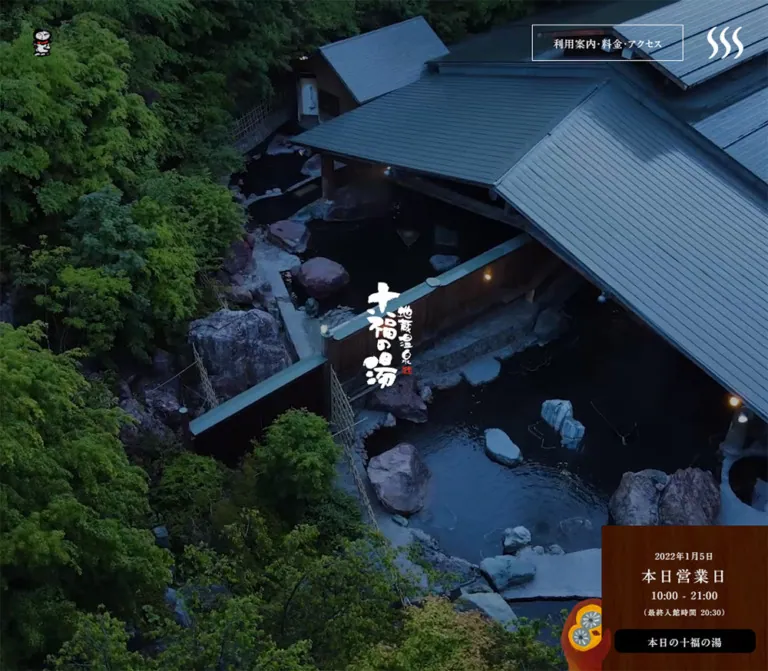
地蔵温泉 十福の湯|森の写真と手描きイラストの温泉サイト
露天風呂の全画面写真、明朝体、淡い紙の質感、手描きの動物、細い楕円リンクを組み合わせた日帰り温泉施設サイト。モバイルでは営業案内やフッターを大きく組み替えています。
Jizo Onsen Jippuku-no-yu / 十福の湯 — Style Reference
A forest bathhouse told through aerial photography, pale paper, and painted woodland characters.
Original URL: https://zippuku.net/ Final URL: https://zippuku.net/ Theme: dark photographic opening, pale textured content, and a white footer; no selectable color theme was demonstrated. Inspected: October 2, 2026, at 06:13:07.893 JST. The supplied browser record is timestamped October 1, 2026, at 21:13:07.893 UTC. Viewports: 1440 × 1000 desktop and 390 × 844 mobile, in CSS pixels. Scope: the current facility homepage. Visual evidence includes the desktop opening, restaurant section, illustrated footer transition, mobile opening, and mobile footer. Rendered DOM and computed styles additionally cover the introduction, bath and sauna sections, facility section, trivia, news, navigation, and daily-information content. Linked destination pages and opened interactive states were not inspected.
The homepage balances two kinds of warmth: the physical atmosphere of a mountain bathhouse and the friendliness of a handmade picture book. Dark forest photography establishes the place. Below it, pale green paper, white cloudlike shapes, generous spacing, and textured animal illustrations soften the presentation. Japanese Mincho typography connects practical information with the traditional calligraphic identity.
This is a facility website with several navigation destinations, operational information, editorial content, and news. Its visual hierarchy does not depend on a large promotional headline or repeated conversion buttons. The opening centers a comparatively small white wordmark, while opening hours and access remain peripheral but easy to locate. Subsequent sections alternate broad photographs with concise descriptions and delicate oval links.
閉じる
Jizo Onsen Jippuku-no-yu / 十福の湯 — Style Reference
A forest bathhouse told through aerial photography, pale paper, and painted woodland characters.
Original URL: https://zippuku.net/ Final URL: https://zippuku.net/ Theme: dark photographic opening, pale textured content, and a white footer; no selectable color theme was demonstrated. Inspected: October 2, 2026, at 06:13:07.893 JST. The supplied browser record is timestamped October 1, 2026, at 21:13:07.893 UTC. Viewports: 1440 × 1000 desktop and 390 × 844 mobile, in CSS pixels. Scope: the current facility homepage. Visual evidence includes the desktop opening, restaurant section, illustrated footer transition, mobile opening, and mobile footer. Rendered DOM and computed styles additionally cover the introduction, bath and sauna sections, facility section, trivia, news, navigation, and daily-information content. Linked destination pages and opened interactive states were not inspected.
The homepage balances two kinds of warmth: the physical atmosphere of a mountain bathhouse and the friendliness of a handmade picture book. Dark forest photography establishes the place. Below it, pale green paper, white cloudlike shapes, generous spacing, and textured animal illustrations soften the presentation. Japanese Mincho typography connects practical information with the traditional calligraphic identity.
This is a facility website with several navigation destinations, operational information, editorial content, and news. Its visual hierarchy does not depend on a large promotional headline or repeated conversion buttons. The opening centers a comparatively small white wordmark, while opening hours and access remain peripheral but easy to locate. Subsequent sections alternate broad photographs with concise descriptions and delicate oval links.
How to Read This Reference
- Measured means a value appears in the supplied rendered element geometry or computed styles. Measurements describe the two recorded viewport states, not a recovered stylesheet formula.
- Visual estimate means a dimension, color, or treatment is judged from the current-page captures. Estimated hexadecimal colors are practical approximations, not sampled source tokens.
- DOM-only evidence identifies content or styling found in the rendered record whose visible or opened state was not captured. An element can have dimensions while remaining concealed through an ancestor or another presentation mechanism.
- Recommendations are implementation choices for a new project. Breakpoints, fallback fonts, focus treatments, and the Quick Start selectors are recommendations unless explicitly identified otherwise.
- All named design tokens are reference aliases. The supplied WordPress and Swiper custom properties do not establish the site's visible design system.
- Document heights were approximately 6878.11px desktop and 6626.66px mobile. Those heights are observations, not layout targets.
Tokens — Colors
Default Palette
| Name | Value | Evidence | Reference token | Role |
|---|---|---|---|---|
| Ink | #000000 |
Measured | --color-ink |
Main text, dark header artwork, footer icons, and the daily-information button |
| White | #FFFFFF |
Measured | --color-white |
Footer background, shop circle, reversed text, and opening identity |
| Mist Paper | Approximately #E4ECE8 |
Visual estimate | --color-paper |
Pale green-gray field behind the illustrated content |
| Deep Teal | #073947 |
Measured, DOM-only layer | --color-deep-teal |
Background of the full-viewport daily-information section |
| Painted Forest | Approximately #2F8B78 |
Visual estimate | --color-forest |
A representative midtone in the illustrated trees; artwork contains many variations |
| Campaign Coral | Approximately #F16B56 |
Visual estimate | --color-coral |
Campaign outline, lettering, and small warm illustration details |
| Warm Wood | Approximately #763410 |
Visual estimate | --color-wood |
Fallback approximation for the textured opening-hours sign |
| Basket Gold | Approximately #A88226 |
Visual estimate | --color-gold |
Small basket symbol in the white shop control |
Black and white are the structural UI colors. Green, brown, gold, and coral mostly arrive through photography, texture, or illustration. They should not become an interchangeable set of button colors.
The pale content background is visibly textured and crossed by large white organic shapes. A single flat green fill will reproduce its approximate tone but not its material character. Similarly, the hours panel is wood imagery with tonal variation, rather than a uniform brown card.
The opening photograph is dark enough to support white lettering. Its exact overlay color and opacity were not supplied. Any overlay value in a new implementation must be treated as a recommendation and checked against the chosen image.
Color States
The access link and steam-shaped menu artwork appear white over the opening and black over the light content and footer. The shop control retains its white circular surface. The captures establish these appearances, but do not establish whether the original switches classes, uses blending, or employs another mechanism.
The measured #073947 belongs to the daily-information layer present in the DOM. Do not automatically assign it to the visible photographic hero. Likewise, the declared Swiper blue and WordPress gradient presets are not evidence of blue controls or gradient surfaces on this page.
Tokens — Typography
Japanese Mincho — Main Interface
- Computed family:
MFW-A1MinchoStd-Bold. - Body weight:
500. - Feature heading weight:
700. - Several section headings and buttons:
400. - Character: clear stroke contrast, traditional Japanese forms, restrained size, and conspicuous breathing room between lines.
- Reference alias:
--font-editorial.
Preserve the distinction between the family name and the computed weight. The word Bold in the family identifier does not mean every element reports font-weight: 700.
Font files and licensing information were not supplied. The Quick Start retains the observed family identifier and adds recommended Mincho fallbacks; those fallbacks are not claims about the original font stack.
Calligraphic Identity
The opening wordmark is artwork with irregular brush lettering, a small red seal, and a vertical composition. It is not an ordinary heading rendered in the body font. The desktop footer uses a horizontal identity treatment with the small mascot; the mobile footer uses a vertical treatment.
Keep these identity arrangements as image or vector assets when authorized. Substituting a generic brush font will not reproduce their silhouette or spacing.
Utility Text and Icons
Utility labels generally retain the same Mincho family as body copy. The menu button reports a browser Arial default, but has no visible text in the supplied record; this does not establish a separate sans-serif visual system.
The shop basket, steam menu mark, mascot, social symbols, and small directional arrows have distinct roles. The steam mark is a custom three-wave symbol, not a conventional three-bar hamburger.
Type Scale
All values below are measured. Tracking is expressed in pixels to preserve the supplied evidence.
| Role | Desktop size / line height | Mobile size / line height | Desktop / mobile tracking | Weight |
|---|---|---|---|---|
| Body copy | 16 / 32px |
14 / 28px |
1.2 / 1.05px |
500 |
| Feature heading | 40 / 64px |
22.75 / 36.4px |
0.8 / 0.455px |
700 |
| Introduction and news heading | 32 / 51.2px |
17.5 / 28px |
0.64 / 0.35px |
700 |
| Introduction paragraph | 20 / 60px |
14 / 28px |
2 / 1.4px |
500 |
| Trivia heading | 27.2 / 47.6px |
23.8 / 41.65px |
0.544 / 0.476px |
400 |
| Header access link | 16 / 16px |
10.5 / 13.65px |
1.2 / 1.05px |
500 |
| Standard oval link | 16 / 32px |
14 / 28px |
1.2 / 1.05px |
500 |
| Opening business-status label | 24 / 31.2px |
25.9 / 33.67px |
3.6 / 3.885px |
500 |
| Opening news title | 14 / 21px |
12.25 / 18.375px |
1.2 / 1.05px |
500 |
| Main news title | 16 / 28.8px |
12.25 / 21px |
1.6 / 1.225px |
500 |
| Footer navigation | 16 / 32px |
14 / 28px |
1.2 / 1.05px |
500 |
| Footer social labels | 12 / 24px |
10.5 / 21px |
0.6 / 0.525px |
500 |
| Footer address | 14 / 28px |
12.25 / 24.5px |
1.2 / 1.05px |
500 |
| Footer telephone number | 28 / 56px |
18.375 / 36.75px |
4.2 / 2.75625px |
500 |
Three reusable relationships emerge: body leading is 2, feature-heading leading is 1.6, and telephone/status tracking is 0.15em. Body tracking is 0.075em; feature-heading tracking is 0.02em.
Mobile typography is not a uniform scale-down. The business-status label becomes slightly larger while feature headings become substantially smaller. The trivia heading retains more of its desktop prominence than the introduction heading.
Tokens — Spacing & Shapes
Measured root size: 16px desktop and 14px mobile.
Density: sparse feature sections, compact utilities, and information-rich navigation.
Shape language: square photographs, thin oval links, circular utility surfaces, irregular illustrated outlines, and occasional small rounded rectangles.
Spacing Scale
| Relationship | Desktop | Mobile | Evidence |
|---|---|---|---|
| Header top and outer inset | About 44.92px |
About 12.16px |
Measured |
| News/footer horizontal inset | About 89.86px |
About 24.34px |
Measured |
| Feature copy left inset | 100px, or 892px for the reversed column |
About 24.33px |
Measured positions |
| Feature heading to paragraph | 16px |
14px |
Calculated from measured bounds |
| Feature paragraph to oval link | 32px |
28px |
Calculated from measured bounds |
| Opening news image to text | About 10px |
About 10px |
Image size visually estimated; text positions measured |
| Desktop news column gap | About 44.11px |
Not applicable | Calculated from measured bounds |
| Mobile news row gap | Not applicable | 14px |
Calculated from measured bounds |
| Footer top padding | 115.2px |
31.2px |
Measured |
| Trivia section top padding | 216px |
97.5px |
Measured |
| News section top padding | 360px |
97.5px |
Measured |
The header inset is approximately 3.12vw at both recorded widths; the news/footer inset is approximately 6.24vw. These are useful reconstruction formulas, not verified source declarations. Footer top padding equals 8vw at both samples.
Border Radius
| Element | Value or geometry | Evidence |
|---|---|---|
| Header access link | 0 radius |
Measured |
| Shop control | 50% |
Measured |
| Standard section link | 50%, forming a wide ellipse |
Measured; outline appearance visible |
| Daily-information button | 10px |
Measured |
| Photographic feature frame | Square corners | Visible |
| Campaign badge | Irregular double scalloped outline | Visible; not a measured CSS radius |
The oval link has a very thin outline with a small interruption near its lower center. Treat this as a distinctive drawn detail, not as a heavily rounded rectangular button. The line appears approximately 1px thick; border width was not included in the supplied computed fields.
Layout Measurements
| Element | Desktop | Mobile |
|---|---|---|
| Opening section | 1440 × 1000px |
390 × 844px |
| Opening wordmark layout box | 108 × 200.25px |
78 × 144.625px |
| Wordmark top-left position | 666, 399.875px |
156, 310.688px |
| Header home-link box | 50 × 50px |
39 × 39px |
| Header access link | About 237.77 × 50px |
About 108.73 × 39px |
| Shop circle | 50 × 50px |
39 × 39px |
| Steam menu button | 50 × 50px |
About 39 × 35.09px |
| Feature copy width | 448px |
About 341.34px |
| Standard oval link | 220 × 75px |
170 × 62px |
| Daily-information layer oval link | 220 × 78px |
220 × 78px |
| Daily-information button in wooden sign | 190 × 48px |
309 × 56px |
| Trivia item link box | 400 × 456px |
312 × 361px |
| Main news item link box | About 390.67 × 338.03px |
About 341.31 × 79.63px |
| Footer region | About 483.19px high |
1076px high |
The desktop restaurant photograph is visually approximately 792 × 462px, beginning at x = 648px. This corresponds to roughly 55% of the viewport width and a 12:7 displayed ratio. Its image element was not included in the measured sample, so these remain screenshot estimates.
Components
Persistent Corner Header
Role: maintain identity, practical access information, shop access, and navigation throughout the long page.
The header has no visible full-width bar. A small mascot sits at the upper left; the access link, circular shop control, and steam menu sit at the upper right. These elements retain their corner positions in the supplied scrolled captures, supporting a persistent-header interpretation. The sampled header wrapper itself has zero height; it should not be used as a conventional navigation-row height measurement.
On desktop, the access link is a transparent rectangle with a fine outline, 32px horizontal padding, and a 50px height. It carries the single-line label 利用案内・料金・アクセス. The shop circle follows with approximately 20px of space. The steam mark is slightly farther away.
On mobile, the access label becomes two lines, the link is about 109px wide, and all utilities move closer to the edges. Preserve the large empty span between the small left identity and the right control group.
The basket links to an external online shop. It is a navigation link, not evidence of an inline cart or basket drawer.
Full-Viewport Photographic Opening
Role: establish the bathhouse's forest setting before presenting detailed content.
The desktop frame is filled by an aerial view of the outdoor baths, large gray roofs, natural rocks, water, and dense foliage. A small white vertical wordmark is centered in the composition. There is no large HTML promotional headline in this visible state.
On mobile, the photograph is reframed into a tall composition with considerably more forest above the building. The wordmark remains horizontally centered but is above the viewport's geometric midpoint. Its measured center is approximately y = 383px, consistent with the opening's measured 78px bottom padding.
The captures establish photographic imagery and different framing, but not its media format. Video playback, autoplay, looping, sound, camera movement, and playback controls remain unverified. Do not describe an observed video interaction from these still frames.
Wooden Opening-Hours Sign
Role: make the current day's operating information visible within the atmospheric opening.
On desktop, a wood-textured rectangle occupies the lower-right corner. Its visible width is approximately 230px, with measured 190px inner content. Stack the date, widely tracked 本日営業日 label, opening hours, smaller last-admission text, and a black 本日の十福の湯 button.
The button is the clearest filled control in the opening: white type, 10px corners, and a 48px desktop height. A painted red-and-gold owl protrudes beyond the sign's left edge. This overlap makes the utility panel feel like part of the illustrated world.
On mobile, the sign expands to approximately 349px across with 309px inner content. Its top appears around y = 734px; the rest extends below the initial viewport. The owl protrudes above its upper-left region. This is not a compact bottom-right badge scaled down for a phone.
The captured date is 2026年10月2日, with hours 10:00 - 21:00 and last admission at 20:30. These are captured content, not evergreen values to hardcode into a reusable implementation.
Daily Information Layer — DOM Evidence Only
Role indicated by content: provide more detailed same-day facility information.
A viewport-sized section is present with a measured #073947 background and white text. It contains 本日の十福の湯, a greeting, an access link, and bath/sauna allocation information. Its heading measures 32 / 64px on desktop and 21 / 42px on mobile. Its oval access link remains 220 × 78px at both widths.
A separate black button labeled ただいまの混雑状況 has a measured height of 60px desktop and 53px mobile. Its sampled top coordinate equals the viewport height, so it is not visible in the opening captures.
The daily button and corresponding layer suggest a relationship, but no click sequence was supplied. Opening, closing, focus management, background-scroll behavior, and congestion updates remain unverified.
Opening News Teaser
Role: expose recent operational news without covering the main photograph.
Desktop anatomy is a narrow vertical お知らせ label, a circular thumbnail of approximately 60px, then a date and one compact title. The group sits near the lower-left corner, opposite the hours sign. The measured news title is 14 / 21px.
Mobile evidence places the news label and teaser below the opening-hours content, outside the initial screenshot. Its inner width is 309px; the title column begins 70px after the row's left edge, consistent with a 60px thumbnail and 10px gap.
The DOM repeats the same three news destinations. Combined with the recorded transitions, this is consistent with a rotating teaser structure. The repetition should not be interpreted as five distinct announcements. Rotation interval and user controls were not observed.
Environment Introduction
Role: explain the location and the experience offered by the facility.
The introduction describes a day-use bathhouse at the mountain pass between Nagano and Ueda. Its heading and paragraph use white text, followed by an oval 環境 link.
Desktop measured geometry places the heading around x = 305px and the paragraph around x = 716px, both beginning near y = 380px. The paragraph uses unusually open 20 / 60px typography. The introduction's section bounds overlap the opening's initial document coordinates and extend to 1600px high. This suggests layered presentation, but the exact scrolling or pinning mechanism cannot be recovered from the supplied fields.
Mobile geometry is clearer: the section starts at y = 844px, with a single copy column approximately 341px wide and a centered 170 × 62px link. The type becomes 14 / 28px for the paragraph. A dedicated visual capture of this section was not supplied.
Alternating Facility Feature
Role: introduce the baths, sauna, food, and indoor facilities while giving each subject room to breathe.
Each feature pairs a large photograph with a copy block containing a heading, a short paragraph, and an oval destination link. On desktop, text alternates between x = 100px and x = 892px. Both positions have 448px copy widths.
The restaurant capture shows the relationship particularly clearly: a two-line 40px heading on the left, two lines of body copy, then a 220 × 75px oval. A broad, square-cornered food photograph occupies the right side and reaches the viewport edge. The picture has no card border, rounded crop, or shadow.
The visible background is pale paper crossed by broad white organic shapes. A painted chef owl overlaps the junction between the copy and photograph. Preserve a separate illustration layer so that the character can cross boundaries without being cropped inside the image frame.
Bath, sauna, restaurant, and facility headings share the measured typography, but their content lengths differ. Avoid forcing every text block into an identical height.
Restaurant Image Pagination and Campaign Link
The restaurant photograph has four small pagination dots near its lower-right corner. In the supplied frame, the third dot is white and the others are muted. This establishes a pagination appearance, but does not verify click, drag, swipe, autoplay, or transition behavior.
Above the copy is a campaign composition: an approximately 173px scalloped double-outline stamp beside a similarly sized square gelato photograph. Coral lettering and a small arrow sit inside the stamp. The link points to the event-news category.
The campaign link measures about 172.8px square on desktop and 109.19px square on mobile. Its mobile document position moves below the restaurant copy region. Do not keep its desktop absolute placement unchanged on a narrow screen.
Trivia Collection — DOM Evidence
Role: present small stories about the facility, food, water, and surrounding environment.
The 十福豆知識 section contains titled links about subjects including a woodcutter's clock, stone-oven pizza, spring water, bath rocks, and handmade soba. The item boxes measure 400 × 456px desktop and 312 × 361px mobile.
Many items share the same recorded coordinates and some destinations repeat. This supports a collection with layered or carousel presentation, rather than a normal vertical list of every item. The exact visible neighboring items, transition, and navigation controls were not captured.
The separate もっと見る link has a 216 × 216px desktop box and an approximately 273 × 163.8px mobile box. These bounds do not establish its precise visible outline; do not substitute an invented circular badge solely because the desktop box is square.
News Collection
Role: provide dated operational announcements and seasonal event information.
Desktop geometry establishes three columns within a roughly 1260px region. Each item is approximately 391px wide, separated by about 44px. Content includes media, dates/categories, and a title. The collection ends with a centered oval 一覧 link.
Mobile geometry changes to three compact rows, each about 341 × 80px, separated by 14px. The title begins approximately 133.47px inside the row, supporting a media-left and copy-right arrangement. The image itself was not measured; a roughly 119px media column plus a 14px gap is a useful reconstruction estimate.
Use typography and image boundaries to organize these items. The evidence does not support adding elevated card surfaces or colorful category pills.
Illustrated Forest Transition
Role: conclude the main content with a memorable scene and lead into practical footer navigation.
The desktop capture shows a full-width painted forest around a central wooden bathhouse. Teal and green trees vary in height and shape. White steam rises above the roof, small birds occupy the open sky, a fox approaches from the left, and a bear with small woodland companions crosses the right foreground.
The illustration has visible brush texture and irregular silhouettes. Its lower shapes overlap the transition toward the white footer. It should be treated as a coherent scene with depth through overlap, not as a row of unrelated decorative icons.
The mobile capture begins farther down the footer, so the forest's mobile framing is not visually established. Its absence from that crop is not evidence that it is hidden on phones.
Footer
Role: close with navigation, contact information, social destinations, and identity.
Desktop uses a white surface and an approximately 90px outer inset. A 330px contact column sits on the left. To its right, a Follow us label extends into a fine horizontal rule, followed by four social links. Below it, navigation forms three columns with small gray arrows and approximately 48px vertical steps.
The contact area contains a horizontal black identity, address, prominently tracked telephone number, and small copyright text. It has no surrounding card.
On mobile, the footer becomes a long sequence: social links, one-column navigation, then centered identity and contact information. Descriptive subtitles appear under the five main facility destinations. The desktop Home entry is absent from the mobile link evidence. The visible lower footer uses a vertical black wordmark with the mascot below it.
The footer's height changes from approximately 483px to 1076px. Preserve this intentional reorganization rather than shrinking the desktop columns into a dense mobile grid.
Expanded Navigation — DOM Evidence Only
The header's navigation content includes the same facility destinations, editorial pages, contact details, and social links. Desktop geometry places primary destinations in a left group and secondary information in a right group. Primary menu links report 24 / 48px type. On mobile, the menu geometry becomes a single column about 341px wide.
The supplied screenshots do not show the menu being opened. Its presence in extracted text should not be treated as evidence that it was visibly covering the opening. Menu animation, dismissal, focus handling, and scrolling remain unverified.
Tokens — Motion & Interaction
The following are measured computed transition declarations. They establish available styling, not proof that every transition played during inspection.
| Element | Recorded declaration | Interpretation and limit |
|---|---|---|
| Header | opacity 1s 1.5s |
A one-second opacity transition with a 1.5-second delay; trigger not supplied |
| Opening wordmark | opacity 1.5s |
Slow identity fade is defined; full opening sequence was not recorded |
| Environment section | 1s |
One-second transition duration; changing property and trigger are unspecified |
| Opening news links | transform 2s, opacity 1s, filter 2s |
Supports movement, fading, and filtering between teaser states; interval and direction unknown |
| Steam menu button | transform 0.1s |
Brief transform feedback is defined; actual transform values unknown |
| Daily-information section | opacity 0.5s |
Half-second opacity transition; opening interaction untested |
| Congestion button | 0.3s |
Transition duration is present; resulting visual change untested |
Many sampled elements report transition: all without a usable nonzero duration. Do not interpret that field alone as a visible animation. Likewise, animation: none at a sampled element does not rule out media playback, script-driven movement, or animation on descendants.
The supplied inspection includes initial observation and scrolling to settled positions. It does not include verified menu activation, carousel manipulation, daily-panel activation, hover states, or keyboard navigation. Header contrast changes are visible across captures, but their implementation is unknown.
For a new implementation, favor quiet opacity changes and restrained image transitions. Any autoplay should have an accessible pause strategy. Reduced-motion behavior is a recommendation, not an observed original feature.
Surfaces
| Layer | Appearance | Function |
|---|---|---|
| Opening | Dark forest and bathhouse photography | Establishes location and atmosphere |
| Header utilities | Transparent outline, white shop circle, unboxed steam mark | Keeps controls light over photography and content |
| Operating information | Wood texture with white text and an overlapping owl | Makes daily information feel tangible and approachable |
| Main content | Pale green paper with large white organic shapes | Connects separate feature sections into one illustrated environment |
| Feature media | Large square-cornered photographs | Provides realistic evidence of the baths, food, and interiors |
| Daily-information layer | Solid deep teal, white type | Separate informational state evidenced in the DOM |
| Footer | White with black text and fine rules | Clear navigation and contact information |
There is no visible general shadow-based elevation system. Separation comes from material, image edges, negative space, linework, and illustration overlap.
Imagery
Use two complementary image languages without blending them into one generic treatment.
Photography is immersive and specific: aerial roofs and rock-lined baths, dense foliage, warm baked food, and timber interiors. The restaurant photograph is dark around the edges with warm highlights on the food. Broad crops make the subjects feel substantial. The opening needs a crop selected for each screen shape so that the building, trees, and centered wordmark remain legible together.
Illustration is textured, playful, and materially handmade. Trees have visible painted variation; animals have irregular silhouettes; the building contains wood-grain marks. Owls appear in contextual roles, including the chef near the food section and the character beside the operating sign. Their placement across component edges is as important as the drawings themselves.
Texture connects the two: paper provides the quiet field, white cloudlike shapes create large areas of relief, and wood gives the operating information a physical surface. Avoid replacing these with generic gradient blobs.
Observed Asset References
No asset URLs, filenames, font binaries, or image manifests were included in the original-page evidence. The following is an inventory of visible assets, not a downloadable asset list.
| Asset | Evidence | Implementation role |
|---|---|---|
| Aerial bathhouse and forest image | Desktop and mobile opening | Full-viewport atmospheric media |
| White vertical calligraphic wordmark | Desktop and mobile opening | Centered identity |
| Small mascot | Header and footer captures | Compact home identity |
| Basket and three-wave steam mark | Header captures | Shop and menu controls |
| Wood texture and painted owl | Opening captures | Operating-information sign |
| Baked-food and gelato photographs | Desktop restaurant capture | Feature media and campaign promotion |
| Chef owl | Desktop restaurant capture | Illustration crossing the photo/copy boundary |
| Pale paper and broad white shapes | Desktop content and footer-transition captures | Continuous decorative canvas |
| Forest, bathhouse, and animal panorama | Desktop footer transition | Closing narrative scene |
| Horizontal and vertical black identity treatments | Desktop and mobile footer | Responsive brand lockups |
Use authorized assets or create new artwork with equivalent material qualities. CSS can reproduce the geometry and hierarchy; it cannot reproduce the site's identity-bearing illustrations or lettering by itself.
Layout & Responsive Behavior
Desktop Composition
The page alternates between immersion and breathing room. The opening fills the screen, while later features expose broad paper margins around comparatively short text blocks. Photographs can reach an outer viewport edge. The restaurant composition suggests a roughly 45% / 55% text-zone/media division; the copy itself is narrower because of its internal margins.
News and footer content use a wider centered region of approximately 1260px. The fixed-looking header has its own smaller outer inset. Do not force the header, features, news, and footer onto one identical gutter.
The introduction's overlapping initial bounds indicate that normal document order alone does not explain the desktop opening. A faithful implementation would need additional observation before reproducing any scroll-linked layering.
Mobile Recomposition
| Area | Observed change at 390 × 844 |
|---|---|
| Header | Smaller utilities, two-line access label, approximately 12px edge clearance |
| Opening identity | Width reduces to 78px; vertical position moves above the screen center |
| Photography | Tall framing with more forest visible above the roof |
| Operating sign | Expands into an almost full-width panel that crosses the first-screen boundary |
| Opening news | Moves below the hours content instead of occupying a separate lower-left corner |
| Feature copy | Every measured text block uses the same approximately 341px column |
| Section links | Reduce from 220 × 75px to 170 × 62px and center under copy |
| Campaign link | Smaller and moved later in document space |
| Trivia | Item width reduces from 400px to 312px, equal to 80% of the mobile viewport |
| News | Three desktop columns become compact stacked rows |
| Footer | Three navigation columns become one, subtitles appear, and contact identity moves below navigation |
Mobile feature-image order and crops were not directly captured. Their exact placement should remain an implementation decision until further visual evidence is available. The Quick Start recommends media above copy on narrow screens; that is an adaptation rather than a verified source rule.
Only two viewport widths were provided. The source breakpoint, tablet behavior, landscape-phone behavior, browser-toolbar handling, and safe-area treatment are unknown. The Quick Start's 48rem breakpoint is explicitly recommended.
Do’s and Don’ts
Do
- Preserve the small central calligraphic identity against a large photographic opening.
- Keep access information and daily operations easy to find without dominating the atmosphere.
- Use the measured Mincho typography, generous leading, and restrained tracking hierarchy.
- Combine pale paper, broad white shapes, real photography, and textured illustrations.
- Alternate desktop feature compositions and retain broad edge-reaching photographs.
- Use thin elliptical destination links with small, carefully drawn details.
- Allow character artwork to overlap component boundaries.
- Keep the wooden operating sign distinct from the lighter editorial sections.
- Reorganize the hours panel, news, and footer for mobile.
- Preserve distinct horizontal and vertical identity assets where available.
Don’t
- Don’t turn the facility homepage into a generic booking funnel with repeated filled CTAs.
- Don’t replace the centered wordmark with a giant typeset headline.
- Don’t flatten the main content into a uniform grid of rounded cards.
- Don’t make coral or gold the default fill for every action.
- Don’t replace textured characters with uniform outline icons or polished vector mascots.
- Don’t add glass panels, broad drop shadows, or glossy gradient surfaces.
- Don’t scale the entire desktop layout proportionally to fit mobile.
- Don’t infer a video, swipe interaction, live congestion feed, or menu animation from still captures.
- Don’t treat hidden navigation or repeated carousel records as simultaneously visible content.
- Don’t treat generic framework presets as measured brand colors.
Recommended Implementation Additions
These are recommendations for a new implementation, not verified original features:
- Give the home mascot, basket link, and steam menu explicit accessible names. Empty extracted link text does not establish whether the original already has an accessible name.
- If the menu and daily-information layer act as dialogs, provide appropriate focus entry, Escape dismissal, focus return, and background interaction handling.
- Increase mobile utility hit areas to at least
44 × 44pxwhile preserving the smaller visible artwork. - Keep the compact access label readable under text zoom; allow its box to grow instead of clipping the two-line label.
- Add a visible keyboard focus outline that remains clear over both photography and paper.
- If any media or carousel advances automatically, provide pause controls and honor reduced-motion preferences. A static poster should retain the opening composition.
- Keep operating dates and hours as real text backed by maintained content, with explicit handling for closed days and exceptions.
- Treat decorative animals and paper textures as decorative in the accessibility tree; provide meaningful alternatives for informative photographs and identity artwork.
- Use art-directed responsive media and reserve image dimensions to avoid content shifts. Preserve the authorized Mincho font's loading and licensing requirements.
Agent Prompt Guide
Quick Color Reference
- Structural text and dark controls: measured
#000000. - Footer, shop circle, and reversed lettering: measured
#FFFFFF. - Textured content fallback: approximately
#E4ECE8. - DOM-evidenced daily-information layer: measured
#073947. - Painted trees: approximately
#2F8B78, with variation inside the artwork. - Campaign detail: approximately
#F16B56. - Wood-sign fallback: approximately
#763410. - Basket detail: approximately
#A88226.
Overall Prompt
“Create a Japanese day-use hot-spring facility homepage inspired by a forest bathhouse and a handmade picture book. Begin with full-viewport aerial photography of roofs, outdoor baths, rocks, and dense trees. Center a small vertical white calligraphic identity. Keep a tiny mascot at upper left and an outlined access link, white circular basket link, and custom steam-shaped menu at upper right. Place opening hours on a wood-textured sign with a painted owl. Continue into pale green paper with broad white organic shapes, alternating large square-cornered photographs, generous Mincho typography, short descriptions, and thin oval destination links. Add contextual painted characters, editorial trivia, dated news, and a forest panorama before a clean white footer. On mobile, recompose the operating sign and footer instead of shrinking desktop columns. Use the supplied measurements, and treat unspecified motion and asset delivery as implementation decisions.”
Example Component Prompts
- Opening: “Use a full-screen dark aerial bathhouse photograph with a small central vertical white wordmark, approximately 108px wide on desktop and 78px on a 390px phone. Keep navigation in the corners. The photograph carries the atmosphere; operating information belongs in a wood-textured peripheral sign.”
- Feature section: “Build a restaurant feature on pale textured paper. At 1440px, use a 448px copy block beginning near x=100 and a broad photograph beginning near x=648. Set the two-line Mincho heading to 40/64px and body to 16/32px. Add a 220×75px thin oval link and let a painted chef owl overlap the photograph's lower-left region.”
- Operating sign: “Create a warm wood panel with white date text, a widely tracked business-status label, opening hours, smaller admission details, and a black button with 10px corners. Let an owl protrude outside the panel. Expand the panel to roughly 349px on a 390px screen and keep its text as maintained content.”
- Campaign link: “Pair a small square seasonal-food photograph with a coral double scalloped outline containing a brief Japanese campaign label and a small arrow. Keep the surface transparent and the linework delicate. Avoid turning it into a filled promotional card.”
- Footer: “Place a textured woodland panorama above a white footer. On desktop, use a left identity/contact column and three navigation columns with fine arrow markers and a social row. On mobile, show one navigation column with descriptive subtitles, followed by a centered vertical wordmark, mascot, address, and tracked telephone number.”
Quick Start
CSS Custom Properties
This is a usable structural adaptation, not the original stylesheet. It reproduces measured type sizes and key geometry while using estimated fallback colors. Supply authorized photography, lettering, paper, wood, and illustration assets separately. The custom image properties may remain unset; their fallback is none.
The example assumes an .opening containing .hero and .today-card; feature sections contain .feature__copy and .feature__media; the footer contains identity first and navigation second inside .footer-main. The mobile feature order, breakpoint, static opening flow, and darkening overlay are recommendations. No unverified carousel or dialog behavior is implemented by this CSS.
:root {
  /* Measured structural colors */
  --color-ink: #000;
  --color-white: #fff;
  --color-deep-teal: #073947;

  /* Estimated artwork and texture fallbacks */
  --color-paper: #e4ece8;
  --color-forest: #2f8b78;
  --color-coral: #f16b56;
  --color-wood: #763410;
  --color-gold: #a88226;

  /* Observed family with recommended fallbacks */
  --font-editorial: 'MFW-A1MinchoStd-Bold',
    'Yu Mincho', 'Hiragino Mincho ProN', serif;
  --feature-size: 40px;
  --section-size: 32px;
  --leading-body: 2;
  --leading-heading: 1.6;
  --tracking-body: 0.075em;
  --tracking-heading: 0.02em;

  /* Approximate formulas fitted to supplied geometry */
  --header-inset: 3.12vw;
  --page-gutter: 6.24vw;
  --header-control: 50px;
  --oval-width: 220px;
  --oval-height: 75px;
  --rule: 1px;
  --radius-daily: 10px;
}

* {
  box-sizing: border-box;
}

html {
  font-size: 16px;
}

body {
  margin: 0;
  color: var(--color-ink);
  background: var(--color-paper);
  font-family: var(--font-editorial);
  font-weight: 500;
  line-height: var(--leading-body);
  letter-spacing: var(--tracking-body);
}

button,
input {
  font: inherit;
}

img {
  max-inline-size: 100%;
}

.site-header {
  position: fixed;
  z-index: 50;
  inset: var(--header-inset) var(--header-inset) auto;
  display: flex;
  align-items: center;
  justify-content: space-between;
  color: var(--color-ink);
  pointer-events: none;
}

/* Apply this state when the header is over dark media. */
.site-header[data-over='dark'] {
  color: var(--color-white);
}

.site-header a,
.site-header button {
  pointer-events: auto;
}

.header-brand,
.shop-link,
.steam-toggle {
  display: grid;
  place-items: center;
  inline-size: var(--header-control);
  block-size: var(--header-control);
  flex: none;
}

.header-actions {
  display: flex;
  align-items: center;
  gap: 20px;
}

.utility-link {
  display: flex;
  align-items: center;
  justify-content: center;
  min-block-size: var(--header-control);
  padding-inline: 32px;
  border: var(--rule) solid currentColor;
  color: inherit;
  background: transparent;
  font-size: 1rem;
  line-height: 1;
  text-align: center;
  text-decoration: none;
}

.shop-link {
  border-radius: 50%;
  background: var(--color-white);
  color: var(--color-gold);
}

.steam-toggle {
  padding: 0;
  border: 0;
  background: transparent;
  color: inherit;
  cursor: pointer;
  transition: transform 100ms;
}

.opening {
  position: relative;
}

.hero {
  position: relative;
  isolation: isolate;
  display: grid;
  place-items: center;
  min-block-size: 100vh;
  min-block-size: 100svh;
  color: var(--color-white);
  background: var(--color-deep-teal);
}

.hero-media {
  position: absolute;
  z-index: -2;
  inset: 0;
  inline-size: 100%;
  block-size: 100%;
  object-fit: cover;
}

/* Recommended starting overlay; tune against the actual asset. */
.hero::before {
  content: '';
  position: absolute;
  z-index: -1;
  inset: 0;
  background: rgb(0 0 0 / 30%);
}

.hero-mark {
  inline-size: 108px;
  margin: 0;
}

.hero-mark img {
  display: block;
  inline-size: 100%;
  block-size: auto;
}

.today-card {
  position: relative;
  inline-size: 230px;
  padding: 30px 20px 28px;
  color: var(--color-white);
  background-color: var(--color-wood);
  background-image: var(--wood-image, none);
  background-size: cover;
  text-align: center;
}

.opening > .today-card {
  position: absolute;
  inset-inline-end: 0;
  inset-block-end: 0;
}

.today-card__status {
  margin: 0;
  font-size: 24px;
  line-height: 1.3;
  letter-spacing: 0.15em;
}

.today-card__hours {
  margin: 0;
  letter-spacing: 0.1em;
}

.today-action {
  display: block;
  inline-size: 100%;
  min-block-size: 48px;
  margin-block-start: 16px;
  padding: 8px;
  border: 0;
  border-radius: var(--radius-daily);
  color: var(--color-white);
  background: var(--color-ink);
  font-weight: 400;
  letter-spacing: 0.05em;
  cursor: pointer;
}

.paper-main {
  background-color: var(--color-paper);
  background-image: var(--paper-image, none);
}

.feature {
  position: relative;
  display: grid;
  grid-template-columns: 45% 55%;
  align-items: center;
  padding-block: clamp(72px, 7.5vw, 108px);
}

.feature__copy {
  inline-size: calc(100% - 200px);
  max-inline-size: 448px;
  justify-self: center;
}

.feature__title {
  margin: 0 0 1rem;
  font-size: var(--feature-size);
  font-weight: 700;
  line-height: var(--leading-heading);
  letter-spacing: var(--tracking-heading);
}

.feature__copy p {
  margin: 0;
}

.feature__copy .oval-link {
  margin-block-start: 2rem;
}

.feature__media {
  min-inline-size: 0;
  margin: 0;
}

.feature__media img {
  display: block;
  inline-size: 100%;
  aspect-ratio: 12 / 7;
  object-fit: cover;
  border-radius: 0;
}

.feature--reverse {
  grid-template-columns: 55% 45%;
}

.feature--reverse .feature__media {
  grid-column: 1;
  grid-row: 1;
}

.feature--reverse .feature__copy {
  grid-column: 2;
  grid-row: 1;
}

.oval-link {
  position: relative;
  display: flex;
  align-items: center;
  justify-content: center;
  inline-size: var(--oval-width);
  min-block-size: var(--oval-height);
  padding: 10px 16px;
  color: inherit;
  background: transparent;
  line-height: 2;
  text-align: center;
  text-decoration: none;
}

/* The clipped border approximates the small lower-center opening. */
.oval-link::before {
  content: '';
  position: absolute;
  inset: 0;
  border: var(--rule) solid currentColor;
  border-radius: 50%;
  clip-path: polygon(
    0 0, 100% 0, 100% 100%, 52% 100%,
    52% 96%, 48% 96%, 48% 100%, 0 100%
  );
  pointer-events: none;
}

.news-grid {
  display: grid;
  grid-template-columns: repeat(3, minmax(0, 1fr));
  gap: 3.063vw;
  margin-inline: var(--page-gutter);
}

.news-card {
  display: flex;
  flex-direction: column;
  gap: 1rem;
  min-inline-size: 0;
  color: inherit;
  text-decoration: none;
}

/* Media ratio is a recommendation, not a measured source value. */
.news-card__image {
  display: block;
  inline-size: 100%;
  aspect-ratio: 3 / 2;
  object-fit: cover;
}

.news-card__title {
  margin: 0;
  font-size: 1rem;
  font-weight: 500;
  line-height: 1.8;
  letter-spacing: 0.1em;
}

.forest-scene {
  display: block;
  inline-size: 100%;
  block-size: auto;
}

.site-footer {
  padding: 8vw var(--page-gutter) 64px;
  background: var(--color-white);
}

.footer-main {
  display: grid;
  grid-template-columns: 330px minmax(0, 1fr);
  gap: 30px;
}

.footer-logo {
  display: block;
  inline-size: 200px;
  block-size: auto;
}

.footer-links {
  display: grid;
  grid-template-columns: repeat(3, minmax(0, 1fr));
  gap: 16px 24px;
}

.footer-links a {
  color: inherit;
  text-decoration: none;
}

.footer-links small {
  display: none;
}

.footer-social {
  display: flex;
  flex-wrap: wrap;
  gap: 24px;
  margin-block-end: 32px;
  font-size: 12px;
  letter-spacing: 0.05em;
}

.footer-phone {
  color: inherit;
  font-size: 28px;
  line-height: 2;
  letter-spacing: 0.15em;
  text-decoration: none;
}

/* Recommended keyboard focus treatment. */
a:focus-visible,
button:focus-visible {
  outline: 2px solid currentColor;
  outline-offset: 5px;
}

/* Recommended breakpoint; only two source widths were observed. */
@media (max-width: 48rem) {
  html {
    font-size: 14px;
  }

  :root {
    --header-control: 39px;
    --feature-size: 22.75px;
    --section-size: 17.5px;
    --oval-width: 170px;
    --oval-height: 62px;
  }

  .header-actions {
    gap: 12px;
  }

  .utility-link {
    padding-inline: 21px;
    font-size: 10.5px;
    line-height: 1.3;
    letter-spacing: 0.1em;
  }

  .hero {
    padding-block-end: 20vw;
  }

  .hero-mark {
    inline-size: 78px;
  }

  /* Static-flow adaptation of the observed first-screen overlap. */
  .opening > .today-card {
    position: relative;
    inset: auto;
    z-index: 2;
    inline-size: calc(100% - 41px);
    margin: -110px auto 0;
  }

  .today-card__status {
    font-size: 25.9px;
  }

  .today-action {
    min-block-size: 56px;
    padding: 14px;
  }

  .feature,
  .feature--reverse {
    grid-template-columns: minmax(0, 1fr);
    padding-block: 48px;
  }

  .feature .feature__media {
    grid-column: 1;
    grid-row: 1;
  }

  .feature .feature__copy {
    grid-column: 1;
    grid-row: 2;
    inline-size: calc(100% - 2 * var(--page-gutter));
    max-inline-size: none;
    margin-block-start: 28px;
  }

  .feature__copy .oval-link {
    margin-inline: auto;
  }

  .news-grid {
    grid-template-columns: minmax(0, 1fr);
    gap: 14px;
  }

  .news-card {
    display: grid;
    grid-template-columns: 35% minmax(0, 1fr);
    align-items: start;
    gap: 14px;
  }

  .news-card__title {
    font-size: 12.25px;
    line-height: 21px;
  }

  .footer-main {
    display: flex;
    flex-direction: column-reverse;
    gap: 70px;
  }

  .footer-links {
    grid-template-columns: minmax(0, 1fr);
    gap: 14px;
  }

  .footer-links small {
    display: block;
    font-size: inherit;
  }

  .footer-social {
    justify-content: space-between;
    gap: 12px;
    font-size: 10.5px;
  }

  .footer-identity {
    text-align: center;
  }

  /* Supply the vertical lockup through picture/source markup. */
  .footer-logo {
    inline-size: 56px;
    margin-inline: auto;
  }

  .footer-phone {
    font-size: 18.375px;
  }
}

@media (prefers-reduced-motion: reduce) {
  .steam-toggle {
    transition: none;
  }
}
The Quick Start leaves the site visible by default. If adding the recorded opening fades, apply them as progressive enhancement and provide a reduced-motion path. A complete implementation also needs appropriate content markup, navigation state, accessible dialog behavior if used, and responsive asset selection.
Tailwind v4 Token Mapping
Optional aliases for a project already using Tailwind v4. This is not evidence that the original uses Tailwind. Define the properties above first.
@theme inline {
  --color-onsen-ink: var(--color-ink);
  --color-onsen-paper: var(--color-paper);
  --color-onsen-teal: var(--color-deep-teal);
  --color-onsen-coral: var(--color-coral);
  --color-onsen-wood: var(--color-wood);
  --font-onsen: var(--font-editorial);
  --text-feature: var(--feature-size);
  --text-section: var(--section-size);
  --spacing-page-gutter: var(--page-gutter);
  --spacing-header-inset: var(--header-inset);
  --radius-daily: 10px;
}
Sources & Evidence
- Original and final page: https://zippuku.net/. The supplied record reports HTTP
200, with no URL change. - Record timestamp:
2026-10-01T21:13:07.893Z, equivalent to October 2, 2026, at 06:13:07.893 JST. This is the supplied collection timestamp; separate timestamps for individual screenshots were not provided. - Desktop evidence: three current-page captures at
1440 × 1000, covering the opening, restaurant feature, and illustrated footer transition; rendered DOM/computed styles report a document height of approximately6878.11px. - Mobile evidence: two current-page captures at
390 × 844, covering the opening and lower footer; rendered DOM/computed styles report a document height of approximately6626.66px. - Measured evidence: element bounds, text, link destinations, font family/size/weight, line height, letter spacing, selected backgrounds, padding, radius, display values, and transition declarations from the supplied browser record.
- Observed inspection activity: an initial observation of at least five seconds and scrolling through intermediate positions. Capture readiness included document load, finite-motion checks, layout/text stability, and visible image decoding. Perpetual motion was paused during readiness checks and resumed afterward.
- Limitations: no additional browsing was performed. Menu and daily-information activation, carousel controls, hover behavior, keyboard operation, media format, source breakpoints, asset URLs, and font files were not independently verified. Readiness checks do not establish that every delayed or interactive state was exposed.
This reference describes the current homepage represented by the supplied evidence. Measurements, visual estimates, DOM-only findings, and recommended implementation choices are separated throughout.
# Jizo Onsen Jippuku-no-yu / 十福の湯 — Style Reference

> A forest bathhouse told through aerial photography, pale paper, and painted woodland characters.

**Original URL:** [https://zippuku.net/](https://zippuku.net/)
**Final URL:** [https://zippuku.net/](https://zippuku.net/)
**Theme:** dark photographic opening, pale textured content, and a white footer; no selectable color theme was demonstrated.
**Inspected:** October 2, 2026, at 06:13:07.893 JST. The supplied browser record is timestamped October 1, 2026, at 21:13:07.893 UTC.
**Viewports:** 1440 × 1000 desktop and 390 × 844 mobile, in CSS pixels.
**Scope:** the current facility homepage. Visual evidence includes the desktop opening, restaurant section, illustrated footer transition, mobile opening, and mobile footer. Rendered DOM and computed styles additionally cover the introduction, bath and sauna sections, facility section, trivia, news, navigation, and daily-information content. Linked destination pages and opened interactive states were not inspected.

The homepage balances two kinds of warmth: the physical atmosphere of a mountain bathhouse and the friendliness of a handmade picture book. Dark forest photography establishes the place. Below it, pale green paper, white cloudlike shapes, generous spacing, and textured animal illustrations soften the presentation. Japanese Mincho typography connects practical information with the traditional calligraphic identity.

This is a facility website with several navigation destinations, operational information, editorial content, and news. Its visual hierarchy does not depend on a large promotional headline or repeated conversion buttons. The opening centers a comparatively small white wordmark, while opening hours and access remain peripheral but easy to locate. Subsequent sections alternate broad photographs with concise descriptions and delicate oval links.
閉じる
# Jizo Onsen Jippuku-no-yu / 十福の湯 — Style Reference

> A forest bathhouse told through aerial photography, pale paper, and painted woodland characters.

**Original URL:** [https://zippuku.net/](https://zippuku.net/)
**Final URL:** [https://zippuku.net/](https://zippuku.net/)
**Theme:** dark photographic opening, pale textured content, and a white footer; no selectable color theme was demonstrated.
**Inspected:** October 2, 2026, at 06:13:07.893 JST. The supplied browser record is timestamped October 1, 2026, at 21:13:07.893 UTC.
**Viewports:** 1440 × 1000 desktop and 390 × 844 mobile, in CSS pixels.
**Scope:** the current facility homepage. Visual evidence includes the desktop opening, restaurant section, illustrated footer transition, mobile opening, and mobile footer. Rendered DOM and computed styles additionally cover the introduction, bath and sauna sections, facility section, trivia, news, navigation, and daily-information content. Linked destination pages and opened interactive states were not inspected.

The homepage balances two kinds of warmth: the physical atmosphere of a mountain bathhouse and the friendliness of a handmade picture book. Dark forest photography establishes the place. Below it, pale green paper, white cloudlike shapes, generous spacing, and textured animal illustrations soften the presentation. Japanese Mincho typography connects practical information with the traditional calligraphic identity.

This is a facility website with several navigation destinations, operational information, editorial content, and news. Its visual hierarchy does not depend on a large promotional headline or repeated conversion buttons. The opening centers a comparatively small white wordmark, while opening hours and access remain peripheral but easy to locate. Subsequent sections alternate broad photographs with concise descriptions and delicate oval links.

## How to Read This Reference

- **Measured** means a value appears in the supplied rendered element geometry or computed styles. Measurements describe the two recorded viewport states, not a recovered stylesheet formula.
- **Visual estimate** means a dimension, color, or treatment is judged from the current-page captures. Estimated hexadecimal colors are practical approximations, not sampled source tokens.
- **DOM-only evidence** identifies content or styling found in the rendered record whose visible or opened state was not captured. An element can have dimensions while remaining concealed through an ancestor or another presentation mechanism.
- **Recommendations** are implementation choices for a new project. Breakpoints, fallback fonts, focus treatments, and the Quick Start selectors are recommendations unless explicitly identified otherwise.
- All named design tokens are reference aliases. The supplied WordPress and Swiper custom properties do not establish the site's visible design system.
- Document heights were approximately **6878.11px desktop** and **6626.66px mobile**. Those heights are observations, not layout targets.

## Tokens — Colors

### Default Palette

| Name | Value | Evidence | Reference token | Role |
| --- | --- | --- | --- | --- |
| Ink | `#000000` | Measured | `--color-ink` | Main text, dark header artwork, footer icons, and the daily-information button |
| White | `#FFFFFF` | Measured | `--color-white` | Footer background, shop circle, reversed text, and opening identity |
| Mist Paper | Approximately `#E4ECE8` | Visual estimate | `--color-paper` | Pale green-gray field behind the illustrated content |
| Deep Teal | `#073947` | Measured, DOM-only layer | `--color-deep-teal` | Background of the full-viewport daily-information section |
| Painted Forest | Approximately `#2F8B78` | Visual estimate | `--color-forest` | A representative midtone in the illustrated trees; artwork contains many variations |
| Campaign Coral | Approximately `#F16B56` | Visual estimate | `--color-coral` | Campaign outline, lettering, and small warm illustration details |
| Warm Wood | Approximately `#763410` | Visual estimate | `--color-wood` | Fallback approximation for the textured opening-hours sign |
| Basket Gold | Approximately `#A88226` | Visual estimate | `--color-gold` | Small basket symbol in the white shop control |

Black and white are the structural UI colors. Green, brown, gold, and coral mostly arrive through photography, texture, or illustration. They should not become an interchangeable set of button colors.

The pale content background is visibly textured and crossed by large white organic shapes. A single flat green fill will reproduce its approximate tone but not its material character. Similarly, the hours panel is wood imagery with tonal variation, rather than a uniform brown card.

The opening photograph is dark enough to support white lettering. Its exact overlay color and opacity were not supplied. Any overlay value in a new implementation must be treated as a recommendation and checked against the chosen image.

### Color States

The access link and steam-shaped menu artwork appear white over the opening and black over the light content and footer. The shop control retains its white circular surface. The captures establish these appearances, but do not establish whether the original switches classes, uses blending, or employs another mechanism.

The measured `#073947` belongs to the daily-information layer present in the DOM. Do not automatically assign it to the visible photographic hero. Likewise, the declared Swiper blue and WordPress gradient presets are not evidence of blue controls or gradient surfaces on this page.

## Tokens — Typography

### Japanese Mincho — Main Interface

- **Computed family:** `MFW-A1MinchoStd-Bold`.
- **Body weight:** `500`.
- **Feature heading weight:** `700`.
- **Several section headings and buttons:** `400`.
- **Character:** clear stroke contrast, traditional Japanese forms, restrained size, and conspicuous breathing room between lines.
- **Reference alias:** `--font-editorial`.

Preserve the distinction between the family name and the computed weight. The word `Bold` in the family identifier does not mean every element reports `font-weight: 700`.

Font files and licensing information were not supplied. The Quick Start retains the observed family identifier and adds recommended Mincho fallbacks; those fallbacks are not claims about the original font stack.

### Calligraphic Identity

The opening wordmark is artwork with irregular brush lettering, a small red seal, and a vertical composition. It is not an ordinary heading rendered in the body font. The desktop footer uses a horizontal identity treatment with the small mascot; the mobile footer uses a vertical treatment.

Keep these identity arrangements as image or vector assets when authorized. Substituting a generic brush font will not reproduce their silhouette or spacing.

### Utility Text and Icons

Utility labels generally retain the same Mincho family as body copy. The menu button reports a browser Arial default, but has no visible text in the supplied record; this does not establish a separate sans-serif visual system.

The shop basket, steam menu mark, mascot, social symbols, and small directional arrows have distinct roles. The steam mark is a custom three-wave symbol, not a conventional three-bar hamburger.

### Type Scale

All values below are measured. Tracking is expressed in pixels to preserve the supplied evidence.

| Role | Desktop size / line height | Mobile size / line height | Desktop / mobile tracking | Weight |
| --- | --- | --- | --- | --- |
| Body copy | `16 / 32px` | `14 / 28px` | `1.2 / 1.05px` | `500` |
| Feature heading | `40 / 64px` | `22.75 / 36.4px` | `0.8 / 0.455px` | `700` |
| Introduction and news heading | `32 / 51.2px` | `17.5 / 28px` | `0.64 / 0.35px` | `700` |
| Introduction paragraph | `20 / 60px` | `14 / 28px` | `2 / 1.4px` | `500` |
| Trivia heading | `27.2 / 47.6px` | `23.8 / 41.65px` | `0.544 / 0.476px` | `400` |
| Header access link | `16 / 16px` | `10.5 / 13.65px` | `1.2 / 1.05px` | `500` |
| Standard oval link | `16 / 32px` | `14 / 28px` | `1.2 / 1.05px` | `500` |
| Opening business-status label | `24 / 31.2px` | `25.9 / 33.67px` | `3.6 / 3.885px` | `500` |
| Opening news title | `14 / 21px` | `12.25 / 18.375px` | `1.2 / 1.05px` | `500` |
| Main news title | `16 / 28.8px` | `12.25 / 21px` | `1.6 / 1.225px` | `500` |
| Footer navigation | `16 / 32px` | `14 / 28px` | `1.2 / 1.05px` | `500` |
| Footer social labels | `12 / 24px` | `10.5 / 21px` | `0.6 / 0.525px` | `500` |
| Footer address | `14 / 28px` | `12.25 / 24.5px` | `1.2 / 1.05px` | `500` |
| Footer telephone number | `28 / 56px` | `18.375 / 36.75px` | `4.2 / 2.75625px` | `500` |

Three reusable relationships emerge: body leading is `2`, feature-heading leading is `1.6`, and telephone/status tracking is `0.15em`. Body tracking is `0.075em`; feature-heading tracking is `0.02em`.

Mobile typography is not a uniform scale-down. The business-status label becomes slightly larger while feature headings become substantially smaller. The trivia heading retains more of its desktop prominence than the introduction heading.

## Tokens — Spacing & Shapes

**Measured root size:** `16px` desktop and `14px` mobile.
**Density:** sparse feature sections, compact utilities, and information-rich navigation.
**Shape language:** square photographs, thin oval links, circular utility surfaces, irregular illustrated outlines, and occasional small rounded rectangles.

### Spacing Scale

| Relationship | Desktop | Mobile | Evidence |
| --- | --- | --- | --- |
| Header top and outer inset | About `44.92px` | About `12.16px` | Measured |
| News/footer horizontal inset | About `89.86px` | About `24.34px` | Measured |
| Feature copy left inset | `100px`, or `892px` for the reversed column | About `24.33px` | Measured positions |
| Feature heading to paragraph | `16px` | `14px` | Calculated from measured bounds |
| Feature paragraph to oval link | `32px` | `28px` | Calculated from measured bounds |
| Opening news image to text | About `10px` | About `10px` | Image size visually estimated; text positions measured |
| Desktop news column gap | About `44.11px` | Not applicable | Calculated from measured bounds |
| Mobile news row gap | Not applicable | `14px` | Calculated from measured bounds |
| Footer top padding | `115.2px` | `31.2px` | Measured |
| Trivia section top padding | `216px` | `97.5px` | Measured |
| News section top padding | `360px` | `97.5px` | Measured |

The header inset is approximately `3.12vw` at both recorded widths; the news/footer inset is approximately `6.24vw`. These are useful reconstruction formulas, not verified source declarations. Footer top padding equals `8vw` at both samples.

### Border Radius

| Element | Value or geometry | Evidence |
| --- | --- | --- |
| Header access link | `0` radius | Measured |
| Shop control | `50%` | Measured |
| Standard section link | `50%`, forming a wide ellipse | Measured; outline appearance visible |
| Daily-information button | `10px` | Measured |
| Photographic feature frame | Square corners | Visible |
| Campaign badge | Irregular double scalloped outline | Visible; not a measured CSS radius |

The oval link has a very thin outline with a small interruption near its lower center. Treat this as a distinctive drawn detail, not as a heavily rounded rectangular button. The line appears approximately `1px` thick; border width was not included in the supplied computed fields.

### Layout Measurements

| Element | Desktop | Mobile |
| --- | --- | --- |
| Opening section | `1440 × 1000px` | `390 × 844px` |
| Opening wordmark layout box | `108 × 200.25px` | `78 × 144.625px` |
| Wordmark top-left position | `666, 399.875px` | `156, 310.688px` |
| Header home-link box | `50 × 50px` | `39 × 39px` |
| Header access link | About `237.77 × 50px` | About `108.73 × 39px` |
| Shop circle | `50 × 50px` | `39 × 39px` |
| Steam menu button | `50 × 50px` | About `39 × 35.09px` |
| Feature copy width | `448px` | About `341.34px` |
| Standard oval link | `220 × 75px` | `170 × 62px` |
| Daily-information layer oval link | `220 × 78px` | `220 × 78px` |
| Daily-information button in wooden sign | `190 × 48px` | `309 × 56px` |
| Trivia item link box | `400 × 456px` | `312 × 361px` |
| Main news item link box | About `390.67 × 338.03px` | About `341.31 × 79.63px` |
| Footer region | About `483.19px` high | `1076px` high |

The desktop restaurant photograph is visually approximately `792 × 462px`, beginning at `x = 648px`. This corresponds to roughly 55% of the viewport width and a `12:7` displayed ratio. Its image element was not included in the measured sample, so these remain screenshot estimates.

## Components

### Persistent Corner Header

**Role:** maintain identity, practical access information, shop access, and navigation throughout the long page.

The header has no visible full-width bar. A small mascot sits at the upper left; the access link, circular shop control, and steam menu sit at the upper right. These elements retain their corner positions in the supplied scrolled captures, supporting a persistent-header interpretation. The sampled header wrapper itself has zero height; it should not be used as a conventional navigation-row height measurement.

On desktop, the access link is a transparent rectangle with a fine outline, `32px` horizontal padding, and a `50px` height. It carries the single-line label `利用案内・料金・アクセス`. The shop circle follows with approximately `20px` of space. The steam mark is slightly farther away.

On mobile, the access label becomes two lines, the link is about `109px` wide, and all utilities move closer to the edges. Preserve the large empty span between the small left identity and the right control group.

The basket links to an external online shop. It is a navigation link, not evidence of an inline cart or basket drawer.

### Full-Viewport Photographic Opening

**Role:** establish the bathhouse's forest setting before presenting detailed content.

The desktop frame is filled by an aerial view of the outdoor baths, large gray roofs, natural rocks, water, and dense foliage. A small white vertical wordmark is centered in the composition. There is no large HTML promotional headline in this visible state.

On mobile, the photograph is reframed into a tall composition with considerably more forest above the building. The wordmark remains horizontally centered but is above the viewport's geometric midpoint. Its measured center is approximately `y = 383px`, consistent with the opening's measured `78px` bottom padding.

The captures establish photographic imagery and different framing, but not its media format. Video playback, autoplay, looping, sound, camera movement, and playback controls remain unverified. Do not describe an observed video interaction from these still frames.

### Wooden Opening-Hours Sign

**Role:** make the current day's operating information visible within the atmospheric opening.

On desktop, a wood-textured rectangle occupies the lower-right corner. Its visible width is approximately `230px`, with measured `190px` inner content. Stack the date, widely tracked `本日営業日` label, opening hours, smaller last-admission text, and a black `本日の十福の湯` button.

The button is the clearest filled control in the opening: white type, `10px` corners, and a `48px` desktop height. A painted red-and-gold owl protrudes beyond the sign's left edge. This overlap makes the utility panel feel like part of the illustrated world.

On mobile, the sign expands to approximately `349px` across with `309px` inner content. Its top appears around `y = 734px`; the rest extends below the initial viewport. The owl protrudes above its upper-left region. This is not a compact bottom-right badge scaled down for a phone.

The captured date is `2026年10月2日`, with hours `10:00 - 21:00` and last admission at `20:30`. These are captured content, not evergreen values to hardcode into a reusable implementation.

### Daily Information Layer — DOM Evidence Only

**Role indicated by content:** provide more detailed same-day facility information.

A viewport-sized section is present with a measured `#073947` background and white text. It contains `本日の十福の湯`, a greeting, an access link, and bath/sauna allocation information. Its heading measures `32 / 64px` on desktop and `21 / 42px` on mobile. Its oval access link remains `220 × 78px` at both widths.

A separate black button labeled `ただいまの混雑状況` has a measured height of `60px` desktop and `53px` mobile. Its sampled top coordinate equals the viewport height, so it is not visible in the opening captures.

The daily button and corresponding layer suggest a relationship, but no click sequence was supplied. Opening, closing, focus management, background-scroll behavior, and congestion updates remain unverified.

### Opening News Teaser

**Role:** expose recent operational news without covering the main photograph.

Desktop anatomy is a narrow vertical `お知らせ` label, a circular thumbnail of approximately `60px`, then a date and one compact title. The group sits near the lower-left corner, opposite the hours sign. The measured news title is `14 / 21px`.

Mobile evidence places the news label and teaser below the opening-hours content, outside the initial screenshot. Its inner width is `309px`; the title column begins `70px` after the row's left edge, consistent with a `60px` thumbnail and `10px` gap.

The DOM repeats the same three news destinations. Combined with the recorded transitions, this is consistent with a rotating teaser structure. The repetition should not be interpreted as five distinct announcements. Rotation interval and user controls were not observed.

### Environment Introduction

**Role:** explain the location and the experience offered by the facility.

The introduction describes a day-use bathhouse at the mountain pass between Nagano and Ueda. Its heading and paragraph use white text, followed by an oval `環境` link.

Desktop measured geometry places the heading around `x = 305px` and the paragraph around `x = 716px`, both beginning near `y = 380px`. The paragraph uses unusually open `20 / 60px` typography. The introduction's section bounds overlap the opening's initial document coordinates and extend to `1600px` high. This suggests layered presentation, but the exact scrolling or pinning mechanism cannot be recovered from the supplied fields.

Mobile geometry is clearer: the section starts at `y = 844px`, with a single copy column approximately `341px` wide and a centered `170 × 62px` link. The type becomes `14 / 28px` for the paragraph. A dedicated visual capture of this section was not supplied.

### Alternating Facility Feature

**Role:** introduce the baths, sauna, food, and indoor facilities while giving each subject room to breathe.

Each feature pairs a large photograph with a copy block containing a heading, a short paragraph, and an oval destination link. On desktop, text alternates between `x = 100px` and `x = 892px`. Both positions have `448px` copy widths.

The restaurant capture shows the relationship particularly clearly: a two-line `40px` heading on the left, two lines of body copy, then a `220 × 75px` oval. A broad, square-cornered food photograph occupies the right side and reaches the viewport edge. The picture has no card border, rounded crop, or shadow.

The visible background is pale paper crossed by broad white organic shapes. A painted chef owl overlaps the junction between the copy and photograph. Preserve a separate illustration layer so that the character can cross boundaries without being cropped inside the image frame.

Bath, sauna, restaurant, and facility headings share the measured typography, but their content lengths differ. Avoid forcing every text block into an identical height.

### Restaurant Image Pagination and Campaign Link

The restaurant photograph has four small pagination dots near its lower-right corner. In the supplied frame, the third dot is white and the others are muted. This establishes a pagination appearance, but does not verify click, drag, swipe, autoplay, or transition behavior.

Above the copy is a campaign composition: an approximately `173px` scalloped double-outline stamp beside a similarly sized square gelato photograph. Coral lettering and a small arrow sit inside the stamp. The link points to the event-news category.

The campaign link measures about `172.8px` square on desktop and `109.19px` square on mobile. Its mobile document position moves below the restaurant copy region. Do not keep its desktop absolute placement unchanged on a narrow screen.

### Trivia Collection — DOM Evidence

**Role:** present small stories about the facility, food, water, and surrounding environment.

The `十福豆知識` section contains titled links about subjects including a woodcutter's clock, stone-oven pizza, spring water, bath rocks, and handmade soba. The item boxes measure `400 × 456px` desktop and `312 × 361px` mobile.

Many items share the same recorded coordinates and some destinations repeat. This supports a collection with layered or carousel presentation, rather than a normal vertical list of every item. The exact visible neighboring items, transition, and navigation controls were not captured.

The separate `もっと見る` link has a `216 × 216px` desktop box and an approximately `273 × 163.8px` mobile box. These bounds do not establish its precise visible outline; do not substitute an invented circular badge solely because the desktop box is square.

### News Collection

**Role:** provide dated operational announcements and seasonal event information.

Desktop geometry establishes three columns within a roughly `1260px` region. Each item is approximately `391px` wide, separated by about `44px`. Content includes media, dates/categories, and a title. The collection ends with a centered oval `一覧` link.

Mobile geometry changes to three compact rows, each about `341 × 80px`, separated by `14px`. The title begins approximately `133.47px` inside the row, supporting a media-left and copy-right arrangement. The image itself was not measured; a roughly `119px` media column plus a `14px` gap is a useful reconstruction estimate.

Use typography and image boundaries to organize these items. The evidence does not support adding elevated card surfaces or colorful category pills.

### Illustrated Forest Transition

**Role:** conclude the main content with a memorable scene and lead into practical footer navigation.

The desktop capture shows a full-width painted forest around a central wooden bathhouse. Teal and green trees vary in height and shape. White steam rises above the roof, small birds occupy the open sky, a fox approaches from the left, and a bear with small woodland companions crosses the right foreground.

The illustration has visible brush texture and irregular silhouettes. Its lower shapes overlap the transition toward the white footer. It should be treated as a coherent scene with depth through overlap, not as a row of unrelated decorative icons.

The mobile capture begins farther down the footer, so the forest's mobile framing is not visually established. Its absence from that crop is not evidence that it is hidden on phones.

### Footer

**Role:** close with navigation, contact information, social destinations, and identity.

Desktop uses a white surface and an approximately `90px` outer inset. A `330px` contact column sits on the left. To its right, a `Follow us` label extends into a fine horizontal rule, followed by four social links. Below it, navigation forms three columns with small gray arrows and approximately `48px` vertical steps.

The contact area contains a horizontal black identity, address, prominently tracked telephone number, and small copyright text. It has no surrounding card.

On mobile, the footer becomes a long sequence: social links, one-column navigation, then centered identity and contact information. Descriptive subtitles appear under the five main facility destinations. The desktop Home entry is absent from the mobile link evidence. The visible lower footer uses a vertical black wordmark with the mascot below it.

The footer's height changes from approximately `483px` to `1076px`. Preserve this intentional reorganization rather than shrinking the desktop columns into a dense mobile grid.

### Expanded Navigation — DOM Evidence Only

The header's navigation content includes the same facility destinations, editorial pages, contact details, and social links. Desktop geometry places primary destinations in a left group and secondary information in a right group. Primary menu links report `24 / 48px` type. On mobile, the menu geometry becomes a single column about `341px` wide.

The supplied screenshots do not show the menu being opened. Its presence in extracted text should not be treated as evidence that it was visibly covering the opening. Menu animation, dismissal, focus handling, and scrolling remain unverified.

## Tokens — Motion & Interaction

The following are measured computed transition declarations. They establish available styling, not proof that every transition played during inspection.

| Element | Recorded declaration | Interpretation and limit |
| --- | --- | --- |
| Header | `opacity 1s 1.5s` | A one-second opacity transition with a 1.5-second delay; trigger not supplied |
| Opening wordmark | `opacity 1.5s` | Slow identity fade is defined; full opening sequence was not recorded |
| Environment section | `1s` | One-second transition duration; changing property and trigger are unspecified |
| Opening news links | `transform 2s, opacity 1s, filter 2s` | Supports movement, fading, and filtering between teaser states; interval and direction unknown |
| Steam menu button | `transform 0.1s` | Brief transform feedback is defined; actual transform values unknown |
| Daily-information section | `opacity 0.5s` | Half-second opacity transition; opening interaction untested |
| Congestion button | `0.3s` | Transition duration is present; resulting visual change untested |

Many sampled elements report `transition: all` without a usable nonzero duration. Do not interpret that field alone as a visible animation. Likewise, `animation: none` at a sampled element does not rule out media playback, script-driven movement, or animation on descendants.

The supplied inspection includes initial observation and scrolling to settled positions. It does not include verified menu activation, carousel manipulation, daily-panel activation, hover states, or keyboard navigation. Header contrast changes are visible across captures, but their implementation is unknown.

For a new implementation, favor quiet opacity changes and restrained image transitions. Any autoplay should have an accessible pause strategy. Reduced-motion behavior is a recommendation, not an observed original feature.

## Surfaces

| Layer | Appearance | Function |
| --- | --- | --- |
| Opening | Dark forest and bathhouse photography | Establishes location and atmosphere |
| Header utilities | Transparent outline, white shop circle, unboxed steam mark | Keeps controls light over photography and content |
| Operating information | Wood texture with white text and an overlapping owl | Makes daily information feel tangible and approachable |
| Main content | Pale green paper with large white organic shapes | Connects separate feature sections into one illustrated environment |
| Feature media | Large square-cornered photographs | Provides realistic evidence of the baths, food, and interiors |
| Daily-information layer | Solid deep teal, white type | Separate informational state evidenced in the DOM |
| Footer | White with black text and fine rules | Clear navigation and contact information |

There is no visible general shadow-based elevation system. Separation comes from material, image edges, negative space, linework, and illustration overlap.

## Imagery

Use two complementary image languages without blending them into one generic treatment.

**Photography** is immersive and specific: aerial roofs and rock-lined baths, dense foliage, warm baked food, and timber interiors. The restaurant photograph is dark around the edges with warm highlights on the food. Broad crops make the subjects feel substantial. The opening needs a crop selected for each screen shape so that the building, trees, and centered wordmark remain legible together.

**Illustration** is textured, playful, and materially handmade. Trees have visible painted variation; animals have irregular silhouettes; the building contains wood-grain marks. Owls appear in contextual roles, including the chef near the food section and the character beside the operating sign. Their placement across component edges is as important as the drawings themselves.

**Texture** connects the two: paper provides the quiet field, white cloudlike shapes create large areas of relief, and wood gives the operating information a physical surface. Avoid replacing these with generic gradient blobs.

### Observed Asset References

No asset URLs, filenames, font binaries, or image manifests were included in the original-page evidence. The following is an inventory of visible assets, not a downloadable asset list.

| Asset | Evidence | Implementation role |
| --- | --- | --- |
| Aerial bathhouse and forest image | Desktop and mobile opening | Full-viewport atmospheric media |
| White vertical calligraphic wordmark | Desktop and mobile opening | Centered identity |
| Small mascot | Header and footer captures | Compact home identity |
| Basket and three-wave steam mark | Header captures | Shop and menu controls |
| Wood texture and painted owl | Opening captures | Operating-information sign |
| Baked-food and gelato photographs | Desktop restaurant capture | Feature media and campaign promotion |
| Chef owl | Desktop restaurant capture | Illustration crossing the photo/copy boundary |
| Pale paper and broad white shapes | Desktop content and footer-transition captures | Continuous decorative canvas |
| Forest, bathhouse, and animal panorama | Desktop footer transition | Closing narrative scene |
| Horizontal and vertical black identity treatments | Desktop and mobile footer | Responsive brand lockups |

Use authorized assets or create new artwork with equivalent material qualities. CSS can reproduce the geometry and hierarchy; it cannot reproduce the site's identity-bearing illustrations or lettering by itself.

## Layout & Responsive Behavior

### Desktop Composition

The page alternates between immersion and breathing room. The opening fills the screen, while later features expose broad paper margins around comparatively short text blocks. Photographs can reach an outer viewport edge. The restaurant composition suggests a roughly `45% / 55%` text-zone/media division; the copy itself is narrower because of its internal margins.

News and footer content use a wider centered region of approximately `1260px`. The fixed-looking header has its own smaller outer inset. Do not force the header, features, news, and footer onto one identical gutter.

The introduction's overlapping initial bounds indicate that normal document order alone does not explain the desktop opening. A faithful implementation would need additional observation before reproducing any scroll-linked layering.

### Mobile Recomposition

| Area | Observed change at 390 × 844 |
| --- | --- |
| Header | Smaller utilities, two-line access label, approximately `12px` edge clearance |
| Opening identity | Width reduces to `78px`; vertical position moves above the screen center |
| Photography | Tall framing with more forest visible above the roof |
| Operating sign | Expands into an almost full-width panel that crosses the first-screen boundary |
| Opening news | Moves below the hours content instead of occupying a separate lower-left corner |
| Feature copy | Every measured text block uses the same approximately `341px` column |
| Section links | Reduce from `220 × 75px` to `170 × 62px` and center under copy |
| Campaign link | Smaller and moved later in document space |
| Trivia | Item width reduces from `400px` to `312px`, equal to 80% of the mobile viewport |
| News | Three desktop columns become compact stacked rows |
| Footer | Three navigation columns become one, subtitles appear, and contact identity moves below navigation |

Mobile feature-image order and crops were not directly captured. Their exact placement should remain an implementation decision until further visual evidence is available. The Quick Start recommends media above copy on narrow screens; that is an adaptation rather than a verified source rule.

Only two viewport widths were provided. The source breakpoint, tablet behavior, landscape-phone behavior, browser-toolbar handling, and safe-area treatment are unknown. The Quick Start's `48rem` breakpoint is explicitly recommended.

## Do’s and Don’ts

### Do

- Preserve the small central calligraphic identity against a large photographic opening.
- Keep access information and daily operations easy to find without dominating the atmosphere.
- Use the measured Mincho typography, generous leading, and restrained tracking hierarchy.
- Combine pale paper, broad white shapes, real photography, and textured illustrations.
- Alternate desktop feature compositions and retain broad edge-reaching photographs.
- Use thin elliptical destination links with small, carefully drawn details.
- Allow character artwork to overlap component boundaries.
- Keep the wooden operating sign distinct from the lighter editorial sections.
- Reorganize the hours panel, news, and footer for mobile.
- Preserve distinct horizontal and vertical identity assets where available.

### Don’t

- Don’t turn the facility homepage into a generic booking funnel with repeated filled CTAs.
- Don’t replace the centered wordmark with a giant typeset headline.
- Don’t flatten the main content into a uniform grid of rounded cards.
- Don’t make coral or gold the default fill for every action.
- Don’t replace textured characters with uniform outline icons or polished vector mascots.
- Don’t add glass panels, broad drop shadows, or glossy gradient surfaces.
- Don’t scale the entire desktop layout proportionally to fit mobile.
- Don’t infer a video, swipe interaction, live congestion feed, or menu animation from still captures.
- Don’t treat hidden navigation or repeated carousel records as simultaneously visible content.
- Don’t treat generic framework presets as measured brand colors.

## Recommended Implementation Additions

These are recommendations for a new implementation, not verified original features:

- Give the home mascot, basket link, and steam menu explicit accessible names. Empty extracted link text does not establish whether the original already has an accessible name.
- If the menu and daily-information layer act as dialogs, provide appropriate focus entry, Escape dismissal, focus return, and background interaction handling.
- Increase mobile utility hit areas to at least `44 × 44px` while preserving the smaller visible artwork.
- Keep the compact access label readable under text zoom; allow its box to grow instead of clipping the two-line label.
- Add a visible keyboard focus outline that remains clear over both photography and paper.
- If any media or carousel advances automatically, provide pause controls and honor reduced-motion preferences. A static poster should retain the opening composition.
- Keep operating dates and hours as real text backed by maintained content, with explicit handling for closed days and exceptions.
- Treat decorative animals and paper textures as decorative in the accessibility tree; provide meaningful alternatives for informative photographs and identity artwork.
- Use art-directed responsive media and reserve image dimensions to avoid content shifts. Preserve the authorized Mincho font's loading and licensing requirements.

## Agent Prompt Guide

### Quick Color Reference

- Structural text and dark controls: measured `#000000`.
- Footer, shop circle, and reversed lettering: measured `#FFFFFF`.
- Textured content fallback: approximately `#E4ECE8`.
- DOM-evidenced daily-information layer: measured `#073947`.
- Painted trees: approximately `#2F8B78`, with variation inside the artwork.
- Campaign detail: approximately `#F16B56`.
- Wood-sign fallback: approximately `#763410`.
- Basket detail: approximately `#A88226`.

### Overall Prompt

“Create a Japanese day-use hot-spring facility homepage inspired by a forest bathhouse and a handmade picture book. Begin with full-viewport aerial photography of roofs, outdoor baths, rocks, and dense trees. Center a small vertical white calligraphic identity. Keep a tiny mascot at upper left and an outlined access link, white circular basket link, and custom steam-shaped menu at upper right. Place opening hours on a wood-textured sign with a painted owl. Continue into pale green paper with broad white organic shapes, alternating large square-cornered photographs, generous Mincho typography, short descriptions, and thin oval destination links. Add contextual painted characters, editorial trivia, dated news, and a forest panorama before a clean white footer. On mobile, recompose the operating sign and footer instead of shrinking desktop columns. Use the supplied measurements, and treat unspecified motion and asset delivery as implementation decisions.”

### Example Component Prompts

1. **Opening:** “Use a full-screen dark aerial bathhouse photograph with a small central vertical white wordmark, approximately 108px wide on desktop and 78px on a 390px phone. Keep navigation in the corners. The photograph carries the atmosphere; operating information belongs in a wood-textured peripheral sign.”
2. **Feature section:** “Build a restaurant feature on pale textured paper. At 1440px, use a 448px copy block beginning near x=100 and a broad photograph beginning near x=648. Set the two-line Mincho heading to 40/64px and body to 16/32px. Add a 220×75px thin oval link and let a painted chef owl overlap the photograph's lower-left region.”
3. **Operating sign:** “Create a warm wood panel with white date text, a widely tracked business-status label, opening hours, smaller admission details, and a black button with 10px corners. Let an owl protrude outside the panel. Expand the panel to roughly 349px on a 390px screen and keep its text as maintained content.”
4. **Campaign link:** “Pair a small square seasonal-food photograph with a coral double scalloped outline containing a brief Japanese campaign label and a small arrow. Keep the surface transparent and the linework delicate. Avoid turning it into a filled promotional card.”
5. **Footer:** “Place a textured woodland panorama above a white footer. On desktop, use a left identity/contact column and three navigation columns with fine arrow markers and a social row. On mobile, show one navigation column with descriptive subtitles, followed by a centered vertical wordmark, mascot, address, and tracked telephone number.”

## Quick Start

### CSS Custom Properties

This is a usable structural adaptation, not the original stylesheet. It reproduces measured type sizes and key geometry while using estimated fallback colors. Supply authorized photography, lettering, paper, wood, and illustration assets separately. The custom image properties may remain unset; their fallback is `none`.

The example assumes an `.opening` containing `.hero` and `.today-card`; feature sections contain `.feature__copy` and `.feature__media`; the footer contains identity first and navigation second inside `.footer-main`. The mobile feature order, breakpoint, static opening flow, and darkening overlay are recommendations. No unverified carousel or dialog behavior is implemented by this CSS.

```css
:root {
  /* Measured structural colors */
  --color-ink: #000;
  --color-white: #fff;
  --color-deep-teal: #073947;

  /* Estimated artwork and texture fallbacks */
  --color-paper: #e4ece8;
  --color-forest: #2f8b78;
  --color-coral: #f16b56;
  --color-wood: #763410;
  --color-gold: #a88226;

  /* Observed family with recommended fallbacks */
  --font-editorial: 'MFW-A1MinchoStd-Bold',
    'Yu Mincho', 'Hiragino Mincho ProN', serif;
  --feature-size: 40px;
  --section-size: 32px;
  --leading-body: 2;
  --leading-heading: 1.6;
  --tracking-body: 0.075em;
  --tracking-heading: 0.02em;

  /* Approximate formulas fitted to supplied geometry */
  --header-inset: 3.12vw;
  --page-gutter: 6.24vw;
  --header-control: 50px;
  --oval-width: 220px;
  --oval-height: 75px;
  --rule: 1px;
  --radius-daily: 10px;
}

* {
  box-sizing: border-box;
}

html {
  font-size: 16px;
}

body {
  margin: 0;
  color: var(--color-ink);
  background: var(--color-paper);
  font-family: var(--font-editorial);
  font-weight: 500;
  line-height: var(--leading-body);
  letter-spacing: var(--tracking-body);
}

button,
input {
  font: inherit;
}

img {
  max-inline-size: 100%;
}

.site-header {
  position: fixed;
  z-index: 50;
  inset: var(--header-inset) var(--header-inset) auto;
  display: flex;
  align-items: center;
  justify-content: space-between;
  color: var(--color-ink);
  pointer-events: none;
}

/* Apply this state when the header is over dark media. */
.site-header[data-over='dark'] {
  color: var(--color-white);
}

.site-header a,
.site-header button {
  pointer-events: auto;
}

.header-brand,
.shop-link,
.steam-toggle {
  display: grid;
  place-items: center;
  inline-size: var(--header-control);
  block-size: var(--header-control);
  flex: none;
}

.header-actions {
  display: flex;
  align-items: center;
  gap: 20px;
}

.utility-link {
  display: flex;
  align-items: center;
  justify-content: center;
  min-block-size: var(--header-control);
  padding-inline: 32px;
  border: var(--rule) solid currentColor;
  color: inherit;
  background: transparent;
  font-size: 1rem;
  line-height: 1;
  text-align: center;
  text-decoration: none;
}

.shop-link {
  border-radius: 50%;
  background: var(--color-white);
  color: var(--color-gold);
}

.steam-toggle {
  padding: 0;
  border: 0;
  background: transparent;
  color: inherit;
  cursor: pointer;
  transition: transform 100ms;
}

.opening {
  position: relative;
}

.hero {
  position: relative;
  isolation: isolate;
  display: grid;
  place-items: center;
  min-block-size: 100vh;
  min-block-size: 100svh;
  color: var(--color-white);
  background: var(--color-deep-teal);
}

.hero-media {
  position: absolute;
  z-index: -2;
  inset: 0;
  inline-size: 100%;
  block-size: 100%;
  object-fit: cover;
}

/* Recommended starting overlay; tune against the actual asset. */
.hero::before {
  content: '';
  position: absolute;
  z-index: -1;
  inset: 0;
  background: rgb(0 0 0 / 30%);
}

.hero-mark {
  inline-size: 108px;
  margin: 0;
}

.hero-mark img {
  display: block;
  inline-size: 100%;
  block-size: auto;
}

.today-card {
  position: relative;
  inline-size: 230px;
  padding: 30px 20px 28px;
  color: var(--color-white);
  background-color: var(--color-wood);
  background-image: var(--wood-image, none);
  background-size: cover;
  text-align: center;
}

.opening > .today-card {
  position: absolute;
  inset-inline-end: 0;
  inset-block-end: 0;
}

.today-card__status {
  margin: 0;
  font-size: 24px;
  line-height: 1.3;
  letter-spacing: 0.15em;
}

.today-card__hours {
  margin: 0;
  letter-spacing: 0.1em;
}

.today-action {
  display: block;
  inline-size: 100%;
  min-block-size: 48px;
  margin-block-start: 16px;
  padding: 8px;
  border: 0;
  border-radius: var(--radius-daily);
  color: var(--color-white);
  background: var(--color-ink);
  font-weight: 400;
  letter-spacing: 0.05em;
  cursor: pointer;
}

.paper-main {
  background-color: var(--color-paper);
  background-image: var(--paper-image, none);
}

.feature {
  position: relative;
  display: grid;
  grid-template-columns: 45% 55%;
  align-items: center;
  padding-block: clamp(72px, 7.5vw, 108px);
}

.feature__copy {
  inline-size: calc(100% - 200px);
  max-inline-size: 448px;
  justify-self: center;
}

.feature__title {
  margin: 0 0 1rem;
  font-size: var(--feature-size);
  font-weight: 700;
  line-height: var(--leading-heading);
  letter-spacing: var(--tracking-heading);
}

.feature__copy p {
  margin: 0;
}

.feature__copy .oval-link {
  margin-block-start: 2rem;
}

.feature__media {
  min-inline-size: 0;
  margin: 0;
}

.feature__media img {
  display: block;
  inline-size: 100%;
  aspect-ratio: 12 / 7;
  object-fit: cover;
  border-radius: 0;
}

.feature--reverse {
  grid-template-columns: 55% 45%;
}

.feature--reverse .feature__media {
  grid-column: 1;
  grid-row: 1;
}

.feature--reverse .feature__copy {
  grid-column: 2;
  grid-row: 1;
}

.oval-link {
  position: relative;
  display: flex;
  align-items: center;
  justify-content: center;
  inline-size: var(--oval-width);
  min-block-size: var(--oval-height);
  padding: 10px 16px;
  color: inherit;
  background: transparent;
  line-height: 2;
  text-align: center;
  text-decoration: none;
}

/* The clipped border approximates the small lower-center opening. */
.oval-link::before {
  content: '';
  position: absolute;
  inset: 0;
  border: var(--rule) solid currentColor;
  border-radius: 50%;
  clip-path: polygon(
    0 0, 100% 0, 100% 100%, 52% 100%,
    52% 96%, 48% 96%, 48% 100%, 0 100%
  );
  pointer-events: none;
}

.news-grid {
  display: grid;
  grid-template-columns: repeat(3, minmax(0, 1fr));
  gap: 3.063vw;
  margin-inline: var(--page-gutter);
}

.news-card {
  display: flex;
  flex-direction: column;
  gap: 1rem;
  min-inline-size: 0;
  color: inherit;
  text-decoration: none;
}

/* Media ratio is a recommendation, not a measured source value. */
.news-card__image {
  display: block;
  inline-size: 100%;
  aspect-ratio: 3 / 2;
  object-fit: cover;
}

.news-card__title {
  margin: 0;
  font-size: 1rem;
  font-weight: 500;
  line-height: 1.8;
  letter-spacing: 0.1em;
}

.forest-scene {
  display: block;
  inline-size: 100%;
  block-size: auto;
}

.site-footer {
  padding: 8vw var(--page-gutter) 64px;
  background: var(--color-white);
}

.footer-main {
  display: grid;
  grid-template-columns: 330px minmax(0, 1fr);
  gap: 30px;
}

.footer-logo {
  display: block;
  inline-size: 200px;
  block-size: auto;
}

.footer-links {
  display: grid;
  grid-template-columns: repeat(3, minmax(0, 1fr));
  gap: 16px 24px;
}

.footer-links a {
  color: inherit;
  text-decoration: none;
}

.footer-links small {
  display: none;
}

.footer-social {
  display: flex;
  flex-wrap: wrap;
  gap: 24px;
  margin-block-end: 32px;
  font-size: 12px;
  letter-spacing: 0.05em;
}

.footer-phone {
  color: inherit;
  font-size: 28px;
  line-height: 2;
  letter-spacing: 0.15em;
  text-decoration: none;
}

/* Recommended keyboard focus treatment. */
a:focus-visible,
button:focus-visible {
  outline: 2px solid currentColor;
  outline-offset: 5px;
}

/* Recommended breakpoint; only two source widths were observed. */
@media (max-width: 48rem) {
  html {
    font-size: 14px;
  }

  :root {
    --header-control: 39px;
    --feature-size: 22.75px;
    --section-size: 17.5px;
    --oval-width: 170px;
    --oval-height: 62px;
  }

  .header-actions {
    gap: 12px;
  }

  .utility-link {
    padding-inline: 21px;
    font-size: 10.5px;
    line-height: 1.3;
    letter-spacing: 0.1em;
  }

  .hero {
    padding-block-end: 20vw;
  }

  .hero-mark {
    inline-size: 78px;
  }

  /* Static-flow adaptation of the observed first-screen overlap. */
  .opening > .today-card {
    position: relative;
    inset: auto;
    z-index: 2;
    inline-size: calc(100% - 41px);
    margin: -110px auto 0;
  }

  .today-card__status {
    font-size: 25.9px;
  }

  .today-action {
    min-block-size: 56px;
    padding: 14px;
  }

  .feature,
  .feature--reverse {
    grid-template-columns: minmax(0, 1fr);
    padding-block: 48px;
  }

  .feature .feature__media {
    grid-column: 1;
    grid-row: 1;
  }

  .feature .feature__copy {
    grid-column: 1;
    grid-row: 2;
    inline-size: calc(100% - 2 * var(--page-gutter));
    max-inline-size: none;
    margin-block-start: 28px;
  }

  .feature__copy .oval-link {
    margin-inline: auto;
  }

  .news-grid {
    grid-template-columns: minmax(0, 1fr);
    gap: 14px;
  }

  .news-card {
    display: grid;
    grid-template-columns: 35% minmax(0, 1fr);
    align-items: start;
    gap: 14px;
  }

  .news-card__title {
    font-size: 12.25px;
    line-height: 21px;
  }

  .footer-main {
    display: flex;
    flex-direction: column-reverse;
    gap: 70px;
  }

  .footer-links {
    grid-template-columns: minmax(0, 1fr);
    gap: 14px;
  }

  .footer-links small {
    display: block;
    font-size: inherit;
  }

  .footer-social {
    justify-content: space-between;
    gap: 12px;
    font-size: 10.5px;
  }

  .footer-identity {
    text-align: center;
  }

  /* Supply the vertical lockup through picture/source markup. */
  .footer-logo {
    inline-size: 56px;
    margin-inline: auto;
  }

  .footer-phone {
    font-size: 18.375px;
  }
}

@media (prefers-reduced-motion: reduce) {
  .steam-toggle {
    transition: none;
  }
}
```

The Quick Start leaves the site visible by default. If adding the recorded opening fades, apply them as progressive enhancement and provide a reduced-motion path. A complete implementation also needs appropriate content markup, navigation state, accessible dialog behavior if used, and responsive asset selection.

### Tailwind v4 Token Mapping

Optional aliases for a project already using Tailwind v4. This is not evidence that the original uses Tailwind. Define the properties above first.

```css
@theme inline {
  --color-onsen-ink: var(--color-ink);
  --color-onsen-paper: var(--color-paper);
  --color-onsen-teal: var(--color-deep-teal);
  --color-onsen-coral: var(--color-coral);
  --color-onsen-wood: var(--color-wood);
  --font-onsen: var(--font-editorial);
  --text-feature: var(--feature-size);
  --text-section: var(--section-size);
  --spacing-page-gutter: var(--page-gutter);
  --spacing-header-inset: var(--header-inset);
  --radius-daily: 10px;
}
```

## Sources & Evidence

- **Original and final page:** [https://zippuku.net/](https://zippuku.net/). The supplied record reports HTTP `200`, with no URL change.
- **Record timestamp:** `2026-10-01T21:13:07.893Z`, equivalent to October 2, 2026, at 06:13:07.893 JST. This is the supplied collection timestamp; separate timestamps for individual screenshots were not provided.
- **Desktop evidence:** three current-page captures at `1440 × 1000`, covering the opening, restaurant feature, and illustrated footer transition; rendered DOM/computed styles report a document height of approximately `6878.11px`.
- **Mobile evidence:** two current-page captures at `390 × 844`, covering the opening and lower footer; rendered DOM/computed styles report a document height of approximately `6626.66px`.
- **Measured evidence:** element bounds, text, link destinations, font family/size/weight, line height, letter spacing, selected backgrounds, padding, radius, display values, and transition declarations from the supplied browser record.
- **Observed inspection activity:** an initial observation of at least five seconds and scrolling through intermediate positions. Capture readiness included document load, finite-motion checks, layout/text stability, and visible image decoding. Perpetual motion was paused during readiness checks and resumed afterward.
- **Limitations:** no additional browsing was performed. Menu and daily-information activation, carousel controls, hover behavior, keyboard operation, media format, source breakpoints, asset URLs, and font files were not independently verified. Readiness checks do not establish that every delayed or interactive state was exposed.

This reference describes the current homepage represented by the supplied evidence. Measurements, visual estimates, DOM-only findings, and recommended implementation choices are separated throughout.関連するデザイン
スタイルやページの種類、ジャンルが近いデザインを集めました。