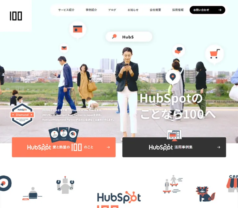
プレビュー準備中デザインリファレンスを見る
DESIGN REFERENCE
株式会社100(ハンドレッド)|HubSpot・AI・CRM支援
白と黒を基調にコーラルを効かせた企業サイト。大きなビジュアル、丸いボタン、写真中心の導入事例、濃紺のサービスカードで情報を整理しています。
100 Inc. — Style Reference
A spacious corporate homepage with human photography, coral actions, slate service panels, and a precise black-and-white frame.
Website: 100 Inc.
Original URL: https://www.100inc.co.jp/
Final URL: https://www.100inc.co.jp/
Response: HTTP 200; no redirect recorded.
Theme: predominantly white, with dark service cards and a near-black footer. No theme selector was verified.
Inspected: October 2, 2026, at 05:34:52 JST. The supplied evidence batch is timestamped 2026-10-01T20:34:52.347Z.
Viewports: desktop 1440 × 1000; mobile 390 × 844, in CSS pixels.
Scope: the current corporate homepage: header, media hero, promotional links, brand introduction, services, case studies, customer proof, blog, news, contact section, footer, and persistent cookie notice. Visual captures cover the opening, desktop case studies, and lower-page areas; rendered DOM measurements cover the broader page at both widths. Linked pages and control outcomes were not inspected.
100 Inc. presents its HubSpot, CRM, and AI services through a substantial corporate homepage. Company information, recruitment, editorial content, customer examples, downloads, and contact routes all have distinct places in the navigation. Its design should preserve that breadth.
The strongest visual relationship is between generous white space and compact, bold Japanese text. Coral #ff7a59 highlights contact actions and small section accents. Black pills provide recurring routes to content indexes. Slate blue distinguishes service panels, while photographs establish the people and companies behind the work. A large media composition opens the page; an office photograph and dark directory footer close it.
The cookie notice is a separate, unusually prominent layer. It uses Lato instead of the main Japanese font stack and obscures much of the mobile viewport. Its appearance belongs in this reference, but covered content must be understood through the supplied DOM measurements rather than imagined from the screenshots.
閉じる
100 Inc. — Style Reference
A spacious corporate homepage with human photography, coral actions, slate service panels, and a precise black-and-white frame.
Website: 100 Inc.
Original URL: https://www.100inc.co.jp/
Final URL: https://www.100inc.co.jp/
Response: HTTP 200; no redirect recorded.
Theme: predominantly white, with dark service cards and a near-black footer. No theme selector was verified.
Inspected: October 2, 2026, at 05:34:52 JST. The supplied evidence batch is timestamped 2026-10-01T20:34:52.347Z.
Viewports: desktop 1440 × 1000; mobile 390 × 844, in CSS pixels.
Scope: the current corporate homepage: header, media hero, promotional links, brand introduction, services, case studies, customer proof, blog, news, contact section, footer, and persistent cookie notice. Visual captures cover the opening, desktop case studies, and lower-page areas; rendered DOM measurements cover the broader page at both widths. Linked pages and control outcomes were not inspected.
100 Inc. presents its HubSpot, CRM, and AI services through a substantial corporate homepage. Company information, recruitment, editorial content, customer examples, downloads, and contact routes all have distinct places in the navigation. Its design should preserve that breadth.
The strongest visual relationship is between generous white space and compact, bold Japanese text. Coral #ff7a59 highlights contact actions and small section accents. Black pills provide recurring routes to content indexes. Slate blue distinguishes service panels, while photographs establish the people and companies behind the work. A large media composition opens the page; an office photograph and dark directory footer close it.
The cookie notice is a separate, unusually prominent layer. It uses Lato instead of the main Japanese font stack and obscures much of the mobile viewport. Its appearance belongs in this reference, but covered content must be understood through the supplied DOM measurements rather than imagined from the screenshots.
How to Read This Reference
- Measured means a value appears in the supplied computed styles or element rectangles. Decimal values are usually rounded to two places for readability.
- Derived means a value is calculated from those measurements, such as a column gap or apparent gutter percentage.
- Visual estimate means a feature is visible in a screenshot but its exact CSS was not supplied. Image corner radii, the cookie-panel shadow, and the navigation surface fall into this category.
- Recommended means an implementation choice for reuse. Proposed breakpoints, accessibility adjustments, and parts of the Quick Start are recommendations.
- Token names are descriptive aliases. The evidence contains no extracted custom properties establishing an original token naming system.
- An element's computed font does not necessarily describe lettering inside an image or an unmeasured child. Several graphic headings have empty extracted text.
- Different captures may show different media frames. Their differences do not establish a specific video, slideshow, or responsive asset mechanism.
Tokens — Colors
Default Palette
| Name | Value | Suggested token | Evidence and role |
|---|---|---|---|
| Canvas White | #ffffff |
--color-canvas |
Measured body background; also logo tile, navigation surface, and cookie surface visually |
| Action Black | #000000 |
--color-ink |
Measured index-button fills and case-study text |
| HubSpot Coral | #ff7a59 |
--color-accent |
Measured contact links, cookie Accept button, and default link color |
| Heading Gray | #444444 |
--color-heading |
Measured major Japanese section headings |
| Text Gray | #333333 |
--color-text |
Measured desktop navigation and cookie copy; also the hero's underlying background |
| Service Slate | #3e556a |
--color-service |
Measured fill of all three service cards |
| Consent Slate | #425b76 |
--color-consent-secondary |
Measured cookie Decline button |
| Brand Blue | #2e475d |
--color-brand-blue |
Measured live-text HubSpot lead-in in the brand introduction |
| Footer Black | #121212 |
--color-footer |
Measured footer background |
Keep the two slate values distinct: the service cards and cookie rejection action do not have the same measured fill. Likewise, the main black buttons are darker than the footer.
The pale aqua visible in the mobile hero belongs to the captured media composition. It is not evidence for a site-wide aqua surface token. Wood, foliage, clothing, client logos, and certification artwork introduce additional image colors without becoming general interface colors.
Color Hierarchy
- White: continuous reading surface and generous section separation.
- Black: primary text, index navigation pills, logo, and compact utility controls.
- Coral: contact emphasis, section accents, and consent acceptance.
- Slate: substantial service panels and the secondary consent action.
- Near-black: the footer's directory and legal information.
The site has several equally recognizable button colors. Preserve their roles instead of making every link coral or every action black.
Tokens — Typography
Main Japanese Interface
The measured family stack is:
'Yu Gothic', '游ゴシック Medium', '游ゴシック体', YuGothic,
'ヒラギノ角ゴ Pro', 'Hiragino Kaku Gothic Pro',
'メイリオ', Meiryo, sans-serif
This is the computed family declaration, not proof of which installed font supplied every glyph. Most navigation, titles, case-study descriptions, and footer links use weight 700. Service descriptions and news headlines use 400.
The result is firm, readable Japanese typography with relatively little ornamental styling. Measured letter spacing is generally normal. The design does not depend on widely tracked Japanese headings.
English Display Typography
'Roboto Condensed', sans-serif is explicitly measured on the contact heading, “We are HubSpot LOVERS,” and the copyright. The contact heading uses weight 700.
Small English section captions look condensed in the screenshots, but their individual font declarations were not supplied. Reusing Roboto Condensed for those captions is a reasonable adaptation, not an additional measured finding.
Cookie Typography
The notice uses Lato, sans-serif, weight 400, at 14px / 24.5px on both inspected viewports. Its relaxed line height and lighter weight visibly separate the notice from the main site's bold Japanese interface.
Type Scale
All font sizes and line heights in this table are measured unless marked otherwise.
| Role | Desktop size / line height | Mobile size / line height | Weight |
|---|---|---|---|
| Root element | 10 / 10px |
10 / 10px |
400 |
| Desktop navigation | 14 / 14px |
Hidden in the opening capture | 700 |
| Mobile navigation links in DOM | — | 16 / 16px |
700 |
| Header download/contact labels | 13 / 13px |
Menu DOM: 15 / 24px |
700 |
| Hero heading wrapper | 60 / 72px |
25 / 30px |
700 |
| Main section heading | 40 / 40px |
24.96 / 24.96px |
700 |
| Service-card title | 18 / 30px |
20 / 25px |
700 |
| Service-card description | 14 / 25px |
13 / 25px |
400 |
| Case-study company and headline | 15 / 24px |
15 / 24px |
700 |
| Blog headline | 15 / 24px |
15 / 24px |
700 |
| News headline | 15 / 24px |
15 / 24px |
400 |
| Standard index button | 15 / 15px |
15 / 24px |
700 |
| Brand introduction: HubSpot | 50 / 50px |
40 / 40px |
700 |
| Brand introduction copy | 15 / 30px |
14.547 / 29.094px |
700 |
| Customer-proof heading | 24 / 24px |
16.614 / 16.614px |
700 |
| Contact English heading | 60 / 60px |
31.2 / 31.2px |
700 |
| Contact supporting copy | 15 / 30px |
12 / 25px |
700 |
| Footer navigation | 14 / 30px |
14 / 30px |
700 |
| Copyright | 12 / 12px |
12 / 12px |
700 |
| Cookie copy and buttons | 14 / 24.5px |
14 / 24.5px |
400 |
Important distinctions: the empty-text hero wrapper does not establish the typeface or exact size of its visible artwork. The contact subtitle likewise has an uninformative parent font declaration; the screenshot shows a larger white underlined line. Do not reproduce either graphic by blindly copying the parent's font size.
The original root is 10px, but that is not the visible body-copy size. The Quick Start uses explicit pixel tokens and leaves the browser's root size conventional.
Tokens — Spacing & Shapes
Spacing Scale
There is no evidence of a single strict base-unit system. Several recurring measurements are nevertheless useful:
| Use | Value | Status |
|---|---|---|
| Cookie button gap | 7px |
Derived from button rectangles, both layouts |
| Case company-to-headline gap | 8px |
Derived |
| Cookie paragraph separation | 14px |
Derived |
| Case image-to-company gap | About 15px |
Screenshot-supported reconstruction |
| Service-card padding | 20px 30px |
Measured |
| Cookie inner padding | About 28px |
Derived from screenshot edges and child rectangles |
| Mobile stacked-card gap | 30px |
Derived for services, case studies, and blog |
| Mobile service cards-to-index button | 50px |
Derived |
| Desktop cards-to-index button | 60px |
Derived |
| Most mobile section separations | 80px |
Derived; some introductory gaps differ |
| Repeated desktop section separations | 120px |
Derived |
Border Radius
| Element | Value | Status |
|---|---|---|
| Logo tile | 0 0 10px 0 |
Measured lower-right rounding |
| Service card | 10px |
Measured |
| Standard black pills | 100px |
Measured |
| Contact-section pill | 30px |
Measured |
| Cookie buttons | 42px |
Measured |
| Case-study image | About 10px |
Visual estimate |
| Cookie panel | About 12px |
Visual estimate |
| Desktop navigation surface | About 20px |
Visual estimate |
| Mobile menu control | Circular, about 45px diameter |
Visual estimate |
Rounded image corners and fully rounded actions coexist with largely unboxed content. Do not apply a large rounded container to every section.
Layout Measurements
| Element | Desktop: 1440px wide | Mobile: 390px wide |
|---|---|---|
| Document height | 6844.66px |
10752.77px |
| Main horizontal inset | 86.39px |
23.39px |
| Main content width | 1267.22px |
343.22px |
| Logo tile | 160 × 160px |
80 × 80px |
| Logo link box inside tile | 60 × 45px |
40 × 30px |
| Hero | 1440 × 810px |
390 × 475.80px |
| Hero heading wrapper | 720 × 206.48px |
273 × 78.28px |
| Promotional link box | 234.42 × 249.42px |
164.73 × 179.73px |
| Service card | 405.50 × 345.92px |
343.22 × 388.09px |
| Case-study link box | 392.83 × 355.95px |
First: 331.22 × 346.06px; third: 343.22 × 352.66px |
| Blog link box | 292.72 × 376.72px |
343.22 × 427.22px |
| Standard index button | 260 × 51px |
260 × 52px |
| Contact-section button | 250 × 60px |
250 × 59px |
| Footer height | 455px |
1142.05px |
| Cookie panel | Approximately 938 × 252.69px |
Approximately 326 × 550.88px |
The main insets correspond to 6% of viewport width at both sizes. An 88% content container is therefore a strong derived implementation rule, although the original stylesheet formula was not supplied.
Desktop service gaps derive to approximately 25.36px; case-study gaps to 44.38px; blog gaps to 32.11px. These are distinct grids, not one universal card layout.
Components
Corporate Header
Role: company identity, section navigation, downloads, contact, and utilities.
The desktop logo occupies a white 160 × 160px corner tile, with the black mark centered in a 60 × 45px link box. A separate white navigation surface floats over the hero. Its visible top offset is about 20px, height about 69px, and right clearance about 58px; these surface measurements are visual estimates.
The measured navigation labels are 14px, bold, dark gray. The sequence includes “サービス,” “テクノロジー,” “事例,” “セミナー,” “ブログ,” “お知らせ,” “会社概要,” and “採用情報.” A globe-like utility icon precedes the action buttons. The download action is black, 162 × 41px; contact is coral, 135 × 41px. A black circular search control measures approximately 35 × 34.80px.
At mobile width, the corner tile becomes 80 × 80px, the logo link becomes 40 × 30px, and a black circular hamburger appears near the upper-right corner. That control remains visible in the supplied footer capture. The logo tile does not remain visible there. Exact scroll thresholds and positioning rules were not provided.
A “Skip to content” link exists in the DOM, positioned offscreen at rest. Its focused appearance was not tested.
Mobile Navigation Structure
The mobile DOM contains a navigation region with seven main links, search, language-related content, download, and contact actions. Main link boxes measure about 369.75 × 58px, using 16px bold text and 20px 10px padding. The search button is 66 × 46px. Download and contact links are approximately 369.75 × 52px, with white and coral fills respectively.
These rectangles establish component structure, not a verified open-menu screenshot. The black mobile capture showing Contents, Service, Blog, and Special is the footer, not evidence that the hamburger was opened. Menu entrance, focus handling, search results, and language switching remain unverified.
Media Hero
Role: a large brand statement before the detailed corporate content.
The desktop hero measures 1440 × 810px, exactly a 16:9 rectangle at the inspected width. The captured composition includes a large white panel on the left with a chart illustration, blurred photographic imagery to the right, and oversized white lettering in the lower-right region. The visible statement reads “HubSpot * AI * DATA” and “のことなら100へ.”
The left chart panel is part of the observed visual composition. Its bars, dotted trend line, and small English labels are not evidence of an interactive analytics widget.
The mobile hero is substantially taller relative to its width: 390 × 475.80px. It shows people outdoors, a central person looking at a phone, and floating communication or location graphics against a pale aqua upper field. The heading wrapper begins around x=101.41px, y=307.52px, but much of it is covered by the cookie notice.
The desktop and mobile scenes differ. The available evidence does not identify whether that comes from playback timing, separate assets, responsive cropping, or a combination. Use a supplied poster or media asset for reconstruction; do not invent a slide sequence, video duration, or autoplay behavior.
Promotional Link Grid
Role: early routes into selected services, a partner offering, a customer example, and a publication.
Five linked promotional graphics appear after the hero. Their destinations identify agent automation, AI workflow, Lovable, Panasonic Industry's case study, and a HubSpot publication download. The graphics have pale surfaces and fine outlined edges in the visible portion of the desktop capture.
At desktop width they form one row of five link boxes, approximately 234.42px wide, with 20.26px horizontal gaps. At mobile width they form two columns, then two columns, then one remaining item, with approximately 9.95px column gaps and 30px row gaps.
Do not replace this measured five-item arrangement with a pair of oversized campaign banners. Image URLs were not included in the evidence, so the individual artwork must be supplied separately.
Brand Introduction
Role: explain the company's relationship with HubSpot before presenting specific services.
The DOM shows a centered HubSpot lead-in in blue #2e475d, followed by an empty-text heading slot, bold explanatory copy, and a centered black “詳しく見る” pill. The heading slot measures 220 × 81px on desktop and approximately 182.91 × 67.33px on mobile; its internal artwork was not separately identified.
The supporting paragraph uses 15px / 30px on desktop and about 14.55px / 29.09px on mobile. Mobile copy breaks into more deliberate lines. Preserve this centered, spacious interlude rather than treating it as another card grid.
Section Heading Pair
Role: connect Japanese content headings with compact English section captions.
Major headings are left aligned within the 6% gutters, bold, and dark gray. Examples include “こんなお悩みありませんか?,” “HubSpot 事例・実績,” “ブログ,” and “お知らせ.” English captions such as “SERVICE / SOLUTIONS,” “CASE STUDY,” “BLOG,” and “NEWS” accompany them.
Japanese heading size falls from 40px to 24.96px on mobile. The screenshot shows CASE STUDY as a small coral caption. Its exact font metrics were not sampled; roughly 14px condensed type is an implementation estimate.
Service / Solution Card
Role: make a business problem the entry point to a relevant service.
Three whole-card links address CRM adoption, website-renewal outcomes, and migration from Salesforce or Marketo. Each uses:
- A substantial upper area preceding the text; its internal visual asset was not identified in the supplied element sample.
- A bold white problem statement.
- A regular white explanation with
25pxline height. - A lower “詳しく見る” affordance.
The measured shell has #3e556a fill, 10px corners, and 20px 30px padding. Desktop cards are equal-sized in three columns. Mobile cards stack with 30px gaps and measure approximately 388px high.
Mobile titles become larger, increasing from 18px to 20px, while descriptions decrease from 14px to 13px. Preserve this local hierarchy instead of proportionally shrinking everything.
The entire card is already an anchor. Implement its detail label as part of that anchor, without nesting another link or button inside it.
Case-Study Card
Role: make customer identity and a specific result easy to scan.
Three desktop columns pair photographs with unboxed text. The current examples are e-dash, Yamaha Robotics, and JFE Systems. The photographs show real people in company settings, including visible brand signage.
The anatomy is notably restrained:
- A wide photograph, approximately
393 × 217pxon desktop, with about10pxcorner rounding. - A company name,
15px / 24px, bold, roughly15pxbelow the image. - An
8pxgap before a descriptive headline, also15px / 24px, bold. - No separately colored card surface or visible elevation shadow.
The photograph ratio is approximately 1.81:1, estimated from the screenshot and text offsets. It should not automatically be treated as an exact 16:9 source rule.
The desktop headline occupies three lines in each sampled card. Mobile descriptions occupy three or four lines without smaller type. The first two mobile links measure 331.22px wide, while the third measures 343.22px; a reuse implementation may normalize these widths, but that would be a deliberate cleanup of the recorded geometry.
A centered black “事例・実績一覧を見る” pill follows the grid. A white right arrow sits toward its trailing edge.
Customer-Proof Region
Role: provide broader company evidence after the individual case studies.
A white section presents a centered heading and customer-logo content. The section measures about 770.19px high on desktop and 1188.45px on mobile. Its measured padding changes from 104px 0 95px to 52px 0 32px.
Three pagination buttons with DOM text 1, 2, and 3 are present. Their own measured boxes are only 5 × 5px, with transparent text; pseudo-elements or surrounding hit regions were not sampled. This supports the existence of pagination controls, but not a claim about slide timing, autoplay, dragging, or the exact visible indicator shape.
Blog Cards
Role: connect the corporate homepage to recent educational content.
Four entries form a desktop row and become a single mobile column. Each entry includes a topic label when available, a date, and a bold headline. The observed subjects include Lovable, recruitment workflows, AI coding tools, and HubSpot lead status. Preserve the optional nature of topic labels: not every entry has the same metadata.
Desktop links measure 292.72 × 376.72px; mobile links measure 343.22 × 427.22px. In both layouts, total height equals width plus approximately 84px. A square leading media area is therefore a plausible reconstruction, but image geometry and artwork were not directly supplied. Treat square blog media as an implementation assumption pending asset verification.
Headline text stays 15px / 24px at both sizes. A black index pill follows the collection.
News List
Role: display dated announcements with less visual weight than case studies or blog entries.
Five announcements appear with dates, category labels, and linked headlines. Desktop headline links start at x≈330.77px, leaving a metadata region inside the main content container. Their first-line positions repeat every 65px.
On mobile, date/category information precedes the headline, and the headline spans the full 343.22px content width. Each sampled headline occupies three lines at 15px / 24px, and successive headline starts are 143px apart.
The “お知らせ一覧を見る” route sits beside the section heading rather than becoming a centered filled pill below the list. Exact row divider styles were not recorded.
Contact Photograph Section
Role: close the content with a direct invitation to talk.
A full-width office photograph shows wood flooring, glass meeting rooms, plants, furnishings, and HubSpot clothing. White text is centered over the darkened image. The measured section is about 615.52px high on desktop and 572.27px on mobile.
The hierarchy is:
- “We are HubSpot LOVERS” in bold Roboto Condensed.
- A centered Japanese paragraph.
- A larger white, underlined invitation line.
- A coral “お問い合わせフォーム” pill with a right arrow.
The button measures 250 × 60px on desktop and 250 × 59px on mobile. Its 30px radius creates a complete capsule.
Desktop typography is 60px for the English heading and 15px / 30px for the paragraph. Mobile uses 31.2px and 12px / 25px. The darkening treatment is visually evident, but its opacity and implementation were not supplied. A controlled overlay is a recommended way to preserve contrast in a new implementation.
Directory Footer
Role: provide the full corporate information architecture, social routes, and policies.
The footer has a measured #121212 background. On desktop, a white logo at left precedes four link groups labeled Contents, Service, Blog, and Special. A partner badge occupies the right side. Small coral vertical marks accompany the muted group captions. Lower rows contain social links, certification artwork, policy links, and copyright, separated visually by subdued rules.
Footer links use white 14px / 30px bold text. The desktop content spans approximately 1260px, from x=90px to x=1350px. The logo's link box should not be mistaken for its visible artwork size.
On mobile, the footer grows to about 1142px. Contents occupies an earlier row; Service and Blog share a later two-column region with unequal vertical offsets; Special follows below. The screenshot and DOM show expanded link lists. No accordion interaction was verified. Policy links form two columns, while the copyright moves to its own lower line.
Cookie Notice
Role: persistent consent choices above the scrolling page.
The notice is a white rounded panel with a strong soft shadow, centered horizontally and approximately 32px above the viewport bottom. It appears at the same viewport location over different scroll positions. No full-screen opaque backdrop is visible.
Its reconstructed outer geometry is supported by the screenshots and exact child rectangles:
| Property | Desktop | Mobile |
|---|---|---|
| Panel width | About 938px |
About 326px |
| Left edge | About 251px |
About 32px |
| Top edge | About 715.31px |
About 261.13px |
| Bottom clearance | About 32px |
About 32px |
| Inner text width | 882px measured |
270px measured |
| Inner padding | About 28px |
About 28px |
| Button size | 154 × 46.19px |
270 × 46.19px |
| Action layout | Right-aligned row | Full-width stack |
| Action gap | 7px |
7px |
The first paragraph is followed by a 14px gap; the second paragraph is followed by another 14px gap before the actions. Accept uses coral, Decline uses slate, and both labels are white. There is no visible heading or close icon.
At mobile width, the panel occupies approximately 65% of the viewport height. Its placement substantially limits direct visual inspection of the page below. Consent dismissal, persistence, tracking changes, and modal semantics were not tested.
Tokens — Motion & Interaction
| Element | Recorded declaration or evidence | What can be concluded |
|---|---|---|
| General anchors and filled links | transition: 0.3s |
A transition duration is declared; target states were not exercised |
| Logo tile | transform 0.3s |
Transform changes can animate; the trigger and displacement are unknown |
| Service titles | color 0.3s |
Color can transition; hover color is unverified |
| Case company names and blog headlines | color 0.3s, border 0.3s |
Color/border transitions exist; no lift or image zoom is established |
| Cookie buttons | opacity 0.3s |
Opacity transitions are declared; endpoints are unknown |
| Customer-proof controls | Three numbered buttons | Pagination structure exists; activation and autoplay were not tested |
| Hero imagery | Different scenes across supplied captures | Media variation exists; playback mechanism and timing are unknown |
| Page scroll | Supplied captures cover multiple scroll positions | Content was traversed; no scroll-triggered choreography was established |
Many sampled elements report animation: none. That does not rule out video, image animation, scripts, unmeasured descendants, or pseudo-elements. Likewise, a bare computed transition: all without a recorded duration is not evidence of visible animation.
For reuse, restrained 300ms control transitions are consistent with the supplied declarations. Parallax, dramatic reveal sequences, spring motion, automatic carousels, and sticky-header hide/show thresholds would require separate evidence or an explicit new design decision.
Surfaces
| Layer | Appearance | Purpose |
|---|---|---|
| Main canvas | White, mostly unboxed | Keeps a long corporate page readable |
| Header identity | White corner tile, black mark | Establishes a strong geometric signature |
| Desktop navigation | Rounded white floating surface | Separates navigation from changing hero imagery |
| Hero | Full-width media composition | Carries the opening brand statement |
| Service card | Slate fill, white text, 10px corners | Groups business problems into clear entry points |
| Case-study card | Rounded photograph over plain white | Prioritizes people, company identity, and results |
| Index action | Black capsule, white label and arrow | Repeated route into deeper content |
| Contact action | Coral capsule | Marks the main conversation route |
| Contact section | Darkened office photograph | Provides an atmospheric closing invitation |
| Footer | Near-black field with white links | Consolidates the corporate directory |
| Cookie notice | White rounded panel with soft shadow | Floats independently above page content |
There is no visible universal card-shadow system. The most conspicuous elevation belongs to the cookie notice; editorial cards remain visually flat.
Imagery
The current imagery combines three functions: an expressive opening composition, documentary customer photography, and a workplace photograph near the footer.
The desktop hero juxtaposes a clean chart illustration with photographic media. The mobile scene includes people, devices, and floating icon graphics. Case studies use wide photographs of actual interview subjects and company interiors. Their embedded logos and signage provide context without additional decorative UI badges.
The contact photograph is warm and architectural: wood flooring, gray surfaces, glass partitions, plants, and a lived-in office. Preserve enough of the scene to retain that character while controlling text contrast.
Use original, authorized assets where available. CSS can reproduce the spacing and surfaces, but it cannot replace the identity of the company mark, customer photographs, partner badges, or hero composition.
Observed Asset References
No image src, video URL, or asset manifest was included. The following references identify visible or structurally evidenced assets without inventing filenames.
| Asset | Evidence location | Reuse guidance |
|---|---|---|
| Black 100 mark | Desktop/mobile opening captures | Preserve the original proportions inside the white corner tile |
| White 100 mark | Desktop footer capture | Use a proper reversed asset rather than a text approximation |
| Hero chart and photographic composition | Desktop opening capture | Preserve the composition; interactive chart behavior is unverified |
| People and floating icon scene | Mobile opening capture | Use verified media and a mobile crop after asset inspection |
| Five promotional graphics | Opening capture edges and linked DOM boxes | Retain the current five-item structure |
| e-dash customer photograph | Desktop case-study capture | Wide crop with people and company identity intact |
| Yamaha Robotics photograph | Desktop case-study capture | Retain people and prominent company signage |
| JFE Systems photograph | Desktop case-study capture | Retain the office sign and interview subjects |
| Contact office photograph | Desktop lower-page capture | Full-width crop with a controlled darkening layer |
| Partner and certification artwork | Desktop footer capture | Preserve authentic artwork and readable proportions |
| Blog media | Layout inference only | Verify assets and aspect ratios before matching imagery |
Layout & Responsive Behavior
The homepage remains a long scrolling document. Its measured height increases from about 6845px on desktop to 10753px on mobile as content grids stack.
| Region | Desktop observation | Mobile observation |
|---|---|---|
| Navigation | Full horizontal menu, two pills, utilities | Logo tile and circular hamburger |
| Hero | Wide 16:9 region | Taller crop, about 1.22 times viewport width |
| Main gutters | About 6% | About 6% |
| Promotional links | Five columns | Two columns with a final single item |
| Services | Three columns | One column, 30px gaps |
| Case studies | Three columns | One column, mostly 30px gaps |
| Blog | Four columns | One column, 30px gaps |
| News | Metadata beside headline | Metadata above headline |
| Standard index buttons | 260px wide | Remain 260px wide |
| Contact | Large heading and four-line paragraph | Smaller heading and seven-line paragraph |
| Footer | Broad directory row | Multiple groups and partial two-column arrangements |
| Cookie actions | Horizontal, right aligned | Vertically stacked, full inner width |
The mobile layout preserves meaningful differences between regions. Promotional links remain in two columns, while service, case-study, and blog cards become single columns. Standard index buttons retain their width rather than stretching across the entire screen.
Exact breakpoints cannot be recovered from only two viewport samples. The Quick Start uses a navigation breakpoint at 1200px and a content breakpoint at 767px as recommendations. Tablet layout, intermediate widths, landscape phones, and very large desktops were not inspected.
The black mobile footer capture should not be used to infer menu styling. Similarly, the different hero scenes should not be attributed solely to responsive cropping without inspecting their assets and playback.
Do’s and Don’ts
Do
- Preserve the corporate site's multiple routes: services, customer evidence, editorial content, company information, recruitment, and contact.
- Use the measured coral
#ff7a59, black actions, slate service panels, and near-black footer consistently. - Keep main content aligned to approximately 6% horizontal gutters.
- Give case studies large photographs and bold, readable descriptions on plain white.
- Preserve the distinct five-, three-, and four-column desktop collections.
- Keep mobile promotional links in two columns while stacking the longer editorial and service cards.
- Retain fixed-width index pills and clear trailing arrows.
- Use the measured Japanese font stack, with Roboto Condensed and Lato confined to their evidenced roles.
- Treat graphic-heading wrappers separately from the lettering contained within them.
- Document the persistent cookie notice as a separate layer with its own typography.
Don’t
- Don't collapse the homepage into a single campaign funnel with a shortened corporate navigation.
- Don't turn every section into a rounded, shadowed card.
- Don't use the cookie notice's Lato font as the default for Japanese content.
- Don't replace customer photographs with generic abstract illustrations.
- Don't merge the two slate colors into one supposedly exact source token.
- Don't shrink mobile case-study text; it remains 15px in the measurements.
- Don't infer a working chart, search, language switcher, carousel, or consent outcome from appearance alone.
- Don't describe the mobile footer as an opened hamburger menu.
- Don't fabricate asset URLs, hero timings, hover transformations, or production authorship.
- Don't copy the root's 10px font size into all visible text.
Recommended Implementation Additions
These are recommendations for a new implementation, not verified features of the original page:
- Make logo, search, language, and menu controls explicitly named for assistive technology. Empty extracted anchor text alone does not establish whether the originals already have suitable labels.
- Implement the hamburger with an expanded state, a controlled region, keyboard access, and reliable focus restoration. Keep hidden navigation out of keyboard traversal.
- Give pagination controls meaningful accessible labels and sufficiently large hit areas; the sampled 5px button rectangles do not establish their complete hit targets.
- Keep the cookie notice scrollable on short screens and preserve access to both choices. Use modal focus management only if the implementation actually blocks the rest of the interface.
- Localize consent copy for a Japanese audience if product requirements permit. Any resulting height change should be treated as an adaptation.
- Review white text on coral. The measured pair has approximately
2.57:1contrast, calculated from the recorded colors. Dark text on coral or a darker action fill can improve accessibility, but changes the observed treatment. - Supply a static hero poster and reduced-motion behavior if moving media is used. Essential information should remain available without playback.
- Prefer live, accessible heading text where possible. If lettering is embedded in artwork, provide an appropriate textual equivalent.
- Normalize the unequal mobile case-card widths if maintaining the site, while recording that this differs from the supplied measurements.
- Verify assets before implementing the inferred square blog-media area or the unknown service-card artwork.
Agent Prompt Guide
Quick Color Reference
- Canvas and raised navigation:
#ffffff. - Main text and index pills:
#000000. - Major headings:
#444444. - Contact emphasis:
#ff7a59. - Service panels:
#3e556awith white text. - Cookie Decline:
#425b76. - Footer:
#121212with white navigation. - Brand introduction lead-in:
#2e475d.
Overall Prompt
“Create a Japanese corporate homepage for a CRM and AI services company using the current 100 Inc. design language. Use a white canvas, approximately 6% side gutters, bold Yu Gothic-based Japanese typography, coral contact actions, black capsule index links, and slate service panels. Open with a large supplied media composition, a white corner logo tile, and a rounded floating desktop navigation. Include five promotional links, a centered brand introduction, three business-problem service cards, three photographic case studies, customer proof, four blog entries, a dated news list, an office-photo contact section, and a near-black directory footer. On mobile, retain two promotional columns and stack service, case-study, and blog cards. Treat media playback and menu behavior as explicit implementation work, not inferred features.”
Example Component Prompts
- Header: “Place a black geometric company mark inside a white 160px square corner tile. Float a white rounded navigation strip near the top-right, with compact bold Japanese links, a black download pill, a coral contact pill, and a black circular search control. At mobile width, use an 80px logo tile and a circular menu button.”
- Service card: “Create a whole-card link with slate
#3e556a, 10px corners, and 20px by 30px padding. Reserve an upper media region only for supplied artwork. Place a bold white business-problem title above regular white explanatory text and a lower detail affordance. Use three columns on desktop and one on mobile.” - Case study: “Create an unboxed case-study link with a wide customer photograph, approximately 1.81:1, and gently rounded image corners. Follow it with a bold company name and a longer result headline, both 15px with 24px line height. Keep the background white and omit elevation shadows.”
- Contact section: “Use an authorized office photograph across the page, darkened enough for centered white copy. Set the English title in bold Roboto Condensed, place Japanese supporting text beneath it, and finish with a 250px coral capsule containing a contact label and right arrow.”
- Cookie notice: “Create a bottom-centered white consent panel with approximately 12px corners, 28px padding, and a soft shadow. Use Lato at 14px with 24.5px line height. Put coral Accept and slate Decline buttons in a right-aligned desktop row and a full-width mobile stack. Keep a 32px outer clearance and support short-screen scrolling.”
Quick Start
CSS Custom Properties
This is a reusable adaptation, not an extracted stylesheet. Exact colors, type sizes, and many dimensions come from the measurements. Navigation and content breakpoints, shadow values, inferred media ratios, and normalized footer columns are implementation choices. Asset loading, menu state, search, consent persistence, and media controls require separate implementation.
The conventional root size is retained; explicit pixel tokens avoid depending on the original 10px root. Named webfonts must be loaded separately if available and authorized.
:root {
  --color-canvas: #ffffff;
  --color-ink: #000000;
  --color-text: #333333;
  --color-heading: #444444;
  --color-accent: #ff7a59;
  --color-service: #3e556a;
  --color-consent-secondary: #425b76;
  --color-brand-blue: #2e475d;
  --color-footer: #121212;

  --font-body: 'Yu Gothic', '游ゴシック Medium', '游ゴシック体',
    YuGothic, 'ヒラギノ角ゴ Pro', 'Hiragino Kaku Gothic Pro',
    'メイリオ', Meiryo, sans-serif;
  --font-display: 'Roboto Condensed', sans-serif;
  --font-consent: Lato, sans-serif;

  --text-section: 40px;
  --text-card: 15px;
  --leading-card: 24px;
  --page-gutter: 6%;
  --section-gap: 120px;
  --radius-card: 10px;
  --radius-pill: 100px;
  --motion-control: 300ms;

  /* Visual estimates for the consent surface. */
  --radius-consent: 12px;
  --shadow-consent: 0 10px 30px rgb(0 0 0 / 25%);
}

* { box-sizing: border-box; }

body {
  margin: 0;
  color: var(--color-ink);
  background: var(--color-canvas);
  font: 15px / 1.6 var(--font-body);
}

img { display: block; max-width: 100%; }
button, input { font: inherit; }
[hidden] { display: none !important; }

.container {
  width: calc(100% - 2 * var(--page-gutter));
  margin-inline: auto;
}

.section { margin-block-start: var(--section-gap); }
.section__title {
  margin: 0;
  color: var(--color-heading);
  font-size: var(--text-section);
  font-weight: 700;
  line-height: 1;
}

/* Caption metrics and family are recommended approximations. */
.section__eyebrow {
  margin: 15px 0 60px;
  color: var(--color-accent);
  font: 700 14px / 1 var(--font-display);
  text-transform: uppercase;
}

.site-header {
  position: absolute;
  inset: 0 0 auto;
  z-index: 30;
}
.brand-tile {
  position: absolute;
  inset: 0 auto auto 0;
  display: grid;
  place-items: center;
  width: 160px;
  height: 160px;
  background: white;
  border-radius: 0 0 10px 0;
}
.brand-tile img { width: 60px; height: 45px; object-fit: contain; }

.desktop-nav {
  position: absolute;
  top: 20px;
  right: 4%;
  display: flex;
  align-items: center;
  gap: 10.5px;
  padding: 14px 40px;
  border-radius: 20px;
  background: white;
}
.desktop-nav a {
  color: var(--color-text);
  font-size: 14px;
  font-weight: 700;
  line-height: 1;
  text-decoration: none;
  white-space: nowrap;
}
.desktop-nav .nav-action {
  padding: 14px 18px;
  border-radius: var(--radius-pill);
  color: white;
  background: black;
  font-size: 13px;
  text-align: center;
}
.desktop-nav .nav-action--contact { background: var(--color-accent); }
.nav-action--download { min-width: 162px; }
.nav-action--contact { min-width: 135px; }

.menu-toggle {
  position: fixed;
  top: 20px;
  right: 20px;
  display: none;
  place-items: center;
  width: 45px;
  height: 45px;
  padding: 0;
  border: 0;
  border-radius: 50%;
  color: white;
  background: black;
}

/* Supply actual media; these rules do not create the hero artwork. */
.hero {
  position: relative;
  height: 56.25vw;
  overflow: hidden;
  background: var(--color-text);
}
.hero__media { width: 100%; height: 100%; object-fit: cover; }
.hero__headline {
  position: absolute;
  left: 41.67%;
  bottom: 19.14%;
  width: 50%;
  margin: 0;
  color: white;
  font-size: 60px;
  font-weight: 700;
  line-height: 1.2;
}

.button {
  display: flex;
  align-items: center;
  justify-content: space-between;
  gap: 20px;
  width: 260px;
  max-width: 100%;
  min-height: 51px;
  padding: 18px 18px 18px 30px;
  border: 0;
  border-radius: var(--radius-pill);
  color: white;
  background: black;
  font: 700 15px / 1 var(--font-body);
  text-decoration: none;
  transition: opacity var(--motion-control);
}
.button--coral { background: var(--color-accent); }
.section__action { margin: 60px auto 0; }
.button__arrow { flex: none; }

.promo-grid {
  display: grid;
  grid-template-columns: repeat(5, 18.5%);
  column-gap: 1.6%;
  row-gap: 30px;
}
.service-grid {
  display: grid;
  grid-template-columns: repeat(3, minmax(0, 1fr));
  gap: 2%;
}
.service-card {
  display: flex;
  flex-direction: column;
  min-height: 345.92px;
  padding: 20px 30px;
  border-radius: var(--radius-card);
  color: white;
  background: var(--color-service);
  text-decoration: none;
}
.service-card__content { margin-top: auto; }
.service-card h3 { margin: 0; font-size: 18px; line-height: 30px; }
.service-card p { margin: 12px 0 0; font-size: 14px; line-height: 25px; }
.service-card__detail { margin-top: 20px; font-size: 14px; line-height: 25px; }

.case-grid {
  display: grid;
  grid-template-columns: repeat(3, minmax(0, 1fr));
  gap: 3.5%;
}
.case-card, .blog-card {
  min-width: 0;
  color: black;
  text-decoration: none;
}
.case-card { padding-bottom: 20px; }
.case-card__image {
  width: 100%;
  aspect-ratio: 1.81;
  object-fit: cover;
  border-radius: var(--radius-card);
}
.case-card__company { margin: 15px 0 8px; }
.case-card__title, .case-card__company, .blog-card__title {
  font-size: var(--text-card);
  font-weight: 700;
  line-height: var(--leading-card);
}
.case-card__title { margin: 0; }

.blog-grid {
  display: grid;
  grid-template-columns: repeat(4, minmax(0, 1fr));
  gap: 2.535%;
}
/* Square blog media is inferred, pending asset verification. */
.blog-card__media { width: 100%; aspect-ratio: 1; object-fit: cover; }

/* Metadata column widths are recommended, not source measurements. */
.news-row {
  display: grid;
  grid-template-columns: 100px 110px minmax(0, 1fr);
  gap: 17px;
  padding-block: 20px;
}
.news-row__headline { color: black; font-size: 15px; line-height: 24px; }

.contact {
  position: relative;
  isolation: isolate;
  padding: 78px 0 119.52px;
  overflow: hidden;
  color: white;
  background: var(--color-text);
  text-align: center;
}
.contact__image {
  position: absolute;
  inset: 0;
  z-index: -2;
  width: 100%;
  height: 100%;
  object-fit: cover;
}
/* Overlay strength is a recommendation; tune against the actual image. */
.contact::before {
  content: '';
  position: absolute;
  inset: 0;
  z-index: -1;
  background: rgb(0 0 0 / 38%);
}
.contact__title {
  margin: 0;
  padding-top: 5px;
  font: 700 60px / 1 var(--font-display);
}
.contact__copy { margin: 40px 0 0; font-size: 15px; font-weight: 700; line-height: 30px; }
.contact__invitation {
  margin: 45px 0 0;
  font-size: 28px;
  font-weight: 700;
  line-height: 1;
  text-decoration: underline;
  text-underline-offset: 10px;
}
.contact .button {
  width: 250px;
  min-height: 60px;
  margin: 60px auto 0;
  border-radius: 30px;
}

.site-footer { padding: 60px 0 25px; color: white; background: var(--color-footer); }
.footer__inner { width: 90%; max-width: 1260px; margin-inline: auto; }
/* Normalized columns simplify the original's unequal group offsets. */
.footer__links { display: grid; grid-template-columns: repeat(4, minmax(0, 1fr)); gap: 24px; }
.footer__links a { display: block; color: white; font-size: 14px; font-weight: 700; line-height: 30px; text-decoration: none; }
.footer__caption { border-left: 4px solid var(--color-accent); padding-left: 5px; }

.consent {
  position: fixed;
  z-index: 100;
  left: 50%;
  bottom: max(32px, env(safe-area-inset-bottom, 0px));
  transform: translateX(-50%);
  width: min(938px, calc(100% - 64px));
  max-height: calc(100dvh - 64px);
  overflow-y: auto;
  padding: 28px;
  border-radius: var(--radius-consent);
  color: var(--color-text);
  background: white;
  box-shadow: var(--shadow-consent);
  font: 400 14px / 24.5px var(--font-consent);
}
.consent p { margin: 0 0 14px; }
.consent__actions { display: flex; justify-content: flex-end; gap: 7px; }
.consent button {
  display: flex;
  align-items: center;
  justify-content: center;
  flex: 0 0 154px;
  min-height: 46.1875px;
  padding: 0;
  border: 0;
  border-radius: 42px;
  color: white;
  cursor: pointer;
  transition: opacity var(--motion-control);
}
.consent__accept { background: var(--color-accent); }
.consent__decline { background: var(--color-consent-secondary); }

/* Recommended visible focus treatment across light and dark surfaces. */
a:focus-visible, button:focus-visible, input:focus-visible {
  outline: 2px solid white;
  outline-offset: 2px;
  box-shadow: 0 0 0 4px black;
}

/* Recommended navigation breakpoint; not recovered from source CSS. */
@media (max-width: 1200px) {
  .desktop-nav { display: none; }
  .brand-tile { width: 80px; height: 80px; }
  .brand-tile img { width: 40px; height: 30px; }
  .menu-toggle { display: grid; }
}

/* Recommended content breakpoint, matching the observed phone endpoint. */
@media (max-width: 767px) {
  :root { --text-section: 24.96px; --section-gap: 80px; }
  .hero { height: 122vw; }
  .hero__headline { left: 26%; bottom: 18.92%; width: 70%; font-size: 25px; }
  .section__eyebrow { margin-bottom: 40px; }
  .promo-grid { grid-template-columns: repeat(2, 48%); column-gap: 2.9%; }
  .service-grid, .case-grid, .blog-grid { grid-template-columns: minmax(0, 1fr); gap: 30px; }
  .service-card { min-height: 388.09px; }
  .service-card h3 { font-size: 20px; line-height: 25px; }
  .service-card p { font-size: 13px; }
  .button { min-height: 52px; padding: 14px 20px; line-height: 24px; }
  .section__action { margin-top: 30px; }
  .service-section .section__action { margin-top: 50px; }
  .news-row { grid-template-columns: auto 1fr; gap: 8px 16px; }
  .news-row__headline { grid-column: 1 / -1; }
  .contact { padding: 49.14px 10px 134.94px; }
  .contact__title { font-size: 31.2px; }
  .contact__copy { margin-top: 25px; font-size: 12px; line-height: 25px; }
  .contact__invitation { margin-top: 35px; font-size: 18px; }
  .contact .button { min-height: 59px; margin-top: 40px; }
  .site-footer { padding: 37px 0 30px; }
  .footer__links { grid-template-columns: repeat(2, minmax(0, 1fr)); }
  .footer__group--contents, .footer__group--special { grid-column: 1 / -1; }
  .consent__actions { flex-direction: column; }
  .consent button { flex-basis: auto; width: 100%; }
}

@media (prefers-reduced-motion: reduce) {
  *, *::before, *::after {
    transition-duration: 0.01ms !important;
    animation-duration: 0.01ms !important;
    animation-iteration-count: 1 !important;
  }
  /* Video playback requires a separate reduced-motion decision. */
}
The hero headline rules reproduce the sampled wrapper proportions when used with ordinary text. They do not reproduce lettering embedded in a supplied graphic. The contact subtitle size and underline treatment are approximations of the visible child content.
The CSS retains the observed white-on-coral buttons for visual reference. Apply the contrast recommendation above when producing an accessible adaptation. This snippet was not executed or visually tested during this analysis.
Tailwind v4 Token Mapping
Optional aliases for a project already using Tailwind v4. This is not evidence that the original website uses Tailwind. Define the custom properties above first.
@theme inline {
  --color-canvas: #ffffff;
  --color-ink: #000000;
  --color-heading: #444444;
  --color-accent: #ff7a59;
  --color-service: #3e556a;
  --color-consent-secondary: #425b76;
  --color-footer: #121212;

  --font-sans: var(--font-body);
  --font-condensed: var(--font-display);
  --font-cookie: var(--font-consent);

  --text-section-heading: var(--text-section);
  --text-card-copy: 15px;
  --text-card-copy--line-height: 24px;
  --spacing-section-gap: var(--section-gap);
  --radius-card: 10px;
  --radius-pill: 100px;
  --radius-consent: 12px;
}
Sources & Evidence
- Inspected original and final page: https://www.100inc.co.jp/. The supplied response is HTTP 200, with identical original and final URLs.
- Evidence timestamp:
2026-10-01T20:34:52.347Z, equivalent to October 2, 2026, 05:34:52.347 JST. - Desktop evidence:
1440 × 1000screenshots of the opening hero, case-study region, and contact/footer area; rendered DOM, link destinations, computed styles, element rectangles, and a document height of6844.65625px. - Mobile evidence:
390 × 844opening and footer screenshots; rendered DOM, link destinations, computed styles, element rectangles, and a document height of10752.765625px. - Capture procedure: the supplied browser process observed the opening for at least five seconds and checked loading, visible image decoding, layout/text stability, and finite motion with bounded waits. It traversed intermediate scroll positions. Perpetual animations were paused during readiness checks and then resumed.
- Limits: the cookie notice remained visible. No menu opening, hover endpoint, search submission, language change, pagination activation, consent choice, form submission, or media-control outcome was supplied. Image/video URLs and complete stylesheets were not included. Shared workers and service workers were disabled in the capture environment. Delayed content and unexercised interactions remain unverified.
This document describes the current homepage using the supplied original-page evidence. Measurements, visual estimates, derived proportions, and recommended implementation choices are identified separately.
# 100 Inc. — Style Reference

> A spacious corporate homepage with human photography, coral actions, slate service panels, and a precise black-and-white frame.

**Website:** [100 Inc.](https://www.100inc.co.jp/)
**Original URL:** https://www.100inc.co.jp/
**Final URL:** https://www.100inc.co.jp/
**Response:** HTTP 200; no redirect recorded.
**Theme:** predominantly white, with dark service cards and a near-black footer. No theme selector was verified.
**Inspected:** October 2, 2026, at 05:34:52 JST. The supplied evidence batch is timestamped `2026-10-01T20:34:52.347Z`.
**Viewports:** desktop `1440 × 1000`; mobile `390 × 844`, in CSS pixels.
**Scope:** the current corporate homepage: header, media hero, promotional links, brand introduction, services, case studies, customer proof, blog, news, contact section, footer, and persistent cookie notice. Visual captures cover the opening, desktop case studies, and lower-page areas; rendered DOM measurements cover the broader page at both widths. Linked pages and control outcomes were not inspected.

100 Inc. presents its HubSpot, CRM, and AI services through a substantial corporate homepage. Company information, recruitment, editorial content, customer examples, downloads, and contact routes all have distinct places in the navigation. Its design should preserve that breadth.

The strongest visual relationship is between generous white space and compact, bold Japanese text. Coral `#ff7a59` highlights contact actions and small section accents. Black pills provide recurring routes to content indexes. Slate blue distinguishes service panels, while photographs establish the people and companies behind the work. A large media composition opens the page; an office photograph and dark directory footer close it.

The cookie notice is a separate, unusually prominent layer. It uses Lato instead of the main Japanese font stack and obscures much of the mobile viewport. Its appearance belongs in this reference, but covered content must be understood through the supplied DOM measurements rather than imagined from the screenshots.
閉じる
# 100 Inc. — Style Reference

> A spacious corporate homepage with human photography, coral actions, slate service panels, and a precise black-and-white frame.

**Website:** [100 Inc.](https://www.100inc.co.jp/)
**Original URL:** https://www.100inc.co.jp/
**Final URL:** https://www.100inc.co.jp/
**Response:** HTTP 200; no redirect recorded.
**Theme:** predominantly white, with dark service cards and a near-black footer. No theme selector was verified.
**Inspected:** October 2, 2026, at 05:34:52 JST. The supplied evidence batch is timestamped `2026-10-01T20:34:52.347Z`.
**Viewports:** desktop `1440 × 1000`; mobile `390 × 844`, in CSS pixels.
**Scope:** the current corporate homepage: header, media hero, promotional links, brand introduction, services, case studies, customer proof, blog, news, contact section, footer, and persistent cookie notice. Visual captures cover the opening, desktop case studies, and lower-page areas; rendered DOM measurements cover the broader page at both widths. Linked pages and control outcomes were not inspected.

100 Inc. presents its HubSpot, CRM, and AI services through a substantial corporate homepage. Company information, recruitment, editorial content, customer examples, downloads, and contact routes all have distinct places in the navigation. Its design should preserve that breadth.

The strongest visual relationship is between generous white space and compact, bold Japanese text. Coral `#ff7a59` highlights contact actions and small section accents. Black pills provide recurring routes to content indexes. Slate blue distinguishes service panels, while photographs establish the people and companies behind the work. A large media composition opens the page; an office photograph and dark directory footer close it.

The cookie notice is a separate, unusually prominent layer. It uses Lato instead of the main Japanese font stack and obscures much of the mobile viewport. Its appearance belongs in this reference, but covered content must be understood through the supplied DOM measurements rather than imagined from the screenshots.

## How to Read This Reference

- **Measured** means a value appears in the supplied computed styles or element rectangles. Decimal values are usually rounded to two places for readability.
- **Derived** means a value is calculated from those measurements, such as a column gap or apparent gutter percentage.
- **Visual estimate** means a feature is visible in a screenshot but its exact CSS was not supplied. Image corner radii, the cookie-panel shadow, and the navigation surface fall into this category.
- **Recommended** means an implementation choice for reuse. Proposed breakpoints, accessibility adjustments, and parts of the Quick Start are recommendations.
- Token names are descriptive aliases. The evidence contains no extracted custom properties establishing an original token naming system.
- An element's computed font does not necessarily describe lettering inside an image or an unmeasured child. Several graphic headings have empty extracted text.
- Different captures may show different media frames. Their differences do not establish a specific video, slideshow, or responsive asset mechanism.

## Tokens — Colors

### Default Palette

| Name | Value | Suggested token | Evidence and role |
| --- | --- | --- | --- |
| Canvas White | `#ffffff` | `--color-canvas` | Measured body background; also logo tile, navigation surface, and cookie surface visually |
| Action Black | `#000000` | `--color-ink` | Measured index-button fills and case-study text |
| HubSpot Coral | `#ff7a59` | `--color-accent` | Measured contact links, cookie Accept button, and default link color |
| Heading Gray | `#444444` | `--color-heading` | Measured major Japanese section headings |
| Text Gray | `#333333` | `--color-text` | Measured desktop navigation and cookie copy; also the hero's underlying background |
| Service Slate | `#3e556a` | `--color-service` | Measured fill of all three service cards |
| Consent Slate | `#425b76` | `--color-consent-secondary` | Measured cookie Decline button |
| Brand Blue | `#2e475d` | `--color-brand-blue` | Measured live-text HubSpot lead-in in the brand introduction |
| Footer Black | `#121212` | `--color-footer` | Measured footer background |

Keep the two slate values distinct: the service cards and cookie rejection action do not have the same measured fill. Likewise, the main black buttons are darker than the footer.

The pale aqua visible in the mobile hero belongs to the captured media composition. It is not evidence for a site-wide aqua surface token. Wood, foliage, clothing, client logos, and certification artwork introduce additional image colors without becoming general interface colors.

### Color Hierarchy

- **White:** continuous reading surface and generous section separation.
- **Black:** primary text, index navigation pills, logo, and compact utility controls.
- **Coral:** contact emphasis, section accents, and consent acceptance.
- **Slate:** substantial service panels and the secondary consent action.
- **Near-black:** the footer's directory and legal information.

The site has several equally recognizable button colors. Preserve their roles instead of making every link coral or every action black.

## Tokens — Typography

### Main Japanese Interface

The measured family stack is:

```css
'Yu Gothic', '游ゴシック Medium', '游ゴシック体', YuGothic,
'ヒラギノ角ゴ Pro', 'Hiragino Kaku Gothic Pro',
'メイリオ', Meiryo, sans-serif
```

This is the computed family declaration, not proof of which installed font supplied every glyph. Most navigation, titles, case-study descriptions, and footer links use weight `700`. Service descriptions and news headlines use `400`.

The result is firm, readable Japanese typography with relatively little ornamental styling. Measured letter spacing is generally `normal`. The design does not depend on widely tracked Japanese headings.

### English Display Typography

`'Roboto Condensed', sans-serif` is explicitly measured on the contact heading, “We are HubSpot LOVERS,” and the copyright. The contact heading uses weight `700`.

Small English section captions look condensed in the screenshots, but their individual font declarations were not supplied. Reusing Roboto Condensed for those captions is a reasonable adaptation, not an additional measured finding.

### Cookie Typography

The notice uses `Lato, sans-serif`, weight `400`, at `14px / 24.5px` on both inspected viewports. Its relaxed line height and lighter weight visibly separate the notice from the main site's bold Japanese interface.

### Type Scale

All font sizes and line heights in this table are measured unless marked otherwise.

| Role | Desktop size / line height | Mobile size / line height | Weight |
| --- | --- | --- | --- |
| Root element | `10 / 10px` | `10 / 10px` | 400 |
| Desktop navigation | `14 / 14px` | Hidden in the opening capture | 700 |
| Mobile navigation links in DOM | — | `16 / 16px` | 700 |
| Header download/contact labels | `13 / 13px` | Menu DOM: `15 / 24px` | 700 |
| Hero heading wrapper | `60 / 72px` | `25 / 30px` | 700 |
| Main section heading | `40 / 40px` | `24.96 / 24.96px` | 700 |
| Service-card title | `18 / 30px` | `20 / 25px` | 700 |
| Service-card description | `14 / 25px` | `13 / 25px` | 400 |
| Case-study company and headline | `15 / 24px` | `15 / 24px` | 700 |
| Blog headline | `15 / 24px` | `15 / 24px` | 700 |
| News headline | `15 / 24px` | `15 / 24px` | 400 |
| Standard index button | `15 / 15px` | `15 / 24px` | 700 |
| Brand introduction: HubSpot | `50 / 50px` | `40 / 40px` | 700 |
| Brand introduction copy | `15 / 30px` | `14.547 / 29.094px` | 700 |
| Customer-proof heading | `24 / 24px` | `16.614 / 16.614px` | 700 |
| Contact English heading | `60 / 60px` | `31.2 / 31.2px` | 700 |
| Contact supporting copy | `15 / 30px` | `12 / 25px` | 700 |
| Footer navigation | `14 / 30px` | `14 / 30px` | 700 |
| Copyright | `12 / 12px` | `12 / 12px` | 700 |
| Cookie copy and buttons | `14 / 24.5px` | `14 / 24.5px` | 400 |

**Important distinctions:** the empty-text hero wrapper does not establish the typeface or exact size of its visible artwork. The contact subtitle likewise has an uninformative parent font declaration; the screenshot shows a larger white underlined line. Do not reproduce either graphic by blindly copying the parent's font size.

The original root is `10px`, but that is not the visible body-copy size. The Quick Start uses explicit pixel tokens and leaves the browser's root size conventional.

## Tokens — Spacing & Shapes

### Spacing Scale

There is no evidence of a single strict base-unit system. Several recurring measurements are nevertheless useful:

| Use | Value | Status |
| --- | --- | --- |
| Cookie button gap | `7px` | Derived from button rectangles, both layouts |
| Case company-to-headline gap | `8px` | Derived |
| Cookie paragraph separation | `14px` | Derived |
| Case image-to-company gap | About `15px` | Screenshot-supported reconstruction |
| Service-card padding | `20px 30px` | Measured |
| Cookie inner padding | About `28px` | Derived from screenshot edges and child rectangles |
| Mobile stacked-card gap | `30px` | Derived for services, case studies, and blog |
| Mobile service cards-to-index button | `50px` | Derived |
| Desktop cards-to-index button | `60px` | Derived |
| Most mobile section separations | `80px` | Derived; some introductory gaps differ |
| Repeated desktop section separations | `120px` | Derived |

### Border Radius

| Element | Value | Status |
| --- | --- | --- |
| Logo tile | `0 0 10px 0` | Measured lower-right rounding |
| Service card | `10px` | Measured |
| Standard black pills | `100px` | Measured |
| Contact-section pill | `30px` | Measured |
| Cookie buttons | `42px` | Measured |
| Case-study image | About `10px` | Visual estimate |
| Cookie panel | About `12px` | Visual estimate |
| Desktop navigation surface | About `20px` | Visual estimate |
| Mobile menu control | Circular, about `45px` diameter | Visual estimate |

Rounded image corners and fully rounded actions coexist with largely unboxed content. Do not apply a large rounded container to every section.

### Layout Measurements

| Element | Desktop: 1440px wide | Mobile: 390px wide |
| --- | --- | --- |
| Document height | `6844.66px` | `10752.77px` |
| Main horizontal inset | `86.39px` | `23.39px` |
| Main content width | `1267.22px` | `343.22px` |
| Logo tile | `160 × 160px` | `80 × 80px` |
| Logo link box inside tile | `60 × 45px` | `40 × 30px` |
| Hero | `1440 × 810px` | `390 × 475.80px` |
| Hero heading wrapper | `720 × 206.48px` | `273 × 78.28px` |
| Promotional link box | `234.42 × 249.42px` | `164.73 × 179.73px` |
| Service card | `405.50 × 345.92px` | `343.22 × 388.09px` |
| Case-study link box | `392.83 × 355.95px` | First: `331.22 × 346.06px`; third: `343.22 × 352.66px` |
| Blog link box | `292.72 × 376.72px` | `343.22 × 427.22px` |
| Standard index button | `260 × 51px` | `260 × 52px` |
| Contact-section button | `250 × 60px` | `250 × 59px` |
| Footer height | `455px` | `1142.05px` |
| Cookie panel | Approximately `938 × 252.69px` | Approximately `326 × 550.88px` |

The main insets correspond to **6% of viewport width** at both sizes. An `88%` content container is therefore a strong derived implementation rule, although the original stylesheet formula was not supplied.

Desktop service gaps derive to approximately `25.36px`; case-study gaps to `44.38px`; blog gaps to `32.11px`. These are distinct grids, not one universal card layout.

## Components

### Corporate Header

**Role:** company identity, section navigation, downloads, contact, and utilities.

The desktop logo occupies a white `160 × 160px` corner tile, with the black mark centered in a `60 × 45px` link box. A separate white navigation surface floats over the hero. Its visible top offset is about `20px`, height about `69px`, and right clearance about `58px`; these surface measurements are visual estimates.

The measured navigation labels are `14px`, bold, dark gray. The sequence includes “サービス,” “テクノロジー,” “事例,” “セミナー,” “ブログ,” “お知らせ,” “会社概要,” and “採用情報.” A globe-like utility icon precedes the action buttons. The download action is black, `162 × 41px`; contact is coral, `135 × 41px`. A black circular search control measures approximately `35 × 34.80px`.

At mobile width, the corner tile becomes `80 × 80px`, the logo link becomes `40 × 30px`, and a black circular hamburger appears near the upper-right corner. That control remains visible in the supplied footer capture. The logo tile does not remain visible there. Exact scroll thresholds and positioning rules were not provided.

A “Skip to content” link exists in the DOM, positioned offscreen at rest. Its focused appearance was not tested.

### Mobile Navigation Structure

The mobile DOM contains a navigation region with seven main links, search, language-related content, download, and contact actions. Main link boxes measure about `369.75 × 58px`, using `16px` bold text and `20px 10px` padding. The search button is `66 × 46px`. Download and contact links are approximately `369.75 × 52px`, with white and coral fills respectively.

These rectangles establish component structure, not a verified open-menu screenshot. The black mobile capture showing Contents, Service, Blog, and Special is the **footer**, not evidence that the hamburger was opened. Menu entrance, focus handling, search results, and language switching remain unverified.

### Media Hero

**Role:** a large brand statement before the detailed corporate content.

The desktop hero measures `1440 × 810px`, exactly a `16:9` rectangle at the inspected width. The captured composition includes a large white panel on the left with a chart illustration, blurred photographic imagery to the right, and oversized white lettering in the lower-right region. The visible statement reads “HubSpot * AI * DATA” and “のことなら100へ.”

The left chart panel is part of the observed visual composition. Its bars, dotted trend line, and small English labels are not evidence of an interactive analytics widget.

The mobile hero is substantially taller relative to its width: `390 × 475.80px`. It shows people outdoors, a central person looking at a phone, and floating communication or location graphics against a pale aqua upper field. The heading wrapper begins around `x=101.41px`, `y=307.52px`, but much of it is covered by the cookie notice.

The desktop and mobile scenes differ. The available evidence does not identify whether that comes from playback timing, separate assets, responsive cropping, or a combination. Use a supplied poster or media asset for reconstruction; do not invent a slide sequence, video duration, or autoplay behavior.

### Promotional Link Grid

**Role:** early routes into selected services, a partner offering, a customer example, and a publication.

Five linked promotional graphics appear after the hero. Their destinations identify agent automation, AI workflow, Lovable, Panasonic Industry's case study, and a HubSpot publication download. The graphics have pale surfaces and fine outlined edges in the visible portion of the desktop capture.

At desktop width they form one row of five link boxes, approximately `234.42px` wide, with `20.26px` horizontal gaps. At mobile width they form **two columns, then two columns, then one remaining item**, with approximately `9.95px` column gaps and `30px` row gaps.

Do not replace this measured five-item arrangement with a pair of oversized campaign banners. Image URLs were not included in the evidence, so the individual artwork must be supplied separately.

### Brand Introduction

**Role:** explain the company's relationship with HubSpot before presenting specific services.

The DOM shows a centered HubSpot lead-in in blue `#2e475d`, followed by an empty-text heading slot, bold explanatory copy, and a centered black “詳しく見る” pill. The heading slot measures `220 × 81px` on desktop and approximately `182.91 × 67.33px` on mobile; its internal artwork was not separately identified.

The supporting paragraph uses `15px / 30px` on desktop and about `14.55px / 29.09px` on mobile. Mobile copy breaks into more deliberate lines. Preserve this centered, spacious interlude rather than treating it as another card grid.

### Section Heading Pair

**Role:** connect Japanese content headings with compact English section captions.

Major headings are left aligned within the 6% gutters, bold, and dark gray. Examples include “こんなお悩みありませんか?,” “HubSpot 事例・実績,” “ブログ,” and “お知らせ.” English captions such as “SERVICE / SOLUTIONS,” “CASE STUDY,” “BLOG,” and “NEWS” accompany them.

Japanese heading size falls from `40px` to `24.96px` on mobile. The screenshot shows CASE STUDY as a small coral caption. Its exact font metrics were not sampled; roughly `14px` condensed type is an implementation estimate.

### Service / Solution Card

**Role:** make a business problem the entry point to a relevant service.

Three whole-card links address CRM adoption, website-renewal outcomes, and migration from Salesforce or Marketo. Each uses:

1. A substantial upper area preceding the text; its internal visual asset was not identified in the supplied element sample.
2. A bold white problem statement.
3. A regular white explanation with `25px` line height.
4. A lower “詳しく見る” affordance.

The measured shell has `#3e556a` fill, `10px` corners, and `20px 30px` padding. Desktop cards are equal-sized in three columns. Mobile cards stack with `30px` gaps and measure approximately `388px` high.

Mobile titles become **larger**, increasing from `18px` to `20px`, while descriptions decrease from `14px` to `13px`. Preserve this local hierarchy instead of proportionally shrinking everything.

The entire card is already an anchor. Implement its detail label as part of that anchor, without nesting another link or button inside it.

### Case-Study Card

**Role:** make customer identity and a specific result easy to scan.

Three desktop columns pair photographs with unboxed text. The current examples are e-dash, Yamaha Robotics, and JFE Systems. The photographs show real people in company settings, including visible brand signage.

The anatomy is notably restrained:

- A wide photograph, approximately `393 × 217px` on desktop, with about `10px` corner rounding.
- A company name, `15px / 24px`, bold, roughly `15px` below the image.
- An `8px` gap before a descriptive headline, also `15px / 24px`, bold.
- No separately colored card surface or visible elevation shadow.

The photograph ratio is approximately `1.81:1`, estimated from the screenshot and text offsets. It should not automatically be treated as an exact `16:9` source rule.

The desktop headline occupies three lines in each sampled card. Mobile descriptions occupy three or four lines without smaller type. The first two mobile links measure `331.22px` wide, while the third measures `343.22px`; a reuse implementation may normalize these widths, but that would be a deliberate cleanup of the recorded geometry.

A centered black “事例・実績一覧を見る” pill follows the grid. A white right arrow sits toward its trailing edge.

### Customer-Proof Region

**Role:** provide broader company evidence after the individual case studies.

A white section presents a centered heading and customer-logo content. The section measures about `770.19px` high on desktop and `1188.45px` on mobile. Its measured padding changes from `104px 0 95px` to `52px 0 32px`.

Three pagination buttons with DOM text `1`, `2`, and `3` are present. Their own measured boxes are only `5 × 5px`, with transparent text; pseudo-elements or surrounding hit regions were not sampled. This supports the existence of pagination controls, but not a claim about slide timing, autoplay, dragging, or the exact visible indicator shape.

### Blog Cards

**Role:** connect the corporate homepage to recent educational content.

Four entries form a desktop row and become a single mobile column. Each entry includes a topic label when available, a date, and a bold headline. The observed subjects include Lovable, recruitment workflows, AI coding tools, and HubSpot lead status. Preserve the optional nature of topic labels: not every entry has the same metadata.

Desktop links measure `292.72 × 376.72px`; mobile links measure `343.22 × 427.22px`. In both layouts, total height equals width plus approximately `84px`. A square leading media area is therefore a plausible reconstruction, but image geometry and artwork were not directly supplied. Treat square blog media as an implementation assumption pending asset verification.

Headline text stays `15px / 24px` at both sizes. A black index pill follows the collection.

### News List

**Role:** display dated announcements with less visual weight than case studies or blog entries.

Five announcements appear with dates, category labels, and linked headlines. Desktop headline links start at `x≈330.77px`, leaving a metadata region inside the main content container. Their first-line positions repeat every `65px`.

On mobile, date/category information precedes the headline, and the headline spans the full `343.22px` content width. Each sampled headline occupies three lines at `15px / 24px`, and successive headline starts are `143px` apart.

The “お知らせ一覧を見る” route sits beside the section heading rather than becoming a centered filled pill below the list. Exact row divider styles were not recorded.

### Contact Photograph Section

**Role:** close the content with a direct invitation to talk.

A full-width office photograph shows wood flooring, glass meeting rooms, plants, furnishings, and HubSpot clothing. White text is centered over the darkened image. The measured section is about `615.52px` high on desktop and `572.27px` on mobile.

The hierarchy is:

1. “We are HubSpot LOVERS” in bold Roboto Condensed.
2. A centered Japanese paragraph.
3. A larger white, underlined invitation line.
4. A coral “お問い合わせフォーム” pill with a right arrow.

The button measures `250 × 60px` on desktop and `250 × 59px` on mobile. Its `30px` radius creates a complete capsule.

Desktop typography is `60px` for the English heading and `15px / 30px` for the paragraph. Mobile uses `31.2px` and `12px / 25px`. The darkening treatment is visually evident, but its opacity and implementation were not supplied. A controlled overlay is a recommended way to preserve contrast in a new implementation.

### Directory Footer

**Role:** provide the full corporate information architecture, social routes, and policies.

The footer has a measured `#121212` background. On desktop, a white logo at left precedes four link groups labeled Contents, Service, Blog, and Special. A partner badge occupies the right side. Small coral vertical marks accompany the muted group captions. Lower rows contain social links, certification artwork, policy links, and copyright, separated visually by subdued rules.

Footer links use white `14px / 30px` bold text. The desktop content spans approximately `1260px`, from `x=90px` to `x=1350px`. The logo's link box should not be mistaken for its visible artwork size.

On mobile, the footer grows to about `1142px`. Contents occupies an earlier row; Service and Blog share a later two-column region with unequal vertical offsets; Special follows below. The screenshot and DOM show expanded link lists. No accordion interaction was verified. Policy links form two columns, while the copyright moves to its own lower line.

### Cookie Notice

**Role:** persistent consent choices above the scrolling page.

The notice is a white rounded panel with a strong soft shadow, centered horizontally and approximately `32px` above the viewport bottom. It appears at the same viewport location over different scroll positions. No full-screen opaque backdrop is visible.

Its reconstructed outer geometry is supported by the screenshots and exact child rectangles:

| Property | Desktop | Mobile |
| --- | --- | --- |
| Panel width | About `938px` | About `326px` |
| Left edge | About `251px` | About `32px` |
| Top edge | About `715.31px` | About `261.13px` |
| Bottom clearance | About `32px` | About `32px` |
| Inner text width | `882px` measured | `270px` measured |
| Inner padding | About `28px` | About `28px` |
| Button size | `154 × 46.19px` | `270 × 46.19px` |
| Action layout | Right-aligned row | Full-width stack |
| Action gap | `7px` | `7px` |

The first paragraph is followed by a `14px` gap; the second paragraph is followed by another `14px` gap before the actions. Accept uses coral, Decline uses slate, and both labels are white. There is no visible heading or close icon.

At mobile width, the panel occupies approximately **65% of the viewport height**. Its placement substantially limits direct visual inspection of the page below. Consent dismissal, persistence, tracking changes, and modal semantics were not tested.

## Tokens — Motion & Interaction

| Element | Recorded declaration or evidence | What can be concluded |
| --- | --- | --- |
| General anchors and filled links | `transition: 0.3s` | A transition duration is declared; target states were not exercised |
| Logo tile | `transform 0.3s` | Transform changes can animate; the trigger and displacement are unknown |
| Service titles | `color 0.3s` | Color can transition; hover color is unverified |
| Case company names and blog headlines | `color 0.3s, border 0.3s` | Color/border transitions exist; no lift or image zoom is established |
| Cookie buttons | `opacity 0.3s` | Opacity transitions are declared; endpoints are unknown |
| Customer-proof controls | Three numbered buttons | Pagination structure exists; activation and autoplay were not tested |
| Hero imagery | Different scenes across supplied captures | Media variation exists; playback mechanism and timing are unknown |
| Page scroll | Supplied captures cover multiple scroll positions | Content was traversed; no scroll-triggered choreography was established |

Many sampled elements report `animation: none`. That does not rule out video, image animation, scripts, unmeasured descendants, or pseudo-elements. Likewise, a bare computed `transition: all` without a recorded duration is not evidence of visible animation.

For reuse, restrained `300ms` control transitions are consistent with the supplied declarations. Parallax, dramatic reveal sequences, spring motion, automatic carousels, and sticky-header hide/show thresholds would require separate evidence or an explicit new design decision.

## Surfaces

| Layer | Appearance | Purpose |
| --- | --- | --- |
| Main canvas | White, mostly unboxed | Keeps a long corporate page readable |
| Header identity | White corner tile, black mark | Establishes a strong geometric signature |
| Desktop navigation | Rounded white floating surface | Separates navigation from changing hero imagery |
| Hero | Full-width media composition | Carries the opening brand statement |
| Service card | Slate fill, white text, 10px corners | Groups business problems into clear entry points |
| Case-study card | Rounded photograph over plain white | Prioritizes people, company identity, and results |
| Index action | Black capsule, white label and arrow | Repeated route into deeper content |
| Contact action | Coral capsule | Marks the main conversation route |
| Contact section | Darkened office photograph | Provides an atmospheric closing invitation |
| Footer | Near-black field with white links | Consolidates the corporate directory |
| Cookie notice | White rounded panel with soft shadow | Floats independently above page content |

There is no visible universal card-shadow system. The most conspicuous elevation belongs to the cookie notice; editorial cards remain visually flat.

## Imagery

The current imagery combines three functions: an expressive opening composition, documentary customer photography, and a workplace photograph near the footer.

The desktop hero juxtaposes a clean chart illustration with photographic media. The mobile scene includes people, devices, and floating icon graphics. Case studies use wide photographs of actual interview subjects and company interiors. Their embedded logos and signage provide context without additional decorative UI badges.

The contact photograph is warm and architectural: wood flooring, gray surfaces, glass partitions, plants, and a lived-in office. Preserve enough of the scene to retain that character while controlling text contrast.

Use original, authorized assets where available. CSS can reproduce the spacing and surfaces, but it cannot replace the identity of the company mark, customer photographs, partner badges, or hero composition.

### Observed Asset References

No image `src`, video URL, or asset manifest was included. The following references identify visible or structurally evidenced assets without inventing filenames.

| Asset | Evidence location | Reuse guidance |
| --- | --- | --- |
| Black 100 mark | Desktop/mobile opening captures | Preserve the original proportions inside the white corner tile |
| White 100 mark | Desktop footer capture | Use a proper reversed asset rather than a text approximation |
| Hero chart and photographic composition | Desktop opening capture | Preserve the composition; interactive chart behavior is unverified |
| People and floating icon scene | Mobile opening capture | Use verified media and a mobile crop after asset inspection |
| Five promotional graphics | Opening capture edges and linked DOM boxes | Retain the current five-item structure |
| e-dash customer photograph | Desktop case-study capture | Wide crop with people and company identity intact |
| Yamaha Robotics photograph | Desktop case-study capture | Retain people and prominent company signage |
| JFE Systems photograph | Desktop case-study capture | Retain the office sign and interview subjects |
| Contact office photograph | Desktop lower-page capture | Full-width crop with a controlled darkening layer |
| Partner and certification artwork | Desktop footer capture | Preserve authentic artwork and readable proportions |
| Blog media | Layout inference only | Verify assets and aspect ratios before matching imagery |

## Layout & Responsive Behavior

The homepage remains a long scrolling document. Its measured height increases from about `6845px` on desktop to `10753px` on mobile as content grids stack.

| Region | Desktop observation | Mobile observation |
| --- | --- | --- |
| Navigation | Full horizontal menu, two pills, utilities | Logo tile and circular hamburger |
| Hero | Wide 16:9 region | Taller crop, about 1.22 times viewport width |
| Main gutters | About 6% | About 6% |
| Promotional links | Five columns | Two columns with a final single item |
| Services | Three columns | One column, 30px gaps |
| Case studies | Three columns | One column, mostly 30px gaps |
| Blog | Four columns | One column, 30px gaps |
| News | Metadata beside headline | Metadata above headline |
| Standard index buttons | 260px wide | Remain 260px wide |
| Contact | Large heading and four-line paragraph | Smaller heading and seven-line paragraph |
| Footer | Broad directory row | Multiple groups and partial two-column arrangements |
| Cookie actions | Horizontal, right aligned | Vertically stacked, full inner width |

The mobile layout preserves meaningful differences between regions. Promotional links remain in two columns, while service, case-study, and blog cards become single columns. Standard index buttons retain their width rather than stretching across the entire screen.

Exact breakpoints cannot be recovered from only two viewport samples. The Quick Start uses a navigation breakpoint at `1200px` and a content breakpoint at `767px` as recommendations. Tablet layout, intermediate widths, landscape phones, and very large desktops were not inspected.

The black mobile footer capture should not be used to infer menu styling. Similarly, the different hero scenes should not be attributed solely to responsive cropping without inspecting their assets and playback.

## Do’s and Don’ts

### Do

- Preserve the corporate site's multiple routes: services, customer evidence, editorial content, company information, recruitment, and contact.
- Use the measured coral `#ff7a59`, black actions, slate service panels, and near-black footer consistently.
- Keep main content aligned to approximately 6% horizontal gutters.
- Give case studies large photographs and bold, readable descriptions on plain white.
- Preserve the distinct five-, three-, and four-column desktop collections.
- Keep mobile promotional links in two columns while stacking the longer editorial and service cards.
- Retain fixed-width index pills and clear trailing arrows.
- Use the measured Japanese font stack, with Roboto Condensed and Lato confined to their evidenced roles.
- Treat graphic-heading wrappers separately from the lettering contained within them.
- Document the persistent cookie notice as a separate layer with its own typography.

### Don’t

- Don't collapse the homepage into a single campaign funnel with a shortened corporate navigation.
- Don't turn every section into a rounded, shadowed card.
- Don't use the cookie notice's Lato font as the default for Japanese content.
- Don't replace customer photographs with generic abstract illustrations.
- Don't merge the two slate colors into one supposedly exact source token.
- Don't shrink mobile case-study text; it remains 15px in the measurements.
- Don't infer a working chart, search, language switcher, carousel, or consent outcome from appearance alone.
- Don't describe the mobile footer as an opened hamburger menu.
- Don't fabricate asset URLs, hero timings, hover transformations, or production authorship.
- Don't copy the root's 10px font size into all visible text.

## Recommended Implementation Additions

These are recommendations for a new implementation, not verified features of the original page:

- Make logo, search, language, and menu controls explicitly named for assistive technology. Empty extracted anchor text alone does not establish whether the originals already have suitable labels.
- Implement the hamburger with an expanded state, a controlled region, keyboard access, and reliable focus restoration. Keep hidden navigation out of keyboard traversal.
- Give pagination controls meaningful accessible labels and sufficiently large hit areas; the sampled 5px button rectangles do not establish their complete hit targets.
- Keep the cookie notice scrollable on short screens and preserve access to both choices. Use modal focus management only if the implementation actually blocks the rest of the interface.
- Localize consent copy for a Japanese audience if product requirements permit. Any resulting height change should be treated as an adaptation.
- Review white text on coral. The measured pair has approximately `2.57:1` contrast, calculated from the recorded colors. Dark text on coral or a darker action fill can improve accessibility, but changes the observed treatment.
- Supply a static hero poster and reduced-motion behavior if moving media is used. Essential information should remain available without playback.
- Prefer live, accessible heading text where possible. If lettering is embedded in artwork, provide an appropriate textual equivalent.
- Normalize the unequal mobile case-card widths if maintaining the site, while recording that this differs from the supplied measurements.
- Verify assets before implementing the inferred square blog-media area or the unknown service-card artwork.

## Agent Prompt Guide

### Quick Color Reference

- Canvas and raised navigation: `#ffffff`.
- Main text and index pills: `#000000`.
- Major headings: `#444444`.
- Contact emphasis: `#ff7a59`.
- Service panels: `#3e556a` with white text.
- Cookie Decline: `#425b76`.
- Footer: `#121212` with white navigation.
- Brand introduction lead-in: `#2e475d`.

### Overall Prompt

“Create a Japanese corporate homepage for a CRM and AI services company using the current 100 Inc. design language. Use a white canvas, approximately 6% side gutters, bold Yu Gothic-based Japanese typography, coral contact actions, black capsule index links, and slate service panels. Open with a large supplied media composition, a white corner logo tile, and a rounded floating desktop navigation. Include five promotional links, a centered brand introduction, three business-problem service cards, three photographic case studies, customer proof, four blog entries, a dated news list, an office-photo contact section, and a near-black directory footer. On mobile, retain two promotional columns and stack service, case-study, and blog cards. Treat media playback and menu behavior as explicit implementation work, not inferred features.”

### Example Component Prompts

1. **Header:** “Place a black geometric company mark inside a white 160px square corner tile. Float a white rounded navigation strip near the top-right, with compact bold Japanese links, a black download pill, a coral contact pill, and a black circular search control. At mobile width, use an 80px logo tile and a circular menu button.”
2. **Service card:** “Create a whole-card link with slate `#3e556a`, 10px corners, and 20px by 30px padding. Reserve an upper media region only for supplied artwork. Place a bold white business-problem title above regular white explanatory text and a lower detail affordance. Use three columns on desktop and one on mobile.”
3. **Case study:** “Create an unboxed case-study link with a wide customer photograph, approximately 1.81:1, and gently rounded image corners. Follow it with a bold company name and a longer result headline, both 15px with 24px line height. Keep the background white and omit elevation shadows.”
4. **Contact section:** “Use an authorized office photograph across the page, darkened enough for centered white copy. Set the English title in bold Roboto Condensed, place Japanese supporting text beneath it, and finish with a 250px coral capsule containing a contact label and right arrow.”
5. **Cookie notice:** “Create a bottom-centered white consent panel with approximately 12px corners, 28px padding, and a soft shadow. Use Lato at 14px with 24.5px line height. Put coral Accept and slate Decline buttons in a right-aligned desktop row and a full-width mobile stack. Keep a 32px outer clearance and support short-screen scrolling.”

## Quick Start

### CSS Custom Properties

This is a reusable adaptation, not an extracted stylesheet. Exact colors, type sizes, and many dimensions come from the measurements. Navigation and content breakpoints, shadow values, inferred media ratios, and normalized footer columns are implementation choices. Asset loading, menu state, search, consent persistence, and media controls require separate implementation.

The conventional root size is retained; explicit pixel tokens avoid depending on the original 10px root. Named webfonts must be loaded separately if available and authorized.

```css
:root {
  --color-canvas: #ffffff;
  --color-ink: #000000;
  --color-text: #333333;
  --color-heading: #444444;
  --color-accent: #ff7a59;
  --color-service: #3e556a;
  --color-consent-secondary: #425b76;
  --color-brand-blue: #2e475d;
  --color-footer: #121212;

  --font-body: 'Yu Gothic', '游ゴシック Medium', '游ゴシック体',
    YuGothic, 'ヒラギノ角ゴ Pro', 'Hiragino Kaku Gothic Pro',
    'メイリオ', Meiryo, sans-serif;
  --font-display: 'Roboto Condensed', sans-serif;
  --font-consent: Lato, sans-serif;

  --text-section: 40px;
  --text-card: 15px;
  --leading-card: 24px;
  --page-gutter: 6%;
  --section-gap: 120px;
  --radius-card: 10px;
  --radius-pill: 100px;
  --motion-control: 300ms;

  /* Visual estimates for the consent surface. */
  --radius-consent: 12px;
  --shadow-consent: 0 10px 30px rgb(0 0 0 / 25%);
}

* { box-sizing: border-box; }

body {
  margin: 0;
  color: var(--color-ink);
  background: var(--color-canvas);
  font: 15px / 1.6 var(--font-body);
}

img { display: block; max-width: 100%; }
button, input { font: inherit; }
[hidden] { display: none !important; }

.container {
  width: calc(100% - 2 * var(--page-gutter));
  margin-inline: auto;
}

.section { margin-block-start: var(--section-gap); }
.section__title {
  margin: 0;
  color: var(--color-heading);
  font-size: var(--text-section);
  font-weight: 700;
  line-height: 1;
}

/* Caption metrics and family are recommended approximations. */
.section__eyebrow {
  margin: 15px 0 60px;
  color: var(--color-accent);
  font: 700 14px / 1 var(--font-display);
  text-transform: uppercase;
}

.site-header {
  position: absolute;
  inset: 0 0 auto;
  z-index: 30;
}
.brand-tile {
  position: absolute;
  inset: 0 auto auto 0;
  display: grid;
  place-items: center;
  width: 160px;
  height: 160px;
  background: white;
  border-radius: 0 0 10px 0;
}
.brand-tile img { width: 60px; height: 45px; object-fit: contain; }

.desktop-nav {
  position: absolute;
  top: 20px;
  right: 4%;
  display: flex;
  align-items: center;
  gap: 10.5px;
  padding: 14px 40px;
  border-radius: 20px;
  background: white;
}
.desktop-nav a {
  color: var(--color-text);
  font-size: 14px;
  font-weight: 700;
  line-height: 1;
  text-decoration: none;
  white-space: nowrap;
}
.desktop-nav .nav-action {
  padding: 14px 18px;
  border-radius: var(--radius-pill);
  color: white;
  background: black;
  font-size: 13px;
  text-align: center;
}
.desktop-nav .nav-action--contact { background: var(--color-accent); }
.nav-action--download { min-width: 162px; }
.nav-action--contact { min-width: 135px; }

.menu-toggle {
  position: fixed;
  top: 20px;
  right: 20px;
  display: none;
  place-items: center;
  width: 45px;
  height: 45px;
  padding: 0;
  border: 0;
  border-radius: 50%;
  color: white;
  background: black;
}

/* Supply actual media; these rules do not create the hero artwork. */
.hero {
  position: relative;
  height: 56.25vw;
  overflow: hidden;
  background: var(--color-text);
}
.hero__media { width: 100%; height: 100%; object-fit: cover; }
.hero__headline {
  position: absolute;
  left: 41.67%;
  bottom: 19.14%;
  width: 50%;
  margin: 0;
  color: white;
  font-size: 60px;
  font-weight: 700;
  line-height: 1.2;
}

.button {
  display: flex;
  align-items: center;
  justify-content: space-between;
  gap: 20px;
  width: 260px;
  max-width: 100%;
  min-height: 51px;
  padding: 18px 18px 18px 30px;
  border: 0;
  border-radius: var(--radius-pill);
  color: white;
  background: black;
  font: 700 15px / 1 var(--font-body);
  text-decoration: none;
  transition: opacity var(--motion-control);
}
.button--coral { background: var(--color-accent); }
.section__action { margin: 60px auto 0; }
.button__arrow { flex: none; }

.promo-grid {
  display: grid;
  grid-template-columns: repeat(5, 18.5%);
  column-gap: 1.6%;
  row-gap: 30px;
}
.service-grid {
  display: grid;
  grid-template-columns: repeat(3, minmax(0, 1fr));
  gap: 2%;
}
.service-card {
  display: flex;
  flex-direction: column;
  min-height: 345.92px;
  padding: 20px 30px;
  border-radius: var(--radius-card);
  color: white;
  background: var(--color-service);
  text-decoration: none;
}
.service-card__content { margin-top: auto; }
.service-card h3 { margin: 0; font-size: 18px; line-height: 30px; }
.service-card p { margin: 12px 0 0; font-size: 14px; line-height: 25px; }
.service-card__detail { margin-top: 20px; font-size: 14px; line-height: 25px; }

.case-grid {
  display: grid;
  grid-template-columns: repeat(3, minmax(0, 1fr));
  gap: 3.5%;
}
.case-card, .blog-card {
  min-width: 0;
  color: black;
  text-decoration: none;
}
.case-card { padding-bottom: 20px; }
.case-card__image {
  width: 100%;
  aspect-ratio: 1.81;
  object-fit: cover;
  border-radius: var(--radius-card);
}
.case-card__company { margin: 15px 0 8px; }
.case-card__title, .case-card__company, .blog-card__title {
  font-size: var(--text-card);
  font-weight: 700;
  line-height: var(--leading-card);
}
.case-card__title { margin: 0; }

.blog-grid {
  display: grid;
  grid-template-columns: repeat(4, minmax(0, 1fr));
  gap: 2.535%;
}
/* Square blog media is inferred, pending asset verification. */
.blog-card__media { width: 100%; aspect-ratio: 1; object-fit: cover; }

/* Metadata column widths are recommended, not source measurements. */
.news-row {
  display: grid;
  grid-template-columns: 100px 110px minmax(0, 1fr);
  gap: 17px;
  padding-block: 20px;
}
.news-row__headline { color: black; font-size: 15px; line-height: 24px; }

.contact {
  position: relative;
  isolation: isolate;
  padding: 78px 0 119.52px;
  overflow: hidden;
  color: white;
  background: var(--color-text);
  text-align: center;
}
.contact__image {
  position: absolute;
  inset: 0;
  z-index: -2;
  width: 100%;
  height: 100%;
  object-fit: cover;
}
/* Overlay strength is a recommendation; tune against the actual image. */
.contact::before {
  content: '';
  position: absolute;
  inset: 0;
  z-index: -1;
  background: rgb(0 0 0 / 38%);
}
.contact__title {
  margin: 0;
  padding-top: 5px;
  font: 700 60px / 1 var(--font-display);
}
.contact__copy { margin: 40px 0 0; font-size: 15px; font-weight: 700; line-height: 30px; }
.contact__invitation {
  margin: 45px 0 0;
  font-size: 28px;
  font-weight: 700;
  line-height: 1;
  text-decoration: underline;
  text-underline-offset: 10px;
}
.contact .button {
  width: 250px;
  min-height: 60px;
  margin: 60px auto 0;
  border-radius: 30px;
}

.site-footer { padding: 60px 0 25px; color: white; background: var(--color-footer); }
.footer__inner { width: 90%; max-width: 1260px; margin-inline: auto; }
/* Normalized columns simplify the original's unequal group offsets. */
.footer__links { display: grid; grid-template-columns: repeat(4, minmax(0, 1fr)); gap: 24px; }
.footer__links a { display: block; color: white; font-size: 14px; font-weight: 700; line-height: 30px; text-decoration: none; }
.footer__caption { border-left: 4px solid var(--color-accent); padding-left: 5px; }

.consent {
  position: fixed;
  z-index: 100;
  left: 50%;
  bottom: max(32px, env(safe-area-inset-bottom, 0px));
  transform: translateX(-50%);
  width: min(938px, calc(100% - 64px));
  max-height: calc(100dvh - 64px);
  overflow-y: auto;
  padding: 28px;
  border-radius: var(--radius-consent);
  color: var(--color-text);
  background: white;
  box-shadow: var(--shadow-consent);
  font: 400 14px / 24.5px var(--font-consent);
}
.consent p { margin: 0 0 14px; }
.consent__actions { display: flex; justify-content: flex-end; gap: 7px; }
.consent button {
  display: flex;
  align-items: center;
  justify-content: center;
  flex: 0 0 154px;
  min-height: 46.1875px;
  padding: 0;
  border: 0;
  border-radius: 42px;
  color: white;
  cursor: pointer;
  transition: opacity var(--motion-control);
}
.consent__accept { background: var(--color-accent); }
.consent__decline { background: var(--color-consent-secondary); }

/* Recommended visible focus treatment across light and dark surfaces. */
a:focus-visible, button:focus-visible, input:focus-visible {
  outline: 2px solid white;
  outline-offset: 2px;
  box-shadow: 0 0 0 4px black;
}

/* Recommended navigation breakpoint; not recovered from source CSS. */
@media (max-width: 1200px) {
  .desktop-nav { display: none; }
  .brand-tile { width: 80px; height: 80px; }
  .brand-tile img { width: 40px; height: 30px; }
  .menu-toggle { display: grid; }
}

/* Recommended content breakpoint, matching the observed phone endpoint. */
@media (max-width: 767px) {
  :root { --text-section: 24.96px; --section-gap: 80px; }
  .hero { height: 122vw; }
  .hero__headline { left: 26%; bottom: 18.92%; width: 70%; font-size: 25px; }
  .section__eyebrow { margin-bottom: 40px; }
  .promo-grid { grid-template-columns: repeat(2, 48%); column-gap: 2.9%; }
  .service-grid, .case-grid, .blog-grid { grid-template-columns: minmax(0, 1fr); gap: 30px; }
  .service-card { min-height: 388.09px; }
  .service-card h3 { font-size: 20px; line-height: 25px; }
  .service-card p { font-size: 13px; }
  .button { min-height: 52px; padding: 14px 20px; line-height: 24px; }
  .section__action { margin-top: 30px; }
  .service-section .section__action { margin-top: 50px; }
  .news-row { grid-template-columns: auto 1fr; gap: 8px 16px; }
  .news-row__headline { grid-column: 1 / -1; }
  .contact { padding: 49.14px 10px 134.94px; }
  .contact__title { font-size: 31.2px; }
  .contact__copy { margin-top: 25px; font-size: 12px; line-height: 25px; }
  .contact__invitation { margin-top: 35px; font-size: 18px; }
  .contact .button { min-height: 59px; margin-top: 40px; }
  .site-footer { padding: 37px 0 30px; }
  .footer__links { grid-template-columns: repeat(2, minmax(0, 1fr)); }
  .footer__group--contents, .footer__group--special { grid-column: 1 / -1; }
  .consent__actions { flex-direction: column; }
  .consent button { flex-basis: auto; width: 100%; }
}

@media (prefers-reduced-motion: reduce) {
  *, *::before, *::after {
    transition-duration: 0.01ms !important;
    animation-duration: 0.01ms !important;
    animation-iteration-count: 1 !important;
  }
  /* Video playback requires a separate reduced-motion decision. */
}
```

The hero headline rules reproduce the sampled wrapper proportions when used with ordinary text. They do not reproduce lettering embedded in a supplied graphic. The contact subtitle size and underline treatment are approximations of the visible child content.

The CSS retains the observed white-on-coral buttons for visual reference. Apply the contrast recommendation above when producing an accessible adaptation. This snippet was not executed or visually tested during this analysis.

### Tailwind v4 Token Mapping

Optional aliases for a project already using Tailwind v4. This is not evidence that the original website uses Tailwind. Define the custom properties above first.

```css
@theme inline {
  --color-canvas: #ffffff;
  --color-ink: #000000;
  --color-heading: #444444;
  --color-accent: #ff7a59;
  --color-service: #3e556a;
  --color-consent-secondary: #425b76;
  --color-footer: #121212;

  --font-sans: var(--font-body);
  --font-condensed: var(--font-display);
  --font-cookie: var(--font-consent);

  --text-section-heading: var(--text-section);
  --text-card-copy: 15px;
  --text-card-copy--line-height: 24px;
  --spacing-section-gap: var(--section-gap);
  --radius-card: 10px;
  --radius-pill: 100px;
  --radius-consent: 12px;
}
```

## Sources & Evidence

- **Inspected original and final page:** [https://www.100inc.co.jp/](https://www.100inc.co.jp/). The supplied response is HTTP 200, with identical original and final URLs.
- **Evidence timestamp:** `2026-10-01T20:34:52.347Z`, equivalent to October 2, 2026, 05:34:52.347 JST.
- **Desktop evidence:** `1440 × 1000` screenshots of the opening hero, case-study region, and contact/footer area; rendered DOM, link destinations, computed styles, element rectangles, and a document height of `6844.65625px`.
- **Mobile evidence:** `390 × 844` opening and footer screenshots; rendered DOM, link destinations, computed styles, element rectangles, and a document height of `10752.765625px`.
- **Capture procedure:** the supplied browser process observed the opening for at least five seconds and checked loading, visible image decoding, layout/text stability, and finite motion with bounded waits. It traversed intermediate scroll positions. Perpetual animations were paused during readiness checks and then resumed.
- **Limits:** the cookie notice remained visible. No menu opening, hover endpoint, search submission, language change, pagination activation, consent choice, form submission, or media-control outcome was supplied. Image/video URLs and complete stylesheets were not included. Shared workers and service workers were disabled in the capture environment. Delayed content and unexercised interactions remain unverified.

This document describes the current homepage using the supplied original-page evidence. Measurements, visual estimates, derived proportions, and recommended implementation choices are identified separately.関連するデザイン
スタイルやページの種類、ジャンルが近いデザインを集めました。