プレビュー準備中デザインリファレンスを見る
日本のWebデザインを、AIの制作リファレンスに。
DESIGN REFERENCE
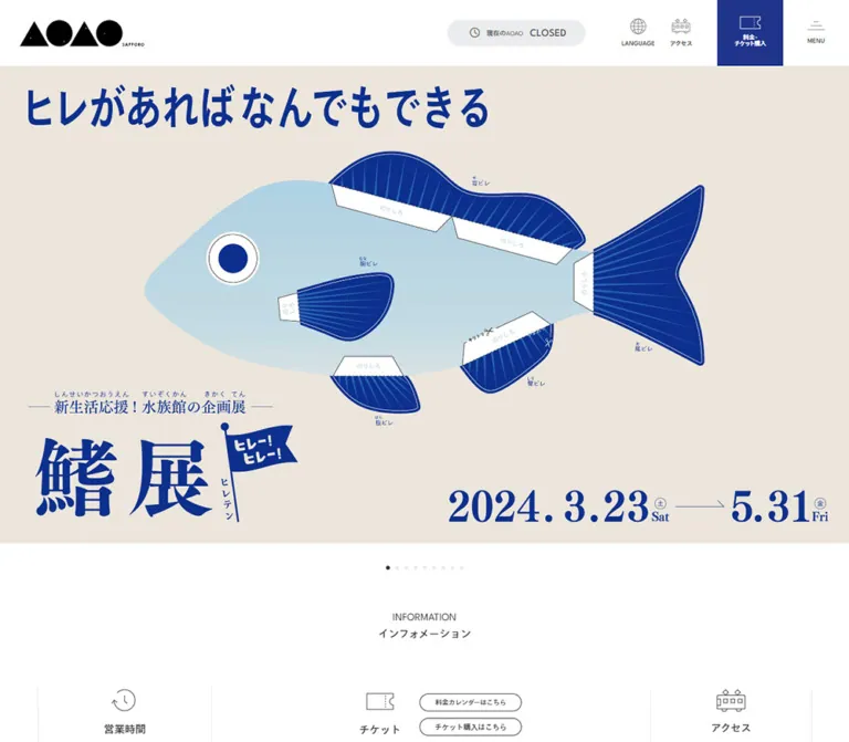
青い水族館ビジュアルと広い白余白を組み合わせた施設公式サイト。幾何学的なロゴ、英字見出し、横スクロールの記事一覧、常設のチケット導線が特徴です。
オリジナルサイトを見るAn immersive blue aquarium framed by quiet white space and precise visitor information.
Website: aoao-sapporo.blue
Original URL: https://aoao-sapporo.blue/
Final URL: https://aoao-sapporo.blue/
Theme: light interface, charcoal typography, deep blue ticket controls, and vivid campaign imagery.
Inspected: September 23, 2026, 00:43 JST, from the supplied browser capture recorded at 2026-09-22T15:43:03.594Z.
Viewports: desktop 1440 × 1000 and mobile 390 × 844 CSS pixels.
Scope: the current aquarium homepage: persistent navigation, the captured membership hero, visitor information, event and news content, recommendation banners, the visible beginning of the floor guide, partner marks, and footer. Additional homepage sections are documented from rendered DOM evidence where detailed screenshots are unavailable. Linked pages and open menu states were not inspected.
AOAO SAPPORO combines a restrained visitor-information interface with expressive exhibition imagery. White dominates the navigation and editorial sections. Charcoal type, fine outlines, and small line icons provide structure; the deep blue ticket block remains the strongest persistent interface accent. The captured hero supplies a different scale of expression: an immersive blue exhibit scene, photographic penguin cutouts, handwritten white lettering, drawn bubbles, and a yellow renewal badge.
This is a substantial facility homepage with practical information and regularly updated cultural programming. Its hierarchy moves from an image-led introduction to opening hours, tickets, events, news, floor information, and broader discovery links. Preserve this mix of utility and exploration when adapting the design.
An immersive blue aquarium framed by quiet white space and precise visitor information.
Website: aoao-sapporo.blue
Original URL: https://aoao-sapporo.blue/
Final URL: https://aoao-sapporo.blue/
Theme: light interface, charcoal typography, deep blue ticket controls, and vivid campaign imagery.
Inspected: September 23, 2026, 00:43 JST, from the supplied browser capture recorded at 2026-09-22T15:43:03.594Z.
Viewports: desktop 1440 × 1000 and mobile 390 × 844 CSS pixels.
Scope: the current aquarium homepage: persistent navigation, the captured membership hero, visitor information, event and news content, recommendation banners, the visible beginning of the floor guide, partner marks, and footer. Additional homepage sections are documented from rendered DOM evidence where detailed screenshots are unavailable. Linked pages and open menu states were not inspected.
AOAO SAPPORO combines a restrained visitor-information interface with expressive exhibition imagery. White dominates the navigation and editorial sections. Charcoal type, fine outlines, and small line icons provide structure; the deep blue ticket block remains the strongest persistent interface accent. The captured hero supplies a different scale of expression: an immersive blue exhibit scene, photographic penguin cutouts, handwritten white lettering, drawn bubbles, and a yellow renewal badge.
This is a substantial facility homepage with practical information and regularly updated cultural programming. Its hierarchy moves from an image-led introduction to opening hours, tickets, events, news, floor information, and broader discovery links. Preserve this mix of utility and exploration when adapting the design.
--aoao- are implementation aliases. Original custom properties are identified explicitly.| Name | Value | Token | Evidence and role |
|---|---|---|---|
| Page White | #FFFFFF |
--aoao-paper |
Measured body background; also measured on the menu control. The visible header and editorial canvas are white. |
| Primary Blue | #21348C |
--aoao-primary |
Exact source --color-primary; measured ticket-control background on both viewports. |
| Charcoal | #333333 |
--aoao-ink |
Measured body, headings, and article text. The bottom copyright strip appears similar, but its background was not separately measured. |
| Utility Gray | #EAECEE |
--aoao-utility |
Measured group-visit control background. The status surface appears to use a similar gray. |
| Tag Text | #4D4D4D |
--aoao-meta |
Measured category-label text. |
| Floor Surface | Approximately #F2F2F2 |
--aoao-surface |
Estimated from the floor-guide panel in the desktop capture. |
| Footer Gray | Approximately #D3D3D3 |
--aoao-footer |
Estimated from both footer captures. |
| Fine Rule | Approximately #DEDEDE |
--aoao-rule |
Estimated neutral for understated dividers and tag outlines. Actual borders vary in strength. |
| Campaign Yellow | Approximately #FFD900 |
--aoao-campaign |
Estimated from the circular renewal promotion within the captured hero. Campaign-specific, not a general interface action color. |
| Logo Black | Visually near #000000 |
— | Black geometric brand artwork; the logo itself was not sampled as a CSS color. |
The bright cyan and blue variations across the hero come from its imagery. They should not be converted into a large collection of unrelated interface colors. Primary Blue is the stable navigation accent; campaign artwork carries its own palette.
The supplied custom-property inventory includes many general WordPress and plugin presets for gradients, shadows, and colors. Their presence does not demonstrate use in this design. In particular, the visible page does not establish a rainbow gradient system or a card-shadow system.
Use white for the persistent header and the long content sequence. Reserve pale gray for selected utility areas and the broad floor-guide surface. Give the footer a distinctly darker gray field, followed by a charcoal copyright band. Keep the ticket destination blue in both desktop and mobile navigation so its position and color remain recognizable.
Measured computed stack: "League Spartan", TazuganeGothicStdN-Regular, sans-serif.
This stack appears on the body, English section headings, general links, and regular text. Its combination of geometric Latin letters and Japanese Gothic text supports the contrast between large English navigation headings and compact Japanese explanations.
Source custom property: --ff-tazg-regular: "League Spartan", "TazuganeGothicStdN-Regular", sans-serif.
The body computes to 16px, weight 400, and 35.2px line height, equivalent to 2.2. Component-specific rules frequently tighten that leading. Do not apply the body line height indiscriminately to article titles or large headings.
Measured computed stack: "League Spartan", TazuganeGothicStdN-Medium, sans-serif.
Event and news titles use this stack with computed weight 500. The source also exposes --ff-tazg-medium-weight: 600, but that token does not describe the sampled article headings. Use the component's computed value when matching it.
A Book stack and a weight token of 500 are also present in the custom-property inventory. Its use on a particular visible component was not established.
News dates and event date ranges use TazuganeGothicStdN-Regular, sans-serif, without League Spartan at the beginning of the sampled stack. Most measured tracking is normal.
Some button elements retain an Arial computed stack. This does not establish Arial as the visual brand font: their visible contents include icons and nested labels that were not independently sampled.
The large handwritten membership title and white annotations belong to the hero's visual composition. No font family for this lettering was established. Preserve the supplied artwork or commission equivalent lettering; do not assign a guessed handwriting font to the whole interface.
| Role | Desktop | Mobile | Weight and leading | Evidence |
|---|---|---|---|---|
| Body baseline | 16px |
16px |
400, 35.2px line height |
Measured |
| Major English heading: PICK UP, RECOMMEND, NEWS | 48px |
48px |
400, 48px line height |
Measured; mobile retains the large size |
| INFORMATION heading | 16px |
16px |
400, 16px line height |
Measured |
| Information item title | 16px |
16px |
700, 35.2px line height |
Measured |
| Featured event title | 24px |
18px |
500; 36px desktop, 27px mobile line height |
Measured |
| Featured event summary | 14px |
13px |
400; 25.2px desktop, 23.4px mobile line height |
Measured |
| Featured event date | 16px |
12px |
400; 35.2px desktop, 26.4px mobile line height |
Measured |
| News title | 16px |
16px |
500, 24px line height |
Measured |
| News date | 10px |
10px |
400, 22px line height |
Measured |
| Category pill | 10px |
9px |
500; 15px desktop, 13.5px mobile line height |
Measured |
| Small information link | 11px |
11px |
400, 24.2px line height |
Measured |
| Upcoming-event title | 16px |
16px |
500; 35.2px desktop, 24px mobile line height |
Measured |
| Japanese section subtitle | Approximately 13–16px |
Approximately 13–16px |
Regular or medium appearance | Estimated; individual subtitle styles were not supplied |
| Opening-hours value | Approximately 28px in the visible mobile panel |
Approximately 28px |
Strong weight, compact leading | Estimated from the mobile capture |
| Footer navigation and address | Approximately 13px |
Approximately 13px |
Compact, substantially tighter than body leading | Estimated |
Computed font-family names establish declarations, not an independent verification of every loaded font file or fallback glyph. The implementation below assumes appropriate font resources are supplied separately.
| Element | Desktop | Mobile | Evidence |
|---|---|---|---|
| Header reservation | 100px |
60px header below a 28px status strip |
Measured |
| Main content start | y = 100px |
y = 88px |
Measured |
| Header logo link | 189 × 41px, at x = 30px |
Approximately 115.23 × 24.98px, at x = 18px |
Measured |
| Group, ticket, and menu blocks | Each 100 × 100px |
Each 50 × 60px |
Measured |
| Main editorial width | 1176px |
360px |
Measured heading/banner bounds |
| Main side inset | 132px |
15px |
Measured |
| Captured hero | Approximately 1440 × 810px |
Approximately 390 × 219.38px |
Screenshot geometry; consistent with 16:9 |
| Hero bottom to INFORMATION title top | Approximately 106px |
Approximately 106px |
Calculated using hero geometry and measured heading positions |
| News card width | 267px |
255px |
Measured |
| News card gap | 30px |
30px |
Calculated from consecutive card positions |
| News image | Approximately 267 × 200px |
Likely approximately 255 × 150px |
Desktop capture estimate; mobile height inferred from date position and the desktop gap pattern |
| List-link pill | 144 × 39px |
123 × 39px |
Measured |
| Featured event item | 1086px wide |
296px wide |
Measured |
| Featured event inset within the editorial area | 45px per side |
32px per side |
Calculated |
| Recommendation banner | 580 × 187.23px |
Approximately 360 × 116.22px |
Measured |
| Recommendation banner gap | 16px horizontally |
16px vertically |
Calculated |
| Full document height | Approximately 6397.64px |
Approximately 7835.86px |
Measured snapshot state; not a fixed layout target |
A centered width of 1176px accounts for the desktop editorial alignment: (1440 − 1176) / 2 = 132. A reusable min(1176px, calc(100% - 30px)) container reproduces both observed widths, but the original intermediate-width formula was not supplied.
| Relationship | Value | Evidence |
|---|---|---|
| Major heading top to news/recommendation media top | Approximately 118.8px |
Calculated from measured element positions on both viewports |
| Desktop heading text to adjacent list link | 30px |
Calculated |
| Desktop news image bottom to date line box | Approximately 20px |
Capture geometry combined with DOM positions |
| Date line box bottom to news title | 16px |
Calculated |
| News title bottom to category pill | 22px desktop; 23px mobile |
Calculated for sampled cards |
| Recommendation media bottom to NEWS heading | 80px desktop; 60px mobile |
Calculated |
| Desktop featured-event text column | 520.5px |
Measured |
| Desktop featured-event column gap | Approximately 45px |
Calculated if the media column mirrors the measured text column |
The page uses several scales at once: small utility details, a regular 30px article rhythm, and generous section separation. Avoid reducing it to a single tightly packed spacing grid.
| Element | Value | Evidence |
|---|---|---|
| Main navigation blocks | 0 |
Measured |
| Article link wrappers | 0 |
Measured; images can have separate rounding |
| List-link pill | 30px radius |
Measured |
| Category pill | 15px radius |
Measured |
| Category padding | 5px 15px 1px |
Measured; asymmetric vertical padding is part of the sampled implementation |
| News image corners | Approximately 4–5px |
Estimated |
| Floor-guide upper corners | Approximately 30px |
Estimated |
| Status capsule | Fully rounded | Visible; exact radius not supplied |
| Small arrow controls | Approximately 35px visible diameter |
Estimated from mobile screenshot; sampled anchor boxes differ |
| Floor MAP control | Approximately 90px diameter |
Estimated |
Use thin outlines and empty space to establish boundaries. The visible cards do not require filled containers, heavy borders, or elevation shadows.
Role: identity, operating status, and immediate access to practical destinations.
The desktop header is a 100px white strip. A black AOAO mark sits 30px from the left edge, with substantial open space before the utility cluster. Its alternating triangles and circles are supplied brand artwork, accompanied by a tiny SAPPORO wordmark.
The right side contains:
CLOSED in the captured state.LANGUAGE.アクセス.MENU caption.Group visits, tickets, and menu each occupy a complete 100 × 100px block. The language button and access link have sampled 50 × 50px boxes within the looser utility area. The status capsule is approximately 210 × 40px in the screenshot; that size is an estimate.
At 390px, the header becomes 60px high and retains the same utility sequence. Group, ticket, and menu shrink to 50px-wide blocks. The language and access captions disappear visually, leaving icons. The operating status occupies a separate 28px strip above the header at the top of the page.
The header remains visible in scrolled captures. In the mobile footer capture, the status strip is absent and the 60px navigation row sits at the viewport top. The implementation mechanism and exact scroll threshold were not supplied.
CLOSED describes the captured operating state of the aquarium. It is not evidence that the website is discontinued. Its update logic was not verified.
Role: introduce the aquarium through a large, replaceable campaign composition.
The captured slide promotes すいぞくかんクラブ. It fills the viewport width beneath the header and maintains an approximately 16:9 composition on both inspected sizes.
Its anatomy is visual rather than a conventional text-and-button layout:
The mobile capture scales down the full composition. The penguins, yellow badge, lettering, and surrounding scene remain in corresponding positions. Do not substitute a tall, tightly cropped mobile hero if the aim is fidelity to this observed state.
The supplied evidence does not establish which visual elements are separate assets, HTML text, or a single composite. Treat the campaign as composed artwork until an asset inventory establishes otherwise. Small embedded text becomes very small on mobile; a new implementation should provide an accessible text equivalent.
Three small centered dots appear in the white space below the hero. The middle dot is dark in both top captures. Visible dots are approximately 6px, with roughly 8px between their edges.
Their center is approximately 37px below the image bottom. A 74px-high centered indicator area is therefore a useful calculated reconstruction. Click behavior, autoplay, slide duration, and transition style were not exercised.
Role: provide the facts needed to plan a visit immediately after the hero.
The INFORMATION heading is deliberately smaller than later section headings: 16px / 16px. A Japanese subtitle sits below it. Desktop information is distributed across opening hours, ticket information, and access, with thin vertical divisions and line icons.
The opening-hours panel stacks an icon, 営業時間, a large time range, and a compact last-entry note. The captured content is 10:00-22:00 with last entry at 21:00.
The ticket area contains a ticket icon, label, a small outlined purchase link, and age-based prices. The captured amounts are ¥2,200, ¥1,100, and ¥200. These are snapshot content, not permanent design tokens. The purchase link points to the external ticket service recorded in the DOM.
On mobile, the heading aligns to the 15px page inset, and two outlined circular arrows sit at the right. The information panels remain arranged horizontally. The opening-hours panel is visible while parts of the following content extend beyond the viewport. Sampled ticket and access headings are at offscreen x-coordinates, confirming that the content has not simply been removed.
Do not turn this observed mobile state into three vertically stacked feature cards when reproducing it. The arrow controls indicate navigation intent, but the exact movement, swipe support, and reachable end positions remain unverified.
Role: establish the editorial hierarchy while keeping list navigation nearby.
PICK UP, RECOMMEND, and NEWS use regular-weight uppercase English at 48px / 48px, with a smaller Japanese subtitle underneath. Desktop list links sit 30px to the right of the heading text. The NEWS link measures 144 × 39px, uses a 30px radius, and contains 一覧を見る with a small circular arrow mark.
On mobile, the major heading remains 48px. The list link narrows to 123px and aligns to the right of the 360px content area. This preservation of large type is a defining responsive choice.
The approximate 119px distance from heading top to following media is consistent across the measured news and recommendation sections. Keep enough room for both the Japanese subtitle and a distinct gap before images.
Role: give currently running programs more space than ordinary news entries.
Desktop event items measure 1086px across. A media area sits beside a 520.5px text column; the measured text position is consistent with two equal columns separated by approximately 45px. The text stack contains a date range, a medium-weight 24px / 36px title, and a regular 14px / 25.2px excerpt.
Mobile items measure 296px across, centered at x = 47px in the sampled state. Dates and text appear below the media rather than beside it. Titles reduce to 18px / 27px, summaries to 13px / 23.4px, and dates to 12px / 26.4px.
Previous/next buttons exist in the rendered evidence. Offscreen copies and repeated item destinations are consistent with a carousel implementation. They do not prove automatic advancement or a particular carousel library.
Role: expose near-future programming without giving every entry a large image.
Below the featured track, the desktop list places dates in a roughly 200px column beside titles. Its sampled list region is 885px wide and sits to the right of the section's leftmost inset.
On mobile, entries occupy the same 296px inner width as the featured content. Dates move above titles. Titles use 16px / 24px, and row height follows wrapping: measured examples range from 82px to 130px. Preserve natural title length rather than forcing all rows to an identical height.
Role: provide two broad promotional destinations between events and news.
Desktop displays two approximately 580 × 187px linked banners separated by 16px. Their destinations are a book-related external site and the aquarium's ticket page. On mobile, both become 360px wide and stack with a 16px gap, retaining an approximately 3.1:1 proportion.
Detailed banner artwork is not visible in the supplied screenshot crops. Their dimensions, order, and destinations are established by the DOM; their precise imagery should not be invented from the link names.
Role: present current announcements with a consistent editorial rhythm.
Each card contains a landscape image, date, Japanese title, and small outlined category pill. The card has no general filled shell or shadow. The whole sampled content grouping is linked to its article.
At 1440px, cards are 267px wide with 30px gaps. The first visible card begins at x = 132px, followed by cards at 429px, 726px, and 1023px. Another card begins at 1320px and is cut off by the viewport edge. This deliberate continuation makes the rail feel larger than the centered content width.
The visible desktop images are approximately 200px high, with subtly rounded corners. Dates use 10px / 22px, followed by 16px of space before a 16px / 24px medium-weight title. Titles wrap naturally to different line counts. The category pill follows the text instead of aligning all cards to a fixed bottom edge.
The category すべて uses 10px text on desktop and 9px on mobile. Its measured desktop box is approximately 60.7 × 23px, with 15px radius and asymmetric padding. It is a paragraph inside the card link in the sampled DOM; separate filtering behavior was not established.
Mobile cards remain a horizontal rail: 255px wide with 30px gaps, beginning at x = 15px. The next card begins at x = 300px, leaving a visible preview. Title and date sizes remain unchanged. The image region appears to become shallower based on the vertical measurements, but its mobile image box was not directly sampled.
Role: transition from current content to the aquarium's physical organization.
In the desktop capture, the section begins as a full-width pale gray surface with approximately 30px rounded upper corners. A large centered FLOOR GUIDE heading and Japanese subtitle sit above the content. A thin outlined circular arrow, approximately 90px across, appears beside the title area with MAP below it.
The top edges of three image columns are visible, approximately 372px wide with 30px gaps inside the 1176px content alignment. Their complete cards are outside the screenshot crop.
The rendered homepage text identifies three floor concepts: CONNECT, SCOPE, and COMMONS, together with facility labels such as MUSEUM SHOP, CO-WORKING, NURSERY, and BAKERY & BAR. Links target floor 4, floor 5, floor 6, and a floor-map anchor.
The complete tile styling and mobile floor-guide arrangement are not established by the provided visual crops. A responsive stacked grid is a reasonable implementation choice, but must be labeled as a recommendation rather than an observation.
The rendered page continues with ABOUT US, HIGHLIGHT, INSTAGRAM, and a web-ticket destination. HIGHLIGHT includes four linked themes addressing day and night visits, time with living creatures, different age groups, and a free viewing route. Six Instagram destinations are present in the supplied evidence.
These sections establish the breadth and order of the homepage. Their complete image arrangements and computed component geometry were not supplied, so this reference does not prescribe an invented card system for them.
The web-ticket text wraps onto two lines in the mobile rendered text. Its destination is the same external ticket channel used by the information section.
Role: connect the aquarium to related local organizations and services.
The desktop lower-page capture shows a narrow vertical sequence of centered partner marks on white, surrounded by large amounts of empty space. Visible marks retain their own identities: some are monochrome, while others use color. Vertical intervals are roughly 70–80px, estimated from the capture.
Do not infer a conventional multi-column sponsor grid from the number of links. The visible state is a vertical arrangement. Exact mobile layout and all logo dimensions were not supplied.
Role: consolidate identity, location, social access, primary navigation, and legal links.
A broad medium-light gray surface replaces the white page. On desktop, a large black logo, address, and Google Maps link occupy the left region. Social links and a GLOBAL SITE pill sit above several rows of navigation on the right.
The footer logo is approximately 218px wide in both visible footer captures. It is much larger than the mobile header logo. The address remains left aligned beneath it. Social marks include Instagram, LINE, and X. The GLOBAL SITE link points to the English section of the original site.
Primary navigation, support/legal navigation, and small policy links form separate groups. A faint divider separates the smallest policy row from the larger link groups. Text stays charcoal on gray; the footer does not introduce a new accent palette.
On mobile, the logo and address form a centered block, followed by the map link, centered social controls, and GLOBAL SITE. The navigation then switches to left-aligned wrapping rows with 15px side insets. It is not presented as an accordion in the supplied capture.
A charcoal strip closes the page with white copyright text at left and Page Top plus a small outlined circle at right. It is approximately 51px high on desktop and 55px on mobile. The page-top destination is a # link; smooth-scroll behavior was not verified.
| Treatment | Evidence | What can be concluded |
|---|---|---|
| General links | Sampled transition: 0.5s ease-out |
A 500ms eased transition is declared. The changing properties and hover end states were not captured. |
| Mobile header | Sampled transition: 0.1s |
A short transition is declared; its trigger and affected properties are unknown. |
| Hero navigation | Three visible dots; multiple slide labels in rendered text | Multiple hero states are represented. Autoplay timing, transition type, and dot activation were not tested. |
| Featured-event track | Previous/next buttons, repeated destinations, offscreen items | Horizontal carousel structure is supported by the evidence. Looping and swipe behavior remain unverified. |
| News rail | Consecutive horizontal card coordinates and clipped continuation | A horizontal sequence is established. Dragging and automatic movement were not tested. |
| Mobile information | Visible arrows and horizontally displaced panels | Panel navigation is suggested; exact interaction behavior is unverified. |
| Persistent header | Header visible in scrolled captures; mobile status strip absent at the footer | Persistent navigation and a changed mobile top state are visible. Sticky positioning versus script control is not established. |
| Language selector | A button and four language destinations in DOM | Destinations exist. The open menu's appearance, placement, and keyboard behavior were not inspected. |
| MENU | Visible menu affordance; sampled link points to the homepage | An open overlay or expanded navigation state was not captured. |
| Page Top | Footer link targets # |
A top-of-page destination is present. Scroll duration is unknown. |
Sampled elements report animation: none; this does not prove the whole page is static. JavaScript-driven carousels, unsampled elements, and later states can behave differently.
For an adaptation, retain calm interaction feedback. A restrained opacity or color transition can use the observed 500ms ease-out timing, but any chosen hover effect is a recommendation. Do not invent floating penguins, animated bubbles, parallax, or a particular slide interval from still images.
| Layer | Appearance | Purpose |
|---|---|---|
| Header and editorial canvas | White, mostly unboxed | Keeps visitor information and article content legible |
| Status and group utility | Pale cool gray | Distinguishes practical utility areas |
| Ticket utility | Solid deep blue with white visible contents | Persistent ticket destination |
| Campaign hero | Full-width imagery with embedded graphics | Emotional and promotional introduction |
| News cards | Image and text directly on the white page | Editorial hierarchy without elevation |
| Floor guide | Pale gray, rounded upper corners | Groups information about the physical venue |
| Footer | Medium-light gray | Separates comprehensive navigation from the content feed |
| Copyright strip | Charcoal with white text | Clear visual end to the page |
Surface changes are broad and deliberate. Small controls use outlines or solid fills; the page does not rely on translucent glass, blurred backgrounds, or stacked shadows.
The captured hero combines environmental photography, photographic cutouts, and hand-drawn graphics. The blue scene establishes immersion, while the isolated penguins and white marks make the composition approachable. Human figures communicate scale and the experience of being inside the exhibit.
News imagery is more editorial and varied. The visible rail includes a colorful event graphic, red autumn foliage beside water, a blue circular exhibit with a silhouetted visitor, and a penguin in a carefully lit architectural setting. A partly visible following card introduces food and jellyfish imagery. Keep these editorial differences; a uniform blue overlay across every thumbnail would remove useful content distinction.
Utility icons are fine outline illustrations: globe, access, group visitors, ticket, and menu. Footer social marks use recognizable service identities. The brand mark is a compact geometric asset, not ordinary text that should be recreated with a substitute typeface.
No image src inventory was included in the supplied evidence. The following table identifies visible assets and content references without inventing filenames.
| Asset | Observed treatment | Reference limitation |
|---|---|---|
| AOAO logo | Black geometric mark in header and footer | Visible in captures; original asset URL not supplied |
| Membership campaign | Blue 16:9 composition with penguins, white lettering, and yellow badge | Current hero in desktop and mobile captures; layer structure unknown |
| NoMaps announcement image | Colorful typographic event artwork | Visible news card linked to /all/41105/; that route is an article destination, not an image URL |
| River-event image | Autumn trees and water | Visible news card linked to /all/41121/; media URL not supplied |
| Moon-viewing image | Blue circular exhibit and visitor silhouette | Visible news card linked to /all/41052/; media URL not supplied |
| Aquarium talk image | Penguin against stepped white structures | Visible news card linked to /all/41012/; media URL not supplied |
| Partner marks | Individually styled logos in a centered vertical sequence | Visible lower-page assets; full asset inventory unavailable |
| Utility icons | Fine monochrome outlines, reversed within the ticket block | File format and icon library not established |
Use appropriately supplied artwork for reproduction. CSS can establish proportions and framing, but cannot replace the campaign's photography and custom lettering.
The white header occupies the first 100px. The captured hero then fills approximately 810px, leaving its pagination visible near the bottom of the first viewport. INFORMATION begins just below that viewport at y = 1016px.
Most editorial content aligns to a centered 1176px width. The featured-event area is inset further, while the news rail begins at the editorial left edge and continues beyond the right edge. This difference matters: the page alternates contained content with visibly continuing horizontal tracks.
PICK UP, RECOMMEND, NEWS, and the floor guide create a clear sequence. Recommendation banners use two columns; featured events pair media with text; news shows four full cards and a partial continuation. The footer uses a broad two-region composition for identity and navigation.
The initial header area totals 88px: a 28px status strip and a 60px navigation row. The hero remains wide and shallow, ending near y = 307.38px. INFORMATION starts at y = 413.38px, while the large PICK UP title begins near y = 802.73px.
Responsive behavior is selective:
Only these two viewport sizes were supplied. No original breakpoint values, tablet states, landscape-phone behavior, or safe-area rules were established. The Quick Start uses a recommended 1023px breakpoint to switch between the two demonstrated layout modes; it is not claimed as original CSS.
#21348C for the persistent ticket control.These recommendations are improvements for a new implementation, not verified original features.
#FFFFFF.#333333.#21348C, with white visible contents.#EAECEE.#F2F2F2.#D3D3D3, ending in a charcoal strip.“Create an aquarium visitor homepage inspired by the current AOAO SAPPORO interface. Use a white canvas, charcoal text, generous section spacing, and a persistent deep blue ticket block in the header. Pair League Spartan Latin text with an appropriate Japanese Gothic face, using regular-weight 48px English section headings and smaller Japanese subtitles. Begin with a full-width 16:9 aquarium campaign composition, followed by compact visitor information, featured events, recommendation banners, a horizontal news rail, and a pale gray floor-guide section. News cards should have landscape images, tiny dates, medium-weight multiline titles, and small outline category pills without shadows. At 390px, keep the hero landscape, retain the 48px major headings, stack featured-event content and banners, preserve horizontal news continuation, and center footer identity above wrapping navigation. Treat unverified menu and carousel behaviors as implementation decisions.”
#21348C ticket square. On mobile, use a 28px status strip above a 60px navigation row, with 50px-wide group, ticket, and menu controls. Keep ticket contrast and utility order consistent.”This CSS is a reusable approximation, not extracted source code. Exact sampled values are retained where practical. Estimated surface colors, the breakpoint, sticky-header mechanism, and hover feedback are recommendations. Font files, artwork, semantic markup, and carousel logic must be provided separately.
Expected structure: .aoao-masthead contains .aoao-status followed by .aoao-header-row; the row contains the brand and utility navigation. .section-heading contains a title/subtitle group and an optional .pill-link. Each .news-card contains an image, date, heading, and category label.
:root {
  /* Measured interface colors */
  --aoao-paper: #fff;
  --aoao-ink: #333;
  --aoao-primary: #21348c;
  --aoao-utility: #eaecee;
  --aoao-meta: #4d4d4d;

  /* Screenshot estimates for this adaptation */
  --aoao-surface: #f2f2f2;
  --aoao-footer: #d3d3d3;
  --aoao-rule: #dedede;

  /* Declared source families; provide font resources separately */
  --aoao-font: 'League Spartan', 'TazuganeGothicStdN-Regular', sans-serif;
  --aoao-font-medium: 'League Spartan', 'TazuganeGothicStdN-Medium', sans-serif;
  --aoao-font-date: 'TazuganeGothicStdN-Regular', sans-serif;

  --aoao-content: 1176px;
  --aoao-gutter: max(15px, calc((100vw - 1176px) / 2));
  --aoao-header-height: 100px;
  --aoao-section-space: 80px;
  --aoao-news-width: 267px;
  --aoao-news-image-height: 200px;
  --aoao-card-gap: 30px;
  --aoao-image-radius: 5px;
  --aoao-link-motion: 500ms ease-out;
}

* { box-sizing: border-box; }

body {
  margin: 0;
  color: var(--aoao-ink);
  background: var(--aoao-paper);
  font-family: var(--aoao-font);
  font-size: 16px;
  line-height: 2.2;
}

img { display: block; max-width: 100%; }
a { color: inherit; }
button { font: inherit; }

.aoao-container {
  width: min(var(--aoao-content), calc(100% - 30px));
  margin-inline: auto;
}

/* Recommended sticky structure matching the two captured states */
.aoao-masthead {
  position: sticky;
  top: 0;
  z-index: 50;
  background: var(--aoao-paper);
}

.aoao-header-row {
  display: flex;
  align-items: center;
  height: var(--aoao-header-height);
}

.aoao-brand {
  flex: 0 0 auto;
  width: 189px;
  margin-left: 30px;
  line-height: 0;
}

.aoao-status {
  position: absolute;
  top: 30px;
  right: 500px;
  display: flex;
  align-items: center;
  justify-content: center;
  gap: 10px;
  width: 210px;
  height: 40px;
  border-radius: 999px;
  background: var(--aoao-utility);
  font-size: 10px;
  line-height: 1;
}

.aoao-status strong { font-size: 18px; }

.aoao-utilities {
  display: flex;
  align-items: center;
  margin-left: auto;
}

.aoao-utility {
  display: flex;
  flex-direction: column;
  align-items: center;
  justify-content: center;
  gap: 5px;
  width: 100px;
  height: 100px;
  padding: 0;
  border: 0;
  border-radius: 0;
  background: var(--aoao-paper);
  color: var(--aoao-ink);
  font-size: 10px;
  line-height: 1.15;
  text-align: center;
  text-decoration: none;
}

.aoao-utility--small { width: 80px; }
.aoao-utility--group { background: var(--aoao-utility); }
.aoao-utility--ticket {
  background: var(--aoao-primary);
  color: #fff;
}

.aoao-utility svg { width: 30px; height: 30px; }

.aoao-hero-art {
  width: 100%;
  height: auto;
  aspect-ratio: 16 / 9;
  object-fit: contain;
}

/* Decorative indicators; add accessible controls separately */
.aoao-hero-dots {
  display: flex;
  justify-content: center;
  align-items: center;
  gap: 8px;
  height: 74px;
}

.aoao-hero-dots > span {
  width: 6px;
  height: 6px;
  border-radius: 50%;
  background: var(--aoao-utility);
}

.aoao-hero-dots > .is-current { background: var(--aoao-ink); }

.aoao-section { margin-block: var(--aoao-section-space); }

.section-heading {
  display: flex;
  align-items: center;
  gap: 30px;
  margin-bottom: 40px;
}

.section-title {
  margin: 0;
  font-size: 48px;
  font-weight: 400;
  line-height: 1;
}

/* Subtitle size is an adaptation, not a sampled declaration */
.section-subtitle {
  margin: 0;
  font-size: 14px;
  line-height: 2.2;
}

.pill-link {
  display: inline-flex;
  flex: 0 0 auto;
  align-items: center;
  justify-content: center;
  gap: 8px;
  width: 144px;
  height: 39px;
  border: 1px solid currentColor;
  border-radius: 30px;
  font-size: 13px;
  line-height: 1;
  text-decoration: none;
}

.aoao-information { margin-top: 32px; }
.aoao-information .section-title { font-size: 16px; }
.aoao-information .section-heading { justify-content: center; }

/* Panel proportions are recommended approximations */
.information-track {
  display: grid;
  grid-template-columns: 1fr 2.5fr 1fr;
  margin-top: 60px;
}

.information-panel {
  min-width: 0;
  min-height: 200px;
  padding-inline: 24px;
  border-left: 1px solid var(--aoao-rule);
  text-align: center;
}

.information-panel:last-child { border-right: 1px solid var(--aoao-rule); }
.information-panel h3 { font-size: 16px; font-weight: 700; }
.information-value { font-size: 28px; font-weight: 600; line-height: 1.3; }

.feature-card {
  display: grid;
  grid-template-columns: minmax(0, 1fr) minmax(0, 1fr);
  gap: 45px;
  width: 100%;
  max-width: 1086px;
  margin-inline: auto;
  color: inherit;
  text-decoration: none;
}

.feature-card img { width: 100%; height: auto; }
.feature-title {
  margin: 24px 0;
  font-family: var(--aoao-font-medium);
  font-size: 24px;
  font-weight: 500;
  line-height: 1.5;
}
.feature-date { font-family: var(--aoao-font-date); }
.feature-summary { margin: 0; font-size: 14px; line-height: 1.8; }

.recommend-grid {
  display: grid;
  grid-template-columns: repeat(2, minmax(0, 1fr));
  gap: 16px;
}
.recommend-grid img { width: 100%; height: auto; }

/* Full-width rail: place outside the centered container */
.news-rail {
  display: flex;
  align-items: flex-start;
  gap: var(--aoao-card-gap);
  overflow-x: auto;
  padding: 0 var(--aoao-gutter) 8px;
  scroll-padding-inline: var(--aoao-gutter);
  scroll-snap-type: x proximity;
}

/* Native scrolling and snap are recommended fallback behavior */
.news-card {
  flex: 0 0 var(--aoao-news-width);
  min-width: 0;
  color: inherit;
  text-decoration: none;
  scroll-snap-align: start;
}

.news-card > img {
  width: 100%;
  height: var(--aoao-news-image-height);
  object-fit: cover;
  border-radius: var(--aoao-image-radius);
}

.news-date {
  display: block;
  margin-top: 20px;
  font-family: var(--aoao-font-date);
  font-size: 10px;
  line-height: 22px;
}

.news-title {
  margin: 16px 0 22px;
  font-family: var(--aoao-font-medium);
  font-size: 16px;
  font-weight: 500;
  line-height: 24px;
  overflow-wrap: anywhere;
}

.news-category {
  display: inline-block;
  padding: 5px 15px 1px;
  border: 1px solid var(--aoao-rule);
  border-radius: 15px;
  color: var(--aoao-meta);
  font-family: var(--aoao-font-medium);
  font-size: 10px;
  font-weight: 500;
  line-height: 15px;
}

.floor-guide {
  padding-block: 90px;
  border-radius: 30px 30px 0 0;
  background: var(--aoao-surface);
}
.floor-guide .section-heading { justify-content: center; }
.floor-grid {
  display: grid;
  grid-template-columns: repeat(3, minmax(0, 1fr));
  gap: 30px;
}

.aoao-footer { background: var(--aoao-footer); }
.footer-grid {
  display: grid;
  grid-template-columns: 300px minmax(0, 1fr);
  gap: 24px 75px;
  padding-block: 120px 40px;
}
.footer-identity { grid-row: span 2; font-size: 13px; line-height: 1.4; }
.footer-logo { width: 218px; margin-bottom: 28px; }
.footer-social { display: flex; align-items: center; flex-wrap: wrap; gap: 18px; }
.footer-nav { font-size: 13px; line-height: 1.8; }
.footer-link-group { display: flex; flex-wrap: wrap; gap: 16px 30px; }
.footer-link-group a { text-decoration: none; }
.footer-policies { margin-top: 24px; padding-top: 24px; border-top: 1px solid #ccc; }

.footer-bottom {
  display: flex;
  justify-content: space-between;
  align-items: center;
  gap: 16px;
  min-height: 51px;
  padding: 14px 30px;
  background: var(--aoao-ink);
  color: #fff;
  font-size: 11px;
  line-height: 1.5;
}

/* Recommended feedback; original hover end states were not captured */
.pill-link, .news-card, .aoao-utility {
  transition: opacity var(--aoao-link-motion);
}
@media (hover: hover) {
  .pill-link:hover, .news-card:hover, .aoao-utility:hover { opacity: .75; }
}

:where(a, button):focus-visible {
  outline: 2px solid currentColor;
  outline-offset: 4px;
}
[id] { scroll-margin-top: calc(var(--aoao-header-height) + 16px); }

/* Recommended breakpoint; only 1440px and 390px were inspected */
@media (max-width: 1023px) {
  :root {
    --aoao-header-height: 60px;
    --aoao-section-space: 60px;
    --aoao-news-width: 255px;
    --aoao-news-image-height: 150px;
  }

  .aoao-masthead { top: -28px; }
  .aoao-status {
    position: static;
    width: 100%;
    height: 28px;
    border-radius: 0;
  }
  .aoao-brand { width: 115.23px; margin-left: 18px; }
  .aoao-utility { width: 50px; height: 60px; font-size: 8px; }
  .aoao-utility--small { width: 48px; }
  .aoao-utility svg { width: 25px; height: 25px; }
  .aoao-utility--small .utility-label { display: none; }

  .section-heading { justify-content: space-between; gap: 16px; }
  .pill-link { width: 123px; }
  .aoao-information .section-heading { justify-content: space-between; }
  .information-track { display: flex; overflow-x: auto; }
  .information-panel { flex: 0 0 240px; }
  .information-panel--ticket { flex-basis: 640px; }

  .feature-card { max-width: 296px; grid-template-columns: 1fr; gap: 16px; }
  .feature-title { margin-block: 18px; font-size: 18px; }
  .feature-date { font-size: 12px; line-height: 26.4px; }
  .feature-summary { font-size: 13px; line-height: 23.4px; }
  .recommend-grid { grid-template-columns: 1fr; }
  .news-title { margin-bottom: 23px; }
  .news-category { font-size: 9px; line-height: 13.5px; }

  /* Recommended mobile floor layout; not visually established */
  .floor-grid { grid-template-columns: 1fr; }
  .footer-grid { grid-template-columns: 1fr; gap: 36px; padding-block: 64px; }
  .footer-identity { grid-row: auto; width: 218px; margin-inline: auto; }
  .footer-social { justify-content: center; }
  .footer-link-group { gap: 20px 24px; }
  .footer-bottom { min-height: 55px; padding-inline: 15px; }
}

@media (prefers-reduced-motion: reduce) {
  .pill-link, .news-card, .aoao-utility { transition: none; }
  .news-rail { scroll-behavior: auto; scroll-snap-type: none; }
}
The information panel widths beyond the first mobile panel are approximation choices. The CSS provides a reachable horizontal fallback rather than claiming to reproduce the original track logic. The news image's 150px mobile height is also an inference, and should be checked against actual media assets during implementation.
Optional aliases for a project already using Tailwind v4. This is not evidence that the original website uses Tailwind. Define the custom properties above first.
@theme inline {
  --color-aquarium: var(--aoao-primary);
  --color-paper: var(--aoao-paper);
  --color-ink: var(--aoao-ink);
  --color-utility: var(--aoao-utility);
  --color-floor: var(--aoao-surface);
  --color-footer: var(--aoao-footer);
  --color-rule: var(--aoao-rule);

  --font-interface: var(--aoao-font);
  --font-interface-medium: var(--aoao-font-medium);
  --font-date: var(--aoao-font-date);

  --text-section: 48px;
  --text-feature: 24px;
  --text-card: 16px;
  --text-meta: 10px;

  --spacing-page: 15px;
  --spacing-card-gap: 30px;
  --spacing-content: 1176px;
  --radius-image: 5px;
  --radius-pill: 30px;
  --radius-section: 30px;
}
2026-09-22T15:43:03.594Z, equivalent to September 23, 2026, 00:43:03.594 JST.1440 × 1000 captures showing the membership hero, news and the beginning of the floor guide, and partner marks with the footer.390 × 844 captures showing the hero and visitor information, and the footer with persistent navigation.# AOAO SAPPORO — Style Reference > An immersive blue aquarium framed by quiet white space and precise visitor information. **Website:** [aoao-sapporo.blue](https://aoao-sapporo.blue/) **Original URL:** https://aoao-sapporo.blue/ **Final URL:** https://aoao-sapporo.blue/ **Theme:** light interface, charcoal typography, deep blue ticket controls, and vivid campaign imagery. **Inspected:** September 23, 2026, 00:43 JST, from the supplied browser capture recorded at `2026-09-22T15:43:03.594Z`. **Viewports:** desktop `1440 × 1000` and mobile `390 × 844` CSS pixels. **Scope:** the current aquarium homepage: persistent navigation, the captured membership hero, visitor information, event and news content, recommendation banners, the visible beginning of the floor guide, partner marks, and footer. Additional homepage sections are documented from rendered DOM evidence where detailed screenshots are unavailable. Linked pages and open menu states were not inspected. AOAO SAPPORO combines a restrained visitor-information interface with expressive exhibition imagery. White dominates the navigation and editorial sections. Charcoal type, fine outlines, and small line icons provide structure; the deep blue ticket block remains the strongest persistent interface accent. The captured hero supplies a different scale of expression: an immersive blue exhibit scene, photographic penguin cutouts, handwritten white lettering, drawn bubbles, and a yellow renewal badge. This is a substantial facility homepage with practical information and regularly updated cultural programming. Its hierarchy moves from an image-led introduction to opening hours, tickets, events, news, floor information, and broader discovery links. Preserve this mix of utility and exploration when adapting the design.
# AOAO SAPPORO — Style Reference

> An immersive blue aquarium framed by quiet white space and precise visitor information.

**Website:** [aoao-sapporo.blue](https://aoao-sapporo.blue/)
**Original URL:** https://aoao-sapporo.blue/
**Final URL:** https://aoao-sapporo.blue/
**Theme:** light interface, charcoal typography, deep blue ticket controls, and vivid campaign imagery.
**Inspected:** September 23, 2026, 00:43 JST, from the supplied browser capture recorded at `2026-09-22T15:43:03.594Z`.
**Viewports:** desktop `1440 × 1000` and mobile `390 × 844` CSS pixels.
**Scope:** the current aquarium homepage: persistent navigation, the captured membership hero, visitor information, event and news content, recommendation banners, the visible beginning of the floor guide, partner marks, and footer. Additional homepage sections are documented from rendered DOM evidence where detailed screenshots are unavailable. Linked pages and open menu states were not inspected.

AOAO SAPPORO combines a restrained visitor-information interface with expressive exhibition imagery. White dominates the navigation and editorial sections. Charcoal type, fine outlines, and small line icons provide structure; the deep blue ticket block remains the strongest persistent interface accent. The captured hero supplies a different scale of expression: an immersive blue exhibit scene, photographic penguin cutouts, handwritten white lettering, drawn bubbles, and a yellow renewal badge.

This is a substantial facility homepage with practical information and regularly updated cultural programming. Its hierarchy moves from an image-led introduction to opening hours, tickets, events, news, floor information, and broader discovery links. Preserve this mix of utility and exploration when adapting the design.
## How to Read This Reference
- **Measured** values come from the supplied rendered DOM and computed styles. Measurements use CSS pixels unless stated otherwise.
- **Calculated** values are arithmetic derived from those measurements, such as card gaps and content widths.
- **Estimated** values describe visible screenshot geometry or colors that were not included in the computed-style samples. They are not pixel samples.
- **Recommended** values and behaviors belong to the reusable implementation, not to verified original functionality.
- Token names beginning with `--aoao-` are implementation aliases. Original custom properties are identified explicitly.
- Screenshots establish visible appearance; DOM entries establish text, destinations, and sampled styling. An offscreen element or a link destination does not establish a visible interaction state.
- Repeated event and news entries occur in horizontal tracks. Do not interpret these repetitions as separate editorial items or reproduce every duplicate in a content model.
## Tokens — Colors
### Default Palette
| Name | Value | Token | Evidence and role |
| --- | --- | --- | --- |
| Page White | `#FFFFFF` | `--aoao-paper` | Measured body background; also measured on the menu control. The visible header and editorial canvas are white. |
| Primary Blue | `#21348C` | `--aoao-primary` | Exact source `--color-primary`; measured ticket-control background on both viewports. |
| Charcoal | `#333333` | `--aoao-ink` | Measured body, headings, and article text. The bottom copyright strip appears similar, but its background was not separately measured. |
| Utility Gray | `#EAECEE` | `--aoao-utility` | Measured group-visit control background. The status surface appears to use a similar gray. |
| Tag Text | `#4D4D4D` | `--aoao-meta` | Measured category-label text. |
| Floor Surface | Approximately `#F2F2F2` | `--aoao-surface` | Estimated from the floor-guide panel in the desktop capture. |
| Footer Gray | Approximately `#D3D3D3` | `--aoao-footer` | Estimated from both footer captures. |
| Fine Rule | Approximately `#DEDEDE` | `--aoao-rule` | Estimated neutral for understated dividers and tag outlines. Actual borders vary in strength. |
| Campaign Yellow | Approximately `#FFD900` | `--aoao-campaign` | Estimated from the circular renewal promotion within the captured hero. Campaign-specific, not a general interface action color. |
| Logo Black | Visually near `#000000` | — | Black geometric brand artwork; the logo itself was not sampled as a CSS color. |
The bright cyan and blue variations across the hero come from its imagery. They should not be converted into a large collection of unrelated interface colors. Primary Blue is the stable navigation accent; campaign artwork carries its own palette.
The supplied custom-property inventory includes many general WordPress and plugin presets for gradients, shadows, and colors. Their presence does not demonstrate use in this design. In particular, the visible page does not establish a rainbow gradient system or a card-shadow system.
### Color Distribution
Use white for the persistent header and the long content sequence. Reserve pale gray for selected utility areas and the broad floor-guide surface. Give the footer a distinctly darker gray field, followed by a charcoal copyright band. Keep the ticket destination blue in both desktop and mobile navigation so its position and color remain recognizable.
## Tokens — Typography
### Main Interface Family
**Measured computed stack:** `"League Spartan", TazuganeGothicStdN-Regular, sans-serif`.
This stack appears on the body, English section headings, general links, and regular text. Its combination of geometric Latin letters and Japanese Gothic text supports the contrast between large English navigation headings and compact Japanese explanations.
**Source custom property:** `--ff-tazg-regular: "League Spartan", "TazuganeGothicStdN-Regular", sans-serif`.
The body computes to `16px`, weight `400`, and `35.2px` line height, equivalent to `2.2`. Component-specific rules frequently tighten that leading. Do not apply the body line height indiscriminately to article titles or large headings.
### Medium Text
**Measured computed stack:** `"League Spartan", TazuganeGothicStdN-Medium, sans-serif`.
Event and news titles use this stack with computed weight `500`. The source also exposes `--ff-tazg-medium-weight: 600`, but that token does not describe the sampled article headings. Use the component's computed value when matching it.
A Book stack and a weight token of `500` are also present in the custom-property inventory. Its use on a particular visible component was not established.
### Dates and Utility Text
News dates and event date ranges use `TazuganeGothicStdN-Regular, sans-serif`, without League Spartan at the beginning of the sampled stack. Most measured tracking is `normal`.
Some button elements retain an Arial computed stack. This does not establish Arial as the visual brand font: their visible contents include icons and nested labels that were not independently sampled.
### Artwork Lettering
The large handwritten membership title and white annotations belong to the hero's visual composition. No font family for this lettering was established. Preserve the supplied artwork or commission equivalent lettering; do not assign a guessed handwriting font to the whole interface.
### Type Scale
| Role | Desktop | Mobile | Weight and leading | Evidence |
| --- | --- | --- | --- | --- |
| Body baseline | `16px` | `16px` | `400`, `35.2px` line height | Measured |
| Major English heading: PICK UP, RECOMMEND, NEWS | `48px` | `48px` | `400`, `48px` line height | Measured; mobile retains the large size |
| INFORMATION heading | `16px` | `16px` | `400`, `16px` line height | Measured |
| Information item title | `16px` | `16px` | `700`, `35.2px` line height | Measured |
| Featured event title | `24px` | `18px` | `500`; `36px` desktop, `27px` mobile line height | Measured |
| Featured event summary | `14px` | `13px` | `400`; `25.2px` desktop, `23.4px` mobile line height | Measured |
| Featured event date | `16px` | `12px` | `400`; `35.2px` desktop, `26.4px` mobile line height | Measured |
| News title | `16px` | `16px` | `500`, `24px` line height | Measured |
| News date | `10px` | `10px` | `400`, `22px` line height | Measured |
| Category pill | `10px` | `9px` | `500`; `15px` desktop, `13.5px` mobile line height | Measured |
| Small information link | `11px` | `11px` | `400`, `24.2px` line height | Measured |
| Upcoming-event title | `16px` | `16px` | `500`; `35.2px` desktop, `24px` mobile line height | Measured |
| Japanese section subtitle | Approximately `13–16px` | Approximately `13–16px` | Regular or medium appearance | Estimated; individual subtitle styles were not supplied |
| Opening-hours value | Approximately `28px` in the visible mobile panel | Approximately `28px` | Strong weight, compact leading | Estimated from the mobile capture |
| Footer navigation and address | Approximately `13px` | Approximately `13px` | Compact, substantially tighter than body leading | Estimated |
Computed font-family names establish declarations, not an independent verification of every loaded font file or fallback glyph. The implementation below assumes appropriate font resources are supplied separately.
## Tokens — Spacing & Shapes
### Layout Measurements
| Element | Desktop | Mobile | Evidence |
| --- | --- | --- | --- |
| Header reservation | `100px` | `60px` header below a `28px` status strip | Measured |
| Main content start | `y = 100px` | `y = 88px` | Measured |
| Header logo link | `189 × 41px`, at `x = 30px` | Approximately `115.23 × 24.98px`, at `x = 18px` | Measured |
| Group, ticket, and menu blocks | Each `100 × 100px` | Each `50 × 60px` | Measured |
| Main editorial width | `1176px` | `360px` | Measured heading/banner bounds |
| Main side inset | `132px` | `15px` | Measured |
| Captured hero | Approximately `1440 × 810px` | Approximately `390 × 219.38px` | Screenshot geometry; consistent with `16:9` |
| Hero bottom to INFORMATION title top | Approximately `106px` | Approximately `106px` | Calculated using hero geometry and measured heading positions |
| News card width | `267px` | `255px` | Measured |
| News card gap | `30px` | `30px` | Calculated from consecutive card positions |
| News image | Approximately `267 × 200px` | Likely approximately `255 × 150px` | Desktop capture estimate; mobile height inferred from date position and the desktop gap pattern |
| List-link pill | `144 × 39px` | `123 × 39px` | Measured |
| Featured event item | `1086px` wide | `296px` wide | Measured |
| Featured event inset within the editorial area | `45px` per side | `32px` per side | Calculated |
| Recommendation banner | `580 × 187.23px` | Approximately `360 × 116.22px` | Measured |
| Recommendation banner gap | `16px` horizontally | `16px` vertically | Calculated |
| Full document height | Approximately `6397.64px` | Approximately `7835.86px` | Measured snapshot state; not a fixed layout target |
A centered width of `1176px` accounts for the desktop editorial alignment: `(1440 − 1176) / 2 = 132`. A reusable `min(1176px, calc(100% - 30px))` container reproduces both observed widths, but the original intermediate-width formula was not supplied.
### Spacing Relationships
| Relationship | Value | Evidence |
| --- | --- | --- |
| Major heading top to news/recommendation media top | Approximately `118.8px` | Calculated from measured element positions on both viewports |
| Desktop heading text to adjacent list link | `30px` | Calculated |
| Desktop news image bottom to date line box | Approximately `20px` | Capture geometry combined with DOM positions |
| Date line box bottom to news title | `16px` | Calculated |
| News title bottom to category pill | `22px` desktop; `23px` mobile | Calculated for sampled cards |
| Recommendation media bottom to NEWS heading | `80px` desktop; `60px` mobile | Calculated |
| Desktop featured-event text column | `520.5px` | Measured |
| Desktop featured-event column gap | Approximately `45px` | Calculated if the media column mirrors the measured text column |
The page uses several scales at once: small utility details, a regular 30px article rhythm, and generous section separation. Avoid reducing it to a single tightly packed spacing grid.
### Border Radius and Linework
| Element | Value | Evidence |
| --- | --- | --- |
| Main navigation blocks | `0` | Measured |
| Article link wrappers | `0` | Measured; images can have separate rounding |
| List-link pill | `30px` radius | Measured |
| Category pill | `15px` radius | Measured |
| Category padding | `5px 15px 1px` | Measured; asymmetric vertical padding is part of the sampled implementation |
| News image corners | Approximately `4–5px` | Estimated |
| Floor-guide upper corners | Approximately `30px` | Estimated |
| Status capsule | Fully rounded | Visible; exact radius not supplied |
| Small arrow controls | Approximately `35px` visible diameter | Estimated from mobile screenshot; sampled anchor boxes differ |
| Floor MAP control | Approximately `90px` diameter | Estimated |
Use thin outlines and empty space to establish boundaries. The visible cards do not require filled containers, heavy borders, or elevation shadows.
## Components
### Persistent Visitor Header
**Role:** identity, operating status, and immediate access to practical destinations.
The desktop header is a 100px white strip. A black AOAO mark sits 30px from the left edge, with substantial open space before the utility cluster. Its alternating triangles and circles are supplied brand artwork, accompanied by a tiny SAPPORO wordmark.
The right side contains:
- A gray operating-status capsule displaying `CLOSED` in the captured state.
- A globe icon with `LANGUAGE`.
- An access icon and the label `アクセス`.
- A pale gray group-visit block.
- A deep blue ticket block with white visible iconography and lettering.
- A white menu block with a fine line icon and `MENU` caption.
Group visits, tickets, and menu each occupy a complete `100 × 100px` block. The language button and access link have sampled `50 × 50px` boxes within the looser utility area. The status capsule is approximately `210 × 40px` in the screenshot; that size is an estimate.
At 390px, the header becomes 60px high and retains the same utility sequence. Group, ticket, and menu shrink to 50px-wide blocks. The language and access captions disappear visually, leaving icons. The operating status occupies a separate 28px strip above the header at the top of the page.
The header remains visible in scrolled captures. In the mobile footer capture, the status strip is absent and the 60px navigation row sits at the viewport top. The implementation mechanism and exact scroll threshold were not supplied.
`CLOSED` describes the captured operating state of the aquarium. It is not evidence that the website is discontinued. Its update logic was not verified.
### Campaign Hero
**Role:** introduce the aquarium through a large, replaceable campaign composition.
The captured slide promotes `すいぞくかんクラブ`. It fills the viewport width beneath the header and maintains an approximately 16:9 composition on both inspected sizes.
Its anatomy is visual rather than a conventional text-and-button layout:
1. An immersive blue exhibit scene with visitors and large aquatic forms.
2. Three isolated photographic penguins distributed around the composition.
3. Central handwritten white Japanese lettering and a smaller English membership label.
4. White waves, bubbles, and short handwritten annotations.
5. A yellow circular renewal promotion in the upper-right region.
6. A short white explanatory line near the bottom.
The mobile capture scales down the full composition. The penguins, yellow badge, lettering, and surrounding scene remain in corresponding positions. Do not substitute a tall, tightly cropped mobile hero if the aim is fidelity to this observed state.
The supplied evidence does not establish which visual elements are separate assets, HTML text, or a single composite. Treat the campaign as composed artwork until an asset inventory establishes otherwise. Small embedded text becomes very small on mobile; a new implementation should provide an accessible text equivalent.
### Hero Pagination
Three small centered dots appear in the white space below the hero. The middle dot is dark in both top captures. Visible dots are approximately 6px, with roughly 8px between their edges.
Their center is approximately 37px below the image bottom. A 74px-high centered indicator area is therefore a useful calculated reconstruction. Click behavior, autoplay, slide duration, and transition style were not exercised.
### Visitor Information
**Role:** provide the facts needed to plan a visit immediately after the hero.
The `INFORMATION` heading is deliberately smaller than later section headings: `16px / 16px`. A Japanese subtitle sits below it. Desktop information is distributed across opening hours, ticket information, and access, with thin vertical divisions and line icons.
The opening-hours panel stacks an icon, `営業時間`, a large time range, and a compact last-entry note. The captured content is `10:00-22:00` with last entry at `21:00`.
The ticket area contains a ticket icon, label, a small outlined purchase link, and age-based prices. The captured amounts are ¥2,200, ¥1,100, and ¥200. These are snapshot content, not permanent design tokens. The purchase link points to the external ticket service recorded in the DOM.
On mobile, the heading aligns to the 15px page inset, and two outlined circular arrows sit at the right. The information panels remain arranged horizontally. The opening-hours panel is visible while parts of the following content extend beyond the viewport. Sampled ticket and access headings are at offscreen x-coordinates, confirming that the content has not simply been removed.
Do not turn this observed mobile state into three vertically stacked feature cards when reproducing it. The arrow controls indicate navigation intent, but the exact movement, swipe support, and reachable end positions remain unverified.
### Bilingual Section Heading
**Role:** establish the editorial hierarchy while keeping list navigation nearby.
PICK UP, RECOMMEND, and NEWS use regular-weight uppercase English at `48px / 48px`, with a smaller Japanese subtitle underneath. Desktop list links sit 30px to the right of the heading text. The NEWS link measures `144 × 39px`, uses a 30px radius, and contains `一覧を見る` with a small circular arrow mark.
On mobile, the major heading remains 48px. The list link narrows to 123px and aligns to the right of the 360px content area. This preservation of large type is a defining responsive choice.
The approximate 119px distance from heading top to following media is consistent across the measured news and recommendation sections. Keep enough room for both the Japanese subtitle and a distinct gap before images.
### Featured Event Track
**Role:** give currently running programs more space than ordinary news entries.
Desktop event items measure 1086px across. A media area sits beside a 520.5px text column; the measured text position is consistent with two equal columns separated by approximately 45px. The text stack contains a date range, a medium-weight `24px / 36px` title, and a regular `14px / 25.2px` excerpt.
Mobile items measure 296px across, centered at x = 47px in the sampled state. Dates and text appear below the media rather than beside it. Titles reduce to `18px / 27px`, summaries to `13px / 23.4px`, and dates to `12px / 26.4px`.
Previous/next buttons exist in the rendered evidence. Offscreen copies and repeated item destinations are consistent with a carousel implementation. They do not prove automatic advancement or a particular carousel library.
### Upcoming-Event List
**Role:** expose near-future programming without giving every entry a large image.
Below the featured track, the desktop list places dates in a roughly 200px column beside titles. Its sampled list region is 885px wide and sits to the right of the section's leftmost inset.
On mobile, entries occupy the same 296px inner width as the featured content. Dates move above titles. Titles use `16px / 24px`, and row height follows wrapping: measured examples range from 82px to 130px. Preserve natural title length rather than forcing all rows to an identical height.
### Recommendation Banners
**Role:** provide two broad promotional destinations between events and news.
Desktop displays two approximately `580 × 187px` linked banners separated by 16px. Their destinations are a book-related external site and the aquarium's ticket page. On mobile, both become 360px wide and stack with a 16px gap, retaining an approximately 3.1:1 proportion.
Detailed banner artwork is not visible in the supplied screenshot crops. Their dimensions, order, and destinations are established by the DOM; their precise imagery should not be invented from the link names.
### News Card and Horizontal Rail
**Role:** present current announcements with a consistent editorial rhythm.
Each card contains a landscape image, date, Japanese title, and small outlined category pill. The card has no general filled shell or shadow. The whole sampled content grouping is linked to its article.
At 1440px, cards are 267px wide with 30px gaps. The first visible card begins at x = 132px, followed by cards at 429px, 726px, and 1023px. Another card begins at 1320px and is cut off by the viewport edge. This deliberate continuation makes the rail feel larger than the centered content width.
The visible desktop images are approximately 200px high, with subtly rounded corners. Dates use `10px / 22px`, followed by 16px of space before a `16px / 24px` medium-weight title. Titles wrap naturally to different line counts. The category pill follows the text instead of aligning all cards to a fixed bottom edge.
The category `すべて` uses 10px text on desktop and 9px on mobile. Its measured desktop box is approximately `60.7 × 23px`, with 15px radius and asymmetric padding. It is a paragraph inside the card link in the sampled DOM; separate filtering behavior was not established.
Mobile cards remain a horizontal rail: 255px wide with 30px gaps, beginning at x = 15px. The next card begins at x = 300px, leaving a visible preview. Title and date sizes remain unchanged. The image region appears to become shallower based on the vertical measurements, but its mobile image box was not directly sampled.
### Floor Guide
**Role:** transition from current content to the aquarium's physical organization.
In the desktop capture, the section begins as a full-width pale gray surface with approximately 30px rounded upper corners. A large centered `FLOOR GUIDE` heading and Japanese subtitle sit above the content. A thin outlined circular arrow, approximately 90px across, appears beside the title area with `MAP` below it.
The top edges of three image columns are visible, approximately 372px wide with 30px gaps inside the 1176px content alignment. Their complete cards are outside the screenshot crop.
The rendered homepage text identifies three floor concepts: CONNECT, SCOPE, and COMMONS, together with facility labels such as MUSEUM SHOP, CO-WORKING, NURSERY, and BAKERY & BAR. Links target floor 4, floor 5, floor 6, and a floor-map anchor.
The complete tile styling and mobile floor-guide arrangement are not established by the provided visual crops. A responsive stacked grid is a reasonable implementation choice, but must be labeled as a recommendation rather than an observation.
### Discovery, Social Content, and Ticket Link
The rendered page continues with ABOUT US, HIGHLIGHT, INSTAGRAM, and a web-ticket destination. HIGHLIGHT includes four linked themes addressing day and night visits, time with living creatures, different age groups, and a free viewing route. Six Instagram destinations are present in the supplied evidence.
These sections establish the breadth and order of the homepage. Their complete image arrangements and computed component geometry were not supplied, so this reference does not prescribe an invented card system for them.
The web-ticket text wraps onto two lines in the mobile rendered text. Its destination is the same external ticket channel used by the information section.
### Partner Marks
**Role:** connect the aquarium to related local organizations and services.
The desktop lower-page capture shows a narrow vertical sequence of centered partner marks on white, surrounded by large amounts of empty space. Visible marks retain their own identities: some are monochrome, while others use color. Vertical intervals are roughly 70–80px, estimated from the capture.
Do not infer a conventional multi-column sponsor grid from the number of links. The visible state is a vertical arrangement. Exact mobile layout and all logo dimensions were not supplied.
### Footer
**Role:** consolidate identity, location, social access, primary navigation, and legal links.
A broad medium-light gray surface replaces the white page. On desktop, a large black logo, address, and Google Maps link occupy the left region. Social links and a GLOBAL SITE pill sit above several rows of navigation on the right.
The footer logo is approximately 218px wide in both visible footer captures. It is much larger than the mobile header logo. The address remains left aligned beneath it. Social marks include Instagram, LINE, and X. The GLOBAL SITE link points to the English section of the original site.
Primary navigation, support/legal navigation, and small policy links form separate groups. A faint divider separates the smallest policy row from the larger link groups. Text stays charcoal on gray; the footer does not introduce a new accent palette.
On mobile, the logo and address form a centered block, followed by the map link, centered social controls, and GLOBAL SITE. The navigation then switches to left-aligned wrapping rows with 15px side insets. It is not presented as an accordion in the supplied capture.
A charcoal strip closes the page with white copyright text at left and `Page Top` plus a small outlined circle at right. It is approximately 51px high on desktop and 55px on mobile. The page-top destination is a `#` link; smooth-scroll behavior was not verified.
## Tokens — Motion & Interaction
| Treatment | Evidence | What can be concluded |
| --- | --- | --- |
| General links | Sampled transition: `0.5s ease-out` | A 500ms eased transition is declared. The changing properties and hover end states were not captured. |
| Mobile header | Sampled transition: `0.1s` | A short transition is declared; its trigger and affected properties are unknown. |
| Hero navigation | Three visible dots; multiple slide labels in rendered text | Multiple hero states are represented. Autoplay timing, transition type, and dot activation were not tested. |
| Featured-event track | Previous/next buttons, repeated destinations, offscreen items | Horizontal carousel structure is supported by the evidence. Looping and swipe behavior remain unverified. |
| News rail | Consecutive horizontal card coordinates and clipped continuation | A horizontal sequence is established. Dragging and automatic movement were not tested. |
| Mobile information | Visible arrows and horizontally displaced panels | Panel navigation is suggested; exact interaction behavior is unverified. |
| Persistent header | Header visible in scrolled captures; mobile status strip absent at the footer | Persistent navigation and a changed mobile top state are visible. Sticky positioning versus script control is not established. |
| Language selector | A button and four language destinations in DOM | Destinations exist. The open menu's appearance, placement, and keyboard behavior were not inspected. |
| MENU | Visible menu affordance; sampled link points to the homepage | An open overlay or expanded navigation state was not captured. |
| Page Top | Footer link targets `#` | A top-of-page destination is present. Scroll duration is unknown. |
Sampled elements report `animation: none`; this does not prove the whole page is static. JavaScript-driven carousels, unsampled elements, and later states can behave differently.
For an adaptation, retain calm interaction feedback. A restrained opacity or color transition can use the observed 500ms ease-out timing, but any chosen hover effect is a recommendation. Do not invent floating penguins, animated bubbles, parallax, or a particular slide interval from still images.
## Surfaces
| Layer | Appearance | Purpose |
| --- | --- | --- |
| Header and editorial canvas | White, mostly unboxed | Keeps visitor information and article content legible |
| Status and group utility | Pale cool gray | Distinguishes practical utility areas |
| Ticket utility | Solid deep blue with white visible contents | Persistent ticket destination |
| Campaign hero | Full-width imagery with embedded graphics | Emotional and promotional introduction |
| News cards | Image and text directly on the white page | Editorial hierarchy without elevation |
| Floor guide | Pale gray, rounded upper corners | Groups information about the physical venue |
| Footer | Medium-light gray | Separates comprehensive navigation from the content feed |
| Copyright strip | Charcoal with white text | Clear visual end to the page |
Surface changes are broad and deliberate. Small controls use outlines or solid fills; the page does not rely on translucent glass, blurred backgrounds, or stacked shadows.
## Imagery
The captured hero combines environmental photography, photographic cutouts, and hand-drawn graphics. The blue scene establishes immersion, while the isolated penguins and white marks make the composition approachable. Human figures communicate scale and the experience of being inside the exhibit.
News imagery is more editorial and varied. The visible rail includes a colorful event graphic, red autumn foliage beside water, a blue circular exhibit with a silhouetted visitor, and a penguin in a carefully lit architectural setting. A partly visible following card introduces food and jellyfish imagery. Keep these editorial differences; a uniform blue overlay across every thumbnail would remove useful content distinction.
Utility icons are fine outline illustrations: globe, access, group visitors, ticket, and menu. Footer social marks use recognizable service identities. The brand mark is a compact geometric asset, not ordinary text that should be recreated with a substitute typeface.
### Observed Asset References
No image `src` inventory was included in the supplied evidence. The following table identifies visible assets and content references without inventing filenames.
| Asset | Observed treatment | Reference limitation |
| --- | --- | --- |
| AOAO logo | Black geometric mark in header and footer | Visible in captures; original asset URL not supplied |
| Membership campaign | Blue 16:9 composition with penguins, white lettering, and yellow badge | Current hero in desktop and mobile captures; layer structure unknown |
| NoMaps announcement image | Colorful typographic event artwork | Visible news card linked to `/all/41105/`; that route is an article destination, not an image URL |
| River-event image | Autumn trees and water | Visible news card linked to `/all/41121/`; media URL not supplied |
| Moon-viewing image | Blue circular exhibit and visitor silhouette | Visible news card linked to `/all/41052/`; media URL not supplied |
| Aquarium talk image | Penguin against stepped white structures | Visible news card linked to `/all/41012/`; media URL not supplied |
| Partner marks | Individually styled logos in a centered vertical sequence | Visible lower-page assets; full asset inventory unavailable |
| Utility icons | Fine monochrome outlines, reversed within the ticket block | File format and icon library not established |
Use appropriately supplied artwork for reproduction. CSS can establish proportions and framing, but cannot replace the campaign's photography and custom lettering.
## Layout & Responsive Behavior
### Desktop: 1440 × 1000
The white header occupies the first 100px. The captured hero then fills approximately 810px, leaving its pagination visible near the bottom of the first viewport. INFORMATION begins just below that viewport at y = 1016px.
Most editorial content aligns to a centered 1176px width. The featured-event area is inset further, while the news rail begins at the editorial left edge and continues beyond the right edge. This difference matters: the page alternates contained content with visibly continuing horizontal tracks.
PICK UP, RECOMMEND, NEWS, and the floor guide create a clear sequence. Recommendation banners use two columns; featured events pair media with text; news shows four full cards and a partial continuation. The footer uses a broad two-region composition for identity and navigation.
### Mobile: 390 × 844
The initial header area totals 88px: a 28px status strip and a 60px navigation row. The hero remains wide and shallow, ending near y = 307.38px. INFORMATION starts at y = 413.38px, while the large PICK UP title begins near y = 802.73px.
Responsive behavior is selective:
- The main editorial inset contracts from 132px to 15px.
- Major English section titles remain 48px.
- Hero artwork scales as a complete landscape composition.
- Information panels remain horizontal with arrow controls.
- Featured events change from media/text columns to stacked content.
- Recommendation banners stack vertically.
- News keeps its horizontal rail and 30px gaps, with 255px cards.
- Footer identity and social content center above wrapping navigation.
- The status strip is no longer visible in the scrolled footer capture, while navigation persists.
Only these two viewport sizes were supplied. No original breakpoint values, tablet states, landscape-phone behavior, or safe-area rules were established. The Quick Start uses a recommended 1023px breakpoint to switch between the two demonstrated layout modes; it is not claimed as original CSS.
## Do’s and Don’ts
### Do
- Use exact Primary Blue `#21348C` for the persistent ticket control.
- Preserve white space around dense campaign imagery and editorial content.
- Keep the geometric logo as artwork and retain its compact proportions.
- Pair large regular-weight English headings with smaller Japanese subtitles.
- Retain the 48px major heading scale on the inspected mobile width.
- Distinguish featured events from smaller news cards through size and text hierarchy.
- Keep desktop news cards at approximately 267px with 30px gaps, and mobile cards at approximately 255px with the same gap.
- Let the next card remain partly visible at the edge of horizontal tracks.
- Preserve the full landscape hero composition on mobile when matching the captured page.
- Keep the gray footer substantial, with clearly grouped navigation and a darker closing strip.
- Separate confirmed DOM values from screenshot estimates in implementation notes.
### Don’t
- Do not reduce this facility homepage to a single campaign page or a generic conversion funnel.
- Do not treat the blue hero photography as evidence that every section needs a blue background.
- Do not turn the campaign's yellow badge into the site's universal action color.
- Do not replace every thin outline control with a large filled button.
- Do not add rounded, elevated shells around all news cards.
- Do not make all headings bold; the measured major headings use weight 400.
- Do not use inherited anchor font sizes as the measured size of tiny icon captions.
- Do not reproduce offscreen carousel duplicates as repeated editorial content.
- Do not invent open menu layouts, hover transformations, autoplay intervals, or swipe behavior.
- Do not use generic plugin gradients and shadow presets merely because they exist in the custom-property inventory.
## Recommended Implementation Additions
These recommendations are improvements for a new implementation, not verified original features.
- Give icon-only mobile controls explicit accessible names. Keep the visible globe and access icons compact while providing adequate hit areas.
- Use real buttons for carousel movement and menu expansion. Navigation destinations should remain links.
- Provide a text alternative for the image-led membership campaign, including its purpose and offer information.
- Keep news and event titles as selectable text. Use meaningful image alternatives without duplicating the whole adjacent headline.
- Make every horizontal track keyboard reachable, and ensure all items remain accessible without dragging.
- Hide decorative carousel clones from assistive technology and remove their descendants from keyboard navigation.
- If autoplay is introduced, provide pause controls and respect reduced-motion preferences. Its presence is not established by this inspection.
- Avoid relying on the observed 9–10px category text for essential information. Increasing metadata sizes in an adaptation is a reasonable accessibility change.
- Populate operating status, dates, and prices from maintained content rather than treating captured values as constants.
- Add scroll offsets for persistent navigation so anchor destinations are not obscured.
- Preserve complete access to hours, tickets, and location if a mobile information slider fails to initialize.
## Agent Prompt Guide
### Quick Color Reference
- Main canvas: white `#FFFFFF`.
- Body and heading text: charcoal `#333333`.
- Persistent ticket control: deep blue `#21348C`, with white visible contents.
- Group utility: measured gray `#EAECEE`.
- Floor guide: approximately `#F2F2F2`.
- Footer: approximately `#D3D3D3`, ending in a charcoal strip.
- Yellow: restricted to the captured membership campaign's promotion.
- Bright aquatic blues: supplied by imagery, not a broad UI token set.
### Overall Prompt
“Create an aquarium visitor homepage inspired by the current AOAO SAPPORO interface. Use a white canvas, charcoal text, generous section spacing, and a persistent deep blue ticket block in the header. Pair League Spartan Latin text with an appropriate Japanese Gothic face, using regular-weight 48px English section headings and smaller Japanese subtitles. Begin with a full-width 16:9 aquarium campaign composition, followed by compact visitor information, featured events, recommendation banners, a horizontal news rail, and a pale gray floor-guide section. News cards should have landscape images, tiny dates, medium-weight multiline titles, and small outline category pills without shadows. At 390px, keep the hero landscape, retain the 48px major headings, stack featured-event content and banners, preserve horizontal news continuation, and center footer identity above wrapping navigation. Treat unverified menu and carousel behaviors as implementation decisions.”
### Example Component Prompts
1. **Header:** “Build a white 100px aquarium header with a compact black geometric brand mark at left, a gray operating-status capsule, fine line utility icons, a pale gray group-visit square, and a `#21348C` ticket square. On mobile, use a 28px status strip above a 60px navigation row, with 50px-wide group, ticket, and menu controls. Keep ticket contrast and utility order consistent.”
2. **News rail:** “Create an unboxed horizontal news sequence aligned to a 1176px desktop content area. Use 267px cards, 30px gaps, approximately 200px-high images, 10px dates, 16px titles with 24px leading, and tiny outlined category pills. Let the next card extend beyond the right edge. At 390px, start at a 15px inset and use 255px cards without shrinking the title text.”
3. **Featured event:** “Use a broad image-and-text event layout, approximately 1086px wide on desktop, with a date range, 24px medium title, and 14px summary. At 390px, center a 296px-wide item, put media above text, and use an 18px title with 27px leading. Preserve natural Japanese wrapping and keep carousel behavior explicit.”
4. **Floor guide:** “Introduce venue information with a full-width pale gray panel, softly rounded upper corners, a centered English heading with Japanese subtitle, and a thin outlined circular MAP arrow. Use three aligned image columns on desktop. Treat the unobserved mobile arrangement as a design decision requiring validation.”
5. **Footer:** “Create a broad gray aquarium footer with a large black logo, compact address, map link, social marks, a GLOBAL SITE outline pill, and grouped navigation. On mobile, center the identity and social area, then switch to left-aligned wrapping link rows. Finish with a charcoal copyright band and a small Page Top control.”
## Quick Start
### CSS Custom Properties
This CSS is a reusable approximation, not extracted source code. Exact sampled values are retained where practical. Estimated surface colors, the breakpoint, sticky-header mechanism, and hover feedback are recommendations. Font files, artwork, semantic markup, and carousel logic must be provided separately.
Expected structure: `.aoao-masthead` contains `.aoao-status` followed by `.aoao-header-row`; the row contains the brand and utility navigation. `.section-heading` contains a title/subtitle group and an optional `.pill-link`. Each `.news-card` contains an image, date, heading, and category label.
```css
:root {
/* Measured interface colors */
--aoao-paper: #fff;
--aoao-ink: #333;
--aoao-primary: #21348c;
--aoao-utility: #eaecee;
--aoao-meta: #4d4d4d;
/* Screenshot estimates for this adaptation */
--aoao-surface: #f2f2f2;
--aoao-footer: #d3d3d3;
--aoao-rule: #dedede;
/* Declared source families; provide font resources separately */
--aoao-font: 'League Spartan', 'TazuganeGothicStdN-Regular', sans-serif;
--aoao-font-medium: 'League Spartan', 'TazuganeGothicStdN-Medium', sans-serif;
--aoao-font-date: 'TazuganeGothicStdN-Regular', sans-serif;
--aoao-content: 1176px;
--aoao-gutter: max(15px, calc((100vw - 1176px) / 2));
--aoao-header-height: 100px;
--aoao-section-space: 80px;
--aoao-news-width: 267px;
--aoao-news-image-height: 200px;
--aoao-card-gap: 30px;
--aoao-image-radius: 5px;
--aoao-link-motion: 500ms ease-out;
}
* { box-sizing: border-box; }
body {
margin: 0;
color: var(--aoao-ink);
background: var(--aoao-paper);
font-family: var(--aoao-font);
font-size: 16px;
line-height: 2.2;
}
img { display: block; max-width: 100%; }
a { color: inherit; }
button { font: inherit; }
.aoao-container {
width: min(var(--aoao-content), calc(100% - 30px));
margin-inline: auto;
}
/* Recommended sticky structure matching the two captured states */
.aoao-masthead {
position: sticky;
top: 0;
z-index: 50;
background: var(--aoao-paper);
}
.aoao-header-row {
display: flex;
align-items: center;
height: var(--aoao-header-height);
}
.aoao-brand {
flex: 0 0 auto;
width: 189px;
margin-left: 30px;
line-height: 0;
}
.aoao-status {
position: absolute;
top: 30px;
right: 500px;
display: flex;
align-items: center;
justify-content: center;
gap: 10px;
width: 210px;
height: 40px;
border-radius: 999px;
background: var(--aoao-utility);
font-size: 10px;
line-height: 1;
}
.aoao-status strong { font-size: 18px; }
.aoao-utilities {
display: flex;
align-items: center;
margin-left: auto;
}
.aoao-utility {
display: flex;
flex-direction: column;
align-items: center;
justify-content: center;
gap: 5px;
width: 100px;
height: 100px;
padding: 0;
border: 0;
border-radius: 0;
background: var(--aoao-paper);
color: var(--aoao-ink);
font-size: 10px;
line-height: 1.15;
text-align: center;
text-decoration: none;
}
.aoao-utility--small { width: 80px; }
.aoao-utility--group { background: var(--aoao-utility); }
.aoao-utility--ticket {
background: var(--aoao-primary);
color: #fff;
}
.aoao-utility svg { width: 30px; height: 30px; }
.aoao-hero-art {
width: 100%;
height: auto;
aspect-ratio: 16 / 9;
object-fit: contain;
}
/* Decorative indicators; add accessible controls separately */
.aoao-hero-dots {
display: flex;
justify-content: center;
align-items: center;
gap: 8px;
height: 74px;
}
.aoao-hero-dots > span {
width: 6px;
height: 6px;
border-radius: 50%;
background: var(--aoao-utility);
}
.aoao-hero-dots > .is-current { background: var(--aoao-ink); }
.aoao-section { margin-block: var(--aoao-section-space); }
.section-heading {
display: flex;
align-items: center;
gap: 30px;
margin-bottom: 40px;
}
.section-title {
margin: 0;
font-size: 48px;
font-weight: 400;
line-height: 1;
}
/* Subtitle size is an adaptation, not a sampled declaration */
.section-subtitle {
margin: 0;
font-size: 14px;
line-height: 2.2;
}
.pill-link {
display: inline-flex;
flex: 0 0 auto;
align-items: center;
justify-content: center;
gap: 8px;
width: 144px;
height: 39px;
border: 1px solid currentColor;
border-radius: 30px;
font-size: 13px;
line-height: 1;
text-decoration: none;
}
.aoao-information { margin-top: 32px; }
.aoao-information .section-title { font-size: 16px; }
.aoao-information .section-heading { justify-content: center; }
/* Panel proportions are recommended approximations */
.information-track {
display: grid;
grid-template-columns: 1fr 2.5fr 1fr;
margin-top: 60px;
}
.information-panel {
min-width: 0;
min-height: 200px;
padding-inline: 24px;
border-left: 1px solid var(--aoao-rule);
text-align: center;
}
.information-panel:last-child { border-right: 1px solid var(--aoao-rule); }
.information-panel h3 { font-size: 16px; font-weight: 700; }
.information-value { font-size: 28px; font-weight: 600; line-height: 1.3; }
.feature-card {
display: grid;
grid-template-columns: minmax(0, 1fr) minmax(0, 1fr);
gap: 45px;
width: 100%;
max-width: 1086px;
margin-inline: auto;
color: inherit;
text-decoration: none;
}
.feature-card img { width: 100%; height: auto; }
.feature-title {
margin: 24px 0;
font-family: var(--aoao-font-medium);
font-size: 24px;
font-weight: 500;
line-height: 1.5;
}
.feature-date { font-family: var(--aoao-font-date); }
.feature-summary { margin: 0; font-size: 14px; line-height: 1.8; }
.recommend-grid {
display: grid;
grid-template-columns: repeat(2, minmax(0, 1fr));
gap: 16px;
}
.recommend-grid img { width: 100%; height: auto; }
/* Full-width rail: place outside the centered container */
.news-rail {
display: flex;
align-items: flex-start;
gap: var(--aoao-card-gap);
overflow-x: auto;
padding: 0 var(--aoao-gutter) 8px;
scroll-padding-inline: var(--aoao-gutter);
scroll-snap-type: x proximity;
}
/* Native scrolling and snap are recommended fallback behavior */
.news-card {
flex: 0 0 var(--aoao-news-width);
min-width: 0;
color: inherit;
text-decoration: none;
scroll-snap-align: start;
}
.news-card > img {
width: 100%;
height: var(--aoao-news-image-height);
object-fit: cover;
border-radius: var(--aoao-image-radius);
}
.news-date {
display: block;
margin-top: 20px;
font-family: var(--aoao-font-date);
font-size: 10px;
line-height: 22px;
}
.news-title {
margin: 16px 0 22px;
font-family: var(--aoao-font-medium);
font-size: 16px;
font-weight: 500;
line-height: 24px;
overflow-wrap: anywhere;
}
.news-category {
display: inline-block;
padding: 5px 15px 1px;
border: 1px solid var(--aoao-rule);
border-radius: 15px;
color: var(--aoao-meta);
font-family: var(--aoao-font-medium);
font-size: 10px;
font-weight: 500;
line-height: 15px;
}
.floor-guide {
padding-block: 90px;
border-radius: 30px 30px 0 0;
background: var(--aoao-surface);
}
.floor-guide .section-heading { justify-content: center; }
.floor-grid {
display: grid;
grid-template-columns: repeat(3, minmax(0, 1fr));
gap: 30px;
}
.aoao-footer { background: var(--aoao-footer); }
.footer-grid {
display: grid;
grid-template-columns: 300px minmax(0, 1fr);
gap: 24px 75px;
padding-block: 120px 40px;
}
.footer-identity { grid-row: span 2; font-size: 13px; line-height: 1.4; }
.footer-logo { width: 218px; margin-bottom: 28px; }
.footer-social { display: flex; align-items: center; flex-wrap: wrap; gap: 18px; }
.footer-nav { font-size: 13px; line-height: 1.8; }
.footer-link-group { display: flex; flex-wrap: wrap; gap: 16px 30px; }
.footer-link-group a { text-decoration: none; }
.footer-policies { margin-top: 24px; padding-top: 24px; border-top: 1px solid #ccc; }
.footer-bottom {
display: flex;
justify-content: space-between;
align-items: center;
gap: 16px;
min-height: 51px;
padding: 14px 30px;
background: var(--aoao-ink);
color: #fff;
font-size: 11px;
line-height: 1.5;
}
/* Recommended feedback; original hover end states were not captured */
.pill-link, .news-card, .aoao-utility {
transition: opacity var(--aoao-link-motion);
}
@media (hover: hover) {
.pill-link:hover, .news-card:hover, .aoao-utility:hover { opacity: .75; }
}
:where(a, button):focus-visible {
outline: 2px solid currentColor;
outline-offset: 4px;
}
[id] { scroll-margin-top: calc(var(--aoao-header-height) + 16px); }
/* Recommended breakpoint; only 1440px and 390px were inspected */
@media (max-width: 1023px) {
:root {
--aoao-header-height: 60px;
--aoao-section-space: 60px;
--aoao-news-width: 255px;
--aoao-news-image-height: 150px;
}
.aoao-masthead { top: -28px; }
.aoao-status {
position: static;
width: 100%;
height: 28px;
border-radius: 0;
}
.aoao-brand { width: 115.23px; margin-left: 18px; }
.aoao-utility { width: 50px; height: 60px; font-size: 8px; }
.aoao-utility--small { width: 48px; }
.aoao-utility svg { width: 25px; height: 25px; }
.aoao-utility--small .utility-label { display: none; }
.section-heading { justify-content: space-between; gap: 16px; }
.pill-link { width: 123px; }
.aoao-information .section-heading { justify-content: space-between; }
.information-track { display: flex; overflow-x: auto; }
.information-panel { flex: 0 0 240px; }
.information-panel--ticket { flex-basis: 640px; }
.feature-card { max-width: 296px; grid-template-columns: 1fr; gap: 16px; }
.feature-title { margin-block: 18px; font-size: 18px; }
.feature-date { font-size: 12px; line-height: 26.4px; }
.feature-summary { font-size: 13px; line-height: 23.4px; }
.recommend-grid { grid-template-columns: 1fr; }
.news-title { margin-bottom: 23px; }
.news-category { font-size: 9px; line-height: 13.5px; }
/* Recommended mobile floor layout; not visually established */
.floor-grid { grid-template-columns: 1fr; }
.footer-grid { grid-template-columns: 1fr; gap: 36px; padding-block: 64px; }
.footer-identity { grid-row: auto; width: 218px; margin-inline: auto; }
.footer-social { justify-content: center; }
.footer-link-group { gap: 20px 24px; }
.footer-bottom { min-height: 55px; padding-inline: 15px; }
}
@media (prefers-reduced-motion: reduce) {
.pill-link, .news-card, .aoao-utility { transition: none; }
.news-rail { scroll-behavior: auto; scroll-snap-type: none; }
}
```
The information panel widths beyond the first mobile panel are approximation choices. The CSS provides a reachable horizontal fallback rather than claiming to reproduce the original track logic. The news image's 150px mobile height is also an inference, and should be checked against actual media assets during implementation.
### Tailwind v4 Token Mapping
Optional aliases for a project already using Tailwind v4. This is not evidence that the original website uses Tailwind. Define the custom properties above first.
```css
@theme inline {
--color-aquarium: var(--aoao-primary);
--color-paper: var(--aoao-paper);
--color-ink: var(--aoao-ink);
--color-utility: var(--aoao-utility);
--color-floor: var(--aoao-surface);
--color-footer: var(--aoao-footer);
--color-rule: var(--aoao-rule);
--font-interface: var(--aoao-font);
--font-interface-medium: var(--aoao-font-medium);
--font-date: var(--aoao-font-date);
--text-section: 48px;
--text-feature: 24px;
--text-card: 16px;
--text-meta: 10px;
--spacing-page: 15px;
--spacing-card-gap: 30px;
--spacing-content: 1176px;
--radius-image: 5px;
--radius-pill: 30px;
--radius-section: 30px;
}
```
## Sources & Evidence
- **Inspected original and final page:** [AOAO SAPPORO](https://aoao-sapporo.blue/). Both supplied URLs are identical, and the recorded response status is HTTP 200.
- **Capture time:** `2026-09-22T15:43:03.594Z`, equivalent to September 23, 2026, 00:43:03.594 JST.
- **Desktop evidence:** three supplied `1440 × 1000` captures showing the membership hero, news and the beginning of the floor guide, and partner marks with the footer.
- **Mobile evidence:** two supplied `390 × 844` captures showing the hero and visitor information, and the footer with persistent navigation.
- **Rendered evidence:** homepage text, link destinations, custom properties, computed font stacks and type sizes, sampled element bounds, colors, spacing, radii, and transition declarations at both viewports.
- **Inspection protocol:** the supplied browser process waited for document load, visible image decoding, finite animation settling, and sampled layout/text stability, within stated time limits. It traversed intermediate scroll positions and temporarily paused perpetual animations during readiness checks. SharedWorkers and service workers were disabled.
- **Interaction limits:** no supplied evidence establishes opened menus, activated language choices, carousel button results, swipe gestures, hover end states, ticket checkout, or smooth-scroll timing. Destinations were recorded without inspecting their pages.
- **Coverage limits:** floor-guide details and the ABOUT US, HIGHLIGHT, INSTAGRAM, and web-ticket sections have partial visual coverage. Their presence is supported by rendered text and links; missing geometry is not inferred as fact.
- **Implementation limits:** the CSS and prompts are recommendations derived from supplied observations. They were not executed or browser-tested as part of this analysis. No additional browsing, command execution, or filesystem inspection was performed.
スタイルやページの種類、ジャンルが近いデザインを集めました。