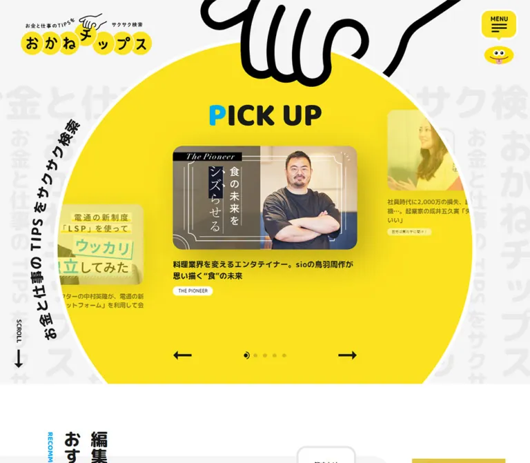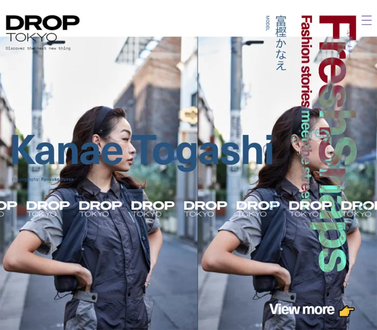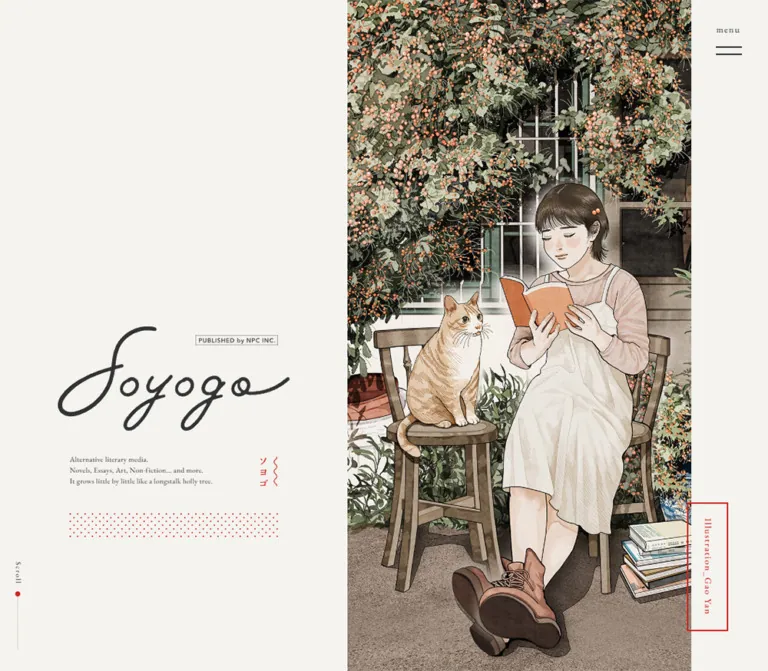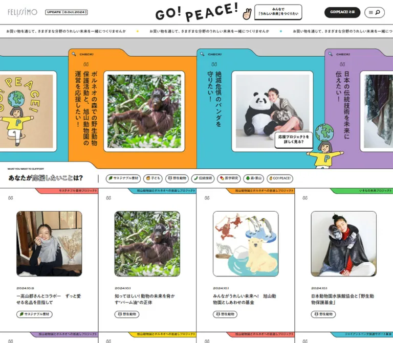
プレビュー準備中デザインリファレンスを見る
DESIGN REFERENCE
IKEN Members|福岡医健・スポーツ専門学校のWEBマガジン
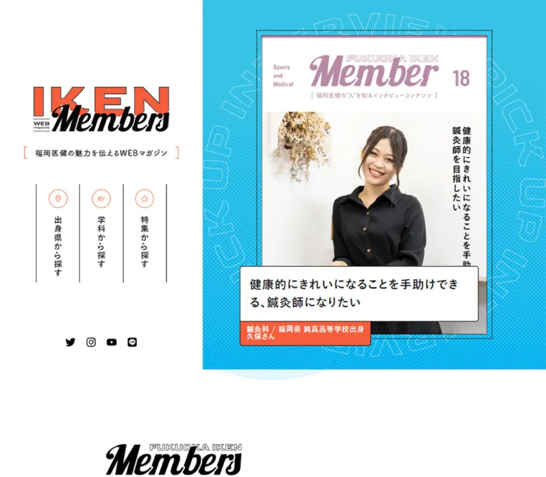
シアンの背景とオレンジのアクセントに、雑誌表紙風の人物写真、重なる見出し、段違いの記事配置、網点模様を組み合わせた学校公式ウェブマガジン。
IKEN Members — Style Reference
A school magazine arranged as portrait covers, with cyan printing textures and coral caption tabs.
Website: IKEN Members Original URL: https://content.iken.ac.jp/media/ Final URL: https://content.iken.ac.jp/media/ Theme: light, with white surfaces, near-black typography, cyan backgrounds, and coral actions Inspected: October 2, 2026, 05:27 JST; supplied retrieval timestamp: October 1, 2026, 20:27:36.225 UTC Viewports: 1440 × 1000 desktop and 390 × 844 mobile, in reported CSS pixels Scope: the current magazine index: opening identity and featured interview, category navigation, six interview entries, tag directory, six Topics entries, archive links, compact header states, and school footer. Article pages, category destinations, the expanded mobile menu, and expanded tag behavior were not inspected.
IKEN Members introduces the people associated with 福岡医健・スポーツ専門学校 through the visual conventions of a printed magazine. Portrait photographs sit inside numbered covers with large script mastheads and Japanese vertical quotations. Live article titles overlap the covers in white boxes; coral strips carry the associated person or article tags. Fine black outlines, cyan backing sheets, and dotted edges make the elements feel assembled from printed pieces.
The desktop opening divides the page into a white identity column and a larger cyan feature stage. Below it, the layout opens into a centered editorial index with two staggered interview columns, a dense tag directory, and a smaller Topics grid. Broad white gaps and pale background graphics keep the photography prominent. This is a browsable publication homepage: its principal actions lead to interviews, categories, and archives.
閉じる
IKEN Members — Style Reference
A school magazine arranged as portrait covers, with cyan printing textures and coral caption tabs.
Website: IKEN Members Original URL: https://content.iken.ac.jp/media/ Final URL: https://content.iken.ac.jp/media/ Theme: light, with white surfaces, near-black typography, cyan backgrounds, and coral actions Inspected: October 2, 2026, 05:27 JST; supplied retrieval timestamp: October 1, 2026, 20:27:36.225 UTC Viewports: 1440 × 1000 desktop and 390 × 844 mobile, in reported CSS pixels Scope: the current magazine index: opening identity and featured interview, category navigation, six interview entries, tag directory, six Topics entries, archive links, compact header states, and school footer. Article pages, category destinations, the expanded mobile menu, and expanded tag behavior were not inspected.
IKEN Members introduces the people associated with 福岡医健・スポーツ専門学校 through the visual conventions of a printed magazine. Portrait photographs sit inside numbered covers with large script mastheads and Japanese vertical quotations. Live article titles overlap the covers in white boxes; coral strips carry the associated person or article tags. Fine black outlines, cyan backing sheets, and dotted edges make the elements feel assembled from printed pieces.
The desktop opening divides the page into a white identity column and a larger cyan feature stage. Below it, the layout opens into a centered editorial index with two staggered interview columns, a dense tag directory, and a smaller Topics grid. Broad white gaps and pale background graphics keep the photography prominent. This is a browsable publication homepage: its principal actions lead to interviews, categories, and archives.
How to Read This Reference
- Measured values come from the supplied rendered DOM and computed styles. Values in tables are generally rounded to two decimal places.
- Calculated values are simple differences or ratios between measured rectangles. They are identified where relevant.
- Visual estimates describe features visible in the current screenshots but absent from the computed-style export, including cyan hues, decorative stroke widths, and some backing offsets.
- Recommendations describe a reusable implementation. Breakpoints, CSS selectors, accessible enhancements, and sample layout formulas are not recovered source code.
- Token names are descriptive aliases. The exported custom properties do not expose a useful public design-token system; the administrative blue variables are not evidence for the visible brand palette.
- A computed font-family stack identifies the requested families, not the particular font file that rendered every glyph. The supplied evidence does not include font-loading diagnostics.
- DOM rectangles can belong to clipped or offscreen content. In particular, tag coordinates extending into later sections do not prove that those tags were visibly painted over those sections.
Tokens — Colors
Default Palette
| Name | Value | Suggested token | Evidence and role |
|---|---|---|---|
| White paper | #ffffff |
--color-paper |
Measured body background, article-title panels, tag chips, and reversed text |
| Main ink | #080304 |
--color-ink |
Measured body text; visually near-black |
| Heading ink | #111111 |
--color-heading |
Measured feature titles, interview titles, and several navigation labels |
| Coral | #f65d3a |
--color-coral |
Measured action fills, feature byline tab, and interview tag strips |
| Cyan | Approximately #32bedc |
--color-cyan |
Visual estimate for the feature stage, tag panel, and backing sheets; exact CSS color unavailable |
| Pale cyan | Approximately #e4f7fc |
--color-pale |
Visual estimate for background halftone circles and supporting decoration |
| Cool footer gray | Approximately #e9eeee |
--color-footer |
Visual estimate of the footer surface; the exported footer itself has a transparent computed background |
Coral and cyan have different jobs. Coral identifies actions and attached metadata; cyan establishes the magazine's environment and the apparent thickness behind cards. White title plates maintain readable text over busy photographs. Black outlines connect all three treatments.
The cover mastheads introduce additional issue-specific colors. The featured issue uses orange, while other visible covers use red and blue. These are colors within editorial imagery, not verified category or interaction tokens. Do not assign a profession to a cover color without additional evidence.
Color Application
- Keep most of the scrolling index white.
- Concentrate saturated cyan in the opening feature stage, tag directory, and small backing layers.
- Use pale cyan textures behind content without reducing the contrast of live text.
- Use coral consistently for archive buttons and attached information strips.
- Keep photographs in natural color. The halftone belongs primarily to the surrounding graphics, not to a global filter over the portraits.
Tokens — Typography
Japanese Editorial Text
Measured stack: 游ゴシック, YuGothic, 'Hiragino Kaku Gothic ProN', 'Hiragino Sans', 'Noto Sans JP', 'BIZ UDPGothic', Meiryo, 'Helvetica Neue', Arial, sans-serif.
This stack supplies navigation, article titles, tags, and action labels. The body reports weight 400, while main content containers commonly report 500. Titles, category links, buttons, and tags use 700.
The result is compact, substantial Japanese typography with enough tracking to separate dense text from the photographic artwork. Article headings use a measured line-height ratio of approximately 1.5; body text uses 1.8.
Rounded Supporting Copy
Measured family: fot-tsukuardgothic-std, sans-serif, weight 700.
It appears in the magazine descriptor and short section introductions. Preserve its softer character where the font is licensed and available. Otherwise, use a compatible rounded Japanese sans-serif and verify wrapping; do not assume the fallback has identical metrics.
English Display Text
Measured family: Goldman, cursive, reported weight 600, on the TOPICS heading.
Its measured size is 75.82px on desktop and 48.39px on mobile. The heading reports white text, but the supplied export does not include its complete outline, shadow, or surrounding decorative treatment. The supplied screenshot crops do not isolate this heading closely enough to reconstruct that treatment exactly.
Do not infer that the script lettering in the IKEN Members identity or individual cover mastheads is Goldman. Those graphical letterforms are separate from the measured live heading.
Type Scale
| Role | Desktop size / line height | Mobile size / line height | Weight | Notes |
|---|---|---|---|---|
| Body | 15.74 / 28.33px |
14.02 / 25.24px |
400 |
Measured body values |
| Compact-header descriptor | 15.61 / 24.35px |
13.04 / 20.34px |
700 |
Rounded family |
| Opening descriptor | 15 / 28.33px |
15 / 25.24px |
700 |
Its mobile size does not shrink |
| Opening category label | 17.48 / 28.33px |
14.05 / 25.24px |
700 |
Vertical desktop arrangement becomes horizontal rows |
| Action label | 15.74 / 22.03px |
14.02 / 19.63px |
700 |
Tracking is 0.1em |
| Featured title | 26.56 / 39.85px |
17.13 / 25.70px |
700 |
White overlapping plate |
| Featured byline | 15.35 / 15.35px |
11.06 / 11.06px |
700 |
Coral attached tab |
| Interview title | 21.09 / 31.63px |
15.09 / 22.63px |
700 |
Natural wrapping controls plate height |
| Interview tags | 13.48 / 21.56px |
10.05 / 16.08px |
700 |
Very small on mobile |
| Directory chip | 13.61 / 13.61px |
11.04 / 11.04px |
700 |
White pill on cyan |
| Interview introduction | 22.69 / 31.77px |
14.12 / 19.77px |
700 |
Rounded family; 0.02em tracking |
| Topics heading | 75.82 / 106.15px |
48.39 / 67.75px |
600 |
Goldman family |
| Topics supporting copy | Not included in desktop element excerpt | 11.09 / 15.52px |
700 |
Rounded family |
The ordinary inherited tracking measures 0.944px on desktop and 0.841px on mobile, equivalent to 0.06em of the respective body sizes. Child headings often inherit that absolute spacing; it should not automatically be recalculated as 0.06em of every heading's own size.
The source root reports 10px. The Quick Start uses a conventional root and explicit component sizes instead of assuming that source rem values can be copied unchanged.
Tokens — Spacing & Shapes
There is no demonstrated single spacing grid. The source combines fluid fractional measurements with fixed details such as 5px caption corners and 8px chip gaps.
Component Spacing
| Use | Desktop | Mobile | Status |
|---|---|---|---|
| Feature-title padding | 19.35px |
15.06px |
Measured |
| Feature-byline padding, vertical / horizontal | 9.74 / 14.09px |
8.02 / 8.09px |
Measured |
| Interview-title padding, top and sides / bottom | 18.69 / 13.96px |
10.12 / 7.10px |
Measured |
| Interview-tag padding | 10px 15px |
10px 15px |
Measured; stays fixed while type shrinks |
| Action padding, vertical / horizontal | 26.44 / 31.48px |
23.56 / 28.05px |
Measured |
| Chip padding | 7.61px |
5.04px |
Measured |
| Chip horizontal gap | 8px |
8px |
Calculated from neighboring boxes |
| Chip row gap | 14.08px |
8.08px |
Calculated from successive rows |
| Feature dotted-frame inset | About 10px |
About 5px |
Visual estimate |
| Interview cyan backing offset | About 12–14px |
Not isolated in the mobile screenshots | Visual estimate |
Shape Vocabulary
| Element | Shape | Evidence |
|---|---|---|
| Magazine cover | Square corners with a fine black edge | Screenshot observation |
| Feature title | 5px 5px 5px 0 corners |
Measured |
| Interview title | 5px 5px 0 0 corners |
Measured |
| Attached metadata strip | 0 0 5px 5px corners |
Measured |
| Action button | 9999px radius |
Measured |
| Directory chip | 999px radius |
Measured |
| Mobile menu trigger | Coral circle, about 48px across |
Visual estimate |
| Desktop footer | Wide outlined panel with modestly rounded upper corners | Screenshot observation |
| Mobile footer | Almost square, nearly edge-to-edge | Measured width 387.56px, radius approximately 0.12px |
Fine borders appear approximately 1px in the captures. The export does not provide border-width properties, so this is a visual estimate, not a computed measurement.
Layout Measurements
| Element | Desktop at 1440 × 1000 | Mobile at 390 × 844 |
|---|---|---|
| Document height | 5562.92px |
4389.61px |
| Opening white identity region | Approximately 540px wide |
Full-width opening region, approximately 210px high |
| Cyan feature stage | Approximately 900 × 847px |
Approximately 390 × 477px, starting at y=210px |
| Opening logo heading box | 289.02 × 97.88px, at x=125.48 |
217.02 × 73.47px, at x=161.48 |
| Featured link frame | 545.86 × 714.02px |
298.83 × 390.98px |
| Featured title plate | 558.20 × 120.38px |
283.91 × 83.50px |
| Title overhang beyond link's left edge | 37.38px |
20.23px |
| Interview link width | 367.34px |
160.64px |
| Interview-title width, typical | 367.34px |
153.05px |
| Interview left-column vertical offset | 160.41px below its paired right entry |
31.83px below its paired right entry |
| Centered index span | Approximately 1000px |
345.56px, leaving about 22.22px on each side |
| Opening discovery button | 297.38 × 76.89px |
309.53 × 68.75px |
| Member archive button | 386.28 × 76.89px |
296.28 × 68.73px |
| Directory-chip height | 30.80px |
23.09px |
| Compact header height | 96.69px |
73.84px |
| Topics card width | Approximately 309px, screenshot estimate |
165.63px, measured |
The featured link's rectangle excludes some visually overflowing caption content. Likewise, the desktop interview link rectangle measures about 485.41px high even though its caption extends below the cover. Avoid treating these anchor rectangles as the complete painted dimensions.
Components
Opening Identity Block
Role: establish the publication before the visitor enters the article index.
The large identity combines coral uppercase IKEN lettering, a black outline, and an overlapping black script Members wordmark. A tiny WEB magazine mark sits within the artwork. Use an approved graphic for this identity; recreating it with an arbitrary italic font changes its proportions.
Below it, the descriptor 福岡医健の魅力を伝えるWEBマガジン is framed by small coral bracket marks. On desktop, the logo and descriptor sit centrally within the white left region, above category navigation.
The initial mobile capture has an observable alignment problem: the logo is centered around x=270px, rather than the 195px viewport center. The descriptor begins at x=120.31px and ends near x=419.67px, beyond the right edge. Record this as current behavior. A reusable implementation should center and wrap this block within the mobile viewport.
Opening Category Navigation
Role: provide three people-based entry points.
The desktop arrangement contains three narrow vertical lanes, separated by black rules. Each lane has a small coral outlined circle containing a category icon, followed by a bold vertical Japanese label:
在校生紹介卒業生紹介先生紹介
Each measured desktop link is about 92.06 × 235px. The icons resemble simple person, graduate, and teaching symbols; their asset format and icon library are unknown.
On mobile, the same categories follow the featured cover as horizontal rows. Each row measures 309.53 × 66.34px, with an icon on the left, horizontal text, and a bottom rule. This is a structural rearrangement, not merely smaller desktop navigation.
Discovery Buttons
Role: browse interviews by course or home prefecture.
学科から探す and 出身県から探す appear as large coral capsules with white bold text and small white icons. A thin black outline and an offset outlined backing edge make the button appear like a thick printed cutout. The back edge is crisp; there is no soft blur.
On desktop these stack below the category lanes. On mobile they follow the three category rows, at roughly 310px wide. The destinations are separate pages, not observed inline filters.
Featured Interview
Role: promote the latest featured person using a complete magazine-cover composition.
The current feature shows issue 124: a smiling sports professional photographed in a gym. The masthead, issue number, small supporting English text, and vertical Japanese quotation belong to the visible cover composition.
Build the component in distinct layers:
- A cyan stage with halftone texture and oversized outlined circular lettering.
- A fine dotted rectangular frame, inset from the stage.
- A portrait cover with a white masthead area and photograph below.
- A white live-text title plate, shifted left and overlapping the cover near its bottom.
- A coral byline tab attached directly beneath the title.
The live headline is 運動を楽しむすべての方々に「安全と安心」を提供できる専門家. The tab reads スポーツ科学科 / 玉城さん. Both desktop and mobile show the same feature and linked destination.
The desktop title plate is slightly wider than the outer link frame. On mobile, it is narrower than the frame while retaining the left overhang. Preserve this distinction; scaling every dimension by a single factor would not reproduce the mobile layout.
No feature-change control, automatic slide change, or swipe interaction was demonstrated.
Compact Header
Role: retain identity and navigation in the scrolled page.
The scrolled desktop screenshots show a small logo at the upper left, a two-line descriptor beside it, and the five navigation destinations on the right. Small coral dots sit beneath the navigation labels. The header visually overlaps passing content in the supplied captures.
The scrolled mobile screenshot shows a roughly 74px header containing a 101px-wide logo, a compact two-line descriptor, and a coral circular hamburger control with a thin black outline and offset edge. The pale header surface separates it from content below.
In the initial mobile DOM state, the header sits at y=-97px, above the viewport. Its presence at the top of a later screenshot supports a scroll-associated reveal. The exact threshold, scroll-direction rules, positioning mechanism, and menu contents are unverified.
Interview Section Introduction
Role: introduce the interview collection as an editorial series.
A graphical section title is followed by the rounded supporting copy 福岡医健の”人”を知るインタビューコンテンツ. On desktop, this introduction occupies the upper-left portion of the interview section while the first cover starts in the right column.
On mobile, the graphical heading and supporting copy use the approximately 346px content span and precede the two-column collection. The supplied element text for the graphical heading is empty; this does not establish whether its image has an accessible name.
Interview Cover Card
Role: link to an individual profile while retaining its cover identity.
The card consists of a portrait magazine cover, a cyan offset sheet, an external publication date, a white headline plate, and a coral tag strip. The visible desktop dates run vertically beside the covers.
A typical desktop cover link is 367.34px wide. Its caption begins 46.73px to the left of the link, creating a deliberate offset between picture and text. The white heading and coral metadata strip usually share a width, though a short observed title has a narrower white plate. Corners remain small at 5px.
On mobile, the cover link narrows to 160.64px, while the title plate is 153.05px wide and starts almost flush with the link's left edge. Title and tag blocks become taller because their text wraps. The first mobile title plate is approximately 109.64px high; its tag strip is approximately 86.25px high. Do not impose a universal card height.
The article hashtags are text within the article link in the supplied evidence. They should not be assumed to be individually clickable. The separate tag directory does expose individual tag links.
Staggered Interview Collection
Role: create the rhythm of magazine covers spread across a page.
The six current articles alternate through a right-first, left-second composition. On desktop, right-hand covers start around x=786.22px, left-hand covers around x=286.44px; each left entry sits about 160.41px below its paired right entry.
Mobile retains two columns. The first right-hand entry begins at x=207.14px, and the paired left entry at x=22.22px. Their vertical difference shrinks to 31.83px.
This ordering matters. A generic left-to-right grid would change the current publication rhythm, and a one-column phone layout would not describe the inspected 390px result. Keep chronological DOM order understandable when using CSS placement to reproduce the visual sequence.
Tag Directory
Role: offer many specific routes into the interview archive.
The directory occupies a cyan outlined panel, with a visible #TAGS label and white pill links. Each chip combines a small coral hash mark with bold near-black Japanese text. Topics include professions, study arrangements, interests, and home prefectures.
The desktop screenshot shows the top of the panel at approximately 1000px wide. The measured links have 8px horizontal gaps and wrap according to their individual lengths. Mobile chips shrink to around 23px high and use approximately 11px text.
View more + is present in the rendered text. The exported tag rectangles extend below the section's later archive button and into subsequent section coordinates. This is consistent with clipped descendants retaining layout boxes, but the clipping implementation and expansion result were not supplied. Do not display every exported tag as if all were simultaneously visible in the captured state.
Archive Capsule
Role: continue from the selected homepage entries to a full collection.
Member 一覧へ and TOPICS 一覧へ use the same coral capsule family as the opening discovery buttons. They are centered, wider on desktop, and feature an arrow toward the right edge. Their visual depth comes from a hard outlined backing edge.
The mobile archive button measures 296.28 × 68.73px; its desktop Member counterpart measures 386.28 × 76.89px. Preserve a centered label even when an arrow is present.
Topics Card
Role: surface school-life and course-choice articles separately from the portrait interview series.
Topics use ordinary editorial thumbnails with photographs and embedded Japanese headline graphics. A small white date tab sits above the thumbnail edge. A bordered white text area sits below the image, with a cyan backing strip visible beneath the card. The lower corners are modestly rounded.
The desktop screenshot shows three columns. Mobile uses two columns at 165.63px per card, with about 14.31px between them. Heights vary with content and wrapping. The last visible mobile row includes 私が医薬品登録販売者をめざした理由 and 大学と専門学校の違いは?在校生に聞いてみました!!.
Keep these thumbnails distinct from the portrait cover cards: they serve a different editorial category and have a different image-to-caption relationship.
School Footer
Role: reconnect the magazine to the institution and its social channels.
The footer presents the school logo, a large white capsule labeled 学校本体サイトはこちら, an external-link icon, four social marks, and the copyright line. The school link points to https://content.iken.ac.jp/.
The white capsule uses coral as its hard offset backing, reversing the dominant surface relationship of the archive buttons. The surrounding footer is pale cool gray with a subtle halftone texture and thin black perimeter.
On desktop, the footer is an inset panel approximately 1266px wide. On mobile, its measured width is 387.56px within the 390px viewport, with almost square corners. Its measured height is 298.66px, with approximately 40.55px top padding and 25.12px bottom padding.
The visible social marks are Twitter, Instagram, YouTube, and LINE. The current Twitter destination and bird-shaped mark should not be silently replaced when documenting the observed page. The icon library and asset filenames are unknown.
Tokens — Motion & Interaction
Recorded Transition Declarations
| Element | Measured declaration | What the evidence establishes |
|---|---|---|
| Header | 0.5s cubic-bezier(0.23, 1, 0.32, 1) |
A transition is configured; initial and scrolled header states differ |
| Category links | 0.4s |
Transition duration exists; changed properties and endpoint styling were not exercised |
| Discovery and archive buttons | 0.4s cubic-bezier(0.19, 1, 0.22, 1) |
A shared action timing curve is configured |
| Directory chips | 0.4s |
Transition configured; hover result unverified |
| Opening social links | 0.4s |
Transition configured; hover result unverified |
| Interview section graphic | 0.5s cubic-bezier(0.645, 0.045, 0.355, 1) |
Heading transition configured; reveal geometry unavailable |
| Interview supporting copy | 0.6s 0.4s |
A 600ms transition with 400ms delay is declared |
| Topics links | 0.4s cubic-bezier(0.19, 1, 0.22, 1) |
Shared timing with capsule actions |
The sampled elements report animation: none. That statement applies to the sampled elements, not necessarily every pseudo-element, image, or script-driven effect on the page.
The inspection process waited for finite visible motion and layout stability, and temporarily paused perpetual animations during readiness checks. Those procedures do not identify a particular perpetual animation. There is no supplied time sequence proving that the circular hero lettering rotates or that the oversized background lettering scrolls.
Verified Affordances and Limits
- The feature and interview cards expose article URLs.
- Category and discovery links expose dedicated destination pages.
- Directory chips expose individual tag archive URLs.
- The archive capsules expose Member and Topics index URLs.
- The footer exposes a school-site URL and social destinations.
- Scrolled captures show compact headers; the mobile menu's expanded state was not exercised.
View more +exists as a label; its activation behavior is unverified.- Hover, keyboard focus, pressed states, and navigation outcomes were not recorded.
Recommended motion: retain the source's short easing family for small changes in backing offset or header position. If decorative motion is added, keep it independent of reading and provide a reduced-motion state. Do not invent a carousel simply because the feature looks like a promotional cover.
Surfaces
| Layer | Appearance | Purpose |
|---|---|---|
| Page canvas | White | Gives photographs and offset cards room to stand apart |
| Feature environment | Saturated cyan with halftone and outlined lettering | Establishes the publication's energetic opening |
| Cover | Portrait image with a fine dark edge | Preserves the identity of each interview issue |
| Caption | White, dark outline, small corners | Keeps live headings readable over photography |
| Metadata attachment | Coral with white text | Joins article information to the caption |
| Card backing | Flat cyan sheet with a hard offset | Suggests printed thickness without soft elevation |
| Directory | Cyan panel with white chips | Groups a dense navigation vocabulary |
| Footer | Pale gray texture and dark perimeter | Creates a quieter institutional ending |
The depth system is graphic and shallow. Its main tools are overlap, one-pixel-looking borders, backing sheets, and offset capsule outlines. Soft shadows, frosted panels, and glossy highlights would introduce a different material language.
Imagery
Portraits show students, graduates, and teachers in settings related to their work: gyms, clinical training rooms, and other professional environments. The current feature is friendly and direct, with a smiling subject looking toward the camera. Other covers preserve equipment, uniforms, and contextual surroundings rather than isolating everyone against a generic studio backdrop.
The portrait cover template is central to the identity. It includes a large white masthead area, script Member lettering, a prominent issue number, small supporting labels, and vertical Japanese statements over the photograph. Treat the complete cover as a designed editorial asset. Avoid cropping it into a generic landscape hero or removing its white masthead.
Topics imagery is more like an editorial or video thumbnail: people, school environments, and embedded headline graphics. Preserve the intentional text inside those thumbnails while keeping the live title below them.
Background imagery includes halftone fields, pale circular dot patterns, very large outlined Latin lettering, and the feature's circular outlined text. These graphics supply energy without replacing the people as the main subject.
Observed Asset References
No image src, SVG path, or background-image URL was included in the supplied evidence. The references below identify visible assets by their current placement and linked destination; they are not asset-file URLs.
| Visible asset | Original-page reference | Use |
|---|---|---|
| IKEN Members identity | Magazine index | Opening identity and compact header |
| Issue 124 cover | Featured interview destination | Opening feature and latest interview entry |
| Issue 120 cover | Teacher interview destination | Red-masthead portrait card |
| Issue 119 cover | Nursing interview destination | Blue-masthead portrait card |
| Pharmacy Topics thumbnail | Topics destination | Photograph with embedded Japanese headline |
| School identity | School link exposed in the footer | Institutional footer |
The linked destinations were not separately inspected. Use approved images and logos when implementing this system; CSS can reproduce its framing but cannot supply the original portraits or lettering.
Layout & Responsive Behavior
Desktop Opening
At 1440px wide, the initial composition splits at approximately x=540px: a 37.5% white identity region and a 62.5% cyan feature stage. The stage is about 847px tall. The large identity, vertical category lanes, discovery capsules, and social row occupy the white side.
The feature frame is centered within the cyan side. Its caption moves left beyond the cover edge, bringing the live title toward the page's center. The interview section starts around document y=1029.97px, leaving approximately 183px of white space after the cyan stage.
The opening white region does not remain a permanent sidebar for the entire document. Subsequent sections use the full page with a centered content span.
Scrolling Index
The interview section uses two broad columns within an approximately 1000px content region. Covers are narrower than their columns, allowing room for dates, caption overhangs, and cyan backing sheets. The right-first stagger continues through all six entries.
A cyan tag directory follows the profiles, then a centered archive capsule. The Topics section uses smaller cards in three desktop columns. A second archive capsule leads to the school footer.
Pale halftone circles and oversized outline lettering appear at similar viewport locations in multiple lower-page captures. Their precise positioning and relationship to scrolling are not established by the supplied evidence; fixed backgrounds and parallax should not be asserted as facts.
Mobile Opening
At 390px, the order becomes identity, full-width cyan feature, category rows, and discovery buttons. The feature frame is about 299px wide and retains its portrait proportions. The title overlaps its lower-left edge, with the attached coral tab below.
The opening logo and descriptor are visibly shifted right. This should be documented without treating the clipping as a desirable reusable rule. The Quick Start deliberately centers the mobile identity.
The compact header is initially outside the viewport and appears in the scrolled capture. Its navigation is represented by a circular menu trigger, but no expanded menu design is available.
Mobile Collections
Both the interview collection and Topics retain two columns at 390px. Interview cards have approximately 24.28px between their measured link boxes; Topics have approximately 14.31px between theirs.
Interview captions lose most of their desktop leftward displacement. Their text wraps into more lines, and their small coral tag text can occupy four or five lines. Topics titles also wrap naturally, producing varied card heights.
The mobile Member button is followed by approximately 86px before the Topics section begins. About 101px separates the end of the main content from the footer. These gaps preserve a spacious rhythm despite the dense two-column cards.
Responsive Limits
Only 1440px and 390px widths were supplied. Exact media queries, interpolation formulas, tablet layouts, landscape behavior, device scale factors, and browser zoom behavior are unknown. The Quick Start's 64rem breakpoint is a recommendation. It is not a measured source breakpoint.
Do’s and Don’ts
Do
- Preserve the magazine-index structure and its category, tag, and archive routes.
- Keep the desktop opening split between white identity space and a cyan feature stage.
- Treat each portrait cover as complete editorial artwork.
- Overlap live white title plates and attach coral metadata strips directly below them.
- Use thin dark outlines and flat offset backing layers.
- Retain the right-first interview stagger and its smaller mobile offset.
- Preserve the observed two-column mobile collections at 390px when matching the reference.
- Distinguish portrait interview covers from smaller Topics thumbnails.
- Keep Japanese title wrapping natural and allow card heights to vary.
- Place low-contrast halftone and outline graphics behind the content.
- Use approved identity graphics instead of approximating the script mastheads with unrelated fonts.
Don’t
- Don’t replace the publication index with a generic sales sequence or feature grid.
- Don’t carry the opening left column down the entire desktop page as a permanent sidebar.
- Don’t flatten the offset caption system into identical rounded cards.
- Don’t crop away issue numbers, mastheads, or vertical cover quotations.
- Don’t introduce soft elevation shadows, glass effects, or glossy surface gradients.
- Don’t treat the measured administrative blue variables as brand colors.
- Don’t infer category meaning from individual cover colors.
- Don’t interpret every exported tag rectangle as visible content.
- Don’t claim rotating lettering, autoplay, menu animation, or hover effects without observing them.
- Don’t reproduce the clipped mobile descriptor as a responsive design rule.
Recommended Implementation Additions
These are improvements for a new implementation, not verified features of the inspected page:
- Center the mobile opening identity and allow its descriptor to wrap within the viewport.
- Increase mobile metadata legibility. The observed approximately
10pxinterview tags and11pxchips are useful fidelity measurements, but a new implementation should consider at least12pxwhere space permits. - Check small white text on coral for sufficient contrast. Dark text or a darker accessible coral can be used for small labels while retaining the bright coral in backing layers.
- Provide generous interactive hit areas for small chips and social icons. Their painted size does not need to determine their full target size.
- Give graphical section headings and identity images meaningful accessible names. Hide purely decorative outline lettering and halftone layers from assistive technology.
- Use article links for cards, ordinary links for destinations, and a button with an expanded state for a tag disclosure or mobile menu.
- Keep hidden compact navigation out of keyboard focus until it becomes available. A menu should support keyboard entry, Escape dismissal, and focus return.
- Preserve publication order in the DOM while using grid placement for the visual stagger.
- Reserve cover dimensions before loading to protect the overlap geometry from layout shifts.
- Provide visible focus outlines and reduced-motion behavior.
- Test long Japanese titles, enlarged text, and narrow widths. Below the inspected 390px size, a single-column fallback may be appropriate if two columns become unreadable.
Agent Prompt Guide
Quick Color Reference
- Main paper and caption surfaces: measured
#ffffff. - Body ink: measured
#080304; title ink: measured#111111. - Buttons and metadata strips: measured
#f65d3a. - Cyan environment and backing sheets: approximate
#32bedc. - Background halftone: approximate
#e4f7fc. - Footer surface: approximate
#e9eeee. - Depth: hard offset outlines and colored sheets, without blurred shadows.
Overall Prompt
“Create a Japanese school web magazine inspired by the current IKEN Members index. Use white paper, near-black Japanese sans-serif text, coral #f65d3a action capsules, and a bright cyan feature environment. At desktop size, place a large approved publication logo and vertical category navigation in a white left region taking about 37.5% of the opening width. Put a numbered portrait magazine cover in the cyan right region, with dotted framing, halftone texture, outlined circular lettering, a white headline plate overlapping its lower-left edge, and an attached coral byline tab. Continue into a spacious two-column interview index with right-first staggered covers, vertical dates, cyan backing sheets, white title plates, and coral tag strips. Follow with a cyan tag directory, a three-column Topics grid, and a pale textured school footer. At 390px, stack the opening, convert category lanes into rows, and retain two-column article collections. Center the mobile identity and keep all text reachable.”
Example Component Prompts
- Featured cover: “Place an approved portrait magazine cover inside a dotted frame on cyan. Keep its white masthead and issue number visible. Overlap the lower-left corner with a white, thinly outlined title box using bold Japanese text, then attach a smaller coral course-and-person tab. Use approximately 5px caption corners.”
- Interview collection: “Arrange six portrait interview covers in two columns. Begin with the latest article at the upper right, then place the next article at the left about 160px lower on desktop. Reduce that offset to about 32px on a 390px phone. Add cyan backing sheets, dates, white title plates, and coral hashtag strips. Preserve chronological DOM order.”
- Tag directory: “Create a cyan bordered panel labeled #TAGS, filled with white pill links. Each chip has a coral hash mark and compact bold Japanese text. Use 8px horizontal gaps and natural wrapping. Treat any expand control as a real accessible disclosure.”
- Topics card: “Use an editorial thumbnail above a white Japanese title panel, with a small white date tab attached above the image. Add a thin black edge, modest lower corner rounding, and a cyan backing strip. Use three desktop columns and two phone columns.”
- School footer: “Build a quiet pale-gray halftone footer with a centered school logo, a white capsule linking to the school website, a coral offset backing edge, four black social marks, and a small copyright line. Inset the panel on desktop and make it nearly full-width on mobile.”
Quick Start
CSS Custom Properties
This is an implementation adaptation, not extracted source CSS. It keeps the measured coral, typography hierarchy, caption geometry, and two-column mobile collection. Cyan and footer colors are visual approximations. The mobile identity is centered as a deliberate correction. Mobile tag text and chip hit areas are enlarged as accessibility recommendations.
Use approved assets for the logo, cover artwork, and optional circular lettering. The CSS halftone is a visual approximation of the supplied texture.
:root {
  --color-paper: #ffffff;
  --color-ink: #080304;
  --color-heading: #111111;
  --color-coral: #f65d3a;
  --color-cyan: #32bedc;
  --color-pale: #e4f7fc;
  --color-footer: #e9eeee;

  --font-body: '游ゴシック', YuGothic,
    'Hiragino Kaku Gothic ProN', 'Hiragino Sans',
    'Noto Sans JP', 'BIZ UDPGothic', Meiryo,
    'Helvetica Neue', Arial, sans-serif;
  --font-rounded: fot-tsukuardgothic-std, sans-serif;
  --font-display: Goldman, cursive;

  --text-body: 14.02px;
  --text-feature: 17.13px;
  --text-card: 15.09px;
  --text-meta: 12px;
  --text-chip: 12px;
  --tracking-base: 0.841px;

  --content-width: 1000px;
  --page-gutter: 22px;
  --caption-radius: 5px;
  --pill-radius: 9999px;
  --rule: 1px solid var(--color-ink);
  --stagger: 32px;
  --feature-overhang: 20px;
  --feature-caption-width: 95%;
  --ease-action: cubic-bezier(0.19, 1, 0.22, 1);
  --ease-header: cubic-bezier(0.23, 1, 0.32, 1);
}

* { box-sizing: border-box; }

body {
  margin: 0;
  color: var(--color-ink);
  background: var(--color-paper);
  font-family: var(--font-body);
  font-size: var(--text-body);
  line-height: 1.8;
  letter-spacing: var(--tracking-base);
}

button, input { font: inherit; }
img { max-width: 100%; }
a { color: inherit; }

.content-shell {
  width: min(
    calc(100% - 2 * var(--page-gutter)),
    var(--content-width)
  );
  margin-inline: auto;
}

.opening {
  display: grid;
  grid-template-areas: 'brand' 'feature' 'navigation';
}

.opening-brand {
  grid-area: brand;
  min-height: 210px;
  display: flex;
  flex-direction: column;
  align-items: center;
  justify-content: center;
  gap: 25px;
  padding: 28px 20px;
  text-align: center;
}

.brand-mark {
  display: block;
  width: 217px;
  height: auto;
}

.brand-description {
  max-width: 100%;
  margin: 0;
  padding-inline: 12px;
  border-inline: 1px solid var(--color-coral);
  font-family: var(--font-rounded);
  font-size: 15px;
  font-weight: 700;
  overflow-wrap: anywhere;
}

.hero-stage {
  grid-area: feature;
  position: relative;
  isolation: isolate;
  min-height: 477px;
  display: grid;
  place-items: center;
  overflow: hidden;
  background: var(--color-cyan);
}

.hero-stage::before {
  content: '';
  position: absolute;
  inset: 0;
  pointer-events: none;
  background-image: radial-gradient(
    circle, rgb(255 255 255 / 38%) 0.7px,
    transparent 0.9px
  );
  background-size: 4px 4px;
  mask-image: linear-gradient(transparent 20%, black);
}

.hero-orbit {
  position: absolute;
  inset: 0;
  width: 100%;
  height: 100%;
  object-fit: contain;
  pointer-events: none;
}

.feature-link {
  position: relative;
  z-index: 1;
  display: block;
  width: min(76.6%, 546px);
  padding: 5px;
  border: 1px dotted var(--color-ink);
  text-decoration: none;
}

.feature-cover {
  display: block;
  width: 100%;
  aspect-ratio: 0.758;
  object-fit: contain;
  background: var(--color-paper);
  border: var(--rule);
}

.feature-caption {
  position: absolute;
  left: calc(-1 * var(--feature-overhang));
  bottom: -15px;
  width: var(--feature-caption-width);
}

.feature-title {
  margin: 0;
  padding: 15.06px;
  border: var(--rule);
  border-radius: 5px 5px 5px 0;
  background: var(--color-paper);
  color: var(--color-heading);
  font-size: var(--text-feature);
  font-weight: 700;
  line-height: 1.5;
  overflow-wrap: anywhere;
}

.feature-byline {
  display: table;
  max-width: 100%;
  margin: -1px 0 0;
  padding: 8px;
  border: var(--rule);
  border-radius: 0 0 5px 5px;
  color: var(--color-paper);
  background: var(--color-coral);
  font-size: 12px;
  font-weight: 700;
  line-height: 1.25;
}

.opening-navigation {
  grid-area: navigation;
  width: min(calc(100% - 80px), 310px);
  margin-inline: auto;
  padding-top: 40px;
}

.role-nav {
  display: grid;
  margin: 0;
  padding: 0;
  list-style: none;
}

.role-nav a {
  display: flex;
  align-items: center;
  gap: 25px;
  min-height: 66px;
  padding: 15px 35px;
  border-bottom: var(--rule);
  text-decoration: none;
  font-weight: 700;
}

.role-icon {
  display: grid;
  place-items: center;
  flex: 0 0 36px;
  width: 36px;
  height: 36px;
  border: 1px solid var(--color-coral);
  border-radius: 50%;
  color: var(--color-coral);
}

.discovery-actions {
  display: grid;
  gap: 10px;
  margin-top: 21px;
}

.capsule {
  --backing: var(--color-paper);
  position: relative;
  display: grid;
  grid-template-columns: 20px minmax(0, 1fr) 20px;
  align-items: center;
  gap: 10px;
  width: 100%;
  min-height: 69px;
  padding: 20px 24px;
  border: var(--rule);
  border-radius: var(--pill-radius);
  color: var(--color-paper);
  background: var(--color-coral);
  box-shadow: 3px 3px 0 0 var(--backing),
    3px 3px 0 1px var(--color-ink);
  text-align: center;
  text-decoration: none;
  font-weight: 700;
  line-height: 1.4;
  letter-spacing: 0.1em;
  transition: transform 400ms var(--ease-action);
}

.capsule-label { grid-column: 2; }
.capsule-arrow { grid-column: 3; }

.archive-action {
  width: min(100%, 296px);
  margin: 70px auto 0;
}

.member-section { margin-top: 110px; }

.member-intro {
  margin-bottom: 24px;
  font-family: var(--font-rounded);
  font-weight: 700;
}

.member-list {
  display: grid;
  grid-template-columns: repeat(2, minmax(0, 1fr));
  grid-auto-flow: row dense;
  align-items: start;
  gap: 35px 24px;
  padding-bottom: var(--stagger);
}

.member-card {
  position: relative;
  display: block;
  min-width: 0;
  width: 100%;
  text-decoration: none;
}

.member-card:nth-child(odd) { grid-column: 2; }
.member-card:nth-child(even) {
  grid-column: 1;
  transform: translateY(var(--stagger));
}

.member-frame {
  position: relative;
  isolation: isolate;
}

.member-frame::before {
  content: '';
  position: absolute;
  z-index: -1;
  inset: 0;
  transform: translate(5px, 7px);
  border: 1px dotted var(--color-ink);
  background: var(--color-cyan);
}

.member-cover {
  display: block;
  width: 100%;
  height: auto;
  border: var(--rule);
}

.member-caption {
  position: relative;
  width: calc(100% - 8px);
  margin-top: -30px;
}

.member-title {
  margin: 0;
  padding: 10px 10px 7px;
  border: var(--rule);
  border-radius: 5px 5px 0 0;
  color: var(--color-heading);
  background: var(--color-paper);
  font-size: var(--text-card);
  line-height: 1.5;
  font-weight: 700;
  overflow-wrap: anywhere;
}

.member-tags {
  margin: -1px 0 0;
  padding: 10px 15px;
  border: var(--rule);
  border-radius: 0 0 5px 5px;
  color: var(--color-paper);
  background: var(--color-coral);
  font-size: var(--text-meta);
  font-weight: 700;
  line-height: 1.6;
  overflow-wrap: anywhere;
}

.tag-directory {
  margin-top: 70px;
  padding: 28px 20px;
  border: 2px dotted var(--color-ink);
  border-radius: 10px;
  background: var(--color-cyan);
}

.tag-list {
  display: flex;
  flex-wrap: wrap;
  gap: 8px;
}

.tag-chip {
  display: inline-flex;
  align-items: center;
  min-height: 44px;
  padding: 8px 10px;
  border-radius: var(--pill-radius);
  color: var(--color-ink);
  background: var(--color-paper);
  text-decoration: none;
  font-size: var(--text-chip);
  font-weight: 700;
  line-height: 1.2;
}

.tag-chip::before {
  content: '#';
  color: var(--color-coral);
}

.topics-section { margin-top: 86px; }

.topics-heading {
  margin: 0 0 40px;
  text-align: center;
  font-family: var(--font-display);
  font-size: 48.39px;
  font-weight: 600;
  line-height: 1.4;
  /* Readable adaptation; source outline details are unavailable. */
  color: var(--color-heading);
}

.topics-grid {
  display: grid;
  grid-template-columns: repeat(2, minmax(0, 1fr));
  align-items: start;
  gap: 36px 14px;
}

.topic-card {
  position: relative;
  display: block;
  margin-top: 20px;
  border: var(--rule);
  border-radius: 0 0 9px 9px;
  background: var(--color-paper);
  box-shadow: 0 7px 0 var(--color-cyan),
    0 8px 0 var(--color-ink);
  text-decoration: none;
}

.topic-date {
  position: absolute;
  bottom: 100%;
  left: -1px;
  padding: 3px 5px;
  border: var(--rule);
  background: var(--color-paper);
  font-size: 10px;
  line-height: 1.2;
}

.topic-image { display: block; width: 100%; height: auto; }
.topic-title { margin: 0; padding: 12px 10px; line-height: 1.5; }

.school-footer {
  width: calc(100% - 2px);
  margin: 101px auto 0;
  padding: 41px 22px 25px;
  border: var(--rule);
  text-align: center;
  background-color: var(--color-footer);
  background-image: radial-gradient(
    circle, rgb(8 3 4 / 5%) 0.7px, transparent 0.9px
  );
  background-size: 5px 5px;
}

.school-logo { display: block; width: 312px; margin: 0 auto 24px; }

.school-link {
  --backing: var(--color-coral);
  width: min(100%, 296px);
  margin-inline: auto;
  color: var(--color-ink);
  background: var(--color-paper);
}

.social-links {
  display: flex;
  justify-content: center;
  gap: 2px;
  margin-top: 28px;
}

.social-links a {
  display: grid;
  place-items: center;
  width: 44px;
  height: 44px;
}

.social-links svg { width: 20px; height: 20px; }

/* Recommended focus and hover states, not observed endpoints. */
:where(a, button):focus-visible {
  outline: 3px solid var(--color-ink);
  outline-offset: 5px;
}

@media (hover: hover) {
  .capsule:hover { transform: translate(-1px, -1px); }
}

/* Recommended breakpoint; only 390px and 1440px were inspected. */
@media (min-width: 64rem) {
  :root {
    --text-body: 15.74px;
    --text-feature: 26.56px;
    --text-card: 21.09px;
    --text-meta: 13.48px;
    --text-chip: 13.61px;
    --tracking-base: 0.944px;
    --stagger: 160px;
    --feature-overhang: 37px;
    --feature-caption-width: 102.26%;
  }

  .opening {
    grid-template-columns: 37.5% 62.5%;
    grid-template-rows: 210px 637px;
    grid-template-areas:
      'brand feature'
      'navigation feature';
  }

  .opening-brand { justify-content: start; padding-top: 41px; }
  .brand-mark { width: 289px; }
  .hero-stage { min-height: 847px; }
  .feature-link { padding: 10px; }
  .feature-caption { bottom: -11px; }
  .feature-title { padding: 19.35px; }
  .feature-byline { padding: 9.74px 14.09px; font-size: 15.35px; }

  .opening-navigation { width: 298px; padding-top: 39px; }
  .role-nav { grid-template-columns: repeat(3, 1fr); }
  .role-nav a {
    flex-direction: column;
    min-height: 235px;
    gap: 16px;
    padding: 10px 0;
    border-bottom: 0;
    border-left: var(--rule);
  }
  .role-nav li:last-child a { border-right: var(--rule); }
  .role-label { writing-mode: vertical-rl; font-size: 17.48px; }
  .discovery-actions { margin-top: 75px; gap: 19px; }
  .capsule { min-height: 77px; padding: 24px 31px; }
  .archive-action, .school-link { width: min(100%, 386px); }

  .member-section { margin-top: 183px; }
  .member-intro { width: 50%; min-height: 165px; margin-bottom: 0; }
  .member-list { margin-top: -84px; column-gap: 0; row-gap: 77px; }
  .member-card { width: 73.5%; justify-self: center; }
  .member-frame::before { transform: translate(12px, 14px); }
  .member-caption { left: -46.7px; width: 100%; margin-top: -87px; }
  .member-title { padding: 18.69px 18.69px 13.96px; }
  .tag-directory { padding: 40px 48px; }
  .tag-list { gap: 14px 8px; }

  .topics-section { margin-top: 168px; }
  .topics-heading { font-size: 75.82px; }
  .topics-grid { grid-template-columns: repeat(3, minmax(0, 1fr)); gap: 40px 36px; }
  .topic-title { padding: 20px 18px; }

  .school-footer {
    width: min(88%, 1266px);
    margin-top: 180px;
    padding: 84px 40px 40px;
    border-radius: 10px 10px 0 0;
  }
}

@media (prefers-reduced-motion: reduce) {
  .capsule { transition: none; }
}
Component Markup Contract
The following example uses the observed latest interview destination. YOUR_APPROVED_COVER_URL is an explicit replacement placeholder, not an observed source filename. Use a heading level appropriate to the surrounding section.
<a class='member-card'
   href='https://content.iken.ac.jp/media/member/32952/'>
  <div class='member-frame'>
    <img class='member-cover'
         src='YOUR_APPROVED_COVER_URL'
         alt='Issue 124 cover featuring 玉城さん in a gym'>
  </div>
  <div class='member-caption'>
    <h3 class='member-title'>
      運動を楽しむすべての方々に「安全と安心」を提供できる専門家
    </h3>
    <p class='member-tags'>
      #先生 #アスレティックトレーナー #スポーツトレーナー
    </p>
  </div>
</a>
The skeleton does not implement compact-header reveal, menu expansion, tag disclosure, decorative lettering, or publication-date positioning. Those require additional markup and behavior. Keep the current navigation usable without animation, and do not hide excess tags until an operable disclosure control exists.
Tailwind v4 Token Mapping
Optional aliases for a project already using Tailwind v4. This does not imply that the inspected website uses Tailwind. Define the custom properties above first.
@theme inline {
  --color-iken-paper: var(--color-paper);
  --color-iken-ink: var(--color-ink);
  --color-iken-coral: var(--color-coral);
  --color-iken-cyan: var(--color-cyan);
  --color-iken-pale: var(--color-pale);
  --color-iken-footer: var(--color-footer);

  --font-iken-body: var(--font-body);
  --font-iken-rounded: var(--font-rounded);
  --font-iken-display: var(--font-display);

  --text-iken-feature: var(--text-feature);
  --text-iken-card: var(--text-card);
  --text-iken-meta: var(--text-meta);
  --radius-iken-caption: var(--caption-radius);
  --radius-iken-pill: var(--pill-radius);
}
Sources & Evidence
- Inspected original page: https://content.iken.ac.jp/media/. The supplied browser record reports HTTP
200, with the same original and final URL. - Capture timestamp:
2026-10-01T20:27:36.225Z, equivalent to October 2, 2026, 05:27:36.225 JST. No separate timestamp was supplied for each screenshot. - Desktop evidence: three current-page captures at
1440 × 1000, covering the opening, lower interview collection and tag-panel entrance, and Topics/footer region; rendered text, links, element rectangles, font stacks, colors, padding, radii, and transition declarations accompany the captures. - Mobile evidence: two current-page captures at
390 × 844, covering the opening feature and the lower Topics/footer region; the accompanying DOM measurements also cover intermediate interview and tag content. - Observed navigation state: scrolling exposed compact headers in the later captures. Linked article, category, archive, school, and social destinations were recorded, but their destination pages were not inspected.
- Inspection conditions: the supplied collector waited for document loading, finite visible motion, sampled layout/text stability, and visible image decoding within bounded time limits. SharedWorkers and service workers were disabled. These checks do not establish that all delayed content or interactive states were exercised.
- Limitations: no independent browsing or command execution was performed for this reference. Full stylesheets, image-source URLs, font-loading confirmation, hover endpoints, menu-open states, tag-expansion results, and motion recordings were not supplied. Colors and dimensions labeled as estimates remain estimates.
This reference describes the current publication index represented by the supplied evidence. Its CSS and prompts are reusable adaptations, with corrections and accessibility additions explicitly separated from observed behavior.
# IKEN Members — Style Reference

> A school magazine arranged as portrait covers, with cyan printing textures and coral caption tabs.

**Website:** [IKEN Members](https://content.iken.ac.jp/media/)
**Original URL:** https://content.iken.ac.jp/media/
**Final URL:** https://content.iken.ac.jp/media/
**Theme:** light, with white surfaces, near-black typography, cyan backgrounds, and coral actions
**Inspected:** October 2, 2026, 05:27 JST; supplied retrieval timestamp: October 1, 2026, 20:27:36.225 UTC
**Viewports:** 1440 × 1000 desktop and 390 × 844 mobile, in reported CSS pixels
**Scope:** the current magazine index: opening identity and featured interview, category navigation, six interview entries, tag directory, six Topics entries, archive links, compact header states, and school footer. Article pages, category destinations, the expanded mobile menu, and expanded tag behavior were not inspected.

IKEN Members introduces the people associated with 福岡医健・スポーツ専門学校 through the visual conventions of a printed magazine. Portrait photographs sit inside numbered covers with large script mastheads and Japanese vertical quotations. Live article titles overlap the covers in white boxes; coral strips carry the associated person or article tags. Fine black outlines, cyan backing sheets, and dotted edges make the elements feel assembled from printed pieces.

The desktop opening divides the page into a white identity column and a larger cyan feature stage. Below it, the layout opens into a centered editorial index with two staggered interview columns, a dense tag directory, and a smaller Topics grid. Broad white gaps and pale background graphics keep the photography prominent. This is a browsable publication homepage: its principal actions lead to interviews, categories, and archives.
閉じる
# IKEN Members — Style Reference

> A school magazine arranged as portrait covers, with cyan printing textures and coral caption tabs.

**Website:** [IKEN Members](https://content.iken.ac.jp/media/)
**Original URL:** https://content.iken.ac.jp/media/
**Final URL:** https://content.iken.ac.jp/media/
**Theme:** light, with white surfaces, near-black typography, cyan backgrounds, and coral actions
**Inspected:** October 2, 2026, 05:27 JST; supplied retrieval timestamp: October 1, 2026, 20:27:36.225 UTC
**Viewports:** 1440 × 1000 desktop and 390 × 844 mobile, in reported CSS pixels
**Scope:** the current magazine index: opening identity and featured interview, category navigation, six interview entries, tag directory, six Topics entries, archive links, compact header states, and school footer. Article pages, category destinations, the expanded mobile menu, and expanded tag behavior were not inspected.

IKEN Members introduces the people associated with 福岡医健・スポーツ専門学校 through the visual conventions of a printed magazine. Portrait photographs sit inside numbered covers with large script mastheads and Japanese vertical quotations. Live article titles overlap the covers in white boxes; coral strips carry the associated person or article tags. Fine black outlines, cyan backing sheets, and dotted edges make the elements feel assembled from printed pieces.

The desktop opening divides the page into a white identity column and a larger cyan feature stage. Below it, the layout opens into a centered editorial index with two staggered interview columns, a dense tag directory, and a smaller Topics grid. Broad white gaps and pale background graphics keep the photography prominent. This is a browsable publication homepage: its principal actions lead to interviews, categories, and archives.

## How to Read This Reference

- **Measured** values come from the supplied rendered DOM and computed styles. Values in tables are generally rounded to two decimal places.
- **Calculated** values are simple differences or ratios between measured rectangles. They are identified where relevant.
- **Visual estimates** describe features visible in the current screenshots but absent from the computed-style export, including cyan hues, decorative stroke widths, and some backing offsets.
- **Recommendations** describe a reusable implementation. Breakpoints, CSS selectors, accessible enhancements, and sample layout formulas are not recovered source code.
- **Token names** are descriptive aliases. The exported custom properties do not expose a useful public design-token system; the administrative blue variables are not evidence for the visible brand palette.
- A computed font-family stack identifies the requested families, not the particular font file that rendered every glyph. The supplied evidence does not include font-loading diagnostics.
- DOM rectangles can belong to clipped or offscreen content. In particular, tag coordinates extending into later sections do not prove that those tags were visibly painted over those sections.

## Tokens — Colors

### Default Palette

| Name | Value | Suggested token | Evidence and role |
| --- | --- | --- | --- |
| White paper | `#ffffff` | `--color-paper` | Measured body background, article-title panels, tag chips, and reversed text |
| Main ink | `#080304` | `--color-ink` | Measured body text; visually near-black |
| Heading ink | `#111111` | `--color-heading` | Measured feature titles, interview titles, and several navigation labels |
| Coral | `#f65d3a` | `--color-coral` | Measured action fills, feature byline tab, and interview tag strips |
| Cyan | Approximately `#32bedc` | `--color-cyan` | Visual estimate for the feature stage, tag panel, and backing sheets; exact CSS color unavailable |
| Pale cyan | Approximately `#e4f7fc` | `--color-pale` | Visual estimate for background halftone circles and supporting decoration |
| Cool footer gray | Approximately `#e9eeee` | `--color-footer` | Visual estimate of the footer surface; the exported footer itself has a transparent computed background |

Coral and cyan have different jobs. Coral identifies actions and attached metadata; cyan establishes the magazine's environment and the apparent thickness behind cards. White title plates maintain readable text over busy photographs. Black outlines connect all three treatments.

The cover mastheads introduce additional issue-specific colors. The featured issue uses orange, while other visible covers use red and blue. These are colors within editorial imagery, not verified category or interaction tokens. Do not assign a profession to a cover color without additional evidence.

### Color Application

- Keep most of the scrolling index white.
- Concentrate saturated cyan in the opening feature stage, tag directory, and small backing layers.
- Use pale cyan textures behind content without reducing the contrast of live text.
- Use coral consistently for archive buttons and attached information strips.
- Keep photographs in natural color. The halftone belongs primarily to the surrounding graphics, not to a global filter over the portraits.

## Tokens — Typography

### Japanese Editorial Text

**Measured stack:** `游ゴシック, YuGothic, 'Hiragino Kaku Gothic ProN', 'Hiragino Sans', 'Noto Sans JP', 'BIZ UDPGothic', Meiryo, 'Helvetica Neue', Arial, sans-serif`.

This stack supplies navigation, article titles, tags, and action labels. The body reports weight `400`, while main content containers commonly report `500`. Titles, category links, buttons, and tags use `700`.

The result is compact, substantial Japanese typography with enough tracking to separate dense text from the photographic artwork. Article headings use a measured line-height ratio of approximately `1.5`; body text uses `1.8`.

### Rounded Supporting Copy

**Measured family:** `fot-tsukuardgothic-std, sans-serif`, weight `700`.

It appears in the magazine descriptor and short section introductions. Preserve its softer character where the font is licensed and available. Otherwise, use a compatible rounded Japanese sans-serif and verify wrapping; do not assume the fallback has identical metrics.

### English Display Text

**Measured family:** `Goldman, cursive`, reported weight `600`, on the `TOPICS` heading.

Its measured size is `75.82px` on desktop and `48.39px` on mobile. The heading reports white text, but the supplied export does not include its complete outline, shadow, or surrounding decorative treatment. The supplied screenshot crops do not isolate this heading closely enough to reconstruct that treatment exactly.

Do not infer that the script lettering in the IKEN Members identity or individual cover mastheads is Goldman. Those graphical letterforms are separate from the measured live heading.

### Type Scale

| Role | Desktop size / line height | Mobile size / line height | Weight | Notes |
| --- | --- | --- | --- | --- |
| Body | `15.74 / 28.33px` | `14.02 / 25.24px` | `400` | Measured body values |
| Compact-header descriptor | `15.61 / 24.35px` | `13.04 / 20.34px` | `700` | Rounded family |
| Opening descriptor | `15 / 28.33px` | `15 / 25.24px` | `700` | Its mobile size does not shrink |
| Opening category label | `17.48 / 28.33px` | `14.05 / 25.24px` | `700` | Vertical desktop arrangement becomes horizontal rows |
| Action label | `15.74 / 22.03px` | `14.02 / 19.63px` | `700` | Tracking is `0.1em` |
| Featured title | `26.56 / 39.85px` | `17.13 / 25.70px` | `700` | White overlapping plate |
| Featured byline | `15.35 / 15.35px` | `11.06 / 11.06px` | `700` | Coral attached tab |
| Interview title | `21.09 / 31.63px` | `15.09 / 22.63px` | `700` | Natural wrapping controls plate height |
| Interview tags | `13.48 / 21.56px` | `10.05 / 16.08px` | `700` | Very small on mobile |
| Directory chip | `13.61 / 13.61px` | `11.04 / 11.04px` | `700` | White pill on cyan |
| Interview introduction | `22.69 / 31.77px` | `14.12 / 19.77px` | `700` | Rounded family; `0.02em` tracking |
| Topics heading | `75.82 / 106.15px` | `48.39 / 67.75px` | `600` | Goldman family |
| Topics supporting copy | Not included in desktop element excerpt | `11.09 / 15.52px` | `700` | Rounded family |

The ordinary inherited tracking measures `0.944px` on desktop and `0.841px` on mobile, equivalent to `0.06em` of the respective body sizes. Child headings often inherit that absolute spacing; it should not automatically be recalculated as `0.06em` of every heading's own size.

The source root reports `10px`. The Quick Start uses a conventional root and explicit component sizes instead of assuming that source `rem` values can be copied unchanged.

## Tokens — Spacing & Shapes

There is no demonstrated single spacing grid. The source combines fluid fractional measurements with fixed details such as `5px` caption corners and `8px` chip gaps.

### Component Spacing

| Use | Desktop | Mobile | Status |
| --- | --- | --- | --- |
| Feature-title padding | `19.35px` | `15.06px` | Measured |
| Feature-byline padding, vertical / horizontal | `9.74 / 14.09px` | `8.02 / 8.09px` | Measured |
| Interview-title padding, top and sides / bottom | `18.69 / 13.96px` | `10.12 / 7.10px` | Measured |
| Interview-tag padding | `10px 15px` | `10px 15px` | Measured; stays fixed while type shrinks |
| Action padding, vertical / horizontal | `26.44 / 31.48px` | `23.56 / 28.05px` | Measured |
| Chip padding | `7.61px` | `5.04px` | Measured |
| Chip horizontal gap | `8px` | `8px` | Calculated from neighboring boxes |
| Chip row gap | `14.08px` | `8.08px` | Calculated from successive rows |
| Feature dotted-frame inset | About `10px` | About `5px` | Visual estimate |
| Interview cyan backing offset | About `12–14px` | Not isolated in the mobile screenshots | Visual estimate |

### Shape Vocabulary

| Element | Shape | Evidence |
| --- | --- | --- |
| Magazine cover | Square corners with a fine black edge | Screenshot observation |
| Feature title | `5px 5px 5px 0` corners | Measured |
| Interview title | `5px 5px 0 0` corners | Measured |
| Attached metadata strip | `0 0 5px 5px` corners | Measured |
| Action button | `9999px` radius | Measured |
| Directory chip | `999px` radius | Measured |
| Mobile menu trigger | Coral circle, about `48px` across | Visual estimate |
| Desktop footer | Wide outlined panel with modestly rounded upper corners | Screenshot observation |
| Mobile footer | Almost square, nearly edge-to-edge | Measured width `387.56px`, radius approximately `0.12px` |

Fine borders appear approximately `1px` in the captures. The export does not provide border-width properties, so this is a visual estimate, not a computed measurement.

### Layout Measurements

| Element | Desktop at 1440 × 1000 | Mobile at 390 × 844 |
| --- | --- | --- |
| Document height | `5562.92px` | `4389.61px` |
| Opening white identity region | Approximately `540px` wide | Full-width opening region, approximately `210px` high |
| Cyan feature stage | Approximately `900 × 847px` | Approximately `390 × 477px`, starting at `y=210px` |
| Opening logo heading box | `289.02 × 97.88px`, at `x=125.48` | `217.02 × 73.47px`, at `x=161.48` |
| Featured link frame | `545.86 × 714.02px` | `298.83 × 390.98px` |
| Featured title plate | `558.20 × 120.38px` | `283.91 × 83.50px` |
| Title overhang beyond link's left edge | `37.38px` | `20.23px` |
| Interview link width | `367.34px` | `160.64px` |
| Interview-title width, typical | `367.34px` | `153.05px` |
| Interview left-column vertical offset | `160.41px` below its paired right entry | `31.83px` below its paired right entry |
| Centered index span | Approximately `1000px` | `345.56px`, leaving about `22.22px` on each side |
| Opening discovery button | `297.38 × 76.89px` | `309.53 × 68.75px` |
| Member archive button | `386.28 × 76.89px` | `296.28 × 68.73px` |
| Directory-chip height | `30.80px` | `23.09px` |
| Compact header height | `96.69px` | `73.84px` |
| Topics card width | Approximately `309px`, screenshot estimate | `165.63px`, measured |

The featured link's rectangle excludes some visually overflowing caption content. Likewise, the desktop interview link rectangle measures about `485.41px` high even though its caption extends below the cover. Avoid treating these anchor rectangles as the complete painted dimensions.

## Components

### Opening Identity Block

**Role:** establish the publication before the visitor enters the article index.

The large identity combines coral uppercase IKEN lettering, a black outline, and an overlapping black script Members wordmark. A tiny WEB magazine mark sits within the artwork. Use an approved graphic for this identity; recreating it with an arbitrary italic font changes its proportions.

Below it, the descriptor `福岡医健の魅力を伝えるWEBマガジン` is framed by small coral bracket marks. On desktop, the logo and descriptor sit centrally within the white left region, above category navigation.

The initial mobile capture has an observable alignment problem: the logo is centered around `x=270px`, rather than the `195px` viewport center. The descriptor begins at `x=120.31px` and ends near `x=419.67px`, beyond the right edge. Record this as current behavior. A reusable implementation should center and wrap this block within the mobile viewport.

### Opening Category Navigation

**Role:** provide three people-based entry points.

The desktop arrangement contains three narrow vertical lanes, separated by black rules. Each lane has a small coral outlined circle containing a category icon, followed by a bold vertical Japanese label:

- `在校生紹介`
- `卒業生紹介`
- `先生紹介`

Each measured desktop link is about `92.06 × 235px`. The icons resemble simple person, graduate, and teaching symbols; their asset format and icon library are unknown.

On mobile, the same categories follow the featured cover as horizontal rows. Each row measures `309.53 × 66.34px`, with an icon on the left, horizontal text, and a bottom rule. This is a structural rearrangement, not merely smaller desktop navigation.

### Discovery Buttons

**Role:** browse interviews by course or home prefecture.

`学科から探す` and `出身県から探す` appear as large coral capsules with white bold text and small white icons. A thin black outline and an offset outlined backing edge make the button appear like a thick printed cutout. The back edge is crisp; there is no soft blur.

On desktop these stack below the category lanes. On mobile they follow the three category rows, at roughly `310px` wide. The destinations are separate pages, not observed inline filters.

### Featured Interview

**Role:** promote the latest featured person using a complete magazine-cover composition.

The current feature shows issue `124`: a smiling sports professional photographed in a gym. The masthead, issue number, small supporting English text, and vertical Japanese quotation belong to the visible cover composition.

Build the component in distinct layers:

1. A cyan stage with halftone texture and oversized outlined circular lettering.
2. A fine dotted rectangular frame, inset from the stage.
3. A portrait cover with a white masthead area and photograph below.
4. A white live-text title plate, shifted left and overlapping the cover near its bottom.
5. A coral byline tab attached directly beneath the title.

The live headline is `運動を楽しむすべての方々に「安全と安心」を提供できる専門家`. The tab reads `スポーツ科学科 / 玉城さん`. Both desktop and mobile show the same feature and linked destination.

The desktop title plate is slightly wider than the outer link frame. On mobile, it is narrower than the frame while retaining the left overhang. Preserve this distinction; scaling every dimension by a single factor would not reproduce the mobile layout.

No feature-change control, automatic slide change, or swipe interaction was demonstrated.

### Compact Header

**Role:** retain identity and navigation in the scrolled page.

The scrolled desktop screenshots show a small logo at the upper left, a two-line descriptor beside it, and the five navigation destinations on the right. Small coral dots sit beneath the navigation labels. The header visually overlaps passing content in the supplied captures.

The scrolled mobile screenshot shows a roughly `74px` header containing a `101px`-wide logo, a compact two-line descriptor, and a coral circular hamburger control with a thin black outline and offset edge. The pale header surface separates it from content below.

In the initial mobile DOM state, the header sits at `y=-97px`, above the viewport. Its presence at the top of a later screenshot supports a scroll-associated reveal. The exact threshold, scroll-direction rules, positioning mechanism, and menu contents are unverified.

### Interview Section Introduction

**Role:** introduce the interview collection as an editorial series.

A graphical section title is followed by the rounded supporting copy `福岡医健の”人”を知るインタビューコンテンツ`. On desktop, this introduction occupies the upper-left portion of the interview section while the first cover starts in the right column.

On mobile, the graphical heading and supporting copy use the approximately `346px` content span and precede the two-column collection. The supplied element text for the graphical heading is empty; this does not establish whether its image has an accessible name.

### Interview Cover Card

**Role:** link to an individual profile while retaining its cover identity.

The card consists of a portrait magazine cover, a cyan offset sheet, an external publication date, a white headline plate, and a coral tag strip. The visible desktop dates run vertically beside the covers.

A typical desktop cover link is `367.34px` wide. Its caption begins `46.73px` to the left of the link, creating a deliberate offset between picture and text. The white heading and coral metadata strip usually share a width, though a short observed title has a narrower white plate. Corners remain small at `5px`.

On mobile, the cover link narrows to `160.64px`, while the title plate is `153.05px` wide and starts almost flush with the link's left edge. Title and tag blocks become taller because their text wraps. The first mobile title plate is approximately `109.64px` high; its tag strip is approximately `86.25px` high. Do not impose a universal card height.

The article hashtags are text within the article link in the supplied evidence. They should not be assumed to be individually clickable. The separate tag directory does expose individual tag links.

### Staggered Interview Collection

**Role:** create the rhythm of magazine covers spread across a page.

The six current articles alternate through a right-first, left-second composition. On desktop, right-hand covers start around `x=786.22px`, left-hand covers around `x=286.44px`; each left entry sits about `160.41px` below its paired right entry.

Mobile retains two columns. The first right-hand entry begins at `x=207.14px`, and the paired left entry at `x=22.22px`. Their vertical difference shrinks to `31.83px`.

This ordering matters. A generic left-to-right grid would change the current publication rhythm, and a one-column phone layout would not describe the inspected 390px result. Keep chronological DOM order understandable when using CSS placement to reproduce the visual sequence.

### Tag Directory

**Role:** offer many specific routes into the interview archive.

The directory occupies a cyan outlined panel, with a visible `#TAGS` label and white pill links. Each chip combines a small coral hash mark with bold near-black Japanese text. Topics include professions, study arrangements, interests, and home prefectures.

The desktop screenshot shows the top of the panel at approximately `1000px` wide. The measured links have `8px` horizontal gaps and wrap according to their individual lengths. Mobile chips shrink to around `23px` high and use approximately `11px` text.

`View more +` is present in the rendered text. The exported tag rectangles extend below the section's later archive button and into subsequent section coordinates. This is consistent with clipped descendants retaining layout boxes, but the clipping implementation and expansion result were not supplied. Do not display every exported tag as if all were simultaneously visible in the captured state.

### Archive Capsule

**Role:** continue from the selected homepage entries to a full collection.

`Member 一覧へ` and `TOPICS 一覧へ` use the same coral capsule family as the opening discovery buttons. They are centered, wider on desktop, and feature an arrow toward the right edge. Their visual depth comes from a hard outlined backing edge.

The mobile archive button measures `296.28 × 68.73px`; its desktop Member counterpart measures `386.28 × 76.89px`. Preserve a centered label even when an arrow is present.

### Topics Card

**Role:** surface school-life and course-choice articles separately from the portrait interview series.

Topics use ordinary editorial thumbnails with photographs and embedded Japanese headline graphics. A small white date tab sits above the thumbnail edge. A bordered white text area sits below the image, with a cyan backing strip visible beneath the card. The lower corners are modestly rounded.

The desktop screenshot shows three columns. Mobile uses two columns at `165.63px` per card, with about `14.31px` between them. Heights vary with content and wrapping. The last visible mobile row includes `私が医薬品登録販売者をめざした理由` and `大学と専門学校の違いは?在校生に聞いてみました!!`.

Keep these thumbnails distinct from the portrait cover cards: they serve a different editorial category and have a different image-to-caption relationship.

### School Footer

**Role:** reconnect the magazine to the institution and its social channels.

The footer presents the school logo, a large white capsule labeled `学校本体サイトはこちら`, an external-link icon, four social marks, and the copyright line. The school link points to `https://content.iken.ac.jp/`.

The white capsule uses coral as its hard offset backing, reversing the dominant surface relationship of the archive buttons. The surrounding footer is pale cool gray with a subtle halftone texture and thin black perimeter.

On desktop, the footer is an inset panel approximately `1266px` wide. On mobile, its measured width is `387.56px` within the `390px` viewport, with almost square corners. Its measured height is `298.66px`, with approximately `40.55px` top padding and `25.12px` bottom padding.

The visible social marks are Twitter, Instagram, YouTube, and LINE. The current Twitter destination and bird-shaped mark should not be silently replaced when documenting the observed page. The icon library and asset filenames are unknown.

## Tokens — Motion & Interaction

### Recorded Transition Declarations

| Element | Measured declaration | What the evidence establishes |
| --- | --- | --- |
| Header | `0.5s cubic-bezier(0.23, 1, 0.32, 1)` | A transition is configured; initial and scrolled header states differ |
| Category links | `0.4s` | Transition duration exists; changed properties and endpoint styling were not exercised |
| Discovery and archive buttons | `0.4s cubic-bezier(0.19, 1, 0.22, 1)` | A shared action timing curve is configured |
| Directory chips | `0.4s` | Transition configured; hover result unverified |
| Opening social links | `0.4s` | Transition configured; hover result unverified |
| Interview section graphic | `0.5s cubic-bezier(0.645, 0.045, 0.355, 1)` | Heading transition configured; reveal geometry unavailable |
| Interview supporting copy | `0.6s 0.4s` | A 600ms transition with 400ms delay is declared |
| Topics links | `0.4s cubic-bezier(0.19, 1, 0.22, 1)` | Shared timing with capsule actions |

The sampled elements report `animation: none`. That statement applies to the sampled elements, not necessarily every pseudo-element, image, or script-driven effect on the page.

The inspection process waited for finite visible motion and layout stability, and temporarily paused perpetual animations during readiness checks. Those procedures do not identify a particular perpetual animation. There is no supplied time sequence proving that the circular hero lettering rotates or that the oversized background lettering scrolls.

### Verified Affordances and Limits

- The feature and interview cards expose article URLs.
- Category and discovery links expose dedicated destination pages.
- Directory chips expose individual tag archive URLs.
- The archive capsules expose Member and Topics index URLs.
- The footer exposes a school-site URL and social destinations.
- Scrolled captures show compact headers; the mobile menu's expanded state was not exercised.
- `View more +` exists as a label; its activation behavior is unverified.
- Hover, keyboard focus, pressed states, and navigation outcomes were not recorded.

**Recommended motion:** retain the source's short easing family for small changes in backing offset or header position. If decorative motion is added, keep it independent of reading and provide a reduced-motion state. Do not invent a carousel simply because the feature looks like a promotional cover.

## Surfaces

| Layer | Appearance | Purpose |
| --- | --- | --- |
| Page canvas | White | Gives photographs and offset cards room to stand apart |
| Feature environment | Saturated cyan with halftone and outlined lettering | Establishes the publication's energetic opening |
| Cover | Portrait image with a fine dark edge | Preserves the identity of each interview issue |
| Caption | White, dark outline, small corners | Keeps live headings readable over photography |
| Metadata attachment | Coral with white text | Joins article information to the caption |
| Card backing | Flat cyan sheet with a hard offset | Suggests printed thickness without soft elevation |
| Directory | Cyan panel with white chips | Groups a dense navigation vocabulary |
| Footer | Pale gray texture and dark perimeter | Creates a quieter institutional ending |

The depth system is graphic and shallow. Its main tools are overlap, one-pixel-looking borders, backing sheets, and offset capsule outlines. Soft shadows, frosted panels, and glossy highlights would introduce a different material language.

## Imagery

Portraits show students, graduates, and teachers in settings related to their work: gyms, clinical training rooms, and other professional environments. The current feature is friendly and direct, with a smiling subject looking toward the camera. Other covers preserve equipment, uniforms, and contextual surroundings rather than isolating everyone against a generic studio backdrop.

The portrait cover template is central to the identity. It includes a large white masthead area, script Member lettering, a prominent issue number, small supporting labels, and vertical Japanese statements over the photograph. Treat the complete cover as a designed editorial asset. Avoid cropping it into a generic landscape hero or removing its white masthead.

Topics imagery is more like an editorial or video thumbnail: people, school environments, and embedded headline graphics. Preserve the intentional text inside those thumbnails while keeping the live title below them.

Background imagery includes halftone fields, pale circular dot patterns, very large outlined Latin lettering, and the feature's circular outlined text. These graphics supply energy without replacing the people as the main subject.

### Observed Asset References

No image `src`, SVG path, or background-image URL was included in the supplied evidence. The references below identify visible assets by their current placement and linked destination; they are not asset-file URLs.

| Visible asset | Original-page reference | Use |
| --- | --- | --- |
| IKEN Members identity | [Magazine index](https://content.iken.ac.jp/media/) | Opening identity and compact header |
| Issue 124 cover | [Featured interview destination](https://content.iken.ac.jp/media/member/32952/) | Opening feature and latest interview entry |
| Issue 120 cover | [Teacher interview destination](https://content.iken.ac.jp/media/member/32706/) | Red-masthead portrait card |
| Issue 119 cover | [Nursing interview destination](https://content.iken.ac.jp/media/member/32726/) | Blue-masthead portrait card |
| Pharmacy Topics thumbnail | [Topics destination](https://content.iken.ac.jp/media/topics/26533/) | Photograph with embedded Japanese headline |
| School identity | [School link exposed in the footer](https://content.iken.ac.jp/) | Institutional footer |

The linked destinations were not separately inspected. Use approved images and logos when implementing this system; CSS can reproduce its framing but cannot supply the original portraits or lettering.

## Layout & Responsive Behavior

### Desktop Opening

At 1440px wide, the initial composition splits at approximately `x=540px`: a 37.5% white identity region and a 62.5% cyan feature stage. The stage is about `847px` tall. The large identity, vertical category lanes, discovery capsules, and social row occupy the white side.

The feature frame is centered within the cyan side. Its caption moves left beyond the cover edge, bringing the live title toward the page's center. The interview section starts around document `y=1029.97px`, leaving approximately `183px` of white space after the cyan stage.

The opening white region does not remain a permanent sidebar for the entire document. Subsequent sections use the full page with a centered content span.

### Scrolling Index

The interview section uses two broad columns within an approximately `1000px` content region. Covers are narrower than their columns, allowing room for dates, caption overhangs, and cyan backing sheets. The right-first stagger continues through all six entries.

A cyan tag directory follows the profiles, then a centered archive capsule. The Topics section uses smaller cards in three desktop columns. A second archive capsule leads to the school footer.

Pale halftone circles and oversized outline lettering appear at similar viewport locations in multiple lower-page captures. Their precise positioning and relationship to scrolling are not established by the supplied evidence; fixed backgrounds and parallax should not be asserted as facts.

### Mobile Opening

At 390px, the order becomes identity, full-width cyan feature, category rows, and discovery buttons. The feature frame is about `299px` wide and retains its portrait proportions. The title overlaps its lower-left edge, with the attached coral tab below.

The opening logo and descriptor are visibly shifted right. This should be documented without treating the clipping as a desirable reusable rule. The Quick Start deliberately centers the mobile identity.

The compact header is initially outside the viewport and appears in the scrolled capture. Its navigation is represented by a circular menu trigger, but no expanded menu design is available.

### Mobile Collections

Both the interview collection and Topics retain two columns at 390px. Interview cards have approximately `24.28px` between their measured link boxes; Topics have approximately `14.31px` between theirs.

Interview captions lose most of their desktop leftward displacement. Their text wraps into more lines, and their small coral tag text can occupy four or five lines. Topics titles also wrap naturally, producing varied card heights.

The mobile Member button is followed by approximately `86px` before the Topics section begins. About `101px` separates the end of the main content from the footer. These gaps preserve a spacious rhythm despite the dense two-column cards.

### Responsive Limits

Only 1440px and 390px widths were supplied. Exact media queries, interpolation formulas, tablet layouts, landscape behavior, device scale factors, and browser zoom behavior are unknown. The Quick Start's 64rem breakpoint is a recommendation. It is not a measured source breakpoint.

## Do’s and Don’ts

### Do

- Preserve the magazine-index structure and its category, tag, and archive routes.
- Keep the desktop opening split between white identity space and a cyan feature stage.
- Treat each portrait cover as complete editorial artwork.
- Overlap live white title plates and attach coral metadata strips directly below them.
- Use thin dark outlines and flat offset backing layers.
- Retain the right-first interview stagger and its smaller mobile offset.
- Preserve the observed two-column mobile collections at 390px when matching the reference.
- Distinguish portrait interview covers from smaller Topics thumbnails.
- Keep Japanese title wrapping natural and allow card heights to vary.
- Place low-contrast halftone and outline graphics behind the content.
- Use approved identity graphics instead of approximating the script mastheads with unrelated fonts.

### Don’t

- Don’t replace the publication index with a generic sales sequence or feature grid.
- Don’t carry the opening left column down the entire desktop page as a permanent sidebar.
- Don’t flatten the offset caption system into identical rounded cards.
- Don’t crop away issue numbers, mastheads, or vertical cover quotations.
- Don’t introduce soft elevation shadows, glass effects, or glossy surface gradients.
- Don’t treat the measured administrative blue variables as brand colors.
- Don’t infer category meaning from individual cover colors.
- Don’t interpret every exported tag rectangle as visible content.
- Don’t claim rotating lettering, autoplay, menu animation, or hover effects without observing them.
- Don’t reproduce the clipped mobile descriptor as a responsive design rule.

## Recommended Implementation Additions

These are improvements for a new implementation, not verified features of the inspected page:

- Center the mobile opening identity and allow its descriptor to wrap within the viewport.
- Increase mobile metadata legibility. The observed approximately `10px` interview tags and `11px` chips are useful fidelity measurements, but a new implementation should consider at least `12px` where space permits.
- Check small white text on coral for sufficient contrast. Dark text or a darker accessible coral can be used for small labels while retaining the bright coral in backing layers.
- Provide generous interactive hit areas for small chips and social icons. Their painted size does not need to determine their full target size.
- Give graphical section headings and identity images meaningful accessible names. Hide purely decorative outline lettering and halftone layers from assistive technology.
- Use article links for cards, ordinary links for destinations, and a button with an expanded state for a tag disclosure or mobile menu.
- Keep hidden compact navigation out of keyboard focus until it becomes available. A menu should support keyboard entry, Escape dismissal, and focus return.
- Preserve publication order in the DOM while using grid placement for the visual stagger.
- Reserve cover dimensions before loading to protect the overlap geometry from layout shifts.
- Provide visible focus outlines and reduced-motion behavior.
- Test long Japanese titles, enlarged text, and narrow widths. Below the inspected 390px size, a single-column fallback may be appropriate if two columns become unreadable.

## Agent Prompt Guide

### Quick Color Reference

- Main paper and caption surfaces: measured `#ffffff`.
- Body ink: measured `#080304`; title ink: measured `#111111`.
- Buttons and metadata strips: measured `#f65d3a`.
- Cyan environment and backing sheets: approximate `#32bedc`.
- Background halftone: approximate `#e4f7fc`.
- Footer surface: approximate `#e9eeee`.
- Depth: hard offset outlines and colored sheets, without blurred shadows.

### Overall Prompt

“Create a Japanese school web magazine inspired by the current IKEN Members index. Use white paper, near-black Japanese sans-serif text, coral `#f65d3a` action capsules, and a bright cyan feature environment. At desktop size, place a large approved publication logo and vertical category navigation in a white left region taking about 37.5% of the opening width. Put a numbered portrait magazine cover in the cyan right region, with dotted framing, halftone texture, outlined circular lettering, a white headline plate overlapping its lower-left edge, and an attached coral byline tab. Continue into a spacious two-column interview index with right-first staggered covers, vertical dates, cyan backing sheets, white title plates, and coral tag strips. Follow with a cyan tag directory, a three-column Topics grid, and a pale textured school footer. At 390px, stack the opening, convert category lanes into rows, and retain two-column article collections. Center the mobile identity and keep all text reachable.”

### Example Component Prompts

1. **Featured cover:** “Place an approved portrait magazine cover inside a dotted frame on cyan. Keep its white masthead and issue number visible. Overlap the lower-left corner with a white, thinly outlined title box using bold Japanese text, then attach a smaller coral course-and-person tab. Use approximately 5px caption corners.”
2. **Interview collection:** “Arrange six portrait interview covers in two columns. Begin with the latest article at the upper right, then place the next article at the left about 160px lower on desktop. Reduce that offset to about 32px on a 390px phone. Add cyan backing sheets, dates, white title plates, and coral hashtag strips. Preserve chronological DOM order.”
3. **Tag directory:** “Create a cyan bordered panel labeled #TAGS, filled with white pill links. Each chip has a coral hash mark and compact bold Japanese text. Use 8px horizontal gaps and natural wrapping. Treat any expand control as a real accessible disclosure.”
4. **Topics card:** “Use an editorial thumbnail above a white Japanese title panel, with a small white date tab attached above the image. Add a thin black edge, modest lower corner rounding, and a cyan backing strip. Use three desktop columns and two phone columns.”
5. **School footer:** “Build a quiet pale-gray halftone footer with a centered school logo, a white capsule linking to the school website, a coral offset backing edge, four black social marks, and a small copyright line. Inset the panel on desktop and make it nearly full-width on mobile.”

## Quick Start

### CSS Custom Properties

This is an implementation adaptation, not extracted source CSS. It keeps the measured coral, typography hierarchy, caption geometry, and two-column mobile collection. Cyan and footer colors are visual approximations. The mobile identity is centered as a deliberate correction. Mobile tag text and chip hit areas are enlarged as accessibility recommendations.

Use approved assets for the logo, cover artwork, and optional circular lettering. The CSS halftone is a visual approximation of the supplied texture.

```css
:root {
  --color-paper: #ffffff;
  --color-ink: #080304;
  --color-heading: #111111;
  --color-coral: #f65d3a;
  --color-cyan: #32bedc;
  --color-pale: #e4f7fc;
  --color-footer: #e9eeee;

  --font-body: '游ゴシック', YuGothic,
    'Hiragino Kaku Gothic ProN', 'Hiragino Sans',
    'Noto Sans JP', 'BIZ UDPGothic', Meiryo,
    'Helvetica Neue', Arial, sans-serif;
  --font-rounded: fot-tsukuardgothic-std, sans-serif;
  --font-display: Goldman, cursive;

  --text-body: 14.02px;
  --text-feature: 17.13px;
  --text-card: 15.09px;
  --text-meta: 12px;
  --text-chip: 12px;
  --tracking-base: 0.841px;

  --content-width: 1000px;
  --page-gutter: 22px;
  --caption-radius: 5px;
  --pill-radius: 9999px;
  --rule: 1px solid var(--color-ink);
  --stagger: 32px;
  --feature-overhang: 20px;
  --feature-caption-width: 95%;
  --ease-action: cubic-bezier(0.19, 1, 0.22, 1);
  --ease-header: cubic-bezier(0.23, 1, 0.32, 1);
}

* { box-sizing: border-box; }

body {
  margin: 0;
  color: var(--color-ink);
  background: var(--color-paper);
  font-family: var(--font-body);
  font-size: var(--text-body);
  line-height: 1.8;
  letter-spacing: var(--tracking-base);
}

button, input { font: inherit; }
img { max-width: 100%; }
a { color: inherit; }

.content-shell {
  width: min(
    calc(100% - 2 * var(--page-gutter)),
    var(--content-width)
  );
  margin-inline: auto;
}

.opening {
  display: grid;
  grid-template-areas: 'brand' 'feature' 'navigation';
}

.opening-brand {
  grid-area: brand;
  min-height: 210px;
  display: flex;
  flex-direction: column;
  align-items: center;
  justify-content: center;
  gap: 25px;
  padding: 28px 20px;
  text-align: center;
}

.brand-mark {
  display: block;
  width: 217px;
  height: auto;
}

.brand-description {
  max-width: 100%;
  margin: 0;
  padding-inline: 12px;
  border-inline: 1px solid var(--color-coral);
  font-family: var(--font-rounded);
  font-size: 15px;
  font-weight: 700;
  overflow-wrap: anywhere;
}

.hero-stage {
  grid-area: feature;
  position: relative;
  isolation: isolate;
  min-height: 477px;
  display: grid;
  place-items: center;
  overflow: hidden;
  background: var(--color-cyan);
}

.hero-stage::before {
  content: '';
  position: absolute;
  inset: 0;
  pointer-events: none;
  background-image: radial-gradient(
    circle, rgb(255 255 255 / 38%) 0.7px,
    transparent 0.9px
  );
  background-size: 4px 4px;
  mask-image: linear-gradient(transparent 20%, black);
}

.hero-orbit {
  position: absolute;
  inset: 0;
  width: 100%;
  height: 100%;
  object-fit: contain;
  pointer-events: none;
}

.feature-link {
  position: relative;
  z-index: 1;
  display: block;
  width: min(76.6%, 546px);
  padding: 5px;
  border: 1px dotted var(--color-ink);
  text-decoration: none;
}

.feature-cover {
  display: block;
  width: 100%;
  aspect-ratio: 0.758;
  object-fit: contain;
  background: var(--color-paper);
  border: var(--rule);
}

.feature-caption {
  position: absolute;
  left: calc(-1 * var(--feature-overhang));
  bottom: -15px;
  width: var(--feature-caption-width);
}

.feature-title {
  margin: 0;
  padding: 15.06px;
  border: var(--rule);
  border-radius: 5px 5px 5px 0;
  background: var(--color-paper);
  color: var(--color-heading);
  font-size: var(--text-feature);
  font-weight: 700;
  line-height: 1.5;
  overflow-wrap: anywhere;
}

.feature-byline {
  display: table;
  max-width: 100%;
  margin: -1px 0 0;
  padding: 8px;
  border: var(--rule);
  border-radius: 0 0 5px 5px;
  color: var(--color-paper);
  background: var(--color-coral);
  font-size: 12px;
  font-weight: 700;
  line-height: 1.25;
}

.opening-navigation {
  grid-area: navigation;
  width: min(calc(100% - 80px), 310px);
  margin-inline: auto;
  padding-top: 40px;
}

.role-nav {
  display: grid;
  margin: 0;
  padding: 0;
  list-style: none;
}

.role-nav a {
  display: flex;
  align-items: center;
  gap: 25px;
  min-height: 66px;
  padding: 15px 35px;
  border-bottom: var(--rule);
  text-decoration: none;
  font-weight: 700;
}

.role-icon {
  display: grid;
  place-items: center;
  flex: 0 0 36px;
  width: 36px;
  height: 36px;
  border: 1px solid var(--color-coral);
  border-radius: 50%;
  color: var(--color-coral);
}

.discovery-actions {
  display: grid;
  gap: 10px;
  margin-top: 21px;
}

.capsule {
  --backing: var(--color-paper);
  position: relative;
  display: grid;
  grid-template-columns: 20px minmax(0, 1fr) 20px;
  align-items: center;
  gap: 10px;
  width: 100%;
  min-height: 69px;
  padding: 20px 24px;
  border: var(--rule);
  border-radius: var(--pill-radius);
  color: var(--color-paper);
  background: var(--color-coral);
  box-shadow: 3px 3px 0 0 var(--backing),
    3px 3px 0 1px var(--color-ink);
  text-align: center;
  text-decoration: none;
  font-weight: 700;
  line-height: 1.4;
  letter-spacing: 0.1em;
  transition: transform 400ms var(--ease-action);
}

.capsule-label { grid-column: 2; }
.capsule-arrow { grid-column: 3; }

.archive-action {
  width: min(100%, 296px);
  margin: 70px auto 0;
}

.member-section { margin-top: 110px; }

.member-intro {
  margin-bottom: 24px;
  font-family: var(--font-rounded);
  font-weight: 700;
}

.member-list {
  display: grid;
  grid-template-columns: repeat(2, minmax(0, 1fr));
  grid-auto-flow: row dense;
  align-items: start;
  gap: 35px 24px;
  padding-bottom: var(--stagger);
}

.member-card {
  position: relative;
  display: block;
  min-width: 0;
  width: 100%;
  text-decoration: none;
}

.member-card:nth-child(odd) { grid-column: 2; }
.member-card:nth-child(even) {
  grid-column: 1;
  transform: translateY(var(--stagger));
}

.member-frame {
  position: relative;
  isolation: isolate;
}

.member-frame::before {
  content: '';
  position: absolute;
  z-index: -1;
  inset: 0;
  transform: translate(5px, 7px);
  border: 1px dotted var(--color-ink);
  background: var(--color-cyan);
}

.member-cover {
  display: block;
  width: 100%;
  height: auto;
  border: var(--rule);
}

.member-caption {
  position: relative;
  width: calc(100% - 8px);
  margin-top: -30px;
}

.member-title {
  margin: 0;
  padding: 10px 10px 7px;
  border: var(--rule);
  border-radius: 5px 5px 0 0;
  color: var(--color-heading);
  background: var(--color-paper);
  font-size: var(--text-card);
  line-height: 1.5;
  font-weight: 700;
  overflow-wrap: anywhere;
}

.member-tags {
  margin: -1px 0 0;
  padding: 10px 15px;
  border: var(--rule);
  border-radius: 0 0 5px 5px;
  color: var(--color-paper);
  background: var(--color-coral);
  font-size: var(--text-meta);
  font-weight: 700;
  line-height: 1.6;
  overflow-wrap: anywhere;
}

.tag-directory {
  margin-top: 70px;
  padding: 28px 20px;
  border: 2px dotted var(--color-ink);
  border-radius: 10px;
  background: var(--color-cyan);
}

.tag-list {
  display: flex;
  flex-wrap: wrap;
  gap: 8px;
}

.tag-chip {
  display: inline-flex;
  align-items: center;
  min-height: 44px;
  padding: 8px 10px;
  border-radius: var(--pill-radius);
  color: var(--color-ink);
  background: var(--color-paper);
  text-decoration: none;
  font-size: var(--text-chip);
  font-weight: 700;
  line-height: 1.2;
}

.tag-chip::before {
  content: '#';
  color: var(--color-coral);
}

.topics-section { margin-top: 86px; }

.topics-heading {
  margin: 0 0 40px;
  text-align: center;
  font-family: var(--font-display);
  font-size: 48.39px;
  font-weight: 600;
  line-height: 1.4;
  /* Readable adaptation; source outline details are unavailable. */
  color: var(--color-heading);
}

.topics-grid {
  display: grid;
  grid-template-columns: repeat(2, minmax(0, 1fr));
  align-items: start;
  gap: 36px 14px;
}

.topic-card {
  position: relative;
  display: block;
  margin-top: 20px;
  border: var(--rule);
  border-radius: 0 0 9px 9px;
  background: var(--color-paper);
  box-shadow: 0 7px 0 var(--color-cyan),
    0 8px 0 var(--color-ink);
  text-decoration: none;
}

.topic-date {
  position: absolute;
  bottom: 100%;
  left: -1px;
  padding: 3px 5px;
  border: var(--rule);
  background: var(--color-paper);
  font-size: 10px;
  line-height: 1.2;
}

.topic-image { display: block; width: 100%; height: auto; }
.topic-title { margin: 0; padding: 12px 10px; line-height: 1.5; }

.school-footer {
  width: calc(100% - 2px);
  margin: 101px auto 0;
  padding: 41px 22px 25px;
  border: var(--rule);
  text-align: center;
  background-color: var(--color-footer);
  background-image: radial-gradient(
    circle, rgb(8 3 4 / 5%) 0.7px, transparent 0.9px
  );
  background-size: 5px 5px;
}

.school-logo { display: block; width: 312px; margin: 0 auto 24px; }

.school-link {
  --backing: var(--color-coral);
  width: min(100%, 296px);
  margin-inline: auto;
  color: var(--color-ink);
  background: var(--color-paper);
}

.social-links {
  display: flex;
  justify-content: center;
  gap: 2px;
  margin-top: 28px;
}

.social-links a {
  display: grid;
  place-items: center;
  width: 44px;
  height: 44px;
}

.social-links svg { width: 20px; height: 20px; }

/* Recommended focus and hover states, not observed endpoints. */
:where(a, button):focus-visible {
  outline: 3px solid var(--color-ink);
  outline-offset: 5px;
}

@media (hover: hover) {
  .capsule:hover { transform: translate(-1px, -1px); }
}

/* Recommended breakpoint; only 390px and 1440px were inspected. */
@media (min-width: 64rem) {
  :root {
    --text-body: 15.74px;
    --text-feature: 26.56px;
    --text-card: 21.09px;
    --text-meta: 13.48px;
    --text-chip: 13.61px;
    --tracking-base: 0.944px;
    --stagger: 160px;
    --feature-overhang: 37px;
    --feature-caption-width: 102.26%;
  }

  .opening {
    grid-template-columns: 37.5% 62.5%;
    grid-template-rows: 210px 637px;
    grid-template-areas:
      'brand feature'
      'navigation feature';
  }

  .opening-brand { justify-content: start; padding-top: 41px; }
  .brand-mark { width: 289px; }
  .hero-stage { min-height: 847px; }
  .feature-link { padding: 10px; }
  .feature-caption { bottom: -11px; }
  .feature-title { padding: 19.35px; }
  .feature-byline { padding: 9.74px 14.09px; font-size: 15.35px; }

  .opening-navigation { width: 298px; padding-top: 39px; }
  .role-nav { grid-template-columns: repeat(3, 1fr); }
  .role-nav a {
    flex-direction: column;
    min-height: 235px;
    gap: 16px;
    padding: 10px 0;
    border-bottom: 0;
    border-left: var(--rule);
  }
  .role-nav li:last-child a { border-right: var(--rule); }
  .role-label { writing-mode: vertical-rl; font-size: 17.48px; }
  .discovery-actions { margin-top: 75px; gap: 19px; }
  .capsule { min-height: 77px; padding: 24px 31px; }
  .archive-action, .school-link { width: min(100%, 386px); }

  .member-section { margin-top: 183px; }
  .member-intro { width: 50%; min-height: 165px; margin-bottom: 0; }
  .member-list { margin-top: -84px; column-gap: 0; row-gap: 77px; }
  .member-card { width: 73.5%; justify-self: center; }
  .member-frame::before { transform: translate(12px, 14px); }
  .member-caption { left: -46.7px; width: 100%; margin-top: -87px; }
  .member-title { padding: 18.69px 18.69px 13.96px; }
  .tag-directory { padding: 40px 48px; }
  .tag-list { gap: 14px 8px; }

  .topics-section { margin-top: 168px; }
  .topics-heading { font-size: 75.82px; }
  .topics-grid { grid-template-columns: repeat(3, minmax(0, 1fr)); gap: 40px 36px; }
  .topic-title { padding: 20px 18px; }

  .school-footer {
    width: min(88%, 1266px);
    margin-top: 180px;
    padding: 84px 40px 40px;
    border-radius: 10px 10px 0 0;
  }
}

@media (prefers-reduced-motion: reduce) {
  .capsule { transition: none; }
}
```

### Component Markup Contract

The following example uses the observed latest interview destination. `YOUR_APPROVED_COVER_URL` is an explicit replacement placeholder, not an observed source filename. Use a heading level appropriate to the surrounding section.

```html
<a class='member-card'
   href='https://content.iken.ac.jp/media/member/32952/'>
  <div class='member-frame'>
    <img class='member-cover'
         src='YOUR_APPROVED_COVER_URL'
         alt='Issue 124 cover featuring 玉城さん in a gym'>
  </div>
  <div class='member-caption'>
    <h3 class='member-title'>
      運動を楽しむすべての方々に「安全と安心」を提供できる専門家
    </h3>
    <p class='member-tags'>
      #先生 #アスレティックトレーナー #スポーツトレーナー
    </p>
  </div>
</a>
```

The skeleton does not implement compact-header reveal, menu expansion, tag disclosure, decorative lettering, or publication-date positioning. Those require additional markup and behavior. Keep the current navigation usable without animation, and do not hide excess tags until an operable disclosure control exists.

### Tailwind v4 Token Mapping

Optional aliases for a project already using Tailwind v4. This does not imply that the inspected website uses Tailwind. Define the custom properties above first.

```css
@theme inline {
  --color-iken-paper: var(--color-paper);
  --color-iken-ink: var(--color-ink);
  --color-iken-coral: var(--color-coral);
  --color-iken-cyan: var(--color-cyan);
  --color-iken-pale: var(--color-pale);
  --color-iken-footer: var(--color-footer);

  --font-iken-body: var(--font-body);
  --font-iken-rounded: var(--font-rounded);
  --font-iken-display: var(--font-display);

  --text-iken-feature: var(--text-feature);
  --text-iken-card: var(--text-card);
  --text-iken-meta: var(--text-meta);
  --radius-iken-caption: var(--caption-radius);
  --radius-iken-pill: var(--pill-radius);
}
```

## Sources & Evidence

- **Inspected original page:** [https://content.iken.ac.jp/media/](https://content.iken.ac.jp/media/). The supplied browser record reports HTTP `200`, with the same original and final URL.
- **Capture timestamp:** `2026-10-01T20:27:36.225Z`, equivalent to October 2, 2026, 05:27:36.225 JST. No separate timestamp was supplied for each screenshot.
- **Desktop evidence:** three current-page captures at `1440 × 1000`, covering the opening, lower interview collection and tag-panel entrance, and Topics/footer region; rendered text, links, element rectangles, font stacks, colors, padding, radii, and transition declarations accompany the captures.
- **Mobile evidence:** two current-page captures at `390 × 844`, covering the opening feature and the lower Topics/footer region; the accompanying DOM measurements also cover intermediate interview and tag content.
- **Observed navigation state:** scrolling exposed compact headers in the later captures. Linked article, category, archive, school, and social destinations were recorded, but their destination pages were not inspected.
- **Inspection conditions:** the supplied collector waited for document loading, finite visible motion, sampled layout/text stability, and visible image decoding within bounded time limits. SharedWorkers and service workers were disabled. These checks do not establish that all delayed content or interactive states were exercised.
- **Limitations:** no independent browsing or command execution was performed for this reference. Full stylesheets, image-source URLs, font-loading confirmation, hover endpoints, menu-open states, tag-expansion results, and motion recordings were not supplied. Colors and dimensions labeled as estimates remain estimates.

This reference describes the current publication index represented by the supplied evidence. Its CSS and prompts are reusable adaptations, with corrections and accessibility additions explicitly separated from observed behavior.関連するデザイン
スタイルやページの種類、ジャンルが近いデザインを集めました。