プレビュー準備中デザインリファレンスを見る
DESIGN REFERENCE
アプリファクトリーはるni株式会社|ボクセルの街を巡る企業サイト
黄色い背景に広がるボクセルの街と、白い情報カードが特徴のゲーム開発会社サイト。デスクトップの重なったカードが、モバイルでは画面下部の横並びカードへ切り替わります。
App Factory はるni — Style Reference
A miniature voxel amusement park doubles as a game studio’s corporate directory.
Website: haru-ni.net Original URL: https://haru-ni.net/ Final URL: https://haru-ni.net/ Theme: a light, warm yellow environment with white interface surfaces and dark brown text; no theme selector was observed. Inspected: September 24, 2026, 06:01 JST. The supplied retrieval timestamp is September 23, 2026, 21:01:01.566 UTC. Viewports: 1440 × 1000 desktop and 390 × 844 mobile, in CSS pixels. Scope: the current corporate homepage, including its spatial scene, desktop card stack, mobile card rail, persistent navigation, recruitment shortcut, and associated rendered DOM. Linked inner pages, an opened mobile menu, and recruitment submenu interactions were not inspected.
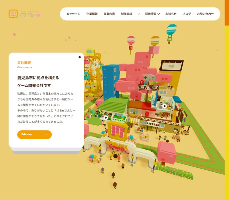
App Factory はるni presents its company information inside a bright miniature town. A Ferris wheel, colorful buildings, tiny people, green platforms, coral block forms, signs, and balloon-like ornaments establish a playful game-development identity. The scene occupies the viewport while conventional HTML navigation and information cards remain readable above it.
The interface balances two kinds of geometry: angular, densely detailed voxel construction in the world, and smooth white cards and pill controls in the foreground. Amber identifies section headings and actions; deep brown replaces black throughout the visible text and small markers. Desktop keeps a substantial information card at the left. Mobile preserves the large scene and moves concise destination cards into a horizontal rail near the bottom.
This is a corporate navigation experience with several equally legitimate destinations. Its defining structure is a full-screen illustrated directory, rather than a long sequence of promotional sections.
閉じる
App Factory はるni — Style Reference
A miniature voxel amusement park doubles as a game studio’s corporate directory.
Website: haru-ni.net Original URL: https://haru-ni.net/ Final URL: https://haru-ni.net/ Theme: a light, warm yellow environment with white interface surfaces and dark brown text; no theme selector was observed. Inspected: September 24, 2026, 06:01 JST. The supplied retrieval timestamp is September 23, 2026, 21:01:01.566 UTC. Viewports: 1440 × 1000 desktop and 390 × 844 mobile, in CSS pixels. Scope: the current corporate homepage, including its spatial scene, desktop card stack, mobile card rail, persistent navigation, recruitment shortcut, and associated rendered DOM. Linked inner pages, an opened mobile menu, and recruitment submenu interactions were not inspected.
App Factory はるni presents its company information inside a bright miniature town. A Ferris wheel, colorful buildings, tiny people, green platforms, coral block forms, signs, and balloon-like ornaments establish a playful game-development identity. The scene occupies the viewport while conventional HTML navigation and information cards remain readable above it.
The interface balances two kinds of geometry: angular, densely detailed voxel construction in the world, and smooth white cards and pill controls in the foreground. Amber identifies section headings and actions; deep brown replaces black throughout the visible text and small markers. Desktop keeps a substantial information card at the left. Mobile preserves the large scene and moves concise destination cards into a horizontal rail near the bottom.
This is a corporate navigation experience with several equally legitimate destinations. Its defining structure is a full-screen illustrated directory, rather than a long sequence of promotional sections.
How to Read This Reference
- Measured means supplied computed CSS values or rendered DOM rectangles. Measurements refer to the recorded state and viewport.
- Visual estimates describe proportions or colors judged from the five original-page captures. Estimated hex values were not obtained through pixel sampling.
- Calculated values are derived from recorded dimensions, such as card spacing and relative scale.
- Recommendations describe a new implementation. They are not claims about existing accessibility, interaction, or rendering behavior.
- Token names introduced here are implementation aliases. The few actual source custom properties are identified explicitly.
- Screenshots and DOM extraction represent different moments. Desktop screenshots show Education in front, while the supplied DOM sample places Game Production at the full-size front-card position. Use their shared geometry without treating them as one synchronized frame.
- An element with a DOM rectangle may still be transparent, covered, or outside the visible state. Auxiliary company text and footer content should not be assumed to appear over the captured scene.
Tokens — Colors
Default Palette
| Name | Value | Evidence | Suggested token | Role |
|---|---|---|---|---|
| Scene Yellow | Approximately #edcf75 |
Visual estimate | --color-scene |
Dominant rendered background and open space around the town |
| Appearance Sand | #e0c67b |
Source custom property | --color-appearance-source |
Recorded value of --background-color-of-appearance |
| Document Cream | #f0e2bb |
Computed HTML background | --color-document |
Underlying document background; not the dominant visible scene color |
| Chocolate Ink | #422612 |
Computed CSS and source property | --color-ink |
Body copy, navigation, small dots, and dark recruitment surface |
| Action Amber | #f4a000 |
Computed CSS | --color-action |
Japanese card categories and More-control fills |
| Card White | #ffffff |
Computed CSS | --color-surface |
Cards, navigation pill, mobile menu tab, and marker surrounds |
| Muted Caption | Approximately #9b9087 |
Visual estimate | --color-muted |
Apparent subdued English captions; sampled text itself computes to brown |
| Near Backplate | Approximately #e6e6e6 |
Visual estimate | --color-stack-near |
First visible layer below the desktop front card |
| Far Backplate | Approximately #c4c4c2 |
Visual estimate | --color-stack-far |
Lower, darker layer of the card stack |
Keep the three background values separate. The root background, appearance variable, and visible rendered scene do not look identical. The evidence does not expose the renderer’s clear color, lighting, or color-management configuration, so it cannot establish why they differ. Matching the visible field requires checking the rendered result rather than copying the HTML background alone.
The English captions appear muted even though their recorded color is #422612. A parent effect or another rendering treatment may account for this; its exact cause was not supplied. The muted token above is an approximation for a direct-color adaptation.
Scene Accents
These are approximate material-color references from the original captures, not measured renderer material values.
| Accent | Approximate value | Visible use |
|---|---|---|
| Coral | #e86a65 |
Large block forms, tree-like structures, and some Ferris-wheel cabins |
| Blue Teal | #0f8297 |
Tall rectangular building |
| Turquoise | #20ae9e |
Cabins, ornaments, and small scene details |
| Grass Green | #8fb62b |
Ground platforms and stepped roofs |
| Wheel Gold | #d9a800 |
Ferris-wheel structure and supporting machinery |
| Pale Cream | #eee5b4 |
Wheel spokes and light architectural details |
Scene accents belong primarily to the artwork. The HTML interface remains much more restrained: white, brown, amber, and a muted caption color. Avoid turning every navigation category into a different bright UI color.
Tokens — Typography
Main Japanese and General Interface Text
Recorded family stack: 'Helvetica Neue', Helvetica, Arial, 'Noto Sans JP', sans-serif.
The page uses regular sans-serif body copy and bold sans-serif headings. A declared stack does not prove which font supplied every Japanese glyph on the capture machine. Do not describe the whole page as definitively rendered in one named Japanese font.
The desktop card’s 13px body copy has a generous 26px line height. This creates a readable, airy text block inside a relatively narrow 270px column. Main card headlines are 18px bold with a 36px line height; there is no oversized marketing headline competing with the town.
Wide English Labels
Recorded family: Staff X Wide.
The English category captions use a broad, compact display face at 10px, weight 700, with 0.6px tracking. The mobile MENU label also declares this family, at 10px with 0.4px tracking and weight 400.
No font file URL or loading trace was provided. Use a properly available font file when reproducing this detail; a normal sans-serif fallback will not retain the same width and character.
Type Scale
| Role | Desktop declaration | Mobile declaration | Notes |
|---|---|---|---|
| Root text | 16px, weight 400 |
Same | Root size remains conventional in both samples |
| Primary navigation | 13px / 13px, weight 700 |
Replaced by MENU | Link padding supplies the large target height |
| Japanese card category | 16px / 32px, weight 700 |
18px / 36px, weight 700 |
Category gets larger on mobile despite the smaller card |
| English category | 10px / 20px, weight 700, tracking 0.6px |
Same declaration | Mobile rendered rectangle is scaled relative to its layout box |
| Desktop card headline | 18px / 36px, weight 700 |
Replaced by concise summary | The copy changes rather than merely shrinking |
| Desktop body | 13px / 26px, weight 400 |
Not visibly displayed | Long text remains in extracted link content |
| Mobile summary | Not the visible desktop headline | 12px / 18px, weight 700 |
Typically two lines beside the More control |
| More button container | 16px / 32px, weight 400 |
Same | Inner lettering looks wider and bolder; its separate computed style was not supplied |
| Mobile MENU label | Not visible | 10px / 10px, weight 400, tracking 0.4px |
Staff X Wide |
| Auxiliary company statement | 24px / 48px, weight 700, tracking 4.8px |
Not established | DOM-only evidence; not the headline in the captured scene |
| Footer company details | 11px / 22px |
Same recorded scale | Visibility in the captured homepage state is unverified |
The mobile English caption has a recorded rectangle of 232 × 16px, compared with a 290px layout-width region and a declared 20px line height. This is consistent with an approximately 0.8 visual scale. It is not evidence for an authored font-size: 8px declaration.
Tokens — Spacing & Shapes
Desktop rhythm: 40px outer left alignment, 40px card side insets, and generous vertical line spacing. Mobile rhythm: 15–30px outer clearances, 20px card side insets, and a 15px inter-card gap.
Spacing Scale
| Use | Value | Status |
|---|---|---|
| Desktop left alignment | 40px |
Measured card and recruitment-link positions |
| Desktop card text inset | 40px each side |
Derived from child rectangles inside a 350px card |
| Desktop category top inset | 30px |
Derived from measured rectangles |
| Desktop card content width | 270px |
Measured |
| Desktop More bottom inset | 40px |
Derived from full-size card and button bounds |
| Desktop navigation link padding | 24px 15px |
Computed CSS |
| Mobile card side inset | 20px |
Derived from measured rectangles |
| Mobile category top inset | 10px |
Derived from measured rectangles |
| Mobile card gap | 15px |
Calculated from 345px pitch minus 330px width |
| Mobile centered-card side clearance | 30px |
Measured |
| Mobile rail bottom clearance | 20px |
Calculated from 844px viewport and 824px card bottom |
| Recruitment-to-card vertical gap on mobile | 16px |
Calculated from 692px recruitment bottom and 708px card top |
The card anchors themselves compute to padding: 0. The internal offsets therefore come from their descendant layout. The Quick Start uses padding and positioned children as a simpler equivalent, not as a transcription of the original DOM structure.
Border Radius
| Element | Value | Evidence |
|---|---|---|
| Desktop card | 20px |
Computed CSS |
| Mobile card | 10px |
Computed CSS |
| More control | 30px |
Computed CSS; produces a pill at 40px height |
| Desktop navigation pill | Approximately 30px |
Visual estimate |
| Mobile MENU tab | 30px 0 0 30px |
Computed CSS |
| Recruitment shortcut | Approximately 5–10px |
Visual estimate; smaller than the main pills |
| Card pin and scene markers | Circular | Visual observation |
| Scene architecture | Predominantly square and stepped | Visual observation |
Layout Measurements
| Element | Desktop: 1440 × 1000 | Mobile: 390 × 844 |
|---|---|---|
| Document height | 1000px |
844px |
| Main scene | Fills the viewport behind UI | Fills the viewport behind UI |
| Full-size card | 350 × 440px, at 40, 280 |
330 × 116px, at 30, 708 |
| More control | 160 × 40px, at 80, 640 for the sampled front card |
100 × 40px, at 242, 764 |
| Recruitment shortcut | 145 × 60px, at 40, 104 |
148 × 60px, at 15, 632 |
| Header navigation | Approximately 760 × 61px, top 34px, right 40px |
Replaced by menu tab |
| Menu tab | Not visible | 106 × 50px, at 284, 16 |
| Scene hotspot button bounds | 64 × 64px |
40 × 40px |
| Logo | Approximately 146 × 40px, near 40, 44 |
Approximately 88 × 24px, near 20, 30 |
Logo and outer navigation-pill measurements are visual estimates. Individual navigation link rectangles and typography were supplied directly.
Desktop Stack Geometry
The recorded card widths reveal a consistent hierarchy:
| Layer in the sampled arrangement | Rendered bounds | Width relative to 350px |
|---|---|---|
| Front | 350 × 440px |
1 |
| Next | 332.5 × 418px |
0.95 |
| Following | 315.875 × 397.1px |
0.9025 |
| Deeper | Approximately 300.081 × 377.245px |
Approximately 0.857375 |
These ratios equal 0.95^depth. Recorded bottoms advance from 720px to 735px, 750px, and 765px. The geometry is therefore consistent with bottom-centered scaling and a 15px bottom-edge offset per depth. This is a calculated reconstruction of the bounds; the actual transform declarations were not included.
The visible result is a small stack of solid layers beneath the active white card. It is not a diffuse elevation shadow.
Components
Full-Viewport Scene
Role: brand expression and spatial context for the site’s destinations.
The scene is an elevated miniature town viewed from an oblique angle. Its strongest landmarks are a large golden Ferris wheel, a tall blue-teal building, a stepped green roof, coral block structures, and a large red sign-like form. Small characters, stalls, benches, tracks, and signs reward close inspection.
The scene extends behind the entire interface. Desktop composition often places most buildings to the right of the information card, but the world is not confined to a separate right-hand rectangular panel. Different captures show different angles and crops.
Use matte, saturated materials, crisp voxel silhouettes, and warm cast shadows. The actual rendering technology and camera projection were not supplied; do not assume a particular 3D library or an orthographic camera.
Brand and Recruitment Shortcut
Role: persistent identity and a direct recruiting route.
The compact multicolor logo sits at the upper left. Its rounded-square app-like symbol and small wordmark are artwork, not a generic text treatment.
The recruitment shortcut reads 採用特設サイト with a smaller second line, エンジニア積極採用中!, and a small right-pointing marker. It appears as a dark brown rounded rectangle with white lettering.
Desktop places this shortcut immediately below the logo. Mobile relocates it to the lower left, 16px above the card rail. It links directly to /engineer-recruit-2025/; this is a distinct destination from the general recruitment card at /recruit/.
Desktop Navigation Pill
Role: conventional access to the corporate site’s main sections.
A long white capsule floats near the upper-right corner. Its eight visible links are メッセージ, 企業情報, 事業内容, 制作実績, 採用情報, お知らせ, ブログ, and お問い合わせ.
Use bold 13px brown text, substantial 24px vertical padding, and 15px horizontal link padding. A slash-like separator divides the first group from recruitment and the later links. A small downward indicator accompanies recruitment.
The DOM includes recruitment links for culture, statistics, staff, and entry requirements. Their presence supports the navigation hierarchy, but no open dropdown was captured. Dropdown positioning, trigger behavior, and focus handling remain unverified.
Desktop Section Card
Role: explains the selected corporate destination without obscuring the whole scene.
The front card is a 350 × 440px white rectangle with a 20px radius. It sits at x = 40px and is vertically centered in the 1000px viewport. A small brown circular pin appears near the top-right corner, approximately 16px from each edge.
Its content order is consistent:
- An amber Japanese category label.
- A small, wide English category caption immediately underneath.
- A bold two-line headline.
- A regular paragraph, typically around six 26px lines in the measured cards.
- An amber More pill at the lower left, with broad lettering and a small white right-pointing chevron.
The Education screenshot uses 教育事業, Education, and the headline ゲームは遊ぶだけじゃなく、つくっても楽しい. Its paragraph describes programming classes and teaching work. The visual hierarchy makes the category and headline easy to scan while preserving useful detail.
The supplied extract contains both a card anchor and a More button associated with its content. Exact parent-child nesting was not provided. In a new implementation, use one card link with a styled, noninteractive More label to avoid ambiguous nested controls.
Destination Inventory
Six distinct destination cards are present. Repeated mobile copies do not represent additional categories.
| Category | English caption | Observed destination |
|---|---|---|
会社概要 |
Company | /company/ |
ゲーム開発事業 |
Game Production | /business/ |
教育事業 |
Education | /business/#education |
制作実績 |
Works | /works/ |
採用情報 |
Recruit | /recruit/ |
お問い合わせ |
Contact | /contact/ |
Preserve this distinction between scene exploration and ordinary destination navigation. The cards provide recognizable links even when the scene is visually complex.
Mobile Card Rail
Role: exposes the same destinations in a compact form while preserving the town’s visual scale.
At 390 × 844, the centered card is 330 × 116px and begins at x = 30px, y = 708px. Neighboring cards are separated by 15px, leaving narrow previews at both viewport edges. A preceding card occupies x = −315px to 15px, and the following card begins at x = 375px.
The content is deliberately rewritten. The Company card uses the short summary 私達は、鹿児島市に拠点を構えるゲーム開発会社です。; the Recruit card uses 鹿児島でゲーム開発に挑戦したい方との出会いを待っています。 Long desktop paragraphs are absent from the visible mobile card.
The category remains at the top left and increases to 18px bold. The English caption sits directly below it. The lower area combines a 12px bold summary with a 100 × 40px More pill on the right. The measured summary box reserves 110px of right padding, leaving approximately 180px for its text.
The DOM repeats the six-card sequence three times. This is consistent with a looping rail implementation, but it does not establish the actual swipe, drag, autoplay, or wrapping behavior. The screenshots establish different selected cards; they do not establish how selection changed.
Mobile Menu Tab
Role: compact primary navigation entry point.
The white MENU tab is attached to the right viewport edge at y = 16px. Its left end is rounded; its right corners are square against the edge. The 106 × 50px control contains a small two-line brown symbol and the wide 10px MENU label.
The opened menu was not supplied. Do not invent a full-screen panel, menu item arrangement, or closing animation as an observed feature.
Scene Markers and Dotted Connector
Role: visually associate interface navigation with locations in the miniature world.
Small white circular markers with brown centers appear over scene locations. A white marker containing a brown star is also visible in the desktop captures. Its function is not established.
The marker buttons have larger bounds than their visible symbols: 64px square on desktop and 40px square on mobile. Their coordinates vary with the scene state.
A chain of small brown dots runs diagonally or curves between the card area and a point in the scene. Together with the card’s corner pin, it gives the information card the character of an attached label. Exact path geometry and update logic were not supplied.
For a new implementation, project scene anchors into screen coordinates and draw the connector in a separate SVG overlay. Keep that decorative overlay out of the pointer-event and accessibility trees. This is an implementation recommendation, not identification of the original technique.
Auxiliary Company and Footer Content
The DOM includes a company statement, company name, Kagoshima address, telephone number, footer navigation, privacy link, and HOME controls. Several elements have offscreen positions, and the footer wrapper has zero height in the sampled state.
These details support the corporate identity and the existence of additional interface content. They do not demonstrate a conventional footer visible beneath the captured homepage. Avoid adding the extracted footer over the scene merely because its descendants have numerical rectangles.
Tokens — Motion & Interaction
Recorded CSS Treatments
| Element or treatment | Supplied value | What the evidence supports |
|---|---|---|
| Desktop card changes | opacity 0.5s, transform 0.5s |
Cards have fading and geometric transition capability |
| Scene-marker visibility | opacity 0.2s cubic-bezier(0.11, 0.76, 0, 1) |
Short eased visibility changes |
| More-control background | background-color 0.2s cubic-bezier(0.11, 0.76, 0, 1) |
Fill-color transitions; end colors were not supplied |
| Navigation link color | color 0.2s cubic-bezier(0.11, 0.76, 0, 1) |
Short color feedback; hover state was not captured |
| Recruitment entrance | 0.5s cubic-bezier(0.36, 2.6, 0.64, 1) forwards |
An entrance animation with an overshooting timing curve |
| Mobile recruitment delay | 0.5s |
Entrance begins after a recorded delay |
| Mobile MENU transform | 0.4s cubic-bezier(0.11, 0.76, 0, 1) 0.5s |
Delayed transform transition capability |
| Mobile MENU label color | color 0.3s |
Separate label-color transition |
| Side HOME control | transform 0.3s |
Transform behavior exists for an auxiliary control |
| Footer color | color 0.5s |
A color transition exists in the DOM-only footer state |
Scene-State Evidence and Limits
The three desktop captures show the town from substantially different angles while retaining the same foreground Education card. The two mobile captures show different scene arrangements and different selected cards. This establishes multiple rendered states of the spatial presentation.
It does not establish whether camera movement is automatic, scroll driven, pointer driven, or linked to another control. Ferris-wheel speed, camera easing, particle lifetimes, drag sensitivity, and transition synchronization cannot be measured from these still captures.
Most sampled HTML elements report no CSS animation. That does not prove the rendered scene is static: a drawing surface or JavaScript renderer can change independently of the sampled DOM animation properties.
For a new implementation, retain the distinction between restrained interface transitions and expressive scene motion. Use the recorded 200–500ms timings for UI feedback. Treat all proposed camera motion as new design work, and provide a stable reduced-motion view.
Surfaces
| Layer | Appearance | Purpose |
|---|---|---|
| Rendered environment | Warm yellow field with directional shadows | Unifies scene and empty space |
| Scene objects | Opaque, flat-colored voxel materials | Provides detail and game-world identity |
| Main card | Solid white, rounded corners, no visible border | Protects text from scene complexity |
| Desktop backplates | Solid offset gray layers | Makes the active card read as part of a stack |
| Desktop navigation | White capsule | Keeps many links together without a full-width header bar |
| Mobile MENU control | White tab attached to the edge | Preserves scene visibility |
| Recruitment shortcut | Brown fill and white text | Creates a compact, distinct secondary emphasis |
| More action | Amber capsule and white details | Repeats the category accent as an action cue |
| Scene marker | Small white disk with brown center or symbol | Remains recognizable over colorful objects |
Keep physical scene shadows separate from interface elevation. The town uses broad, soft, warm shadows; the card stack uses discrete, solid layers. The captures do not show a general system of blurred card shadows, glass surfaces, or interface gradients.
Imagery
The artwork is constructed from small rectangular volumes rather than smooth sculpted forms. Building windows repeat in a grid. Roofs rise in stepped layers. Ferris-wheel beams, spokes, cabins, trees, and people retain deliberately blocky silhouettes. The world is richly populated, but the lighting and limited material treatment keep it legible.
A giant Ferris wheel acts as a recognizable landmark across several angles. Its cream spokes and golden frame contrast with pink, turquoise, and yellow-green cabins. Other landmarks include the blue-teal tower, coral block sculpture, green-roofed pavilion, signs, tracks, benches, and tiny characters.
Use crisp geometry with normal rendered shading. Voxel construction is not evidence that the entire viewport should use image-rendering: pixelated. Applying that property indiscriminately would degrade the smooth HTML text and interface.
Observed Asset References
No original image URLs, model filenames, texture paths, or font-file URLs were included. The following inventory records visible assets without inventing source paths.
| Asset | Observed character | Implementation implication |
|---|---|---|
| Brand logo | Small multicolor app symbol and wordmark | Preserve as supplied artwork when available |
| Town model | Dense miniature architecture and attractions | Requires authored scene assets or an authorized rendered substitute |
| Ferris wheel | Distinct frame, spokes, and colored cabins | Preserve its recognizable construction and silhouette |
| Small inhabitants | Tiny block-built figures | Use consistent voxel scale across the scene |
| Scene signage | Lettering embedded in billboards and shop signs | Treat as artwork; retain HTML equivalents for essential navigation |
| Floating details | Small coral fragments and elevated ornaments | Decorative accents; exact animation is unverified |
| Interface marks | Pins, rings, star, and small chevrons | Simple foreground symbols with adequate contrast and hit areas |
A single image can serve as a recommended loading or reduced-motion fallback. It would not reproduce the multiple viewpoints evidenced by the current page. CSS alone can recreate the interface shell, but not the identity carried by the town.
Layout & Responsive Behavior
Desktop Composition
At 1440 × 1000, the document height equals the viewport height. The card’s top of 280px follows directly from centering a 440px card: (1000 − 440) / 2 = 280.
The logo and recruiting link establish a 40px left edge. The navigation floats independently at the top right. The scene runs behind both, with its composition changing across captured states. Avoid imposing a rigid two-column document layout that shrinks the world to fit beside the card.
A narrow orange/yellow strip, approximately 20px wide, appears along the right edge of the desktop captures. Its color division changes between images. Its semantics are not exposed, so it should not be described as a verified scrollbar or progress indicator.
Mobile Composition
Mobile is a structural adaptation:
- The full desktop navigation becomes a right-edge MENU tab.
- The logo becomes smaller and remains at the top left.
- The recruitment shortcut moves above the bottom card rail.
- The vertical desktop card becomes a shallow horizontal card.
- Long paragraphs are replaced by concise destination-specific summaries.
- Neighboring cards remain partially visible to communicate continuation.
- The town is reframed and cropped, preserving large landmarks rather than scaling the complete desktop composition into the phone width.
The bottom geometry at the inspected viewport is precise: 116px card height plus 20px bottom clearance places the rail at y = 708px. The 60px recruitment shortcut ends at y = 692px, leaving a 16px gap above the rail.
Responsive Source Variables
| Source property | Desktop sample | Mobile sample | Interpretation limit |
|---|---|---|---|
--max-viewport-height |
1000px |
844px |
Matches the inspected viewport heights |
--vw-base-size |
1280 |
390 |
Indicates different layout bases; the scaling formula was not supplied |
--scroll-top |
0px |
0px |
Recorded state only; does not establish the navigation mechanism |
--card-line-offset-y |
0px |
0px |
A connector-related variable exists; its behavior is unknown |
--letter-spacing |
0 |
0 |
Recorded source variable, not a replacement for measured label tracking |
The exact breakpoint, tablet behavior, landscape arrangement, and browser-chrome resizing were not inspected. The Quick Start uses a recommended 1100px breakpoint and safe-area additions; neither is claimed as an original source rule.
Do’s and Don’ts
Do
- Build the homepage around the relationship between a navigable miniature world and readable destination cards.
- Keep the visible scene yellow, white foreground surfaces, brown text, and amber actions distinct.
- Preserve the desktop card’s narrow text column and generous line height.
- Use layered backplates to express the desktop stack.
- Keep English captions compact and wide, subordinate to Japanese category names.
- Rewrite mobile summaries for the available space.
- Preserve the mobile card previews at both edges.
- Keep UI controls independently readable while the scene changes viewpoint.
- Maintain ordinary links to all six corporate destinations.
- Distinguish visible marker size from its larger interactive bounds.
Don’t
- Don’t turn the corporate directory into an unrelated sequence of generic hero, feature, testimonial, and conversion sections.
- Don’t shrink the entire desktop composition uniformly onto mobile.
- Don’t place the desktop’s full paragraphs into the 116px mobile card.
- Don’t replace the card stack with a broad, blurred drop shadow.
- Don’t apply the scene’s full rainbow palette to all interface controls.
- Don’t use a giant text headline that competes with the town’s landmarks.
- Don’t infer a 3D engine, camera projection, or drag interaction from appearance alone.
- Don’t mistake repeated carousel entries for eighteen unique destinations.
- Don’t label the star marker or right-edge strip with an unverified function.
- Don’t reproduce offscreen or covered DOM content as if it were visible in the supplied state.
Recommended Implementation Additions
These are recommendations for a new implementation, not verified features of the original page.
- Provide a complete HTML navigation path. Scene interaction should supplement links to company, business, education, works, recruitment, and contact.
- Use clear interactive semantics. Make each destination card one link; style More as an internal label. Give scene buttons explicit names and distinguish any special star action.
- Support keyboard navigation. Use visible focus indicators and explicit previous/next controls if the card rail is controlled by JavaScript. Keep offscreen clones out of the tab order and accessibility tree.
- Review small-text contrast. The measured amber/white pair has approximately 2.1:1 contrast, calculated from the CSS colors. For essential small text, consider brown lettering on amber or a darker functional amber. This would be an accessibility adaptation rather than an exact visual copy.
- Increase small touch targets where practical. The recorded mobile marker boxes are 40px square; a recommended implementation can expand their invisible target to at least 44px.
- Handle reduced motion in the renderer. Disable camera drift and decorative loops when requested. A CSS media query alone will not stop a JavaScript drawing loop.
- Provide a resilient scene fallback. Keep logo, navigation, and destination cards usable while models load or if rendering fails.
- Accommodate text zoom and short screens. Treat the measured 116px rail height as a reference for the supplied copy, not a reason to clip longer text. Allow a larger card or an alternative layout when needed.
- Protect mobile safe areas. Add bottom and top insets while preserving the recruitment-to-card relationship.
Agent Prompt Guide
Quick Color Reference
- Rendered scene field: approximately
#edcf75; visually estimated. - Main interface ink: measured
#422612. - Category and action amber: measured
#f4a000. - Cards and navigation: measured
#ffffff. - Source appearance background:
#e0c67b; do not assume this equals the final scene field. - Scene accents: coral, blue teal, turquoise, grass green, and wheel gold.
- Card depth: two visible solid gray backplates, not a soft shadow.
Overall Prompt
“Create a full-viewport corporate directory for a Japanese game-development studio. Use a detailed voxel miniature town with a golden Ferris wheel, colorful cabins, a blue-teal tower, coral block forms, stepped green roofs, tiny people, and warm cast shadows. Keep the open scene field pale yellow. Overlay a compact logo at the upper left, a white capsule navigation at the upper right, and a 350 × 440px white information card at the left center. Use dark brown #422612 text, amber #f4a000 categories and More controls, wide compact English captions, and two offset card backplates. At 390px width, preserve a large cropped scene, replace navigation with a right-edge MENU tab, and show 330 × 116px destination cards in a bottom horizontal rail with rewritten summaries and neighboring-card previews. Treat scene controls and camera behavior as separately specified interactions.”
Example Component Prompts
- Desktop section card: “Create a 350 × 440px white card with a 20px radius, 40px side insets, a small brown pin near the top right, an amber Japanese category, and a compact wide English caption. Add an 18px bold two-line headline, 13px body copy with 26px line height, and a 160 × 40px amber More pill. Place solid gray backplates behind it using approximately 0.95 and 0.9025 scales.”
- Mobile destination card: “Create a 330 × 116px white card with a 10px radius. Use an 18px amber category, a small wide English caption, and a two-line 12px bold summary. Reserve the lower right for a 100 × 40px amber More pill. Place cards 15px apart, centered with 30px viewport margins at 390px width.”
- Desktop navigation: “Create a floating white capsule at the upper right, 61px high. Use eight brown 13px bold links with 24px vertical and 15px horizontal padding. Separate the corporate-information group from recruitment and updates with a small slash. Keep the scene visible around the capsule.”
- Mobile menu and recruiting link: “Place a 106 × 50px white MENU tab at the top-right edge with only its left corners rounded. Place a compact brown recruiting link near the lower left, 16px above the card rail, using two lines of white Japanese text.”
- Scene-to-card connector: “Draw a decorative chain of small brown dots from a scene anchor toward the active card’s corner pin. Keep it beneath interactive controls and update its endpoints when the scene or viewport changes. Use ordinary HTML buttons for the white scene markers.”
Quick Start
CSS Custom Properties
This is a recommended shell implementation calibrated to the two supplied viewports. Exact measured colors and dimensions are retained where available. Scene colors, backplate colors, caption muting, and some decorative details are approximations.
The desktop backplates below are decorative substitutes for the original multi-card stack. The mobile rail uses native scrolling and CSS scroll snapping as an accessible starting point; this is not a claim about the original carousel technology. Scene rendering, selection synchronization, MENU behavior, and connector coordinates require separate implementation.
:root {
  /* Measured interface colors */
  --color-ink: #422612;
  --color-action: #f4a000;
  --color-surface: #ffffff;
  --color-document: #f0e2bb;
  --color-appearance-source: #e0c67b;

  /* Visual approximations for the rendered appearance */
  --color-scene: #edcf75;
  --color-muted: #9b9087;
  --color-stack-near: #e6e6e6;
  --color-stack-far: #c4c4c2;

  --font-ui: 'Helvetica Neue', Helvetica, Arial, 'Noto Sans JP', sans-serif;
  /* No font-file URL was supplied. Use an available licensed font. */
  --font-wide: 'Staff X Wide', Arial, sans-serif;

  --card-width: 350px;
  --card-height: 440px;
  --card-radius: 20px;
  --card-inset: 40px;
  --rail-gap: 15px;
  --desktop-edge: 40px;

  --ease-ui: cubic-bezier(0.11, 0.76, 0, 1);
  --motion-feedback: 200ms var(--ease-ui);
  --motion-card: 500ms ease;
  --motion-recruit: 500ms cubic-bezier(0.36, 2.6, 0.64, 1);

  /* Recommended additions */
  --safe-top: env(safe-area-inset-top, 0px);
  --safe-bottom: env(safe-area-inset-bottom, 0px);
}

* { box-sizing: border-box; }
body { margin: 0; background: var(--color-document); }

.haruni-shell {
  position: fixed;
  inset: 0;
  isolation: isolate;
  overflow: hidden;
  color: var(--color-ink);
  background: var(--color-scene);
  font-family: var(--font-ui);
}

.scene-layer {
  position: absolute;
  inset: 0;
  z-index: 0;
}

.scene-layer > canvas,
.scene-layer > img {
  display: block;
  width: 100%;
  height: 100%;
  object-fit: cover;
}

/* A renderer must also resize its drawing buffer and camera. */
.connector-layer {
  position: absolute;
  inset: 0;
  z-index: 1;
  width: 100%;
  height: 100%;
  pointer-events: none;
}

.connector-layer path {
  fill: none;
  stroke: var(--color-ink);
  stroke-width: 3;
  stroke-linecap: round;
  stroke-dasharray: 0.1 16;
  vector-effect: non-scaling-stroke;
}

.site-logo {
  position: absolute;
  z-index: 5;
  top: 44px;
  left: var(--desktop-edge);
  width: 146px;
}

.site-logo img { display: block; width: 100%; height: auto; }

.site-nav {
  position: absolute;
  z-index: 5;
  top: 34px;
  right: var(--desktop-edge);
  display: flex;
  align-items: center;
  padding-inline: 16px;
  border-radius: 30px;
  background: var(--color-surface);
}

.site-nav a {
  display: flex;
  align-items: center;
  padding: 24px 15px;
  color: var(--color-ink);
  font-size: 13px;
  font-weight: 700;
  line-height: 13px;
  text-decoration: none;
  white-space: nowrap;
  transition: color var(--motion-feedback);
}

.site-nav__divider { width: 32px; text-align: center; }
.mobile-menu { display: none; }

.recruit-shortcut {
  position: absolute;
  z-index: 5;
  top: 104px;
  left: var(--desktop-edge);
  display: flex;
  flex-direction: column;
  justify-content: center;
  width: 145px;
  height: 60px;
  padding-inline: 14px;
  border-radius: 6px;
  color: white;
  background: var(--color-ink);
  text-decoration: none;
}

/* Recruitment text sizing is a visual approximation. */
.recruit-shortcut strong { font-size: 15px; line-height: 22px; }
.recruit-shortcut small { font-size: 9px; line-height: 15px; letter-spacing: 0.1em; }

.card-rail {
  position: absolute;
  z-index: 4;
  isolation: isolate;
  top: 50%;
  left: var(--desktop-edge);
  width: var(--card-width);
  height: var(--card-height);
  transform: translateY(-50%);
}

.card-rail::before,
.card-rail::after {
  content: '';
  position: absolute;
  inset: 0;
  border-radius: var(--card-radius);
  transform-origin: bottom center;
  pointer-events: none;
}

.card-rail::before {
  z-index: -2;
  background: var(--color-stack-far);
  transform: translateY(30px) scale(0.9025);
}

.card-rail::after {
  z-index: -1;
  background: var(--color-stack-near);
  transform: translateY(15px) scale(0.95);
}

.portal-card {
  position: relative;
  display: block;
  width: var(--card-width);
  height: var(--card-height);
  padding: 30px var(--card-inset) 40px;
  border-radius: var(--card-radius);
  color: var(--color-ink);
  background: var(--color-surface);
  text-decoration: none;
  transition: opacity var(--motion-card), transform var(--motion-card);
}

.portal-card:not(.is-active) { display: none; }

.portal-card::after {
  content: '';
  position: absolute;
  top: 16px;
  right: 16px;
  width: 10px;
  height: 10px;
  border-radius: 50%;
  background: var(--color-ink);
}

.portal-card__category {
  margin: 0;
  color: var(--color-action);
  font-size: 16px;
  font-weight: 700;
  line-height: 32px;
}

.portal-card__english {
  margin: -4px 0 0;
  color: var(--color-muted);
  font-family: var(--font-wide);
  font-size: 10px;
  font-weight: 700;
  line-height: 20px;
  letter-spacing: 0.6px;
}

.portal-card__headline {
  margin: 20px 0 8px;
  font-size: 18px;
  font-weight: 700;
  line-height: 36px;
}

.portal-card__body { margin: 0; font-size: 13px; line-height: 26px; }
.portal-card__summary { display: none; }

.portal-card__more {
  position: absolute;
  left: 40px;
  bottom: 40px;
  display: flex;
  align-items: center;
  justify-content: space-between;
  width: 160px;
  height: 40px;
  padding-inline: 20px;
  border-radius: 30px;
  color: white;
  background: var(--color-action);
  /* Inner label typography is a visual approximation. */
  font-family: var(--font-wide);
  font-size: 14px;
  font-weight: 700;
  line-height: 1;
  transition: background-color var(--motion-feedback);
}

.world-hotspot {
  position: absolute;
  left: var(--anchor-x, 50%);
  top: var(--anchor-y, 50%);
  display: grid;
  place-items: center;
  width: 64px;
  height: 64px;
  padding: 0;
  border: 0;
  background: transparent;
  transform: translate(-50%, -50%);
  cursor: pointer;
  transition: opacity var(--motion-feedback);
}

/* Approximate visible marker inside the larger target. */
.world-hotspot::before {
  content: '';
  width: 22px;
  height: 22px;
  border: 7px solid white;
  border-radius: 50%;
  background: var(--color-ink);
}

.haruni-shell :focus-visible {
  outline: 3px solid var(--color-ink);
  outline-offset: 4px;
}

/* Recommended breakpoint; the original threshold was not supplied. */
@media (max-width: 1100px) {
  :root {
    --card-width: calc(100vw - 60px);
    --card-height: 116px;
    --card-radius: 10px;
  }

  .site-logo { top: calc(30px + var(--safe-top)); left: 20px; width: 88px; }
  .site-nav { display: none; }

  .mobile-menu {
    position: absolute;
    z-index: 5;
    top: calc(16px + var(--safe-top));
    right: 0;
    display: flex;
    align-items: center;
    gap: 8px;
    width: 106px;
    height: 50px;
    padding: 20px;
    border: 0;
    border-radius: 30px 0 0 30px;
    color: var(--color-ink);
    background: white;
    font-family: var(--font-wide);
    font-size: 10px;
    line-height: 10px;
    letter-spacing: 0.4px;
  }

  .recruit-shortcut {
    top: auto;
    bottom: calc(var(--card-height) + 36px + var(--safe-bottom));
    left: 15px;
    width: 148px;
    border-radius: 10px;
  }

  .card-rail {
    top: auto;
    right: 0;
    bottom: calc(20px + var(--safe-bottom));
    left: 0;
    display: flex;
    gap: var(--rail-gap);
    width: 100%;
    padding-inline: 30px;
    overflow-x: auto;
    overflow-y: hidden;
    transform: none;
    scroll-snap-type: x mandatory;
    scroll-padding-inline: 30px;
    scrollbar-width: none;
  }

  .card-rail::-webkit-scrollbar { display: none; }
  .card-rail::before, .card-rail::after { display: none; }

  .portal-card,
  .portal-card:not(.is-active) {
    display: block;
    flex: 0 0 var(--card-width);
    padding: 10px 20px 20px;
    scroll-snap-align: center;
  }

  .portal-card::after { top: 10px; right: 10px; }
  .portal-card__category { font-size: 18px; line-height: 36px; }

  .portal-card__english {
    position: absolute;
    top: 38px;
    right: 20px;
    left: 20px;
    margin: 0;
    transform: scale(0.8);
    transform-origin: top left;
  }

  .portal-card__headline, .portal-card__body { display: none; }

  .portal-card__summary {
    position: absolute;
    top: 60px;
    right: 20px;
    left: 20px;
    display: block;
    margin: 0;
    padding-right: 110px;
    font-size: 12px;
    font-weight: 700;
    line-height: 18px;
  }

  .portal-card__more {
    right: 18px;
    bottom: 20px;
    left: auto;
    width: 100px;
    font-size: 10px;
  }

  /* Recommended target expansion from the observed 40px. */
  .world-hotspot { width: 44px; height: 44px; }
  .portal-card:focus-visible { outline-offset: -4px; }
}

@media (prefers-reduced-motion: reduce) {
  .haruni-shell *, .haruni-shell *::before, .haruni-shell *::after {
    animation: none !important;
    transition: none !important;
    scroll-behavior: auto !important;
  }
  /* Stop renderer-driven camera and object motion separately. */
}
Suggested Card Markup
Use six distinct destination links in the rail. This example shows the Education pattern; it intentionally avoids a nested button and uses actual source copy. Add the scene, brand asset, primary navigation, and functional menu separately.
<nav class='card-rail' aria-label='Explore the company'>
  <a class='portal-card is-active'
     href='https://haru-ni.net/business/#education'
     aria-labelledby='education-title'>
    <h2 class='portal-card__category' id='education-title'>教育事業</h2>
    <p class='portal-card__english'>Education</p>
    <p class='portal-card__headline'>ゲームは遊ぶだけじゃなく、<br>つくっても楽しい</p>
    <p class='portal-card__body'>IT Adventureという小中学生向けプログラミング教室を鹿児島市に2校運営しており、Scratch、Python、Unityを指導しています。また、専門学校や会社さまに対してゲームやITについての講義を行う講師の派遣業務も行っています。</p>
    <p class='portal-card__summary'>小中学生向けプログラミング教室を運営しています。</p>
    <span class='portal-card__more' aria-hidden='true'>More <span>›</span></span>
  </a>
  <!-- Repeat with unique IDs and content for the other five destinations. -->
</nav>
For a new site, substitute its own destinations and copy. The fixed card dimensions reproduce the inspected proportions; increase available height or change layout when text zoom, localization, or shorter viewports require it. This starter was not executed or browser-tested during this evidence-only analysis.
Tailwind v4 Token Mapping
Optional aliases for an implementation already using Tailwind v4. They do not imply that the original site uses Tailwind. Define the custom properties above first.
@theme inline {
  --color-scene: #edcf75;
  --color-ink: #422612;
  --color-action: #f4a000;
  --color-surface: #ffffff;
  --color-caption: #9b9087;

  --font-body: var(--font-ui);
  --font-label: var(--font-wide);

  --text-card-body: 13px;
  --text-card-heading: 18px;
  --text-card-summary: 12px;
  --text-utility: 10px;

  --spacing-card-inset: 40px;
  --spacing-card-gap: 15px;
  --spacing-mobile-inset: 20px;

  --radius-card-desktop: 20px;
  --radius-card-mobile: 10px;
  --radius-control: 30px;
}
Sources & Evidence
- Inspected original and final page: https://haru-ni.net/. The supplied response reports HTTP 200 and no URL change.
- Capture timestamp: September 23, 2026, 21:01:01.566 UTC; September 24, 2026, 06:01:01.566 JST.
- Visual evidence: three original-page desktop captures at 1440 × 1000 and two original-page mobile captures at 390 × 844.
- Rendered evidence: page title, text, destination URLs, document heights, custom properties, element rectangles, computed typography, colors, radii, and transition declarations for both viewports.
- Observed state differences: several scene viewpoints, the desktop Education card, and mobile Company and Recruit cards. The action sequence producing these states was not supplied.
- Capture limitations: readiness checks included document loading, finite animation settling, layout/text stability, and image decoding within bounded waits. Perpetual animations were paused during checks and resumed afterward. These checks do not establish semantic completeness or cover delayed content. SharedWorkers and service workers were disabled.
- Unverified areas: opened menus, hover outcomes, destination-page content, camera controls, precise scene animation, keyboard behavior, asset paths, renderer technology, exact responsive breakpoint, tablet layouts, and footer visibility in other states.
This reference describes the current homepage evidenced by those captures and DOM records. Visual estimates, calculated relationships, and recommended implementation choices are labeled separately from measured source values.
# App Factory はるni — Style Reference

> A miniature voxel amusement park doubles as a game studio’s corporate directory.

**Website:** [haru-ni.net](https://haru-ni.net/)
**Original URL:** https://haru-ni.net/
**Final URL:** https://haru-ni.net/
**Theme:** a light, warm yellow environment with white interface surfaces and dark brown text; no theme selector was observed.
**Inspected:** September 24, 2026, 06:01 JST. The supplied retrieval timestamp is September 23, 2026, 21:01:01.566 UTC.
**Viewports:** 1440 × 1000 desktop and 390 × 844 mobile, in CSS pixels.
**Scope:** the current corporate homepage, including its spatial scene, desktop card stack, mobile card rail, persistent navigation, recruitment shortcut, and associated rendered DOM. Linked inner pages, an opened mobile menu, and recruitment submenu interactions were not inspected.

App Factory はるni presents its company information inside a bright miniature town. A Ferris wheel, colorful buildings, tiny people, green platforms, coral block forms, signs, and balloon-like ornaments establish a playful game-development identity. The scene occupies the viewport while conventional HTML navigation and information cards remain readable above it.

The interface balances two kinds of geometry: angular, densely detailed voxel construction in the world, and smooth white cards and pill controls in the foreground. Amber identifies section headings and actions; deep brown replaces black throughout the visible text and small markers. Desktop keeps a substantial information card at the left. Mobile preserves the large scene and moves concise destination cards into a horizontal rail near the bottom.

This is a corporate navigation experience with several equally legitimate destinations. Its defining structure is a full-screen illustrated directory, rather than a long sequence of promotional sections.
閉じる
# App Factory はるni — Style Reference

> A miniature voxel amusement park doubles as a game studio’s corporate directory.

**Website:** [haru-ni.net](https://haru-ni.net/)
**Original URL:** https://haru-ni.net/
**Final URL:** https://haru-ni.net/
**Theme:** a light, warm yellow environment with white interface surfaces and dark brown text; no theme selector was observed.
**Inspected:** September 24, 2026, 06:01 JST. The supplied retrieval timestamp is September 23, 2026, 21:01:01.566 UTC.
**Viewports:** 1440 × 1000 desktop and 390 × 844 mobile, in CSS pixels.
**Scope:** the current corporate homepage, including its spatial scene, desktop card stack, mobile card rail, persistent navigation, recruitment shortcut, and associated rendered DOM. Linked inner pages, an opened mobile menu, and recruitment submenu interactions were not inspected.

App Factory はるni presents its company information inside a bright miniature town. A Ferris wheel, colorful buildings, tiny people, green platforms, coral block forms, signs, and balloon-like ornaments establish a playful game-development identity. The scene occupies the viewport while conventional HTML navigation and information cards remain readable above it.

The interface balances two kinds of geometry: angular, densely detailed voxel construction in the world, and smooth white cards and pill controls in the foreground. Amber identifies section headings and actions; deep brown replaces black throughout the visible text and small markers. Desktop keeps a substantial information card at the left. Mobile preserves the large scene and moves concise destination cards into a horizontal rail near the bottom.

This is a corporate navigation experience with several equally legitimate destinations. Its defining structure is a full-screen illustrated directory, rather than a long sequence of promotional sections.

## How to Read This Reference

- **Measured** means supplied computed CSS values or rendered DOM rectangles. Measurements refer to the recorded state and viewport.
- **Visual estimates** describe proportions or colors judged from the five original-page captures. Estimated hex values were not obtained through pixel sampling.
- **Calculated** values are derived from recorded dimensions, such as card spacing and relative scale.
- **Recommendations** describe a new implementation. They are not claims about existing accessibility, interaction, or rendering behavior.
- Token names introduced here are implementation aliases. The few actual source custom properties are identified explicitly.
- Screenshots and DOM extraction represent different moments. Desktop screenshots show Education in front, while the supplied DOM sample places Game Production at the full-size front-card position. Use their shared geometry without treating them as one synchronized frame.
- An element with a DOM rectangle may still be transparent, covered, or outside the visible state. Auxiliary company text and footer content should not be assumed to appear over the captured scene.

## Tokens — Colors

### Default Palette

| Name | Value | Evidence | Suggested token | Role |
| --- | --- | --- | --- | --- |
| Scene Yellow | Approximately `#edcf75` | Visual estimate | `--color-scene` | Dominant rendered background and open space around the town |
| Appearance Sand | `#e0c67b` | Source custom property | `--color-appearance-source` | Recorded value of `--background-color-of-appearance` |
| Document Cream | `#f0e2bb` | Computed HTML background | `--color-document` | Underlying document background; not the dominant visible scene color |
| Chocolate Ink | `#422612` | Computed CSS and source property | `--color-ink` | Body copy, navigation, small dots, and dark recruitment surface |
| Action Amber | `#f4a000` | Computed CSS | `--color-action` | Japanese card categories and More-control fills |
| Card White | `#ffffff` | Computed CSS | `--color-surface` | Cards, navigation pill, mobile menu tab, and marker surrounds |
| Muted Caption | Approximately `#9b9087` | Visual estimate | `--color-muted` | Apparent subdued English captions; sampled text itself computes to brown |
| Near Backplate | Approximately `#e6e6e6` | Visual estimate | `--color-stack-near` | First visible layer below the desktop front card |
| Far Backplate | Approximately `#c4c4c2` | Visual estimate | `--color-stack-far` | Lower, darker layer of the card stack |

**Keep the three background values separate.** The root background, appearance variable, and visible rendered scene do not look identical. The evidence does not expose the renderer’s clear color, lighting, or color-management configuration, so it cannot establish why they differ. Matching the visible field requires checking the rendered result rather than copying the HTML background alone.

The English captions appear muted even though their recorded `color` is `#422612`. A parent effect or another rendering treatment may account for this; its exact cause was not supplied. The muted token above is an approximation for a direct-color adaptation.

### Scene Accents

These are approximate material-color references from the original captures, not measured renderer material values.

| Accent | Approximate value | Visible use |
| --- | --- | --- |
| Coral | `#e86a65` | Large block forms, tree-like structures, and some Ferris-wheel cabins |
| Blue Teal | `#0f8297` | Tall rectangular building |
| Turquoise | `#20ae9e` | Cabins, ornaments, and small scene details |
| Grass Green | `#8fb62b` | Ground platforms and stepped roofs |
| Wheel Gold | `#d9a800` | Ferris-wheel structure and supporting machinery |
| Pale Cream | `#eee5b4` | Wheel spokes and light architectural details |

Scene accents belong primarily to the artwork. The HTML interface remains much more restrained: white, brown, amber, and a muted caption color. Avoid turning every navigation category into a different bright UI color.

## Tokens — Typography

### Main Japanese and General Interface Text

**Recorded family stack:** `'Helvetica Neue', Helvetica, Arial, 'Noto Sans JP', sans-serif`.

The page uses regular sans-serif body copy and bold sans-serif headings. A declared stack does not prove which font supplied every Japanese glyph on the capture machine. Do not describe the whole page as definitively rendered in one named Japanese font.

The desktop card’s 13px body copy has a generous 26px line height. This creates a readable, airy text block inside a relatively narrow 270px column. Main card headlines are 18px bold with a 36px line height; there is no oversized marketing headline competing with the town.

### Wide English Labels

**Recorded family:** `Staff X Wide`.

The English category captions use a broad, compact display face at 10px, weight 700, with 0.6px tracking. The mobile MENU label also declares this family, at 10px with 0.4px tracking and weight 400.

No font file URL or loading trace was provided. Use a properly available font file when reproducing this detail; a normal sans-serif fallback will not retain the same width and character.

### Type Scale

| Role | Desktop declaration | Mobile declaration | Notes |
| --- | --- | --- | --- |
| Root text | `16px`, weight `400` | Same | Root size remains conventional in both samples |
| Primary navigation | `13px / 13px`, weight `700` | Replaced by MENU | Link padding supplies the large target height |
| Japanese card category | `16px / 32px`, weight `700` | `18px / 36px`, weight `700` | Category gets larger on mobile despite the smaller card |
| English category | `10px / 20px`, weight `700`, tracking `0.6px` | Same declaration | Mobile rendered rectangle is scaled relative to its layout box |
| Desktop card headline | `18px / 36px`, weight `700` | Replaced by concise summary | The copy changes rather than merely shrinking |
| Desktop body | `13px / 26px`, weight `400` | Not visibly displayed | Long text remains in extracted link content |
| Mobile summary | Not the visible desktop headline | `12px / 18px`, weight `700` | Typically two lines beside the More control |
| More button container | `16px / 32px`, weight `400` | Same | Inner lettering looks wider and bolder; its separate computed style was not supplied |
| Mobile MENU label | Not visible | `10px / 10px`, weight `400`, tracking `0.4px` | `Staff X Wide` |
| Auxiliary company statement | `24px / 48px`, weight `700`, tracking `4.8px` | Not established | DOM-only evidence; not the headline in the captured scene |
| Footer company details | `11px / 22px` | Same recorded scale | Visibility in the captured homepage state is unverified |

The mobile English caption has a recorded rectangle of 232 × 16px, compared with a 290px layout-width region and a declared 20px line height. This is consistent with an approximately `0.8` visual scale. It is not evidence for an authored `font-size: 8px` declaration.

## Tokens — Spacing & Shapes

**Desktop rhythm:** 40px outer left alignment, 40px card side insets, and generous vertical line spacing.
**Mobile rhythm:** 15–30px outer clearances, 20px card side insets, and a 15px inter-card gap.

### Spacing Scale

| Use | Value | Status |
| --- | --- | --- |
| Desktop left alignment | `40px` | Measured card and recruitment-link positions |
| Desktop card text inset | `40px` each side | Derived from child rectangles inside a 350px card |
| Desktop category top inset | `30px` | Derived from measured rectangles |
| Desktop card content width | `270px` | Measured |
| Desktop More bottom inset | `40px` | Derived from full-size card and button bounds |
| Desktop navigation link padding | `24px 15px` | Computed CSS |
| Mobile card side inset | `20px` | Derived from measured rectangles |
| Mobile category top inset | `10px` | Derived from measured rectangles |
| Mobile card gap | `15px` | Calculated from 345px pitch minus 330px width |
| Mobile centered-card side clearance | `30px` | Measured |
| Mobile rail bottom clearance | `20px` | Calculated from 844px viewport and 824px card bottom |
| Recruitment-to-card vertical gap on mobile | `16px` | Calculated from 692px recruitment bottom and 708px card top |

The card anchors themselves compute to `padding: 0`. The internal offsets therefore come from their descendant layout. The Quick Start uses padding and positioned children as a simpler equivalent, not as a transcription of the original DOM structure.

### Border Radius

| Element | Value | Evidence |
| --- | --- | --- |
| Desktop card | `20px` | Computed CSS |
| Mobile card | `10px` | Computed CSS |
| More control | `30px` | Computed CSS; produces a pill at 40px height |
| Desktop navigation pill | Approximately `30px` | Visual estimate |
| Mobile MENU tab | `30px 0 0 30px` | Computed CSS |
| Recruitment shortcut | Approximately `5–10px` | Visual estimate; smaller than the main pills |
| Card pin and scene markers | Circular | Visual observation |
| Scene architecture | Predominantly square and stepped | Visual observation |

### Layout Measurements

| Element | Desktop: 1440 × 1000 | Mobile: 390 × 844 |
| --- | --- | --- |
| Document height | `1000px` | `844px` |
| Main scene | Fills the viewport behind UI | Fills the viewport behind UI |
| Full-size card | `350 × 440px`, at `40, 280` | `330 × 116px`, at `30, 708` |
| More control | `160 × 40px`, at `80, 640` for the sampled front card | `100 × 40px`, at `242, 764` |
| Recruitment shortcut | `145 × 60px`, at `40, 104` | `148 × 60px`, at `15, 632` |
| Header navigation | Approximately `760 × 61px`, top `34px`, right `40px` | Replaced by menu tab |
| Menu tab | Not visible | `106 × 50px`, at `284, 16` |
| Scene hotspot button bounds | `64 × 64px` | `40 × 40px` |
| Logo | Approximately `146 × 40px`, near `40, 44` | Approximately `88 × 24px`, near `20, 30` |

Logo and outer navigation-pill measurements are visual estimates. Individual navigation link rectangles and typography were supplied directly.

### Desktop Stack Geometry

The recorded card widths reveal a consistent hierarchy:

| Layer in the sampled arrangement | Rendered bounds | Width relative to 350px |
| --- | --- | --- |
| Front | `350 × 440px` | `1` |
| Next | `332.5 × 418px` | `0.95` |
| Following | `315.875 × 397.1px` | `0.9025` |
| Deeper | Approximately `300.081 × 377.245px` | Approximately `0.857375` |

These ratios equal `0.95^depth`. Recorded bottoms advance from 720px to 735px, 750px, and 765px. The geometry is therefore consistent with bottom-centered scaling and a 15px bottom-edge offset per depth. This is a calculated reconstruction of the bounds; the actual transform declarations were not included.

The visible result is a small stack of solid layers beneath the active white card. It is not a diffuse elevation shadow.

## Components

### Full-Viewport Scene

**Role:** brand expression and spatial context for the site’s destinations.

The scene is an elevated miniature town viewed from an oblique angle. Its strongest landmarks are a large golden Ferris wheel, a tall blue-teal building, a stepped green roof, coral block structures, and a large red sign-like form. Small characters, stalls, benches, tracks, and signs reward close inspection.

The scene extends behind the entire interface. Desktop composition often places most buildings to the right of the information card, but the world is not confined to a separate right-hand rectangular panel. Different captures show different angles and crops.

Use matte, saturated materials, crisp voxel silhouettes, and warm cast shadows. The actual rendering technology and camera projection were not supplied; do not assume a particular 3D library or an orthographic camera.

### Brand and Recruitment Shortcut

**Role:** persistent identity and a direct recruiting route.

The compact multicolor logo sits at the upper left. Its rounded-square app-like symbol and small wordmark are artwork, not a generic text treatment.

The recruitment shortcut reads `採用特設サイト` with a smaller second line, `エンジニア積極採用中!`, and a small right-pointing marker. It appears as a dark brown rounded rectangle with white lettering.

Desktop places this shortcut immediately below the logo. Mobile relocates it to the lower left, 16px above the card rail. It links directly to `/engineer-recruit-2025/`; this is a distinct destination from the general recruitment card at `/recruit/`.

### Desktop Navigation Pill

**Role:** conventional access to the corporate site’s main sections.

A long white capsule floats near the upper-right corner. Its eight visible links are `メッセージ`, `企業情報`, `事業内容`, `制作実績`, `採用情報`, `お知らせ`, `ブログ`, and `お問い合わせ`.

Use bold 13px brown text, substantial 24px vertical padding, and 15px horizontal link padding. A slash-like separator divides the first group from recruitment and the later links. A small downward indicator accompanies recruitment.

The DOM includes recruitment links for culture, statistics, staff, and entry requirements. Their presence supports the navigation hierarchy, but no open dropdown was captured. Dropdown positioning, trigger behavior, and focus handling remain unverified.

### Desktop Section Card

**Role:** explains the selected corporate destination without obscuring the whole scene.

The front card is a 350 × 440px white rectangle with a 20px radius. It sits at x = 40px and is vertically centered in the 1000px viewport. A small brown circular pin appears near the top-right corner, approximately 16px from each edge.

Its content order is consistent:

1. An amber Japanese category label.
2. A small, wide English category caption immediately underneath.
3. A bold two-line headline.
4. A regular paragraph, typically around six 26px lines in the measured cards.
5. An amber More pill at the lower left, with broad lettering and a small white right-pointing chevron.

The Education screenshot uses `教育事業`, `Education`, and the headline `ゲームは遊ぶだけじゃなく、つくっても楽しい`. Its paragraph describes programming classes and teaching work. The visual hierarchy makes the category and headline easy to scan while preserving useful detail.

The supplied extract contains both a card anchor and a More button associated with its content. Exact parent-child nesting was not provided. In a new implementation, use one card link with a styled, noninteractive More label to avoid ambiguous nested controls.

### Destination Inventory

Six distinct destination cards are present. Repeated mobile copies do not represent additional categories.

| Category | English caption | Observed destination |
| --- | --- | --- |
| `会社概要` | Company | `/company/` |
| `ゲーム開発事業` | Game Production | `/business/` |
| `教育事業` | Education | `/business/#education` |
| `制作実績` | Works | `/works/` |
| `採用情報` | Recruit | `/recruit/` |
| `お問い合わせ` | Contact | `/contact/` |

Preserve this distinction between scene exploration and ordinary destination navigation. The cards provide recognizable links even when the scene is visually complex.

### Mobile Card Rail

**Role:** exposes the same destinations in a compact form while preserving the town’s visual scale.

At 390 × 844, the centered card is 330 × 116px and begins at x = 30px, y = 708px. Neighboring cards are separated by 15px, leaving narrow previews at both viewport edges. A preceding card occupies x = −315px to 15px, and the following card begins at x = 375px.

The content is deliberately rewritten. The Company card uses the short summary `私達は、鹿児島市に拠点を構えるゲーム開発会社です。`; the Recruit card uses `鹿児島でゲーム開発に挑戦したい方との出会いを待っています。` Long desktop paragraphs are absent from the visible mobile card.

The category remains at the top left and increases to 18px bold. The English caption sits directly below it. The lower area combines a 12px bold summary with a 100 × 40px More pill on the right. The measured summary box reserves 110px of right padding, leaving approximately 180px for its text.

The DOM repeats the six-card sequence three times. This is consistent with a looping rail implementation, but it does not establish the actual swipe, drag, autoplay, or wrapping behavior. The screenshots establish different selected cards; they do not establish how selection changed.

### Mobile Menu Tab

**Role:** compact primary navigation entry point.

The white MENU tab is attached to the right viewport edge at y = 16px. Its left end is rounded; its right corners are square against the edge. The 106 × 50px control contains a small two-line brown symbol and the wide 10px MENU label.

The opened menu was not supplied. Do not invent a full-screen panel, menu item arrangement, or closing animation as an observed feature.

### Scene Markers and Dotted Connector

**Role:** visually associate interface navigation with locations in the miniature world.

Small white circular markers with brown centers appear over scene locations. A white marker containing a brown star is also visible in the desktop captures. Its function is not established.

The marker buttons have larger bounds than their visible symbols: 64px square on desktop and 40px square on mobile. Their coordinates vary with the scene state.

A chain of small brown dots runs diagonally or curves between the card area and a point in the scene. Together with the card’s corner pin, it gives the information card the character of an attached label. Exact path geometry and update logic were not supplied.

For a new implementation, project scene anchors into screen coordinates and draw the connector in a separate SVG overlay. Keep that decorative overlay out of the pointer-event and accessibility trees. This is an implementation recommendation, not identification of the original technique.

### Auxiliary Company and Footer Content

The DOM includes a company statement, company name, Kagoshima address, telephone number, footer navigation, privacy link, and HOME controls. Several elements have offscreen positions, and the footer wrapper has zero height in the sampled state.

These details support the corporate identity and the existence of additional interface content. They do not demonstrate a conventional footer visible beneath the captured homepage. Avoid adding the extracted footer over the scene merely because its descendants have numerical rectangles.

## Tokens — Motion & Interaction

### Recorded CSS Treatments

| Element or treatment | Supplied value | What the evidence supports |
| --- | --- | --- |
| Desktop card changes | `opacity 0.5s, transform 0.5s` | Cards have fading and geometric transition capability |
| Scene-marker visibility | `opacity 0.2s cubic-bezier(0.11, 0.76, 0, 1)` | Short eased visibility changes |
| More-control background | `background-color 0.2s cubic-bezier(0.11, 0.76, 0, 1)` | Fill-color transitions; end colors were not supplied |
| Navigation link color | `color 0.2s cubic-bezier(0.11, 0.76, 0, 1)` | Short color feedback; hover state was not captured |
| Recruitment entrance | `0.5s cubic-bezier(0.36, 2.6, 0.64, 1) forwards` | An entrance animation with an overshooting timing curve |
| Mobile recruitment delay | `0.5s` | Entrance begins after a recorded delay |
| Mobile MENU transform | `0.4s cubic-bezier(0.11, 0.76, 0, 1) 0.5s` | Delayed transform transition capability |
| Mobile MENU label color | `color 0.3s` | Separate label-color transition |
| Side HOME control | `transform 0.3s` | Transform behavior exists for an auxiliary control |
| Footer color | `color 0.5s` | A color transition exists in the DOM-only footer state |

### Scene-State Evidence and Limits

The three desktop captures show the town from substantially different angles while retaining the same foreground Education card. The two mobile captures show different scene arrangements and different selected cards. This establishes multiple rendered states of the spatial presentation.

It does not establish whether camera movement is automatic, scroll driven, pointer driven, or linked to another control. Ferris-wheel speed, camera easing, particle lifetimes, drag sensitivity, and transition synchronization cannot be measured from these still captures.

Most sampled HTML elements report no CSS animation. That does not prove the rendered scene is static: a drawing surface or JavaScript renderer can change independently of the sampled DOM animation properties.

For a new implementation, retain the distinction between restrained interface transitions and expressive scene motion. Use the recorded 200–500ms timings for UI feedback. Treat all proposed camera motion as new design work, and provide a stable reduced-motion view.

## Surfaces

| Layer | Appearance | Purpose |
| --- | --- | --- |
| Rendered environment | Warm yellow field with directional shadows | Unifies scene and empty space |
| Scene objects | Opaque, flat-colored voxel materials | Provides detail and game-world identity |
| Main card | Solid white, rounded corners, no visible border | Protects text from scene complexity |
| Desktop backplates | Solid offset gray layers | Makes the active card read as part of a stack |
| Desktop navigation | White capsule | Keeps many links together without a full-width header bar |
| Mobile MENU control | White tab attached to the edge | Preserves scene visibility |
| Recruitment shortcut | Brown fill and white text | Creates a compact, distinct secondary emphasis |
| More action | Amber capsule and white details | Repeats the category accent as an action cue |
| Scene marker | Small white disk with brown center or symbol | Remains recognizable over colorful objects |

Keep physical scene shadows separate from interface elevation. The town uses broad, soft, warm shadows; the card stack uses discrete, solid layers. The captures do not show a general system of blurred card shadows, glass surfaces, or interface gradients.

## Imagery

The artwork is constructed from small rectangular volumes rather than smooth sculpted forms. Building windows repeat in a grid. Roofs rise in stepped layers. Ferris-wheel beams, spokes, cabins, trees, and people retain deliberately blocky silhouettes. The world is richly populated, but the lighting and limited material treatment keep it legible.

A giant Ferris wheel acts as a recognizable landmark across several angles. Its cream spokes and golden frame contrast with pink, turquoise, and yellow-green cabins. Other landmarks include the blue-teal tower, coral block sculpture, green-roofed pavilion, signs, tracks, benches, and tiny characters.

Use crisp geometry with normal rendered shading. Voxel construction is not evidence that the entire viewport should use `image-rendering: pixelated`. Applying that property indiscriminately would degrade the smooth HTML text and interface.

### Observed Asset References

No original image URLs, model filenames, texture paths, or font-file URLs were included. The following inventory records visible assets without inventing source paths.

| Asset | Observed character | Implementation implication |
| --- | --- | --- |
| Brand logo | Small multicolor app symbol and wordmark | Preserve as supplied artwork when available |
| Town model | Dense miniature architecture and attractions | Requires authored scene assets or an authorized rendered substitute |
| Ferris wheel | Distinct frame, spokes, and colored cabins | Preserve its recognizable construction and silhouette |
| Small inhabitants | Tiny block-built figures | Use consistent voxel scale across the scene |
| Scene signage | Lettering embedded in billboards and shop signs | Treat as artwork; retain HTML equivalents for essential navigation |
| Floating details | Small coral fragments and elevated ornaments | Decorative accents; exact animation is unverified |
| Interface marks | Pins, rings, star, and small chevrons | Simple foreground symbols with adequate contrast and hit areas |

A single image can serve as a recommended loading or reduced-motion fallback. It would not reproduce the multiple viewpoints evidenced by the current page. CSS alone can recreate the interface shell, but not the identity carried by the town.

## Layout & Responsive Behavior

### Desktop Composition

At 1440 × 1000, the document height equals the viewport height. The card’s top of 280px follows directly from centering a 440px card: `(1000 − 440) / 2 = 280`.

The logo and recruiting link establish a 40px left edge. The navigation floats independently at the top right. The scene runs behind both, with its composition changing across captured states. Avoid imposing a rigid two-column document layout that shrinks the world to fit beside the card.

A narrow orange/yellow strip, approximately 20px wide, appears along the right edge of the desktop captures. Its color division changes between images. Its semantics are not exposed, so it should not be described as a verified scrollbar or progress indicator.

### Mobile Composition

Mobile is a structural adaptation:

- The full desktop navigation becomes a right-edge MENU tab.
- The logo becomes smaller and remains at the top left.
- The recruitment shortcut moves above the bottom card rail.
- The vertical desktop card becomes a shallow horizontal card.
- Long paragraphs are replaced by concise destination-specific summaries.
- Neighboring cards remain partially visible to communicate continuation.
- The town is reframed and cropped, preserving large landmarks rather than scaling the complete desktop composition into the phone width.

The bottom geometry at the inspected viewport is precise: 116px card height plus 20px bottom clearance places the rail at y = 708px. The 60px recruitment shortcut ends at y = 692px, leaving a 16px gap above the rail.

### Responsive Source Variables

| Source property | Desktop sample | Mobile sample | Interpretation limit |
| --- | --- | --- | --- |
| `--max-viewport-height` | `1000px` | `844px` | Matches the inspected viewport heights |
| `--vw-base-size` | `1280` | `390` | Indicates different layout bases; the scaling formula was not supplied |
| `--scroll-top` | `0px` | `0px` | Recorded state only; does not establish the navigation mechanism |
| `--card-line-offset-y` | `0px` | `0px` | A connector-related variable exists; its behavior is unknown |
| `--letter-spacing` | `0` | `0` | Recorded source variable, not a replacement for measured label tracking |

The exact breakpoint, tablet behavior, landscape arrangement, and browser-chrome resizing were not inspected. The Quick Start uses a recommended 1100px breakpoint and safe-area additions; neither is claimed as an original source rule.

## Do’s and Don’ts

### Do

- Build the homepage around the relationship between a navigable miniature world and readable destination cards.
- Keep the visible scene yellow, white foreground surfaces, brown text, and amber actions distinct.
- Preserve the desktop card’s narrow text column and generous line height.
- Use layered backplates to express the desktop stack.
- Keep English captions compact and wide, subordinate to Japanese category names.
- Rewrite mobile summaries for the available space.
- Preserve the mobile card previews at both edges.
- Keep UI controls independently readable while the scene changes viewpoint.
- Maintain ordinary links to all six corporate destinations.
- Distinguish visible marker size from its larger interactive bounds.

### Don’t

- Don’t turn the corporate directory into an unrelated sequence of generic hero, feature, testimonial, and conversion sections.
- Don’t shrink the entire desktop composition uniformly onto mobile.
- Don’t place the desktop’s full paragraphs into the 116px mobile card.
- Don’t replace the card stack with a broad, blurred drop shadow.
- Don’t apply the scene’s full rainbow palette to all interface controls.
- Don’t use a giant text headline that competes with the town’s landmarks.
- Don’t infer a 3D engine, camera projection, or drag interaction from appearance alone.
- Don’t mistake repeated carousel entries for eighteen unique destinations.
- Don’t label the star marker or right-edge strip with an unverified function.
- Don’t reproduce offscreen or covered DOM content as if it were visible in the supplied state.

## Recommended Implementation Additions

These are recommendations for a new implementation, not verified features of the original page.

- **Provide a complete HTML navigation path.** Scene interaction should supplement links to company, business, education, works, recruitment, and contact.
- **Use clear interactive semantics.** Make each destination card one link; style More as an internal label. Give scene buttons explicit names and distinguish any special star action.
- **Support keyboard navigation.** Use visible focus indicators and explicit previous/next controls if the card rail is controlled by JavaScript. Keep offscreen clones out of the tab order and accessibility tree.
- **Review small-text contrast.** The measured amber/white pair has approximately 2.1:1 contrast, calculated from the CSS colors. For essential small text, consider brown lettering on amber or a darker functional amber. This would be an accessibility adaptation rather than an exact visual copy.
- **Increase small touch targets where practical.** The recorded mobile marker boxes are 40px square; a recommended implementation can expand their invisible target to at least 44px.
- **Handle reduced motion in the renderer.** Disable camera drift and decorative loops when requested. A CSS media query alone will not stop a JavaScript drawing loop.
- **Provide a resilient scene fallback.** Keep logo, navigation, and destination cards usable while models load or if rendering fails.
- **Accommodate text zoom and short screens.** Treat the measured 116px rail height as a reference for the supplied copy, not a reason to clip longer text. Allow a larger card or an alternative layout when needed.
- **Protect mobile safe areas.** Add bottom and top insets while preserving the recruitment-to-card relationship.

## Agent Prompt Guide

### Quick Color Reference

- Rendered scene field: approximately `#edcf75`; visually estimated.
- Main interface ink: measured `#422612`.
- Category and action amber: measured `#f4a000`.
- Cards and navigation: measured `#ffffff`.
- Source appearance background: `#e0c67b`; do not assume this equals the final scene field.
- Scene accents: coral, blue teal, turquoise, grass green, and wheel gold.
- Card depth: two visible solid gray backplates, not a soft shadow.

### Overall Prompt

“Create a full-viewport corporate directory for a Japanese game-development studio. Use a detailed voxel miniature town with a golden Ferris wheel, colorful cabins, a blue-teal tower, coral block forms, stepped green roofs, tiny people, and warm cast shadows. Keep the open scene field pale yellow. Overlay a compact logo at the upper left, a white capsule navigation at the upper right, and a 350 × 440px white information card at the left center. Use dark brown `#422612` text, amber `#f4a000` categories and More controls, wide compact English captions, and two offset card backplates. At 390px width, preserve a large cropped scene, replace navigation with a right-edge MENU tab, and show 330 × 116px destination cards in a bottom horizontal rail with rewritten summaries and neighboring-card previews. Treat scene controls and camera behavior as separately specified interactions.”

### Example Component Prompts

1. **Desktop section card:** “Create a 350 × 440px white card with a 20px radius, 40px side insets, a small brown pin near the top right, an amber Japanese category, and a compact wide English caption. Add an 18px bold two-line headline, 13px body copy with 26px line height, and a 160 × 40px amber More pill. Place solid gray backplates behind it using approximately 0.95 and 0.9025 scales.”
2. **Mobile destination card:** “Create a 330 × 116px white card with a 10px radius. Use an 18px amber category, a small wide English caption, and a two-line 12px bold summary. Reserve the lower right for a 100 × 40px amber More pill. Place cards 15px apart, centered with 30px viewport margins at 390px width.”
3. **Desktop navigation:** “Create a floating white capsule at the upper right, 61px high. Use eight brown 13px bold links with 24px vertical and 15px horizontal padding. Separate the corporate-information group from recruitment and updates with a small slash. Keep the scene visible around the capsule.”
4. **Mobile menu and recruiting link:** “Place a 106 × 50px white MENU tab at the top-right edge with only its left corners rounded. Place a compact brown recruiting link near the lower left, 16px above the card rail, using two lines of white Japanese text.”
5. **Scene-to-card connector:** “Draw a decorative chain of small brown dots from a scene anchor toward the active card’s corner pin. Keep it beneath interactive controls and update its endpoints when the scene or viewport changes. Use ordinary HTML buttons for the white scene markers.”

## Quick Start

### CSS Custom Properties

This is a recommended shell implementation calibrated to the two supplied viewports. Exact measured colors and dimensions are retained where available. Scene colors, backplate colors, caption muting, and some decorative details are approximations.

The desktop backplates below are decorative substitutes for the original multi-card stack. The mobile rail uses native scrolling and CSS scroll snapping as an accessible starting point; this is not a claim about the original carousel technology. Scene rendering, selection synchronization, MENU behavior, and connector coordinates require separate implementation.

```css
:root {
  /* Measured interface colors */
  --color-ink: #422612;
  --color-action: #f4a000;
  --color-surface: #ffffff;
  --color-document: #f0e2bb;
  --color-appearance-source: #e0c67b;

  /* Visual approximations for the rendered appearance */
  --color-scene: #edcf75;
  --color-muted: #9b9087;
  --color-stack-near: #e6e6e6;
  --color-stack-far: #c4c4c2;

  --font-ui: 'Helvetica Neue', Helvetica, Arial, 'Noto Sans JP', sans-serif;
  /* No font-file URL was supplied. Use an available licensed font. */
  --font-wide: 'Staff X Wide', Arial, sans-serif;

  --card-width: 350px;
  --card-height: 440px;
  --card-radius: 20px;
  --card-inset: 40px;
  --rail-gap: 15px;
  --desktop-edge: 40px;

  --ease-ui: cubic-bezier(0.11, 0.76, 0, 1);
  --motion-feedback: 200ms var(--ease-ui);
  --motion-card: 500ms ease;
  --motion-recruit: 500ms cubic-bezier(0.36, 2.6, 0.64, 1);

  /* Recommended additions */
  --safe-top: env(safe-area-inset-top, 0px);
  --safe-bottom: env(safe-area-inset-bottom, 0px);
}

* { box-sizing: border-box; }
body { margin: 0; background: var(--color-document); }

.haruni-shell {
  position: fixed;
  inset: 0;
  isolation: isolate;
  overflow: hidden;
  color: var(--color-ink);
  background: var(--color-scene);
  font-family: var(--font-ui);
}

.scene-layer {
  position: absolute;
  inset: 0;
  z-index: 0;
}

.scene-layer > canvas,
.scene-layer > img {
  display: block;
  width: 100%;
  height: 100%;
  object-fit: cover;
}

/* A renderer must also resize its drawing buffer and camera. */
.connector-layer {
  position: absolute;
  inset: 0;
  z-index: 1;
  width: 100%;
  height: 100%;
  pointer-events: none;
}

.connector-layer path {
  fill: none;
  stroke: var(--color-ink);
  stroke-width: 3;
  stroke-linecap: round;
  stroke-dasharray: 0.1 16;
  vector-effect: non-scaling-stroke;
}

.site-logo {
  position: absolute;
  z-index: 5;
  top: 44px;
  left: var(--desktop-edge);
  width: 146px;
}

.site-logo img { display: block; width: 100%; height: auto; }

.site-nav {
  position: absolute;
  z-index: 5;
  top: 34px;
  right: var(--desktop-edge);
  display: flex;
  align-items: center;
  padding-inline: 16px;
  border-radius: 30px;
  background: var(--color-surface);
}

.site-nav a {
  display: flex;
  align-items: center;
  padding: 24px 15px;
  color: var(--color-ink);
  font-size: 13px;
  font-weight: 700;
  line-height: 13px;
  text-decoration: none;
  white-space: nowrap;
  transition: color var(--motion-feedback);
}

.site-nav__divider { width: 32px; text-align: center; }
.mobile-menu { display: none; }

.recruit-shortcut {
  position: absolute;
  z-index: 5;
  top: 104px;
  left: var(--desktop-edge);
  display: flex;
  flex-direction: column;
  justify-content: center;
  width: 145px;
  height: 60px;
  padding-inline: 14px;
  border-radius: 6px;
  color: white;
  background: var(--color-ink);
  text-decoration: none;
}

/* Recruitment text sizing is a visual approximation. */
.recruit-shortcut strong { font-size: 15px; line-height: 22px; }
.recruit-shortcut small { font-size: 9px; line-height: 15px; letter-spacing: 0.1em; }

.card-rail {
  position: absolute;
  z-index: 4;
  isolation: isolate;
  top: 50%;
  left: var(--desktop-edge);
  width: var(--card-width);
  height: var(--card-height);
  transform: translateY(-50%);
}

.card-rail::before,
.card-rail::after {
  content: '';
  position: absolute;
  inset: 0;
  border-radius: var(--card-radius);
  transform-origin: bottom center;
  pointer-events: none;
}

.card-rail::before {
  z-index: -2;
  background: var(--color-stack-far);
  transform: translateY(30px) scale(0.9025);
}

.card-rail::after {
  z-index: -1;
  background: var(--color-stack-near);
  transform: translateY(15px) scale(0.95);
}

.portal-card {
  position: relative;
  display: block;
  width: var(--card-width);
  height: var(--card-height);
  padding: 30px var(--card-inset) 40px;
  border-radius: var(--card-radius);
  color: var(--color-ink);
  background: var(--color-surface);
  text-decoration: none;
  transition: opacity var(--motion-card), transform var(--motion-card);
}

.portal-card:not(.is-active) { display: none; }

.portal-card::after {
  content: '';
  position: absolute;
  top: 16px;
  right: 16px;
  width: 10px;
  height: 10px;
  border-radius: 50%;
  background: var(--color-ink);
}

.portal-card__category {
  margin: 0;
  color: var(--color-action);
  font-size: 16px;
  font-weight: 700;
  line-height: 32px;
}

.portal-card__english {
  margin: -4px 0 0;
  color: var(--color-muted);
  font-family: var(--font-wide);
  font-size: 10px;
  font-weight: 700;
  line-height: 20px;
  letter-spacing: 0.6px;
}

.portal-card__headline {
  margin: 20px 0 8px;
  font-size: 18px;
  font-weight: 700;
  line-height: 36px;
}

.portal-card__body { margin: 0; font-size: 13px; line-height: 26px; }
.portal-card__summary { display: none; }

.portal-card__more {
  position: absolute;
  left: 40px;
  bottom: 40px;
  display: flex;
  align-items: center;
  justify-content: space-between;
  width: 160px;
  height: 40px;
  padding-inline: 20px;
  border-radius: 30px;
  color: white;
  background: var(--color-action);
  /* Inner label typography is a visual approximation. */
  font-family: var(--font-wide);
  font-size: 14px;
  font-weight: 700;
  line-height: 1;
  transition: background-color var(--motion-feedback);
}

.world-hotspot {
  position: absolute;
  left: var(--anchor-x, 50%);
  top: var(--anchor-y, 50%);
  display: grid;
  place-items: center;
  width: 64px;
  height: 64px;
  padding: 0;
  border: 0;
  background: transparent;
  transform: translate(-50%, -50%);
  cursor: pointer;
  transition: opacity var(--motion-feedback);
}

/* Approximate visible marker inside the larger target. */
.world-hotspot::before {
  content: '';
  width: 22px;
  height: 22px;
  border: 7px solid white;
  border-radius: 50%;
  background: var(--color-ink);
}

.haruni-shell :focus-visible {
  outline: 3px solid var(--color-ink);
  outline-offset: 4px;
}

/* Recommended breakpoint; the original threshold was not supplied. */
@media (max-width: 1100px) {
  :root {
    --card-width: calc(100vw - 60px);
    --card-height: 116px;
    --card-radius: 10px;
  }

  .site-logo { top: calc(30px + var(--safe-top)); left: 20px; width: 88px; }
  .site-nav { display: none; }

  .mobile-menu {
    position: absolute;
    z-index: 5;
    top: calc(16px + var(--safe-top));
    right: 0;
    display: flex;
    align-items: center;
    gap: 8px;
    width: 106px;
    height: 50px;
    padding: 20px;
    border: 0;
    border-radius: 30px 0 0 30px;
    color: var(--color-ink);
    background: white;
    font-family: var(--font-wide);
    font-size: 10px;
    line-height: 10px;
    letter-spacing: 0.4px;
  }

  .recruit-shortcut {
    top: auto;
    bottom: calc(var(--card-height) + 36px + var(--safe-bottom));
    left: 15px;
    width: 148px;
    border-radius: 10px;
  }

  .card-rail {
    top: auto;
    right: 0;
    bottom: calc(20px + var(--safe-bottom));
    left: 0;
    display: flex;
    gap: var(--rail-gap);
    width: 100%;
    padding-inline: 30px;
    overflow-x: auto;
    overflow-y: hidden;
    transform: none;
    scroll-snap-type: x mandatory;
    scroll-padding-inline: 30px;
    scrollbar-width: none;
  }

  .card-rail::-webkit-scrollbar { display: none; }
  .card-rail::before, .card-rail::after { display: none; }

  .portal-card,
  .portal-card:not(.is-active) {
    display: block;
    flex: 0 0 var(--card-width);
    padding: 10px 20px 20px;
    scroll-snap-align: center;
  }

  .portal-card::after { top: 10px; right: 10px; }
  .portal-card__category { font-size: 18px; line-height: 36px; }

  .portal-card__english {
    position: absolute;
    top: 38px;
    right: 20px;
    left: 20px;
    margin: 0;
    transform: scale(0.8);
    transform-origin: top left;
  }

  .portal-card__headline, .portal-card__body { display: none; }

  .portal-card__summary {
    position: absolute;
    top: 60px;
    right: 20px;
    left: 20px;
    display: block;
    margin: 0;
    padding-right: 110px;
    font-size: 12px;
    font-weight: 700;
    line-height: 18px;
  }

  .portal-card__more {
    right: 18px;
    bottom: 20px;
    left: auto;
    width: 100px;
    font-size: 10px;
  }

  /* Recommended target expansion from the observed 40px. */
  .world-hotspot { width: 44px; height: 44px; }
  .portal-card:focus-visible { outline-offset: -4px; }
}

@media (prefers-reduced-motion: reduce) {
  .haruni-shell *, .haruni-shell *::before, .haruni-shell *::after {
    animation: none !important;
    transition: none !important;
    scroll-behavior: auto !important;
  }
  /* Stop renderer-driven camera and object motion separately. */
}
```

### Suggested Card Markup

Use six distinct destination links in the rail. This example shows the Education pattern; it intentionally avoids a nested button and uses actual source copy. Add the scene, brand asset, primary navigation, and functional menu separately.

```html
<nav class='card-rail' aria-label='Explore the company'>
  <a class='portal-card is-active'
     href='https://haru-ni.net/business/#education'
     aria-labelledby='education-title'>
    <h2 class='portal-card__category' id='education-title'>教育事業</h2>
    <p class='portal-card__english'>Education</p>
    <p class='portal-card__headline'>ゲームは遊ぶだけじゃなく、<br>つくっても楽しい</p>
    <p class='portal-card__body'>IT Adventureという小中学生向けプログラミング教室を鹿児島市に2校運営しており、Scratch、Python、Unityを指導しています。また、専門学校や会社さまに対してゲームやITについての講義を行う講師の派遣業務も行っています。</p>
    <p class='portal-card__summary'>小中学生向けプログラミング教室を運営しています。</p>
    <span class='portal-card__more' aria-hidden='true'>More <span>›</span></span>
  </a>
  <!-- Repeat with unique IDs and content for the other five destinations. -->
</nav>
```

For a new site, substitute its own destinations and copy. The fixed card dimensions reproduce the inspected proportions; increase available height or change layout when text zoom, localization, or shorter viewports require it. This starter was not executed or browser-tested during this evidence-only analysis.

### Tailwind v4 Token Mapping

Optional aliases for an implementation already using Tailwind v4. They do not imply that the original site uses Tailwind. Define the custom properties above first.

```css
@theme inline {
  --color-scene: #edcf75;
  --color-ink: #422612;
  --color-action: #f4a000;
  --color-surface: #ffffff;
  --color-caption: #9b9087;

  --font-body: var(--font-ui);
  --font-label: var(--font-wide);

  --text-card-body: 13px;
  --text-card-heading: 18px;
  --text-card-summary: 12px;
  --text-utility: 10px;

  --spacing-card-inset: 40px;
  --spacing-card-gap: 15px;
  --spacing-mobile-inset: 20px;

  --radius-card-desktop: 20px;
  --radius-card-mobile: 10px;
  --radius-control: 30px;
}
```

## Sources & Evidence

- **Inspected original and final page:** [https://haru-ni.net/](https://haru-ni.net/). The supplied response reports HTTP 200 and no URL change.
- **Capture timestamp:** September 23, 2026, 21:01:01.566 UTC; September 24, 2026, 06:01:01.566 JST.
- **Visual evidence:** three original-page desktop captures at 1440 × 1000 and two original-page mobile captures at 390 × 844.
- **Rendered evidence:** page title, text, destination URLs, document heights, custom properties, element rectangles, computed typography, colors, radii, and transition declarations for both viewports.
- **Observed state differences:** several scene viewpoints, the desktop Education card, and mobile Company and Recruit cards. The action sequence producing these states was not supplied.
- **Capture limitations:** readiness checks included document loading, finite animation settling, layout/text stability, and image decoding within bounded waits. Perpetual animations were paused during checks and resumed afterward. These checks do not establish semantic completeness or cover delayed content. SharedWorkers and service workers were disabled.
- **Unverified areas:** opened menus, hover outcomes, destination-page content, camera controls, precise scene animation, keyboard behavior, asset paths, renderer technology, exact responsive breakpoint, tablet layouts, and footer visibility in other states.

This reference describes the current homepage evidenced by those captures and DOM records. Visual estimates, calculated relationships, and recommended implementation choices are labeled separately from measured source values.関連するデザイン
スタイルやページの種類、ジャンルが近いデザインを集めました。