プレビュー準備中デザインリファレンスを見る
日本のWebデザインを、AIの制作リファレンスに。
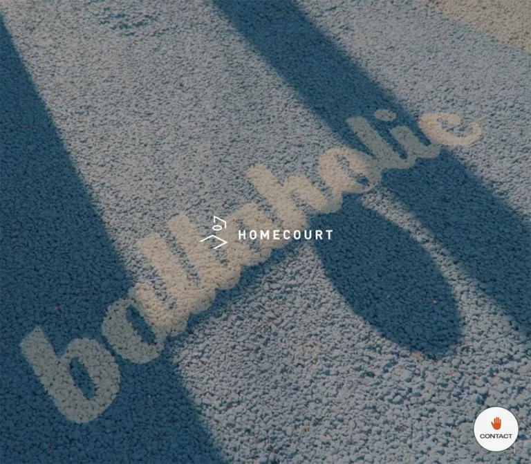
DESIGN REFERENCE
バスケットボールの実写表現とワイドな欧文書体が印象的なサービスサイト。グレーの背景、グリーンの相談導線、大きなワードマークを軸に、施工事例や関連サービスを紹介しています。
オリジナルサイトを見るBasketball at home, expressed through documentary imagery, wide lettering, and generous architectural space.
Website: www.home-court.jp
Original URL: https://www.home-court.jp/
Final URL: https://www.home-court.jp/
Theme: light content surfaces, darkened photographic opening, green consulting section
Inspected: September 22, 2026; supplied retrieval timestamp 2026-09-22T13:55:19.129Z, equivalent to 22:55:19 JST
Viewports: desktop 1440 × 1000 and mobile 390 × 844 CSS pixels
Scope: the current homepage. Visual evidence covers the desktop and mobile opening, a desktop intermediate image-and-brand-band transition, and desktop/mobile consulting and footer regions. Rendered DOM and computed styles additionally document GOAL, COURT, RENTAL, CASE, NEWS, PLAY & STAY, navigation, and contact controls. Linked pages and opened overlay states were not inspected.
HOMECOURT is a service and brand website for basketball goal installation, court construction, and equipment rental. Its homepage connects those services to installation examples, news, and a basketball-oriented accommodation project. The design uses a long editorial sequence rather than a compact collection of interchangeable cards.
The visual identity comes from three relationships: intimate basketball imagery against expansive neutral surfaces; wide English lettering against small Japanese explanatory copy; and restrained navigation against oversized brand graphics. Concrete, asphalt, fencing, residential architecture, players, and hoops provide the texture. Gray #dadada supports the service content, green #33846b anchors consulting, and pale orange #fcaa62 gives the oversized brand band its emphasis. Rounded shapes are reserved mainly for contact and archive controls.
Basketball at home, expressed through documentary imagery, wide lettering, and generous architectural space.
Website: www.home-court.jp
Original URL: https://www.home-court.jp/
Final URL: https://www.home-court.jp/
Theme: light content surfaces, darkened photographic opening, green consulting section
Inspected: September 22, 2026; supplied retrieval timestamp 2026-09-22T13:55:19.129Z, equivalent to 22:55:19 JST
Viewports: desktop 1440 × 1000 and mobile 390 × 844 CSS pixels
Scope: the current homepage. Visual evidence covers the desktop and mobile opening, a desktop intermediate image-and-brand-band transition, and desktop/mobile consulting and footer regions. Rendered DOM and computed styles additionally document GOAL, COURT, RENTAL, CASE, NEWS, PLAY & STAY, navigation, and contact controls. Linked pages and opened overlay states were not inspected.
HOMECOURT is a service and brand website for basketball goal installation, court construction, and equipment rental. Its homepage connects those services to installation examples, news, and a basketball-oriented accommodation project. The design uses a long editorial sequence rather than a compact collection of interchangeable cards.
The visual identity comes from three relationships: intimate basketball imagery against expansive neutral surfaces; wide English lettering against small Japanese explanatory copy; and restrained navigation against oversized brand graphics. Concrete, asphalt, fencing, residential architecture, players, and hoops provide the texture. Gray #dadada supports the service content, green #33846b anchors consulting, and pale orange #fcaa62 gives the oversized brand band its emphasis. Rounded shapes are reserved mainly for contact and archive controls.
8vw at both inspected widths; the original CSS expression itself was not supplied.--hc-* tokens below are new descriptive aliases. The supplied custom properties do not expose a named HOMECOURT design-token system.| Name | Value | Suggested token | Evidence and role |
|---|---|---|---|
| Service Gray | #dadada |
--hc-gray |
Measured rgb(218, 218, 218) on the combined GOAL/COURT region, RENTAL, and CASE |
| Court Green | #33846b |
--hc-green |
Measured consulting background, rental detail link, and case numbers |
| Brand Peach | #fcaa62 |
--hc-peach |
Measured oversized HOMECOURT by ballaholic lettering |
| Contact Clay | #c85729 |
--hc-clay |
Measured contact-panel heading and channel-button backgrounds; the visible hand symbol has a related orange appearance |
| Control Paper | #f4f4f4 |
--hc-paper |
Measured circular CONTACT button background and offscreen menu text |
| White | #ffffff |
--hc-white |
Measured reversed service, case-detail, and consulting text; visually the footer canvas is white |
| Body Ink | #333333 |
--hc-ink |
Measured body text, ordinary headings, and news titles |
| Navigation Black | #000000 |
--hc-black |
Measured header and footer navigation; visible black brand graphics |
| Date Gray | #868788 |
--hc-muted |
Measured NEWS dates |
| News Blue | #316092 |
--hc-news-blue |
Measured small news-category label お知らせ |
The footer and body have transparent computed backgrounds in the supplied sample. Their visible white canvas is not evidence of an explicit white declaration on those elements. Use white as the semantic canvas in a new implementation, while retaining this distinction in any source reconstruction.
Gray occupies the long service and case-study portions. Green appears as a substantial destination surface at CONSULTING and as a smaller directional accent elsewhere. Peach belongs to the oversized brand statement. Clay belongs to contact utilities. The blue news label is a minor information color, not the primary action color.
The opening has a muted, dark photographic appearance. Its exact overlay opacity, color grading, and compositing method were not supplied. Do not turn colors present in the footage-like imagery into additional interface tokens.
No theme selector or alternative palette was evidenced. Generic --tw-* ring and effect defaults in the DOM are not proof of corresponding visible treatments.
Computed family: roc-grotesk-wide, sans-serif.
The wide letterforms give short words such as GOAL, COURT, CASE, and NEWS considerable horizontal presence. Main section headings generally use weight 400; compact header navigation uses 500; footer and offscreen menu links use 700.
Use width and scale to create emphasis before adding weight. Most large English headings are not heavy black display type. Footer navigation is deliberately bolder than the large brand lettering around it.
Computed first-choice family: Noto Sans JP.
The supplied fallback chain includes Apple system fonts, Helvetica Neue, Yu Gothic, Hiragino, Arial, and Meiryo. The Quick Start abbreviates that chain and does not load font files.
Service descriptions use unusually generous leading: 2.4 on both desktop and mobile. Consulting uses 2.2, and PLAY & STAY uses 2.1. News and mobile case titles are tighter, allowing utility content to remain compact.
The centered opening identity is an angular line symbol beside a tracked HOMECOURT wordmark. Its graphic treatment should be preserved as artwork when authorized assets are available.
The opening H1 has empty extracted text and a measured graphic container. The footer signoff also appears as artwork inside a large link. Neither measurement establishes a CSS font size or proves that the artwork uses the English display font.
Values below are measured computed sizes and line heights, not estimates from letter outlines.
| Role | Desktop size / line height | Mobile size / line height | Weight and notes |
|---|---|---|---|
| Body baseline | 16 / 24px |
16 / 24px |
400, Japanese stack |
| Header navigation | 12 / 12px |
Not visibly exposed | 500, wide family, 0.12px tracking |
| Offscreen menu links | 24 / 24px |
18 / 18px |
700, 0.04em tracking; opened state unverified |
| GOAL and COURT copy | 17 / 40.8px |
14 / 33.6px |
400, white |
Service view more text |
16 / 28.8px |
14 / 25.2px |
400, wide family |
| Brand-band lettering | 115.2 / 172.8px |
31.2 / 46.8px |
400, peach; consistent with 8vw / 1.5 |
| CASE heading | 60 / 90px |
38.5 / 57.75px |
400, wide family |
| CASE introduction | 16 / 24px |
14 / 22.75px |
400, tracking -0.03em |
| Case number | 26 / 39px |
16 / 24px |
400, green |
| Case title | 20 / 44px |
14 / 23.8px |
Desktop white at 400; mobile dark at 500 |
| Desktop case fact label | 12 / 12px |
Not in visible mobile fact layout | 500, wide family, 2px top padding |
| Desktop case fact value | 13 / 13px |
Not in visible mobile fact layout | 500, Japanese stack |
| NEWS heading | 36 / 54px |
32 / 48px |
400, wide family |
| News date | 14 / 21px |
13 / 19.5px |
400, muted gray |
| News category | 12 / 18px |
12 / 18px |
400, blue |
| News title | 14 / 25.2px |
14 / 25.2px |
500 |
| PLAY & STAY heading | 36 / 36px |
32 / 32px |
400, wide family |
| PLAY & STAY body | 15 / 31.5px |
14 / 29.4px |
400 |
| CONSULTING heading | 32 / 48px |
30 / 45px |
400, wide family |
| CONSULTING body | 16 / 35.2px |
14 / 30.8px |
400, white |
| Footer navigation | 14 / 21px |
14 / 21px |
700, 0.56px tracking |
| Floating CONTACT caption | 11 / 11px |
10 / 10px |
500, wide family |
| Contact-panel body | 12 / 19.5px |
12 / 19.5px |
500; panel activation unverified |
The GOAL and COURT H2 wrappers inherit 16px, but their tall bounding boxes contain a larger display assembly whose child styling was not included. Do not interpret the wrapper's inherited size as the visible title size.
Similarly, the mobile GOAL link wrapper reports 4.875px, while its actual view more paragraph reports 14px. Use the visible text descendant when extracting a typography token.
Layout character: broad image fields, narrow reading columns, substantial vertical breathing room, and compact utility controls.
There is no evidence of one universal spacing unit. Desktop sections use different gutters according to their role, and mobile preserves that distinction.
| Use | Desktop | Mobile | Evidence |
|---|---|---|---|
| Header logo inset | 40px left, 28px top |
16px left, 20px top |
Measured rectangles |
| Primary navigation gap | 24px |
Navigation absent from visible header | Calculated between link rectangles |
| RENTAL padding | 120px 100px 140px |
80px 16px 40px |
Computed CSS |
| CASE section left inset | 112px |
46.8px on both sides |
Computed CSS; mobile equivalent is approximately 12vw |
| CASE section top padding | 120.096px |
80px |
Computed CSS |
| Desktop case detail inset | 46px |
Different content arrangement | Calculated from parent and title rectangles |
| Mobile case-to-case gap | Not applicable to horizontal row | 64px |
Calculated between link rectangles |
| NEWS content width | 1000px |
312px |
Calculated from section contents; mobile equals 80vw |
| NEWS row padding | 50px 70px 50px 30px |
28px 18.96px 28px 8.125px |
Computed CSS |
| CONSULTING vertical padding | 160px 0 |
80px 0 48px |
Computed CSS; total section envelope includes additional layout space |
| Footer outer padding | 0 36px 36px |
0 12px 36px |
Computed CSS |
| Footer navigation column gap | 28px |
16px |
Calculated |
| Footer navigation row gap | 16px |
12px |
Calculated from 21px link boxes |
| Mobile partner-logo gap | Horizontal desktop arrangement | 20px vertically |
Calculated between logo rectangles |
| Floating contact edge inset | 24px right and bottom |
24px right and bottom |
Calculated |
| Element | Treatment | Evidence |
|---|---|---|
| Image and case containers | Square corners, 0px radius on sampled links |
Measured; image corner appearance also consistent with captures |
| Floating CONTACT control | Circle, source radius 9999px |
Measured |
Archive view all controls |
Pill, source radius 9999px |
Measured |
| Contact channel buttons | 4px radius |
Measured in panel descendants |
| Header CONTACT outline | Thin rounded capsule, approximately 103 × 32px |
Visual estimate; the enclosing control was not separately sampled |
| Menu lines and separator | Fine black strokes | Visually observed; exact stroke width not supplied |
The design does not exhibit a general rounded-card or shadow-elevation system. Any divider or shadow not explicitly documented below is an implementation choice.
| Element | Desktop | Mobile |
|---|---|---|
| Document height | 13913.42px |
9138.61px |
| Opening section envelope | 2343.38px |
1788.13px |
| Centered opening H1 box | 265 × 65.83px |
200 × 46.70px, including 12px right padding |
| Header logo box | 130 × 32.25px |
120 × 29.77px |
| Combined GOAL/COURT section | 3670px high |
2574px high |
| RENTAL section | 1107px high |
539.11px high |
| Individual desktop case link | 480 × 480px |
Mobile links are approximately 296.41px wide and 395.5–419.3px high |
| CONSULTING section | 390.41px high |
333.39px high |
| Footer | 711.34px high |
547.47px high |
| Footer signoff link | 1368 × 173.59px |
366 × 55.17px |
| Floating CONTACT | 90 × 90px |
75 × 75px |
These are recorded envelopes, not target fixed heights. The opening extends beyond the first viewport, and the desktop case region is followed by substantial document distance before NEWS. The evidence does not establish how much of that distance belongs to scroll staging, transforms, or unsampled content. Do not reproduce it as arbitrary blank space.
Role: establish the basketball setting and brand before the denser service content.
The desktop capture fills the viewport with a darkened residential basketball scene: a perforated backboard, net, nearby buildings, and fencing. The mobile capture uses an intimate ground-level view of a shoe and asphalt. Both place the white brand graphic at the center.
The desktop H1 box is centered at (720, 500). The mobile box is centered at (195, 422), with internal right padding that slightly affects the graphic's apparent alignment. These are viewport-centered measurements, not a top-of-page marketing headline position.
A slender vertical line and small orange dot appear near the lower-right edge. Their function is unverified; the captures do not establish whether they indicate scroll, playback, or another state.
The opening has no visible header navigation or circular contact control in the supplied initial captures, despite those elements having DOM geometry. Do not assume every measured control is visible over this state. The record also does not establish that this is a blocking loading screen or a timed splash.
Role: identity, direct service navigation, and access to broader navigation and contact.
In the scrolled desktop captures, the small black logo sits at the upper left. The upper-right group contains GOAL, COURT, RENTAL, an outlined CONTACT capsule, a vertical separator, and MENU with a two-line symbol. The header has no visible solid background strip, border, or shadow.
The logo remains 130px wide on desktop and 120px on mobile. The reduction is modest: mobile removes navigation density instead of shrinking the entire identity.
At 390px, the visible header consists of the logo and the two-line menu symbol. The button's DOM text contains MENU, but the word is not visible in the mobile capture. Its measured box is 36 × 24px at (330, 24).
The repeated viewport-edge placement in the scrolled captures supports a persistent overlay treatment. The exact CSS positioning and visibility trigger were not supplied.
Role: access to TOP, GOAL, COURT, RENTAL, CASE, FAQ, NEWS, and contact channels.
The DOM includes a second navigation group positioned beyond the right viewport edge. Desktop link text uses 24px, weight 700, with 0.96px tracking; mobile uses 18px with 0.72px tracking. Both use pale #f4f4f4 text.
The markup also includes contact links, a close control, and an OUTNUMBER copyright link. This establishes content and text styling, but not the opened panel's background, width, animation, keyboard behavior, or focus handling.
Role: explain the installation services through short, spacious Japanese copy and distinct display-title assemblies.
The two services share the measured gray section surface. Their title wrappers occupy opposite sides of the desktop layout: GOAL near x=90, COURT near x=1166. The wrappers are tall and narrow, approximately 170px wide, suggesting separately styled or transformed lettering. Rotation and child font sizes are not included in the evidence.
Desktop GOAL copy occupies a 255px column beginning near x=376; COURT uses a 272px column near x=761. Both have white 17px text with 40.8px leading and a wide-family view more link.
Mobile retains asymmetry. GOAL copy is 210px wide at x=156, leaving only 24px to the right edge. COURT copy is 224px wide at approximately x=59.5. Both change to 14px / 33.6px.
The sampled text layers are white, but their complete image and overlay arrangement is not visible in the supplied captures. In a reuse, position white copy over sufficiently dark media rather than directly on the light-gray canvas.
Role: introduce portable goal rental for events.
Desktop RENTAL uses 100px horizontal gutters with 120px top and 140px bottom padding. Its heading assembly is a two-column grid: 423px 324px with a 30px gap. A separate green view more link sits toward the right edge.
At mobile width, the heading assembly becomes one 358px column inside 16px gutters, followed by a full-width link row. Padding becomes 80px 16px 40px.
The intermediate desktop capture shows a large basketball photograph aligned from approximately x=100 to x=1340, followed by a 140px gray lower margin. The image shows blue sky, raised arms, a ball, and an orange rim. Its top is cropped by the viewport; the visible 523px portion is not the complete image height.
Role: provide a large-scale brand statement between service content and case studies.
A dark photographic field carries peach HOMECOURT by ballaholic lettering. The text is oversized and visibly clipped by the viewport edges. Two copies occur in the rendered text.
Measured sizes are 115.2px at 1440px and 31.2px at 390px, exactly consistent with 8vw. Both use line height 1.5. This is a strong reusable proportional rule, although its original declaration was not supplied.
The duplicate text and overflow support a marquee-style composition. They do not prove continuous movement, direction, speed, or scroll linkage.
Role: present installation examples as substantial visual projects with structured facts.
The CASE heading is 60px, with a Japanese introduction beside it. The rendered evidence contains five case links in one horizontal sequence. Every link measures 480 × 480px; consecutive x positions differ by 480px, indicating no measured gap between these link boxes.
The first recorded link begins near x=490.72, and later links extend beyond the viewport. This demonstrates horizontal arrangement, but the particular starting position may include a transform or current scroll state. It should not become a hardcoded initial offset.
Each link contains a number, title, detail labels, values, and view more content. Desktop title and fact text are white. The title starts 46px inside the square and spans 388px. Fact rows use a 96px English label column for PLACE, AREA, PRICE, and PRODUCT, followed by compact Japanese or numeric values. Product lists have variable height.
The DOM documents this detail layer, but no supplied screenshot demonstrates its visible resting or hover state. Do not claim a hover reveal, flip, zoom, or drag interaction.
Role: preserve the projects in a readable vertical sequence.
The mobile rendered evidence exposes three case links. They are stacked at x≈46.8, each approximately 296.4px wide, with 64px gaps. Their varying heights show that the entire mobile link is not a square.
Mobile text includes product descriptors and dark Japanese titles. PLACE, AREA, and PRICE are not exposed in the visible mobile text snapshot. The title changes to 14px / 23.8px, weight 500, rather than retaining the desktop white 20px overlay typography.
Case numbers move from the desktop square's lower edge to near the mobile link's top. A centered pill-shaped view all follows the third item and links to the case archive.
The mobile image rectangles and product-label styling were not separately sampled. A square image above the text is a reasonable implementation recommendation, not an additional measured value.
Role: maintain a concise, current content index without competing with the photographic sections.
Desktop NEWS uses a centered 1000px content region. The heading and archive link occupy the left column; the three news links occupy a 721.72px right column. The gap between the heading's measured width and the list is 140px.
Each row combines a muted date, a small blue category, and a dark Japanese title. Rows have generous 50px vertical padding. Their square geometry and restrained type provide structure without a card container. Exact divider styling was not included in the sampled properties.
At mobile width, the section becomes one 312px column at x=39. NEWS precedes the rows, and view all follows them. Row padding reduces to 28px vertically. The three visible entries are dated 2025.11.01, 2024.04.24, and 2024.01.19; these are content dates, not inspection dates.
Role: keep inquiry access compact and recognizable.
The visible desktop control is a 90px circle with a pale #f4f4f4 background, an orange hand symbol, and an 11px CONTACT caption. It sits 24px from the right and bottom edges. The mobile DOM specifies a 75px circle with a 10px caption and the same edge insets.
The control appears in the intermediate desktop capture. It is not visible in the supplied initial or footer captures, so its visibility conditions remain unverified.
Associated panel descendants contain a clay CONTACT heading, a short Japanese explanation, and two channel links: お問い合わせ(LINE) and お問い合わせ(Webフォーム). The measured channel buttons are 100 × 40px on desktop and 90 × 40px on mobile, with a 4px gap and 4px radius.
The hrefs point to LINE and a hosted web form. Their presence is verified; panel opening, dismissal, external navigation behavior, and form completion were not tested.
Role: connect the installed-court service to an accommodation experience.
Desktop text occupies a narrow 303.09px region near the right side of the page, at x≈1018.45. Japanese paragraphs use 15px / 31.5px. In the recorded geometry, the PLAY & STAY heading follows the paragraphs, with a view more link below it.
Mobile reorders the visible layout: the 32px heading appears above the paragraphs. The content is approximately 282.89px wide and centered with 53.55px side insets. Body text becomes 14px / 29.4px.
The homepage href leads to https://playandstay.jp/. That destination and this feature's complete imagery were not inspected.
Role: introduce support for organizations and local governments.
This is a full-width #33846b surface with white text. Desktop places CONSULTING at approximately x=210 and a two-line Japanese explanation at x≈579.59, in a 528px text column. The heading is 32px; the body is 16px / 35.2px.
Mobile changes to a 310px block inside 40px side gutters. The 30px heading is visually centered, while the three-line paragraph remains left aligned. The measured gap between heading and paragraph is 32px.
The whole content block is an anchor whose supplied href is the homepage itself. Do not substitute an assumed consulting form route or claim a modal action.
Both final captures begin partway through this section. The visible green area is approximately 289px on desktop and 296px on mobile, but the complete measured sections are 390.41px and 333.39px respectively.
Role: present company information, site navigation, related brands, and a final identity statement.
The white footer begins with three compact lines for the company, address, and construction license. The inspected page explicitly names 株式会社アウトナンバー and contains an OUTNUMBER link. This supports the operator identity; it does not establish a website production credit.
Desktop navigation occupies two small columns on the left. Six brand marks form a horizontal group on the right: ballaholic, SOMECITY, PLAYGROUND GAMES, Asphalt Roots, PLAY & STAY, and Hub FUKUOKA. These are outbound brand links, not a production-credit list.
On mobile, the two navigation columns remain side by side at the left, while the six logos become a vertical stack at the right. Their widths stay unchanged between the sampled viewports: 74, 63, 80, 59, 40, and 45px. Responsive adaptation changes arrangement rather than shrinking every logo.
The footer ends with a nearly edge-to-edge HOMECOURT wordmark and small copyright detail. The desktop signoff link has 36px side insets and a 1368 × 173.59px box. Mobile uses 12px insets and a 366 × 55.17px box. These boxes include the signoff composition; they are not font-size measurements.
The copyright detail is visually right aligned on desktop and left aligned on mobile. Preserve the fine, open letterforms of the large wordmark rather than applying the bold footer-navigation style to it.
No reliable source durations, easing curves, media attributes, or exercised hover transitions were supplied.
| Treatment | Evidence | Limit or reuse guidance |
|---|---|---|
| Film-like opening imagery | Different current captures show basketball-related scenes | Media format, looping, autoplay, sound, and playback controls are unverified |
| Header and contact visibility | Absent in the initial captures; header visible in scrolled captures; contact visible in the intermediate desktop capture | Trigger and transition timing are unknown |
| Lower-right line and dot | Visible in initial desktop and mobile captures | Do not assign seek or scroll-progress behavior without additional evidence |
| Repeated brand lettering | Two text copies, oversized type, horizontal clipping | Marquee-style appearance is verified; motion is not |
| Desktop case progression | Five adjacent squares extend beyond the viewport | Horizontal layout is measured; dragging, scroll mapping, snapping, and pinning are unverified |
| Menu | Offscreen links and close-control geometry | Opened appearance and interaction were not exercised |
| Contact panel | Channel links and panel descendants have computed styles | Opening and dismissal were not exercised |
| Sampled animation properties | Elements report animation: none and a transition field of all |
No usable duration is supplied; these values do not rule out JavaScript or media motion |
The capture process waited for document load, finite motion, image decoding, and sampled layout stability, with bounded waits. Perpetual animations were temporarily paused during readiness checks and resumed. This helps explain the capture procedure, but does not provide a motion recording or prove that all delayed states were revealed.
Recommended adaptation: begin with a complete static layout. If motion is added, use a short 180ms opacity or color transition for utilities, provide a static brand band under reduced motion, and make every case reachable without scroll-driven animation. These values and behaviors are recommendations, not recovered source tokens.
| Layer | Appearance | Purpose |
|---|---|---|
| Opening media | Darkened, muted real-world basketball imagery | Establish atmosphere around the centered white identity |
| Service canvas | Flat #dadada |
Connect the long service and case sequence |
| Large image field | Square corners, no visible frame or elevation | Let courts, players, architecture, and sky carry visual density |
| Brand band | Dark photographic field with peach lettering | Create a large-scale punctuation point |
| Consulting | Solid #33846b, white text |
Distinguish institutional support from product storytelling |
| Footer | Visually white, black text and logos | Present navigation and company detail with ample separation |
| Contact utility | Pale circle; clay accents in associated panel content | Keep inquiry access visible without a large banner |
The supplied captures do not establish a glass, gradient, or shadow-based surface hierarchy. Structure comes from scale, image boundaries, color fields, spacing, and a few outlined controls.
The photographs feel close to everyday basketball: a hoop beside a home, a shoe on textured asphalt, hands reaching toward a ball, and outdoor play near dense greenery. Residential materials and human movement make the service tangible.
The desktop intermediate image uses open blue sky as negative space, with bodies entering from below and the rim occupying the upper-right area. The opening instead uses darker, denser compositions behind a centered white mark. Maintain those different exposure roles; applying the same dark treatment to every photograph would flatten the page.
No original image URLs, video URLs, SVG paths, or font-file paths were included in the supplied evidence. The following is an asset inventory, not a filename manifest.
| Visible asset | Evidence | Reuse guidance |
|---|---|---|
| White opening brand graphic | Desktop and mobile opening captures | Preserve the angular symbol and compact tracked wordmark as authorized artwork |
| Black compact brand graphic | Scrolled desktop and mobile captures | Use the small horizontal lockup at the measured header widths |
| Residential hoop scene | Desktop opening | Preserve fencing, backboard texture, and architecture in the crop |
| Shoe and asphalt scene | Mobile opening | Preserve the close viewpoint and surface texture; its relation to the desktop media is unverified |
| Basketball action under blue sky | Desktop intermediate capture | Keep a broad landscape composition and the rim/ball relationship |
| Outdoor player amid greenery | Lower part of desktop intermediate capture | Supports the dark brand-band composition |
| Orange hand symbol | Visible floating CONTACT control | Use the original symbol if available; no icon library was identified |
| Six related-brand marks | Desktop and mobile footer | Keep individual proportions and optical size differences |
| Large HOMECOURT signoff | Desktop and mobile footer | Treat as artwork; do not infer a font from its enclosing link box |
Use real project photography for installation examples. Exact source assets should be supplied through an authorized asset pipeline; no invented /assets/ or media paths are necessary to implement the CSS shell.
The design changes composition between the two inspected widths. It is not a uniformly scaled desktop page.
| Area | Desktop observation | Mobile observation |
|---|---|---|
| Opening identity | 265px graphic container centered in the first viewport |
200px container, also viewport centered |
| Header | Logo, three services, contact capsule, separator, MENU | Logo and menu symbol |
| GOAL/COURT copy | Narrow columns at different desktop positions | Narrow columns retain different horizontal offsets |
| RENTAL heading | Two-column heading assembly with separate right-side detail link | Single-column assembly and full-width link row |
| Brand type | 115.2px |
31.2px; both consistent with 8vw |
| CASE | Five 480px square links in a horizontal sequence |
Three vertically stacked links, dark titles, product descriptors, archive pill |
| NEWS | Left heading/archive column and right list | Heading, list, then centered archive action |
| PLAY & STAY | Paragraphs above the heading in sampled geometry | Heading above paragraphs |
| CONSULTING | Side-by-side heading and explanation | Centered heading above left-aligned copy |
| Footer brands | Horizontal row | Vertical stack beside the two navigation columns |
| Signoff | 36px side insets |
12px side insets |
Several mobile gutters coexist: 16px for the header logo and RENTAL, 39–40px for NEWS and CONSULTING, 46.8px for CASE, and approximately 53.5px for PLAY & STAY. Preserve this hierarchy instead of forcing every section into one container width.
Only 1440px and 390px widths were inspected. Intermediate breakpoints, landscape layouts, browser safe-area behavior, and font fallback reflow remain unverified. The Quick Start uses a recommended 768px breakpoint and content-driven heights.
16px as the visible GOAL or COURT display size.These recommendations are not verified original-site features:
44px or larger interaction targets. The measured mobile menu box is smaller than this recommendation.#dadada.#33846b.#fcaa62.#c85729.#f4f4f4.#333333; navigation and footer graphics: black.#868788, category #316092.“Create a basketball installation service homepage inspired by the inspected HOMECOURT design. Begin with a full-viewport, darkened documentary basketball image and a small centered white graphic identity. Use a persistent compact header in scrolled content, wide English sans-serif headings, and narrow Japanese reading columns with generous leading. Build long gray service sections, a broad rental photograph, a dark image band with oversized peach brand lettering, a desktop horizontal case sequence, a restrained news list, a green consulting band, and a white footer with small navigation and a nearly full-width brand graphic. At mobile width, reduce header navigation, stack three case previews, move news archive access below the list, and place partner logos in a vertical column beside the footer links. Use the supplied measurements; label any proposed motion or missing asset treatment as an adaptation.”
This is a reusable CSS adaptation, not the recovered stylesheet. It preserves the measured palette and major component proportions. The 768px breakpoint, photographic scrims, ordinary horizontal overflow, focus styling, and 180ms utility transition are recommendations.
The starter deliberately uses content-driven section heights. It does not recreate unknown scroll staging, a menu animation, contact-panel activation, or media playback. Supply authorized graphics and font files separately. Use a hidden attribute under application control when reproducing the opening-versus-scrolled chrome states; the original trigger was not observed.
Class anatomy: .hc-hero contains media and a graphic H1; .hc-case-list contains linked .hc-case-card elements with an image, number, and .hc-case-copy; .hc-news contains heading, list, and archive action; .hc-footer-body contains two navigation groups and related-brand links. The footer signoff is treated as supplied artwork.
:root {
  /* Measured palette, expressed as new aliases. */
  --hc-gray: #dadada;
  --hc-green: #33846b;
  --hc-peach: #fcaa62;
  --hc-clay: #c85729;
  --hc-paper: #f4f4f4;
  --hc-white: #ffffff;
  --hc-ink: #333333;
  --hc-black: #000000;
  --hc-muted: #868788;
  --hc-news-blue: #316092;

  /* Computed family names; font files are not bundled. */
  --hc-font-wide: roc-grotesk-wide, sans-serif;
  --hc-font-body: 'Noto Sans JP', -apple-system,
    'Helvetica Neue', 'Yu Gothic', Arial, sans-serif;

  --hc-header-x: 40px;
  --hc-header-y: 28px;
  --hc-rental-x: 100px;
  --hc-case-x: 112px;
  --hc-footer-x: 36px;
  --hc-contact-size: 90px;
  --hc-service-size: 17px;
  --hc-more-size: 16px;

  /* Recommended additions, not measured source tokens. */
  --hc-rule: rgb(51 51 51 / 25%);
  --hc-ui-motion: 180ms ease-out;
}

.hc-page,
.hc-page * {
  box-sizing: border-box;
}

.hc-page {
  margin: 0;
  color: var(--hc-ink);
  background: var(--hc-white);
  font: 400 16px/1.5 var(--hc-font-body);
}

.hc-page img,
.hc-page video {
  display: block;
  max-width: 100%;
}

.hc-page [hidden] {
  display: none !important;
}

.hc-page :focus-visible {
  outline: 2px solid currentColor;
  outline-offset: 4px;
}

.hc-header {
  position: fixed;
  z-index: 30;
  inset: 0 0 auto;
  display: flex;
  align-items: center;
  justify-content: space-between;
  padding: var(--hc-header-y) var(--hc-header-x);
  color: var(--hc-black);
}

.hc-header-logo {
  display: block;
  width: 130px;
}

.hc-header-right,
.hc-primary-nav {
  display: flex;
  align-items: center;
}

.hc-header-right { gap: 36px; }
.hc-primary-nav { gap: 24px; }

.hc-primary-nav a,
.hc-menu {
  color: inherit;
  font: 500 12px/1 var(--hc-font-wide);
  text-decoration: none;
}

.hc-primary-nav a { letter-spacing: 0.01em; }

.hc-pill {
  display: inline-flex;
  align-items: center;
  justify-content: center;
  padding: 8px 16px;
  border: 1px solid currentColor;
  border-radius: 9999px;
  color: inherit;
  background: transparent;
  text-decoration: none;
}

.hc-menu {
  position: relative;
  display: flex;
  align-items: center;
  gap: 12px;
  min-height: 24px;
  padding: 0 0 0 36px;
  border: 0;
  border-left: 1px solid currentColor;
  background: transparent;
  cursor: pointer;
}

.hc-menu-lines {
  position: relative;
  display: block;
  width: 24px;
  height: 8px;
  border-top: 1px solid currentColor;
}

.hc-menu-lines::after {
  position: absolute;
  top: 6px;
  left: 0;
  width: 12px;
  border-top: 1px solid currentColor;
  content: '';
}

/* The first viewport only; extra source staging is unverified. */
.hc-hero {
  position: relative;
  height: 100vh;
  height: 100svh;
  overflow: hidden;
  background: var(--hc-ink);
}

.hc-hero-media,
.hc-band-media {
  position: absolute;
  inset: 0;
  width: 100%;
  height: 100%;
  object-fit: cover;
}

/* Recommended exposure treatment, not measured opacity. */
.hc-hero::after,
.hc-brand-band::before {
  position: absolute;
  inset: 0;
  background: rgb(0 0 0 / 35%);
  content: '';
  pointer-events: none;
}

.hc-hero-logo {
  position: absolute;
  z-index: 1;
  top: 50%;
  left: 50%;
  width: 265px;
  margin: 0;
  transform: translate(-50%, -50%);
}

.hc-hero-logo img { width: 100%; }
.hc-service-surface { background: var(--hc-gray); }

.hc-service-copy {
  max-width: 272px;
  color: var(--hc-white);
  font-size: var(--hc-service-size);
  line-height: 2.4;
}

.hc-service-copy--goal { max-width: 255px; }

.hc-more {
  display: flex;
  align-items: center;
  justify-content: space-between;
  color: inherit;
  font: 400 var(--hc-more-size)/1.8 var(--hc-font-wide);
  text-decoration: none;
}

.hc-rental {
  padding: 120px var(--hc-rental-x) 140px;
  background: var(--hc-gray);
}

.hc-rental-heading {
  display: grid;
  grid-template-columns: 423px 324px;
  column-gap: 30px;
}

.hc-rental .hc-more { color: var(--hc-green); }
.hc-rental-image { width: 100%; }

/* Static by default; no source marquee timing was supplied. */
.hc-brand-band {
  position: relative;
  display: flex;
  align-items: center;
  justify-content: center;
  min-height: clamp(229px, 33.333vw, 480px);
  overflow: hidden;
  background: var(--hc-ink);
}

.hc-brand-band p {
  position: relative;
  flex: none;
  width: max-content;
  margin: 0;
  color: var(--hc-peach);
  font: 400 8vw/1.5 var(--hc-font-wide);
  white-space: nowrap;
}

.hc-case {
  padding-block: 120.1px 160px;
  background: var(--hc-gray);
}

.hc-case-heading {
  display: flex;
  align-items: center;
  gap: 36px;
  padding-inline: var(--hc-case-x);
}

.hc-case-heading h2 {
  margin: 0;
  font: 400 60px/1.5 var(--hc-font-wide);
}

.hc-case-heading p { letter-spacing: -0.03em; }

/* Accessible overflow is an adaptation of the measured row. */
.hc-case-list {
  display: flex;
  gap: 0;
  margin-top: 64px;
  padding-inline: var(--hc-case-x);
  overflow-x: auto;
}

.hc-case-card {
  position: relative;
  flex: 0 0 480px;
  width: 480px;
  min-height: 480px;
  color: var(--hc-ink);
  border-radius: 0;
  text-decoration: none;
}

.hc-case-card > img {
  width: 100%;
  aspect-ratio: 1;
  object-fit: cover;
}

/* Always-readable details; original reveal behavior is unknown. */
.hc-case-copy {
  position: absolute;
  inset: 0;
  display: flex;
  flex-direction: column;
  justify-content: space-between;
  padding: 46px;
  color: var(--hc-white);
  background: rgb(0 0 0 / 45%);
}

.hc-case-title {
  margin: 0;
  font: 400 20px/2.2 var(--hc-font-body);
}

.hc-case-facts {
  display: grid;
  grid-template-columns: 96px minmax(0, 1fr);
  gap: 16px 0;
  margin: 28px 0 0;
  font-size: 13px;
  line-height: 1.5;
}

.hc-case-facts dt {
  padding-top: 2px;
  font: 500 12px/1 var(--hc-font-wide);
}

.hc-case-facts dd { margin: 0; }

.hc-case-number {
  position: absolute;
  z-index: 1;
  bottom: 0;
  left: 0;
  color: var(--hc-green);
  font: 400 26px/1.5 var(--hc-font-wide);
}

.hc-case-products { display: none; }

.hc-news {
  display: grid;
  grid-template-columns: 138.28px minmax(0, 1fr);
  grid-template-areas: 'heading list' 'all list';
  grid-template-rows: auto 1fr;
  gap: 35px 140px;
  width: min(1000px, calc(100% - 80px));
  margin-inline: auto;
}

.hc-news-heading {
  grid-area: heading;
  margin: 0;
  font: 400 36px/1.5 var(--hc-font-wide);
}

.hc-news-list { grid-area: list; }

.hc-news-all {
  grid-area: all;
  align-self: start;
  justify-self: start;
  font: 400 16px/1.5 var(--hc-font-wide);
}

/* Divider color and stroke are recommended. */
.hc-news-row {
  display: block;
  padding: 50px 70px 50px 30px;
  border-top: 1px solid var(--hc-rule);
  color: inherit;
  text-decoration: none;
}

.hc-news-row:last-child {
  border-bottom: 1px solid var(--hc-rule);
}

.hc-news-date {
  color: var(--hc-muted);
  font-size: 14px;
}

.hc-news-category {
  margin-left: 8px;
  color: var(--hc-news-blue);
  font-size: 12px;
}

.hc-news-row h3 {
  margin: 8px 0 0;
  font: 500 14px/1.8 var(--hc-font-body);
}

.hc-contact {
  position: fixed;
  z-index: 40;
  right: 24px;
  bottom: 24px;
  display: flex;
  flex-direction: column;
  align-items: center;
  justify-content: center;
  gap: 8px;
  width: var(--hc-contact-size);
  height: var(--hc-contact-size);
  padding: 0;
  border: 0;
  border-radius: 50%;
  color: var(--hc-ink);
  background: var(--hc-paper);
  font: 500 11px/1 var(--hc-font-wide);
  cursor: pointer;
  transition: color var(--hc-ui-motion);
}

.hc-contact-icon {
  width: 24px;
  color: var(--hc-clay);
}

.hc-consulting {
  padding: 160px 40px;
  color: var(--hc-white);
  background: var(--hc-green);
}

.hc-consulting-inner {
  display: grid;
  grid-template-columns: 247.2px minmax(0, 528px);
  align-items: center;
  column-gap: 122.4px;
  max-width: 1020px;
  margin-inline: auto;
  color: inherit;
  text-decoration: none;
}

.hc-consulting h2 {
  margin: 0;
  font: 400 32px/1.5 var(--hc-font-wide);
}

.hc-consulting p {
  margin: 0;
  font-size: 16px;
  line-height: 2.2;
}

/* Top spacing adapts the visible footer, not source margins. */
.hc-footer {
  padding: 64px var(--hc-footer-x) 36px;
  color: var(--hc-black);
  background: var(--hc-white);
}

.hc-footer-company {
  margin: 0;
  font-size: 12px;
  line-height: 1.8;
}

.hc-footer-body {
  display: flex;
  justify-content: space-between;
  gap: 40px;
  margin-top: 128px;
}

.hc-footer-nav {
  display: grid;
  grid-template-columns: max-content max-content;
  align-items: start;
  gap: 28px;
}

.hc-footer-nav > div {
  display: grid;
  gap: 16px;
}

.hc-footer-nav a {
  color: inherit;
  font: 700 14px/1.5 var(--hc-font-wide);
  letter-spacing: 0.04em;
  text-decoration: none;
}

.hc-partners {
  display: flex;
  align-items: center;
  align-self: start;
  gap: 36px;
}

/* Set --logo-width per asset using the documented widths. */
.hc-partners img {
  width: var(--logo-width, 74px);
  height: auto;
}

.hc-footer-signature {
  display: block;
  margin-top: 112px;
}

.hc-footer-signature img { width: 100%; }

/* Recommended intermediate adaptation; not a source breakpoint. */
@media (min-width: 768px) and (max-width: 1100px) {
  .hc-rental-heading,
  .hc-consulting-inner {
    grid-template-columns: 1fr 1fr;
    column-gap: 40px;
  }

  .hc-footer-body { flex-wrap: wrap; }
  .hc-partners { flex-wrap: wrap; }
  .hc-news { column-gap: 60px; }
}

@media (max-width: 767px) {
  :root {
    --hc-header-x: 16px;
    --hc-header-y: 20px;
    --hc-rental-x: 16px;
    --hc-case-x: 12vw;
    --hc-footer-x: 12px;
    --hc-contact-size: 75px;
    --hc-service-size: 14px;
    --hc-more-size: 14px;
  }

  .hc-header { padding-right: 24px; }
  .hc-header-logo { width: 120px; }
  .hc-primary-nav,
  .hc-menu-label { display: none; }

  .hc-menu {
    width: 36px;
    padding: 0;
    border: 0;
    justify-content: flex-end;
  }

  /* Recommended transparent target enlargement. */
  .hc-menu::after {
    position: absolute;
    inset: -10px -4px;
    content: '';
  }

  .hc-hero-logo {
    width: 200px;
    padding-right: 12px;
  }

  .hc-service-copy { max-width: 224px; }
  .hc-service-copy--goal { max-width: 210px; }
  .hc-rental { padding-block: 80px 40px; }
  .hc-rental-heading { grid-template-columns: minmax(0, 1fr); }

  .hc-case { padding-block: 80px 43.33px; }
  .hc-case-heading { display: block; }
  .hc-case-heading h2 { font-size: 38.5px; }
  .hc-case-heading p { font-size: 14px; line-height: 1.625; }

  .hc-case-list {
    display: grid;
    gap: 64px;
    overflow: visible;
  }

  .hc-case-card {
    width: auto;
    min-height: 0;
  }

  .hc-case-copy {
    position: static;
    display: block;
    margin-top: 20px;
    padding: 0;
    color: var(--hc-ink);
    background: transparent;
  }

  .hc-case-title { font-size: 14px; line-height: 1.7; font-weight: 500; }
  .hc-case-facts { display: none; }
  .hc-case-products { display: block; font-size: 14px; }
  .hc-case-number { top: 10px; bottom: auto; font-size: 16px; }

  .hc-news {
    width: 80vw;
    grid-template-columns: minmax(0, 1fr);
    grid-template-areas: 'heading' 'list' 'all';
    grid-template-rows: auto;
    row-gap: 40px;
  }

  .hc-news-heading { font-size: 32px; }
  .hc-news-row { padding: 28px 18.96px 28px 8.125px; }
  .hc-news-date { font-size: 13px; }
  .hc-news-all { justify-self: center; padding: 6px 24px; line-height: 1.8; }
  .hc-contact { font-size: 10px; }

  .hc-consulting { padding: 80px 40px 48px; }
  .hc-consulting-inner { display: grid; grid-template-columns: 1fr; gap: 32px; }
  .hc-consulting h2 { font-size: 30px; text-align: center; }
  .hc-consulting p { font-size: 14px; }

  .hc-footer { padding-top: 36px; }
  .hc-footer-company { margin-inline: 20px; }
  .hc-footer-body { margin: 64px 20px 0; gap: 24px; }
  .hc-footer-nav { gap: 16px; }
  .hc-footer-nav > div { gap: 12px; }
  .hc-partners { flex-direction: column; gap: 20px; }
  .hc-footer-signature { margin-top: 28px; }
}

@media (prefers-reduced-motion: reduce) {
  .hc-contact { transition: none; }
}
The static case treatment intentionally makes desktop details readable without assuming an original hover trigger. For mobile, populate the preview with the three observed entries, preserve product descriptors separately, and retain archive access to the remaining projects. The CSS does not decide which content belongs in that preview.
Optional aliases for a project already using Tailwind v4. These are an implementation mapping, not evidence of how the original components were authored. Define the custom properties above first.
@theme inline {
  --color-service-gray: var(--hc-gray);
  --color-court-green: var(--hc-green);
  --color-brand-peach: var(--hc-peach);
  --color-contact-clay: var(--hc-clay);
  --color-control-paper: var(--hc-paper);
  --color-body-ink: var(--hc-ink);
  --color-date-gray: var(--hc-muted);
  --color-news-blue: var(--hc-news-blue);

  --font-wide: var(--hc-font-wide);
  --font-body: var(--hc-font-body);

  --text-service: var(--hc-service-size);
  --text-detail-link: var(--hc-more-size);
  --text-brand-band: 8vw;

  --spacing-header-inset: var(--hc-header-x);
  --spacing-case-inset: var(--hc-case-x);
  --spacing-contact: var(--hc-contact-size);

  --radius-contact-action: 4px;
  --radius-pill: 9999px;
}
200; original and final URLs are identical.13:55:19.129 UTC. Individual per-image timestamps were not supplied.1440 × 1000: opening, intermediate photograph/brand-band transition, and consulting/footer.390 × 844: opening and consulting/footer.This reference describes the supplied current homepage evidence. The CSS, accessibility additions, and suggested motion are explicitly reusable adaptations; they do not establish unobserved original behavior.
# HOMECOURT — Style Reference

> Basketball at home, expressed through documentary imagery, wide lettering, and generous architectural space.

**Website:** [www.home-court.jp](https://www.home-court.jp/)
**Original URL:** https://www.home-court.jp/
**Final URL:** https://www.home-court.jp/
**Theme:** light content surfaces, darkened photographic opening, green consulting section
**Inspected:** September 22, 2026; supplied retrieval timestamp `2026-09-22T13:55:19.129Z`, equivalent to 22:55:19 JST
**Viewports:** desktop `1440 × 1000` and mobile `390 × 844` CSS pixels
**Scope:** the current homepage. Visual evidence covers the desktop and mobile opening, a desktop intermediate image-and-brand-band transition, and desktop/mobile consulting and footer regions. Rendered DOM and computed styles additionally document GOAL, COURT, RENTAL, CASE, NEWS, PLAY & STAY, navigation, and contact controls. Linked pages and opened overlay states were not inspected.

HOMECOURT is a service and brand website for basketball goal installation, court construction, and equipment rental. Its homepage connects those services to installation examples, news, and a basketball-oriented accommodation project. The design uses a long editorial sequence rather than a compact collection of interchangeable cards.

The visual identity comes from three relationships: intimate basketball imagery against expansive neutral surfaces; wide English lettering against small Japanese explanatory copy; and restrained navigation against oversized brand graphics. Concrete, asphalt, fencing, residential architecture, players, and hoops provide the texture. Gray `#dadada` supports the service content, green `#33846b` anchors consulting, and pale orange `#fcaa62` gives the oversized brand band its emphasis. Rounded shapes are reserved mainly for contact and archive controls.
# HOMECOURT — Style Reference

> Basketball at home, expressed through documentary imagery, wide lettering, and generous architectural space.

**Website:** [www.home-court.jp](https://www.home-court.jp/)
**Original URL:** https://www.home-court.jp/
**Final URL:** https://www.home-court.jp/
**Theme:** light content surfaces, darkened photographic opening, green consulting section
**Inspected:** September 22, 2026; supplied retrieval timestamp `2026-09-22T13:55:19.129Z`, equivalent to 22:55:19 JST
**Viewports:** desktop `1440 × 1000` and mobile `390 × 844` CSS pixels
**Scope:** the current homepage. Visual evidence covers the desktop and mobile opening, a desktop intermediate image-and-brand-band transition, and desktop/mobile consulting and footer regions. Rendered DOM and computed styles additionally document GOAL, COURT, RENTAL, CASE, NEWS, PLAY & STAY, navigation, and contact controls. Linked pages and opened overlay states were not inspected.

HOMECOURT is a service and brand website for basketball goal installation, court construction, and equipment rental. Its homepage connects those services to installation examples, news, and a basketball-oriented accommodation project. The design uses a long editorial sequence rather than a compact collection of interchangeable cards.

The visual identity comes from three relationships: intimate basketball imagery against expansive neutral surfaces; wide English lettering against small Japanese explanatory copy; and restrained navigation against oversized brand graphics. Concrete, asphalt, fencing, residential architecture, players, and hoops provide the texture. Gray `#dadada` supports the service content, green `#33846b` anchors consulting, and pale orange `#fcaa62` gives the oversized brand band its emphasis. Rounded shapes are reserved mainly for contact and archive controls.

## How to Read This Reference

- **Measured** means supplied computed CSS or rendered element geometry. Values are rounded for readability where appropriate.
- **Calculated** means arithmetic from those measurements. For example, the brand-band font size equals `8vw` at both inspected widths; the original CSS expression itself was not supplied.
- **Visual estimate** means an approximation from the current-page captures. It is not a sampled stylesheet value.
- **Recommended** means an implementation choice for reuse, including the CSS starter, breakpoint, focus treatment, and any proposed motion.
- All `--hc-*` tokens below are new descriptive aliases. The supplied custom properties do not expose a named HOMECOURT design-token system.
- A DOM rectangle does not establish visibility. Offscreen navigation and contact-panel descendants have measurable geometry even though their opened states are absent from the captures.
- Font-family names are verified computed declarations. Font files, licensing configuration, and the actual font used for every glyph were not supplied.
- The screenshots are viewport crops. Their visible section heights must not be mistaken for complete section heights.

## Tokens — Colors

### Default Palette

| Name | Value | Suggested token | Evidence and role |
| --- | --- | --- | --- |
| Service Gray | `#dadada` | `--hc-gray` | Measured `rgb(218, 218, 218)` on the combined GOAL/COURT region, RENTAL, and CASE |
| Court Green | `#33846b` | `--hc-green` | Measured consulting background, rental detail link, and case numbers |
| Brand Peach | `#fcaa62` | `--hc-peach` | Measured oversized `HOMECOURT by ballaholic` lettering |
| Contact Clay | `#c85729` | `--hc-clay` | Measured contact-panel heading and channel-button backgrounds; the visible hand symbol has a related orange appearance |
| Control Paper | `#f4f4f4` | `--hc-paper` | Measured circular CONTACT button background and offscreen menu text |
| White | `#ffffff` | `--hc-white` | Measured reversed service, case-detail, and consulting text; visually the footer canvas is white |
| Body Ink | `#333333` | `--hc-ink` | Measured body text, ordinary headings, and news titles |
| Navigation Black | `#000000` | `--hc-black` | Measured header and footer navigation; visible black brand graphics |
| Date Gray | `#868788` | `--hc-muted` | Measured NEWS dates |
| News Blue | `#316092` | `--hc-news-blue` | Measured small news-category label `お知らせ` |

The footer and body have transparent computed backgrounds in the supplied sample. Their visible white canvas is not evidence of an explicit white declaration on those elements. Use white as the semantic canvas in a new implementation, while retaining this distinction in any source reconstruction.

### Color Distribution

Gray occupies the long service and case-study portions. Green appears as a substantial destination surface at CONSULTING and as a smaller directional accent elsewhere. Peach belongs to the oversized brand statement. Clay belongs to contact utilities. The blue news label is a minor information color, not the primary action color.

The opening has a muted, dark photographic appearance. Its exact overlay opacity, color grading, and compositing method were not supplied. Do not turn colors present in the footage-like imagery into additional interface tokens.

No theme selector or alternative palette was evidenced. Generic `--tw-*` ring and effect defaults in the DOM are not proof of corresponding visible treatments.

## Tokens — Typography

### Wide English Display and Navigation

**Computed family:** `roc-grotesk-wide, sans-serif`.

The wide letterforms give short words such as GOAL, COURT, CASE, and NEWS considerable horizontal presence. Main section headings generally use weight `400`; compact header navigation uses `500`; footer and offscreen menu links use `700`.

Use width and scale to create emphasis before adding weight. Most large English headings are not heavy black display type. Footer navigation is deliberately bolder than the large brand lettering around it.

### Japanese Reading Text

**Computed first-choice family:** `Noto Sans JP`.

The supplied fallback chain includes Apple system fonts, Helvetica Neue, Yu Gothic, Hiragino, Arial, and Meiryo. The Quick Start abbreviates that chain and does not load font files.

Service descriptions use unusually generous leading: `2.4` on both desktop and mobile. Consulting uses `2.2`, and PLAY & STAY uses `2.1`. News and mobile case titles are tighter, allowing utility content to remain compact.

### Logo and Wordmark Artwork

The centered opening identity is an angular line symbol beside a tracked HOMECOURT wordmark. Its graphic treatment should be preserved as artwork when authorized assets are available.

The opening H1 has empty extracted text and a measured graphic container. The footer signoff also appears as artwork inside a large link. Neither measurement establishes a CSS font size or proves that the artwork uses the English display font.

### Type Scale

Values below are measured computed sizes and line heights, not estimates from letter outlines.

| Role | Desktop size / line height | Mobile size / line height | Weight and notes |
| --- | --- | --- | --- |
| Body baseline | `16 / 24px` | `16 / 24px` | `400`, Japanese stack |
| Header navigation | `12 / 12px` | Not visibly exposed | `500`, wide family, `0.12px` tracking |
| Offscreen menu links | `24 / 24px` | `18 / 18px` | `700`, `0.04em` tracking; opened state unverified |
| GOAL and COURT copy | `17 / 40.8px` | `14 / 33.6px` | `400`, white |
| Service `view more` text | `16 / 28.8px` | `14 / 25.2px` | `400`, wide family |
| Brand-band lettering | `115.2 / 172.8px` | `31.2 / 46.8px` | `400`, peach; consistent with `8vw / 1.5` |
| CASE heading | `60 / 90px` | `38.5 / 57.75px` | `400`, wide family |
| CASE introduction | `16 / 24px` | `14 / 22.75px` | `400`, tracking `-0.03em` |
| Case number | `26 / 39px` | `16 / 24px` | `400`, green |
| Case title | `20 / 44px` | `14 / 23.8px` | Desktop white at `400`; mobile dark at `500` |
| Desktop case fact label | `12 / 12px` | Not in visible mobile fact layout | `500`, wide family, `2px` top padding |
| Desktop case fact value | `13 / 13px` | Not in visible mobile fact layout | `500`, Japanese stack |
| NEWS heading | `36 / 54px` | `32 / 48px` | `400`, wide family |
| News date | `14 / 21px` | `13 / 19.5px` | `400`, muted gray |
| News category | `12 / 18px` | `12 / 18px` | `400`, blue |
| News title | `14 / 25.2px` | `14 / 25.2px` | `500` |
| PLAY & STAY heading | `36 / 36px` | `32 / 32px` | `400`, wide family |
| PLAY & STAY body | `15 / 31.5px` | `14 / 29.4px` | `400` |
| CONSULTING heading | `32 / 48px` | `30 / 45px` | `400`, wide family |
| CONSULTING body | `16 / 35.2px` | `14 / 30.8px` | `400`, white |
| Footer navigation | `14 / 21px` | `14 / 21px` | `700`, `0.56px` tracking |
| Floating CONTACT caption | `11 / 11px` | `10 / 10px` | `500`, wide family |
| Contact-panel body | `12 / 19.5px` | `12 / 19.5px` | `500`; panel activation unverified |

The GOAL and COURT H2 wrappers inherit `16px`, but their tall bounding boxes contain a larger display assembly whose child styling was not included. Do not interpret the wrapper's inherited size as the visible title size.

Similarly, the mobile GOAL link wrapper reports `4.875px`, while its actual `view more` paragraph reports `14px`. Use the visible text descendant when extracting a typography token.

## Tokens — Spacing & Shapes

**Layout character:** broad image fields, narrow reading columns, substantial vertical breathing room, and compact utility controls.

There is no evidence of one universal spacing unit. Desktop sections use different gutters according to their role, and mobile preserves that distinction.

### Spacing Measurements

| Use | Desktop | Mobile | Evidence |
| --- | --- | --- | --- |
| Header logo inset | `40px` left, `28px` top | `16px` left, `20px` top | Measured rectangles |
| Primary navigation gap | `24px` | Navigation absent from visible header | Calculated between link rectangles |
| RENTAL padding | `120px 100px 140px` | `80px 16px 40px` | Computed CSS |
| CASE section left inset | `112px` | `46.8px` on both sides | Computed CSS; mobile equivalent is approximately `12vw` |
| CASE section top padding | `120.096px` | `80px` | Computed CSS |
| Desktop case detail inset | `46px` | Different content arrangement | Calculated from parent and title rectangles |
| Mobile case-to-case gap | Not applicable to horizontal row | `64px` | Calculated between link rectangles |
| NEWS content width | `1000px` | `312px` | Calculated from section contents; mobile equals `80vw` |
| NEWS row padding | `50px 70px 50px 30px` | `28px 18.96px 28px 8.125px` | Computed CSS |
| CONSULTING vertical padding | `160px 0` | `80px 0 48px` | Computed CSS; total section envelope includes additional layout space |
| Footer outer padding | `0 36px 36px` | `0 12px 36px` | Computed CSS |
| Footer navigation column gap | `28px` | `16px` | Calculated |
| Footer navigation row gap | `16px` | `12px` | Calculated from `21px` link boxes |
| Mobile partner-logo gap | Horizontal desktop arrangement | `20px` vertically | Calculated between logo rectangles |
| Floating contact edge inset | `24px` right and bottom | `24px` right and bottom | Calculated |

### Border Radius and Edges

| Element | Treatment | Evidence |
| --- | --- | --- |
| Image and case containers | Square corners, `0px` radius on sampled links | Measured; image corner appearance also consistent with captures |
| Floating CONTACT control | Circle, source radius `9999px` | Measured |
| Archive `view all` controls | Pill, source radius `9999px` | Measured |
| Contact channel buttons | `4px` radius | Measured in panel descendants |
| Header CONTACT outline | Thin rounded capsule, approximately `103 × 32px` | Visual estimate; the enclosing control was not separately sampled |
| Menu lines and separator | Fine black strokes | Visually observed; exact stroke width not supplied |

The design does not exhibit a general rounded-card or shadow-elevation system. Any divider or shadow not explicitly documented below is an implementation choice.

### Layout Envelopes

| Element | Desktop | Mobile |
| --- | --- | --- |
| Document height | `13913.42px` | `9138.61px` |
| Opening section envelope | `2343.38px` | `1788.13px` |
| Centered opening H1 box | `265 × 65.83px` | `200 × 46.70px`, including `12px` right padding |
| Header logo box | `130 × 32.25px` | `120 × 29.77px` |
| Combined GOAL/COURT section | `3670px` high | `2574px` high |
| RENTAL section | `1107px` high | `539.11px` high |
| Individual desktop case link | `480 × 480px` | Mobile links are approximately `296.41px` wide and `395.5–419.3px` high |
| CONSULTING section | `390.41px` high | `333.39px` high |
| Footer | `711.34px` high | `547.47px` high |
| Footer signoff link | `1368 × 173.59px` | `366 × 55.17px` |
| Floating CONTACT | `90 × 90px` | `75 × 75px` |

These are recorded envelopes, not target fixed heights. The opening extends beyond the first viewport, and the desktop case region is followed by substantial document distance before NEWS. The evidence does not establish how much of that distance belongs to scroll staging, transforms, or unsampled content. Do not reproduce it as arbitrary blank space.

## Components

### Opening Visual

**Role:** establish the basketball setting and brand before the denser service content.

The desktop capture fills the viewport with a darkened residential basketball scene: a perforated backboard, net, nearby buildings, and fencing. The mobile capture uses an intimate ground-level view of a shoe and asphalt. Both place the white brand graphic at the center.

The desktop H1 box is centered at `(720, 500)`. The mobile box is centered at `(195, 422)`, with internal right padding that slightly affects the graphic's apparent alignment. These are viewport-centered measurements, not a top-of-page marketing headline position.

A slender vertical line and small orange dot appear near the lower-right edge. Their function is unverified; the captures do not establish whether they indicate scroll, playback, or another state.

The opening has no visible header navigation or circular contact control in the supplied initial captures, despite those elements having DOM geometry. Do not assume every measured control is visible over this state. The record also does not establish that this is a blocking loading screen or a timed splash.

### Persistent Header

**Role:** identity, direct service navigation, and access to broader navigation and contact.

In the scrolled desktop captures, the small black logo sits at the upper left. The upper-right group contains GOAL, COURT, RENTAL, an outlined CONTACT capsule, a vertical separator, and MENU with a two-line symbol. The header has no visible solid background strip, border, or shadow.

The logo remains `130px` wide on desktop and `120px` on mobile. The reduction is modest: mobile removes navigation density instead of shrinking the entire identity.

At `390px`, the visible header consists of the logo and the two-line menu symbol. The button's DOM text contains MENU, but the word is not visible in the mobile capture. Its measured box is `36 × 24px` at `(330, 24)`.

The repeated viewport-edge placement in the scrolled captures supports a persistent overlay treatment. The exact CSS positioning and visibility trigger were not supplied.

### Offscreen Navigation

**Role:** access to TOP, GOAL, COURT, RENTAL, CASE, FAQ, NEWS, and contact channels.

The DOM includes a second navigation group positioned beyond the right viewport edge. Desktop link text uses `24px`, weight `700`, with `0.96px` tracking; mobile uses `18px` with `0.72px` tracking. Both use pale `#f4f4f4` text.

The markup also includes contact links, a close control, and an OUTNUMBER copyright link. This establishes content and text styling, but not the opened panel's background, width, animation, keyboard behavior, or focus handling.

### GOAL and COURT Story Sections

**Role:** explain the installation services through short, spacious Japanese copy and distinct display-title assemblies.

The two services share the measured gray section surface. Their title wrappers occupy opposite sides of the desktop layout: GOAL near `x=90`, COURT near `x=1166`. The wrappers are tall and narrow, approximately `170px` wide, suggesting separately styled or transformed lettering. Rotation and child font sizes are not included in the evidence.

Desktop GOAL copy occupies a `255px` column beginning near `x=376`; COURT uses a `272px` column near `x=761`. Both have white `17px` text with `40.8px` leading and a wide-family `view more` link.

Mobile retains asymmetry. GOAL copy is `210px` wide at `x=156`, leaving only `24px` to the right edge. COURT copy is `224px` wide at approximately `x=59.5`. Both change to `14px / 33.6px`.

The sampled text layers are white, but their complete image and overlay arrangement is not visible in the supplied captures. In a reuse, position white copy over sufficiently dark media rather than directly on the light-gray canvas.

### RENTAL Feature

**Role:** introduce portable goal rental for events.

Desktop RENTAL uses `100px` horizontal gutters with `120px` top and `140px` bottom padding. Its heading assembly is a two-column grid: `423px 324px` with a `30px` gap. A separate green `view more` link sits toward the right edge.

At mobile width, the heading assembly becomes one `358px` column inside `16px` gutters, followed by a full-width link row. Padding becomes `80px 16px 40px`.

The intermediate desktop capture shows a large basketball photograph aligned from approximately `x=100` to `x=1340`, followed by a `140px` gray lower margin. The image shows blue sky, raised arms, a ball, and an orange rim. Its top is cropped by the viewport; the visible `523px` portion is not the complete image height.

### Brand Band

**Role:** provide a large-scale brand statement between service content and case studies.

A dark photographic field carries peach `HOMECOURT by ballaholic` lettering. The text is oversized and visibly clipped by the viewport edges. Two copies occur in the rendered text.

Measured sizes are `115.2px` at `1440px` and `31.2px` at `390px`, exactly consistent with `8vw`. Both use line height `1.5`. This is a strong reusable proportional rule, although its original declaration was not supplied.

The duplicate text and overflow support a marquee-style composition. They do not prove continuous movement, direction, speed, or scroll linkage.

### Desktop Case Track

**Role:** present installation examples as substantial visual projects with structured facts.

The CASE heading is `60px`, with a Japanese introduction beside it. The rendered evidence contains five case links in one horizontal sequence. Every link measures `480 × 480px`; consecutive x positions differ by `480px`, indicating no measured gap between these link boxes.

The first recorded link begins near `x=490.72`, and later links extend beyond the viewport. This demonstrates horizontal arrangement, but the particular starting position may include a transform or current scroll state. It should not become a hardcoded initial offset.

Each link contains a number, title, detail labels, values, and `view more` content. Desktop title and fact text are white. The title starts `46px` inside the square and spans `388px`. Fact rows use a `96px` English label column for PLACE, AREA, PRICE, and PRODUCT, followed by compact Japanese or numeric values. Product lists have variable height.

The DOM documents this detail layer, but no supplied screenshot demonstrates its visible resting or hover state. Do not claim a hover reveal, flip, zoom, or drag interaction.

### Mobile Case List

**Role:** preserve the projects in a readable vertical sequence.

The mobile rendered evidence exposes three case links. They are stacked at `x≈46.8`, each approximately `296.4px` wide, with `64px` gaps. Their varying heights show that the entire mobile link is not a square.

Mobile text includes product descriptors and dark Japanese titles. PLACE, AREA, and PRICE are not exposed in the visible mobile text snapshot. The title changes to `14px / 23.8px`, weight `500`, rather than retaining the desktop white `20px` overlay typography.

Case numbers move from the desktop square's lower edge to near the mobile link's top. A centered pill-shaped `view all` follows the third item and links to the case archive.

The mobile image rectangles and product-label styling were not separately sampled. A square image above the text is a reasonable implementation recommendation, not an additional measured value.

### NEWS List

**Role:** maintain a concise, current content index without competing with the photographic sections.

Desktop NEWS uses a centered `1000px` content region. The heading and archive link occupy the left column; the three news links occupy a `721.72px` right column. The gap between the heading's measured width and the list is `140px`.

Each row combines a muted date, a small blue category, and a dark Japanese title. Rows have generous `50px` vertical padding. Their square geometry and restrained type provide structure without a card container. Exact divider styling was not included in the sampled properties.

At mobile width, the section becomes one `312px` column at `x=39`. NEWS precedes the rows, and `view all` follows them. Row padding reduces to `28px` vertically. The three visible entries are dated `2025.11.01`, `2024.04.24`, and `2024.01.19`; these are content dates, not inspection dates.

### Floating Contact Control and Panel Content

**Role:** keep inquiry access compact and recognizable.

The visible desktop control is a `90px` circle with a pale `#f4f4f4` background, an orange hand symbol, and an `11px` CONTACT caption. It sits `24px` from the right and bottom edges. The mobile DOM specifies a `75px` circle with a `10px` caption and the same edge insets.

The control appears in the intermediate desktop capture. It is not visible in the supplied initial or footer captures, so its visibility conditions remain unverified.

Associated panel descendants contain a clay CONTACT heading, a short Japanese explanation, and two channel links: `お問い合わせ(LINE)` and `お問い合わせ(Webフォーム)`. The measured channel buttons are `100 × 40px` on desktop and `90 × 40px` on mobile, with a `4px` gap and `4px` radius.

The hrefs point to LINE and a hosted web form. Their presence is verified; panel opening, dismissal, external navigation behavior, and form completion were not tested.

### PLAY & STAY Feature

**Role:** connect the installed-court service to an accommodation experience.

Desktop text occupies a narrow `303.09px` region near the right side of the page, at `x≈1018.45`. Japanese paragraphs use `15px / 31.5px`. In the recorded geometry, the PLAY & STAY heading follows the paragraphs, with a `view more` link below it.

Mobile reorders the visible layout: the `32px` heading appears above the paragraphs. The content is approximately `282.89px` wide and centered with `53.55px` side insets. Body text becomes `14px / 29.4px`.

The homepage href leads to `https://playandstay.jp/`. That destination and this feature's complete imagery were not inspected.

### CONSULTING Band

**Role:** introduce support for organizations and local governments.

This is a full-width `#33846b` surface with white text. Desktop places CONSULTING at approximately `x=210` and a two-line Japanese explanation at `x≈579.59`, in a `528px` text column. The heading is `32px`; the body is `16px / 35.2px`.

Mobile changes to a `310px` block inside `40px` side gutters. The `30px` heading is visually centered, while the three-line paragraph remains left aligned. The measured gap between heading and paragraph is `32px`.

The whole content block is an anchor whose supplied href is the homepage itself. Do not substitute an assumed consulting form route or claim a modal action.

Both final captures begin partway through this section. The visible green area is approximately `289px` on desktop and `296px` on mobile, but the complete measured sections are `390.41px` and `333.39px` respectively.

### Footer and Brand Signoff

**Role:** present company information, site navigation, related brands, and a final identity statement.

The white footer begins with three compact lines for the company, address, and construction license. The inspected page explicitly names `株式会社アウトナンバー` and contains an OUTNUMBER link. This supports the operator identity; it does not establish a website production credit.

Desktop navigation occupies two small columns on the left. Six brand marks form a horizontal group on the right: ballaholic, SOMECITY, PLAYGROUND GAMES, Asphalt Roots, PLAY & STAY, and Hub FUKUOKA. These are outbound brand links, not a production-credit list.

On mobile, the two navigation columns remain side by side at the left, while the six logos become a vertical stack at the right. Their widths stay unchanged between the sampled viewports: `74`, `63`, `80`, `59`, `40`, and `45px`. Responsive adaptation changes arrangement rather than shrinking every logo.

The footer ends with a nearly edge-to-edge HOMECOURT wordmark and small copyright detail. The desktop signoff link has `36px` side insets and a `1368 × 173.59px` box. Mobile uses `12px` insets and a `366 × 55.17px` box. These boxes include the signoff composition; they are not font-size measurements.

The copyright detail is visually right aligned on desktop and left aligned on mobile. Preserve the fine, open letterforms of the large wordmark rather than applying the bold footer-navigation style to it.

## Tokens — Motion & Interaction

No reliable source durations, easing curves, media attributes, or exercised hover transitions were supplied.

| Treatment | Evidence | Limit or reuse guidance |
| --- | --- | --- |
| Film-like opening imagery | Different current captures show basketball-related scenes | Media format, looping, autoplay, sound, and playback controls are unverified |
| Header and contact visibility | Absent in the initial captures; header visible in scrolled captures; contact visible in the intermediate desktop capture | Trigger and transition timing are unknown |
| Lower-right line and dot | Visible in initial desktop and mobile captures | Do not assign seek or scroll-progress behavior without additional evidence |
| Repeated brand lettering | Two text copies, oversized type, horizontal clipping | Marquee-style appearance is verified; motion is not |
| Desktop case progression | Five adjacent squares extend beyond the viewport | Horizontal layout is measured; dragging, scroll mapping, snapping, and pinning are unverified |
| Menu | Offscreen links and close-control geometry | Opened appearance and interaction were not exercised |
| Contact panel | Channel links and panel descendants have computed styles | Opening and dismissal were not exercised |
| Sampled animation properties | Elements report `animation: none` and a transition field of `all` | No usable duration is supplied; these values do not rule out JavaScript or media motion |

The capture process waited for document load, finite motion, image decoding, and sampled layout stability, with bounded waits. Perpetual animations were temporarily paused during readiness checks and resumed. This helps explain the capture procedure, but does not provide a motion recording or prove that all delayed states were revealed.

**Recommended adaptation:** begin with a complete static layout. If motion is added, use a short `180ms` opacity or color transition for utilities, provide a static brand band under reduced motion, and make every case reachable without scroll-driven animation. These values and behaviors are recommendations, not recovered source tokens.

## Surfaces

| Layer | Appearance | Purpose |
| --- | --- | --- |
| Opening media | Darkened, muted real-world basketball imagery | Establish atmosphere around the centered white identity |
| Service canvas | Flat `#dadada` | Connect the long service and case sequence |
| Large image field | Square corners, no visible frame or elevation | Let courts, players, architecture, and sky carry visual density |
| Brand band | Dark photographic field with peach lettering | Create a large-scale punctuation point |
| Consulting | Solid `#33846b`, white text | Distinguish institutional support from product storytelling |
| Footer | Visually white, black text and logos | Present navigation and company detail with ample separation |
| Contact utility | Pale circle; clay accents in associated panel content | Keep inquiry access visible without a large banner |

The supplied captures do not establish a glass, gradient, or shadow-based surface hierarchy. Structure comes from scale, image boundaries, color fields, spacing, and a few outlined controls.

## Imagery

The photographs feel close to everyday basketball: a hoop beside a home, a shoe on textured asphalt, hands reaching toward a ball, and outdoor play near dense greenery. Residential materials and human movement make the service tangible.

The desktop intermediate image uses open blue sky as negative space, with bodies entering from below and the rim occupying the upper-right area. The opening instead uses darker, denser compositions behind a centered white mark. Maintain those different exposure roles; applying the same dark treatment to every photograph would flatten the page.

### Observed Asset References

No original image URLs, video URLs, SVG paths, or font-file paths were included in the supplied evidence. The following is an asset inventory, not a filename manifest.

| Visible asset | Evidence | Reuse guidance |
| --- | --- | --- |
| White opening brand graphic | Desktop and mobile opening captures | Preserve the angular symbol and compact tracked wordmark as authorized artwork |
| Black compact brand graphic | Scrolled desktop and mobile captures | Use the small horizontal lockup at the measured header widths |
| Residential hoop scene | Desktop opening | Preserve fencing, backboard texture, and architecture in the crop |
| Shoe and asphalt scene | Mobile opening | Preserve the close viewpoint and surface texture; its relation to the desktop media is unverified |
| Basketball action under blue sky | Desktop intermediate capture | Keep a broad landscape composition and the rim/ball relationship |
| Outdoor player amid greenery | Lower part of desktop intermediate capture | Supports the dark brand-band composition |
| Orange hand symbol | Visible floating CONTACT control | Use the original symbol if available; no icon library was identified |
| Six related-brand marks | Desktop and mobile footer | Keep individual proportions and optical size differences |
| Large HOMECOURT signoff | Desktop and mobile footer | Treat as artwork; do not infer a font from its enclosing link box |

Use real project photography for installation examples. Exact source assets should be supplied through an authorized asset pipeline; no invented `/assets/` or media paths are necessary to implement the CSS shell.

## Layout & Responsive Behavior

The design changes composition between the two inspected widths. It is not a uniformly scaled desktop page.

| Area | Desktop observation | Mobile observation |
| --- | --- | --- |
| Opening identity | `265px` graphic container centered in the first viewport | `200px` container, also viewport centered |
| Header | Logo, three services, contact capsule, separator, MENU | Logo and menu symbol |
| GOAL/COURT copy | Narrow columns at different desktop positions | Narrow columns retain different horizontal offsets |
| RENTAL heading | Two-column heading assembly with separate right-side detail link | Single-column assembly and full-width link row |
| Brand type | `115.2px` | `31.2px`; both consistent with `8vw` |
| CASE | Five `480px` square links in a horizontal sequence | Three vertically stacked links, dark titles, product descriptors, archive pill |
| NEWS | Left heading/archive column and right list | Heading, list, then centered archive action |
| PLAY & STAY | Paragraphs above the heading in sampled geometry | Heading above paragraphs |
| CONSULTING | Side-by-side heading and explanation | Centered heading above left-aligned copy |
| Footer brands | Horizontal row | Vertical stack beside the two navigation columns |
| Signoff | `36px` side insets | `12px` side insets |

Several mobile gutters coexist: `16px` for the header logo and RENTAL, `39–40px` for NEWS and CONSULTING, `46.8px` for CASE, and approximately `53.5px` for PLAY & STAY. Preserve this hierarchy instead of forcing every section into one container width.

Only `1440px` and `390px` widths were inspected. Intermediate breakpoints, landscape layouts, browser safe-area behavior, and font fallback reflow remain unverified. The Quick Start uses a recommended `768px` breakpoint and content-driven heights.

## Do’s and Don’ts

### Do

- Keep the service gray, consulting green, brand peach, and contact clay assigned to their observed roles.
- Use wide English type with restrained weights and generously led Japanese service copy.
- Preserve the small centered opening identity and the dramatically larger footer wordmark.
- Retain architectural and surface texture in the basketball imagery.
- Give large photographs square corners and room to breathe.
- Keep the service text columns narrow and compositionally offset.
- Recompose CASE for mobile rather than shrinking the desktop squares.
- Preserve the mobile footer's two navigation columns and separate vertical brand stack.
- Distinguish graphic logo dimensions from CSS typography measurements.
- Treat offscreen markup and untested motion as evidence limitations.

### Don’t

- Don’t add a large promotional headline over the centered opening logo without a new content requirement.
- Don’t classify the opening as a loading screen solely because it shows only the brand.
- Don’t turn every section into a rounded, shadowed card.
- Don’t use peach or clay as interchangeable fills for all buttons and sections.
- Don’t force the desktop case fact overlay onto mobile unchanged.
- Don’t assume that white case details are revealed on hover.
- Don’t infer video playback, menu easing, or scroll pinning from isolated rectangles.
- Don’t copy the sampled document height into fixed blank spacers.
- Don’t use the H2 wrapper's inherited `16px` as the visible GOAL or COURT display size.
- Don’t treat footer brand marks as website production credits.

## Recommended Implementation Additions

These recommendations are not verified original-site features:

- Give the menu and contact controls explicit accessible names, visible focus states, and approximately `44px` or larger interaction targets. The measured mobile menu box is smaller than this recommendation.
- Verify that the graphic H1 supplies an accessible name. Empty extracted text alone does not prove that its accessibility name is missing.
- If using a drawer or contact popover, expose expanded state and implement keyboard dismissal and appropriate focus behavior.
- Ensure header contrast over both dark imagery and light surfaces. The exact source visibility or color-switching logic was not supplied.
- Provide a static poster and reduced-motion behavior if the opening is implemented as video. Keep audible playback dependent on user action.
- Keep duplicate brand-band text out of repeated accessibility announcements.
- Provide an ordinary keyboard-accessible path through all case studies. If reproducing the three-item mobile preview, retain a clear archive link.
- Increase tiny utility and company text where needed for readability, accepting that the footer's exact spacing may then change.
- Keep desktop case details reachable by touch and keyboard rather than relying on an unverified hover-only pattern.

## Agent Prompt Guide

### Quick Color Reference

- Service and case canvas: `#dadada`.
- Consulting surface and selected small accents: `#33846b`.
- Oversized brand-band text: `#fcaa62`.
- Contact-panel accents: `#c85729`.
- Circular contact surface: `#f4f4f4`.
- Body text: `#333333`; navigation and footer graphics: black.
- Reversed text: white, positioned over green or sufficiently dark imagery.
- News details: dates `#868788`, category `#316092`.

### Overall Prompt

“Create a basketball installation service homepage inspired by the inspected HOMECOURT design. Begin with a full-viewport, darkened documentary basketball image and a small centered white graphic identity. Use a persistent compact header in scrolled content, wide English sans-serif headings, and narrow Japanese reading columns with generous leading. Build long gray service sections, a broad rental photograph, a dark image band with oversized peach brand lettering, a desktop horizontal case sequence, a restrained news list, a green consulting band, and a white footer with small navigation and a nearly full-width brand graphic. At mobile width, reduce header navigation, stack three case previews, move news archive access below the list, and place partner logos in a vertical column beside the footer links. Use the supplied measurements; label any proposed motion or missing asset treatment as an adaptation.”

### Example Component Prompts

1. **Opening:** “A viewport-filling residential basketball scene with darkened exposure and a centered white graphic logo. Use a 265px identity container on desktop and 200px on a 390px phone. Preserve photographic texture. Do not add a large text headline or treat the scene as a blocking loader.”
2. **Case sequence:** “On a gray desktop surface, arrange five square 480px project links horizontally. Structure each with a number, a Japanese title, and compact PLACE, AREA, PRICE, and PRODUCT facts. The documented detail inset is 46px. On mobile, present three approximately 296px-wide entries in a vertical list with 64px gaps, dark 14px titles, product descriptors, and a centered archive pill. Do not require hover to access information.”
3. **Brand band:** “Use a dark outdoor basketball photograph behind a horizontally clipped peach brand phrase. Set the wide display type to an 8vw approximation with 1.5 line height. Keep the static composition complete; continuous movement is optional and must respect reduced motion.”
4. **Consulting and footer:** “Create a flat #33846b consulting section with a 32px wide English heading and white Japanese copy at 16px/2.2. Stack it on mobile with 40px gutters and a centered 30px heading. Follow with a white company footer, two compact bold navigation columns, six individually sized brand marks, and an oversized thin HOMECOURT signoff graphic.”
5. **Contact utility:** “Create a pale circular contact control, 90px on desktop and 75px on mobile, fixed 24px from the lower-right edges. Place an authorized orange hand graphic over a tiny wide CONTACT caption. Associated inquiry actions use clay #c85729, white text, and a 4px radius. Implement any popover behavior accessibly as a recommendation.”

## Quick Start

### CSS Custom Properties

This is a reusable CSS adaptation, not the recovered stylesheet. It preserves the measured palette and major component proportions. The `768px` breakpoint, photographic scrims, ordinary horizontal overflow, focus styling, and `180ms` utility transition are recommendations.

The starter deliberately uses content-driven section heights. It does not recreate unknown scroll staging, a menu animation, contact-panel activation, or media playback. Supply authorized graphics and font files separately. Use a `hidden` attribute under application control when reproducing the opening-versus-scrolled chrome states; the original trigger was not observed.

Class anatomy: `.hc-hero` contains media and a graphic H1; `.hc-case-list` contains linked `.hc-case-card` elements with an image, number, and `.hc-case-copy`; `.hc-news` contains heading, list, and archive action; `.hc-footer-body` contains two navigation groups and related-brand links. The footer signoff is treated as supplied artwork.

```css
:root {
  /* Measured palette, expressed as new aliases. */
  --hc-gray: #dadada;
  --hc-green: #33846b;
  --hc-peach: #fcaa62;
  --hc-clay: #c85729;
  --hc-paper: #f4f4f4;
  --hc-white: #ffffff;
  --hc-ink: #333333;
  --hc-black: #000000;
  --hc-muted: #868788;
  --hc-news-blue: #316092;

  /* Computed family names; font files are not bundled. */
  --hc-font-wide: roc-grotesk-wide, sans-serif;
  --hc-font-body: 'Noto Sans JP', -apple-system,
    'Helvetica Neue', 'Yu Gothic', Arial, sans-serif;

  --hc-header-x: 40px;
  --hc-header-y: 28px;
  --hc-rental-x: 100px;
  --hc-case-x: 112px;
  --hc-footer-x: 36px;
  --hc-contact-size: 90px;
  --hc-service-size: 17px;
  --hc-more-size: 16px;

  /* Recommended additions, not measured source tokens. */
  --hc-rule: rgb(51 51 51 / 25%);
  --hc-ui-motion: 180ms ease-out;
}

.hc-page,
.hc-page * {
  box-sizing: border-box;
}

.hc-page {
  margin: 0;
  color: var(--hc-ink);
  background: var(--hc-white);
  font: 400 16px/1.5 var(--hc-font-body);
}

.hc-page img,
.hc-page video {
  display: block;
  max-width: 100%;
}

.hc-page [hidden] {
  display: none !important;
}

.hc-page :focus-visible {
  outline: 2px solid currentColor;
  outline-offset: 4px;
}

.hc-header {
  position: fixed;
  z-index: 30;
  inset: 0 0 auto;
  display: flex;
  align-items: center;
  justify-content: space-between;
  padding: var(--hc-header-y) var(--hc-header-x);
  color: var(--hc-black);
}

.hc-header-logo {
  display: block;
  width: 130px;
}

.hc-header-right,
.hc-primary-nav {
  display: flex;
  align-items: center;
}

.hc-header-right { gap: 36px; }
.hc-primary-nav { gap: 24px; }

.hc-primary-nav a,
.hc-menu {
  color: inherit;
  font: 500 12px/1 var(--hc-font-wide);
  text-decoration: none;
}

.hc-primary-nav a { letter-spacing: 0.01em; }

.hc-pill {
  display: inline-flex;
  align-items: center;
  justify-content: center;
  padding: 8px 16px;
  border: 1px solid currentColor;
  border-radius: 9999px;
  color: inherit;
  background: transparent;
  text-decoration: none;
}

.hc-menu {
  position: relative;
  display: flex;
  align-items: center;
  gap: 12px;
  min-height: 24px;
  padding: 0 0 0 36px;
  border: 0;
  border-left: 1px solid currentColor;
  background: transparent;
  cursor: pointer;
}

.hc-menu-lines {
  position: relative;
  display: block;
  width: 24px;
  height: 8px;
  border-top: 1px solid currentColor;
}

.hc-menu-lines::after {
  position: absolute;
  top: 6px;
  left: 0;
  width: 12px;
  border-top: 1px solid currentColor;
  content: '';
}

/* The first viewport only; extra source staging is unverified. */
.hc-hero {
  position: relative;
  height: 100vh;
  height: 100svh;
  overflow: hidden;
  background: var(--hc-ink);
}

.hc-hero-media,
.hc-band-media {
  position: absolute;
  inset: 0;
  width: 100%;
  height: 100%;
  object-fit: cover;
}

/* Recommended exposure treatment, not measured opacity. */
.hc-hero::after,
.hc-brand-band::before {
  position: absolute;
  inset: 0;
  background: rgb(0 0 0 / 35%);
  content: '';
  pointer-events: none;
}

.hc-hero-logo {
  position: absolute;
  z-index: 1;
  top: 50%;
  left: 50%;
  width: 265px;
  margin: 0;
  transform: translate(-50%, -50%);
}

.hc-hero-logo img { width: 100%; }
.hc-service-surface { background: var(--hc-gray); }

.hc-service-copy {
  max-width: 272px;
  color: var(--hc-white);
  font-size: var(--hc-service-size);
  line-height: 2.4;
}

.hc-service-copy--goal { max-width: 255px; }

.hc-more {
  display: flex;
  align-items: center;
  justify-content: space-between;
  color: inherit;
  font: 400 var(--hc-more-size)/1.8 var(--hc-font-wide);
  text-decoration: none;
}

.hc-rental {
  padding: 120px var(--hc-rental-x) 140px;
  background: var(--hc-gray);
}

.hc-rental-heading {
  display: grid;
  grid-template-columns: 423px 324px;
  column-gap: 30px;
}

.hc-rental .hc-more { color: var(--hc-green); }
.hc-rental-image { width: 100%; }

/* Static by default; no source marquee timing was supplied. */
.hc-brand-band {
  position: relative;
  display: flex;
  align-items: center;
  justify-content: center;
  min-height: clamp(229px, 33.333vw, 480px);
  overflow: hidden;
  background: var(--hc-ink);
}

.hc-brand-band p {
  position: relative;
  flex: none;
  width: max-content;
  margin: 0;
  color: var(--hc-peach);
  font: 400 8vw/1.5 var(--hc-font-wide);
  white-space: nowrap;
}

.hc-case {
  padding-block: 120.1px 160px;
  background: var(--hc-gray);
}

.hc-case-heading {
  display: flex;
  align-items: center;
  gap: 36px;
  padding-inline: var(--hc-case-x);
}

.hc-case-heading h2 {
  margin: 0;
  font: 400 60px/1.5 var(--hc-font-wide);
}

.hc-case-heading p { letter-spacing: -0.03em; }

/* Accessible overflow is an adaptation of the measured row. */
.hc-case-list {
  display: flex;
  gap: 0;
  margin-top: 64px;
  padding-inline: var(--hc-case-x);
  overflow-x: auto;
}

.hc-case-card {
  position: relative;
  flex: 0 0 480px;
  width: 480px;
  min-height: 480px;
  color: var(--hc-ink);
  border-radius: 0;
  text-decoration: none;
}

.hc-case-card > img {
  width: 100%;
  aspect-ratio: 1;
  object-fit: cover;
}

/* Always-readable details; original reveal behavior is unknown. */
.hc-case-copy {
  position: absolute;
  inset: 0;
  display: flex;
  flex-direction: column;
  justify-content: space-between;
  padding: 46px;
  color: var(--hc-white);
  background: rgb(0 0 0 / 45%);
}

.hc-case-title {
  margin: 0;
  font: 400 20px/2.2 var(--hc-font-body);
}

.hc-case-facts {
  display: grid;
  grid-template-columns: 96px minmax(0, 1fr);
  gap: 16px 0;
  margin: 28px 0 0;
  font-size: 13px;
  line-height: 1.5;
}

.hc-case-facts dt {
  padding-top: 2px;
  font: 500 12px/1 var(--hc-font-wide);
}

.hc-case-facts dd { margin: 0; }

.hc-case-number {
  position: absolute;
  z-index: 1;
  bottom: 0;
  left: 0;
  color: var(--hc-green);
  font: 400 26px/1.5 var(--hc-font-wide);
}

.hc-case-products { display: none; }

.hc-news {
  display: grid;
  grid-template-columns: 138.28px minmax(0, 1fr);
  grid-template-areas: 'heading list' 'all list';
  grid-template-rows: auto 1fr;
  gap: 35px 140px;
  width: min(1000px, calc(100% - 80px));
  margin-inline: auto;
}

.hc-news-heading {
  grid-area: heading;
  margin: 0;
  font: 400 36px/1.5 var(--hc-font-wide);
}

.hc-news-list { grid-area: list; }

.hc-news-all {
  grid-area: all;
  align-self: start;
  justify-self: start;
  font: 400 16px/1.5 var(--hc-font-wide);
}

/* Divider color and stroke are recommended. */
.hc-news-row {
  display: block;
  padding: 50px 70px 50px 30px;
  border-top: 1px solid var(--hc-rule);
  color: inherit;
  text-decoration: none;
}

.hc-news-row:last-child {
  border-bottom: 1px solid var(--hc-rule);
}

.hc-news-date {
  color: var(--hc-muted);
  font-size: 14px;
}

.hc-news-category {
  margin-left: 8px;
  color: var(--hc-news-blue);
  font-size: 12px;
}

.hc-news-row h3 {
  margin: 8px 0 0;
  font: 500 14px/1.8 var(--hc-font-body);
}

.hc-contact {
  position: fixed;
  z-index: 40;
  right: 24px;
  bottom: 24px;
  display: flex;
  flex-direction: column;
  align-items: center;
  justify-content: center;
  gap: 8px;
  width: var(--hc-contact-size);
  height: var(--hc-contact-size);
  padding: 0;
  border: 0;
  border-radius: 50%;
  color: var(--hc-ink);
  background: var(--hc-paper);
  font: 500 11px/1 var(--hc-font-wide);
  cursor: pointer;
  transition: color var(--hc-ui-motion);
}

.hc-contact-icon {
  width: 24px;
  color: var(--hc-clay);
}

.hc-consulting {
  padding: 160px 40px;
  color: var(--hc-white);
  background: var(--hc-green);
}

.hc-consulting-inner {
  display: grid;
  grid-template-columns: 247.2px minmax(0, 528px);
  align-items: center;
  column-gap: 122.4px;
  max-width: 1020px;
  margin-inline: auto;
  color: inherit;
  text-decoration: none;
}

.hc-consulting h2 {
  margin: 0;
  font: 400 32px/1.5 var(--hc-font-wide);
}

.hc-consulting p {
  margin: 0;
  font-size: 16px;
  line-height: 2.2;
}

/* Top spacing adapts the visible footer, not source margins. */
.hc-footer {
  padding: 64px var(--hc-footer-x) 36px;
  color: var(--hc-black);
  background: var(--hc-white);
}

.hc-footer-company {
  margin: 0;
  font-size: 12px;
  line-height: 1.8;
}

.hc-footer-body {
  display: flex;
  justify-content: space-between;
  gap: 40px;
  margin-top: 128px;
}

.hc-footer-nav {
  display: grid;
  grid-template-columns: max-content max-content;
  align-items: start;
  gap: 28px;
}

.hc-footer-nav > div {
  display: grid;
  gap: 16px;
}

.hc-footer-nav a {
  color: inherit;
  font: 700 14px/1.5 var(--hc-font-wide);
  letter-spacing: 0.04em;
  text-decoration: none;
}

.hc-partners {
  display: flex;
  align-items: center;
  align-self: start;
  gap: 36px;
}

/* Set --logo-width per asset using the documented widths. */
.hc-partners img {
  width: var(--logo-width, 74px);
  height: auto;
}

.hc-footer-signature {
  display: block;
  margin-top: 112px;
}

.hc-footer-signature img { width: 100%; }

/* Recommended intermediate adaptation; not a source breakpoint. */
@media (min-width: 768px) and (max-width: 1100px) {
  .hc-rental-heading,
  .hc-consulting-inner {
    grid-template-columns: 1fr 1fr;
    column-gap: 40px;
  }

  .hc-footer-body { flex-wrap: wrap; }
  .hc-partners { flex-wrap: wrap; }
  .hc-news { column-gap: 60px; }
}

@media (max-width: 767px) {
  :root {
    --hc-header-x: 16px;
    --hc-header-y: 20px;
    --hc-rental-x: 16px;
    --hc-case-x: 12vw;
    --hc-footer-x: 12px;
    --hc-contact-size: 75px;
    --hc-service-size: 14px;
    --hc-more-size: 14px;
  }

  .hc-header { padding-right: 24px; }
  .hc-header-logo { width: 120px; }
  .hc-primary-nav,
  .hc-menu-label { display: none; }

  .hc-menu {
    width: 36px;
    padding: 0;
    border: 0;
    justify-content: flex-end;
  }

  /* Recommended transparent target enlargement. */
  .hc-menu::after {
    position: absolute;
    inset: -10px -4px;
    content: '';
  }

  .hc-hero-logo {
    width: 200px;
    padding-right: 12px;
  }

  .hc-service-copy { max-width: 224px; }
  .hc-service-copy--goal { max-width: 210px; }
  .hc-rental { padding-block: 80px 40px; }
  .hc-rental-heading { grid-template-columns: minmax(0, 1fr); }

  .hc-case { padding-block: 80px 43.33px; }
  .hc-case-heading { display: block; }
  .hc-case-heading h2 { font-size: 38.5px; }
  .hc-case-heading p { font-size: 14px; line-height: 1.625; }

  .hc-case-list {
    display: grid;
    gap: 64px;
    overflow: visible;
  }

  .hc-case-card {
    width: auto;
    min-height: 0;
  }

  .hc-case-copy {
    position: static;
    display: block;
    margin-top: 20px;
    padding: 0;
    color: var(--hc-ink);
    background: transparent;
  }

  .hc-case-title { font-size: 14px; line-height: 1.7; font-weight: 500; }
  .hc-case-facts { display: none; }
  .hc-case-products { display: block; font-size: 14px; }
  .hc-case-number { top: 10px; bottom: auto; font-size: 16px; }

  .hc-news {
    width: 80vw;
    grid-template-columns: minmax(0, 1fr);
    grid-template-areas: 'heading' 'list' 'all';
    grid-template-rows: auto;
    row-gap: 40px;
  }

  .hc-news-heading { font-size: 32px; }
  .hc-news-row { padding: 28px 18.96px 28px 8.125px; }
  .hc-news-date { font-size: 13px; }
  .hc-news-all { justify-self: center; padding: 6px 24px; line-height: 1.8; }
  .hc-contact { font-size: 10px; }

  .hc-consulting { padding: 80px 40px 48px; }
  .hc-consulting-inner { display: grid; grid-template-columns: 1fr; gap: 32px; }
  .hc-consulting h2 { font-size: 30px; text-align: center; }
  .hc-consulting p { font-size: 14px; }

  .hc-footer { padding-top: 36px; }
  .hc-footer-company { margin-inline: 20px; }
  .hc-footer-body { margin: 64px 20px 0; gap: 24px; }
  .hc-footer-nav { gap: 16px; }
  .hc-footer-nav > div { gap: 12px; }
  .hc-partners { flex-direction: column; gap: 20px; }
  .hc-footer-signature { margin-top: 28px; }
}

@media (prefers-reduced-motion: reduce) {
  .hc-contact { transition: none; }
}
```

The static case treatment intentionally makes desktop details readable without assuming an original hover trigger. For mobile, populate the preview with the three observed entries, preserve product descriptors separately, and retain archive access to the remaining projects. The CSS does not decide which content belongs in that preview.

### Tailwind v4 Token Mapping

Optional aliases for a project already using Tailwind v4. These are an implementation mapping, not evidence of how the original components were authored. Define the custom properties above first.

```css
@theme inline {
  --color-service-gray: var(--hc-gray);
  --color-court-green: var(--hc-green);
  --color-brand-peach: var(--hc-peach);
  --color-contact-clay: var(--hc-clay);
  --color-control-paper: var(--hc-paper);
  --color-body-ink: var(--hc-ink);
  --color-date-gray: var(--hc-muted);
  --color-news-blue: var(--hc-news-blue);

  --font-wide: var(--hc-font-wide);
  --font-body: var(--hc-font-body);

  --text-service: var(--hc-service-size);
  --text-detail-link: var(--hc-more-size);
  --text-brand-band: 8vw;

  --spacing-header-inset: var(--hc-header-x);
  --spacing-case-inset: var(--hc-case-x);
  --spacing-contact: var(--hc-contact-size);

  --radius-contact-action: 4px;
  --radius-pill: 9999px;
}
```

## Sources & Evidence

- **Inspected original and final page:** [HOMECOURT](https://www.home-court.jp/), reported HTTP `200`; original and final URLs are identical.
- **Retrieval record:** September 22, 2026 at `13:55:19.129 UTC`. Individual per-image timestamps were not supplied.
- **Desktop visual evidence:** three current-page captures at `1440 × 1000`: opening, intermediate photograph/brand-band transition, and consulting/footer.
- **Mobile visual evidence:** two current-page captures at `390 × 844`: opening and consulting/footer.
- **Rendered evidence:** supplied text, link destinations, element rectangles, computed font declarations, colors, padding, radii, display values, and selected grid information at both viewports.
- **Interaction scope:** the collection traversed scroll positions and waited for bounded readiness checks. No opened-menu, contact-panel activation, case hover, drag, or playback test was supplied.
- **Limitations:** the complete stylesheet, media URLs, graphic asset paths, font files, pseudo-element styling, animation timings, and intermediate responsive widths were not available. SharedWorkers and service workers were disabled during collection. Offscreen and delayed content may not be semantically complete.

This reference describes the supplied current homepage evidence. The CSS, accessibility additions, and suggested motion are explicitly reusable adaptations; they do not establish unobserved original behavior.スタイルやページの種類、ジャンルが近いデザインを集めました。