プレビュー準備中デザインリファレンスを見る
DESIGN REFERENCE
こやま法務事務所|縦書きと自然な写真を活かした士業サイト
白とネイビーを基調に、縦書きのコピー、相談風景の写真、右側固定ナビゲーションを組み合わせた司法書士・行政書士事務所のサイト。写真主体の業務案内と大きな曲線を持つお問い合わせエリアが特徴です。
Koyama Solicitor Office — Style Reference
A quiet professional-services homepage built from navy typography, vertical Japanese text, and photographs of approachable, everyday consultation.
Website: koyama-houmu.com Original URL: https://koyama-houmu.com/ Final URL: https://koyama-houmu.com/ Theme: white and pale blue surfaces, dark navy text, and a substantial navy contact area. Inspected: October 2, 2026, Japan Standard Time. The supplied retrieval timestamp is October 1, 2026, at 19:01:32.861 UTC. Viewports: desktop 1440 × 1000 CSS pixels; mobile 390 × 844 CSS pixels. Scope: the current homepage, including its opening composition, office introduction, services, strengths, client stories, information list, and consultation/footer content. Visual captures cover the desktop opening, service-to-strength transition, desktop footer, mobile opening, and mobile footer. Other sections are documented through the supplied rendered DOM and computed styles. Linked pages, the pricing document, and open navigation states were not inspected.
Koyama Solicitor Office is a Japanese judicial-scrivener and administrative-scrivener practice website. Its homepage introduces the office, explains services, presents client stories and news, and provides consultation routes. The design creates trust through a restrained blue palette and personal photography: a suited professional talking with a woman in a leafy park, a hand reviewing documents, and ordinary working scenes.
The desktop composition has three distinct areas: a white identity and message zone on the left, a large photograph in the middle, and a narrow persistent navigation rail at the right edge. Vertical Japanese text provides a deliberate reading rhythm alongside generously spaced English section titles. Farther down, service photographs form a two-plus-three mosaic, while the contact area becomes a broad navy field with a large curved upper-right corner.
Mobile changes the composition substantially. The right rail gives way to a three-line menu button, the hero photograph becomes full width, and the vertical message overlaps its upper edge on white strips. Services occupy a horizontal strip in the measured DOM, strengths become a vertical sequence, and the telephone and contact button stack centrally in the footer.
閉じる
Koyama Solicitor Office — Style Reference
A quiet professional-services homepage built from navy typography, vertical Japanese text, and photographs of approachable, everyday consultation.
Website: koyama-houmu.com Original URL: https://koyama-houmu.com/ Final URL: https://koyama-houmu.com/ Theme: white and pale blue surfaces, dark navy text, and a substantial navy contact area. Inspected: October 2, 2026, Japan Standard Time. The supplied retrieval timestamp is October 1, 2026, at 19:01:32.861 UTC. Viewports: desktop 1440 × 1000 CSS pixels; mobile 390 × 844 CSS pixels. Scope: the current homepage, including its opening composition, office introduction, services, strengths, client stories, information list, and consultation/footer content. Visual captures cover the desktop opening, service-to-strength transition, desktop footer, mobile opening, and mobile footer. Other sections are documented through the supplied rendered DOM and computed styles. Linked pages, the pricing document, and open navigation states were not inspected.
Koyama Solicitor Office is a Japanese judicial-scrivener and administrative-scrivener practice website. Its homepage introduces the office, explains services, presents client stories and news, and provides consultation routes. The design creates trust through a restrained blue palette and personal photography: a suited professional talking with a woman in a leafy park, a hand reviewing documents, and ordinary working scenes.
The desktop composition has three distinct areas: a white identity and message zone on the left, a large photograph in the middle, and a narrow persistent navigation rail at the right edge. Vertical Japanese text provides a deliberate reading rhythm alongside generously spaced English section titles. Farther down, service photographs form a two-plus-three mosaic, while the contact area becomes a broad navy field with a large curved upper-right corner.
Mobile changes the composition substantially. The right rail gives way to a three-line menu button, the hero photograph becomes full width, and the vertical message overlaps its upper edge on white strips. Services occupy a horizontal strip in the measured DOM, strengths become a vertical sequence, and the telephone and contact button stack centrally in the footer.
How to Read This Reference
- Measured values come from the supplied rendered element rectangles, computed styles, or custom properties. Rectangle measurements are CSS pixels and are rounded where appropriate.
- Visual estimates come from the website screenshots. They are explicitly identified and should not be mistaken for stylesheet declarations.
- Derived values are arithmetic based on measured rectangles, such as the gap between adjacent service cards.
- Recommended values and behaviors are implementation guidance for a new build. The Quick Start is an adaptation, not recovered source code.
- Declared font families identify computed CSS stacks. They do not independently establish which font file supplied every visible glyph.
- DOM presence does not prove visibility. The mobile evidence includes desktop navigation elements and additional menu content that are not visible in the closed-menu screenshot.
- Motion declarations do not prove an exercised interaction. No supplied recording establishes menu opening, dragging, autoplay, hover endpoints, or scroll-animation triggers.
Tokens — Colors
Default Palette
| Name | Value | Source token / implementation alias | Role and evidence |
|---|---|---|---|
| White | #ffffff |
Source --main-bg; alias --paper |
Measured page background; visible in the identity area, navigation rail, and open content regions |
| Navy Ink | #13334e |
Source --main-color; alias --ink |
Measured body text, navigation, and headings |
| Navy Field | #1a3b56 |
Source --blue-bg; alias --navy |
Source color consistent with the large contact surface and filled contact control |
| Pale Blue | #e8f3f9 |
Source --light-blue-bg; alias --wash |
Source background color; visible as the pale curved layer around the desktop footer |
| Light Rule | #d9d9d9 |
Source --line-color; alias --rule |
Measured token consistent with restrained dividers and the desktop rail boundary |
| Neutral Border | #bcbcbc |
Source --border-color |
Available border token; its application is not established for every outlined component |
| Muted Blue Border | rgba(180,206,228,.7) |
Source --blue-border-color |
Available translucent border token; do not assume it is the exact contact-button outline |
| Interaction Blue | #1558d6 |
Source --hover-color |
Declared interaction token; a visible hover state was not captured |
| Selection Blue | rgba(51,153,255,.4) |
Source --selection-color |
Declared selection treatment; selection was not exercised |
White and the two navy values form the core system. Pale blue supplies broad, low-contrast separation. The strong greens belong to photography rather than a second interface accent system.
Screenshot-Only Supporting Colors
| Detail | Approximation | Status |
|---|---|---|
| Blue-green sheet behind the document photograph | Around #4598a8 |
Visual estimate; no corresponding asset or element color was supplied |
| Pale pen-stroke decoration behind the strengths introduction | Around #e5e5e5 |
Visual estimate |
| Dark circular detail inside the contact pill | Around #0a2639 |
Visual estimate; deeper than the surrounding navy field |
| Pale contact-pill outline | White with reduced opacity | Visual characterization; the precise source color was not exposed |
The custom-property list also contains generic publishing-system color, gradient, and shadow presets. Their presence does not establish their use in this page. They should not expand the reference palette into purple, orange, rainbow gradients, or elevated card shadows.
Tokens — Typography
Japanese Body Text
Measured source stack:
YakuHanJP, -apple-system, YuGothic, 'Yu Gothic Medium',
'Yu Gothic', Verdana, Meiryo, 'Hiragino Kaku Gothic Pro',
'ヒラギノ角ゴ Pro', sans-serif
The desktop body computes to 16px; the mobile body computes to 14.4px. Paragraphs have component-specific line heights. Service and contact descriptions commonly use 1.8; the office introduction uses 2.
Weight is also component-specific. The office introduction and strengths descriptions compute to 700, while service descriptions and consultation copy use 400. A reconstruction that makes every paragraph light would lose some of the source's typographic firmness.
Japanese Headings and Navigation
Measured source stack:
'Midashi Go MB31', YuGothic, 'Yu Gothic', 'Hiragino Sans',
'Hiragino Kaku Gothic ProN', Meiryo, sans-serif
This stack appears on primary navigation, service titles, the consultation heading, telephone text, and office identity in the footer. The measured weight is generally 700.
The vertical hero message is also associated with this stack. Its parent heading computes to 14.4px on desktop and approximately 11.35px on mobile, but the visible characters are larger. Descendant styles were not included, so those parent values must not be presented as the final glyph sizes.
English Section Typography
europa, sans-serif is directly measured on INFORMATION and on English labels in the mobile-menu DOM. Both use weight 700 and tracking of 0.08em.
The photographed desktop OUR STRENGTHS heading is a widely tracked geometric sans serif, approximately 48px by visual estimate. Its individual computed font declaration was not supplied. Reusing the measured English stack is a reasonable implementation choice, but remains an adaptation for that specific heading.
Office Wordmark
The visible identity reads KOYAMA / SOLICITOR / OFFICE in three uppercase, serif-like lines, with the Japanese office name beneath it. The containing H1's computed body stack does not identify the lettering's actual typeface. Treat the wordmark as supplied brand artwork when available; do not infer a logo font from the H1 style or the HTML element's default Times family.
The identity block measures 165 × 137px on desktop and approximately 116.98 × 97.13px on mobile.
Type Scale
| Role | Desktop | Mobile | Weight / leading | Evidence |
|---|---|---|---|---|
| Body base | 16px |
14.4px |
400; local leading varies |
Computed |
| Desktop rail navigation | 16px |
Not visible in the closed mobile capture | 700 / 16px |
Computed and desktop screenshot |
| Rail pricing caption | 12px |
Closed mobile equivalent not visible | 700 / 12px |
Computed |
| Hero message characters | About 21–23px |
About 18px |
Bold, upright vertical text | Visual estimate; descendant size unavailable |
| Office introduction heading | 23.4px |
18.954px |
700 / 1.4; tracking 0.06em |
Computed |
| Office introduction paragraphs | 17px |
13.77px |
700 / 2 |
Computed |
| Vertical service/strength label container | 22px |
19.8px |
Parent weight 400, leading 1 |
Computed; descendants may differ |
| Large English section title | About 48px |
Not directly measured | Bold and widely tracked | Desktop screenshot estimate |
| First-row service titles | 26px |
17.82px |
700 / 1 |
Computed |
| Second-row service titles | 22px |
17.82px |
700 / 1 |
Computed |
| First-row service descriptions | 16px / 28.8px |
12.15px / 21.87px |
400 |
Computed |
| Second-row service descriptions | 15px / 27px |
12.15px / 21.87px |
400 |
Computed |
| Strengths descriptions | 14.4px / 25.92px |
Same | 700 |
Computed |
| Information heading | 40px |
27px |
700 / 1; tracking 0.08em |
Computed |
| Information entry links | 17px / 27.2px |
15.3px / 24.48px |
700 |
Computed |
| Consultation heading | 27px |
24.3px |
700 / 1 |
Computed |
| Consultation paragraphs | 16px / 28.8px |
14.4px / 25.92px |
400 |
Computed |
| Telephone | 30px |
27px |
700 / 1; tracking 0.08em |
Computed |
| Contact-pill label | 16px |
13.68px |
400 / 1 |
Computed |
| Footer office name | 19px |
17.1px |
700 / 1 |
Computed |
| Footer address link | 14px |
12.6px |
700 / 1 |
Computed |
| Copyright | About 11px |
About 11px |
Regular | Visual estimate |
Tokens — Spacing & Shapes
The page does not expose one universal spacing scale. It combines fixed dimensions, local font-size scaling, and different content widths. The most useful reusable measurements are the narrow desktop rail, mobile gutters, image-grid gaps, generous section intervals, and selective corner rounding.
Spacing Scale
| Use | Value | Status |
|---|---|---|
| Mobile service-card gap | 11px |
Derived from successive x positions and 249px card widths |
| Desktop service-grid gap | About 14.77px |
Derived horizontally and vertically |
| Mobile standard content gutter | 26px |
Measured repeatedly across introduction, strengths, information, and footer |
| Small service-card side inset | About 23.06px |
Measured desktop |
| Large service-card side inset | About 38.77px |
Measured desktop |
| Desktop service-card bottom inset | 40px |
Computed |
| Mobile service-card bottom inset | 32.4px |
Computed |
| Telephone-to-button desktop gap | 33px |
Derived |
| Mobile strengths-item gap | 72px |
Derived between section rectangles |
| Desktop services bottom / strengths top padding | 114px each |
Computed |
| Desktop services top padding | 228px |
Computed |
| Mobile services top padding | 90px |
Computed |
| Desktop information padding | 178px top, 168px bottom |
Computed |
| Mobile information padding | 96.12px top, 90.72px bottom |
Computed |
These values establish a spacious editorial rhythm. Small gaps join related images; much larger intervals distinguish changes of subject.
Border Radius
| Element | Value | Evidence |
|---|---|---|
| Hero photograph | Square visible corners | Screenshot |
| Desktop service mosaic | 40px at the four outside corners only |
Computed on individual links |
| Mobile service-card outer wrapper | 12.96px |
Computed; inner links retain separate small corner values |
| Office-information pill | 29px desktop; 23.49px mobile |
Computed |
| Contact pill | 32.5px desktop; 27.7875px mobile |
Computed |
| Information-index pill | About 19.22px desktop; 17.30px mobile |
Computed |
| Desktop back-to-top button | 50% |
Computed |
| Desktop navy footer upper-right corner | Approximately 300px |
Screenshot estimate; surface geometry was not included in the element sample |
The service grid's rounding belongs to the whole mosaic. Its interior seams remain square. The contact curve is a much larger architectural shape rather than another small card radius.
Layout Measurements
| Element | Desktop 1440 × 1000 | Mobile 390 × 844 |
|---|---|---|
| Document height | 6921.30px |
6205.48px |
| Right navigation rail | Approximately 110px wide, starting at x 1330 |
Absent from the closed-menu screenshot |
| Wordmark rectangle | x 47, y 80, 165 × 137px |
x 26, y 45.38, 116.98 × 97.13px |
| Hero photograph | Approximately x 437, y 0, 893 × 932px |
Approximately x 0, y 188, 390 × 504px |
| Document-photo inset | Approximately x 189, y 559, width 346px; continues below capture |
Not visible in the captured opening composition |
| Hero downward link | 126.89 × 126.89px bounding rectangle |
Not present in the supplied mobile link list |
| Introduction section | x 240, width 960px, begins near y 1050.30 |
x 26, width 338px, begins near y 692.30 |
| Service mosaic | x 178.16 to about 1210.14; width about 1031.98px |
Horizontal sequence beginning at x 45.5 |
| Large service card | 508.61 × 600px |
249 × 352.5px |
| Small service card | 334.14 × 516px |
249 × 352.5px |
| Contact pill | 350 × 65px |
299.25 × 55.56px |
| Back-to-top circle | 112 × 112px |
Not shown or listed in the mobile evidence |
Hero-image and inset-photo dimensions in this table are screenshot estimates; the supplied element sample did not include their image nodes.
Components
Desktop Identity and Navigation Rail
Role: separate the office identity from persistent site navigation.
The logo sits in the upper-left white zone. Navigation occupies an independent white strip at the far right, separated by a fine vertical rule. The four labels are upright vertical Japanese text: ホーム, 業務について, 事業所案内, and クライアントの声.
Their measured desktop link rectangles are 109px wide, beginning at x 1331. Their heights follow the label lengths: 48, 96, 80, and 128px. Their y positions are 80, 162, 292, and 406px, leaving approximately 34px between successive link boxes.
A short navy marker appears at the rail's left edge beside the current home item. Near the bottom, a 64 × 64px navy circle contains a white envelope. Beneath it sits an outlined yen symbol and the small pricing caption 報酬等の目安.
The rail occupies the same screen position in the desktop opening, middle, and footer captures, supporting persistent positioning. The logo is part of the opening composition; the screenshots do not establish that it stays fixed during scrolling.
Mobile Identity and Menu Trigger
The identity moves to a 26px left inset and a top position of about 45.38px. A wide, three-line menu button sits opposite it at x 288.14, with a measured box of 75.86 × 28.36px. Its thin navy lines are unusually long relative to a conventional compact menu icon.
The mobile DOM contains a separate navigation structure with English labels such as HOME, OUR SERVICE, and ABOUT KOYAMA, paired with Japanese labels. Its measured English text uses Europa at approximately 21.56px; Japanese text uses the heading stack at approximately 13.61px.
These additional nodes do not establish an observed open-menu appearance. Opening direction, backdrop, focus handling, body-scroll locking, close behavior, and transition timing remain unverified.
Opening Hero
Role: communicate a personal, approachable professional relationship before presenting service details.
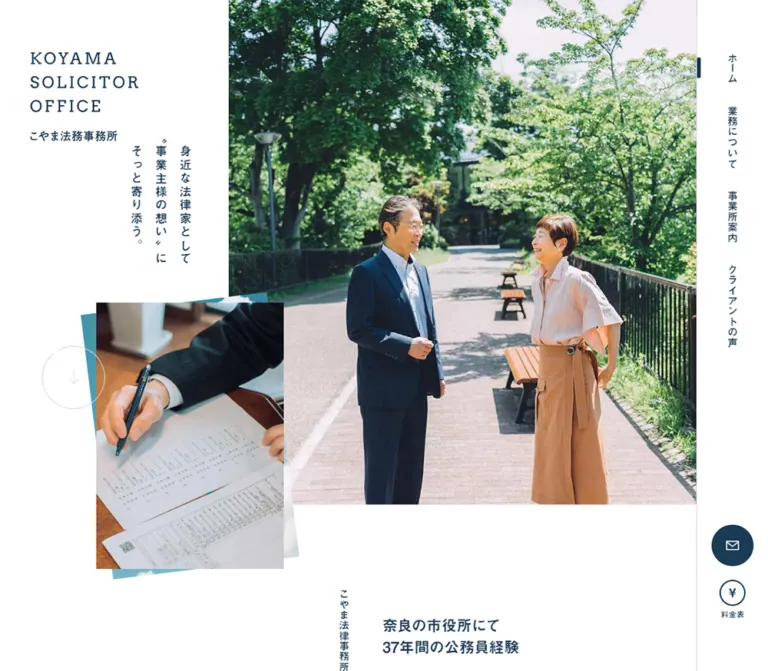
On desktop, the photograph fills the central-right area up to the navigation rail. A broad white left area contains the identity and a three-column vertical message:
身近な法律家として / 〝お客様の想い〟に / そっと寄り添う。
Read the columns from right to left. The message occupies a compact visible area even though its parent heading has a much wider flex rectangle. Do not use that parent rectangle as the width of the visible lettering.
The park image shows two people facing each other along a tree-lined path. Their full or nearly full figures, the path's perspective, and the open space between them are essential to the composition. Preserve both people when adapting the crop.
A second photograph overlaps the white area and the main image near the lower-left. It shows a suited arm and a pen over printed documents. Offset, slightly rotated sheets behind it introduce a restrained blue-green accent. The visible composition is a photographic collage without an elevated card shadow.
An outlined circular downward control links to #about. Its transform transition is measured, but its hover displacement and scrolling behavior were not exercised.
Mobile Hero
The white header region reaches approximately y 188. The park photograph then occupies the full 390px screen width and continues to approximately y 692.
The three vertical text columns start around y 131, overlapping the white header and the photograph. Each column has a separate white strip behind it; the strips terminate at different heights following the text lengths. This keeps the message readable over foliage while retaining the vertical rhythm.
The document inset and desktop downward circle are not visible in this opening capture. The introduction begins immediately below the main photograph. Reproduce this change in hierarchy instead of simply shrinking the desktop collage.
Office Introduction
The introduction pairs a vertical section label with a horizontally read statement and paragraphs. The source label is こやま法律事務所について; the office identity elsewhere is こやま法務事務所.
On desktop, the section is 960px wide. Its text column starts around x 692.08 and is approximately 507.92px wide, while the vertical label sits near x 635.08. The measured heading reads 自治体職員としての豊富な行政経験 and uses 23.4px bold type with 0.06em tracking.
The mobile section spans 338px between 26px gutters. Its vertical label moves to the right near x 339.63; the main copy starts near x 49.41 and uses a 275px column. The heading wraps into two lines. The section therefore retains asymmetry even after becoming narrow.
The outlined 事務所について link measures 247 × 58px on desktop and approximately 200.06 × 46.97px on mobile. Keep its label and directional cue within one capsule-shaped target.
Bilingual Section Heading
The desktop service and strengths introductions place a short vertical Japanese label to the left of a large horizontal English heading. A fine vertical navy line reinforces the label. Explanatory copy sits beneath the English text.
In the strengths screenshot, the vertical label begins around x 263, while OUR STRENGTHS begins around x 334. A pale, sweeping pen-stroke decoration crosses the otherwise open background. It supplies a light association with writing and documents without competing with the heading.
The mobile DOM places the vertical section-label boxes near the horizontal center: x 172.5, width approximately 44.98px. Their exact relationship to the English lettering is not fully established by the provided screenshots. Centering the label and stacking the remaining heading content is a reasonable adaptation, not a verified source breakpoint rule.
Service Photograph Mosaic
Role: provide five direct entries into the office's service areas.
The desktop layout is a single coherent mosaic:
- Two large cards for
不動産登記and会社・法人登記. - Three smaller cards for
内容証明作成代行,遺言・相続, and官公署の許可・認可.
Each card is an entire anchor linking to a corresponding fragment on /service/. Its anatomy is a full-bleed photograph, a darkened lower image region, a bold white title, and a short white description aligned near the bottom.
The first row uses 508.61 × 600px cards with approximately 38.77px side padding. The second uses 334.14 × 516px cards with approximately 23.06px side padding. Both rows use 40px bottom padding and approximately 14.77px gaps.
Only the outer four corners of the combined grid are rounded to 40px. The center lower card remains square. The visible lower-row photographs show a suited person walking outdoors, writing on documents, and working at a computer. Exact subjects of the first two card images are not established by the supplied visual captures.
On mobile, all five cards measure 249 × 352.5px and share the same document y coordinate. Their x positions advance by 260px, establishing an 11px gap. This is a horizontal-strip layout, with the next card extending beyond the viewport. The geometry supports a slider or horizontally navigable presentation; swipe, drag, arrows, pagination, and autoplay were not tested.
Three Strengths
The desktop DOM contains three horizontally distributed items with deliberately different top positions. They address collaboration with other professions, public-sector experience, and an approachable consultation environment.
The first item begins near y 3888.78, the second near 3800.17, and the third near 3861.09. Their text regions combine narrow vertical heading boxes with adjacent description columns. This staggered composition continues the page's vertical-text motif.
On mobile, the three items become 338px-wide stacked sections separated by 72px. Their heading boxes become horizontal, centered blocks above full-width descriptions. Description text remains 14.4px, bold, with 25.92px leading.
The screenshots do not establish the full imagery within these items. Preserve the measured layout relationships without inventing an illustration set, numbered icon system, or unseen photograph treatment.
Client Stories
The rendered DOM identifies three distinct client-story destinations. Desktop story anchors form a horizontal sequence of approximately 1039 × 725.39px, starting near x 51.3. Associated text includes white section labels, case descriptions, and smaller client/location lines.
On mobile, the supplied story anchors occupy 390 × 580.31px rectangles. Several entries repeat the same destinations, consistent with duplicated slider content. These repetitions are not five independent testimonials.
The evidence supports a large visual story module with text overlays and state-dependent text transforms. It does not establish a specific slide transition, autoplay interval, pagination design, or keyboard interaction. Exact story-image compositions are outside the supplied screenshots.
Information List
The information section presents three dated entries and an index link. Its desktop container is 960px wide and uses a flex layout, with the INFORMATION heading on the left and entries to the right. The heading is Europa, 40px, weight 700, with 3.2px tracking.
Mobile changes the section to block layout within 338px. The heading becomes 27px with 2.16px tracking. Entry links use 15.3px bold type and appear beneath their dates in the extracted content sequence.
The compact 一覧はこちら index pill measures 120 × 41px on desktop and approximately 108 × 36.89px on mobile. Keep this secondary action visibly smaller than the main consultation button.
Consultation Panel
Role: provide a welcoming final step for arranging a consultation.
A deep navy surface carries a bold heading, explanatory copy, weekday appointment information, the telephone number, and an outlined contact pill. The heading is 随時、無料相談会を開催中.
On desktop, the visible navy shape is approximately 1237px wide, ending before the right navigation rail and leaving a pale blue region beside it. Its upper-right corner has a very large curve. The text begins at x 249; the heading and paragraph rectangles are 951px wide.
The telephone and contact pill sit in one row. The number uses 30px bold type and 0.08em tracking. The pill is 350 × 65px, with a roughly 2px pale outline, a darker circular detail at its left, and a right arrow separated by a vertical rule.
The mobile telephone is centered at 27px. The button sits below it at x 45.38, measuring approximately 299.25 × 55.56px. The explanatory copy remains left aligned inside 26px gutters, and opening hours wrap into two lines.
The mobile screenshot begins below the panel's heading, so its upper boundary and corner shape are not visually established. The visible lower panel is an edge-to-edge navy field.
Footer Identity and Return Control
A fine horizontal rule separates the consultation block from office information. The footer names こやま法務事務所, provides an underlined address link, and displays © Koyama Solicitor Office.
Desktop places a white 112px circular return control toward the right. Its thin upward arrow links to #l-wrapper. The mobile footer keeps the office information left aligned and centers the copyright. No return circle appears in the supplied mobile evidence.
Tokens — Motion & Interaction
| Element or token | Measured declaration | What is established | What remains unverified |
|---|---|---|---|
| General transition token | .5s cubic-bezier(0.250,0.460,0.450,0.940) |
A shared ease-out timing is declared | Whether every component uses it |
| Hero downward link | transform 0.4s cubic-bezier(0.455,0.03,0.515,0.955) |
Transform transition on the anchor | Trigger, displacement, and scroll duration |
| Information links | opacity 0.5s cubic-bezier(0.25,0.46,0.45,0.94) |
Opacity transition | Final hover/focus opacity |
| Client byline, one sampled state | transform 0.5s cubic-bezier(0.86,0,0.07,1) 0.3s |
Delayed transform transition | Exact state sequence or slide choreography |
| Client byline, other sampled states | transform 0.3s cubic-bezier(0.23,1,0.32,1) |
Alternative transform timing | Whether it is entry, exit, or reset behavior |
| Footer | opacity 0.6s |
Footer opacity transition | Activation condition and starting opacity |
| Desktop return control | Background color and transform, each 0.4s cubic-bezier(0.455,0.03,0.515,0.955) |
Two transitioning properties | Exact hover transformation and color |
| Service wrappers | Transition property reported as transform |
Transform is named | A useful duration or interaction endpoint |
| Sampled elements | Mostly animation: none |
No active CSS animation reported on those sampled nodes | Descendant, pseudo-element, script-driven, or earlier motion |
The extracted character-by-character heading text is not sufficient proof of a staggered letter reveal. Likewise, slider-related custom properties do not establish autoplay or gesture support.
The inspection waited for page readiness and sampled stability, with an initial observation of at least five seconds. Those checks improve the reliability of settled screenshots, but do not replace interaction testing.
Recommended motion direction: use restrained opacity and small transform changes, generally around 300–500ms, and preserve a stable reading layout. Keep all essential copy visible without requiring an animation to complete. Respect reduced-motion preferences.
Confirmed Link Purposes
- Primary navigation leads to the home, services, office-information, and client-story pages.
- Service cards link to specific service-page fragments.
- The envelope and main contact pill link to
/contact/. - The telephone uses
tel:0743564401. - The pricing control points to a PDF; its document contents were not inspected.
- The address is a map link.
- Desktop circular arrows target
#aboutand#l-wrapper.
These destinations are established by href values. Successful navigation, form submission, document loading, and telephone handling were not exercised.
Surfaces
| Surface | Appearance | Purpose |
|---|---|---|
| Main page | White with navy text | Quiet, readable background for long-form information |
| Desktop navigation rail | White with a fine left divider | Persistent wayfinding without competing with photography |
| Hero text strips on mobile | Individual white rectangles | Maintain contrast where vertical text crosses the photograph |
| Service cards | Full-bleed images with white text over a dark lower region | Combine service recognition and navigation |
| Transitional background | White or a very pale cool tint | Separate sections without adding a strong new color |
| Decorative writing stroke | Very light gray, large and sparse | Support the document-writing theme |
| Footer backdrop | Pale blue curved field | Frame the large navy contact surface |
| Contact panel | Solid navy with white text and pale outlines | Give consultation details a clear concluding emphasis |
| Buttons | Outlined capsules or simple circles | Establish actions through geometry and contrast |
There is no visible general-purpose shadow elevation system. Depth comes from overlapping photographs, clipping, contrasting fields, and large curves.
Imagery
The visual direction is natural, local, and personal. The hero's daylight, greenery, ordinary clothing, and conversational body language make the office feel accessible. Indoor photographs focus on practical work: pens, printed documents, a desk, and a computer.
Preserve natural color. Foliage carries much of the page's saturated green; the interface remains predominantly navy and white. Avoid applying a global blue tint that removes the warmth of skin and the distinction between outdoor and indoor scenes.
Image Composition Rules
- Keep both hero subjects visible across desktop and mobile crops.
- Preserve the path and surrounding foliage so the scene retains depth and context.
- Use the document inset as an intentional overlap, with restrained rotated backing shapes.
- Give service images enough lower-area darkening for their white title and description to remain readable.
- Keep image content continuous to the card edges; do not add separate white caption boxes.
- Use authorized photographs and brand artwork. The supplied evidence does not establish reuse rights.
Observed Asset References
Image-source URLs and logo asset paths were not included in the supplied DOM sample. The following identifies observed imagery without inventing filenames.
| Asset | Evidence | Intended treatment |
|---|---|---|
| Park conversation photograph | Desktop and mobile opening captures | Large desktop image; full-width mobile crop |
| Document-review photograph | Desktop opening capture | Rectangular inset overlapping the hero composition |
| Walking professional photograph | Desktop service capture | Full-bleed service card with white lower text |
| Document-writing photograph | Desktop service capture | Full-bleed service card |
| Office computer photograph | Desktop service capture | Full-bleed service card |
| Stacked office wordmark | Desktop and mobile opening captures | Preserve supplied lettering rather than guessing its font |
| Pale pen-stroke decoration | Desktop strengths-introduction capture | Large, low-contrast decorative mark |
The envelope, yen symbol, and directional arrows use simple linework. Their exact asset format was not supplied. Small SVG icons would be a suitable implementation choice, not a claim about the original files.
Layout & Responsive Behavior
Desktop Composition
At the inspected width, the source's main-width custom property subtracts a 110px-equivalent rail from the viewport. The visible hero therefore ends around x 1330. Its white left portion is approximately 437px wide, or about one third of that remaining area.
The content below does not follow one perfectly uniform center line. The introduction and information sections are 960px wide at x 240, while the service mosaic spans approximately 1032px from x 178. Section labels and the footer use additional offsets. These differences contribute to the editorial composition and should be retained when pursuing a close match.
The page sequence is:
- Photographic hero and vertical statement.
- Office introduction and detail link.
- Service introduction and five-image mosaic.
- Strengths introduction and three staggered items.
- Client-story presentation.
- Information list.
- Consultation panel and office footer.
Mobile Changes
| Desktop relationship | Mobile observation |
|---|---|
| Persistent right navigation rail | Closed header shows the identity and a wide three-line menu trigger |
| White left hero zone beside photography | White header above a full-width photograph |
| Vertical message within the left zone | Vertical columns cross the photograph's top edge on white strips |
| Overlapping document-photo inset | Not visible in the opening mobile capture |
| Right-hand introduction copy | Narrow copy column with a vertical label near the right gutter |
| Two-plus-three service mosaic | Five equal-width cards arranged horizontally in DOM geometry |
| Staggered strengths across the page | Three stacked full-width items with 72px intervals |
| Side-by-side information heading and entries | Block layout within 26px gutters |
| Telephone and contact button in one row | Centered telephone above the contact pill |
| Desktop return circle | Not shown in mobile evidence |
The mobile root font size is 90%, yielding 14.4px, but some components apply additional local scaling. For example, introduction paragraphs become 13.77px and service descriptions become 12.15px. Do not multiply every desktop number by 0.9 and expect an exact match.
The mobile custom-property list retains a desktop-style main-width expression. Its presence must not be used to shrink the visible mobile page around an imaginary rail: the actual screenshot and page rectangles are full width.
Breakpoint limitation: only 1440px and 390px widths were inspected. The exact breakpoint, tablet arrangement, short-window rail behavior, landscape layout, and intermediate image crops are unknown. The Quick Start uses a recommended 1000px breakpoint for its adaptation.
Do’s and Don’ts
Do
- Preserve the white, navy, and pale-blue hierarchy.
- Treat vertical Japanese text as a structural device in the hero, navigation, and section labels.
- Keep the large conversational photograph and the smaller document photograph distinct in scale.
- Preserve generous section spacing alongside tight service-grid seams.
- Round only the outside corners of the desktop service mosaic.
- Keep the desktop right rail narrow and visually independent from the main content.
- Use the measured Japanese body and heading stacks, with honest fallbacks when licensed fonts are unavailable.
- Recompose the mobile hero around a full-width image and individual white text strips.
- Keep telephone and contact routes prominent in the navy footer.
- Distinguish screenshot-backed imagery from DOM-only sections when extending this reference.
Don’t
- Do not replace the vertical message with an oversized horizontal promotional headline.
- Do not make all service cards equally rounded, floating panels on desktop.
- Do not use the generic publishing-system gradient presets as the site's visual palette.
- Do not infer the wordmark's typeface from its containing H1.
- Do not treat mobile DOM navigation boxes as proof that the closed page displays those links.
- Do not describe the service strip or client stories as autoplaying without testing them.
- Do not turn repeated client-story links into additional distinct testimonials.
- Do not apply uniform mobile scaling to every component.
- Do not crop either hero subject out merely to fill a preset aspect ratio.
- Do not invent image paths, font files, animation sequences, or unseen menu states.
Recommended Implementation Additions
These are recommendations for a new implementation, not verified features of the original page:
- Give the envelope, menu trigger, and circular arrow links explicit accessible names.
- Enlarge the mobile menu's interactive height to at least
44pxwhile retaining its thin, wide three-line appearance. - Implement vertical copy as readable text with
writing-mode: vertical-rl; preserve natural sentence order for assistive technology. - Use one semantic heading per message rather than exposing every character as a separate announcement.
- Make a mobile service strip reachable by keyboard and touch. Native horizontal scrolling with scroll snapping is a practical baseline when reproducing the measured geometry.
- If client stories use a carousel, provide manual controls and keep inactive duplicates out of the accessibility reading order.
- Ensure hidden mobile navigation is also removed from keyboard focus until opened, then manage focus and dismissal deliberately.
- Check white-text contrast against each service image, especially after mobile cropping.
- Consider increasing the observed
12.15pxmobile service descriptions to approximately14pxfor readability; account for the resulting text height. - Maintain visible focus outlines on white, photographic, and navy surfaces.
- Load below-the-fold imagery lazily while prioritizing the hero; reserve image dimensions to prevent layout shifts.
- Allow text enlargement and narrow screens to expand cards and footer content instead of clipping copy.
Agent Prompt Guide
Quick Color Reference
- Page: white
#ffffff. - Text and primary linework: navy
#13334e. - Large contact field: navy
#1a3b56. - Background accent: pale blue
#e8f3f9. - Fine neutral rules:
#d9d9d9. - Service-card text: white over a locally darkened photograph.
- Supporting blue-green and darker button-disc colors are screenshot estimates, not measured brand tokens.
Overall Prompt
“Create a Japanese professional-services homepage inspired by Koyama Solicitor Office. Use white space, navy text #13334e, a navy contact field #1a3b56, and pale blue #e8f3f9. On desktop, place a stacked office wordmark and a compact three-column vertical Japanese message in a white left zone, a large natural park-conversation photograph to its right, and a fixed 110px navigation rail at the far right. Overlap a smaller document-review photograph near the lower-left of the hero. Follow with an asymmetric office introduction, bilingual section headings, a two-plus-three service-photo mosaic with only its outer corners rounded, strengths, client stories, news, and a broad curved contact footer. On mobile, replace the rail with a wide three-line menu trigger, place the vertical message on white strips over a full-width hero photograph, arrange services in a horizontal strip, and stack the telephone above the contact pill. Keep motion restrained and do not invent unverified original interactions.”
Example Component Prompts
- Hero: “Design a desktop opening with a white identity area occupying roughly one third of the space before a narrow right navigation rail. Use upright vertical Japanese text and a large photograph of two people talking in a leafy park. Add a smaller overlapping document photograph with a restrained blue-green backing sheet. Keep the photographic edges mostly square.”
- Service mosaic: “Create five photographic service links: two large cards above three smaller cards, approximately 15px apart. Place bold white titles and short white descriptions near the bottom over a dark image overlay. Round only the four outside corners of the combined desktop mosaic to 40px.”
- Mobile services: “Adapt five service links into a horizontal strip of approximately 249 × 353px cards with 11px gaps at a 390px viewport. Show a portion of the following card. Use accessible native scrolling as the implementation baseline; do not assume original autoplay or swipe behavior.”
- Section introduction: “Pair a narrow vertical Japanese label and fine navy rule with a large, widely tracked English heading. Use generous white space and restrained navy paragraph text. A pale writing-stroke decoration may sit behind the strengths introduction.”
- Consultation footer: “Build a large navy consultation panel with an oversized upper-right curve on desktop, white explanatory text, a bold telephone number, and a pale outlined capsule button. Divide the button's arrow area with a vertical rule and include a darker circular detail behind its leading edge. Stack telephone and button centrally on mobile while keeping body copy left aligned.”
Quick Start
CSS Custom Properties
This scaffold reproduces the main visual relationships using ordinary CSS. Exact colors and several component dimensions are measured; hero proportions, the footer curve, image-overlay opacity, and the breakpoint are adaptations. It intentionally keeps a conventional root size and assigns mobile component sizes explicitly instead of reproducing the original nested scaling.
Use authorized image and wordmark assets. No original image URLs or font-file URLs were supplied. Font names below are the measured declarations, with fallbacks; they do not load the fonts by themselves.
:root {
  /* Measured palette */
  --paper: #ffffff;
  --ink: #13334e;
  --navy: #1a3b56;
  --wash: #e8f3f9;
  --rule: #d9d9d9;
  --border: #bcbcbc;
  --blue-border: rgba(180, 206, 228, 0.7);

  /* Screenshot estimates for supporting details */
  --collage-accent: #4598a8;
  --contact-disc: #0a2639;

  /* Measured font-family declarations */
  --font-body: YakuHanJP, -apple-system, YuGothic,
    'Yu Gothic Medium', 'Yu Gothic', Verdana, Meiryo,
    'Hiragino Kaku Gothic Pro', 'ヒラギノ角ゴ Pro', sans-serif;
  --font-heading: 'Midashi Go MB31', YuGothic, 'Yu Gothic',
    'Hiragino Sans', 'Hiragino Kaku Gothic ProN', Meiryo, sans-serif;
  --font-latin: europa, sans-serif;

  /* Measured or rounded geometry */
  --rail-width: 110px;
  --content-width: 960px;
  --service-width: 1032px;
  --service-gap: 14.77px;
  --mobile-gutter: 26px;
  --mosaic-radius: 40px;
  --section-space: 114px;

  /* Source timing functions; usage below is an adaptation */
  --ease-out: cubic-bezier(0.25, 0.46, 0.45, 0.94);
  --ease-in-out: cubic-bezier(0.455, 0.03, 0.515, 0.955);
}

* { box-sizing: border-box; }

html { color: var(--ink); background: var(--paper); }
body { margin: 0; font: 400 16px/1.8 var(--font-body); }
img { display: block; max-width: 100%; }
a { color: inherit; }
button { font: inherit; }

.content {
  width: min(var(--content-width), calc(100% - 104px - var(--rail-width)));
  margin-inline: auto;
}

.brand {
  position: absolute;
  z-index: 3;
  top: 80px;
  left: 47px;
  width: 165px;
}

.brand img { width: 100%; height: auto; }
.mobile-menu-trigger { display: none; }

/* Desktop navigation rail */
.site-rail {
  position: fixed;
  z-index: 20;
  inset: 0 0 0 auto;
  width: var(--rail-width);
  border-left: 1px solid var(--rule);
  background: var(--paper);
}

.rail-links {
  display: grid;
  justify-items: center;
  gap: 34px;
  margin: 0;
  padding: 80px 0 0;
  list-style: none;
}

.rail-links a {
  display: block;
  writing-mode: vertical-rl;
  text-orientation: upright;
  font: 700 16px/1 var(--font-heading);
  text-decoration: none;
}

.rail-links a[aria-current='page']::before {
  content: '';
  position: absolute;
  top: 88px;
  left: 0;
  width: 4px;
  height: 32px;
  background: var(--ink);
}

.rail-tools {
  position: absolute;
  right: 0;
  bottom: 80px;
  left: 0;
  display: grid;
  justify-items: center;
  gap: 21px;
}

.rail-contact {
  display: grid;
  place-items: center;
  width: 64px;
  height: 64px;
  border-radius: 50%;
  color: var(--paper);
  background: var(--navy);
}

/* Hero sizing approximates the supplied desktop composition */
.hero {
  position: relative;
  width: calc(100% - var(--rail-width));
  min-height: clamp(850px, 72.94vw, 1120px);
}

.hero-photo {
  position: absolute;
  top: 0;
  right: 0;
  width: 67.14%;
  height: clamp(700px, 64.72vw, 980px);
  object-fit: cover;
  object-position: center;
}

.hero-copy {
  position: absolute;
  z-index: 2;
  top: 267px;
  left: calc(32.86% - 185px);
  display: flex;
  flex-direction: row-reverse;
  align-items: flex-start;
  gap: 22px;
  margin: 0;
  font: 700 22px/1.1 var(--font-heading);
  letter-spacing: 0.08em;
}

.hero-copy > span {
  writing-mode: vertical-rl;
  text-orientation: upright;
}

.hero-inset {
  position: absolute;
  z-index: 3;
  top: 559px;
  left: 14.2%;
  width: 26%;
  isolation: isolate;
}

.hero-inset::before {
  content: '';
  position: absolute;
  z-index: -1;
  inset: 0;
  background: var(--collage-accent);
  transform: rotate(-7deg);
}

.hero-inset img { width: 100%; height: auto; }

/* Shared section introduction */
.section-heading {
  position: relative;
  left: 11px;
  display: grid;
  grid-template-columns: 42px minmax(0, 1fr);
  gap: 30px;
  width: min(936px, calc(100% - var(--rail-width) - 104px));
  margin: 0 auto 80px;
}

.section-kicker {
  width: 42px;
  margin: 0;
  padding: 0 9px;
  border-left: 2px solid var(--ink);
  writing-mode: vertical-rl;
  text-orientation: upright;
  font: 700 22px/1 var(--font-heading);
}

.section-title {
  margin: 22px 0 18px;
  font: 700 48px/1.2 var(--font-latin);
  letter-spacing: 0.08em;
}

.section-summary { margin: 0; line-height: 1.8; }
.services { padding-block: 228px var(--section-space); }

/* Two large cards above three small cards */
.service-grid {
  position: relative;
  left: -26px;
  display: grid;
  grid-template-columns: repeat(6, minmax(0, 1fr));
  gap: var(--service-gap);
  width: min(var(--service-width), calc(100% - var(--rail-width) - 104px));
  margin-inline: auto;
}

.service-card {
  position: relative;
  display: flex;
  align-items: flex-end;
  grid-column: span 2;
  min-height: 516px;
  overflow: hidden;
  padding: 0 23px 40px;
  color: var(--paper);
  text-decoration: none;
  isolation: isolate;
}

.service-card:nth-child(-n + 2) {
  grid-column: span 3;
  min-height: 600px;
  padding-inline: 38.77px;
}

.service-card:nth-child(1) { border-top-left-radius: var(--mosaic-radius); }
.service-card:nth-child(2) { border-top-right-radius: var(--mosaic-radius); }
.service-card:nth-child(3) { border-bottom-left-radius: var(--mosaic-radius); }
.service-card:nth-child(5) { border-bottom-right-radius: var(--mosaic-radius); }

.service-card > img {
  position: absolute;
  z-index: -2;
  inset: 0;
  width: 100%;
  height: 100%;
  object-fit: cover;
}

.service-card::before {
  content: '';
  position: absolute;
  z-index: -1;
  inset: 0;
  /* Recommended overlay; exact original stops are unknown */
  background: linear-gradient(to top, rgba(0,0,0,.65), rgba(0,0,0,.12) 70%);
}

.service-card h3 {
  margin: 0 0 14px;
  font: 700 22px/1.25 var(--font-heading);
}

.service-card p { margin: 0; font-size: 15px; line-height: 1.8; }
.service-card:nth-child(-n + 2) h3 { font-size: 26px; }
.service-card:nth-child(-n + 2) p { font-size: 16px; }

/* Information module */
.information {
  display: grid;
  grid-template-columns: 1fr 1.5fr;
  gap: 60px;
  padding-block: 178px 168px;
}

.information h2 {
  margin: 0;
  font: 700 40px/1 var(--font-latin);
  letter-spacing: 0.08em;
}

.news-list { display: grid; gap: 32px; margin: 0; padding: 0; list-style: none; }
.news-list a { font: 700 17px/1.6 var(--font-heading); transition: opacity .5s var(--ease-out); }

/* Large contact surface */
.contact-zone { position: relative; padding-top: 155px; isolation: isolate; }

.contact-zone::before {
  content: '';
  position: absolute;
  z-index: -1;
  inset: 0 var(--rail-width) 0 auto;
  width: 52%;
  border-top-left-radius: 320px;
  background: var(--wash);
}

.contact-panel {
  --footer-inset: max(26px, calc((100vw - 960px) / 2 + 9px));
  width: calc((100% - var(--rail-width)) * .93);
  border-top-right-radius: 300px;
  color: var(--paper);
  background: var(--navy);
}

.contact-inner {
  width: min(951px, calc(100% - var(--footer-inset) - 37px));
  margin-left: var(--footer-inset);
  padding-block: 155px 72px;
}

.contact-title { margin: 0; font: 700 27px/1.3 var(--font-heading); }
.contact-copy { margin: 40px 0 28px; line-height: 1.8; }
.contact-hours { margin: 0; }

.contact-actions {
  display: flex;
  align-items: center;
  flex-wrap: wrap;
  gap: 33px;
  margin-top: 50px;
}

.contact-phone {
  margin: 0;
  font: 700 30px/1 var(--font-heading);
  letter-spacing: 0.08em;
}

.contact-phone a { text-decoration: none; }

.contact-pill {
  position: relative;
  display: flex;
  align-items: center;
  width: 350px;
  min-height: 65px;
  overflow: hidden;
  border: 2px solid rgba(255,255,255,.8);
  border-radius: 999px;
  color: inherit;
  text-decoration: none;
  isolation: isolate;
}

.contact-pill::before {
  content: '';
  position: absolute;
  z-index: -1;
  top: 0;
  bottom: 0;
  left: 0;
  aspect-ratio: 1;
  border-radius: 50%;
  background: var(--contact-disc);
}

.pill-label { flex: 1; padding: 12px 10px 12px 30px; font-size: 16px; line-height: 1.4; }
.pill-arrow { display: grid; place-items: center; width: 59px; min-height: 49px; border-left: 2px solid rgba(255,255,255,.8); }
.contact-details { margin-top: 94px; padding-top: 94px; border-top: 1px solid rgba(255,255,255,.25); }
.contact-details h3 { margin: 0 0 22px; font: 700 19px/1.3 var(--font-heading); }
.contact-details address { font: 700 14px/1.8 var(--font-heading); }
.copyright { margin: 110px 0 0; font-size: 11px; }

/* Recommended focus and hover treatments */
a:focus-visible, button:focus-visible {
  outline: 3px solid currentColor;
  outline-offset: 5px;
}

.service-card:focus-visible { outline-color: var(--ink); }
@media (hover: hover) { .news-list a:hover { opacity: .7; } }

/* Recommended breakpoint; the original breakpoint is unknown */
@media (max-width: 999px) {
  :root { --rail-width: 0px; }
  body { font-size: 14.4px; }
  .site-rail { display: none; }
  .content { width: calc(100% - 52px); }

  .brand { top: 45.38px; left: 26px; width: 116.98px; }
  .mobile-menu-trigger {
    position: absolute;
    z-index: 5;
    top: 38px;
    right: 26px;
    display: flex;
    flex-direction: column;
    justify-content: space-between;
    width: 76px;
    height: 44px;
    padding: 7px 0;
    border: 0;
    background: transparent;
    color: var(--ink);
  }
  .mobile-menu-trigger span { width: 100%; height: 1px; background: currentColor; }

  .hero { width: 100%; min-height: calc(188px + 129.23vw); }
  .hero-photo { top: 188px; width: 100%; height: 129.23vw; }
  .hero-copy { top: 131px; right: 21%; left: auto; gap: 10px; font-size: 18px; }
  .hero-copy > span { padding: 0 5px 8px; background: var(--paper); }
  .hero-inset { display: none; }

  .services { padding-block: 90px 61.56px; }
  .section-heading { left: 0; grid-template-columns: 1fr; justify-items: center; width: calc(100% - 52px); gap: 24px; margin-bottom: 60px; }
  .section-kicker { font-size: 19.8px; }
  .section-title { margin: 0 0 20px; font-size: 30px; text-align: center; }

  .service-grid {
    left: 0;
    display: flex;
    gap: 11px;
    width: 100%;
    overflow-x: auto;
    padding: 8px 45.5px;
    scroll-padding-inline: 45.5px;
    scroll-snap-type: x proximity;
  }
  .service-card,
  .service-card:nth-child(-n + 2) {
    flex: 0 0 249px;
    min-height: 352.5px;
    padding: 0 18px 32.4px;
    border-radius: 13px;
    scroll-snap-align: start;
  }
  .service-card h3,
  .service-card:nth-child(-n + 2) h3 { font-size: 17.82px; }
  .service-card p,
  .service-card:nth-child(-n + 2) p { font-size: 12.15px; line-height: 1.8; }

  .information { display: block; padding-block: 96.12px 90.72px; }
  .information h2 { margin-bottom: 60px; font-size: 27px; }
  .news-list a { font-size: 15.3px; }

  .contact-zone { padding-top: 0; }
  .contact-zone::before { display: none; }
  /* Flat upper edge is an adaptation; the mobile edge was not captured */
  .contact-panel { width: 100%; border-radius: 0; }
  .contact-inner { width: auto; margin-inline: 26px; padding-block: 108px; }
  .contact-title { font-size: 24.3px; }
  .contact-copy { margin: 36px 0 25.2px; }
  .contact-actions { flex-direction: column; gap: 29.7px; margin-top: 81px; }
  .contact-phone { font-size: 27px; }
  .contact-pill { width: min(299.25px, 100%); min-height: 55.56px; }
  .pill-label { padding-left: 25.65px; font-size: 13.68px; }
  .pill-arrow { width: 50px; min-height: 43px; }
  .contact-details { margin-top: 85px; padding-top: 61px; }
  .contact-details h3 { font-size: 17.1px; }
  .contact-details address { font-size: 12.6px; }
  .copyright { margin-top: 72px; text-align: center; }
}

@media (prefers-reduced-motion: reduce) {
  .news-list a { transition: none; }
  .service-grid { scroll-behavior: auto; }
}
This CSS assumes that each .service-card is an anchor containing an image and a text wrapper. Keep the image decorative when its purpose is fully expressed by the adjacent service title; use meaningful alternative text when the photograph adds information.
The menu trigger requires a separate accessible open/close implementation. The service strip's native scrolling is a recommended baseline and does not claim to reproduce the original script. The scaffold also leaves client-story behavior and the detailed strengths imagery to verified assets and explicit product requirements.
Minimal Component Markup
The following demonstrates the vertical message's reading order and the contact button's label/arrow anatomy. Japanese text is quoted from the source UI.
<h2 class='hero-copy' lang='ja'>
  <span>身近な法律家として</span>
  <span>〝お客様の想い〟に</span>
  <span>そっと寄り添う。</span>
</h2>

<a class='contact-pill' href='https://koyama-houmu.com/contact/'>
  <span class='pill-label' lang='ja'>無料相談・お問い合わせはこちら</span>
  <span class='pill-arrow' aria-hidden='true'>→</span>
</a>
Tailwind v4 Token Mapping
Optional aliases for an implementation already using Tailwind v4. These do not imply that the original site uses Tailwind. Define the custom properties above first.
@theme inline {
  --color-paper: var(--paper);
  --color-legal-ink: var(--ink);
  --color-legal-navy: var(--navy);
  --color-legal-wash: var(--wash);
  --color-legal-rule: var(--rule);

  --font-sans: var(--font-body);
  --font-heading-jp: var(--font-heading);
  --font-heading-en: var(--font-latin);

  --spacing-rail: 110px;
  --spacing-mobile-gutter: 26px;
  --spacing-service-gap: 14.77px;
  --spacing-section: 114px;

  --radius-mosaic: 40px;
  --radius-service-mobile: 13px;
  --radius-contact-curve: 300px;
}
Sources & Evidence
- Inspected original and final page: Koyama Solicitor Office. The supplied browser record reports HTTP
200and the same original and final URL. - Capture timestamp:
2026-10-01T19:01:32.861Z, equivalent to October 2, 2026, at 04:01:32.861 JST. - Desktop evidence: three website screenshots at
1440 × 1000, plus rendered text, links, custom properties, and sampled computed element styles. Measured document height: approximately6921.30px. - Mobile evidence: two website screenshots at
390 × 844, plus rendered text, links, custom properties, and sampled computed element styles. Measured document height: approximately6205.48px. - Observed navigation persistence: the right rail remains in the same desktop screen position across the opening, middle, and footer captures.
- Interaction evidence: anchor destinations and CSS transition declarations are supplied. No click, hover, menu-opening, form, or gesture result is documented.
- Inspection limitations: only two viewport sizes were measured; image-source nodes, font-file URLs, complete stylesheet rules, and many descendant styles were not supplied. Some sections are supported by DOM geometry without corresponding screenshots.
- Readiness limitations: the supplied capture process waited for load, visible image decoding, finite animation completion within limits, and sampled layout/text stability. Delayed content, unexercised interactions, and script-driven behavior may remain outside the evidence.
This reference describes the current homepage represented by the supplied inspection. Measurements, visual estimates, and implementation recommendations are separated throughout so that a new build can preserve the observed design without claiming unsupported source behavior.
# Koyama Solicitor Office — Style Reference

> A quiet professional-services homepage built from navy typography, vertical Japanese text, and photographs of approachable, everyday consultation.

**Website:** [koyama-houmu.com](https://koyama-houmu.com/)
**Original URL:** https://koyama-houmu.com/
**Final URL:** https://koyama-houmu.com/
**Theme:** white and pale blue surfaces, dark navy text, and a substantial navy contact area.
**Inspected:** October 2, 2026, Japan Standard Time. The supplied retrieval timestamp is October 1, 2026, at 19:01:32.861 UTC.
**Viewports:** desktop 1440 × 1000 CSS pixels; mobile 390 × 844 CSS pixels.
**Scope:** the current homepage, including its opening composition, office introduction, services, strengths, client stories, information list, and consultation/footer content. Visual captures cover the desktop opening, service-to-strength transition, desktop footer, mobile opening, and mobile footer. Other sections are documented through the supplied rendered DOM and computed styles. Linked pages, the pricing document, and open navigation states were not inspected.

Koyama Solicitor Office is a Japanese judicial-scrivener and administrative-scrivener practice website. Its homepage introduces the office, explains services, presents client stories and news, and provides consultation routes. The design creates trust through a restrained blue palette and personal photography: a suited professional talking with a woman in a leafy park, a hand reviewing documents, and ordinary working scenes.

The desktop composition has three distinct areas: a white identity and message zone on the left, a large photograph in the middle, and a narrow persistent navigation rail at the right edge. Vertical Japanese text provides a deliberate reading rhythm alongside generously spaced English section titles. Farther down, service photographs form a two-plus-three mosaic, while the contact area becomes a broad navy field with a large curved upper-right corner.

Mobile changes the composition substantially. The right rail gives way to a three-line menu button, the hero photograph becomes full width, and the vertical message overlaps its upper edge on white strips. Services occupy a horizontal strip in the measured DOM, strengths become a vertical sequence, and the telephone and contact button stack centrally in the footer.
閉じる
# Koyama Solicitor Office — Style Reference

> A quiet professional-services homepage built from navy typography, vertical Japanese text, and photographs of approachable, everyday consultation.

**Website:** [koyama-houmu.com](https://koyama-houmu.com/)
**Original URL:** https://koyama-houmu.com/
**Final URL:** https://koyama-houmu.com/
**Theme:** white and pale blue surfaces, dark navy text, and a substantial navy contact area.
**Inspected:** October 2, 2026, Japan Standard Time. The supplied retrieval timestamp is October 1, 2026, at 19:01:32.861 UTC.
**Viewports:** desktop 1440 × 1000 CSS pixels; mobile 390 × 844 CSS pixels.
**Scope:** the current homepage, including its opening composition, office introduction, services, strengths, client stories, information list, and consultation/footer content. Visual captures cover the desktop opening, service-to-strength transition, desktop footer, mobile opening, and mobile footer. Other sections are documented through the supplied rendered DOM and computed styles. Linked pages, the pricing document, and open navigation states were not inspected.

Koyama Solicitor Office is a Japanese judicial-scrivener and administrative-scrivener practice website. Its homepage introduces the office, explains services, presents client stories and news, and provides consultation routes. The design creates trust through a restrained blue palette and personal photography: a suited professional talking with a woman in a leafy park, a hand reviewing documents, and ordinary working scenes.

The desktop composition has three distinct areas: a white identity and message zone on the left, a large photograph in the middle, and a narrow persistent navigation rail at the right edge. Vertical Japanese text provides a deliberate reading rhythm alongside generously spaced English section titles. Farther down, service photographs form a two-plus-three mosaic, while the contact area becomes a broad navy field with a large curved upper-right corner.

Mobile changes the composition substantially. The right rail gives way to a three-line menu button, the hero photograph becomes full width, and the vertical message overlaps its upper edge on white strips. Services occupy a horizontal strip in the measured DOM, strengths become a vertical sequence, and the telephone and contact button stack centrally in the footer.

## How to Read This Reference

- **Measured** values come from the supplied rendered element rectangles, computed styles, or custom properties. Rectangle measurements are CSS pixels and are rounded where appropriate.
- **Visual estimates** come from the website screenshots. They are explicitly identified and should not be mistaken for stylesheet declarations.
- **Derived** values are arithmetic based on measured rectangles, such as the gap between adjacent service cards.
- **Recommended** values and behaviors are implementation guidance for a new build. The Quick Start is an adaptation, not recovered source code.
- **Declared font families** identify computed CSS stacks. They do not independently establish which font file supplied every visible glyph.
- **DOM presence does not prove visibility.** The mobile evidence includes desktop navigation elements and additional menu content that are not visible in the closed-menu screenshot.
- **Motion declarations do not prove an exercised interaction.** No supplied recording establishes menu opening, dragging, autoplay, hover endpoints, or scroll-animation triggers.

## Tokens — Colors

### Default Palette

| Name | Value | Source token / implementation alias | Role and evidence |
| --- | --- | --- | --- |
| White | `#ffffff` | Source `--main-bg`; alias `--paper` | Measured page background; visible in the identity area, navigation rail, and open content regions |
| Navy Ink | `#13334e` | Source `--main-color`; alias `--ink` | Measured body text, navigation, and headings |
| Navy Field | `#1a3b56` | Source `--blue-bg`; alias `--navy` | Source color consistent with the large contact surface and filled contact control |
| Pale Blue | `#e8f3f9` | Source `--light-blue-bg`; alias `--wash` | Source background color; visible as the pale curved layer around the desktop footer |
| Light Rule | `#d9d9d9` | Source `--line-color`; alias `--rule` | Measured token consistent with restrained dividers and the desktop rail boundary |
| Neutral Border | `#bcbcbc` | Source `--border-color` | Available border token; its application is not established for every outlined component |
| Muted Blue Border | `rgba(180,206,228,.7)` | Source `--blue-border-color` | Available translucent border token; do not assume it is the exact contact-button outline |
| Interaction Blue | `#1558d6` | Source `--hover-color` | Declared interaction token; a visible hover state was not captured |
| Selection Blue | `rgba(51,153,255,.4)` | Source `--selection-color` | Declared selection treatment; selection was not exercised |

White and the two navy values form the core system. Pale blue supplies broad, low-contrast separation. The strong greens belong to photography rather than a second interface accent system.

### Screenshot-Only Supporting Colors

| Detail | Approximation | Status |
| --- | --- | --- |
| Blue-green sheet behind the document photograph | Around `#4598a8` | Visual estimate; no corresponding asset or element color was supplied |
| Pale pen-stroke decoration behind the strengths introduction | Around `#e5e5e5` | Visual estimate |
| Dark circular detail inside the contact pill | Around `#0a2639` | Visual estimate; deeper than the surrounding navy field |
| Pale contact-pill outline | White with reduced opacity | Visual characterization; the precise source color was not exposed |

The custom-property list also contains generic publishing-system color, gradient, and shadow presets. Their presence does not establish their use in this page. They should not expand the reference palette into purple, orange, rainbow gradients, or elevated card shadows.

## Tokens — Typography

### Japanese Body Text

**Measured source stack:**

```css
YakuHanJP, -apple-system, YuGothic, 'Yu Gothic Medium',
'Yu Gothic', Verdana, Meiryo, 'Hiragino Kaku Gothic Pro',
'ヒラギノ角ゴ Pro', sans-serif
```

The desktop body computes to `16px`; the mobile body computes to `14.4px`. Paragraphs have component-specific line heights. Service and contact descriptions commonly use `1.8`; the office introduction uses `2`.

Weight is also component-specific. The office introduction and strengths descriptions compute to `700`, while service descriptions and consultation copy use `400`. A reconstruction that makes every paragraph light would lose some of the source's typographic firmness.

### Japanese Headings and Navigation

**Measured source stack:**

```css
'Midashi Go MB31', YuGothic, 'Yu Gothic', 'Hiragino Sans',
'Hiragino Kaku Gothic ProN', Meiryo, sans-serif
```

This stack appears on primary navigation, service titles, the consultation heading, telephone text, and office identity in the footer. The measured weight is generally `700`.

The vertical hero message is also associated with this stack. Its parent heading computes to `14.4px` on desktop and approximately `11.35px` on mobile, but the visible characters are larger. Descendant styles were not included, so those parent values must not be presented as the final glyph sizes.

### English Section Typography

`europa, sans-serif` is directly measured on `INFORMATION` and on English labels in the mobile-menu DOM. Both use weight `700` and tracking of `0.08em`.

The photographed desktop `OUR STRENGTHS` heading is a widely tracked geometric sans serif, approximately `48px` by visual estimate. Its individual computed font declaration was not supplied. Reusing the measured English stack is a reasonable implementation choice, but remains an adaptation for that specific heading.

### Office Wordmark

The visible identity reads `KOYAMA / SOLICITOR / OFFICE` in three uppercase, serif-like lines, with the Japanese office name beneath it. The containing H1's computed body stack does not identify the lettering's actual typeface. Treat the wordmark as supplied brand artwork when available; do not infer a logo font from the H1 style or the HTML element's default Times family.

The identity block measures `165 × 137px` on desktop and approximately `116.98 × 97.13px` on mobile.

### Type Scale

| Role | Desktop | Mobile | Weight / leading | Evidence |
| --- | --- | --- | --- | --- |
| Body base | `16px` | `14.4px` | `400`; local leading varies | Computed |
| Desktop rail navigation | `16px` | Not visible in the closed mobile capture | `700 / 16px` | Computed and desktop screenshot |
| Rail pricing caption | `12px` | Closed mobile equivalent not visible | `700 / 12px` | Computed |
| Hero message characters | About `21–23px` | About `18px` | Bold, upright vertical text | Visual estimate; descendant size unavailable |
| Office introduction heading | `23.4px` | `18.954px` | `700 / 1.4`; tracking `0.06em` | Computed |
| Office introduction paragraphs | `17px` | `13.77px` | `700 / 2` | Computed |
| Vertical service/strength label container | `22px` | `19.8px` | Parent weight `400`, leading `1` | Computed; descendants may differ |
| Large English section title | About `48px` | Not directly measured | Bold and widely tracked | Desktop screenshot estimate |
| First-row service titles | `26px` | `17.82px` | `700 / 1` | Computed |
| Second-row service titles | `22px` | `17.82px` | `700 / 1` | Computed |
| First-row service descriptions | `16px / 28.8px` | `12.15px / 21.87px` | `400` | Computed |
| Second-row service descriptions | `15px / 27px` | `12.15px / 21.87px` | `400` | Computed |
| Strengths descriptions | `14.4px / 25.92px` | Same | `700` | Computed |
| Information heading | `40px` | `27px` | `700 / 1`; tracking `0.08em` | Computed |
| Information entry links | `17px / 27.2px` | `15.3px / 24.48px` | `700` | Computed |
| Consultation heading | `27px` | `24.3px` | `700 / 1` | Computed |
| Consultation paragraphs | `16px / 28.8px` | `14.4px / 25.92px` | `400` | Computed |
| Telephone | `30px` | `27px` | `700 / 1`; tracking `0.08em` | Computed |
| Contact-pill label | `16px` | `13.68px` | `400 / 1` | Computed |
| Footer office name | `19px` | `17.1px` | `700 / 1` | Computed |
| Footer address link | `14px` | `12.6px` | `700 / 1` | Computed |
| Copyright | About `11px` | About `11px` | Regular | Visual estimate |

## Tokens — Spacing & Shapes

The page does not expose one universal spacing scale. It combines fixed dimensions, local font-size scaling, and different content widths. The most useful reusable measurements are the narrow desktop rail, mobile gutters, image-grid gaps, generous section intervals, and selective corner rounding.

### Spacing Scale

| Use | Value | Status |
| --- | --- | --- |
| Mobile service-card gap | `11px` | Derived from successive x positions and `249px` card widths |
| Desktop service-grid gap | About `14.77px` | Derived horizontally and vertically |
| Mobile standard content gutter | `26px` | Measured repeatedly across introduction, strengths, information, and footer |
| Small service-card side inset | About `23.06px` | Measured desktop |
| Large service-card side inset | About `38.77px` | Measured desktop |
| Desktop service-card bottom inset | `40px` | Computed |
| Mobile service-card bottom inset | `32.4px` | Computed |
| Telephone-to-button desktop gap | `33px` | Derived |
| Mobile strengths-item gap | `72px` | Derived between section rectangles |
| Desktop services bottom / strengths top padding | `114px` each | Computed |
| Desktop services top padding | `228px` | Computed |
| Mobile services top padding | `90px` | Computed |
| Desktop information padding | `178px` top, `168px` bottom | Computed |
| Mobile information padding | `96.12px` top, `90.72px` bottom | Computed |

These values establish a spacious editorial rhythm. Small gaps join related images; much larger intervals distinguish changes of subject.

### Border Radius

| Element | Value | Evidence |
| --- | --- | --- |
| Hero photograph | Square visible corners | Screenshot |
| Desktop service mosaic | `40px` at the four outside corners only | Computed on individual links |
| Mobile service-card outer wrapper | `12.96px` | Computed; inner links retain separate small corner values |
| Office-information pill | `29px` desktop; `23.49px` mobile | Computed |
| Contact pill | `32.5px` desktop; `27.7875px` mobile | Computed |
| Information-index pill | About `19.22px` desktop; `17.30px` mobile | Computed |
| Desktop back-to-top button | `50%` | Computed |
| Desktop navy footer upper-right corner | Approximately `300px` | Screenshot estimate; surface geometry was not included in the element sample |

The service grid's rounding belongs to the whole mosaic. Its interior seams remain square. The contact curve is a much larger architectural shape rather than another small card radius.

### Layout Measurements

| Element | Desktop 1440 × 1000 | Mobile 390 × 844 |
| --- | --- | --- |
| Document height | `6921.30px` | `6205.48px` |
| Right navigation rail | Approximately `110px` wide, starting at x `1330` | Absent from the closed-menu screenshot |
| Wordmark rectangle | x `47`, y `80`, `165 × 137px` | x `26`, y `45.38`, `116.98 × 97.13px` |
| Hero photograph | Approximately x `437`, y `0`, `893 × 932px` | Approximately x `0`, y `188`, `390 × 504px` |
| Document-photo inset | Approximately x `189`, y `559`, width `346px`; continues below capture | Not visible in the captured opening composition |
| Hero downward link | `126.89 × 126.89px` bounding rectangle | Not present in the supplied mobile link list |
| Introduction section | x `240`, width `960px`, begins near y `1050.30` | x `26`, width `338px`, begins near y `692.30` |
| Service mosaic | x `178.16` to about `1210.14`; width about `1031.98px` | Horizontal sequence beginning at x `45.5` |
| Large service card | `508.61 × 600px` | `249 × 352.5px` |
| Small service card | `334.14 × 516px` | `249 × 352.5px` |
| Contact pill | `350 × 65px` | `299.25 × 55.56px` |
| Back-to-top circle | `112 × 112px` | Not shown or listed in the mobile evidence |

Hero-image and inset-photo dimensions in this table are screenshot estimates; the supplied element sample did not include their image nodes.

## Components

### Desktop Identity and Navigation Rail

**Role:** separate the office identity from persistent site navigation.

The logo sits in the upper-left white zone. Navigation occupies an independent white strip at the far right, separated by a fine vertical rule. The four labels are upright vertical Japanese text: `ホーム`, `業務について`, `事業所案内`, and `クライアントの声`.

Their measured desktop link rectangles are `109px` wide, beginning at x `1331`. Their heights follow the label lengths: `48`, `96`, `80`, and `128px`. Their y positions are `80`, `162`, `292`, and `406px`, leaving approximately `34px` between successive link boxes.

A short navy marker appears at the rail's left edge beside the current home item. Near the bottom, a `64 × 64px` navy circle contains a white envelope. Beneath it sits an outlined yen symbol and the small pricing caption `報酬等の目安`.

The rail occupies the same screen position in the desktop opening, middle, and footer captures, supporting persistent positioning. The logo is part of the opening composition; the screenshots do not establish that it stays fixed during scrolling.

### Mobile Identity and Menu Trigger

The identity moves to a `26px` left inset and a top position of about `45.38px`. A wide, three-line menu button sits opposite it at x `288.14`, with a measured box of `75.86 × 28.36px`. Its thin navy lines are unusually long relative to a conventional compact menu icon.

The mobile DOM contains a separate navigation structure with English labels such as `HOME`, `OUR SERVICE`, and `ABOUT KOYAMA`, paired with Japanese labels. Its measured English text uses Europa at approximately `21.56px`; Japanese text uses the heading stack at approximately `13.61px`.

These additional nodes do not establish an observed open-menu appearance. Opening direction, backdrop, focus handling, body-scroll locking, close behavior, and transition timing remain unverified.

### Opening Hero

**Role:** communicate a personal, approachable professional relationship before presenting service details.

On desktop, the photograph fills the central-right area up to the navigation rail. A broad white left area contains the identity and a three-column vertical message:

`身近な法律家として / 〝お客様の想い〟に / そっと寄り添う。`

Read the columns from right to left. The message occupies a compact visible area even though its parent heading has a much wider flex rectangle. Do not use that parent rectangle as the width of the visible lettering.

The park image shows two people facing each other along a tree-lined path. Their full or nearly full figures, the path's perspective, and the open space between them are essential to the composition. Preserve both people when adapting the crop.

A second photograph overlaps the white area and the main image near the lower-left. It shows a suited arm and a pen over printed documents. Offset, slightly rotated sheets behind it introduce a restrained blue-green accent. The visible composition is a photographic collage without an elevated card shadow.

An outlined circular downward control links to `#about`. Its transform transition is measured, but its hover displacement and scrolling behavior were not exercised.

### Mobile Hero

The white header region reaches approximately y `188`. The park photograph then occupies the full `390px` screen width and continues to approximately y `692`.

The three vertical text columns start around y `131`, overlapping the white header and the photograph. Each column has a separate white strip behind it; the strips terminate at different heights following the text lengths. This keeps the message readable over foliage while retaining the vertical rhythm.

The document inset and desktop downward circle are not visible in this opening capture. The introduction begins immediately below the main photograph. Reproduce this change in hierarchy instead of simply shrinking the desktop collage.

### Office Introduction

The introduction pairs a vertical section label with a horizontally read statement and paragraphs. The source label is `こやま法律事務所について`; the office identity elsewhere is `こやま法務事務所`.

On desktop, the section is `960px` wide. Its text column starts around x `692.08` and is approximately `507.92px` wide, while the vertical label sits near x `635.08`. The measured heading reads `自治体職員としての豊富な行政経験` and uses `23.4px` bold type with `0.06em` tracking.

The mobile section spans `338px` between `26px` gutters. Its vertical label moves to the right near x `339.63`; the main copy starts near x `49.41` and uses a `275px` column. The heading wraps into two lines. The section therefore retains asymmetry even after becoming narrow.

The outlined `事務所について` link measures `247 × 58px` on desktop and approximately `200.06 × 46.97px` on mobile. Keep its label and directional cue within one capsule-shaped target.

### Bilingual Section Heading

The desktop service and strengths introductions place a short vertical Japanese label to the left of a large horizontal English heading. A fine vertical navy line reinforces the label. Explanatory copy sits beneath the English text.

In the strengths screenshot, the vertical label begins around x `263`, while `OUR STRENGTHS` begins around x `334`. A pale, sweeping pen-stroke decoration crosses the otherwise open background. It supplies a light association with writing and documents without competing with the heading.

The mobile DOM places the vertical section-label boxes near the horizontal center: x `172.5`, width approximately `44.98px`. Their exact relationship to the English lettering is not fully established by the provided screenshots. Centering the label and stacking the remaining heading content is a reasonable adaptation, not a verified source breakpoint rule.

### Service Photograph Mosaic

**Role:** provide five direct entries into the office's service areas.

The desktop layout is a single coherent mosaic:

1. Two large cards for `不動産登記` and `会社・法人登記`.
2. Three smaller cards for `内容証明作成代行`, `遺言・相続`, and `官公署の許可・認可`.

Each card is an entire anchor linking to a corresponding fragment on `/service/`. Its anatomy is a full-bleed photograph, a darkened lower image region, a bold white title, and a short white description aligned near the bottom.

The first row uses `508.61 × 600px` cards with approximately `38.77px` side padding. The second uses `334.14 × 516px` cards with approximately `23.06px` side padding. Both rows use `40px` bottom padding and approximately `14.77px` gaps.

Only the outer four corners of the combined grid are rounded to `40px`. The center lower card remains square. The visible lower-row photographs show a suited person walking outdoors, writing on documents, and working at a computer. Exact subjects of the first two card images are not established by the supplied visual captures.

On mobile, all five cards measure `249 × 352.5px` and share the same document y coordinate. Their x positions advance by `260px`, establishing an `11px` gap. This is a horizontal-strip layout, with the next card extending beyond the viewport. The geometry supports a slider or horizontally navigable presentation; swipe, drag, arrows, pagination, and autoplay were not tested.

### Three Strengths

The desktop DOM contains three horizontally distributed items with deliberately different top positions. They address collaboration with other professions, public-sector experience, and an approachable consultation environment.

The first item begins near y `3888.78`, the second near `3800.17`, and the third near `3861.09`. Their text regions combine narrow vertical heading boxes with adjacent description columns. This staggered composition continues the page's vertical-text motif.

On mobile, the three items become `338px`-wide stacked sections separated by `72px`. Their heading boxes become horizontal, centered blocks above full-width descriptions. Description text remains `14.4px`, bold, with `25.92px` leading.

The screenshots do not establish the full imagery within these items. Preserve the measured layout relationships without inventing an illustration set, numbered icon system, or unseen photograph treatment.

### Client Stories

The rendered DOM identifies three distinct client-story destinations. Desktop story anchors form a horizontal sequence of approximately `1039 × 725.39px`, starting near x `51.3`. Associated text includes white section labels, case descriptions, and smaller client/location lines.

On mobile, the supplied story anchors occupy `390 × 580.31px` rectangles. Several entries repeat the same destinations, consistent with duplicated slider content. These repetitions are not five independent testimonials.

The evidence supports a large visual story module with text overlays and state-dependent text transforms. It does not establish a specific slide transition, autoplay interval, pagination design, or keyboard interaction. Exact story-image compositions are outside the supplied screenshots.

### Information List

The information section presents three dated entries and an index link. Its desktop container is `960px` wide and uses a flex layout, with the `INFORMATION` heading on the left and entries to the right. The heading is Europa, `40px`, weight `700`, with `3.2px` tracking.

Mobile changes the section to block layout within `338px`. The heading becomes `27px` with `2.16px` tracking. Entry links use `15.3px` bold type and appear beneath their dates in the extracted content sequence.

The compact `一覧はこちら` index pill measures `120 × 41px` on desktop and approximately `108 × 36.89px` on mobile. Keep this secondary action visibly smaller than the main consultation button.

### Consultation Panel

**Role:** provide a welcoming final step for arranging a consultation.

A deep navy surface carries a bold heading, explanatory copy, weekday appointment information, the telephone number, and an outlined contact pill. The heading is `随時、無料相談会を開催中`.

On desktop, the visible navy shape is approximately `1237px` wide, ending before the right navigation rail and leaving a pale blue region beside it. Its upper-right corner has a very large curve. The text begins at x `249`; the heading and paragraph rectangles are `951px` wide.

The telephone and contact pill sit in one row. The number uses `30px` bold type and `0.08em` tracking. The pill is `350 × 65px`, with a roughly `2px` pale outline, a darker circular detail at its left, and a right arrow separated by a vertical rule.

The mobile telephone is centered at `27px`. The button sits below it at x `45.38`, measuring approximately `299.25 × 55.56px`. The explanatory copy remains left aligned inside `26px` gutters, and opening hours wrap into two lines.

The mobile screenshot begins below the panel's heading, so its upper boundary and corner shape are not visually established. The visible lower panel is an edge-to-edge navy field.

### Footer Identity and Return Control

A fine horizontal rule separates the consultation block from office information. The footer names `こやま法務事務所`, provides an underlined address link, and displays `© Koyama Solicitor Office.`

Desktop places a white `112px` circular return control toward the right. Its thin upward arrow links to `#l-wrapper`. The mobile footer keeps the office information left aligned and centers the copyright. No return circle appears in the supplied mobile evidence.

## Tokens — Motion & Interaction

| Element or token | Measured declaration | What is established | What remains unverified |
| --- | --- | --- | --- |
| General transition token | `.5s cubic-bezier(0.250,0.460,0.450,0.940)` | A shared ease-out timing is declared | Whether every component uses it |
| Hero downward link | `transform 0.4s cubic-bezier(0.455,0.03,0.515,0.955)` | Transform transition on the anchor | Trigger, displacement, and scroll duration |
| Information links | `opacity 0.5s cubic-bezier(0.25,0.46,0.45,0.94)` | Opacity transition | Final hover/focus opacity |
| Client byline, one sampled state | `transform 0.5s cubic-bezier(0.86,0,0.07,1) 0.3s` | Delayed transform transition | Exact state sequence or slide choreography |
| Client byline, other sampled states | `transform 0.3s cubic-bezier(0.23,1,0.32,1)` | Alternative transform timing | Whether it is entry, exit, or reset behavior |
| Footer | `opacity 0.6s` | Footer opacity transition | Activation condition and starting opacity |
| Desktop return control | Background color and transform, each `0.4s cubic-bezier(0.455,0.03,0.515,0.955)` | Two transitioning properties | Exact hover transformation and color |
| Service wrappers | Transition property reported as `transform` | Transform is named | A useful duration or interaction endpoint |
| Sampled elements | Mostly `animation: none` | No active CSS animation reported on those sampled nodes | Descendant, pseudo-element, script-driven, or earlier motion |

The extracted character-by-character heading text is not sufficient proof of a staggered letter reveal. Likewise, slider-related custom properties do not establish autoplay or gesture support.

The inspection waited for page readiness and sampled stability, with an initial observation of at least five seconds. Those checks improve the reliability of settled screenshots, but do not replace interaction testing.

**Recommended motion direction:** use restrained opacity and small transform changes, generally around `300–500ms`, and preserve a stable reading layout. Keep all essential copy visible without requiring an animation to complete. Respect reduced-motion preferences.

### Confirmed Link Purposes

- Primary navigation leads to the home, services, office-information, and client-story pages.
- Service cards link to specific service-page fragments.
- The envelope and main contact pill link to `/contact/`.
- The telephone uses `tel:0743564401`.
- The pricing control points to a PDF; its document contents were not inspected.
- The address is a map link.
- Desktop circular arrows target `#about` and `#l-wrapper`.

These destinations are established by href values. Successful navigation, form submission, document loading, and telephone handling were not exercised.

## Surfaces

| Surface | Appearance | Purpose |
| --- | --- | --- |
| Main page | White with navy text | Quiet, readable background for long-form information |
| Desktop navigation rail | White with a fine left divider | Persistent wayfinding without competing with photography |
| Hero text strips on mobile | Individual white rectangles | Maintain contrast where vertical text crosses the photograph |
| Service cards | Full-bleed images with white text over a dark lower region | Combine service recognition and navigation |
| Transitional background | White or a very pale cool tint | Separate sections without adding a strong new color |
| Decorative writing stroke | Very light gray, large and sparse | Support the document-writing theme |
| Footer backdrop | Pale blue curved field | Frame the large navy contact surface |
| Contact panel | Solid navy with white text and pale outlines | Give consultation details a clear concluding emphasis |
| Buttons | Outlined capsules or simple circles | Establish actions through geometry and contrast |

There is no visible general-purpose shadow elevation system. Depth comes from overlapping photographs, clipping, contrasting fields, and large curves.

## Imagery

The visual direction is natural, local, and personal. The hero's daylight, greenery, ordinary clothing, and conversational body language make the office feel accessible. Indoor photographs focus on practical work: pens, printed documents, a desk, and a computer.

Preserve natural color. Foliage carries much of the page's saturated green; the interface remains predominantly navy and white. Avoid applying a global blue tint that removes the warmth of skin and the distinction between outdoor and indoor scenes.

### Image Composition Rules

- Keep both hero subjects visible across desktop and mobile crops.
- Preserve the path and surrounding foliage so the scene retains depth and context.
- Use the document inset as an intentional overlap, with restrained rotated backing shapes.
- Give service images enough lower-area darkening for their white title and description to remain readable.
- Keep image content continuous to the card edges; do not add separate white caption boxes.
- Use authorized photographs and brand artwork. The supplied evidence does not establish reuse rights.

### Observed Asset References

Image-source URLs and logo asset paths were not included in the supplied DOM sample. The following identifies observed imagery without inventing filenames.

| Asset | Evidence | Intended treatment |
| --- | --- | --- |
| Park conversation photograph | Desktop and mobile opening captures | Large desktop image; full-width mobile crop |
| Document-review photograph | Desktop opening capture | Rectangular inset overlapping the hero composition |
| Walking professional photograph | Desktop service capture | Full-bleed service card with white lower text |
| Document-writing photograph | Desktop service capture | Full-bleed service card |
| Office computer photograph | Desktop service capture | Full-bleed service card |
| Stacked office wordmark | Desktop and mobile opening captures | Preserve supplied lettering rather than guessing its font |
| Pale pen-stroke decoration | Desktop strengths-introduction capture | Large, low-contrast decorative mark |

The envelope, yen symbol, and directional arrows use simple linework. Their exact asset format was not supplied. Small SVG icons would be a suitable implementation choice, not a claim about the original files.

## Layout & Responsive Behavior

### Desktop Composition

At the inspected width, the source's main-width custom property subtracts a `110px`-equivalent rail from the viewport. The visible hero therefore ends around x `1330`. Its white left portion is approximately `437px` wide, or about one third of that remaining area.

The content below does not follow one perfectly uniform center line. The introduction and information sections are `960px` wide at x `240`, while the service mosaic spans approximately `1032px` from x `178`. Section labels and the footer use additional offsets. These differences contribute to the editorial composition and should be retained when pursuing a close match.

The page sequence is:

1. Photographic hero and vertical statement.
2. Office introduction and detail link.
3. Service introduction and five-image mosaic.
4. Strengths introduction and three staggered items.
5. Client-story presentation.
6. Information list.
7. Consultation panel and office footer.

### Mobile Changes

| Desktop relationship | Mobile observation |
| --- | --- |
| Persistent right navigation rail | Closed header shows the identity and a wide three-line menu trigger |
| White left hero zone beside photography | White header above a full-width photograph |
| Vertical message within the left zone | Vertical columns cross the photograph's top edge on white strips |
| Overlapping document-photo inset | Not visible in the opening mobile capture |
| Right-hand introduction copy | Narrow copy column with a vertical label near the right gutter |
| Two-plus-three service mosaic | Five equal-width cards arranged horizontally in DOM geometry |
| Staggered strengths across the page | Three stacked full-width items with `72px` intervals |
| Side-by-side information heading and entries | Block layout within `26px` gutters |
| Telephone and contact button in one row | Centered telephone above the contact pill |
| Desktop return circle | Not shown in mobile evidence |

The mobile root font size is `90%`, yielding `14.4px`, but some components apply additional local scaling. For example, introduction paragraphs become `13.77px` and service descriptions become `12.15px`. Do not multiply every desktop number by `0.9` and expect an exact match.

The mobile custom-property list retains a desktop-style main-width expression. Its presence must not be used to shrink the visible mobile page around an imaginary rail: the actual screenshot and page rectangles are full width.

**Breakpoint limitation:** only 1440px and 390px widths were inspected. The exact breakpoint, tablet arrangement, short-window rail behavior, landscape layout, and intermediate image crops are unknown. The Quick Start uses a recommended `1000px` breakpoint for its adaptation.

## Do’s and Don’ts

### Do

- Preserve the white, navy, and pale-blue hierarchy.
- Treat vertical Japanese text as a structural device in the hero, navigation, and section labels.
- Keep the large conversational photograph and the smaller document photograph distinct in scale.
- Preserve generous section spacing alongside tight service-grid seams.
- Round only the outside corners of the desktop service mosaic.
- Keep the desktop right rail narrow and visually independent from the main content.
- Use the measured Japanese body and heading stacks, with honest fallbacks when licensed fonts are unavailable.
- Recompose the mobile hero around a full-width image and individual white text strips.
- Keep telephone and contact routes prominent in the navy footer.
- Distinguish screenshot-backed imagery from DOM-only sections when extending this reference.

### Don’t

- Do not replace the vertical message with an oversized horizontal promotional headline.
- Do not make all service cards equally rounded, floating panels on desktop.
- Do not use the generic publishing-system gradient presets as the site's visual palette.
- Do not infer the wordmark's typeface from its containing H1.
- Do not treat mobile DOM navigation boxes as proof that the closed page displays those links.
- Do not describe the service strip or client stories as autoplaying without testing them.
- Do not turn repeated client-story links into additional distinct testimonials.
- Do not apply uniform mobile scaling to every component.
- Do not crop either hero subject out merely to fill a preset aspect ratio.
- Do not invent image paths, font files, animation sequences, or unseen menu states.

## Recommended Implementation Additions

These are recommendations for a new implementation, not verified features of the original page:

- Give the envelope, menu trigger, and circular arrow links explicit accessible names.
- Enlarge the mobile menu's interactive height to at least `44px` while retaining its thin, wide three-line appearance.
- Implement vertical copy as readable text with `writing-mode: vertical-rl`; preserve natural sentence order for assistive technology.
- Use one semantic heading per message rather than exposing every character as a separate announcement.
- Make a mobile service strip reachable by keyboard and touch. Native horizontal scrolling with scroll snapping is a practical baseline when reproducing the measured geometry.
- If client stories use a carousel, provide manual controls and keep inactive duplicates out of the accessibility reading order.
- Ensure hidden mobile navigation is also removed from keyboard focus until opened, then manage focus and dismissal deliberately.
- Check white-text contrast against each service image, especially after mobile cropping.
- Consider increasing the observed `12.15px` mobile service descriptions to approximately `14px` for readability; account for the resulting text height.
- Maintain visible focus outlines on white, photographic, and navy surfaces.
- Load below-the-fold imagery lazily while prioritizing the hero; reserve image dimensions to prevent layout shifts.
- Allow text enlargement and narrow screens to expand cards and footer content instead of clipping copy.

## Agent Prompt Guide

### Quick Color Reference

- Page: white `#ffffff`.
- Text and primary linework: navy `#13334e`.
- Large contact field: navy `#1a3b56`.
- Background accent: pale blue `#e8f3f9`.
- Fine neutral rules: `#d9d9d9`.
- Service-card text: white over a locally darkened photograph.
- Supporting blue-green and darker button-disc colors are screenshot estimates, not measured brand tokens.

### Overall Prompt

“Create a Japanese professional-services homepage inspired by Koyama Solicitor Office. Use white space, navy text `#13334e`, a navy contact field `#1a3b56`, and pale blue `#e8f3f9`. On desktop, place a stacked office wordmark and a compact three-column vertical Japanese message in a white left zone, a large natural park-conversation photograph to its right, and a fixed 110px navigation rail at the far right. Overlap a smaller document-review photograph near the lower-left of the hero. Follow with an asymmetric office introduction, bilingual section headings, a two-plus-three service-photo mosaic with only its outer corners rounded, strengths, client stories, news, and a broad curved contact footer. On mobile, replace the rail with a wide three-line menu trigger, place the vertical message on white strips over a full-width hero photograph, arrange services in a horizontal strip, and stack the telephone above the contact pill. Keep motion restrained and do not invent unverified original interactions.”

### Example Component Prompts

1. **Hero:** “Design a desktop opening with a white identity area occupying roughly one third of the space before a narrow right navigation rail. Use upright vertical Japanese text and a large photograph of two people talking in a leafy park. Add a smaller overlapping document photograph with a restrained blue-green backing sheet. Keep the photographic edges mostly square.”
2. **Service mosaic:** “Create five photographic service links: two large cards above three smaller cards, approximately 15px apart. Place bold white titles and short white descriptions near the bottom over a dark image overlay. Round only the four outside corners of the combined desktop mosaic to 40px.”
3. **Mobile services:** “Adapt five service links into a horizontal strip of approximately 249 × 353px cards with 11px gaps at a 390px viewport. Show a portion of the following card. Use accessible native scrolling as the implementation baseline; do not assume original autoplay or swipe behavior.”
4. **Section introduction:** “Pair a narrow vertical Japanese label and fine navy rule with a large, widely tracked English heading. Use generous white space and restrained navy paragraph text. A pale writing-stroke decoration may sit behind the strengths introduction.”
5. **Consultation footer:** “Build a large navy consultation panel with an oversized upper-right curve on desktop, white explanatory text, a bold telephone number, and a pale outlined capsule button. Divide the button's arrow area with a vertical rule and include a darker circular detail behind its leading edge. Stack telephone and button centrally on mobile while keeping body copy left aligned.”

## Quick Start

### CSS Custom Properties

This scaffold reproduces the main visual relationships using ordinary CSS. Exact colors and several component dimensions are measured; hero proportions, the footer curve, image-overlay opacity, and the breakpoint are adaptations. It intentionally keeps a conventional root size and assigns mobile component sizes explicitly instead of reproducing the original nested scaling.

Use authorized image and wordmark assets. No original image URLs or font-file URLs were supplied. Font names below are the measured declarations, with fallbacks; they do not load the fonts by themselves.

```css
:root {
  /* Measured palette */
  --paper: #ffffff;
  --ink: #13334e;
  --navy: #1a3b56;
  --wash: #e8f3f9;
  --rule: #d9d9d9;
  --border: #bcbcbc;
  --blue-border: rgba(180, 206, 228, 0.7);

  /* Screenshot estimates for supporting details */
  --collage-accent: #4598a8;
  --contact-disc: #0a2639;

  /* Measured font-family declarations */
  --font-body: YakuHanJP, -apple-system, YuGothic,
    'Yu Gothic Medium', 'Yu Gothic', Verdana, Meiryo,
    'Hiragino Kaku Gothic Pro', 'ヒラギノ角ゴ Pro', sans-serif;
  --font-heading: 'Midashi Go MB31', YuGothic, 'Yu Gothic',
    'Hiragino Sans', 'Hiragino Kaku Gothic ProN', Meiryo, sans-serif;
  --font-latin: europa, sans-serif;

  /* Measured or rounded geometry */
  --rail-width: 110px;
  --content-width: 960px;
  --service-width: 1032px;
  --service-gap: 14.77px;
  --mobile-gutter: 26px;
  --mosaic-radius: 40px;
  --section-space: 114px;

  /* Source timing functions; usage below is an adaptation */
  --ease-out: cubic-bezier(0.25, 0.46, 0.45, 0.94);
  --ease-in-out: cubic-bezier(0.455, 0.03, 0.515, 0.955);
}

* { box-sizing: border-box; }

html { color: var(--ink); background: var(--paper); }
body { margin: 0; font: 400 16px/1.8 var(--font-body); }
img { display: block; max-width: 100%; }
a { color: inherit; }
button { font: inherit; }

.content {
  width: min(var(--content-width), calc(100% - 104px - var(--rail-width)));
  margin-inline: auto;
}

.brand {
  position: absolute;
  z-index: 3;
  top: 80px;
  left: 47px;
  width: 165px;
}

.brand img { width: 100%; height: auto; }
.mobile-menu-trigger { display: none; }

/* Desktop navigation rail */
.site-rail {
  position: fixed;
  z-index: 20;
  inset: 0 0 0 auto;
  width: var(--rail-width);
  border-left: 1px solid var(--rule);
  background: var(--paper);
}

.rail-links {
  display: grid;
  justify-items: center;
  gap: 34px;
  margin: 0;
  padding: 80px 0 0;
  list-style: none;
}

.rail-links a {
  display: block;
  writing-mode: vertical-rl;
  text-orientation: upright;
  font: 700 16px/1 var(--font-heading);
  text-decoration: none;
}

.rail-links a[aria-current='page']::before {
  content: '';
  position: absolute;
  top: 88px;
  left: 0;
  width: 4px;
  height: 32px;
  background: var(--ink);
}

.rail-tools {
  position: absolute;
  right: 0;
  bottom: 80px;
  left: 0;
  display: grid;
  justify-items: center;
  gap: 21px;
}

.rail-contact {
  display: grid;
  place-items: center;
  width: 64px;
  height: 64px;
  border-radius: 50%;
  color: var(--paper);
  background: var(--navy);
}

/* Hero sizing approximates the supplied desktop composition */
.hero {
  position: relative;
  width: calc(100% - var(--rail-width));
  min-height: clamp(850px, 72.94vw, 1120px);
}

.hero-photo {
  position: absolute;
  top: 0;
  right: 0;
  width: 67.14%;
  height: clamp(700px, 64.72vw, 980px);
  object-fit: cover;
  object-position: center;
}

.hero-copy {
  position: absolute;
  z-index: 2;
  top: 267px;
  left: calc(32.86% - 185px);
  display: flex;
  flex-direction: row-reverse;
  align-items: flex-start;
  gap: 22px;
  margin: 0;
  font: 700 22px/1.1 var(--font-heading);
  letter-spacing: 0.08em;
}

.hero-copy > span {
  writing-mode: vertical-rl;
  text-orientation: upright;
}

.hero-inset {
  position: absolute;
  z-index: 3;
  top: 559px;
  left: 14.2%;
  width: 26%;
  isolation: isolate;
}

.hero-inset::before {
  content: '';
  position: absolute;
  z-index: -1;
  inset: 0;
  background: var(--collage-accent);
  transform: rotate(-7deg);
}

.hero-inset img { width: 100%; height: auto; }

/* Shared section introduction */
.section-heading {
  position: relative;
  left: 11px;
  display: grid;
  grid-template-columns: 42px minmax(0, 1fr);
  gap: 30px;
  width: min(936px, calc(100% - var(--rail-width) - 104px));
  margin: 0 auto 80px;
}

.section-kicker {
  width: 42px;
  margin: 0;
  padding: 0 9px;
  border-left: 2px solid var(--ink);
  writing-mode: vertical-rl;
  text-orientation: upright;
  font: 700 22px/1 var(--font-heading);
}

.section-title {
  margin: 22px 0 18px;
  font: 700 48px/1.2 var(--font-latin);
  letter-spacing: 0.08em;
}

.section-summary { margin: 0; line-height: 1.8; }
.services { padding-block: 228px var(--section-space); }

/* Two large cards above three small cards */
.service-grid {
  position: relative;
  left: -26px;
  display: grid;
  grid-template-columns: repeat(6, minmax(0, 1fr));
  gap: var(--service-gap);
  width: min(var(--service-width), calc(100% - var(--rail-width) - 104px));
  margin-inline: auto;
}

.service-card {
  position: relative;
  display: flex;
  align-items: flex-end;
  grid-column: span 2;
  min-height: 516px;
  overflow: hidden;
  padding: 0 23px 40px;
  color: var(--paper);
  text-decoration: none;
  isolation: isolate;
}

.service-card:nth-child(-n + 2) {
  grid-column: span 3;
  min-height: 600px;
  padding-inline: 38.77px;
}

.service-card:nth-child(1) { border-top-left-radius: var(--mosaic-radius); }
.service-card:nth-child(2) { border-top-right-radius: var(--mosaic-radius); }
.service-card:nth-child(3) { border-bottom-left-radius: var(--mosaic-radius); }
.service-card:nth-child(5) { border-bottom-right-radius: var(--mosaic-radius); }

.service-card > img {
  position: absolute;
  z-index: -2;
  inset: 0;
  width: 100%;
  height: 100%;
  object-fit: cover;
}

.service-card::before {
  content: '';
  position: absolute;
  z-index: -1;
  inset: 0;
  /* Recommended overlay; exact original stops are unknown */
  background: linear-gradient(to top, rgba(0,0,0,.65), rgba(0,0,0,.12) 70%);
}

.service-card h3 {
  margin: 0 0 14px;
  font: 700 22px/1.25 var(--font-heading);
}

.service-card p { margin: 0; font-size: 15px; line-height: 1.8; }
.service-card:nth-child(-n + 2) h3 { font-size: 26px; }
.service-card:nth-child(-n + 2) p { font-size: 16px; }

/* Information module */
.information {
  display: grid;
  grid-template-columns: 1fr 1.5fr;
  gap: 60px;
  padding-block: 178px 168px;
}

.information h2 {
  margin: 0;
  font: 700 40px/1 var(--font-latin);
  letter-spacing: 0.08em;
}

.news-list { display: grid; gap: 32px; margin: 0; padding: 0; list-style: none; }
.news-list a { font: 700 17px/1.6 var(--font-heading); transition: opacity .5s var(--ease-out); }

/* Large contact surface */
.contact-zone { position: relative; padding-top: 155px; isolation: isolate; }

.contact-zone::before {
  content: '';
  position: absolute;
  z-index: -1;
  inset: 0 var(--rail-width) 0 auto;
  width: 52%;
  border-top-left-radius: 320px;
  background: var(--wash);
}

.contact-panel {
  --footer-inset: max(26px, calc((100vw - 960px) / 2 + 9px));
  width: calc((100% - var(--rail-width)) * .93);
  border-top-right-radius: 300px;
  color: var(--paper);
  background: var(--navy);
}

.contact-inner {
  width: min(951px, calc(100% - var(--footer-inset) - 37px));
  margin-left: var(--footer-inset);
  padding-block: 155px 72px;
}

.contact-title { margin: 0; font: 700 27px/1.3 var(--font-heading); }
.contact-copy { margin: 40px 0 28px; line-height: 1.8; }
.contact-hours { margin: 0; }

.contact-actions {
  display: flex;
  align-items: center;
  flex-wrap: wrap;
  gap: 33px;
  margin-top: 50px;
}

.contact-phone {
  margin: 0;
  font: 700 30px/1 var(--font-heading);
  letter-spacing: 0.08em;
}

.contact-phone a { text-decoration: none; }

.contact-pill {
  position: relative;
  display: flex;
  align-items: center;
  width: 350px;
  min-height: 65px;
  overflow: hidden;
  border: 2px solid rgba(255,255,255,.8);
  border-radius: 999px;
  color: inherit;
  text-decoration: none;
  isolation: isolate;
}

.contact-pill::before {
  content: '';
  position: absolute;
  z-index: -1;
  top: 0;
  bottom: 0;
  left: 0;
  aspect-ratio: 1;
  border-radius: 50%;
  background: var(--contact-disc);
}

.pill-label { flex: 1; padding: 12px 10px 12px 30px; font-size: 16px; line-height: 1.4; }
.pill-arrow { display: grid; place-items: center; width: 59px; min-height: 49px; border-left: 2px solid rgba(255,255,255,.8); }
.contact-details { margin-top: 94px; padding-top: 94px; border-top: 1px solid rgba(255,255,255,.25); }
.contact-details h3 { margin: 0 0 22px; font: 700 19px/1.3 var(--font-heading); }
.contact-details address { font: 700 14px/1.8 var(--font-heading); }
.copyright { margin: 110px 0 0; font-size: 11px; }

/* Recommended focus and hover treatments */
a:focus-visible, button:focus-visible {
  outline: 3px solid currentColor;
  outline-offset: 5px;
}

.service-card:focus-visible { outline-color: var(--ink); }
@media (hover: hover) { .news-list a:hover { opacity: .7; } }

/* Recommended breakpoint; the original breakpoint is unknown */
@media (max-width: 999px) {
  :root { --rail-width: 0px; }
  body { font-size: 14.4px; }
  .site-rail { display: none; }
  .content { width: calc(100% - 52px); }

  .brand { top: 45.38px; left: 26px; width: 116.98px; }
  .mobile-menu-trigger {
    position: absolute;
    z-index: 5;
    top: 38px;
    right: 26px;
    display: flex;
    flex-direction: column;
    justify-content: space-between;
    width: 76px;
    height: 44px;
    padding: 7px 0;
    border: 0;
    background: transparent;
    color: var(--ink);
  }
  .mobile-menu-trigger span { width: 100%; height: 1px; background: currentColor; }

  .hero { width: 100%; min-height: calc(188px + 129.23vw); }
  .hero-photo { top: 188px; width: 100%; height: 129.23vw; }
  .hero-copy { top: 131px; right: 21%; left: auto; gap: 10px; font-size: 18px; }
  .hero-copy > span { padding: 0 5px 8px; background: var(--paper); }
  .hero-inset { display: none; }

  .services { padding-block: 90px 61.56px; }
  .section-heading { left: 0; grid-template-columns: 1fr; justify-items: center; width: calc(100% - 52px); gap: 24px; margin-bottom: 60px; }
  .section-kicker { font-size: 19.8px; }
  .section-title { margin: 0 0 20px; font-size: 30px; text-align: center; }

  .service-grid {
    left: 0;
    display: flex;
    gap: 11px;
    width: 100%;
    overflow-x: auto;
    padding: 8px 45.5px;
    scroll-padding-inline: 45.5px;
    scroll-snap-type: x proximity;
  }
  .service-card,
  .service-card:nth-child(-n + 2) {
    flex: 0 0 249px;
    min-height: 352.5px;
    padding: 0 18px 32.4px;
    border-radius: 13px;
    scroll-snap-align: start;
  }
  .service-card h3,
  .service-card:nth-child(-n + 2) h3 { font-size: 17.82px; }
  .service-card p,
  .service-card:nth-child(-n + 2) p { font-size: 12.15px; line-height: 1.8; }

  .information { display: block; padding-block: 96.12px 90.72px; }
  .information h2 { margin-bottom: 60px; font-size: 27px; }
  .news-list a { font-size: 15.3px; }

  .contact-zone { padding-top: 0; }
  .contact-zone::before { display: none; }
  /* Flat upper edge is an adaptation; the mobile edge was not captured */
  .contact-panel { width: 100%; border-radius: 0; }
  .contact-inner { width: auto; margin-inline: 26px; padding-block: 108px; }
  .contact-title { font-size: 24.3px; }
  .contact-copy { margin: 36px 0 25.2px; }
  .contact-actions { flex-direction: column; gap: 29.7px; margin-top: 81px; }
  .contact-phone { font-size: 27px; }
  .contact-pill { width: min(299.25px, 100%); min-height: 55.56px; }
  .pill-label { padding-left: 25.65px; font-size: 13.68px; }
  .pill-arrow { width: 50px; min-height: 43px; }
  .contact-details { margin-top: 85px; padding-top: 61px; }
  .contact-details h3 { font-size: 17.1px; }
  .contact-details address { font-size: 12.6px; }
  .copyright { margin-top: 72px; text-align: center; }
}

@media (prefers-reduced-motion: reduce) {
  .news-list a { transition: none; }
  .service-grid { scroll-behavior: auto; }
}
```

This CSS assumes that each `.service-card` is an anchor containing an image and a text wrapper. Keep the image decorative when its purpose is fully expressed by the adjacent service title; use meaningful alternative text when the photograph adds information.

The menu trigger requires a separate accessible open/close implementation. The service strip's native scrolling is a recommended baseline and does not claim to reproduce the original script. The scaffold also leaves client-story behavior and the detailed strengths imagery to verified assets and explicit product requirements.

### Minimal Component Markup

The following demonstrates the vertical message's reading order and the contact button's label/arrow anatomy. Japanese text is quoted from the source UI.

```html
<h2 class='hero-copy' lang='ja'>
  <span>身近な法律家として</span>
  <span>〝お客様の想い〟に</span>
  <span>そっと寄り添う。</span>
</h2>

<a class='contact-pill' href='https://koyama-houmu.com/contact/'>
  <span class='pill-label' lang='ja'>無料相談・お問い合わせはこちら</span>
  <span class='pill-arrow' aria-hidden='true'>→</span>
</a>
```

### Tailwind v4 Token Mapping

Optional aliases for an implementation already using Tailwind v4. These do not imply that the original site uses Tailwind. Define the custom properties above first.

```css
@theme inline {
  --color-paper: var(--paper);
  --color-legal-ink: var(--ink);
  --color-legal-navy: var(--navy);
  --color-legal-wash: var(--wash);
  --color-legal-rule: var(--rule);

  --font-sans: var(--font-body);
  --font-heading-jp: var(--font-heading);
  --font-heading-en: var(--font-latin);

  --spacing-rail: 110px;
  --spacing-mobile-gutter: 26px;
  --spacing-service-gap: 14.77px;
  --spacing-section: 114px;

  --radius-mosaic: 40px;
  --radius-service-mobile: 13px;
  --radius-contact-curve: 300px;
}
```

## Sources & Evidence

- **Inspected original and final page:** [Koyama Solicitor Office](https://koyama-houmu.com/). The supplied browser record reports HTTP `200` and the same original and final URL.
- **Capture timestamp:** `2026-10-01T19:01:32.861Z`, equivalent to October 2, 2026, at 04:01:32.861 JST.
- **Desktop evidence:** three website screenshots at `1440 × 1000`, plus rendered text, links, custom properties, and sampled computed element styles. Measured document height: approximately `6921.30px`.
- **Mobile evidence:** two website screenshots at `390 × 844`, plus rendered text, links, custom properties, and sampled computed element styles. Measured document height: approximately `6205.48px`.
- **Observed navigation persistence:** the right rail remains in the same desktop screen position across the opening, middle, and footer captures.
- **Interaction evidence:** anchor destinations and CSS transition declarations are supplied. No click, hover, menu-opening, form, or gesture result is documented.
- **Inspection limitations:** only two viewport sizes were measured; image-source nodes, font-file URLs, complete stylesheet rules, and many descendant styles were not supplied. Some sections are supported by DOM geometry without corresponding screenshots.
- **Readiness limitations:** the supplied capture process waited for load, visible image decoding, finite animation completion within limits, and sampled layout/text stability. Delayed content, unexercised interactions, and script-driven behavior may remain outside the evidence.

This reference describes the current homepage represented by the supplied inspection. Measurements, visual estimates, and implementation recommendations are separated throughout so that a new build can preserve the observed design without claiming unsupported source behavior.関連するデザイン
スタイルやページの種類、ジャンルが近いデザインを集めました。