プレビュー準備中デザインリファレンスを見る
日本のWebデザインを、AIの制作リファレンスに。
DESIGN REFERENCE
力強い日本語見出しと細い縦罫線を軸に、白・ブルー・濃紺の大きな面を切り替える企業サイト。コーラル色のボタン、事業写真、情報量の多いナビゲーションが特徴。
オリジナルサイトを見るPrecision expressed through bold Japanese type, fine vertical rules, and expansive blue fields.
Original URL: https://www.kyowa-ei.com/ Final URL: https://www.kyowa-ei.com/ Theme: a light opening followed by blue, dark navy, photographic, and light editorial sections; no user-selectable theme was verified. Inspected: September 17, 2026, at 05:20 JST. The supplied retrieval timestamp is September 16, 2026, at 20:20:31.937 UTC. Viewports: desktop 1440 × 1000 and mobile 390 × 844 CSS pixels. Scope: the current Japanese corporate homepage. Visual evidence covers the desktop opening, Business section, and footer, plus the mobile opening and footer. Supplied rendered DOM measurements additionally cover Future, Products, History, news, contact, navigation candidates, and footer links. Linked pages and control outcomes were not inspected.
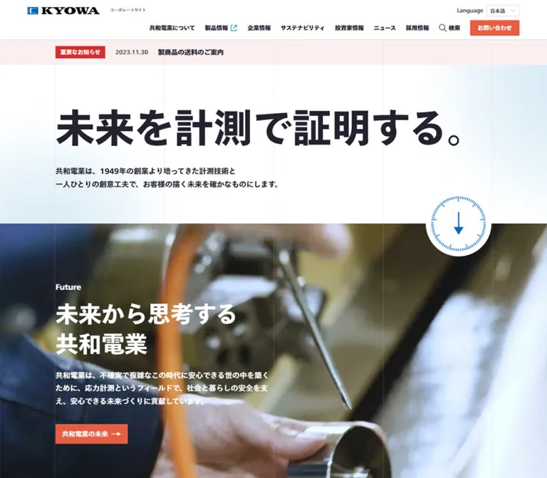
KYOWA's homepage combines an assertive corporate statement with a substantial information architecture. The opening headline, “未来を計測で証明する。”, is set at 96px on desktop against a nearly white field with diffuse blue at the edges. Fine vertical rules organize the page without enclosing everything in cards. Dense navigation sits above this generous opening, while compact coral buttons identify routes into the wider site.
Further down, white text and large photographs sit on a dark blue field. The Business composition pairs a substantial text column with an image-led story column. Investor and recruitment panels lead into a dark, densely linked footer. These are routes for several audiences—customers, investors, applicants, and corporate-information readers—rather than a single conversion funnel.
A large English cookie notice remains visible in every supplied current-page screenshot. It is a separate utility layer with its own pill buttons and regular-weight text. Its obstruction is part of the captured state, but its styling should not become the template for the main corporate interface.
Precision expressed through bold Japanese type, fine vertical rules, and expansive blue fields.
Original URL: https://www.kyowa-ei.com/ Final URL: https://www.kyowa-ei.com/ Theme: a light opening followed by blue, dark navy, photographic, and light editorial sections; no user-selectable theme was verified. Inspected: September 17, 2026, at 05:20 JST. The supplied retrieval timestamp is September 16, 2026, at 20:20:31.937 UTC. Viewports: desktop 1440 × 1000 and mobile 390 × 844 CSS pixels. Scope: the current Japanese corporate homepage. Visual evidence covers the desktop opening, Business section, and footer, plus the mobile opening and footer. Supplied rendered DOM measurements additionally cover Future, Products, History, news, contact, navigation candidates, and footer links. Linked pages and control outcomes were not inspected.
KYOWA's homepage combines an assertive corporate statement with a substantial information architecture. The opening headline, “未来を計測で証明する。”, is set at 96px on desktop against a nearly white field with diffuse blue at the edges. Fine vertical rules organize the page without enclosing everything in cards. Dense navigation sits above this generous opening, while compact coral buttons identify routes into the wider site.
Further down, white text and large photographs sit on a dark blue field. The Business composition pairs a substantial text column with an image-led story column. Investor and recruitment panels lead into a dark, densely linked footer. These are routes for several audiences—customers, investors, applicants, and corporate-information readers—rather than a single conversion funnel.
A large English cookie notice remains visible in every supplied current-page screenshot. It is a separate utility layer with its own pill buttons and regular-weight text. Its obstruction is part of the captured state, but its styling should not become the template for the main corporate interface.
--tw-* entries, but no semantic brand-token definitions.| Name | Value | Suggested token | Role and evidence |
|---|---|---|---|
| Corporate Blue | #0069bc |
--color-blue |
Measured on the mobile Future label; visually corresponds to the major blue brand fields |
| Charcoal Ink | #22222f |
--color-ink |
Measured body text and History background; visually consistent with the footer |
| Action Coral | #e55e43 |
--color-action |
Measured primary button fill and secondary button text |
| White | #ffffff |
--color-white |
Measured reversed text, language-control surface, and secondary action surfaces |
| Notice Wash | #fcf0f0 |
--color-notice |
Measured full-width important-notice background |
| Muted Text | #64646d |
--color-muted |
Measured small corporate-site descriptor beside the logo |
| Footer Gray | #a7a7ac |
--color-footer-text |
Measured mobile footer links |
| Subdued White | rgba(255,255,255,.8) |
--color-caption-inverse |
Measured History milestone caption |
| Treatment | Approximation | Evidence status |
|---|---|---|
| Important-notice badge | Around #df262e |
Screenshot estimate; the badge's own computed fill was not supplied |
| Lower Business background | Around #15374f |
Screenshot estimate for the blue end of the dark field |
| Pale blue hero glow | White fading toward a very light cyan-blue | Visible; exact stops, opacity, and geometry are unknown |
| Vertical rules on light sections | A very low-opacity blue-gray | Visible; no exact stroke color supplied |
| Vertical rules on dark sections | A low-opacity pale gray-blue | Visible; no exact opacity supplied |
| Consent button blue | Visually close to Corporate Blue | Screenshot estimate, not a measured consent-component token |
| Consent close-control outline | Bright blue | Visible; whether this is a focus state or permanent border is unverified |
Use coral to identify navigation actions, blue to establish the brand, and red to distinguish the important notice. These roles are separate. The footer and History section use a near-black navy; the Business background has a visibly bluer lower region.
The hero's soft blue illumination remains secondary to its headline. Reproduce it with restrained gradients, not a saturated gradient across every surface.
Measured family: TazuganeGothicStdN-Bold throughout the sampled corporate interface.
The supplied records use this family name even when font-weight is 350, 400, or 600. Preserve the distinction between the family identifier and the computed weight. The evidence does not establish separate font files, a variable-font axis, successful rendering of every requested weight, or a fallback stack.
The visual character is dense, confident Japanese Gothic typography with normal tracking. Large headings gain emphasis through size and weight, while body copy remains comparatively substantial. Do not substitute an unrelated display face and compensate with excessive letter spacing.
The KYOWA wordmark is visible as brand artwork. Its lettering should not be recreated by typing the company name in the body font.
Values below are measured unless explicitly marked as estimates.
| Role | Desktop size / line height | Mobile size / line height | Computed weight |
|---|---|---|---|
| Opening statement | 96px / 115.2px |
44px / 55px |
700 |
| Main story heading | 56px / 72.8px |
28px / 42px |
Desktop 700; mobile commonly 750 |
| Introductory body copy | 18px / 31.5px |
16px / 28px |
600 |
| English section label | 18px / 28px |
16px / 28px |
Usually 700; mobile Future 750 |
| Business story title | 24px / 36px |
18px / 27px |
700 |
| Business story description | 16px / 28px |
Not included in the mobile extracted story text | Desktop 400 |
| News heading | 32px / 48px |
22px / 33px |
700 |
| Notice-section heading | 24px / 36px |
18px / 27px |
700 |
| General body baseline | 16px / 28px |
16px / 28px |
400 |
| Desktop navigation label | 14px / 14px |
Offscreen mobile navigation uses 16px / 16px |
700 / 600 |
| Standard section CTA | 16px / 16px |
14px / 14px or 16px / 16px |
600 |
| Header contact CTA | 14px / 14px |
Same values in the offscreen menu record | 600 |
| Corporate-site descriptor | 10px / 16px |
10px / 16px |
400 |
| History year | 24px / 28px |
24px / 28px |
350 |
| History caption | 14px / 28px |
14px / 28px |
350 |
| Mobile footer links | Not sampled here | 14px / 14px |
600 |
| Consent paragraph | Approximately 13px / 28px |
Approximately 13px / 28px |
Regular appearance; screenshot estimate |
The opening statement is approximately 1.71 times the desktop story-heading size. Mobile does not apply one global scale factor: the statement becomes 44px, story headings become 28px, and body copy changes only from 18px to 16px.
The desktop hero uses one headline line followed by two separate introductory lines. On mobile, the headline occupies a measured 110px box, equivalent to two 55px lines, and the introduction is a continuous paragraph occupying three 28px lines.
Business uses a two-line main heading at both inspected widths, but at substantially different sizes. Several display headings are paragraph elements in the supplied DOM. A new implementation should retain their appearance while using a meaningful h1/h2/h3 hierarchy.
The consent text appears in a separate regular sans-serif treatment. Its exact font family was not supplied.
There is a recurring 4px-based rhythm, but no original spacing-token system was exposed. These are useful aliases for measured values, not recovered source variables.
| Value | Measured use |
|---|---|
4px |
Product-link icon gap in desktop navigation |
8px |
CTA icon gap; language-control gap; news-row content gap |
12px |
Important-notice row gap |
16px |
Notice vertical padding; CTA horizontal padding; section-label-to-heading gap |
24px |
Desktop navigation gaps; heading-to-body spacing; mobile Business item gap |
32px |
Hero statement-to-introduction spacing |
40px |
Common body-to-CTA spacing; clearance between desktop Business content blocks |
52px |
Mobile hero bottom padding |
64px |
Common mobile section vertical padding |
80px |
Desktop hero bottom padding; inset above the current blue notice heading |
96px |
Desktop space between the important-notice strip and hero text box |
120px |
Desktop Products, History, and news section padding values |
140px / 151px |
Desktop Future top and bottom padding values |
| Element | Value | Evidence |
|---|---|---|
| Corporate CTAs | 2px |
Measured |
| Language selector | 2px |
Measured |
| Sampled content sections and links | 0 |
Measured |
| Business photograph | Visually square | Screenshot |
| Investor/recruitment panels | Square | Screenshot |
| Consent action buttons | Pill shape, approximately 21px radius at 42px height | Screenshot estimate |
| Consent close button | Slightly rounded square | Screenshot estimate |
The main site has no general rounded-card system. Use tiny control radii and crisp image boundaries. The consent buttons are a separate exception.
| Element | Desktop | Mobile | Status |
|---|---|---|---|
| Header / main boundary | y = 96px |
y = 51px |
Measured |
| Header logo link | 176 × 48px, at x = 72px |
117.33 × 12px, at x = 19.5px |
Measured; desktop link includes vertical padding |
| Main content inset | 144px |
19.5px |
Measured |
| Main content width | 1152px |
351px |
Measured |
| Important-notice inset | 144px |
39px |
Measured; mobile notice is more inset than ordinary content |
| Important-notice height | 62px |
98px |
Measured |
| Hero text-box start | y = 254px |
y = 189px |
Measured |
| Standard section CTA | Frequently 176 × 48px |
Usually 351px wide, 38px or 48px high |
Measured |
| Business text and story blocks | 536px each, starting at x = 144px and 720px |
Story items 240px wide |
Measured |
| Mobile Business item origins | — | 19.5px, 283.5px, 547.5px |
Measured; establishes a 24px gap |
| Mobile Future media-sized region | — | 390 × 219.375px |
Measured box; calculated aspect ratio 16:9 |
| Desktop investor/recruitment panels | Approximately 720 × 288px each |
Stacked regions | Screenshot estimate plus mobile DOM order |
| Document height | 7616.53px |
5870.89px |
Measured at capture time |
The desktop screenshots show guide lines around x = 144, 432, 720, 1008, 1296px. These divide the 1152px content span into four 288px bays. On mobile, visible rules are near x = 19.5, 195, 370.5px, suggesting two 175.5px bays.
These positions are screenshot readings supported by the measured content insets. They establish alignment, but do not prove a particular CSS grid implementation. A decorative pseudo-element is a practical recreation. Keep it behind content and exclude it from hit testing.
Role: identify the corporate site and expose its major information routes.
The desktop header is a white, two-level arrangement. The logo and small “コーポレートサイト” descriptor occupy the upper left. Language controls sit at the upper right. Navigation occupies the lower row and ends with search and a coral “お問い合わせ” button.
The header uses a 72px horizontal inset at 1440px, while the main content uses 144px. This wider header footprint is deliberate: do not force both onto the same narrow content column.
Navigation labels use 14px bold type. Ordinary navigation hit regions are 56px tall. The contact button is 120 × 38px with a 2px radius. The product link includes a small blue external-link symbol; search combines a magnifier with its label.
On mobile, the header becomes approximately 51px tall. The smaller logo, descriptor, and hamburger fit on one row. The full desktop navigation is absent from the visible capture. No persistent sticky-header behavior was established; the header is not visible in the supplied lower-page screenshots.
Role: organize a large corporate information hierarchy.
Desktop DOM records include submenu rows approximately 280 × 40px, with 8px 22px padding and 14px / 17.5px bold text. Long labels increase some rows to 51px. Nested candidates appear either 280px to the right or 280px to the left of their parent columns, depending on the navigation group.
These measurements describe DOM candidates, not a visibly opened menu. Backgrounds, hover states, activation method, focus behavior, and dismissal behavior remain unverified.
Mobile menu rows begin around x = 409.5px, outside the 390px viewport. Their width is 351px, with typical heights of 57px and 20px vertical padding. This is consistent with an offscreen menu arrangement, but its opening animation and working state were not tested.
Role: present a current, high-priority announcement before the brand statement.
A full-width pale pink band contains a red “重要なお知らせ” badge, a muted date, and a dark title. The captured title is “製品価格改定のご案内”, dated 2026.09.01. The entire strip is a link to a document.
Desktop anatomy is one horizontal row with 24px column gaps, 16px vertical padding, and a 144px inset. On mobile, the badge and date remain together while the title moves below. The strip grows from 62px to 98px tall and retains a 10% horizontal inset—39px at the inspected width.
Treat its date and announcement as changing content. Its hierarchy and wrapping behavior are the reusable design pattern.
Role: state the company's positioning with maximum typographic emphasis.
The hero's primary material is text. A 96px headline sits above 18px supporting copy in a 1152px content span. The measured gap below the headline is 32px. The surrounding white field has pale blue illumination and visible vertical rules, with no enclosing card.
On mobile, the title becomes 44px with a 55px line height. The content inset decreases to 19.5px, and the lead becomes 16px with a 28px line height. The title remains large enough to dominate the narrow viewport.
The current desktop hero is followed by a separate blue notice section. Its presence should not be removed to create a cleaner opening composition.
Role: carry a separate corporate notice beneath the opening statement.
The captured section contains the heading “令和8年熊本地震による災害のお見舞い” and supporting text. This is quoted page content, not independently verified event information.
The section uses reversed text on a visually solid blue field. Desktop measurements show a 24px heading, 18px body text, and a total section height of 275px. Mobile uses an 18px heading, 14px body text with 24.5px leading, and a 244.5px section box.
It follows the same content alignment as adjacent sections. It is a full-width information band rather than a floating alert card.
Role: introduce the company's forward-looking narrative and link to its dedicated page.
Desktop DOM measurements show white text, a 576px-wide copy block, a small English label, a two-line 56px heading, supporting text, and a 176 × 48px coral CTA. The section is approximately 687px tall, with 140px top and 151px bottom padding.
The supplied current screenshots do not expose its media clearly enough to identify the subject or format. Do not invent an image filename, video source, playback behavior, or crop.
Mobile separates a 390 × 219.375px media-sized region from a following 428px text section. The text section has 64px vertical padding, dark text, a blue Future label, and a full-width 38px-high CTA. This is a structural change from the desktop reversed-text composition, not merely a smaller version of it.
Role: connect measurement technology to safety, infrastructure, and research.
The desktop screenshot presents a dark charcoal-to-blue field with vertical guides. The left column contains the Business label, a large two-line heading, four lines of substantial body copy, and a coral arrow CTA. The right column contains a large rectangular photograph, a 24px story title, and supporting copy.
Measured content blocks are 536px wide at x = 144px and x = 720px. One useful reconstruction is two 576px tracks with 40px of trailing clearance inside each track.
The visible photograph shows a person climbing an indoor bouldering wall. Its screen bounds are approximately 536 × 400px; use this as a screenshot estimate, not an exact original aspect-ratio declaration. The colorful holds and blue wall create visual continuity with the surrounding blue palette.
The DOM records three stories across a 3000px desktop section. The middle capture pairs the introduction with the third story, suggesting a staged or pinned narrative arrangement. The exact positioning mechanism and scroll relationship were not supplied.
On mobile, the introduction precedes a horizontal row of 240px-wide story items, separated by 24px. The business CTA follows that row and spans 351px. Story descriptions present on desktop do not appear in the supplied mobile extracted story text. Horizontal geometry is measured; working swipe, drag, pagination, and snap behavior are unverified.
Role: provide a compact, repeatable route to a section or inquiry page.
The core treatment is coral fill, white text, a right-pointing arrow, a 2px radius, 8px vertical padding, 16px horizontal padding, and an 8px label-to-icon gap. Typical desktop section buttons are 48px tall with 16px semibold labels. The header version is 38px tall with 14px text.
Mobile Future and Business buttons are 38px tall and full width. Products, History, contact, and the lower portal buttons retain 48px height. Do not normalize every source button to one height when documenting the captured design.
The secondary treatment reverses the surface to white and uses coral text with a visible coral outline. It appears over the investor and recruitment panels.
Role: direct visitors from the corporate narrative to the separate product website.
Measured desktop layout centers the headline block, supporting copy, and coral product-site CTA. It uses a 56px two-line heading and 18px supporting text. The section box is 1000px tall, with 120px top padding and a substantial lower region.
Mobile uses a 660px section box, 64px top padding, a 28px heading, 16px body text, and a full-width 48px CTA. The supplied records show 224px bottom padding.
These measurements establish the text hierarchy and reserved space. They do not establish the appearance of imagery in the lower region. Do not fill that space with guessed product renders and label them as observations.
Role: connect the brand narrative to selected historical milestones.
The measured palette is white on #22222f. The content includes the History label, the captured headline “つねに未来を / 支えつづけた75年”, explanatory copy, a coral CTA, and a milestone year with a smaller caption.
The desktop snapshot includes a 2010 milestone; the mobile snapshot includes 1973. Different samples do not prove that each viewport intentionally receives a different milestone. Rotation, state, timing, and selection behavior were not verified.
Desktop descendants extend beyond the reported 272px section box, including text positioned above its top. That box must not be copied as a reliable normal-flow height. Mobile has a more conventional 766px section box, with introductory content above the milestone region.
Keep the year visually lighter than the large story headings: its recorded weight is 350, with a 14px caption at 80% white.
Role: provide an up-to-date editorial index within the corporate homepage.
The section has 120px vertical padding on desktop and 64px on mobile. Its heading is 32px on desktop and 22px on mobile. Four linked entries were supplied, each grouping a date, an IR category label, and a descriptive title.
Desktop row boxes span 1152px and are 89px high, with 16px vertical padding and an 8px content gap. Mobile rows span 351px; the three longer entries become 113px high, while the shorter entry remains 89px.
The “すべてのニュース” link sits beside the heading on desktop and after the entries on mobile. Preserve this change in reading order. The available element records do not establish every child alignment or separator style, so avoid claiming a precise multi-column news grid.
Role: provide a direct inquiry route and clear onward paths for investors and applicants.
The lower page contains a blue contact area followed by investor and recruitment panels. The contact copy and link are present in both DOM snapshots. On mobile, the inquiry statement uses 22px / 33px bold type and a 351 × 48px coral CTA.
In the desktop screenshot, investor and recruitment panels split the viewport into two equal halves. Each is approximately 288px tall. The left panel uses a very dark background with a fine dotted wave or mesh image. The right panel uses a photograph of employees conversing outdoors, darkened with a blue overlay so white text remains prominent.
Each panel contains a heading and a compact white button with coral text and border. On mobile, the panels stack and the buttons become full width. DOM measurements place the mobile investor and recruitment headings 241px apart.
Role: expose the complete site hierarchy, utility links, and corporate identity.
The desktop footer is a broad dark field with a reversed KYOWA logo, followed by five main link columns. The columns align approximately with an evenly divided 1152px content area. Muted gray links create a quieter hierarchy than the white logo and portal headings above.
Mobile uses a smaller reversed logo followed by ruled category rows with plus symbols on the right. These visually indicate expandable groups. The supplied screenshot shows collapsed-looking top-level rows; the DOM includes their descendant links, but expanded behavior was not tested.
Measured mobile links use 14px semibold text. Nested links add approximately 16px indentation per level, with many 46px-tall link regions. Utility links, social destinations, language controls, and copyright are present in the extracted page text, although much of the footer is covered by the consent notice.
Role: present tracking information and consent choices independently of the corporate content.
On desktop, a white panel occupies the bottom 340px of each screenshot. Its left text region begins around x = 56px; a 256px-wide action stack begins around x = 1128px. Three blue pill buttons are labeled Privacy Settings, Reject All, and Accept All. Their visible heights are approximately 42px, with 12px vertical gaps.
A roughly 46px-square close control sits at the upper right. The paragraph uses small regular sans-serif text with generous leading. A separate Privacy Policy link appears below. The text also exposes an unresolved link-template fragment, which should be treated as a content defect rather than a decorative convention.
The panel stays in the same screen position while the underlying captured page position changes. This supports viewport-anchored behavior, although its exact CSS positioning was not supplied.
At 390 × 844, the panel begins around y = 253px. Its visible portion occupies about 70% of the viewport, and the paragraph continues below the screenshot. The three action labels exist in the DOM, but their mobile visibility, reachability, and internal scrolling were not demonstrated. No consent, dismissal, or settings action was tested.
| Treatment | Supplied evidence | Safe interpretation |
|---|---|---|
| Primary desktop navigation | 0.2s cubic-bezier(0.4, 0, 0.2, 1) |
A short transition is configured; the changed property and visual result were not captured |
| Submenu candidates | 0.2s cubic-bezier(0, 0, 0.2, 1) |
Timing is measurable, but activation and movement are unverified |
| Search control | 0.2s cubic-bezier(0, 0, 0.2, 1) |
A defined transition does not establish the search-panel behavior |
| Footer social links | opacity 0.15s cubic-bezier(0.4, 0, 0.2, 1) |
Opacity is the specified transition property; endpoint values were not supplied |
| Business section | 3000px desktop section; three vertically distributed stories; introduction beside the third story in a capture | Consistent with staged scrolling; exact pinning and interpolation remain unverified |
| Mobile Business items | Three items sharing a vertical position and extending horizontally beyond the viewport | Horizontal track geometry is established; gesture and snapping behavior are not |
| History content | Different milestone text across the two samples | Multiple states are represented; autoplay and transition timing are unknown |
| Consent panel | Same screen placement across page positions | Viewport anchoring is visually supported; dismissal and persistence are unverified |
Many sampled elements report animation: none. This applies only to those records. It does not establish that background media, pseudo-elements, scripts, or the entire page are static.
Likewise, a bare computed transition: all without a supplied nonzero duration is not evidence of visible animation. Do not invent a reveal system, parallax speed, looping video, or carousel interval.
Recommended motion: use restrained 150–200ms feedback for ordinary controls. Keep any later implementation of staged storytelling optional until its behavior can be inspected directly. Provide a normal reading flow under reduced motion.
| Surface | Appearance | Structural role |
|---|---|---|
| Header | White with a fine lower boundary | Dense global navigation |
| Important notice | Pale pink band with red badge | High-priority information |
| Hero | White with faint blue glow and vertical rules | Maximum emphasis on the opening statement |
| Blue information field | Strong blue, white type | Separate corporate notice and lower contact context |
| Business field | Dark charcoal blending toward blue, pale rules | Long-form visual storytelling |
| History field | Measured solid #22222f |
Historical narrative and milestone content |
| News region | Light presentation indicated by dark text | Editorial index; detailed backdrop not separately sampled |
| Audience portals | Dark imagery beneath white text | Investor and recruitment navigation |
| Footer | Dark navy with white branding and gray links | Dense site directory |
| Consent panel | Opaque white with blue pill buttons | Independent utility overlay |
There is no visible general elevation system of floating cards and soft shadows. Section color, typography, rules, and image boundaries provide most of the separation. A slight edge shadow is visible around the consent layer, but it should not be generalized across the site.
The current visible imagery grounds the technical brand in human activity. The Business photograph shows an indoor climber on a blue-and-white wall with colorful holds. The recruitment panel shows employees talking in an outdoor workplace setting. The investor panel uses an abstract dotted wave or mesh rather than another human photograph.
Preserve these distinct functions: activity photography for the business narrative, people and place for recruitment, and abstract precision for investor information. Keep the photographs rectangular and let their subjects supply visual complexity. The main text does not need illustrated decorations competing with it.
The recruitment photograph is visibly tinted blue and darkened beneath white copy. The Business photograph remains more natural in color. Avoid applying one heavy duotone filter indiscriminately to every image.
No original media asset URLs were supplied. The following are visual references, not downloadable paths.
| Asset | Current evidence | Implementation guidance |
|---|---|---|
| Header KYOWA logo | Desktop and mobile opening captures | Use authorized logo artwork; preserve its proportions |
| Reversed KYOWA logo | Desktop and mobile footer captures | Use a proper reversed asset, not reconstructed text |
| Indoor climbing photograph | Desktop Business capture | Preserve the person's action and blue wall context; approximate 4:3 framing is a recommendation |
| Employee conversation photograph | Desktop recruitment panel and a narrow mobile fragment | Retain people in the crop and enough tonal suppression for white labels |
| Dotted wave / mesh graphic | Desktop investor panel | Keep fine detail subtle against a nearly black field |
| Hero blue glow | Current opening captures | Can be approximated with restrained CSS gradients |
| Future, Products, and History media | Relevant regions exist in DOM; imagery is not sufficiently exposed in the supplied current captures | Leave asset choice unresolved until original media is available |
The main content span is 80% of the inspected desktop viewport: 144px margins around 1152px of content. The header spans a wider 90% region. Five faint vertical lines form four large content bays and continue through several visually different sections.
The page alternates a typographic opening, information bands, narrative sections, editorial content, audience portals, and a site directory. Maintain this hierarchy instead of converting the whole homepage into interchangeable feature cards.
The 3000px Business section is a major contributor to the desktop document height. Its length and the anomalous History rectangles suggest behavior that a static stack alone may not reproduce. They are inspection findings, not sufficient specifications for a scrolling engine.
| Area | Observed mobile adaptation |
|---|---|
| Header | Compact logo, descriptor, and hamburger; approximately 51px tall |
| Main margins | 5% rather than the desktop's 10% |
| Important notice | Retains 10% margins and wraps the title below badge/date |
| Hero | 44px title over two measured lines; continuous 16px introduction |
| Future | Media-sized region followed by a separate light text section |
| Business | Introduction, horizontal 240px story items, then full-width CTA |
| Products | Smaller heading and full-width CTA; substantial lower space remains |
| History | Introductory content above the milestone region |
| News | Taller wrapped entries; all-news link moves below the list |
| Audience portals | Investor and recruitment panels stack |
| Footer | Category rows use plus symbols and horizontal separators |
| Consent | Visible notice occupies approximately 70% of the viewport; actions are not shown in the supplied mobile crops |
Only the two endpoint viewports were supplied. The exact breakpoint, tablet layout, wider-screen maximum width, landscape behavior, and browser-zoom behavior remain unknown.
For implementation, a breakpoint around 64rem is a reasonable starting recommendation, but it is not a recovered source value. Intermediate widths require testing, especially for the dense header and long Japanese headings.
These are recommendations for a new implementation, not verified features of the original page:
h1 for the opening statement and meaningful section headings beneath it.aria-expanded and aria-controls; keep actual destinations as links.#22222f.#0069bc.#e55e43.#fcf0f0.#ffffff.#a7a7ac.#64646d.“Create a Japanese corporate homepage for a measurement-technology company using the KYOWA reference's measured hierarchy. Use a white opening with subtle pale-blue illumination, dark ink #22222f, fine vertical guides, and a bold Japanese Gothic statement at 96px on a 1440px desktop. Place the main content inside 144px margins and use a denser, wider two-level header. Follow with broad blue and dark narrative sections, rectangular activity photography, compact coral #e55e43 arrow buttons, a news index, investor and recruitment portals, and a substantial dark footer. At 390px, use 19.5px main margins, a 44px statement, 28px story headings, separated Future media and copy, a horizontal Business story row, and full-width section buttons. Preserve the site's multiple information routes. Do not invent media assets or unverified scrolling behavior.”
This is an implementation starter, not recovered source CSS. Exact colors and typography come from measured records; gradient endpoints, guide opacity, a 64rem breakpoint, and image aspect ratios are recommendations. The Business layout below uses ordinary document flow rather than recreating an unverified pinned sequence. The consent layout deliberately improves mobile action access.
The font declaration does not download a font. Supply a properly licensed face if available; the proposed system fallback will produce different metrics. Use authorized logo and photographic assets separately.
:root {
  /* Measured palette */
  --color-blue: #0069bc;
  --color-ink: #22222f;
  --color-action: #e55e43;
  --color-white: #ffffff;
  --color-notice: #fcf0f0;
  --color-muted: #64646d;
  --color-footer-text: #a7a7ac;

  /* Screenshot approximations */
  --color-alert: #df262e;
  --color-business-end: #15374f;
  --rule-color: rgb(0 105 188 / 12%);

  /* Observed family; recommended fallback */
  --font-site: 'TazuganeGothicStdN-Bold', system-ui, sans-serif;
  --font-consent: system-ui, sans-serif;
  --text-hero: 44px;
  --leading-hero: 1.25;
  --text-story: 28px;
  --leading-story: 1.5;
  --weight-story: 750;
  --text-lead: 16px;
  --text-kicker: 16px;

  /* Mobile measurements */
  --page-gutter: 5vw;
  --header-gutter: 5vw;
  --section-space: 64px;
  --grid-step: 50%;
  --radius-control: 2px;
  --motion-nav: 200ms cubic-bezier(0.4, 0, 0.2, 1);
}

* { box-sizing: border-box; }
body {
  margin: 0;
  color: var(--color-ink);
  background: var(--color-white);
  font-family: var(--font-site);
  font-size: 16px;
  font-weight: 400;
  line-height: 1.75;
}
button, input, select { font: inherit; }
img { display: block; max-inline-size: 100%; }
a { color: inherit; }

.ruled { position: relative; isolation: isolate; }
.ruled::before {
  content: '';
  position: absolute;
  inset: 0 var(--page-gutter);
  z-index: 0;
  pointer-events: none;
  border-inline-end: 1px solid var(--rule-color);
  background-image: linear-gradient(
    to right, var(--rule-color) 1px, transparent 1px
  );
  background-size: var(--grid-step) 100%;
}
.ruled > * { position: relative; z-index: 1; }

.site-header {
  display: flex;
  align-items: center;
  gap: 16px;
  min-block-size: 51px;
  padding-inline: var(--header-gutter);
  border-bottom: 1px solid rgb(34 34 47 / 16%);
  background: var(--color-white);
}
.brand { flex: none; }
.brand img { inline-size: 117.33px; }
.brand-caption {
  margin: 0;
  color: var(--color-muted);
  font-size: 10px;
  line-height: 16px;
}
.desktop-nav, .header-language { display: none; }
.menu-toggle {
  margin-inline-start: auto;
  min-inline-size: 44px;
  min-block-size: 44px;
  border: 0;
  background: transparent;
}

.important-notice {
  display: flex;
  flex-wrap: wrap;
  align-items: center;
  gap: 12px 24px;
  padding: 16px 10vw;
  background: var(--color-notice);
  text-decoration: none;
}
.notice-badge {
  padding: 4px 12px;
  color: var(--color-white);
  background: var(--color-alert);
  font-size: 14px;
  font-weight: 700;
  line-height: 22px;
}
.notice-date { color: var(--color-muted); }
.notice-title { flex-basis: 100%; }

.hero {
  padding: 40px var(--page-gutter) 52px;
  background:
    radial-gradient(ellipse at 0% 100%, #deeff7, transparent 38%),
    radial-gradient(ellipse at 100% 0%, #deeff7, transparent 32%),
    var(--color-white);
}
.hero h1 {
  margin: 0 0 32px;
  font-size: var(--text-hero);
  font-weight: 700;
  line-height: var(--leading-hero);
}
.lead {
  margin: 0;
  font-size: var(--text-lead);
  font-weight: 600;
  line-height: 1.75;
}
.site-section { padding: var(--section-space) var(--page-gutter); }
.section-kicker {
  margin: 0 0 16px;
  font-size: var(--text-kicker);
  font-weight: 700;
  line-height: 28px;
}
.section-title {
  margin: 0 0 24px;
  font-size: var(--text-story);
  font-weight: var(--weight-story);
  line-height: var(--leading-story);
}
.section-action { margin-block-start: 40px; }
.blue-section { color: white; background: var(--color-blue); }
.business-section {
  --rule-color: rgb(255 255 255 / 18%);
  color: white;
  background: linear-gradient(
    var(--color-ink), var(--color-business-end)
  );
}

.cta {
  display: inline-flex;
  align-items: center;
  justify-content: center;
  gap: 8px;
  min-block-size: 48px;
  padding: 8px 16px;
  border: 0;
  border-radius: var(--radius-control);
  color: white;
  background: var(--color-action);
  font-size: 16px;
  font-weight: 600;
  line-height: 1;
  text-decoration: none;
}
.cta--small { min-block-size: 38px; font-size: 14px; }
.cta--wide-mobile { inline-size: 100%; }
.cta--compact-mobile { min-block-size: 38px; font-size: 14px; }
.cta--outline {
  border: 2px solid var(--color-action);
  padding-inline: 14px;
  color: var(--color-action);
  background: white;
}

/* Recommended normal-flow version of the measured Business geometry */
.business-layout {
  display: grid;
  grid-template-areas: 'intro' 'stories' 'action';
  gap: 40px;
}
.business-intro { grid-area: intro; min-inline-size: 0; }
.business-stories {
  grid-area: stories;
  display: flex;
  gap: 24px;
  min-inline-size: 0;
  overflow-x: auto;
  margin-inline: calc(-1 * var(--page-gutter));
  padding-inline: var(--page-gutter);
}
.business-action { grid-area: action; }
.story-card { flex: 0 0 240px; min-inline-size: 0; }
.story-card img {
  inline-size: 100%;
  aspect-ratio: 4 / 3;
  object-fit: cover;
}
.story-card h3 {
  margin: 24px 0 8px;
  font-size: 18px;
  line-height: 1.5;
}
.story-description { display: none; margin: 0; }

.portal-grid { display: grid; }
.portal {
  position: relative;
  padding: 64px var(--page-gutter);
  color: white;
  background: var(--color-ink);
}
.portal h2 { margin: 0 0 32px; font-size: 22px; line-height: 1.5; }
.site-footer {
  padding: 32px var(--page-gutter);
  color: var(--color-footer-text);
  background: var(--color-ink);
}
.footer-nav { display: grid; margin-block-start: 32px; }
.footer-row {
  padding-block: 16px;
  border-bottom: 1px solid rgb(255 255 255 / 20%);
  font-size: 14px;
  font-weight: 600;
  line-height: 16px;
}

/* Recommended consent adaptation: choices remain outside scrolling copy */
.consent-panel {
  position: fixed;
  inset-inline: 0;
  inset-block-end: 0;
  z-index: 1000;
  display: grid;
  grid-template-rows: minmax(0, 1fr) auto;
  gap: 16px;
  block-size: 70dvh;
  padding: 48px 16px max(16px, env(safe-area-inset-bottom));
  color: #000;
  background: white;
  font-family: var(--font-consent);
  font-size: 13px;
  font-weight: 400;
  line-height: 28px;
}
.consent-copy { min-block-size: 0; overflow-y: auto; }
.consent-actions { display: grid; gap: 12px; align-content: start; }
.consent-actions button {
  min-block-size: 44px;
  border: 0;
  border-radius: 999px;
  color: white;
  background: var(--color-blue);
  font-size: 15px;
  font-weight: 700;
}
.consent-close {
  position: absolute;
  inset-block-start: 6px;
  inset-inline-end: 6px;
  inline-size: 46px;
  block-size: 46px;
  border: 2px solid var(--color-blue);
  border-radius: 3px;
  background: white;
}

/* Chosen breakpoint; the original breakpoint was not supplied */
@media (min-width: 64rem) {
  :root {
    --page-gutter: 10vw;
    --section-space: 120px;
    --grid-step: 25%;
    --text-hero: 96px;
    --leading-hero: 1.2;
    --text-story: 56px;
    --leading-story: 1.3;
    --weight-story: 700;
    --text-lead: 18px;
    --text-kicker: 18px;
  }
  .site-header {
    display: grid;
    grid-template-columns: 176px minmax(0, 1fr) auto;
    grid-template-rows: 40px 56px;
    gap: 0 24px;
    border-bottom: 0;
  }
  .brand { grid-area: 1 / 1; align-self: start; padding: 17px 0 13px; }
  .brand img { inline-size: 176px; }
  .brand-caption { grid-area: 1 / 2; align-self: start; margin-top: 16px; }
  .header-language {
    grid-area: 1 / 3;
    display: flex;
    align-self: start;
    margin-top: 12px;
  }
  .desktop-nav {
    grid-area: 2 / 1 / 3 / -1;
    display: flex;
    align-items: center;
    justify-content: flex-end;
    gap: 24px;
    min-block-size: 56px;
    font-size: 14px;
    font-weight: 700;
    line-height: 1;
  }
  .desktop-nav a { text-decoration: none; }
  .menu-toggle { display: none; }
  .notice-title { flex-basis: auto; }
  .hero { padding-block: 96px 80px; }
  .cta--wide-mobile { inline-size: auto; }
  .cta--compact-mobile { min-block-size: 48px; font-size: 16px; }
  .business-layout {
    grid-template-areas: 'intro stories' 'action stories';
    grid-template-columns: repeat(2, minmax(0, 1fr));
    grid-template-rows: min-content 1fr;
    gap: 40px 0;
    align-items: start;
  }
  .business-intro { padding-inline-end: 40px; }
  .business-stories {
    display: grid;
    gap: 64px;
    overflow: visible;
    margin: 0;
    padding: 0 40px 0 0;
  }
  .business-action { justify-self: start; }
  .story-card h3 { font-size: 24px; }
  .story-description { display: block; }
  .portal-grid { grid-template-columns: repeat(2, minmax(0, 1fr)); }
  .portal { padding: 80px; }
  .portal:first-child { padding-inline-start: var(--page-gutter); }
  .portal h2 { font-size: 32px; }
  .site-footer { padding-block: 40px; }
  .footer-nav {
    grid-template-columns: repeat(5, minmax(0, 1fr));
    margin-block-start: 64px;
  }
  .consent-panel {
    grid-template-columns: minmax(0, 1fr) 256px;
    grid-template-rows: minmax(0, 1fr);
    gap: 48px;
    block-size: 340px;
    max-block-size: 80dvh;
    padding: 48px 56px 24px;
  }
  .consent-actions { padding-block-start: 8px; }
  .consent-actions button { min-block-size: 42px; }
}

/* Recommended interaction and accessibility additions */
:where(a, button, summary, input, select):focus-visible {
  outline: 3px solid currentColor;
  outline-offset: 4px;
}
@media (hover: hover) {
  .cta { transition: filter var(--motion-nav); }
  .cta:hover { filter: brightness(.92); }
}
@media (prefers-reduced-motion: reduce) {
  .cta { transition: none; }
  .business-stories { scroll-behavior: auto; }
}
Use .business-intro, .business-stories, and .business-action as sibling elements inside .business-layout. Portal photography, navigation panels, footer expansion, consent state, and persistence require markup and behavior beyond this CSS. Give all icon controls accessible labels. Do not treat the hover filter above as an observed original effect.
Optional aliases for a project that already uses Tailwind v4. The supplied --tw-* properties do not establish the original site's framework version. Define the custom properties above first.
@theme inline {
  --color-kyowa-blue: var(--color-blue);
  --color-kyowa-ink: var(--color-ink);
  --color-kyowa-action: var(--color-action);
  --color-kyowa-notice: var(--color-notice);
  --color-kyowa-muted: var(--color-muted);
  --color-kyowa-footer: var(--color-footer-text);

  --font-kyowa: var(--font-site);
  --text-display: var(--text-hero);
  --text-section: var(--text-story);
  --text-lead: var(--text-lead);
  --spacing-page: var(--page-gutter);
  --spacing-section: var(--section-space);
  --radius-control: 2px;
}
2026-09-16T20:20:31.937Z, equivalent to September 17, 2026, 05:20:31.937 JST.The cookie notice, offscreen navigation candidates, unsampled media, and unusual History rectangles limit what can be claimed about the complete experience. Exact measurements, screenshot estimates, calculations, and implementation recommendations are kept distinct throughout.
# KYOWA / 共和電業 — Style Reference

> Precision expressed through bold Japanese type, fine vertical rules, and expansive blue fields.

**Original URL:** [https://www.kyowa-ei.com/](https://www.kyowa-ei.com/)
**Final URL:** [https://www.kyowa-ei.com/](https://www.kyowa-ei.com/)
**Theme:** a light opening followed by blue, dark navy, photographic, and light editorial sections; no user-selectable theme was verified.
**Inspected:** September 17, 2026, at 05:20 JST. The supplied retrieval timestamp is September 16, 2026, at 20:20:31.937 UTC.
**Viewports:** desktop 1440 × 1000 and mobile 390 × 844 CSS pixels.
**Scope:** the current Japanese corporate homepage. Visual evidence covers the desktop opening, Business section, and footer, plus the mobile opening and footer. Supplied rendered DOM measurements additionally cover Future, Products, History, news, contact, navigation candidates, and footer links. Linked pages and control outcomes were not inspected.

KYOWA's homepage combines an assertive corporate statement with a substantial information architecture. The opening headline, “未来を計測で証明する。”, is set at 96px on desktop against a nearly white field with diffuse blue at the edges. Fine vertical rules organize the page without enclosing everything in cards. Dense navigation sits above this generous opening, while compact coral buttons identify routes into the wider site.

Further down, white text and large photographs sit on a dark blue field. The Business composition pairs a substantial text column with an image-led story column. Investor and recruitment panels lead into a dark, densely linked footer. These are routes for several audiences—customers, investors, applicants, and corporate-information readers—rather than a single conversion funnel.

A large English cookie notice remains visible in every supplied current-page screenshot. It is a separate utility layer with its own pill buttons and regular-weight text. Its obstruction is part of the captured state, but its styling should not become the template for the main corporate interface.
# KYOWA / 共和電業 — Style Reference

> Precision expressed through bold Japanese type, fine vertical rules, and expansive blue fields.

**Original URL:** [https://www.kyowa-ei.com/](https://www.kyowa-ei.com/)
**Final URL:** [https://www.kyowa-ei.com/](https://www.kyowa-ei.com/)
**Theme:** a light opening followed by blue, dark navy, photographic, and light editorial sections; no user-selectable theme was verified.
**Inspected:** September 17, 2026, at 05:20 JST. The supplied retrieval timestamp is September 16, 2026, at 20:20:31.937 UTC.
**Viewports:** desktop 1440 × 1000 and mobile 390 × 844 CSS pixels.
**Scope:** the current Japanese corporate homepage. Visual evidence covers the desktop opening, Business section, and footer, plus the mobile opening and footer. Supplied rendered DOM measurements additionally cover Future, Products, History, news, contact, navigation candidates, and footer links. Linked pages and control outcomes were not inspected.

KYOWA's homepage combines an assertive corporate statement with a substantial information architecture. The opening headline, “未来を計測で証明する。”, is set at 96px on desktop against a nearly white field with diffuse blue at the edges. Fine vertical rules organize the page without enclosing everything in cards. Dense navigation sits above this generous opening, while compact coral buttons identify routes into the wider site.

Further down, white text and large photographs sit on a dark blue field. The Business composition pairs a substantial text column with an image-led story column. Investor and recruitment panels lead into a dark, densely linked footer. These are routes for several audiences—customers, investors, applicants, and corporate-information readers—rather than a single conversion funnel.

A large English cookie notice remains visible in every supplied current-page screenshot. It is a separate utility layer with its own pill buttons and regular-weight text. Its obstruction is part of the captured state, but its styling should not become the template for the main corporate interface.

## How to Read This Reference

- **Measured** values come from the supplied rendered DOM and computed-style records. They are not independently fetched stylesheet declarations.
- **Screenshot estimates** describe visible colors, image dimensions, and geometry where corresponding computed properties were not supplied.
- **Calculated** values are arithmetic relationships between measurements, such as a 144px inset being 10% of a 1440px viewport.
- **Recommended** treatments are implementation choices for a new build. They do not establish behavior on the original site.
- Custom-property names in this document are reusable aliases. The supplied root properties contain utility-related `--tw-*` entries, but no semantic brand-token definitions.
- Offscreen menu entries, duplicate responsive content, and overlapping element rectangles appear in the DOM evidence. Their presence does not mean they were visibly open.
- The consent notice obscures the lower 340px of the desktop captures and approximately 591px of the mobile captures. DOM measurements support analysis beneath that obstruction, but cannot supply missing visual or interaction evidence.

## Tokens — Colors

### Default Palette

| Name | Value | Suggested token | Role and evidence |
| --- | --- | --- | --- |
| Corporate Blue | `#0069bc` | `--color-blue` | Measured on the mobile Future label; visually corresponds to the major blue brand fields |
| Charcoal Ink | `#22222f` | `--color-ink` | Measured body text and History background; visually consistent with the footer |
| Action Coral | `#e55e43` | `--color-action` | Measured primary button fill and secondary button text |
| White | `#ffffff` | `--color-white` | Measured reversed text, language-control surface, and secondary action surfaces |
| Notice Wash | `#fcf0f0` | `--color-notice` | Measured full-width important-notice background |
| Muted Text | `#64646d` | `--color-muted` | Measured small corporate-site descriptor beside the logo |
| Footer Gray | `#a7a7ac` | `--color-footer-text` | Measured mobile footer links |
| Subdued White | `rgba(255,255,255,.8)` | `--color-caption-inverse` | Measured History milestone caption |

### Supporting Colors and Effects

| Treatment | Approximation | Evidence status |
| --- | --- | --- |
| Important-notice badge | Around `#df262e` | Screenshot estimate; the badge's own computed fill was not supplied |
| Lower Business background | Around `#15374f` | Screenshot estimate for the blue end of the dark field |
| Pale blue hero glow | White fading toward a very light cyan-blue | Visible; exact stops, opacity, and geometry are unknown |
| Vertical rules on light sections | A very low-opacity blue-gray | Visible; no exact stroke color supplied |
| Vertical rules on dark sections | A low-opacity pale gray-blue | Visible; no exact opacity supplied |
| Consent button blue | Visually close to Corporate Blue | Screenshot estimate, not a measured consent-component token |
| Consent close-control outline | Bright blue | Visible; whether this is a focus state or permanent border is unverified |

Use coral to identify navigation actions, blue to establish the brand, and red to distinguish the important notice. These roles are separate. The footer and History section use a near-black navy; the Business background has a visibly bluer lower region.

The hero's soft blue illumination remains secondary to its headline. Reproduce it with restrained gradients, not a saturated gradient across every surface.

## Tokens — Typography

### Source Family and Weight Semantics

**Measured family:** `TazuganeGothicStdN-Bold` throughout the sampled corporate interface.

The supplied records use this family name even when `font-weight` is `350`, `400`, or `600`. Preserve the distinction between the family identifier and the computed weight. The evidence does not establish separate font files, a variable-font axis, successful rendering of every requested weight, or a fallback stack.

The visual character is dense, confident Japanese Gothic typography with normal tracking. Large headings gain emphasis through size and weight, while body copy remains comparatively substantial. Do not substitute an unrelated display face and compensate with excessive letter spacing.

The KYOWA wordmark is visible as brand artwork. Its lettering should not be recreated by typing the company name in the body font.

### Type Scale

Values below are measured unless explicitly marked as estimates.

| Role | Desktop size / line height | Mobile size / line height | Computed weight |
| --- | --- | --- | --- |
| Opening statement | `96px / 115.2px` | `44px / 55px` | `700` |
| Main story heading | `56px / 72.8px` | `28px / 42px` | Desktop `700`; mobile commonly `750` |
| Introductory body copy | `18px / 31.5px` | `16px / 28px` | `600` |
| English section label | `18px / 28px` | `16px / 28px` | Usually `700`; mobile Future `750` |
| Business story title | `24px / 36px` | `18px / 27px` | `700` |
| Business story description | `16px / 28px` | Not included in the mobile extracted story text | Desktop `400` |
| News heading | `32px / 48px` | `22px / 33px` | `700` |
| Notice-section heading | `24px / 36px` | `18px / 27px` | `700` |
| General body baseline | `16px / 28px` | `16px / 28px` | `400` |
| Desktop navigation label | `14px / 14px` | Offscreen mobile navigation uses `16px / 16px` | `700` / `600` |
| Standard section CTA | `16px / 16px` | `14px / 14px` or `16px / 16px` | `600` |
| Header contact CTA | `14px / 14px` | Same values in the offscreen menu record | `600` |
| Corporate-site descriptor | `10px / 16px` | `10px / 16px` | `400` |
| History year | `24px / 28px` | `24px / 28px` | `350` |
| History caption | `14px / 28px` | `14px / 28px` | `350` |
| Mobile footer links | Not sampled here | `14px / 14px` | `600` |
| Consent paragraph | Approximately `13px / 28px` | Approximately `13px / 28px` | Regular appearance; screenshot estimate |

The opening statement is approximately 1.71 times the desktop story-heading size. Mobile does not apply one global scale factor: the statement becomes 44px, story headings become 28px, and body copy changes only from 18px to 16px.

### Line Breaking and Hierarchy

The desktop hero uses one headline line followed by two separate introductory lines. On mobile, the headline occupies a measured 110px box, equivalent to two 55px lines, and the introduction is a continuous paragraph occupying three 28px lines.

Business uses a two-line main heading at both inspected widths, but at substantially different sizes. Several display headings are paragraph elements in the supplied DOM. A new implementation should retain their appearance while using a meaningful `h1`/`h2`/`h3` hierarchy.

The consent text appears in a separate regular sans-serif treatment. Its exact font family was not supplied.

## Tokens — Spacing & Shapes

### Spacing Scale

There is a recurring 4px-based rhythm, but no original spacing-token system was exposed. These are useful aliases for measured values, not recovered source variables.

| Value | Measured use |
| --- | --- |
| `4px` | Product-link icon gap in desktop navigation |
| `8px` | CTA icon gap; language-control gap; news-row content gap |
| `12px` | Important-notice row gap |
| `16px` | Notice vertical padding; CTA horizontal padding; section-label-to-heading gap |
| `24px` | Desktop navigation gaps; heading-to-body spacing; mobile Business item gap |
| `32px` | Hero statement-to-introduction spacing |
| `40px` | Common body-to-CTA spacing; clearance between desktop Business content blocks |
| `52px` | Mobile hero bottom padding |
| `64px` | Common mobile section vertical padding |
| `80px` | Desktop hero bottom padding; inset above the current blue notice heading |
| `96px` | Desktop space between the important-notice strip and hero text box |
| `120px` | Desktop Products, History, and news section padding values |
| `140px` / `151px` | Desktop Future top and bottom padding values |

### Border Radius

| Element | Value | Evidence |
| --- | --- | --- |
| Corporate CTAs | `2px` | Measured |
| Language selector | `2px` | Measured |
| Sampled content sections and links | `0` | Measured |
| Business photograph | Visually square | Screenshot |
| Investor/recruitment panels | Square | Screenshot |
| Consent action buttons | Pill shape, approximately 21px radius at 42px height | Screenshot estimate |
| Consent close button | Slightly rounded square | Screenshot estimate |

The main site has no general rounded-card system. Use tiny control radii and crisp image boundaries. The consent buttons are a separate exception.

### Layout Measurements

| Element | Desktop | Mobile | Status |
| --- | --- | --- | --- |
| Header / main boundary | `y = 96px` | `y = 51px` | Measured |
| Header logo link | `176 × 48px`, at `x = 72px` | `117.33 × 12px`, at `x = 19.5px` | Measured; desktop link includes vertical padding |
| Main content inset | `144px` | `19.5px` | Measured |
| Main content width | `1152px` | `351px` | Measured |
| Important-notice inset | `144px` | `39px` | Measured; mobile notice is more inset than ordinary content |
| Important-notice height | `62px` | `98px` | Measured |
| Hero text-box start | `y = 254px` | `y = 189px` | Measured |
| Standard section CTA | Frequently `176 × 48px` | Usually `351px` wide, `38px` or `48px` high | Measured |
| Business text and story blocks | `536px` each, starting at `x = 144px` and `720px` | Story items `240px` wide | Measured |
| Mobile Business item origins | — | `19.5px`, `283.5px`, `547.5px` | Measured; establishes a 24px gap |
| Mobile Future media-sized region | — | `390 × 219.375px` | Measured box; calculated aspect ratio `16:9` |
| Desktop investor/recruitment panels | Approximately `720 × 288px` each | Stacked regions | Screenshot estimate plus mobile DOM order |
| Document height | `7616.53px` | `5870.89px` | Measured at capture time |

### Vertical Guide System

The desktop screenshots show guide lines around `x = 144, 432, 720, 1008, 1296px`. These divide the 1152px content span into four 288px bays. On mobile, visible rules are near `x = 19.5, 195, 370.5px`, suggesting two 175.5px bays.

These positions are screenshot readings supported by the measured content insets. They establish alignment, but do not prove a particular CSS grid implementation. A decorative pseudo-element is a practical recreation. Keep it behind content and exclude it from hit testing.

## Components

### Corporate Header

**Role:** identify the corporate site and expose its major information routes.

The desktop header is a white, two-level arrangement. The logo and small “コーポレートサイト” descriptor occupy the upper left. Language controls sit at the upper right. Navigation occupies the lower row and ends with search and a coral “お問い合わせ” button.

The header uses a 72px horizontal inset at 1440px, while the main content uses 144px. This wider header footprint is deliberate: do not force both onto the same narrow content column.

Navigation labels use 14px bold type. Ordinary navigation hit regions are 56px tall. The contact button is `120 × 38px` with a 2px radius. The product link includes a small blue external-link symbol; search combines a magnifier with its label.

On mobile, the header becomes approximately 51px tall. The smaller logo, descriptor, and hamburger fit on one row. The full desktop navigation is absent from the visible capture. No persistent sticky-header behavior was established; the header is not visible in the supplied lower-page screenshots.

### Navigation Candidates

**Role:** organize a large corporate information hierarchy.

Desktop DOM records include submenu rows approximately `280 × 40px`, with `8px 22px` padding and `14px / 17.5px` bold text. Long labels increase some rows to 51px. Nested candidates appear either 280px to the right or 280px to the left of their parent columns, depending on the navigation group.

These measurements describe DOM candidates, not a visibly opened menu. Backgrounds, hover states, activation method, focus behavior, and dismissal behavior remain unverified.

Mobile menu rows begin around `x = 409.5px`, outside the 390px viewport. Their width is 351px, with typical heights of 57px and 20px vertical padding. This is consistent with an offscreen menu arrangement, but its opening animation and working state were not tested.

### Important-Notice Strip

**Role:** present a current, high-priority announcement before the brand statement.

A full-width pale pink band contains a red “重要なお知らせ” badge, a muted date, and a dark title. The captured title is “製品価格改定のご案内”, dated `2026.09.01`. The entire strip is a link to a document.

Desktop anatomy is one horizontal row with 24px column gaps, 16px vertical padding, and a 144px inset. On mobile, the badge and date remain together while the title moves below. The strip grows from 62px to 98px tall and retains a 10% horizontal inset—39px at the inspected width.

Treat its date and announcement as changing content. Its hierarchy and wrapping behavior are the reusable design pattern.

### Opening Statement

**Role:** state the company's positioning with maximum typographic emphasis.

The hero's primary material is text. A 96px headline sits above 18px supporting copy in a 1152px content span. The measured gap below the headline is 32px. The surrounding white field has pale blue illumination and visible vertical rules, with no enclosing card.

On mobile, the title becomes 44px with a 55px line height. The content inset decreases to 19.5px, and the lead becomes 16px with a 28px line height. The title remains large enough to dominate the narrow viewport.

The current desktop hero is followed by a separate blue notice section. Its presence should not be removed to create a cleaner opening composition.

### Blue Notice Section

**Role:** carry a separate corporate notice beneath the opening statement.

The captured section contains the heading “令和8年熊本地震による災害のお見舞い” and supporting text. This is quoted page content, not independently verified event information.

The section uses reversed text on a visually solid blue field. Desktop measurements show a 24px heading, 18px body text, and a total section height of 275px. Mobile uses an 18px heading, 14px body text with 24.5px leading, and a 244.5px section box.

It follows the same content alignment as adjacent sections. It is a full-width information band rather than a floating alert card.

### Future Section

**Role:** introduce the company's forward-looking narrative and link to its dedicated page.

Desktop DOM measurements show white text, a 576px-wide copy block, a small English label, a two-line 56px heading, supporting text, and a `176 × 48px` coral CTA. The section is approximately 687px tall, with 140px top and 151px bottom padding.

The supplied current screenshots do not expose its media clearly enough to identify the subject or format. Do not invent an image filename, video source, playback behavior, or crop.

Mobile separates a 390 × 219.375px media-sized region from a following 428px text section. The text section has 64px vertical padding, dark text, a blue Future label, and a full-width 38px-high CTA. This is a structural change from the desktop reversed-text composition, not merely a smaller version of it.

### Business Story Section

**Role:** connect measurement technology to safety, infrastructure, and research.

The desktop screenshot presents a dark charcoal-to-blue field with vertical guides. The left column contains the Business label, a large two-line heading, four lines of substantial body copy, and a coral arrow CTA. The right column contains a large rectangular photograph, a 24px story title, and supporting copy.

Measured content blocks are 536px wide at `x = 144px` and `x = 720px`. One useful reconstruction is two 576px tracks with 40px of trailing clearance inside each track.

The visible photograph shows a person climbing an indoor bouldering wall. Its screen bounds are approximately `536 × 400px`; use this as a screenshot estimate, not an exact original aspect-ratio declaration. The colorful holds and blue wall create visual continuity with the surrounding blue palette.

The DOM records three stories across a 3000px desktop section. The middle capture pairs the introduction with the third story, suggesting a staged or pinned narrative arrangement. The exact positioning mechanism and scroll relationship were not supplied.

On mobile, the introduction precedes a horizontal row of 240px-wide story items, separated by 24px. The business CTA follows that row and spans 351px. Story descriptions present on desktop do not appear in the supplied mobile extracted story text. Horizontal geometry is measured; working swipe, drag, pagination, and snap behavior are unverified.

### Corporate Action Button

**Role:** provide a compact, repeatable route to a section or inquiry page.

The core treatment is coral fill, white text, a right-pointing arrow, a 2px radius, 8px vertical padding, 16px horizontal padding, and an 8px label-to-icon gap. Typical desktop section buttons are 48px tall with 16px semibold labels. The header version is 38px tall with 14px text.

Mobile Future and Business buttons are 38px tall and full width. Products, History, contact, and the lower portal buttons retain 48px height. Do not normalize every source button to one height when documenting the captured design.

The secondary treatment reverses the surface to white and uses coral text with a visible coral outline. It appears over the investor and recruitment panels.

### Products Section

**Role:** direct visitors from the corporate narrative to the separate product website.

Measured desktop layout centers the headline block, supporting copy, and coral product-site CTA. It uses a 56px two-line heading and 18px supporting text. The section box is 1000px tall, with 120px top padding and a substantial lower region.

Mobile uses a 660px section box, 64px top padding, a 28px heading, 16px body text, and a full-width 48px CTA. The supplied records show 224px bottom padding.

These measurements establish the text hierarchy and reserved space. They do not establish the appearance of imagery in the lower region. Do not fill that space with guessed product renders and label them as observations.

### History Section

**Role:** connect the brand narrative to selected historical milestones.

The measured palette is white on `#22222f`. The content includes the History label, the captured headline “つねに未来を / 支えつづけた75年”, explanatory copy, a coral CTA, and a milestone year with a smaller caption.

The desktop snapshot includes a `2010` milestone; the mobile snapshot includes `1973`. Different samples do not prove that each viewport intentionally receives a different milestone. Rotation, state, timing, and selection behavior were not verified.

Desktop descendants extend beyond the reported 272px section box, including text positioned above its top. That box must not be copied as a reliable normal-flow height. Mobile has a more conventional 766px section box, with introductory content above the milestone region.

Keep the year visually lighter than the large story headings: its recorded weight is 350, with a 14px caption at 80% white.

### News List

**Role:** provide an up-to-date editorial index within the corporate homepage.

The section has 120px vertical padding on desktop and 64px on mobile. Its heading is 32px on desktop and 22px on mobile. Four linked entries were supplied, each grouping a date, an IR category label, and a descriptive title.

Desktop row boxes span 1152px and are 89px high, with 16px vertical padding and an 8px content gap. Mobile rows span 351px; the three longer entries become 113px high, while the shorter entry remains 89px.

The “すべてのニュース” link sits beside the heading on desktop and after the entries on mobile. Preserve this change in reading order. The available element records do not establish every child alignment or separator style, so avoid claiming a precise multi-column news grid.

### Contact and Audience Portals

**Role:** provide a direct inquiry route and clear onward paths for investors and applicants.

The lower page contains a blue contact area followed by investor and recruitment panels. The contact copy and link are present in both DOM snapshots. On mobile, the inquiry statement uses `22px / 33px` bold type and a 351 × 48px coral CTA.

In the desktop screenshot, investor and recruitment panels split the viewport into two equal halves. Each is approximately 288px tall. The left panel uses a very dark background with a fine dotted wave or mesh image. The right panel uses a photograph of employees conversing outdoors, darkened with a blue overlay so white text remains prominent.

Each panel contains a heading and a compact white button with coral text and border. On mobile, the panels stack and the buttons become full width. DOM measurements place the mobile investor and recruitment headings 241px apart.

### Corporate Footer

**Role:** expose the complete site hierarchy, utility links, and corporate identity.

The desktop footer is a broad dark field with a reversed KYOWA logo, followed by five main link columns. The columns align approximately with an evenly divided 1152px content area. Muted gray links create a quieter hierarchy than the white logo and portal headings above.

Mobile uses a smaller reversed logo followed by ruled category rows with plus symbols on the right. These visually indicate expandable groups. The supplied screenshot shows collapsed-looking top-level rows; the DOM includes their descendant links, but expanded behavior was not tested.

Measured mobile links use 14px semibold text. Nested links add approximately 16px indentation per level, with many 46px-tall link regions. Utility links, social destinations, language controls, and copyright are present in the extracted page text, although much of the footer is covered by the consent notice.

### Cookie Notice

**Role:** present tracking information and consent choices independently of the corporate content.

On desktop, a white panel occupies the bottom 340px of each screenshot. Its left text region begins around `x = 56px`; a 256px-wide action stack begins around `x = 1128px`. Three blue pill buttons are labeled Privacy Settings, Reject All, and Accept All. Their visible heights are approximately 42px, with 12px vertical gaps.

A roughly 46px-square close control sits at the upper right. The paragraph uses small regular sans-serif text with generous leading. A separate Privacy Policy link appears below. The text also exposes an unresolved link-template fragment, which should be treated as a content defect rather than a decorative convention.

The panel stays in the same screen position while the underlying captured page position changes. This supports viewport-anchored behavior, although its exact CSS positioning was not supplied.

At 390 × 844, the panel begins around `y = 253px`. Its visible portion occupies about 70% of the viewport, and the paragraph continues below the screenshot. The three action labels exist in the DOM, but their mobile visibility, reachability, and internal scrolling were not demonstrated. No consent, dismissal, or settings action was tested.

## Tokens — Motion & Interaction

| Treatment | Supplied evidence | Safe interpretation |
| --- | --- | --- |
| Primary desktop navigation | `0.2s cubic-bezier(0.4, 0, 0.2, 1)` | A short transition is configured; the changed property and visual result were not captured |
| Submenu candidates | `0.2s cubic-bezier(0, 0, 0.2, 1)` | Timing is measurable, but activation and movement are unverified |
| Search control | `0.2s cubic-bezier(0, 0, 0.2, 1)` | A defined transition does not establish the search-panel behavior |
| Footer social links | `opacity 0.15s cubic-bezier(0.4, 0, 0.2, 1)` | Opacity is the specified transition property; endpoint values were not supplied |
| Business section | 3000px desktop section; three vertically distributed stories; introduction beside the third story in a capture | Consistent with staged scrolling; exact pinning and interpolation remain unverified |
| Mobile Business items | Three items sharing a vertical position and extending horizontally beyond the viewport | Horizontal track geometry is established; gesture and snapping behavior are not |
| History content | Different milestone text across the two samples | Multiple states are represented; autoplay and transition timing are unknown |
| Consent panel | Same screen placement across page positions | Viewport anchoring is visually supported; dismissal and persistence are unverified |

Many sampled elements report `animation: none`. This applies only to those records. It does not establish that background media, pseudo-elements, scripts, or the entire page are static.

Likewise, a bare computed `transition: all` without a supplied nonzero duration is not evidence of visible animation. Do not invent a reveal system, parallax speed, looping video, or carousel interval.

**Recommended motion:** use restrained 150–200ms feedback for ordinary controls. Keep any later implementation of staged storytelling optional until its behavior can be inspected directly. Provide a normal reading flow under reduced motion.

## Surfaces

| Surface | Appearance | Structural role |
| --- | --- | --- |
| Header | White with a fine lower boundary | Dense global navigation |
| Important notice | Pale pink band with red badge | High-priority information |
| Hero | White with faint blue glow and vertical rules | Maximum emphasis on the opening statement |
| Blue information field | Strong blue, white type | Separate corporate notice and lower contact context |
| Business field | Dark charcoal blending toward blue, pale rules | Long-form visual storytelling |
| History field | Measured solid `#22222f` | Historical narrative and milestone content |
| News region | Light presentation indicated by dark text | Editorial index; detailed backdrop not separately sampled |
| Audience portals | Dark imagery beneath white text | Investor and recruitment navigation |
| Footer | Dark navy with white branding and gray links | Dense site directory |
| Consent panel | Opaque white with blue pill buttons | Independent utility overlay |

There is no visible general elevation system of floating cards and soft shadows. Section color, typography, rules, and image boundaries provide most of the separation. A slight edge shadow is visible around the consent layer, but it should not be generalized across the site.

## Imagery

The current visible imagery grounds the technical brand in human activity. The Business photograph shows an indoor climber on a blue-and-white wall with colorful holds. The recruitment panel shows employees talking in an outdoor workplace setting. The investor panel uses an abstract dotted wave or mesh rather than another human photograph.

Preserve these distinct functions: activity photography for the business narrative, people and place for recruitment, and abstract precision for investor information. Keep the photographs rectangular and let their subjects supply visual complexity. The main text does not need illustrated decorations competing with it.

The recruitment photograph is visibly tinted blue and darkened beneath white copy. The Business photograph remains more natural in color. Avoid applying one heavy duotone filter indiscriminately to every image.

### Observed Asset References

No original media asset URLs were supplied. The following are visual references, not downloadable paths.

| Asset | Current evidence | Implementation guidance |
| --- | --- | --- |
| Header KYOWA logo | Desktop and mobile opening captures | Use authorized logo artwork; preserve its proportions |
| Reversed KYOWA logo | Desktop and mobile footer captures | Use a proper reversed asset, not reconstructed text |
| Indoor climbing photograph | Desktop Business capture | Preserve the person's action and blue wall context; approximate 4:3 framing is a recommendation |
| Employee conversation photograph | Desktop recruitment panel and a narrow mobile fragment | Retain people in the crop and enough tonal suppression for white labels |
| Dotted wave / mesh graphic | Desktop investor panel | Keep fine detail subtle against a nearly black field |
| Hero blue glow | Current opening captures | Can be approximated with restrained CSS gradients |
| Future, Products, and History media | Relevant regions exist in DOM; imagery is not sufficiently exposed in the supplied current captures | Leave asset choice unresolved until original media is available |

## Layout & Responsive Behavior

### Desktop Structure

The main content span is 80% of the inspected desktop viewport: 144px margins around 1152px of content. The header spans a wider 90% region. Five faint vertical lines form four large content bays and continue through several visually different sections.

The page alternates a typographic opening, information bands, narrative sections, editorial content, audience portals, and a site directory. Maintain this hierarchy instead of converting the whole homepage into interchangeable feature cards.

The 3000px Business section is a major contributor to the desktop document height. Its length and the anomalous History rectangles suggest behavior that a static stack alone may not reproduce. They are inspection findings, not sufficient specifications for a scrolling engine.

### Mobile Structure

| Area | Observed mobile adaptation |
| --- | --- |
| Header | Compact logo, descriptor, and hamburger; approximately 51px tall |
| Main margins | 5% rather than the desktop's 10% |
| Important notice | Retains 10% margins and wraps the title below badge/date |
| Hero | 44px title over two measured lines; continuous 16px introduction |
| Future | Media-sized region followed by a separate light text section |
| Business | Introduction, horizontal 240px story items, then full-width CTA |
| Products | Smaller heading and full-width CTA; substantial lower space remains |
| History | Introductory content above the milestone region |
| News | Taller wrapped entries; all-news link moves below the list |
| Audience portals | Investor and recruitment panels stack |
| Footer | Category rows use plus symbols and horizontal separators |
| Consent | Visible notice occupies approximately 70% of the viewport; actions are not shown in the supplied mobile crops |

Only the two endpoint viewports were supplied. The exact breakpoint, tablet layout, wider-screen maximum width, landscape behavior, and browser-zoom behavior remain unknown.

For implementation, a breakpoint around `64rem` is a reasonable starting recommendation, but it is not a recovered source value. Intermediate widths require testing, especially for the dense header and long Japanese headings.

## Do’s and Don’ts

### Do

- Keep the 96px desktop statement and its generous surrounding space central to the opening.
- Preserve the measured distinction between the 10% desktop content inset and 5% mobile inset.
- Align narrative text, images, and fine vertical guides deliberately.
- Use blue for brand fields, coral for actions, and red for the important-notice badge.
- Retain normal Japanese tracking and substantial body weight.
- Keep core buttons nearly square, with a 2px radius and clear arrow relationship.
- Separate mobile Future copy from its media region.
- Preserve the mobile Business row's 240px item width and 24px gap when recreating its geometry.
- Maintain investor, recruitment, news, and corporate-information routes as distinct parts of the homepage.
- Document the consent notice as a separate utility component.

### Don't

- Don't reinterpret the homepage as a single-purpose campaign page.
- Don't turn every section into a rounded, elevated card.
- Don't spread the consent component's pill shape throughout the corporate interface.
- Don't replace the actual logo with styled text.
- Don't derive current imagery from an unrelated or older visual reference.
- Don't assume offscreen menu rectangles prove an opened, working menu.
- Don't equate different History samples with verified autoplay.
- Don't hardcode the anomalous desktop History height as a normal-flow layout rule.
- Don't use the 3000px Business measurement as justification for invented scroll locking.
- Don't reproduce the mobile consent obstruction or exposed template fragment as desirable behavior.

## Recommended Implementation Additions

These are recommendations for a new implementation, not verified features of the original page:

- Use one semantic `h1` for the opening statement and meaningful section headings beneath it.
- Implement menu triggers as buttons with `aria-expanded` and `aria-controls`; keep actual destinations as links.
- Give the hamburger, close control, search control, and social links explicit accessible names.
- Keep closed navigation and accordion content out of keyboard focus, even if it remains mounted for animation.
- Provide visible focus indicators on light, dark, and photographic surfaces.
- Check the contrast of small white labels on the exact coral fill. Introduce a darker accessible action variant if necessary.
- Expand 38px-high mobile controls to at least 44px in an accessibility-focused adaptation, while recording the departure from the captured dimensions.
- Make the mobile Business track keyboard accessible and expose further items without requiring a precision drag gesture.
- Localize consent copy appropriately, repair malformed link content, and keep every consent choice reachable within the viewport.
- Use an independently scrollable consent text region with persistent controls on small screens.
- Supply text alternatives for meaningful photography and avoid repeating adjacent captions verbatim.
- Respect reduced motion and retain a complete reading order if staged presentation is disabled.

## Agent Prompt Guide

### Quick Color Reference

- Main ink and dark base: `#22222f`.
- Corporate blue: `#0069bc`.
- Action fill and secondary-action ink: `#e55e43`.
- Important-notice surface: `#fcf0f0`.
- Reversed text and secondary-action surface: `#ffffff`.
- Footer links: `#a7a7ac`.
- Header descriptor: `#64646d`.
- Supporting gradients and guide opacity: approximate from the screenshots; do not present them as measured source values.

### Overall Prompt

“Create a Japanese corporate homepage for a measurement-technology company using the KYOWA reference's measured hierarchy. Use a white opening with subtle pale-blue illumination, dark ink `#22222f`, fine vertical guides, and a bold Japanese Gothic statement at 96px on a 1440px desktop. Place the main content inside 144px margins and use a denser, wider two-level header. Follow with broad blue and dark narrative sections, rectangular activity photography, compact coral `#e55e43` arrow buttons, a news index, investor and recruitment portals, and a substantial dark footer. At 390px, use 19.5px main margins, a 44px statement, 28px story headings, separated Future media and copy, a horizontal Business story row, and full-width section buttons. Preserve the site's multiple information routes. Do not invent media assets or unverified scrolling behavior.”

### Example Component Prompts

1. **Header:** “Build a white corporate header with a supplied KYOWA logo and a 10px site descriptor at upper left, a language control at upper right, and a lower row of 14px bold Japanese navigation labels. End with search and a 120 × 38px coral contact button. Collapse to a 51px mobile bar with a smaller logo and hamburger. Menu opening behavior must be implemented accessibly rather than inferred from offscreen coordinates.”
2. **Opening statement:** “Use a near-white field with diffuse pale-blue edges and fine vertical alignment rules. Set ‘未来を計測で証明する。’ at 96px/1.2 on desktop and 44px/1.25 on mobile. Leave 32px before substantial supporting copy. Avoid a card container, decorative illustration, or a cluster of hero buttons.”
3. **Business section:** “Create a dark charcoal-to-blue section with white Japanese copy on the left and a rectangular activity photograph on the right. At 1440px, place 536px content blocks at x=144 and x=720. Use a 56px heading, 18px body copy, and a small coral arrow CTA. On mobile, place 240px-wide story items in a horizontal row with 24px gaps and move the full-width CTA after the row. Treat any pinned scroll sequence as a separately verified enhancement.”
4. **Audience portals and footer:** “Place two equal-width dark image panels above a navy footer: an abstract dotted wave for investors and a blue-tinted employee photograph for recruitment. Use white headings and white rectangular buttons with coral text and borders. Below, use a reversed logo and five columns of muted gray links; convert the directory to accessible expandable groups on mobile.”
5. **Consent adaptation:** “Create a separate white consent panel with regular sans-serif copy, three blue pill actions, and an explicitly labeled close control. Preserve the desktop two-column relationship, but improve mobile access with a scrollable copy region and persistent choices. Do not obscure or clip the action buttons.”

## Quick Start

### CSS Custom Properties

This is an implementation starter, not recovered source CSS. Exact colors and typography come from measured records; gradient endpoints, guide opacity, a `64rem` breakpoint, and image aspect ratios are recommendations. The Business layout below uses ordinary document flow rather than recreating an unverified pinned sequence. The consent layout deliberately improves mobile action access.

The font declaration does not download a font. Supply a properly licensed face if available; the proposed system fallback will produce different metrics. Use authorized logo and photographic assets separately.

```css
:root {
  /* Measured palette */
  --color-blue: #0069bc;
  --color-ink: #22222f;
  --color-action: #e55e43;
  --color-white: #ffffff;
  --color-notice: #fcf0f0;
  --color-muted: #64646d;
  --color-footer-text: #a7a7ac;

  /* Screenshot approximations */
  --color-alert: #df262e;
  --color-business-end: #15374f;
  --rule-color: rgb(0 105 188 / 12%);

  /* Observed family; recommended fallback */
  --font-site: 'TazuganeGothicStdN-Bold', system-ui, sans-serif;
  --font-consent: system-ui, sans-serif;
  --text-hero: 44px;
  --leading-hero: 1.25;
  --text-story: 28px;
  --leading-story: 1.5;
  --weight-story: 750;
  --text-lead: 16px;
  --text-kicker: 16px;

  /* Mobile measurements */
  --page-gutter: 5vw;
  --header-gutter: 5vw;
  --section-space: 64px;
  --grid-step: 50%;
  --radius-control: 2px;
  --motion-nav: 200ms cubic-bezier(0.4, 0, 0.2, 1);
}

* { box-sizing: border-box; }
body {
  margin: 0;
  color: var(--color-ink);
  background: var(--color-white);
  font-family: var(--font-site);
  font-size: 16px;
  font-weight: 400;
  line-height: 1.75;
}
button, input, select { font: inherit; }
img { display: block; max-inline-size: 100%; }
a { color: inherit; }

.ruled { position: relative; isolation: isolate; }
.ruled::before {
  content: '';
  position: absolute;
  inset: 0 var(--page-gutter);
  z-index: 0;
  pointer-events: none;
  border-inline-end: 1px solid var(--rule-color);
  background-image: linear-gradient(
    to right, var(--rule-color) 1px, transparent 1px
  );
  background-size: var(--grid-step) 100%;
}
.ruled > * { position: relative; z-index: 1; }

.site-header {
  display: flex;
  align-items: center;
  gap: 16px;
  min-block-size: 51px;
  padding-inline: var(--header-gutter);
  border-bottom: 1px solid rgb(34 34 47 / 16%);
  background: var(--color-white);
}
.brand { flex: none; }
.brand img { inline-size: 117.33px; }
.brand-caption {
  margin: 0;
  color: var(--color-muted);
  font-size: 10px;
  line-height: 16px;
}
.desktop-nav, .header-language { display: none; }
.menu-toggle {
  margin-inline-start: auto;
  min-inline-size: 44px;
  min-block-size: 44px;
  border: 0;
  background: transparent;
}

.important-notice {
  display: flex;
  flex-wrap: wrap;
  align-items: center;
  gap: 12px 24px;
  padding: 16px 10vw;
  background: var(--color-notice);
  text-decoration: none;
}
.notice-badge {
  padding: 4px 12px;
  color: var(--color-white);
  background: var(--color-alert);
  font-size: 14px;
  font-weight: 700;
  line-height: 22px;
}
.notice-date { color: var(--color-muted); }
.notice-title { flex-basis: 100%; }

.hero {
  padding: 40px var(--page-gutter) 52px;
  background:
    radial-gradient(ellipse at 0% 100%, #deeff7, transparent 38%),
    radial-gradient(ellipse at 100% 0%, #deeff7, transparent 32%),
    var(--color-white);
}
.hero h1 {
  margin: 0 0 32px;
  font-size: var(--text-hero);
  font-weight: 700;
  line-height: var(--leading-hero);
}
.lead {
  margin: 0;
  font-size: var(--text-lead);
  font-weight: 600;
  line-height: 1.75;
}
.site-section { padding: var(--section-space) var(--page-gutter); }
.section-kicker {
  margin: 0 0 16px;
  font-size: var(--text-kicker);
  font-weight: 700;
  line-height: 28px;
}
.section-title {
  margin: 0 0 24px;
  font-size: var(--text-story);
  font-weight: var(--weight-story);
  line-height: var(--leading-story);
}
.section-action { margin-block-start: 40px; }
.blue-section { color: white; background: var(--color-blue); }
.business-section {
  --rule-color: rgb(255 255 255 / 18%);
  color: white;
  background: linear-gradient(
    var(--color-ink), var(--color-business-end)
  );
}

.cta {
  display: inline-flex;
  align-items: center;
  justify-content: center;
  gap: 8px;
  min-block-size: 48px;
  padding: 8px 16px;
  border: 0;
  border-radius: var(--radius-control);
  color: white;
  background: var(--color-action);
  font-size: 16px;
  font-weight: 600;
  line-height: 1;
  text-decoration: none;
}
.cta--small { min-block-size: 38px; font-size: 14px; }
.cta--wide-mobile { inline-size: 100%; }
.cta--compact-mobile { min-block-size: 38px; font-size: 14px; }
.cta--outline {
  border: 2px solid var(--color-action);
  padding-inline: 14px;
  color: var(--color-action);
  background: white;
}

/* Recommended normal-flow version of the measured Business geometry */
.business-layout {
  display: grid;
  grid-template-areas: 'intro' 'stories' 'action';
  gap: 40px;
}
.business-intro { grid-area: intro; min-inline-size: 0; }
.business-stories {
  grid-area: stories;
  display: flex;
  gap: 24px;
  min-inline-size: 0;
  overflow-x: auto;
  margin-inline: calc(-1 * var(--page-gutter));
  padding-inline: var(--page-gutter);
}
.business-action { grid-area: action; }
.story-card { flex: 0 0 240px; min-inline-size: 0; }
.story-card img {
  inline-size: 100%;
  aspect-ratio: 4 / 3;
  object-fit: cover;
}
.story-card h3 {
  margin: 24px 0 8px;
  font-size: 18px;
  line-height: 1.5;
}
.story-description { display: none; margin: 0; }

.portal-grid { display: grid; }
.portal {
  position: relative;
  padding: 64px var(--page-gutter);
  color: white;
  background: var(--color-ink);
}
.portal h2 { margin: 0 0 32px; font-size: 22px; line-height: 1.5; }
.site-footer {
  padding: 32px var(--page-gutter);
  color: var(--color-footer-text);
  background: var(--color-ink);
}
.footer-nav { display: grid; margin-block-start: 32px; }
.footer-row {
  padding-block: 16px;
  border-bottom: 1px solid rgb(255 255 255 / 20%);
  font-size: 14px;
  font-weight: 600;
  line-height: 16px;
}

/* Recommended consent adaptation: choices remain outside scrolling copy */
.consent-panel {
  position: fixed;
  inset-inline: 0;
  inset-block-end: 0;
  z-index: 1000;
  display: grid;
  grid-template-rows: minmax(0, 1fr) auto;
  gap: 16px;
  block-size: 70dvh;
  padding: 48px 16px max(16px, env(safe-area-inset-bottom));
  color: #000;
  background: white;
  font-family: var(--font-consent);
  font-size: 13px;
  font-weight: 400;
  line-height: 28px;
}
.consent-copy { min-block-size: 0; overflow-y: auto; }
.consent-actions { display: grid; gap: 12px; align-content: start; }
.consent-actions button {
  min-block-size: 44px;
  border: 0;
  border-radius: 999px;
  color: white;
  background: var(--color-blue);
  font-size: 15px;
  font-weight: 700;
}
.consent-close {
  position: absolute;
  inset-block-start: 6px;
  inset-inline-end: 6px;
  inline-size: 46px;
  block-size: 46px;
  border: 2px solid var(--color-blue);
  border-radius: 3px;
  background: white;
}

/* Chosen breakpoint; the original breakpoint was not supplied */
@media (min-width: 64rem) {
  :root {
    --page-gutter: 10vw;
    --section-space: 120px;
    --grid-step: 25%;
    --text-hero: 96px;
    --leading-hero: 1.2;
    --text-story: 56px;
    --leading-story: 1.3;
    --weight-story: 700;
    --text-lead: 18px;
    --text-kicker: 18px;
  }
  .site-header {
    display: grid;
    grid-template-columns: 176px minmax(0, 1fr) auto;
    grid-template-rows: 40px 56px;
    gap: 0 24px;
    border-bottom: 0;
  }
  .brand { grid-area: 1 / 1; align-self: start; padding: 17px 0 13px; }
  .brand img { inline-size: 176px; }
  .brand-caption { grid-area: 1 / 2; align-self: start; margin-top: 16px; }
  .header-language {
    grid-area: 1 / 3;
    display: flex;
    align-self: start;
    margin-top: 12px;
  }
  .desktop-nav {
    grid-area: 2 / 1 / 3 / -1;
    display: flex;
    align-items: center;
    justify-content: flex-end;
    gap: 24px;
    min-block-size: 56px;
    font-size: 14px;
    font-weight: 700;
    line-height: 1;
  }
  .desktop-nav a { text-decoration: none; }
  .menu-toggle { display: none; }
  .notice-title { flex-basis: auto; }
  .hero { padding-block: 96px 80px; }
  .cta--wide-mobile { inline-size: auto; }
  .cta--compact-mobile { min-block-size: 48px; font-size: 16px; }
  .business-layout {
    grid-template-areas: 'intro stories' 'action stories';
    grid-template-columns: repeat(2, minmax(0, 1fr));
    grid-template-rows: min-content 1fr;
    gap: 40px 0;
    align-items: start;
  }
  .business-intro { padding-inline-end: 40px; }
  .business-stories {
    display: grid;
    gap: 64px;
    overflow: visible;
    margin: 0;
    padding: 0 40px 0 0;
  }
  .business-action { justify-self: start; }
  .story-card h3 { font-size: 24px; }
  .story-description { display: block; }
  .portal-grid { grid-template-columns: repeat(2, minmax(0, 1fr)); }
  .portal { padding: 80px; }
  .portal:first-child { padding-inline-start: var(--page-gutter); }
  .portal h2 { font-size: 32px; }
  .site-footer { padding-block: 40px; }
  .footer-nav {
    grid-template-columns: repeat(5, minmax(0, 1fr));
    margin-block-start: 64px;
  }
  .consent-panel {
    grid-template-columns: minmax(0, 1fr) 256px;
    grid-template-rows: minmax(0, 1fr);
    gap: 48px;
    block-size: 340px;
    max-block-size: 80dvh;
    padding: 48px 56px 24px;
  }
  .consent-actions { padding-block-start: 8px; }
  .consent-actions button { min-block-size: 42px; }
}

/* Recommended interaction and accessibility additions */
:where(a, button, summary, input, select):focus-visible {
  outline: 3px solid currentColor;
  outline-offset: 4px;
}
@media (hover: hover) {
  .cta { transition: filter var(--motion-nav); }
  .cta:hover { filter: brightness(.92); }
}
@media (prefers-reduced-motion: reduce) {
  .cta { transition: none; }
  .business-stories { scroll-behavior: auto; }
}
```

Use `.business-intro`, `.business-stories`, and `.business-action` as sibling elements inside `.business-layout`. Portal photography, navigation panels, footer expansion, consent state, and persistence require markup and behavior beyond this CSS. Give all icon controls accessible labels. Do not treat the hover filter above as an observed original effect.

### Tailwind v4 Token Mapping

Optional aliases for a project that already uses Tailwind v4. The supplied `--tw-*` properties do not establish the original site's framework version. Define the custom properties above first.

```css
@theme inline {
  --color-kyowa-blue: var(--color-blue);
  --color-kyowa-ink: var(--color-ink);
  --color-kyowa-action: var(--color-action);
  --color-kyowa-notice: var(--color-notice);
  --color-kyowa-muted: var(--color-muted);
  --color-kyowa-footer: var(--color-footer-text);

  --font-kyowa: var(--font-site);
  --text-display: var(--text-hero);
  --text-section: var(--text-story);
  --text-lead: var(--text-lead);
  --spacing-page: var(--page-gutter);
  --spacing-section: var(--section-space);
  --radius-control: 2px;
}
```

## Sources & Evidence

- **Original and final website:** [https://www.kyowa-ei.com/](https://www.kyowa-ei.com/). The supplied observation reports HTTP 200, an unchanged final URL, and the page title “共和電業”.
- **Capture time:** `2026-09-16T20:20:31.937Z`, equivalent to September 17, 2026, 05:20:31.937 JST.
- **Desktop evidence:** three supplied current-page captures at 1440 × 1000, showing the opening, Business composition, and lower portals/footer. Rendered DOM and computed-style records cover additional homepage sections.
- **Mobile evidence:** two supplied current-page captures at 390 × 844, showing the opening and footer, with a corresponding rendered DOM and computed-style snapshot.
- **Measured sources:** element rectangles, computed colors, font family identifiers, sizes, weights, leading, padding, gaps, radii, transition strings, page text, and destination links supplied with the original-page observation.
- **Original-page identity:** the footer text names KYOWA ELECTRONIC INSTRUMENTS CO., LTD. No production studio is identified in the supplied original-page evidence.
- **Observed state changes:** page scrolling is represented by the supplied captures. No menu opening, accordion expansion, language change, search, consent choice, or linked-page navigation outcome was supplied.
- **Capture limitations:** the collection waited for document readiness, sampled stability, relevant finite motion, and image decoding within stated limits. Perpetual animations were paused during readiness checks and resumed afterward. SharedWorkers and service workers were disabled. These conditions do not prove complete delayed content or reveal untested interaction behavior.
- **Analysis boundary:** this reference uses the supplied current website captures and rendered evidence. No additional browsing, commands, asset fetching, or linked-page inspection was performed. CSS examples are proposed implementation guidance and were not executed or browser-tested.

The cookie notice, offscreen navigation candidates, unsampled media, and unusual History rectangles limit what can be claimed about the complete experience. Exact measurements, screenshot estimates, calculations, and implementation recommendations are kept distinct throughout.スタイルやページの種類、ジャンルが近いデザインを集めました。