プレビュー準備中デザインリファレンスを見る
日本のWebデザインを、AIの制作リファレンスに。
DESIGN REFERENCE
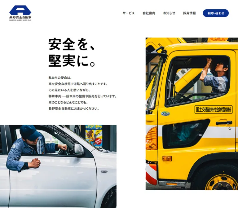
白い余白、大胆な非対称の写真配置、太い日本語コピー、深い青のアクセントが特徴。サービス一覧の罫線と揃ったカラムで、整備現場の実直さを伝える企業サイト。
オリジナルサイトを見るBroad white space, uncompromising type, and close photographs of people keeping vehicles safe.
Website: Nagano Anzen Original URL: https://naganoanzen.jp/ Final URL: https://naganoanzen.jp/ Theme: light canvas with deep blue accents and a blue contact band Inspected: September 23, 2026, at 02:59 JST; supplied retrieval timestamp: September 22, 2026, 17:59:06.597 UTC Viewports: 1440 × 1000 desktop and 390 × 844 mobile, in CSS pixels Scope: the current corporate homepage: header, introductory photographic composition, four services, News, recruitment copy, contact area, and footer. Visual captures cover the opening, a desktop services/News segment, and the lower contact/footer area. Rendered DOM measurements cover additional homepage content. Destination pages and the opened mobile menu were not inspected.
Nagano Anzen presents an automotive maintenance and sales business through the physical reality of its work. A mechanic inside a yellow special-purpose truck and another leaning into a white passenger vehicle establish the subject immediately. Large rectangular photographs, a forceful two-line statement, and generous white space make the page feel confident without adding ornamental interface elements.
The desktop layout is deliberately asymmetric. The introductory copy begins well inside the left half, while the truck photograph reaches the right edge. Lower down, service descriptions and the News list share a strong vertical alignment. Deep blue appears in the logo, compact pill links, and the contact band. Yellow belongs primarily to the photographed machinery. The homepage provides routes into services, company information, news, recruitment, and contact; its structure is that of a corporate site.
Broad white space, uncompromising type, and close photographs of people keeping vehicles safe.
Website: Nagano Anzen Original URL: https://naganoanzen.jp/ Final URL: https://naganoanzen.jp/ Theme: light canvas with deep blue accents and a blue contact band Inspected: September 23, 2026, at 02:59 JST; supplied retrieval timestamp: September 22, 2026, 17:59:06.597 UTC Viewports: 1440 × 1000 desktop and 390 × 844 mobile, in CSS pixels Scope: the current corporate homepage: header, introductory photographic composition, four services, News, recruitment copy, contact area, and footer. Visual captures cover the opening, a desktop services/News segment, and the lower contact/footer area. Rendered DOM measurements cover additional homepage content. Destination pages and the opened mobile menu were not inspected.
Nagano Anzen presents an automotive maintenance and sales business through the physical reality of its work. A mechanic inside a yellow special-purpose truck and another leaning into a white passenger vehicle establish the subject immediately. Large rectangular photographs, a forceful two-line statement, and generous white space make the page feel confident without adding ornamental interface elements.
The desktop layout is deliberately asymmetric. The introductory copy begins well inside the left half, while the truck photograph reaches the right edge. Lower down, service descriptions and the News list share a strong vertical alignment. Deep blue appears in the logo, compact pill links, and the contact band. Yellow belongs primarily to the photographed machinery. The homepage provides routes into services, company information, news, recruitment, and contact; its structure is that of a corporate site.
| Name | Value | Suggested token | Role and evidence |
|---|---|---|---|
| White Canvas | #ffffff |
--color-canvas |
Measured body background and reversed button text; dominant page surface |
| Anzen Blue | #0b318f |
--color-brand |
Measured contact and more pill backgrounds; the logo and contact band visually use a corresponding deep blue |
| Body Ink | #333333 |
--color-ink |
Measured navigation, paragraphs, section headings, and news titles |
| Statement Black | Approximately #000000 |
--color-statement |
Visual estimate for the large slogan; no computed color was supplied for the artwork itself |
| Rule Black | Approximately #000000 |
--color-rule |
Visual estimate for the fine service, News, and mobile footer dividers |
| Machinery Yellow | No fixed UI value established | None | Photographic color in the truck and wheel rims; retain through imagery rather than promoting it to a second button color |
The contact band's exact background declaration was not included in the sampled elements. Mapping it to the measured button blue is a faithful implementation recommendation supported by its appearance, rather than a separately measured container color.
White supplies most of the composition. Dark text and thin rules establish hierarchy without gray panels. Blue is concentrated into a few strong signals: identity, small navigation actions, and the full-width contact area. Photography supplies yellow, steel gray, workwear blue, and deep workshop shadows.
The reported --swiper-theme-color: #007aff is a library variable, not evidence that bright blue is the page's action color or that a carousel is visible. Likewise, WordPress preset sizes are not substitutes for the measured component typography.
Measured source stack:
'Noto Sans JP', 游ゴシック体, 'Yu Gothic', YuGothic,
'ヒラギノ角ゴ ProN W3', 'Hiragino Kaku Gothic ProN',
メイリオ, Meiryo, sans-serif
The base body weight is 500. The introductory mission, navigation, news titles, and recruitment statement use 700. Long line heights keep Japanese copy open and readable even where the letterforms are bold.
The measured global letter spacing is 0.5px. Preserve this as a small fixed adjustment; it is not a large tracking effect.
Measured source stack: presicav, sans-serif.
This family is explicitly reported for Service, News, Recruit, Contact, category links, standalone more links, and Privacy Policy. Its broad letterforms give short English labels considerable horizontal presence. Section headings use weight 700 and a 1.2 line-height ratio.
The dates, telephone number, and copyright visually share the broad Latin lettering character, but their individual font declarations were not sampled. Using the same display family for them is a reasonable adaptation, not a separate verified measurement. Load this family only through an authorized font source; no font-file URL was supplied.
The visible slogan reads “安全を、 / 堅実に。” in the hero and again in the footer. It has heavy black Japanese forms and a conspicuous open circular full stop. It is absent from the extracted hero text, and the sampled H1 is the logo container. Its exact element type, font family, and font size therefore remain unverified.
Treat the slogan as a carefully composed visual mark. Prefer an authorized original asset if available. If rebuilding it as live text, use a heavy Japanese sans serif and compare the glyph shapes, punctuation, line breaks, and overall width against the captures; a font-size match alone will not be sufficient.
All values below are measured unless marked as visual estimates.
| Role | Desktop | Mobile | Weight / notes |
|---|---|---|---|
| English section heading | 40px / 48px |
30px / 36px |
700, Presicav stack |
| Introductory mission | 16px / 32px |
13px / 24.05px |
700, Japanese stack |
| Service description | 16px / 32px |
13px / 24.05px |
500 |
| News item title | 16px / 24px |
13px / 19.5px |
700 |
| Recruitment statement and follow-up | 30px / 45px |
19px / 28.5px |
700 |
| Contact supporting copy | 20px / 40px |
13px / 24.05px |
500 |
| Contact form label | 20px / 40px |
16px / 32px |
500 |
| Desktop primary navigation | 16px / 21.6px |
Replaced by menu control | 700 |
| Header contact pill | 14px / 28px |
Not present in the captured header | 700 |
Standalone more label |
14px / 14px |
10px / 10px |
700, Presicav stack |
| News category links | 12px / 18px |
12px / 18px |
700; unchanged size |
| Footer primary links | 20px / 40px |
13px / 26px |
700 |
| Footer telephone text | 16px / 24px |
16px / 24px |
500; not reduced on mobile |
| Footer Privacy Policy | 11px / 16.5px |
11px / 16.5px |
700, Presicav stack |
| Hero slogan | Roughly 78–82px lettering |
Roughly 44–46px lettering |
Visual estimate; possibly artwork rather than live text |
| Desktop service title | Roughly 60–64px lettering |
Not visually sampled | Visual estimate from the sales row |
The original HTML and body report a 10px font size, but readable content receives its own explicit sizes. Do not interpret the entire page as 10px text. The Quick Start uses measured pixel values without requiring a 10px document root.
Density: sparse page composition with denser, precisely aligned information rows.
Geometry: square photographs, uninterrupted white surfaces, fine horizontal rules, and fully rounded small actions. There is no visible general-purpose card or elevation system.
| Use | Desktop | Mobile | Evidence |
|---|---|---|---|
| Header logo left inset | 56.02px |
25.97px |
Measured |
| Main services/News gutter | 88.13px |
About 25.97px |
Measured; mobile Service heading is a slight exception at 23.86px |
| Header-to-hero gap | 59.70px |
0px |
Derived from header and main bounds |
| Service row vertical padding | 38px top and bottom |
23px top, 45px bottom |
Measured |
| Mobile service row horizontal padding | — | 29.09px left, 25.97px right |
Measured |
| Mobile service body indent | — | 30px inside the row's left padding |
Derived; body begins at 59.09px |
| News row vertical padding | 40px |
15px |
Measured |
| Hero-to-Service gap | 70px |
70px |
Derived |
| Services-to-News gap | 200px |
60px |
Derived |
| News-to-Recruit gap | 159px |
80px |
Derived |
| Contact heading top inset | 75px |
39px |
Derived from footer and heading positions |
These values describe several intentional rhythms, rather than one universal spacing multiplier. Preserve the large section gaps alongside the smaller component insets.
| Element | Value | Evidence |
|---|---|---|
| Header contact pill | 30px |
Measured |
Standalone more pill |
20px |
Measured |
| Mobile contact form container | 50px |
Measured |
| Mobile telephone link | 50px |
Measured |
| Service row container | 0 |
Measured |
| Photographs | Square corners | Visually observed |
| Service and News rules | Approximately 1px |
Visual estimate; border properties were not sampled |
| Element | Desktop at 1440px | Mobile at 390px |
|---|---|---|
| Header height | 135.30px measured |
67.27px measured |
| Header logo box | 115 × 79.30px, at 56.02, 28 |
70 × 48.27px, at 25.97, 19 |
| Hero section | Starts at y=195; height 1311.13px |
Starts at y=67.27; height 779.69px |
| Hero paragraph | x=293.91, width 411.39px |
x=25.97, width 338.05px |
| Main content width | 1263.75px |
News width 338.06px |
| Service description column | x=617.11, width 323.28px |
x=59.09, width 304.94px |
| Service photograph | Approximately 353 × 235px, beginning at x=999 |
Not directly captured; do not treat an inferred size as measured |
| News list | x=617.14, width 734.73px |
x=25.97, width 338.06px |
| Standard service row | Approximately 312px high |
Approximately 468px; second row 492px |
| News item | 105px, first item 106px |
72.5px, first item 73.5px |
Standalone more |
103.41 × 36px |
89.88 × 32px |
| Mobile telephone action | — | 304.81 × 79px |
The desktop content gutter is about 6.12% of the viewport. The mobile News and hero-copy gutter is about 6.66%. These are useful derived proportions, not verified source expressions.
Role: clear identity and direct access to the main corporate destinations.
The blue logo sits at the upper left without a surrounding panel or rule. Desktop navigation is aligned toward the right: “サービス”, “会社案内”, “お知らせ”, and “採用情報”, followed by the blue “お問い合わせ” pill. Most neighboring text links have approximately 41px of horizontal separation. The contact action measures 133.59 × 40px and uses white type.
At 390px, the logo shrinks from 115px to 70px wide. A small outlined circle followed by menu replaces the horizontal navigation. Its right-edge position is visually about 16px from the viewport boundary. The menu trigger also appears near the top right of the lower mobile capture, suggesting independent persistence; the exact positioning rule was not sampled. The logo does not accompany it in that lower capture.
The mobile DOM contains six bilingual destinations: Home, Service, About ANZEN, News, Recruit, and Contact, followed by Privacy Policy. The main destination link boxes are measured at 390 × 75px, with 15px vertical padding and approximately 26px horizontal padding.
These measurements describe a menu structure present in the rendered DOM. They do not establish an observed open state: the supplied mobile screenshots show the homepage with the compact menu trigger. Do not infer the panel background, opening direction, focus behavior, or close transition from the extracted text alone.
Role: connect the safety statement to actual work on ordinary and special-purpose vehicles.
On desktop, the slogan and mission occupy an inset left column beginning near x=294. The large truck photograph starts around x=882, y=195, touches the right viewport edge, and continues below the first capture. The white-car photograph begins at the left edge around y=670 and spans approximately 705px. Their staggered placement makes the white space an active part of the composition.
The mission is six lines of bold Japanese text at 16px / 32px, beginning at y=408.47. It contains the business's actual service promise rather than a row of badges or separate benefit cards. Preserve its compact measure and deliberate line breaks where the language and available width allow.
On mobile, the truck image occupies approximately x=221–390, y=67–346. The slogan sits lower on the left, around y=245, beside the lower part of that image. The mission then spans the main text width, starting at y=366.44. A white-car crop appears at approximately 0, 541, sized 203 × 170px. A smaller workshop detail begins near 187, 742, approximately 157px wide. This is a recomposed collage, not a desktop layout scaled down uniformly.
Service, News, Recruit, and Contact use a large English heading with a much smaller Japanese descriptor underneath. The display heading provides the visual landmark; the Japanese line names its purpose for the local audience.
Keep the English heading at 40px / 48px on desktop and 30px / 36px on mobile. The small descriptor is visibly subordinate, but its exact computed size was not included. A 12px descriptor is a reasonable starting recommendation, to be checked against the original capture.
Role: provide four large, legible entry points into the business's capabilities.
Each service is one full-width anchor. The observed destinations are:
| Number and source label | Destination |
|---|---|
01 “整備” |
/inspection/ |
02 “車検・点検” |
/maintenance/ |
03 “修理” |
/repair/ |
04 “販売” |
/sell/ |
Desktop anatomy is a large numbered service heading on the left, a narrower description with a blue more treatment in the middle, and a rectangular photograph at the right. The actual sampled row uses display: flex, with 38px 88.125px padding. Fine rules run across the entire viewport, beyond the content inset.
In the sales row, the photograph shows a seated consultation with a vehicle brochure on a low table. The adjacent repair photograph shows work under an open hood. These images explain the service through human activity and tools.
On mobile, rows switch to display: block and become approximately 468–492px tall. Descriptions are inset to x=59.09, 30px beyond the row's left padding, and use 13px / 24.05px. The measured positions are consistent with a stacked title/media/description structure, although the mobile service photographs were not included in the visual captures. Verify their exact sizing and order before claiming a pixel-exact reproduction.
For implementation, keep one anchor around the row. The inner more treatment should be a visual span, not another nested anchor or button.
Role: indicate a route to more information without overwhelming the editorial layout.
Standalone more links use blue fill, white Presicav text, a 20px radius, and 10px 26px padding. The desktop box is approximately 103 × 36px; mobile is approximately 90 × 32px, with the same padding but smaller lettering.
The header contact action belongs to the same visual family but uses Japanese text, a 30px radius, and different padding. Retain these small differences rather than forcing every action into one identical component size.
Role: present current operational updates in a simple index.
On desktop, the left column contains News, its Japanese descriptor, and vertically arranged ALL and # Information links. The right list begins at x=617.14, essentially the same alignment as the service descriptions above it. Each item contains a date, category, and bold Japanese title on one row, separated from its neighbors by thin rules.
The captured list includes 2026.07.24, 2026.06.01, and 2026.04.21. The first title is “夏季休業のお知らせ”. These are content examples, not permanent design tokens. The standalone more action sits at the lower right of the list.
On mobile, the heading and filters move above the list. The filters share one horizontal line with a measured 20px gap. Each news title takes a full-width line below the date/category area. Vertical row padding drops from 40px to 15px. Category controls have real destination URLs; in-place filtering was not demonstrated.
Role: extend the safety mission into an invitation to join the company.
The DOM contains the Recruit heading, a three-line Japanese statement, a follow-up sentence, and a more link to /recruit/. Both statement and follow-up use 30px / 45px, weight 700, on desktop; mobile uses 19px / 28.5px.
The desktop copy begins at x=236.25 in a 420px-wide box. The mobile box begins at x=25.97 and is 301.63px wide. The heading occurs about 254.5px below the section start on desktop and 339px below it on mobile. These are measured spatial facts; the supplied screenshots do not show the surrounding recruitment composition. Do not invent a background, photograph, or overlay treatment for that region.
Role: bring form and telephone contact into a prominent, unified area.
The contact area changes the page from white to deep blue with white text. Desktop geometry divides the content into three regions: Contact at x=88.13, supporting copy at x=473.86, and contact controls at x=999.19. The telephone number is large and visually broad, with weekday hours underneath.
The form destination is /contact/. Its sampled desktop container is 349 × 62px. The upper form treatment is outside the supplied footer screenshot, so its complete border or icon styling is not visually established.
Mobile becomes a vertical sequence. The heading uses the normal approximately 26px gutter, while the supporting copy and actions begin at x=59.22, creating a secondary indent. The form container is 304.81 × 74px with a measured 50px radius. The telephone anchor is 304.81 × 79px, also with a 50px radius, and its thin white outline is visible. The telephone number and weekday hours are centered inside it.
A tel:026-243-7192 link is explicitly present in mobile evidence. The desktop link inventory does not establish the same telephone interaction there.
Role: close with identity, location, navigation, and the repeated safety statement.
The desktop white footer is a spacious composition rather than a compact legal strip. The logo and company details sit left, a square photograph of stored tires with yellow rims sits near the center, and a right-aligned vertical navigation list sits right. The slogan returns at the lower left; copyright appears at the lower right. The central photograph is visually about 379 × 379px.
The company name “長野安全自動車株式会社”, Nagano address, and telephone number are directly visible on the original page. Address and telephone text remain comfortably sized on mobile.
On mobile, the footer changes structure. A centered identity block contains the logo, company name, address, and telephone. A thin rule introduces a second block with the slogan on the left and right-aligned navigation on the right. Privacy Policy sits below the primary links. Another rule separates a centered copyright row. The large tire photograph is absent from this captured mobile footer.
The evidence contains computed transition and animation declarations, plus settled screenshots. It does not contain a complete recording of state changes.
| Element | Recorded declaration | What can be concluded |
|---|---|---|
| Logo container | width 0.5s cubic-bezier(0.16, 1, 0.3, 1) |
A width transition is defined; its triggering state was not exercised |
| Desktop text navigation | color 0.1s cubic-bezier(0.19, 1, 0.22, 1) |
A short color transition is defined; endpoint colors were not supplied |
Desktop contact and standalone more pills |
0.5s cubic-bezier(0.36, 0.14, 0, 1) |
A half-second transition is defined; changed properties and endpoints remain unverified |
| Introductory paragraph | 0.8s cubic-bezier(0.36, 0.14, 0, 1) 1.5s |
An 800ms transition with a 1.5s delay is present at both widths |
| Mobile service rows | 1.5s cubic-bezier(0.19, 1, 0.22, 1) forwards fadeUp |
A named entrance animation is declared; keyframes and travel distance were not provided |
The fadeUp name suggests an upward reveal, but its opacity values, translation distance, and trigger mechanism must not be treated as measured. The desktop service rows report animation: none in the supplied sample. Other entries reporting only transition: all do not establish a meaningful duration.
Verified interaction affordances are the homepage's anchor destinations and the mobile telephone link. Menu opening, keyboard behavior, hover appearance, form submission, and destination-page behavior remain untested. There is no supplied evidence for parallax, a slideshow, autoplay media, or an elaborate page-transition system.
For a new implementation, use the measured easing curves where appropriate, keep content available without entrance animation, and provide reduced-motion behavior. Do not invent a dramatic scroll effect to account for the staggered photography.
| Surface | Appearance | Purpose |
|---|---|---|
| Main canvas | Pure white | Supports whitespace, photography, and text |
| Service rows | White with fine full-width rules | Separates services without cards |
| News list | White with fine local rules | Creates an orderly update index |
| Small action | Deep blue, white lettering, pill shape | Signals navigation to more information |
| Contact band | Deep blue field, white content | Creates the strongest section-level emphasis |
| Mobile telephone action | Transparent blue-field surface with white outline | Makes the call target explicit |
| Desktop footer | White, widely spaced text and square photo | Combines identity with workplace imagery |
| Mobile footer | White blocks divided by thin rules | Clarifies stacked information and navigation |
No visible shadow hierarchy, glass effect, decorative gradient, or rounded photograph system is needed to reproduce these surfaces.
The photographs are close, specific, and work-oriented. The dominant hero image shows a mechanic reaching upward inside a yellow truck cab. The second shows a mechanic inspecting a white passenger vehicle from its open window. A smaller mobile image provides a cropped hand/tool detail. Service photographs include an open engine bay and a sales consultation. The desktop footer returns to equipment through a row of large tires.
Preserve the relationship between bright painted machinery and darker workshop interiors. The photographs have strong contrast and substantial detail, while the surrounding interface stays spare. Faces do not need to address the camera; concentration on the task is more characteristic of the captured page.
No original image filenames, asset URLs, or native resolutions were supplied. The references below identify visible assets by their role in the original-page captures, without inventing paths.
| Asset | Visible reference | Treatment |
|---|---|---|
| Company logo | Header and footer | Blue geometric emblem with Japanese identity and small Latin line; preserve the complete lockup |
| Safety slogan | Hero and lower footer | Heavy two-line black statement; exact asset format unverified |
| Yellow truck and mechanic | Desktop and mobile opening | Tall crop; flush to the right edge |
| White passenger car and mechanic | Desktop and mobile opening | Wide desktop presentation and tighter mobile crop; flush left |
| Workshop detail | Lower part of mobile opening | Small offset rectangle; only part of the image is visible |
| Engine repair | Upper edge of desktop middle capture | Landscape photograph, square corners |
| Sales consultation | Desktop fourth service row | Approximately 3:2 landscape image |
| Stored tires | Desktop footer | Square crop; omitted from the supplied mobile footer |
Use authorized images with meaningful alternative text where they convey service information. For equivalent new photography, show real people, appropriate vehicles, and credible workshop activity. Keep enough image resolution for the large desktop crops, and define mobile focal positions independently.
The page has several distinct left edges, each with a purpose:
56px.88px.236px.294px.617px.999px.Do not flatten these into a single universal text column. The recurring 617px alignment is particularly important: it connects the service explanation area to the News list even though their content structures differ.
A useful recommended grid approximation inside the 1263.75px content width is 37.21% / 25.58% / 27.91%, separated by two 4.65% gaps. For News, retain the first track and gap, then merge the remaining area. The original sampled service layout uses flexbox; this grid is a reusable way to reproduce its measured result.
| Area | Observed change at 390px |
|---|---|
| Header | 70px logo and small menu control replace desktop navigation |
| Hero | Truck remains upper right; slogan sits lower left; copy spans the available text width |
| Supporting photos | Smaller staggered crops retain the collage character |
| Service rows | Switch from flex to block; descriptions keep a secondary 30px indent |
| News | Heading and horizontal filters precede a full-width list; titles move below metadata |
| Recruitment copy | Uses 19px type and a narrower left-aligned text box |
| Contact | Stacks vertically; copy and large rounded actions retain a secondary indent |
| Footer | Centers identity, removes the visible tire image, and separates navigation/copyright with rules |
Only two viewport widths were supplied. The exact breakpoint and intermediate tablet behavior are unknown. The Quick Start uses 48rem as a recommended initial breakpoint; test it with the real navigation labels and photographs before adopting it.
| Section start | Desktop document y | Mobile document y |
|---|---|---|
| Introductory section | 195px |
67.27px |
| Service | 1576.13px |
916.95px |
| News | 3132.44px |
2968.28px |
| Recruit | 3673.44px |
3495.78px |
| Contact/footer | 4640.44px |
4179.81px |
The reported document heights are approximately 5812px desktop and 5376px mobile. These are inspection results, not target heights to hardcode. Text wrapping, font availability, and actual asset dimensions should determine the final flow.
#0b318f action blue, and #333333 body text.These are recommendations for a new implementation, not verified original-site features:
aria-expanded and aria-controls values. Hide closed menu content from keyboard navigation.more links accessible names that identify their destinations.more height is a visual reference, not an accessibility target.tel: link wherever appropriate, including desktop if desired.#ffffff.#333333.#0b318f with white lettering.“Create a Japanese automotive-service corporate homepage with the measured visual character of Nagano Anzen. Use a white canvas, dark gray text, deep blue #0b318f pill actions, bold Japanese copy, and broad Presicav-style English section labels. Build an asymmetric opening with an inset two-line safety statement, a tall workshop photograph flush right, and a second vehicle photograph flush left below the copy. Use full-width ruled service rows with a numbered heading, narrow description, small action, and square-cornered photograph. Align the desktop News list with the service description column. Finish with a blue contact band and a spacious corporate footer. At phone widths, recompose the photography, stack information, preserve secondary text indents, and divide the footer into clear ruled blocks. Treat unverified animation and menu behavior as implementation decisions.”
more span inside the anchor. On mobile, stack the content and indent the description by an additional 30px.”This is an implementation starter, not recovered source CSS. It uses the measured colors, type sizes, principal alignments, and responsive differences. The grid implementation, 48rem breakpoint, hover endpoints, focus treatment, and uncaptured image proportions are recommendations. Image placement should be tuned using authorized assets; no original asset paths were provided.
Expected anatomy: a .service-row is a single anchor containing .service-heading, .service-media, and .service-body; its inner .pill is a span. A .news-row contains date, category, and title elements. The hero mark is an image or equivalent accessible artwork. The menu button still needs a separately implemented interaction.
:root {
  /* Measured colors; black artwork and rules are visual approximations. */
  --color-canvas: #fff;
  --color-brand: #0b318f;
  --color-ink: #333;
  --color-statement: #000;
  --color-rule: #000;

  --font-jp: 'Noto Sans JP', 'Yu Gothic', YuGothic,
    'Hiragino Kaku Gothic ProN', Meiryo, sans-serif;
  --font-display: presicav, sans-serif;
  --weight-medium: 500;
  --weight-bold: 700;
  --tracking: 0.5px;
  --text-body: 16px;
  --leading-body: 2;
  --text-section: 40px;
  --text-news: 16px;
  --text-recruit: 30px;
  --text-more: 14px;

  /* Derived viewport proportions, not original source formulas. */
  --page-gutter: 6.12vw;
  --header-gutter: 3.89vw;
  --column-gap: 4.65%;
  --radius-pill: 20px;
  --radius-contact: 50px;
  --rule: 1px solid var(--color-rule);

  --ease-link: cubic-bezier(0.19, 1, 0.22, 1);
  --ease-action: cubic-bezier(0.36, 0.14, 0, 1);
  --ease-logo: cubic-bezier(0.16, 1, 0.3, 1);
}

* { box-sizing: border-box; }
body {
  margin: 0;
  color: var(--color-ink);
  background: var(--color-canvas);
  font-family: var(--font-jp);
  font-size: var(--text-body);
  font-weight: var(--weight-medium);
  line-height: var(--leading-body);
  letter-spacing: var(--tracking);
}
img { display: block; max-width: 100%; }
a { color: inherit; text-decoration: none; }
h1, h2, h3, p { margin: 0; }
button { font: inherit; }

.site-header {
  display: flex;
  align-items: center;
  justify-content: space-between;
  padding: 28px var(--header-gutter);
}
.site-logo {
  width: 115px;
  transition: width 500ms var(--ease-logo);
}
.primary-nav { display: flex; align-items: center; gap: 41px; }
.primary-nav a {
  font-size: 16px;
  font-weight: 700;
  line-height: 1.35;
  transition: color 100ms var(--ease-link);
}
.primary-nav .contact-pill {
  display: inline-flex;
  align-items: center;
  min-height: 40px;
  padding: 5px 23px;
  border-radius: 30px;
  color: #fff;
  background: var(--color-brand);
  font-size: 14px;
  line-height: 28px;
}
.menu-trigger { display: none; }

/* Opening geometry approximates the supplied 1440px capture. */
.hero {
  position: relative;
  min-height: 91.05vw;
  margin-top: 60px;
}
.hero-intro { width: 28.57vw; margin-left: 20.41vw; }
.hero-mark { width: 19.86vw; max-width: 286px; height: auto; }
.hero-copy { margin-top: 40px; font-weight: 700; }
.hero-primary,
.hero-secondary,
.hero-detail { position: absolute; object-fit: cover; }
.hero-primary {
  top: 0;
  right: 0;
  width: 38.75vw;
  /* Recommended desktop ratio; the full desktop image was not captured. */
  aspect-ratio: 169 / 279;
}
.hero-secondary {
  top: 33vw;
  left: 0;
  width: 48.98vw;
  /* Recommended ratio for the uncaptured lower desktop boundary. */
  aspect-ratio: 3 / 2;
}
.hero-detail {
  /* Optional desktop placement; only its mobile placement was visible. */
  right: var(--page-gutter);
  bottom: 0;
  width: 24vw;
  aspect-ratio: 3 / 2;
}

.section-heading {
  font-family: var(--font-display);
  font-size: var(--text-section);
  font-weight: 700;
  line-height: 1.2;
}
.section-caption {
  margin-top: 8px;
  font-size: 12px;
  font-weight: 700;
  line-height: 1.5;
}
.services { margin-top: 70px; }
.services-header { margin: 0 var(--page-gutter) 40px; }
.service-list { border-top: var(--rule); }
.service-row {
  display: grid;
  grid-template-columns: minmax(0, 1fr) 25.58% 27.91%;
  grid-template-areas: 'heading body media';
  column-gap: var(--column-gap);
  align-items: start;
  padding: 38px var(--page-gutter);
  border-bottom: var(--rule);
}
.service-heading {
  grid-area: heading;
  display: flex;
  align-items: flex-start;
  gap: 12px;
  font-weight: 700;
  line-height: 1.15;
}
.service-index {
  padding-top: 5px;
  font: 700 20px/1.2 var(--font-display);
}
.service-title { font-size: 60px; }
.service-body { grid-area: body; min-width: 0; }
.service-body p { font-size: var(--text-body); line-height: var(--leading-body); }
.service-media { grid-area: media; width: 100%; aspect-ratio: 3 / 2; object-fit: cover; }
.pill {
  display: inline-flex;
  align-items: center;
  justify-content: center;
  min-height: 36px;
  padding: 10px 26px;
  border: 1px solid transparent;
  border-radius: var(--radius-pill);
  color: #fff;
  background: var(--color-brand);
  font: 700 var(--text-more)/1 var(--font-display);
  letter-spacing: var(--tracking);
  transition: opacity 500ms var(--ease-action);
}
.service-body .pill { margin-top: 16px; }

.news {
  display: grid;
  grid-template-columns: 37.21% minmax(0, 1fr);
  column-gap: var(--column-gap);
  margin: 200px var(--page-gutter) 0;
}
.news-filters { display: grid; justify-items: start; margin-top: 45px; }
.news-filters a {
  padding-block: 7px;
  font: 700 12px/18px var(--font-display);
}
.news-list { border-top: var(--rule); }
.news-row {
  display: grid;
  grid-template-columns: 113px 120px minmax(0, 1fr);
  gap: 20px;
  align-items: baseline;
  padding: 40px 0;
  border-bottom: var(--rule);
}
.news-date,
.news-category { font: 700 14px/24px var(--font-display); }
.news-title { font-size: var(--text-news); font-weight: 700; line-height: 1.5; }
.news-more { margin-top: 30px; text-align: right; }

/* Recruitment media and full section geometry need further visual evidence. */
.recruit-copy { max-width: 420px; margin-left: 16.41vw; }
.recruit-message { font-size: var(--text-recruit); font-weight: 700; line-height: 1.5; }

.contact-band { color: #fff; background: var(--color-brand); }
.contact-inner {
  display: grid;
  grid-template-columns: 30.52% 41.56% minmax(0, 1fr);
  padding: 75px var(--page-gutter);
}
.contact-copy { font-size: 20px; line-height: 2; }
.contact-form {
  display: flex;
  align-items: center;
  min-height: 62px;
  font-size: 20px;
  line-height: 2;
}
.contact-phone { display: block; margin-top: 34px; }
.contact-phone strong { display: block; font: 700 30px/1.2 var(--font-display); }
.contact-phone small { display: block; font-size: 13px; line-height: 1.5; }

.footer-main {
  display: grid;
  grid-template-columns: 35.44% 30% minmax(0, 1fr);
  min-height: 772px;
  padding: 78px var(--page-gutter) 70px;
}
.footer-identity { grid-column: 1; grid-row: 1; }
.footer-logo { width: 115px; }
.footer-company { margin-top: 48px; font-size: 20px; font-weight: 700; line-height: 1.5; }
.footer-address { margin-top: 16px; font-size: 16px; font-style: normal; line-height: 1.5; }
.footer-photo {
  grid-column: 2;
  grid-row: 1 / 3;
  width: 100%;
  margin-top: 130px;
  aspect-ratio: 1;
  object-fit: cover;
}
.footer-nav {
  grid-column: 3;
  grid-row: 1;
  display: grid;
  align-content: start;
  justify-items: end;
  gap: 15px;
  font-size: 20px;
  font-weight: 700;
  line-height: 2;
}
.footer-nav .privacy { margin-top: 14px; font: 700 11px/1.5 var(--font-display); }
.footer-statement { grid-column: 1; grid-row: 2; align-self: end; }
.footer-statement img { width: 190px; }
.footer-copyright {
  grid-column: 3;
  grid-row: 2;
  align-self: end;
  text-align: right;
  font: 700 10px/20px var(--font-display);
}

/* Recommended state endpoints and accessible focus treatment. */
@media (hover: hover) {
  .primary-nav a:not(.contact-pill):hover { color: var(--color-brand); }
  a.pill:hover, .service-row:hover .pill { opacity: 0.82; }
}
a:focus-visible,
button:focus-visible { outline: 2px solid currentColor; outline-offset: 4px; }

/* Recommended breakpoint; only 1440px and 390px were inspected. */
@media (max-width: 48rem) {
  :root {
    --page-gutter: 6.66vw;
    --text-body: 13px;
    --leading-body: 1.85;
    --text-section: 30px;
    --text-news: 13px;
    --text-recruit: 19px;
    --text-more: 10px;
  }
  .site-header { padding: 19px var(--page-gutter) 0; }
  .site-logo { width: 70px; }
  .primary-nav { display: none; }
  .menu-trigger {
    display: inline-flex;
    align-items: center;
    gap: 7px;
    position: fixed;
    z-index: 20;
    top: 20px;
    right: 16px;
    padding: 0;
    border: 0;
    color: var(--color-ink);
    background: transparent;
    font: 700 10px/20px var(--font-display);
  }
  .menu-trigger::before {
    content: '';
    width: 8px;
    height: 8px;
    border: 1px solid currentColor;
    border-radius: 50%;
  }
  .menu-trigger.on-blue { color: #fff; }

  .hero { min-height: 200vw; margin-top: 0; }
  .hero-intro {
    width: auto;
    margin-inline: var(--page-gutter);
    padding-top: 45.65vw;
  }
  .hero-mark { width: 43.59vw; max-width: none; }
  .hero-copy { margin-top: 19px; }
  .hero-primary { width: 43.33vw; aspect-ratio: 169 / 279; }
  .hero-secondary { top: 121.54vw; width: 52.05vw; aspect-ratio: 203 / 170; }
  .hero-detail {
    top: 173.01vw;
    right: auto;
    bottom: auto;
    left: 47.95vw;
    width: 40.26vw;
  }

  .service-row {
    grid-template-columns: minmax(0, 1fr);
    grid-template-areas: 'heading' 'media' 'body';
    gap: 20px;
    padding: 23px 6.66vw 45px 7.46vw;
  }
  .service-heading { display: grid; grid-template-columns: 30px minmax(0, 1fr); gap: 0; }
  .service-title { font-size: 32px; }
  .service-index { font-size: 14px; }
  .service-media { width: calc(100% - 30px); margin-left: 30px; }
  .service-body { margin-left: 30px; }
  .pill { min-height: 32px; }

  .news { display: block; margin-top: 60px; }
  .news-filters { display: flex; gap: 20px; margin-top: 45px; }
  .news-list { margin-top: 40px; }
  .news-row { grid-template-columns: auto minmax(0, 1fr); gap: 4px 20px; padding: 15px 0; }
  .news-date, .news-category { font-size: 12px; line-height: 18px; }
  .news-title { grid-column: 1 / -1; }
  .recruit-copy { max-width: 77.34vw; margin-left: var(--page-gutter); }

  .contact-inner { display: block; padding: 39px var(--page-gutter) 56px; }
  .contact-copy { margin: 40px 0 30px 33.25px; font-size: 13px; line-height: 1.85; }
  .contact-actions { margin-left: 33.25px; }
  .contact-form,
  .contact-phone {
    display: block;
    border: 1px solid #fff;
    border-radius: var(--radius-contact);
    text-align: center;
  }
  .contact-form { min-height: 74px; padding: 20px 0; font-size: 16px; line-height: 32px; }
  .contact-phone { min-height: 79px; padding: 20px 0 15px; }
  .contact-phone strong { font-size: 23px; }
  .contact-phone small { font-size: 11px; }

  .footer-main { grid-template-columns: 1fr 1fr; min-height: 0; padding: 0; }
  .footer-identity { grid-column: 1 / -1; padding: 50px var(--page-gutter) 67px; text-align: center; }
  .footer-logo { margin-inline: auto; }
  .footer-photo { display: none; }
  .footer-statement {
    grid-column: 1;
    grid-row: 2;
    align-self: stretch;
    padding: 25px 0 32px var(--page-gutter);
    border-top: var(--rule);
  }
  .footer-statement img { width: 140px; }
  .footer-nav {
    grid-column: 2;
    grid-row: 2;
    gap: 5px;
    padding: 30px var(--page-gutter) 35px 0;
    border-top: var(--rule);
    font-size: 13px;
    line-height: 26px;
  }
  .footer-nav .privacy { margin-top: 20px; }
  .footer-copyright {
    grid-column: 1 / -1;
    grid-row: 3;
    padding: 30px var(--page-gutter);
    border-top: var(--rule);
    text-align: center;
  }
}

/* Recommended: essential content must remain visible without animation. */
@media (prefers-reduced-motion: reduce) {
  *, *::before, *::after {
    animation: none !important;
    transition: none !important;
    scroll-behavior: auto !important;
  }
}
The opening geometry intentionally approximates the inspected widths. At intermediate widths and under text zoom, allow its section height to grow if copy approaches the photographs. Recruitment imagery, the menu panel, exact entrance keyframes, and unobserved contact decorations require additional evidence or an explicitly new design decision.
Optional aliases for a project already using Tailwind v4. These do not imply that the original website uses Tailwind. Define the custom properties above first; their mobile overrides will continue to apply.
@theme inline {
  --color-canvas: #ffffff;
  --color-anzen: #0b318f;
  --color-ink: #333333;
  --color-rule: #000000;

  --font-body: var(--font-jp);
  --font-heading: var(--font-display);

  --text-copy: var(--text-body);
  --text-section-title: var(--text-section);
  --text-news-title: var(--text-news);
  --text-recruit-copy: var(--text-recruit);
  --text-pill-label: var(--text-more);

  --spacing-page: var(--page-gutter);
  --radius-action: 20px;
  --radius-contact-action: 50px;
}
2026-09-22T17:59:06.597Z, equivalent to September 23, 2026, 02:59:06.597 JST.This document describes the current homepage evidenced by the supplied inspection. Measured CSS, derived layout relationships, visual estimates, and recommended implementation choices remain distinct throughout.
# Nagano Anzen — Style Reference

> Broad white space, uncompromising type, and close photographs of people keeping vehicles safe.

**Website:** [Nagano Anzen](https://naganoanzen.jp/)
**Original URL:** https://naganoanzen.jp/
**Final URL:** https://naganoanzen.jp/
**Theme:** light canvas with deep blue accents and a blue contact band
**Inspected:** September 23, 2026, at 02:59 JST; supplied retrieval timestamp: September 22, 2026, 17:59:06.597 UTC
**Viewports:** 1440 × 1000 desktop and 390 × 844 mobile, in CSS pixels
**Scope:** the current corporate homepage: header, introductory photographic composition, four services, News, recruitment copy, contact area, and footer. Visual captures cover the opening, a desktop services/News segment, and the lower contact/footer area. Rendered DOM measurements cover additional homepage content. Destination pages and the opened mobile menu were not inspected.

Nagano Anzen presents an automotive maintenance and sales business through the physical reality of its work. A mechanic inside a yellow special-purpose truck and another leaning into a white passenger vehicle establish the subject immediately. Large rectangular photographs, a forceful two-line statement, and generous white space make the page feel confident without adding ornamental interface elements.

The desktop layout is deliberately asymmetric. The introductory copy begins well inside the left half, while the truck photograph reaches the right edge. Lower down, service descriptions and the News list share a strong vertical alignment. Deep blue appears in the logo, compact pill links, and the contact band. Yellow belongs primarily to the photographed machinery. The homepage provides routes into services, company information, news, recruitment, and contact; its structure is that of a corporate site.
# Nagano Anzen — Style Reference

> Broad white space, uncompromising type, and close photographs of people keeping vehicles safe.

**Website:** [Nagano Anzen](https://naganoanzen.jp/)
**Original URL:** https://naganoanzen.jp/
**Final URL:** https://naganoanzen.jp/
**Theme:** light canvas with deep blue accents and a blue contact band
**Inspected:** September 23, 2026, at 02:59 JST; supplied retrieval timestamp: September 22, 2026, 17:59:06.597 UTC
**Viewports:** 1440 × 1000 desktop and 390 × 844 mobile, in CSS pixels
**Scope:** the current corporate homepage: header, introductory photographic composition, four services, News, recruitment copy, contact area, and footer. Visual captures cover the opening, a desktop services/News segment, and the lower contact/footer area. Rendered DOM measurements cover additional homepage content. Destination pages and the opened mobile menu were not inspected.

Nagano Anzen presents an automotive maintenance and sales business through the physical reality of its work. A mechanic inside a yellow special-purpose truck and another leaning into a white passenger vehicle establish the subject immediately. Large rectangular photographs, a forceful two-line statement, and generous white space make the page feel confident without adding ornamental interface elements.

The desktop layout is deliberately asymmetric. The introductory copy begins well inside the left half, while the truck photograph reaches the right edge. Lower down, service descriptions and the News list share a strong vertical alignment. Deep blue appears in the logo, compact pill links, and the contact band. Yellow belongs primarily to the photographed machinery. The homepage provides routes into services, company information, news, recruitment, and contact; its structure is that of a corporate site.

## How to Read This Reference

- **Measured** means a value is explicitly present in the supplied rendered DOM or computed-style evidence. Coordinates are document coordinates unless described as screenshot positions.
- **Derived** means a value is calculated from those measurements, such as a gutter percentage or the gap between sections. A derived percentage does not establish the original CSS formula.
- **Visual estimate** means a dimension, color, or arrangement is read from an attached original-page capture. Image boundaries and unsampled lettering are approximate.
- **Recommended** means an implementation choice for a new build. The suggested breakpoint, accessibility behavior, and CSS grid implementation are not claims about the original source.
- Token names below are descriptive aliases. The supplied custom-property inventory does not expose a complete site design-token system.
- Computed font-family names establish declared stacks. They do not independently prove which font file rendered each glyph.

## Tokens — Colors

### Default Palette

| Name | Value | Suggested token | Role and evidence |
| --- | --- | --- | --- |
| White Canvas | `#ffffff` | `--color-canvas` | Measured body background and reversed button text; dominant page surface |
| Anzen Blue | `#0b318f` | `--color-brand` | Measured contact and `more` pill backgrounds; the logo and contact band visually use a corresponding deep blue |
| Body Ink | `#333333` | `--color-ink` | Measured navigation, paragraphs, section headings, and news titles |
| Statement Black | Approximately `#000000` | `--color-statement` | Visual estimate for the large slogan; no computed color was supplied for the artwork itself |
| Rule Black | Approximately `#000000` | `--color-rule` | Visual estimate for the fine service, News, and mobile footer dividers |
| Machinery Yellow | No fixed UI value established | None | Photographic color in the truck and wheel rims; retain through imagery rather than promoting it to a second button color |

The contact band's exact background declaration was not included in the sampled elements. Mapping it to the measured button blue is a faithful implementation recommendation supported by its appearance, rather than a separately measured container color.

### Color Distribution

White supplies most of the composition. Dark text and thin rules establish hierarchy without gray panels. Blue is concentrated into a few strong signals: identity, small navigation actions, and the full-width contact area. Photography supplies yellow, steel gray, workwear blue, and deep workshop shadows.

The reported `--swiper-theme-color: #007aff` is a library variable, not evidence that bright blue is the page's action color or that a carousel is visible. Likewise, WordPress preset sizes are not substitutes for the measured component typography.

## Tokens — Typography

### Japanese Text

**Measured source stack:**

```css
'Noto Sans JP', 游ゴシック体, 'Yu Gothic', YuGothic,
'ヒラギノ角ゴ ProN W3', 'Hiragino Kaku Gothic ProN',
メイリオ, Meiryo, sans-serif
```

The base body weight is `500`. The introductory mission, navigation, news titles, and recruitment statement use `700`. Long line heights keep Japanese copy open and readable even where the letterforms are bold.

The measured global letter spacing is `0.5px`. Preserve this as a small fixed adjustment; it is not a large tracking effect.

### English Section Titles and Utility Text

**Measured source stack:** `presicav, sans-serif`.

This family is explicitly reported for Service, News, Recruit, Contact, category links, standalone `more` links, and Privacy Policy. Its broad letterforms give short English labels considerable horizontal presence. Section headings use weight `700` and a `1.2` line-height ratio.

The dates, telephone number, and copyright visually share the broad Latin lettering character, but their individual font declarations were not sampled. Using the same display family for them is a reasonable adaptation, not a separate verified measurement. Load this family only through an authorized font source; no font-file URL was supplied.

### The Large Slogan

The visible slogan reads “安全を、 / 堅実に。” in the hero and again in the footer. It has heavy black Japanese forms and a conspicuous open circular full stop. It is absent from the extracted hero text, and the sampled H1 is the logo container. Its exact element type, font family, and font size therefore remain unverified.

Treat the slogan as a carefully composed visual mark. Prefer an authorized original asset if available. If rebuilding it as live text, use a heavy Japanese sans serif and compare the glyph shapes, punctuation, line breaks, and overall width against the captures; a font-size match alone will not be sufficient.

### Type Scale

All values below are measured unless marked as visual estimates.

| Role | Desktop | Mobile | Weight / notes |
| --- | --- | --- | --- |
| English section heading | `40px / 48px` | `30px / 36px` | `700`, Presicav stack |
| Introductory mission | `16px / 32px` | `13px / 24.05px` | `700`, Japanese stack |
| Service description | `16px / 32px` | `13px / 24.05px` | `500` |
| News item title | `16px / 24px` | `13px / 19.5px` | `700` |
| Recruitment statement and follow-up | `30px / 45px` | `19px / 28.5px` | `700` |
| Contact supporting copy | `20px / 40px` | `13px / 24.05px` | `500` |
| Contact form label | `20px / 40px` | `16px / 32px` | `500` |
| Desktop primary navigation | `16px / 21.6px` | Replaced by menu control | `700` |
| Header contact pill | `14px / 28px` | Not present in the captured header | `700` |
| Standalone `more` label | `14px / 14px` | `10px / 10px` | `700`, Presicav stack |
| News category links | `12px / 18px` | `12px / 18px` | `700`; unchanged size |
| Footer primary links | `20px / 40px` | `13px / 26px` | `700` |
| Footer telephone text | `16px / 24px` | `16px / 24px` | `500`; not reduced on mobile |
| Footer Privacy Policy | `11px / 16.5px` | `11px / 16.5px` | `700`, Presicav stack |
| Hero slogan | Roughly `78–82px` lettering | Roughly `44–46px` lettering | Visual estimate; possibly artwork rather than live text |
| Desktop service title | Roughly `60–64px` lettering | Not visually sampled | Visual estimate from the sales row |

The original HTML and body report a `10px` font size, but readable content receives its own explicit sizes. Do not interpret the entire page as 10px text. The Quick Start uses measured pixel values without requiring a 10px document root.

## Tokens — Spacing & Shapes

**Density:** sparse page composition with denser, precisely aligned information rows.

**Geometry:** square photographs, uninterrupted white surfaces, fine horizontal rules, and fully rounded small actions. There is no visible general-purpose card or elevation system.

### Spacing Scale

| Use | Desktop | Mobile | Evidence |
| --- | --- | --- | --- |
| Header logo left inset | `56.02px` | `25.97px` | Measured |
| Main services/News gutter | `88.13px` | About `25.97px` | Measured; mobile Service heading is a slight exception at `23.86px` |
| Header-to-hero gap | `59.70px` | `0px` | Derived from header and main bounds |
| Service row vertical padding | `38px` top and bottom | `23px` top, `45px` bottom | Measured |
| Mobile service row horizontal padding | — | `29.09px` left, `25.97px` right | Measured |
| Mobile service body indent | — | `30px` inside the row's left padding | Derived; body begins at `59.09px` |
| News row vertical padding | `40px` | `15px` | Measured |
| Hero-to-Service gap | `70px` | `70px` | Derived |
| Services-to-News gap | `200px` | `60px` | Derived |
| News-to-Recruit gap | `159px` | `80px` | Derived |
| Contact heading top inset | `75px` | `39px` | Derived from footer and heading positions |

These values describe several intentional rhythms, rather than one universal spacing multiplier. Preserve the large section gaps alongside the smaller component insets.

### Border Radius

| Element | Value | Evidence |
| --- | --- | --- |
| Header contact pill | `30px` | Measured |
| Standalone `more` pill | `20px` | Measured |
| Mobile contact form container | `50px` | Measured |
| Mobile telephone link | `50px` | Measured |
| Service row container | `0` | Measured |
| Photographs | Square corners | Visually observed |
| Service and News rules | Approximately `1px` | Visual estimate; border properties were not sampled |

### Layout Measurements

| Element | Desktop at 1440px | Mobile at 390px |
| --- | --- | --- |
| Header height | `135.30px` measured | `67.27px` measured |
| Header logo box | `115 × 79.30px`, at `56.02, 28` | `70 × 48.27px`, at `25.97, 19` |
| Hero section | Starts at `y=195`; height `1311.13px` | Starts at `y=67.27`; height `779.69px` |
| Hero paragraph | `x=293.91`, width `411.39px` | `x=25.97`, width `338.05px` |
| Main content width | `1263.75px` | News width `338.06px` |
| Service description column | `x=617.11`, width `323.28px` | `x=59.09`, width `304.94px` |
| Service photograph | Approximately `353 × 235px`, beginning at `x=999` | Not directly captured; do not treat an inferred size as measured |
| News list | `x=617.14`, width `734.73px` | `x=25.97`, width `338.06px` |
| Standard service row | Approximately `312px` high | Approximately `468px`; second row `492px` |
| News item | `105px`, first item `106px` | `72.5px`, first item `73.5px` |
| Standalone `more` | `103.41 × 36px` | `89.88 × 32px` |
| Mobile telephone action | — | `304.81 × 79px` |

The desktop content gutter is about `6.12%` of the viewport. The mobile News and hero-copy gutter is about `6.66%`. These are useful derived proportions, not verified source expressions.

## Components

### Header

**Role:** clear identity and direct access to the main corporate destinations.

The blue logo sits at the upper left without a surrounding panel or rule. Desktop navigation is aligned toward the right: “サービス”, “会社案内”, “お知らせ”, and “採用情報”, followed by the blue “お問い合わせ” pill. Most neighboring text links have approximately `41px` of horizontal separation. The contact action measures `133.59 × 40px` and uses white type.

At 390px, the logo shrinks from 115px to 70px wide. A small outlined circle followed by `menu` replaces the horizontal navigation. Its right-edge position is visually about 16px from the viewport boundary. The menu trigger also appears near the top right of the lower mobile capture, suggesting independent persistence; the exact positioning rule was not sampled. The logo does not accompany it in that lower capture.

### Mobile Menu Structure

The mobile DOM contains six bilingual destinations: Home, Service, About ANZEN, News, Recruit, and Contact, followed by Privacy Policy. The main destination link boxes are measured at `390 × 75px`, with `15px` vertical padding and approximately `26px` horizontal padding.

These measurements describe a menu structure present in the rendered DOM. They do not establish an observed open state: the supplied mobile screenshots show the homepage with the compact `menu` trigger. Do not infer the panel background, opening direction, focus behavior, or close transition from the extracted text alone.

### Introductory Photographic Composition

**Role:** connect the safety statement to actual work on ordinary and special-purpose vehicles.

On desktop, the slogan and mission occupy an inset left column beginning near `x=294`. The large truck photograph starts around `x=882, y=195`, touches the right viewport edge, and continues below the first capture. The white-car photograph begins at the left edge around `y=670` and spans approximately 705px. Their staggered placement makes the white space an active part of the composition.

The mission is six lines of bold Japanese text at `16px / 32px`, beginning at `y=408.47`. It contains the business's actual service promise rather than a row of badges or separate benefit cards. Preserve its compact measure and deliberate line breaks where the language and available width allow.

On mobile, the truck image occupies approximately `x=221–390, y=67–346`. The slogan sits lower on the left, around `y=245`, beside the lower part of that image. The mission then spans the main text width, starting at `y=366.44`. A white-car crop appears at approximately `0, 541`, sized `203 × 170px`. A smaller workshop detail begins near `187, 742`, approximately 157px wide. This is a recomposed collage, not a desktop layout scaled down uniformly.

### Section Heading Pair

Service, News, Recruit, and Contact use a large English heading with a much smaller Japanese descriptor underneath. The display heading provides the visual landmark; the Japanese line names its purpose for the local audience.

Keep the English heading at `40px / 48px` on desktop and `30px / 36px` on mobile. The small descriptor is visibly subordinate, but its exact computed size was not included. A 12px descriptor is a reasonable starting recommendation, to be checked against the original capture.

### Service Row

**Role:** provide four large, legible entry points into the business's capabilities.

Each service is one full-width anchor. The observed destinations are:

| Number and source label | Destination |
| --- | --- |
| `01` “整備” | `/inspection/` |
| `02` “車検・点検” | `/maintenance/` |
| `03` “修理” | `/repair/` |
| `04` “販売” | `/sell/` |

Desktop anatomy is a large numbered service heading on the left, a narrower description with a blue `more` treatment in the middle, and a rectangular photograph at the right. The actual sampled row uses `display: flex`, with `38px 88.125px` padding. Fine rules run across the entire viewport, beyond the content inset.

In the sales row, the photograph shows a seated consultation with a vehicle brochure on a low table. The adjacent repair photograph shows work under an open hood. These images explain the service through human activity and tools.

On mobile, rows switch to `display: block` and become approximately 468–492px tall. Descriptions are inset to `x=59.09`, 30px beyond the row's left padding, and use `13px / 24.05px`. The measured positions are consistent with a stacked title/media/description structure, although the mobile service photographs were not included in the visual captures. Verify their exact sizing and order before claiming a pixel-exact reproduction.

For implementation, keep one anchor around the row. The inner `more` treatment should be a visual span, not another nested anchor or button.

### Compact Pill Link

**Role:** indicate a route to more information without overwhelming the editorial layout.

Standalone `more` links use blue fill, white Presicav text, a 20px radius, and `10px 26px` padding. The desktop box is approximately `103 × 36px`; mobile is approximately `90 × 32px`, with the same padding but smaller lettering.

The header contact action belongs to the same visual family but uses Japanese text, a 30px radius, and different padding. Retain these small differences rather than forcing every action into one identical component size.

### News Section

**Role:** present current operational updates in a simple index.

On desktop, the left column contains News, its Japanese descriptor, and vertically arranged `ALL` and `# Information` links. The right list begins at `x=617.14`, essentially the same alignment as the service descriptions above it. Each item contains a date, category, and bold Japanese title on one row, separated from its neighbors by thin rules.

The captured list includes `2026.07.24`, `2026.06.01`, and `2026.04.21`. The first title is “夏季休業のお知らせ”. These are content examples, not permanent design tokens. The standalone `more` action sits at the lower right of the list.

On mobile, the heading and filters move above the list. The filters share one horizontal line with a measured 20px gap. Each news title takes a full-width line below the date/category area. Vertical row padding drops from 40px to 15px. Category controls have real destination URLs; in-place filtering was not demonstrated.

### Recruitment Section

**Role:** extend the safety mission into an invitation to join the company.

The DOM contains the Recruit heading, a three-line Japanese statement, a follow-up sentence, and a `more` link to `/recruit/`. Both statement and follow-up use `30px / 45px`, weight 700, on desktop; mobile uses `19px / 28.5px`.

The desktop copy begins at `x=236.25` in a 420px-wide box. The mobile box begins at `x=25.97` and is `301.63px` wide. The heading occurs about 254.5px below the section start on desktop and 339px below it on mobile. These are measured spatial facts; the supplied screenshots do not show the surrounding recruitment composition. Do not invent a background, photograph, or overlay treatment for that region.

### Contact Band

**Role:** bring form and telephone contact into a prominent, unified area.

The contact area changes the page from white to deep blue with white text. Desktop geometry divides the content into three regions: Contact at `x=88.13`, supporting copy at `x=473.86`, and contact controls at `x=999.19`. The telephone number is large and visually broad, with weekday hours underneath.

The form destination is `/contact/`. Its sampled desktop container is `349 × 62px`. The upper form treatment is outside the supplied footer screenshot, so its complete border or icon styling is not visually established.

Mobile becomes a vertical sequence. The heading uses the normal approximately 26px gutter, while the supporting copy and actions begin at `x=59.22`, creating a secondary indent. The form container is `304.81 × 74px` with a measured 50px radius. The telephone anchor is `304.81 × 79px`, also with a 50px radius, and its thin white outline is visible. The telephone number and weekday hours are centered inside it.

A `tel:026-243-7192` link is explicitly present in mobile evidence. The desktop link inventory does not establish the same telephone interaction there.

### Corporate Footer

**Role:** close with identity, location, navigation, and the repeated safety statement.

The desktop white footer is a spacious composition rather than a compact legal strip. The logo and company details sit left, a square photograph of stored tires with yellow rims sits near the center, and a right-aligned vertical navigation list sits right. The slogan returns at the lower left; copyright appears at the lower right. The central photograph is visually about `379 × 379px`.

The company name “長野安全自動車株式会社”, Nagano address, and telephone number are directly visible on the original page. Address and telephone text remain comfortably sized on mobile.

On mobile, the footer changes structure. A centered identity block contains the logo, company name, address, and telephone. A thin rule introduces a second block with the slogan on the left and right-aligned navigation on the right. Privacy Policy sits below the primary links. Another rule separates a centered copyright row. The large tire photograph is absent from this captured mobile footer.

## Tokens — Motion & Interaction

The evidence contains computed transition and animation declarations, plus settled screenshots. It does not contain a complete recording of state changes.

| Element | Recorded declaration | What can be concluded |
| --- | --- | --- |
| Logo container | `width 0.5s cubic-bezier(0.16, 1, 0.3, 1)` | A width transition is defined; its triggering state was not exercised |
| Desktop text navigation | `color 0.1s cubic-bezier(0.19, 1, 0.22, 1)` | A short color transition is defined; endpoint colors were not supplied |
| Desktop contact and standalone `more` pills | `0.5s cubic-bezier(0.36, 0.14, 0, 1)` | A half-second transition is defined; changed properties and endpoints remain unverified |
| Introductory paragraph | `0.8s cubic-bezier(0.36, 0.14, 0, 1) 1.5s` | An 800ms transition with a 1.5s delay is present at both widths |
| Mobile service rows | `1.5s cubic-bezier(0.19, 1, 0.22, 1) forwards fadeUp` | A named entrance animation is declared; keyframes and travel distance were not provided |

The `fadeUp` name suggests an upward reveal, but its opacity values, translation distance, and trigger mechanism must not be treated as measured. The desktop service rows report `animation: none` in the supplied sample. Other entries reporting only `transition: all` do not establish a meaningful duration.

Verified interaction affordances are the homepage's anchor destinations and the mobile telephone link. Menu opening, keyboard behavior, hover appearance, form submission, and destination-page behavior remain untested. There is no supplied evidence for parallax, a slideshow, autoplay media, or an elaborate page-transition system.

For a new implementation, use the measured easing curves where appropriate, keep content available without entrance animation, and provide reduced-motion behavior. Do not invent a dramatic scroll effect to account for the staggered photography.

## Surfaces

| Surface | Appearance | Purpose |
| --- | --- | --- |
| Main canvas | Pure white | Supports whitespace, photography, and text |
| Service rows | White with fine full-width rules | Separates services without cards |
| News list | White with fine local rules | Creates an orderly update index |
| Small action | Deep blue, white lettering, pill shape | Signals navigation to more information |
| Contact band | Deep blue field, white content | Creates the strongest section-level emphasis |
| Mobile telephone action | Transparent blue-field surface with white outline | Makes the call target explicit |
| Desktop footer | White, widely spaced text and square photo | Combines identity with workplace imagery |
| Mobile footer | White blocks divided by thin rules | Clarifies stacked information and navigation |

No visible shadow hierarchy, glass effect, decorative gradient, or rounded photograph system is needed to reproduce these surfaces.

## Imagery

The photographs are close, specific, and work-oriented. The dominant hero image shows a mechanic reaching upward inside a yellow truck cab. The second shows a mechanic inspecting a white passenger vehicle from its open window. A smaller mobile image provides a cropped hand/tool detail. Service photographs include an open engine bay and a sales consultation. The desktop footer returns to equipment through a row of large tires.

Preserve the relationship between bright painted machinery and darker workshop interiors. The photographs have strong contrast and substantial detail, while the surrounding interface stays spare. Faces do not need to address the camera; concentration on the task is more characteristic of the captured page.

### Observed Asset References

No original image filenames, asset URLs, or native resolutions were supplied. The references below identify visible assets by their role in the original-page captures, without inventing paths.

| Asset | Visible reference | Treatment |
| --- | --- | --- |
| Company logo | Header and footer | Blue geometric emblem with Japanese identity and small Latin line; preserve the complete lockup |
| Safety slogan | Hero and lower footer | Heavy two-line black statement; exact asset format unverified |
| Yellow truck and mechanic | Desktop and mobile opening | Tall crop; flush to the right edge |
| White passenger car and mechanic | Desktop and mobile opening | Wide desktop presentation and tighter mobile crop; flush left |
| Workshop detail | Lower part of mobile opening | Small offset rectangle; only part of the image is visible |
| Engine repair | Upper edge of desktop middle capture | Landscape photograph, square corners |
| Sales consultation | Desktop fourth service row | Approximately 3:2 landscape image |
| Stored tires | Desktop footer | Square crop; omitted from the supplied mobile footer |

Use authorized images with meaningful alternative text where they convey service information. For equivalent new photography, show real people, appropriate vehicles, and credible workshop activity. Keep enough image resolution for the large desktop crops, and define mobile focal positions independently.

## Layout & Responsive Behavior

### Desktop Alignment System

The page has several distinct left edges, each with a purpose:

- Header identity: approximately `56px`.
- Main section headings and footer identity: approximately `88px`.
- Recruitment copy: approximately `236px`.
- Hero statement and mission: approximately `294px`.
- Service descriptions and News list: approximately `617px`.
- Service photographs and contact controls: approximately `999px`.

Do not flatten these into a single universal text column. The recurring `617px` alignment is particularly important: it connects the service explanation area to the News list even though their content structures differ.

A useful **recommended grid approximation** inside the 1263.75px content width is `37.21% / 25.58% / 27.91%`, separated by two `4.65%` gaps. For News, retain the first track and gap, then merge the remaining area. The original sampled service layout uses flexbox; this grid is a reusable way to reproduce its measured result.

### Mobile Recomposition

| Area | Observed change at 390px |
| --- | --- |
| Header | 70px logo and small `menu` control replace desktop navigation |
| Hero | Truck remains upper right; slogan sits lower left; copy spans the available text width |
| Supporting photos | Smaller staggered crops retain the collage character |
| Service rows | Switch from flex to block; descriptions keep a secondary 30px indent |
| News | Heading and horizontal filters precede a full-width list; titles move below metadata |
| Recruitment copy | Uses 19px type and a narrower left-aligned text box |
| Contact | Stacks vertically; copy and large rounded actions retain a secondary indent |
| Footer | Centers identity, removes the visible tire image, and separates navigation/copyright with rules |

Only two viewport widths were supplied. The exact breakpoint and intermediate tablet behavior are unknown. The Quick Start uses `48rem` as a recommended initial breakpoint; test it with the real navigation labels and photographs before adopting it.

### Document Flow

| Section start | Desktop document y | Mobile document y |
| --- | --- | --- |
| Introductory section | `195px` | `67.27px` |
| Service | `1576.13px` | `916.95px` |
| News | `3132.44px` | `2968.28px` |
| Recruit | `3673.44px` | `3495.78px` |
| Contact/footer | `4640.44px` | `4179.81px` |

The reported document heights are approximately 5812px desktop and 5376px mobile. These are inspection results, not target heights to hardcode. Text wrapping, font availability, and actual asset dimensions should determine the final flow.

## Do’s and Don’ts

### Do

- Keep the white canvas, measured `#0b318f` action blue, and `#333333` body text.
- Preserve the distinction between inset text and edge-reaching photographs.
- Give the two-line slogan its own carefully matched proportions.
- Align desktop service descriptions and the News list on the same vertical axis.
- Use a few large rectangular photographs with deliberate crops.
- Keep service rows as complete navigation targets with thin full-width separators.
- Pair broad English section headings with smaller Japanese descriptors.
- Retain the mobile secondary indent in services and contact.
- Recompose the footer for mobile, including its centered company block and ruled lower sections.
- Separate measured declarations from untested interaction assumptions.

### Don’t

- Don’t replace the service rows with a generic rounded-card grid.
- Don’t center every desktop section or give every element the same gutter.
- Don’t add yellow buttons simply because the truck is yellow.
- Don’t place the mission copy over the hero photography.
- Don’t shrink the desktop hero uniformly to make the mobile view.
- Don’t round or shadow the photographic rectangles.
- Don’t assume the slogan is ordinary H1 text with a known font.
- Don’t treat menu links found in the DOM as proof that the menu was visually opened.
- Don’t infer a carousel from a library custom property.
- Don’t hardcode the captured news content or document height as part of the design system.

## Recommended Implementation Additions

These are recommendations for a new implementation, not verified original-site features:

- Give the menu trigger a real button role, an accessible name, and accurate `aria-expanded` and `aria-controls` values. Hide closed menu content from keyboard navigation.
- If the menu is implemented as a modal, manage focus, support Escape, and restore focus when it closes.
- Preserve semantic headings and an accessible text equivalent for the slogan if it is supplied as artwork. Confirm meaningful alternative text for the logo and informative photographs.
- Keep service rows as single links. Give repeated standalone `more` links accessible names that identify their destinations.
- Increase small mobile action hit areas toward 44px without unnecessarily enlarging the visible pill artwork. The measured 32px `more` height is a visual reference, not an accessibility target.
- Supply visible focus indicators and ensure the persistent menu remains legible over both white and blue backgrounds. Its color-switching mechanism was not established.
- Make telephone contact available through a `tel:` link wherever appropriate, including desktop if desired.
- Reserve image dimensions to avoid layout shifts, and use responsive sources and crop-specific focal points.
- Disable nonessential delayed entrances when reduced motion is requested, and never require animation to reveal essential content.
- Test long titles, text zoom, intermediate viewport widths, and font fallbacks instead of relying on fixed row heights.

## Agent Prompt Guide

### Quick Color Reference

- Main page and footer: `#ffffff`.
- Body, navigation, and English headings: `#333333`.
- Filled actions: `#0b318f` with white lettering.
- Contact field: use the same deep blue as an implementation match to the captures.
- Slogan and fine rules: approximately black.
- Yellow: supplied by vehicle and equipment photography, not a separate interface theme.

### Overall Prompt

“Create a Japanese automotive-service corporate homepage with the measured visual character of Nagano Anzen. Use a white canvas, dark gray text, deep blue `#0b318f` pill actions, bold Japanese copy, and broad Presicav-style English section labels. Build an asymmetric opening with an inset two-line safety statement, a tall workshop photograph flush right, and a second vehicle photograph flush left below the copy. Use full-width ruled service rows with a numbered heading, narrow description, small action, and square-cornered photograph. Align the desktop News list with the service description column. Finish with a blue contact band and a spacious corporate footer. At phone widths, recompose the photography, stack information, preserve secondary text indents, and divide the footer into clear ruled blocks. Treat unverified animation and menu behavior as implementation decisions.”

### Example Component Prompts

1. **Hero:** “At 1440px, begin the mission column near x=294 and the right-edge vehicle photograph near x=882. Set the mission to 16px bold Japanese type with 32px leading. Place the white-car image against the left edge around 475px below the hero's top. Preserve a two-line black statement as separate artwork or carefully matched lettering. At 390px, use a 169px-wide upper-right crop and place the statement lower on the left.”
2. **Service row:** “Create one full-width service anchor with a thin black separator, 38px vertical padding, and an approximately 88px desktop inset. Place a large numbered Japanese service title left, a 323px description near x=617, and a 353px landscape image near x=999. Use a small blue `more` span inside the anchor. On mobile, stack the content and indent the description by an additional 30px.”
3. **News:** “Use a 40px broad English heading in a left column and a ruled update list aligned with the service descriptions. Each desktop row has a date, category, and 16px bold Japanese title. On mobile, move filters into one horizontal line and put each 13px title beneath its metadata. Keep the final small blue action right aligned.”
4. **Contact:** “Make a full-width deep blue contact section with white content. Use three desktop regions for heading, supporting copy, and contact methods. On mobile, stack them and indent the body and actions to about 59px at a 390px viewport. Provide a 305px-wide outlined telephone pill with the number above the opening hours.”
5. **Footer:** “On desktop, place the company identity left, a square equipment photograph centrally, and right-aligned navigation right, with a repeated black safety statement below. On mobile, center the company block, omit the large photograph, and create a ruled two-column slogan/navigation block followed by centered copyright.”

## Quick Start

### CSS Custom Properties

This is an implementation starter, not recovered source CSS. It uses the measured colors, type sizes, principal alignments, and responsive differences. The grid implementation, `48rem` breakpoint, hover endpoints, focus treatment, and uncaptured image proportions are recommendations. Image placement should be tuned using authorized assets; no original asset paths were provided.

Expected anatomy: a `.service-row` is a single anchor containing `.service-heading`, `.service-media`, and `.service-body`; its inner `.pill` is a span. A `.news-row` contains date, category, and title elements. The hero mark is an image or equivalent accessible artwork. The menu button still needs a separately implemented interaction.

```css
:root {
  /* Measured colors; black artwork and rules are visual approximations. */
  --color-canvas: #fff;
  --color-brand: #0b318f;
  --color-ink: #333;
  --color-statement: #000;
  --color-rule: #000;

  --font-jp: 'Noto Sans JP', 'Yu Gothic', YuGothic,
    'Hiragino Kaku Gothic ProN', Meiryo, sans-serif;
  --font-display: presicav, sans-serif;
  --weight-medium: 500;
  --weight-bold: 700;
  --tracking: 0.5px;
  --text-body: 16px;
  --leading-body: 2;
  --text-section: 40px;
  --text-news: 16px;
  --text-recruit: 30px;
  --text-more: 14px;

  /* Derived viewport proportions, not original source formulas. */
  --page-gutter: 6.12vw;
  --header-gutter: 3.89vw;
  --column-gap: 4.65%;
  --radius-pill: 20px;
  --radius-contact: 50px;
  --rule: 1px solid var(--color-rule);

  --ease-link: cubic-bezier(0.19, 1, 0.22, 1);
  --ease-action: cubic-bezier(0.36, 0.14, 0, 1);
  --ease-logo: cubic-bezier(0.16, 1, 0.3, 1);
}

* { box-sizing: border-box; }
body {
  margin: 0;
  color: var(--color-ink);
  background: var(--color-canvas);
  font-family: var(--font-jp);
  font-size: var(--text-body);
  font-weight: var(--weight-medium);
  line-height: var(--leading-body);
  letter-spacing: var(--tracking);
}
img { display: block; max-width: 100%; }
a { color: inherit; text-decoration: none; }
h1, h2, h3, p { margin: 0; }
button { font: inherit; }

.site-header {
  display: flex;
  align-items: center;
  justify-content: space-between;
  padding: 28px var(--header-gutter);
}
.site-logo {
  width: 115px;
  transition: width 500ms var(--ease-logo);
}
.primary-nav { display: flex; align-items: center; gap: 41px; }
.primary-nav a {
  font-size: 16px;
  font-weight: 700;
  line-height: 1.35;
  transition: color 100ms var(--ease-link);
}
.primary-nav .contact-pill {
  display: inline-flex;
  align-items: center;
  min-height: 40px;
  padding: 5px 23px;
  border-radius: 30px;
  color: #fff;
  background: var(--color-brand);
  font-size: 14px;
  line-height: 28px;
}
.menu-trigger { display: none; }

/* Opening geometry approximates the supplied 1440px capture. */
.hero {
  position: relative;
  min-height: 91.05vw;
  margin-top: 60px;
}
.hero-intro { width: 28.57vw; margin-left: 20.41vw; }
.hero-mark { width: 19.86vw; max-width: 286px; height: auto; }
.hero-copy { margin-top: 40px; font-weight: 700; }
.hero-primary,
.hero-secondary,
.hero-detail { position: absolute; object-fit: cover; }
.hero-primary {
  top: 0;
  right: 0;
  width: 38.75vw;
  /* Recommended desktop ratio; the full desktop image was not captured. */
  aspect-ratio: 169 / 279;
}
.hero-secondary {
  top: 33vw;
  left: 0;
  width: 48.98vw;
  /* Recommended ratio for the uncaptured lower desktop boundary. */
  aspect-ratio: 3 / 2;
}
.hero-detail {
  /* Optional desktop placement; only its mobile placement was visible. */
  right: var(--page-gutter);
  bottom: 0;
  width: 24vw;
  aspect-ratio: 3 / 2;
}

.section-heading {
  font-family: var(--font-display);
  font-size: var(--text-section);
  font-weight: 700;
  line-height: 1.2;
}
.section-caption {
  margin-top: 8px;
  font-size: 12px;
  font-weight: 700;
  line-height: 1.5;
}
.services { margin-top: 70px; }
.services-header { margin: 0 var(--page-gutter) 40px; }
.service-list { border-top: var(--rule); }
.service-row {
  display: grid;
  grid-template-columns: minmax(0, 1fr) 25.58% 27.91%;
  grid-template-areas: 'heading body media';
  column-gap: var(--column-gap);
  align-items: start;
  padding: 38px var(--page-gutter);
  border-bottom: var(--rule);
}
.service-heading {
  grid-area: heading;
  display: flex;
  align-items: flex-start;
  gap: 12px;
  font-weight: 700;
  line-height: 1.15;
}
.service-index {
  padding-top: 5px;
  font: 700 20px/1.2 var(--font-display);
}
.service-title { font-size: 60px; }
.service-body { grid-area: body; min-width: 0; }
.service-body p { font-size: var(--text-body); line-height: var(--leading-body); }
.service-media { grid-area: media; width: 100%; aspect-ratio: 3 / 2; object-fit: cover; }
.pill {
  display: inline-flex;
  align-items: center;
  justify-content: center;
  min-height: 36px;
  padding: 10px 26px;
  border: 1px solid transparent;
  border-radius: var(--radius-pill);
  color: #fff;
  background: var(--color-brand);
  font: 700 var(--text-more)/1 var(--font-display);
  letter-spacing: var(--tracking);
  transition: opacity 500ms var(--ease-action);
}
.service-body .pill { margin-top: 16px; }

.news {
  display: grid;
  grid-template-columns: 37.21% minmax(0, 1fr);
  column-gap: var(--column-gap);
  margin: 200px var(--page-gutter) 0;
}
.news-filters { display: grid; justify-items: start; margin-top: 45px; }
.news-filters a {
  padding-block: 7px;
  font: 700 12px/18px var(--font-display);
}
.news-list { border-top: var(--rule); }
.news-row {
  display: grid;
  grid-template-columns: 113px 120px minmax(0, 1fr);
  gap: 20px;
  align-items: baseline;
  padding: 40px 0;
  border-bottom: var(--rule);
}
.news-date,
.news-category { font: 700 14px/24px var(--font-display); }
.news-title { font-size: var(--text-news); font-weight: 700; line-height: 1.5; }
.news-more { margin-top: 30px; text-align: right; }

/* Recruitment media and full section geometry need further visual evidence. */
.recruit-copy { max-width: 420px; margin-left: 16.41vw; }
.recruit-message { font-size: var(--text-recruit); font-weight: 700; line-height: 1.5; }

.contact-band { color: #fff; background: var(--color-brand); }
.contact-inner {
  display: grid;
  grid-template-columns: 30.52% 41.56% minmax(0, 1fr);
  padding: 75px var(--page-gutter);
}
.contact-copy { font-size: 20px; line-height: 2; }
.contact-form {
  display: flex;
  align-items: center;
  min-height: 62px;
  font-size: 20px;
  line-height: 2;
}
.contact-phone { display: block; margin-top: 34px; }
.contact-phone strong { display: block; font: 700 30px/1.2 var(--font-display); }
.contact-phone small { display: block; font-size: 13px; line-height: 1.5; }

.footer-main {
  display: grid;
  grid-template-columns: 35.44% 30% minmax(0, 1fr);
  min-height: 772px;
  padding: 78px var(--page-gutter) 70px;
}
.footer-identity { grid-column: 1; grid-row: 1; }
.footer-logo { width: 115px; }
.footer-company { margin-top: 48px; font-size: 20px; font-weight: 700; line-height: 1.5; }
.footer-address { margin-top: 16px; font-size: 16px; font-style: normal; line-height: 1.5; }
.footer-photo {
  grid-column: 2;
  grid-row: 1 / 3;
  width: 100%;
  margin-top: 130px;
  aspect-ratio: 1;
  object-fit: cover;
}
.footer-nav {
  grid-column: 3;
  grid-row: 1;
  display: grid;
  align-content: start;
  justify-items: end;
  gap: 15px;
  font-size: 20px;
  font-weight: 700;
  line-height: 2;
}
.footer-nav .privacy { margin-top: 14px; font: 700 11px/1.5 var(--font-display); }
.footer-statement { grid-column: 1; grid-row: 2; align-self: end; }
.footer-statement img { width: 190px; }
.footer-copyright {
  grid-column: 3;
  grid-row: 2;
  align-self: end;
  text-align: right;
  font: 700 10px/20px var(--font-display);
}

/* Recommended state endpoints and accessible focus treatment. */
@media (hover: hover) {
  .primary-nav a:not(.contact-pill):hover { color: var(--color-brand); }
  a.pill:hover, .service-row:hover .pill { opacity: 0.82; }
}
a:focus-visible,
button:focus-visible { outline: 2px solid currentColor; outline-offset: 4px; }

/* Recommended breakpoint; only 1440px and 390px were inspected. */
@media (max-width: 48rem) {
  :root {
    --page-gutter: 6.66vw;
    --text-body: 13px;
    --leading-body: 1.85;
    --text-section: 30px;
    --text-news: 13px;
    --text-recruit: 19px;
    --text-more: 10px;
  }
  .site-header { padding: 19px var(--page-gutter) 0; }
  .site-logo { width: 70px; }
  .primary-nav { display: none; }
  .menu-trigger {
    display: inline-flex;
    align-items: center;
    gap: 7px;
    position: fixed;
    z-index: 20;
    top: 20px;
    right: 16px;
    padding: 0;
    border: 0;
    color: var(--color-ink);
    background: transparent;
    font: 700 10px/20px var(--font-display);
  }
  .menu-trigger::before {
    content: '';
    width: 8px;
    height: 8px;
    border: 1px solid currentColor;
    border-radius: 50%;
  }
  .menu-trigger.on-blue { color: #fff; }

  .hero { min-height: 200vw; margin-top: 0; }
  .hero-intro {
    width: auto;
    margin-inline: var(--page-gutter);
    padding-top: 45.65vw;
  }
  .hero-mark { width: 43.59vw; max-width: none; }
  .hero-copy { margin-top: 19px; }
  .hero-primary { width: 43.33vw; aspect-ratio: 169 / 279; }
  .hero-secondary { top: 121.54vw; width: 52.05vw; aspect-ratio: 203 / 170; }
  .hero-detail {
    top: 173.01vw;
    right: auto;
    bottom: auto;
    left: 47.95vw;
    width: 40.26vw;
  }

  .service-row {
    grid-template-columns: minmax(0, 1fr);
    grid-template-areas: 'heading' 'media' 'body';
    gap: 20px;
    padding: 23px 6.66vw 45px 7.46vw;
  }
  .service-heading { display: grid; grid-template-columns: 30px minmax(0, 1fr); gap: 0; }
  .service-title { font-size: 32px; }
  .service-index { font-size: 14px; }
  .service-media { width: calc(100% - 30px); margin-left: 30px; }
  .service-body { margin-left: 30px; }
  .pill { min-height: 32px; }

  .news { display: block; margin-top: 60px; }
  .news-filters { display: flex; gap: 20px; margin-top: 45px; }
  .news-list { margin-top: 40px; }
  .news-row { grid-template-columns: auto minmax(0, 1fr); gap: 4px 20px; padding: 15px 0; }
  .news-date, .news-category { font-size: 12px; line-height: 18px; }
  .news-title { grid-column: 1 / -1; }
  .recruit-copy { max-width: 77.34vw; margin-left: var(--page-gutter); }

  .contact-inner { display: block; padding: 39px var(--page-gutter) 56px; }
  .contact-copy { margin: 40px 0 30px 33.25px; font-size: 13px; line-height: 1.85; }
  .contact-actions { margin-left: 33.25px; }
  .contact-form,
  .contact-phone {
    display: block;
    border: 1px solid #fff;
    border-radius: var(--radius-contact);
    text-align: center;
  }
  .contact-form { min-height: 74px; padding: 20px 0; font-size: 16px; line-height: 32px; }
  .contact-phone { min-height: 79px; padding: 20px 0 15px; }
  .contact-phone strong { font-size: 23px; }
  .contact-phone small { font-size: 11px; }

  .footer-main { grid-template-columns: 1fr 1fr; min-height: 0; padding: 0; }
  .footer-identity { grid-column: 1 / -1; padding: 50px var(--page-gutter) 67px; text-align: center; }
  .footer-logo { margin-inline: auto; }
  .footer-photo { display: none; }
  .footer-statement {
    grid-column: 1;
    grid-row: 2;
    align-self: stretch;
    padding: 25px 0 32px var(--page-gutter);
    border-top: var(--rule);
  }
  .footer-statement img { width: 140px; }
  .footer-nav {
    grid-column: 2;
    grid-row: 2;
    gap: 5px;
    padding: 30px var(--page-gutter) 35px 0;
    border-top: var(--rule);
    font-size: 13px;
    line-height: 26px;
  }
  .footer-nav .privacy { margin-top: 20px; }
  .footer-copyright {
    grid-column: 1 / -1;
    grid-row: 3;
    padding: 30px var(--page-gutter);
    border-top: var(--rule);
    text-align: center;
  }
}

/* Recommended: essential content must remain visible without animation. */
@media (prefers-reduced-motion: reduce) {
  *, *::before, *::after {
    animation: none !important;
    transition: none !important;
    scroll-behavior: auto !important;
  }
}
```

The opening geometry intentionally approximates the inspected widths. At intermediate widths and under text zoom, allow its section height to grow if copy approaches the photographs. Recruitment imagery, the menu panel, exact entrance keyframes, and unobserved contact decorations require additional evidence or an explicitly new design decision.

### Tailwind v4 Token Mapping

Optional aliases for a project already using Tailwind v4. These do not imply that the original website uses Tailwind. Define the custom properties above first; their mobile overrides will continue to apply.

```css
@theme inline {
  --color-canvas: #ffffff;
  --color-anzen: #0b318f;
  --color-ink: #333333;
  --color-rule: #000000;

  --font-body: var(--font-jp);
  --font-heading: var(--font-display);

  --text-copy: var(--text-body);
  --text-section-title: var(--text-section);
  --text-news-title: var(--text-news);
  --text-recruit-copy: var(--text-recruit);
  --text-pill-label: var(--text-more);

  --spacing-page: var(--page-gutter);
  --radius-action: 20px;
  --radius-contact-action: 50px;
}
```

## Sources & Evidence

- [Original and final homepage — Nagano Anzen](https://naganoanzen.jp/): the supplied browser observation reports HTTP 200 and no URL change. The original-page footer directly identifies the company and its contact information.
- **Capture time:** supplied retrieval timestamp `2026-09-22T17:59:06.597Z`, equivalent to September 23, 2026, 02:59:06.597 JST.
- **Desktop evidence:** three supplied original-page captures at 1440 × 1000, covering the opening, a services/News segment, and the lower contact/footer region; rendered text, anchor destinations, element bounds, and computed-style samples at the same viewport.
- **Mobile evidence:** two supplied original-page captures at 390 × 844, covering the opening and lower contact/footer region; rendered text, destinations, bounds, and computed-style samples at that viewport.
- **Inspection behavior:** the supplied collection process included an initial observation of at least five seconds, readiness checks for finite animations, layout/text stability, and visible image decoding, plus traversal through intermediate scroll positions. Its overall readiness window was limited to 15 seconds, with five seconds for pending images and ten seconds per scroll position. Perpetual animations were temporarily paused during readiness checks. SharedWorkers and service workers were disabled.
- **Limitations:** no additional browsing or command execution was performed for this reference. Source stylesheets, image URLs, native image dimensions, font files, animation keyframes, intermediate breakpoints, opened menu states, hover endpoints, form submission, and linked destination pages were not independently inspected. The recruitment region is supported by DOM measurements but lacks a dedicated visual capture.

This document describes the current homepage evidenced by the supplied inspection. Measured CSS, derived layout relationships, visual estimates, and recommended implementation choices remain distinct throughout.スタイルやページの種類、ジャンルが近いデザインを集めました。