プレビュー準備中デザインリファレンスを見る
DESIGN REFERENCE
税理士事務所O’lion
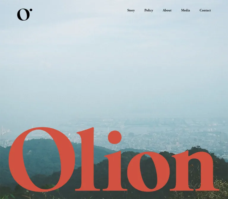
自然の風景写真と大胆なセリフ体を組み合わせた税理士事務所のコーポレートサイト。朱赤と温かな生成り、ゆったりした余白で親しみやすさを表現しています。
O’lion — Style Reference
Quiet landscapes, warm paper, and monumental red serif lettering frame an approachable tax practice.
Website: olion-tax.com Original URL: https://olion-tax.com/ Final URL: https://olion-tax.com/ Theme: warm light surfaces, coral chapter fields, black navigation, and photographic backgrounds. Inspected: October 1, 2026 at 17:21:40.849 UTC; October 2, 2026 at 02:21:40.849 JST. Viewports: desktop 1440 × 1000 CSS pixels; mobile 390 × 844 CSS pixels. Scope: supplied current-page captures of the opening, desktop About section, and desktop/mobile page endings, supported by rendered text and computed-style samples throughout the document. No additional browsing or interaction testing was performed for this reference.
O’lion is a single-page corporate website for a Japanese tax practice. Its sequence is an opening landscape, Story, Policy, About, Media, Contact, and a substantial footer. The original page identifies the practice as 税理士事務所O’lion and its representative as 岩田まり子. The content emphasizes personal consultation, professional relationships, biography, seminars, and a publication.
The design gives the practice a human, outdoors-oriented presence. A hazy mountain-and-city panorama fills the opening screen, while an enormous coral wordmark rests near its lower edge. Small black navigation stays near the top. Later, warm paper supports dense Japanese copy, an oversized About heading crosses a photographic boundary, and the contact area merges into a coral footer.
The important contrast is one of scale: enormous English display lettering, small English navigation, and bold, carefully spaced Japanese prose. Preserve that relationship alongside the generous empty areas and asymmetric desktop columns.
閉じる
O’lion — Style Reference
Quiet landscapes, warm paper, and monumental red serif lettering frame an approachable tax practice.
Website: olion-tax.com Original URL: https://olion-tax.com/ Final URL: https://olion-tax.com/ Theme: warm light surfaces, coral chapter fields, black navigation, and photographic backgrounds. Inspected: October 1, 2026 at 17:21:40.849 UTC; October 2, 2026 at 02:21:40.849 JST. Viewports: desktop 1440 × 1000 CSS pixels; mobile 390 × 844 CSS pixels. Scope: supplied current-page captures of the opening, desktop About section, and desktop/mobile page endings, supported by rendered text and computed-style samples throughout the document. No additional browsing or interaction testing was performed for this reference.
O’lion is a single-page corporate website for a Japanese tax practice. Its sequence is an opening landscape, Story, Policy, About, Media, Contact, and a substantial footer. The original page identifies the practice as 税理士事務所O’lion and its representative as 岩田まり子. The content emphasizes personal consultation, professional relationships, biography, seminars, and a publication.
The design gives the practice a human, outdoors-oriented presence. A hazy mountain-and-city panorama fills the opening screen, while an enormous coral wordmark rests near its lower edge. Small black navigation stays near the top. Later, warm paper supports dense Japanese copy, an oversized About heading crosses a photographic boundary, and the contact area merges into a coral footer.
The important contrast is one of scale: enormous English display lettering, small English navigation, and bold, carefully spaced Japanese prose. Preserve that relationship alongside the generous empty areas and asymmetric desktop columns.
How to Read This Reference
- Measured values come from the supplied rendered DOM and computed styles. Coordinates describe the captured layouts, not recovered layout formulas.
- Capture estimates describe visible image bounds, logo dimensions, and compositions that lack corresponding element measurements.
- Calculated values are derived from supplied coordinates or colors and are labeled accordingly.
- Recommendations and the Quick Start are implementation guidance, not claims about the original stylesheet or behavior.
- Token names are descriptive aliases. The observation reported no custom properties; this does not establish that the complete site contains none.
- Several large
h2elements have empty extracted text despite visible display lettering. Their computed typography is available, but the exact lettering mechanism and accessible names were not established. - The red mobile ending is a footer capture, not evidence that the hamburger menu was opened. Its footer controls and document coordinates support that distinction.
Tokens — Colors
Default Palette
| Name | Value | Suggested token | Evidence and role |
|---|---|---|---|
| Coral Red | #d0513f |
--color-coral |
Measured footer background and large heading color; visually dominates the ending |
| Warm Paper | #f7eee8 |
--color-paper |
Measured main background and light chapter-heading color |
| Warm Reversed Text | #f5eee9 |
--color-reverse |
Measured Story copy, contact links, and footer controls |
| Black Ink | #000000 |
--color-ink |
Measured navigation and ordinary content text; visible monogram color |
| Photo White | #ffffff |
--color-photo-text |
Measured About photo-overlay copy and offscreen mobile navigation labels |
The two warm whites are distinct source values. Warm Paper is the main surface; Warm Reversed Text is used for much of the lettering over coral. Preserve the distinction when matching the supplied page. Consolidating them is a possible simplification for a new system, not an observed source behavior.
The landscape adds pale blue-gray sky, hazy city tones, and dark green hills. These are photographic colors, not additional interface tokens. The red jacket in the About image visually connects the photography with the coral identity color; no color-processing technique was established.
Color Relationships
- Paper + black: information, biography, and readable Japanese text.
- Paper + coral: oversized section identity.
- Coral + warm white: broad narrative/contact surfaces and footer navigation.
- Photography + coral: the opening wordmark.
- Photography + white: the About message.
- Transparent header + black: persistent navigation over multiple underlying surfaces.
Calculated accessibility consideration: Warm Reversed Text on Coral Red has approximately 3.7:1 contrast. This suits large bold lettering better than small utility text. A new implementation should strengthen the contrast of small links, especially the observed 10px mobile privacy link.
Tokens — Typography
English Editorial Typography
Measured declared family: adobe-garamond-pro, serif.
The supplied styles assign this stack to navigation buttons, large chapter-heading containers, contact links, footer links, and the external view more link. These sampled elements use weight 700.
This serif gives the interface a literary character at small sizes and a sculptural presence at display sizes. Keep its proportions and bracketed serif character when selecting a fallback. A generic geometric sans-serif would substantially change the design.
The declared family is verified; the actual downloaded font file and resolved font for every glyph were not independently inspected. The hero and footer wordmarks should be treated as distinct brand artwork until their rendering method is known.
Japanese Content Typography
Measured declared stack:
'游ゴシック Medium', 'YuGothic M', 游ゴシック体, YuGothic,
'Hiragino Kaku Gothic Pro', 'Meiryo UI', メイリオ, Meiryo, sans-serif
The body defaults to 16px and weight 400, but the sampled Japanese headings and paragraphs mostly use weight 700. The visual result is substantial, compact text rather than delicate editorial body copy.
Ordinary content paragraphs use 14px / 23.8px with 0.84px tracking, equivalent to 1.7 line height and 0.06em letter spacing. Story paragraphs use a much more relaxed 2.5 line height and normal tracking.
Root Size
The measured root font size is 10px. Its Times declaration is a root default, not evidence that the visible Japanese content or branded English controls use Times.
Do not transfer source-sized rem values into a conventional 16px-root project without conversion. The Quick Start uses explicit pixel tokens for the measured endpoints and leaves the browser root size intact.
Type Scale
| Role | Desktop | Mobile | Weight / tracking | Evidence |
|---|---|---|---|---|
| Chapter-heading containers | 240px / 240px |
100px / 100px |
700, normal |
Measured h2 styles; extracted text empty |
| Story Japanese lead | 56px / 89.6px |
30px / 48px |
700, normal |
Measured |
| Story paragraphs | 18px / 45px |
14px / 35px |
700, normal |
Measured |
| Policy and About subheadings | 28px / 42px |
24px / 36px |
700, normal |
Measured |
| Standard Japanese paragraphs | 14px / 23.8px |
14px / 23.8px |
700, 0.84px |
Measured |
| Media subheadings | 24px / 40.8px |
24px / 40.8px |
700, normal |
Measured |
| Desktop header navigation | 16px / 18.4px |
Not visible in closed header | 700, normal |
Measured |
| Offscreen mobile navigation | — | 40px / 46px |
700, normal |
Measured outside viewport; open state unverified |
| Contact links | 40px / 46px |
25px / 28.75px |
700, normal |
Measured |
| Footer navigation | 32px / 36.8px |
40px / 46px |
700, normal |
Measured |
| Privacy link | 14px / 23.8px |
10px / 17px |
700, normal |
Measured |
view more / Back to top |
16px / 18.4px |
16px / 18.4px |
700, normal |
Measured |
The footer navigation becomes larger on mobile even as chapter headings become smaller. This is a meaningful responsive decision: the footer becomes a prominent vertical index.
Tokens — Spacing & Shapes
Spacing Relationships
The site does not present a uniform card-based spacing system. Its rhythm comes from broad chapter intervals, different column offsets, and deliberate gaps between large English lettering and Japanese content.
| Relationship | Desktop | Mobile | Status |
|---|---|---|---|
| Header top padding | 40px |
40px |
Measured |
| Header horizontal padding | 80px |
30px |
Measured |
| Header navigation gap | 45px |
— | Calculated between button rectangles |
| Header/navigation bottom padding | 5px |
Mobile menu labels: 0px |
Measured |
| Story title-box to lead gap | 114px |
114px |
Calculated |
| Story lead to first paragraph | 68px |
68px |
Calculated |
| Story paragraph gap | 20px |
15px |
Calculated |
| Policy heading to paragraph | 40px |
40px |
Calculated |
| About photo heading to paragraph | 33px |
33px |
Calculated |
| Greeting heading to paragraph | 37px |
37px |
Calculated |
| Footer navigation row gap | 36px |
Approximately 42.94px |
Calculated between button boxes |
| Footer bottom padding | 40px |
30px |
Measured |
The recurring 33–40px text gaps and 68–114px editorial gaps serve different purposes. Do not flatten them into one default section spacing.
Layout Measurements
| Element | Desktop, 1440px wide | Mobile, 390px wide | Status |
|---|---|---|---|
| Header box | 1440 × 96.25px |
390 × 96.25px |
Measured |
| Black monogram | Approximately 70 × 56px |
Approximately 70 × 56px |
Capture estimate |
| Mobile menu button | — | 30 × 24px, at x330, y50 |
Measured |
| Story title/lead region | x289.5, width 861px |
Lead: x30, width 330px |
Measured |
| Story paragraph column | x289.5, width 576px |
x30, width 330px |
Measured |
| Policy heading container | x240, width 960px |
x117, width 273px |
Measured |
| Policy text column | x720, width 480px |
x30, width 330px |
Measured |
| About display-heading box | x160, width about 617px |
x10, width 258px |
Measured |
| About photo text | x855, width 425px |
x30, width 330px |
Measured |
| Greeting/profile text | x669.6, width about 610.4px |
x30, width 330px |
Measured |
| Media text column | x715.6, width 480px |
x30, width 330px |
Measured |
| Contact heading box | x20, width 1400px |
x31.5, width 327px |
Measured |
| Footer | Height about 471.4px |
Height about 777.1px |
Measured |
| Full document | Height about 9529.8px |
Height about 9119.2px |
Measured |
The desktop uses several alignment systems rather than one centered content column. Story begins around 20% of the viewport width; Policy and Media place prose in the right half; About biography uses a wider right-side column.
Shapes and Edges
- Sampled elements have
0pxborder radius. - Captured imagery is rectangular and full bleed where shown.
- Navigation and contact controls are typography without filled button containers.
- No card-shadow or elevation system is visible in the supplied captures.
- The small mobile menu icon consists of three thin horizontal black strokes.
- The monogram is a distinctive black O-shaped mark with a dot at its upper right. Its shape should come from brand artwork, not a generic circle icon.
Components
Persistent Header
Role: keep the identity and chapter navigation available throughout the page.
At desktop size, the header uses a transparent flex container with 40px 80px 0 padding. The black monogram sits at the left; five small serif buttons sit at the right in the order Story, Policy, About, Media, Contact. Their calculated horizontal gap is 45px.
The header appears in the same screen position in the opening, About, and ending captures. This supports a persistent overlay treatment, although the supplied properties do not identify whether the implementation uses fixed positioning, sticky positioning, or another mechanism.
The header itself is transparent. The warm band behind it in the About capture comes from the underlying page composition; it should not automatically be reproduced as a permanently opaque header bar.
On mobile, the visible navigation is replaced by a 30 × 24px menu button. The monogram remains approximately the same size, and the horizontal inset changes to 30px.
Landscape Opening
Role: introduce the practice through atmosphere and identity before explanatory copy.
A pale, hazy sky occupies most of the opening photograph. The city sits behind dark foreground hills. The image is edge to edge, with no framing, card, caption box, or visible action button.
The coral Olion wordmark spans approximately 1200px on the desktop capture, from around x120 to x1320. Its visible glyphs sit near the bottom of the image. On mobile, it spans approximately 370px with about 10px side clearance.
These are artwork-bound estimates, not measured CSS font sizes. Preserve the wordmark’s proportions rather than recreating its width with an arbitrary font size.
The desktop image fills the supplied 1000px-high opening frame. On mobile, the photographic area ends at approximately y821, exposing about 23px of the next coral surface. The source viewport-height formula is unknown.
The opening image is cropped differently between desktop and mobile while retaining the sky/city/hill hierarchy. Avoid simply squeezing the desktop image into a portrait box.
Story Chapter
Role: introduce the practice’s personal approach in a slower reading rhythm.
The rendered text begins with the Japanese lead 近くのことに、そっと耳を傾ける。 and four prose blocks. On desktop, the lead occupies an 861px-wide region, while the paragraphs narrow to 576px and share its left edge.
A 114px gap separates the large heading box from the lead, followed by 68px before the first paragraph. Paragraphs use 18px bold type with 45px line height. These unusually open lines help the long statement feel conversational.
On mobile, the lead and paragraphs occupy the 330px inner column. The lead becomes 30px and wraps over two lines; paragraphs become 14px with 35px line height.
Measured light text and the coral surface visible immediately after the mobile hero support a reversed chapter treatment. A complete Story screenshot was not supplied, so its full background extent and any surrounding artwork remain unverified.
Policy Articles
Role: turn the introductory philosophy into two concrete working principles.
The content contains numbered entries 01. and 02., each with a Japanese heading and paragraph. The desktop copy sits at x720 in a 480px-wide column inside the broader 960px chapter region.
Headings use 28px bold Japanese type. Paragraphs begin 40px below their heading boxes and use the standard 14px, 1.7-line-height, tracked treatment. Mobile headings become 24px, and both entries use the 330px reading column.
The supplied evidence establishes the numbering and text layout but does not show the complete Policy artwork. Do not invent matching illustrations, icon badges, or card containers for the numbered items.
About Display Heading and Photo Banner
Role: connect the large chapter identity with a personal photographic scene.
The coral About heading begins at x160 on desktop and overlaps the boundary between paper and photography. In the supplied mid-page capture, the photograph runs from approximately y117 to y799, giving a visible height of about 682px. The display lettering crosses into its upper area.
The photograph shows a person from behind wearing a red jacket on a wooded path. The person occupies the left side; the right side supports white Japanese copy. The scene is soft and textured, with shallow visual detail rather than a crisp business portrait. The identity of the photographed person is not independently established by the evidence.
The text group begins at x855 and is 425px wide. Its heading is 28px / 42px; a 33px gap leads to two lines of 14px body copy. No panel or opaque text box is visible behind the lettering.
On mobile, the heading container shifts to x10, the chapter type becomes 100px, and the photo copy moves to the 330px content column. The exact mobile photograph crop is not shown in the supplied images.
Greeting, Profile, Career, and Company Information
Role: provide the factual depth behind the visual introduction.
The sequence includes ご挨拶, Profile, the representative’s name, Carrier, and Company. Preserve Carrier when quoting the source label; it is the spelling present in the supplied page text.
Greeting and profile copy use a desktop column approximately 610.4px wide, beginning at x669.6 and ending 160px from the right edge. This is wider than the Policy and Media prose columns. Mobile copy uses the same 30px side insets as the other reading sections.
The career content lists dated milestones; Company provides the practice name, representative, business activity, contact address, and postal address. Their content is verified, but detailed row styling was not supplied.
Recommended implementation: use a chronological list for career entries and a semantic definition list for company label/value pairs. Keep those structures visually quiet and consistent with the paper-and-black information areas.
Media and Archive
Role: present seminars and the practice’s publication without introducing a separate visual system.
The rendered content includes a seminar introduction, an Archive entry dated July 12, 2022, an external view more link, and a publication introduction. Desktop text sits in a 480px-wide right-side column; mobile text uses the 330px column.
The Japanese subsection headings remain 24px / 40.8px at both inspected widths. The view more link uses bold 16px Garamond and has 41px of measured right padding. The exact decoration occupying or motivating that space was not captured.
An actual external seminar destination is present in the rendered links. Its destination page was not inspected. Book-cover imagery, hover behavior, and complete archive styling are not established by the supplied evidence.
Contact Field
Role: make direct communication the final main-page action.
The contact area uses the coral field and large warm-white display treatment. The visible contact methods are email and telephone, with Mail : and Tel : prefixes. There is no contact form in the supplied rendered content.
On desktop, both links share a horizontal line and use 40px bold serif type. On mobile, they stack and become 25px. Their measured top positions differ by about 67.75px on mobile.
The actual link protocols are verified: mailto: for the email address and tel: for the telephone number. Activation and platform handling were not tested.
The large empty red area above the footer navigation in the desktop ending capture belongs primarily to the preceding contact region. The footer itself measures about 471px high; it is not a 1000px-high block of empty padding.
Footer Index
Role: repeat the identity and provide a clear final navigation index.
On desktop, a warm-white wordmark sits near x80. A vertical chapter list begins at x720, using 32px bold serif buttons with 36px gaps between their boxes. The privacy link aligns toward the lower right. Copyright sits at the lower left; Back to top sits at the lower right.
The coral contact surface continues into the footer without a visible separating rule. The black persistent header remains visible over it.
On mobile, the footer becomes a tall single-column composition. The larger wordmark appears first, followed by 40px navigation labels at x30. The first navigation button begins 200px below the footer’s document top. Privacy follows the chapter list, while copyright and Back to top form a bottom row with approximately 10px outer visual insets.
The persistent monogram overlaps the upper wordmark region in the supplied mobile ending. This is an observed composition, not a reason to classify the capture as an open menu. A new implementation may provide more header clearance if overlap harms legibility.
Tokens — Motion & Interaction
| Element or behavior | Supplied evidence | What remains unverified |
|---|---|---|
| Header persistence | Same screen placement across opening, mid-page, and ending captures | Exact positioning mechanism |
| Chapter navigation | Rendered as buttons with chapter labels | Click outcomes, scroll duration, easing, selected state |
| Mobile navigation | Closed hamburger visible; navigation labels measured at x420, outside a 390px viewport | Open appearance, direction of entry, focus behavior, dismissal |
Back to top |
Visible button at both widths | Scroll behavior and timing |
| Contact methods | Valid mailto: and tel: destinations supplied |
Activation behavior |
| External seminar/privacy links | Rendered destination URLs supplied | Destination page appearance or availability |
| Hero and About media | Photographic frames visible | Whether the underlying assets are still images, video, or animated media |
| Sampled CSS animations | animation: none reported on sampled elements |
Other elements, pseudo-elements, scripts, and event-triggered animation |
| Sampled transitions | Field reported as all |
Useful duration, easing, and actual transitioned properties |
There is no sufficient evidence to prescribe a source-specific parallax effect, entrance sequence, hover animation, menu slide, or smooth-scroll curve.
The collection process waited for finite motion and checked stability, but temporarily paused perpetual animations during readiness checks. Settled screenshots therefore establish composition more reliably than temporal behavior.
Recommended motion for an adaptation: keep ordinary reading static. If adding link feedback, use a brief underline or opacity change around 120–180ms. If adding animated section navigation or a menu, provide reduced-motion behavior and explicit keyboard support. These are additions, not recovered source tokens.
Surfaces
| Surface | Appearance | Structural purpose |
|---|---|---|
| Opening | Edge-to-edge landscape with coral wordmark | Atmosphere and identity |
| Main information canvas | Warm paper with black Japanese text | Long-form reading |
| Chapter display layer | Giant coral or warm-white lettering | Section identity and transitions |
| About photograph | Full-width woodland scene with white copy | Human context |
| Contact and footer | Continuous coral with warm-white lettering | Direct contact and final index |
| Header | Transparent, black symbol and labels | Persistent orientation |
The visible design obtains separation through changes in color, image boundaries, type scale, and whitespace. It does not need floating white cards, rounded containers, or shadows to organize information.
Imagery
Landscape Direction
The opening uses distance and atmospheric haze: pale sky, a faint city, and dark wooded ridges. Its broad low-detail sky gives the header room to breathe, while the darker foreground gives the coral wordmark a firm visual base.
Choose imagery with comparable compositional zones, not simply any mountain photograph. A busy bright foreground or a horizon near the top would alter the relationship between lettering and landscape.
Human Direction
The About photograph is informal and situated outdoors. A red jacket provides a warm focal point against foliage, and the person is seen from behind. The image supports the practice’s personal, grounded tone without the formality of a conventional office headshot.
The supplied frame has visible softness and texture. Preserve that character when selecting or preparing imagery, but do not assume the source applies a CSS blur, grain overlay, or particular filter.
Wordmarks and Symbols
The large Olion lettering and the small O-and-dot monogram are distinct visual assets. Preserve their proportions, spacing, and clear silhouette. Their original file formats and paths were not supplied.
Observed Asset References
No original image URLs or asset manifest were provided. These references identify observed visual material, not recoverable filenames.
| Visual asset | Evidence | Implementation guidance |
|---|---|---|
| Mountain/city panorama | Desktop and mobile opening captures | Use an authorized landscape asset; tune cropping at both widths |
| Coral opening wordmark | Desktop and mobile opening captures | Preserve brand artwork proportions |
| Black O-and-dot monogram | All supplied original-page captures | Use the original symbol when available |
| Woodland/red-jacket scene | Desktop About capture | Preserve left-side subject and right-side text space |
| Warm-white footer wordmark | Desktop and mobile endings | Reuse consistent brand artwork with an appropriate light variant |
Do not infer a source asset path, video format, photographer, or production credit from these appearances.
Layout & Responsive Behavior
Page Sequence and Scale
The page remains a long scrolling corporate document at both widths. Its measured height is about 9530px on desktop and 9119px on mobile. Mobile is not simply a taller version of the desktop: large display type and some broad spatial relationships become smaller while the text wraps more deeply.
The persistent header, opening photograph, editorial chapters, direct contact area, and footer index remain the main structure.
Desktop Composition
Desktop reading is intentionally asymmetric:
- Story uses a centered 861px region with a narrower left-aligned prose column.
- Policy places 480px of copy in the right half of a 960px region.
- About combines full-width photography with a 425px overlay and a separate 610px biography column.
- Media uses another approximately 480px right-side column.
- Contact methods appear together horizontally.
- Footer identity and chapter navigation occupy separate halves.
These are distinct composition choices. Applying one global max-width to every child would lose the observed rhythm.
Mobile Composition
At 390px, most Japanese reading content uses a 330px width with 30px side margins. Large headings retain individual offsets: About begins at x10, Media’s heading container begins at x0, and Policy’s heading container begins at x117. The display layer therefore does not always align with the body-copy grid.
Chapter typography changes from 240px to 100px. The Story lead changes from 56px to 30px, ordinary subheadings from 28px to 24px, and contact links from 40px to 25px. Standard body text stays at 14px.
The navigation collapses to a hamburger, contact methods stack, and the footer becomes a larger vertical index. Its navigation grows from 32px to 40px.
Responsive Limits
Only two widths were supplied. The exact breakpoint, interpolation rules, tablet layout, landscape-phone behavior, and safe-area handling are unknown. Do not present an invented breakpoint or fluid formula as source CSS.
For a new implementation, a breakpoint near 760px is a reasonable starting point for testing the transition to the single-column layout. Confirm it against real content and intermediate widths. The Quick Start uses that value as a recommendation.
Do’s and Don’ts
Do
- Preserve the measured coral, paper, black, and reversed-text relationships.
- Make the wordmark and section lettering much larger than ordinary navigation.
- Pair the declared Garamond stack with bold Japanese sans-serif content.
- Keep the opening dominated by sky, distant city, wooded hills, and a low-positioned wordmark.
- Preserve different desktop column widths for Story, Policy, About, and Media.
- Use the standard 14px body style with its measured line height and tracking where appropriate.
- Retain the slower 2.5-line-height rhythm for Story paragraphs.
- Keep chapter transitions and information groups spacious.
- Treat direct email and telephone links as the contact actions.
- Preserve the mobile footer’s large vertical navigation.
- Keep brand artwork separate from ordinary text when its rendering method is unknown.
Don’t
- Don’t replace the corporate narrative with a generic conversion funnel or pricing-card layout.
- Don’t add boxed CTA buttons merely because the site contains contact information.
- Don’t turn every content group into a rounded card.
- Don’t replace the transparent header with an opaque white bar throughout the page.
- Don’t use the same centered width for every desktop section.
- Don’t shrink the entire desktop composition proportionally onto a phone.
- Don’t treat the red mobile footer capture as a verified open-menu state.
- Don’t label photographic frames as video or parallax without additional evidence.
- Don’t infer asset paths, image authors, or production roles from appearance.
- Don’t copy the unexplained mobile hero height as a universal viewport formula.
Recommended Implementation Additions
These are recommendations for a new implementation, not verified original features:
- Give the menu button an accessible name,
aria-expanded, andaria-controls. Keep closed navigation out of the keyboard focus order. - Make the visible 30px menu icon part of a target at least 44px square.
- Implement chapter navigation as real fragment links when suitable, with scroll margins that account for the persistent header.
- Give image-based wordmarks and section titles useful accessible names. Avoid duplicating those names in decorative image alternatives.
- Provide visible keyboard focus styles that work on paper, photography, and coral.
- Increase the mobile privacy link’s size and contrast while retaining its subordinate placement.
- Verify white text against the actual responsive About image crop. Use a restrained local scrim only if needed; none is established in the supplied capture.
- Allow email addresses to wrap safely on narrower devices and at increased text sizes.
- Preserve a static, usable reading experience when reduced motion is requested.
- Check the persistent header’s overlap with large titles and the mobile footer wordmark.
- Reserve image dimensions and load the correct licensed font to reduce layout shifts.
Agent Prompt Guide
Quick Color Reference
- Main paper:
#f7eee8. - Coral fields and display lettering:
#d0513f. - Warm reversed text:
#f5eee9. - Header, monogram, and ordinary body text:
#000000. - About photo copy:
#ffffff. - Additional blues and greens should come from photography rather than new interface accents.
Overall Prompt
“Create a single-page corporate website for an approachable Japanese professional practice, inspired by O’lion’s observed composition. Use warm paper #f7eee8, coral #d0513f, black navigation, and warm reversed text #f5eee9. Combine enormous old-style serif chapter lettering with bold Japanese sans-serif copy. Open with an edge-to-edge hazy mountain-and-city photograph, a small black monogram at upper left, restrained navigation at upper right, and a huge coral wordmark close to the lower edge. Build spacious Story, Policy, About, Media, and Contact chapters with asymmetric desktop text columns. Let the About title cross a woodland photograph, with white copy at the right. Finish with direct email and telephone links and a coral footer containing a large wordmark and vertical chapter index. On mobile, use 30px reading insets, 100px chapter titles, a compact hamburger, stacked contact methods, and 40px footer links. Keep surfaces flat and motion restrained.”
Example Component Prompts
- Opening: “A full-width hazy landscape with abundant pale sky and dark wooded hills. Place a black O-and-dot symbol at the upper left, five small bold serif navigation labels at the upper right, and a very large coral wordmark near the bottom. No panel behind the wordmark.”
- Story: “A reversed editorial chapter with an oversized warm-white serif label, a bold Japanese lead, and a narrower prose column. Use 114px between title and lead, 68px before the body, and unusually generous 2.5 line height for the narrative.”
- About banner: “Place a 240px coral serif About title across the boundary between warm paper and a full-width woodland photograph. Keep the red-jacketed subject to the left and a 425px white Japanese text group at the right. Use a 28px heading and 14px body text without a visible card.”
- Information group: “Use a flat warm-paper surface and a right-positioned 610px desktop column for a greeting and professional profile. Bold Japanese 14px text, 1.7 line height, and 0.06em tracking. Collapse to a 330px column within a 390px viewport.”
- Footer: “A continuous coral field with a warm-white wordmark on the left and a vertical serif chapter index in the right half. Put privacy, copyright, and Back to top near the lower edges. On mobile, stack the composition and enlarge the chapter links to 40px.”
These prompts describe the visual system. They do not authorize reuse of original photographs or brand artwork.
Quick Start
CSS Custom Properties
This is an adaptation of measured colors, typography, and alignment patterns. It is not the original stylesheet. The 760px breakpoint, intermediate layout rules, image positioning, and some section spacing are recommendations.
The hero wordmark offsets and 24px mobile next-section peek are capture-tuned approximations. The About mobile image height is a starting value because its crop was not visually supplied. The CSS does not attempt to recreate the complete document height or unobserved artwork.
Use authorized image assets in the indicated image elements. adobe-garamond-pro must be loaded separately if licensed and available; the fallback will change text metrics. The menu still requires an accessible controller, and no unverified menu animation is included.
:root {
  /* Measured palette */
  --color-paper: #f7eee8;
  --color-coral: #d0513f;
  --color-reverse: #f5eee9;
  --color-ink: #000000;
  --color-photo-text: #ffffff;

  /* Measured declared families */
  --font-editorial: adobe-garamond-pro, serif;
  --font-body: '游ゴシック Medium', 'YuGothic M', 游ゴシック体,
    YuGothic, 'Hiragino Kaku Gothic Pro', 'Meiryo UI',
    メイリオ, Meiryo, sans-serif;

  /* Measured desktop type endpoints */
  --text-chapter: 240px;
  --text-story-lead: 56px;
  --text-story-body: 18px;
  --text-subheading: 28px;
  --text-body: 14px;
  --text-contact: 40px;
  --text-footer-nav: 32px;
  --leading-body: 1.7;
  --tracking-body: 0.06em;

  /* Measured spacing and adaptation aliases */
  --gutter: 80px;
  --header-top: 40px;
  --nav-gap: 45px;
  --story-title-gap: 114px;
  --story-copy-gap: 68px;
  --header-clearance: 116px;
}

* { box-sizing: border-box; }

body {
  margin: 0;
  color: var(--color-ink);
  background: var(--color-paper);
  font: 400 16px/1.15 var(--font-body);
}

img { display: block; max-width: 100%; }
a { color: inherit; }
button { font: inherit; }

section[id] {
  scroll-margin-top: var(--header-clearance);
}

.text-control {
  display: inline-block;
  padding: 0 0 5px;
  border: 0;
  border-radius: 0;
  color: inherit;
  background: transparent;
  font: 700 16px/1.15 var(--font-editorial);
  text-decoration: none;
  cursor: pointer;
}

/* Fixed positioning is an adaptation of observed persistence. */
.site-header {
  position: fixed;
  inset: 0 0 auto;
  z-index: 20;
  display: flex;
  align-items: flex-start;
  justify-content: space-between;
  padding: var(--header-top) var(--gutter) 0;
  color: var(--color-ink);
  background: transparent;
}

.brand-symbol {
  display: block;
  width: 70px;
  height: 56.25px;
  object-fit: contain;
}

.site-header__nav {
  display: flex;
  gap: var(--nav-gap);
}

/* Recommended larger target around the observed small icon. */
.menu-toggle {
  display: none;
  align-items: center;
  justify-content: center;
  width: 44px;
  height: 44px;
  padding: 0;
  border: 0;
  color: inherit;
  background: transparent;
  cursor: pointer;
}

.menu-icon {
  display: grid;
  width: 30px;
  gap: 6px;
}

.menu-icon > span {
  display: block;
  height: 2px;
  background: currentColor;
}

.hero {
  position: relative;
  height: 100vh;
  height: 100svh;
  overflow: hidden;
}

.hero__image {
  position: absolute;
  inset: 0;
  width: 100%;
  height: 100%;
  object-fit: cover;
  object-position: 50% 50%;
}

/* Use proportional brand artwork, not stretched live text. */
.hero__wordmark {
  position: absolute;
  left: 50%;
  bottom: 34px;
  width: min(83.333%, 1200px);
  height: auto;
  transform: translateX(-50%);
}

.section-title {
  margin: 0;
  color: var(--color-coral);
  font: 700 var(--text-chapter)/1 var(--font-editorial);
  letter-spacing: normal;
}

.section-subtitle {
  margin: 0;
  font: 700 var(--text-subheading)/1.5 var(--font-body);
}

.body-copy {
  font: 700 var(--text-body)/var(--leading-body) var(--font-body);
  letter-spacing: var(--tracking-body);
}

.story {
  padding: 200px var(--gutter) 180px;
  color: var(--color-reverse);
  background: var(--color-coral);
}

.story__inner {
  max-width: 861px;
  margin-inline: auto;
}

.story .section-title { color: var(--color-paper); }

.story__lead {
  margin: var(--story-title-gap) 0 var(--story-copy-gap);
  font: 700 var(--text-story-lead)/1.6 var(--font-body);
}

.story__prose {
  max-width: 576px;
  font: 700 var(--text-story-body)/2.5 var(--font-body);
  letter-spacing: normal;
}

.story__prose p { margin: 0; }
.story__prose p + p { margin-top: 20px; }

.policy,
.media {
  width: min(960px, calc(100% - 2 * var(--gutter)));
  margin-inline: auto;
  padding-block: 120px;
}

.policy__copy,
.media__copy {
  width: 50%;
  margin: 120px 0 0 auto;
}

.policy__item + .policy__item { margin-top: 95px; }
.policy__item .body-copy { margin: 40px 0 0; }

.media .section-subtitle {
  font-size: 24px;
  line-height: 1.7;
}

.text-link {
  display: inline-block;
  padding: 0 41px 5px 0;
  font: 700 16px/1.15 var(--font-editorial);
  text-decoration: none;
}

.about > .section-title {
  position: relative;
  z-index: 1;
  margin-left: 160px;
}

/* Capture-based desktop banner approximation. */
.about__scene {
  position: relative;
  isolation: isolate;
  display: grid;
  grid-template-columns: minmax(0, 1fr) 425px;
  align-items: center;
  min-height: 682px;
  margin-top: -100px;
  padding-inline: 160px;
}

.about__image {
  position: absolute;
  inset: 0;
  z-index: -1;
  width: 100%;
  height: 100%;
  object-fit: cover;
}

.about__copy {
  grid-column: 2;
  color: var(--color-photo-text);
}

.about__copy .body-copy { margin: 33px 0 0; }

.about__article {
  width: min(610.4px, calc(100% - 320px));
  margin: 110px 160px 0 auto;
}

.about__article .body-copy { margin-top: 37px; }

.contact {
  padding: 160px 20px 480px;
  color: var(--color-reverse);
  background: var(--color-coral);
  text-align: center;
}

.contact .section-title { color: var(--color-paper); }

.contact__methods {
  display: flex;
  justify-content: center;
  flex-wrap: wrap;
  gap: 40px 80px;
  margin-top: 80px;
  font: 700 var(--text-contact)/1.15 var(--font-editorial);
}

.contact__methods p { margin: 0; }
.contact__methods a {
  text-decoration: none;
  overflow-wrap: anywhere;
}

.site-footer {
  padding: 0 80px 40px;
  color: var(--color-reverse);
  background: var(--color-coral);
}

.site-footer__main {
  position: relative;
  display: grid;
  grid-template-columns: 1fr 1fr;
  align-items: start;
}

.site-footer__wordmark {
  width: 256px;
  height: auto;
}

.site-footer__nav {
  grid-column: 2;
  display: flex;
  flex-direction: column;
  align-items: flex-start;
  gap: 36px;
}

.site-footer__nav .text-control {
  font-size: var(--text-footer-nav);
}

.site-footer__privacy {
  position: absolute;
  right: 0;
  bottom: 0;
  font: 700 14px/1.7 var(--font-body);
  text-decoration: none;
}

.site-footer__bottom {
  display: flex;
  justify-content: space-between;
  align-items: baseline;
  gap: 20px;
  margin-top: 55px;
  font: 700 16px/1.15 var(--font-editorial);
}

/* Recommended keyboard feedback; not verified source styling. */
:where(a, button):focus-visible {
  outline: 2px solid currentColor;
  outline-offset: 5px;
}

@media (hover: hover) {
  .text-control:hover,
  .text-link:hover,
  .contact__methods a:hover {
    text-decoration: underline;
    text-underline-offset: 0.2em;
  }
}

/* Recommended breakpoint, using measured mobile endpoints. */
@media (max-width: 760px) {
  :root {
    --gutter: 30px;
    --text-chapter: 100px;
    --text-story-lead: 30px;
    --text-story-body: 14px;
    --text-subheading: 24px;
    --text-contact: 25px;
    --text-footer-nav: 40px;
  }

  .site-header__nav { display: none; }
  .menu-toggle {
    display: flex;
    margin-right: -7px;
  }

  .hero {
    height: calc(100vh - 24px);
    height: calc(100svh - 24px);
  }

  .hero__wordmark {
    width: calc(100% - 20px);
    bottom: 66px;
  }

  .story { padding-block: 180px 140px; }
  .story__prose p + p { margin-top: 15px; }

  .policy,
  .media { padding-block: 100px; }

  .policy__copy,
  .media__copy { width: 100%; }

  .about > .section-title { margin-left: 10px; }

  /* Mobile photographic geometry is an adaptation. */
  .about__scene {
    grid-template-columns: minmax(0, 1fr);
    align-items: end;
    min-height: 460px;
    margin-top: -35px;
    padding: 150px 30px 50px;
  }

  .about__copy { grid-column: 1; }
  .about__article {
    width: auto;
    margin: 80px 30px 0;
  }

  .contact { padding: 140px 30px 220px; }
  .contact__methods {
    flex-direction: column;
    gap: 39px;
    margin-top: 100px;
  }

  .site-footer { padding: 0 30px 30px; }
  .site-footer__main { grid-template-columns: 1fr; }
  .site-footer__wordmark {
    width: 100%;
    max-width: 330px;
  }

  .site-footer__nav {
    grid-column: 1;
    gap: 42.94px;
    margin-top: 100px;
  }

  .site-footer .text-control { padding-bottom: 0; }
  .site-footer__privacy {
    position: static;
    grid-column: 1;
    justify-self: start;
    margin-top: 50px;
    font-size: 10px;
  }

  .site-footer__bottom { margin: 60px -20px 0; }
  .text-link { padding-bottom: 0; }
}

@media (prefers-reduced-motion: reduce) {
  html { scroll-behavior: auto; }
}
The CSS retains the measured 10px mobile privacy style for reference fidelity. Apply the recommended readability and contrast improvements before shipping an adaptation. A production build also needs semantic markup, menu state management, accessible image alternatives, and verified image crops.
Tailwind v4 Token Mapping
Optional mapping for projects already using Tailwind v4. This is not evidence that the original website uses Tailwind. Define the custom properties above first.
@theme inline {
  --color-paper: #f7eee8;
  --color-coral: #d0513f;
  --color-reverse: #f5eee9;
  --color-ink: #000000;
  --color-photo-text: #ffffff;

  --font-editorial: adobe-garamond-pro, serif;
  --font-japanese: var(--font-body);

  --text-chapter: var(--text-chapter-size);
  --text-copy: 14px;
  --text-copy--line-height: 1.7;
  --text-copy--letter-spacing: 0.06em;
  --text-copy--font-weight: 700;

  --spacing-page-gutter: var(--gutter);
  --spacing-story-title-gap: 114px;
  --spacing-story-copy-gap: 68px;
}

/* Separate alias avoids a self-referencing theme variable. */
:root { --text-chapter-size: 240px; }
@media (max-width: 760px) {
  :root { --text-chapter-size: 100px; }
}
Sources & Evidence
- Inspected original and final website: https://olion-tax.com/. Both supplied URLs are identical; the observation reports HTTP 200 and the title
税理士事務所O’lion. - Capture timestamp: October 1, 2026, 17:21:40.849 UTC, equivalent to October 2, 2026, 02:21:40.849 JST.
- Desktop evidence: 1440 × 1000 CSS-pixel viewport; opening, About, and ending captures; rendered document height approximately 9529.8px.
- Mobile evidence: 390 × 844 CSS-pixel viewport; opening and ending captures; rendered document height approximately 9119.2px.
- Rendered DOM and styles: page text, link destinations, sampled element rectangles, font stacks, type sizes, weights, line heights, tracking, colors, padding, radii, and limited animation/transition fields.
- Collection conditions: the supplied collector observed the initial page for at least five seconds and checked document load, finite motion, sampled layout/text stability, and visible image decoding within bounded waits. Perpetual animations were temporarily paused during readiness checks and then resumed. Scrolling traversed intermediate positions. SharedWorkers and service workers were disabled.
- Interaction limits: there is no supplied click trace for chapter navigation, menu opening, back-to-top, hover states, contact activation, or external destinations. No exact animation timing, asset manifest, or original breakpoint rules were provided.
- Attribution limits: the operator is identified by the original page’s Company content. No production-team claim is made from the supplied original-page evidence.
This reference describes the currently supplied website evidence. Measured endpoints, visual estimates, and implementation recommendations are distinguished throughout; unobserved sections and behaviors should not be reconstructed as established facts.
# O’lion — Style Reference

> Quiet landscapes, warm paper, and monumental red serif lettering frame an approachable tax practice.

**Website:** [olion-tax.com](https://olion-tax.com/)
**Original URL:** https://olion-tax.com/
**Final URL:** https://olion-tax.com/
**Theme:** warm light surfaces, coral chapter fields, black navigation, and photographic backgrounds.
**Inspected:** October 1, 2026 at 17:21:40.849 UTC; October 2, 2026 at 02:21:40.849 JST.
**Viewports:** desktop 1440 × 1000 CSS pixels; mobile 390 × 844 CSS pixels.
**Scope:** supplied current-page captures of the opening, desktop About section, and desktop/mobile page endings, supported by rendered text and computed-style samples throughout the document. No additional browsing or interaction testing was performed for this reference.

O’lion is a single-page corporate website for a Japanese tax practice. Its sequence is an opening landscape, Story, Policy, About, Media, Contact, and a substantial footer. The original page identifies the practice as **税理士事務所O’lion** and its representative as **岩田まり子**. The content emphasizes personal consultation, professional relationships, biography, seminars, and a publication.

The design gives the practice a human, outdoors-oriented presence. A hazy mountain-and-city panorama fills the opening screen, while an enormous coral wordmark rests near its lower edge. Small black navigation stays near the top. Later, warm paper supports dense Japanese copy, an oversized About heading crosses a photographic boundary, and the contact area merges into a coral footer.

The important contrast is one of scale: enormous English display lettering, small English navigation, and bold, carefully spaced Japanese prose. Preserve that relationship alongside the generous empty areas and asymmetric desktop columns.
閉じる
# O’lion — Style Reference

> Quiet landscapes, warm paper, and monumental red serif lettering frame an approachable tax practice.

**Website:** [olion-tax.com](https://olion-tax.com/)
**Original URL:** https://olion-tax.com/
**Final URL:** https://olion-tax.com/
**Theme:** warm light surfaces, coral chapter fields, black navigation, and photographic backgrounds.
**Inspected:** October 1, 2026 at 17:21:40.849 UTC; October 2, 2026 at 02:21:40.849 JST.
**Viewports:** desktop 1440 × 1000 CSS pixels; mobile 390 × 844 CSS pixels.
**Scope:** supplied current-page captures of the opening, desktop About section, and desktop/mobile page endings, supported by rendered text and computed-style samples throughout the document. No additional browsing or interaction testing was performed for this reference.

O’lion is a single-page corporate website for a Japanese tax practice. Its sequence is an opening landscape, Story, Policy, About, Media, Contact, and a substantial footer. The original page identifies the practice as **税理士事務所O’lion** and its representative as **岩田まり子**. The content emphasizes personal consultation, professional relationships, biography, seminars, and a publication.

The design gives the practice a human, outdoors-oriented presence. A hazy mountain-and-city panorama fills the opening screen, while an enormous coral wordmark rests near its lower edge. Small black navigation stays near the top. Later, warm paper supports dense Japanese copy, an oversized About heading crosses a photographic boundary, and the contact area merges into a coral footer.

The important contrast is one of scale: enormous English display lettering, small English navigation, and bold, carefully spaced Japanese prose. Preserve that relationship alongside the generous empty areas and asymmetric desktop columns.

## How to Read This Reference

- **Measured** values come from the supplied rendered DOM and computed styles. Coordinates describe the captured layouts, not recovered layout formulas.
- **Capture estimates** describe visible image bounds, logo dimensions, and compositions that lack corresponding element measurements.
- **Calculated** values are derived from supplied coordinates or colors and are labeled accordingly.
- **Recommendations** and the Quick Start are implementation guidance, not claims about the original stylesheet or behavior.
- **Token names** are descriptive aliases. The observation reported no custom properties; this does not establish that the complete site contains none.
- Several large `h2` elements have empty extracted text despite visible display lettering. Their computed typography is available, but the exact lettering mechanism and accessible names were not established.
- The red mobile ending is a **footer capture**, not evidence that the hamburger menu was opened. Its footer controls and document coordinates support that distinction.

## Tokens — Colors

### Default Palette

| Name | Value | Suggested token | Evidence and role |
| --- | --- | --- | --- |
| Coral Red | `#d0513f` | `--color-coral` | Measured footer background and large heading color; visually dominates the ending |
| Warm Paper | `#f7eee8` | `--color-paper` | Measured main background and light chapter-heading color |
| Warm Reversed Text | `#f5eee9` | `--color-reverse` | Measured Story copy, contact links, and footer controls |
| Black Ink | `#000000` | `--color-ink` | Measured navigation and ordinary content text; visible monogram color |
| Photo White | `#ffffff` | `--color-photo-text` | Measured About photo-overlay copy and offscreen mobile navigation labels |

The two warm whites are distinct source values. Warm Paper is the main surface; Warm Reversed Text is used for much of the lettering over coral. Preserve the distinction when matching the supplied page. Consolidating them is a possible simplification for a new system, not an observed source behavior.

The landscape adds pale blue-gray sky, hazy city tones, and dark green hills. These are photographic colors, not additional interface tokens. The red jacket in the About image visually connects the photography with the coral identity color; no color-processing technique was established.

### Color Relationships

- **Paper + black:** information, biography, and readable Japanese text.
- **Paper + coral:** oversized section identity.
- **Coral + warm white:** broad narrative/contact surfaces and footer navigation.
- **Photography + coral:** the opening wordmark.
- **Photography + white:** the About message.
- **Transparent header + black:** persistent navigation over multiple underlying surfaces.

**Calculated accessibility consideration:** Warm Reversed Text on Coral Red has approximately **3.7:1** contrast. This suits large bold lettering better than small utility text. A new implementation should strengthen the contrast of small links, especially the observed 10px mobile privacy link.

## Tokens — Typography

### English Editorial Typography

**Measured declared family:** `adobe-garamond-pro, serif`.

The supplied styles assign this stack to navigation buttons, large chapter-heading containers, contact links, footer links, and the external `view more` link. These sampled elements use weight `700`.

This serif gives the interface a literary character at small sizes and a sculptural presence at display sizes. Keep its proportions and bracketed serif character when selecting a fallback. A generic geometric sans-serif would substantially change the design.

The declared family is verified; the actual downloaded font file and resolved font for every glyph were not independently inspected. The hero and footer wordmarks should be treated as distinct brand artwork until their rendering method is known.

### Japanese Content Typography

**Measured declared stack:**

```css
'游ゴシック Medium', 'YuGothic M', 游ゴシック体, YuGothic,
'Hiragino Kaku Gothic Pro', 'Meiryo UI', メイリオ, Meiryo, sans-serif
```

The body defaults to 16px and weight `400`, but the sampled Japanese headings and paragraphs mostly use weight `700`. The visual result is substantial, compact text rather than delicate editorial body copy.

Ordinary content paragraphs use `14px / 23.8px` with `0.84px` tracking, equivalent to `1.7` line height and `0.06em` letter spacing. Story paragraphs use a much more relaxed `2.5` line height and normal tracking.

### Root Size

The measured root font size is `10px`. Its `Times` declaration is a root default, not evidence that the visible Japanese content or branded English controls use Times.

Do not transfer source-sized rem values into a conventional 16px-root project without conversion. The Quick Start uses explicit pixel tokens for the measured endpoints and leaves the browser root size intact.

### Type Scale

| Role | Desktop | Mobile | Weight / tracking | Evidence |
| --- | --- | --- | --- | --- |
| Chapter-heading containers | `240px / 240px` | `100px / 100px` | `700`, normal | Measured `h2` styles; extracted text empty |
| Story Japanese lead | `56px / 89.6px` | `30px / 48px` | `700`, normal | Measured |
| Story paragraphs | `18px / 45px` | `14px / 35px` | `700`, normal | Measured |
| Policy and About subheadings | `28px / 42px` | `24px / 36px` | `700`, normal | Measured |
| Standard Japanese paragraphs | `14px / 23.8px` | `14px / 23.8px` | `700`, `0.84px` | Measured |
| Media subheadings | `24px / 40.8px` | `24px / 40.8px` | `700`, normal | Measured |
| Desktop header navigation | `16px / 18.4px` | Not visible in closed header | `700`, normal | Measured |
| Offscreen mobile navigation | — | `40px / 46px` | `700`, normal | Measured outside viewport; open state unverified |
| Contact links | `40px / 46px` | `25px / 28.75px` | `700`, normal | Measured |
| Footer navigation | `32px / 36.8px` | `40px / 46px` | `700`, normal | Measured |
| Privacy link | `14px / 23.8px` | `10px / 17px` | `700`, normal | Measured |
| `view more` / `Back to top` | `16px / 18.4px` | `16px / 18.4px` | `700`, normal | Measured |

The footer navigation becomes **larger** on mobile even as chapter headings become smaller. This is a meaningful responsive decision: the footer becomes a prominent vertical index.

## Tokens — Spacing & Shapes

### Spacing Relationships

The site does not present a uniform card-based spacing system. Its rhythm comes from broad chapter intervals, different column offsets, and deliberate gaps between large English lettering and Japanese content.

| Relationship | Desktop | Mobile | Status |
| --- | --- | --- | --- |
| Header top padding | `40px` | `40px` | Measured |
| Header horizontal padding | `80px` | `30px` | Measured |
| Header navigation gap | `45px` | — | Calculated between button rectangles |
| Header/navigation bottom padding | `5px` | Mobile menu labels: `0px` | Measured |
| Story title-box to lead gap | `114px` | `114px` | Calculated |
| Story lead to first paragraph | `68px` | `68px` | Calculated |
| Story paragraph gap | `20px` | `15px` | Calculated |
| Policy heading to paragraph | `40px` | `40px` | Calculated |
| About photo heading to paragraph | `33px` | `33px` | Calculated |
| Greeting heading to paragraph | `37px` | `37px` | Calculated |
| Footer navigation row gap | `36px` | Approximately `42.94px` | Calculated between button boxes |
| Footer bottom padding | `40px` | `30px` | Measured |

The recurring 33–40px text gaps and 68–114px editorial gaps serve different purposes. Do not flatten them into one default section spacing.

### Layout Measurements

| Element | Desktop, 1440px wide | Mobile, 390px wide | Status |
| --- | --- | --- | --- |
| Header box | `1440 × 96.25px` | `390 × 96.25px` | Measured |
| Black monogram | Approximately `70 × 56px` | Approximately `70 × 56px` | Capture estimate |
| Mobile menu button | — | `30 × 24px`, at `x330, y50` | Measured |
| Story title/lead region | `x289.5`, width `861px` | Lead: `x30`, width `330px` | Measured |
| Story paragraph column | `x289.5`, width `576px` | `x30`, width `330px` | Measured |
| Policy heading container | `x240`, width `960px` | `x117`, width `273px` | Measured |
| Policy text column | `x720`, width `480px` | `x30`, width `330px` | Measured |
| About display-heading box | `x160`, width about `617px` | `x10`, width `258px` | Measured |
| About photo text | `x855`, width `425px` | `x30`, width `330px` | Measured |
| Greeting/profile text | `x669.6`, width about `610.4px` | `x30`, width `330px` | Measured |
| Media text column | `x715.6`, width `480px` | `x30`, width `330px` | Measured |
| Contact heading box | `x20`, width `1400px` | `x31.5`, width `327px` | Measured |
| Footer | Height about `471.4px` | Height about `777.1px` | Measured |
| Full document | Height about `9529.8px` | Height about `9119.2px` | Measured |

The desktop uses several alignment systems rather than one centered content column. Story begins around 20% of the viewport width; Policy and Media place prose in the right half; About biography uses a wider right-side column.

### Shapes and Edges

- Sampled elements have `0px` border radius.
- Captured imagery is rectangular and full bleed where shown.
- Navigation and contact controls are typography without filled button containers.
- No card-shadow or elevation system is visible in the supplied captures.
- The small mobile menu icon consists of three thin horizontal black strokes.
- The monogram is a distinctive black O-shaped mark with a dot at its upper right. Its shape should come from brand artwork, not a generic circle icon.

## Components

### Persistent Header

**Role:** keep the identity and chapter navigation available throughout the page.

At desktop size, the header uses a transparent flex container with `40px 80px 0` padding. The black monogram sits at the left; five small serif buttons sit at the right in the order `Story`, `Policy`, `About`, `Media`, `Contact`. Their calculated horizontal gap is 45px.

The header appears in the same screen position in the opening, About, and ending captures. This supports a persistent overlay treatment, although the supplied properties do not identify whether the implementation uses fixed positioning, sticky positioning, or another mechanism.

The header itself is transparent. The warm band behind it in the About capture comes from the underlying page composition; it should not automatically be reproduced as a permanently opaque header bar.

On mobile, the visible navigation is replaced by a 30 × 24px menu button. The monogram remains approximately the same size, and the horizontal inset changes to 30px.

### Landscape Opening

**Role:** introduce the practice through atmosphere and identity before explanatory copy.

A pale, hazy sky occupies most of the opening photograph. The city sits behind dark foreground hills. The image is edge to edge, with no framing, card, caption box, or visible action button.

The coral `Olion` wordmark spans approximately 1200px on the desktop capture, from around x120 to x1320. Its visible glyphs sit near the bottom of the image. On mobile, it spans approximately 370px with about 10px side clearance.

These are artwork-bound estimates, not measured CSS font sizes. Preserve the wordmark’s proportions rather than recreating its width with an arbitrary font size.

The desktop image fills the supplied 1000px-high opening frame. On mobile, the photographic area ends at approximately y821, exposing about 23px of the next coral surface. The source viewport-height formula is unknown.

The opening image is cropped differently between desktop and mobile while retaining the sky/city/hill hierarchy. Avoid simply squeezing the desktop image into a portrait box.

### Story Chapter

**Role:** introduce the practice’s personal approach in a slower reading rhythm.

The rendered text begins with the Japanese lead `近くのことに、そっと耳を傾ける。` and four prose blocks. On desktop, the lead occupies an 861px-wide region, while the paragraphs narrow to 576px and share its left edge.

A 114px gap separates the large heading box from the lead, followed by 68px before the first paragraph. Paragraphs use 18px bold type with 45px line height. These unusually open lines help the long statement feel conversational.

On mobile, the lead and paragraphs occupy the 330px inner column. The lead becomes 30px and wraps over two lines; paragraphs become 14px with 35px line height.

Measured light text and the coral surface visible immediately after the mobile hero support a reversed chapter treatment. A complete Story screenshot was not supplied, so its full background extent and any surrounding artwork remain unverified.

### Policy Articles

**Role:** turn the introductory philosophy into two concrete working principles.

The content contains numbered entries `01.` and `02.`, each with a Japanese heading and paragraph. The desktop copy sits at x720 in a 480px-wide column inside the broader 960px chapter region.

Headings use 28px bold Japanese type. Paragraphs begin 40px below their heading boxes and use the standard 14px, 1.7-line-height, tracked treatment. Mobile headings become 24px, and both entries use the 330px reading column.

The supplied evidence establishes the numbering and text layout but does not show the complete Policy artwork. Do not invent matching illustrations, icon badges, or card containers for the numbered items.

### About Display Heading and Photo Banner

**Role:** connect the large chapter identity with a personal photographic scene.

The coral `About` heading begins at x160 on desktop and overlaps the boundary between paper and photography. In the supplied mid-page capture, the photograph runs from approximately y117 to y799, giving a visible height of about 682px. The display lettering crosses into its upper area.

The photograph shows a person from behind wearing a red jacket on a wooded path. The person occupies the left side; the right side supports white Japanese copy. The scene is soft and textured, with shallow visual detail rather than a crisp business portrait. The identity of the photographed person is not independently established by the evidence.

The text group begins at x855 and is 425px wide. Its heading is `28px / 42px`; a 33px gap leads to two lines of 14px body copy. No panel or opaque text box is visible behind the lettering.

On mobile, the heading container shifts to x10, the chapter type becomes 100px, and the photo copy moves to the 330px content column. The exact mobile photograph crop is not shown in the supplied images.

### Greeting, Profile, Career, and Company Information

**Role:** provide the factual depth behind the visual introduction.

The sequence includes `ご挨拶`, `Profile`, the representative’s name, `Carrier`, and `Company`. Preserve `Carrier` when quoting the source label; it is the spelling present in the supplied page text.

Greeting and profile copy use a desktop column approximately 610.4px wide, beginning at x669.6 and ending 160px from the right edge. This is wider than the Policy and Media prose columns. Mobile copy uses the same 30px side insets as the other reading sections.

The career content lists dated milestones; Company provides the practice name, representative, business activity, contact address, and postal address. Their content is verified, but detailed row styling was not supplied.

**Recommended implementation:** use a chronological list for career entries and a semantic definition list for company label/value pairs. Keep those structures visually quiet and consistent with the paper-and-black information areas.

### Media and Archive

**Role:** present seminars and the practice’s publication without introducing a separate visual system.

The rendered content includes a seminar introduction, an `Archive` entry dated July 12, 2022, an external `view more` link, and a publication introduction. Desktop text sits in a 480px-wide right-side column; mobile text uses the 330px column.

The Japanese subsection headings remain `24px / 40.8px` at both inspected widths. The `view more` link uses bold 16px Garamond and has 41px of measured right padding. The exact decoration occupying or motivating that space was not captured.

An actual external seminar destination is present in the rendered links. Its destination page was not inspected. Book-cover imagery, hover behavior, and complete archive styling are not established by the supplied evidence.

### Contact Field

**Role:** make direct communication the final main-page action.

The contact area uses the coral field and large warm-white display treatment. The visible contact methods are email and telephone, with `Mail :` and `Tel :` prefixes. There is no contact form in the supplied rendered content.

On desktop, both links share a horizontal line and use 40px bold serif type. On mobile, they stack and become 25px. Their measured top positions differ by about 67.75px on mobile.

The actual link protocols are verified: `mailto:` for the email address and `tel:` for the telephone number. Activation and platform handling were not tested.

The large empty red area above the footer navigation in the desktop ending capture belongs primarily to the preceding contact region. The footer itself measures about 471px high; it is not a 1000px-high block of empty padding.

### Footer Index

**Role:** repeat the identity and provide a clear final navigation index.

On desktop, a warm-white wordmark sits near x80. A vertical chapter list begins at x720, using 32px bold serif buttons with 36px gaps between their boxes. The privacy link aligns toward the lower right. Copyright sits at the lower left; `Back to top` sits at the lower right.

The coral contact surface continues into the footer without a visible separating rule. The black persistent header remains visible over it.

On mobile, the footer becomes a tall single-column composition. The larger wordmark appears first, followed by 40px navigation labels at x30. The first navigation button begins 200px below the footer’s document top. Privacy follows the chapter list, while copyright and `Back to top` form a bottom row with approximately 10px outer visual insets.

The persistent monogram overlaps the upper wordmark region in the supplied mobile ending. This is an observed composition, not a reason to classify the capture as an open menu. A new implementation may provide more header clearance if overlap harms legibility.

## Tokens — Motion & Interaction

| Element or behavior | Supplied evidence | What remains unverified |
| --- | --- | --- |
| Header persistence | Same screen placement across opening, mid-page, and ending captures | Exact positioning mechanism |
| Chapter navigation | Rendered as buttons with chapter labels | Click outcomes, scroll duration, easing, selected state |
| Mobile navigation | Closed hamburger visible; navigation labels measured at x420, outside a 390px viewport | Open appearance, direction of entry, focus behavior, dismissal |
| `Back to top` | Visible button at both widths | Scroll behavior and timing |
| Contact methods | Valid `mailto:` and `tel:` destinations supplied | Activation behavior |
| External seminar/privacy links | Rendered destination URLs supplied | Destination page appearance or availability |
| Hero and About media | Photographic frames visible | Whether the underlying assets are still images, video, or animated media |
| Sampled CSS animations | `animation: none` reported on sampled elements | Other elements, pseudo-elements, scripts, and event-triggered animation |
| Sampled transitions | Field reported as `all` | Useful duration, easing, and actual transitioned properties |

There is no sufficient evidence to prescribe a source-specific parallax effect, entrance sequence, hover animation, menu slide, or smooth-scroll curve.

The collection process waited for finite motion and checked stability, but temporarily paused perpetual animations during readiness checks. Settled screenshots therefore establish composition more reliably than temporal behavior.

**Recommended motion for an adaptation:** keep ordinary reading static. If adding link feedback, use a brief underline or opacity change around 120–180ms. If adding animated section navigation or a menu, provide reduced-motion behavior and explicit keyboard support. These are additions, not recovered source tokens.

## Surfaces

| Surface | Appearance | Structural purpose |
| --- | --- | --- |
| Opening | Edge-to-edge landscape with coral wordmark | Atmosphere and identity |
| Main information canvas | Warm paper with black Japanese text | Long-form reading |
| Chapter display layer | Giant coral or warm-white lettering | Section identity and transitions |
| About photograph | Full-width woodland scene with white copy | Human context |
| Contact and footer | Continuous coral with warm-white lettering | Direct contact and final index |
| Header | Transparent, black symbol and labels | Persistent orientation |

The visible design obtains separation through changes in color, image boundaries, type scale, and whitespace. It does not need floating white cards, rounded containers, or shadows to organize information.

## Imagery

### Landscape Direction

The opening uses distance and atmospheric haze: pale sky, a faint city, and dark wooded ridges. Its broad low-detail sky gives the header room to breathe, while the darker foreground gives the coral wordmark a firm visual base.

Choose imagery with comparable compositional zones, not simply any mountain photograph. A busy bright foreground or a horizon near the top would alter the relationship between lettering and landscape.

### Human Direction

The About photograph is informal and situated outdoors. A red jacket provides a warm focal point against foliage, and the person is seen from behind. The image supports the practice’s personal, grounded tone without the formality of a conventional office headshot.

The supplied frame has visible softness and texture. Preserve that character when selecting or preparing imagery, but do not assume the source applies a CSS blur, grain overlay, or particular filter.

### Wordmarks and Symbols

The large `Olion` lettering and the small O-and-dot monogram are distinct visual assets. Preserve their proportions, spacing, and clear silhouette. Their original file formats and paths were not supplied.

### Observed Asset References

No original image URLs or asset manifest were provided. These references identify observed visual material, not recoverable filenames.

| Visual asset | Evidence | Implementation guidance |
| --- | --- | --- |
| Mountain/city panorama | Desktop and mobile opening captures | Use an authorized landscape asset; tune cropping at both widths |
| Coral opening wordmark | Desktop and mobile opening captures | Preserve brand artwork proportions |
| Black O-and-dot monogram | All supplied original-page captures | Use the original symbol when available |
| Woodland/red-jacket scene | Desktop About capture | Preserve left-side subject and right-side text space |
| Warm-white footer wordmark | Desktop and mobile endings | Reuse consistent brand artwork with an appropriate light variant |

Do not infer a source asset path, video format, photographer, or production credit from these appearances.

## Layout & Responsive Behavior

### Page Sequence and Scale

The page remains a long scrolling corporate document at both widths. Its measured height is about 9530px on desktop and 9119px on mobile. Mobile is not simply a taller version of the desktop: large display type and some broad spatial relationships become smaller while the text wraps more deeply.

The persistent header, opening photograph, editorial chapters, direct contact area, and footer index remain the main structure.

### Desktop Composition

Desktop reading is intentionally asymmetric:

- Story uses a centered 861px region with a narrower left-aligned prose column.
- Policy places 480px of copy in the right half of a 960px region.
- About combines full-width photography with a 425px overlay and a separate 610px biography column.
- Media uses another approximately 480px right-side column.
- Contact methods appear together horizontally.
- Footer identity and chapter navigation occupy separate halves.

These are distinct composition choices. Applying one global `max-width` to every child would lose the observed rhythm.

### Mobile Composition

At 390px, most Japanese reading content uses a 330px width with 30px side margins. Large headings retain individual offsets: About begins at x10, Media’s heading container begins at x0, and Policy’s heading container begins at x117. The display layer therefore does not always align with the body-copy grid.

Chapter typography changes from 240px to 100px. The Story lead changes from 56px to 30px, ordinary subheadings from 28px to 24px, and contact links from 40px to 25px. Standard body text stays at 14px.

The navigation collapses to a hamburger, contact methods stack, and the footer becomes a larger vertical index. Its navigation grows from 32px to 40px.

### Responsive Limits

Only two widths were supplied. The exact breakpoint, interpolation rules, tablet layout, landscape-phone behavior, and safe-area handling are unknown. Do not present an invented breakpoint or fluid formula as source CSS.

For a new implementation, a breakpoint near 760px is a reasonable starting point for testing the transition to the single-column layout. Confirm it against real content and intermediate widths. The Quick Start uses that value as a recommendation.

## Do’s and Don’ts

### Do

- Preserve the measured coral, paper, black, and reversed-text relationships.
- Make the wordmark and section lettering much larger than ordinary navigation.
- Pair the declared Garamond stack with bold Japanese sans-serif content.
- Keep the opening dominated by sky, distant city, wooded hills, and a low-positioned wordmark.
- Preserve different desktop column widths for Story, Policy, About, and Media.
- Use the standard 14px body style with its measured line height and tracking where appropriate.
- Retain the slower 2.5-line-height rhythm for Story paragraphs.
- Keep chapter transitions and information groups spacious.
- Treat direct email and telephone links as the contact actions.
- Preserve the mobile footer’s large vertical navigation.
- Keep brand artwork separate from ordinary text when its rendering method is unknown.

### Don’t

- Don’t replace the corporate narrative with a generic conversion funnel or pricing-card layout.
- Don’t add boxed CTA buttons merely because the site contains contact information.
- Don’t turn every content group into a rounded card.
- Don’t replace the transparent header with an opaque white bar throughout the page.
- Don’t use the same centered width for every desktop section.
- Don’t shrink the entire desktop composition proportionally onto a phone.
- Don’t treat the red mobile footer capture as a verified open-menu state.
- Don’t label photographic frames as video or parallax without additional evidence.
- Don’t infer asset paths, image authors, or production roles from appearance.
- Don’t copy the unexplained mobile hero height as a universal viewport formula.

## Recommended Implementation Additions

These are recommendations for a new implementation, not verified original features:

- Give the menu button an accessible name, `aria-expanded`, and `aria-controls`. Keep closed navigation out of the keyboard focus order.
- Make the visible 30px menu icon part of a target at least 44px square.
- Implement chapter navigation as real fragment links when suitable, with scroll margins that account for the persistent header.
- Give image-based wordmarks and section titles useful accessible names. Avoid duplicating those names in decorative image alternatives.
- Provide visible keyboard focus styles that work on paper, photography, and coral.
- Increase the mobile privacy link’s size and contrast while retaining its subordinate placement.
- Verify white text against the actual responsive About image crop. Use a restrained local scrim only if needed; none is established in the supplied capture.
- Allow email addresses to wrap safely on narrower devices and at increased text sizes.
- Preserve a static, usable reading experience when reduced motion is requested.
- Check the persistent header’s overlap with large titles and the mobile footer wordmark.
- Reserve image dimensions and load the correct licensed font to reduce layout shifts.

## Agent Prompt Guide

### Quick Color Reference

- Main paper: `#f7eee8`.
- Coral fields and display lettering: `#d0513f`.
- Warm reversed text: `#f5eee9`.
- Header, monogram, and ordinary body text: `#000000`.
- About photo copy: `#ffffff`.
- Additional blues and greens should come from photography rather than new interface accents.

### Overall Prompt

“Create a single-page corporate website for an approachable Japanese professional practice, inspired by O’lion’s observed composition. Use warm paper #f7eee8, coral #d0513f, black navigation, and warm reversed text #f5eee9. Combine enormous old-style serif chapter lettering with bold Japanese sans-serif copy. Open with an edge-to-edge hazy mountain-and-city photograph, a small black monogram at upper left, restrained navigation at upper right, and a huge coral wordmark close to the lower edge. Build spacious Story, Policy, About, Media, and Contact chapters with asymmetric desktop text columns. Let the About title cross a woodland photograph, with white copy at the right. Finish with direct email and telephone links and a coral footer containing a large wordmark and vertical chapter index. On mobile, use 30px reading insets, 100px chapter titles, a compact hamburger, stacked contact methods, and 40px footer links. Keep surfaces flat and motion restrained.”

### Example Component Prompts

1. **Opening:** “A full-width hazy landscape with abundant pale sky and dark wooded hills. Place a black O-and-dot symbol at the upper left, five small bold serif navigation labels at the upper right, and a very large coral wordmark near the bottom. No panel behind the wordmark.”
2. **Story:** “A reversed editorial chapter with an oversized warm-white serif label, a bold Japanese lead, and a narrower prose column. Use 114px between title and lead, 68px before the body, and unusually generous 2.5 line height for the narrative.”
3. **About banner:** “Place a 240px coral serif About title across the boundary between warm paper and a full-width woodland photograph. Keep the red-jacketed subject to the left and a 425px white Japanese text group at the right. Use a 28px heading and 14px body text without a visible card.”
4. **Information group:** “Use a flat warm-paper surface and a right-positioned 610px desktop column for a greeting and professional profile. Bold Japanese 14px text, 1.7 line height, and 0.06em tracking. Collapse to a 330px column within a 390px viewport.”
5. **Footer:** “A continuous coral field with a warm-white wordmark on the left and a vertical serif chapter index in the right half. Put privacy, copyright, and Back to top near the lower edges. On mobile, stack the composition and enlarge the chapter links to 40px.”

These prompts describe the visual system. They do not authorize reuse of original photographs or brand artwork.

## Quick Start

### CSS Custom Properties

This is an adaptation of measured colors, typography, and alignment patterns. It is not the original stylesheet. The 760px breakpoint, intermediate layout rules, image positioning, and some section spacing are recommendations.

The hero wordmark offsets and 24px mobile next-section peek are capture-tuned approximations. The About mobile image height is a starting value because its crop was not visually supplied. The CSS does not attempt to recreate the complete document height or unobserved artwork.

Use authorized image assets in the indicated image elements. `adobe-garamond-pro` must be loaded separately if licensed and available; the fallback will change text metrics. The menu still requires an accessible controller, and no unverified menu animation is included.

```css
:root {
  /* Measured palette */
  --color-paper: #f7eee8;
  --color-coral: #d0513f;
  --color-reverse: #f5eee9;
  --color-ink: #000000;
  --color-photo-text: #ffffff;

  /* Measured declared families */
  --font-editorial: adobe-garamond-pro, serif;
  --font-body: '游ゴシック Medium', 'YuGothic M', 游ゴシック体,
    YuGothic, 'Hiragino Kaku Gothic Pro', 'Meiryo UI',
    メイリオ, Meiryo, sans-serif;

  /* Measured desktop type endpoints */
  --text-chapter: 240px;
  --text-story-lead: 56px;
  --text-story-body: 18px;
  --text-subheading: 28px;
  --text-body: 14px;
  --text-contact: 40px;
  --text-footer-nav: 32px;
  --leading-body: 1.7;
  --tracking-body: 0.06em;

  /* Measured spacing and adaptation aliases */
  --gutter: 80px;
  --header-top: 40px;
  --nav-gap: 45px;
  --story-title-gap: 114px;
  --story-copy-gap: 68px;
  --header-clearance: 116px;
}

* { box-sizing: border-box; }

body {
  margin: 0;
  color: var(--color-ink);
  background: var(--color-paper);
  font: 400 16px/1.15 var(--font-body);
}

img { display: block; max-width: 100%; }
a { color: inherit; }
button { font: inherit; }

section[id] {
  scroll-margin-top: var(--header-clearance);
}

.text-control {
  display: inline-block;
  padding: 0 0 5px;
  border: 0;
  border-radius: 0;
  color: inherit;
  background: transparent;
  font: 700 16px/1.15 var(--font-editorial);
  text-decoration: none;
  cursor: pointer;
}

/* Fixed positioning is an adaptation of observed persistence. */
.site-header {
  position: fixed;
  inset: 0 0 auto;
  z-index: 20;
  display: flex;
  align-items: flex-start;
  justify-content: space-between;
  padding: var(--header-top) var(--gutter) 0;
  color: var(--color-ink);
  background: transparent;
}

.brand-symbol {
  display: block;
  width: 70px;
  height: 56.25px;
  object-fit: contain;
}

.site-header__nav {
  display: flex;
  gap: var(--nav-gap);
}

/* Recommended larger target around the observed small icon. */
.menu-toggle {
  display: none;
  align-items: center;
  justify-content: center;
  width: 44px;
  height: 44px;
  padding: 0;
  border: 0;
  color: inherit;
  background: transparent;
  cursor: pointer;
}

.menu-icon {
  display: grid;
  width: 30px;
  gap: 6px;
}

.menu-icon > span {
  display: block;
  height: 2px;
  background: currentColor;
}

.hero {
  position: relative;
  height: 100vh;
  height: 100svh;
  overflow: hidden;
}

.hero__image {
  position: absolute;
  inset: 0;
  width: 100%;
  height: 100%;
  object-fit: cover;
  object-position: 50% 50%;
}

/* Use proportional brand artwork, not stretched live text. */
.hero__wordmark {
  position: absolute;
  left: 50%;
  bottom: 34px;
  width: min(83.333%, 1200px);
  height: auto;
  transform: translateX(-50%);
}

.section-title {
  margin: 0;
  color: var(--color-coral);
  font: 700 var(--text-chapter)/1 var(--font-editorial);
  letter-spacing: normal;
}

.section-subtitle {
  margin: 0;
  font: 700 var(--text-subheading)/1.5 var(--font-body);
}

.body-copy {
  font: 700 var(--text-body)/var(--leading-body) var(--font-body);
  letter-spacing: var(--tracking-body);
}

.story {
  padding: 200px var(--gutter) 180px;
  color: var(--color-reverse);
  background: var(--color-coral);
}

.story__inner {
  max-width: 861px;
  margin-inline: auto;
}

.story .section-title { color: var(--color-paper); }

.story__lead {
  margin: var(--story-title-gap) 0 var(--story-copy-gap);
  font: 700 var(--text-story-lead)/1.6 var(--font-body);
}

.story__prose {
  max-width: 576px;
  font: 700 var(--text-story-body)/2.5 var(--font-body);
  letter-spacing: normal;
}

.story__prose p { margin: 0; }
.story__prose p + p { margin-top: 20px; }

.policy,
.media {
  width: min(960px, calc(100% - 2 * var(--gutter)));
  margin-inline: auto;
  padding-block: 120px;
}

.policy__copy,
.media__copy {
  width: 50%;
  margin: 120px 0 0 auto;
}

.policy__item + .policy__item { margin-top: 95px; }
.policy__item .body-copy { margin: 40px 0 0; }

.media .section-subtitle {
  font-size: 24px;
  line-height: 1.7;
}

.text-link {
  display: inline-block;
  padding: 0 41px 5px 0;
  font: 700 16px/1.15 var(--font-editorial);
  text-decoration: none;
}

.about > .section-title {
  position: relative;
  z-index: 1;
  margin-left: 160px;
}

/* Capture-based desktop banner approximation. */
.about__scene {
  position: relative;
  isolation: isolate;
  display: grid;
  grid-template-columns: minmax(0, 1fr) 425px;
  align-items: center;
  min-height: 682px;
  margin-top: -100px;
  padding-inline: 160px;
}

.about__image {
  position: absolute;
  inset: 0;
  z-index: -1;
  width: 100%;
  height: 100%;
  object-fit: cover;
}

.about__copy {
  grid-column: 2;
  color: var(--color-photo-text);
}

.about__copy .body-copy { margin: 33px 0 0; }

.about__article {
  width: min(610.4px, calc(100% - 320px));
  margin: 110px 160px 0 auto;
}

.about__article .body-copy { margin-top: 37px; }

.contact {
  padding: 160px 20px 480px;
  color: var(--color-reverse);
  background: var(--color-coral);
  text-align: center;
}

.contact .section-title { color: var(--color-paper); }

.contact__methods {
  display: flex;
  justify-content: center;
  flex-wrap: wrap;
  gap: 40px 80px;
  margin-top: 80px;
  font: 700 var(--text-contact)/1.15 var(--font-editorial);
}

.contact__methods p { margin: 0; }
.contact__methods a {
  text-decoration: none;
  overflow-wrap: anywhere;
}

.site-footer {
  padding: 0 80px 40px;
  color: var(--color-reverse);
  background: var(--color-coral);
}

.site-footer__main {
  position: relative;
  display: grid;
  grid-template-columns: 1fr 1fr;
  align-items: start;
}

.site-footer__wordmark {
  width: 256px;
  height: auto;
}

.site-footer__nav {
  grid-column: 2;
  display: flex;
  flex-direction: column;
  align-items: flex-start;
  gap: 36px;
}

.site-footer__nav .text-control {
  font-size: var(--text-footer-nav);
}

.site-footer__privacy {
  position: absolute;
  right: 0;
  bottom: 0;
  font: 700 14px/1.7 var(--font-body);
  text-decoration: none;
}

.site-footer__bottom {
  display: flex;
  justify-content: space-between;
  align-items: baseline;
  gap: 20px;
  margin-top: 55px;
  font: 700 16px/1.15 var(--font-editorial);
}

/* Recommended keyboard feedback; not verified source styling. */
:where(a, button):focus-visible {
  outline: 2px solid currentColor;
  outline-offset: 5px;
}

@media (hover: hover) {
  .text-control:hover,
  .text-link:hover,
  .contact__methods a:hover {
    text-decoration: underline;
    text-underline-offset: 0.2em;
  }
}

/* Recommended breakpoint, using measured mobile endpoints. */
@media (max-width: 760px) {
  :root {
    --gutter: 30px;
    --text-chapter: 100px;
    --text-story-lead: 30px;
    --text-story-body: 14px;
    --text-subheading: 24px;
    --text-contact: 25px;
    --text-footer-nav: 40px;
  }

  .site-header__nav { display: none; }
  .menu-toggle {
    display: flex;
    margin-right: -7px;
  }

  .hero {
    height: calc(100vh - 24px);
    height: calc(100svh - 24px);
  }

  .hero__wordmark {
    width: calc(100% - 20px);
    bottom: 66px;
  }

  .story { padding-block: 180px 140px; }
  .story__prose p + p { margin-top: 15px; }

  .policy,
  .media { padding-block: 100px; }

  .policy__copy,
  .media__copy { width: 100%; }

  .about > .section-title { margin-left: 10px; }

  /* Mobile photographic geometry is an adaptation. */
  .about__scene {
    grid-template-columns: minmax(0, 1fr);
    align-items: end;
    min-height: 460px;
    margin-top: -35px;
    padding: 150px 30px 50px;
  }

  .about__copy { grid-column: 1; }
  .about__article {
    width: auto;
    margin: 80px 30px 0;
  }

  .contact { padding: 140px 30px 220px; }
  .contact__methods {
    flex-direction: column;
    gap: 39px;
    margin-top: 100px;
  }

  .site-footer { padding: 0 30px 30px; }
  .site-footer__main { grid-template-columns: 1fr; }
  .site-footer__wordmark {
    width: 100%;
    max-width: 330px;
  }

  .site-footer__nav {
    grid-column: 1;
    gap: 42.94px;
    margin-top: 100px;
  }

  .site-footer .text-control { padding-bottom: 0; }
  .site-footer__privacy {
    position: static;
    grid-column: 1;
    justify-self: start;
    margin-top: 50px;
    font-size: 10px;
  }

  .site-footer__bottom { margin: 60px -20px 0; }
  .text-link { padding-bottom: 0; }
}

@media (prefers-reduced-motion: reduce) {
  html { scroll-behavior: auto; }
}
```

The CSS retains the measured 10px mobile privacy style for reference fidelity. Apply the recommended readability and contrast improvements before shipping an adaptation. A production build also needs semantic markup, menu state management, accessible image alternatives, and verified image crops.

### Tailwind v4 Token Mapping

Optional mapping for projects already using Tailwind v4. This is not evidence that the original website uses Tailwind. Define the custom properties above first.

```css
@theme inline {
  --color-paper: #f7eee8;
  --color-coral: #d0513f;
  --color-reverse: #f5eee9;
  --color-ink: #000000;
  --color-photo-text: #ffffff;

  --font-editorial: adobe-garamond-pro, serif;
  --font-japanese: var(--font-body);

  --text-chapter: var(--text-chapter-size);
  --text-copy: 14px;
  --text-copy--line-height: 1.7;
  --text-copy--letter-spacing: 0.06em;
  --text-copy--font-weight: 700;

  --spacing-page-gutter: var(--gutter);
  --spacing-story-title-gap: 114px;
  --spacing-story-copy-gap: 68px;
}

/* Separate alias avoids a self-referencing theme variable. */
:root { --text-chapter-size: 240px; }
@media (max-width: 760px) {
  :root { --text-chapter-size: 100px; }
}
```

## Sources & Evidence

- **Inspected original and final website:** [https://olion-tax.com/](https://olion-tax.com/). Both supplied URLs are identical; the observation reports HTTP 200 and the title `税理士事務所O’lion`.
- **Capture timestamp:** October 1, 2026, 17:21:40.849 UTC, equivalent to October 2, 2026, 02:21:40.849 JST.
- **Desktop evidence:** 1440 × 1000 CSS-pixel viewport; opening, About, and ending captures; rendered document height approximately 9529.8px.
- **Mobile evidence:** 390 × 844 CSS-pixel viewport; opening and ending captures; rendered document height approximately 9119.2px.
- **Rendered DOM and styles:** page text, link destinations, sampled element rectangles, font stacks, type sizes, weights, line heights, tracking, colors, padding, radii, and limited animation/transition fields.
- **Collection conditions:** the supplied collector observed the initial page for at least five seconds and checked document load, finite motion, sampled layout/text stability, and visible image decoding within bounded waits. Perpetual animations were temporarily paused during readiness checks and then resumed. Scrolling traversed intermediate positions. SharedWorkers and service workers were disabled.
- **Interaction limits:** there is no supplied click trace for chapter navigation, menu opening, back-to-top, hover states, contact activation, or external destinations. No exact animation timing, asset manifest, or original breakpoint rules were provided.
- **Attribution limits:** the operator is identified by the original page’s Company content. No production-team claim is made from the supplied original-page evidence.

This reference describes the currently supplied website evidence. Measured endpoints, visual estimates, and implementation recommendations are distinguished throughout; unobserved sections and behaviors should not be reconstructed as established facts.関連するデザイン
スタイルやページの種類、ジャンルが近いデザインを集めました。