プレビュー準備中デザインリファレンスを見る
日本のWebデザインを、AIの制作リファレンスに。
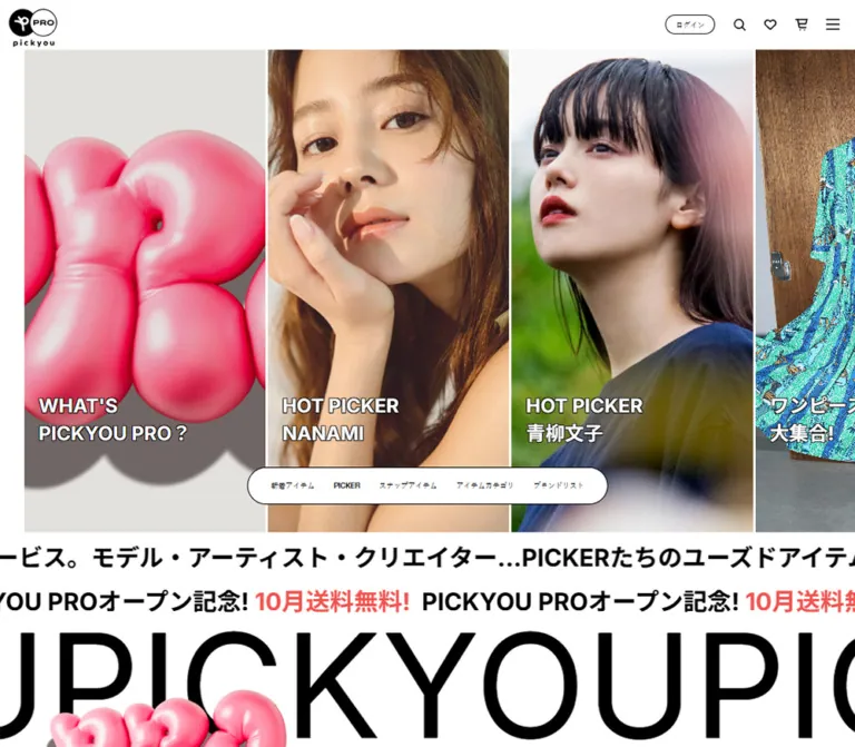
DESIGN REFERENCE
白黒のミニマルなUIに、ピンクの立体グラフィックと大きな人物写真を組み合わせたリユースEC。横長の商品棚、細い輪郭のボタン、端末ごとに変化するクリエイター紹介が特徴。
オリジナルサイトを見るA white fashion marketplace where oversized portraits, inflated pink artwork, and tightly packed product rails carry the personality.
Original URL: https://pro.pickyou.jp/
Final URL: https://pro.pickyou.jp/ — supplied response status: 200
Theme: light in the inspected states; white surfaces and black interface details
Inspected: September 17, 2026, Japan Standard Time. Supplied retrieval timestamp: September 16, 2026, 19:15:36.937 UTC, equivalent to September 17 at 04:15:36.937 JST.
Viewports: desktop 1440 × 1000 CSS pixels; mobile 390 × 844 CSS pixels
Scope: the current marketplace homepage, including its opening feature rail, navigation, creator collections, product metadata, outfit snaps, illustrated category links, and footer. Desktop opening, middle, and footer captures and mobile opening and footer captures were supplied. Additional mobile collection measurements come from the rendered DOM.
PICKYOU PRO presents secondhand fashion through the people associated with it. The interface is restrained: white space, black type, thin outlines, square photographs, and small utility icons. Its expressive layer comes from close portrait crops, personal outfit photography, saturated product backdrops, and glossy inflated graphics. Large images establish identity; compact product names, prices, and availability labels support browsing.
This is a substantial commerce homepage with repeated collections and several discovery routes. The desktop document measures approximately 13,054px high, while the mobile document measures approximately 8,968px. Its defining structure is the combination of vertical browsing and horizontal image rails. On mobile, creator sections change their composition substantially rather than merely shrinking the desktop row.
A white fashion marketplace where oversized portraits, inflated pink artwork, and tightly packed product rails carry the personality.
Original URL: https://pro.pickyou.jp/
Final URL: https://pro.pickyou.jp/ — supplied response status: 200
Theme: light in the inspected states; white surfaces and black interface details
Inspected: September 17, 2026, Japan Standard Time. Supplied retrieval timestamp: September 16, 2026, 19:15:36.937 UTC, equivalent to September 17 at 04:15:36.937 JST.
Viewports: desktop 1440 × 1000 CSS pixels; mobile 390 × 844 CSS pixels
Scope: the current marketplace homepage, including its opening feature rail, navigation, creator collections, product metadata, outfit snaps, illustrated category links, and footer. Desktop opening, middle, and footer captures and mobile opening and footer captures were supplied. Additional mobile collection measurements come from the rendered DOM.
PICKYOU PRO presents secondhand fashion through the people associated with it. The interface is restrained: white space, black type, thin outlines, square photographs, and small utility icons. Its expressive layer comes from close portrait crops, personal outfit photography, saturated product backdrops, and glossy inflated graphics. Large images establish identity; compact product names, prices, and availability labels support browsing.
This is a substantial commerce homepage with repeated collections and several discovery routes. The desktop document measures approximately 13,054px high, while the mobile document measures approximately 8,968px. Its defining structure is the combination of vertical browsing and horizontal image rails. On mobile, creator sections change their composition substantially rather than merely shrinking the desktop row.
| Name | Value | Evidence | Role and reuse |
|---|---|---|---|
| Canvas White | #FFFFFF |
Measured body and header backgrounds; source --color-white, --color-global-header-background |
Main canvas, header, navigation pills, footer, and photographic gutters |
| Interface Black | #000000 |
Measured text; source --color-text-primary |
Typography, utility icons, thin outlines, oversized brand lettering |
| Secondary Ink | #121212 |
Measured social-link color; declared button color 18,18,18 |
Near-black utility details; not a separate expressive accent |
| Divider Ink | rgba(0,0,0,0.85) |
Source --color-divider-main |
Fine structural rules; approximately #262626 when composited over white |
| Warm Neutral | #F3F1EF |
Declared --color-background-accent |
Available supplementary surface token; its application to a particular visible section is unverified |
| Muted Navigation | #9E9E9E |
Measured on several category links in the navigation DOM | Muted category text; disabled or inventory-related semantics were not verified |
| Inflated Pink | Approximately #F45B8A |
Visual estimate from the original opening artwork | A representative artwork midtone, not a flat button color or a source variable |
| Snap Aqua | Approximately #ADD5D5 |
Visual estimate from the original desktop middle capture | Broad background behind the outfit-snap rail and its metadata |
Pink is part of rendered artwork, with bright highlights, darker folds, and cast shadows. A single hex value cannot reproduce that material. Likewise, the warm gray behind the opening graphic is an image background; it should not automatically be equated with the declared Warm Neutral token.
The interface does not require a colored primary CTA. Most visible actions use black outlines on white. Keep photographic color, pink artwork, and the aqua section distinct from the neutral control system.
The supplied properties also contain a blue slider-library theme value and an error red. Neither establishes a visible blue navigation accent or a red promotional treatment in the inspected homepage. Do not promote unused or unverified theme defaults into the main palette.
The measured body family is:
'Helvetica Neue', Arial, 'Hiragino Kaku Gothic ProN', 'Hiragino Sans', '游ゴシック', Meiryo, sans-serif
Desktop body text uses 16px / 28.8px; mobile uses 15px / 27px. Both have regular weight and normal tracking. Japanese and Latin text coexist within the same navigation and product labels.
The root reports 10px, but the body explicitly overrides its font family and size. The root's reported serif family is not evidence of a serif visual style. A new implementation can keep a conventional root size and use the measured pixel dimensions below.
Hero captions and product metadata explicitly report Inter, sans-serif. Their observed weight is 700. This is direct computed-style evidence, although the supplied record does not include a font-loading audit or font-file URLs.
Hero captions are white with a visible dark edge. The exact stroke or shadow declaration was not supplied. Their outlined appearance allows the text to sit directly on detailed photography without a separate text panel.
The desktop screenshot shows very large, heavy uppercase creator lettering, including FUMIKO AOYAGI. Its apparent size is approximately 56–60px. However, the sampled creator h2 wrapper reports 24px, regular weight, and contains other content. The inner display treatment was not sampled, so do not treat the wrapper style as the complete heading specification.
Mobile creator h2 wrappers report 20px / 26px, regular weight, and white text. They sit near the bottom of a wide creator banner. The desktop and mobile name presentations are different components in practice, not simply one text size scaled down.
Repeated oversized PICKYOU lettering functions as a graphic band. Its exact font size and family were not included in the sampled element styles.
| Role | Desktop | Mobile | Evidence |
|---|---|---|---|
| Body | 16px / 28.8px, 400 |
15px / 27px, 400 |
Measured |
| Login label | 12px / 12px, 400 |
Not shown as a top-header pill | Measured desktop; mobile screenshot |
| Hero caption | 32px / 45.76px, 700 |
32px / 35.2px, 700 |
Measured Inter declaration |
| Hero discovery links | 12px / 14.4px, 400 |
12px / 12px, 400 |
Measured |
| Product name | 16px / 19.44px, 700 |
10px / 12px, 700 in sampled creator rails |
Measured Inter declaration |
Price or SOLD OUT |
14px / 17.01px, 700 |
10px / 12px, 700 in sampled creator rails |
Measured |
| Desktop navigation subcategory | 14px / 22.4px, 400 |
Replaced by a different navigation structure in the sampled mobile DOM | Measured |
| Creator heading wrapper | 24px / 31.2px, 400 |
20px / 26px, 400 |
Measured parent; descendant styling may differ |
| Visible desktop creator display | Approximately 56–60px, heavy | Not the same presentation | Visual estimate |
| Illustrated category caption | Approximately 22px, mixed regular and bold | Large illustrated version not shown in mobile evidence | Visual estimate |
| Service-description band | Approximately 40px, bold | Approximately 20px, bold | Visual estimate |
| Footer links | Approximately 12px | Approximately 14px | Screenshot estimates; matching navigation links use these measured sizes |
| Newsletter headline | Approximately 20px, regular | Approximately 16px, bold | Visual estimate |
Do not apply the compact mobile product size to every mobile text element. It belongs to the unusually small creator-product thumbnails; the opening caption remains 32px.
| Use | Desktop | Mobile | Evidence |
|---|---|---|---|
| Main rail inset | Approximately 40px |
24px |
Measured rectangles; source gutter tokens 40 and 24 |
| Header padding | 0 24px 0 15px |
4px 20px |
Measured |
| Header layout gap | 28px |
16px |
Measured |
| Hero panel gap | Approximately 4px |
Approximately 4px |
Calculated from adjacent rectangles |
| Hero caption side inset | 24px |
24px |
Calculated from panel and caption bounds |
| Collection heading-to-media gap | 24px |
Banner followed by a 4px gap |
Calculated |
| Creator portrait-to-first-product gap | Approximately 18px |
Separate stacked presentation | Calculated |
| Product-to-product gap | Approximately 4px |
4px |
Calculated |
| Product image-to-metadata gap | 16px |
7px |
Calculated |
| Product title-to-price gap | 4px |
4px |
Calculated |
| Collection-group spacing | 100px |
48px |
Measured parent gap |
| Opening section-to-collection group | 182px |
64px |
Calculated from section bounds |
| Illustrated tile image-to-caption gap | 52px |
Not established | Measured desktop tile gap |
| Footer outer horizontal inset | Approximately 64px |
Approximately 40px |
Visual estimate |
The footer top-spacing variable is explicitly responsive:
/* Original declared formulas */
--global-footer-margin-top: calc(120 / 1440 * 100vw);

/* Mobile declaration */
--global-footer-margin-top: calc(80 / 390 * 100vw);
These evaluate to 120px and 80px at the two inspected widths. Other gaps should not be assumed to use the same formula.
| Element | Value or appearance | Evidence |
|---|---|---|
| Hero photographs and product images | Square corners | Screenshots and measured link boxes |
| Login pill | 40px radius; about 81 × 32px |
Measured |
| Desktop discovery capsule | Fully rounded outer outline | Screenshot; approximately 590 × 62px |
| Desktop discovery links inside capsule | 8px radius |
Measured; visually contained by the shared capsule |
| Mobile discovery pills | 40px radius; 42px high |
Measured |
| More-items control | 50px radius; 300 × 52px |
Measured |
| Previous/next controls | 100% radius; 52 × 52px |
Measured |
| Product favorite control | Circular visible outline in a 40 × 40px button box |
Screenshot and DOM; sampled outer button itself reports radius zero |
| Newsletter field | Fully rounded; approximately 52px high |
Visual estimate |
| Navigation panel | 40px desktop; 0 mobile |
Measured DOM, open state not visually verified |
| Mobile navigation account actions | 12px radius |
Measured DOM |
Fine outlines are central to the control language. Source button and input border-width variables are 1px, consistent with the visible treatment. Avoid imposing one global radius on both controls and images.
| Element | Desktop 1440 × 1000 | Mobile 390 × 844 |
|---|---|---|
| Expanded header | 1440 × 82px |
390 × 64px |
| Full logo link | 80 × 59.70px |
64 × 47.75px |
| Compact header in scrolled captures | Approximately 56px high |
Approximately 48px high |
| Hero panel | 400 × 800px |
360 × 640px |
| First hero panel origin | Approximately (40,82) |
(0,64) |
| Second hero panel x position | Approximately 444px |
Approximately 364px |
| Hero caption block | 352 × 91.5px |
312 × 70.38px |
| Sample desktop creator portrait/product image | 300 × 424.63px |
Different mobile structures below |
| Mobile creator banner link | Not applicable | 366 × 226px, beginning at x = 24px |
| Mobile creator-product image | Not applicable | 90 × 120px |
| Sample creator section height | Approximately 557.06px |
385px |
| Illustrated navigation tile | 320 × 254.5px |
Large tile version not established |
| Illustrated tile artwork | Approximately 180 × 180px |
Not established |
| Newsletter field | Approximately 372 × 52px |
Approximately 310 × 52px |
The desktop product ratio is approximately 0.7065 width-to-height. The mobile creator thumbnails are exactly 3:4 in the sampled rectangles. Do not assume one universal image ratio.
Role: identity and access to search, saved items, cart, account, and navigation.
The expanded desktop header is an 82px white strip. An 80px-wide logo sits at x = 15px. The right side contains an outlined ログイン pill followed by search, heart, cart, and menu symbols. Measured heart and cart link boxes are 24 × 24px. Icons use crisp black outlines; the menu has three horizontal strokes.
On mobile, the hamburger moves to the far left, the full logo is centered, and search, heart, and cart remain on the right. The login pill is absent from the top bar. The header becomes a three-column grid with measured columns of approximately 119.25px 79.5px 119.25px, separated by 16px gaps inside 20px side padding.
Scrolled desktop and mobile captures retain the header at the viewport top and show a smaller logo without the lower wordmark. This supports a compact header state. The exact scroll threshold and positioning implementation were not supplied.
Role: editorial discovery within the shop.
Four linked portrait panels are present in the current DOM: an introduction to the service, a feature for 青柳文子, a feature for NANAMI, and a dress collection. Their content and order are data, not permanent design tokens.
At desktop, each panel measures 400 × 800px, separated by approximately 4px of white. The rail starts about 40px from the left edge and extends beyond the right edge. Three panels are fully visible and part of the fourth remains exposed.
At mobile, each panel becomes 360 × 640px. The first starts at the viewport edge; about 26px of the next image is visible after the gutter. That partial image communicates horizontal continuation.
Each panel combines a full-area image link with a two-line caption inset 24px. The desktop caption block ends 140px above the panel bottom; the mobile block ends approximately 103px above it. White Inter captions remain 32px on both devices, with tighter mobile leading.
The opening artwork is an inflated pink form on a neutral background. The following photographs use very close portrait crops. Preserve image-specific focal positioning rather than centering every face mechanically.
Role: gives five direct routes into the catalog while the feature images remain dominant.
Desktop combines the links inside a single white, black-outlined capsule, approximately 590px wide and 62px high, centered over the lower hero. Individual links use 12px text and measured padding of 16px 14px.
The routes are new items, pickers, outfit snaps, item categories, and brands. The original labels include 新着アイテム, PICKER, and スナップアイテム.
Mobile separates these into individual outlined pills with small leading icons. They are 42px high, have approximately 4px gaps, and begin at x = 24px. At the inspected width, two pills and part of the third are visible. Their measured y position is 639px, leaving approximately 23px beneath them inside the hero.
This is an overlay within the opening section. The evidence does not establish a persistent bottom navigation bar.
Role: explain the marketplace and provide a graphic transition between shopping sections.
A bold Japanese sentence repeats horizontally and clips at the viewport boundaries. Beneath it, very large repeated PICKYOU lettering forms a second graphic layer, with pink inflated artwork appearing nearby or overlapping the composition.
The sentence describes access to used items from models, artists, and creators. Its role is continuous brand messaging rather than a paragraph of explanatory body copy.
Repeated DOM strings and clipped text are consistent with a marquee construction. The supplied evidence does not establish its direction, speed, or continuous playback. Reproduce the composition first; any animation needs separate verification or should be labeled as an implementation choice.
Role: a larger, visual version of the five primary shopping routes.
Desktop presents five 320px-wide tiles in a horizontal strip. Each has a centered square illustration, approximately 180px across, followed by a large gap and a caption. Fine vertical rules separate tiles. The fifth tile extends beyond the 1440px viewport.
The art uses soft, inflated objects: cushions, rounded pink forms, a floating picture frame, fabric-like rings, and pastel clusters. Captions mix bold English keywords with regular Japanese labels, such as NEW アイテム, PICKER を探す, and アイテム CATEGORY.
This illustrated route set appears in both opening and closing desktop content, with a smaller variant represented in the navigation DOM. The large image-tile version is not present in the supplied mobile captures; the mobile evidence instead exposes compact text routes.
Role: connects a named picker with their available and sold items.
The section header places a small circular portrait beside a large creator name. On the right is a 300 × 52px outline pill containing a garment icon, item count, and MORE ITEMS, followed by two 52px circular arrow controls. Counts vary by collection and must come from content.
After a 24px vertical gap, the rail begins with a 300 × 424.63px creator portrait. An approximately 18px gap separates this portrait from the first product image. Subsequent product cards use much tighter 4px gaps.
The image boundaries organize the rail; cards have no visible enclosing rounded surface. Collections are separated by generous vertical white space, with a measured 100px gap on the sampled desktop group.
Role: preserves the association between person and wardrobe within a much shorter section.
The mobile DOM shows a 366 × 226px creator link starting 24px from the left edge and extending to the right viewport boundary. A white creator name and count sit in its lower area. Its content box uses 12px 12px 5px padding.
A 4px gap leads into a row of 90 × 120px product images. Their x positions are 24, 118, 212, and 306px, so almost four items fit across the viewport. This is a horizontal sequence, not a two-column product grid.
Metadata begins 7px below each image, with only 1px of horizontal inset. Product names and availability use 10px bold Inter with 12px leading. The sampled section is 385px high, followed by 48px before the next creator section.
The sampled mobile creator cards do not include the desktop favorite-button boxes or separate MORE ITEMS toolbar. The creator banner itself links to the collection. These observations should not be generalized to every mobile product component elsewhere on the site.
Role: supports rapid image-first browsing with a small amount of commerce information.
Desktop anatomy:
SOLD OUT.Both the photograph and the text have product links in the rendered evidence. Product names combine brand names and Japanese garment types. Availability stays black and compact; sold items remain visible at full photographic emphasis in the supplied capture.
Keep the favorite button separate from the product anchor. A heart icon is an action affordance, but its toggle response and persistence were not tested.
Role: shows garments in personal styling contexts.
The desktop middle capture shows a broad muted aqua surface behind a rail of outfit photographs, product labels, and favorite controls. Images are approximately 300px wide and separated by narrow gutters. The exposed image height is about 480px in this scrolled capture, but the viewport crop prevents a reliable full-height or intrinsic-ratio measurement.
Each image includes a small circular picker portrait and bold white name near its upper-left corner. Below, black product names and price or stock labels sit directly on the aqua background. There is no white card enclosing the metadata.
Photography includes outdoor full-body outfits, mirror photographs, and closer garment portraits. Preserve that personal variation. The DOM also identifies an ITEM IN SNAPS section and links to /pages/item-in-snaps; the screenshot establishes its visual treatment without establishing all section positions or carousel behavior.
Role: adds ways to browse beyond a specific picker.
The text inventory includes RECOMMENDED and a popular-category group with dress, hat, and sneaker labels. Their content includes the same mixture of available and sold items.
The supplied screenshots do not expose every state of these sections. Reuse the established image, typography, and metadata language where appropriate, but do not invent a selected-tab style, filtering transition, or empty state.
Role: exposes the shop taxonomy and secondary routes.
The desktop DOM describes a white panel at approximately x = 32px, y = 130px, width 1376px, and radius 40px. It contains garment-category groups, a smaller discovery index, social links, and policy links. Category titles use pill-like geometry, while subcategories use 14px text with 22.4px leading. Several links are gray; their functional meaning is unverified.
The mobile DOM instead describes a square-cornered, full-width white panel with 40px side padding. Two 310 × 64.39px account actions appear first: a black registration action and a white login action, both with 12px radii. Five primary shopping links follow, then secondary links and social icons.
This is DOM-supported component anatomy. No supplied screenshot shows the panel open, and no opening, closing, focus, or backdrop behavior was recorded.
Role: offers coupons and updates without introducing a large promotional block.
The desktop footer positions the newsletter at the right, in a column approximately 372px wide. A short headline sits above a visible newsletter label and a 52px-high outline field. The field has generous horizontal padding, muted placeholder text, and an outlined paper-plane submit symbol.
Mobile moves the newsletter above the legal links. The field is approximately 310px wide within 40px side insets, and the headline is centered and bold. The extra desktop label is not visible in the mobile screenshot.
The placeholder reads メールアドレスを入力. No validation, success, error, or submission behavior was exercised.
Role: closes the shop with service information, social destinations, and payment marks.
Desktop uses substantial empty white space. Social icons occupy the left side, with a two-row payment-mark grid below them. The newsletter sits to the right. Copyright is lower left, and six informational links form a small horizontal row at lower right.
Mobile changes the order to newsletter, a vertical list of informational links, one evenly distributed social row, centered payment marks, and centered copyright. Legal links have approximately 42px vertical pitch. The five social symbols are Instagram, X, TikTok, YouTube, and Pinterest; the DOM still labels the X destination as Twitter.
Payment marks remain in a compact two-by-five arrangement. They are visible brand artwork, not proof that every payment method was tested. The footer independently displays © pickyou, Inc..
| Treatment | Evidence | What can be concluded |
|---|---|---|
| Header resize | Measured height 0.2s ease-in-out; expanded and compact screenshot states |
A short height transition is defined; exact trigger is unverified |
| Logo wrapper transition | Measured 0.2s ease-in-out |
A transition exists; complete changing properties were not supplied |
| Hero and product links | Measured 0.2s transition declaration |
Short transitions are defined; hover opacity, zoom, or other effects are unverified |
| Navigation panel | Measured 0.3s declaration |
A transition exists; direction and open/close sequence were not exercised |
| General durations | Declared 200ms, 500ms, and 3s |
Available source tokens, not established timings for individual carousels |
| Fade-in | Declared fadeIn 600ms cubic-bezier(0,0,0.3,1) |
Available animation token; application to visible content was not established |
| Hero and product rail movement | Overflow geometry and desktop arrow controls | Horizontal browsing affordances exist; autoplay, drag, swipe, and keyboard response were not tested |
| Repeated text bands | Duplicate text and clipped composition | Marquee-like construction is plausible; playback, speed, and direction are unverified |
| Favorites, search, menu, form | Visible controls and/or DOM elements | Their presence is established; state changes are unverified |
Many sampled elements report animation: none. This does not prove that descendants, pseudo-elements, or script-driven sliders are static.
For a new implementation, use restrained transitions around 200ms for small state changes. Keep rail scrolling user-controlled unless automatic behavior is specifically required. Provide reduced-motion behavior for any added marquees or automatic movement. These are recommendations, not claims about the original.
| Layer | Appearance | Purpose |
|---|---|---|
| Main page | White, broad areas of empty space | Gives colorful photography and artwork room |
| Header | Opaque white with black controls | Stable commerce navigation over long content |
| Feature rail | Edge-to-edge imagery within rectangular panels | Editorial entry points |
| Product rails | Unboxed images and text on the section background | Dense inventory browsing |
| Snap section | Muted aqua field | Distinguishes outfit-led discovery |
| Navigation pills | White fill, fine black outline | Lightweight route selection |
| Newsletter field | White fill, fine outline, full radius | Quiet subscription action |
| Navigation panel | White; desktop rounded, mobile square | DOM-defined expanded navigation surface |
There is no visible general-purpose elevation system in these captures. Shadows inside the inflated illustrations are part of the artwork, not reusable UI shadows. Generic card-shadow variables in the theme do not establish that the inspected product rails have raised surfaces.
Three image families carry the design:
Keep photographic corners square and gutters narrow. Circular crops are reserved for small identity portraits. The rectangular rail rhythm should remain stronger than any individual image treatment.
The supplied record does not include image src or srcset URLs. The following are visual references and associated link destinations, not downloadable asset paths.
| Visual asset | Observed use | Associated destination where supplied |
|---|---|---|
| Two-circle PICKYOU PRO logo with lower wordmark | Expanded header | https://pro.pickyou.jp/ |
| Compact logo presentation | Scrolled header captures | Homepage identity; asset URL unknown |
| Inflated pink introduction artwork | First feature panel and brand composition | https://pickyoupro.myshopify.com/pages/about-pickyou-pro for the opening panel |
| 青柳文子 portrait | Current feature panel and creator identity | https://pro.pickyou.jp/collections/fumiko-aoyagi |
| NANAMI portrait | Current feature panel and creator identity | https://pro.pickyou.jp/collections/nanami |
| Patterned dress photograph | Dress feature panel | https://pro.pickyou.jp/collections/dress |
| Five pastel object illustrations | Illustrated discovery index | New items, picker, snap, category, and brand routes |
| Outfit photographs | Aqua snap rail | Individual product links and snap discovery route |
| Social and payment marks | Footer | Social hrefs supplied; image asset paths unknown |
Use authorized image files with deliberate crops. CSS can reproduce the layout and controls, but it cannot substitute for the portraits or the inflated artwork. Do not invent original CDN filenames from the destination URLs.
The main content fills the viewport instead of sitting inside a narrow centered article container. Horizontal rails begin around 40px from the left and continue beyond the right edge. The opening panels are unusually tall, while product rails combine 300px images with very tight inter-item gaps.
White space works at the section level: 100px collection gaps, a 182px separation after the opening composition, and a spacious footer. Inside each rail, content is dense. This difference between broad section spacing and narrow image spacing is essential to the design.
At 390px, the opening panel occupies 360px, leaving a clear glimpse of the next panel. The shared desktop discovery capsule becomes separate icon-and-label pills. The caption size stays 32px while its line height tightens.
Creator collections undergo a structural change: a wide banner replaces the desktop heading-and-leading-portrait arrangement, and 90px product thumbnails follow beneath it. Several Japanese creator names are used in the mobile text where desktop uses romanized display names. Preserve the actual content mapping instead of forcing uppercase Latin names everywhere.
The footer also changes order rather than simply stacking desktop columns. Its mobile newsletter and links receive generous spacing even though the creator-product rows are compact.
A max-width: 749px media query appears in the supplied header-search text. This confirms a mobile breakpoint for that component. The complete responsive stylesheet was not supplied, so it does not establish every section's breakpoint or interpolation formula.
The Quick Start uses 749px as a practical adaptation boundary. Intermediate tablet layouts, landscape phones, and very wide desktop behavior remain unverified.
Constrain horizontal overflow to the intended rails and text bands. The document itself should remain a vertical page. The repeated header at the top of scrolled captures supports persistent navigation, but does not establish whether the original uses fixed positioning, sticky positioning, or another implementation.
Do not extrapolate desktop product dimensions directly onto mobile. Also avoid assuming that all mobile collections share the sampled creator-thumbnail layout; snap and recommendation components were not measured in the same detail.
SOLD OUT as compact typographic information.These are recommendations for a new implementation, not verified features of the original:
#FFFFFF.#000000.rgba(0,0,0,0.85).#F3F1EF; component usage unverified.#F45B8A, with material shading inside the artwork.#ADD5D5.“Create a Japanese secondhand-fashion marketplace inspired by the current PICKYOU PRO homepage. Use a white canvas, black sans-serif typography, fine outlined pills, crisp line icons, and square photographic panels. Begin with a horizontal rail of 400 × 800px desktop features containing inflated pink artwork, close picker portraits, and a garment feature. Add 32px white captions with a dark edge and a shared white discovery capsule over the lower hero. Build repeated creator collections with a large name, count, more-items control, circular arrows, a leading portrait, and tightly spaced 300px product cards. Include an aqua outfit-snap section and a spacious newsletter footer. At 390px, use 360 × 640px hero panels, separate discovery pills, creator banners, and 90 × 120px product thumbnails. Keep motion restrained and identify any behavior that is newly designed.”
This is an implementation scaffold, not the original stylesheet. It preserves measured hero and creator-card dimensions at the inspected widths. Aqua and pink are visual approximations; large creator text and compact-header heights use screenshot estimates. The breakpoint is an adaptation informed by the observed header query.
Use .hero-rail for feature anchors, .creator-shelf for a creator portrait followed by .product-rail, and .product-meta for a product link plus a separate favorite button. The application supplies authorized images, links, stock data, header state, and control behavior.
:root {
  /* Measured interface colors */
  --shop-white: #fff;
  --shop-ink: #000;
  --shop-secondary-ink: #121212;
  --shop-rule: rgb(0 0 0 / 85%);
  --shop-neutral: #f3f1ef;

  /* Visual approximations, not source color declarations */
  --shop-pink: #f45b8a;
  --shop-aqua: #add5d5;

  --shop-font: 'Helvetica Neue', Arial,
    'Hiragino Kaku Gothic ProN', 'Hiragino Sans',
    '游ゴシック', Meiryo, sans-serif;
  --shop-display: Inter, var(--shop-font);

  --shop-gutter: 40px;
  --shop-rail-gap: 4px;
  --shop-section-gap: 100px;
  --shop-header-height: 82px;
  --shop-header-compact: 56px;
  --shop-hero-width: 400px;
  --shop-hero-height: 800px;
  --shop-item-width: 300px;
  --shop-item-ratio: 300 / 424.625;
  --shop-rule-width: 1px;
  --shop-pill-radius: 999px;
  --shop-fast: 200ms ease-in-out;
}

.pickyou-reference,
.pickyou-reference * {
  box-sizing: border-box;
}

.pickyou-reference {
  margin: 0;
  color: var(--shop-ink);
  background: var(--shop-white);
  font: 400 16px/1.8 var(--shop-font);
}

.pickyou-reference a {
  color: inherit;
  text-decoration: none;
}

.pickyou-reference button,
.pickyou-reference input {
  font: inherit;
}

.pickyou-reference img {
  display: block;
  max-width: 100%;
}

.pickyou-reference :focus-visible {
  outline: 2px solid currentColor;
  outline-offset: 4px;
}

/* Recommended persistent implementation; source positioning is unknown. */
.site-header {
  position: sticky;
  top: 0;
  z-index: 12;
  display: grid;
  grid-template-columns: auto 1fr auto auto;
  align-items: center;
  gap: 28px;
  height: var(--shop-header-height);
  padding: 0 24px 0 15px;
  background: var(--shop-white);
  transition: height var(--shop-fast);
}

.brand {
  grid-column: 1;
  grid-row: 1;
  width: 80px;
}

.header-utilities {
  grid-column: 3;
  grid-row: 1;
  display: flex;
  align-items: center;
  gap: 28px;
}

.menu-toggle {
  grid-column: 4;
  grid-row: 1;
}

.utility-control {
  display: inline-grid;
  place-items: center;
  padding: 0;
  border: 0;
  color: inherit;
  background: transparent;
  cursor: pointer;
}

.utility-control svg {
  width: 24px;
  height: 24px;
}

.login-pill {
  padding: 10px 16px 8px;
  border: 1px solid var(--shop-ink);
  border-radius: var(--shop-pill-radius);
  font-size: 12px;
  line-height: 12px;
}

/* The host application controls this state and the logo asset variant. */
.site-header[data-compact='true'] {
  height: var(--shop-header-compact);
}

.site-header[data-compact='true'] .brand {
  width: 70px;
}

.hero {
  position: relative;
}

.hero-rail {
  display: flex;
  gap: var(--shop-rail-gap);
  padding-inline: var(--shop-gutter);
  overflow-x: auto;
  overscroll-behavior-inline: contain;
  scroll-snap-type: x proximity;
  scroll-padding-inline: var(--shop-gutter);
}

.hero-panel {
  position: relative;
  flex: 0 0 var(--shop-hero-width);
  height: var(--shop-hero-height);
  overflow: hidden;
  scroll-snap-align: start;
}

.hero-panel > img {
  width: 100%;
  height: 100%;
  object-fit: cover;
  object-position: var(--image-position, 50% 50%);
}

.hero-caption {
  position: absolute;
  inset-inline: 24px;
  bottom: 140px;
  margin: 0;
  color: #fff;
  font: 700 32px/1.43 var(--shop-display);
  -webkit-text-stroke: 1px #000;
  paint-order: stroke fill;
  text-shadow: 0 1px 1px #000;
}

.hero-discovery {
  position: absolute;
  left: 50%;
  bottom: 45px;
  display: flex;
  align-items: center;
  gap: 4px;
  padding: 7px 24px;
  border: 1px solid var(--shop-ink);
  border-radius: var(--shop-pill-radius);
  background: var(--shop-white);
  transform: translateX(-50%);
}

.discovery-link {
  display: flex;
  align-items: center;
  flex: 0 0 auto;
  gap: 8px;
  padding: 16px 14px;
  border-radius: 8px;
  white-space: nowrap;
  font-size: 12px;
  line-height: 14.4px;
}

.discovery-link .discovery-icon {
  display: none;
}

/* Static bands: original playback timing was not established. */
.brand-band {
  overflow: hidden;
}

.service-line {
  width: max-content;
  margin: 16px 0;
  white-space: nowrap;
  font-size: 40px;
  font-weight: 700;
  line-height: 1.3;
}

.brand-wordmark {
  width: max-content;
  margin: 0;
  white-space: nowrap;
  font-size: clamp(80px, 14vw, 200px);
  line-height: 1;
}

.collections {
  display: grid;
  gap: var(--shop-section-gap);
}

.creator-heading {
  display: flex;
  align-items: center;
  justify-content: space-between;
  gap: 24px;
  margin: 0 var(--shop-gutter) 24px;
}

.creator-title {
  display: flex;
  align-items: center;
  gap: 16px;
  margin: 0;
  font-size: 60px;
  font-weight: 700;
  line-height: 1;
}

.creator-avatar {
  width: 52px;
  height: 52px;
  border-radius: 50%;
  object-fit: cover;
}

.collection-controls {
  display: flex;
  align-items: center;
  gap: 8px;
}

.more-items,
.rail-arrow {
  display: inline-flex;
  align-items: center;
  justify-content: center;
  height: 52px;
  border: 1px solid var(--shop-rule);
  border-radius: var(--shop-pill-radius);
  color: inherit;
  background: transparent;
}

.more-items {
  justify-content: space-between;
  width: 300px;
  margin-right: 12px;
  padding: 16px 22px;
  line-height: 20px;
}

.rail-arrow {
  flex: 0 0 52px;
  padding: 0;
  cursor: pointer;
}

.creator-shelf {
  display: flex;
  align-items: flex-start;
  gap: 18px;
  padding-inline: var(--shop-gutter);
  overflow-x: auto;
  overscroll-behavior-inline: contain;
}

.creator-profile {
  position: relative;
  display: block;
  flex: 0 0 300px;
  height: 424.625px;
}

.creator-profile > img {
  width: 100%;
  height: 100%;
  object-fit: cover;
  object-position: var(--image-position, 50% 50%);
}

.profile-caption {
  display: none;
}

.product-rail {
  display: flex;
  align-items: flex-start;
  flex: 0 0 auto;
  gap: var(--shop-rail-gap);
}

.product-card {
  flex: 0 0 var(--shop-item-width);
  width: var(--shop-item-width);
  min-width: 0;
}

.product-image {
  display: block;
  width: 100%;
  aspect-ratio: var(--shop-item-ratio);
  overflow: hidden;
}

.product-image > img {
  width: 100%;
  height: 100%;
  object-fit: cover;
  object-position: var(--image-position, 50% 50%);
}

.product-meta {
  display: grid;
  grid-template-columns: minmax(0, 1fr) 40px;
  gap: 8px;
  padding: 16px 6px 0 4px;
  font-family: var(--shop-display);
  font-weight: 700;
}

.product-name {
  margin: 0;
  overflow: hidden;
  white-space: nowrap;
  text-overflow: ellipsis;
  font-size: 16px;
  line-height: 1.215;
}

.product-price {
  margin: 4px 0 0;
  font-size: 14px;
  line-height: 1.215;
}

.favorite-button {
  display: grid;
  place-items: center;
  width: 40px;
  height: 40px;
  padding: 0;
  border: 1px solid var(--shop-rule);
  border-radius: 50%;
  color: inherit;
  background: transparent;
  cursor: pointer;
}

.snap-section {
  padding-block: 64px 96px;
  background: var(--shop-aqua);
}

.snap-rail {
  display: flex;
  gap: 4px;
  padding-inline: var(--shop-gutter);
  overflow-x: auto;
}

.snap-media {
  position: relative;
}

.snap-identity {
  position: absolute;
  top: 8px;
  left: 12px;
  display: flex;
  align-items: center;
  gap: 8px;
  color: #fff;
  font: 700 16px/1.2 var(--shop-display);
}

.snap-identity img {
  width: 32px;
  height: 32px;
  border-radius: 50%;
  object-fit: cover;
}

.category-index {
  display: flex;
  overflow-x: auto;
}

.category-tile {
  display: grid;
  flex: 0 0 320px;
  justify-items: center;
  align-content: start;
  gap: 52px;
  border-inline-start: 1px solid var(--shop-rule);
}

.category-tile:first-child {
  border-inline-start: 0;
}

.category-tile > img {
  width: 180px;
  height: 180px;
  object-fit: cover;
}

.category-label {
  margin: 0;
  font-size: 22px;
  line-height: 22.5px;
}

.site-footer {
  display: grid;
  grid-template-columns: minmax(0, 1fr) 372px;
  grid-template-areas:
    'social newsletter'
    'payments newsletter'
    'bottom bottom';
  gap: 36px 64px;
  margin-top: calc(120 / 1440 * 100vw);
  padding: 64px;
}

.footer-social {
  grid-area: social;
  display: flex;
  align-items: center;
  gap: 28px;
}

.footer-social svg {
  width: 28px;
  height: 28px;
}

.payment-marks {
  grid-area: payments;
  display: grid;
  grid-template-columns: repeat(5, 47px);
  gap: 10px 9px;
  align-content: start;
}

.payment-marks img {
  width: 47px;
  height: 30px;
  object-fit: contain;
}

.newsletter {
  grid-area: newsletter;
}

.newsletter-title {
  margin: 0 0 24px;
  font-size: 20px;
  font-weight: 400;
  line-height: 1.5;
}

.newsletter-label {
  display: block;
  margin-bottom: 12px;
  font-size: 16px;
}

.newsletter-field {
  display: flex;
  align-items: center;
  height: 52px;
  padding-inline: 24px 16px;
  border: 1px solid var(--shop-rule);
  border-radius: var(--shop-pill-radius);
}

.newsletter-field input {
  width: 100%;
  min-width: 0;
  border: 0;
  color: inherit;
  background: transparent;
  font-size: 16px;
}

.newsletter-field button {
  flex: 0 0 36px;
  height: 44px;
  padding: 0;
  border: 0;
  background: transparent;
  cursor: pointer;
}

.footer-bottom {
  grid-area: bottom;
  display: flex;
  align-items: baseline;
  justify-content: space-between;
  flex-wrap: wrap;
  gap: 24px;
  margin-top: 40px;
}

.footer-legal {
  display: flex;
  flex-wrap: wrap;
  gap: 20px;
  font-size: 12px;
  line-height: 1.8;
}

.copyright {
  margin: 0;
  font-size: 14px;
  font-weight: 700;
  letter-spacing: 1px;
}

@media (max-width: 749px) {
  .pickyou-reference {
    --shop-gutter: 24px;
    --shop-section-gap: 48px;
    --shop-header-height: 64px;
    --shop-header-compact: 48px;
    --shop-hero-width: 360px;
    --shop-hero-height: 640px;
    --shop-item-width: 90px;
    --shop-item-ratio: 3 / 4;
    font-size: 15px;
  }

  .site-header {
    grid-template-columns: 1fr auto 1fr;
    gap: 16px;
    padding: 4px 20px;
  }

  .menu-toggle {
    grid-column: 1;
    justify-self: start;
  }

  .brand {
    grid-column: 2;
    width: 64px;
  }

  .site-header[data-compact='true'] .brand {
    width: 54px;
  }

  .header-utilities {
    grid-column: 3;
    justify-self: end;
    gap: 16px;
  }

  .login-pill {
    display: none;
  }

  .hero-rail {
    padding-inline: 0;
    scroll-padding-inline: 0;
  }

  .hero-caption {
    bottom: 103px;
    line-height: 1.1;
  }

  .hero-discovery {
    inset-inline: 0;
    bottom: 23px;
    padding: 0 24px;
    overflow-x: auto;
    border: 0;
    border-radius: 0;
    background: transparent;
    transform: none;
  }

  .discovery-link {
    height: 42px;
    padding: 12px 17.17px;
    border: 1px solid var(--shop-ink);
    border-radius: var(--shop-pill-radius);
    background: var(--shop-white);
    line-height: 12px;
  }

  .discovery-link .discovery-icon {
    display: block;
    width: 16px;
    height: 16px;
  }

  .service-line {
    font-size: 20px;
  }

  .creator-heading {
    display: none;
  }

  .creator-shelf {
    display: block;
    padding-inline: 24px 0;
    overflow: visible;
  }

  .creator-profile {
    width: 100%;
    height: 226px;
  }

  .profile-caption {
    position: absolute;
    inset-inline: 12px;
    bottom: 5px;
    display: flex;
    justify-content: space-between;
    align-items: end;
    gap: 6px;
    color: #fff;
  }

  .profile-caption h2 {
    margin: 0;
    font-size: 20px;
    font-weight: 400;
    line-height: 26px;
  }

  .creator-shelf .product-rail {
    margin-top: 4px;
    overflow-x: auto;
    overscroll-behavior-inline: contain;
  }

  .product-meta {
    grid-template-columns: minmax(0, 1fr);
    gap: 0;
    padding: 7px 1px 0;
  }

  .product-name,
  .product-price {
    font-size: 10px;
    line-height: 12px;
  }

  .creator-shelf .favorite-button {
    display: none;
  }

  .category-index {
    display: none;
  }

  .site-footer {
    display: flex;
    flex-direction: column;
    gap: 64px;
    margin-top: calc(80 / 390 * 100vw);
    padding: 40px;
  }

  .newsletter {
    order: 0;
  }

  .newsletter-title {
    margin-bottom: 20px;
    text-align: center;
    font-size: 16px;
    font-weight: 700;
  }

  /* Keep the label available to assistive technology. */
  .newsletter-label {
    position: absolute;
    width: 1px;
    height: 1px;
    overflow: hidden;
    clip-path: inset(50%);
    white-space: nowrap;
  }

  .footer-bottom {
    display: contents;
  }

  .footer-legal {
    order: 1;
    flex-direction: column;
    gap: 20px;
    padding-inline: 6px;
    font-size: 14px;
    line-height: 22px;
  }

  .footer-social {
    order: 2;
    justify-content: space-between;
    gap: 0;
  }

  .footer-social svg {
    width: 24px;
    height: 24px;
  }

  .payment-marks {
    order: 3;
    align-self: center;
    grid-template-columns: repeat(5, 35px);
    gap: 10px;
  }

  .payment-marks img {
    width: 35px;
    height: 23px;
  }

  .copyright {
    order: 4;
    text-align: center;
    font-size: 12px;
  }
}

@media (prefers-reduced-motion: reduce) {
  .site-header {
    transition: none;
  }

  .hero-rail,
  .creator-shelf,
  .product-rail {
    scroll-behavior: auto;
  }
}
The scaffold uses native overflow and optional scroll snapping as implementation choices. Wire arrow buttons to their associated rails, provide accessible control labels, and manage compact-header state separately. A snap-card image ratio is intentionally not prescribed because its complete measured geometry was unavailable.
If Inter is required for fidelity, load an authorized font resource explicitly. Merely listing it in a CSS stack does not guarantee that the font is available.
Optional mapping for a project already using Tailwind v4. This does not imply that the original site uses Tailwind. Define the properties above first.
@theme inline {
  --color-shop-white: var(--shop-white);
  --color-shop-ink: var(--shop-ink);
  --color-shop-neutral: var(--shop-neutral);
  --color-shop-aqua: var(--shop-aqua);
  --color-shop-pink: var(--shop-pink);

  --font-shop: var(--shop-font);
  --font-shop-display: var(--shop-display);

  --spacing-shop-gutter: var(--shop-gutter);
  --spacing-shop-rail: var(--shop-rail-gap);
  --spacing-shop-section: var(--shop-section-gap);
  --spacing-shop-item: var(--shop-item-width);

  --radius-shop-pill: 999px;
  --text-shop-hero: 32px;
  --text-shop-product: 16px;
  --text-shop-price: 14px;
}
2026-09-16T19:15:36.937Z, equivalent to September 17, 2026, 04:15:36.937 JST.This reference describes the current homepage represented by the supplied original-page evidence. Estimated swatches, inferred visual sizes, and implementation recommendations are distinguished from measured source values.
# PICKYOU PRO — Style Reference

> A white fashion marketplace where oversized portraits, inflated pink artwork, and tightly packed product rails carry the personality.

**Original URL:** https://pro.pickyou.jp/
**Final URL:** https://pro.pickyou.jp/ — supplied response status: 200
**Theme:** light in the inspected states; white surfaces and black interface details
**Inspected:** September 17, 2026, Japan Standard Time. Supplied retrieval timestamp: September 16, 2026, 19:15:36.937 UTC, equivalent to September 17 at 04:15:36.937 JST.
**Viewports:** desktop 1440 × 1000 CSS pixels; mobile 390 × 844 CSS pixels
**Scope:** the current marketplace homepage, including its opening feature rail, navigation, creator collections, product metadata, outfit snaps, illustrated category links, and footer. Desktop opening, middle, and footer captures and mobile opening and footer captures were supplied. Additional mobile collection measurements come from the rendered DOM.

PICKYOU PRO presents secondhand fashion through the people associated with it. The interface is restrained: white space, black type, thin outlines, square photographs, and small utility icons. Its expressive layer comes from close portrait crops, personal outfit photography, saturated product backdrops, and glossy inflated graphics. Large images establish identity; compact product names, prices, and availability labels support browsing.

This is a substantial commerce homepage with repeated collections and several discovery routes. The desktop document measures approximately 13,054px high, while the mobile document measures approximately 8,968px. Its defining structure is the combination of vertical browsing and horizontal image rails. On mobile, creator sections change their composition substantially rather than merely shrinking the desktop row.
# PICKYOU PRO — Style Reference

> A white fashion marketplace where oversized portraits, inflated pink artwork, and tightly packed product rails carry the personality.

**Original URL:** https://pro.pickyou.jp/
**Final URL:** https://pro.pickyou.jp/ — supplied response status: 200
**Theme:** light in the inspected states; white surfaces and black interface details
**Inspected:** September 17, 2026, Japan Standard Time. Supplied retrieval timestamp: September 16, 2026, 19:15:36.937 UTC, equivalent to September 17 at 04:15:36.937 JST.
**Viewports:** desktop 1440 × 1000 CSS pixels; mobile 390 × 844 CSS pixels
**Scope:** the current marketplace homepage, including its opening feature rail, navigation, creator collections, product metadata, outfit snaps, illustrated category links, and footer. Desktop opening, middle, and footer captures and mobile opening and footer captures were supplied. Additional mobile collection measurements come from the rendered DOM.

PICKYOU PRO presents secondhand fashion through the people associated with it. The interface is restrained: white space, black type, thin outlines, square photographs, and small utility icons. Its expressive layer comes from close portrait crops, personal outfit photography, saturated product backdrops, and glossy inflated graphics. Large images establish identity; compact product names, prices, and availability labels support browsing.

This is a substantial commerce homepage with repeated collections and several discovery routes. The desktop document measures approximately 13,054px high, while the mobile document measures approximately 8,968px. Its defining structure is the combination of vertical browsing and horizontal image rails. On mobile, creator sections change their composition substantially rather than merely shrinking the desktop row.

## How to Read This Reference

- **Measured** means a value appears in the supplied computed styles, custom properties, or element rectangles. Measurements apply to the stated viewport and capture state.
- **Visual estimate** means an approximate reading of an original-page screenshot. Estimated colors are implementation swatches, not sampled source declarations.
- **Declared** means a source custom property exists. Its presence alone does not establish that a visible component uses it.
- **Recommended** means guidance for a new implementation. The Quick Start combines measured proportions with explicitly described approximations.
- Token names introduced here are implementation aliases unless accompanied by an original variable name.
- DOM extracts contain navigation content that is not visible in the supplied screenshots. Geometry and text extraction do not establish that a menu was open.
- Computed styles on heading wrappers do not necessarily describe their rendered descendants. This matters particularly for the large creator names.
- Only the supplied evidence was analyzed. Linked pages, checkout, forms, search, and account flows were not independently opened or exercised.

## Tokens — Colors

### Default Palette

| Name | Value | Evidence | Role and reuse |
| --- | --- | --- | --- |
| Canvas White | `#FFFFFF` | Measured body and header backgrounds; source `--color-white`, `--color-global-header-background` | Main canvas, header, navigation pills, footer, and photographic gutters |
| Interface Black | `#000000` | Measured text; source `--color-text-primary` | Typography, utility icons, thin outlines, oversized brand lettering |
| Secondary Ink | `#121212` | Measured social-link color; declared button color `18,18,18` | Near-black utility details; not a separate expressive accent |
| Divider Ink | `rgba(0,0,0,0.85)` | Source `--color-divider-main` | Fine structural rules; approximately `#262626` when composited over white |
| Warm Neutral | `#F3F1EF` | Declared `--color-background-accent` | Available supplementary surface token; its application to a particular visible section is unverified |
| Muted Navigation | `#9E9E9E` | Measured on several category links in the navigation DOM | Muted category text; disabled or inventory-related semantics were not verified |
| Inflated Pink | Approximately `#F45B8A` | Visual estimate from the original opening artwork | A representative artwork midtone, not a flat button color or a source variable |
| Snap Aqua | Approximately `#ADD5D5` | Visual estimate from the original desktop middle capture | Broad background behind the outfit-snap rail and its metadata |

Pink is part of rendered artwork, with bright highlights, darker folds, and cast shadows. A single hex value cannot reproduce that material. Likewise, the warm gray behind the opening graphic is an image background; it should not automatically be equated with the declared Warm Neutral token.

The interface does not require a colored primary CTA. Most visible actions use black outlines on white. Keep photographic color, pink artwork, and the aqua section distinct from the neutral control system.

### Declared Colors That Are Not Visual Design Evidence

The supplied properties also contain a blue slider-library theme value and an error red. Neither establishes a visible blue navigation accent or a red promotional treatment in the inspected homepage. Do not promote unused or unverified theme defaults into the main palette.

## Tokens — Typography

### Body and Utility Stack

The measured body family is:

`'Helvetica Neue', Arial, 'Hiragino Kaku Gothic ProN', 'Hiragino Sans', '游ゴシック', Meiryo, sans-serif`

Desktop body text uses `16px / 28.8px`; mobile uses `15px / 27px`. Both have regular weight and normal tracking. Japanese and Latin text coexist within the same navigation and product labels.

The root reports `10px`, but the body explicitly overrides its font family and size. The root's reported serif family is not evidence of a serif visual style. A new implementation can keep a conventional root size and use the measured pixel dimensions below.

### Hero and Commerce Labels

Hero captions and product metadata explicitly report `Inter, sans-serif`. Their observed weight is `700`. This is direct computed-style evidence, although the supplied record does not include a font-loading audit or font-file URLs.

Hero captions are white with a visible dark edge. The exact stroke or shadow declaration was not supplied. Their outlined appearance allows the text to sit directly on detailed photography without a separate text panel.

### Creator Names and Brand Lettering

The desktop screenshot shows very large, heavy uppercase creator lettering, including `FUMIKO AOYAGI`. Its apparent size is approximately 56–60px. However, the sampled creator `h2` wrapper reports `24px`, regular weight, and contains other content. The inner display treatment was not sampled, so do not treat the wrapper style as the complete heading specification.

Mobile creator `h2` wrappers report `20px / 26px`, regular weight, and white text. They sit near the bottom of a wide creator banner. The desktop and mobile name presentations are different components in practice, not simply one text size scaled down.

Repeated oversized `PICKYOU` lettering functions as a graphic band. Its exact font size and family were not included in the sampled element styles.

### Type Scale

| Role | Desktop | Mobile | Evidence |
| --- | --- | --- | --- |
| Body | `16px / 28.8px`, 400 | `15px / 27px`, 400 | Measured |
| Login label | `12px / 12px`, 400 | Not shown as a top-header pill | Measured desktop; mobile screenshot |
| Hero caption | `32px / 45.76px`, 700 | `32px / 35.2px`, 700 | Measured Inter declaration |
| Hero discovery links | `12px / 14.4px`, 400 | `12px / 12px`, 400 | Measured |
| Product name | `16px / 19.44px`, 700 | `10px / 12px`, 700 in sampled creator rails | Measured Inter declaration |
| Price or `SOLD OUT` | `14px / 17.01px`, 700 | `10px / 12px`, 700 in sampled creator rails | Measured |
| Desktop navigation subcategory | `14px / 22.4px`, 400 | Replaced by a different navigation structure in the sampled mobile DOM | Measured |
| Creator heading wrapper | `24px / 31.2px`, 400 | `20px / 26px`, 400 | Measured parent; descendant styling may differ |
| Visible desktop creator display | Approximately 56–60px, heavy | Not the same presentation | Visual estimate |
| Illustrated category caption | Approximately 22px, mixed regular and bold | Large illustrated version not shown in mobile evidence | Visual estimate |
| Service-description band | Approximately 40px, bold | Approximately 20px, bold | Visual estimate |
| Footer links | Approximately 12px | Approximately 14px | Screenshot estimates; matching navigation links use these measured sizes |
| Newsletter headline | Approximately 20px, regular | Approximately 16px, bold | Visual estimate |

Do not apply the compact mobile product size to every mobile text element. It belongs to the unusually small creator-product thumbnails; the opening caption remains 32px.

## Tokens — Spacing & Shapes

### Spacing Scale

| Use | Desktop | Mobile | Evidence |
| --- | --- | --- | --- |
| Main rail inset | Approximately `40px` | `24px` | Measured rectangles; source gutter tokens `40` and `24` |
| Header padding | `0 24px 0 15px` | `4px 20px` | Measured |
| Header layout gap | `28px` | `16px` | Measured |
| Hero panel gap | Approximately `4px` | Approximately `4px` | Calculated from adjacent rectangles |
| Hero caption side inset | `24px` | `24px` | Calculated from panel and caption bounds |
| Collection heading-to-media gap | `24px` | Banner followed by a `4px` gap | Calculated |
| Creator portrait-to-first-product gap | Approximately `18px` | Separate stacked presentation | Calculated |
| Product-to-product gap | Approximately `4px` | `4px` | Calculated |
| Product image-to-metadata gap | `16px` | `7px` | Calculated |
| Product title-to-price gap | `4px` | `4px` | Calculated |
| Collection-group spacing | `100px` | `48px` | Measured parent gap |
| Opening section-to-collection group | `182px` | `64px` | Calculated from section bounds |
| Illustrated tile image-to-caption gap | `52px` | Not established | Measured desktop tile gap |
| Footer outer horizontal inset | Approximately `64px` | Approximately `40px` | Visual estimate |

The footer top-spacing variable is explicitly responsive:

```css
/* Original declared formulas */
--global-footer-margin-top: calc(120 / 1440 * 100vw);

/* Mobile declaration */
--global-footer-margin-top: calc(80 / 390 * 100vw);
```

These evaluate to 120px and 80px at the two inspected widths. Other gaps should not be assumed to use the same formula.

### Border Radius and Edges

| Element | Value or appearance | Evidence |
| --- | --- | --- |
| Hero photographs and product images | Square corners | Screenshots and measured link boxes |
| Login pill | `40px` radius; about `81 × 32px` | Measured |
| Desktop discovery capsule | Fully rounded outer outline | Screenshot; approximately `590 × 62px` |
| Desktop discovery links inside capsule | `8px` radius | Measured; visually contained by the shared capsule |
| Mobile discovery pills | `40px` radius; `42px` high | Measured |
| More-items control | `50px` radius; `300 × 52px` | Measured |
| Previous/next controls | `100%` radius; `52 × 52px` | Measured |
| Product favorite control | Circular visible outline in a `40 × 40px` button box | Screenshot and DOM; sampled outer button itself reports radius zero |
| Newsletter field | Fully rounded; approximately `52px` high | Visual estimate |
| Navigation panel | `40px` desktop; `0` mobile | Measured DOM, open state not visually verified |
| Mobile navigation account actions | `12px` radius | Measured DOM |

Fine outlines are central to the control language. Source button and input border-width variables are `1px`, consistent with the visible treatment. Avoid imposing one global radius on both controls and images.

### Layout Measurements

| Element | Desktop 1440 × 1000 | Mobile 390 × 844 |
| --- | --- | --- |
| Expanded header | `1440 × 82px` | `390 × 64px` |
| Full logo link | `80 × 59.70px` | `64 × 47.75px` |
| Compact header in scrolled captures | Approximately `56px` high | Approximately `48px` high |
| Hero panel | `400 × 800px` | `360 × 640px` |
| First hero panel origin | Approximately `(40,82)` | `(0,64)` |
| Second hero panel x position | Approximately `444px` | Approximately `364px` |
| Hero caption block | `352 × 91.5px` | `312 × 70.38px` |
| Sample desktop creator portrait/product image | `300 × 424.63px` | Different mobile structures below |
| Mobile creator banner link | Not applicable | `366 × 226px`, beginning at x = 24px |
| Mobile creator-product image | Not applicable | `90 × 120px` |
| Sample creator section height | Approximately `557.06px` | `385px` |
| Illustrated navigation tile | `320 × 254.5px` | Large tile version not established |
| Illustrated tile artwork | Approximately `180 × 180px` | Not established |
| Newsletter field | Approximately `372 × 52px` | Approximately `310 × 52px` |

The desktop product ratio is approximately 0.7065 width-to-height. The mobile creator thumbnails are exactly 3:4 in the sampled rectangles. Do not assume one universal image ratio.

## Components

### Persistent Commerce Header

**Role:** identity and access to search, saved items, cart, account, and navigation.

The expanded desktop header is an 82px white strip. An 80px-wide logo sits at x = 15px. The right side contains an outlined `ログイン` pill followed by search, heart, cart, and menu symbols. Measured heart and cart link boxes are 24 × 24px. Icons use crisp black outlines; the menu has three horizontal strokes.

On mobile, the hamburger moves to the far left, the full logo is centered, and search, heart, and cart remain on the right. The login pill is absent from the top bar. The header becomes a three-column grid with measured columns of approximately `119.25px 79.5px 119.25px`, separated by 16px gaps inside 20px side padding.

Scrolled desktop and mobile captures retain the header at the viewport top and show a smaller logo without the lower wordmark. This supports a compact header state. The exact scroll threshold and positioning implementation were not supplied.

### Opening Feature Rail

**Role:** editorial discovery within the shop.

Four linked portrait panels are present in the current DOM: an introduction to the service, a feature for 青柳文子, a feature for NANAMI, and a dress collection. Their content and order are data, not permanent design tokens.

At desktop, each panel measures 400 × 800px, separated by approximately 4px of white. The rail starts about 40px from the left edge and extends beyond the right edge. Three panels are fully visible and part of the fourth remains exposed.

At mobile, each panel becomes 360 × 640px. The first starts at the viewport edge; about 26px of the next image is visible after the gutter. That partial image communicates horizontal continuation.

Each panel combines a full-area image link with a two-line caption inset 24px. The desktop caption block ends 140px above the panel bottom; the mobile block ends approximately 103px above it. White Inter captions remain 32px on both devices, with tighter mobile leading.

The opening artwork is an inflated pink form on a neutral background. The following photographs use very close portrait crops. Preserve image-specific focal positioning rather than centering every face mechanically.

### Hero Discovery Navigation

**Role:** gives five direct routes into the catalog while the feature images remain dominant.

Desktop combines the links inside a single white, black-outlined capsule, approximately 590px wide and 62px high, centered over the lower hero. Individual links use 12px text and measured padding of `16px 14px`.

The routes are new items, pickers, outfit snaps, item categories, and brands. The original labels include `新着アイテム`, `PICKER`, and `スナップアイテム`.

Mobile separates these into individual outlined pills with small leading icons. They are 42px high, have approximately 4px gaps, and begin at x = 24px. At the inspected width, two pills and part of the third are visible. Their measured y position is 639px, leaving approximately 23px beneath them inside the hero.

This is an overlay within the opening section. The evidence does not establish a persistent bottom navigation bar.

### Service and Brand Bands

**Role:** explain the marketplace and provide a graphic transition between shopping sections.

A bold Japanese sentence repeats horizontally and clips at the viewport boundaries. Beneath it, very large repeated `PICKYOU` lettering forms a second graphic layer, with pink inflated artwork appearing nearby or overlapping the composition.

The sentence describes access to used items from models, artists, and creators. Its role is continuous brand messaging rather than a paragraph of explanatory body copy.

Repeated DOM strings and clipped text are consistent with a marquee construction. The supplied evidence does not establish its direction, speed, or continuous playback. Reproduce the composition first; any animation needs separate verification or should be labeled as an implementation choice.

### Illustrated Discovery Index

**Role:** a larger, visual version of the five primary shopping routes.

Desktop presents five 320px-wide tiles in a horizontal strip. Each has a centered square illustration, approximately 180px across, followed by a large gap and a caption. Fine vertical rules separate tiles. The fifth tile extends beyond the 1440px viewport.

The art uses soft, inflated objects: cushions, rounded pink forms, a floating picture frame, fabric-like rings, and pastel clusters. Captions mix bold English keywords with regular Japanese labels, such as `NEW アイテム`, `PICKER を探す`, and `アイテム CATEGORY`.

This illustrated route set appears in both opening and closing desktop content, with a smaller variant represented in the navigation DOM. The large image-tile version is not present in the supplied mobile captures; the mobile evidence instead exposes compact text routes.

### Desktop Creator Collection

**Role:** connects a named picker with their available and sold items.

The section header places a small circular portrait beside a large creator name. On the right is a 300 × 52px outline pill containing a garment icon, item count, and `MORE ITEMS`, followed by two 52px circular arrow controls. Counts vary by collection and must come from content.

After a 24px vertical gap, the rail begins with a 300 × 424.63px creator portrait. An approximately 18px gap separates this portrait from the first product image. Subsequent product cards use much tighter 4px gaps.

The image boundaries organize the rail; cards have no visible enclosing rounded surface. Collections are separated by generous vertical white space, with a measured 100px gap on the sampled desktop group.

### Mobile Creator Collection

**Role:** preserves the association between person and wardrobe within a much shorter section.

The mobile DOM shows a 366 × 226px creator link starting 24px from the left edge and extending to the right viewport boundary. A white creator name and count sit in its lower area. Its content box uses `12px 12px 5px` padding.

A 4px gap leads into a row of 90 × 120px product images. Their x positions are 24, 118, 212, and 306px, so almost four items fit across the viewport. This is a horizontal sequence, not a two-column product grid.

Metadata begins 7px below each image, with only 1px of horizontal inset. Product names and availability use 10px bold Inter with 12px leading. The sampled section is 385px high, followed by 48px before the next creator section.

The sampled mobile creator cards do not include the desktop favorite-button boxes or separate `MORE ITEMS` toolbar. The creator banner itself links to the collection. These observations should not be generalized to every mobile product component elsewhere on the site.

### Product Card and Stock Label

**Role:** supports rapid image-first browsing with a small amount of commerce information.

Desktop anatomy:

1. Square-cornered portrait image link, 300px wide.
2. Metadata row 16px below the image.
3. A 242px-wide text area with a bold 16px product name.
4. A second line, 4px below, containing a 14px yen price or `SOLD OUT`.
5. A separate 40 × 40px favorite button at the right.

Both the photograph and the text have product links in the rendered evidence. Product names combine brand names and Japanese garment types. Availability stays black and compact; sold items remain visible at full photographic emphasis in the supplied capture.

Keep the favorite button separate from the product anchor. A heart icon is an action affordance, but its toggle response and persistence were not tested.

### Outfit-Snap Rail

**Role:** shows garments in personal styling contexts.

The desktop middle capture shows a broad muted aqua surface behind a rail of outfit photographs, product labels, and favorite controls. Images are approximately 300px wide and separated by narrow gutters. The exposed image height is about 480px in this scrolled capture, but the viewport crop prevents a reliable full-height or intrinsic-ratio measurement.

Each image includes a small circular picker portrait and bold white name near its upper-left corner. Below, black product names and price or stock labels sit directly on the aqua background. There is no white card enclosing the metadata.

Photography includes outdoor full-body outfits, mirror photographs, and closer garment portraits. Preserve that personal variation. The DOM also identifies an `ITEM IN SNAPS` section and links to `/pages/item-in-snaps`; the screenshot establishes its visual treatment without establishing all section positions or carousel behavior.

### Recommendation and Popular-Category Collections

**Role:** adds ways to browse beyond a specific picker.

The text inventory includes `RECOMMENDED` and a popular-category group with dress, hat, and sneaker labels. Their content includes the same mixture of available and sold items.

The supplied screenshots do not expose every state of these sections. Reuse the established image, typography, and metadata language where appropriate, but do not invent a selected-tab style, filtering transition, or empty state.

### Global Navigation Panel

**Role:** exposes the shop taxonomy and secondary routes.

The desktop DOM describes a white panel at approximately x = 32px, y = 130px, width 1376px, and radius 40px. It contains garment-category groups, a smaller discovery index, social links, and policy links. Category titles use pill-like geometry, while subcategories use 14px text with 22.4px leading. Several links are gray; their functional meaning is unverified.

The mobile DOM instead describes a square-cornered, full-width white panel with 40px side padding. Two 310 × 64.39px account actions appear first: a black registration action and a white login action, both with 12px radii. Five primary shopping links follow, then secondary links and social icons.

This is DOM-supported component anatomy. No supplied screenshot shows the panel open, and no opening, closing, focus, or backdrop behavior was recorded.

### Newsletter Form

**Role:** offers coupons and updates without introducing a large promotional block.

The desktop footer positions the newsletter at the right, in a column approximately 372px wide. A short headline sits above a visible newsletter label and a 52px-high outline field. The field has generous horizontal padding, muted placeholder text, and an outlined paper-plane submit symbol.

Mobile moves the newsletter above the legal links. The field is approximately 310px wide within 40px side insets, and the headline is centered and bold. The extra desktop label is not visible in the mobile screenshot.

The placeholder reads `メールアドレスを入力`. No validation, success, error, or submission behavior was exercised.

### Footer

**Role:** closes the shop with service information, social destinations, and payment marks.

Desktop uses substantial empty white space. Social icons occupy the left side, with a two-row payment-mark grid below them. The newsletter sits to the right. Copyright is lower left, and six informational links form a small horizontal row at lower right.

Mobile changes the order to newsletter, a vertical list of informational links, one evenly distributed social row, centered payment marks, and centered copyright. Legal links have approximately 42px vertical pitch. The five social symbols are Instagram, X, TikTok, YouTube, and Pinterest; the DOM still labels the X destination as Twitter.

Payment marks remain in a compact two-by-five arrangement. They are visible brand artwork, not proof that every payment method was tested. The footer independently displays `© pickyou, Inc.`.

## Tokens — Motion & Interaction

| Treatment | Evidence | What can be concluded |
| --- | --- | --- |
| Header resize | Measured `height 0.2s ease-in-out`; expanded and compact screenshot states | A short height transition is defined; exact trigger is unverified |
| Logo wrapper transition | Measured `0.2s ease-in-out` | A transition exists; complete changing properties were not supplied |
| Hero and product links | Measured `0.2s` transition declaration | Short transitions are defined; hover opacity, zoom, or other effects are unverified |
| Navigation panel | Measured `0.3s` declaration | A transition exists; direction and open/close sequence were not exercised |
| General durations | Declared `200ms`, `500ms`, and `3s` | Available source tokens, not established timings for individual carousels |
| Fade-in | Declared `fadeIn 600ms cubic-bezier(0,0,0.3,1)` | Available animation token; application to visible content was not established |
| Hero and product rail movement | Overflow geometry and desktop arrow controls | Horizontal browsing affordances exist; autoplay, drag, swipe, and keyboard response were not tested |
| Repeated text bands | Duplicate text and clipped composition | Marquee-like construction is plausible; playback, speed, and direction are unverified |
| Favorites, search, menu, form | Visible controls and/or DOM elements | Their presence is established; state changes are unverified |

Many sampled elements report `animation: none`. This does not prove that descendants, pseudo-elements, or script-driven sliders are static.

For a new implementation, use restrained transitions around 200ms for small state changes. Keep rail scrolling user-controlled unless automatic behavior is specifically required. Provide reduced-motion behavior for any added marquees or automatic movement. These are recommendations, not claims about the original.

## Surfaces

| Layer | Appearance | Purpose |
| --- | --- | --- |
| Main page | White, broad areas of empty space | Gives colorful photography and artwork room |
| Header | Opaque white with black controls | Stable commerce navigation over long content |
| Feature rail | Edge-to-edge imagery within rectangular panels | Editorial entry points |
| Product rails | Unboxed images and text on the section background | Dense inventory browsing |
| Snap section | Muted aqua field | Distinguishes outfit-led discovery |
| Navigation pills | White fill, fine black outline | Lightweight route selection |
| Newsletter field | White fill, fine outline, full radius | Quiet subscription action |
| Navigation panel | White; desktop rounded, mobile square | DOM-defined expanded navigation surface |

There is no visible general-purpose elevation system in these captures. Shadows inside the inflated illustrations are part of the artwork, not reusable UI shadows. Generic card-shadow variables in the theme do not establish that the inspected product rails have raised surfaces.

## Imagery

Three image families carry the design:

- **Picker portraits:** close crops, recognizable expressions, natural light, hair and skin detail, and occasional soft foreground blur. They establish the person before the garment.
- **Products and outfit snaps:** a mixture of garments on hangers, objects against colored backgrounds, and personal outfit photography. Preserve material, silhouette, and individual photographic context.
- **Inflated graphic artwork:** glossy pink rounded lettering and soft pastel objects with seams, folds, fabric-like surfaces, and directional cast shadows. These add playful volume to an otherwise flat interface.

Keep photographic corners square and gutters narrow. Circular crops are reserved for small identity portraits. The rectangular rail rhythm should remain stronger than any individual image treatment.

### Observed Asset References

The supplied record does not include image `src` or `srcset` URLs. The following are visual references and associated link destinations, not downloadable asset paths.

| Visual asset | Observed use | Associated destination where supplied |
| --- | --- | --- |
| Two-circle PICKYOU PRO logo with lower wordmark | Expanded header | `https://pro.pickyou.jp/` |
| Compact logo presentation | Scrolled header captures | Homepage identity; asset URL unknown |
| Inflated pink introduction artwork | First feature panel and brand composition | `https://pickyoupro.myshopify.com/pages/about-pickyou-pro` for the opening panel |
| 青柳文子 portrait | Current feature panel and creator identity | `https://pro.pickyou.jp/collections/fumiko-aoyagi` |
| NANAMI portrait | Current feature panel and creator identity | `https://pro.pickyou.jp/collections/nanami` |
| Patterned dress photograph | Dress feature panel | `https://pro.pickyou.jp/collections/dress` |
| Five pastel object illustrations | Illustrated discovery index | New items, picker, snap, category, and brand routes |
| Outfit photographs | Aqua snap rail | Individual product links and snap discovery route |
| Social and payment marks | Footer | Social hrefs supplied; image asset paths unknown |

Use authorized image files with deliberate crops. CSS can reproduce the layout and controls, but it cannot substitute for the portraits or the inflated artwork. Do not invent original CDN filenames from the destination URLs.

## Layout & Responsive Behavior

### Desktop Composition

The main content fills the viewport instead of sitting inside a narrow centered article container. Horizontal rails begin around 40px from the left and continue beyond the right edge. The opening panels are unusually tall, while product rails combine 300px images with very tight inter-item gaps.

White space works at the section level: 100px collection gaps, a 182px separation after the opening composition, and a spacious footer. Inside each rail, content is dense. This difference between broad section spacing and narrow image spacing is essential to the design.

### Mobile Composition

At 390px, the opening panel occupies 360px, leaving a clear glimpse of the next panel. The shared desktop discovery capsule becomes separate icon-and-label pills. The caption size stays 32px while its line height tightens.

Creator collections undergo a structural change: a wide banner replaces the desktop heading-and-leading-portrait arrangement, and 90px product thumbnails follow beneath it. Several Japanese creator names are used in the mobile text where desktop uses romanized display names. Preserve the actual content mapping instead of forcing uppercase Latin names everywhere.

The footer also changes order rather than simply stacking desktop columns. Its mobile newsletter and links receive generous spacing even though the creator-product rows are compact.

### Breakpoint Evidence

A `max-width: 749px` media query appears in the supplied header-search text. This confirms a mobile breakpoint for that component. The complete responsive stylesheet was not supplied, so it does not establish every section's breakpoint or interpolation formula.

The Quick Start uses 749px as a practical adaptation boundary. Intermediate tablet layouts, landscape phones, and very wide desktop behavior remain unverified.

### Overflow and Persistent UI

Constrain horizontal overflow to the intended rails and text bands. The document itself should remain a vertical page. The repeated header at the top of scrolled captures supports persistent navigation, but does not establish whether the original uses fixed positioning, sticky positioning, or another implementation.

Do not extrapolate desktop product dimensions directly onto mobile. Also avoid assuming that all mobile collections share the sampled creator-thumbnail layout; snap and recommendation components were not measured in the same detail.

## Do’s and Don’ts

### Do

- Keep the interface primarily white and black, letting artwork and photography carry color.
- Preserve 4px image gutters and the partial next item at rail boundaries.
- Use 32px bold outlined hero captions on both inspected device sizes.
- Keep hero panels, product images, and illustrated tiles square-cornered.
- Distinguish creator portraits, garment photographs, and personal outfit snaps.
- Retain a visible relationship between each creator and their product selection.
- Give desktop creator rows a large name, item count, more-items link, and circular arrows.
- Recompose mobile creator sections into banners above compact thumbnail rails.
- Show prices and `SOLD OUT` as compact typographic information.
- Preserve the aqua background around snap metadata, not only behind the images.
- Keep the desktop footer spacious and reorder its content deliberately on mobile.
- Treat content counts, product stock, and featured people as dynamic data.

### Don't

- Don't replace the marketplace with a single conversion-focused introduction and generic feature cards.
- Don't turn every image into a rounded, shadowed card.
- Don't fill the main controls with pink simply because the artwork is pink.
- Don't impose a uniform image ratio across hero panels, desktop products, and mobile thumbnails.
- Don't reduce the mobile hero caption to the tiny product-label scale.
- Don't infer a large creator heading's full typography from its sampled parent wrapper.
- Don't claim gray menu links are disabled without confirming their behavior.
- Don't implement automatic sliding, hover zoom, or ticker timing as if it were verified.
- Don't hide remaining rail content through unrecoverable page-level clipping.
- Don't treat payment logos or form controls as evidence that transaction flows were tested.

## Recommended Implementation Additions

These are recommendations for a new implementation, not verified features of the original:

- Give search, menu, cart, favorite, carousel-arrow, and newsletter-submit controls explicit accessible names.
- Preserve the existing skip-link concept and provide a clear focus state that remains visible against white, aqua, and photographic backgrounds.
- Keep 24px utility glyphs while providing larger touch targets where the layout permits. Avoid overlapping hit regions in the dense mobile header.
- Increase the 10px mobile product metadata when readability is more important than matching the observed density. A 12px variant with wider thumbnails is a reasonable alternative.
- Make rails keyboard-operable and ensure users can reach every item without dragging. Keep arrows associated with a named collection.
- If duplicated text is animated, expose one semantic copy and hide decorative duplicates from assistive technology. Offer pause and reduced-motion behavior.
- Give the newsletter a persistent programmatic label even where the visible label is omitted. Provide inline validation and an announced submission result.
- Use separate anchors and buttons inside product cards; do not nest a favorite button inside a product link.
- Provide meaningful image alternatives for products and people, and empty alternatives for purely decorative inflated objects.
- Reserve image dimensions, load the opening imagery deliberately, and defer lower-page images where appropriate. This long homepage benefits from stable media geometry.

## Agent Prompt Guide

### Quick Color Reference

- Canvas, header, pills, and footer: `#FFFFFF`.
- Primary text, outlines, and icons: `#000000`.
- Fine divider source: `rgba(0,0,0,0.85)`.
- Declared supplementary neutral: `#F3F1EF`; component usage unverified.
- Approximate inflated-art pink: `#F45B8A`, with material shading inside the artwork.
- Approximate snap-section aqua: `#ADD5D5`.
- Keep functional controls neutral; image color supplies expression.

### Overall Prompt

“Create a Japanese secondhand-fashion marketplace inspired by the current PICKYOU PRO homepage. Use a white canvas, black sans-serif typography, fine outlined pills, crisp line icons, and square photographic panels. Begin with a horizontal rail of 400 × 800px desktop features containing inflated pink artwork, close picker portraits, and a garment feature. Add 32px white captions with a dark edge and a shared white discovery capsule over the lower hero. Build repeated creator collections with a large name, count, more-items control, circular arrows, a leading portrait, and tightly spaced 300px product cards. Include an aqua outfit-snap section and a spacious newsletter footer. At 390px, use 360 × 640px hero panels, separate discovery pills, creator banners, and 90 × 120px product thumbnails. Keep motion restrained and identify any behavior that is newly designed.”

### Example Component Prompts

1. **Header:** “Build a white commerce header with the full two-circle logo at left on desktop, an outlined login pill, and black search, heart, cart, and menu icons. On mobile, move the menu left, center the logo, and keep search, heart, and cart right. Support separate expanded and compact states; do not invent the original scroll threshold.”
2. **Feature rail:** “Create square-cornered portrait panels with 4px gutters and a visible partial next panel. Use 32px bold Inter captions, white with a fine black edge, inset 24px. Put pastel inflated artwork in one panel and deliberately cropped portraits in the others.”
3. **Creator collection:** “Design a desktop creator row with a large black name, circular avatar, a 300 × 52px count-and-more pill, and two circular arrows. Below it, place a 300px portrait, an 18px gap, then product images separated by 4px. On mobile, replace the header and portrait arrangement with a 366 × 226px banner over a 90px thumbnail rail.”
4. **Product card:** “Use an unboxed portrait image, a bold product name, and a smaller yen price or SOLD OUT label. Place an outlined heart separately beside the desktop metadata. Keep corners square and stock information black.”
5. **Snap section:** “Place personal outfit photographs in a narrow-gutter horizontal rail on muted aqua, approximately #ADD5D5. Overlay a small circular picker portrait and white name at the top left of each photograph. Keep product metadata directly on the aqua surface.”
6. **Footer:** “Build a spacious white desktop footer with social icons and compact payment marks left, a rounded email field with paper-plane submit icon right, and a low legal-link row. On mobile, order the sections as newsletter, vertical links, social icons, payment marks, and centered copyright.”

## Quick Start

### CSS Custom Properties

This is an implementation scaffold, not the original stylesheet. It preserves measured hero and creator-card dimensions at the inspected widths. Aqua and pink are visual approximations; large creator text and compact-header heights use screenshot estimates. The breakpoint is an adaptation informed by the observed header query.

Use `.hero-rail` for feature anchors, `.creator-shelf` for a creator portrait followed by `.product-rail`, and `.product-meta` for a product link plus a separate favorite button. The application supplies authorized images, links, stock data, header state, and control behavior.

```css
:root {
  /* Measured interface colors */
  --shop-white: #fff;
  --shop-ink: #000;
  --shop-secondary-ink: #121212;
  --shop-rule: rgb(0 0 0 / 85%);
  --shop-neutral: #f3f1ef;

  /* Visual approximations, not source color declarations */
  --shop-pink: #f45b8a;
  --shop-aqua: #add5d5;

  --shop-font: 'Helvetica Neue', Arial,
    'Hiragino Kaku Gothic ProN', 'Hiragino Sans',
    '游ゴシック', Meiryo, sans-serif;
  --shop-display: Inter, var(--shop-font);

  --shop-gutter: 40px;
  --shop-rail-gap: 4px;
  --shop-section-gap: 100px;
  --shop-header-height: 82px;
  --shop-header-compact: 56px;
  --shop-hero-width: 400px;
  --shop-hero-height: 800px;
  --shop-item-width: 300px;
  --shop-item-ratio: 300 / 424.625;
  --shop-rule-width: 1px;
  --shop-pill-radius: 999px;
  --shop-fast: 200ms ease-in-out;
}

.pickyou-reference,
.pickyou-reference * {
  box-sizing: border-box;
}

.pickyou-reference {
  margin: 0;
  color: var(--shop-ink);
  background: var(--shop-white);
  font: 400 16px/1.8 var(--shop-font);
}

.pickyou-reference a {
  color: inherit;
  text-decoration: none;
}

.pickyou-reference button,
.pickyou-reference input {
  font: inherit;
}

.pickyou-reference img {
  display: block;
  max-width: 100%;
}

.pickyou-reference :focus-visible {
  outline: 2px solid currentColor;
  outline-offset: 4px;
}

/* Recommended persistent implementation; source positioning is unknown. */
.site-header {
  position: sticky;
  top: 0;
  z-index: 12;
  display: grid;
  grid-template-columns: auto 1fr auto auto;
  align-items: center;
  gap: 28px;
  height: var(--shop-header-height);
  padding: 0 24px 0 15px;
  background: var(--shop-white);
  transition: height var(--shop-fast);
}

.brand {
  grid-column: 1;
  grid-row: 1;
  width: 80px;
}

.header-utilities {
  grid-column: 3;
  grid-row: 1;
  display: flex;
  align-items: center;
  gap: 28px;
}

.menu-toggle {
  grid-column: 4;
  grid-row: 1;
}

.utility-control {
  display: inline-grid;
  place-items: center;
  padding: 0;
  border: 0;
  color: inherit;
  background: transparent;
  cursor: pointer;
}

.utility-control svg {
  width: 24px;
  height: 24px;
}

.login-pill {
  padding: 10px 16px 8px;
  border: 1px solid var(--shop-ink);
  border-radius: var(--shop-pill-radius);
  font-size: 12px;
  line-height: 12px;
}

/* The host application controls this state and the logo asset variant. */
.site-header[data-compact='true'] {
  height: var(--shop-header-compact);
}

.site-header[data-compact='true'] .brand {
  width: 70px;
}

.hero {
  position: relative;
}

.hero-rail {
  display: flex;
  gap: var(--shop-rail-gap);
  padding-inline: var(--shop-gutter);
  overflow-x: auto;
  overscroll-behavior-inline: contain;
  scroll-snap-type: x proximity;
  scroll-padding-inline: var(--shop-gutter);
}

.hero-panel {
  position: relative;
  flex: 0 0 var(--shop-hero-width);
  height: var(--shop-hero-height);
  overflow: hidden;
  scroll-snap-align: start;
}

.hero-panel > img {
  width: 100%;
  height: 100%;
  object-fit: cover;
  object-position: var(--image-position, 50% 50%);
}

.hero-caption {
  position: absolute;
  inset-inline: 24px;
  bottom: 140px;
  margin: 0;
  color: #fff;
  font: 700 32px/1.43 var(--shop-display);
  -webkit-text-stroke: 1px #000;
  paint-order: stroke fill;
  text-shadow: 0 1px 1px #000;
}

.hero-discovery {
  position: absolute;
  left: 50%;
  bottom: 45px;
  display: flex;
  align-items: center;
  gap: 4px;
  padding: 7px 24px;
  border: 1px solid var(--shop-ink);
  border-radius: var(--shop-pill-radius);
  background: var(--shop-white);
  transform: translateX(-50%);
}

.discovery-link {
  display: flex;
  align-items: center;
  flex: 0 0 auto;
  gap: 8px;
  padding: 16px 14px;
  border-radius: 8px;
  white-space: nowrap;
  font-size: 12px;
  line-height: 14.4px;
}

.discovery-link .discovery-icon {
  display: none;
}

/* Static bands: original playback timing was not established. */
.brand-band {
  overflow: hidden;
}

.service-line {
  width: max-content;
  margin: 16px 0;
  white-space: nowrap;
  font-size: 40px;
  font-weight: 700;
  line-height: 1.3;
}

.brand-wordmark {
  width: max-content;
  margin: 0;
  white-space: nowrap;
  font-size: clamp(80px, 14vw, 200px);
  line-height: 1;
}

.collections {
  display: grid;
  gap: var(--shop-section-gap);
}

.creator-heading {
  display: flex;
  align-items: center;
  justify-content: space-between;
  gap: 24px;
  margin: 0 var(--shop-gutter) 24px;
}

.creator-title {
  display: flex;
  align-items: center;
  gap: 16px;
  margin: 0;
  font-size: 60px;
  font-weight: 700;
  line-height: 1;
}

.creator-avatar {
  width: 52px;
  height: 52px;
  border-radius: 50%;
  object-fit: cover;
}

.collection-controls {
  display: flex;
  align-items: center;
  gap: 8px;
}

.more-items,
.rail-arrow {
  display: inline-flex;
  align-items: center;
  justify-content: center;
  height: 52px;
  border: 1px solid var(--shop-rule);
  border-radius: var(--shop-pill-radius);
  color: inherit;
  background: transparent;
}

.more-items {
  justify-content: space-between;
  width: 300px;
  margin-right: 12px;
  padding: 16px 22px;
  line-height: 20px;
}

.rail-arrow {
  flex: 0 0 52px;
  padding: 0;
  cursor: pointer;
}

.creator-shelf {
  display: flex;
  align-items: flex-start;
  gap: 18px;
  padding-inline: var(--shop-gutter);
  overflow-x: auto;
  overscroll-behavior-inline: contain;
}

.creator-profile {
  position: relative;
  display: block;
  flex: 0 0 300px;
  height: 424.625px;
}

.creator-profile > img {
  width: 100%;
  height: 100%;
  object-fit: cover;
  object-position: var(--image-position, 50% 50%);
}

.profile-caption {
  display: none;
}

.product-rail {
  display: flex;
  align-items: flex-start;
  flex: 0 0 auto;
  gap: var(--shop-rail-gap);
}

.product-card {
  flex: 0 0 var(--shop-item-width);
  width: var(--shop-item-width);
  min-width: 0;
}

.product-image {
  display: block;
  width: 100%;
  aspect-ratio: var(--shop-item-ratio);
  overflow: hidden;
}

.product-image > img {
  width: 100%;
  height: 100%;
  object-fit: cover;
  object-position: var(--image-position, 50% 50%);
}

.product-meta {
  display: grid;
  grid-template-columns: minmax(0, 1fr) 40px;
  gap: 8px;
  padding: 16px 6px 0 4px;
  font-family: var(--shop-display);
  font-weight: 700;
}

.product-name {
  margin: 0;
  overflow: hidden;
  white-space: nowrap;
  text-overflow: ellipsis;
  font-size: 16px;
  line-height: 1.215;
}

.product-price {
  margin: 4px 0 0;
  font-size: 14px;
  line-height: 1.215;
}

.favorite-button {
  display: grid;
  place-items: center;
  width: 40px;
  height: 40px;
  padding: 0;
  border: 1px solid var(--shop-rule);
  border-radius: 50%;
  color: inherit;
  background: transparent;
  cursor: pointer;
}

.snap-section {
  padding-block: 64px 96px;
  background: var(--shop-aqua);
}

.snap-rail {
  display: flex;
  gap: 4px;
  padding-inline: var(--shop-gutter);
  overflow-x: auto;
}

.snap-media {
  position: relative;
}

.snap-identity {
  position: absolute;
  top: 8px;
  left: 12px;
  display: flex;
  align-items: center;
  gap: 8px;
  color: #fff;
  font: 700 16px/1.2 var(--shop-display);
}

.snap-identity img {
  width: 32px;
  height: 32px;
  border-radius: 50%;
  object-fit: cover;
}

.category-index {
  display: flex;
  overflow-x: auto;
}

.category-tile {
  display: grid;
  flex: 0 0 320px;
  justify-items: center;
  align-content: start;
  gap: 52px;
  border-inline-start: 1px solid var(--shop-rule);
}

.category-tile:first-child {
  border-inline-start: 0;
}

.category-tile > img {
  width: 180px;
  height: 180px;
  object-fit: cover;
}

.category-label {
  margin: 0;
  font-size: 22px;
  line-height: 22.5px;
}

.site-footer {
  display: grid;
  grid-template-columns: minmax(0, 1fr) 372px;
  grid-template-areas:
    'social newsletter'
    'payments newsletter'
    'bottom bottom';
  gap: 36px 64px;
  margin-top: calc(120 / 1440 * 100vw);
  padding: 64px;
}

.footer-social {
  grid-area: social;
  display: flex;
  align-items: center;
  gap: 28px;
}

.footer-social svg {
  width: 28px;
  height: 28px;
}

.payment-marks {
  grid-area: payments;
  display: grid;
  grid-template-columns: repeat(5, 47px);
  gap: 10px 9px;
  align-content: start;
}

.payment-marks img {
  width: 47px;
  height: 30px;
  object-fit: contain;
}

.newsletter {
  grid-area: newsletter;
}

.newsletter-title {
  margin: 0 0 24px;
  font-size: 20px;
  font-weight: 400;
  line-height: 1.5;
}

.newsletter-label {
  display: block;
  margin-bottom: 12px;
  font-size: 16px;
}

.newsletter-field {
  display: flex;
  align-items: center;
  height: 52px;
  padding-inline: 24px 16px;
  border: 1px solid var(--shop-rule);
  border-radius: var(--shop-pill-radius);
}

.newsletter-field input {
  width: 100%;
  min-width: 0;
  border: 0;
  color: inherit;
  background: transparent;
  font-size: 16px;
}

.newsletter-field button {
  flex: 0 0 36px;
  height: 44px;
  padding: 0;
  border: 0;
  background: transparent;
  cursor: pointer;
}

.footer-bottom {
  grid-area: bottom;
  display: flex;
  align-items: baseline;
  justify-content: space-between;
  flex-wrap: wrap;
  gap: 24px;
  margin-top: 40px;
}

.footer-legal {
  display: flex;
  flex-wrap: wrap;
  gap: 20px;
  font-size: 12px;
  line-height: 1.8;
}

.copyright {
  margin: 0;
  font-size: 14px;
  font-weight: 700;
  letter-spacing: 1px;
}

@media (max-width: 749px) {
  .pickyou-reference {
    --shop-gutter: 24px;
    --shop-section-gap: 48px;
    --shop-header-height: 64px;
    --shop-header-compact: 48px;
    --shop-hero-width: 360px;
    --shop-hero-height: 640px;
    --shop-item-width: 90px;
    --shop-item-ratio: 3 / 4;
    font-size: 15px;
  }

  .site-header {
    grid-template-columns: 1fr auto 1fr;
    gap: 16px;
    padding: 4px 20px;
  }

  .menu-toggle {
    grid-column: 1;
    justify-self: start;
  }

  .brand {
    grid-column: 2;
    width: 64px;
  }

  .site-header[data-compact='true'] .brand {
    width: 54px;
  }

  .header-utilities {
    grid-column: 3;
    justify-self: end;
    gap: 16px;
  }

  .login-pill {
    display: none;
  }

  .hero-rail {
    padding-inline: 0;
    scroll-padding-inline: 0;
  }

  .hero-caption {
    bottom: 103px;
    line-height: 1.1;
  }

  .hero-discovery {
    inset-inline: 0;
    bottom: 23px;
    padding: 0 24px;
    overflow-x: auto;
    border: 0;
    border-radius: 0;
    background: transparent;
    transform: none;
  }

  .discovery-link {
    height: 42px;
    padding: 12px 17.17px;
    border: 1px solid var(--shop-ink);
    border-radius: var(--shop-pill-radius);
    background: var(--shop-white);
    line-height: 12px;
  }

  .discovery-link .discovery-icon {
    display: block;
    width: 16px;
    height: 16px;
  }

  .service-line {
    font-size: 20px;
  }

  .creator-heading {
    display: none;
  }

  .creator-shelf {
    display: block;
    padding-inline: 24px 0;
    overflow: visible;
  }

  .creator-profile {
    width: 100%;
    height: 226px;
  }

  .profile-caption {
    position: absolute;
    inset-inline: 12px;
    bottom: 5px;
    display: flex;
    justify-content: space-between;
    align-items: end;
    gap: 6px;
    color: #fff;
  }

  .profile-caption h2 {
    margin: 0;
    font-size: 20px;
    font-weight: 400;
    line-height: 26px;
  }

  .creator-shelf .product-rail {
    margin-top: 4px;
    overflow-x: auto;
    overscroll-behavior-inline: contain;
  }

  .product-meta {
    grid-template-columns: minmax(0, 1fr);
    gap: 0;
    padding: 7px 1px 0;
  }

  .product-name,
  .product-price {
    font-size: 10px;
    line-height: 12px;
  }

  .creator-shelf .favorite-button {
    display: none;
  }

  .category-index {
    display: none;
  }

  .site-footer {
    display: flex;
    flex-direction: column;
    gap: 64px;
    margin-top: calc(80 / 390 * 100vw);
    padding: 40px;
  }

  .newsletter {
    order: 0;
  }

  .newsletter-title {
    margin-bottom: 20px;
    text-align: center;
    font-size: 16px;
    font-weight: 700;
  }

  /* Keep the label available to assistive technology. */
  .newsletter-label {
    position: absolute;
    width: 1px;
    height: 1px;
    overflow: hidden;
    clip-path: inset(50%);
    white-space: nowrap;
  }

  .footer-bottom {
    display: contents;
  }

  .footer-legal {
    order: 1;
    flex-direction: column;
    gap: 20px;
    padding-inline: 6px;
    font-size: 14px;
    line-height: 22px;
  }

  .footer-social {
    order: 2;
    justify-content: space-between;
    gap: 0;
  }

  .footer-social svg {
    width: 24px;
    height: 24px;
  }

  .payment-marks {
    order: 3;
    align-self: center;
    grid-template-columns: repeat(5, 35px);
    gap: 10px;
  }

  .payment-marks img {
    width: 35px;
    height: 23px;
  }

  .copyright {
    order: 4;
    text-align: center;
    font-size: 12px;
  }
}

@media (prefers-reduced-motion: reduce) {
  .site-header {
    transition: none;
  }

  .hero-rail,
  .creator-shelf,
  .product-rail {
    scroll-behavior: auto;
  }
}
```

The scaffold uses native overflow and optional scroll snapping as implementation choices. Wire arrow buttons to their associated rails, provide accessible control labels, and manage compact-header state separately. A snap-card image ratio is intentionally not prescribed because its complete measured geometry was unavailable.

If Inter is required for fidelity, load an authorized font resource explicitly. Merely listing it in a CSS stack does not guarantee that the font is available.

### Tailwind v4 Token Mapping

Optional mapping for a project already using Tailwind v4. This does not imply that the original site uses Tailwind. Define the properties above first.

```css
@theme inline {
  --color-shop-white: var(--shop-white);
  --color-shop-ink: var(--shop-ink);
  --color-shop-neutral: var(--shop-neutral);
  --color-shop-aqua: var(--shop-aqua);
  --color-shop-pink: var(--shop-pink);

  --font-shop: var(--shop-font);
  --font-shop-display: var(--shop-display);

  --spacing-shop-gutter: var(--shop-gutter);
  --spacing-shop-rail: var(--shop-rail-gap);
  --spacing-shop-section: var(--shop-section-gap);
  --spacing-shop-item: var(--shop-item-width);

  --radius-shop-pill: 999px;
  --text-shop-hero: 32px;
  --text-shop-product: 16px;
  --text-shop-price: 14px;
}
```

## Sources & Evidence

- **Inspected original and final page:** [PICKYOU PRO](https://pro.pickyou.jp/). The supplied browser record reports HTTP 200 and no change of URL.
- **Capture timestamp:** `2026-09-16T19:15:36.937Z`, equivalent to September 17, 2026, 04:15:36.937 JST.
- **Desktop evidence:** 1440 × 1000 CSS pixels; opening, middle, and footer screenshots; rendered text, hrefs, custom properties, and sampled computed styles. Measured body height: approximately 13,054.22px.
- **Mobile evidence:** 390 × 844 CSS pixels; opening and footer screenshots; rendered text, hrefs, custom properties, and sampled computed styles. Measured body height: approximately 8,967.75px. Creator-banner and thumbnail dimensions are DOM observations, not measurements from an attached mobile middle screenshot.
- **Capture behavior:** the supplied process waited for document readiness, bounded image decoding, sampled layout stability, and relevant finite motion. It traversed intermediate scroll positions and accepted settled snap positions. Perpetual animations were paused during readiness checks and resumed afterward; the resulting still images are not a motion timeline.
- **Observed state differences:** expanded and compact headers are visible across captures. Horizontal overflow, partial cards, arrow controls, and form controls are visible. Their full interaction behavior was not exercised in the supplied record.
- **Inspection limits:** navigation-panel visibility, hover states, autoplay timing, swipe and drag behavior, search results, wishlist persistence, newsletter outcomes, checkout, intermediate breakpoints, and delayed content remain unverified. SharedWorkers and service workers were disabled during capture. Linked destinations were used only as href evidence, not as independently inspected pages.

This reference describes the current homepage represented by the supplied original-page evidence. Estimated swatches, inferred visual sizes, and implementation recommendations are distinguished from measured source values.スタイルやページの種類、ジャンルが近いデザインを集めました。