プレビュー準備中デザインリファレンスを見る
DESIGN REFERENCE
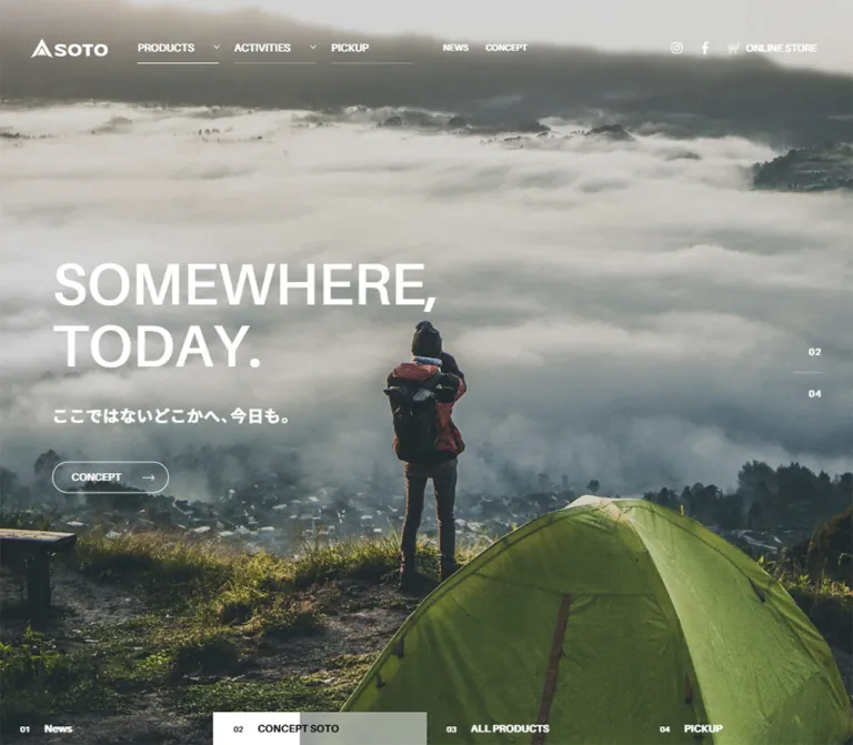
SOTO(ソト)|アウトドア用品ブランドサイト
調理器具の大きな写真と白い太字見出しを重ねた全画面ヒーローが特徴。横方向の製品・記事一覧、黄緑のアクセント、黒いフッターで構成されたアウトドアブランドサイト。
SOTO — Style Reference
Large-scale cooking photography, white utility typography, and compact navigation for an outdoor equipment brand.
Original URL: https://soto.shinfuji.co.jp/
Final URL: https://soto.shinfuji.co.jp/
Page title: SOTO|ソト -
Theme: photographic hero with white interface elements; black mobile footer; a declared neutral palette with a yellow-green accent.
Inspected: supplied browser evidence retrieved October 2, 2026, at 01:39:45.935 JST / October 1, 2026, at 16:39:45.935 UTC.
Viewports: desktop 1440 × 1000 CSS pixels; mobile 390 × 844 CSS pixels.
Scope: the current homepage, including its campaign hero, global navigation, product discovery structure, activity content, and footer. Linked destination pages were not inspected.
SOTO presents its equipment through an immersive photographic opening. In the visible desktop campaign, tall vertical slices of cooking scenes fill the screen: steel supports, dark cookware, rising steam, and prepared food. A large white Japanese title sits toward the left, followed by a smaller release label and a restrained outlined product link. The header and slide navigation occupy the image itself, keeping the equipment visually dominant.
This is a brand and product-discovery homepage with editorial and support functions. The document continues through activity-based discovery, product categories, recipes and articles, news, brand concept, support, and a substantial footer. The most reusable relationships are the large image versus compact controls, strong left alignment, horizontal content tracks, square content geometry, and a limited palette punctuated by yellow-green metadata.
閉じる
SOTO — Style Reference
Large-scale cooking photography, white utility typography, and compact navigation for an outdoor equipment brand.
Original URL: https://soto.shinfuji.co.jp/
Final URL: https://soto.shinfuji.co.jp/
Page title: SOTO|ソト -
Theme: photographic hero with white interface elements; black mobile footer; a declared neutral palette with a yellow-green accent.
Inspected: supplied browser evidence retrieved October 2, 2026, at 01:39:45.935 JST / October 1, 2026, at 16:39:45.935 UTC.
Viewports: desktop 1440 × 1000 CSS pixels; mobile 390 × 844 CSS pixels.
Scope: the current homepage, including its campaign hero, global navigation, product discovery structure, activity content, and footer. Linked destination pages were not inspected.
SOTO presents its equipment through an immersive photographic opening. In the visible desktop campaign, tall vertical slices of cooking scenes fill the screen: steel supports, dark cookware, rising steam, and prepared food. A large white Japanese title sits toward the left, followed by a smaller release label and a restrained outlined product link. The header and slide navigation occupy the image itself, keeping the equipment visually dominant.
This is a brand and product-discovery homepage with editorial and support functions. The document continues through activity-based discovery, product categories, recipes and articles, news, brand concept, support, and a substantial footer. The most reusable relationships are the large image versus compact controls, strong left alignment, horizontal content tracks, square content geometry, and a limited palette punctuated by yellow-green metadata.
How to Read This Reference
- Measured means supplied computed styles or rendered element rectangles. These values describe the sampled state at the stated viewport.
- Derived means arithmetic from those rectangles, such as the gap between adjacent cards. A derived measurement does not establish the original CSS formula.
- Estimated means visual assessment of a supplied current-page screenshot. Estimated values are not pixel samples or stylesheet declarations.
- Recommended means implementation guidance for a new build. The CSS Quick Start contains explicitly identified adaptations where the evidence is incomplete.
- Visual coverage is uneven. Desktop capture 1 shows the hero. Desktop captures 2 and 3 are white. Mobile capture 4 is white; mobile capture 5 shows the footer and header. The blank frames establish a capture limitation, not an intentional empty-page design.
- DOM coverage is broader than screenshot coverage. It establishes text, links, geometry, and computed styles for several intermediate sections. Their final imagery and composite backgrounds cannot be confirmed from the blank frames.
- Nonzero bounds do not prove visibility. Mobile navigation descendants have overlapping rectangles, and track items extend beyond the viewport. Hidden, clipped, or transformed content can remain represented in the supplied evidence.
- Token names introduced here are implementation aliases. Only names explicitly labeled as source variables were supplied by the original page.
Tokens — Colors
Verified Palette and Usage
| Name | Value | Source or evidence | Role |
|---|---|---|---|
| Interface White | #ffffff |
Computed header links, hero copy, and content labels; visible footer | Reversed text and icons; also the computed body background |
| Black | #000000 |
Source --color-gray-4; computed activity pill background and selected hero label |
Strong contrast surface and selected-label color; visually matches the mobile footer |
| Default Gray | #434343 |
Source --color-default; computed body color |
Default document text color before component overrides |
| Yellow-Green | #cac914 |
Source --color-key; computed activity links and mobile submenu links |
Editorial categories and selected secondary navigation treatments |
| Hero Shade | Exact value unavailable | Desktop screenshot | Darkens or accompanies the photographic composition enough to support white text; overlay construction and opacity are unverified |
The yellow-green is supported by actual element colors, even though it is not prominent in the visible hero and footer frames. Keep it associated with editorial and secondary navigation details rather than making every primary action a bright filled button.
Additional Declared Neutrals
| Source variable | Value | Evidence boundary |
|---|---|---|
--color-gray-1 |
#545454 |
Declared; specific component assignment not supplied |
--color-gray-2 |
#333333 |
Declared; specific component assignment not supplied |
--color-gray-3 |
#1a1a1a |
Declared; specific component assignment not supplied |
--color-btnBg |
#2b2b2b |
Declared; do not assume it fills the outlined hero link |
--color-bgGray |
#f6f6f6 |
Declared; visible usage not established |
The evidence also includes numerous general WordPress color, gradient, spacing, and shadow presets. Their presence does not make them part of this page's visible design system. Do not introduce those gradients or shadows without component-level evidence.
Tokens — Typography
Main Interface Stack
Computed source stack: YakuHanJP, webfont-sb, 'Noto Sans JP', sans-serif.
This stack appears on the body, navigation, hero text, section headings, category labels, and much of the metadata. Most sampled interface elements have a computed weight of 500; hero and section headings use 700.
webfont-sb is a source family alias. Its underlying typeface and font file were not supplied. The presence of 'Noto Sans JP' in the stack does not prove it rendered every glyph. Preserve the recorded stack when the corresponding licensed assets are available; otherwise use the declared fallback and verify the resulting text widths.
Heavier Utility Stack
Computed source stack: YakuHanJP, webfont-b, 'Noto Sans JP', sans-serif.
This appears in hero navigation captions and sampled mobile social and corporate navigation text. Some of these elements still report font-weight: 500, so the family alias contributes to the visual weight. Do not replace every occurrence with an arbitrary 700 without checking the result.
Logo and Image Lettering
The SOTO wordmark is a graphic identity element. Its heading wrapper's small computed font size does not describe the visible logo lettering. Preserve the logo's approximately 3.875:1 proportions using an authorized asset.
The large product names visible near the bottom of the cooking montage are not represented by the measured hero heading. Treat this lettering as part of the campaign artwork unless the original asset structure establishes otherwise.
Type Scale
All values below are computed, except where marked as estimates. Desktop and mobile hero measurements come from different campaign states.
| Role | Desktop | Mobile | Weight / tracking |
|---|---|---|---|
| Body | 16px / 25.6px |
13px / 20.8px |
500, normal tracking |
| Primary desktop navigation | 17px / 40px |
Separate mobile navigation structure | 500 |
| Desktop NEWS and CONCEPT | 14px / 40px |
— | 500 |
| Mobile navigation parent links | — | 20px / 60px |
500; DOM evidence only |
| Mobile navigation child links | — | 13px / 20.8px |
500; yellow-green |
| Hero heading | 73px / 76.65px |
42px / 44.1px |
700, normal tracking |
| Hero supporting line | 20px / 32px |
13px / 20.8px |
700; 1px / 0.65px tracking |
| Hero product link | 13px / 16.9px |
11px / 14.3px |
500 |
| Hero navigation caption | 13px / 13px |
10px / 10px |
webfont-b, computed 500 |
| MOMENT / PRODUCTS CATEGORY heading | 33px / 33px |
16px / 16px |
700 |
| Moment label | 20px / 32px |
14px / 22.4px |
500 |
| Product category label | 20px / 20px |
15px / 15px |
500 |
| Product count | 16px / 25.6px |
12px / 19.2px |
500 |
| Activity date | 14px / 14px |
10px / 10px |
500 |
| Activity category | 12px / 12px |
10px / 10px |
500; yellow-green |
| Sampled mobile social-link text | — | 24px / 24px |
webfont-b, computed 500 |
| Sampled mobile corporate links | — | 12px / 35px |
webfont-b, computed 500 |
The hero heading has a tight 1.05 line-height. Supporting copy uses 1.6, with 0.05em tracking. This combination gives the title impact while keeping the release information legible.
The visible footer's social labels also appear approximately 24px tall. Its exact footer element styles were not separately supplied; the measured mobile navigation equivalents should not be mistaken for footer measurements.
Tokens — Spacing & Shapes
There is no demonstrated universal spacing unit. The evidence supports role-specific dimensions, with a spacious desktop layout and smaller mobile margins.
Spacing Measurements
| Use | Desktop | Mobile | Status |
|---|---|---|---|
| Main section inset | 65px |
18px |
Measured |
| Header logo left edge | 48px |
Centered | Measured |
| Hero copy left inset | 65px |
33px |
Measured |
| Gap between first three desktop navigation links | 25px |
— | Derived |
| Hero heading to supporting line | 35px |
15px |
Derived |
| Supporting line to hero link | 40px |
30px |
Derived |
| MOMENT heading to tiles | 25px |
20px |
Derived |
| Gap between moment tiles | 35px |
22px |
Derived |
| Moment tiles to category heading | 80px |
55px |
Derived |
| Category heading to cards | 38px |
25px |
Derived |
| Gap between category cards | 38px |
28px |
Derived |
| Category label to count | 8px |
8px |
Derived |
| Gap between activity cards | 45px |
28px |
Derived |
| Activity metadata horizontal inset | 24px |
Approximately 18px |
Derived |
| Discovery section end to activity section start | 160px |
75px |
Derived |
Geometry
| Element | Desktop | Mobile | Evidence |
|---|---|---|---|
| Header | 1440 × 120px |
390 × 60px |
Measured |
| Logo | 124 × 32px |
92 × 23.73px |
Measured |
| Hero / MAIN box | 1440 × 1000px |
390 × 844px |
Measured |
| Hero product link | 134.31 × 38.89px |
162.16 × 36.30px |
Measured; labels differ |
| Hero link radius | 38px |
38px |
Computed |
| Moment tile | 234 × 234px |
150 × 150px |
Measured |
| Typical category card link box | 275.48 × 347.08px |
210.75 × 264.94px |
Measured |
| Activity card link box | 365.59 × 502.86px |
265.84 × 366.20px |
Measured |
| Activity section link | 127.31 × 27.59px |
34 × 24.30px |
Measured |
| Activity section link radius | 28px |
28px |
Computed |
| Footer catalog link | — | Approximately 262 × 38px |
Screenshot estimate |
| Footer social icon discs | — | Approximately 30px diameter |
Screenshot estimate |
Sampled content links have border-radius: 0. Rounded geometry is concentrated in small action links and circular icon containers. Fine separators and outlines appear approximately 1px thick in the screenshots; no general border-width token was supplied.
Components
Global Header
Role: brand identity, product discovery, editorial navigation, commerce, and search.
At desktop, the transparent header occupies the first 120px of the hero. The white logo sits at (48, 44) with a 124 × 32px box. Three primary links begin at x=220, 375, and 530; each has a 130px-wide box and a 40px line-height. Their thin lower rules create a quiet horizontal structure over the photograph.
A wider 204px item follows, labeled FORCUS PRODUCTS in the source UI. Preserve that spelling when documenting the original. NEWS and CONCEPT are smaller secondary links. Instagram, Facebook, the cart/store link, and search occupy the right edge. The visible icons mix outlined utility symbols with social brand marks; no icon-library identity was supplied.
At mobile, the measured header height halves to 60px. The logo is truly centered at x=149, with a width of 92px. The visible footer frame places a menu symbol on the left and cart/search symbols on the right. The header appears at the top of this lower-page frame, supporting persistent chrome, but its exact fixed/sticky implementation and scroll visibility rules remain unverified.
Campaign Hero
Role: the homepage's main campaign presentation and direct route to a featured product or story.
The visible desktop state promotes カコム シリーズ, followed by 2026 NEW PRODUCT and an ST-311X link. Its anatomy is:
- A full-viewport photographic composition with vertical cooking scenes.
- White global navigation across the top.
- A left-aligned title, supporting line, and small outlined action near the vertical center.
- A compact current/total counter near the right edge.
- Five numbered campaign navigation items along the bottom.
The desktop title starts at (65, 388.73). The link ends at approximately y=611.27, so the complete text group is centered around y=500, the viewport midpoint. The title is substantially larger than the navigation but remains secondary to the broad photographic field.
The mobile DOM captures a different campaign, Editors’ Choice 2026. Its heading occupies two lines in a 324 × 88.19px box at (33, 326.86). The complete title/support/link group is centered around y=422, again the viewport midpoint. This establishes similar composition at both sizes; it does not establish a breakpoint-specific campaign change.
The product link is a transparent capsule with a thin white outline and a right-pointing arrow. Desktop padding is 10px 58px 10px 23px; mobile padding is 10px 55px 10px 18px. The larger right inset reserves room for the arrow. Do not turn this into a large opaque purchase button.
Campaign Index and Counter
Role: identifies the active campaign and exposes the other featured entries.
Five caption positions are spaced 288px apart on desktop and 78px apart on mobile, consistent with five equal-width slots. Desktop captions sit at y=973 within a bottom band approximately 41px tall in the screenshot. The entries are numbered 01 through 05.
The selected desktop item has a pale filled region with black text; the other labels remain white over the image. The fill contains a visible tonal boundary, but its progress or transition semantics cannot be established from a single frame. Do not invent a timed progress bar.
At the right, the visible counter reads 02 above 05, separated by a fine horizontal rule. The DOM contains vertical sequences of digits and a defined transition. This supports a rolling-number construction, but no complete rollover was observed.
Mobile caption boxes are only about 33.3px wide despite retaining full text in the DOM. Exact clipping, masking, and readable label treatment are not visible in the blank mobile hero capture. A reusable version should retain full accessible names even if it displays abbreviated labels.
MOMENT Discovery Tiles
Role: routes visitors by intended use: キャンプ, 焚火, 料理, 登山, and ホーム.
The desktop heading begins at (65, 1060), 60px below the hero. Five square 234px link boxes follow in one row, with 35px gaps. Their labels sit centrally within each square and use white 20px / 32px text.
On mobile, the heading begins at (18, 874), 30px below the hero. Tiles become 150px squares, separated by 22px. The first three x positions are 18, 190, and 362, establishing a horizontal track rather than a wrapped two-column grid. Labels reduce to 14px / 22.4px.
The rectangles and centered labels are established by the DOM. Tile photography, hover effects, and the final background treatment are not visually established by the supplied captures.
PRODUCTS CATEGORY Track
Role: gives direct access to the equipment taxonomy, with counts alongside category names.
The source contains thirteen entries, including new products, stoves, torches, lanterns, fuel, cooking tools, accessories, parts, and discontinued products. Counts are content data, such as 29 new products, 18 stoves, and 75 accessories at capture time; they should not become decorative constants.
Desktop cards begin at x=65 with a width of 275.48px and a 38px gap. The fifth card begins at x=1318.94, with later items continuing well beyond the viewport. On mobile, cards are 210.75px wide with a 28px gap, beginning at x=18 and 256.75.
Each entry has a link region, a category label, and a count below it. Label width is 35px narrower than the desktop link box and 30px narrower on mobile. The source of that reserved trailing space is not shown.
The vertical caption positions are consistent with a square media region followed by an 18px desktop or 12px mobile gap. This is a useful reconstruction hypothesis, not a measured image aspect ratio. Long labels expand the card height by one line; preserve that flexibility.
ACTIVITIES Track
Role: connects product use to recipes, reports, interviews, and practical articles.
The source begins with recipes dated 2026.07.23, followed by older recipes and reading material. The first desktop link footprint is 365.59 × 502.86px, with subsequent cards placed every 410.59px. Mobile footprints are 265.84 × 366.20px, placed every 293.84px. Both indicate a horizontal sequence of tall cards.
Desktop date text sits approximately 24px from the left and 20px from the top of the card footprint. The category link sits near the upper right, also inset by 24px. Dates are white; category links use #cac914. Mobile metadata reduces to approximately 18px horizontal insets and 10px type.
The article titles are present in the text evidence, but their exact positions and typography are not supplied. Card media, title placement, image overlays, and hover behavior therefore remain unverified.
Repeated ACTIVITIES text appears before the cards, suggesting a decorative repeated heading. Its size, animation, and clipping were not established. A small section link is measured at the right: black with yellow-green text, a 28px radius, and a 300ms transition. On mobile its 34px-wide footprint suggests compact presentation; the visible label treatment is unknown.
Mobile Navigation Structure
Role: provides a narrow-screen alternative to the desktop header links.
The mobile DOM includes parent links in 330px-wide boxes inset 30px from each side. Parent text uses 20px / 60px; category children use 13px yellow-green text in recorded 43px-high rectangles. Product families, activity categories, featured products, general links, social links, and corporate links are represented.
Several child rectangles overlap later parent rectangles. This evidence must not be presented as a screenshot of every menu expanded at once. No menu-opening action, submenu expansion, focus behavior, or dismissal sequence was supplied.
Keep this navigation structure separate from the visible footer. Their insets and text scales differ: the footer screenshot uses approximately 18px side margins and smaller primary labels.
Mobile Footer
Role: consolidates discovery links, catalog access, social destinations, corporate information, and return-to-top navigation.
The visible footer is a black field with white content and muted horizontal rules. Its layout uses approximately 18px side margins, giving a 354px-wide content band.
From top to bottom, the visible anatomy is:
- PRODUCTS and ACTIVITIES rows with right-side chevrons, followed by PICKUP; each row is separated by a fine rule.
- A compact horizontal row of NEWS, CONCEPT, and STORES.
- A separate catalog band containing the centered outlined
カタログ最新版 無料送付link and a small book symbol. - Three prominent external destinations: ONLINE STORE, FACEBOOK, and INSTAGRAM. Each has a white circular icon holder, a bold uppercase label, and a small diagonal arrow.
- A slim upward arrow near the right edge, corresponding to the supplied
#pagetoplink. - A divider, compact corporate/legal links, and centered copyright text.
The catalog capsule is approximately 262px wide and 38px high. Social icon circles are approximately 30px in diameter; the label starts about 40px to their right. Social rows are spaced roughly 51px apart. These are screenshot estimates, not source CSS values.
The source footer identifies Shinfuji Burner co., ltd. in its copyright and includes COMPANY and RECRUIT links. No production credit is established by the inspected homepage.
News, Concept, and Support
Evidence level: content structure and destinations only.
NEWS contains three current entries and an ALL NEWS link. The concept passage begins with 未開を、愛する。 and includes SOMEWHERE, TODAY.. SUPPORT includes repair, important product notices, and a support-home destination. Repeated Sparked by Nature,Designed by SOTO text precedes the footer in the document.
These sections demonstrate the homepage's broader editorial and service scope. Their type scale, imagery, surfaces, column structure, and motion cannot be specified as observed design from the supplied blank frames.
Tokens — Motion & Interaction
Measured Transition Declarations
| Element | Supplied declaration | What can be concluded |
|---|---|---|
| Header | 1.5s cubic-bezier(0.19, 1, 0.22, 1) |
A long eased transition is defined; trigger and changed properties are unverified |
| Hero navigation captions | 1.5s cubic-bezier(0.19, 1, 0.22, 1) |
Selected-state changes may use this timing; a full transition was not captured |
| Hero product link | 0.3s cubic-bezier(0.165, 0.84, 0.44, 1) |
Short control transition is defined; actual hover endpoint is unverified |
| Activity section link | 0.3s cubic-bezier(0.165, 0.84, 0.44, 1) |
Shares the compact control timing |
| Counter digit tracks | 0.6s cubic-bezier(0.075, 0.82, 0.165, 1) |
Supports an eased numerical-track change; exact animation sequence is unverified |
Many sampled elements report animation: none. This is not proof that the page lacks JavaScript animation, ancestor transforms, pseudo-element animation, or motion elsewhere.
Interaction Boundaries
- The supplied desktop and mobile DOM states show different active hero campaigns. This supports a multi-state hero, but does not establish autoplay, its interval, or a user-triggered transition.
- Offscreen card positions establish horizontal tracks. Dragging, touch swiping, arrow controls, wheel handling, and snap behavior were not exercised in the supplied evidence.
- Chevrons establish a disclosure affordance. They do not establish whether a submenu opens on hover, click, or another action.
- A search icon is visible; no search panel or result state was captured.
- The return-to-top destination is supplied, but scrolling duration and easing are unknown.
- Repeated text is present in the DOM; continuous marquee movement is not verified.
For a new implementation, use the measured easing curves selectively. Define the properties being animated rather than copying an unrestricted transition: all. Provide static, readable content when motion is disabled.
Surfaces
| Surface | Established appearance | Limitation or implementation guidance |
|---|---|---|
| Document body | Computed white background, default gray text | Does not establish the final composite appearance of every section |
| Desktop hero | Dark photographic composition with white UI | Exact darkening layer and image treatment are unavailable |
| Desktop header | Computed transparent background over the hero | Do not introduce a frosted panel or opaque bar as an observed treatment |
| Hero action | Transparent outlined capsule | Border appears thin; no shadow is visible |
| Selected hero index | Pale filled region with black caption | Fill/progress behavior remains unknown |
| Activity section action | Computed black background with yellow-green text | This specific surface is verified independently of the blank section captures |
| Intermediate discovery sections | Transparent sampled sections with white text | Underlying backgrounds and compositing are unverified |
| Mobile footer | Visually black with white text and fine muted rules | Exact rule colors are estimated |
There is no visible evidence for a general elevated-card or shadow system in the confirmed hero and footer. The sampled content anchors use square corners. Structure is carried by alignment, image scale, rules, and text contrast.
Imagery
The confirmed current hero uses detailed cooking and equipment photography. Steel frames and black cooking surfaces supply hard edges; steam and food add softer texture and warm color. The composition places several tall photographic slices side by side, with partial scenes at the outer edges. These slices belong to the campaign artwork and should not be confused with the five campaign controls below.
The large white title crosses the photographic composition without a separate card or text panel. A reconstruction needs an image with suitable contrast and usable space around the left-center text area. Preserve the equipment's proportions and material detail. Avoid stretching the montage or replacing its photographic texture with a flat illustration.
Whether this background is a single assembled asset or several separately rendered images cannot be determined from the supplied element list. Start with an authorized composed image if reproducing this state, then use cover cropping and explicit focal-position checks at each viewport.
No current-page image URLs, intrinsic dimensions, or font-file URLs were supplied. Do not invent asset paths.
Observed Asset References
| Asset role | Evidence | Known constraint |
|---|---|---|
| SOTO logo | Desktop hero and mobile footer frame; measured wrappers | Approximately 3.875:1 ratio; graphic identity asset |
| Cooking campaign montage | Desktop capture 1 | Full-screen crop; vertical scene divisions; actual file URL unavailable |
| Header utility symbols | Desktop capture 1 and mobile capture 5 | White social/cart/search/menu symbols; implementation format unknown |
| Footer social icon holders | Mobile capture 5 | White discs with dark symbols |
| Catalog book and return-to-top symbols | Mobile capture 5 | Small book glyph and thin upward arrow |
| Discovery and activity media | Link geometry and text only | Image content, crop, and file paths unverified |
Use normal high-quality image rendering for the confirmed photography. Pixelated rendering would contradict the observed material detail.
Layout & Responsive Behavior
Measured Comparison
| Feature | 1440 × 1000 desktop | 390 × 844 mobile |
|---|---|---|
| Document height | Approximately 5642.25px |
Approximately 5052.45px |
| Header height | 120px |
60px |
| Logo placement | Left, x=48 |
Centered, x=149 |
| Main content band | 1310px, inset 65px |
354px, inset 18px |
| Hero content inset | 65px |
33px |
| Hero copy group center | Approximately y=500 |
Approximately y=422 |
| Hero title size | 73px |
42px |
| First discovery heading | y=1060 |
y=874 |
| Moment tiles | Five 234px squares in the sampled row | 150px squares continuing horizontally |
| Category cards | 275.48px wide, 38px gap |
210.75px wide, 28px gap |
| Activity cards | 365.59px wide, 45px gap |
265.84px wide, 28px gap |
| Section heading size | 33px |
16px |
The measured content insets correspond to approximately 4.51% of desktop width and 4.62% of mobile width. Their similarity does not prove a single viewport-based CSS formula. The hero uses the main desktop alignment but gains a larger 33px inset on mobile.
The homepage preserves horizontal browsing on narrow screens rather than stacking every category and article into a long grid. Card widths shrink less than the viewport, leaving partial subsequent entries as a likely continuation cue. The precise clipping boundary was not supplied.
Two viewport samples cannot identify the original breakpoint. The Quick Start uses 1200px as a recommended navigation/layout switch to avoid crowding the broad desktop header. That value is an adaptation, not a recovered media query.
Mobile footer content remains a vertical sequence with a short horizontal general-link row. Preserve independent layout roles: header controls, hero text, content rails, and footer do not all share one inset.
Do’s and Don’ts
Do
- Let current campaign photography occupy the full opening viewport.
- Keep the hero title large, white, tightly led, and aligned with its supporting line and product link.
- Preserve the compact outlined action and separate numbered campaign navigation.
- Use the actual SOTO logo proportions instead of approximating it with ordinary text.
- Keep the distinction between 65px desktop content margins, 18px mobile section margins, and 33px mobile hero margins.
- Preserve horizontal discovery tracks and their square or tall card geometry.
- Use yellow-green
#cac914for the verified editorial and secondary navigation roles. - Build the mobile footer around black, white, thin rules, circular social icons, and a centered catalog capsule.
- Distinguish computed font aliases from identified font files.
- Treat unverified section surfaces and imagery as open implementation decisions.
Don’t
- Do not reduce the homepage to a single campaign landing page or omit catalog, editorial, and support navigation.
- Do not treat blank captures as designed white spacer sections.
- Do not use unrelated imagery to fill the missing visual evidence.
- Do not turn every content item into a rounded, shadowed card.
- Do not infer colorful gradients from general WordPress presets.
- Do not present mobile menu descendants as a verified fully expanded menu.
- Do not hardcode product counts or dates as permanent design tokens.
- Do not claim autoplay timing, hover behavior, swipe mechanics, or marquee animation without an observed sequence.
- Do not interpret background product lettering as the hero's CSS type scale.
- Do not use the small logo-wrapper font size to recreate the graphic wordmark.
Recommended Implementation Additions
These are recommendations for a new implementation, not verified features of the original:
- Give menu, cart, search, social, and return-to-top controls clear accessible names. The extracted link text is not a complete accessibility-tree audit.
- Use buttons for slide changes and menu disclosures, and links for navigation to products or articles. Expose the current slide and expanded states programmatically.
- If the hero rotates automatically, provide pause controls, pause during interaction, and keep inactive slides out of the keyboard sequence.
- Hide decorative digit columns and duplicated decorative text from assistive technology; expose one meaningful current/total value.
- Keep horizontal rails keyboard reachable and touch scrollable. A partial next card should supplement explicit navigation, not be the only cue.
- Preserve visible text alternatives when reducing mobile slide captions or compact section links.
- Aim for at least 44px touch targets even where the original capsule's visual height is smaller. Additional transparent hit area can preserve its proportions.
- Provide a visible initial state when animation scripts or media fail. Essential page sections should not depend on a reveal animation to become readable.
- Verify white text against every hero crop. A 40% black veil in the Quick Start is only a starting recommendation.
- Load the initial hero image promptly and defer nonessential below-the-fold media. Set dimensions to keep the rails stable during loading.
- Respect reduced-motion preferences and safe-area insets. Increase very small metadata where necessary for readability.
Agent Prompt Guide
Quick Color Reference
- Hero and footer interface:
#ffffff. - Footer and verified dark action surface:
#000000. - Default document text:
#434343. - Editorial and submenu accent:
#cac914. - Additional declared neutrals:
#545454,#333333,#1a1a1a,#2b2b2b,#f6f6f6. - Primary hero action: white outline and white text on a transparent capsule.
- Intermediate section backgrounds: not visually verified; any chosen dark fallback is an implementation recommendation.
Overall Prompt
“Create an outdoor equipment brand homepage using SOTO's measured current-page proportions. Open with a full-viewport cooking-equipment photograph, a transparent white navigation header, a large left-aligned Japanese heading, a smaller release line, and a compact outlined product link. Use five numbered campaign selectors across the bottom and a small current/total counter at the right. Continue with horizontally arranged use-case tiles, product categories with counts, and tall editorial entries with dates and restrained yellow-green category labels. Use square content geometry, limited rounding for small action capsules, and a black mobile footer with white rules, circular social icons, catalog access, and corporate links. Keep all unverified imagery, lower-section surfaces, and interaction behavior explicitly identified as implementation choices.”
Example Component Prompts
- Desktop hero: “At 1440 × 1000, place an authorized cooking montage edge to edge. Position a 73px bold white heading at x=65, with 1.05 line-height. Use a 35px gap before a 20px release line and a 40px gap before a thin outlined capsule. Center the complete copy group vertically. Add a 120px transparent header and five compact campaign controls along the bottom.”
- Discovery rail: “Build square use-case links at 234px with 35px gaps on desktop. At a 390px viewport, use 150px squares with 22px gaps and an 18px left inset. Keep the items on a horizontal track, with centered white labels. Supply imagery separately because the inspected media was not visible.”
- Product category: “Use a square media area as an explicitly inferred adaptation, followed by a category name and an 8px gap before its count. Set the desktop item width to approximately 275.48px and mobile width to 210.75px. Keep corners square and allow long labels to add a line.”
- Mobile footer: “Use a black 390px-wide footer with 18px side margins. Stack primary navigation rows with thin rules, a compact general-link row, and a centered outlined catalog capsule. Below, place three 24px uppercase destination labels beside 30px white icon discs. Finish with a thin upward arrow and compact corporate/legal links.”
Quick Start
CSS Custom Properties
This is a reusable adaptation, not the original stylesheet. Desktop and mobile endpoint values come from the evidence where available. The 1200px breakpoint, dark discovery fallback, square category media, hero veil, hover treatment, and native rail scrolling are recommendations. Font aliases work only when their corresponding font faces are available.
Apply soto-reference to the page wrapper. Place an authorized image in .soto-hero__media, and keep the header, copy, counter, and index as separate layers. The rail classes work with semantic lists containing links. Actual carousel and menu state requires application code.
:root {
  /* Recorded colors */
  --soto-white: #ffffff;
  --soto-black: #000000;
  --soto-text: #434343;
  --soto-key: #cac914;
  --soto-gray-1: #545454;
  --soto-gray-2: #333333;
  --soto-gray-3: #1a1a1a;
  --soto-button-gray: #2b2b2b;
  --soto-light-gray: #f6f6f6;

  /* Recorded family aliases; font files are not included */
  --soto-font: YakuHanJP, webfont-sb, 'Noto Sans JP', sans-serif;
  --soto-font-bold: YakuHanJP, webfont-b, 'Noto Sans JP', sans-serif;

  /* Desktop measurements */
  --soto-inset: 65px;
  --soto-hero-inset: 65px;
  --soto-header-inset: 48px;
  --soto-header-height: 120px;
  --soto-logo-width: 124px;
  --soto-body-size: 16px;
  --soto-hero-size: 73px;
  --soto-support-size: 20px;
  --soto-section-size: 33px;
  --soto-copy-gap: 35px;
  --soto-action-gap: 40px;
  --soto-moment-width: 234px;
  --soto-moment-gap: 35px;
  --soto-category-width: 275.484px;
  --soto-category-gap: 38px;
  --soto-activity-width: 365.594px;
  --soto-activity-gap: 45px;

  /* Recorded durations and easing curves */
  --soto-ease-long: cubic-bezier(0.19, 1, 0.22, 1);
  --soto-ease-control: cubic-bezier(0.165, 0.84, 0.44, 1);
  --soto-ease-counter: cubic-bezier(0.075, 0.82, 0.165, 1);
  --soto-time-long: 1500ms;
  --soto-time-control: 300ms;
  --soto-time-counter: 600ms;

  /* Recommended values, not measured source tokens */
  --soto-rule: rgb(255 255 255 / 0.25);
  --soto-hero-veil: rgb(0 0 0 / 0.4);
  --soto-discovery-surface: #1a1a1a;
}

.soto-reference,
.soto-reference * {
  box-sizing: border-box;
}

.soto-reference {
  margin: 0;
  color: var(--soto-text);
  background: var(--soto-white);
  font-family: var(--soto-font);
  font-size: var(--soto-body-size);
  font-weight: 500;
  line-height: 1.6;
}

.soto-reference a {
  color: inherit;
}

.soto-reference button {
  font: inherit;
}

.soto-reference img {
  display: block;
  max-width: 100%;
}

/* Fixed positioning is an adaptation for persistent chrome. */
.soto-header {
  position: fixed;
  inset: 0 0 auto;
  z-index: 20;
  display: flex;
  align-items: center;
  gap: 48px;
  height: var(--soto-header-height);
  padding-inline: var(--soto-header-inset);
  color: var(--soto-white);
  background: transparent;
}

.soto-logo {
  display: block;
  flex: 0 0 auto;
  width: var(--soto-logo-width);
  aspect-ratio: 3.875;
}

.soto-logo img {
  width: 100%;
  height: 100%;
  object-fit: contain;
}

.soto-desktop-nav {
  display: flex;
  flex: 1;
  align-items: center;
  justify-content: space-between;
  gap: 25px;
  min-width: 0;
}

.soto-primary-nav {
  display: flex;
  gap: 25px;
}

.soto-primary-nav a {
  min-width: 130px;
  border-bottom: 1px solid var(--soto-rule);
  font-size: 17px;
  line-height: 40px;
  text-decoration: none;
}

.soto-mobile-tools {
  display: none;
}

.soto-hero {
  position: relative;
  isolation: isolate;
  min-height: 100vh;
  min-height: 100svh;
  color: var(--soto-white);
  background: var(--soto-black);
}

.soto-hero__media,
.soto-hero::before {
  position: absolute;
  inset: 0;
  width: 100%;
  height: 100%;
}

.soto-hero__media {
  z-index: -2;
  object-fit: cover;
  object-position: var(--hero-focal-point, 50% 50%);
}

.soto-hero::before {
  content: '';
  z-index: -1;
  background: var(--soto-hero-veil);
}

.soto-hero__copy {
  position: absolute;
  top: 50%;
  left: var(--soto-hero-inset);
  width: min(780px, calc(100% - 2 * var(--soto-hero-inset)));
  transform: translateY(-50%);
}

.soto-hero__title {
  margin: 0;
  font-size: var(--soto-hero-size);
  font-weight: 700;
  line-height: 1.05;
}

.soto-hero__support {
  margin: var(--soto-copy-gap) 0 0;
  font-size: var(--soto-support-size);
  font-weight: 700;
  line-height: 1.6;
  letter-spacing: 0.05em;
}

.soto-pill {
  position: relative;
  display: inline-block;
  padding: 10px 58px 10px 23px;
  border: 1px solid currentColor;
  border-radius: 38px;
  color: inherit;
  background: transparent;
  font-size: 13px;
  line-height: 1.3;
  text-decoration: none;
  transition:
    color var(--soto-time-control) var(--soto-ease-control),
    background-color var(--soto-time-control) var(--soto-ease-control);
}

.soto-pill__arrow {
  position: absolute;
  top: 50%;
  right: 18px;
  transform: translateY(-50%);
}

.soto-hero__copy .soto-pill {
  margin-top: var(--soto-action-gap);
}

/* Static fallback index; state changes require application code. */
.soto-hero__index {
  position: absolute;
  inset: auto 0 0;
  display: grid;
  grid-template-columns: repeat(5, minmax(0, 1fr));
}

.soto-hero__index button {
  display: flex;
  align-items: center;
  gap: 18px;
  min-width: 0;
  min-height: 44px;
  padding: 12px 25px;
  border: 0;
  color: var(--soto-white);
  background: transparent;
  text-align: left;
  cursor: pointer;
}

.soto-hero__index [aria-current='true'] {
  color: var(--soto-black);
  background: var(--soto-white);
}

.soto-hero__index-label {
  overflow: hidden;
  font-family: var(--soto-font-bold);
  font-size: 13px;
  line-height: 1;
  text-overflow: ellipsis;
  white-space: nowrap;
}

.soto-hero__counter {
  position: absolute;
  top: 50%;
  right: 40px;
  display: grid;
  gap: 16px;
  text-align: center;
  transform: translateY(-50%);
  font-size: 12px;
}

.soto-hero__counter span + span {
  padding-top: 16px;
  border-top: 1px solid var(--soto-rule);
}

/* Dark discovery fill is a recommended readable fallback. */
.soto-discovery {
  padding-block: 60px 80px;
  color: var(--soto-white);
  background: var(--soto-discovery-surface);
}

.soto-section-title {
  margin: 0 var(--soto-inset) 25px;
  font-size: var(--soto-section-size);
  font-weight: 700;
  line-height: 1;
}

/* Native scrolling is an adaptation, not a recovered mechanism. */
.soto-rail {
  display: grid;
  grid-auto-flow: column;
  grid-auto-columns: var(--rail-width);
  justify-content: start;
  gap: var(--rail-gap);
  margin: 0;
  padding: 0 var(--soto-inset) 12px;
  overflow-x: auto;
  list-style: none;
  scroll-snap-type: x proximity;
  scroll-padding-inline: var(--soto-inset);
}

.soto-rail > * {
  min-width: 0;
  scroll-snap-align: start;
}

.soto-rail--moments {
  --rail-width: var(--soto-moment-width);
  --rail-gap: var(--soto-moment-gap);
}

.soto-rail--categories {
  --rail-width: var(--soto-category-width);
  --rail-gap: var(--soto-category-gap);
}

.soto-rail--activities {
  --rail-width: var(--soto-activity-width);
  --rail-gap: var(--soto-activity-gap);
}

.soto-moment {
  position: relative;
  display: grid;
  place-items: center;
  aspect-ratio: 1;
  overflow: hidden;
  border-radius: 0;
  color: var(--soto-white);
  background: var(--soto-black);
  text-decoration: none;
}

.soto-moment img {
  position: absolute;
  inset: 0;
  width: 100%;
  height: 100%;
  object-fit: cover;
}

.soto-moment span {
  position: relative;
  font-size: 20px;
  line-height: 1.6;
}

.soto-category {
  display: block;
  color: inherit;
  text-decoration: none;
}

/* Square media is inferred from caption placement. */
.soto-category__media {
  width: 100%;
  aspect-ratio: 1;
  object-fit: cover;
  border-radius: 0;
}

.soto-category__title {
  margin: 18px 35px 0 0;
  font-size: 20px;
  font-weight: 500;
  line-height: 1;
}

.soto-category__count {
  margin: 8px 0 0;
  font-size: 16px;
  line-height: 1.6;
}

/* Envelope and metadata reproduce measured geometry. */
.soto-activity {
  min-height: 502.86px;
  padding: 20px 24px;
  border-radius: 0;
}

.soto-activity__meta {
  display: flex;
  align-items: start;
  justify-content: space-between;
  gap: 12px;
}

.soto-activity__date {
  font-size: 14px;
  line-height: 1;
}

.soto-activity__category {
  padding-bottom: 6px;
  color: var(--soto-key);
  font-size: 12px;
  line-height: 1;
}

.soto-footer {
  padding: 40px var(--soto-inset) 24px;
  color: var(--soto-white);
  background: var(--soto-black);
}

.soto-footer__row {
  display: flex;
  align-items: center;
  justify-content: space-between;
  min-height: 66px;
  border-bottom: 1px solid var(--soto-rule);
  text-decoration: none;
}

.soto-footer__catalog {
  display: flex;
  justify-content: center;
  margin-block: 44px;
  padding-block: 44px;
  border-block: 1px solid var(--soto-rule);
}

.soto-footer__catalog .soto-pill {
  width: min(262px, 100%);
  padding: 10px 18px;
  text-align: center;
  font-size: 12px;
}

.soto-footer__socials {
  display: grid;
  gap: 7px;
}

.soto-footer__social {
  display: flex;
  align-items: center;
  gap: 10px;
  min-height: 44px;
  font-family: var(--soto-font-bold);
  font-size: 24px;
  line-height: 1;
  text-decoration: none;
}

.soto-footer__icon {
  display: grid;
  flex: 0 0 30px;
  place-items: center;
  width: 30px;
  height: 30px;
  border-radius: 50%;
  color: var(--soto-black);
  background: var(--soto-white);
}

.soto-footer__legal {
  display: flex;
  flex-wrap: wrap;
  gap: 0 16px;
  margin-top: 64px;
  padding-top: 12px;
  border-top: 1px solid var(--soto-rule);
  font-size: 12px;
  line-height: 35px;
}

/* Recommended endpoint switch; original breakpoint unknown. */
@media (max-width: 1200px) {
  :root {
    --soto-inset: 18px;
    --soto-hero-inset: 33px;
    --soto-header-inset: 18px;
    --soto-header-height: 60px;
    --soto-logo-width: 92px;
    --soto-body-size: 13px;
    --soto-hero-size: 42px;
    --soto-support-size: 13px;
    --soto-section-size: 16px;
    --soto-copy-gap: 15px;
    --soto-action-gap: 30px;
    --soto-moment-width: 150px;
    --soto-moment-gap: 22px;
    --soto-category-width: 210.75px;
    --soto-category-gap: 28px;
    --soto-activity-width: 265.844px;
    --soto-activity-gap: 28px;
  }

  .soto-header {
    justify-content: center;
  }

  .soto-desktop-nav {
    display: none;
  }

  .soto-mobile-tools {
    position: absolute;
    inset-inline: var(--soto-header-inset);
    display: flex;
    align-items: center;
    justify-content: space-between;
    pointer-events: none;
  }

  .soto-mobile-tools :is(a, button) {
    display: inline-grid;
    place-items: center;
    min-width: 44px;
    min-height: 44px;
    border: 0;
    color: inherit;
    background: transparent;
    pointer-events: auto;
  }

  .soto-pill {
    padding: 10px 55px 10px 18px;
    font-size: 11px;
  }

  .soto-hero__index button {
    gap: 6px;
    padding-inline: 8px;
  }

  .soto-hero__index-label {
    font-size: 10px;
  }

  .soto-hero__counter {
    right: 17px;
    font-size: 10px;
  }

  .soto-discovery {
    padding-top: 30px;
  }

  .soto-section-title {
    margin-bottom: 20px;
  }

  .soto-moment span {
    font-size: 14px;
  }

  .soto-category__title {
    margin: 12px 30px 0 0;
    font-size: 15px;
  }

  .soto-category__count {
    font-size: 12px;
  }

  .soto-activity {
    min-height: 366.2px;
    padding: 12.5px 18px;
  }

  .soto-activity__date,
  .soto-activity__category {
    font-size: 10px;
  }

  .soto-footer {
    padding-bottom: max(24px, env(safe-area-inset-bottom));
  }
}

/* Recommended interaction and accessibility additions */
.soto-reference :focus-visible {
  outline: 2px solid currentColor;
  outline-offset: 4px;
}

@media (hover: hover) {
  .soto-hero .soto-pill:hover {
    color: var(--soto-black);
    background: var(--soto-white);
  }
}

@media (prefers-reduced-motion: reduce) {
  .soto-reference *,
  .soto-reference *::before,
  .soto-reference *::after {
    animation: none !important;
    transition: none !important;
    scroll-behavior: auto !important;
  }
}
The CSS provides a static visual foundation. It deliberately leaves article media and title styling to verified assets and a subsequent design decision. The recommended active hero selector uses a solid white fill; it does not attempt to reproduce the unverified partial fill seen in the capture. Test the hero copy and counter together on narrow screens, especially with long campaign text.
Tailwind v4 Token Mapping
Optional aliases for a project already using Tailwind v4. This does not imply the original site uses Tailwind. Define the custom properties above first.
@theme inline {
  --color-soto-white: var(--soto-white);
  --color-soto-black: var(--soto-black);
  --color-soto-text: var(--soto-text);
  --color-soto-key: var(--soto-key);
  --font-soto: var(--soto-font);
  --font-soto-bold: var(--soto-font-bold);
  --text-soto-hero: var(--soto-hero-size);
  --text-soto-section: var(--soto-section-size);
  --spacing-soto-inset: var(--soto-inset);
  --spacing-soto-header: var(--soto-header-height);
  --radius-soto-pill: 38px;
}
Sources & Evidence
- Inspected original and final page: SOTO homepage. The supplied browser record reports HTTP 200 with no URL change.
- Capture timestamp:
2026-10-01T16:39:45.935Z, equivalent to October 2, 2026, 01:39:45.935 JST. This reference analyzes that supplied inspection rather than claiming a separate live visit. - Desktop viewport: 1440 × 1000 CSS pixels. Capture 1 supplies the visible cooking campaign, header, counter, and campaign index. Captures 2 and 3 are blank white frames.
- Mobile viewport: 390 × 844 CSS pixels. Capture 4 is blank white. Capture 5 supplies the black footer, navigation rows, catalog action, social links, corporate/legal area, and header chrome.
- Rendered DOM and computed styles: body and header typography, hero rectangles, navigation geometry, source color variables, horizontal track positions, category/count typography, article metadata, link destinations, and transition declarations. Detailed element samples end within the activities content; later sections have text/link evidence but limited geometry.
- Observed destination examples: the hero points to ST-311X, product navigation to PRODUCTS, editorial navigation to ACTIVITIES, and footer catalog access to the catalog page. These destinations were supplied as links, not separately inspected pages.
- Inspection procedure supplied with the evidence: initial observation lasted at least five seconds. Capture readiness checked document loading, finite motion, layout/text stability, and visible image decoding within time limits. Perpetual animation was paused during readiness checks and resumed afterward. Scroll traversal accepted settled positions. SharedWorkers and service workers were disabled.
- Limitations: readiness checks do not prove complete rendering. Exact screenshot scroll offsets, image assets, font files, original breakpoints, composite backgrounds, hover endpoints, carousel controls, menu transitions, search behavior, and reduced-motion behavior were not supplied. The cause of the blank frames is unknown.
This reference describes the current homepage state supported by the supplied evidence. Measured geometry, visible appearance, inferred structure, and recommended implementation choices remain separate throughout.
# SOTO — Style Reference

> Large-scale cooking photography, white utility typography, and compact navigation for an outdoor equipment brand.

**Original URL:** [https://soto.shinfuji.co.jp/](https://soto.shinfuji.co.jp/)
**Final URL:** [https://soto.shinfuji.co.jp/](https://soto.shinfuji.co.jp/)
**Page title:** `SOTO|ソト -`
**Theme:** photographic hero with white interface elements; black mobile footer; a declared neutral palette with a yellow-green accent.
**Inspected:** supplied browser evidence retrieved October 2, 2026, at 01:39:45.935 JST / October 1, 2026, at 16:39:45.935 UTC.
**Viewports:** desktop 1440 × 1000 CSS pixels; mobile 390 × 844 CSS pixels.
**Scope:** the current homepage, including its campaign hero, global navigation, product discovery structure, activity content, and footer. Linked destination pages were not inspected.

SOTO presents its equipment through an immersive photographic opening. In the visible desktop campaign, tall vertical slices of cooking scenes fill the screen: steel supports, dark cookware, rising steam, and prepared food. A large white Japanese title sits toward the left, followed by a smaller release label and a restrained outlined product link. The header and slide navigation occupy the image itself, keeping the equipment visually dominant.

This is a brand and product-discovery homepage with editorial and support functions. The document continues through activity-based discovery, product categories, recipes and articles, news, brand concept, support, and a substantial footer. The most reusable relationships are the large image versus compact controls, strong left alignment, horizontal content tracks, square content geometry, and a limited palette punctuated by yellow-green metadata.
閉じる
# SOTO — Style Reference

> Large-scale cooking photography, white utility typography, and compact navigation for an outdoor equipment brand.

**Original URL:** [https://soto.shinfuji.co.jp/](https://soto.shinfuji.co.jp/)
**Final URL:** [https://soto.shinfuji.co.jp/](https://soto.shinfuji.co.jp/)
**Page title:** `SOTO|ソト -`
**Theme:** photographic hero with white interface elements; black mobile footer; a declared neutral palette with a yellow-green accent.
**Inspected:** supplied browser evidence retrieved October 2, 2026, at 01:39:45.935 JST / October 1, 2026, at 16:39:45.935 UTC.
**Viewports:** desktop 1440 × 1000 CSS pixels; mobile 390 × 844 CSS pixels.
**Scope:** the current homepage, including its campaign hero, global navigation, product discovery structure, activity content, and footer. Linked destination pages were not inspected.

SOTO presents its equipment through an immersive photographic opening. In the visible desktop campaign, tall vertical slices of cooking scenes fill the screen: steel supports, dark cookware, rising steam, and prepared food. A large white Japanese title sits toward the left, followed by a smaller release label and a restrained outlined product link. The header and slide navigation occupy the image itself, keeping the equipment visually dominant.

This is a brand and product-discovery homepage with editorial and support functions. The document continues through activity-based discovery, product categories, recipes and articles, news, brand concept, support, and a substantial footer. The most reusable relationships are the large image versus compact controls, strong left alignment, horizontal content tracks, square content geometry, and a limited palette punctuated by yellow-green metadata.

## How to Read This Reference

- **Measured** means supplied computed styles or rendered element rectangles. These values describe the sampled state at the stated viewport.
- **Derived** means arithmetic from those rectangles, such as the gap between adjacent cards. A derived measurement does not establish the original CSS formula.
- **Estimated** means visual assessment of a supplied current-page screenshot. Estimated values are not pixel samples or stylesheet declarations.
- **Recommended** means implementation guidance for a new build. The CSS Quick Start contains explicitly identified adaptations where the evidence is incomplete.
- **Visual coverage is uneven.** Desktop capture 1 shows the hero. Desktop captures 2 and 3 are white. Mobile capture 4 is white; mobile capture 5 shows the footer and header. The blank frames establish a capture limitation, not an intentional empty-page design.
- **DOM coverage is broader than screenshot coverage.** It establishes text, links, geometry, and computed styles for several intermediate sections. Their final imagery and composite backgrounds cannot be confirmed from the blank frames.
- **Nonzero bounds do not prove visibility.** Mobile navigation descendants have overlapping rectangles, and track items extend beyond the viewport. Hidden, clipped, or transformed content can remain represented in the supplied evidence.
- **Token names introduced here are implementation aliases.** Only names explicitly labeled as source variables were supplied by the original page.

## Tokens — Colors

### Verified Palette and Usage

| Name | Value | Source or evidence | Role |
| --- | --- | --- | --- |
| Interface White | `#ffffff` | Computed header links, hero copy, and content labels; visible footer | Reversed text and icons; also the computed body background |
| Black | `#000000` | Source `--color-gray-4`; computed activity pill background and selected hero label | Strong contrast surface and selected-label color; visually matches the mobile footer |
| Default Gray | `#434343` | Source `--color-default`; computed body color | Default document text color before component overrides |
| Yellow-Green | `#cac914` | Source `--color-key`; computed activity links and mobile submenu links | Editorial categories and selected secondary navigation treatments |
| Hero Shade | Exact value unavailable | Desktop screenshot | Darkens or accompanies the photographic composition enough to support white text; overlay construction and opacity are unverified |

The yellow-green is supported by actual element colors, even though it is not prominent in the visible hero and footer frames. Keep it associated with editorial and secondary navigation details rather than making every primary action a bright filled button.

### Additional Declared Neutrals

| Source variable | Value | Evidence boundary |
| --- | --- | --- |
| `--color-gray-1` | `#545454` | Declared; specific component assignment not supplied |
| `--color-gray-2` | `#333333` | Declared; specific component assignment not supplied |
| `--color-gray-3` | `#1a1a1a` | Declared; specific component assignment not supplied |
| `--color-btnBg` | `#2b2b2b` | Declared; do not assume it fills the outlined hero link |
| `--color-bgGray` | `#f6f6f6` | Declared; visible usage not established |

The evidence also includes numerous general WordPress color, gradient, spacing, and shadow presets. Their presence does not make them part of this page's visible design system. Do not introduce those gradients or shadows without component-level evidence.

## Tokens — Typography

### Main Interface Stack

**Computed source stack:** `YakuHanJP, webfont-sb, 'Noto Sans JP', sans-serif`.

This stack appears on the body, navigation, hero text, section headings, category labels, and much of the metadata. Most sampled interface elements have a computed weight of `500`; hero and section headings use `700`.

`webfont-sb` is a source family alias. Its underlying typeface and font file were not supplied. The presence of `'Noto Sans JP'` in the stack does not prove it rendered every glyph. Preserve the recorded stack when the corresponding licensed assets are available; otherwise use the declared fallback and verify the resulting text widths.

### Heavier Utility Stack

**Computed source stack:** `YakuHanJP, webfont-b, 'Noto Sans JP', sans-serif`.

This appears in hero navigation captions and sampled mobile social and corporate navigation text. Some of these elements still report `font-weight: 500`, so the family alias contributes to the visual weight. Do not replace every occurrence with an arbitrary `700` without checking the result.

### Logo and Image Lettering

The SOTO wordmark is a graphic identity element. Its heading wrapper's small computed font size does not describe the visible logo lettering. Preserve the logo's approximately 3.875:1 proportions using an authorized asset.

The large product names visible near the bottom of the cooking montage are not represented by the measured hero heading. Treat this lettering as part of the campaign artwork unless the original asset structure establishes otherwise.

### Type Scale

All values below are computed, except where marked as estimates. Desktop and mobile hero measurements come from different campaign states.

| Role | Desktop | Mobile | Weight / tracking |
| --- | --- | --- | --- |
| Body | `16px / 25.6px` | `13px / 20.8px` | `500`, normal tracking |
| Primary desktop navigation | `17px / 40px` | Separate mobile navigation structure | `500` |
| Desktop NEWS and CONCEPT | `14px / 40px` | — | `500` |
| Mobile navigation parent links | — | `20px / 60px` | `500`; DOM evidence only |
| Mobile navigation child links | — | `13px / 20.8px` | `500`; yellow-green |
| Hero heading | `73px / 76.65px` | `42px / 44.1px` | `700`, normal tracking |
| Hero supporting line | `20px / 32px` | `13px / 20.8px` | `700`; `1px` / `0.65px` tracking |
| Hero product link | `13px / 16.9px` | `11px / 14.3px` | `500` |
| Hero navigation caption | `13px / 13px` | `10px / 10px` | `webfont-b`, computed `500` |
| MOMENT / PRODUCTS CATEGORY heading | `33px / 33px` | `16px / 16px` | `700` |
| Moment label | `20px / 32px` | `14px / 22.4px` | `500` |
| Product category label | `20px / 20px` | `15px / 15px` | `500` |
| Product count | `16px / 25.6px` | `12px / 19.2px` | `500` |
| Activity date | `14px / 14px` | `10px / 10px` | `500` |
| Activity category | `12px / 12px` | `10px / 10px` | `500`; yellow-green |
| Sampled mobile social-link text | — | `24px / 24px` | `webfont-b`, computed `500` |
| Sampled mobile corporate links | — | `12px / 35px` | `webfont-b`, computed `500` |

The hero heading has a tight `1.05` line-height. Supporting copy uses `1.6`, with `0.05em` tracking. This combination gives the title impact while keeping the release information legible.

The visible footer's social labels also appear approximately 24px tall. Its exact footer element styles were not separately supplied; the measured mobile navigation equivalents should not be mistaken for footer measurements.

## Tokens — Spacing & Shapes

There is no demonstrated universal spacing unit. The evidence supports role-specific dimensions, with a spacious desktop layout and smaller mobile margins.

### Spacing Measurements

| Use | Desktop | Mobile | Status |
| --- | --- | --- | --- |
| Main section inset | `65px` | `18px` | Measured |
| Header logo left edge | `48px` | Centered | Measured |
| Hero copy left inset | `65px` | `33px` | Measured |
| Gap between first three desktop navigation links | `25px` | — | Derived |
| Hero heading to supporting line | `35px` | `15px` | Derived |
| Supporting line to hero link | `40px` | `30px` | Derived |
| MOMENT heading to tiles | `25px` | `20px` | Derived |
| Gap between moment tiles | `35px` | `22px` | Derived |
| Moment tiles to category heading | `80px` | `55px` | Derived |
| Category heading to cards | `38px` | `25px` | Derived |
| Gap between category cards | `38px` | `28px` | Derived |
| Category label to count | `8px` | `8px` | Derived |
| Gap between activity cards | `45px` | `28px` | Derived |
| Activity metadata horizontal inset | `24px` | Approximately `18px` | Derived |
| Discovery section end to activity section start | `160px` | `75px` | Derived |

### Geometry

| Element | Desktop | Mobile | Evidence |
| --- | --- | --- | --- |
| Header | `1440 × 120px` | `390 × 60px` | Measured |
| Logo | `124 × 32px` | `92 × 23.73px` | Measured |
| Hero / MAIN box | `1440 × 1000px` | `390 × 844px` | Measured |
| Hero product link | `134.31 × 38.89px` | `162.16 × 36.30px` | Measured; labels differ |
| Hero link radius | `38px` | `38px` | Computed |
| Moment tile | `234 × 234px` | `150 × 150px` | Measured |
| Typical category card link box | `275.48 × 347.08px` | `210.75 × 264.94px` | Measured |
| Activity card link box | `365.59 × 502.86px` | `265.84 × 366.20px` | Measured |
| Activity section link | `127.31 × 27.59px` | `34 × 24.30px` | Measured |
| Activity section link radius | `28px` | `28px` | Computed |
| Footer catalog link | — | Approximately `262 × 38px` | Screenshot estimate |
| Footer social icon discs | — | Approximately `30px` diameter | Screenshot estimate |

Sampled content links have `border-radius: 0`. Rounded geometry is concentrated in small action links and circular icon containers. Fine separators and outlines appear approximately 1px thick in the screenshots; no general border-width token was supplied.

## Components

### Global Header

**Role:** brand identity, product discovery, editorial navigation, commerce, and search.

At desktop, the transparent header occupies the first 120px of the hero. The white logo sits at `(48, 44)` with a `124 × 32px` box. Three primary links begin at `x=220`, `375`, and `530`; each has a 130px-wide box and a 40px line-height. Their thin lower rules create a quiet horizontal structure over the photograph.

A wider 204px item follows, labeled `FORCUS PRODUCTS` in the source UI. Preserve that spelling when documenting the original. NEWS and CONCEPT are smaller secondary links. Instagram, Facebook, the cart/store link, and search occupy the right edge. The visible icons mix outlined utility symbols with social brand marks; no icon-library identity was supplied.

At mobile, the measured header height halves to 60px. The logo is truly centered at `x=149`, with a width of 92px. The visible footer frame places a menu symbol on the left and cart/search symbols on the right. The header appears at the top of this lower-page frame, supporting persistent chrome, but its exact fixed/sticky implementation and scroll visibility rules remain unverified.

### Campaign Hero

**Role:** the homepage's main campaign presentation and direct route to a featured product or story.

The visible desktop state promotes `カコム シリーズ`, followed by `2026 NEW PRODUCT` and an `ST-311X` link. Its anatomy is:

1. A full-viewport photographic composition with vertical cooking scenes.
2. White global navigation across the top.
3. A left-aligned title, supporting line, and small outlined action near the vertical center.
4. A compact current/total counter near the right edge.
5. Five numbered campaign navigation items along the bottom.

The desktop title starts at `(65, 388.73)`. The link ends at approximately `y=611.27`, so the complete text group is centered around `y=500`, the viewport midpoint. The title is substantially larger than the navigation but remains secondary to the broad photographic field.

The mobile DOM captures a different campaign, `Editors’ Choice 2026`. Its heading occupies two lines in a `324 × 88.19px` box at `(33, 326.86)`. The complete title/support/link group is centered around `y=422`, again the viewport midpoint. This establishes similar composition at both sizes; it does not establish a breakpoint-specific campaign change.

The product link is a transparent capsule with a thin white outline and a right-pointing arrow. Desktop padding is `10px 58px 10px 23px`; mobile padding is `10px 55px 10px 18px`. The larger right inset reserves room for the arrow. Do not turn this into a large opaque purchase button.

### Campaign Index and Counter

**Role:** identifies the active campaign and exposes the other featured entries.

Five caption positions are spaced 288px apart on desktop and 78px apart on mobile, consistent with five equal-width slots. Desktop captions sit at `y=973` within a bottom band approximately 41px tall in the screenshot. The entries are numbered `01` through `05`.

The selected desktop item has a pale filled region with black text; the other labels remain white over the image. The fill contains a visible tonal boundary, but its progress or transition semantics cannot be established from a single frame. Do not invent a timed progress bar.

At the right, the visible counter reads `02` above `05`, separated by a fine horizontal rule. The DOM contains vertical sequences of digits and a defined transition. This supports a rolling-number construction, but no complete rollover was observed.

Mobile caption boxes are only about 33.3px wide despite retaining full text in the DOM. Exact clipping, masking, and readable label treatment are not visible in the blank mobile hero capture. A reusable version should retain full accessible names even if it displays abbreviated labels.

### MOMENT Discovery Tiles

**Role:** routes visitors by intended use: `キャンプ`, `焚火`, `料理`, `登山`, and `ホーム`.

The desktop heading begins at `(65, 1060)`, 60px below the hero. Five square 234px link boxes follow in one row, with 35px gaps. Their labels sit centrally within each square and use white `20px / 32px` text.

On mobile, the heading begins at `(18, 874)`, 30px below the hero. Tiles become 150px squares, separated by 22px. The first three x positions are `18`, `190`, and `362`, establishing a horizontal track rather than a wrapped two-column grid. Labels reduce to `14px / 22.4px`.

The rectangles and centered labels are established by the DOM. Tile photography, hover effects, and the final background treatment are not visually established by the supplied captures.

### PRODUCTS CATEGORY Track

**Role:** gives direct access to the equipment taxonomy, with counts alongside category names.

The source contains thirteen entries, including new products, stoves, torches, lanterns, fuel, cooking tools, accessories, parts, and discontinued products. Counts are content data, such as 29 new products, 18 stoves, and 75 accessories at capture time; they should not become decorative constants.

Desktop cards begin at `x=65` with a width of 275.48px and a 38px gap. The fifth card begins at `x=1318.94`, with later items continuing well beyond the viewport. On mobile, cards are 210.75px wide with a 28px gap, beginning at `x=18` and `256.75`.

Each entry has a link region, a category label, and a count below it. Label width is 35px narrower than the desktop link box and 30px narrower on mobile. The source of that reserved trailing space is not shown.

The vertical caption positions are consistent with a square media region followed by an 18px desktop or 12px mobile gap. This is a useful reconstruction hypothesis, not a measured image aspect ratio. Long labels expand the card height by one line; preserve that flexibility.

### ACTIVITIES Track

**Role:** connects product use to recipes, reports, interviews, and practical articles.

The source begins with recipes dated `2026.07.23`, followed by older recipes and reading material. The first desktop link footprint is `365.59 × 502.86px`, with subsequent cards placed every 410.59px. Mobile footprints are `265.84 × 366.20px`, placed every 293.84px. Both indicate a horizontal sequence of tall cards.

Desktop date text sits approximately 24px from the left and 20px from the top of the card footprint. The category link sits near the upper right, also inset by 24px. Dates are white; category links use `#cac914`. Mobile metadata reduces to approximately 18px horizontal insets and 10px type.

The article titles are present in the text evidence, but their exact positions and typography are not supplied. Card media, title placement, image overlays, and hover behavior therefore remain unverified.

Repeated `ACTIVITIES` text appears before the cards, suggesting a decorative repeated heading. Its size, animation, and clipping were not established. A small section link is measured at the right: black with yellow-green text, a 28px radius, and a 300ms transition. On mobile its 34px-wide footprint suggests compact presentation; the visible label treatment is unknown.

### Mobile Navigation Structure

**Role:** provides a narrow-screen alternative to the desktop header links.

The mobile DOM includes parent links in 330px-wide boxes inset 30px from each side. Parent text uses `20px / 60px`; category children use 13px yellow-green text in recorded 43px-high rectangles. Product families, activity categories, featured products, general links, social links, and corporate links are represented.

Several child rectangles overlap later parent rectangles. This evidence must not be presented as a screenshot of every menu expanded at once. No menu-opening action, submenu expansion, focus behavior, or dismissal sequence was supplied.

Keep this navigation structure separate from the visible footer. Their insets and text scales differ: the footer screenshot uses approximately 18px side margins and smaller primary labels.

### Mobile Footer

**Role:** consolidates discovery links, catalog access, social destinations, corporate information, and return-to-top navigation.

The visible footer is a black field with white content and muted horizontal rules. Its layout uses approximately 18px side margins, giving a 354px-wide content band.

From top to bottom, the visible anatomy is:

1. PRODUCTS and ACTIVITIES rows with right-side chevrons, followed by PICKUP; each row is separated by a fine rule.
2. A compact horizontal row of NEWS, CONCEPT, and STORES.
3. A separate catalog band containing the centered outlined `カタログ最新版 無料送付` link and a small book symbol.
4. Three prominent external destinations: ONLINE STORE, FACEBOOK, and INSTAGRAM. Each has a white circular icon holder, a bold uppercase label, and a small diagonal arrow.
5. A slim upward arrow near the right edge, corresponding to the supplied `#pagetop` link.
6. A divider, compact corporate/legal links, and centered copyright text.

The catalog capsule is approximately 262px wide and 38px high. Social icon circles are approximately 30px in diameter; the label starts about 40px to their right. Social rows are spaced roughly 51px apart. These are screenshot estimates, not source CSS values.

The source footer identifies `Shinfuji Burner co., ltd.` in its copyright and includes COMPANY and RECRUIT links. No production credit is established by the inspected homepage.

### News, Concept, and Support

**Evidence level:** content structure and destinations only.

NEWS contains three current entries and an ALL NEWS link. The concept passage begins with `未開を、愛する。` and includes `SOMEWHERE, TODAY.`. SUPPORT includes repair, important product notices, and a support-home destination. Repeated `Sparked by Nature,Designed by SOTO` text precedes the footer in the document.

These sections demonstrate the homepage's broader editorial and service scope. Their type scale, imagery, surfaces, column structure, and motion cannot be specified as observed design from the supplied blank frames.

## Tokens — Motion & Interaction

### Measured Transition Declarations

| Element | Supplied declaration | What can be concluded |
| --- | --- | --- |
| Header | `1.5s cubic-bezier(0.19, 1, 0.22, 1)` | A long eased transition is defined; trigger and changed properties are unverified |
| Hero navigation captions | `1.5s cubic-bezier(0.19, 1, 0.22, 1)` | Selected-state changes may use this timing; a full transition was not captured |
| Hero product link | `0.3s cubic-bezier(0.165, 0.84, 0.44, 1)` | Short control transition is defined; actual hover endpoint is unverified |
| Activity section link | `0.3s cubic-bezier(0.165, 0.84, 0.44, 1)` | Shares the compact control timing |
| Counter digit tracks | `0.6s cubic-bezier(0.075, 0.82, 0.165, 1)` | Supports an eased numerical-track change; exact animation sequence is unverified |

Many sampled elements report `animation: none`. This is not proof that the page lacks JavaScript animation, ancestor transforms, pseudo-element animation, or motion elsewhere.

### Interaction Boundaries

- The supplied desktop and mobile DOM states show different active hero campaigns. This supports a multi-state hero, but does not establish autoplay, its interval, or a user-triggered transition.
- Offscreen card positions establish horizontal tracks. Dragging, touch swiping, arrow controls, wheel handling, and snap behavior were not exercised in the supplied evidence.
- Chevrons establish a disclosure affordance. They do not establish whether a submenu opens on hover, click, or another action.
- A search icon is visible; no search panel or result state was captured.
- The return-to-top destination is supplied, but scrolling duration and easing are unknown.
- Repeated text is present in the DOM; continuous marquee movement is not verified.

For a new implementation, use the measured easing curves selectively. Define the properties being animated rather than copying an unrestricted `transition: all`. Provide static, readable content when motion is disabled.

## Surfaces

| Surface | Established appearance | Limitation or implementation guidance |
| --- | --- | --- |
| Document body | Computed white background, default gray text | Does not establish the final composite appearance of every section |
| Desktop hero | Dark photographic composition with white UI | Exact darkening layer and image treatment are unavailable |
| Desktop header | Computed transparent background over the hero | Do not introduce a frosted panel or opaque bar as an observed treatment |
| Hero action | Transparent outlined capsule | Border appears thin; no shadow is visible |
| Selected hero index | Pale filled region with black caption | Fill/progress behavior remains unknown |
| Activity section action | Computed black background with yellow-green text | This specific surface is verified independently of the blank section captures |
| Intermediate discovery sections | Transparent sampled sections with white text | Underlying backgrounds and compositing are unverified |
| Mobile footer | Visually black with white text and fine muted rules | Exact rule colors are estimated |

There is no visible evidence for a general elevated-card or shadow system in the confirmed hero and footer. The sampled content anchors use square corners. Structure is carried by alignment, image scale, rules, and text contrast.

## Imagery

The confirmed current hero uses detailed cooking and equipment photography. Steel frames and black cooking surfaces supply hard edges; steam and food add softer texture and warm color. The composition places several tall photographic slices side by side, with partial scenes at the outer edges. These slices belong to the campaign artwork and should not be confused with the five campaign controls below.

The large white title crosses the photographic composition without a separate card or text panel. A reconstruction needs an image with suitable contrast and usable space around the left-center text area. Preserve the equipment's proportions and material detail. Avoid stretching the montage or replacing its photographic texture with a flat illustration.

Whether this background is a single assembled asset or several separately rendered images cannot be determined from the supplied element list. Start with an authorized composed image if reproducing this state, then use cover cropping and explicit focal-position checks at each viewport.

No current-page image URLs, intrinsic dimensions, or font-file URLs were supplied. Do not invent asset paths.

### Observed Asset References

| Asset role | Evidence | Known constraint |
| --- | --- | --- |
| SOTO logo | Desktop hero and mobile footer frame; measured wrappers | Approximately 3.875:1 ratio; graphic identity asset |
| Cooking campaign montage | Desktop capture 1 | Full-screen crop; vertical scene divisions; actual file URL unavailable |
| Header utility symbols | Desktop capture 1 and mobile capture 5 | White social/cart/search/menu symbols; implementation format unknown |
| Footer social icon holders | Mobile capture 5 | White discs with dark symbols |
| Catalog book and return-to-top symbols | Mobile capture 5 | Small book glyph and thin upward arrow |
| Discovery and activity media | Link geometry and text only | Image content, crop, and file paths unverified |

Use normal high-quality image rendering for the confirmed photography. Pixelated rendering would contradict the observed material detail.

## Layout & Responsive Behavior

### Measured Comparison

| Feature | 1440 × 1000 desktop | 390 × 844 mobile |
| --- | --- | --- |
| Document height | Approximately `5642.25px` | Approximately `5052.45px` |
| Header height | `120px` | `60px` |
| Logo placement | Left, `x=48` | Centered, `x=149` |
| Main content band | `1310px`, inset `65px` | `354px`, inset `18px` |
| Hero content inset | `65px` | `33px` |
| Hero copy group center | Approximately `y=500` | Approximately `y=422` |
| Hero title size | `73px` | `42px` |
| First discovery heading | `y=1060` | `y=874` |
| Moment tiles | Five 234px squares in the sampled row | 150px squares continuing horizontally |
| Category cards | `275.48px` wide, `38px` gap | `210.75px` wide, `28px` gap |
| Activity cards | `365.59px` wide, `45px` gap | `265.84px` wide, `28px` gap |
| Section heading size | `33px` | `16px` |

The measured content insets correspond to approximately 4.51% of desktop width and 4.62% of mobile width. Their similarity does not prove a single viewport-based CSS formula. The hero uses the main desktop alignment but gains a larger 33px inset on mobile.

The homepage preserves horizontal browsing on narrow screens rather than stacking every category and article into a long grid. Card widths shrink less than the viewport, leaving partial subsequent entries as a likely continuation cue. The precise clipping boundary was not supplied.

Two viewport samples cannot identify the original breakpoint. The Quick Start uses 1200px as a recommended navigation/layout switch to avoid crowding the broad desktop header. That value is an adaptation, not a recovered media query.

Mobile footer content remains a vertical sequence with a short horizontal general-link row. Preserve independent layout roles: header controls, hero text, content rails, and footer do not all share one inset.

## Do’s and Don’ts

### Do

- Let current campaign photography occupy the full opening viewport.
- Keep the hero title large, white, tightly led, and aligned with its supporting line and product link.
- Preserve the compact outlined action and separate numbered campaign navigation.
- Use the actual SOTO logo proportions instead of approximating it with ordinary text.
- Keep the distinction between 65px desktop content margins, 18px mobile section margins, and 33px mobile hero margins.
- Preserve horizontal discovery tracks and their square or tall card geometry.
- Use yellow-green `#cac914` for the verified editorial and secondary navigation roles.
- Build the mobile footer around black, white, thin rules, circular social icons, and a centered catalog capsule.
- Distinguish computed font aliases from identified font files.
- Treat unverified section surfaces and imagery as open implementation decisions.

### Don’t

- Do not reduce the homepage to a single campaign landing page or omit catalog, editorial, and support navigation.
- Do not treat blank captures as designed white spacer sections.
- Do not use unrelated imagery to fill the missing visual evidence.
- Do not turn every content item into a rounded, shadowed card.
- Do not infer colorful gradients from general WordPress presets.
- Do not present mobile menu descendants as a verified fully expanded menu.
- Do not hardcode product counts or dates as permanent design tokens.
- Do not claim autoplay timing, hover behavior, swipe mechanics, or marquee animation without an observed sequence.
- Do not interpret background product lettering as the hero's CSS type scale.
- Do not use the small logo-wrapper font size to recreate the graphic wordmark.

## Recommended Implementation Additions

These are recommendations for a new implementation, not verified features of the original:

- Give menu, cart, search, social, and return-to-top controls clear accessible names. The extracted link text is not a complete accessibility-tree audit.
- Use buttons for slide changes and menu disclosures, and links for navigation to products or articles. Expose the current slide and expanded states programmatically.
- If the hero rotates automatically, provide pause controls, pause during interaction, and keep inactive slides out of the keyboard sequence.
- Hide decorative digit columns and duplicated decorative text from assistive technology; expose one meaningful current/total value.
- Keep horizontal rails keyboard reachable and touch scrollable. A partial next card should supplement explicit navigation, not be the only cue.
- Preserve visible text alternatives when reducing mobile slide captions or compact section links.
- Aim for at least 44px touch targets even where the original capsule's visual height is smaller. Additional transparent hit area can preserve its proportions.
- Provide a visible initial state when animation scripts or media fail. Essential page sections should not depend on a reveal animation to become readable.
- Verify white text against every hero crop. A 40% black veil in the Quick Start is only a starting recommendation.
- Load the initial hero image promptly and defer nonessential below-the-fold media. Set dimensions to keep the rails stable during loading.
- Respect reduced-motion preferences and safe-area insets. Increase very small metadata where necessary for readability.

## Agent Prompt Guide

### Quick Color Reference

- Hero and footer interface: `#ffffff`.
- Footer and verified dark action surface: `#000000`.
- Default document text: `#434343`.
- Editorial and submenu accent: `#cac914`.
- Additional declared neutrals: `#545454`, `#333333`, `#1a1a1a`, `#2b2b2b`, `#f6f6f6`.
- Primary hero action: white outline and white text on a transparent capsule.
- Intermediate section backgrounds: not visually verified; any chosen dark fallback is an implementation recommendation.

### Overall Prompt

“Create an outdoor equipment brand homepage using SOTO's measured current-page proportions. Open with a full-viewport cooking-equipment photograph, a transparent white navigation header, a large left-aligned Japanese heading, a smaller release line, and a compact outlined product link. Use five numbered campaign selectors across the bottom and a small current/total counter at the right. Continue with horizontally arranged use-case tiles, product categories with counts, and tall editorial entries with dates and restrained yellow-green category labels. Use square content geometry, limited rounding for small action capsules, and a black mobile footer with white rules, circular social icons, catalog access, and corporate links. Keep all unverified imagery, lower-section surfaces, and interaction behavior explicitly identified as implementation choices.”

### Example Component Prompts

1. **Desktop hero:** “At 1440 × 1000, place an authorized cooking montage edge to edge. Position a 73px bold white heading at x=65, with 1.05 line-height. Use a 35px gap before a 20px release line and a 40px gap before a thin outlined capsule. Center the complete copy group vertically. Add a 120px transparent header and five compact campaign controls along the bottom.”
2. **Discovery rail:** “Build square use-case links at 234px with 35px gaps on desktop. At a 390px viewport, use 150px squares with 22px gaps and an 18px left inset. Keep the items on a horizontal track, with centered white labels. Supply imagery separately because the inspected media was not visible.”
3. **Product category:** “Use a square media area as an explicitly inferred adaptation, followed by a category name and an 8px gap before its count. Set the desktop item width to approximately 275.48px and mobile width to 210.75px. Keep corners square and allow long labels to add a line.”
4. **Mobile footer:** “Use a black 390px-wide footer with 18px side margins. Stack primary navigation rows with thin rules, a compact general-link row, and a centered outlined catalog capsule. Below, place three 24px uppercase destination labels beside 30px white icon discs. Finish with a thin upward arrow and compact corporate/legal links.”

## Quick Start

### CSS Custom Properties

This is a reusable adaptation, not the original stylesheet. Desktop and mobile endpoint values come from the evidence where available. The 1200px breakpoint, dark discovery fallback, square category media, hero veil, hover treatment, and native rail scrolling are recommendations. Font aliases work only when their corresponding font faces are available.

Apply `soto-reference` to the page wrapper. Place an authorized image in `.soto-hero__media`, and keep the header, copy, counter, and index as separate layers. The rail classes work with semantic lists containing links. Actual carousel and menu state requires application code.

```css
:root {
  /* Recorded colors */
  --soto-white: #ffffff;
  --soto-black: #000000;
  --soto-text: #434343;
  --soto-key: #cac914;
  --soto-gray-1: #545454;
  --soto-gray-2: #333333;
  --soto-gray-3: #1a1a1a;
  --soto-button-gray: #2b2b2b;
  --soto-light-gray: #f6f6f6;

  /* Recorded family aliases; font files are not included */
  --soto-font: YakuHanJP, webfont-sb, 'Noto Sans JP', sans-serif;
  --soto-font-bold: YakuHanJP, webfont-b, 'Noto Sans JP', sans-serif;

  /* Desktop measurements */
  --soto-inset: 65px;
  --soto-hero-inset: 65px;
  --soto-header-inset: 48px;
  --soto-header-height: 120px;
  --soto-logo-width: 124px;
  --soto-body-size: 16px;
  --soto-hero-size: 73px;
  --soto-support-size: 20px;
  --soto-section-size: 33px;
  --soto-copy-gap: 35px;
  --soto-action-gap: 40px;
  --soto-moment-width: 234px;
  --soto-moment-gap: 35px;
  --soto-category-width: 275.484px;
  --soto-category-gap: 38px;
  --soto-activity-width: 365.594px;
  --soto-activity-gap: 45px;

  /* Recorded durations and easing curves */
  --soto-ease-long: cubic-bezier(0.19, 1, 0.22, 1);
  --soto-ease-control: cubic-bezier(0.165, 0.84, 0.44, 1);
  --soto-ease-counter: cubic-bezier(0.075, 0.82, 0.165, 1);
  --soto-time-long: 1500ms;
  --soto-time-control: 300ms;
  --soto-time-counter: 600ms;

  /* Recommended values, not measured source tokens */
  --soto-rule: rgb(255 255 255 / 0.25);
  --soto-hero-veil: rgb(0 0 0 / 0.4);
  --soto-discovery-surface: #1a1a1a;
}

.soto-reference,
.soto-reference * {
  box-sizing: border-box;
}

.soto-reference {
  margin: 0;
  color: var(--soto-text);
  background: var(--soto-white);
  font-family: var(--soto-font);
  font-size: var(--soto-body-size);
  font-weight: 500;
  line-height: 1.6;
}

.soto-reference a {
  color: inherit;
}

.soto-reference button {
  font: inherit;
}

.soto-reference img {
  display: block;
  max-width: 100%;
}

/* Fixed positioning is an adaptation for persistent chrome. */
.soto-header {
  position: fixed;
  inset: 0 0 auto;
  z-index: 20;
  display: flex;
  align-items: center;
  gap: 48px;
  height: var(--soto-header-height);
  padding-inline: var(--soto-header-inset);
  color: var(--soto-white);
  background: transparent;
}

.soto-logo {
  display: block;
  flex: 0 0 auto;
  width: var(--soto-logo-width);
  aspect-ratio: 3.875;
}

.soto-logo img {
  width: 100%;
  height: 100%;
  object-fit: contain;
}

.soto-desktop-nav {
  display: flex;
  flex: 1;
  align-items: center;
  justify-content: space-between;
  gap: 25px;
  min-width: 0;
}

.soto-primary-nav {
  display: flex;
  gap: 25px;
}

.soto-primary-nav a {
  min-width: 130px;
  border-bottom: 1px solid var(--soto-rule);
  font-size: 17px;
  line-height: 40px;
  text-decoration: none;
}

.soto-mobile-tools {
  display: none;
}

.soto-hero {
  position: relative;
  isolation: isolate;
  min-height: 100vh;
  min-height: 100svh;
  color: var(--soto-white);
  background: var(--soto-black);
}

.soto-hero__media,
.soto-hero::before {
  position: absolute;
  inset: 0;
  width: 100%;
  height: 100%;
}

.soto-hero__media {
  z-index: -2;
  object-fit: cover;
  object-position: var(--hero-focal-point, 50% 50%);
}

.soto-hero::before {
  content: '';
  z-index: -1;
  background: var(--soto-hero-veil);
}

.soto-hero__copy {
  position: absolute;
  top: 50%;
  left: var(--soto-hero-inset);
  width: min(780px, calc(100% - 2 * var(--soto-hero-inset)));
  transform: translateY(-50%);
}

.soto-hero__title {
  margin: 0;
  font-size: var(--soto-hero-size);
  font-weight: 700;
  line-height: 1.05;
}

.soto-hero__support {
  margin: var(--soto-copy-gap) 0 0;
  font-size: var(--soto-support-size);
  font-weight: 700;
  line-height: 1.6;
  letter-spacing: 0.05em;
}

.soto-pill {
  position: relative;
  display: inline-block;
  padding: 10px 58px 10px 23px;
  border: 1px solid currentColor;
  border-radius: 38px;
  color: inherit;
  background: transparent;
  font-size: 13px;
  line-height: 1.3;
  text-decoration: none;
  transition:
    color var(--soto-time-control) var(--soto-ease-control),
    background-color var(--soto-time-control) var(--soto-ease-control);
}

.soto-pill__arrow {
  position: absolute;
  top: 50%;
  right: 18px;
  transform: translateY(-50%);
}

.soto-hero__copy .soto-pill {
  margin-top: var(--soto-action-gap);
}

/* Static fallback index; state changes require application code. */
.soto-hero__index {
  position: absolute;
  inset: auto 0 0;
  display: grid;
  grid-template-columns: repeat(5, minmax(0, 1fr));
}

.soto-hero__index button {
  display: flex;
  align-items: center;
  gap: 18px;
  min-width: 0;
  min-height: 44px;
  padding: 12px 25px;
  border: 0;
  color: var(--soto-white);
  background: transparent;
  text-align: left;
  cursor: pointer;
}

.soto-hero__index [aria-current='true'] {
  color: var(--soto-black);
  background: var(--soto-white);
}

.soto-hero__index-label {
  overflow: hidden;
  font-family: var(--soto-font-bold);
  font-size: 13px;
  line-height: 1;
  text-overflow: ellipsis;
  white-space: nowrap;
}

.soto-hero__counter {
  position: absolute;
  top: 50%;
  right: 40px;
  display: grid;
  gap: 16px;
  text-align: center;
  transform: translateY(-50%);
  font-size: 12px;
}

.soto-hero__counter span + span {
  padding-top: 16px;
  border-top: 1px solid var(--soto-rule);
}

/* Dark discovery fill is a recommended readable fallback. */
.soto-discovery {
  padding-block: 60px 80px;
  color: var(--soto-white);
  background: var(--soto-discovery-surface);
}

.soto-section-title {
  margin: 0 var(--soto-inset) 25px;
  font-size: var(--soto-section-size);
  font-weight: 700;
  line-height: 1;
}

/* Native scrolling is an adaptation, not a recovered mechanism. */
.soto-rail {
  display: grid;
  grid-auto-flow: column;
  grid-auto-columns: var(--rail-width);
  justify-content: start;
  gap: var(--rail-gap);
  margin: 0;
  padding: 0 var(--soto-inset) 12px;
  overflow-x: auto;
  list-style: none;
  scroll-snap-type: x proximity;
  scroll-padding-inline: var(--soto-inset);
}

.soto-rail > * {
  min-width: 0;
  scroll-snap-align: start;
}

.soto-rail--moments {
  --rail-width: var(--soto-moment-width);
  --rail-gap: var(--soto-moment-gap);
}

.soto-rail--categories {
  --rail-width: var(--soto-category-width);
  --rail-gap: var(--soto-category-gap);
}

.soto-rail--activities {
  --rail-width: var(--soto-activity-width);
  --rail-gap: var(--soto-activity-gap);
}

.soto-moment {
  position: relative;
  display: grid;
  place-items: center;
  aspect-ratio: 1;
  overflow: hidden;
  border-radius: 0;
  color: var(--soto-white);
  background: var(--soto-black);
  text-decoration: none;
}

.soto-moment img {
  position: absolute;
  inset: 0;
  width: 100%;
  height: 100%;
  object-fit: cover;
}

.soto-moment span {
  position: relative;
  font-size: 20px;
  line-height: 1.6;
}

.soto-category {
  display: block;
  color: inherit;
  text-decoration: none;
}

/* Square media is inferred from caption placement. */
.soto-category__media {
  width: 100%;
  aspect-ratio: 1;
  object-fit: cover;
  border-radius: 0;
}

.soto-category__title {
  margin: 18px 35px 0 0;
  font-size: 20px;
  font-weight: 500;
  line-height: 1;
}

.soto-category__count {
  margin: 8px 0 0;
  font-size: 16px;
  line-height: 1.6;
}

/* Envelope and metadata reproduce measured geometry. */
.soto-activity {
  min-height: 502.86px;
  padding: 20px 24px;
  border-radius: 0;
}

.soto-activity__meta {
  display: flex;
  align-items: start;
  justify-content: space-between;
  gap: 12px;
}

.soto-activity__date {
  font-size: 14px;
  line-height: 1;
}

.soto-activity__category {
  padding-bottom: 6px;
  color: var(--soto-key);
  font-size: 12px;
  line-height: 1;
}

.soto-footer {
  padding: 40px var(--soto-inset) 24px;
  color: var(--soto-white);
  background: var(--soto-black);
}

.soto-footer__row {
  display: flex;
  align-items: center;
  justify-content: space-between;
  min-height: 66px;
  border-bottom: 1px solid var(--soto-rule);
  text-decoration: none;
}

.soto-footer__catalog {
  display: flex;
  justify-content: center;
  margin-block: 44px;
  padding-block: 44px;
  border-block: 1px solid var(--soto-rule);
}

.soto-footer__catalog .soto-pill {
  width: min(262px, 100%);
  padding: 10px 18px;
  text-align: center;
  font-size: 12px;
}

.soto-footer__socials {
  display: grid;
  gap: 7px;
}

.soto-footer__social {
  display: flex;
  align-items: center;
  gap: 10px;
  min-height: 44px;
  font-family: var(--soto-font-bold);
  font-size: 24px;
  line-height: 1;
  text-decoration: none;
}

.soto-footer__icon {
  display: grid;
  flex: 0 0 30px;
  place-items: center;
  width: 30px;
  height: 30px;
  border-radius: 50%;
  color: var(--soto-black);
  background: var(--soto-white);
}

.soto-footer__legal {
  display: flex;
  flex-wrap: wrap;
  gap: 0 16px;
  margin-top: 64px;
  padding-top: 12px;
  border-top: 1px solid var(--soto-rule);
  font-size: 12px;
  line-height: 35px;
}

/* Recommended endpoint switch; original breakpoint unknown. */
@media (max-width: 1200px) {
  :root {
    --soto-inset: 18px;
    --soto-hero-inset: 33px;
    --soto-header-inset: 18px;
    --soto-header-height: 60px;
    --soto-logo-width: 92px;
    --soto-body-size: 13px;
    --soto-hero-size: 42px;
    --soto-support-size: 13px;
    --soto-section-size: 16px;
    --soto-copy-gap: 15px;
    --soto-action-gap: 30px;
    --soto-moment-width: 150px;
    --soto-moment-gap: 22px;
    --soto-category-width: 210.75px;
    --soto-category-gap: 28px;
    --soto-activity-width: 265.844px;
    --soto-activity-gap: 28px;
  }

  .soto-header {
    justify-content: center;
  }

  .soto-desktop-nav {
    display: none;
  }

  .soto-mobile-tools {
    position: absolute;
    inset-inline: var(--soto-header-inset);
    display: flex;
    align-items: center;
    justify-content: space-between;
    pointer-events: none;
  }

  .soto-mobile-tools :is(a, button) {
    display: inline-grid;
    place-items: center;
    min-width: 44px;
    min-height: 44px;
    border: 0;
    color: inherit;
    background: transparent;
    pointer-events: auto;
  }

  .soto-pill {
    padding: 10px 55px 10px 18px;
    font-size: 11px;
  }

  .soto-hero__index button {
    gap: 6px;
    padding-inline: 8px;
  }

  .soto-hero__index-label {
    font-size: 10px;
  }

  .soto-hero__counter {
    right: 17px;
    font-size: 10px;
  }

  .soto-discovery {
    padding-top: 30px;
  }

  .soto-section-title {
    margin-bottom: 20px;
  }

  .soto-moment span {
    font-size: 14px;
  }

  .soto-category__title {
    margin: 12px 30px 0 0;
    font-size: 15px;
  }

  .soto-category__count {
    font-size: 12px;
  }

  .soto-activity {
    min-height: 366.2px;
    padding: 12.5px 18px;
  }

  .soto-activity__date,
  .soto-activity__category {
    font-size: 10px;
  }

  .soto-footer {
    padding-bottom: max(24px, env(safe-area-inset-bottom));
  }
}

/* Recommended interaction and accessibility additions */
.soto-reference :focus-visible {
  outline: 2px solid currentColor;
  outline-offset: 4px;
}

@media (hover: hover) {
  .soto-hero .soto-pill:hover {
    color: var(--soto-black);
    background: var(--soto-white);
  }
}

@media (prefers-reduced-motion: reduce) {
  .soto-reference *,
  .soto-reference *::before,
  .soto-reference *::after {
    animation: none !important;
    transition: none !important;
    scroll-behavior: auto !important;
  }
}
```

The CSS provides a static visual foundation. It deliberately leaves article media and title styling to verified assets and a subsequent design decision. The recommended active hero selector uses a solid white fill; it does not attempt to reproduce the unverified partial fill seen in the capture. Test the hero copy and counter together on narrow screens, especially with long campaign text.

### Tailwind v4 Token Mapping

Optional aliases for a project already using Tailwind v4. This does not imply the original site uses Tailwind. Define the custom properties above first.

```css
@theme inline {
  --color-soto-white: var(--soto-white);
  --color-soto-black: var(--soto-black);
  --color-soto-text: var(--soto-text);
  --color-soto-key: var(--soto-key);
  --font-soto: var(--soto-font);
  --font-soto-bold: var(--soto-font-bold);
  --text-soto-hero: var(--soto-hero-size);
  --text-soto-section: var(--soto-section-size);
  --spacing-soto-inset: var(--soto-inset);
  --spacing-soto-header: var(--soto-header-height);
  --radius-soto-pill: 38px;
}
```

## Sources & Evidence

- **Inspected original and final page:** [SOTO homepage](https://soto.shinfuji.co.jp/). The supplied browser record reports HTTP 200 with no URL change.
- **Capture timestamp:** `2026-10-01T16:39:45.935Z`, equivalent to October 2, 2026, 01:39:45.935 JST. This reference analyzes that supplied inspection rather than claiming a separate live visit.
- **Desktop viewport:** 1440 × 1000 CSS pixels. Capture 1 supplies the visible cooking campaign, header, counter, and campaign index. Captures 2 and 3 are blank white frames.
- **Mobile viewport:** 390 × 844 CSS pixels. Capture 4 is blank white. Capture 5 supplies the black footer, navigation rows, catalog action, social links, corporate/legal area, and header chrome.
- **Rendered DOM and computed styles:** body and header typography, hero rectangles, navigation geometry, source color variables, horizontal track positions, category/count typography, article metadata, link destinations, and transition declarations. Detailed element samples end within the activities content; later sections have text/link evidence but limited geometry.
- **Observed destination examples:** the hero points to [ST-311X](https://soto.shinfuji.co.jp/forcus-products/st311x/), product navigation to [PRODUCTS](https://soto.shinfuji.co.jp/products-top/), editorial navigation to [ACTIVITIES](https://soto.shinfuji.co.jp/activities-top/), and footer catalog access to [the catalog page](https://soto.shinfuji.co.jp/catalog/). These destinations were supplied as links, not separately inspected pages.
- **Inspection procedure supplied with the evidence:** initial observation lasted at least five seconds. Capture readiness checked document loading, finite motion, layout/text stability, and visible image decoding within time limits. Perpetual animation was paused during readiness checks and resumed afterward. Scroll traversal accepted settled positions. SharedWorkers and service workers were disabled.
- **Limitations:** readiness checks do not prove complete rendering. Exact screenshot scroll offsets, image assets, font files, original breakpoints, composite backgrounds, hover endpoints, carousel controls, menu transitions, search behavior, and reduced-motion behavior were not supplied. The cause of the blank frames is unknown.

This reference describes the current homepage state supported by the supplied evidence. Measured geometry, visible appearance, inferred structure, and recommended implementation choices remain separate throughout.関連するデザイン
スタイルやページの種類、ジャンルが近いデザインを集めました。